Overview
This chapter will dive deep into the order of operations, filters, and sets and parameters in Tableau. We will also work through exercises on using groups and hierarchies in our views. Some of these features of Tableau give end users the ability to control the view. Finally, we will be discussing an activity that will utilize context filters, parameters, and sets on the World Indicator dataset to reinforce the skills you will gain in this chapter. By the end of this chapter, you will have gained the skills to create interactive reports, which give end users more control to slice and dice the data in the report.
Introduction
In this chapter, you will explore your options in creating reports/dashboards in Tableau, which allows you to arrange your data or report in a more comprehensible manner for your stakeholders/audience. Previous chapters have focused a lot on creating calculated fields, table calculations, and advanced calculations such as level of detail calculations. These types of calculations can help you go a long way in achieving desired results/views. However, you can also explore other ways of arranging, sorting, or grouping your data, adding another layer of interactivity to your reports, which in turn helps improve the ease of use of reports. This chapter will dive deeper into the order of operations, filters, and sets and parameters in Tableau from a conceptual as well as a practical perspective and discuss how to make the best use of these features in your reports/dashboards. In this chapter, you will review how to group data and hierarchy use cases and consider an interesting use case for parameters.
Grouping Data
The grouping of data is useful when you want to simplify or stack multiple dimension rows/members into one bigger bucket. For example, say you are working on a report on the population of countries in the world, and the standard data does not contain a custom grouping of all the South Asian countries. When you decide to create a custom grouping of all the South Asian countries by grouping countries such as India, Pakistan, Nepal, Sri Lanka, and so on, you will notice that a new dimension is added in your Data pane:
Figure 11.1: Sub-category group in the Sample - Superstore dataset
As is often the case with Tableau features, you can achieve the same results in multiple ways. You can use either of the following methods to create a group:
- Create a group from the worksheet view.
- Create a group from the Data pane.
You'll practice the both of these options in the following exercise.
Exercise 11.01: Creating Groups
You are a retail analyst of XYZ group tasked to group multiple sub-categories so that it is easier for a sub-category manager to report on their KPIs of sales:
- Open the Sample - Superstore dataset in your Tableau instance.
- Create a bar chart of Sales across Category and Sub-Category as shown here:
Figure 11.2: Sales by Subcategory view
Creating a Group from the Worksheet View:
- Press Ctrl and select or press Command. Select the sub-category to select multiple Sub-category members in the view. Then, either right-click to group them or click on the group icon in the toolbar or within the tooltip as shown here:
Figure 11.3: Adding groups
- As you can see, a new Labels, Paper, Storage, and Supplies sub-category grouping is created. You can also rename the sub-category grouping by right-clicking and changing the alias name to be more descriptive, such as Desk Stationery if you desire.
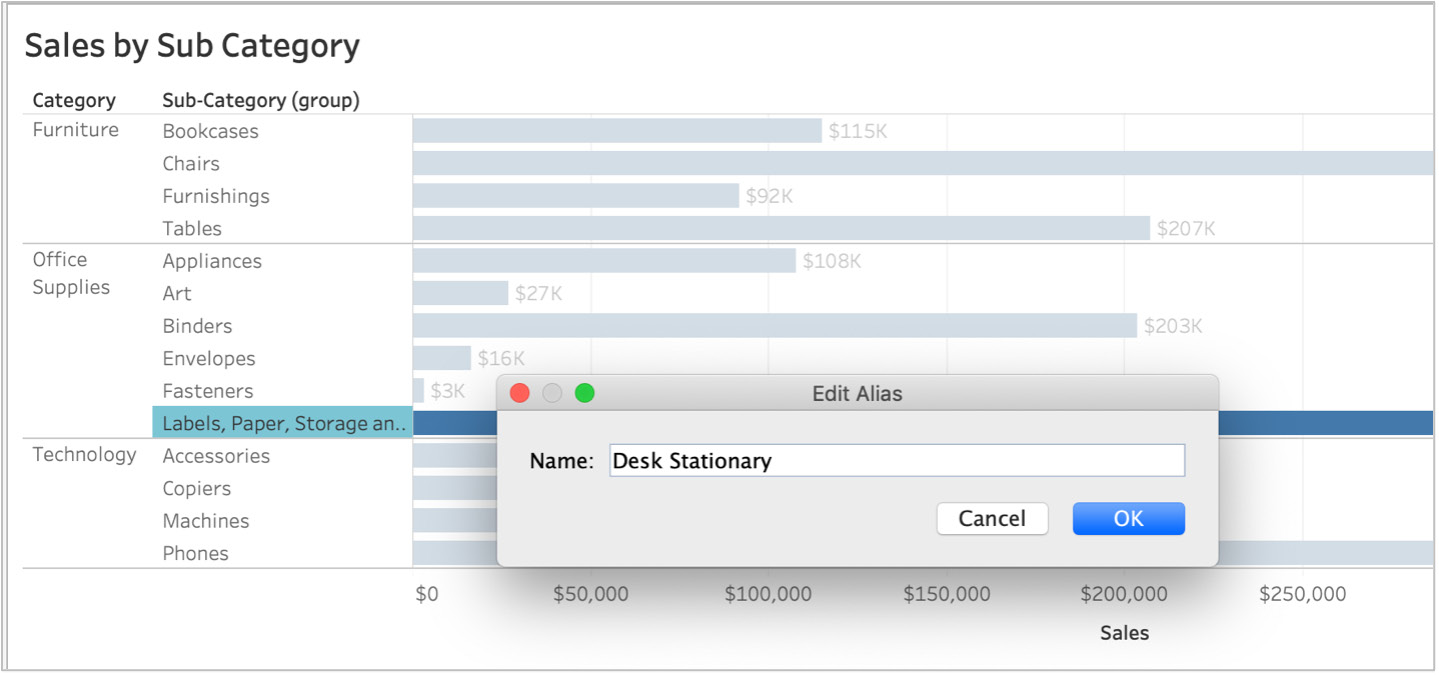
Figure 11.4: Naming groups
Creating a Group from the Data Pane
In the previous steps, you used the worksheet view to create a group. Now you'll create a separate group via the Data pane:
- Create a new worksheet as you did in the steps above.
- Create a bar chart of Sales across Category and Sub-Category as shown here:
Figure 11.5: Adding groups from the data pane
- Right-click on the Sub-Category dimension in the Data pane and hover over Create. Click on Group... from the sub-menu as shown in the following screenshot:
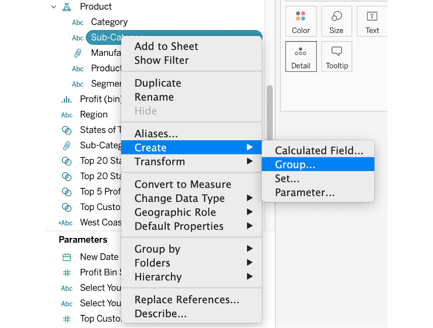
Figure 11.6: Creating a group from the Data pane
- In the group pop-up window, change the field name to something more descriptive: Papers Sub-Category(group).
- Hold Ctrl or Command and multi-select the sub-categories that you want to group. In this case, group all paper related items in one group and click on the Group button:
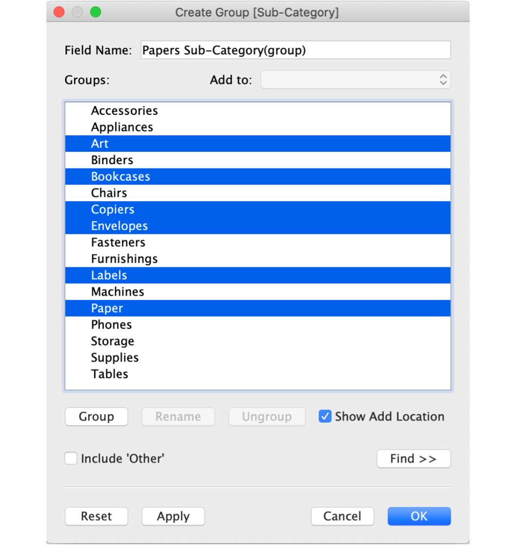
Figure 11.7: Adding members to the group Paper Sub-Category
- Rename the selected items in the window to Paper Items for easier readability, as shown in the following screenshot. You can add or remove the items by dragging them in and out of the groups at your convenience.
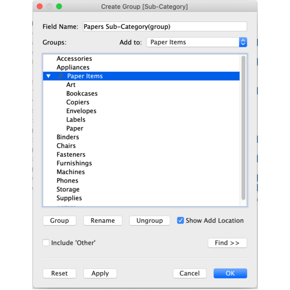
Figure 11.8: Editing a group
- To check if your group is working the way you expect, drag the newly created group dimension Paper Sub-Category(group) to the Rows shelf and remove the Category as well as the Sub-Category dimensions from the view. You'll notice the group that you created in the previous step:
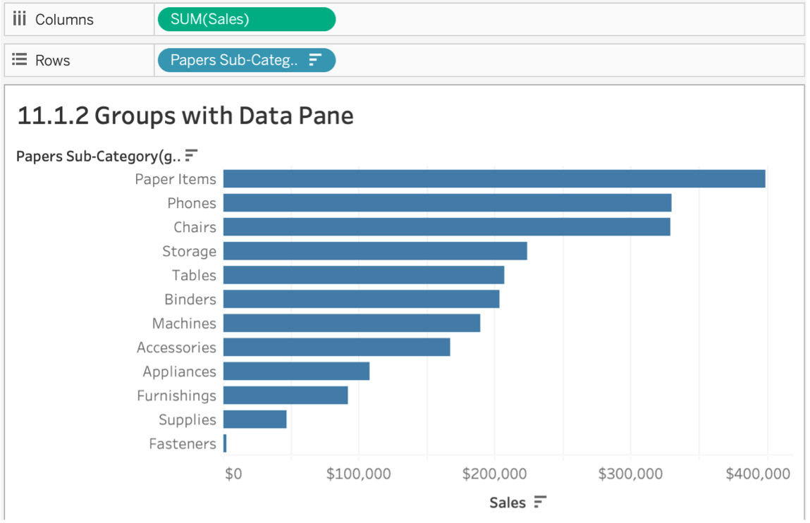
Figure 11.9 The groups sub-category
In this exercise, you explored two ways of creating groups: via the worksheet view and the Data pane. With your completion of this task, sub-category managers now have a way of looking at their KPIs for multiple grouped sub-categories.
Note
If you want to edit the grouping now or in the future, right-click on the new group dimension that was created (the dimension with the clip icon) in the Data pane and click on Edit Group. In the Edit Group popup, you can drag and drop to remove members or add new members to the group.
Hierarchies
Hierarchies are not specific to Tableau. As such, you have almost certainly used them previously, whether consciously or unconsciously. In a data context, when the relevant data is arranged logically based on its level of detail, it is called a hierarchy. In our Sample - Superstore dataset, you have already used hierarchies many times, including the Location hierarchy, which contains Country/Region, State, City, and Postal Code; the Product hierarchy consists of Category, Sub-Category, Manufacturer, and Product Name. Hierarchies grant you a comprehensive look into your data. For example, if you add the State dimension to your view, because of the hierarchies that were pre-created in your data, you can switch from state to city by clicking on the + icon in your shelf or go a level up by clicking the - sign as shown here:
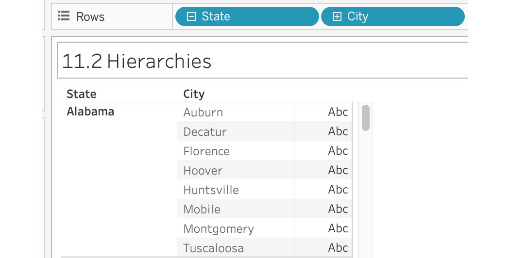
Figure 11.10: Default hierarchies
Take a look at how hierarchies can be created through the following short exercise.
Exercise 11.02: Creating Hierarchies
As an e-commerce analyst of emzon.com, the product catalog manager wants to add Segment to the Product hierarchy. You will have to initially remove the original Product hierarchy and later create a new Product hierarchy by combining one of the existing ones.
Note
If you load the default Sample - Superstore dataset provided by Tableau in Tableau Desktop, you may notice that some fields are missing or new fields have been added. That is expected as Tableau constantly updates data files as per the requirements. If you want to avoid confusion, download the dataset from the official GitHub repository for this chapter, available here: https://packt.link/eLmSX.
- Open the Sample - Superstore dataset in your Tableau instance, if it is not already open.
- Follow Step 2 and Step 3 below only if your version of data has a Product hierarchy inbuilt. If not, proceed to step 4 directly. Assuming in your Data pane you find a Decision Tree icon(as shown below) attached to Product dimension, the decision tree signifies that the dimension is a hierarchy and can be drilled down in your view.

Figure 11.11: The hierarchy icon
- Navigate to the Product dimension in your Dimensions data pane and right-click the Product dimension. Then click on Remove Hierarchy:
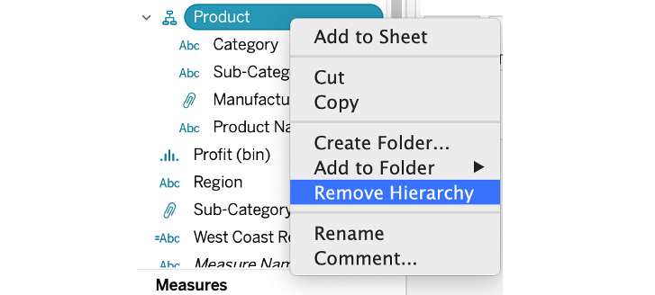
Figure 11.12: Removing the hierarchy
As soon as you remove the hierarchy, the Decision Tree icon is also removed and all the dimensions that were part of the hierarchy subsequently become their own dimensions. You will also be unable to drill them down as they are no longer logically arranged.
- To re-construct the hierarchy that we just removed, multi-select dimensions by pressing Ctrl and selecting (for Windows) or Command and selecting (for Mac) all the dimensions that were a part of the product hierarchy. In this case, this will be Category, Sub-Category, Manufacturer, Product name, and Segment.
- After selecting all the dimensions mentioned, right-click on any of the selected dimensions, hover over Hierarchy, click on Create Hierarchy…, and name the hierarchy Product as shown here:
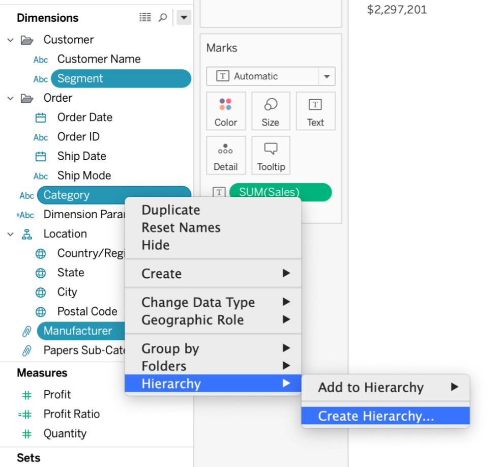
Figure 11.13: Creating a new hierarchy
Ideally, the order of multi-select in the previous steps should have allowed Tableau to select the level of your hierarchies. Unfortunately, Tableau levels them alphabetically, which is not the level you want:
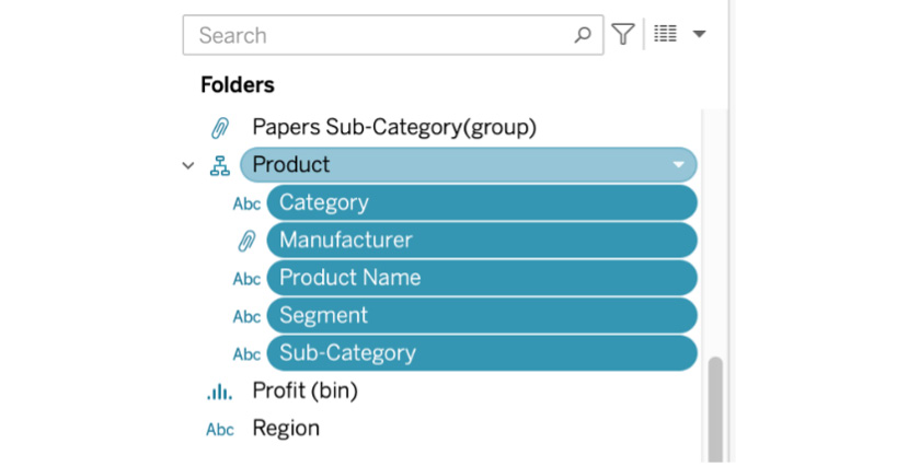
Figure 11.14: The newly created hierarchy
- Before you create a hierarchy, you should have a good idea of the logical leveling of the hierarchy. In this case, these were Category | Sub-Category | Manufacturer | Product name | Segment. Drag your dimensions above or below depending on the level. For example, Sub-Category is below Segment, so drag Sub-Category above Product Name and Manufacturer:
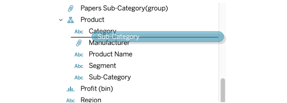
Figure 11.15: Dragging dimensions to change their logical order
- Check if the hierarchy is working as expected. Drag the Product hierarchy to the Rows shelf and double-click on Sales to create a Sales report by Product hierarchy.
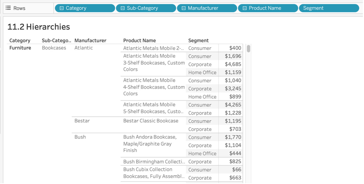
Figure 11.16: Final hierarchy
Like groups, hierarchies can be useful when you can logically arrange relevant data points based on their level of detail or granularity. You just removed as well as re-created a Product hierarchy in this exercise.
Filters: The Heart and Soul of Tableau
If you want to differentiate yourself from a casual Tableau developer, understanding the order of operations and the order in which Tableau manipulates and filters data is critical. In other words, to be a true expert in Tableau, you need to be able to determine when and where data was filtered and pinpoint the reason when the view doesn't produce the data you expect.
Think of the order of operations as the query pipeline. The order in which Tableau filters data is critical and Tableau follows a sequential order, as shown in the following chart.
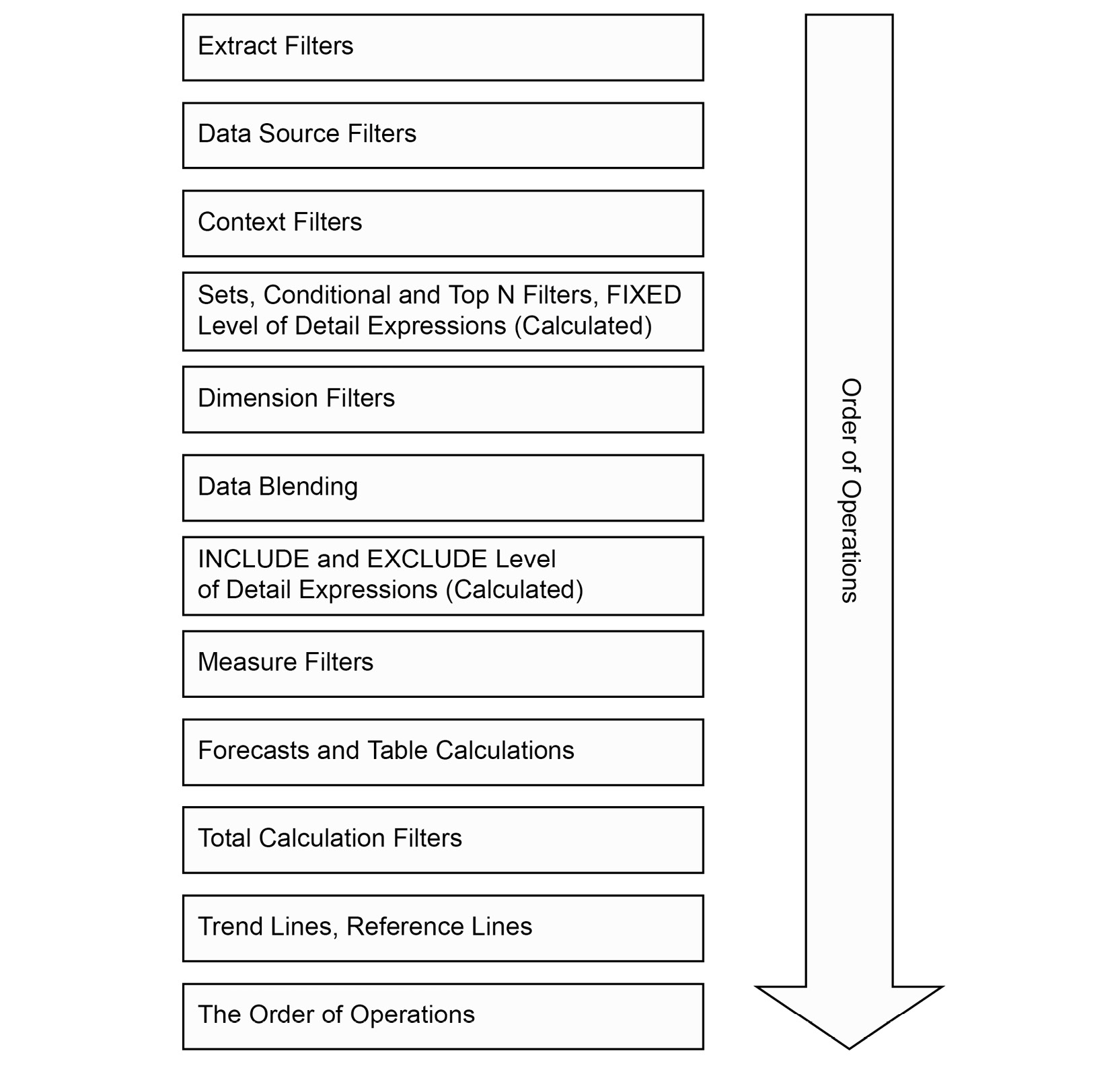
Figure 11.17: Tableau table of operations
When you create business dashboards in Tableau, you will have multiple filters, table calculations, and calculated fields to work with. As is the case with most programs, execution follows a set order/operation priority. The order of operations is just that. In the chart above, Extract Filters has the highest priority, followed by Data Source Filters and Context Filters, and Trend Lines, Reference Lines has the lowest priority. In the following sub-sections, we will try to explain most of the filters with an exercise to demonstrate the importance of this.
Data Source and Extract Filters
Data Source and Extract filters are the first in the order of operations in Tableau and take place before you create your first view or when you are loading your data into the Tableau instance. This type of filtering is useful when you don't want to load all the data from your server/source file into the Tableau instance. See this in practice in the following exercise.
Exercise 11.03: Filtering Data Using Extract/Data Source Filters
As an analyst, you want to load only a sub-region of data into your Tableau worksheet to lower the load on the dashboard and limit the amount of data being downloaded into the worksheet. Create a view of Sales by State for the East region only.
- Open the Sample - Superstore dataset in your Tableau instance if you don't have it open already.
- Before creating a sample view, double-click on Data Source at the bottom-left of your screen.
Figure 11.18: Data pane view
- To import data for the East region only for your view, add that as a Data Source Filter here. On the Data Source page, click on Add in the Filters section at the top right of the view.

Figure 11.19: Data Source view
- In the Edit Data Source Filters window, click the Add… button, select Region, and click OK. Just select East from the list and click the OK button. Click the OK button again to close the dialog box:

Figure 11.20: Adding data source filters
- To confirm the working of the filters, create a new worksheet and review Sales by State from your data:

Figure 11.21: Data after adding a data source filter
You might not notice the difference in speed when loading any of the dimensions in your view because the data is not at gigabyte or terabyte scale. If you were working with large-scale data, utilizing data source filtering is one way to improve the speed and efficiency of your work.
When the data source you are importing contains more data than your report/dashboard requires, you can utilize data source filters to improve the efficiency and reduce the load on Tableau views. In this exercise, your goal was to improve the performance of your dashboard, and by using data source filters, you were able to limit the amount of data being loaded in the worksheet.
Filters Using Views
These types of filters resemble how you group dimensions using views. In this type of filtering, you manually select one or multiple data points in the view to include or exclude from the view. In the following exercise, you'll perform these simple steps to create a filter in this way.
Exercise 11.04: Creating Filters from the View
As an analyst, you have been given completely new data, and as part of the dashboard designing process, you want to do some Exploratory Data Analysis (EDA). Creating filters using the view can be a great way of filtering data as you see the data in the worksheet.
Perform the following steps to complete this exercise:
- Open the Sample - Superstore dataset in your Tableau instance if you have not already done so.
- Create a bar chart of Sales by State. Drag and drop State to the Rows shelf and Sales to the Columns shelf. You should end up with the following view:
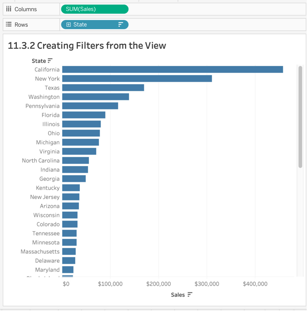
Figure 11.22: Sales by State view
- Manually select your states/data points to include/exclude from your view. Click and drag a region to exclude the top five states by sales as shown here:
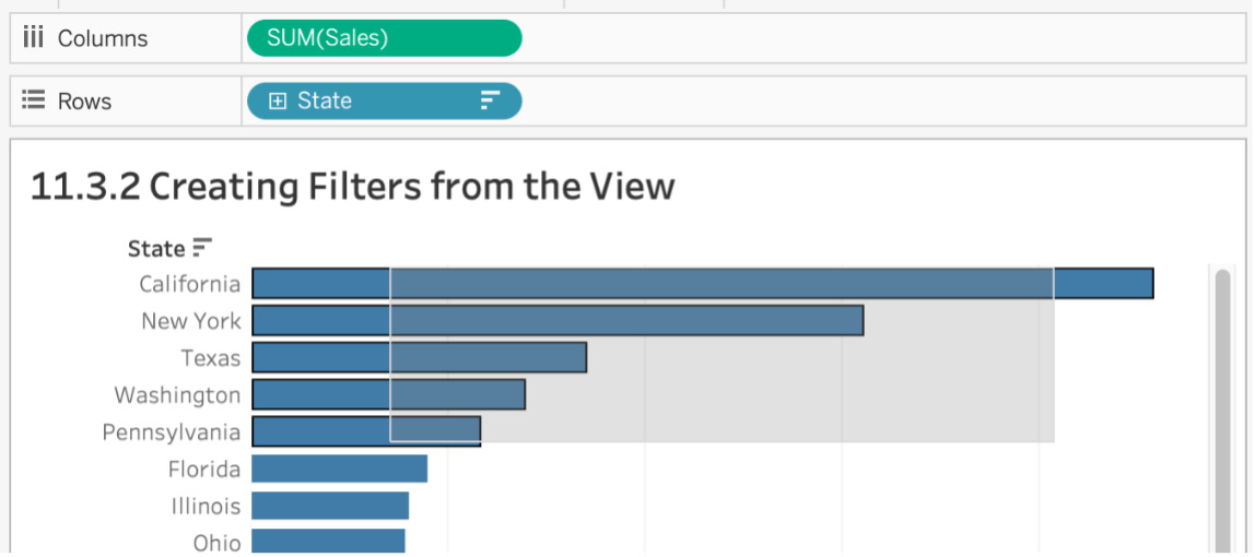
Figure 11.23: Dragging multiple data points to create a filter
- If you hover your mouse over the selected region for a couple of seconds, a tooltip option pops up. From here, select Keep Only or Exclude for the selected states. You exclude these states, so click on Exclude:
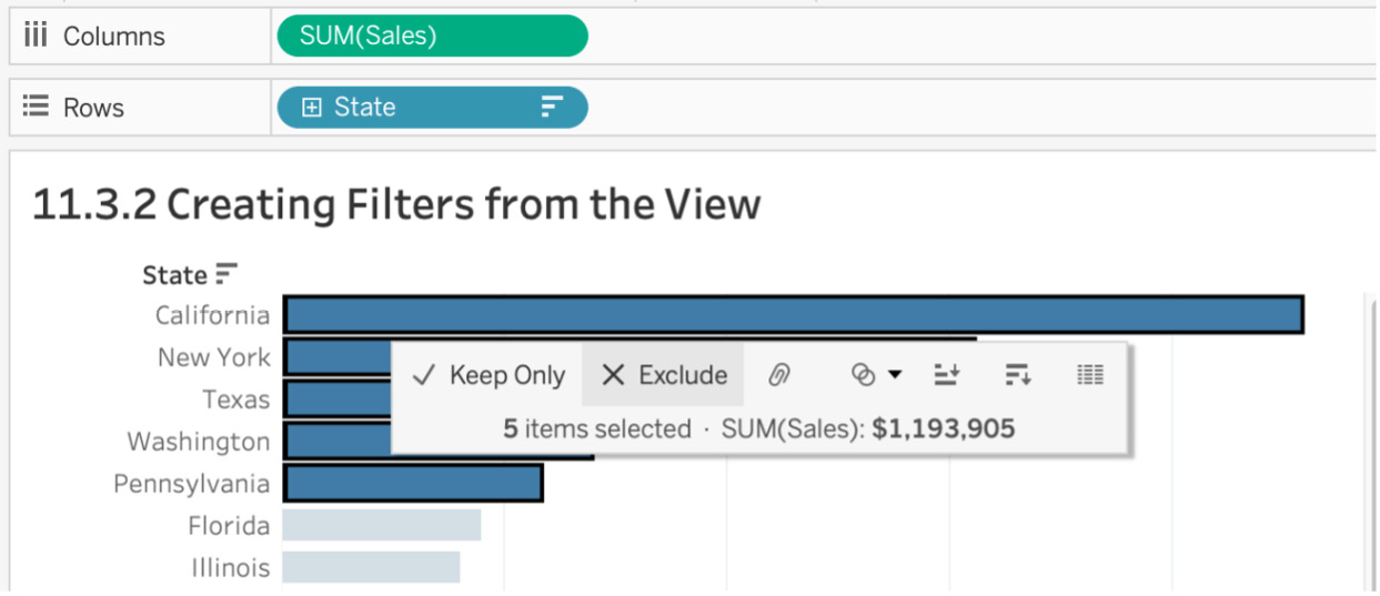
Figure 11.24: Include/exclude data points from the view
A State dimension filter will be added to the Filters shelf. In the next sub-section, you are going to dive deep into how to best use the Filters shelf, so hold on to your questions at the moment. Here is the final output:
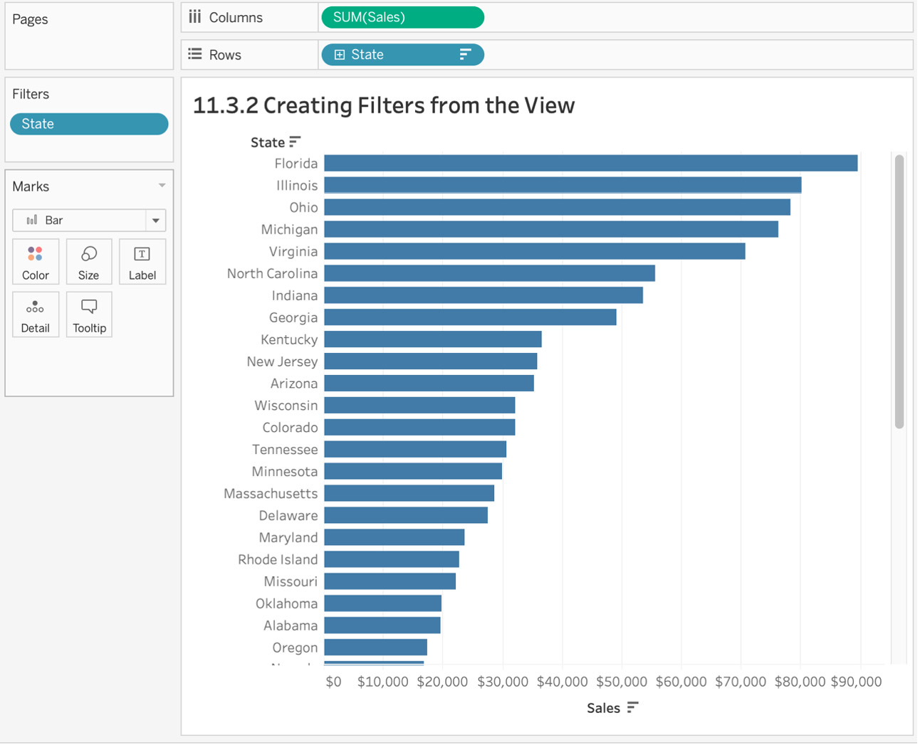
Figure 11.25: Final output after creating the filter from the view
In this exercise, you practiced manually selecting or dragging and selecting a subset of the view to include/exclude from the view. Creating filters using the view can be incredibly helpful when you initially conduct EDA, which is what all analysts start with when creating a new dashboard. Next, we will dive deep into how to best utilize the Filters shelf.
Creating Filters Using the Filters Shelf
In previous sections, we looked at filtering data either at the data source level or using views, but the right way to utilize filters in Tableau is via the Filters shelf. In this section, we will discuss how to use the Filters shelf for filtering dimensions, measures, as well as dates. But first, we will dive deep into the options of the Filter dialog box, which opens up when you drag any of the mentioned data types.
Dimension Filters Using the Filters Shelf
Dimensions in Tableau are essentially categorical data. When filtering a dimension, you either include or exclude some part of this data from the view. The following dialog box opens up whenever you drag a dimension to the Filters shelf:
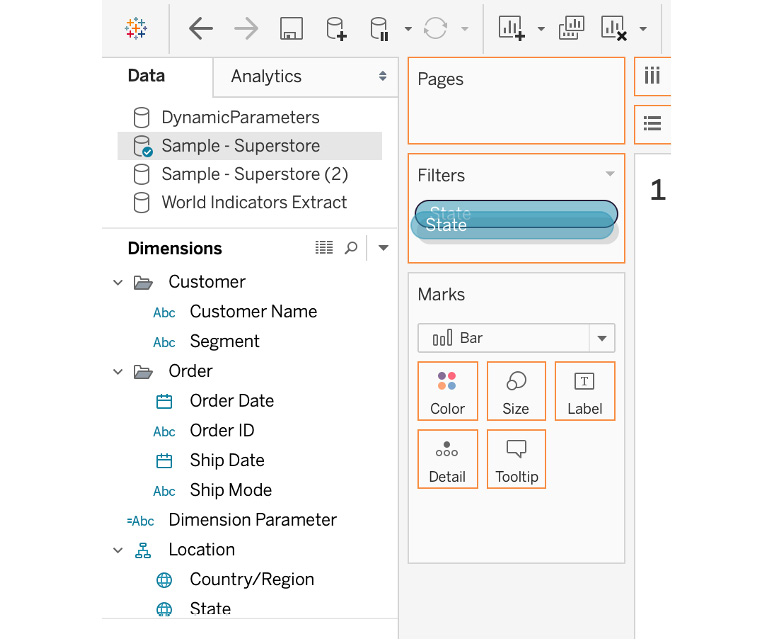
Figure 11.26: Dragging a dimension to the Filters shelf
The box has four tabs, as follows:
- General: You use this tab when to manually select the categorical data to include or exclude from the view. For example, if you wanted to filter Sub-Category on Supplies and Tables, you could manually select only two sub-categories to include, as shown below:
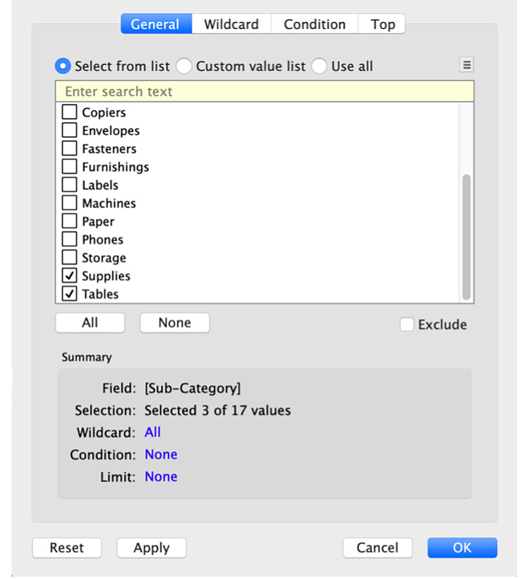
Figure 11.27: Filters shelf General tab
- Wildcard: The Wildcard tab is used to match a pattern of text to use the filter on. Say you had a column with thousands of URLs, which may or may not contain the term football in the URL. It would be quite tiring to use the General tab to manually select all the URLs that contain the term football, but using Wildcard, you can match the value by stating that the dimension either contains, starts with, ends with, or exactly matches the term football for your URL dimensions.
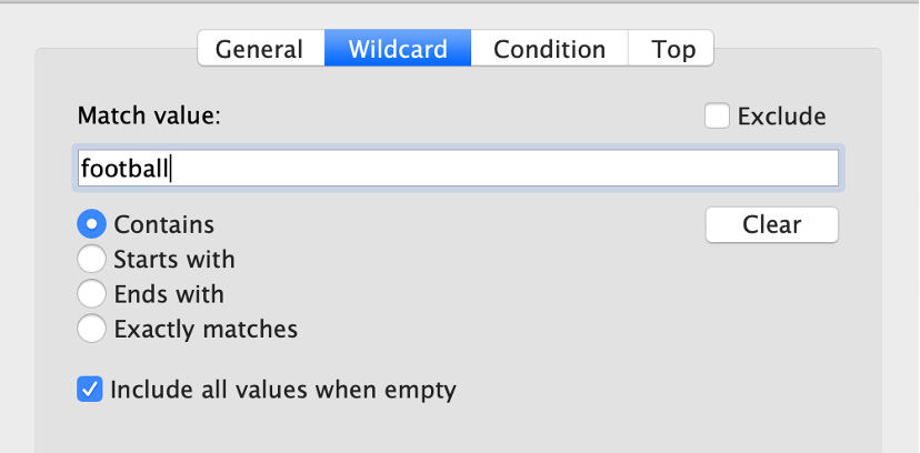
Figure 11.28: Filters shelf Wildcard tab
- Condition: In the Condition tab, you define rules or criteria for filtering the data. For example, you could also use the Condition tab to filter on those sub-categories that reported losses in your data. To do that, select By field, and in the dropdown, select Profit with Sum as aggregation and < 0 as shown below:
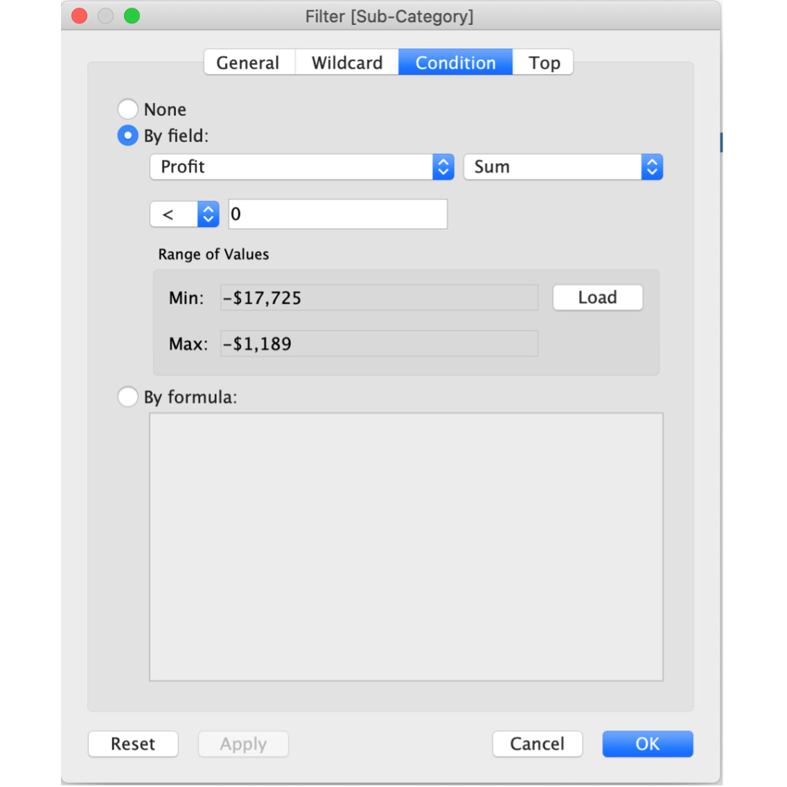
Figure 11.29: Filters shelf Condition tab
- Top: Use the Top tab in the Filter box when you want to compute the Top or Bottom N members of the view depending on the measure you want to filter the view on. In this example, you know that the Bottom three sub-categories are the rows with losses, so you can create a Bottom filter using these details, as shown here:
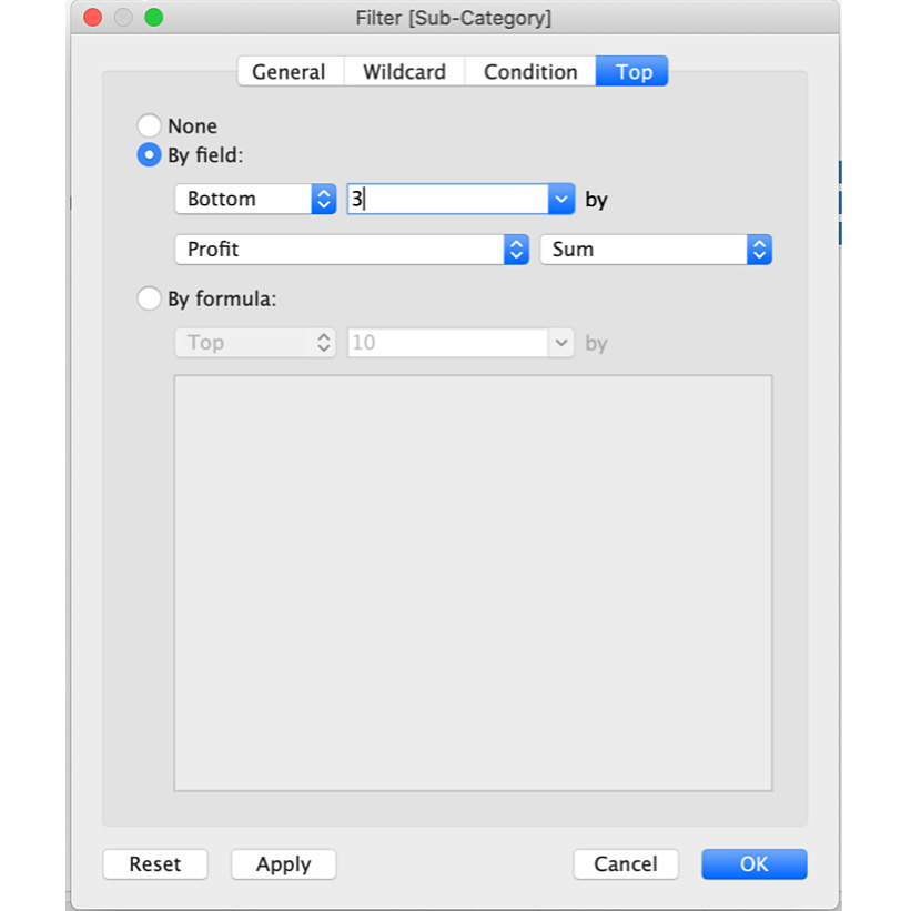
Figure 11.30: Filters shelf Top view
Next, you will utilize the Filter dialog box in an exercise.
Exercise 11.05: Dimension Filters Using the Filters Shelf
The portfolio manager has been tasked with identifying a list of all sub-categories that are not making profit. You are tasked with creating a dynamic filter via the Filters shelf.
Perform the following steps to complete this exercise:
- Open the Sample - Superstore dataset in your Tableau instance if you don't have it open already.
- Create a Profit by Sub-Category bar chart and drag and drop Sub-Category to the Rows shelf and Profit to Columns. You should get the following view:
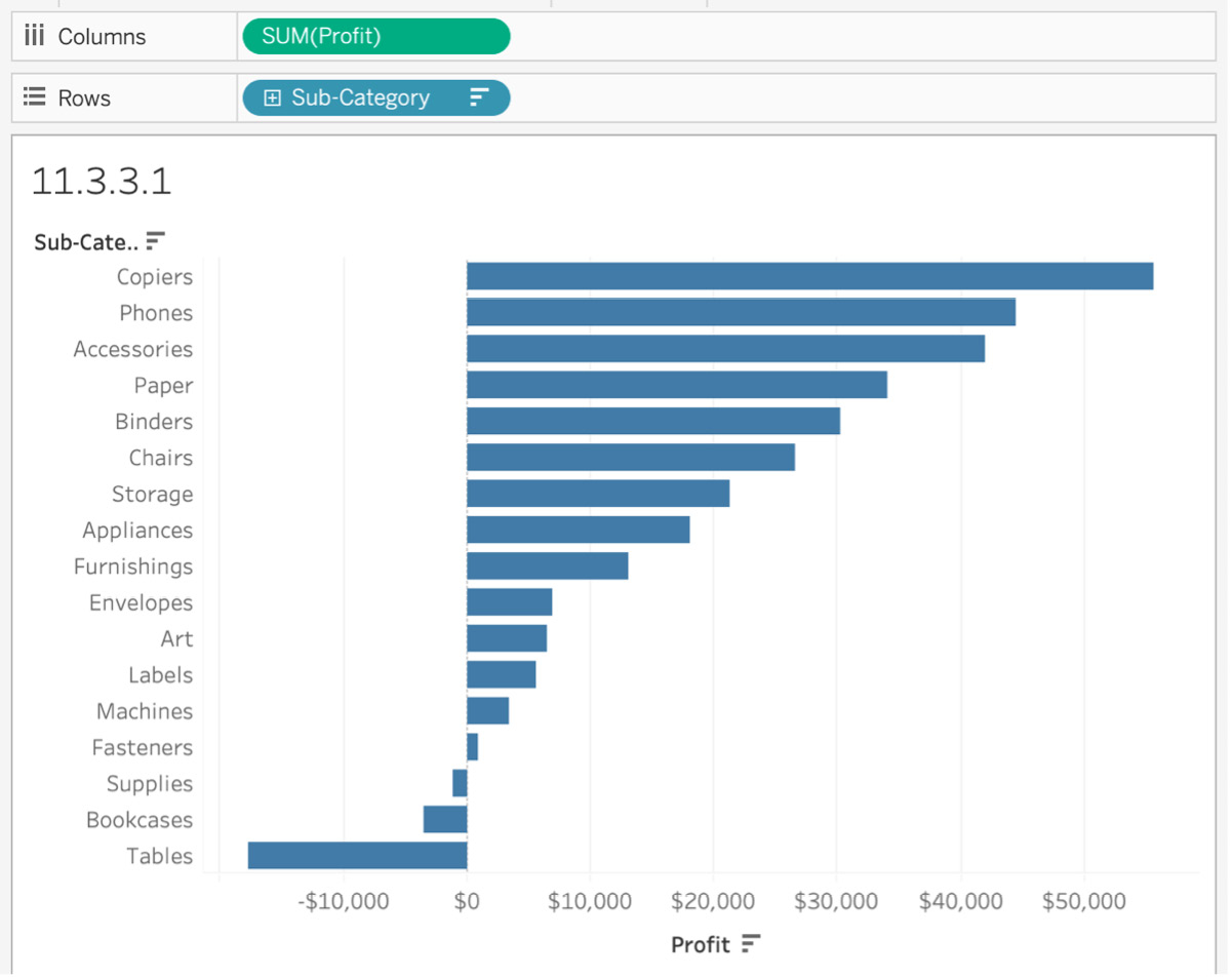
Figure 11.31: Profit by Sub-Category view
Note that there are three sub-cat egories (Supplies, Bookcases, and Tables) where the superstore made a loss. You want to include them in your view and exclude all other sub-categories. You can obviously manually select the sub-categories from the view itself, but go ahead and use the Filters shelf here, as instructed in the next step.
- Drag and drop Sub-Category from the Data pane to the Filters shelf and a Filters [Sub-Category] dialog box opens up.
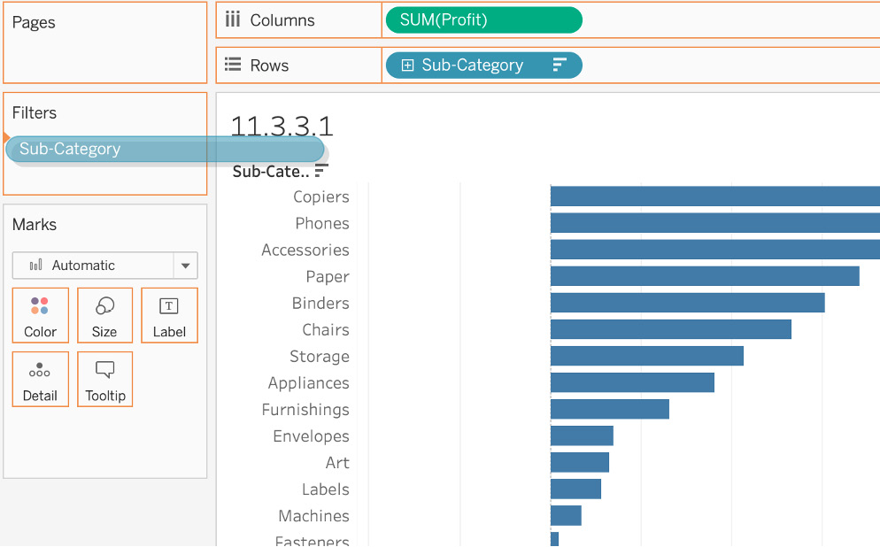
Figure 11.32: Only profitable sub-categories
- In the dialog box, click on the Condition tab, select By Field, and filter on all sub-categories with [Profit] <0. You will get a list of all the sub-categories that are making losses for the business. Click on OK to filter the data.
- You should get the following view showing a list of all sub-categories that are making losses:
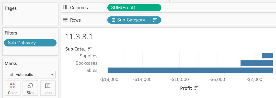
Figure 11.33: Only loss-making sub-categories
In your career as a data analyst, you will likely find yourself using the Filters shelf day in and day out as part of your job, making this an essential skill to have under your belt. In this exercise, you explored all the options Tableau has to offer in the Filters shelf for dimensions.
Measure Filters Using the Filters Shelf
Measures are quantitative data, which means, unlike dimensions, filtering on measures involves selecting a range of numbers that you want to include/exclude from your view. Whenever you drag a Measure onto the Filters shelf, the Filter dialog box offers you four options to filter the Measure on. The following list will define these options in greater detail:
- The Measure Filter Dialog Box:

Figure 11.34: Range of values in the Filter window
- Range of values: In Range of values, you specify the range of values you want to filter on. In this use case, you only want profitable sub-categories, so your range will be from zero to the maximum as shown in the next screenshot (Figure 11.35).
- At least: In At least, you specify the minimum value and all values greater or equal to the minimum value will be included in your view. This can usually be used when you don't have control over what the maximum for the column/data could be, and it is difficult to predict. In this use case, your minimum will be zero because you want only profitable sub-categories as shown here:
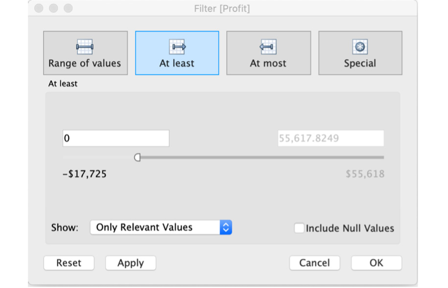
Figure 11.35: At least filter window
- At most: At most is the opposite of At least and is used when you want to include all values that are less than or equal to the maximum specified. This can usually be used when you don't have control over the minimum but know the maximum value that you want to be included in your view, which is exactly opposite to that of the At least tab. You cannot use At most for this use case identifying profitable sub-categories because all the negative values will also be included in the view, and you don't have control over them if you use At most.
- Special: As the name suggests, this filter is only used when you want to include either null values, non values, or all values. This tab is rarely used, but depending on the data, it may be required.
Exercise 11.06: Measuring Filters Using the Filters Shelf
The portfolio manager liked the work you did creating a view of loss-making sub-categories. Now he wants you to create a similar view, but instead of loss-making sub-categories, he wants a profit-making view this time. You will utilize Profit as a filter to create the view in the following steps:
- Open the Sample - Superstore dataset in your Tableau instance if you have not already done so.
- Create a Profit by Sub-Category bar chart, and drag and drop Sub-Category to the Rows shelf and Profit to Columns. You should be at the following view:
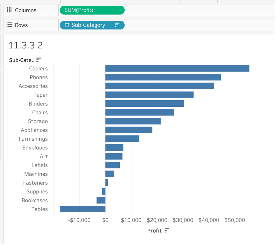
Figure 11.36: Profit by Sub-Category view
- Drag Profit from the Data pane to the Filters shelf. The following dialog box opens up:
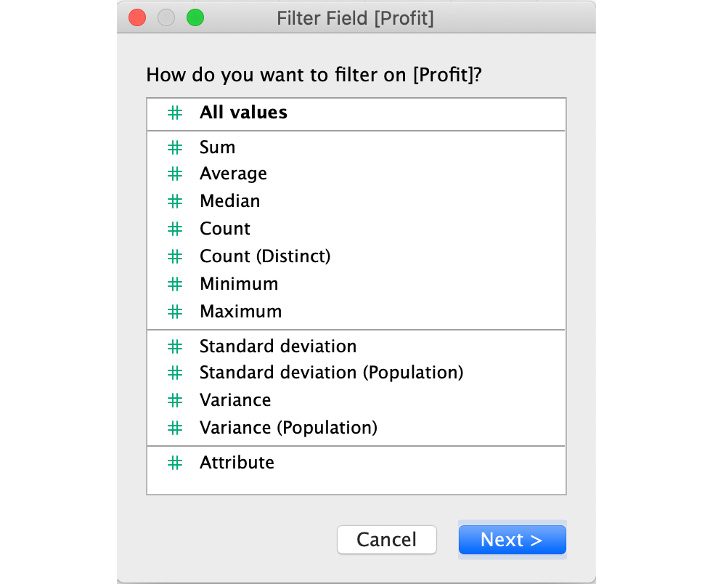
Figure 11.37: Measure Filter Field options
- In the Filter Field [Profit] dialog box, select the aggregation for your measures. In this case, select Sum as you want to look at the sum of the profit.
- Range of values, as well as At least, can be used for identifying profitable sub-categories. For this exercise, use Range of values to filter on profitable subcategories.
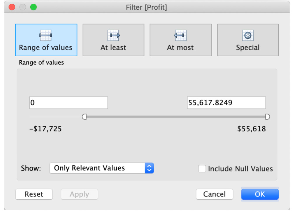
Figure 11.38: Range of values for Measure
- Regardless of Profit option you decided to use, your final output should resemble the following:
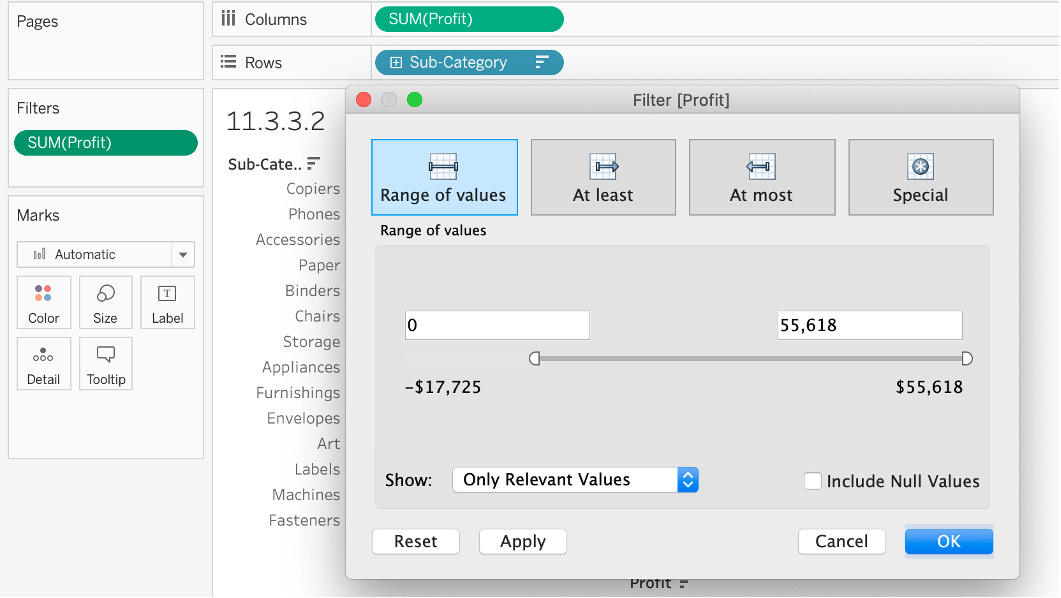
Figure 11.39: Measure filter final output
In this exercise, you utilized the Measure data type as a filter for the first time and explored all Tableau's corresponding options for this in detail. You used Profit to filter on only profitable sub-categories.
In the next section, you will explore date filters using the Filters shelf.
Date Filters Using the Filters Shelf
Dates are neither qualitative data nor quantitative data out of the box. We can filter dates either by Relative Date, Range of Dates, or filtering by discrete dates. Let's explore each one of the options and how they differ from each other, and in the exercise after the explanation, walk through a specific use case.
When you drag a Date dimension such as Order Date in your Sample - Superstore dataset, you are presented with the following window:
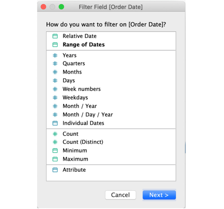
Figure 11.40: Date filter modal window
- Filtering by relative dates: If you choose to filter by a relative date, in the subsequent window, you can define the relative time-frame of your date and the dates will be filtered depending on the date on which the view was opened. Say you want to show only the last 12 months of data. In the Relative Dates dialog box, select Months, click on Last, and enter 12 months as shown here:
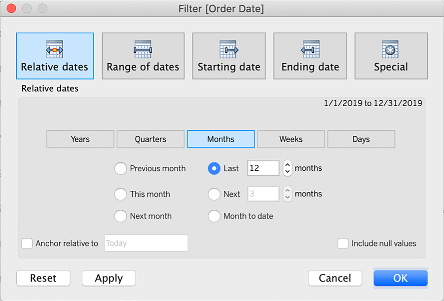
Figure 11.41: Filter by Relative dates
Relative dates are defined from the date the view was opened. If the data source only has dates till December 2019 and you are opening this in July 2020, the view will only include dates from August 2019 to the maximum date that is present in the data, which in this case is December 2019. Hence you will only see five months' worth of data. To change that, you can check Anchor relative to at the bottom left and enter the date as December 31, 2019, as shown here.
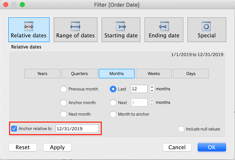
Figure 11.42: Filter by Relative dates with an anchor date
- Filtering by range of dates: You use this filter when you want your dates to have a fixed range. In this use case, you want 12 months of data relative to December 2019, so your range will be January 2019 to December 2019 as shown here:
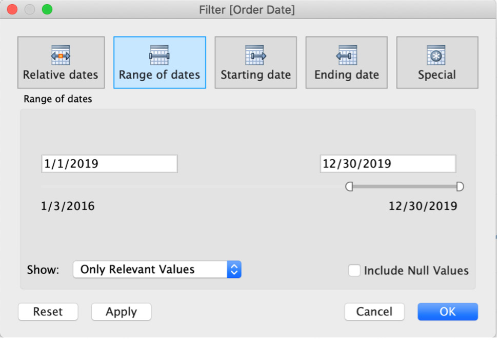
Figure 11.43: Filter by Range of dates
- Filtering by discrete dates: In the Filter Field [Order Date] dialog box, if you select discrete date values, you will filter on the entire date levels. For example, if you filter the discrete date on Months and select January, you will filter on January irrespective of the year. If you want to filter on a month and a year, select Month / Year from the Filter Field dialog box.
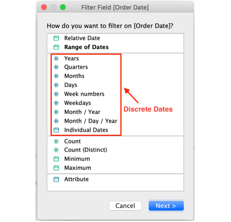
Figure 11.44: Filter by discrete dates
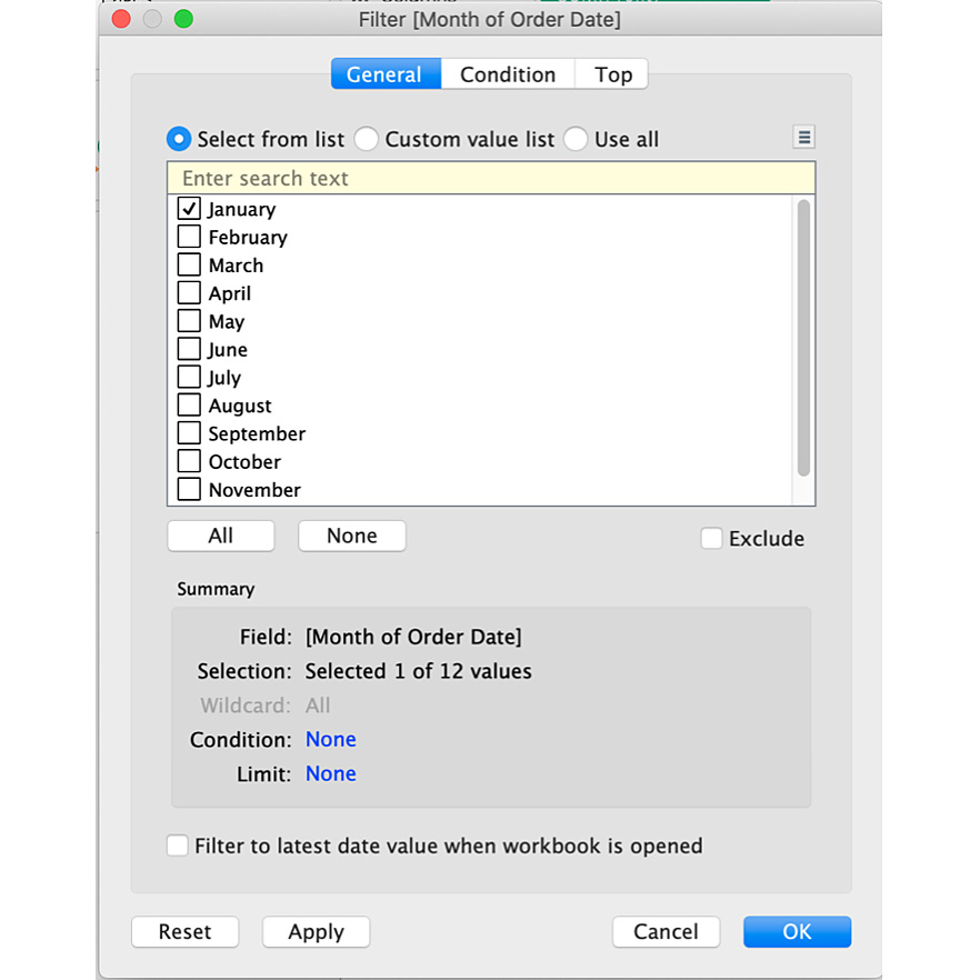
Figure 11.45: Filter by discrete month
In the following exercise, you will use the Date dialog box and create a time-series view to showcase the use of the Date filter.
Exercise 11.07: Creating Date Filters Using the Filters Shelf
You are asked to create a time-series view of the sales of the last 12 months relative to the last updated date of the data. You will be using the Sample - Superstore dataset again in this exercise and utilizing relative dates, as well as anchoring relative to the options covered in the preceding section.
Perform the following steps to complete this exercise:
- Open the Sample - Superstore dataset in your Tableau instance if you have not already done so.
- Create a line chart of Sales by continuous Month(Order Date) as shown here:
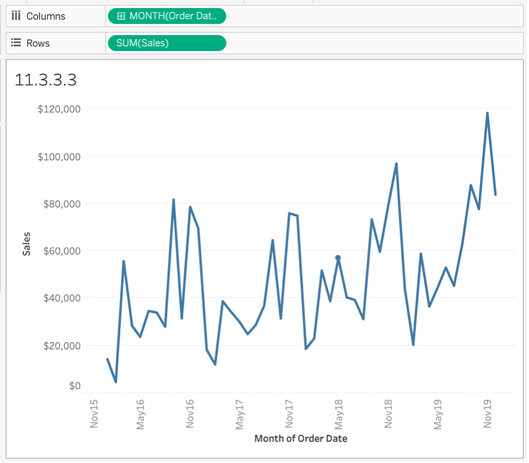
Figure 11.46: Time-series view after filtering on the last 12 months
You want the line chart to only show the last 12 months of data, so you will be using the Filters shelf to select only the last 12 months of data.
- Drag and drop Order Date to the Filters shelf. In the Filter Field [Order Date] dialog box, filter the dates either by Relative Date, Range of Dates, or filtering by discrete dates.
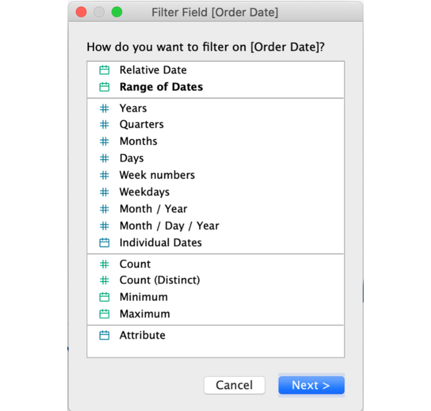
Figure 11.47: Date filter window
- For this exercise, you will filter by Relative Date since you want your view to be dynamically updated in the future too, to only show the last 12 months of data. Click on Relative Date in the preceding dialog box and on the next screen select Months and enter 12.
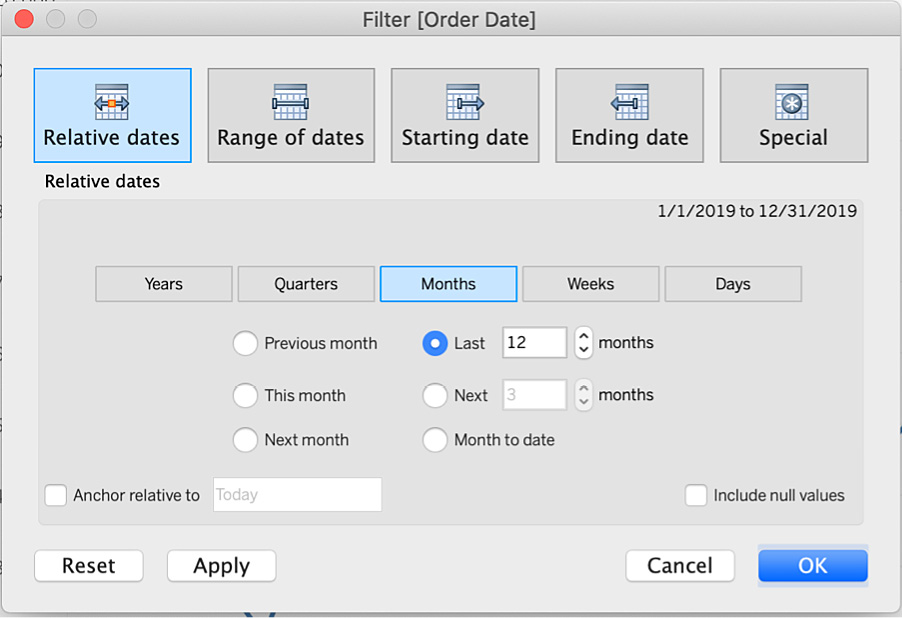
Figure 11.48: Relative dates date filter
This was discussed this in the Note section above. Since the Sample – Superstore dataset only has data till December 2019, and considering this book was written in July 2020, you will see only six checkmarks.
- To change that, make use of Anchor relative to and enter the date as December 31, 2019, as shown here:
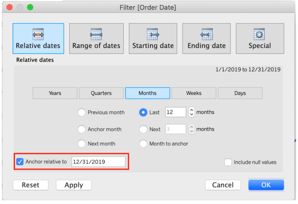
Figure 11.49: Relative dates with an anchor date
You achieved your goal of displaying the last 12 months' trends from the last date in the data using Relative dates with Anchor relative to December 2019. Here is what the final output should look like (Month(Order Date) has been added as a label in the Marks shelf for readability):
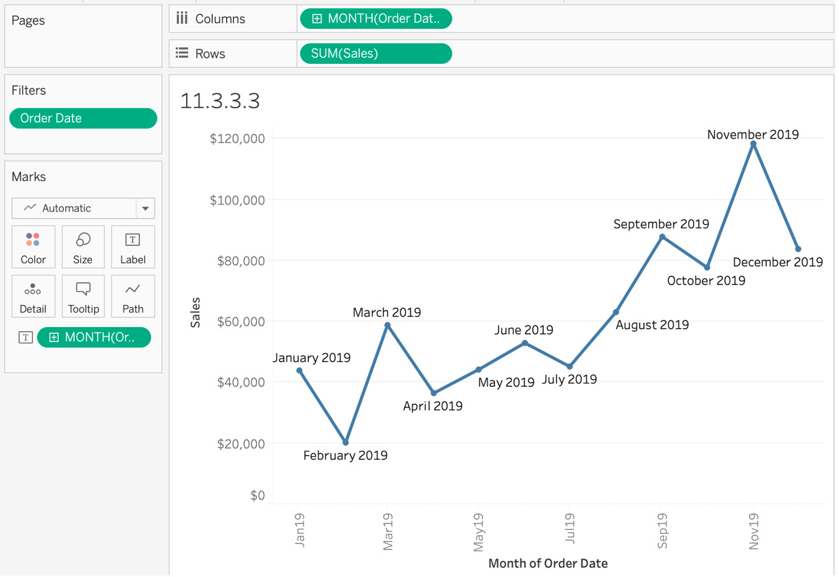
Figure 11.50: Time series to show the last 12 months relative to the anchor date
In this section, you were reviewed in relative detail the options that available for date filters and how to make the best use of them, and also how to make the best use of Anchor relative to and when to use it.
In the next section, we will look at how you can give the end user of your report/dashboard the ability to filter the report as per their requirements.
Quick Filters
Thus far, you have been using filters on your data as a developer without giving end users the ability to filter on a view. One of the many reasons why Tableau is a beloved tool across the developer as well as the end user community is because it allows even end users to control the flow of data in a view. This reduces the back-and-forth with developers because the end user can use the filters to change the data and get the insights they desire. This type of end user filter control is achieved with quick filters.
There are multiple ways of showing your quick filters. The major differences between them are as follows:
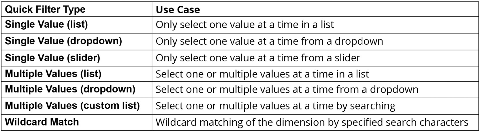
Figure 11.51: Quick filter types
Each quick filter has a specific purpose and is widely used across pretty much every dashboard you will ever build. In the following exercise, you'll explore a specific example and review the exact steps to add quick filters to your view.
Exercise 11.8: Creating Quick Filters
Create a simple view of Sales by State and use Region as a quick filter, as regional managers will use the dashboard to filter on their specific dashboard. Use the Sample - Superstore dataset once again to complete this exercise.
Perform the following steps:
- Open the Sample - Superstore dataset in your Tableau instance if you don't have it open already.
You are going to create a cross table of Sales by State and use Region as a quick filter, but first you need to build the view.
- Drag and drop State to the Rows shelf and, next, double-click on Sales to create the table of Sales by State. We will now add Region as a filter in our Filters shelf by selecting all values:
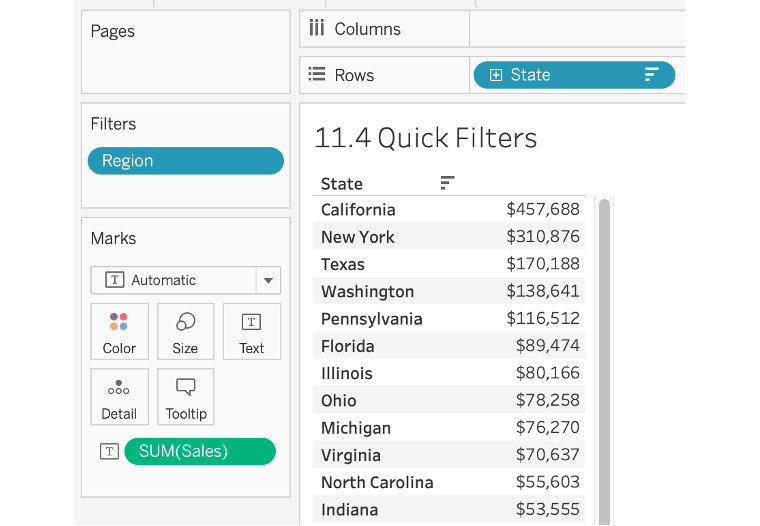
Figure 11.52: Sales by State view
- Click the down-arrow or simply right-click the Region dimension in your Filters shelf and select Show Filter:
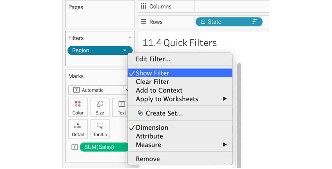
Figure 11.53: Show Filter step
- Drag the Region quick filter from the right-hand side to the left-hand side just below the Marks shelf for ease of use. Tableau automatically created Multiple Values (list) as a quick filter. If you hover over and click on the arrow in the Region quick filter as shown here, you get the following options:
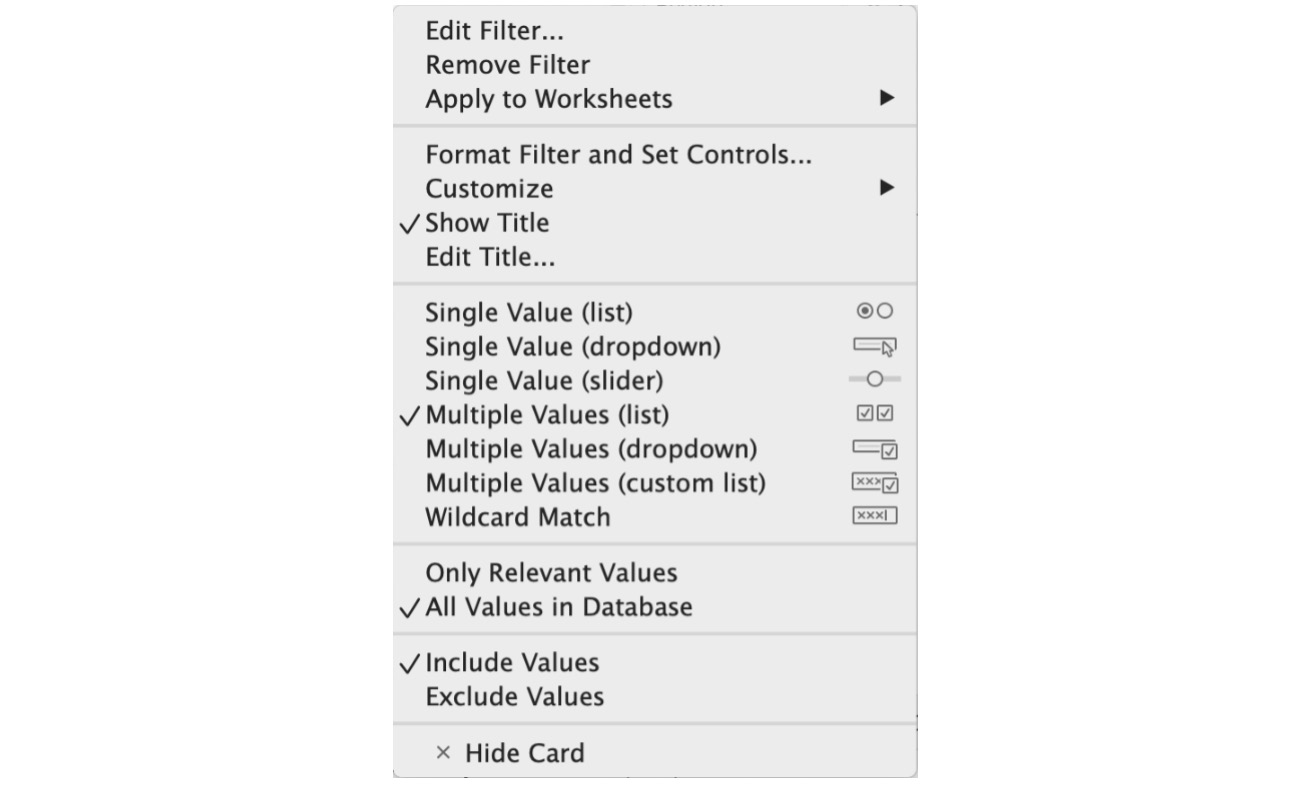
Figure 11.54: Quick filter type options
- As a recap of all the quick filter types in Tableau, review the following:
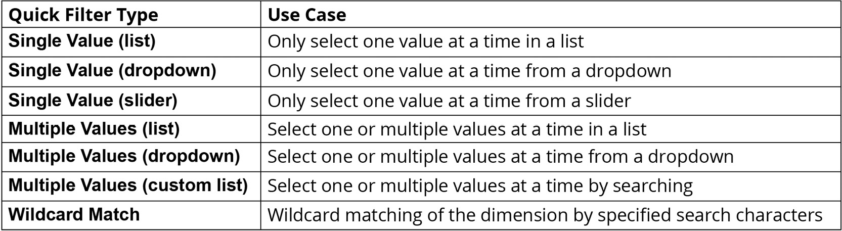
Figure 11.55: Quick filter types (review)
- In this use case, you want your end users to control the region that they want to view so that they are able to view one region or all regions at once. To do this, select Single Value (list), change the quick filter type from Multiple Values (list) to Single Value (list), keeping Show "All" Value from the Customize option checkmarked as shown here:
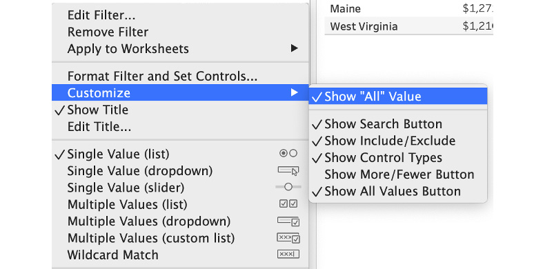
Figure 11.56: Quick filter Customize option
- Select East for Region in our quick filter and the final output should resemble the following view:
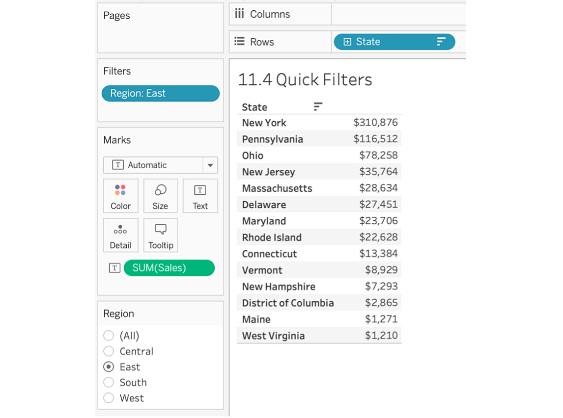
Figure 11.57: Final output after adding a quick filter
Quick filters are why Tableau is such a powerful tool even for end users. In this section, you have learned the major differences between the types of quick filters and the best use cases for them. You then created Sales by State and used Region as a quick filter.
Applying Filters across Multiple Sheets/Multiple Data Sources or an Entire Data Source
When you add a filter to your view, it only applies to your current view. But there will be times when you want to apply the same filter across multiple selected, using the same or a related data source if there is a relationship between primary and secondary data. This section will examine the difference between each of these options and when to use them.
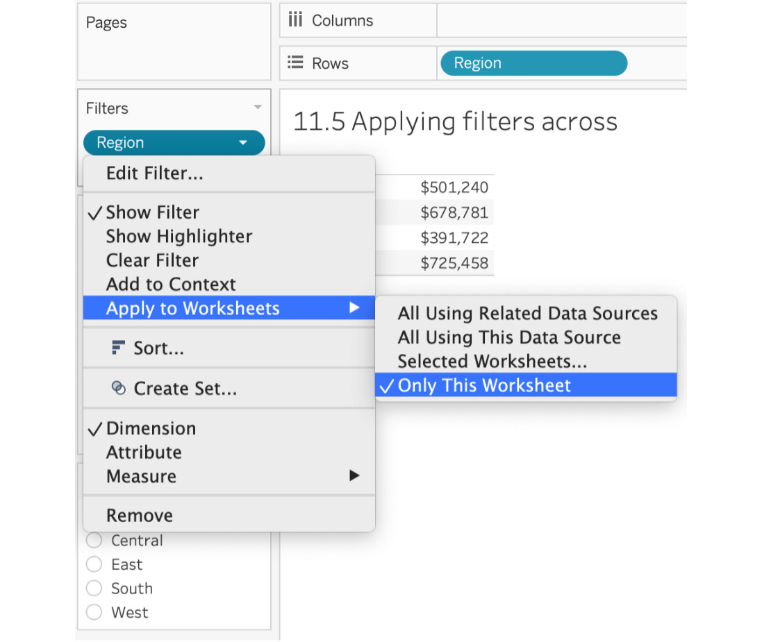
Figure 11.58: Apply to Worksheets options
- Applying a filter to Only This Worksheet: Here the filter(s) added to the worksheet is only applied to the worksheet to which the filter was added.
- Applying a filter to Selected Worksheets...: If you want your filters to be applied across multiple worksheets or even all of your worksheets, this option comes in handy. In the previous section, you created the Region filter. Say you want to use the same filter across a couple of other worksheets that are part of the Tableau workbook. You can do that as shown here:
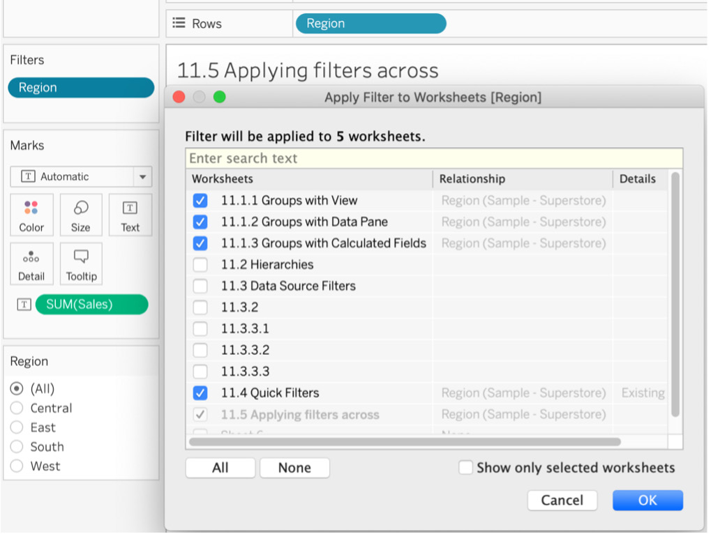
Figure 11.59: Apply a filter to the selected worksheets
- Applying a filter to All Using This Data Source: If you want to filter all worksheets that use the same Sample - Superstore dataset using the Region dimension, use this option. You can achieve the same result by selecting all worksheets in the Selected Worksheets option if the workbook only contains one data source.
- Applying a filter to All Using Related Data Sources: Choose this option when you want to use the filter from the current worksheet across multiple data sources. This feature was released in 2016, and when Tableau announced this feature release, the company mentioned that it was one of the most asked for features of all time.
This option only works when you create a relationship between a current or primary data source and a secondary data source. You do that by navigating to Data in the menu bar, then clicking on Edit Relationships. If Tableau does not automatically create some relationships between the data sources, you can create a custom relationship depending on the use case.
Custom Relationship comes in handy when the names of the common columns across the data sources don't match. Once you are able to create the relationship, you can select All using Related Data Sources for its magic to work. This option comes in handy when you are data blending, which was discussed in previous chapters.
Context Filters
When you add multiple filters into your Tableau view, each of these filters is calculated independently of the others. So, if you have two quick filters such as Category and Sub-Category in your view, when you select/deselect a filter, Tableau uses all of its data to show you the view.
If you want to limit the calculation across the whole data source and improve the performance of your report/dashboard (more on this in the exercise that follows), you'll want to use context filters. These help Tableau understand the context of the data and limit the amount of data filtering/loading that happens whenever you change a filter in your view.
In the Tableau order of operations, Context Filters has third priority. So when you set a filter as a context filter, you are essentially creating one independent filter and all other filters that are not context filters become dependent filters. This is because those other quick filters will process only the data that is first passed through the context filter.
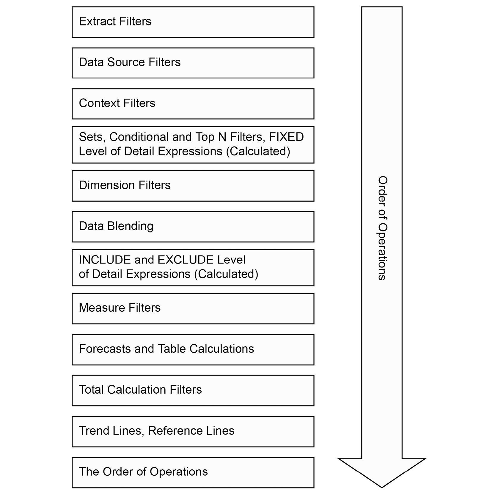
Figure 11.60: Tableau order of operations
An example of this in practice is detailed below.
Exercise 11.09: Creating and Using Context Filters
In this exercise, you will create and use context filters in an example use case with the Sample – Superstore dataset to see why mastering the Tableau order of operations is so beneficial.
- Open the Sample - Superstore dataset in your Tableau instance if you don't have it open already.
- Create a Sales by Sub-Category bar chart view, sort it descending by Sales, and add Category to the Filters shelf and show it as a quick filter. You should have the following view:
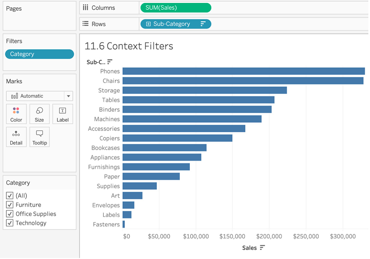
Figure 11.61: Sales by Sub-Category view
- To show only the top five sub-categories by sales, add the sub-category in the Filters shelf, and using the Top tab, filter on the top five sub-categories by Sum of Sales as shown here:
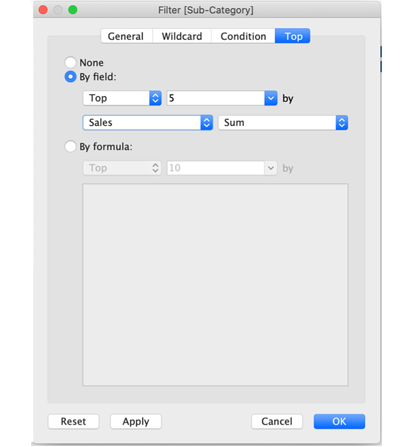
Figure 11.62: Top N filter view
- Note that all the top five sub-categories in the view. However, if you start de-selecting some of the Category quick filters, you will notice that only some of the top five sub-categories remain in the view.
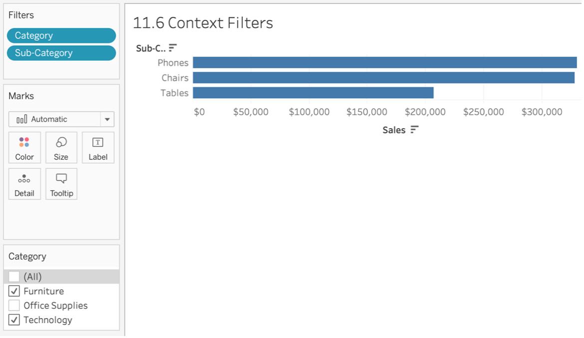
Figure 11.63: Need for context filters
The reason this happens (as you can see in the following figure) is that top N gets filtered first in Tableau operations before dimension filtering is applied to the view. Therefore, when you use the top N filter, Tableau has already calculated the top N for the dimension in the view; and when you use a secondary dimension for filtering, it gets filtered on the top N data and not the whole dataset.
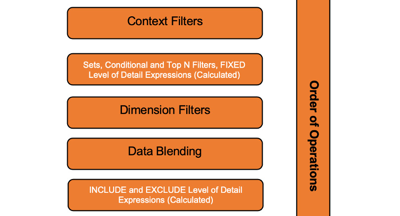
Figure 11.64: Sectional view of the Tableau order of operations
- Use context filters to counter this since, in the order of operations, these are executed before top N filters, as seen in the preceding figure.
Note
Major benefits of context filters are as follows:
Performance Improvements: When working on a large-scale dataset and using a lot of filters, it is recommended that you limit the number of calculations required in the view. When you use context filters, Tableau creates a TEMP table with the context and subsequent filters in the order of operations after the context filter references the TEMP table for calculating. Say you have a Customer Order database with 100 million rows, and you want to only look at customers in California, which is 18 million rows. By using a context filter on State, you are limiting the querying of your whole dataset so that only a subset of the California data will be used for calculating all subsequent filters. This is extremely useful.
Top N Filters: As discussed above, if your view has top N filters, utilizing a context filter is highly recommended so that the filter works in the desired way of showing all the top N irrespective of the secondary filter selected!
- To fix this issue, change your Category filter type to a context filter by right-clicking on Category and selecting Add to Context as shown here:
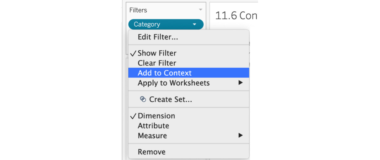
Figure 11.65: How to add a filter to context
- If your filter in the Filters shelf turns into a gray dimension, the filter is being used as a context filter. Verify that the context filter is working as expected:
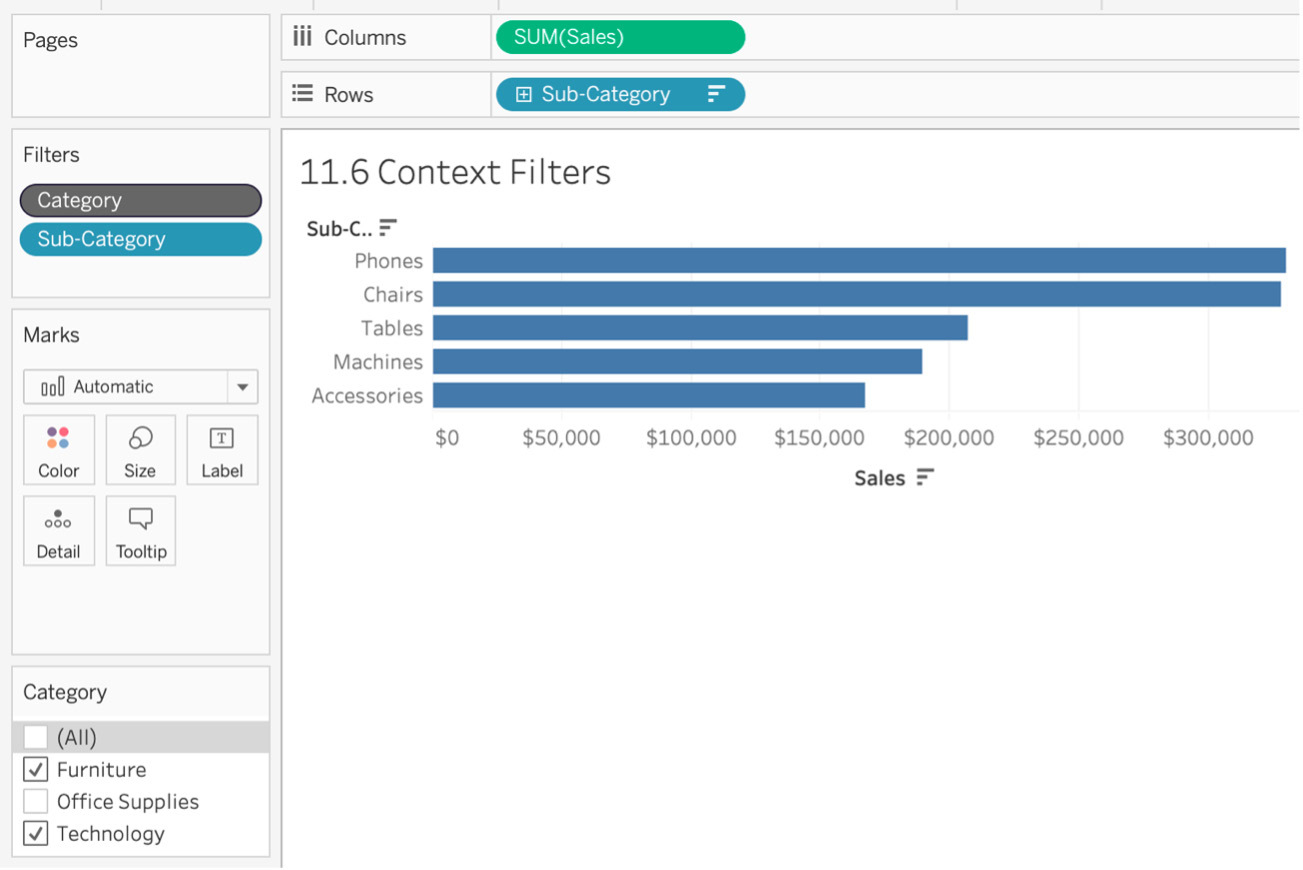
Figure 11.66: View after making Category a context dependent filter
As expected, after using Category as a context filter, the changes in Category quick filters are appropriately reflected in the view. Category becomes the dependent filter, where the top five sub-categories' filters become the independent filters that process the data that is passed through the context filter. It is now showing the top five sub-categories while using Category in context.
In this exercise, you explored why context filters are important and how the order of operations dictates how data is presented in the view. The context filter in this exercise was Category, which became the dependent variable, and the top N sub-category became the independent variable in our case.
Sets
Sets are custom-created fields used to define a subset of data based on pre-defined conditions or rules.
Think of sets as custom segments that are always binary: a data point is either in or out of the segment depending on whether the data point meets the criteria defined. Sets are created on dimensions, though your conditions can include measures if required. Sets can either be static or dynamic, and you can also combine multiple sets into one set in Tableau, which can be pretty useful, as you will learn from the following exercises. A set is identified in the Data pane by the field with a Venn diagram icon as shown here:

Figure 11.67: Venn diagram icon
Static Sets
As mentioned in the preceding section, sets can be either dynamic or static. In static sets, you define the set rules and create a fixed subset of the data, where the members of the set are not updated if the underlying data is updated with new data. For example, you create a Top City set manually, selecting New York, San Francisco, Mumbai, and London. The set members won't be changed even when new data is added or deleted. It's a static set. Dynamic sets can help counter this, but you will learn about dynamic sets in later exercises.
Exercise 11.10: Creating Static Sets
In this exercise, you will create a view of the Sample - Superstore dataset where all products that contain Envelope as part of their name are grouped together as In while everything else is grouped as Out.
Perform the following steps:
- Open the Sample - Superstore dataset in your Tableau instance if you don't have it open already.
- Create a view of Sales and Profit by Product Name. Drag and drop Product Name to Rows and double-click Sales and Profit to get the following view:
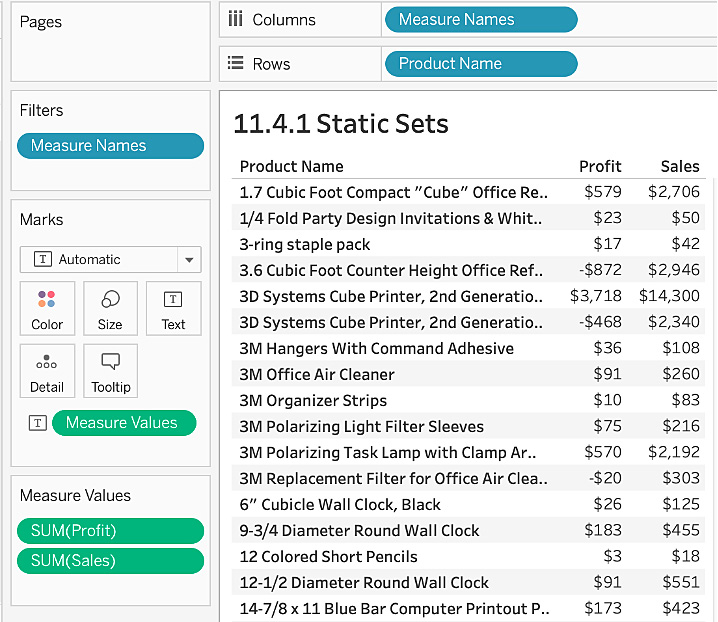
Figure 11.68: Profit and Sales by Product Name
- Navigate to Product Name in the Data pane and right-click on it. Click Create | Set... as shown here:
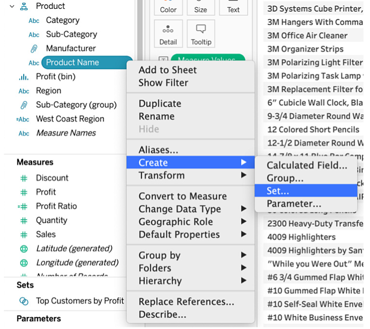
Figure 11.69: How to create a set
In the Create Set dialog box, you will notice there are three tabs (General, Condition, and Top), which are pretty similar to those of filters if you remember from the previous section.
- Create a set for any product that has Envelope as part of its Product Name. Select the Select From List radio button, search for Envelope, and press the All button to select the list of all the products that contain Envelope as part of their name. Then, name your set Envelope Product Set, as shown below:
Note
The text search is not case-sensitive and, when you search text, it will search across the complete string and not find an exact match. Here, you searched for Envelope but your selected list also contains products with Envelopes in the name.
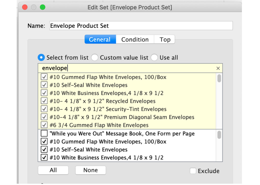
Figure 11.70: Manually adding members to the set
Before you click on the OK button, look at the Summary section in the Create Set dialog box and note that your set contains 48 out of 1,850 values. As mentioned previously, this way of manually selecting items for set creation is static, where the set members won't get updated if new records/rows are added to the data at a later date. You will see how to overcome this limitation in the next exercise.
- Save the set by clicking on the OK button.
- Check whether the set is working as desired. Drag Envelope Product Set to the Rows shelf. Consider the In/Out set here. If a product name meets the criteria that you set, that product will be In the set; and if the product does not meet the requirements, that product will be Out.
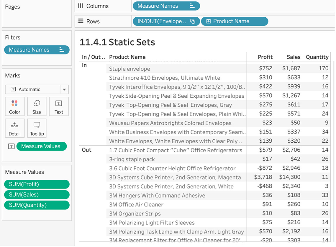
Figure 11.71: In/Out set view
- Instead of In/Out, display the actual product name by right-clicking on Envelope Product Set and selecting Show Members in Set:
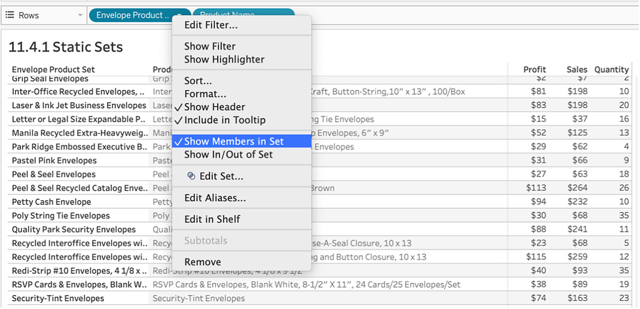
Figure 11.72: How to show members in a set
In this exercise, you encounterd sets for the first time and observed how static sets are used on dashboards. You also learned to show/hide members from a set and what the Summary tab in the Create Set dialog box means.
The next section will review dynamic sets and how they can overcome the shortcomings of static ones.
Dynamic Sets
In this section, you will learn why dynamic sets are preferred over static sets. You'll also practice using the two remaining tabs from the Create Set dialog box you encountered in the previous section. Dynamic sets use logic to dynamically update the members of the set, which means when the data changes, the set will be re-computed and the In/Out members can be added/deleted depending on the computation.
Exercise 11.11: Creating Dynamic Sets
Though previous sets that you created were good, but the product manager responsible for all Envelope products has asked you to create a dynamic view of the groupings as he wants to update the In/Out groups whenever a new product name is added or deleted. You will be using the same view that you created in the previous exercise and extending that view to add dynamic sets.
Perform the following steps:
- Open the Sample - Superstore dataset in your Tableau instance if you have not already done so.
- Create a view of Sales and Profit by Product Name. Drag and drop Product Name to Rows and double-click Sales and Profit to get the following view:
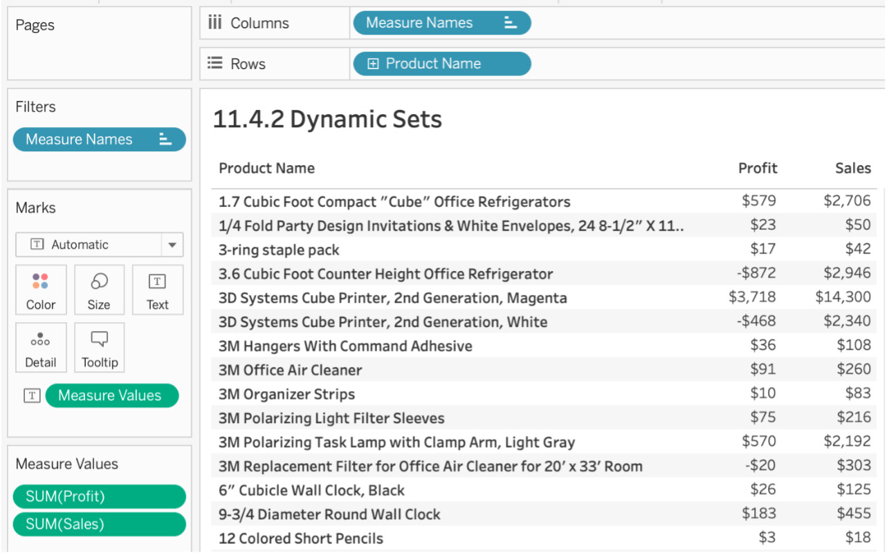
Figure 11.73: Profit and Sales by Product Name
- Navigate to Product Name in the Data pane and right-click on it. Click on Create | Set....
- Expand your previous set criteria. You want the top five profitable envelope product names that had more than $100 in sales. For this, use both the Condition and the Top tabs. Create the condition for at least $100 of sales first, as shown here:
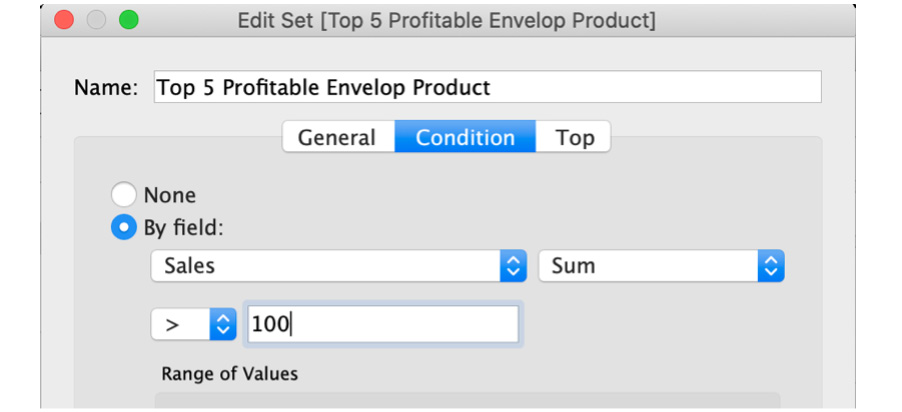
Figure 11.74: Conditional set definition
- Add the criteria of top five profitable Envelope products in the Top tab, as shown here:
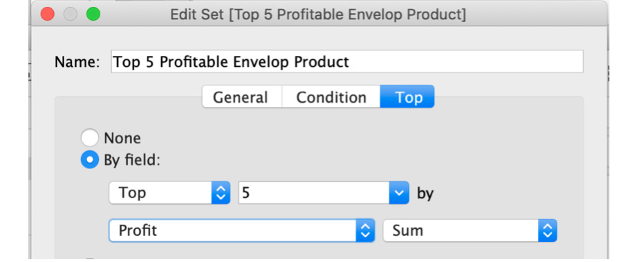
Figure 11.75: Dynamic set definition
- You have not yet filtered for Envelope as you did for your static set, but if you use the same General tab to filter the Envelope products, your set won't be updated when new data is added. To ensure your future data is considered for the set, use the Condition tab and write a calculated formula to do this dynamically. Then, de-select By field and use By formula and write the following formula:
MIN(CONTAINS([Product Name],"envelope")) AND SUM([Sales])>=100
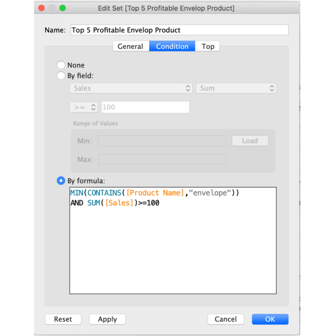
Figure 11.76: Formula-based conditional set
Note
You had to use MIN for Product Name because you cannot mix aggregate and non-aggregate in the calculated field without using aggregation for a non-aggregate dimension, as explained in previous chapters.
- Before you do the spot check and saving the set, review the Summary section of the dialog box:
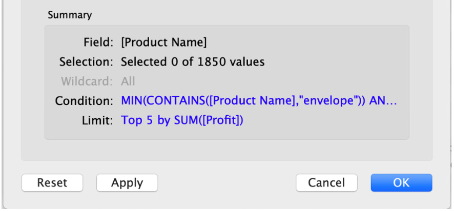
Figure 11.77: Summary box of sets
In the Summary section, your selection says 0 because you have not manually selected anything. Condition is the formula you used in your Condition tab, and Limit is the criteria in the Top tab.
- Drag both sets you created in the last two exercises to your Rows shelf: You have the top five rows by profit in Top 5 Profitable Envelope Product, as seen. These five products are also part of the static set because these product names include Envelope.
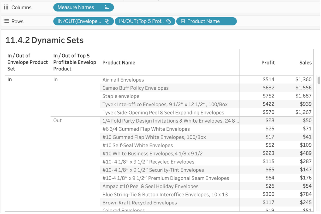
Figure 11.78: Final output for dynamic sets
With this exercise, you are now able to create a non-static set that can update the set members depending on the changes made to the dataset or when new data is added or deleted from the set. Dynamic sets are usually preferred over static sets because they allow you to ensure new data is populated in sets in the future when you are not actively working on the dashboard.
Adding Members to the Set
In both the previous sections, you created sets from scratch. In this section, we will address those cases in which you want to add more conditions to your set definition to add new members or delete them. Adding members to the set is more often done when stakeholders want to update the condition of the underlying set or the developer wants to experiment with complicated conditional logic.
The following exercise will guide through how to complete this task.
Exercise 11.12: Adding Members to the Set
For the Envelope Product Set you created in the previous section, the product manager wants you to add a specific product to the set since they cannot add that product IN the set from their view and that product is not part of the top N sales or profit. As the dashboard developer, you are tasked with adding that specific product to the set.
Perform the following steps:
- You will be reusing the view that you created in the previous exercise, but to demonstrate the workings of adding members to the set, remove Envelope Product Set from the view. Your view should now look as follows:
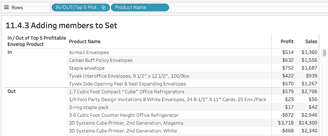
Figure 11.79: Adding members to the set
- To add members to the set, select the product name/row of data that you want to include in your view, and left-click the row to get the following:
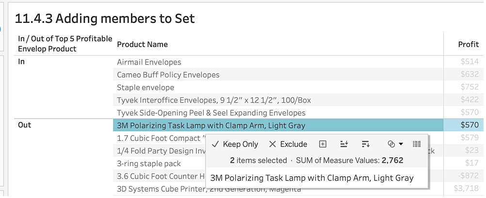
Figure 11.80: Include/exclude members from the set
- Click on the Venn diagram icon in the options panel and select Add to Top 5 Profitable Envelop Product (Sample – Superstore) as shown in the following screenshot:
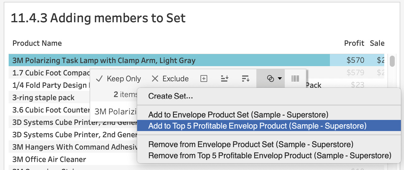
Figure 11.81: Adding the product to the set
- As soon as you do that, the row 3M Polarizing Task Lamp with Clamp Arm, Light Gray is moved from the Out set to the In set as shown here:
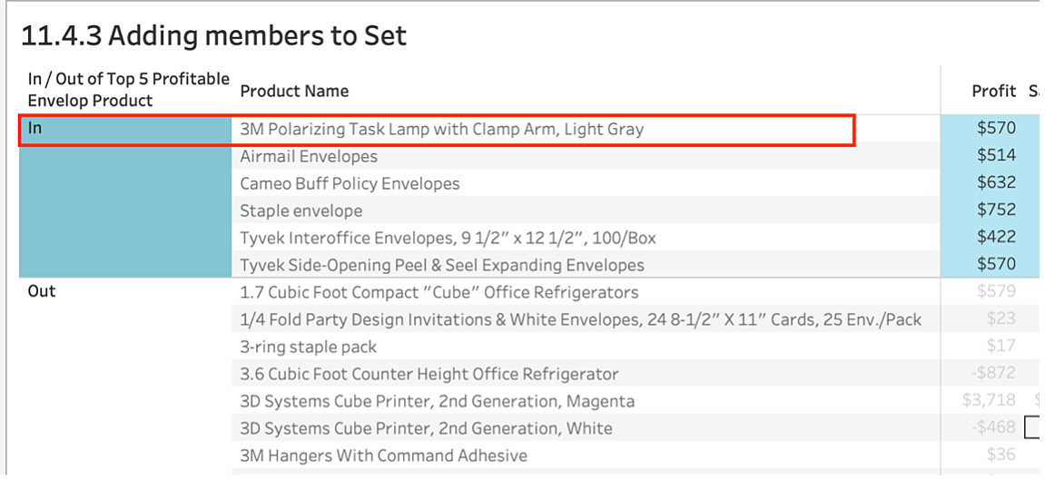
Figure 11.82: The product was added to the set
- You would follow a similar process if you want to remove a data row from the set. Instead of adding, remove from the set options as shown here:
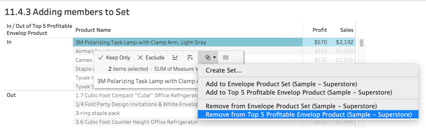
Figure 11.83: Removing a member from the set
Adding members to a set is pretty straightforward and can be incredibly helpful when you want to manually update the member set without editing the actual definition of the set.
Combined Sets
You have now created both static and dynamic sets. Individually, these sets work well, but you can also extend Tableau functionality by combining multiple sets to create a combined set. Using combined sets, you can perform additional analysis and compare and contrast multiple sets. When you create a combined set, you create an altogether new set that contains a combination of either all members from both sets, some members that exist in both sets, or a member from one specific set.
Complete the following exercise to see this in practice.
Exercise 11.13: How to Create Combined Sets
Your regional manager wants you to create a view of states that are both in Top 20 States by Profits as well as Top 20 States by Sales. You will utilize combined sets for this, which will be created from two individual sets you'll make first: Top 20 States by Profits and Top 20 States by Sales.
Perform the following steps to complete this exercise:
- Open the Sample - Superstore dataset in your Tableau instance if you don't have it open already.
Set 1: Top 20 States by Profits:
- Create your first set with Top 20 [States] by [Profits] as shown here:
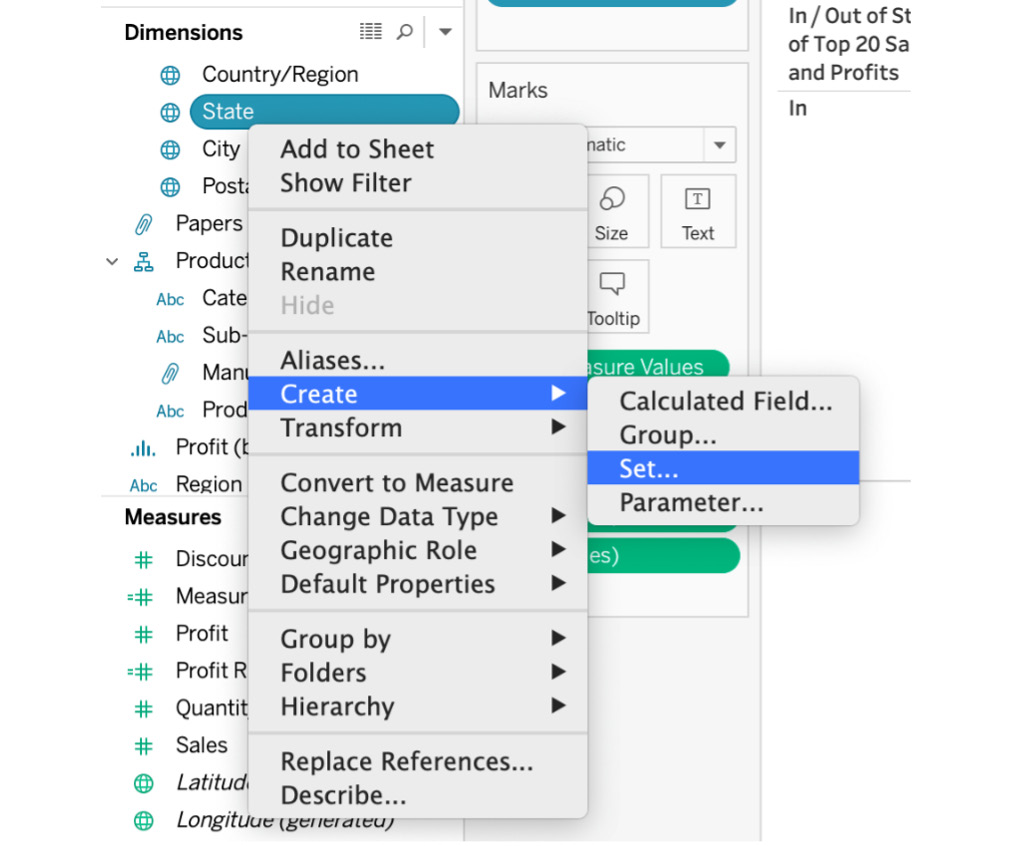
Figure 11.84: Creating the set
- Name the set Top 20 States by Profits, select the Top tab from the window, and select By field and Top 20 by Profit Sum as shown below:
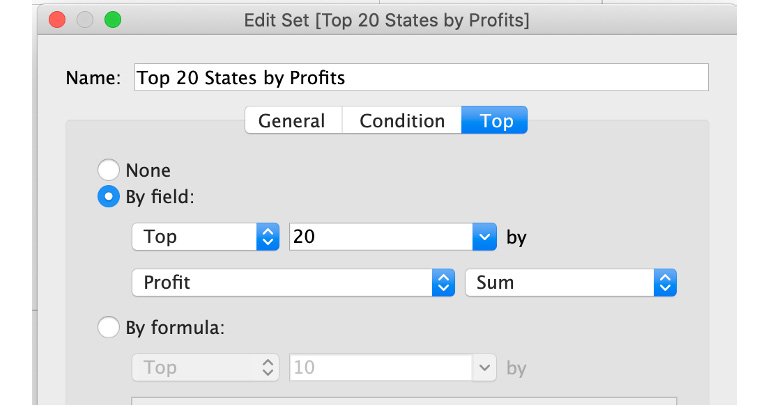
Figure 11.85: Top N members for the set
Set 2: Top 20 States by Sales:
- Similarly, create your second set with Top 20 [States] by [Sales] as shown here:
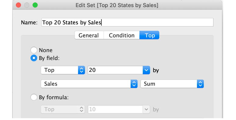
Figure 11.86: Top N members for the set -2!
- Create a view by dragging State to the Rows shelf and adding Profits and Sales to the view as shown here:
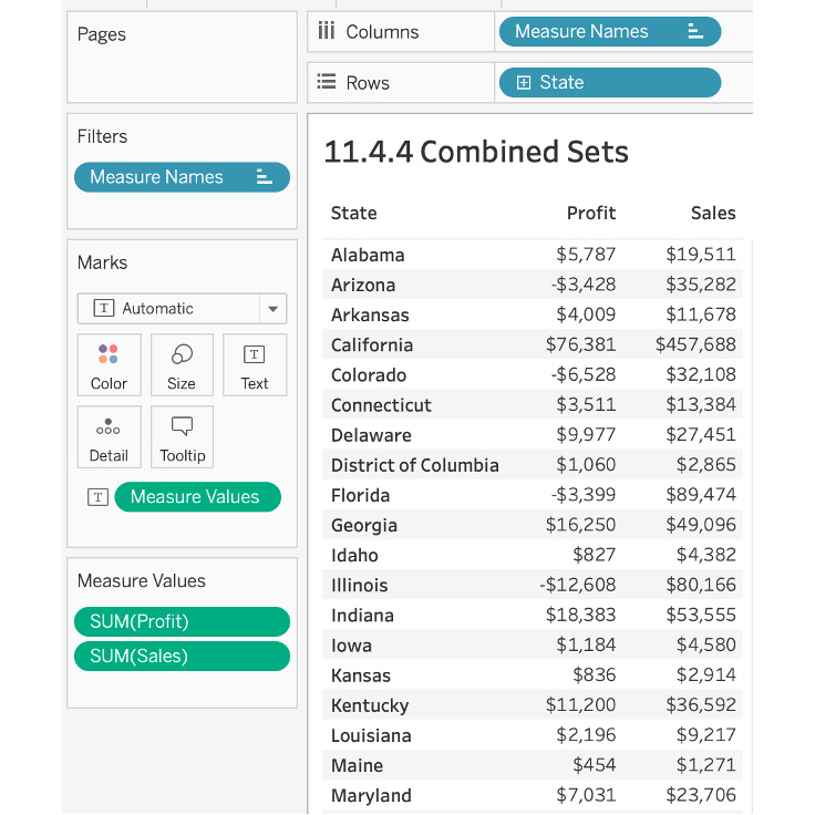
Figure 11.87: Profit and Sales by State view
- Add both Top 20 States by Profits and Top 20 States by Sales to your view in Rows as shown here:
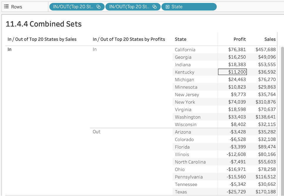
Figure 11.88: Two sets view
The goal is to create a combined set from which you can get a list of all the states that are part of the top 20 by both profits and sales. For this, you want all In members of both of the sets you just created.
- Press Command + multi-select both the sets for Mac or Ctrl + multi-select both the sets for Windows and click on Create Combined Set...:
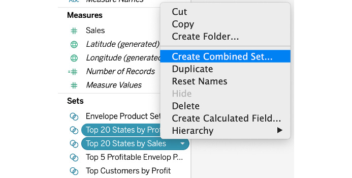
Figure 11.89: Creating a combined set
- In the Create Set modal window, name your new set States of Top 20 Sales and Profits. You can also change the sets that you want to be part of the combined sets from the dropdown. There are four options for members in your combined sets, which are pretty self-explanatory. You want a list of all the states that are part of both the top 20 states by sales as well as profits, so use Shared members in both sets as shown here:
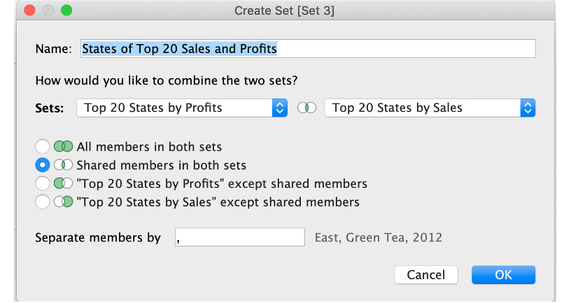
Figure 11.90: Combined set definition
Previous steps noted that you want your combined sets to contain all In members from both sets. In the following screenshots, you'll observe that the combined set has all the same states as the intersection of two individual sets.
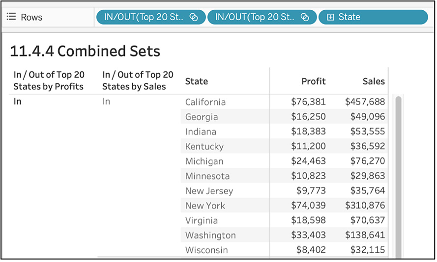
Figure 11.91: In combined set view
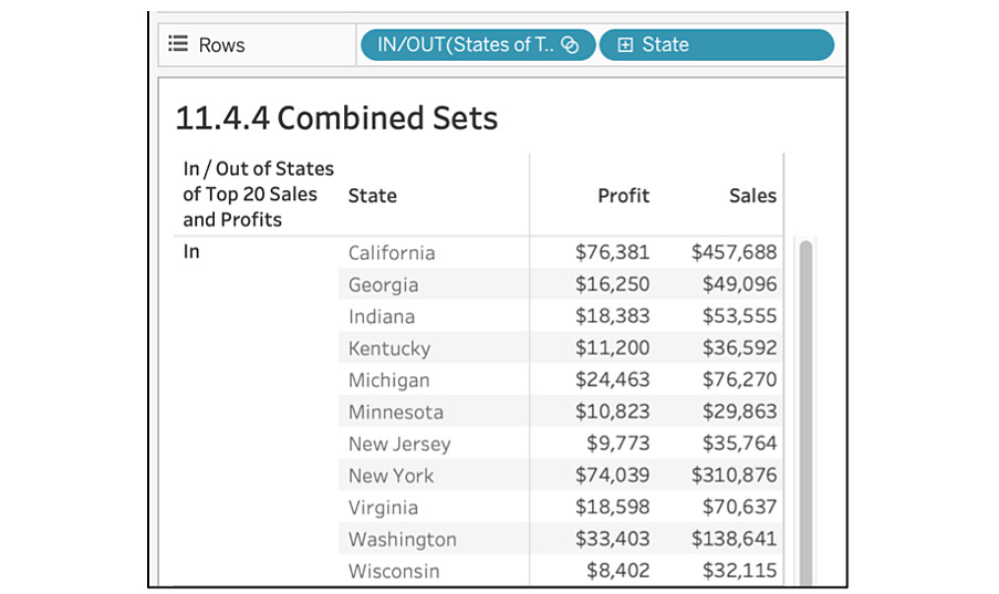
Figure 11.92: States in the top 20 of both profits and sales
The final output will be as follows:
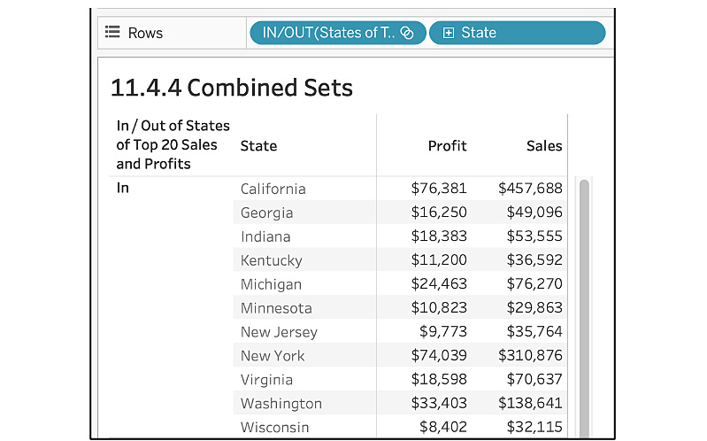
Figure 11.93: Combined Sets final output!
In this final section on sets, you learned how to use combined sets by walking through an example. The next will explore parameters.
Parameters
Parameters are like variables/placeholders in Tableau, which give the end user the ability to control the view or data that is shown as part of the report. They allow you to customize your view, adding interactivity as well as flexibility to the workbook. Parameters are used to replacing a constant value from the view with more variable/dynamic values, which are controlled by the end user. They can take any data type: strings, integers, floats, dates, or any varchars. They can easily be confused with filters but the major difference between parameters and filters is that, with filters, the data gets filtered from the view so that it only shows for the filtered values, whereas with parameters, the variables only act as a reference. Parameters control the value of the variable created instead of filtering on the data.
To use parameters in the view, there are four steps that you need to perform:
- Create the parameters based on the requirements.
- Show the parameter control to the end user, as we do for sets/filters.
- Use the parameters either in the calculated field, filters, or reference lines.
- Use the calculated field, filters, and reference lines in the view.
Exercise 11.14: Standard Parameters
In this exercise, you'll create and use standard parameters. To observe the true essence of Tableau and parameters, you will create a more advanced view that allows your end users to select the dimensions as well as the measures that they want to see in the view.
In previous chapters, you have given users the ability to filter data, create groups, and create sets on pre-selected dimensions and measures, but you have not yet given users the ability to select/change the dimensions/measures as per their requirements. But there are many instances when stakeholders want the exact same view with different measures/dimensions. So, instead of creating 4-6 different views with different dimensions/measures combinations, letting users choose their own measures and dimensions is a more efficient way of handling the request while limiting clutter. This is the final view you are aiming for:
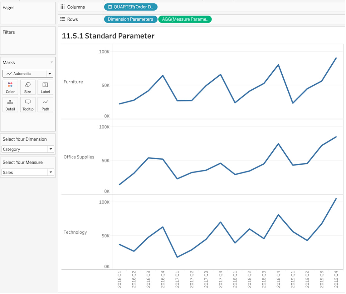
Figure 11.94: Final output for parameters
Perform the following steps to complete this exercise:
- Open the Sample - Superstore dataset in your Tableau instance if you have not already done so.
In this example, you will create a continuous line graph for the measure, selected by the end user, by quarter. As mentioned earlier, you want to give end users the ability to change the measures or dimensions.
- There are four steps to using parameters. The first step is to create a parameter. Do this by either clicking on the arrow in the Dimensions pane and clicking on Create Parameter..., as shown in the following screenshot, or else right-clicking anywhere in the Parameters shelf and clicking on Create Parameter...:
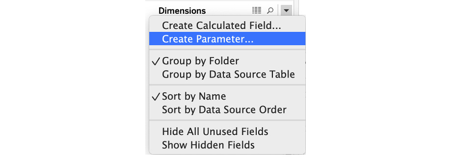
Figure 11.95: Creating a parameter
You will be creating two parameters in this exercise: one for selecting Measures and one for selecting Dimensions.
- First, create a parameter for selecting Measures. In the Edit Parameter modal window, you have a choice of six data types: Float, Integer, String, Boolean, Date, or Date & Time. Since your parameter contains text, use String as the data type. For the Allowable values option, instead of all values, use List so that you can define the options available to the end user selecting the measure.
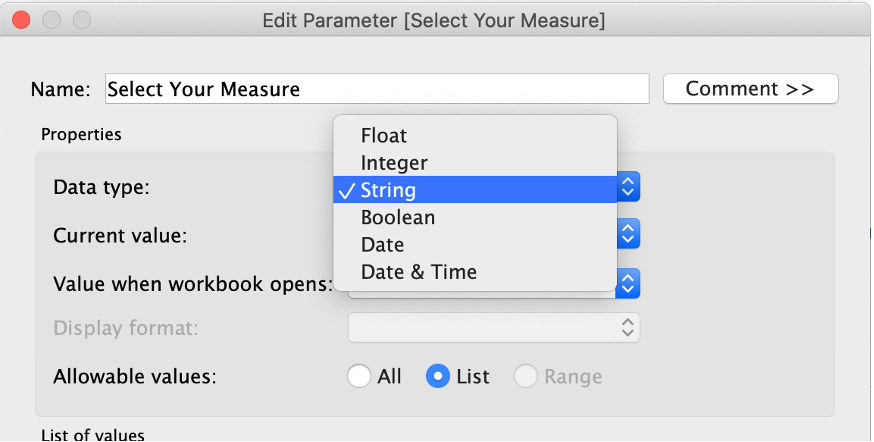
Figure 11.96: Data type options in parameter creation
When you select List for Allowable values, you are presented with List of values options. You then have to define your list, which will be the measure names that your users can select.
- Manually add Sales, Profit, Discount, and Quantity to List of values. Your Create Parameter window should look something like this:
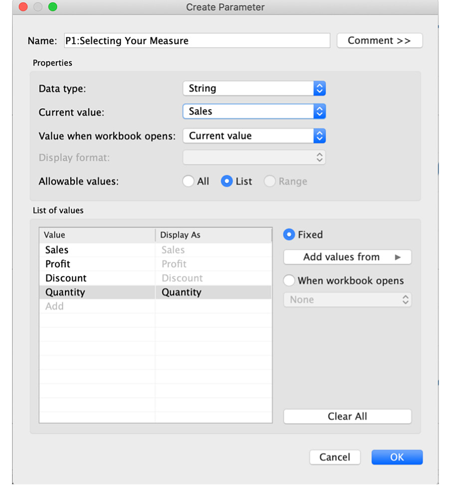
Figure 11.97: Adding measure options for the parameter
- Repeat the same steps for Select Your Dimension. The Create Parameter modal window should look something like the following:
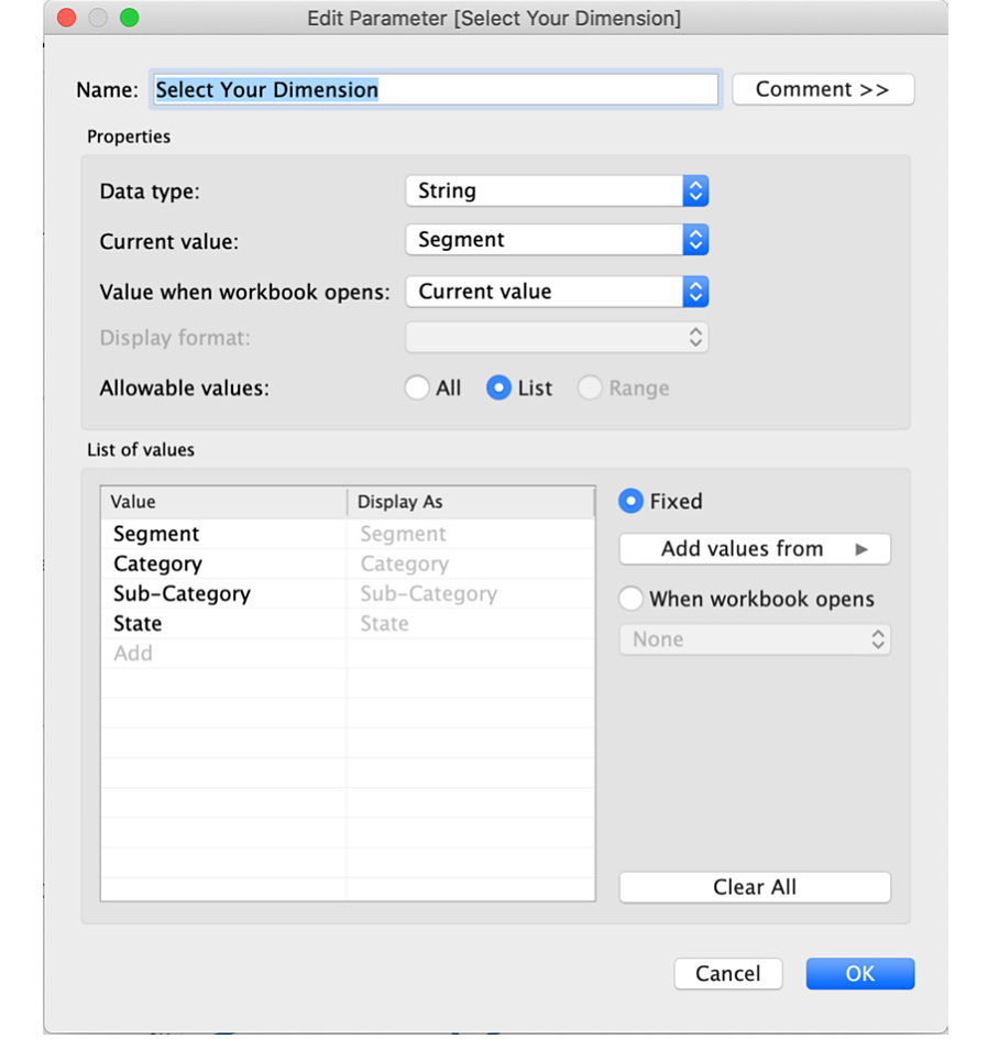
Figure 11.98: Adding a dimension option for the parameter
The next step is to use the created parameter in a calculated field. By default, parameters don't control anything unless you use the parameter either as part of a calculated field, reference lines, or filters. You will be using the calculated field to use the parameter, which acts as a placeholder substitution for dynamically populating the calculated field with the end user's selected measure/dimension.
- Create a calculated field now, named Measure Parameter.
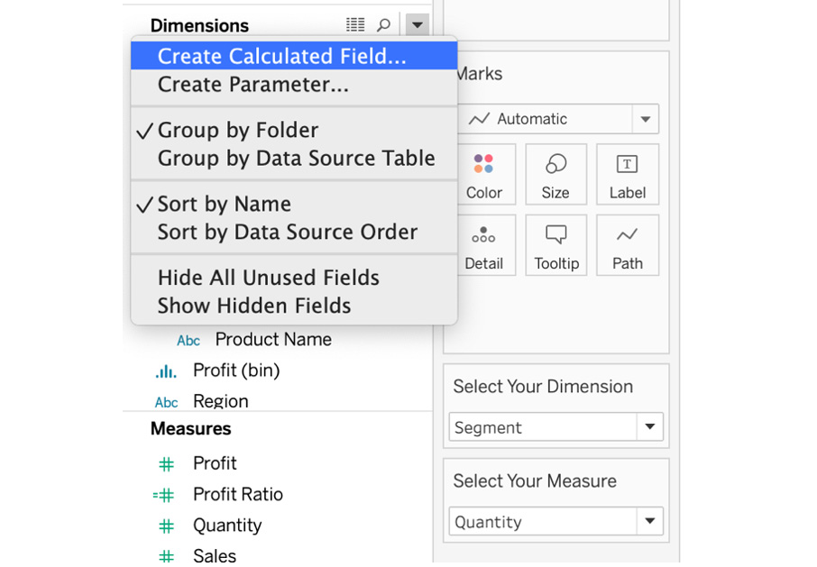
Figure 11.99: Creating a calculated field
- Use the CASE statement so that if the user selects Sales measures in the parameter, your calculated field should show SUM(Sales) in the view. If the user selects Profit measures in the parameter, your calculated field should show SUM(Profit) in the view and so on. Here is the formula for the calculated field:
CASE [Select Your Measure]
WHEN "Sales" THEN SUM([Sales])
WHEN "Profit" THEN SUM([Profit])
WHEN "Discount" THEN AVG([Discount])
WHEN "Quantity" THEN SUM([Quantity])
END
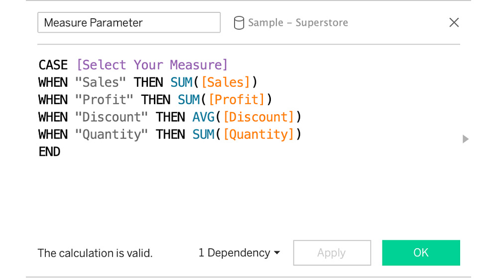
Figure 11.100: Case statement calculated field for the measure parameter
- Repeat the same step for the Dimension Parameter calculated field with the following CASE statement:
CASE [Select Your Dimension]
WHEN "Segment" THEN [Segment]
WHEN "Category" THEN [Category]
WHEN "Sub-Category" THEN [Sub-Category]
WHEN "State" THEN [State]
END
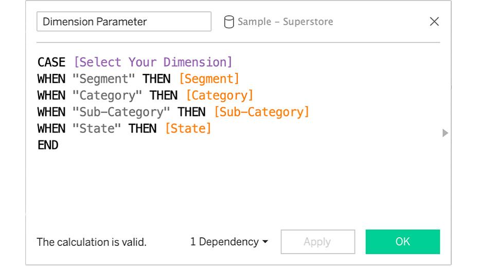
Figure 11.101: Case statement calculated field for Dimension Parameter
- The next step is to create a view with calculated fields as well as using two of our parameters: Drag Dimension Parameter as well as Measure Parameter to the Rows shelf. Next, drag Order Date to Columns and change the date dimension to Continuous date by quarter. The view that you see is pre-selected based on the current value that you selected when creating the parameter. You had Sales for the {Select Your Measure} parameter and Segment for the {Select Your Dimension} parameter. So, your current view is the quarterly trend of Sales by Segment.
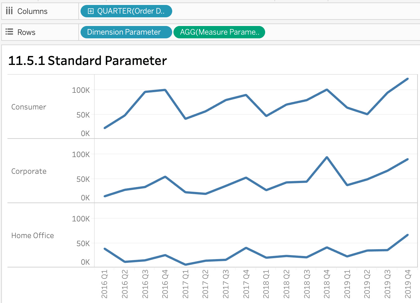
Figure 11.102: Parameter view with default parameters selected
- The final step is to allow your end users to control the measure as well as the dimension in the view. Right-click on the parameter that you created and click on Show Parameter Control. Repeat the step for the other parameter:
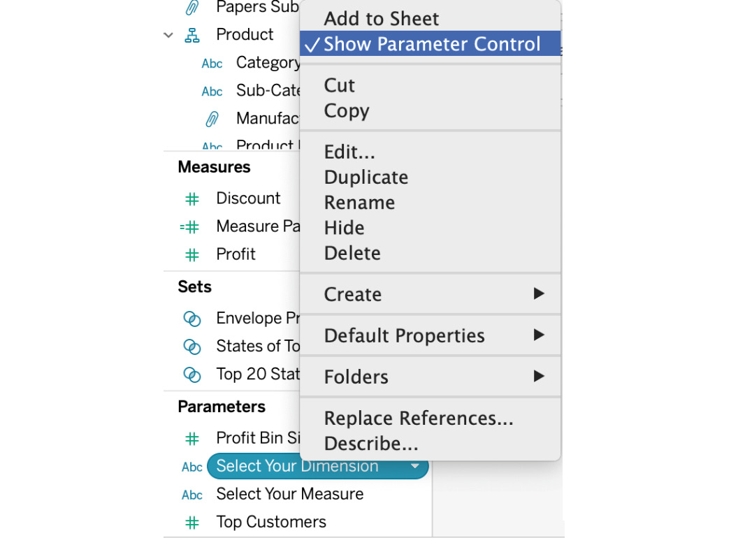
Figure 11.103: Show Parameter Control
- Add the parameter control to your view, so that the end users have the ability to choose the dimension/measure of their choice. Here are two views with a different combination of dimensions and measures:
Profit by Category:
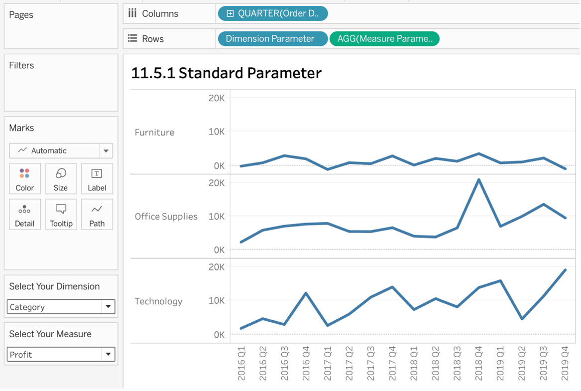
Figure 11.104 Profit by Category parametric view
Quantity by Segment:
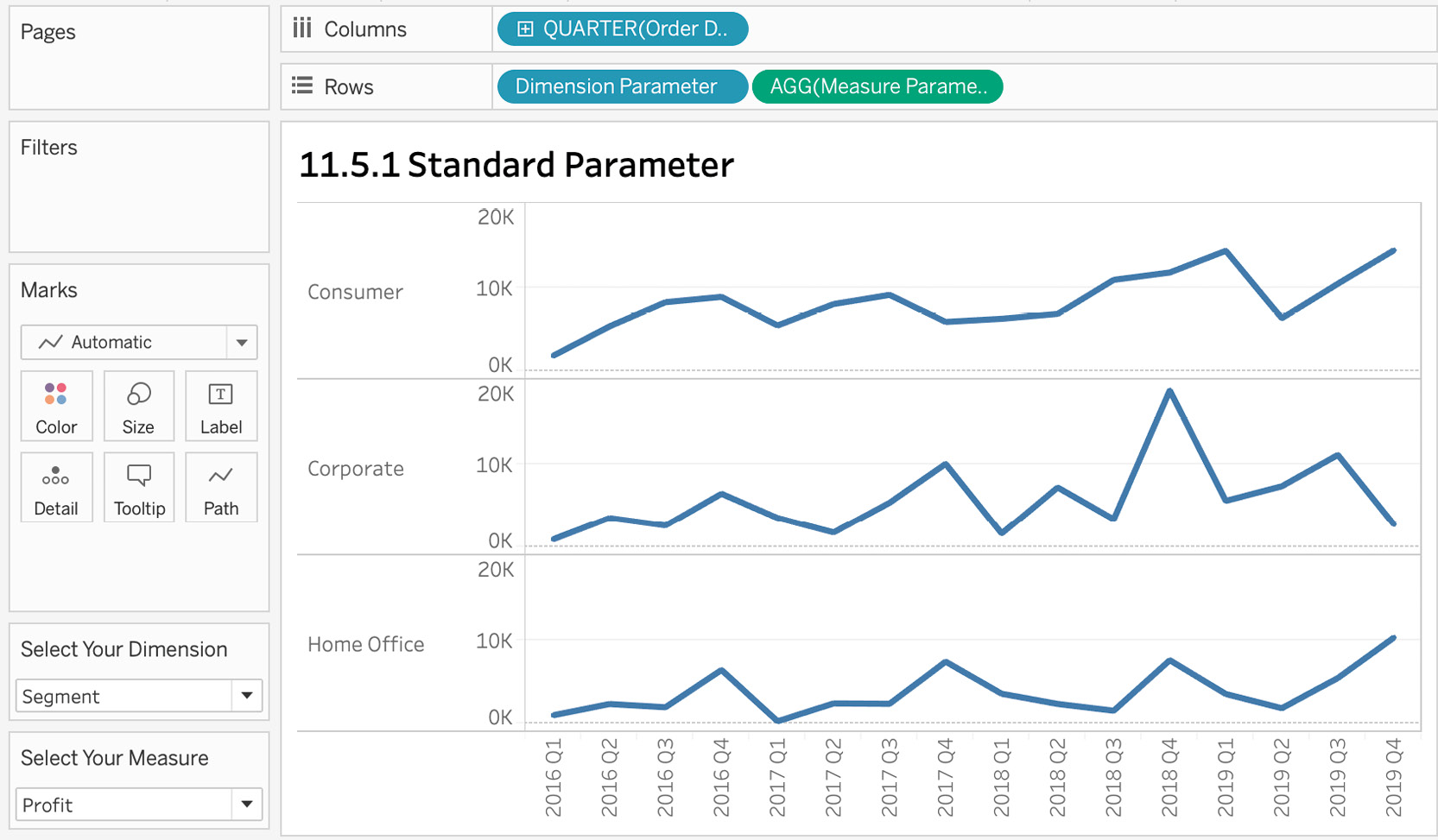
Figure 11.105: Quantity by Segment parametric view
As an end user, it can be confusing to look at different combinations because the line graph or graph view does not show which dimension/measure is part of the view. Though you have the dropdowns, to make it easier for end users, you can also include the callout in your title by creating a dynamic title that is updated along with the dimension in the view. Edit the title by double-clicking on the worksheet title and that opens up the Edit Title window as shown here:
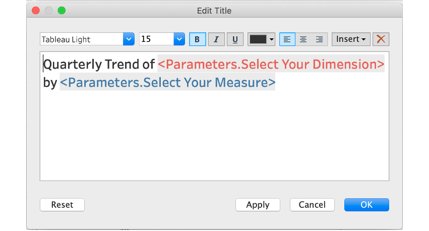
Figure 11.106: Editing the title
The preceding formula uses dynamic variables. In particular, <Parameters.Select Your Dimension> is dynamic such that, when you change the parameter from the dropdown in the worksheet, the title will be automatically updated. You don't have to type the exact variable; you can insert these variables by clicking on Insert in the top right-hand corner of the window as shown here:
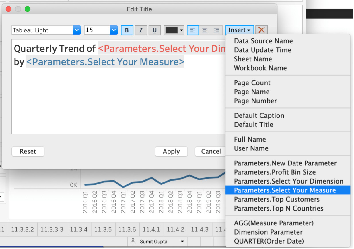
Figure 11.107: Inserting a dynamic variable in the title
Here is the final output that you aimed for:
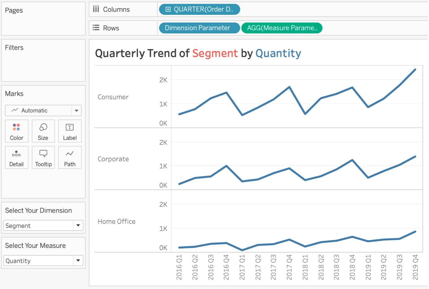
Figure 11.108: Parameter final view with parameter control
In this exercise, you learned what parameters are and how to use them in combination with calculated fields to create a dynamic worksheet where the end users have complete control over which dimension/measures they want the report view to be part of. The skills imparted in this section will go a long way toward growing your advanced knowledge and expertise in Tableau.
Dynamic Parameters
Dynamic parameters was one of the most requested features in the Tableau Community forum, and the Tableau developers shipped the feature in the Tableau 2020.1 version in February 2020. Prior to Tableau version 2020.1, standard parameters had a specific limitation: When the data was updated with new entries (specifically dates), the parameters list/members were not updated. This meant that Tableau authors had to manually refresh the parameter list every time the data source was updated, which, depending on the frequency of the updates, could be very time-consuming. Dynamic parameters overcame that. With these, you can also allow your parameters to automatically choose the most recent date, which wasn't possible previously. Let's explore how this works with the help of an exercise.
Exercise 11.15: Dynamic Parameters
In this exercise, you will be using new dummy data to see what parameters looked like in previous versions of Tableau (2019.4 or earlier). You'll then follow the steps outlined below to use the new parameters to automatically update the parameter list as and when the data source is updated.
Note
A screenshot of the previous version of Tableau has been included; however, you might not have that option. The goal is to communicate the point about static versus dynamic parameters, so you don't need to have two versions of Tableau installed. This exercise will stick with Tableau 2020.1 or later versions.
Perform the following steps to complete this exercise:
- Date parameters in Tableau 2019.1: To create a parameter in an earlier version of Tableau, connect the DynamicParameters.csv file in Tableau. Create a parameter, and set Data type as Date and Allowable values as List, and instead of manually adding these dates, use Add from Field and the Date column to pre-populate the list of values as shown here:
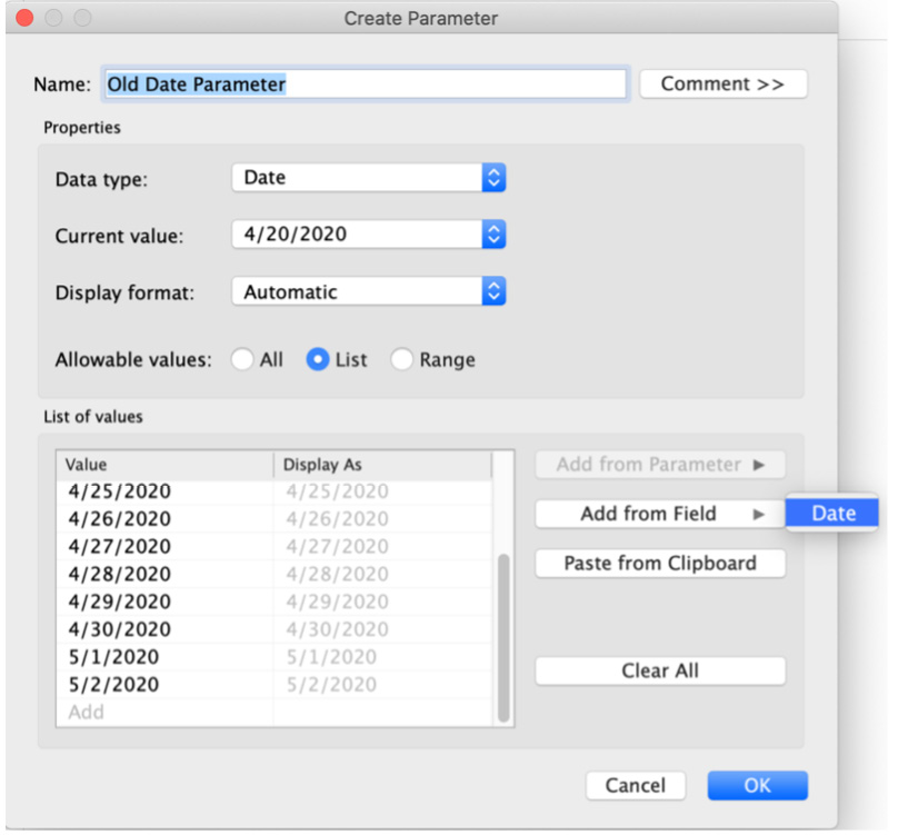
Figure 11.109: Dynamic parameters – adding from a field
This method, as discussed previously, is pretty static. If new data is added with new dates, the parameter won't automatically pre-populate List of Values to include the new dates as part of the updated data source, which was a limitation in previous versions of Tableau.
- Date Parameters in Tableau 2020.1: Repeat the step with the same dataset but, this time, do so in the Tableau 2020.1 version. Connect the DynamicParameters.csv file in Tableau, create a parameter, and set Data type as Date and Allowable values as List. Note that, as soon as you select List, unlike previous versions of Tableau, Tableau 2020.1 has two options:
- Fixed: This is where you can pre-populate the list from a field as you did in the previous old date parameter.
- When Workbook Opens: This is dynamic option wherein the list will be pre-populated from the Date field, but instead of a fixed list, the list will get updated whenever new data is updated/added.
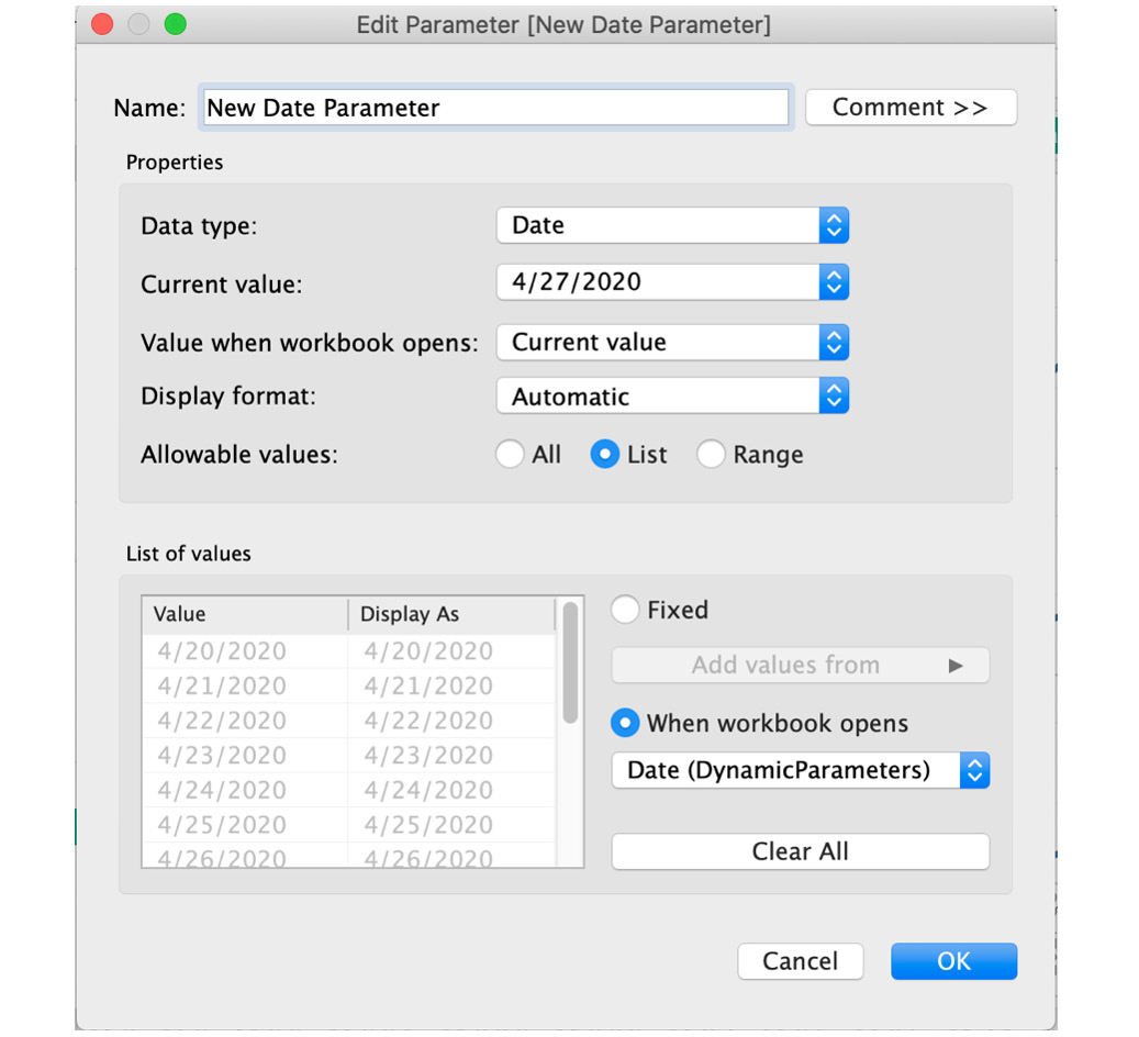
Figure 11.110: Dynamic parameters in Tableau 2020.1 and above
- In the preceding screenshot, the last date is 5/2/2020. Open the DynamicParameters.csv spreadsheet in a tool of your choice (non-Tableau) and add a new row, Date: 5/3/2020 and Sales: 80. Save the file as shown here:
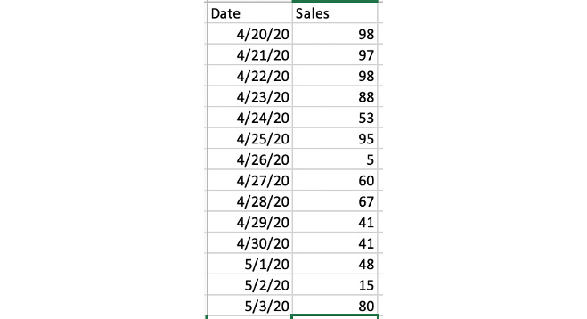
Figure 11.111: CSV data from DynamicParameters.csv
- To check whether the new date was added or not, close your Tableau workbook (make sure you save it first, though). Then, re-open the workbook and edit New Date Parameter to confirm whether the new date was appended to the list of values in the parameter. As you can see from the following screenshot, May 3, 2020, was automatically added to the list of values in the parameter.
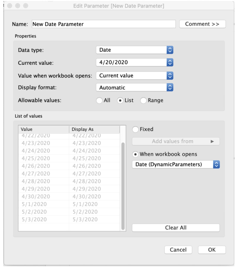
Figure 11.112: Dynamic parameters using When workbook opens
In this exercise, you reviewed the major differences between dynamic parameters and static parameters and saw how dynamic parameters automatically update the list of allowable values alongside the data source update.
In the last section of this chapter, you will put all you have learned about Tableau's advanced interactivity features into practice with a real-world scenario.
Activity 11.01: Top N Countries Using Parameters, Sets, and Filters
As part of the annual hackathon in the company, each team is required to utilize the World Indicators dataset to showcase the top 5 countries according to certain metrics. You decide to show the top N countries by energy usage and also give end users the ability to change the N from 5 to 10, 15, or 20 for ease of use. You will create an interactive view of the World Indicators dataset using sets, context filters, and parameters in this activity.
By the end of this activity, you will have created an interesting view by utilizing all the major topics covered in this chapter, with a special focus on context filters and end user interactivity.
- Connect to the WorldIndicators.hyper dataset downloaded from the project/book folder in Tableau.
- Create a bar chart of Country/Region by Energy Usage.
- Create a Top N Countries parameter with 5, 10, 15, and 20 as list values.
- Create a set called Top N by Energy Usage and use the Top N Countries parameter for user interactivity.
- Drag the Top N by Energy Usage set to the Color Marks shelf.
- Show Year[Year] as a single drop-down filter.
- Make sure the Year filter updates the list of top N countries by their energy usage. Hint: context filters.
- Make the title dynamic, so when the Top N Countries parameter and the Year filter are updated, the title should appropriately reflect the changes. For example, if the user selects the top 10 countries for the year 2010, the title should be Top 10 countries by their energy usage for the year 2010.
The final expected output is as follows:
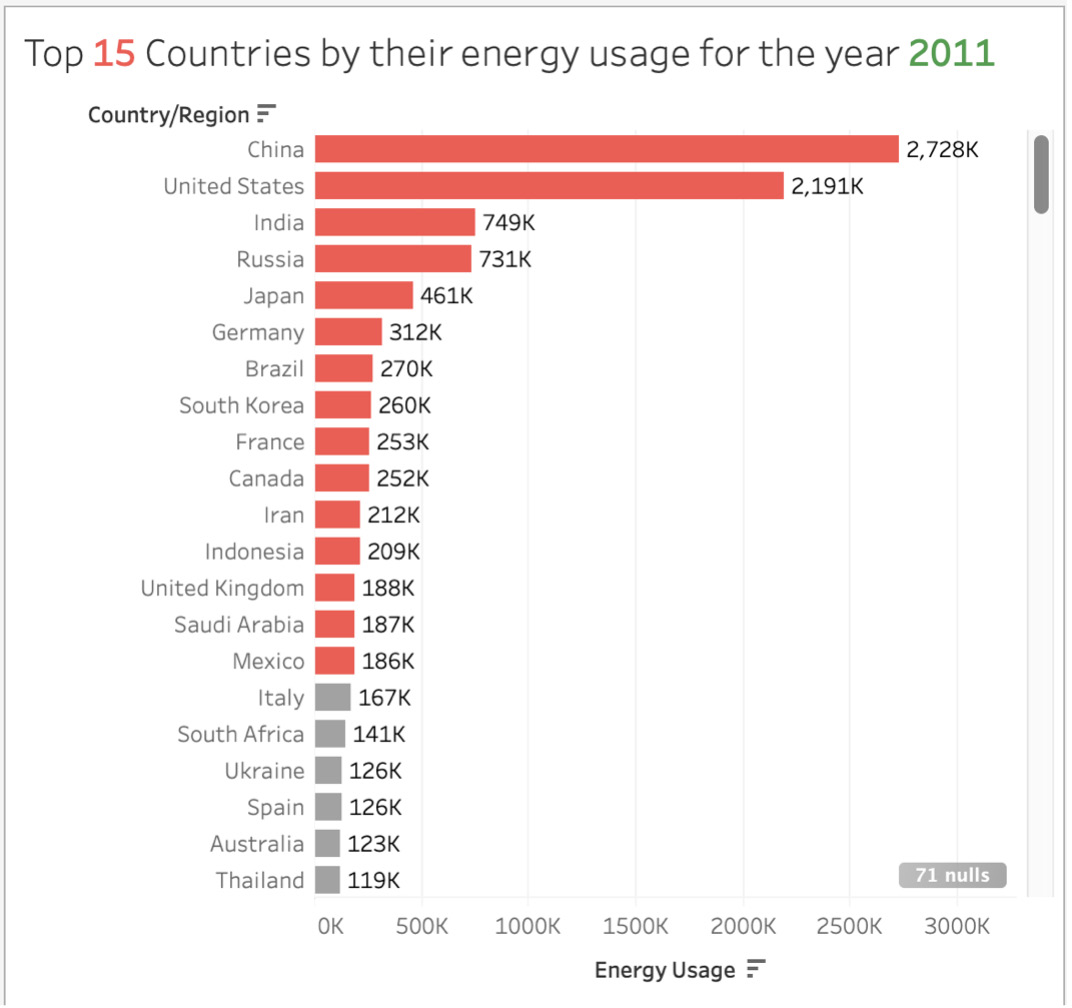
Figure 11.113: Activity final output
Note
The solution to this activity can be found here: https://packt.link/CTCxk.
Summary
This chapter considered a number of advanced interactivity features in Tableau. We looked closely at the order of operations in Tableau, which is one of the most important concepts to master in Tableau if we want to create an efficient report for our stakeholders. We also discussed filters, sets, groups, and hierarchies, covered filters in depth, explored the difference between dimensions, measures, and date filters, and practiced using data source filters, which can be a great way to limit the data being loaded in your view.
Regarding sets, we reviewed static, dynamic, and combined sets, using the Envelope example to demo the concepts. In the section on parameters, we also defined the difference between static and dynamic parameters and learned one of the advanced use cases of parameters: dimension/measure swapping, which you can use to give end users the ability to choose the dimension/measures that they want to include in the view.
We wrapped up the chapter by working through an activity utilizing the World Indicators dataset. Here, you created a complex view using sets, context filters, and parameters, which in a way resembled a real-world scenario that you might face in your data job.
This concludes the print copy of this book, but it is not the end of your journey. Visit https://packt.link/SHQ4H for a further three chapters, covering such topics as tips and tools for increased interactivity (Part 2 of this lesson), dashboard distribution, and even a case study regarding the utilization of multiple data sources and the practical implementation of all the skills you learned throughout the course of this book.