
Overview
In this chapter, you will learn about Visual Analytics and why it is important to visualize your data. You will connect to data using Tableau Desktop and familiarize yourself with the Tableau workspace. By the end of this chapter, you will be well acquainted with the Tableau interface and some of the fundamental important concepts that will help you get started with Tableau. The topics that are covered in this chapter will mark the start of your Tableau journey.
Introduction
At a very broad level, the whole data analytics process can be broken down into the following steps: data preparation, data exploration, data analysis, and distribution. This process typically starts with a question or a goal, which is followed by finding and getting the relevant data. Once the relevant data is available, you then need to prepare this data for your exploration and analysis stage. You might have to clean and restructure the data to get it in the right form, maybe combine it with some additional datasets, or enhance the data by creating some calculations. This stage is referred to as the data preparation stage. After this comes the data exploration stage. It is at this stage that you try to see the composition and distribution of your data, compare data, and identify relationships if any exist. This step gives an idea of what kind of analysis can be done with the given dataset.
Typically, people like to explore the data by looking at it in its raw form (that is, at the data preparation stage); however, a quick and easy way to explore the data is to visualize it. Visualizing the data can reveal patterns that were difficult to recognize in the raw data.
The data exploration stage is followed by the data analysis stage, in which you analyze your data and develop insights that can be shared with others. These insights, when visualized, will enable easier interpretation of data, which in turn leads to better decision making. In very simplistic terms, the process of exploring and analyzing the data by visualizing it as charts and graphs is called "visual analytics." As mentioned earlier, the idea behind visualizing your data is to enable faster decision making. Finally, the last step in the data analytics cycle is the distribution stage, wherein you share your work with other stakeholders who can consume this information and act upon it.
In this chapter, we will discuss all these topics in detail, starting with a further exploration of the value of the titular process.
The Importance of Visual Analytics
As mentioned earlier, "Visual Analytics" can be defined as the process of exploring and analyzing data by visualizing it as charts and graphs. This enables end users to quickly consume the information and, in turn, empowers them to make quicker and better decisions.
In this section, you will learn why data visualization is a better tool for evaluation than looking at large volumes of data in numeric format.
All of us have at some point heard the expression "A picture is worth a thousand words." Indeed, it has been found that humans are great at identifying and recognizing patterns and trends in data when consumed as visuals as opposed to large volumes of data in tabular or spreadsheet formats.
To understand the importance and the power of data visualization/visual analytics, let's look at one of the classic examples: Anscombe's Quartet. Anscombe's quartet is comprised of four distinct datasets with nearly identical statistical properties, yet completely different distributions and visualizations.
Note
This was developed in 1973 by an English statistician named Francis John (Frank) Anscombe, after whom it was named.
Let's take a deeper look at these datasets.
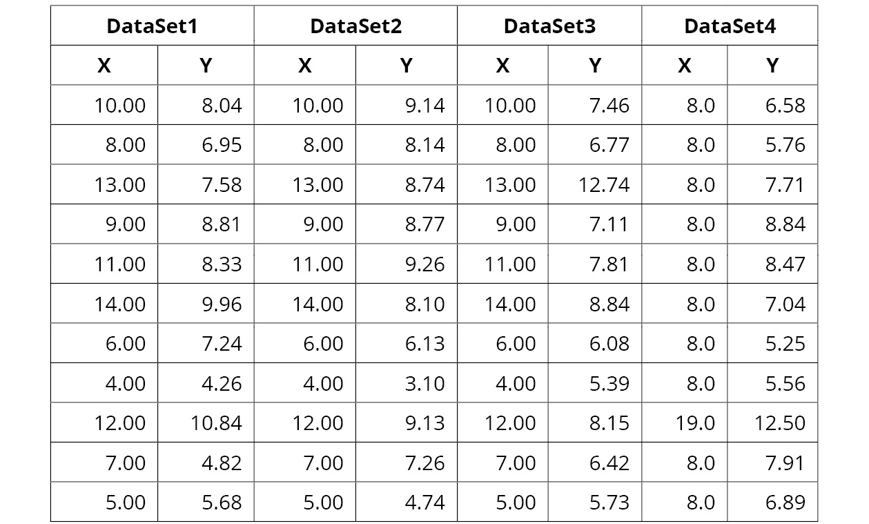
Figure 1.1: A screenshot showing the datasets used in Anscombe's quartet
As you can see in the preceding figure, each dataset consists of 11 X and Y points. Now, if you were to analyze these datasets using typical descriptive statistics such as mean, standard deviation, and correlation between X and Y, you would see that the output is identical.
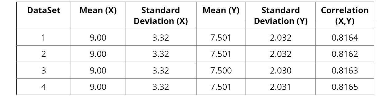
Figure 1.2: A screenshot showing descriptive statistics of the Anscombe's quartet data
Looking at the preceding figure, you can see the following:
- The mean of X for each dataset is 9 (exact accuracy).
- The standard deviation for X for each dataset is 3.32 (exact accuracy).
- The mean of Y for each dataset is 7.50 (accurate up to two decimals).
- The standard deviation for Y for each dataset is 2.03 (accurate up to two decimals).
- The correlation between X and Y for each dataset is 0.816 (accurate up to three decimals).
So, by looking at the above statistical inferences, you would assume that these datasets are identical until you decide to visualize each of them, the results of which are displayed below.
The images show how these datasets appear when visualized as graphs. Now, let's compare each of these visualizations side by side so that you can see how different each of these datasets really are.
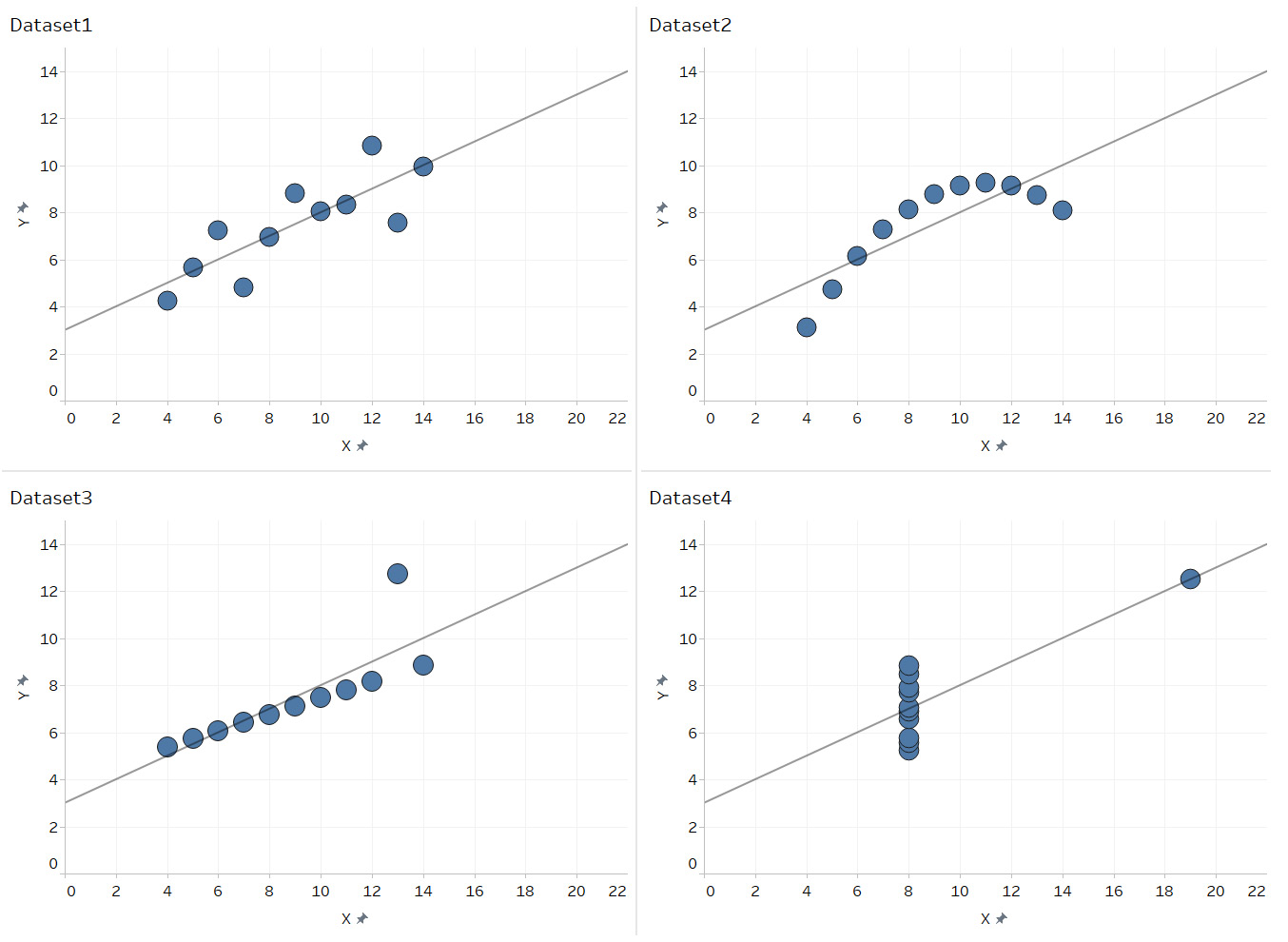
Figure 1.3: A screenshot showing a graphical representation of all four datasets of Anscombe's quartet
The preceding example highlights how data visualization can help uncover patterns in data that it was not possible to see by simply looking at the numbers and/or just analyzing the data statistically. This is exactly why Francis Anscombe created his "quartet." He wanted to counter the argument that "numerical calculations are exact, but graphs are rough," which, back then, was a quite common impression among statisticians.
Next, take a look at one more example of how visualizing data helps us find quick insights. Refer to the following figure:
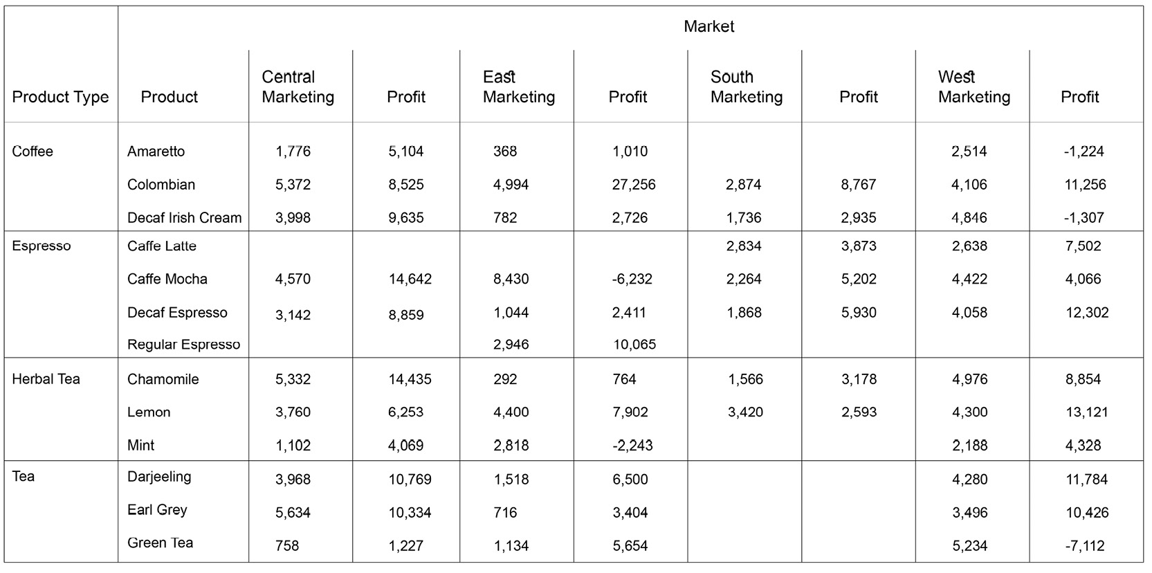
Figure 1.4: A screenshot of a grid view showing the marketing expense and profitability for products across markets
In the preceding figure, you can see a grid view of fields such as Product Type, Product, Market, Marketing, and Profit. In the data that you have used, Marketing is the money that is spent on any marketing efforts to promote products, and Profit is the profit generated after those marketing efforts. Further, these values are broken down by dimensions such as Product Type, Product, and Market. The idea is to evaluate how each product is doing in terms of Marketing and Profit across different markets.
Now, displaying this information in a grid format, as shown above, results in 84 numbers being shown in the view, and doing any kind of comparison across these 84 numbers is going to be very difficult. So, imagine you want to find out whether there are any products in any specific markets where losses are made even after spending significant money on the marketing efforts. Then you will end up comparing these numbers horizontally as well as vertically, which, honestly, is a bit tedious. However, let's see whether visualizing this data makes any difference. Refer to the following figure:
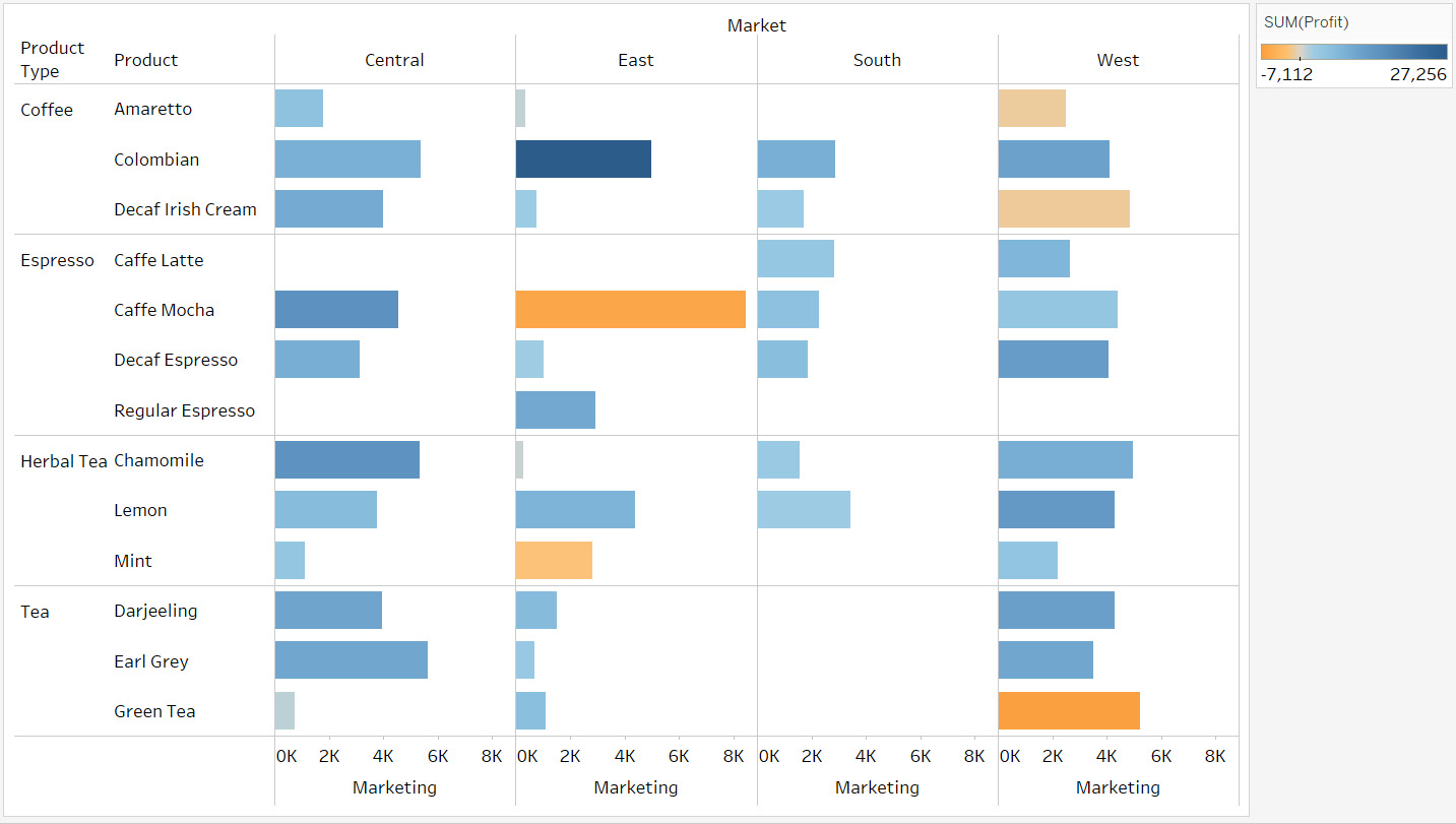
Figure 1.5: A bar chart comparing the marketing expense and profitability for products
In the preceding figure, you can see that the length of the bar is the money spent on Marketing, whereas the color of the bar represents the Profit value. So basically, the longer the bar, the more money was spent on marketing; the darker the shade of blue, the more profitable the product; and the darker the shade of orange, the greater the loss accrued.
Looking back at that figure, note that the longest bar is Caffe Mocha in the East market. This means that Caffe Mocha has the highest marketing spending, but because the color of that bar is orange, you also know that it is accruing a loss.
This is another example that demonstrates the power of data visualization.
Now that you have understood what visual analytics is and why it is important, let's look at some data visualization tools in the next section.
The Tableau Product Suite
There are a lot of tools available on the market offering various features and functionalities that you can use to visualize your data. When it comes to business analytics and data visualization, Tableau is one of the leading tools in this space because of its ease of use and drag and drop functionality, which makes it easier even for a business user to start making sense of their data. Tableau has different tools for different purposes, available in the Tableau product suite, which we'll explore in this section.
The entire suite can be divided into three parts: data preparation, data visualization, and consumption or distribution. Refer to the following figure:
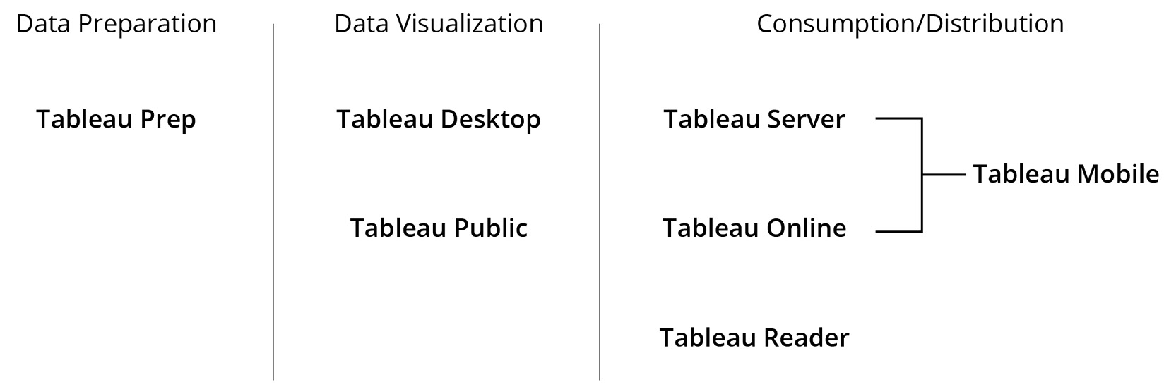
Figure 1.6: A screenshot showing the Tableau product suite
As shown in the preceding figure, you have Tableau Prep in the Data Preparation layer, which is used for cleaning, combining, reshaping, and enhancing your data. This tool helps get your data ready for analysis and visualization.
Now, once your data is ready and is in the right form and structure, you will start analyzing and visualizing it. For this purpose, you will use either Tableau Desktop or Tableau Public.
Tableau Desktop is where you create your visualizations, analytics, and dashboards. This is typically the tool you would spend your time on as most of your development is done using Tableau Desktop. Tableau Public can also be used for creating your analytics and visualizations. However, the catch here is that you cannot save your work locally or offline, and it will necessarily be saved to a Tableau Public server, which can be viewed by anybody. Tableau Public is a free version that is like Tableau Desktop and is typically used by bloggers, journalists, researchers, and so on who deal with public or open data.
Tableau Public is a great tool for anyone wanting to build visualizations for public consumption but is not recommended for anyone working with confidential data. When dealing with confidential data, it is best to use Tableau Desktop.
Once you are done building your visualizations, you can share your work with others using an online methodology with Tableau Server or Tableau Online or share an offline copy of your work, which can then be opened using Tableau Reader.
Tableau Server is an on-premises hosted browser and mobile-based collaboration platform used to publish dashboards created in Tableau Desktop and share them with your end users. It allows you to share and, to some extent, edit and publish dashboards, while also managing access rights and making your visualizations accessible securely over the web. It allows you to refresh your dashboards at a scheduled frequency and maintain live data connectivity to the backend data sources, which in turn allows users to consume the up-to-date dashboards online from anywhere. Tableau Server also allows you to view your dashboards on a mobile tablet through an app available on both iOS and Android. Tableau Online, on the other hand, is a cloud-hosted version (or SaaS version) of Tableau Server. It brings the server capabilities of the cloud without the infrastructure cost.
However, if you want to consume dashboards offline, you can use Tableau Reader. This is a free desktop application that can be used to open, view, and interact with dashboards and visualizations built in Tableau Desktop. So basically, it allows you to filter, drill down, view the details of data, and interact with dashboards to the full extent of what the author has intended. That said, being a reader, you cannot make any changes or edit the dashboard in any way beyond what has already been built in by the author.
The upcoming section, as well as the following chapters, will focus on Tableau Desktop. You will be familiarizing yourself with the interface of Tableau Desktop, to understand its workspace and see how you can create your visualizations and build your dashboards.
The point to note here is that Tableau Desktop is a licensed product and if you don't have the necessary license, then you can even use Tableau Public to try out the examples covered in the book. As mentioned earlier, Tableau Desktop and Tableau Public are the two main developer products offered by Tableau and the only difference between these two products is the range of data source connectivity offered, the ability to save files locally, and the security of your work. While Tableau Desktop offers all this, Tableau Public has limitations.
However, the rest of the functionalities and the look and feel of both these tools is the same. The next section explores how to use Tableau to connect, analyze, and visualize your data.
Please note that we are using a licensed version of Tableau Desktop in this book.
Introduction to Tableau Desktop
Now, that you have identified and chosen Tableau Desktop for the creation of your visuals and dashboards, let's dive deeper into the product, its interface, and its functionality. So, once you have downloaded and installed the product, you will be able to use the products to connect to your data and start building your visualizations.
The landing page of Tableau Desktop is shown in the following screenshot:
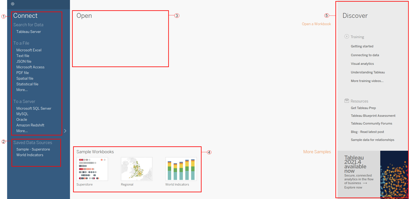
Figure 1.7: A screenshot of the Tableau Desktop landing page
Review the following list for explanations of the highlighted sections in the screenshot:
- Connect: The list of data sources you can connect to. You can connect to data residing on Tableau Server (the Search for Data option); to flat files, such as Excel and CSVs (the To a File option); or to databases (the To a Server option). Tableau has native in-built connectors for a lot of the data sources, which makes the interaction with data from these data sources seamless. The list is quite extensive, and it keeps on growing. Note though that while Tableau Desktop provides an extensive list of data connectors, Tableau Public only allows you to connect to flat files (the To a File option). Refer to the following screenshot to see the More… option of Tableau Desktop 2020.1 version:
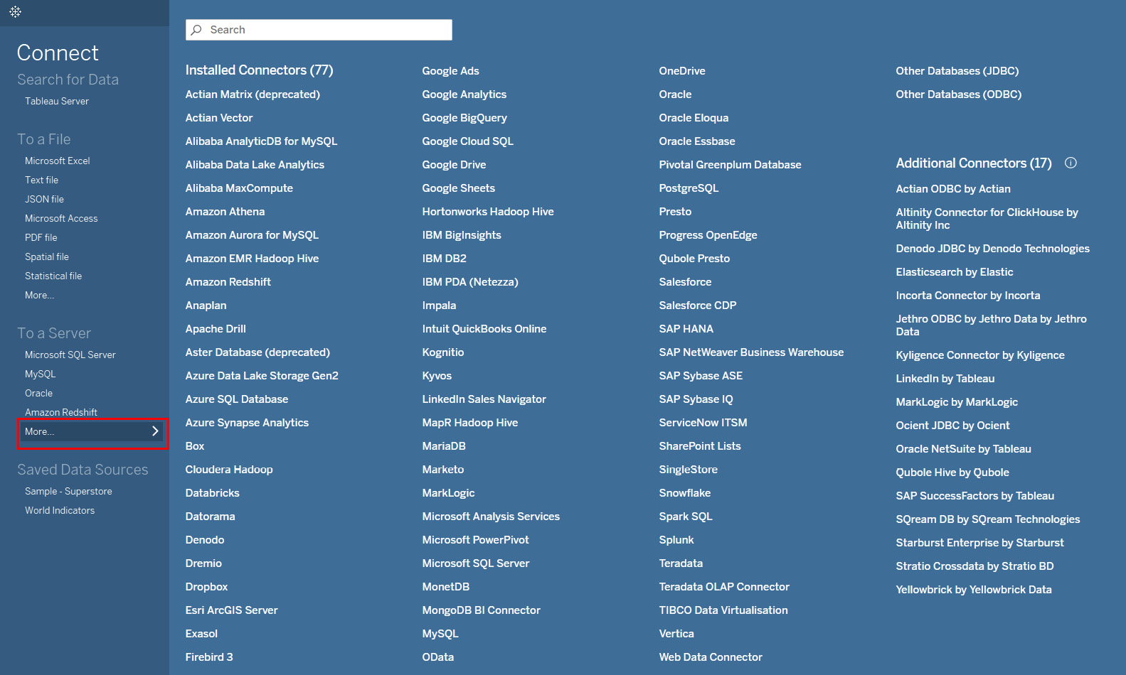
Figure 1.8: A screenshot showing the extensive list of data sources that Tableau Desktop can connect to
- Saved Data Sources: While the top section allows you to connect to raw data sources, the Saved Data Sources option lets you connect to data sources that have been previously worked on and/or modified and then saved for later use.
- Open: This section shows the thumbnails of the recently accessed Tableau files. This section is blank to begin with, but as you create and save new workbooks, it will keep on updating and will display the thumbnails of the most recently opened workbooks. This section can also be used to pin your favorite workbooks.
- Sample Workbooks: This section shows some of the sample work already done in Tableau. Selecting any of the thumbnails here will open the relevant Tableau workbook. A quick point to note here is that a "workbook" in Tableau is a file that consists of multiple worksheets and/or dashboards and/or storyboards.
- Discover: This section contains some shortcut links to the training videos and resources on the Tableau website.
- Now that you are familiar with the landing page of Tableau, let's move on and see how to connect to data in the following exercise.
Exercise 1.01: Connecting to a Data Source
In this exercise, you will connect to a data source for the first time, which is the very first step when analyzing data in Tableau.
There are many types of data sources that you can connect to, but for the purposes of this exercise, you will work with an Excel file—in this case, Sample-Superstore.xls, which comes in-built with Tableau and contains sales and profit data for a company.
Perform the following steps to complete the exercise:
- Select the Microsoft Excel option from the To a File option under Connect on the left-hand side of the landing page. You should see the following screen:
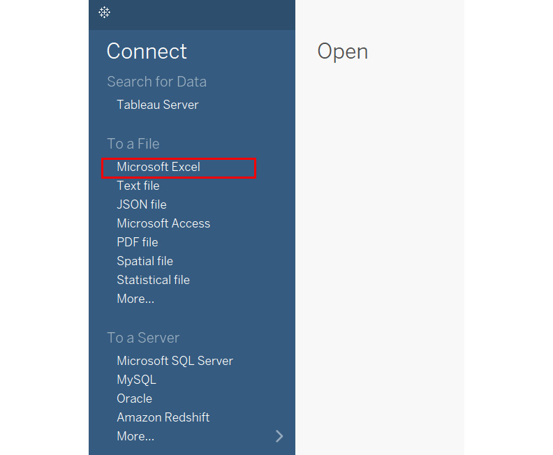
Figure 1.9: A screenshot showing the Connect to Microsoft Excel option
- Once you have selected this option, it will ask you to browse the Excel file that you wish to connect to. To do this, connect to Sample-Superstore.xls, which can be found in Documents>My Tableau Repository>Datasources, or can also be downloaded from the GitHub repository for this chapter, at https://packt.link/7hnNH. Refer to the following screenshot:
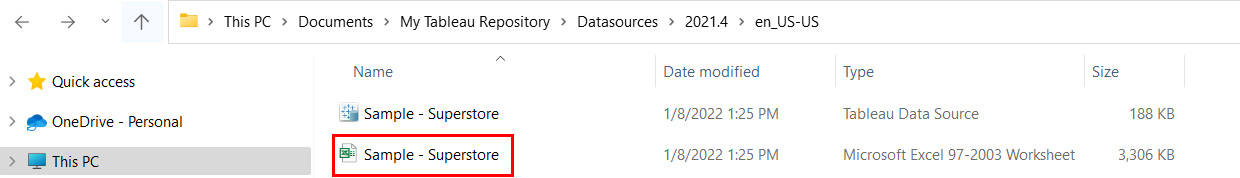
Figure 1.10: A screenshot showing the Sample - Superstore.xls data under My Tableau Repository
This data is the sample dataset that comes along with the product. Once you have downloaded and installed Tableau Desktop, you will notice the My Tableau Repository folder being created under your Documents folder. This is where you will find this sample dataset.
- Once you have connected to this data source, you will see the data connection page of Tableau Desktop, as shown in the following screenshot. Review the following notes to better understand what you're looking at:
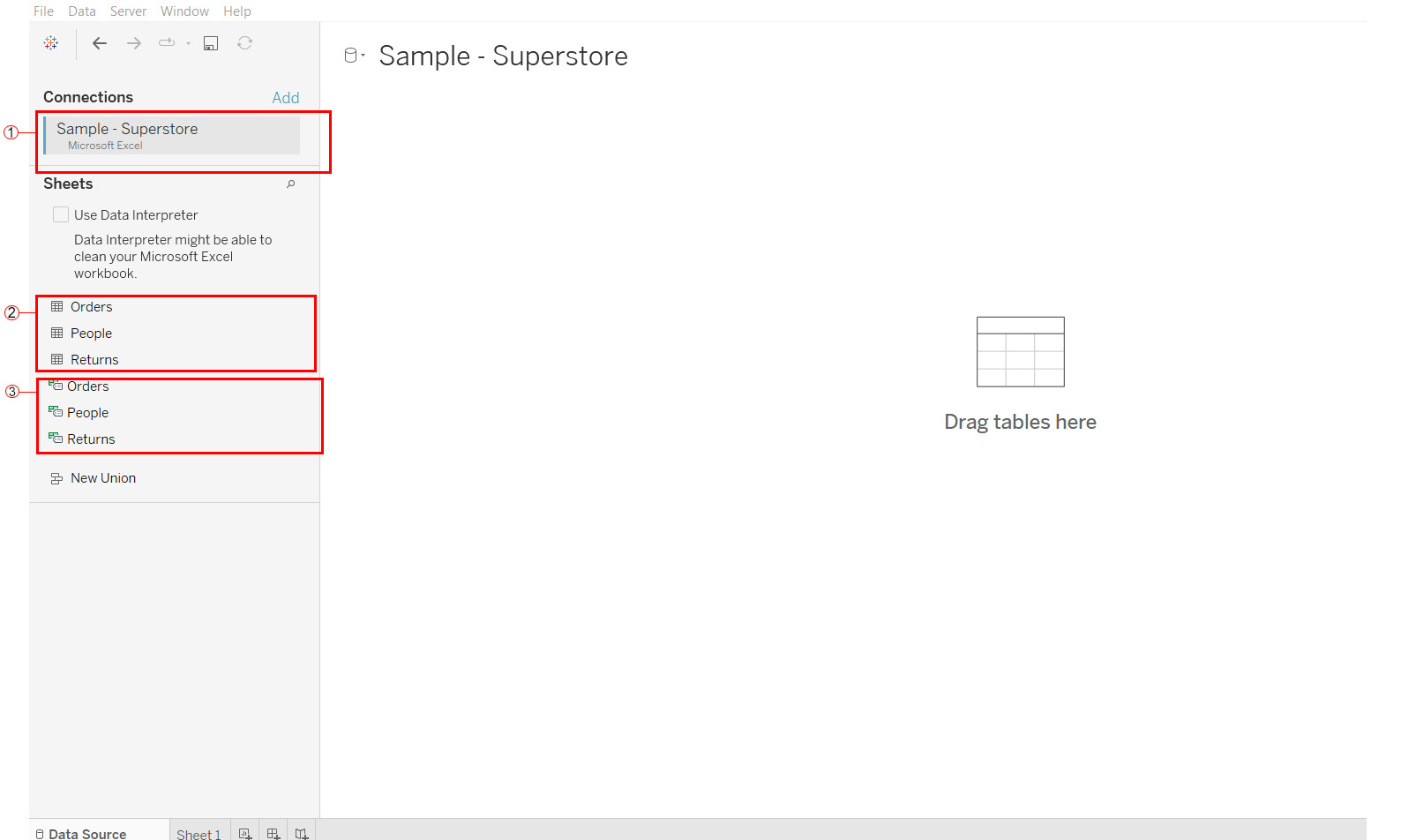
Figure 1.11: A screenshot showing the data connection page in Tableau Desktop
- Section 1: This highlights the data source that you have connected to. This is the Sample - Superstore.xls file that you just established a connection with. One point to note here is that just because you have established a connection to this Excel file does not mean that you have connected to the data.
- Section 2: These are the tables/worksheets in your Sample - Superstore.xls file, which is where the actual data resides. The Orders table contains the list of all transactions from this retail superstore and contains data at an order level. This order level contains details of the day, product, and customer levels. Refer to the following figure to take a glance at the Orders table:
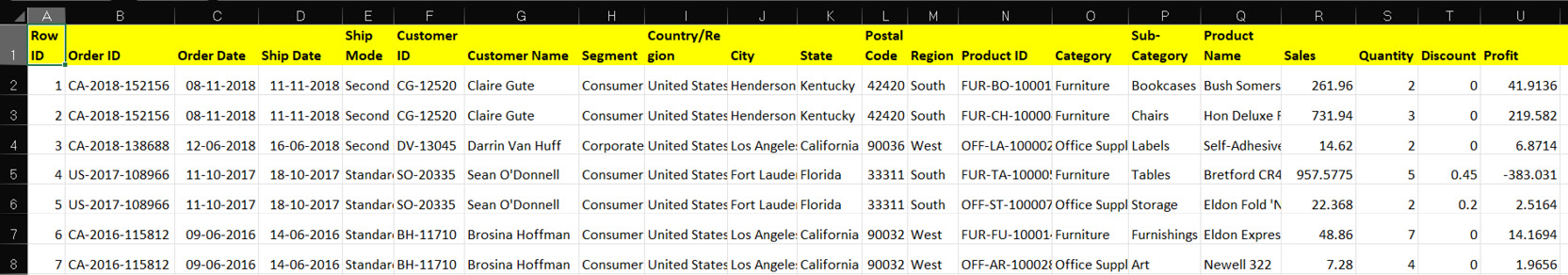
Figure 1.12: A screenshot showing a glimpse into the Orders worksheet of Sample - Superstore.xls
- The People table contains just two columns: Region and Person. The Person column is the list of managers for each Region. Refer to the following screenshot to take a glance at the People table:

Figure 1.13: A screenshot showing a glimpse into the People worksheet of Sample - Superstore.xls
The Returns table contains the list of all the transactions/orders that were returned. So, again, only two columns: Returned and Order ID. Refer to the following screenshot to take a glance at the Returns table:
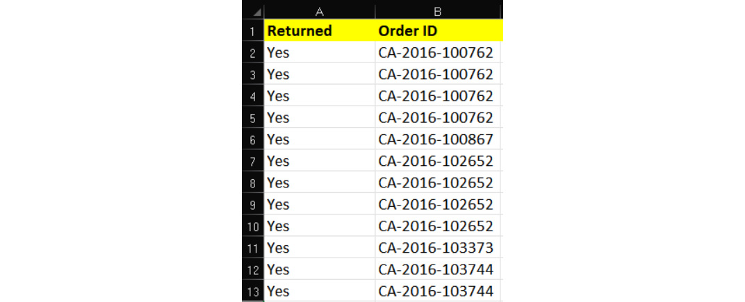
Figure 1.14: A screenshot showing a glimpse into the Returns worksheet of Sample - Superstore.xls
- Section 3: This is the list of Named Ranges that were created on the aforementioned tables/ worksheets (that is, Orders, People, and Returns) of the Sample - Superstore.xls data source. Named Ranges are a feature in Microsoft Excel, and Tableau gives you the option of reading data from these predefined Named Ranges. To understand more about these Named Ranges in Excel, please refer to the following link: https://support.microsoft.com/en-us/office/define-and-use-names-in-formulas-4d0f13ac-53b7-422e-afd2-abd7ff379c64?ui=en-us&rs=en-us&ad=us.
- So, at this point, you have made a connection to the Sample - Superstore.xls file; however, you are yet to establish a connection to the data to be able to read it in Tableau for your analysis. To do so, drag the Orders worksheet from the left-hand side list and drop it into the top blank section, which reads Drag sheets here. (If you are working with a version later than 2020.1, this may instead read Drag tables here.) Please note that you need to use the Orders worksheet and not the Orders named range since the data in the named range could be limited compared to the data in the Orders worksheet. Refer to the following screenshot:
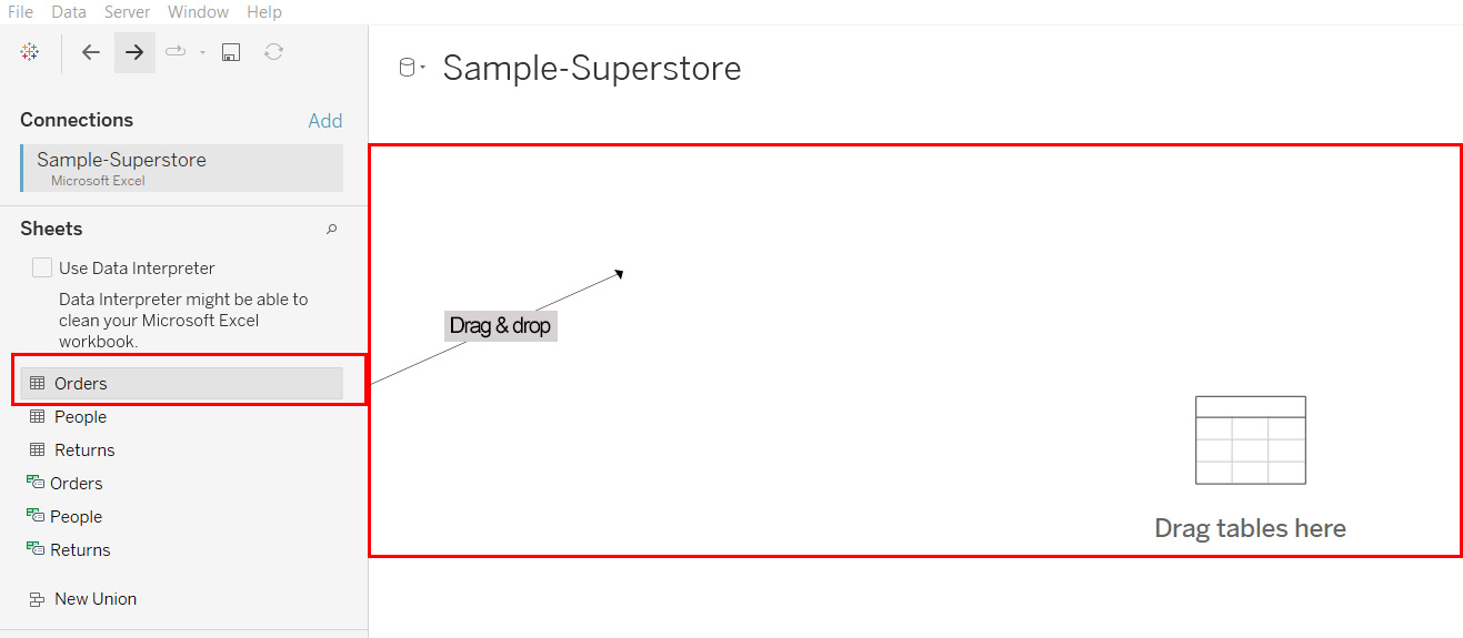
Figure 1.15: A screenshot showing how to read data from the Orders worksheet of Sample - Superstore.xls
- Once you drag and drop the Orders worksheet into the Drag sheets here section, you will see the view update for you, as shown in the following screenshot:
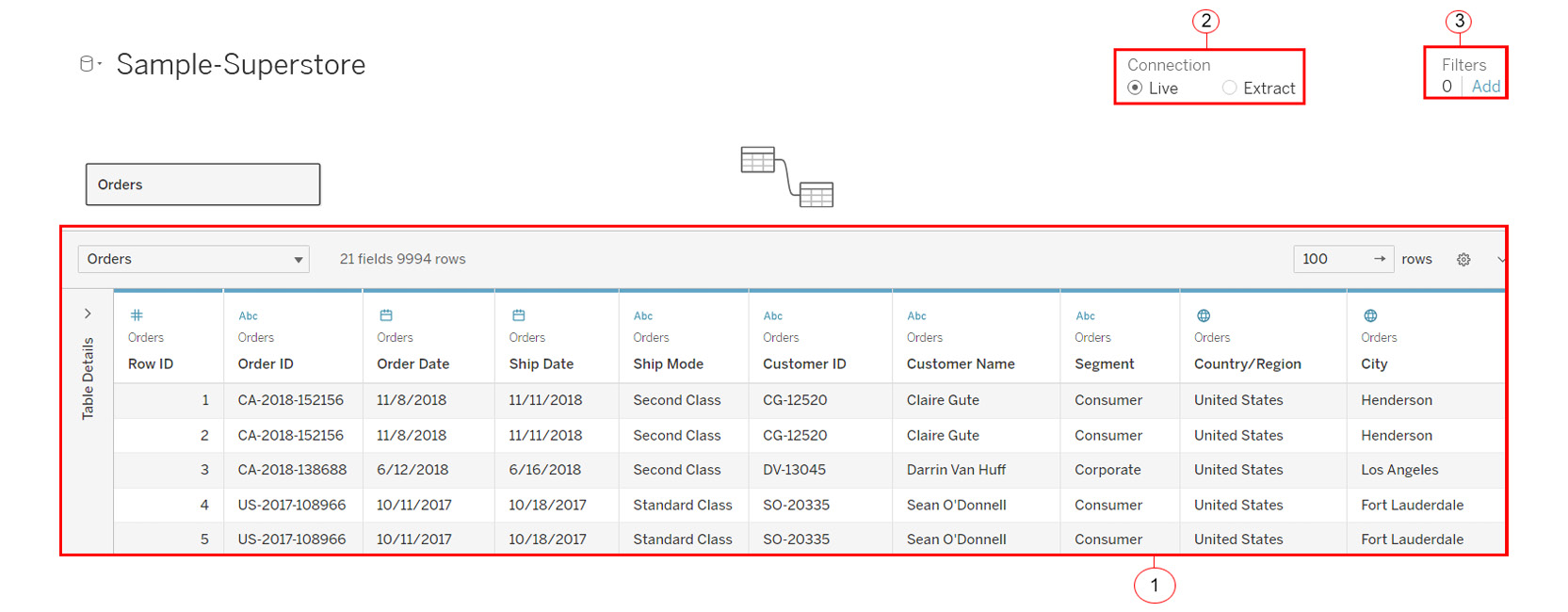
Figure 1.16: A screenshot showing the view after dragging and dropping the Orders worksheet
The preceding figure shows the view after fetching the Orders worksheet into the Drag sheets here section. Review the highlighted sections in the screenshot and the corresponding notes below to understand more.
- Section 1: This is the preview section where you get to see a quick preview (about 1,000 rows) of your Orders data. This is where you can quickly take stock of your data and make sure you have all the necessary columns to work with.
- Section 2: This is the Connection option. It has two options to choose from, Live and Extract. A Live connection is the option that you use when you want to connect to data in real time. This means that basically any changes at the data end will be reflected in Tableau. However, a quick point to note here is that the Live connection option relies on the data sources to process all the queries, and this could lead to performance issues in Tableau if the backend data source is a slow-performing data source. The Extract connection, on the other hand, is a snapshot of your data stored in a Tableau propriety format called Tableau Data Extract, which uses the file extension .hyper. Since the .hyper file only has a snapshot of the data, it will have to be refreshed if you need to see and use the updated data.
- Section 3: This is the Filters option, which is used to limit the amount of data that is read and used in Tableau. This works for both the Live and Extract options mentioned earlier.
Now that you understand the data connection page of Tableau, you can finally start using Tableau to analyze and visualize your data.
- Connect Live to your Orders data from Sample - Superstore.xls. Refer to the following screenshot:
Figure 1.17: A screenshot showing the Go to Worksheet option
- Now, the final step for fetching the data for your analysis is to click on Sheet1, and from there, select Go to Worksheet. With this, you will have read the data into Tableau Desktop and will now be able to start using it. Refer to the following screenshot:
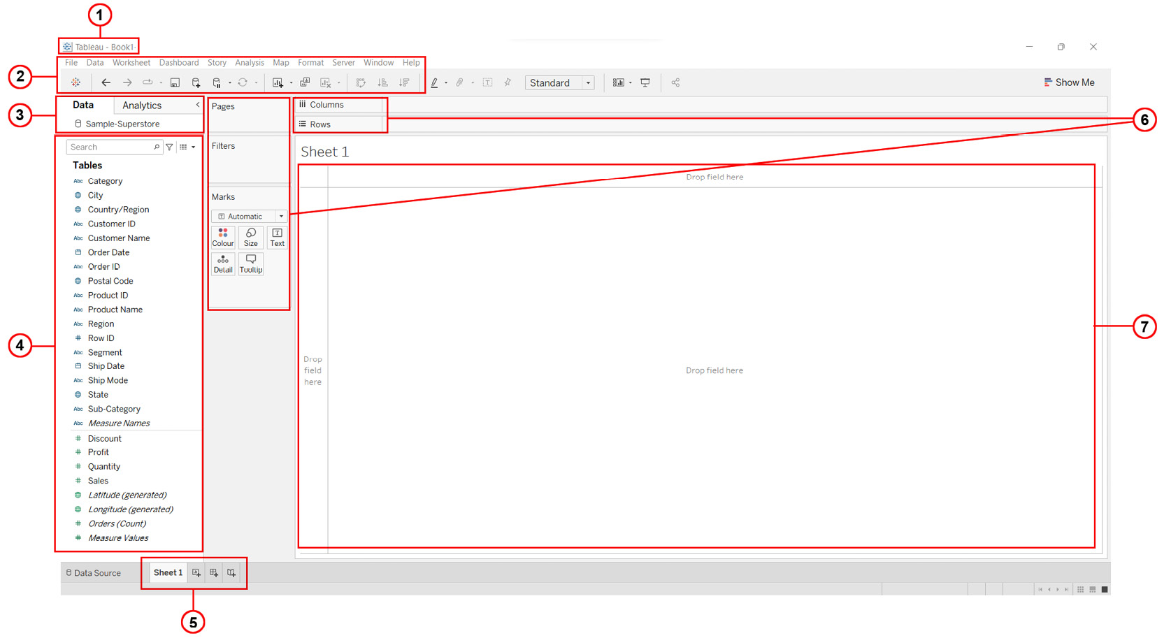
Figure 1.18: A screenshot showing the workspace of Tableau
The preceding screenshot shows the Tableau workspace. This is the space in which you will create your visualizations going forward. Let's quickly go through the highlighted sections in the screenshot to understand the workspace in more detail.
- Section 1: This is the workbook name. As mentioned previously, a workbook in Tableau is a file that consists of multiple worksheets and/or dashboards and/or storyboards. By default, it is named Book1 (as shown in the image). However, you can assign any new name you like when you save the workbook.
- Section 2: This is the toolbar section, and this consists of various options that help you explore the various features and functionalities available in Tableau.
- Section 3: This is the side bar area, which contains the Data pane and the Analytics pane. The Data pane shows the details of the fields coming from the data, which are classified as either Dimensions or Measures. The Analytics pane, on the other hand, shows the various analyses, such as constant line, average line, median with quartiles, totals, trend line, forecast line, and clusters, that can be performed on the view that you create. To begin with, the Analytics pane is disabled or grayed out and will only start appearing when you create a view or visual.
- Section 4: This is the Dimensions and Measures section, which technically is part of the Data pane (and, if you are working with a version of Tableau later than 2020.1, it may not appear in the view). Dimensions are all the fields from the data that are categorical, descriptive, or qualitative in nature, such as Customer Name, Product Name, Order ID, and Region. These, when fetched in the view, will result in each data member of that field being displayed in the view. Measures, on the other hand, are fields from the data that are quantitative in nature and can be aggregated as either sum, average, minimum, maximum, standard deviation, variance, and so on. These, when fetched in the view, will result in aggregated values being displayed. Examples of Measures are fields such as Sales, Profit, and Quantity, which will be aggregated for the purpose of your analysis. Refer to the following screenshot for more clarity:
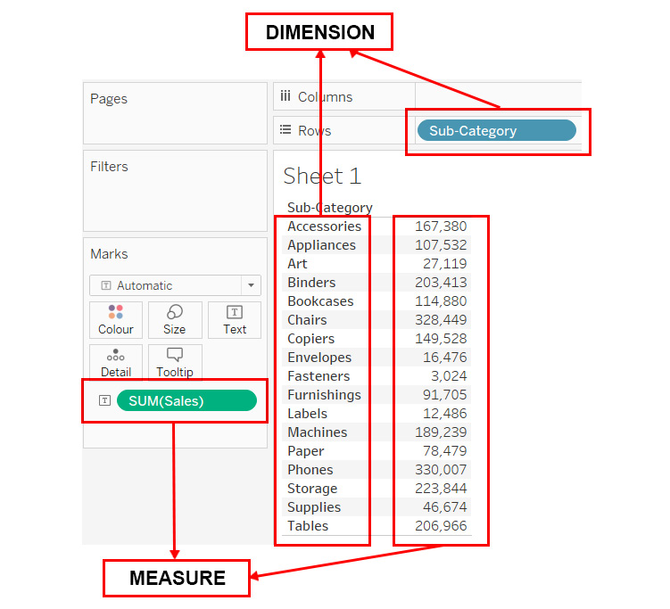
Figure 1.19: A screenshot showing the difference between Dimensions and Measures
- Section 5: This is the Sheet tab. Here you get the option to create either a new worksheet, dashboard, or storyboard.
- Section 6: These are the various cards and shelves available for use in Tableau. Here you can see various shelves such as the Columns shelf, Rows shelf, Pages shelf, and Filters shelf, along with the Marks card, which contains shelves such as the Color shelf, Size shelf, Text shelf, Detail shelf, and the Tooltip shelf. These shelves are used to change the appearance and details of your view.
- Section 7: This is the View section. This is where you will create your visualizations. It can be referred to as the canvas for creating your views and visualizations.
Now that you are familiar with the workspace of Tableau, you can create your first visualization. To create your views or visualizations, you can either try the manual drag and drop approach or the automated approach of using the Show Me button. Let's explore both of these options.
You will begin with the manual drag and drop approach and then explore the automated approach using the Show Me button in the following exercise.
Exercise 1.02: Creating a Comparison Chart Using Manual Drag and Drop
The aim of this exercise is to create a chart to determine which ship mode is better in terms of Sales by Region using the manual drag and drop method. In this case, you will create one stacked bar chart using the Ship Mode, Region, and Sales fields from the Orders data from Sample - Superstore.xlsx and another by manually dragging the fields from the Data pane and dropping them into the necessary shelves.
Perform the following steps to complete this exercise:
- Drag the Sales field from the Measures section in the Data pane and drop it onto the Columns shelf. This will create a horizontal bar.
- Drag the Region field from the Dimensions section from the Data pane and drop it onto the Rows shelf. This will create a horizontal bar chart with labels for regions and bars showing the sum of Sales.
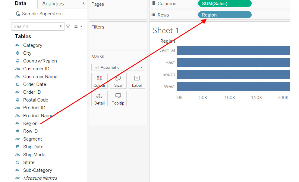
Figure 1.20: A screenshot showing the stacked bar chart created using the manual drag and drop method
- Finally, to include the ship mode, drag the Ship Mode field from the Dimensions section in the Data pane and drop it onto the Color shelf available under the Marks card. This will update your view to show a stacked bar chart with ship modes as colors, as in the following screenshot:
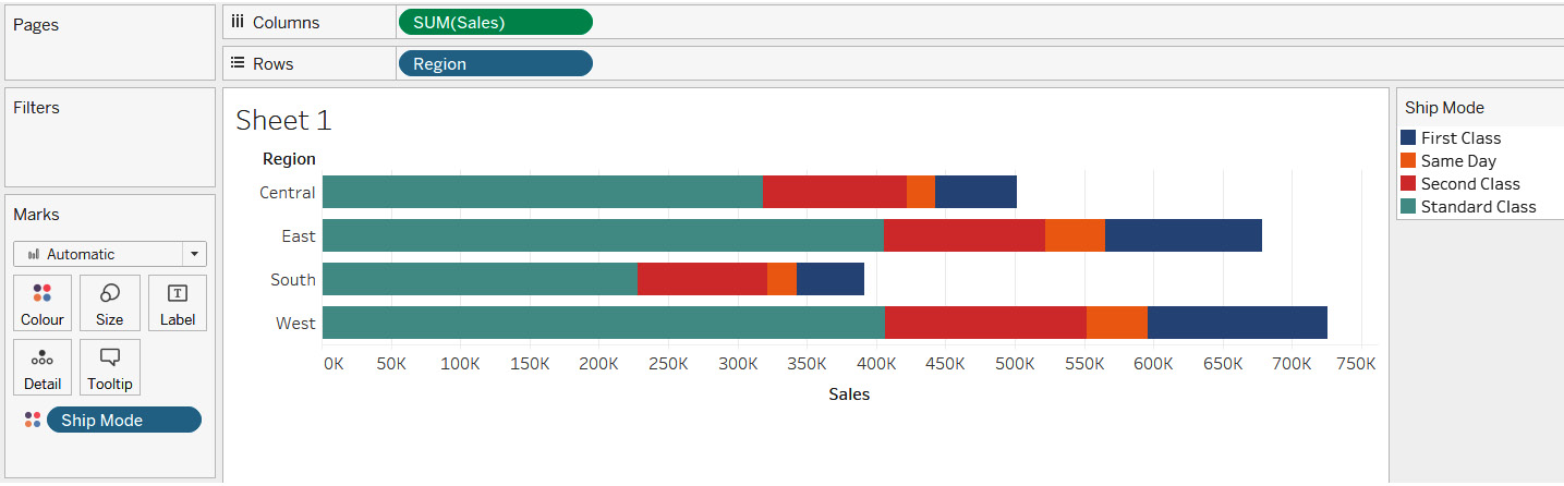
Figure 1.21: A screenshot showing the stacked bar chart created using the manual drag and drop method
In this exercise, you created a stacked bar chart to show which ship mode is better in terms of Sales across Regions using the manual drag and drop method. As you can see in the preceding screenshot, the Standard Class ship mode seems to be performing best by comparison to other modes.
In the following exercise, you will create another sales comparison chart—but this time with the Show Me button.
Exercise 1.03: Creating a Comparison Chart Using the Automated Show Me Button Method
The aim of this exercise is to create a chart to determine which Ship Mode is better in terms of Sales by Region using the automated method via the Show Me button. Just like the previous exercise, you will create one stacked bar chart using the Ship Mode, Region, and Sales field from the Orders data of Sample-Superstore.xlsx and another using the Show Me button. You will then compare the resulting charts to determine which mode helps generate the highest sales.
In a new worksheet, perform the following steps to complete the exercise:
- Press and hold the CTRL key on your keyboard and select the Region and Ship Mode fields from the Dimensions section and the Sales field from the Measures pane.
Note
You will need to keep the CRTL key pressed while doing multiple selections. Furthermore, if you are on an Apple device, use the Command key instead. Refer to the following link to find the list of equivalent macOS commands and keyboard shortcuts for both Windows and macOS: https://help.tableau.com/current/pro/desktop/en-us/shortcut.htm.
- Once you have selected the necessary fields, click on the Show Me button, which can be seen in the extreme top-right corner of your Tableau workbook. Refer to the following screenshot:
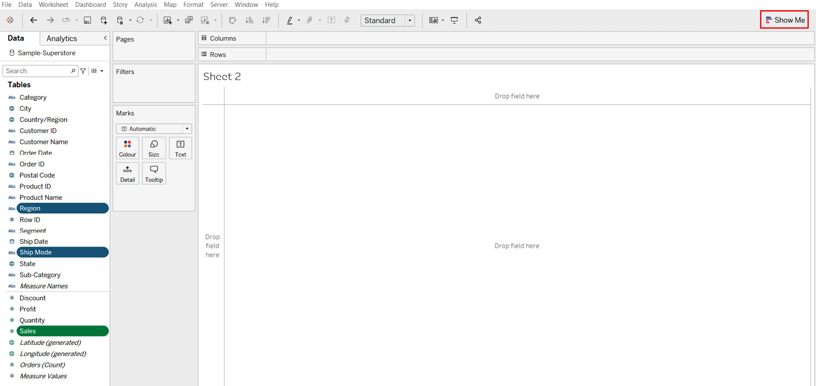
Figure 1.22: A screenshot showing the Show Me button
Once you have clicked on the Show Me button, you will see the list of visualizations that are possible with your current selection of fields, that is, two dimensions (Region and Ship Mode) and one measure (Sales). Further, you will also see that the horizontal bar chart is highlighted. The highlighted chart (this is highlighted by Tableau in version 2020.1 with an orangish-brown rectangular border in the following screenshot) is the result of the in-built recommendation engine that is based on the best practices of data visualization.
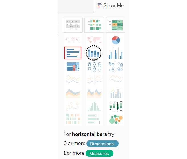
Figure 1.23: A screenshot showing the possible charts and the Show Me button
You now have two options: you can either go ahead with the chart recommended by Tableau, which will create a horizontal bar chart (which is not the aim here), or select some other chart that is available and enabled in the Show Me button (ideally a stacked bar chart like the one that you created in the previous exercise). So, select the chart right next to the recommended one (the one that is highlighted using a black dotted circular border in the preceding screenshot). This is the stacked bar chart option, which is exactly what you wanted.
However, when you go ahead with this option, you see two things that are different from the output that you created in the previous exercise. Firstly, it is a vertically stacked bar chart and not a horizontal one, and, secondly, you have Region in the Color shelf instead of Ship Mode. Refer to the following screenshot:
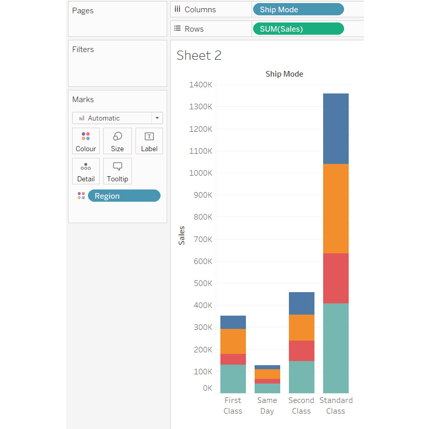
Figure 1.24: A screenshot showing the output of the stacked bar chart option from the Show Me button
Now, neither of these things are technically wrong, but they are not what you wanted in this case, and so you will need to change them.
- Firstly, change the orientation of your stacked bar chart from vertical to horizontal by clicking on the swap button in the toolbar, as shown in the following screenshot:
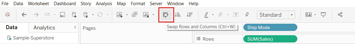
Figure 1.25: A screenshot showing the Swap Rows and Columns button
- Next, interchange/swap your Region and Ship Mode fields so that you have Ship Mode in the Color shelf instead of Region.
To do this, press CTRL and select Region from the Color shelf as well as Ship Mode from the Rows shelf. Make sure the pills for these selected fields are now darker in color as the dark color indicates that the selection of these fields is retained.
- Now, click on the dropdown of either the Region field or the Ship Mode field and choose the Swap option, as shown in the following screenshot:
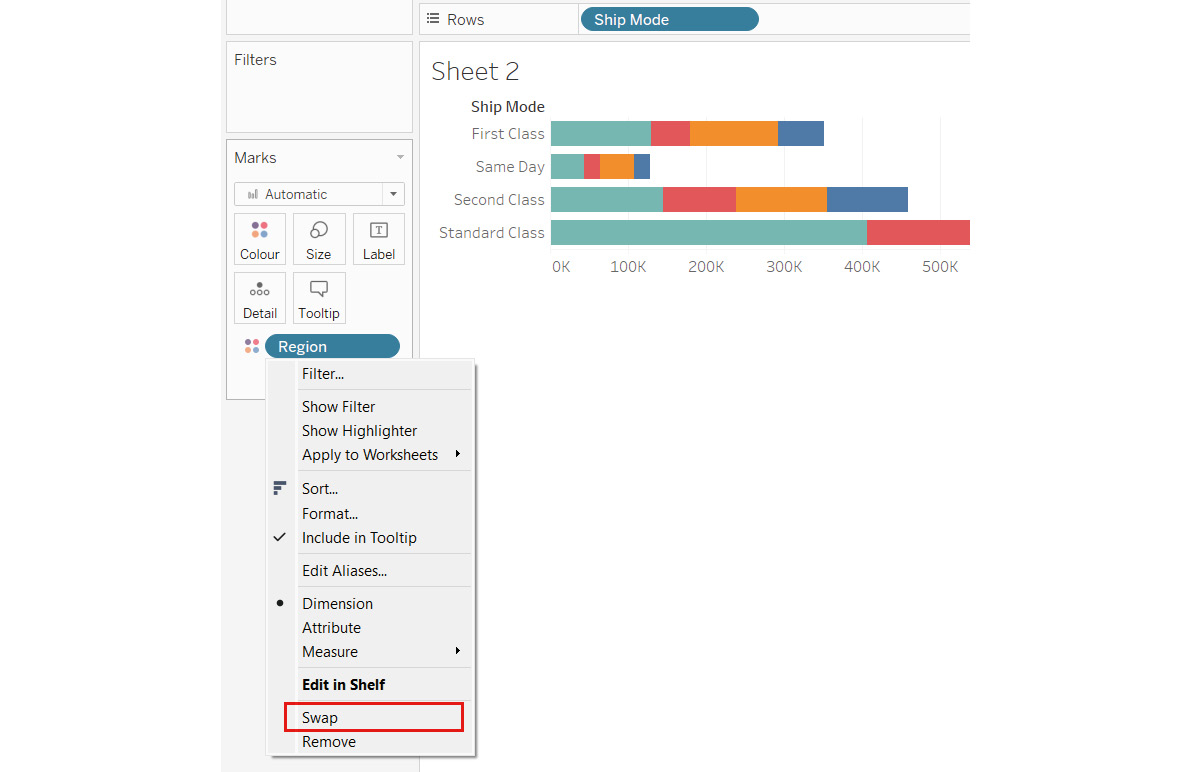
Figure 1.26: A screenshot showing the Swap option of the CTRL multiselect and drop-down method
This produces the following output:
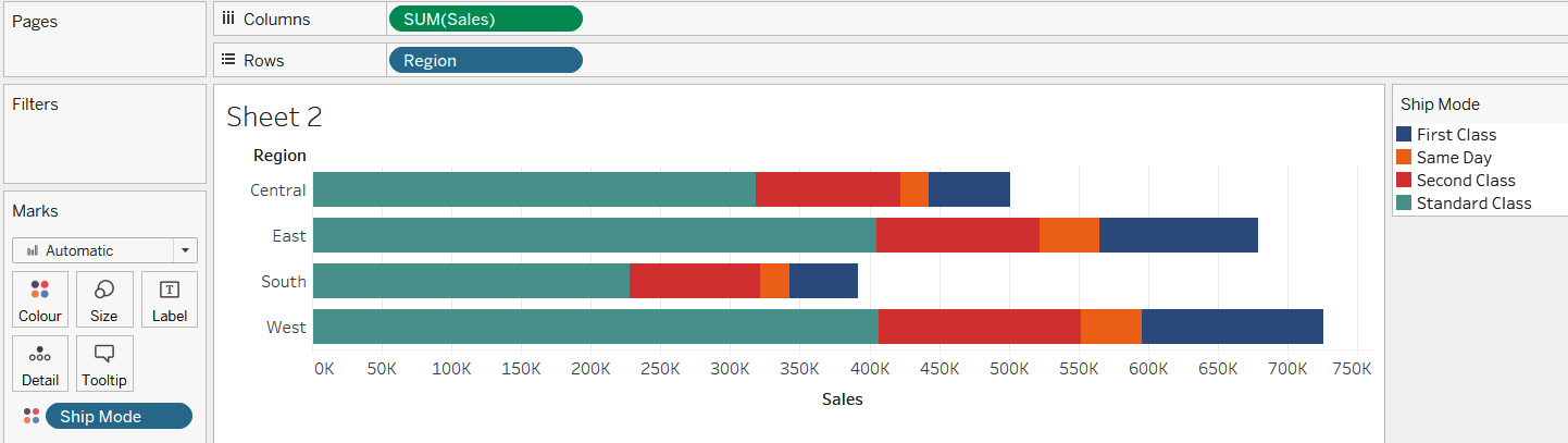
Figure 1.27: A screenshot showing the stacked bar chart created using the Swap options
In this exercise, you created a stacked bar chart to show which Ship Mode is better in terms of Sales by Regions using the manual drag and drop method. As you can see in the preceding screenshot, the Standard Class ship mode seems to generate more sales compared to the other ship modes.
Data Visualization Using Tableau Desktop
In an earlier section, you familiarized yourself with the workspace of Tableau and learned how to create a visualization using the manual drag and drop method as well as the automated Show Me button. During the course of this book and across various chapters, you will get into more details of this workspace and learn about some more of the options available in the toolbar as well as the other shelves.
Now that you have some fundamental knowledge of how to create a visualization using the aforementioned methods, you will now explore some concepts of data visualization and how to use these in Tableau Desktop.
Ideally, when you present your analysis and insights, you want your end user to be able to quickly consume the information that you have presented and make better decisions more quickly. One way to achieve this objective is to present the information in the right format. Each chart, graph, or visualization has a specific purpose, and it is particularly important to choose the appropriate chart for answering a specific goal or a business question.
Now, to be able to choose the appropriate chart, you first need to look at the data and answer the question "What is it that you need to do with your data?".
To help you make your decision, consider the following:
- Do you wish to compare values?
- Do you wish to look at the composition of your data?
- Do you wish to understand the distribution of your data?
- Do you wish to find and understand the relationships between the various variables of your dataset?
Once you have addressed these points and determined what you wish to do with your data, you will also need to decide on the following:
- How many variables do you need to look at at any given point in time?
- Do you wish to trend the data?
With the help of this list, you will be able to figure out which chart is the most appropriate one to answer your business questions. To elaborate on this point, begin by first categorizing your charts into four sections—namely, charts that help you either compare, determine the composition, show the distribution of your data, or else the ones that help you find relationships in your data.
Comparison, composition, distribution, and relationships are often referred to as the four pillars of data visualization and are described in greater detail here:
- Comparison: When analyzing your data, a common (if not the most common) use case would be to compare your data. Comparison is often done between two or more values. Some examples of comparison would be sales revenue in different regions, how the performance of a particular sales representative compared to their colleagues, the profitability of different products, and so on.
Typically, you will see comparison being done across categorical data, that is, data members of a dimension (for example, comparison across regions wherein Region is a dimension, and East, West, North, and South are the data members of that dimension), but it can also be done across quantitative data, that is, across measures (for example, sales versus profit or actual sales versus budget sales).
Another type of comparison that is very common is a comparison over a period of time (for example, evaluating your monthly sales performance or which months are better for your business and whether there are any seasonal trends that you need to look out for).
So, based on the preceding information, you will further break down comparison as comparison across dimensional items or categorical data (for example, region-wise sales), comparison over time, and comparison across measures or quantifiable data (for example, sales versus quota).
The following list outlines the typical charts that should be used for each type of comparison:
Comparison across dimensional items:
- Bar chart
- Packed bubble chart
- Word cloud
Comparison over time:
- Bar chart
- Line chart
Comparison across measures:
- Bullet chart
- Bar chart
- Composition: Another common use case when analyzing your data is to find out what ratio or proportion each data member contributes to the whole. So basically, out of the total value, what is the contribution of each data member? This is typically referred to as a part to whole composition and it helps us understand how each individual part makes up the whole of something. For example, out of the total sales, which category is contributing the most? Or what is the breakdown of your total sales by region? And so on.
Typically, you end up showing a static snapshot of the composition of your data (for example, your market share along with the market share of your competitors at a given point in time), or you may also want to trend this information over a period of time (for example, how is your and your competitor's market share changing over a period of time). Both these perspectives are important and can provide some very valuable insights regarding your performance.
So, based on this information, you will further break down composition as composition (snapshot/static) and composition over time.
The following list outlines the typical charts that should be used for each type of composition:
Composition (snapshot/static):
- Pie chart
- Stacked bar chart
- Treemap
Composition over time:
- Stacked bar chart
- Area chart
- Distribution: Finding the distribution of your data is important when you want to find patterns, trends, clusters, and outliers or anomalies in your data—for example, if you want to understand how employees are performing during the annual appraisal cycle (that is, which employees or how many employees are below par, which or how many employees meet expectations, and which or how many employees exceed expectations). Another example of distribution would be evaluating students' performance in an exam or determining the defect frequency in your manufacturing process.
So, based on this information, you will further break down distribution as distribution for a single measure, and distribution across two measures.
The following list outlines the typical charts that should be used for each type of distribution:
Distribution for a single measure:
- Box and whisker plot
- Histogram
Distribution across two measures:
- Scatter plot
- Relationships: Finding and understanding relationships, dependency, correlations, or cause and effect relationships between different variables of your data is another method of data analysis. When analyzing your data, it is important to ascertain whether there is any dependency between variables of your data (does one variable have any effect on another variable and if so, whether it is a positive or negative effect, such as the impact of marketing expenditure on sales profit or the increase or decrease in warm clothing sales depending on temperature). So, based on this information, you will further break down relationship as the relationship between two measures and the relationship between multiple measures.
The following list outlines the typical charts that should be used for each type of relationship:
- Relationships between two measures: scatter plot
- Relationships between multiple measures: scatter plot with size and color
Now that you understand these concepts of Comparison, Composition, Distribution, and Relationships, and which charts to choose for each of these scenarios, you will also try to see how to create these in Tableau. All these abovementioned scenarios and charts are explained in more detail in the upcoming chapters.
Apart from the aforementioned use cases or scenarios, you may also want to explore the geographic aspect of your data (that is, if you have any geographical information in your data). This could mean having data at a country level, state level, city level, or even postal code level. Creating geographic maps to show this geographic data is another way of exploring and visualizing your data since visualizing geographic data on a map can help us highlight certain events or occurrences across geographies and possibly unearth some hidden spatial patterns and or perform proximity analysis.
Note
For more information on choosing the right chart, see the following article: https://www.tableau.com/learn/whitepapers/which-chart-or-graph-is-right-for-you.
Saving and Sharing Your Work
Another important point to discuss when working with Tableau is how to save your files and share them with others. As you know, Tableau is an interactive tool that allows users to filter, drill down, and slice and dice data using the features that are provided within the tool. Now, when it comes to saving and sharing your work with others, some people may want their end users to have the flexibility to play with the report and use the interactivity that is provided, while others may simply want end users to have a static snapshot of information that doesn't provide any sort of interactivity. Further, some may want to share the entire dashboard with their end users, while others may only want to share a single visualization.
All these scenarios can be handled in Tableau. The following list will go through these options in detail, breaking them into two parts: static snapshots and interactivity versions:
Static snapshots: The following is the list of options to choose from when you want to save and share a static snapshot of your work:
- Saving as an Image: When saving your work as an image, you can either save just a single worksheet or an entire dashboard as either a PNG, JPEG, BMP, or EMF image. To do so, use either the Worksheet > Copy > Image option from the toolbar or the Worksheet > Export > Image option from the toolbar. Refer to the following screenshots:
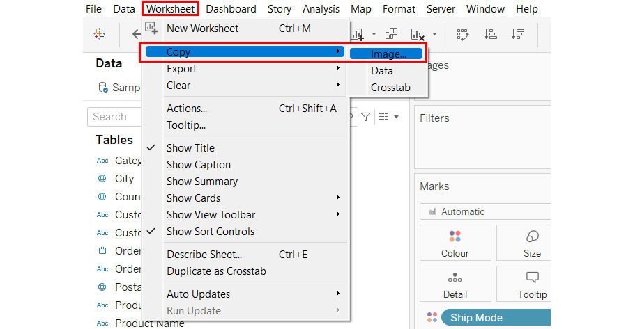
Figure 1.28: A screenshot showing the Worksheet > Copy > Image option from the toolbar menu
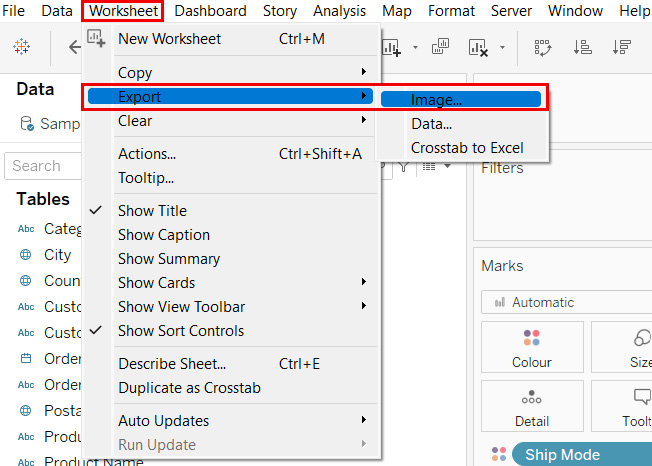
Figure 1.29: A screenshot showing the Worksheet > Export > Image option from the toolbar menu
The Copy > Image option allows you to copy the individual view as an image and then paste it into another application if desired, whereas the Export > Image option lets you directly export the view as an image rather than doing a copy and paste operation.
The preceding screenshots show the options of either copying or exporting just a single worksheet (that is, a single visualization). However, if you wish to save the entire dashboard as an image, then you will use the Dashboard > Copy Image or Dashboard > Export Image option in the toolbar. Refer to the following screenshot:
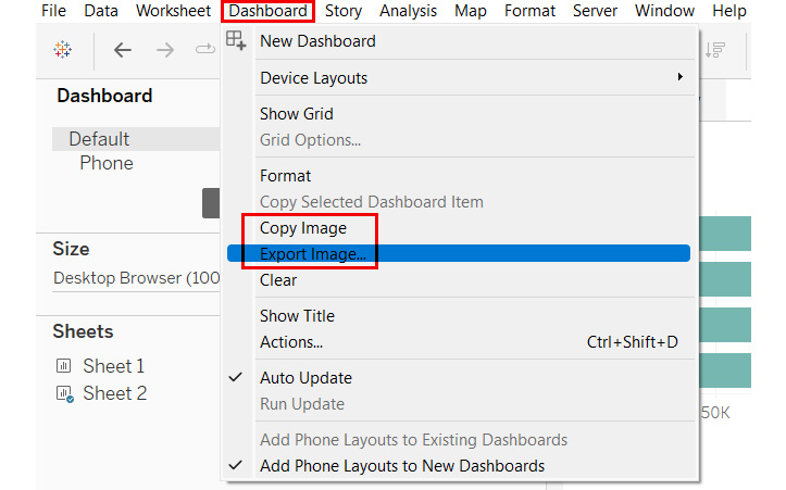
Figure 1.30: A screenshot showing the option of saving the entire dashboard as an image
- Saving as Data: When saving the data that you have used to generate a view, you can either save the data as a .csv file by copying and pasting the data into a .csv file or export the data as a Microsoft Access file, using either the Worksheet > Copy > Data option or the Worksheet > Export > Data option from the toolbar menu. Refer to the following screenshots:
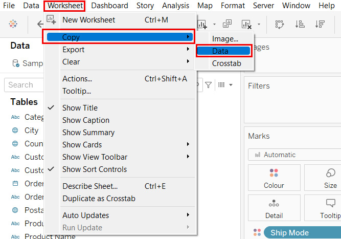
Figure 1.31: A screenshot showing the Worksheet > Copy > Data option
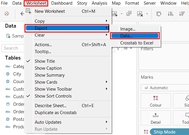
Figure 1.32: A screenshot showing the Worksheet > Export > Data option
- Saving as Crosstab: Another way of saving the data that is used for building your view is to have it as crosstab Excel output. Earlier, in Saving as Data, the options were to save it as .csv or as .mdb files, which is the Microsoft Access format. However, when you want to have the data stored as an Excel output, you will either have to use the Worksheet > Copy > Crosstab option or the Worksheet > Export > Crosstab to Excel option from the toolbar menu. Refer to the following screenshots:
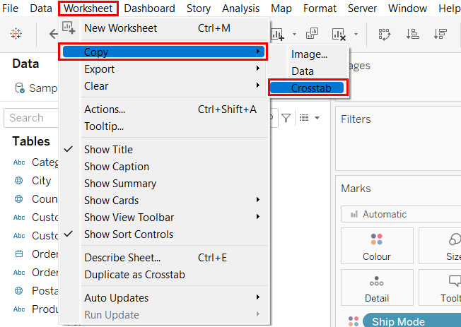
Figure 1.33: A screenshot showing the Worksheet > Copy > Crosstab option
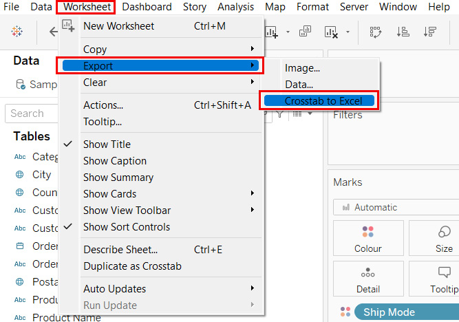
Figure 1.34: A screenshot showing the Worksheet > Export > Crosstab to Excel option
- Export as PowerPoint: This option allows you to export your work into a PowerPoint presentation where the selected sheets are converted into a static PNG format and exported to separate individual slides. To export as PowerPoint, choose the File > Export As PowerPoint option from the toolbar menu. Refer to the following screenshot:
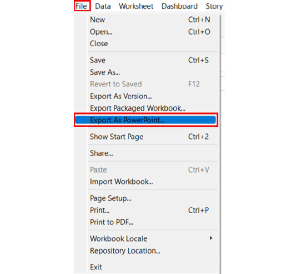
Figure 1.35: A screenshot showing the File > Export as PowerPoint option
- Print as PDF: This option allows you to export your work into a PDF file. You can have a single or multiple selected worksheets, or the entire Tableau workbook saved as a PDF output. To export the view as a PDF document, choose the File > Print to PDF option from the toolbar menu. Refer to the following screenshot:
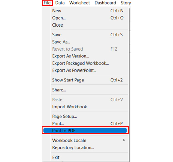
Figure 1.36: A screenshot showing the File > Print to PDF option
Exercise 1.04: Saving Your Work as a Static Snapshot-PowerPoint Export
In the previous section, you explored different options for choosing a static output of your work. In this exercise, you will export or save your work as a PowerPoint export. For this, you will continue using the stacked bar chart of Ship Mode, Region, and Sales that was created in the previous exercise. This exercise will help you see how you can save your analyses as interactive versions and publish these works to different platforms—something you'll need to do fairly often as a Tableau developer.
You will continue working with the Sample Superstore dataset for this exercise.
The steps to accomplish this are as follows:
- Make sure that you have the stacked bar chart that you created earlier handy. If not, then please start by first re-creating the stacked bar chart by following the steps mentioned in the earlier exercise, Exercise 1.03, Creating a Comparison Chart Using the Automated Show Me Button Method.
- Once you have the stacked bar chart ready, click on the File option in the toolbar and select the Export As PowerPoint option. Refer to the following screenshot:
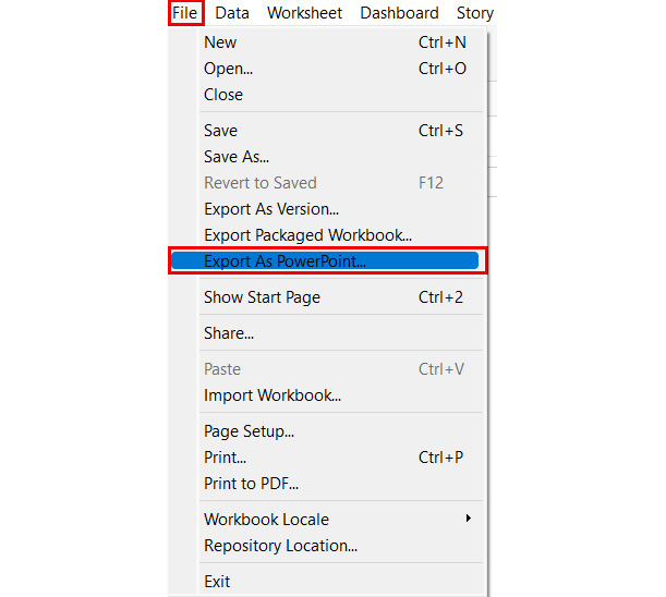
Figure 1.37: A screenshot showing the File > Export as PowerPoint option
- Go with the default options in the pop-up window and then click on the Export button and save the file to your desired location. Finally, name the file My PowerPoint Export.pptx. Refer to the following screenshot:
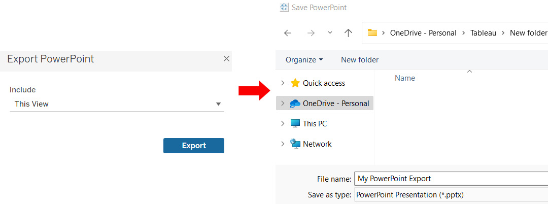
Figure 1.38: A screenshot showing the PowerPoint export
This will save your output as a .pptx file, which can later be opened in the Microsoft PowerPoint app.
Interactive versions: The following is the list of options to choose from when you want to save and share interactive versions of your work:
- Save the file as .twb or .twbx: In order to save your views as interactive views, you will need to save your Tableau files in the following formats.
.TWB: This is the file extension used to save a file as a Tableau workbook, which is a proprietary file format. .twb is the default file extension when you try to save any of your Tableau workbooks. These .twb files are kind of work-in-progress files that constantly require access to data and, since these require constant connectivity to data, it will not be possible to open the file unless you have Tableau Desktop and access to data that is used for creating this .twb file. So, if you wish to share this .twb file with anyone, you need to make sure they have access to the data; and if not, then the data source file will have to be made available to them. To save the file as .twb, choose the File > Save As option from the toolbar menu.
This will open a new window that allows you to save the file. Make sure to choose the Tableau Workbook (.twb) option. Refer to the following screenshot:
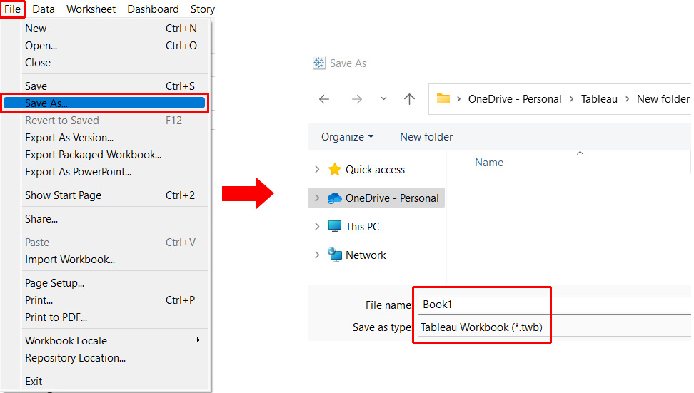
Figure 1.39: A screenshot showing the File > Save As > Tableau Workbook (.twb) option
TWBX: This is the file extension used to save the file as a Tableau packaged workbook, which contains the views as well as the copy of the data used for creating those views. Since the copy of the data is bundled along with the views that have been created, it allows the end user to access and interact with the file even when they don't have direct access to the raw data that is being used for analysis.
Further, since the copy of data is bundled along with the views, the data that is seen in the file is not the actual live data but a static snapshot of that data at a given point in time, which can be refreshed as and when required.
To save the file as .twbx, choose the File > Save As option from the toolbar menu. This will open a new window that allows you to save the file. Make sure to choose the Tableau Packaged Workbook (.twbx) option. Refer to the following screenshot:
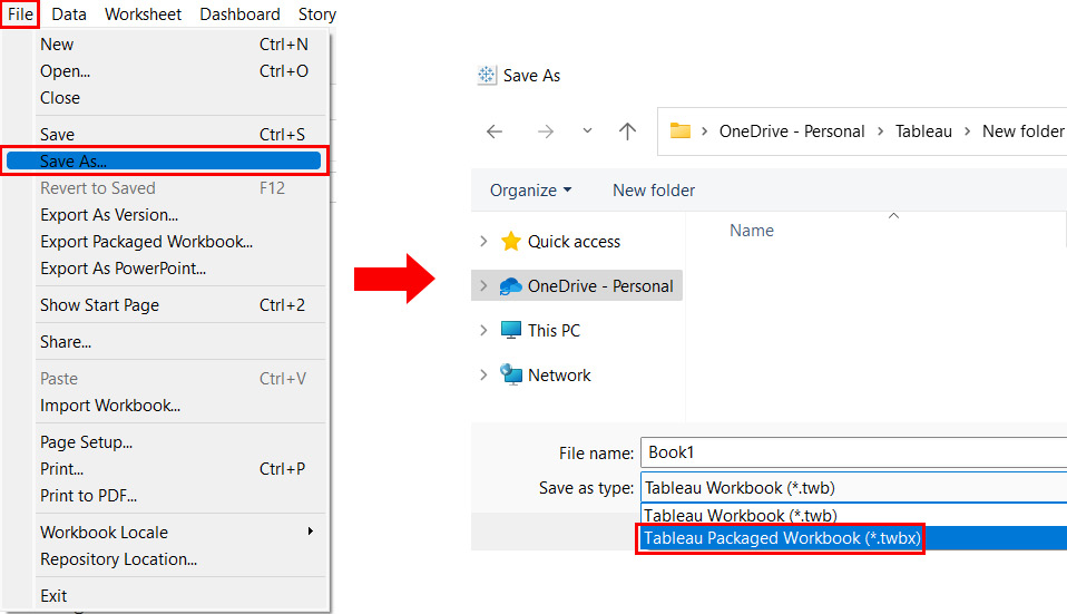
Figure 1.40: A screenshot showing the File > Save As > Tableau Packaged Workbook (.twbx) option
To save the file as Tableau Packaged Workbook (.twbx), you can even choose the File > Export As Packaged Workbook option from the toolbar menu. Refer to the following screenshot:
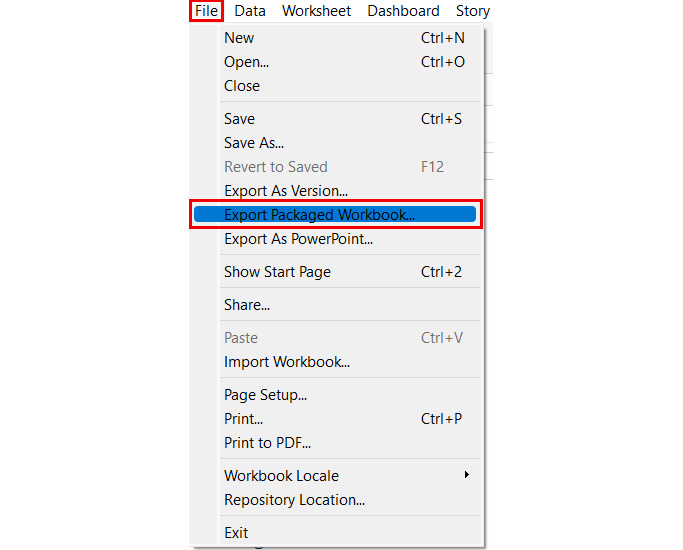
Figure 1.41: A screenshot showing the File > Export Packaged Workbook option
- Publish to Server: This option allows you to publish your work on either Tableau Server or Tableau Online. You need to have permission to publish to Tableau Server, and when a file is published on Tableau Server, the end user will need to have permission to either view it or interact with it, or even modify it. So, in short, Tableau Server and Tableau Online are permission-based applications. To see how to publish to a Tableau server, choose the Server > Publish Workbook option from the toolbar menu. Refer to the following screenshot:
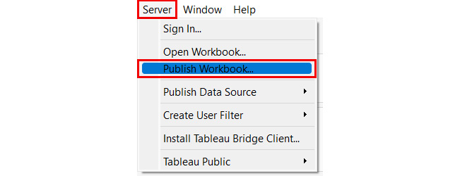
Figure 1.42: A screenshot showing the Server > Publish Workbook option
- Publish to Tableau Public: This option allows you to publish your work to the Tableau Public server, which can be viewed and accessed by anybody. You do not need any special permissions to publish to the Tableau Public server. To see how to publish to the Tableau Public server, choose the Server > Tableau Public option from the toolbar menu. Refer to the following screenshot:
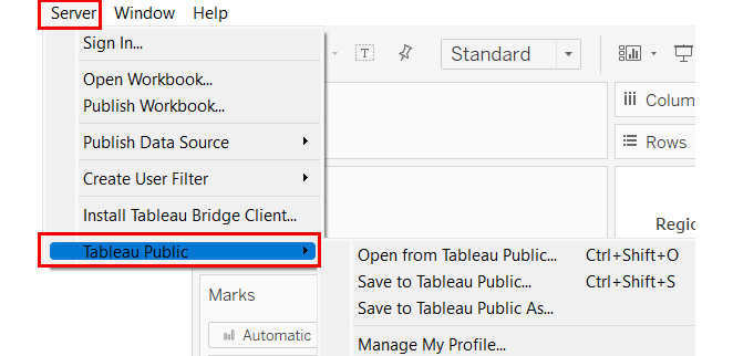
Figure 1.43: A screenshot showing the Server > Tableau Public option
In the following exercise, you will learn how to save your work in a packaged Tableau workbook.
Exercise 1.05: Saving Your Work as a Tableau Interactive File–Tableau Packaged Workbook
In the previous section, you saw different options when it comes to choosing an interactive version of your work. The aim of this exercise is to export or save your work as a Tableau Packaged Workbook (.twbx). For this, you will continue using the stacked bar chart of Ship Mode, Region, and Sales that was created in the previous exercise.
Complete the following steps:
- Make sure that you have the stacked bar chart that you created earlier handy. If you don't have it handy, then first recreate the stacked bar chart by following the steps mentioned in Exercise 1.03, Creating a Comparison Chart Using the Automated Show Me Button Method.
- Once you have the stacked bar chart ready, click on the File option in the toolbar and select the Export Packaged Workbook option. Refer to the following screenshot:
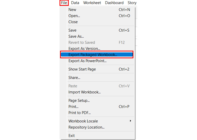
Figure 1.44: A screenshot showing the File > Export Packaged Workbook option
- Save the file to your desired location and name it My Tableau Packaged Workbook.twbx. Refer to the following screenshot:
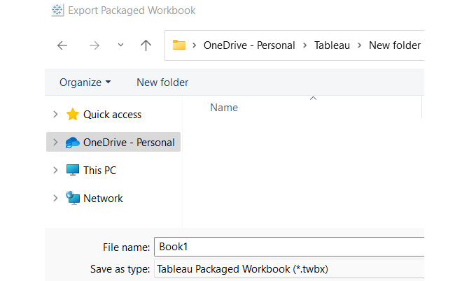
Figure 1.45: A screenshot showing the PowerPoint export
This will save your output as a .twbx file, which can later be opened in Tableau Reader or Tableau Desktop itself.
In the next section, you will practice your new skills by completing an activity using everything that you have learned in this chapter.
Activity 1.01: Identifying and Creating the Appropriate Chart to Find Outliers in Your Data
In this activity, you will identify and create the appropriate chart to find outliers in your data. The dataset being used has two measures—namely, Profit and Marketing. Marketing refers to the money being spent on marketing efforts, while Profit is the profit that you are making. You need to compare Marketing and Profit across different products and across different markets (so, two dimensions and two measures).
The outliers to be identified are as follows:
- High marketing and low profit
- Low marketing and high profit
You will use the CoffeeChain Query table from the Sample-Coffee Chain.mdb dataset. The data can be downloaded from the GitHub repository of this book, at https://packt.link/MOpmr.
As the name suggests, the dataset contains information pertaining to a fictional chain of coffee shops.
Perform the following steps to complete this activity:
- Select the Sample-Coffee Chain.mdb data using the Microsoft Access option in the data connection window of Tableau.
- Use the CoffeeChain Query table from the Sample-Coffee Chain.mdb data.
- Identify which chart would be the most appropriate to find your outliers in your data when looking at two measures, (that is, Profit and Marketing) across two dimensions (that is, Product and Market). The outliers that you are looking for are high marketing and low profit and low marketing and high profit. (Hint: Refer to the section that discussed the four pillars of data visualization and choose the chart that will help you find outliers.)
- After identifying which chart would be the most appropriate, create that chart using the automated Show Me button method.
- Export the view that you have created as a PowerPoint image.
- Finally, save the workbook as a Tableau Packaged Workbook (.twbx) on your desktop and give the file the following name: My first Tableau view.
Note
The solution to this activity can be found here: https://packt.link/CTCxk.
Summary
In this chapter, you learned the definition and importance of visual analytics and data visualization. You were presented with several points for evaluation when choosing a data visualization tool and explored Tableau's product suite. Having identified Tableau Desktop as the best choice of platform for analyzing and visualizing your data, you looked at how to utilize it to connect to data and familiarized yourself with the Tableau Desktop workspace. You also considered various scenarios for data visualization and identified which charts to use for the given task and learned how to save and share your work with others.
In the next chapter, you will see how to build the various charts that you identified earlier. You will also learn how to prepare your data for analysis using Tableau Prep as well as Tableau Desktop.