Overview
This chapter will teach you the processes for building Tableau dashboards and storyboards. You will learn about tools such as tiled versus floating objects, branding elements, and filter actions, as well as adding web pages to the dashboards. By the end of this chapter, you will be able to use these objects/elements to create highly interactive dashboards, communicate results, and create stories, providing important insights to end users. These are essential tools for every Tableau analyst and designer.
Introduction
Thus far, you have developed many core Tableau skills, including creating calculations, building and using filters, developing geospatial analyses, and many other core skills. In this chapter, you will use many of these skills to create dashboards that will enable your users to easily and effectively navigate complex datasets.
We will provide you with the essential skills for designing effective dashboards and storyboards using a variety of data sources. You will build on the many techniques and methods you have learned in previous chapters. You will learn how to effectively use filters, parameters, sets, and actions to make your dashboards and storyboards both powerful and flexible. Additionally, you will learn how to effectively design dashboards using data visualization best practices for color, spacing, interaction, design flow, and element sizing. All of this will be facilitated with hands-on exercises and activities.
By the end of the chapter, you will be well positioned to design highly effective, well-designed dashboards and storyboards to answer essential business questions.
The Who, What, and Why of the Dashboard
Before you begin exploring how to best create dashboards in Tableau, it is equally important for you to answer some of the essential questions around building the dashboard: Why are you building the dashboard in the first place? What is your end goal and who is your target audience?
The Who: Audience
After years of building dashboards, one thing that most experienced Tableau users will agree upon is the fact that the kind of dashboard you build will depend on the seniority of the stakeholder that you'll be presenting it to. If you are building a dashboard for C-level execs or directors/VPs of the business, more often than not, you will need to create a holistic, high-level dashboard that presents a complete picture of the business data. By way of contrast, when you are building a dashboard for a business development manager or marketing manager, the dashboard needs to be a lot more granular and deeply detailed.
As you will see later in the section, the overall anatomy of the dashboard remains almost the same, but the granularity, as well as giving the end user the ability to "peel the onion" or dig deeper into the data, is what differentiates the target audience. Hence, before you start building the dashboard, it is important to narrow down your audience, consider their requests, and then start the process of framing the dashboard.
The What: Begin with the End in Mind
The next step in building the dashboard is to understand the end goal of the dashboard you are building. If you can answer these questions with relative ease, you already have a head start in the dashboard building process. Consider the following points before you start building your dashboard:
- Do you know how your audience will use this dashboard?
- Is there a specific point you want your audience to understand by looking at the dashboard?
- What are all the stakeholder questions your dashboard might have answers to?
- Does the dashboard provide contextual knowledge instead of just metrics?
Once you answer these questions, you should have a good end goal of what the absolute minimum your dashboard should have. After that, it is all about placing all the relevant worksheets and elements/objects in the dashboard for easy consumption of the data you want to share.
The Why: The Need for a Dashboard
The final question you should be asking is Why is the dashboard required in the first place? You can break that question down into multiple pieces as follows:
- What area of business is the dashboard concerned with? For example, a dashboard intended for the finance department would look different from the one for the digital marketing team.
- What kind of information/metrics does the end user want from the dashboard?
Once you've answered these questions, the process of building a dashboard will become a lot smoother, as you know the context for requesting this dashboard as well as how the dashboard will eventually be used.
Designing a Dashboard
Dashboard design is one aspect of Tableau that is a bit subjective and relies on the design and visual skills of the dashboard designer. In this sense, there isn't a single correct end result, but there are general design principles that will make your dashboard easier to interpret and ultimately more useful. In this section, you will incorporate those principles within the Tableau framework to create an attractive dashboard that makes it easy for the end user to understand the underlying data.
Before you start on your dashboard design path, there are a few questions you should ask yourself and your users. These questions will help to guide you as you create the many elements that will eventually be used to populate the dashboard. Here are some potential questions:
- What are the critical metrics you should be measuring?
- How granular should your measurements be? Are you looking at data for hourly, daily, weekly, monthly, or annual intervals?
- Does location matter?
- Should you be aggregating the data to provide more useful insights?
- How much historical data do you need? Are historical trends pertinent to data analysis?
There are undoubtedly many more questions depending on the environment in which the business organization operates. Regardless of the specific questions, as a dashboard designer, you should have a sense of what's important to your end user and be able to prioritize and rank all the essential data. Going through this process will help when you start designing the dashboard and laying out the specific elements from most to least important.
Why is it important to design effective dashboards? The reason you spend so much time on building a powerful and easy-to-use dashboard is that it can be leveraged in multiple ways by multiple audiences. Unlike traditional reports often geared to a single metric for a single business unit and delivered on a fixed schedule, a dashboard can be used to engage users across the organization. An effective dashboard with a rich user interface and effective storytelling can serve the needs of many users without the need to create multiple versions of the same report.
In this chapter, you will illustrate effective dashboard principles using a coffee chain dataset that looks at sales, profit, expenses, and other metrics according to the following:
- Market size
- Market
- Product type
- Product
- State
- Area code (store location)
After a general overview of dashboard concepts, you will use this dataset in creating our dashboard, but before you do that, let's have a look at our finished dashboard so that you understand the end goal you are working toward.
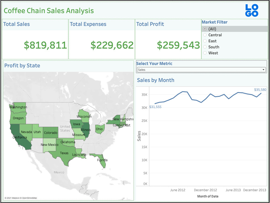
Figure 10.1: An example dashboard using coffee chain data
As you can see, the dashboard takes advantage of many Tableau capabilities, for example, chart types, titles, parameters, and filters. Each component of the dashboard content—the chart, map, and three calculated value panels—uses individual worksheets you have built from your dataset. This enables us to create a dashboard by inserting the selected worksheets and their related parameters, filters, and legends into a dashboard framework. Note also the symmetry in how the elements flow from top to bottom and left to right, with summary values at the top of the page followed by more detailed data as you move from top to bottom. Colors are harmonious and limited throughout, font sizes are consistent at each level, and element sizes within the graphs are minimized so viewers are not distracted by a lot of visual noise. The dashboard is very easy to read and navigate.
Contrast this with the following poorly designed dashboard using the same elements, but not maintaining best design practices.
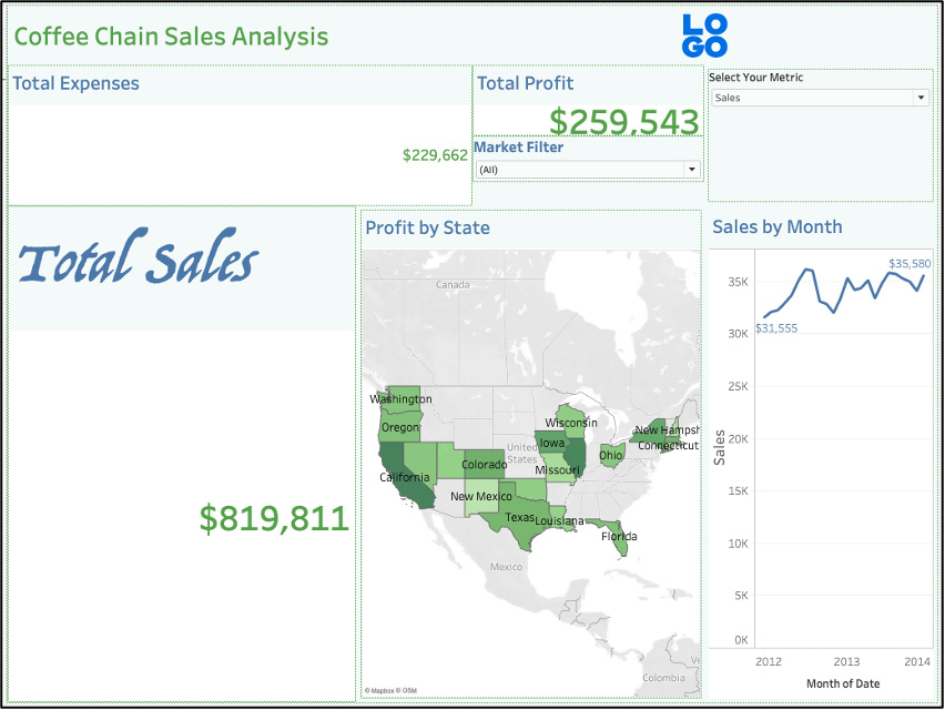
Figure 10.2: An example of poor dashboard design
Even though this version maintains the same top-to-bottom flow, it reveals multiple design flaws that make it more difficult to read while adding no additional value:
- The top level uses different font sizes across the two summary elements.
- The next level uses fonts that are too small to have an impact as well as inconsistent title formats.
- The chart is too small for the size of the dashboard to use it effectively.
This comparison should give you some ideas about the importance of good versus bad designs, and I am pretty sure that, as an analyst, you have probably seen worse dashboard designs, but this should give you some ideas on the importance of consistent and appropriate sizing, text, and color on a dashboard.
Now, let's move on to an overview of the design principles to follow for the creation of an effective and attractive dashboard.
The Basic Layout
A Tableau dashboard is simple in concept; however, it can be challenging for new users to implement. Even experienced users find dashboard designing to be one of the more challenging aspects of Tableau. Designing a Tableau dashboard is not simply a matter of dropping elements on a canvas, shifting, and resizing them to fit perfectly on a page. Instead, you need to use a combination of objects, such as textboxes, images, horizontal/vertical objects, and web page objects (we'll often use the term containers) populated by worksheets you have created previously, combined with images, text, and other related elements. While there is a bit of a learning curve, the result is the ability to create dynamic, attractive dashboards filled with information and insights for our users.
In the design process, you can combine the best data visualization practices for spacing, sizing, layout, color, and user interaction with the many tools provided by Tableau to create powerful and intuitive dashboards. A helpful source for best practices can be found here: https://www.tableau.com/learn/articles/data-visualization-tips. In this section, you will first cover some best practices before moving on to using specific Tableau dashboard objects to display your information. Let's begin with general design practices.
Display Size
One of the first steps when designing a dashboard is to understand who the users are and how they will typically view the dashboard. You should understand whether our users will be working from a desktop machine, a laptop, tablet, or another mobile device. Think of display sizes as the size of the canvas that you have to decide on when building the dashboard; you should adapt your display size based on the expected use case of the dashboards – either on a laptop, desktop, or mobile device. If users have oversized monitors, you can potentially increase the size of individual items within the dashboard for better readability. Fortunately, recent versions of Tableau enable the designer to view a dashboard in multiple end user formats – you can see how your dashboard appears to both a laptop user as well as someone viewing from a mobile device.
Positioning
Positioning refers to the effective design of a dashboard layout, with related items grouped, and primary metrics given the optimal position on a dashboard (shown below in the next figure) typically at the top of the dashboard. For Western cultures, the flow is from left to right and top to bottom, as though the user is reading a book. To optimize our design, you should therefore place the most important metrics at the top of the page, with secondary measures placed below. Ideally, you can group supporting metrics on the same side of the page as a related primary metric so that the user can easily follow the flow of the dashboard.
Here's a general framework for how you want to position content on a page, using your final dashboard:
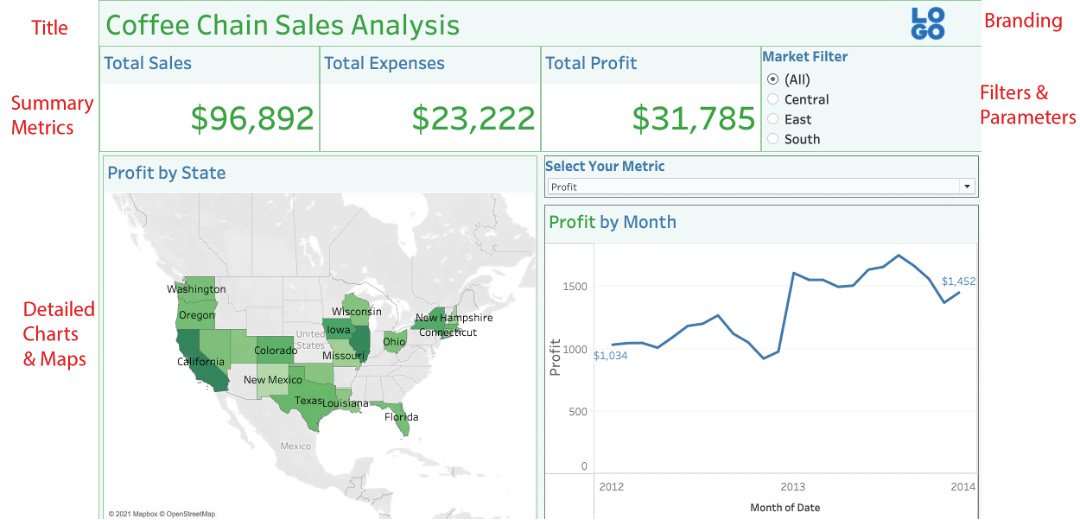
Figure 10.3: General structure of a dashboard
The idea is to have an informative title at the top of the dashboard while making efficient use of the valuable space on the page. This is typically followed by a section with summary metrics that an executive might be more likely to view. Detailed charts or tables come next; this is the section where regular users will need to be able to filter the data to understand more granular details. Finally, you will generally place your filters to the far right, an area where screen real estate is less valuable – or you can use a sliding panel to hide the filters until they are needed. Always remember that the most valuable visual space in Western culture sits at the top left of the page, so you should avoid cluttering that area with filters, images, logos, or detailed charts.
Spacing
One of the key considerations in dashboard design is to allow adequate whitespace for users. If dashboard elements are crowded together, users will have a difficult time understanding each element, and the overall impact will be less than optimal. Incorporating spacing using the Tableau Blank object (a blank container that gives you the ability to add spacing and/or other visual elements on the dashboard) can make a dashboard easier to read and ultimately more impactful. The Blank object can be found on the Tableau Objects tab adjacent to other elements such as vertical and horizontal objects.
Notice in the preceding example how elements can "breathe;" they do not run into one another or seem crowded at any point. This also helps viewers interpret the flow of the design, as they can easily navigate from top to bottom and left to right without any confusion.
Colors
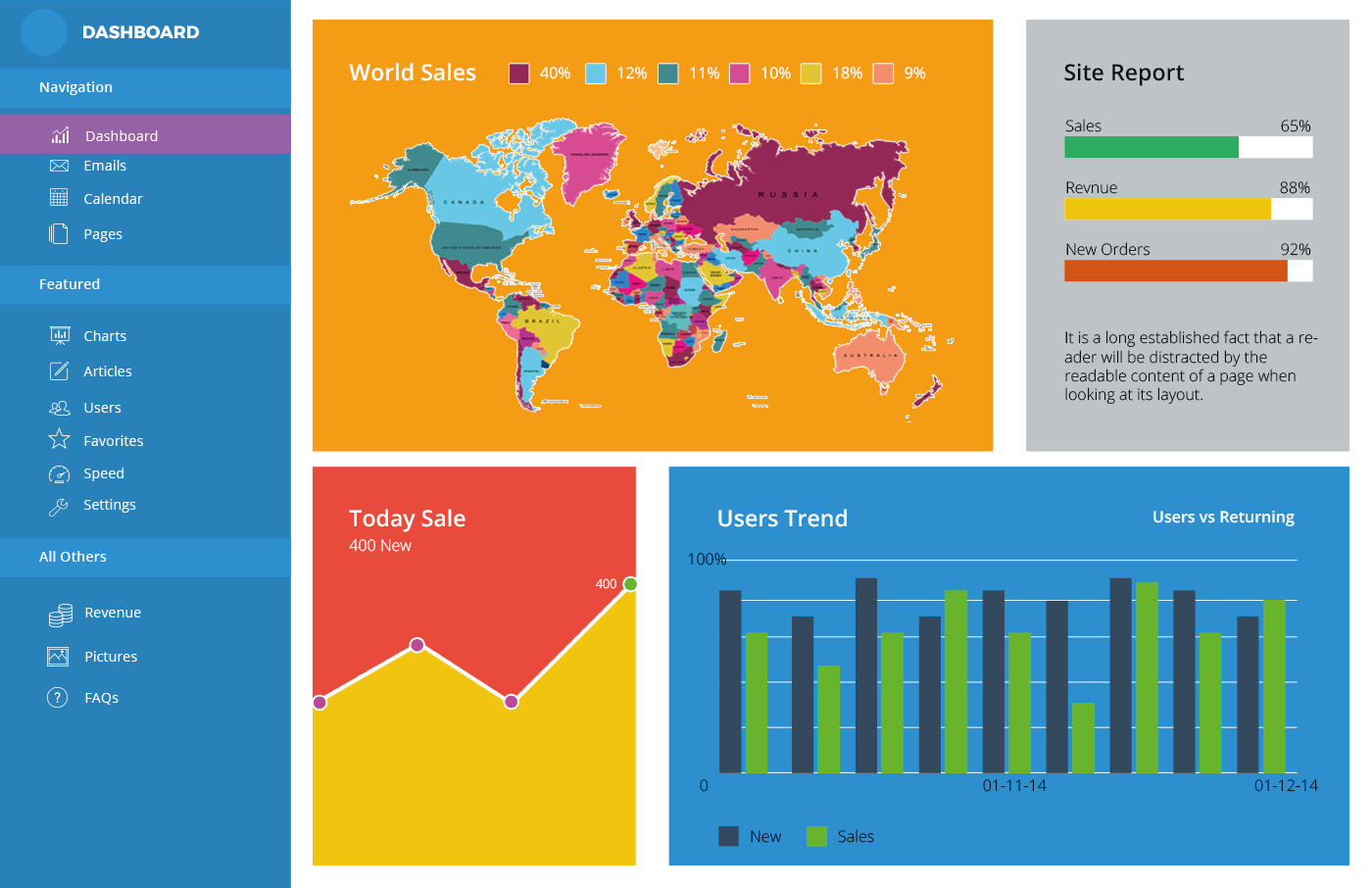
Figure 10.4: An example of a visually unappealing dashboard
As a dashboard designer, you need to resist the temptation to use too many contrasting colors (as pictured above), which can ultimately confuse or mislead the user. The human visual system has limitations on how many colors can be processed at a single time, so dashboards exceeding that level will look visually chaotic and lose their impact. Here are two useful references for working with color: http://www.perceptualedge.com/articles/visual_business_intelligence/rules_for_using_color.pdf and https://colorbrewer2.org. Ideally, our dashboard should use just three to four colors or brand palettes in a consistent fashion, making it easy for users to identify common elements across multiple charts. As we'll see in later examples, Tableau makes it very easy to change colors using one of the many available color schemes.
Our finished dashboard follows this principle by using a single primary color for the summary section, a second main color for the charts, and a consistent color scheme for the two maps. Overall, this provides a harmonious look and feel to the dashboard.
What happens when you try to use too many colors? Here's an example:
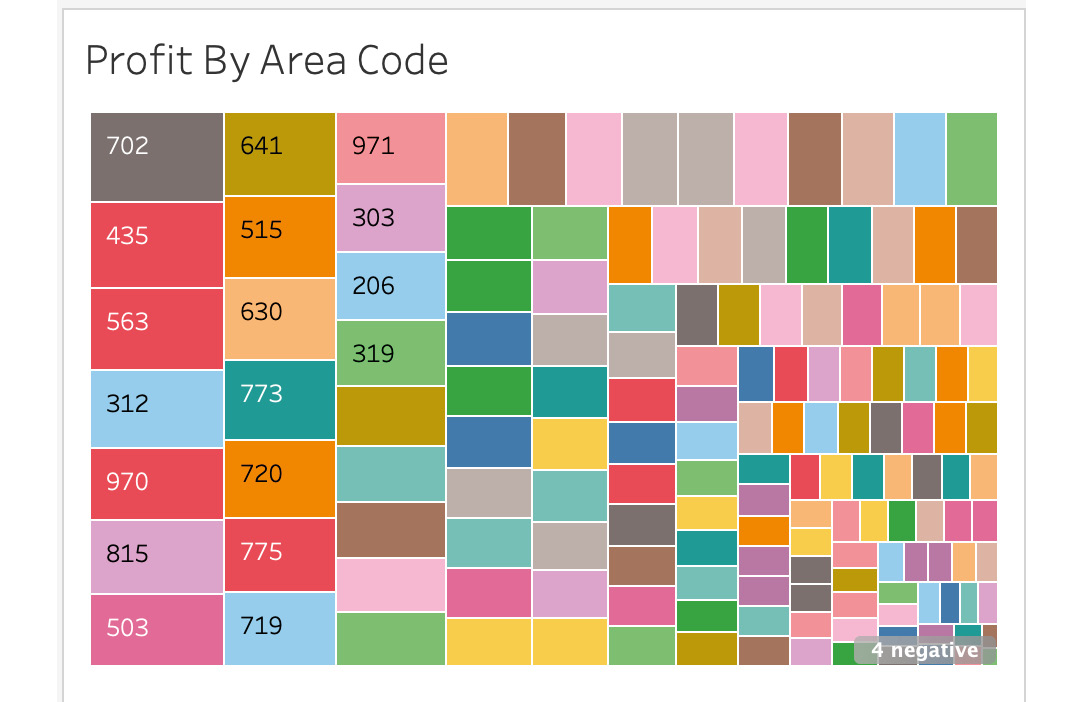
Figure 10.5: Excessive use of color in a chart
You now have a color for every area code in the area chart, but to what end? There are now 100+ colors, many of them repeated three or even four times. Even if you had a color palette with 100 unique colors, many would be difficult to distinguish from similar colors. All you have done is introduce more work for the viewer; instead of focusing solely on the distribution of the data points, the user will spend time attempting to decode what each color represents. It is important to remember that color should be used only when it adds to the story; in the preceding case, you could use five colors to highlight states at a regional level. This might show meaningful patterns without overwhelming the dashboard user, while also utilizing other chart types if possible.
Size
Given that dashboards have limited space, proper sizing is critical. Sizing is related to positioning as well; if you strive to size elements consistently, our user will see a natural flow to the dashboard and will focus on content rather than navigation.
Size can be thought of in two ways; the first refers to the size of individual elements (charts, summary numbers, and so on) in a dashboard. In other words, the physical footprint of each element composing a dashboard.
The second use of size refers to how you design individual items within a larger element. For instance, you need to decide how large chart titles will be, as well as labels, bar and line sizes, and other similar attributes. If these items are too large, our dashboard becomes cluttered, and the actual information may become overwhelming. If they are too small, the user may have a difficult time interpreting the information within each dashboard element. You need to strike a balance where information display is maximized and supported by the proper use of titles, labels, and other chart elements. Here are examples involving the proper and improper sizing of marks:
Figure 10.6: Sizing marks is important for readability
While the marks on the left appear small, remember that they will appear larger when a worksheet is added to a dashboard due to the condensed sizing in a dashboard. The chart on the right already has marks that are so large that the result is the occlusion (overlap) of data points. When placed in a dashboard, these marks will appear even larger due to the reduced space given to the chart. The recommendation here is to make your marks small and then adjust their size once the chart has been added to your dashboard.
Text
How you use text in a dashboard is another important consideration. While the proper use of text may seem like a secondary consideration in a dashboard design, you need to recognize that poor use of text elements may discredit the rest of the dashboard. As with color, you want to minimize the number of fonts used, ideally limiting ourselves to two or three fonts per dashboard. Text style should be consistent across all individual chart titles and labels, and you might select a second font for titles or tooltips. The goal is to use a very legible font style and to have text support the information without being overwhelming.
Notice the use of font sizes in our dashboard example previously, and how they are sized consistently within each type of object. Also notice the relative sizes and how larger fonts are used for titles and summary metrics, while filters and legend text are much smaller.
Exercise 10.01: Text Formatting – Workbook versus Worksheet
In this exercise, you will review different text formatting options that Tableau offers by using the Sample – Coffee Chain dataset and exploring the formatting pane.
Here is the data download link: https://packt.link/zT15G.
- Open Tableau and load Sample – Coffee Chain data into your Tableau instance.
- Format at both a workbook level as well as at the level of individual elements. Navigate to Format | Workbook in the menu bar. Here is what you should get:
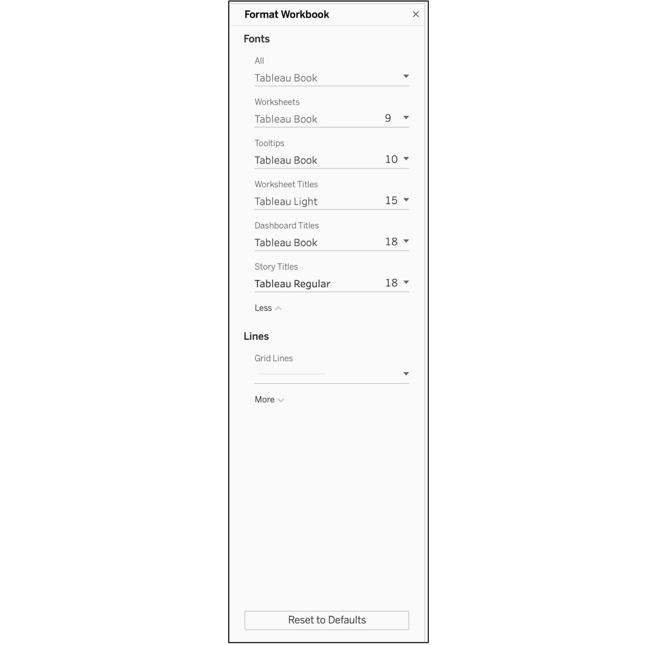
Figure 10.7: Format workbook options
This allows you to set global options for the workbook that also apply to your dashboard styling, making it a nice way to establish a consistent visual look.
- Note that it is possible to override these options on any individual sheet or text object by selecting the Format menu command. Format an individual worksheet, which is a two-step process – first, right-click in your blank work area and select the Format option. This will open a tab to the left of the workspace, which is the second step for editing Font, Alignment, Shading, Borders, and Lines at the Sheet, Row, and Column levels.
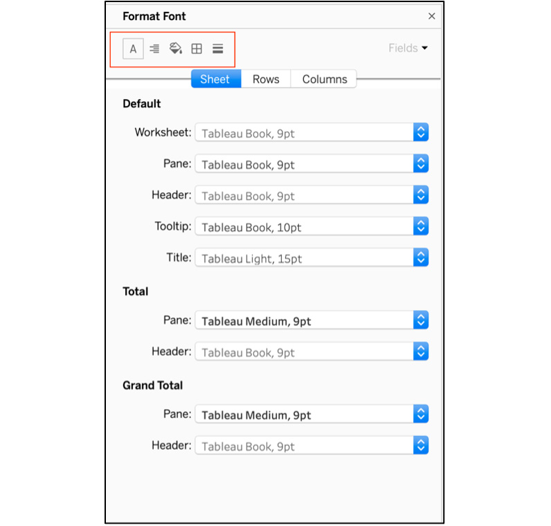
Figure 10.8: Object formatting options
These are the text formatting options at Workbook (complete report/dashboard) as well as Worksheet (individual sheet) level in Tableau. While this exercise was very limited in scope, it should have allowed you to gain some basic familiarity with text formatting before progressing to more complex elements in later sections, including Tableau interactions and objects you will use for your dashboard interaction.
Most dashboards require some level of interaction on the user end. Filters are a common means provided for user interaction, but you can also design using actions, tooltips, and highlighting to make a dashboard come alive. Tableau provides dashboard designers with multiple tools such as tooltips, actions, parameters, and more; the challenge lies in making them fit seamlessly so that they enhance the user experience. Here is a brief summary of these tools:
- Filters allow users to easily reduce or customize data displayed within a dashboard.
- Parameters often work like filters but can be customized by the dashboard designer to limit or direct user interaction.
- Actions are set up at the dashboard level to apply rules based on when and where a user clicks on an element in the dashboard.
- Legends can be used to provide context and allow users to highlight specific data elements.
- Highlighters may be used to show linked data elements across multiple charts or tables.
You want to keep these tools as unobtrusive as possible, leaving the primary canvas space available for the important content. Therefore, you will usually place them on the right side of a dashboard page, or even hide them on a sliding panel so you can maximize display space. You have covered these previous chapters, and this chapter, you will use the same interactive elements in dashboards.
Dashboard Objects
Objects are Tableau elements used to build a dashboard and are typically found at the lower left of the dashboard window. You may consider them to be modular pieces that can be combined in endless ways to create a dashboard. Some will be used as containers for previously created Tableau worksheets, while others contain external or newly created content. Most can be used together to build a custom experience for the user. With objects, you can completely customize each dashboard you build.
Now let's consider each object type in detail.
Vertical Objects
Vertical objects are frequently used containers designed to display one or more Tableau worksheets within a dashboard. They may be used as a standalone container within a tiled framework, or they may reside inside an existing vertical or horizontal container. In other words, they can be nested multiple times within a single dashboard, although there are practical limits to this approach, as we'll see soon. Vertical objects can also be used as floating containers, where the onscreen positioning is specified by the designer.
Use vertical objects to assist in laying out your dashboard from top to bottom; you can then easily add charts, maps, and other worksheet types inside each vertical container.
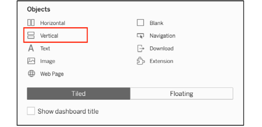
Figure 10.9: Selecting the vertical object
Vertical objects are likely to be the most used object type on many dashboards given their versatility, and their ability to nest multiple containers within a single master object. Our example dashboard uses vertical objects to contain most of our chart content. In most cases, our vertical containers will have a fixed set of coordinates (x, y, width, and height) based on their position within the dashboard, but you can use them as floating containers with a set of coordinates that allow the container to float outside of the dashboard structure. To set the floating option, right-click inside a vertical object and select the Floating menu option.
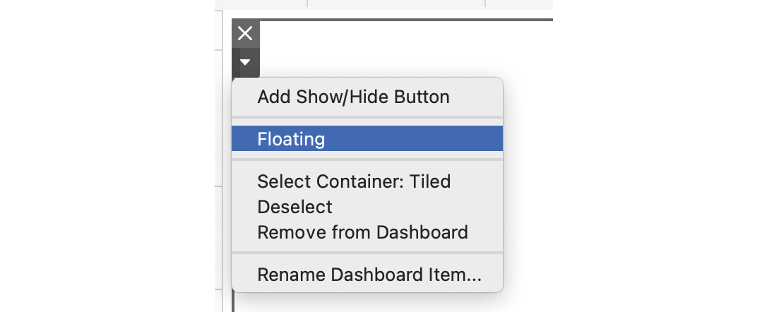
Figure 10.10: Creating a floating object
This will create a small window where you use the Layout tab to adjust the coordinates.
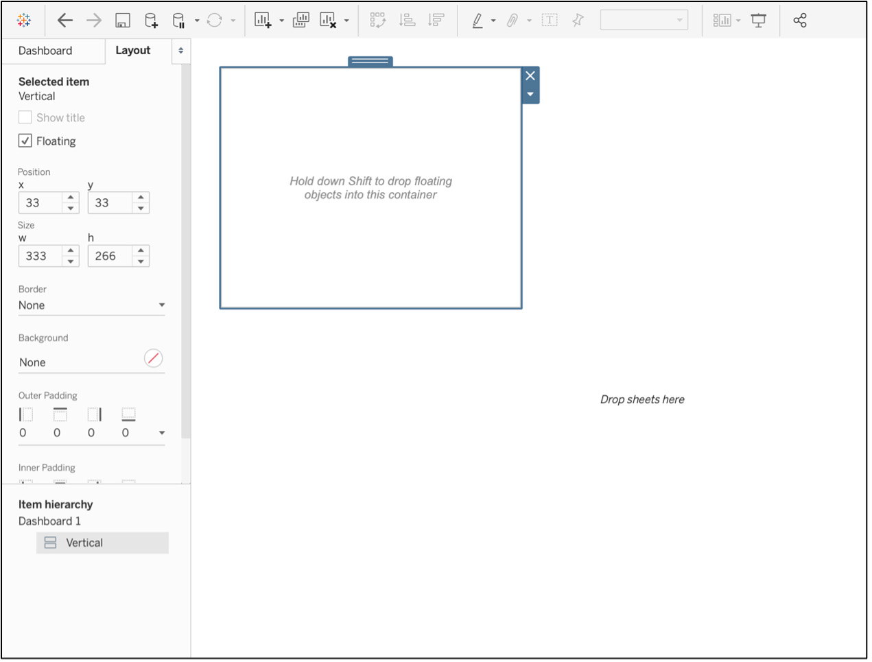
Figure 10.11: Positioning a floating object
Once the x, y, w, and h values have been set, the container will reside in that position, regardless of the positioning of the other non-floating objects. Be careful in how you use floating objects so that they do not interfere with the data display in your dashboard.
Horizontal Objects
Horizontal objects are frequently used containers designed to display one or more Tableau worksheets within a dashboard. They may be used as a standalone container within a tiled framework, or they may reside inside an existing vertical or horizontal container. As with vertical objects, they can also be used as a floating container, where the onscreen positioning is specified by the designer.
You often use horizontal containers to position dashboard elements from left to right within the dashboard. A typical use case might be to display three separate charts side by side inside of an existing vertical container. When used together, vertical and horizontal objects can help us to design dashboards that are symmetrical and balanced from top to bottom and left to right.
To add a Horizontal object, select the Horizontal icon from the Objects tab and drag it to the appropriate location in your dashboard.
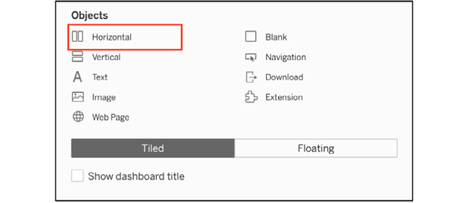
Figure 10.12: Selecting the horizontal object
Horizontal containers are used in much the same way as verticals and can also be nested multiple times. You can think of vertical containers being useful for laying out the north-south flow of the dashboards, with horizontals used for the east-west layout. Most complex dashboards will have both types in operation.
Text Objects
Text objects are used primarily for fixed titles and Tableau workbook metadata such as the workbook name or sheet name. Text objects may also use parameters to create flexible titles or text within a dashboard. For example, a date parameter could be used to display the date range selected by a dashboard user.
To add a Text object to a dashboard, you again use the Objects tab, this time selecting the Text icon and dragging it to a specific location within the dashboard.
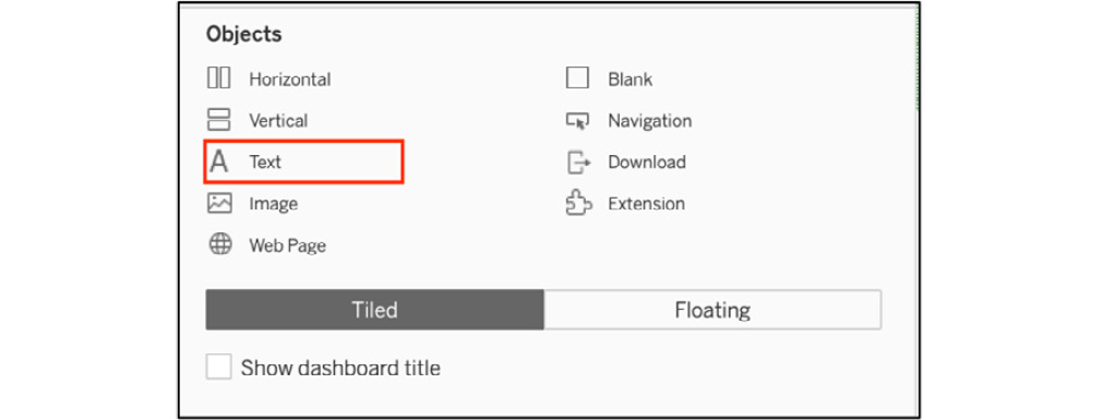
Figure 10.13: Selecting the text object
When a text container is dragged to a dashboard canvas, you will see the following (we've added some sample text here):
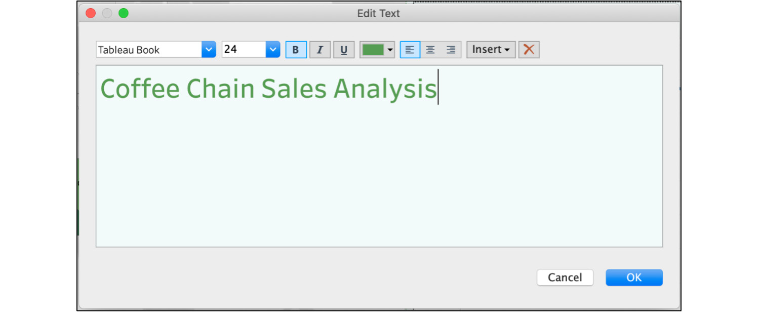
Figure 10.14: Viewing the text window
As you can see, the text can be fully styled by selecting a specific font, font size, style, and alignment from the menu bar in the text object window. These qualities make text objects more powerful than they first appear, as you can use them to customize our dashboards with additional notation or titles that are not bound to specific charts or other dashboard elements.
Image Objects
Image objects can be used to display nearly any popular image format within a dashboard. This is an easy way to insert logos, marketing materials, or other relevant visual content. Both local and web-based images can be inserted anywhere on a dashboard.
To add an image to a dashboard, go to the Objects tab and drag the Image icon to a spot in the dashboard.
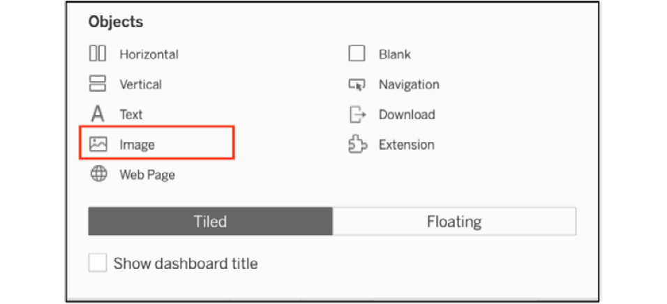
Figure 10.15: Selecting the image object
When an image container is dragged to a dashboard canvas, you will see the following:
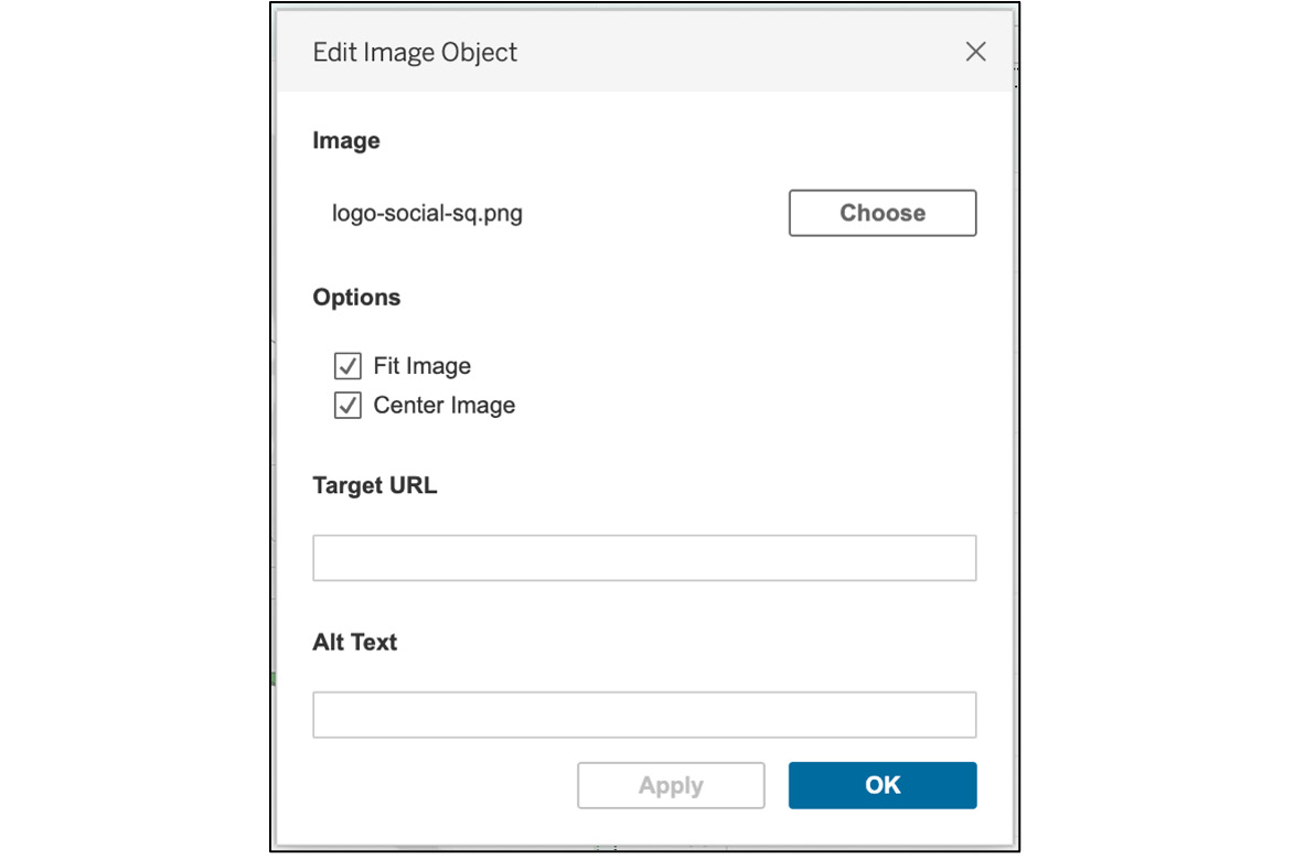
Figure 10.16: Editing an image object
You may select a local image file by clicking the Choose button, or you can use a URL address to provide an image to the dashboard. In either case, it is possible to both fit and center the image inside the container to ensure it works well with the look and feel of the dashboard. Images can be used to display corporate logos, marketing slogans, or other relevant visuals.
Web Page Objects
A web page object makes it very easy to display web content y entering a URL address. This can be useful for displaying external content such as a landing page for a product or marketing campaign side by side with metrics from the page.
Once again, you navigate to the Objects tab to select the Web Page option, which can then be dropped inside the dashboard container.
Figure 10.17: Selecting the web page object
When a web page container is dragged to a dashboard canvas, you will see the following:
Figure 10.18: The URL window for a web object
Simply enter the URL link and your dashboard will have an embedded web page. This feature should be used with care, given the limited available space on a dashboard.
Blank Objects
Blank objects are used to create spacing within a dashboard, either between objects or around the margins. They prove highly useful for creating a dashboard where the individual elements can "breathe" due to the empty space surrounding them. This often has a positive impact on the readability of a dashboard. Blank objects are also useful for centering legends and helping to align margins between the chart elements.
To add a blank object, navigate to the Objects menu and drag the Blank icon to the dashboard container, typically placing it between charts or around the edges of the dashboard to improve spacing and readability.
Figure 10.19: Selecting the blank object
In many cases, blank objects will have a fixed minimum width or height, depending on where they are inserted. Tableau defaults to 32 px, and this is the normal minimum whenever you drag an object onto the canvas, which turns out to be a nice size for providing space between elements on a dashboard. There are instances where you have full control over their width or height, depending on how they are used inside or between other objects. Blanks can be a bit tricky to use, so be patient and recognize the benefit they add to the appearance of your dashboard.
Navigation Objects
The navigation/button (Tableau 2020.3 and older) object is a recent addition to Tableau and can be used to facilitate easy navigation from the dashboard to another sheet or dashboard within the same workbook, or even to an external resource. Text or images may be used, allowing for a customizable experience using a logo or tagline. Note that this feature was first available in Tableau 2018.3; earlier versions will not have the Button object. You can find the Navigation/Button object icon on the Objects tab; drag it to your chosen location in the dashboard.
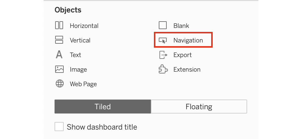
Figure 10.20: Selecting the button object
When a button container is dragged to a dashboard canvas, you will initially see a large arrow, but after selecting the Edit Button option, here's what appears:
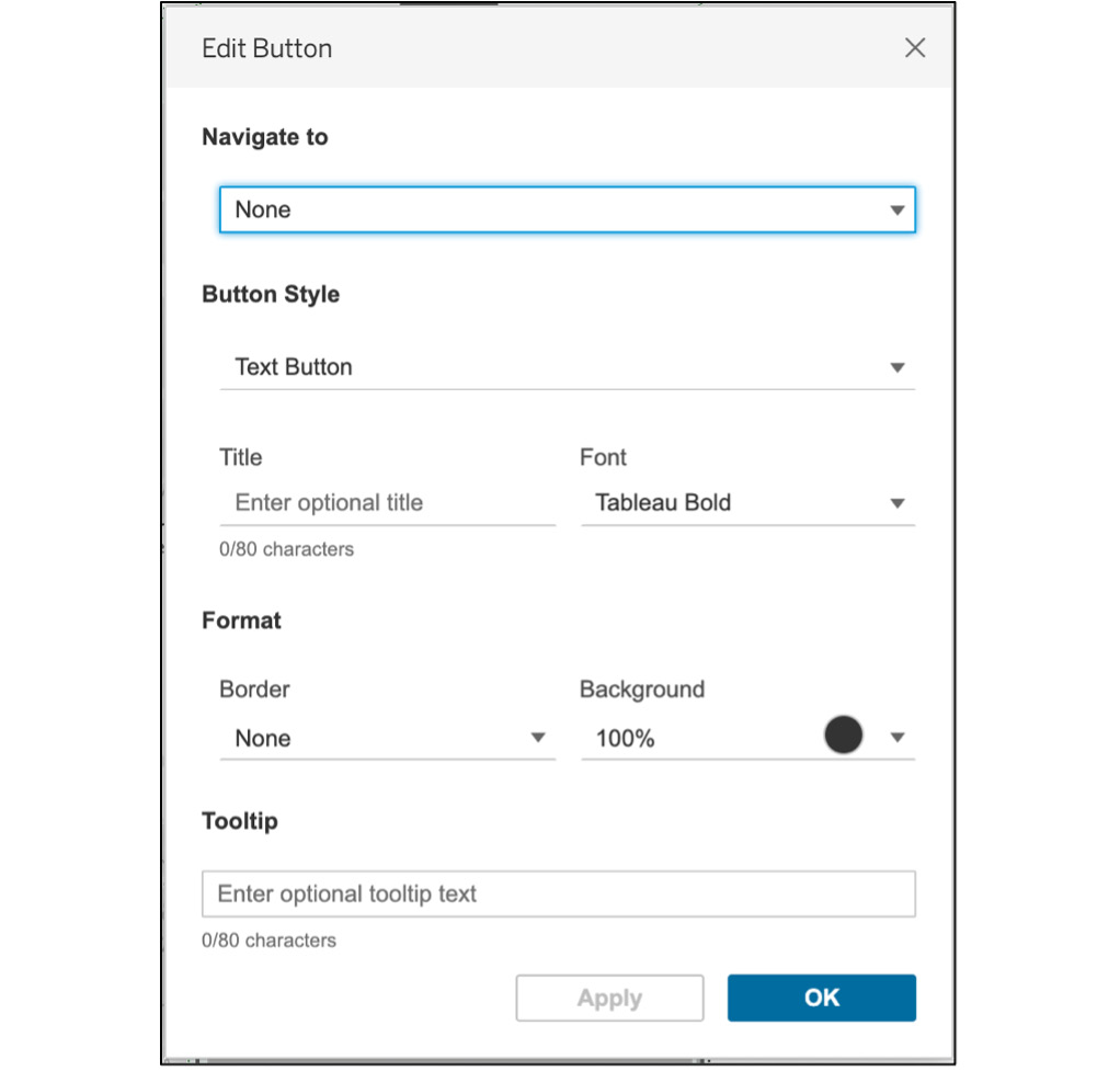
Figure 10.21: Editing a Button object
This option can be a great way to customize a dashboard using carefully selected imagery and can also display a helpful tooltip to guide the dashboard user. You can also change the button image to add more design elements to your dashboard.
Extension Object
Extension objects are used to increase the functionality of a dashboard with third-party applications developed for Tableau. Note that many of these extensions will incur an additional cost based on the number of users and the duration of the license.
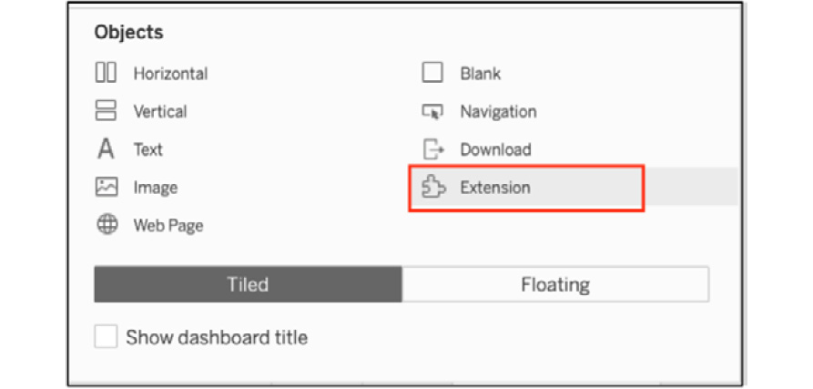
Figure 10.22: Selecting the extension object
You won't cover extensions in detail here, but they are worth exploring to find functionality that may prove beneficial for your dashboard. Many help integrate Tableau with data science functionality, while others extend Tableau data display options, enable geospatial integration, or allow custom scripting. More information can be found here: https://help.tableau.com/current/pro/desktop/en-us/dashboard_extensions.htm.
Using Floating Objects
Before moving on, we'll briefly revisit the floating option for objects. In most cases, you will opt for the default tiled selection, but there are some use cases where floating containers make sense. Here are two potential use cases:
- Perhaps you wish to overlay some content in a specific location on the dashboard. While this can often be done using the traditional tiled approach, a floating container gives us complete positioning flexibility. You can set the x and y locations and specify the exact width and height of the object. This can also be useful for button objects, as you can place them discreetly in small sections of unused display space.
- You can also use floating containers (vertical or horizontal floating objects) to embed charts that can be controlled by a user through a parameter. This is useful in cases where you have more charts than a dashboard can reasonably hold. You can display the primary charts in a tiled format, and then leave some space for displaying a single chart based on a user selection. Each chart will have the same x-y coordinates and width and height attributes, so they are essentially stacked. However, only one can be displayed at any time, based on a parameter.
Take some time to explore the floating option, even though you might only use it sparingly. It has been valuable for each of the use cases above and many other such use cases.
Exercise 10.02: KPIs and Metrics View
You are the supply chain analyst of a coffee chain company, and you are required to build a high-level dashboard for the lead executive who wants to get a holistic view of sales, profit, and expenses by market and state, as well as understand the trends over the last 2 years.
You will now create three Scorecard worksheets, one line chart for each metric in a view, as well as a Profit by State geographical view. You will also add parameter metrics swapping, which you learned in the previous chapter, and use Filter Dashboard actions to filter the dashboard based on the state selected from the map view.
Worksheet 1-3: Total Sales and Other KPIs Worksheet View:
- Open Tableau and load Sample – Coffee Chain data into your Tableau instance.
- Create a new worksheet once the data has been loaded. Drag Sales to the Text marks card, as shown:
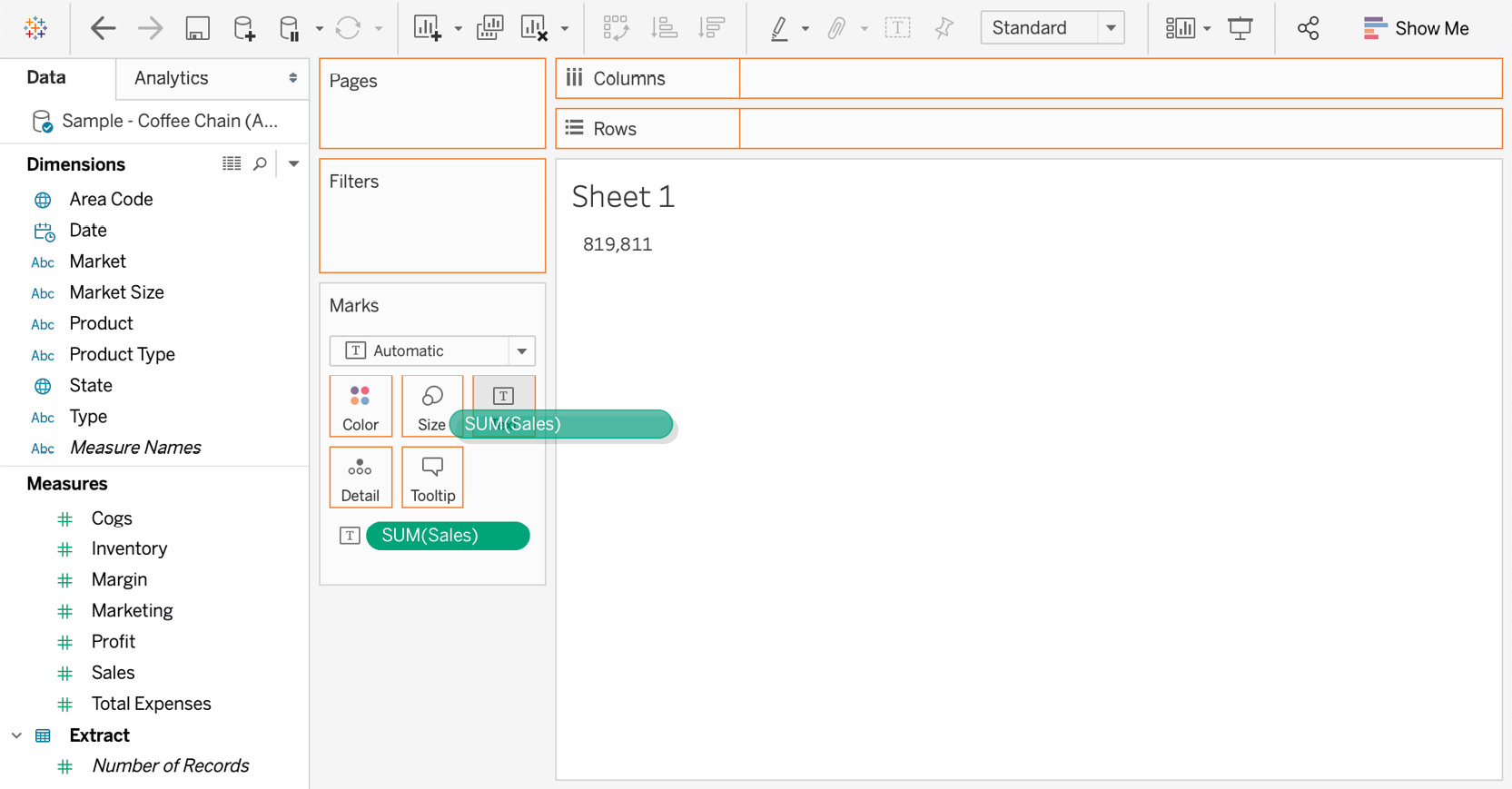
Figure 10.23: Dragging a measure to the Marks card
- Now that the total sale is shown as text, format the text to make it look more like the scorecard you want. Right-click on SUM(Sales) under the Marks card and click on FORMAT, as shown:
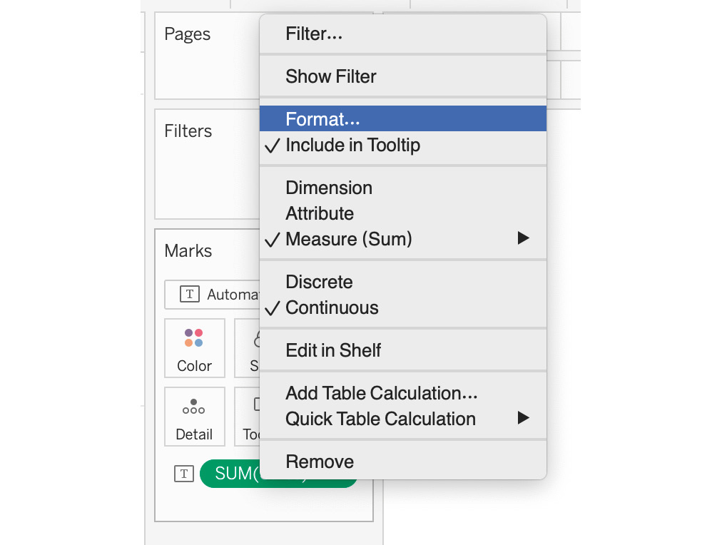
Figure 10.24: Formatting the measure
- Change the font size to 28, the text format to bold, and use the color of your choice. The following screenshot will show what this would look like if you had opted for green:
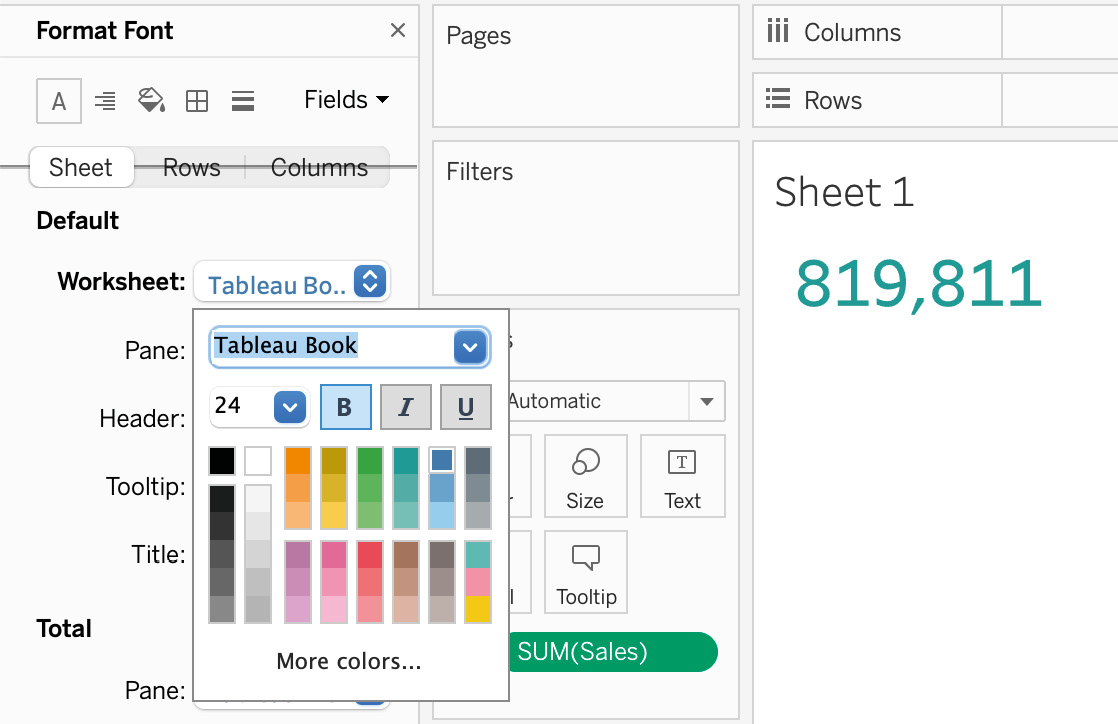
Figure 10.25: Changing font sizes and color
- Add a $ currency sign to your KPI as you are talking about Total Sales in dollars. Right-click on SUM(Sales) under the Marks card to format the table and, in the format box, click on Currency (Custom) to add a $ sign, as shown:
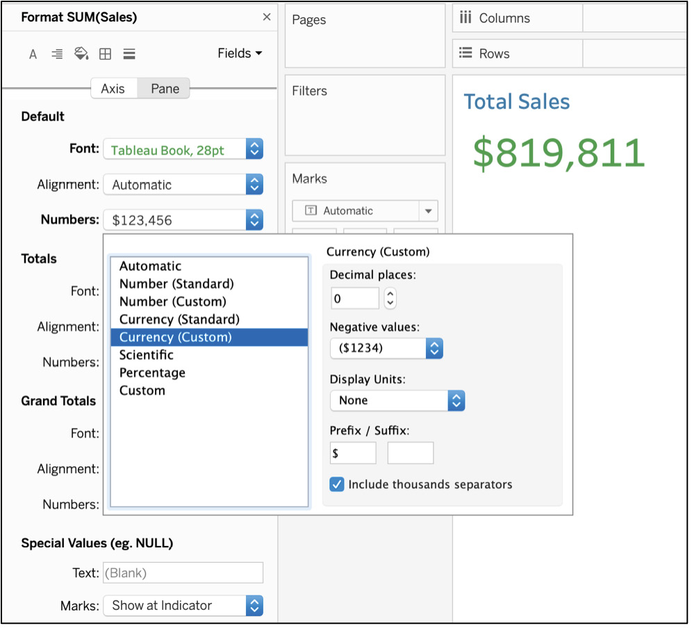
Figure 10.26: Adding a '$' sign to the number
- Update the title from Sheet 1 to Total Sales by double-clicking on the title, as shown here:
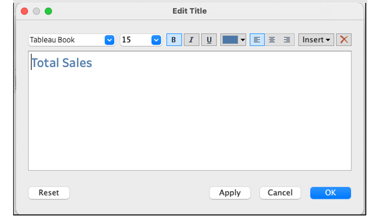
Figure 10.27: Formatting title
- Since you will be creating a couple more similar worksheets, rename the worksheet to a more descriptive name, such as Sales KPI or something similar.
- Duplicate the same worksheet and follow the same preceding steps to create Expenses KPI and Profit KPI worksheets, as shown here:
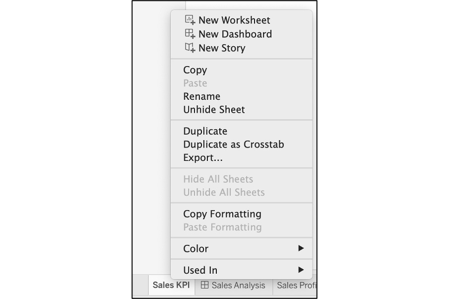
Figure 10.28: How to duplicate a sheet
- The Profit KPI and Expenses KPI worksheets should look like the following screenshots:
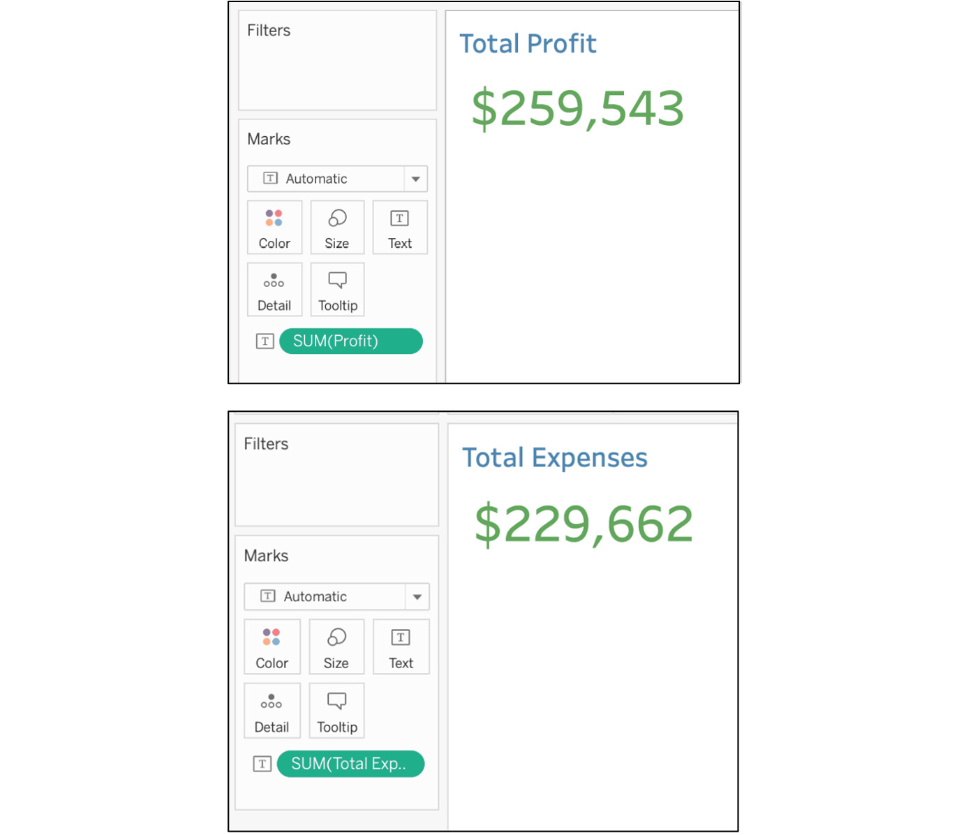
Figure 10.29: Two other scorecard worksheets
In this exercise, you created Scorecard-driven KPI designs and individually formatted the KPIs to reflect the overall formatting of the dashboard you are in the process of creating (Figure 10.3). In the next section, you will create a couple of worksheets, including maps and a dynamic measure-switching worksheet with parameters.
Exercise 10.03: Map and Parameter Worksheet Views
In this exercise, you will continue with the preceding example and create a couple more worksheets, including map view and parameter metric selection view worksheets.
Worksheet 4: Map Worksheet View:
- Continuing from the previous exercise, now that you have created the KPI view, create a couple more granular worksheets. One of these will involve creating a map view by states and color them by total profits, while the second worksheet will utilize parameters to give end users the ability to select their own metric view from the options given in the Parameter dropdown. Open Tableau and load the Sample – Coffee Chain dataset if you closed the workbook previously.
- Create a new sheet and double-click on State to create a map.
- If the following view is not created automatically, select the Marks dropdown and switch Automatic to Map:
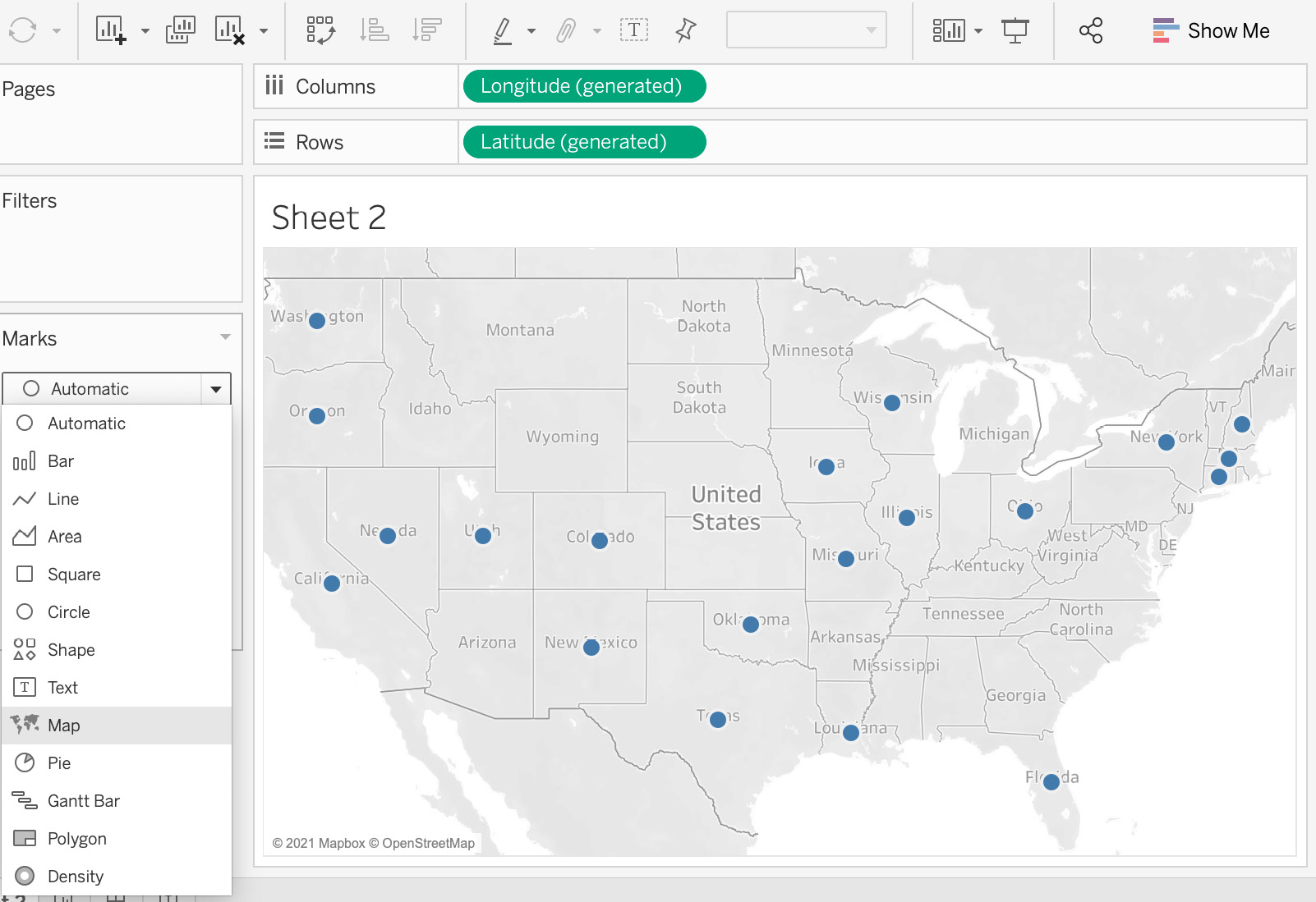
Figure 10.30: Converting the geo dimensions to a map
Note
For Step 4, your default view for maps may not be United States if you are not from the United States. To change the default country to United States, go to Map under Menus and click on Edit Locations and change your country to United States.
- Drag Profit to the Color marks card and State to the Label marks card, as shown here:
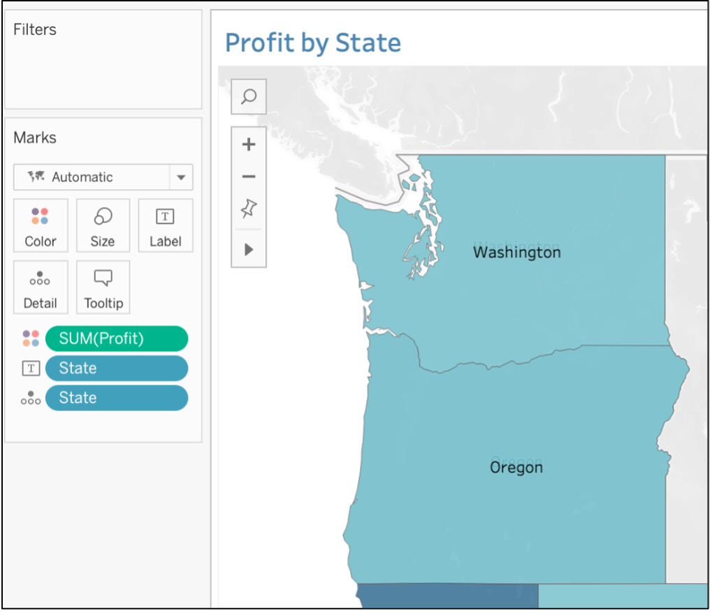
Figure 10.31: Filling the map by SUM(Profit)
Worksheet 5: Parameter Metric Selection Worksheet:
In the previous chapter, you created a similar parameter metric selection worksheet. You are going to create a similar worksheet here, wherein you will give end users the ability to select the metric the lead executive wants to view in the line chart/trend chart.
- Create a parameter by right-clicking on the data pane and selecting Create Parameter, name it Select Your Metric, and keep the data type as String and Allowable values as List, as shown here:
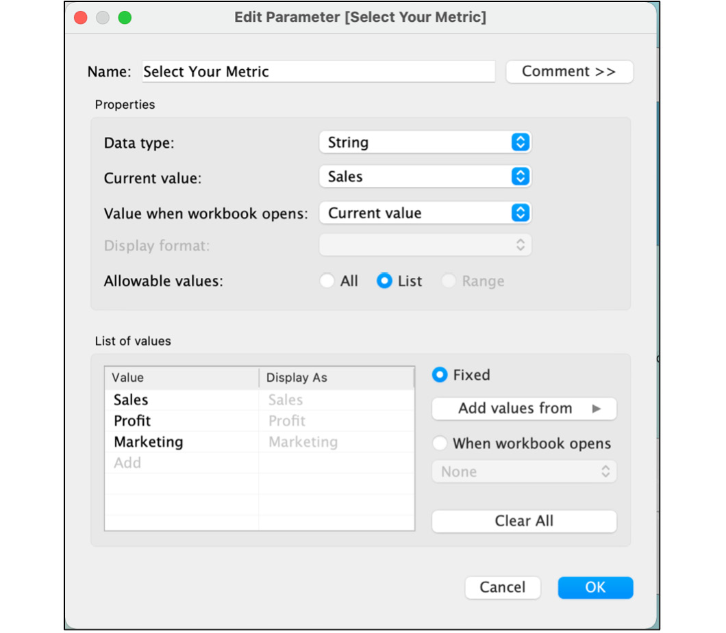
Figure 10.32: Creating the Select Your Metric parameter
- To use the Parameter selection dropdown, use this parameter in a calculated field using an IF ELSE or CASE WHEN statement. Here, you'll use the CASE WHEN calculated field to display appropriate measures depending on the parameter that will be selected by your dashboard user from the [Parameters].[Select Your Metric] parameter you created previously. Now, create a calculated field by right-clicking on the data pane and using the following formula, where you are creating a LOGICAL CASE statement that, when Sales is selected as the parameter, will show SUM(Sales), then do the same for Profit and Marketing.
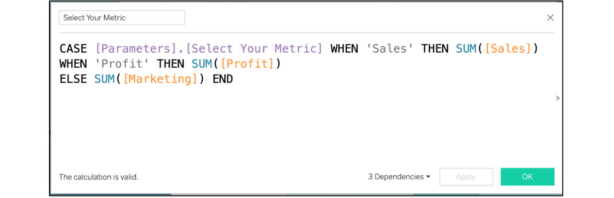
Figure 10.33: The Select Your Metric calculated field
- Now, use these calculated fields and parameters in your new worksheet. Create a new worksheet and drag MONTH(Date) to the Columns shelf and the AGG(Select Your Metric) calculated field to the Rows shelf, as shown here:
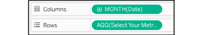
Figure 10.34: Adding date and select your metric calculated fields to the view
- If your date dimension is a blue pill or a discrete dimension, right-click on the dimension and select Continuous from the dropdown.
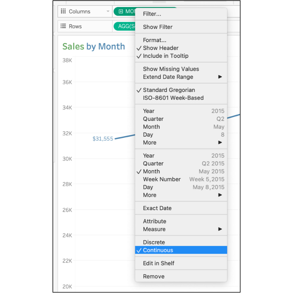
Figure 10.35: Changing the date to a continuous date
- Next, show your parameter in the worksheet. For that, right-click on the Select Your Metric parameter in the data pane and click on Show Parameter as follows:
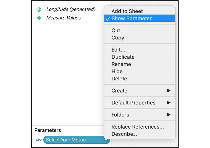
Figure 10.36: Show parameter
- To make the worksheet more descriptive, use dynamic titles. Double-click on Title and either click on the Insert dropdown on the right and select Parameters.Select Your Metric or type the exact text, as shown here:
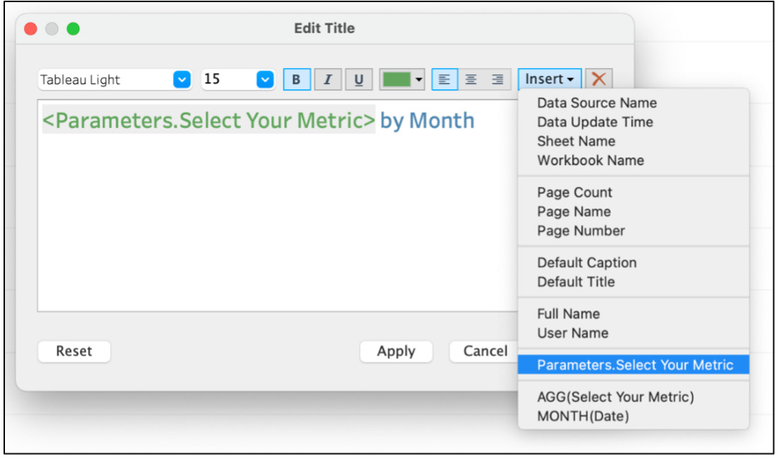
Figure 10.37: Inserting a parameter value into the title to make a dynamic title
- Finally, add the Select Your Metric calculated field under Label. Click on the Label marks card and show Select Your Metric under Line Ends, as shown here:
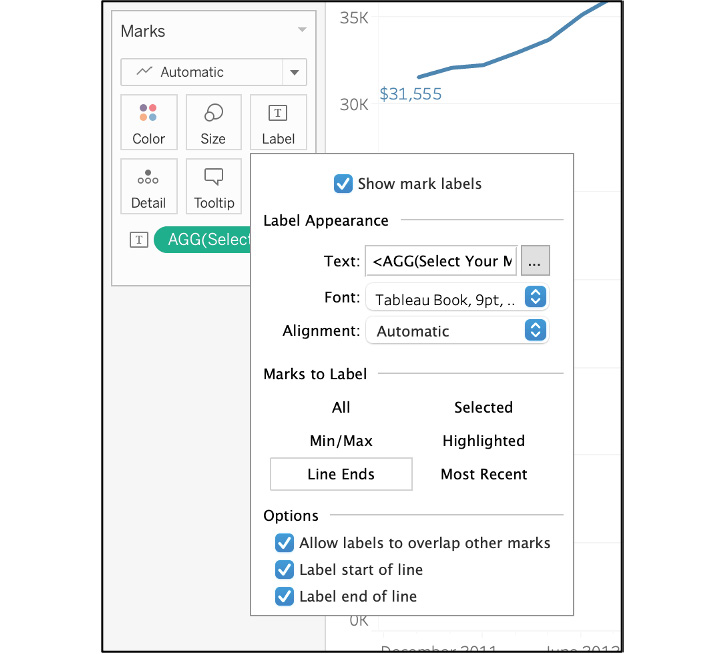
Figure 10.38: Showing labels only on line ends
The following screenshot shows what your final parameter metric selection sheet should look like:
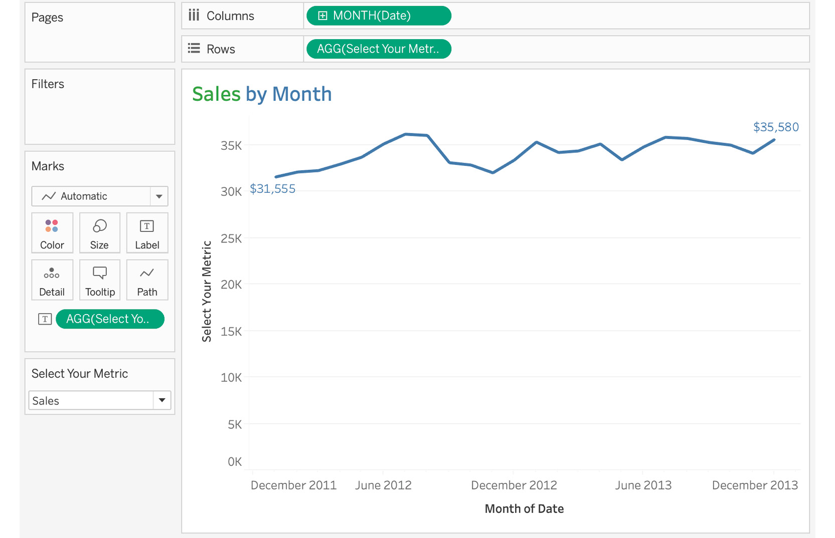
Figure 10.39: Trend analysis according to the metric selected
- In your final dashboard, you also have a Market filter on your dashboard. Add that as a filter to this view and apply it to all worksheets using this data source, as shown here:
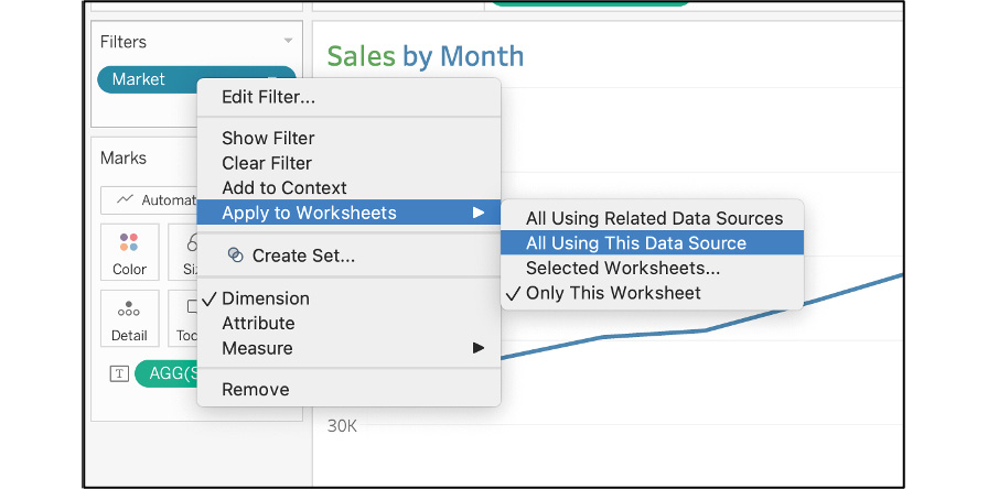
Figure 10.40: Applying the filter to all worksheets using this data source
This just about wraps up this section of creating individual worksheets. In the following exercise, you will start adding these worksheets to your Dashboard view, including additional elements to the dashboard, such as interactivity with the Select to Filter State dashboard action, dropdowns to filter the view, and adding your own branding elements.
Exercise 10.04: Putting It All Together: Dashboarding
In previous exercises, you created all the required worksheets that you wanted for your dashboard. Now it's time to put all of them on the same canvas called Dashboard and format it accordingly.
Perform the following steps to complete this exercise:
- Create the dashboard by clicking on the second icon at the bottom or navigating to Dashboard at the top menu bar and selecting New Dashboard as follows:
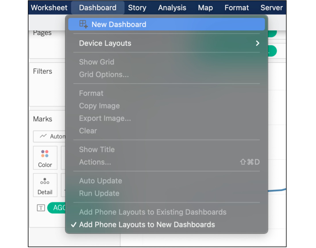
Figure 10.41: Creating a new dashboard
- To create a dashboard, first select the size of the canvas/dashboard. It's recommended that you have a canvas with a width of at least 1000 and a height of 800 as most laptops and desktops are at least that size. Select Desktop Browser 1000X800 as the canvas size but feel free to select the size that best suits your laptop/desktop.
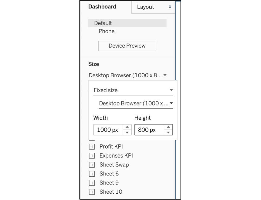
Figure 10.42: Choosing your dashboard size
Stick with tiled objects for the majority of the dashboard, unless you are in a situation where you need to add an object on top of another object or maintain a specific position for an object, which is not possible with Tiled objects. However, using tiled objects/canvases does allow you to control a lot of your objects and floating objects adapt to your screen size.
But before you start adding your worksheet to the view, it would be useful to start with a Vertical floating object overlayed by a Blank tiled object as it makes it relatively easy to place objects later, and the Blank objects also give you the buffer to place objects on the dashboard without moving other objects or messing up the dashboard altogether.
- Drag a Vertical floating object to the canvas first, then change the position of the Vertical object to be 0 on X axis and 0 on Y axis and change the width and height to the size of the canvas. Also, add a thick border so that when you add a tiled Blank object on top of the Vertical object, you can differentiate between these objects, as well as adding a light green background to create the white and green contrast.
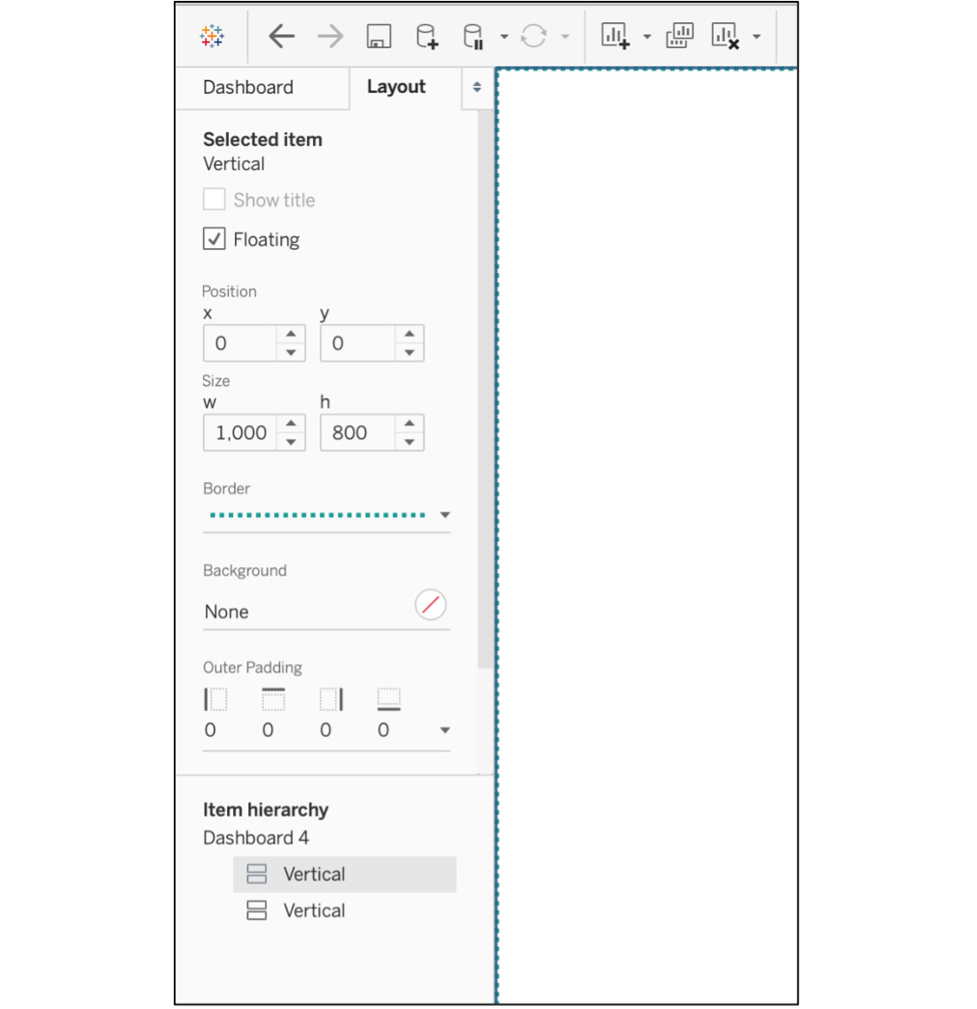
Figure 10.43: Formatting the vertical object, including position and size changes
Note
Vertical and horizontal objects are not required to create a dashboard, although they will make it much easier to build more detailed views. If you don't specify vertical and horizontal tabs in your design, Tableau will automatically arrange items in a Tiled hierarchy, unless you specify the object as floating.
- Click on the Tiles section now and drag a Blank object to the view and add a thin line border as well as an outer padding of 15 to create spacing between objects.
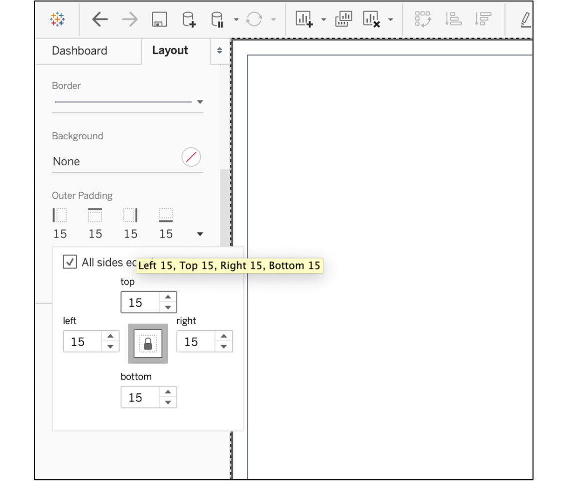
Figure 10.44: Adding padding for differentiation
- Now that the base is created, create your Header and Branding section. Your header is split into two sections: Title and Logo. To create these two sections, drag a tiled Horizontal object to the top of the view, add a border, place a Text object to the left of this newly created horizontal section, and name your dashboard Coffee Chain Sales Analysis, as shown in the following screenshot:
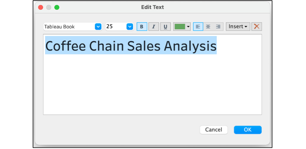
Figure 10.45: Adding a custom title to the dashboard
- Next, to add a logo to your view, use a tiled Image object, place it to the right of the Title object, and select your desired logo, as shown here:
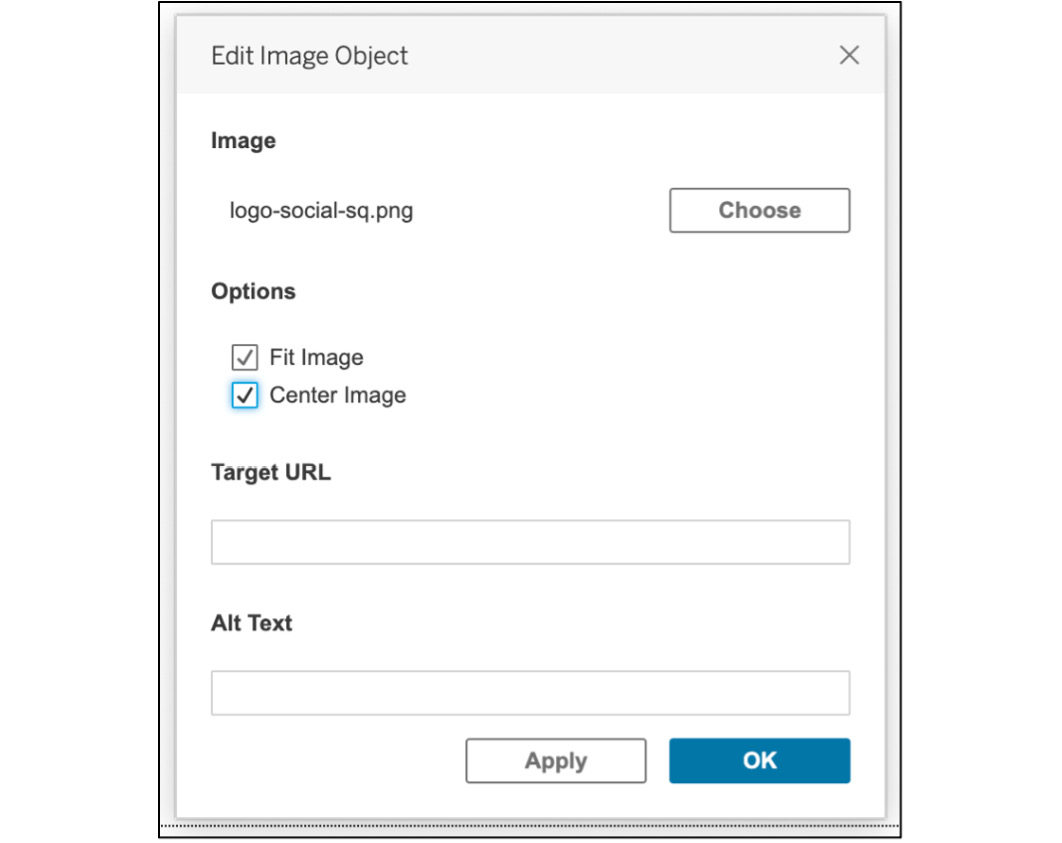
Figure 10.46: Adding a custom logo as a branding element
- If the logo you've added is too big, you can double-click the double line at the top (see arrow). Select the parent layout containers and resize the window from the bottom.
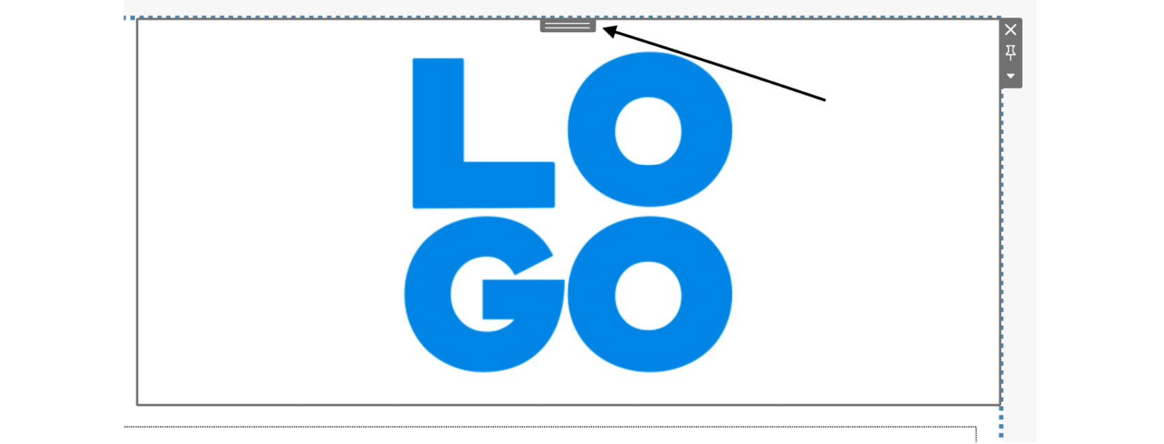
Figure 10.47: Double-clicking on the double line selects the parent container
- Now that the header section is ready, drag your Scorecards/KPI worksheets onto the view. But before that, you need to divide/create two sections for scorecards and charts later. Drag a tiled Vertical object right below the header section to create two sections for your use case.
Note
You have added red borders for descriptive and visibility purposes only. You will delete the border before finalizing the dashboard.
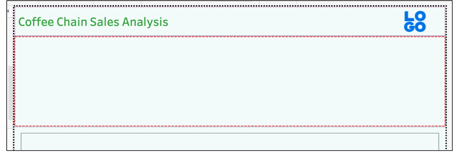
Figure 10.48: Scorecard section creation
- First, drag the Sales KPI scorecard to the section, and then add the Profit KPI and Expenses KPI scorecards to the right, as shown here:
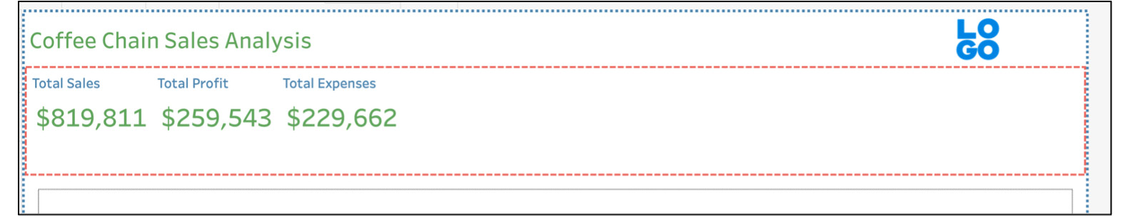
Figure 10.49: Adding scorecards to the view
- But there is an issue with the scorecards above; there is too much whitespace remaining on the right. To fix that, select the parent container by double-clicking the double line, clicking on the Options dropdown, and selecting Distribute Contents Evenly.
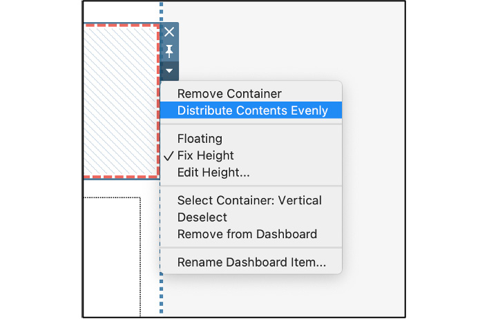
Figure 10.50: How to distribute contents evenly
- There is still a lot more whitespace left in each of the scorecards, as seen in Figure 10.50. To fix that, click on the individual worksheet dropdown again and select Fit -> Entire view, as shown here:
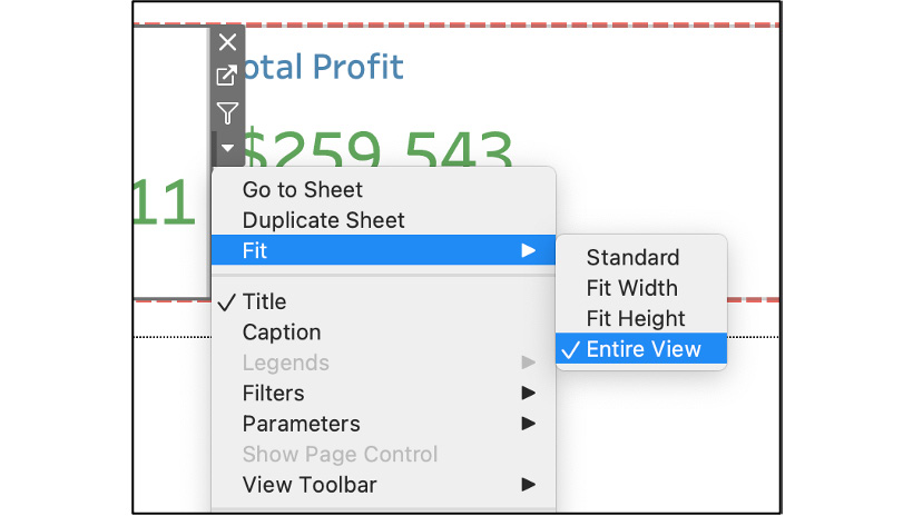
Figure 10.51: Fitting the worksheet to the entire view of the object
- Lastly, for this scorecard section, add a thin border line to help us differentiate between the KPI sheets, as shown here.
- Repeat Step 10, Step 11, and Step 12 for the other two KPI sheets too, and this should be the result. Remove the bold red border from the parent layout container as the purpose of the border was served.
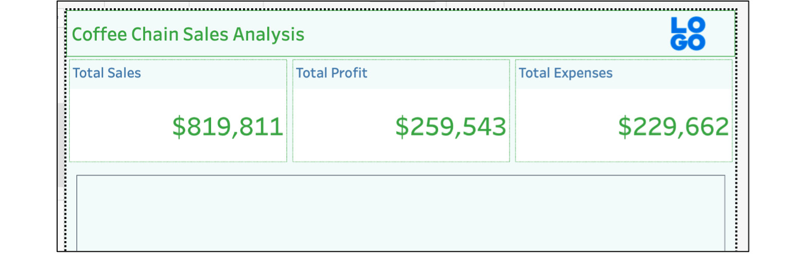
Figure 10.52: Header plus the scorecard view added to the dashboard
- Next, add your Map view as well as a Trends analysis view to the dashboard by dragging the Map View worksheet from Exercise 10.03 first and then dragging the Parameter Metric Selection Sheet sheet to the right of the map view. The result should look as follows:
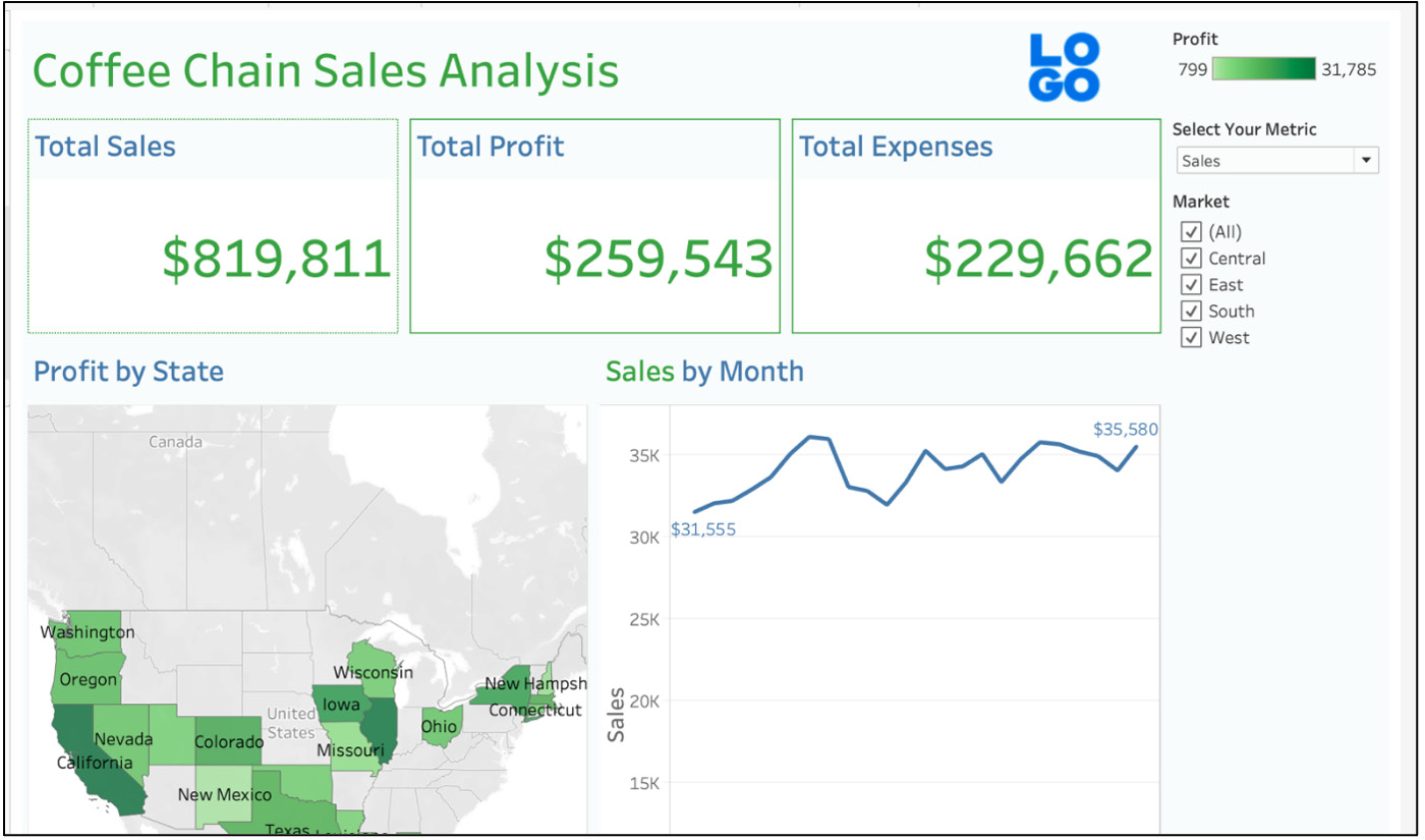
Figure 10.53: Adding another worksheet plus filters
- If you are not seeing any of the Profit color legends nor the Select Your Parameter parameter and Market filter, here is how to add them to the view:
Click on the Options dropdown of the Sales by Month worksheet and select Filter -> Market.
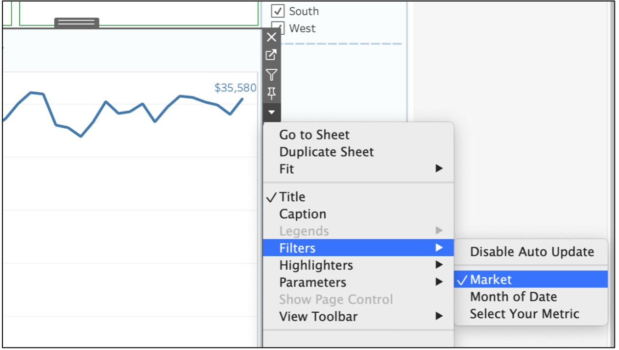
Figure 10.54: Manually adding filters to the dashboard
Add the Parameter dropdown by clicking on the Options dropdown of the Sales by Month worksheet and selecting Parameter -> Select Your Metric.
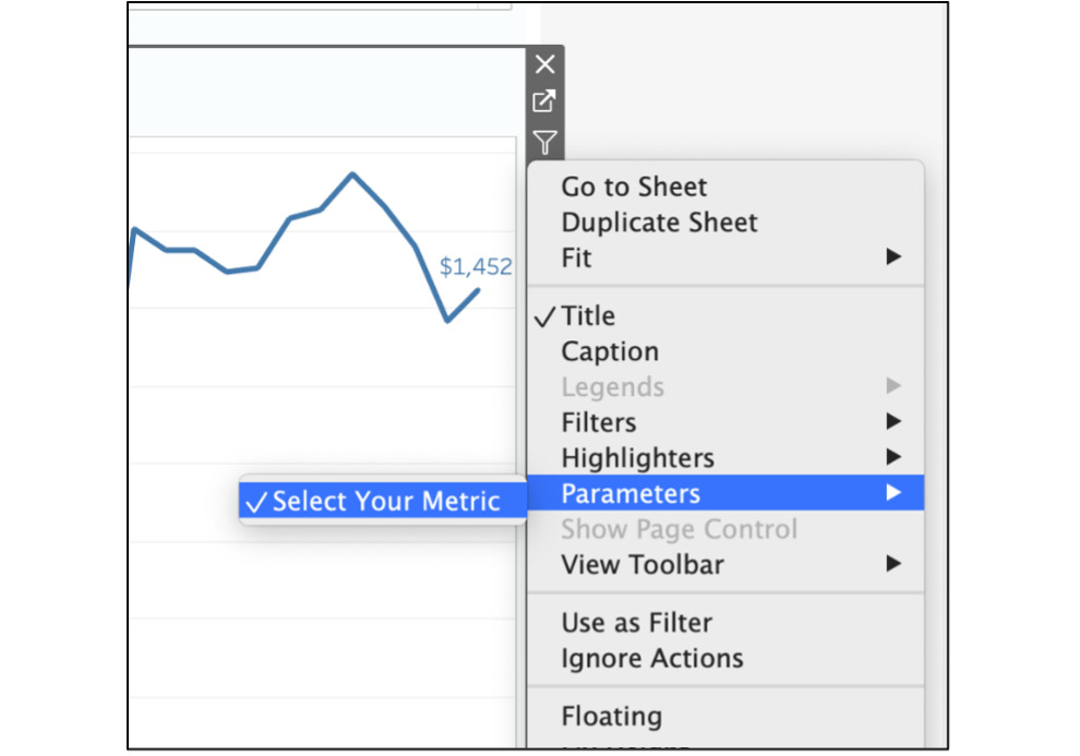
Figure 10.55: An example dashboard using education data
You don't require the Profit legend as part of the dashboard, so you can remove/delete that if it's already part of your dashboard.
- If necessary, keep the filters/parameters as they are but move them to better positions for quick visibility as well as easier access.
Drag Select Your Metric on top of the Sales By Month worksheet and resize the parameter/worksheet as required.
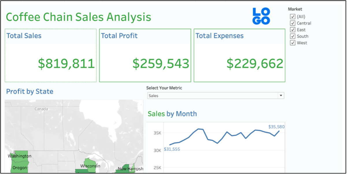
Figure 10.56: Dashboard without an action added
Drag the Market filter to the right of the Total Expenses worksheet to place it to the right. Next, add a thin green line border to the Market filter to match the formatting of other worksheets in that section.
- Add a filter action to your map so that whenever your stakeholders click on a state on the map, all the other elements of the dashboard also get filtered. Navigate to the menu bar and click on Dashboard -> Actions or press CMD + Shift + D for Mac or Ctrl + Shift + D for Windows, as shown here:
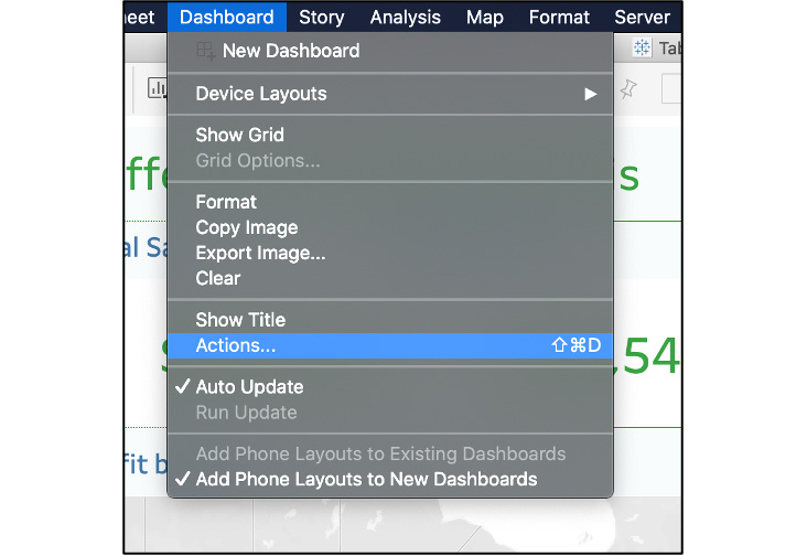
Figure 10.57: Adding action to the dashboard
- Add a Filter action by clicking on Add Action -> Filter.
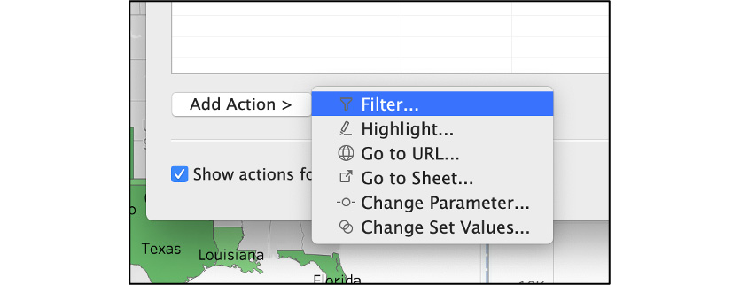
Figure 10.58: Selecting a filter action for the dashboard
- Select your source sheet, which in this case is the Map worksheet, and run the action on Select. For Target Sheets, select all the worksheets and, from the Clearing the selection will option, choose Show all values, as you can see in the following screenshot:
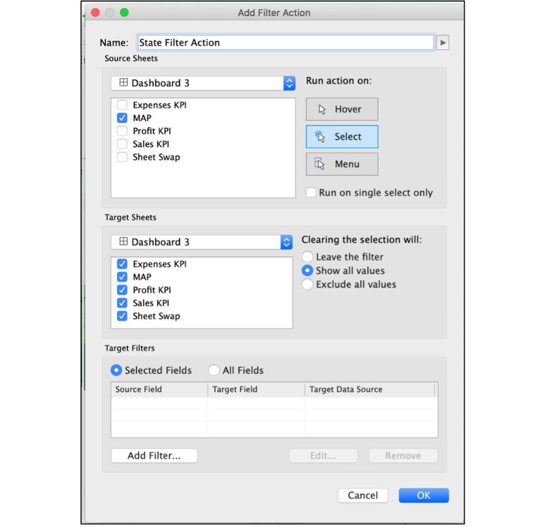
Figure 10.59: Selecting the filter action configuration
- The final step is to add State as a field under Target Filters. For this, click on Selected Fields -> Add Filter and select State as the dimension to filter on, as shown, then click OK.
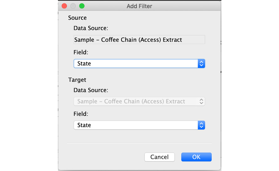
Figure 10.60: Selecting the fields in both the source and target sheets
This should be the final configuration for State Filter Action.
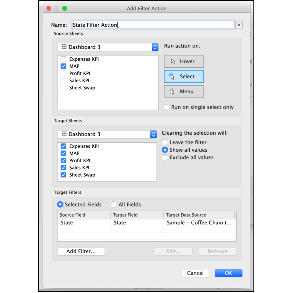
Figure 10.61: Final State Filter Action configuration
- Test all the interactive elements of the dashboard. The following is a view of West Market, with Profit for Select Your Metric and California as the state:
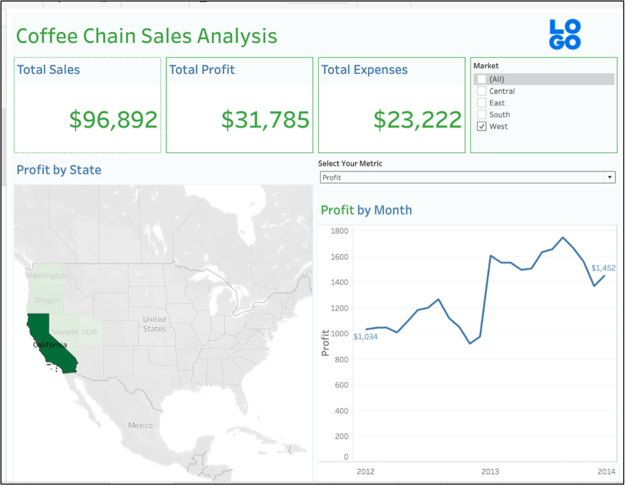
Figure 10.62: Final coffee chain sales analysis dashboard
That should conclude your first dashboard using Tableau. You added advanced interactivity to your view, including swapping metrics, using State action filters, and also used Color, Size, and Branding elements in our dashboard. Using the above view, you can infer that the total sales in California were $96,892, while $31,785 of those were profits. You can also easily identify the profit trend from the line chart, as shown above on the right.
Creating Storyboards
Storyboards differ from dashboards in a few different ways, but especially in one critical aspect – a dashboard is designed to display results for key organizational metrics (or similar measures), while a storyboard is designed to tell a pre-defined story. For example, a business user will use a dashboard to track a range of key metrics; the same user might use a storyboard to create a story based on very specific information found in the metrics (for example, showing how a single customer has grown over multiple periods, and a storyboard can help split those periods into multiple views).
To create a new story, you click on the New Story button on the menu at the bottom of the workspace. Selecting this button will give us a blank canvas with room for a single worksheet or dashboard. The next step is to drag a worksheet onto the canvas space; any related filters, parameters, and legends will automatically accompany the sheet. As with dashboards, you can adjust the screen size of the story and add text elements to accompany our chart. Storyboard text elements are designed to float on top of a chart; they can be used to add context to the displayed data.
One similarity between dashboards and storyboards is that both are built using existing worksheets, so you don't require a lot of additional effort to create a new storyboard. You simply need to find a story within the data, plan the sequence of storyboard slides, and add a title and text that walks the user through the story. Here's a very simple example where you have used a single chart with a different parameter selection for each tab in the story:
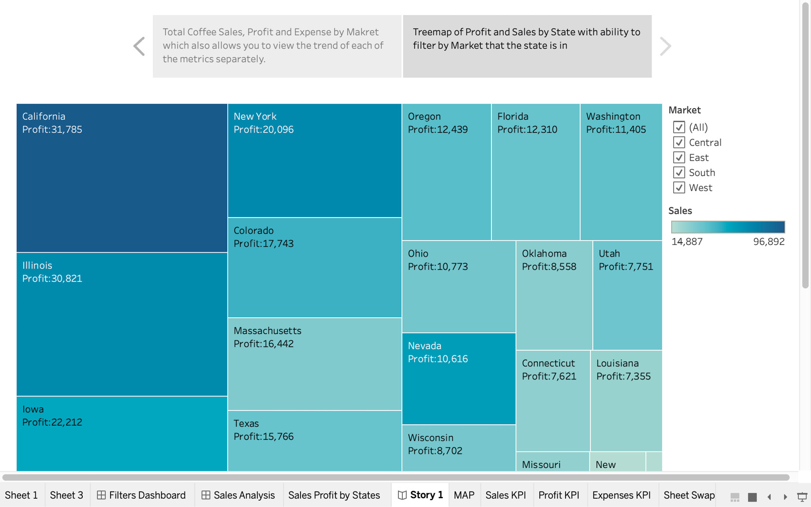
Figure 10.63: An example storyboard
Stories can be simple or complex, employing a single chart with changing filters or using many charts, maps, and summary worksheets to walk the user through something of interest. We'll use the next exercise to build the simple storyboard you see above.
Exercise 10.05: Creating a Simple Storyboard
You have created a dashboard previously. Now the manager wants to add another worksheet in a new page instead of adding more to the dashboard you built. In this exercise, you will create a treemap of states according to sales and profit and tell a story using the dashboard as well as the new Treemap worksheet:
- Open the previously created dashboard again.
- Create a new worksheet and drag State to detail under the Marks card. If longitude and latitude have been added to the Column shelf, remove them from the shelves.
- Add Profit to Size and Sales to Color, as shown here:
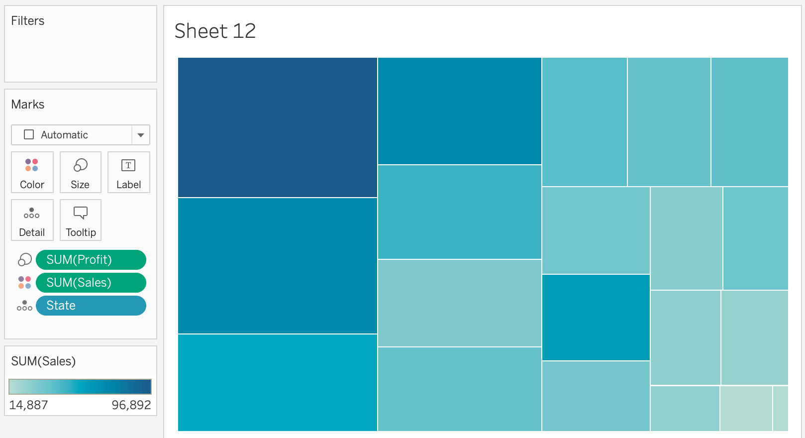
Figure 10.64: Treemap using Sales and Profit
- Add more visual cues to the report, including State and Profit on the label, and update the title to Sales/Profit by States.
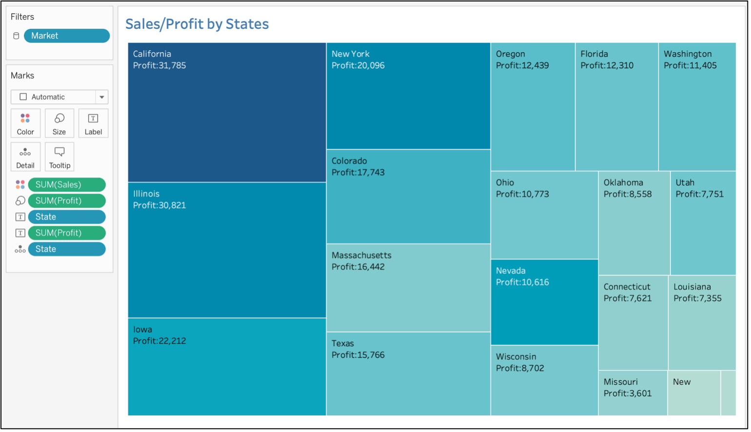
Figure 10.65: Adding a label to the treemap
- You have one dashboard and one worksheet for your storyboard. Click on the New Story icon on the bottom toolbar. Rename it to Coffee Sales by States to update your story title.
- Drag the Coffee Sales Analysis Dashboard (or the "dashboard name" you created previously) to the storyboard canvas. You should see this:
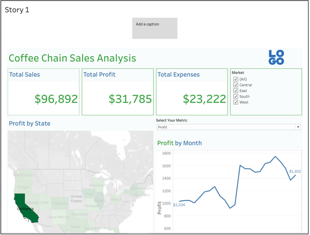
Figure 10.66: Adding a dashboard to the story point
- The major difference between a storyboard and dashboard is that a storyboard can include multiple dashboards as well as reports in one view, and you can add captions for step-by-step insights into what the dashboard story is all about. The Add a caption option allows you to add interesting insights or story points to the dashboard. Click on Add a caption and write Total Coffee Sales, Profit, and Expense by Market, which also allows you to view the trend of each of the metrics separately, and also hide the Story title.
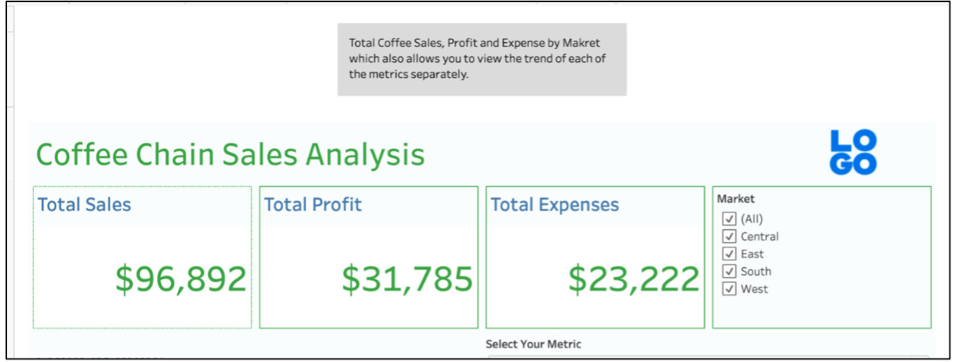
Figure 10.67: Adding a custom caption to the story point
- Add another story point to the view by clicking on the Blank story point in the Story section.
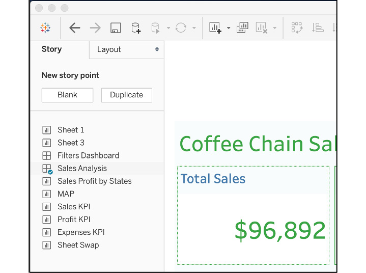
Figure 10.68: Adding a new story point to the view
- Drag Sales Profit by States (or the second dashboard you created earlier in the exercise) to the new story point and update the caption to read Tree map of Profit and Sales by State with the ability to filter by Market that the state is in.
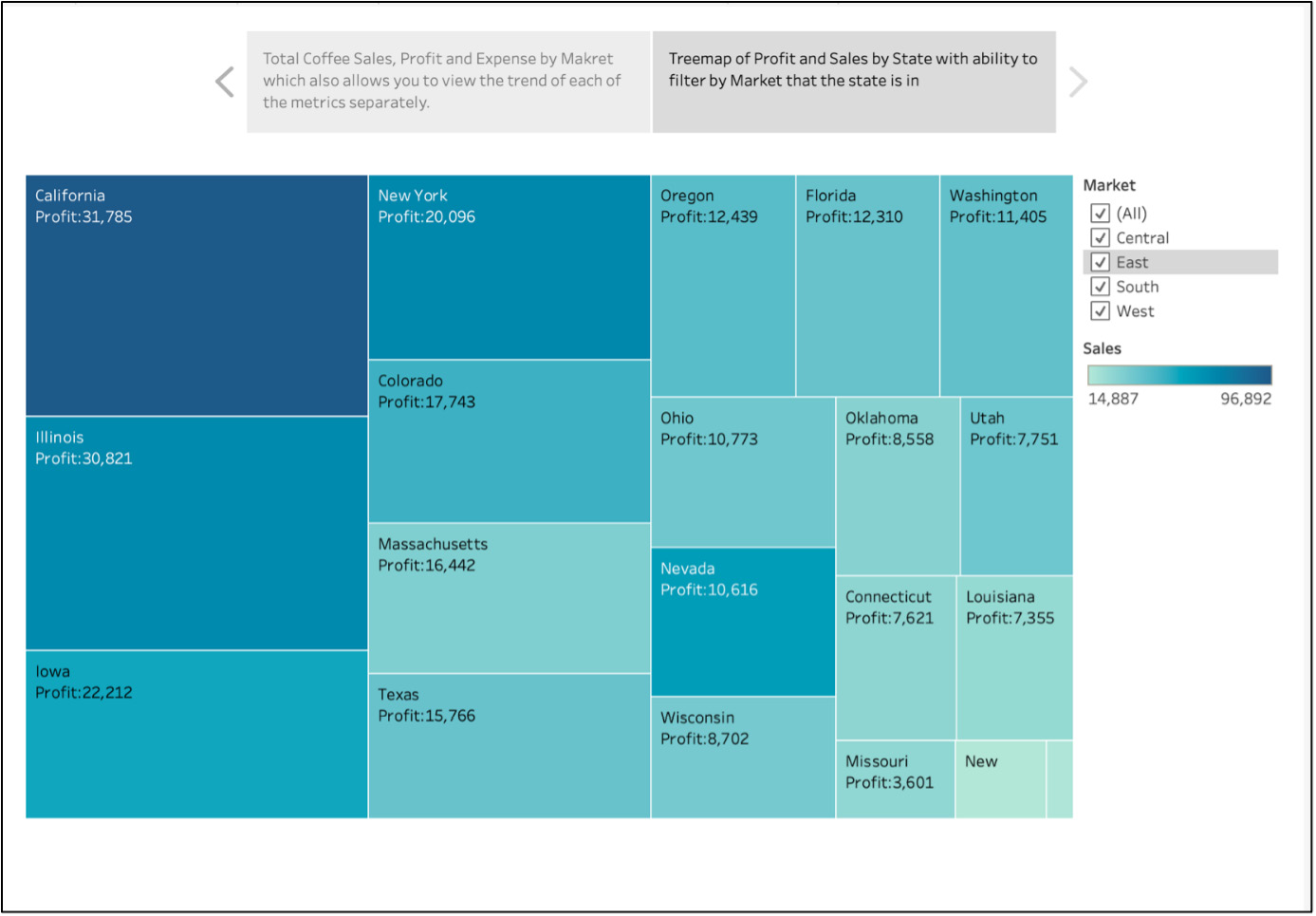
Figure 10.69: Final storyboard with the second story point with a custom caption
You have now completed a very simple storyboard and should be able to see the possibilities for more advanced stories. As you have seen in this basic example, storyboards can be very effective in walking a user through a focused narrative.
Let's finish this chapter by taking what you have learned and employing it to build a complete dashboard.
Activity 10.01: Building a Complete Dashboard
In this activity, you are an analyst working for the European Union looking to build a dashboard showcasing the 2014 versus 2015 growth in passengers across all European airports and also enable stakeholders to interact with the data.
You will create multiple scorecards and branding elements, as well as add a Top N European Airports parameters view to your dashboard. The final output should look as follows:
Note
You can find the dataset for this activity at the following link: https://packt.link/vyWvi.
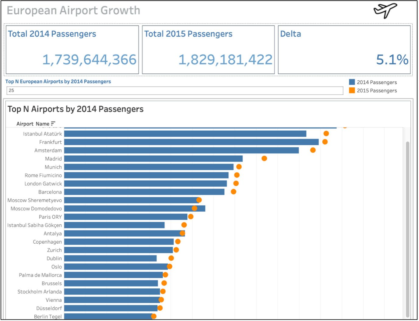
Figure 10.70: Final expected output using European airports data
The following steps will help you to complete this activity:
- Open a new Tableau instance and load the European Airports 2015 data in the view.
- Create three scorecard/KPI metrics: Total 2014 Passengers, Total 2015 Passengers, and Passengers Growth/Decline.
- For Total 2014 Passengers, put 2014 Passengers on the Text marks card and format the text as well as the title, as shown in the output. Do the same for Total 2015 Passengers.
- For the Passengers Growth/Decline scorecard, create a new calculated field by using the following formula:
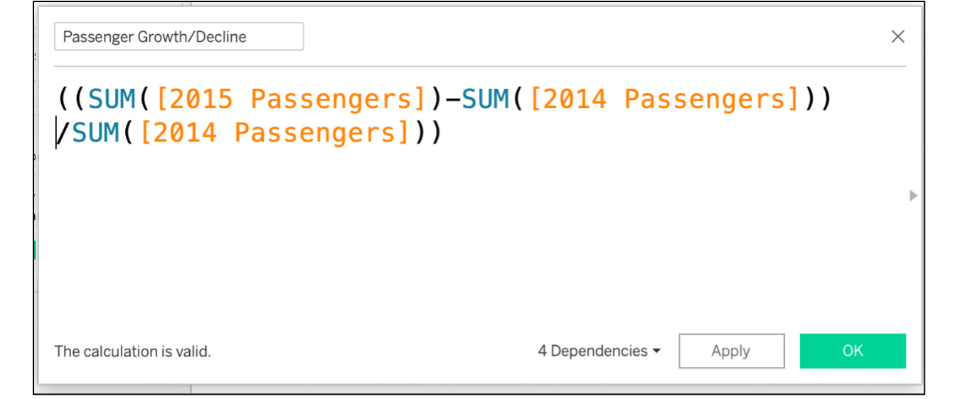
Figure 10.71: The passenger growth/decline calculated field
- Using the Passenger Growth/Decline field, create a similar scorecard to the one you created for 2014 Passengers.
- Create a new worksheet and rename the worksheet Top N Airports by 2014.
- Create a Top N Parameter, name your parameter Top N, select Integer as the data type, 10 for the current value, and then click OK.
- Add Airport Name to the rows, and 2014 Passengers and 2015 Passengers to the Columns shelf, convert the two axes into a dual axis, and then synchronize the axis.
- Under the Marks card, change one of the axes to the Circle mark type to create a Bullet Chart view that you want as your output.
- To add the Top N parameter to the view, drag the name of the airport to Filters. Click on Top and filter the field by Fields. Then, select the parameter from the dropdown and add 2014 Passengers as the field before clicking OK.
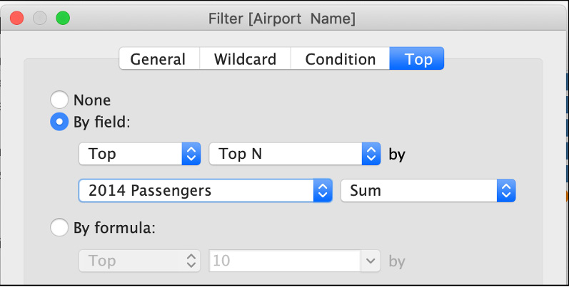
Figure 10.72: Adding a top N filter
- Right-click on the Top N parameter in the data pane and click Show Parameter.
- Add a couple of descriptive elements to the dual axis, drag Passenger Growth/Decline and Country to the Tooltip, and confirm whether 2014 Passengers (2015 Passengers) are already part of the tooltip. If not, drag them to the Tooltip marks card as well.
- Create a new dashboard and drag a Vertical tiled object. Start at the top with branding and work your way through the bottom.
- Header: Drag a Horizontal tiled object, drag Text, and then call your dashboard European Airports Growth.
- Next, download a hand airplane or an airline logo online and drag that using the Image tiled object to the right of the title of the dashboard.
- Add another Vertical tiled object below the header and drag all three scorecards.
- Next, drag another Vertical tiled object below the scorecards and put the Top N Airports by 2014 worksheet in that section.
- Align/realign the legends and parameters as per your requirements.
- Your final output should look like this:
Figure 10.73: Final output for activity 10.01
Note
The solution to this activity can be found here: https://packt.link/CTCxk.
Summary
This chapter covered the design and development of dashboards and storyboards, two essential tools for Tableau designers and users. Dashboards continue to be a critical component of the Tableau experience, with thousands of companies and organizations using them to communicate insights to executives, managers, and analysts.
Before you decided to create our first dashboard, you reviewed best practices for creating a dashboard and how size, color, and placement play an important role in dashboard development as well as the readability aspect of the dashboard. Later, you walked through each of the dashboard elements/objects and provided an example of how those objects work before you switched gears and started creating dashboards.
In our first Coffee Chain Sales Analysis dashboard, you used concepts learned previously to create the Selecting Your Metric parameter, learned how to divide your dashboard into sections, saw some tips and tricks for best placing the objects, and considered when to use tiled versus floating objects. You also formatted your dashboards and added your custom branding elements to the dashboard. Later, you walked through the creation of a storyboard and how that differs from a dashboard, and when to use a storyboard versus a dashboard. Finally, you concluded the chapter by walking through another unique dashboard using European Airports data and again used some of the advanced concepts that you have learned throughout the book, including the dual axis lollypop chart, the Top N filter using parameters, along with formatting the dashboard using best practices.
The knowledge gained here will allow you to create the dashboards and storyboards in the upcoming chapter. The dashboards and storyboards maximize the impact of each dataset that you encounter. The ability to integrate the power of Tableau calculations, filters, parameters, sets, groups, and actions into a single dashboard is a major step in developing your Tableau skills and providing essential solutions for your customers.