Overview
This chapter builds on the basic charts you created in Chapter 4, Exploring Comparison and Composition. You will also cover the advanced topics of trend and reference lines, and will see some examples of where they are frequently used. By the end of this chapter, you will be able to create charts for distributions, show relationships across data points, and create advanced chart types such as Dual Axis and Quadrant charts.
Introduction
In previous chapters, you have learned about various charting methods that are reliant upon having both dimensions and measures in the view. However, there may be times, especially in business scenarios, where you only have measures to work with. In this chapter, you will learn how to create charts without dimensions, and also charts with multiple measures. You will learn to create relationships between measures, and will see how advanced Tableau skills like trend and reference lines can help better demonstrate insights to stakeholders.
First, you will explore distribution for a single measure using histograms, box plots, and whisker plots. Then, you will look at distributions across two measures using scatter plots, and scatter plots with trend lines (linear, logarithmic, and exponential). You will then look at advanced visualizations such as dual axis and quadrant charts for multiple dimensions/measures.
Exploring Distribution for a Single Measure
Distribution charts such as histograms and box plots are used to show the distribution of continuous and numerical quantitative data. However, bar charts, as discussed in the previous chapter, are used when plotting discrete and categorical data. In these sections, you will focus on discrete and categorical chart types.
Creating a Histogram
A histogram represents frequency distribution. It shows the distribution of values and can help identify any outliers. Histograms take your continuous measures and splits the range of measurements. They are placed into buckets known as bins. Each bin is essentially a bar in a histogram representing the count of that range of values falling within that bin.
If you were to create a histogram of the salary of all the employees in a company, where the range of each bin is $10,000, your histogram would represent how many employees are earning $0-10,000, $10,001-20,000, $20,001-30,000, and so on.
It is straightforward to create a histogram in Tableau, as it is one of the 24 default chart types in the Show Me pane. Whenever you create a histogram in Tableau, bins/buckets of equal size are created, and Tableau creates a bin dimension (a local temporary dimension created for your bin ranges) for the measure you used while creating the chart.
The following figure shows a sample histogram. Here, you are looking at the distribution of the count of total order quantities with a bin size of 1. Essentially, from the following histogram, you can see that there were 899 orders with only 1 item, there were 2,402 orders with 2 items, and so on:
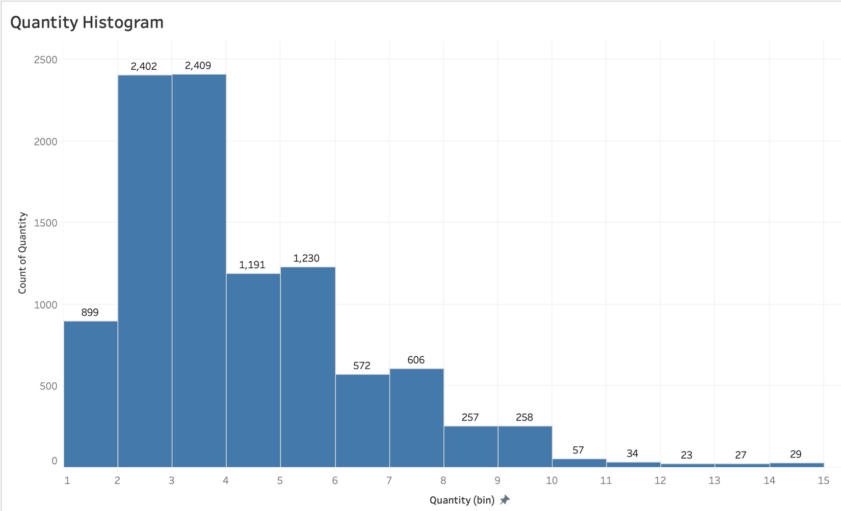
Figure 5.1: A sample quantity histogram
The following screenshot shows that the histogram option is part of the Show Me pane:
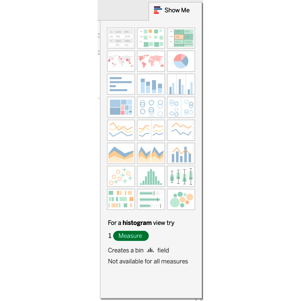
Figure 5.2: Histogram option as a part of the Show Me pane
While creating the histogram, Tableau automatically adds the Quantity (bin) dimension in the Data pane, as shown here:
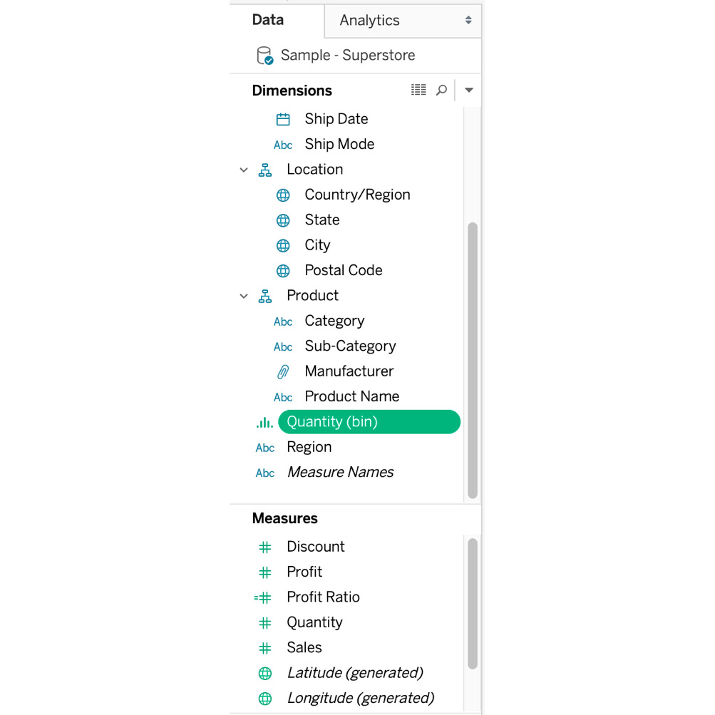
Figure 5.3: Quantity (bin) added to the Data pane
Now work through this Exercise 5.01 and see in practice how to create a histogram.
Exercise 5.01: Creating a Histogram
As an analyst of an e-commerce store, your manager is looking to better understand the size of each order by asking you to create a chart that shows the count of orders by the quantity of orders. One of the better ways to represent frequency distribution is using histograms. In this exercise, you will use the Sample – Superstore dataset to create a view of Counts of Orders by Quantity distribution and in the process, learn the exact steps to create a histogram in Tableau.
Note
You can find the Sample - Superstore dataset at the following link: https://community.tableau.com/s/question/0D54T00000CWeX8SAL/sample-superstore-sales-excelxls?language=en_US.
Alternatively, you can also find the dataset in our GitHub repository here: https://packt.link/21LCj.
Dataset Description: The Sample – Superstore dataset is a dataset that comes loaded with Tableau Desktop by default. The dataset represents a fictional store that contains dimensions of orders such as Order Dates, Ship Date, Country, Product Category/Sub-category/Manufacturer/Name, Segment, and Customer Name, as well as measures such as Discount, Profit, Quantity, and Sales numbers.
Perform the following steps to complete this exercise:
- Load the Orders table from Sample – Superstore dataset in your Tableau instance.
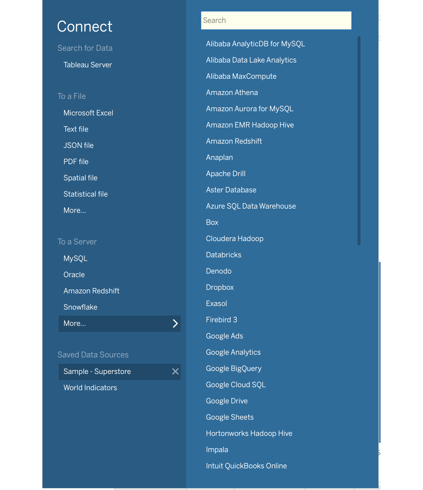
Figure 5.4: Loading the Sample – Superstore dataset
As mentioned, a histogram is used for continuous and numerical data, so in this case, you have Discount, Profit, Quantity, and Sales. In this example, you will use Quantity to create the histogram.
- Double-click on Quantity or drag the Quantity measure to the Rows shelf. By default, Tableau selects horizontal bars as the preferred chart method, as seen here:
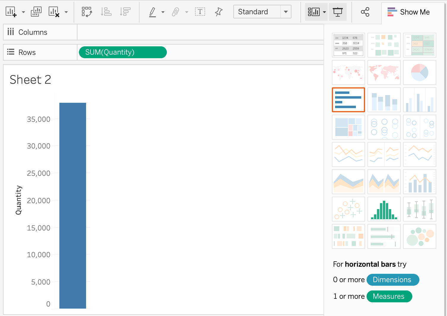
Figure 5.5: A single bar for the total sales
As you see, there are only two chart options for the Quantity measure available in the Show Me panel.
- Select Histogram and you will get with the following view:
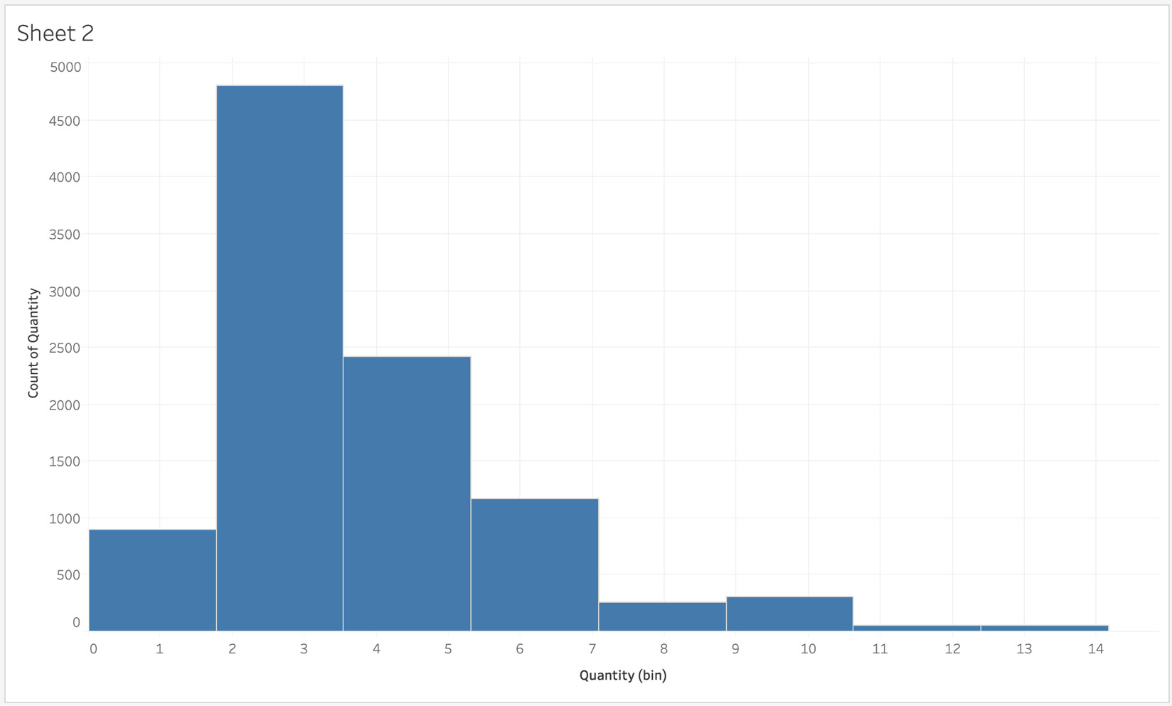
Figure 5.6: Histogram bin default by Tableau
As you see, Tableau has now created a Quantity (bin) dimension in the Data pane and has automatically decided the best bin size for the data. In your current view, it is unclear whether the first bin ends at 1.5 or 2.0.
- For better readability, edit the bin sizes to be integers. Right-click on Quantity (bin) in the Data pane and select Edit...:
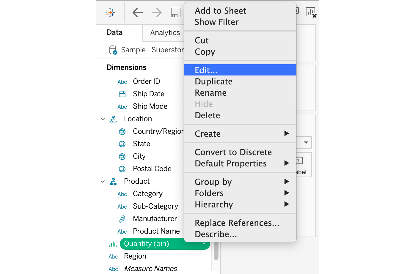
Figure 5.7: Editing bin sizes
In the Edit Bins [Quantity] window, the bin size is 1.77 for this dataset, which is less than 2, making it unclear where our first bin ended.
- Change the bin size to an integer value (in this case, to 1 for readability). This will show your end user how many orders included only one item in the invoice, two items, and so on:
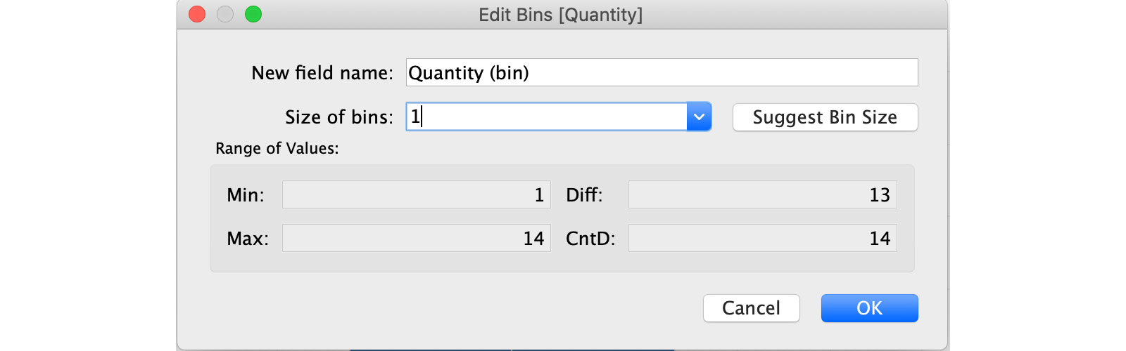
Figure 5.8: Changing bin sizes
Next, you will make some formatting changes. As you can see, the x axis starts from zero and ends at one bin past the maximum bin. Edit this to start the x axis from one and go up to the maximum bin size so that you have one continuous axis.
- To edit the axis, right-click on the x axis and click on Edit Axis. Next, select Fixed range from the Edit Axis window, enter 1 for Fixed start and keep Fixed end as it is, as shown here:
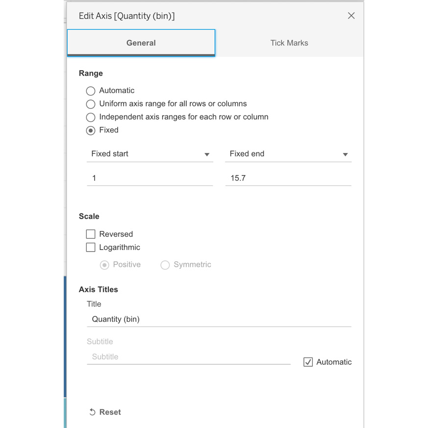
Figure 5.9: Editing the axis for bins
- Make one final edit by using Ctrl + drag (for Windows) or Option + drag (for Mac) the CNT(Quantity) pill from the Rows shelf to the Label shelf to add a label to individual bins. Finally, rename the sheet title to Quantity Histogram as shown here:
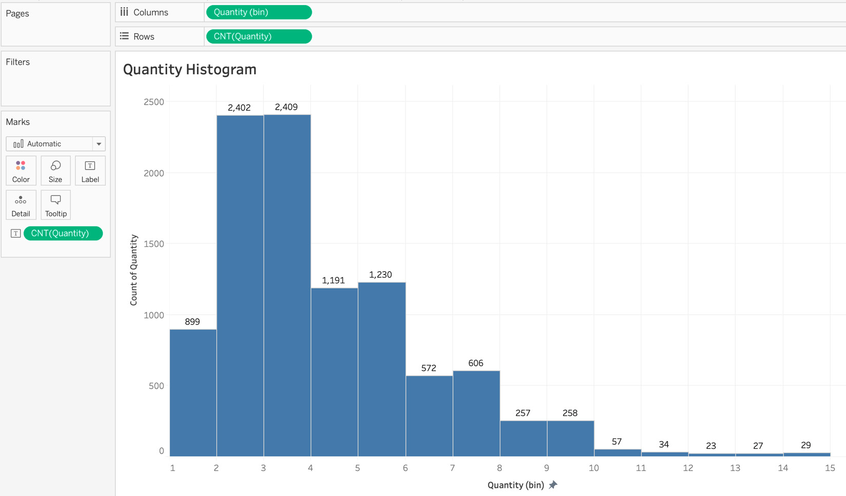
Figure 5.10: Final histogram
You have learned how to use frequency distribution to create histograms, and have answered the following question: How many sales/orders included one item, two items, and so on?
In the preceding screenshot, the histogram represents the count of orders with one item, two items, and so on. There are 1,230 orders with 5 items and 572 orders with 6 items.
Next, you will learn about the importance of Box and Whisker (B&W) plots and when to use them in your charts.
Box and Whisker Plots
Whenever you want to illustrate distributions, apart from histograms, B&W plots are one of the other options you have. Box plots work really well when you want to compare two dimensions side by side where one of the dimensions is on the x axis and the other is on the y axis. For example, the batting average of hitters in major league baseball. Before learning to create B&W plots (also called box plots), it is important to understand their importance, how to read them, and when it’s best to use them.
Here is what a B&W plot looks like:
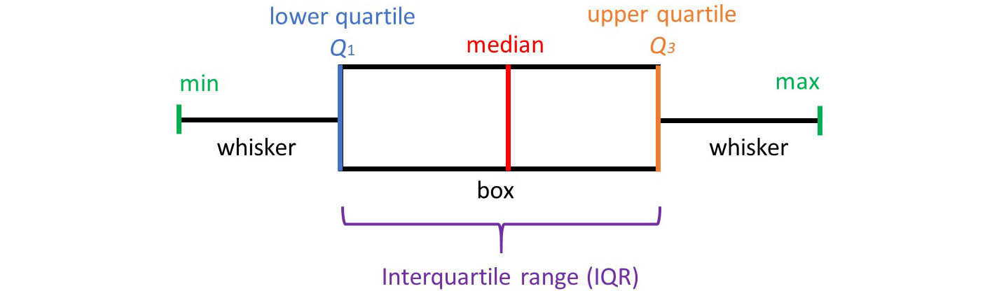
Figure 5.11: Sample B&W plot
The box part of the image represents the first and third quartiles, also known as the Interquartile Range (IQR). The IQR is calculated as Q3 minus Q1 (Q3-Q1). The whiskers on the left and right represent the lowest value of the first quartile and the highest value of the fourth quartile respectively. The middle line in the box is the median (Q2), which is the middle number of the dataset. Data points to the left of the line are the numbers less than the median, whereas to the right side are all the numbers greater than the median. Next, you will start creating box plots with the superstore dataset.
B&W plots are particularly useful when you want your distribution to identify outliers. For example, the next screenshot shows the age distribution of two counties: the County of Philly and the County of Morago. The top plot represents Philly, the bottom Morago. The IQR for Philly is between 23 and 64, and for Morago is 15 and 43. But the screenshot also helps identify the outliers, as there is a section of the population in both counties with humans aged 100 and above. That is where B&W plots can be so useful.
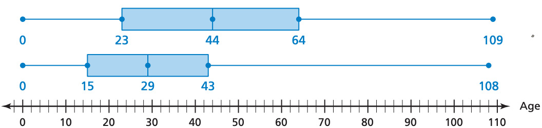
Figure 5.12: Two-county B&W plot
Exercise 5.02: Creating a Box and Whisker Plot without the Show Me Panel
Like a histogram, a B&W plot is part of the Show Me pane in Tableau, but in this case, you will learn how to create box plots using reference lines.
Perform the following steps to complete this exercise:
- Load the Orders table from Sample – Superstore dataset in your Tableau instance.
- Create a bar chart with one dimension and one measure (bar charts were discussed in Chapter 4: Data Exploration: Comparison and Composition). Select Profit as the measure and the product Segment as the dimension (looking at Profit by Segment).
- Drag Segment to the Columns shelf and Profit to the Rows shelf as shown in the following screenshot:
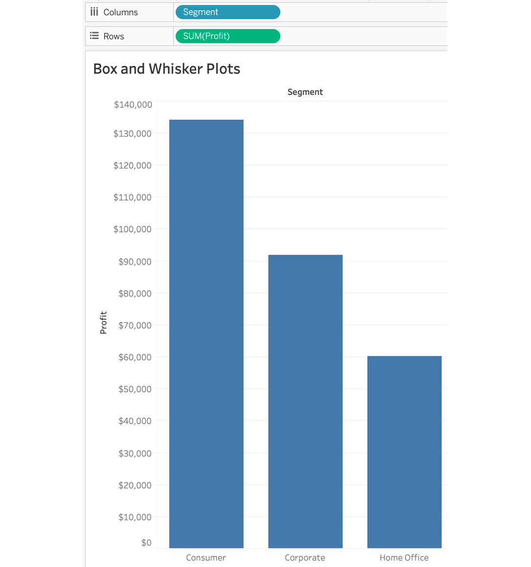
Figure 5.13: Bar Graph of Profit by Segment
- Add the distribution dimension to the Detail Marks card. In this case, you are looking at Profit distributed by Segment, by year of order. Now, add year of order to the Detail card.
Note
Ctrl + drag (for Windows) or Option + drag (for Mac) the Order date to open the Drop Field window, which will allow you to select YEAR(Order Date) on the Marks card).
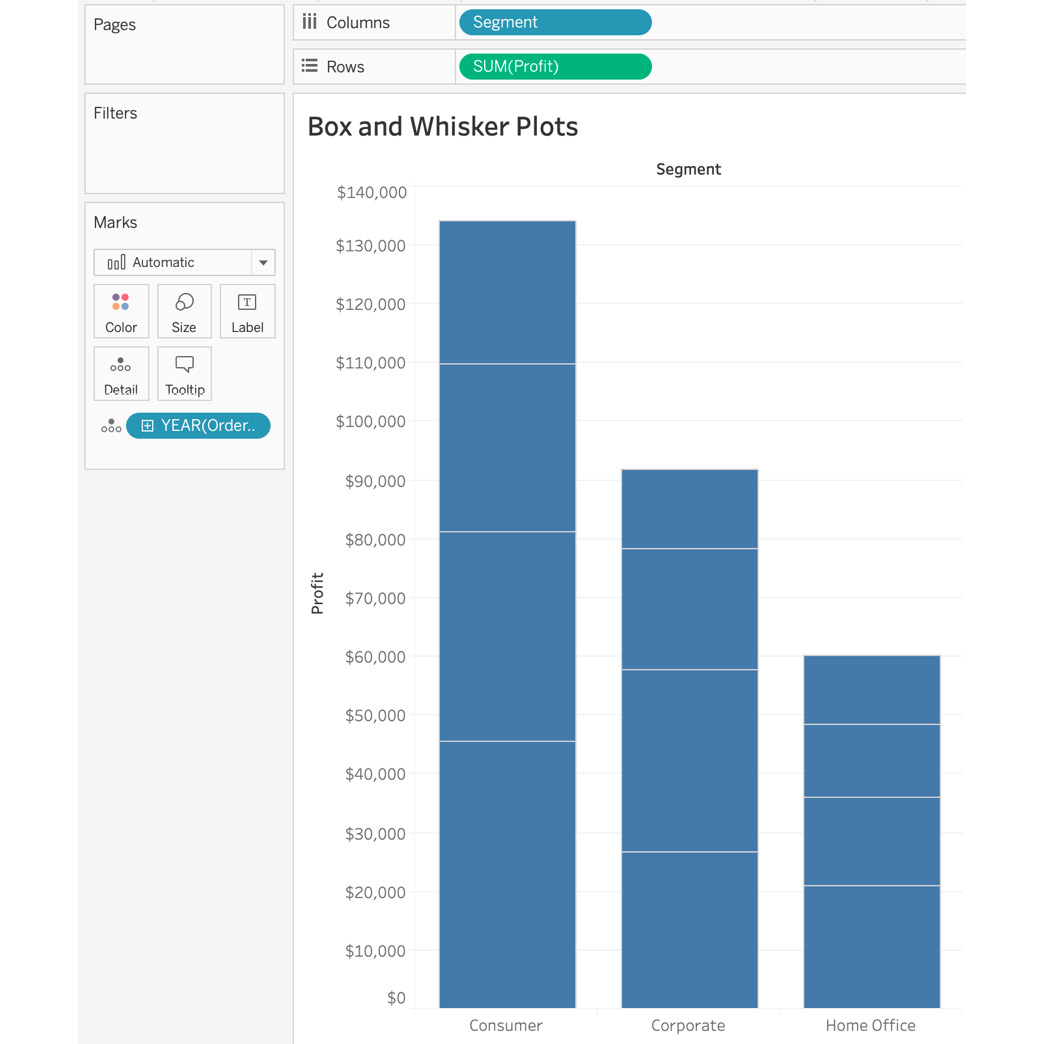
Figure 5.14: Stacked bar chart
Once you add YEAR(Order Date) to your Detail Marks card, a stacked bar chart is created, where each stack represents the year of the order date.
- Convert this stacked bar chart into a dot plot for your B&W plots by changing the mark type from Automatic to Circle (from the Marks shelf):
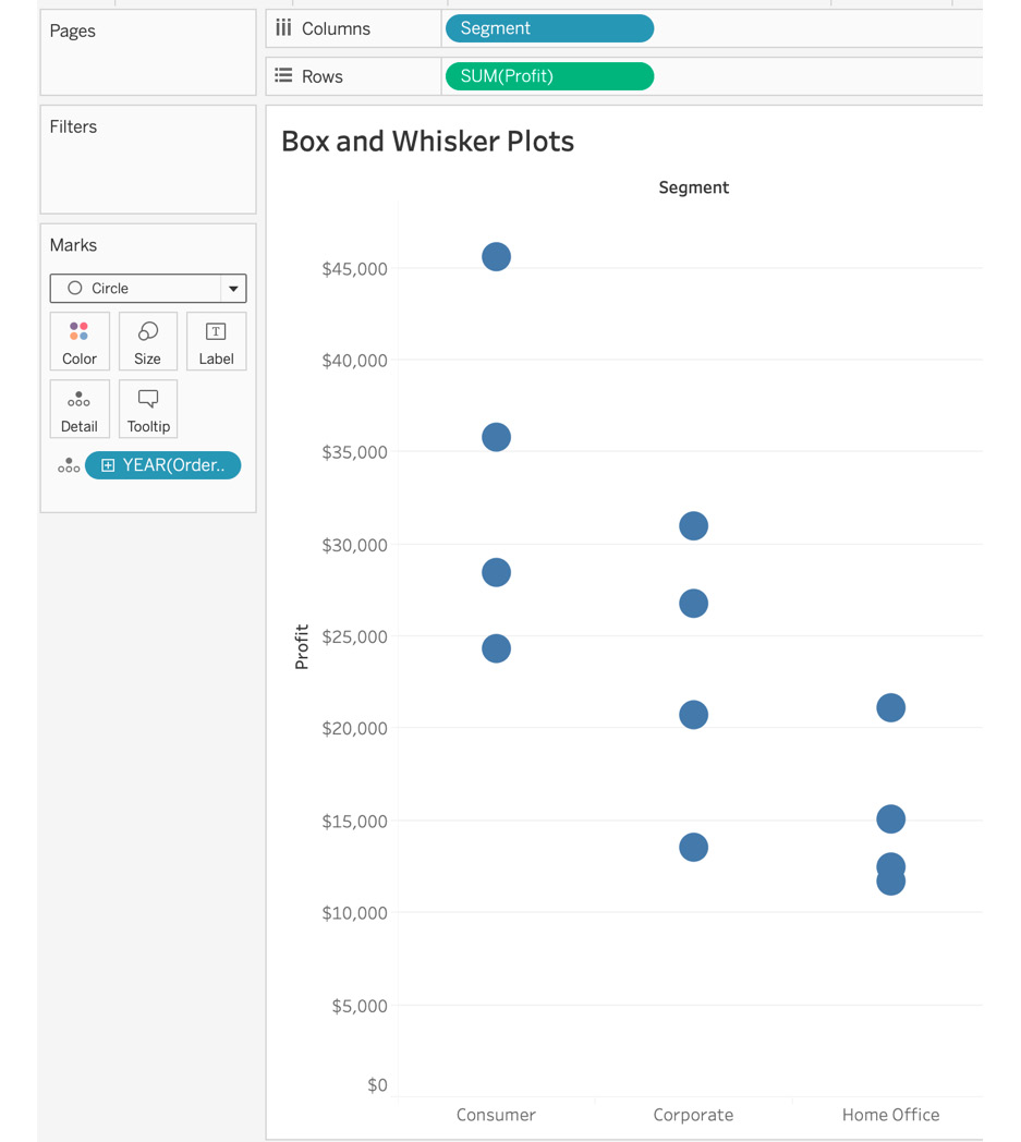
Figure 5.15: Scatter plot of profit by segment
If you don’t convert the mark type to a dot plot, you won’t be able to see the B&W plots as shown in the following figure:
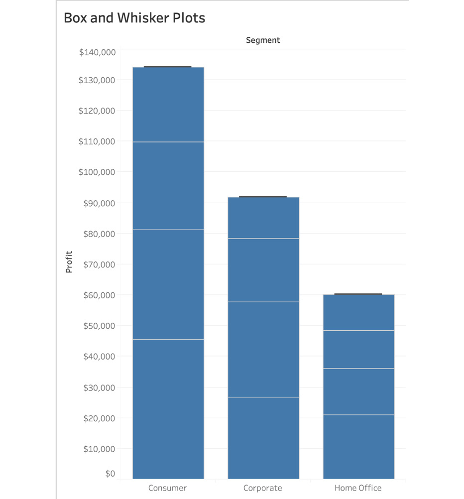
Figure 5.16: Issues with not converting the mark type from Bar to Circle
- Now, to create the B&W plot, right-click the y axis and choose Add Reference Line:
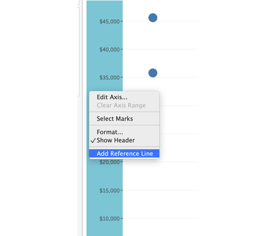
Figure 5.17: Adding a Reference Line from the axis
- In the Add Reference Line, Band, or Box dialog box, select Box Plot. You can play with the options, maybe changing the fill color, style, or the weight of the borders and whiskers:
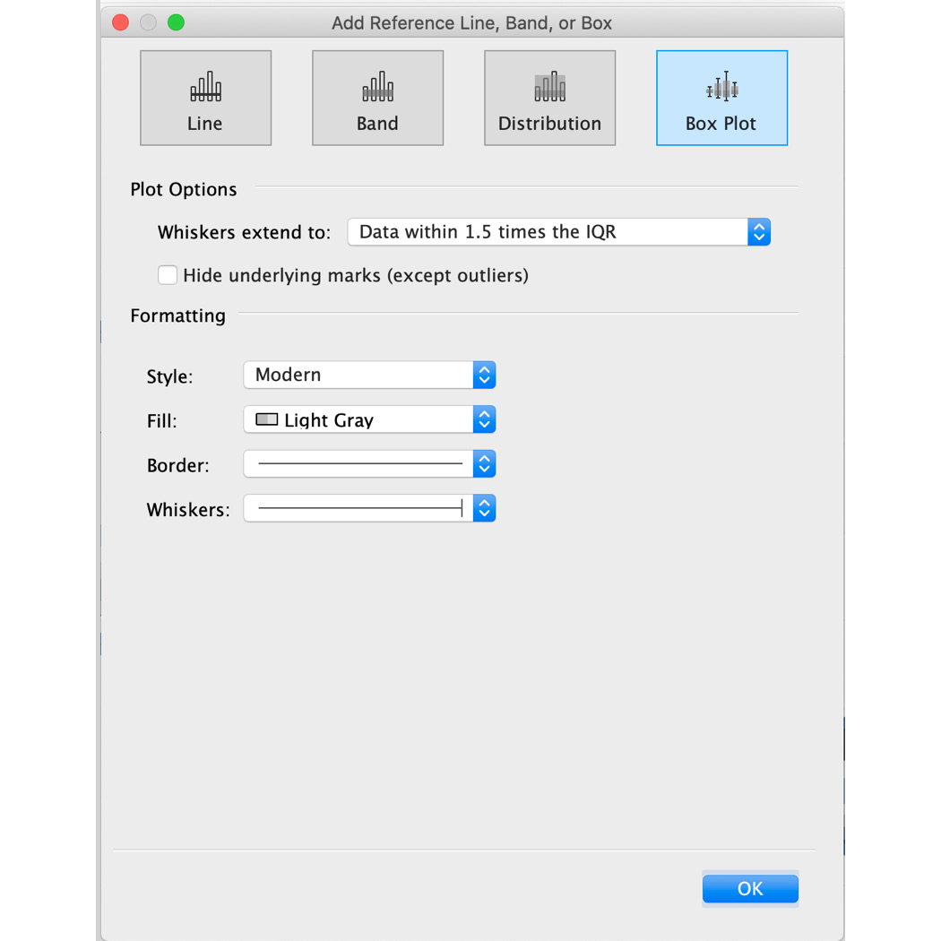
Figure 5.18: Reference line options
IQR, as mentioned previously, stands for interquartile range, which is all the data points between the first and third quartiles. In the Box Plot dialog option box, Data within 1.5 times the IQR essentially means we are asking Tableau to make all data points on the plot fit within 1.5 times the IQR. Any data point outside the range will be considered an outlier. You will explore this concept with your actual plot in the following figure:
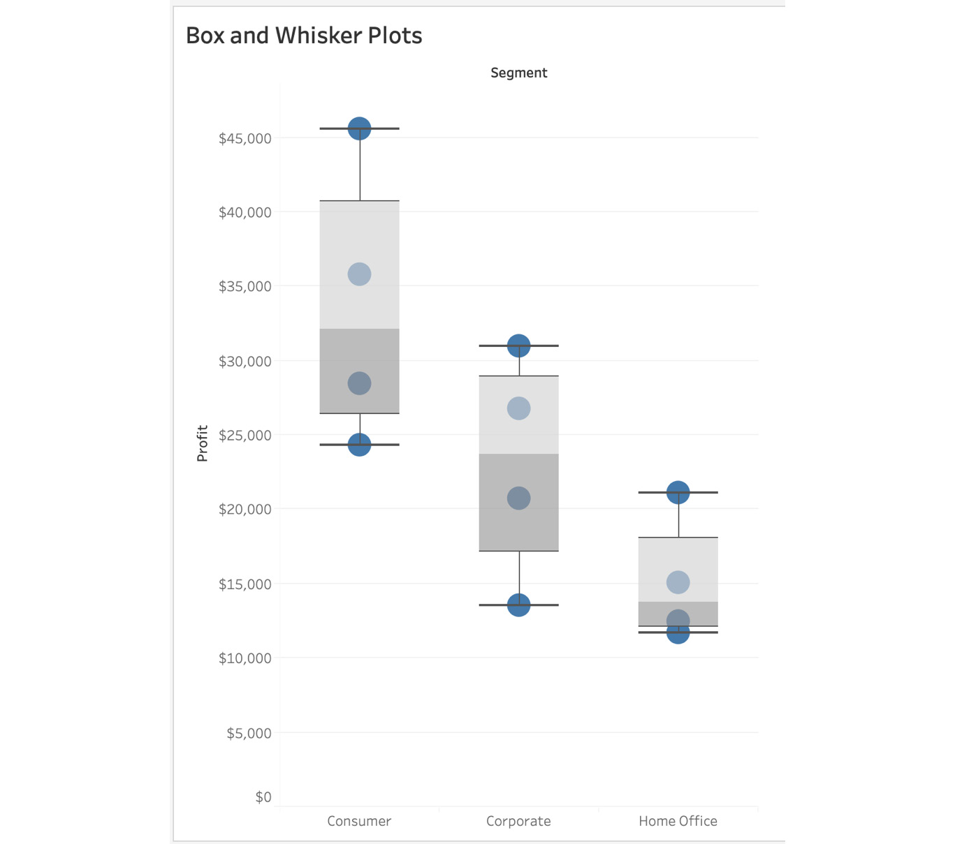
Figure 5.19: B&W plot for profit by segment
The middle line in the box plot, the intersection of light and dark gray, is the median. If you look across the view, you can quickly compare the medians of all the product segments irrespective of how big or small the median is. The upper whisker is 50% higher than the IQR and the lower whisker is 50% lower than the IQR. If data points are outside the box and whisker, those data points are considered outliers and this chart allows you to quickly identify them, which isn’t so straightforward in histograms.
Next, you will see how to create a box plot using the Show Me panel, a more straightforward method.
Exercise 5.03: Box Plot Using the Show Me Panel
In this exercise, you will create a box plot from the Show me panel. You will be continuing on from where you left off in the previous exercise, but you may use a new sheet.
Perform the following steps to complete the exercise:
- Drag Segment into Columns and Profit into Rows. This helps create the bar chart.
- Drag the YEAR (Order Date) dimension onto the Marks shelf, which you want to use as your distribution dimension. In this example, use YEAR (Order Date) as shown here:
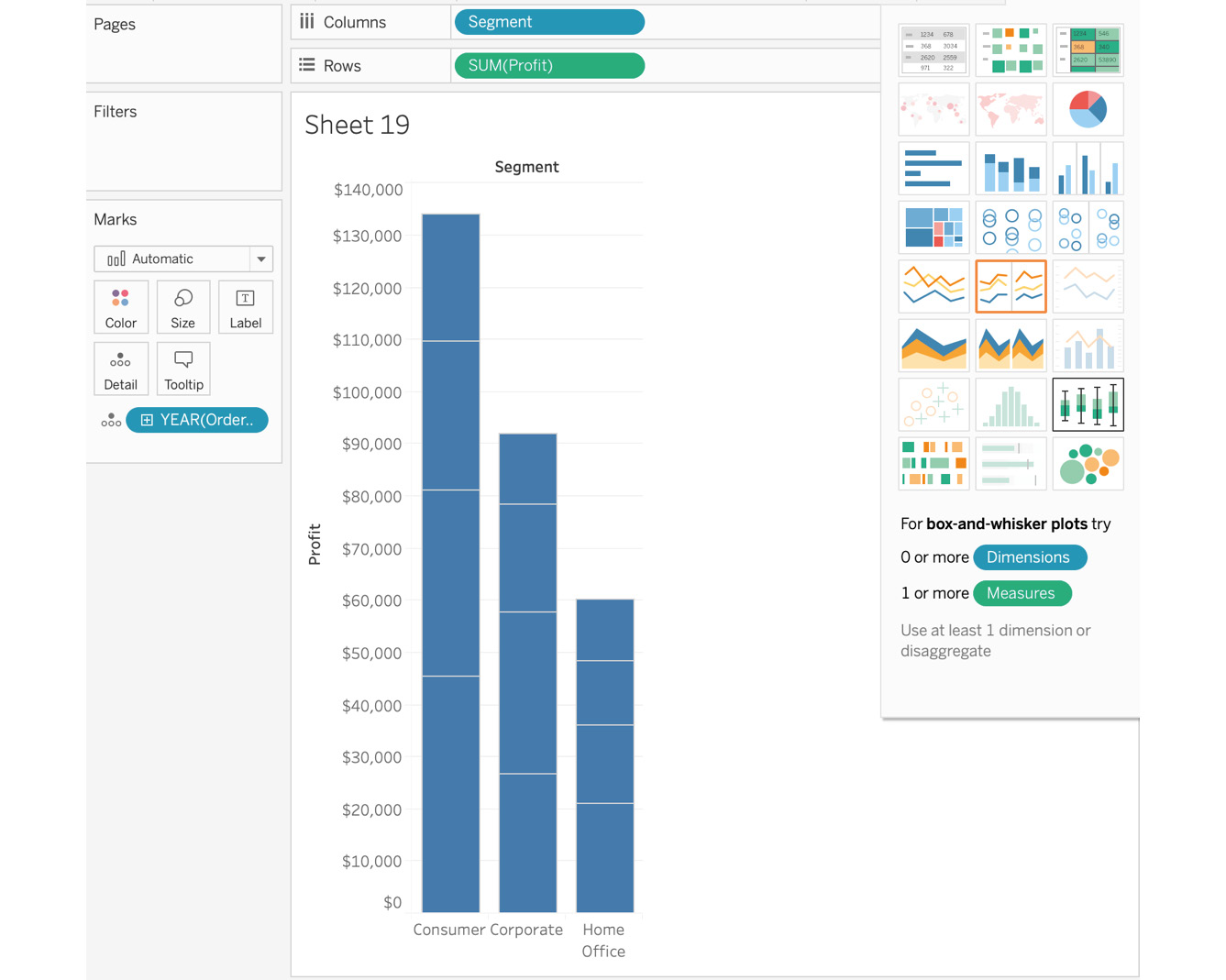
Figure 5.20: B&W plot with a stacked bar chart
- Click on the Show Me panel (as shown in the previous step), and click on Box and Whisker Plots:

Figure 5.21: Final B&W plot
Consider the median (the middle line in the box plot) of the preceding screenshot. If you look across the view, you can quickly compare the medians of all the product segments irrespective of how big or small the median is. If a data point is outside the B&W, those data points are considered outliers.
Box plots can be incredibly powerful when the right data is in place. A box plot conveys a lot of information in a single chart.
This wraps up the histogram, box, and whisker plot activity using single measures. Next, you will explore scatter plots, which are useful when dealing with two or more measures.
Relationship and Distribution with Multiple Measures
In this part of the chapter, you will explore how to best represent two measures in the same view and how these charts can help build the relationship between two or more measures. You will initially look at scatter plots. Once you cover the distribution part of these multiple-measure charts, you will move on to the relationship between these measures by discussing dual axis charts and their uses.
Distribution with Two Measures
Scatter plots are two-dimensional graphs created with two to four measures and zero or more dimensions. The first two measures are used as the x and y axis, and the third and fourth measures, as well as the dimensions, are used for adding more formatting and context to the scatter marks.
Scatter plots are useful when plotting two quantifiable measures against one and other. This could be Sales versus Profit or Quantity versus Discount, for example. Scatter plots also help find patterns or clusters, which aids in decision making, by identifying outliers and groups of points that are related.
If you want to go a level deeper, you can also add reference lines to these plots, which can split the scatter plots into four quadrants (we will walk through an exercise later in the chapter explaining how to create a four-quadrant view). This makes it easier for the end user to call out the relationship.
Creating a Scatter Plot
You will now create a scatter plot in Tableau. When doing this, one measure becomes the x axis and the second measure becomes the y axis. By default, when you plot two measures in your view, Tableau aggregates these measures to a single dot in the view. You then have to manually de-aggregate (make the more granular) the measure to create the scatter plot (as shown in the following screenshot).
Here is the final version of the scatter plot, which you will create with two measures and two dimensions:
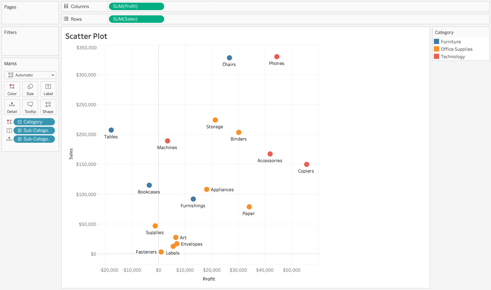
Figure 5.22: Sample scatter plot of Sales versus Profit for each sub-category
The following Exercise 5.04 will outline the steps to this in detail.
Exercise 5.04: Creating a Scatter Plot
The manager of your store requests a report looking at total sales versus profit for each sub-category sold in the store. The chart must identify each sub-category, using color to represent the overarching category each subcategory belongs to. You will be using the Sample – Superstore dataset to fulfill the request.
Perform the following steps to complete the exercise:
- Load the Orders table from Sample – Superstore dataset in your Tableau instance (if its not already open in your Tableau instance).
- Select two measures for plotting data points. For this exercise, these are Sales and Profit.
- Drag Profit to the Columns shelf and Sales to the Rows shelf:
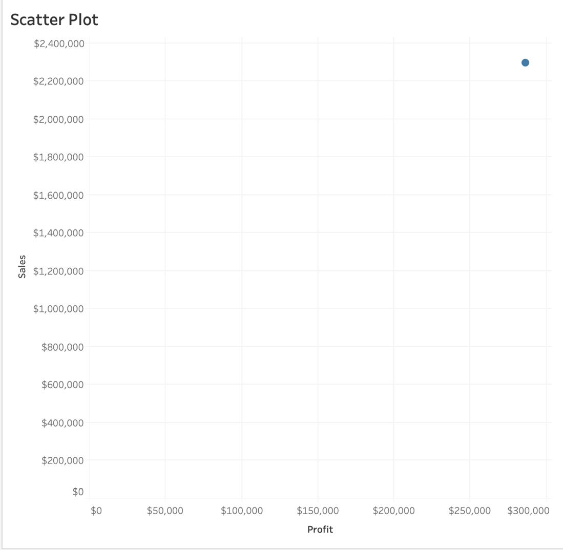
Figure 5.23: Aggregated scatter plot of Profit versus Sales
As soon as you drag the second measure to the Rows shelf, you get a plot with only one dot in the view. By default, Tableau aggregates all measures whenever they are dragged from the Data pane to the shelf. The point here represents the intersection of Sales versus Profits for all records in the dataset. You have to specify the level of detail for the plot by de-aggregating the measures.
- Next, you will de-aggregate the measures to break down your aggregate data point into multiple points. You do that by selecting Analysis from the menu bar at the top and de-selecting Aggregate Measures:
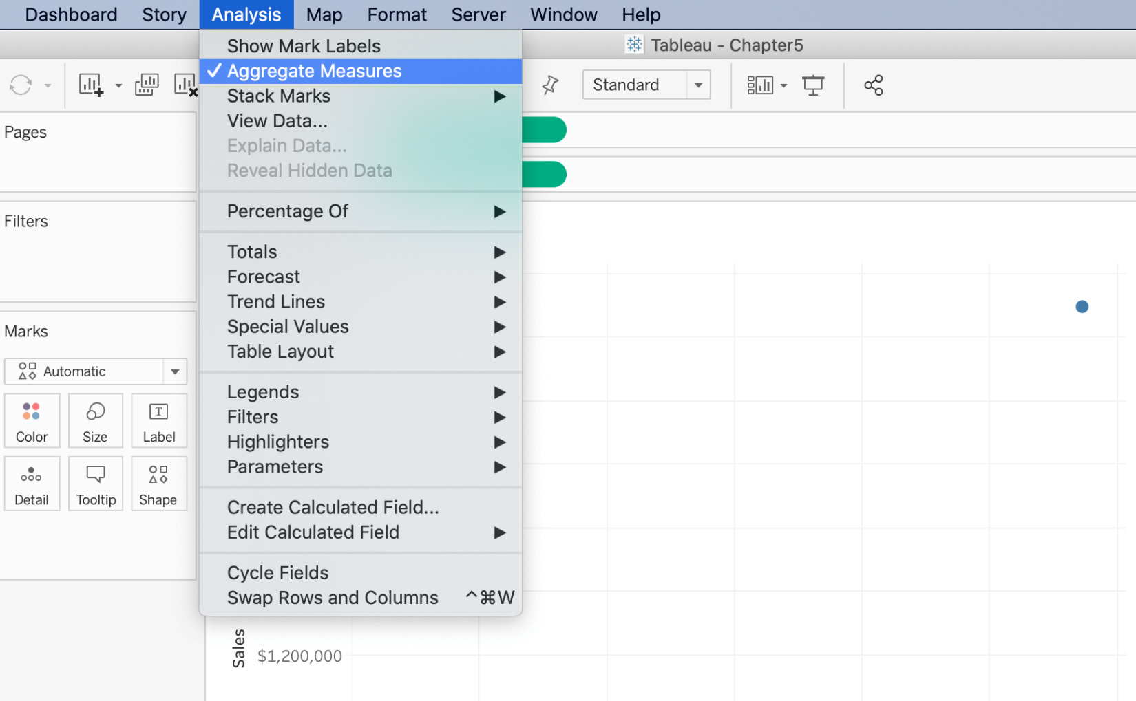
Figure 5.24: How to aggregate/de-aggregate measures
This changes the level of detail of the plot from one point for all the records in the dataset to one point for each record in the dataset.
- Double-click the title to revise it, and your Sales versus Profit scatter plot is ready:
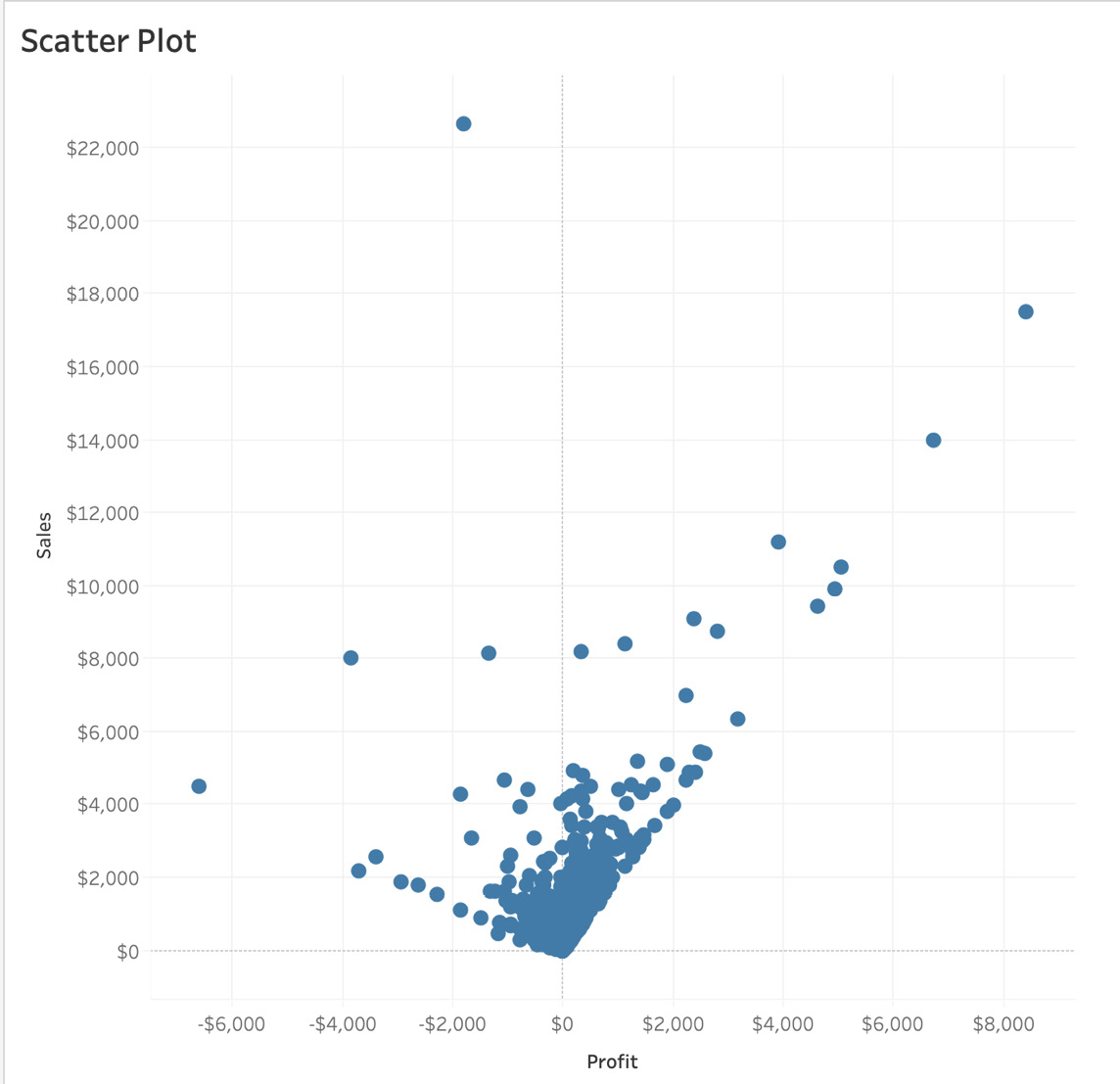
Figure 5.25: De-aggregated scatter plot of Sales versus Profit
In Figure 5.25, you see that after de-aggregation there is one point for every order in the dataset, rather than just one mark/point. The view represents every order in the dataset, and the sales and profit of each order ID.
- Reselect Aggregate Measures. Change the level of detail to Sub-Category, so there is one dot for each Sub-Category in the data. Do this by dragging Sub-Category from the Data pane to the Detail Marks card. Next, drag Sub-Category to the Label Marks card so it is easier to understand the plot:
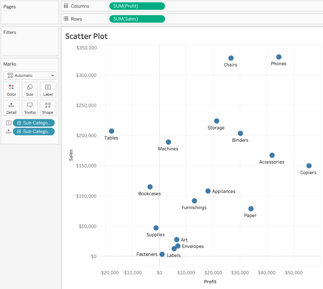
Figure 5.26: Scatter points of total sales versus profit for each sub-category
In Figure 5.25, you see that when the level of detail is changed from each order ID to each sub-category, the number of scatter points in the view reduces. There is now one mark representing each sub-category.
- To add another dimension to the view, add Category to the Color Marks shelf, which allow you to identify the sub-category quickly. These category colors also act as highlighters. The final output is as follows:
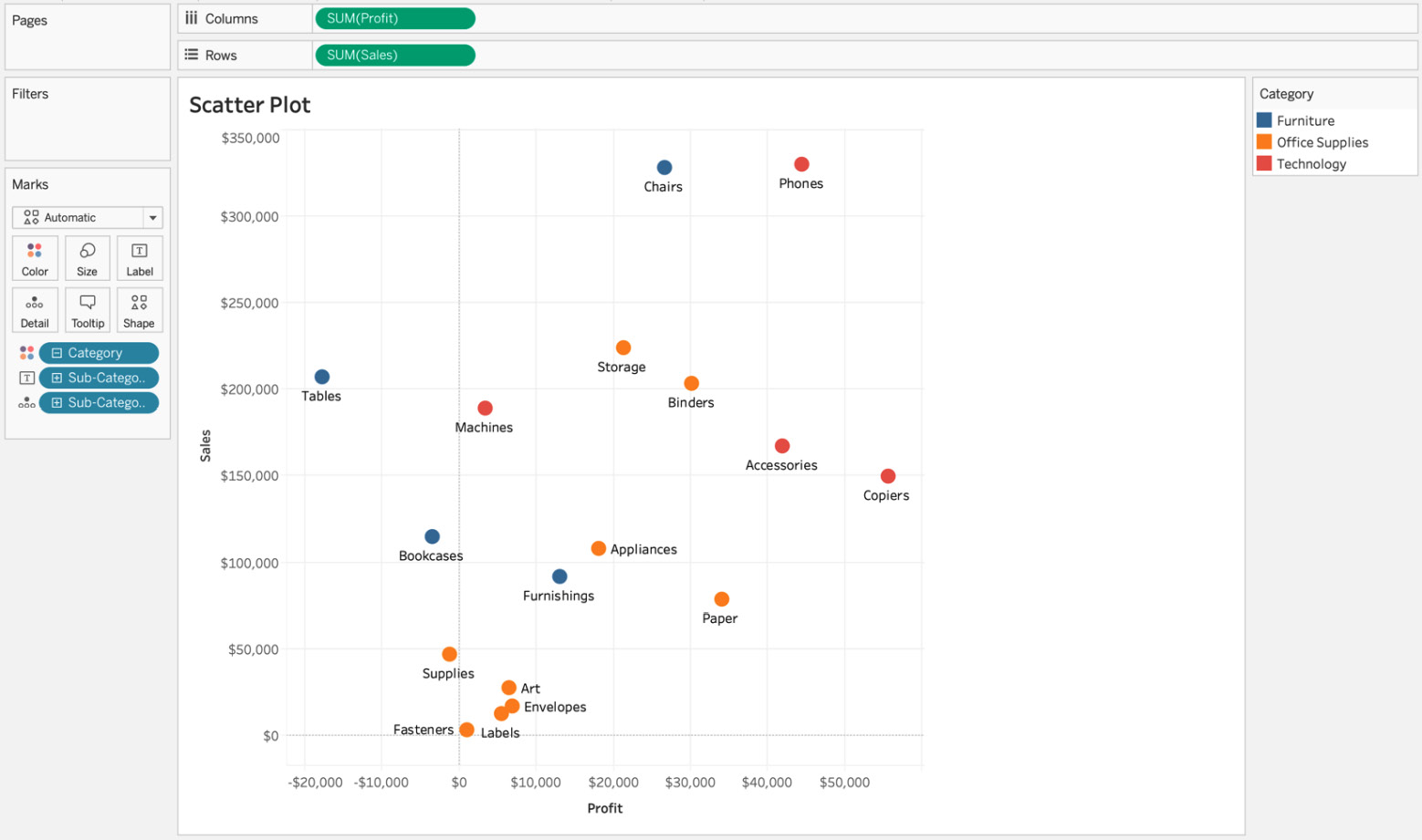
Figure 5.27: Color-coded sub-category scatter plot
Figure 5.27 clearly shows that the Tables sub-category brought in roughly $200K in sales, but was a loss-making sub-category, since Tables sales shows a loss of about $20K. Copiers on the other hand, shows sales of $150K and profits over $50K.
Considering how easy it is to observe these insights, scatter plots can be an incredible tool for plotting two measures against one and other. By adding more visual elements, it can transform into a powerful visual chart that is easily understandable as well as reasonably easy to create.
This wraps up scatter plots with two measures and two dimensions. Next, you will explore trend lines, and the options we have available in Tableau.
Scatter Plots with Trend Lines
In this section, rather than focusing on the math that trend lines are dependent on, you will look at them from an analyst/data developer perspective, and will see some common use cases in business.
Trend lines are used to observe relationships between variables. For example, they could be used to see the relationship between force and acceleration, or to track the relationship between sales and profits over a given time period. They are statistical models that are useful in estimating future patterns or trends based on historical data points.
Adding trend lines in Tableau is fairly simple. In this section, you will explore the variations of trend lines available. Figure 5.27 shows the five types of a trend line in Tableau. You will get a thorough definition of each as well as their most common applications a little later in this section.
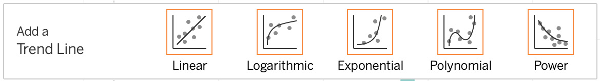
Figure 5.28: Types of trend lines in Tableau
In the next exercise, you will explore trend lines using scatter plots.
Exercise 5.05: Trend Lines with Scatter Plots
You will create scatter plots (as before), and will later add trend lines to your charts You will be using the Sample – Superstore dataset, and by the end of the exercise, you will have a good grasp of the different types of trend line that Tableau has available.
Perform the following steps to complete this exercise:
- From the Superstore sample dataset, drag Profit to the Columns shelf in the view.
- Drag Sales to the Rows shelf. Tableau automatically aggregates (sums) the measures as a default setting. To change the level of detail in the view or to de-aggregate the view, navigate to Analysis | Untick Aggregate Measures.
- To make these trend lines clearer, add Order Date to Color. Also, format the opacity of the Color Marks to 70% to make it easier to read.
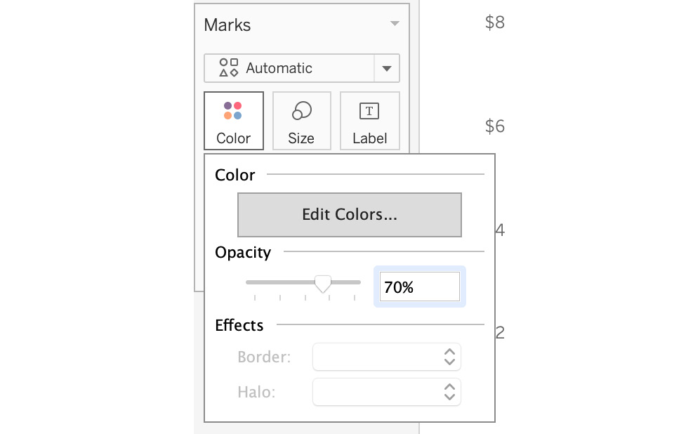
Figure 5.29: Changing Opacity for our Marks
There are three different methods to add trend lines in our views illustrated below:
- Method 1 – Using the menu bar: Navigate to Analysis | Trend Lines | Show Trend Lines:
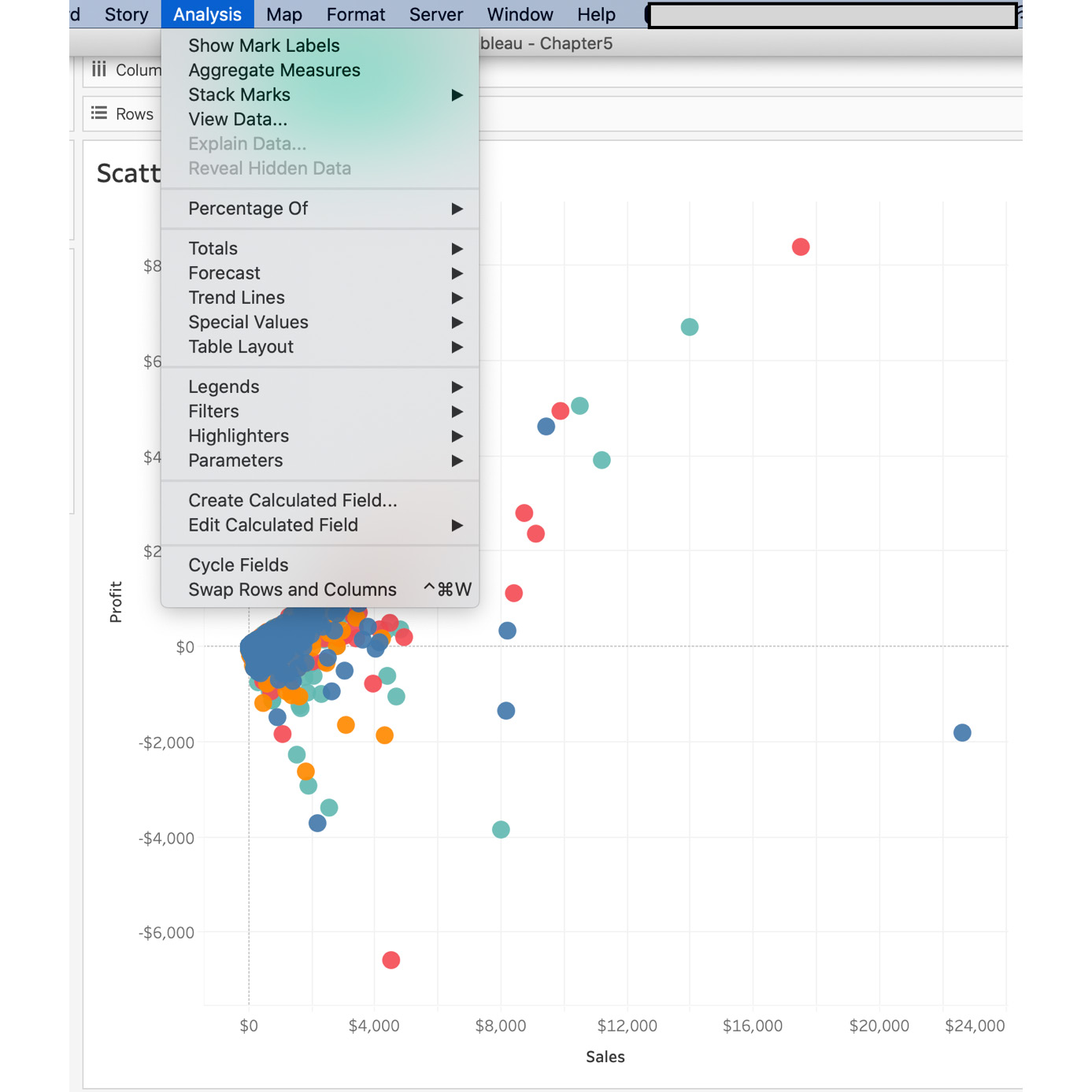
Figure 5.30: Showing trend lines
- Method 2 – Using the pane of the view: Right-click on an empty area or any of the circular Marks and navigate to Trend Lines | Show Trend Lines:
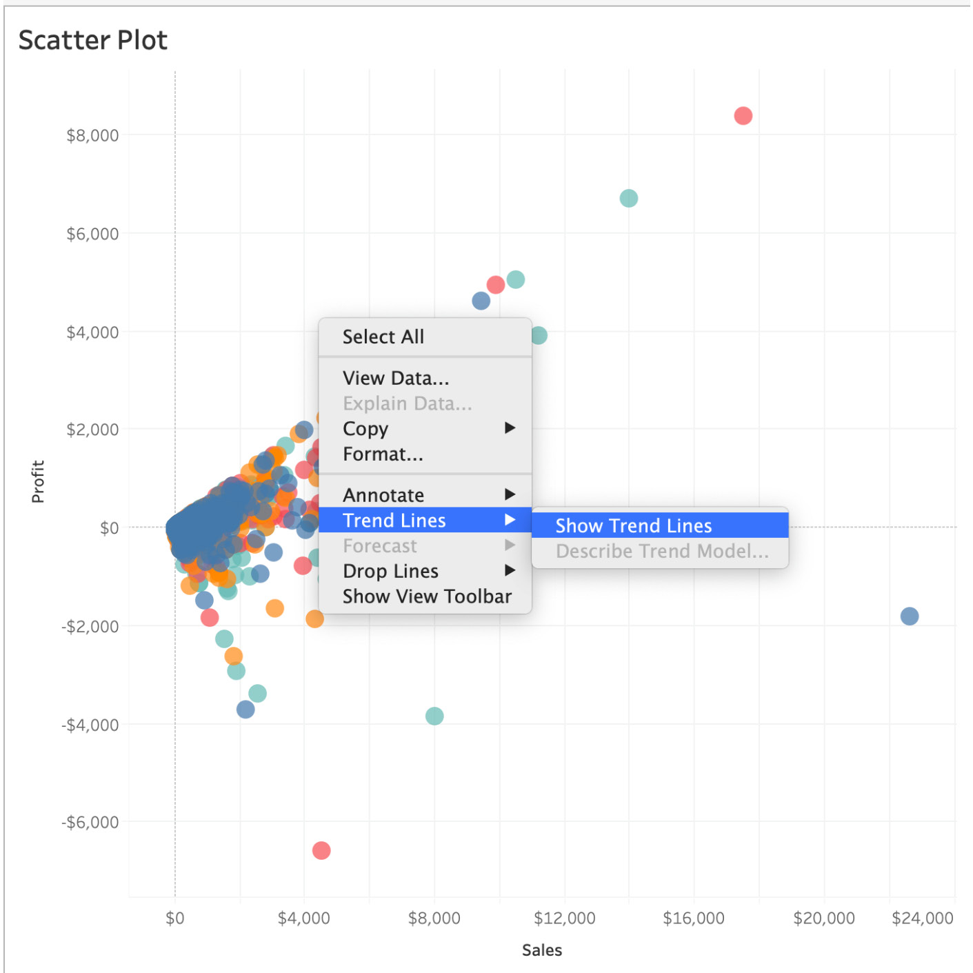
Figure 5.31: Showing Trend Lines – 2
- Method 3 – Using the Analytics pane: If you have not yet explored Tableau’s second pane in addition to the Data pane, it’s about time. Navigate to the Analytics pane and drag a trend line into the view. Select any of the trend line options available to you.
Note
Depending on your Tableau version, you will either get four or five trend line options. Users with Tableau instances older than Tableau 10.5 won’t be able to see the Power trend line. This book uses Tableau version 2020.X—hence, the Power trend line is available.
The final output is as follows:
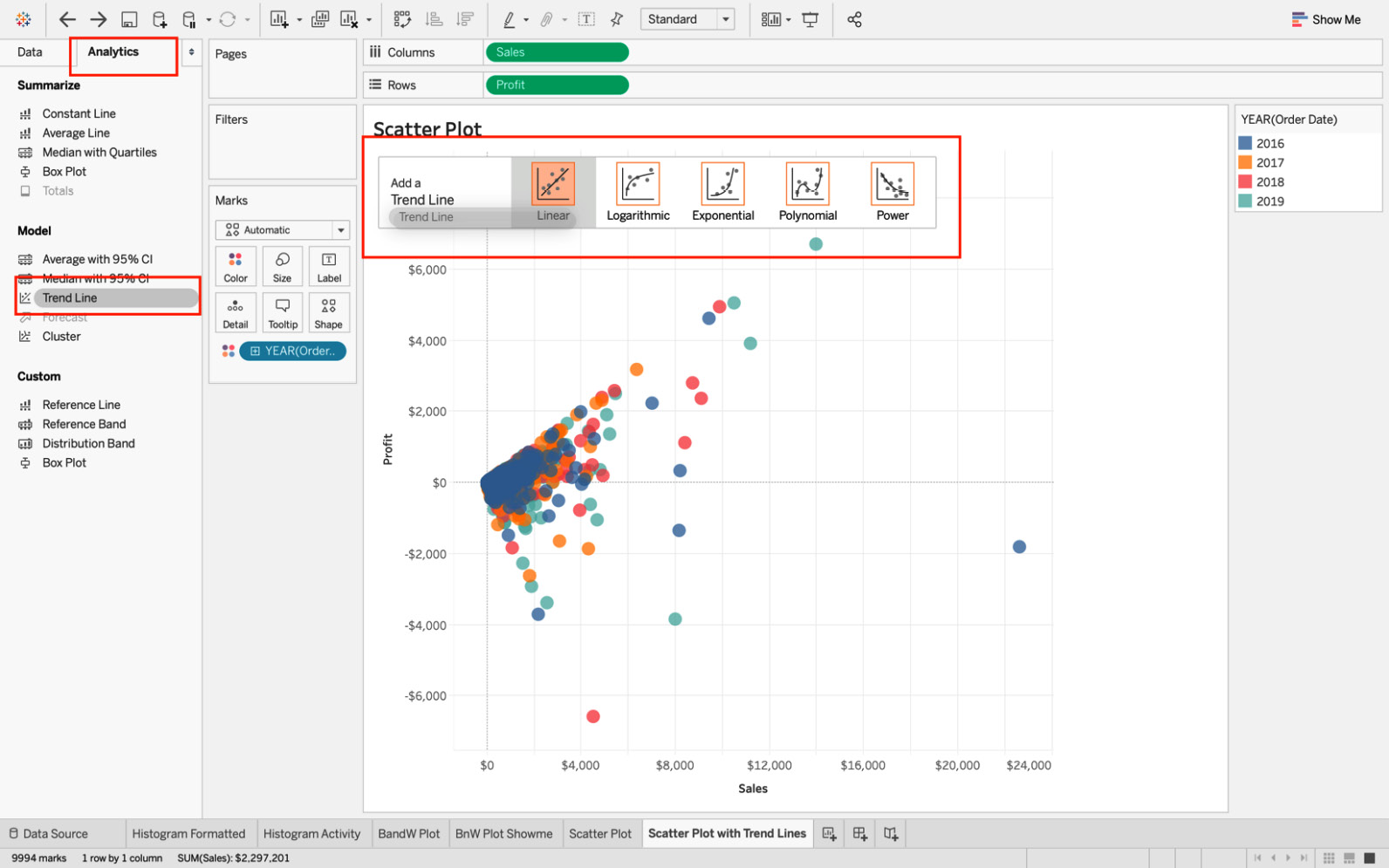
Figure 5.32: Types of trend lines in Tableau
In this exercise, you learned ways to add a trend line to the view. Next, you will explore each trend line in greater detail.
Trend Lines and Types
As previously covered, trend lines help to show the overall trend in the view. They can also be used to predict the continuation of a trend in data. Additionally, they help to identify the correlation between two variables by analyzing the underlying trend.
You will now explore each of the five trend lines that Tableau has to offer, how they differ from each other, and when to use them.
Linear Trend Lines
When estimating the linear relationship between independent as well as dependent variables (for example, the exchange rate between US dollars and others currencies), linear trend lines are the best-fit lines. Linear trend lines help to estimate variables that are steadily increasing or decreasing. The formula for a linear trend line is as follows:
Figure 5.33: Linear trend line formula
Here, Y is the dependent variable, x is the independent variable, which affects the dependent variable. m is the slope of the trend line, and c is the constant (y-intercept).
In a linear model, it is assumed that as one of the variables increases, the rate of increase/decrease for the second variable will increase/decrease at a constant rate too. More often, the variables will fall close to the trend line plotted by the model. The following figure shows an example of a linear trend line:
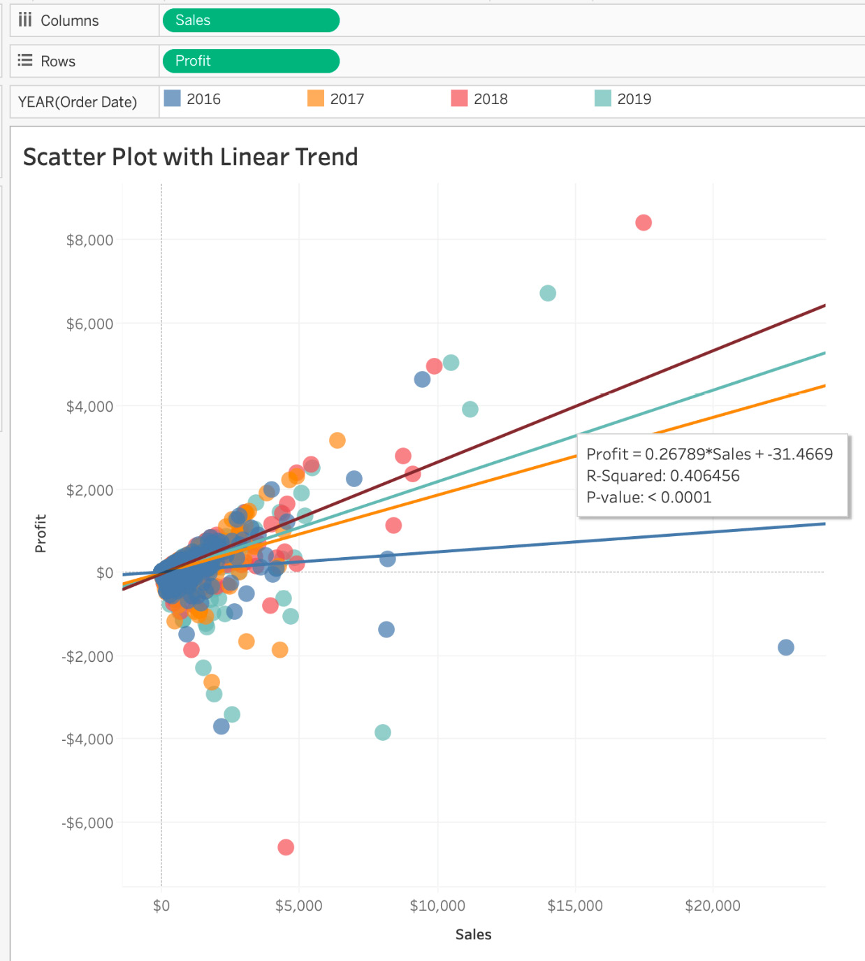
Figure 5.34: Linear trend line showcase
Polynomial Trend Lines
Polynomial, as the word suggests, means multiple items, and is best when there are a lot of fluctuations in your data. For example, it might be used when analyzing the gains and losses of stocks over a large dataset. The degree/order of a polynomial trend line is useful for determining the number of fluctuations or hills/bends in our data. The formula for a polynomial trend line is as follows:
Figure 5.35: Polynomial trend lines formula
Here, Y is the dependent variable, x is the independent variable, which affects the dependent variable; m is the slope at a point, and c is the constant.
The following figure shows an example of a scatter plot with a polynomial trend line:
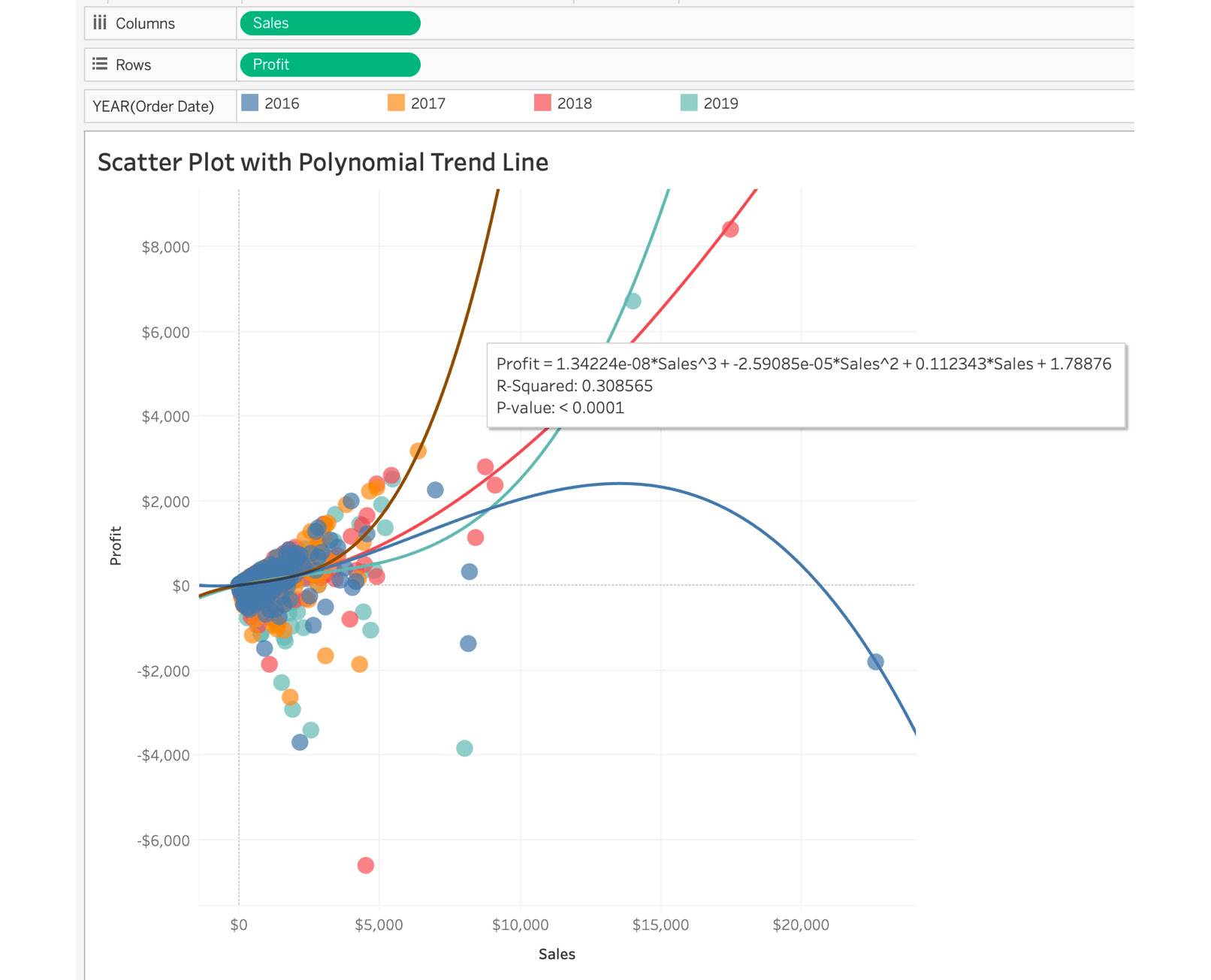
Figure 5.36: Polynomial trend line showcase
Polynomial Degree of Freedom
In the following screenshot, the degree of freedom for the polynomial trend line is 3, which means that, after analyzing the dataset, Tableau decided that the data should have three bends/hills depending on the fluctuations. A degree of 3 usually has either one or two hills and/or valleys. If you want the data to be more precise and sensitive to fluctuations, you can increase the degree of freedom to the maximum value of 8. Go ahead and play with it.
Figure 5.37: Polynomial degree of freedom edit
Logarithmic Trend Lines
If variables increase/decrease quickly and the rate later flattens out, the best-fit lines are logarithmic trend lines. An example of a logarithmic trend line is inflation rate, where the inflation rate can increase/decrease quickly and eventually flatten as the economy starts to stabilize. Another example is the rate of learning for a novice versus an expert. When a novice starts learning a topic, the rate of learning is Very fast but as they master the topic, the rate of learning flattens out. Like a linear trend line, a logarithmic trend line can use both negative and positive values.

Figure 5.38: Logarithmic trend line formula
Here, Y is the dependent variable, ln(X) is the log base, which affects the dependent variable; m is the slope, and c is the constant. The following figure shows a scatter plot with a logarithmic trend line:

Figure 5.39: Logarithmic trend line showcase
Note
The opacity is reduced and some of the data is filtered to make it more readable.
Exponential Trend Lines
The exponential trend line is the best-fit line that is most useful when the rate of the rise/fall of data is steep. The rate of spread of a virus is exponential, as an example from nature: COVID-19. The formula for an exponential trend line is as follows:

Figure 5.40: Exponential trend line formula
Here, Y is the dependent variable, X is the independent variable, which affects the dependent variable; m is the slope of the line, and e is the mathematical constant. The following plot shows the execution of an exponential trend line:
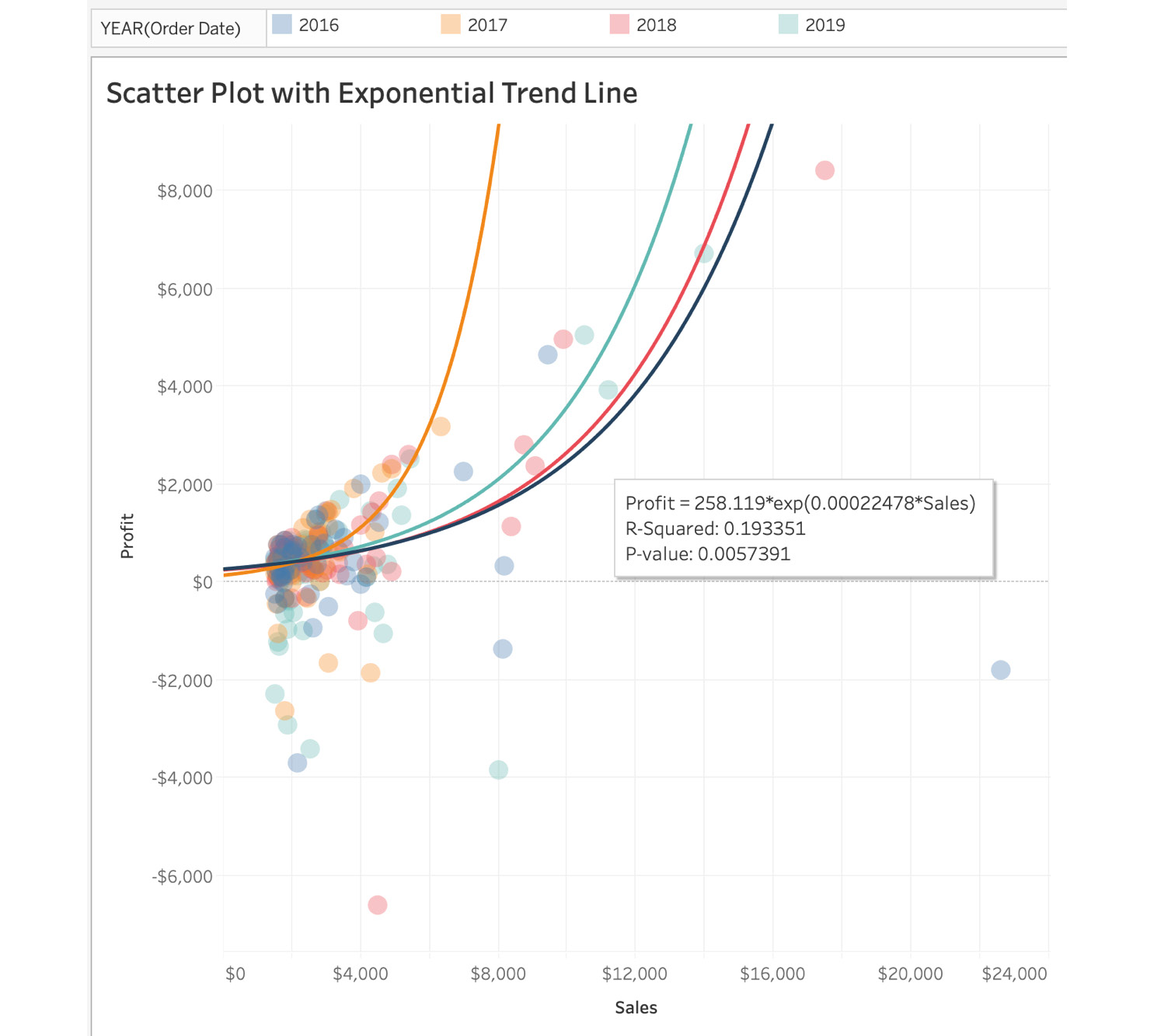
Figure 5.41: Scatter plot with an exponential trend line
Power Trend Lines
A power trend line is usually a curved line that is best utilized when the dataset contains measures that increase at a specific rate. Think about the rate of interest every year, the rate of water flow from a dam every minute, or the acceleration of a train or car. Although the trend line looks like a linear trend line, it is not linear, but curved. The formula for a power trend line is as follows:

Figure 5.42: Power trend line formula
Here, Y is the dependent variable, X is the independent variable, which affects the dependent variable, and m1 and m2 are the slope. The following figure shows a scatter plot with a power trend line:

Figure 5.43: Power trend line plot
This wraps up the types of trend lines in Tableau. Next, you will explore the reliability of trend lines and the significance of R-squared values and p-values.
The Reliability of Trend Lines
For each of the trend lines, you have a tooltip that includes the trend line formula, the R-squared value, and the p-value. For example, in a power trend line, Profit, which is the dependent variable, is related to the independent variable of Sales as seen in the following formula:

Figure 5.44: Power trend line result
The way to read the formula is that for every unit increase in Sales, Profit will be calculated by multiplying Sales by the power of 1.158 by 0.5591. You will now explore the significance of R-squared values and p-values.
R-Squared
As end users of the trend line, it is important to understand the reliability of these predictions. The trend line is considered most reliable when the R-squared value is closest to 1. This signals that there is an extremely high likelihood that future data/variables will fall within the predicted line (or close to it).
P-value
The p-value is a statistical function that quantifies how likely it is that a given prediction happened by chance. The lower the p-value, the more statistically significant. In the power trend line example, the p-value was very small (p < 0.0001), which means if you were to collect the data points for the report again, it is highly likely you would see a similar trend, . For most use cases, any p-value greater than p > 0.05 is considered statistically insignificant, which means if you were to repeat the same data collection, you would likely not get a similar trend, since there is a greater than 5% chance the results were due to randomness or chance.
This wraps up the section on trend lines, where you explored the five default trend lines Tableau and the importance of R-squared and p-value. In the next section, you will compare two measures with one another via dual axis.
Advanced Charts
In previous exercises, you have explored distributions and relationships across single as well as multiple measures, which allows you to answer essential business questions relatively well. But Tableau offers advanced chart types, which can help answer complicated questions such as What are the trends of profit with regard to sales by year? You can easily answer this question by utilizing a dual axis chart.
In this section, you will explore the following chart types:
- Quadrant charts
- Combination charts
- Lollipop charts
- Pareto charts
This is certainly not an exhaustive list of the advanced charting available in Tableau; there are other interesting chart types such as donut charts, sparkline charts, Sankey diagrams, and waffle charts. But the charts above are some of the essential ones that are most frequently used in business dashboards, and are generally well received by end users.
Quadrant Charts
Quadrant charts are just scatter plots divided into four grids instead of two sections. In the scatter plots created previously (Exercise 5.04, Creating a Scatter Plot), you compared sales versus profits, but it was difficult to identify outliers, or marks that had high profit and high sales, or low profit and high sales.
Quadrant charts can help . In this section, you will create a quadrant chart, as you can see in the following figure:

Figure 5.45: Power trend line result
Before creating your quadrant chart, it is important to talk about reference lines and the options available.
Reference Lines
Reference lines do what their name suggests, adding a reference to our view. You can add reference lines either as constants or with calculated values of the axis. When you add a reference line with a computed value, the line is dynamic and adjusts depending on the specific field that the line is dependent on.
Apart from reference lines, you can also add confidence intervals to lines.
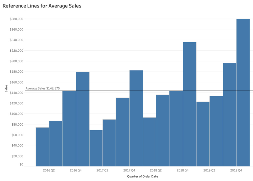
Figure 5.46: Reference line for average sales for the Superstore dataset
In the preceding screenshot, the reference line added in the view represents the average sales each quarter across the dataset. Adding reference lines helps to create a reference point where the reference point can be compared with the overall view.
Understanding Reference Lines
To better understand the importance of reference lines, you will now create a sample view of sales by year and explore the types of reference lines available in Tableau:
- Entire Table Reference Line: The scope of this type of reference line is the entire table.
- Per Pane Reference Line: This type of reference line is added to each sub-section of the view.
- Per Cell Reference Line: With this reference line type, you add a reference line for each individual cell in the view.
The steps to this are as follows:
- Assuming you have the Sample – Superstore dataset open in Tableau instance, add YEAR(Order Date), then drag Category (Ctrl + drag for Windows or Option + drag for Mac) to the Columns shelf.
- Drag Sales to the Rows shelf and, to add color to the view, drag YEAR(Order Date) to the Color Marks card:
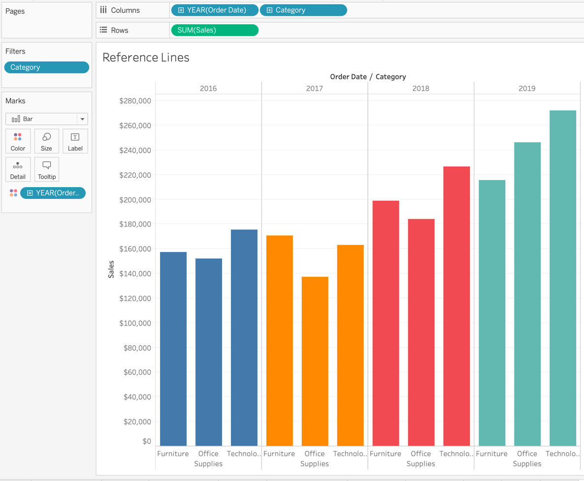
Figure 5.47: Sales by category and year
- Navigate to the Analytics pane and select and drag Reference Lines to the view. As you do so, you get three options: Table, Pane, and Cell. These are the scope of the reference lines that you have to select for the view.
- Entire Table Reference Line: The scope of the reference line in the entire table. In this case, you are adding a reference line for Average Sales for the entire table.
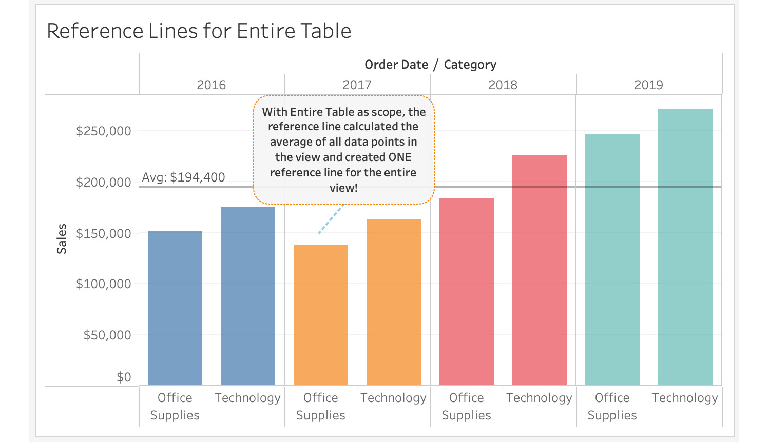
Figure 5.48: Average sales for the dataset
- Per Pane Reference Line: In this type of reference line, the reference line is added to each category and the average or any other computation is calculated as required by each category.
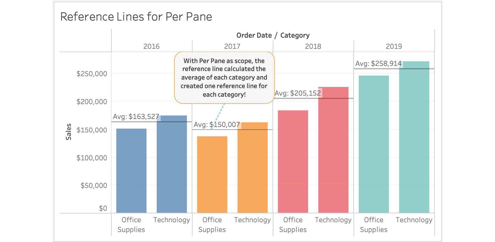
Figure 5.49: Average sales by year
- Per Cell Reference Line: This is likely the least used reference line, because, in this case, it just adds a reference line for sales by category for each of the years in the view, which as you can see in the following figure is just a reference line at the top of the bar chart.
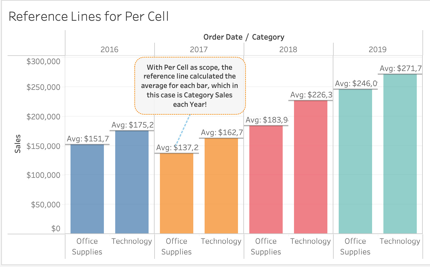
Figure 5.50: Average sales by category and year
- In the preceding screenshots, you might have noticed that the reference line has the Average Sales label at the start of the line. You can add that either while adding the reference line to the view or by editing after adding the reference line to the view. Right-click Reference Lines | Edit Reference Lines. Navigate to Label and select Custom from the dropdown. Type your label name with <Value> (in this case, Avg: <Value>):
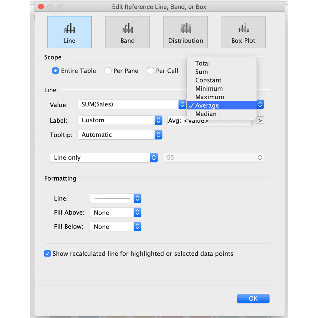
Figure 5.51: Editing Reference Lines with aggregation options
If you want to change the scope of your reference line, you can edit it from the Edit Reference Line, Band, or Box window that you saw in the previous step. You can also change the value of your measure to be count, sum, min, max, or some other aggregation as per your need.
Exercise 5.06: Creating Quadrant Charts
In this exercise, you will analyze store data to find both overall profit across all orders, as well as profit ratio. A reference point should be present in the view that allows anyone to quickly understand higher profit and higher profit ratio orders, as well as lower profit and higher loss-making orders.
The best chart to fulfill these requirements is the quadrant chart, because it allows for scatter plot-creation with vertical and horizontal reference lines, which will help create a reference point with regard to profit versus profit ratio.
You will be using the Sample – Superstore dataset. By the end of the exercise, you should be able to understand the different types of reference lines available in Tableau.
Perform the followings steps to complete the exercise:
- Open the Sample – Superstore dataset in your Tableau instance.
- Create a scatter plot of profit versus profit ratio. Drag Profit to the Columns shelf and Profit Ratio to the Rows shelf. De-aggregate the measures by navigating to Analysis and unchecking Aggregate Measures.
Note
If Profit Ratio is unavailable for you, use Sales instead.
- Drag YEAR(Order Date) (Ctrl + drag for Windows and Option + drag for Mac) to the Color Marks shelf:
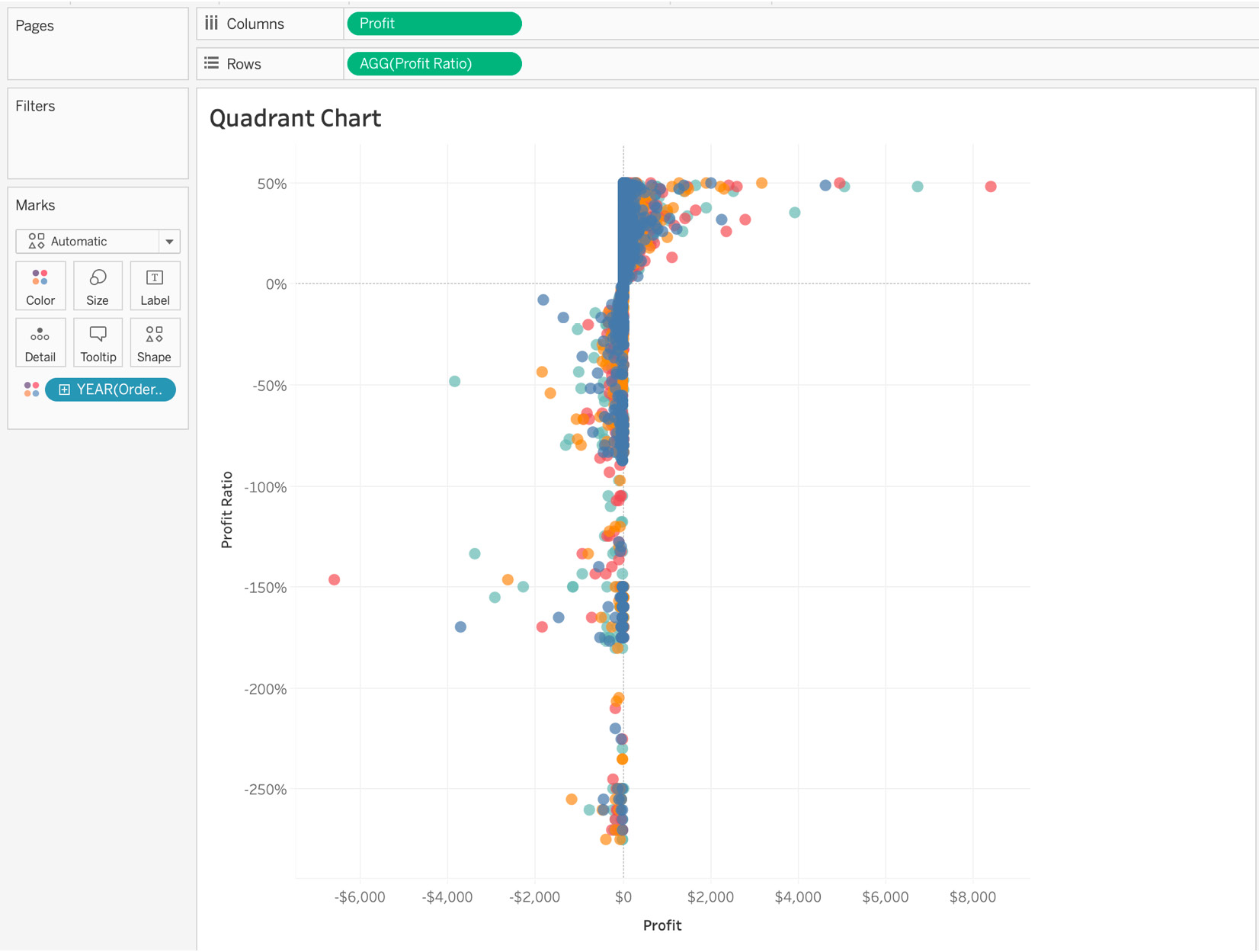
Figure 5.52: Scatter plot for a quadrant chart
As you can see, you have plotted all orders on the x-y axis where the x axis is Profit and the y axis is Profit Ratio. You also color-coded the orders by year.
- To add quadrants, add reference lines to the view. Since a quadrant contains two lines intersecting in the middle, you will be adding two reference lines—one for Average Profit, and one for Average Profit Ratio.
- Navigate to the Analytics pane, and drag Reference Lines to the view. First, you will create a reference line for Profit, which in this case is the vertical reference line. Right-click the reference line to edit the Label text and value as discussed in the Understanding Reference Lines section. You have added Average Profit: <Value> as the Label Marks card for the vertical line.
- Repeat the steps for a horizontal reference line, which in this case, is the average horizontal reference line for Profit Ratio:
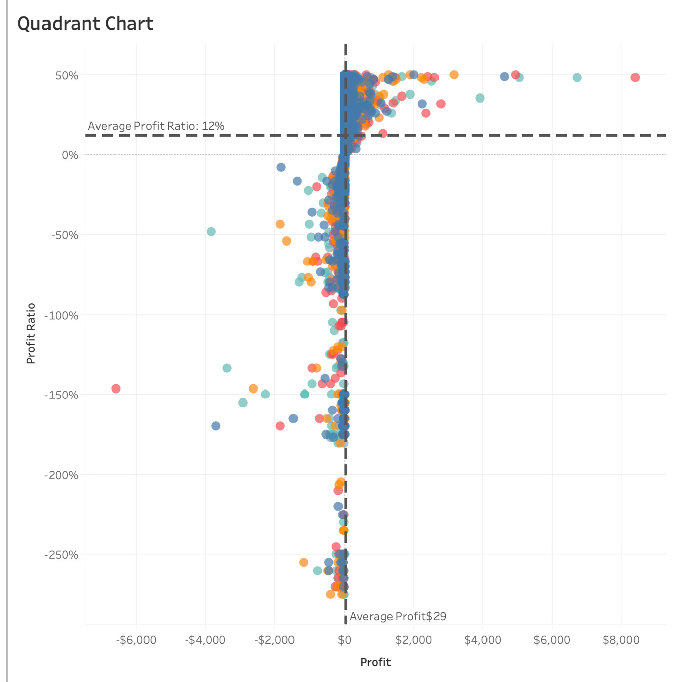
Figure 5.53: Reference lines on a scatter plot
In the preceding figure, you added two reference lines with aggregation set to Average. The horizontal reference line represents Average Profit Ratio across Orders and the vertical reference line represents Average Profit across Orders.
- To make it easier for an audience, you can annotate the quadrants by right-clicking in the view and adding annotation text as shown in the following figure:
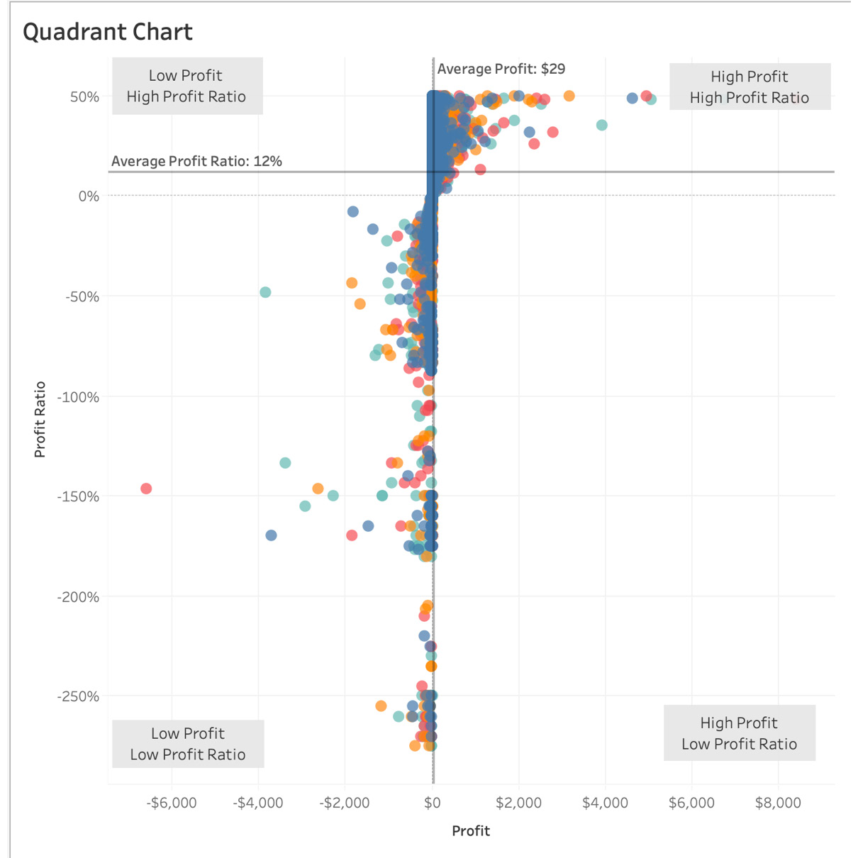
Figure 5.54: Annotated text quadrant chart
This wraps up this section on quadrant charts. You have now explored reference lines in combination with scatter plots and have also added annotations to the view, which is a great contextual tool for charts. Next, you will explore dual axis charts.
Combination Charts – Dual axis Charts
Combination charts (otherwise known as dual axis charts or combo charts) are one of the most popular chart types due to their flexibility and the value they add to storytelling. Dual axis chart types are essentially two charts merged into one with a shared axis. For example, a date dimension could be the x axis and you could have two separate y axes on the same chart representing two different measures. An example of a dual axis chart for our Superstore dataset would be the trends of profit with regard to sales by year. Here, Year will be the Date dimension (x axis) and Sales and Profit will be the y axis. You will create a dual axis chart with similar mark types as part of the section.
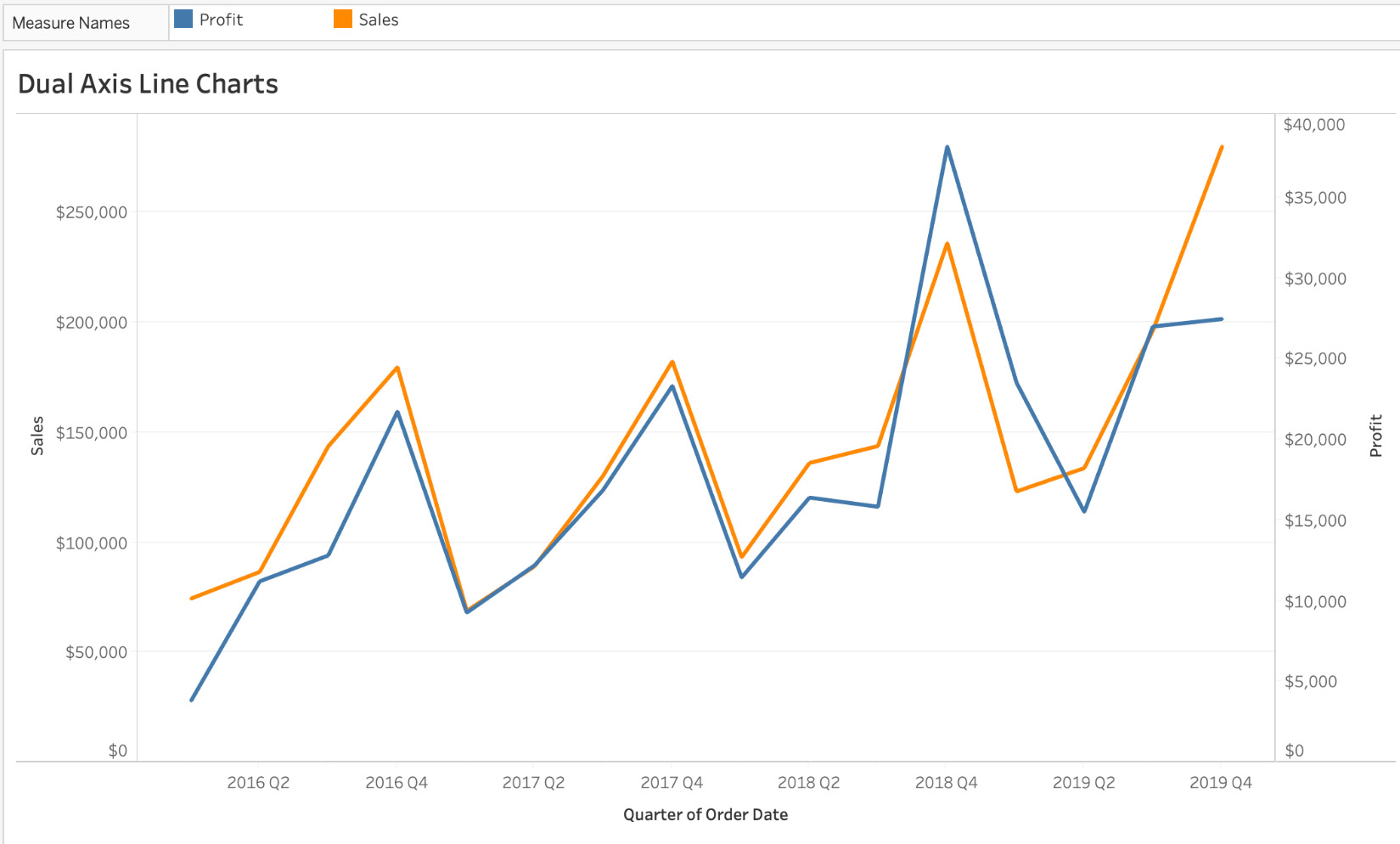
Figure 5.55: Sample dual axis line chart
As you can see in the preceding figure, there are two line charts in the same view. The blue line represents Profit by Quarter and the orange line represents Sales by Quarter.
Exercise 5.07: Creating Dual axis Charts
Now, you will create a view of sales versus profits, and will also show the trends of both these business-critical metrics in the view. The view has to be by quarter. You will be using the Sample – Superstore dataset to create the view.
Perform the following steps to complete this exercise:
- Open the Sample – Superstore dataset in your Tableau instance.
- Drag QUARTER(Order Date) to the Columns shelf and click the arrow on QUARTER(Order Date) in the Columns shelf and change the level of detail for the dimension to Continuous (you can also press Ctrl + drag for Windows or Option + drag for Mac to select Continuous):
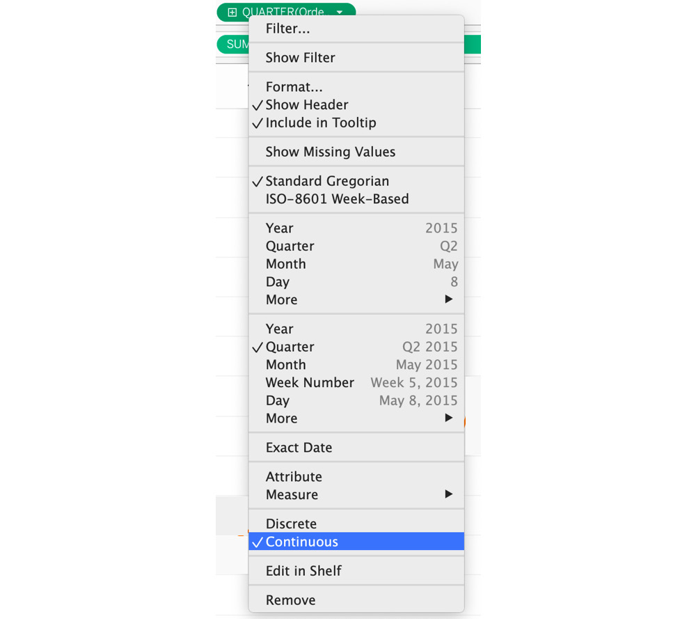
Figure 5.56: Converting the date to Continuous
- Add Profit as well as Sales to the Rows shelf. Create two bar charts as shown in the following figure. Add QUARTER(Order Date) as Label for better representation:
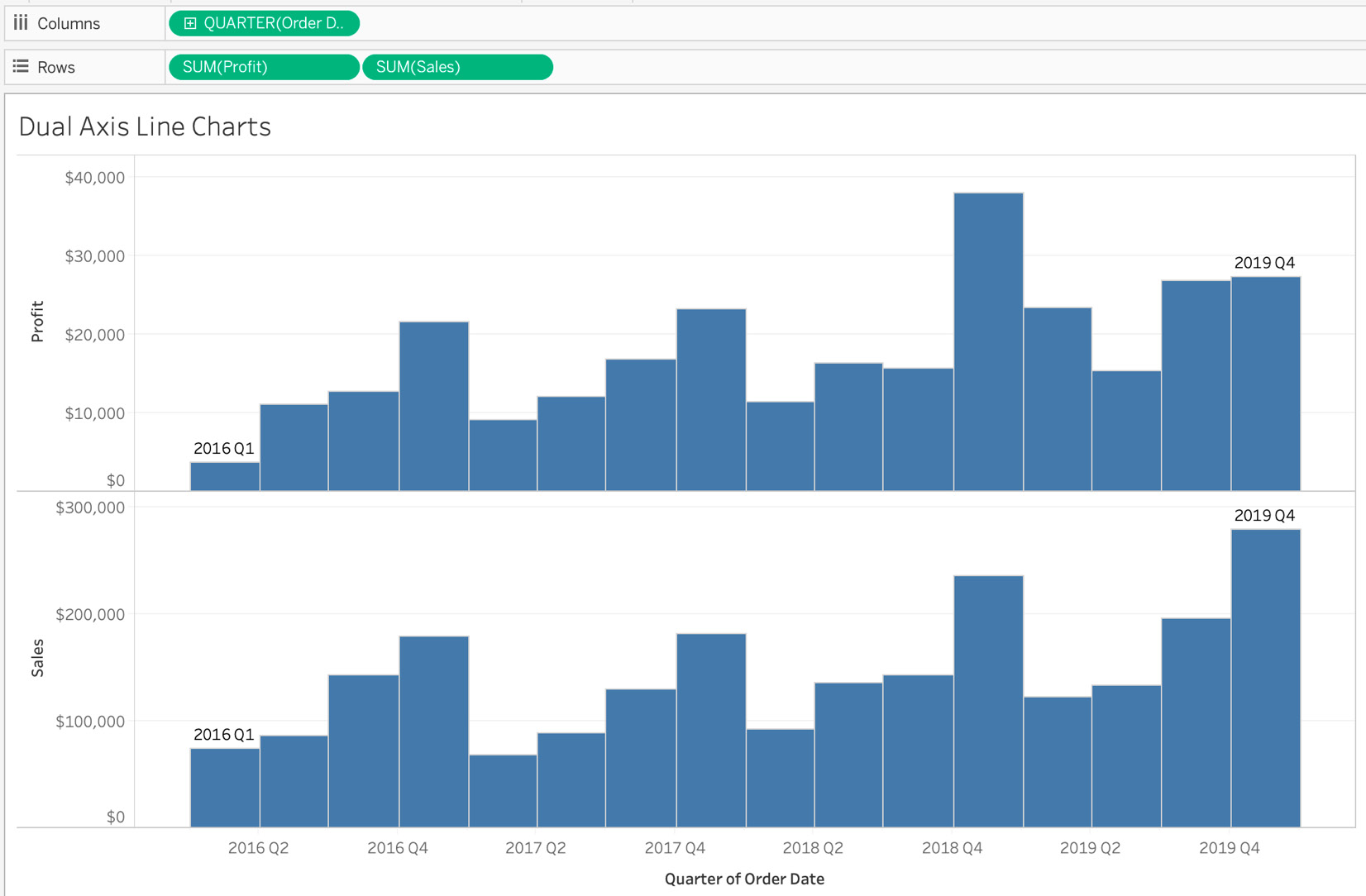
Figure 5.57: Profit and Sales bar charts by quarter
- On the Marks shelf, there are three sections: All, SUM(Profit), and SUM(Sales). Having individual measures as Marks cards allows you to control each of these measures separately. On the All marks card (if applicable in your Tableau instance), change the Marks type from Bar to Line. The output is shown in the following screenshot:
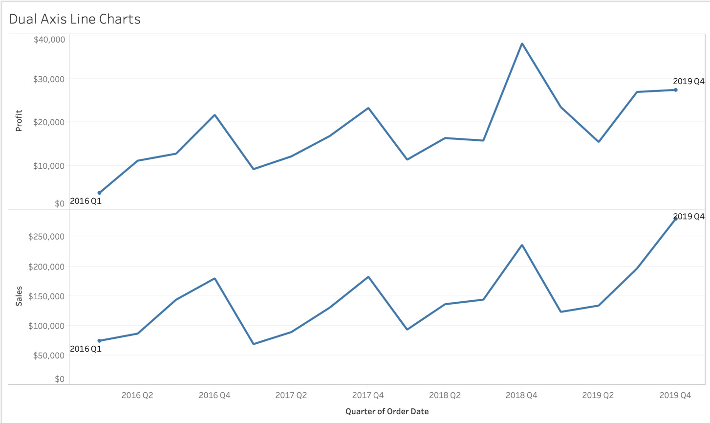
Figure 5.58: Sales and Profit line charts by quarter
- The most important step is to right-click or click on the down arrow for either of the two measures (Profit or Sales) in the Rows shelf and tick to select Dual Axis.

Figure 5.59: Converting two line charts to a dual axis chart
- There are now two separate measures, Profit and Sales, sharing Order Date as a common x axis and two measure values as the y axis:
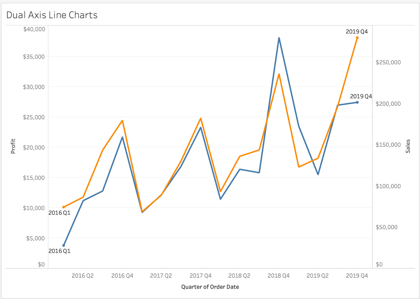
Figure 5.60: Dual axis chart – asynchronous
If you observe closely, the two axes have different Marks, with the Profit axis ranging from $0-$40,000, and Sales ranging from $0-$250,000. The chart portrays the completely wrong picture, because the two line charts have different axis ranges and could lead to incorrect insights.
- To fix the asynchronous axes, right-click either of the axes and select Synchronize Axis, this will fix the issue and should now have two axes with the same ranges:
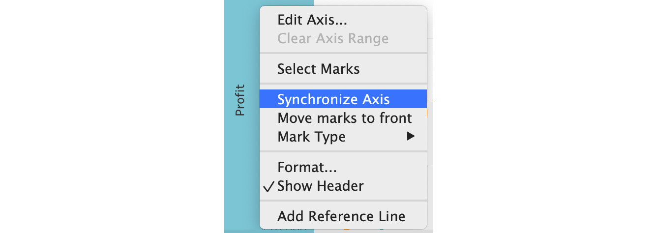
Figure 5.61: How to synchronize a dual axis chart
The final output will be as follows:
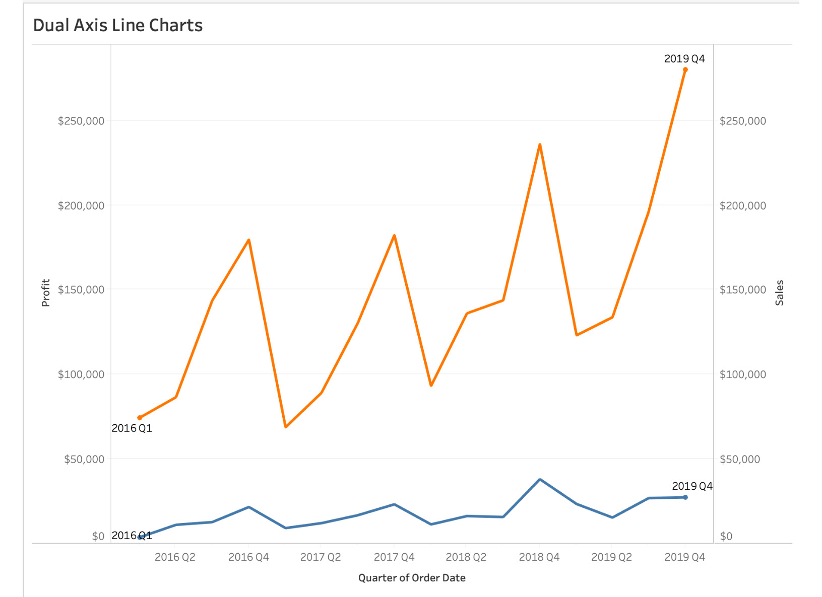
Figure 5.62: Synchronized dual axis chart
You have now created your first dual axis chart. The title or axes labels can be changed as per your requirements. In the preceding screenshot, after synchronizing the axes, you see that for 2016 Q4, Sales were in the range of $150-200K, whereas Profit was in the range of $0-50K. If you had not synchronized the axes, it would have been difficult to understand what the sales or profit was for each of the line charts.
As you have observed, dual axis charts such as scatter plots can be incredibly powerful charts to convey information in the most succinct, contextual way. In Figure 5.62, you can see sales versus profit growth over the years, and can analyze the trend while doing so.
This brings to close the main body of the chapter. You will now complete some activities to build on what you have learned.
Activity 5.01: Creating Scatter Plots
Imagine you work as an e-commerce analyst and your manager has asked you to create a view of Sales versus Profit Ratio. (Use Profit, if Profit Ratio is unavailable for you.) They want to see the metric broken down by Segment and Year. You will use scatter plots to achieve this, and will fulfill the requirements using the Sample – Superstore dataset.
The following steps will help you complete this activity:
- Open the Sample – Superstore dataset in Tableau instance.
- Double-click or drag Profit Ratio to the Columns shelf.
- Repeat the last step for the Sales to Rows shelf.
- De-aggregate the measure by navigating to Analysis and unselecting the aggregate measures.
- Add Category to the Color Marks card and Segment to the Shape Marks card.
- Next, add Segment to Filters and show it in your view.
- Repeat the same step for YEAR(Order Date), by dragging Order Date to the Filter shelf.
- Change both the filters shown in the view to Single Value (List) by clicking or right-clicking on the top-right arrow.
- Double-click on View Title to change the title of the worksheet to Scatter Plot by Segment and Year.
- Change the opacity of your color to 70% for better readability.
- You should have the following filters.
The final output will be as follows:
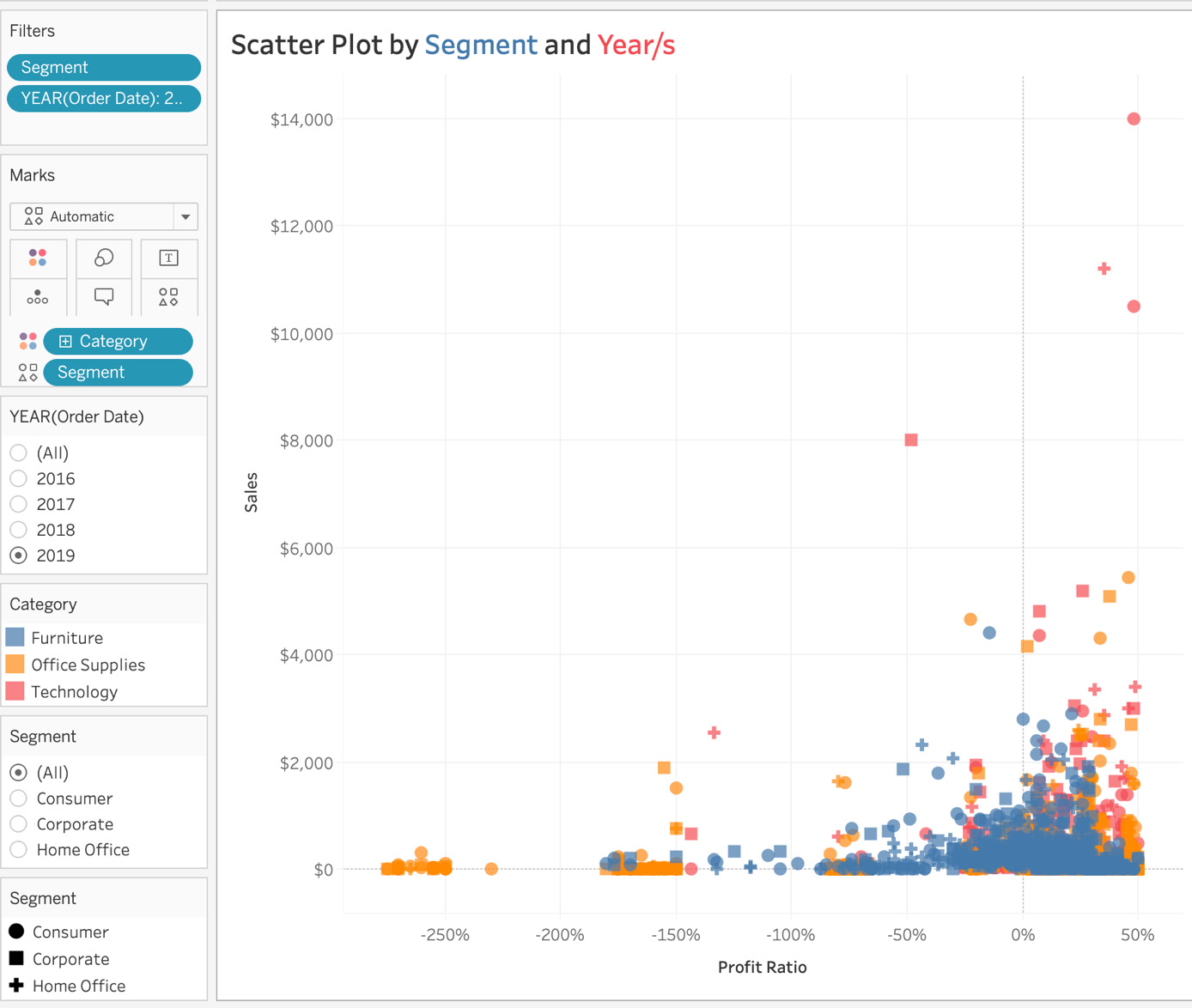
Figure 5.63: Activity final output
In this activity, you strengthened your knowledge of scatter plots and formatting options.
As a chart reading exercise, consider the circular (Consumer segment), red (Technology category) mark type at the top right of the chart. As you see, this particular point (order) has a high sales figure, and a high profit ratio for 2019. An observing category manager, will see such outliers, and can now take steps to replicate this success across the board.
Note
The solution to this activity can be found here: https://packt.link/CTCxk.
Activity 5.02: Dual axis Chart with Asynchronous Axes
This activity continues on from the last. After fulfilling the initial scatter plot requirements, you are now tasked with creating a dual axis chart, that shows how Discounts affect Sales month by month. Essentially, you are asked to create a view of sales versus discounts by month using a dual axis chart with an asynchronous dual axis.
The following steps will help you complete this activity:
- Open the Sample – Superstore dataset in your Tableau instance.
- Create the initial bar chart showing Sales by Order Date by Month (Continuous).
- Change the chart type from Line to Bar from the Marks card.
- Drag Discount to the Column shelf.
- Create a dual axis by right-clicking on any of the measures in the Column shelf.
- Change the mark type of Discount from Bar to Line from the Marks shelf.
- Don’t synchronize your axes, because if you do, the Discount axis will have a range of 0-120,000%, which in reality does not exist.
- Format the chart by adding the Discount label for Discount, and edit the color of the Discount line chart to blue, or any color you prefer.
The final expected output is as follows:
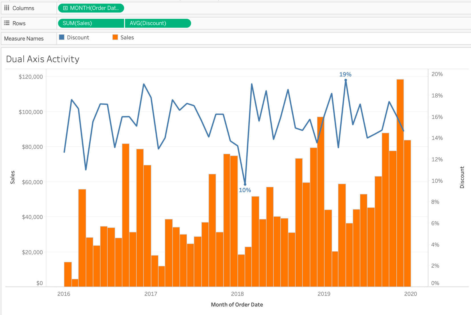
Figure 5.64: Final output of Activity 5.02
In this activity, you created a dual axis chart with different marks types for the measures, and explored why synchronizing the axes is not always a good idea, as it can lead to extrapolating or under-reporting the actual numbers.
The way to read the preceding dual axis chart is, say, for April 2016, the average discount was 11% and Total Sales that month were $28,295.
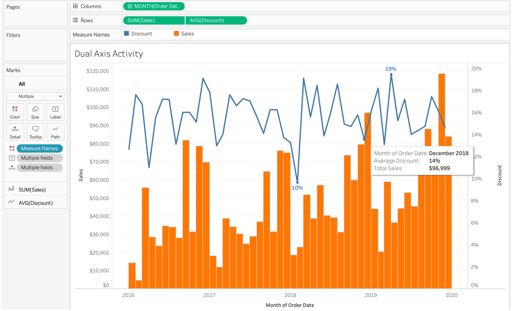
Figure 5.65: Dual axis final output of Activity 5.02
Similarly, for the month of December 2018, you should notice that the average discount was 14% while Total Sales that month were $96,999. If you sync your dual axes, the average discount percentage would probably be in the thousands, as seen in Figure 5.73.
Note
The solution to this activity can be found here: https://packt.link/CTCxk.
Summary
In this chapter, you explored distribution with one-measure histograms, box and whisker plots, and multiple-measure scatter plots. You also saw in detail the types of trend lines available in Tableau, why they are used, and which trend lines are most appropriate for given situations. Then, you learned how to check whether a trend line created by Tableau is reliable, and touched on the R-squared value and p-value. Finally, you explored advanced chart types, where we interacted with dual axis and quadrant charts. Finally, you completed some activities on dual axis charts with asynchronous axes, as well as scatter plots with filters and shapes.
You are now at the stage where you can start to answer data questions using all the different types of you have created. You can start adding readability elements , and you can also create advanced visualizations if the view requires you to answer multiple questions at once (such as profit versus sales trend by quarter on a dual axis chart).
In the next chapter, you will move away from standard data and on to geographical data, where you will dive deeper into maps and the formatting options available.