
Chapter 6: CSS and Built-In Styling Methods
What makes the difference between a great and a bad UI? Some people may answer "features!" and others may say "speed of interaction!" but I would personally define it as a good combination of a great design and ease of use. Your web application could potentially be the most powerful app in the world. Still, it would be difficult for your users to make it work as intended if the UI is not well designed and implemented. So here comes the concept of styling.
We all know what CSS is: a basic set of rules telling the browser how to render HTML content graphically. While this seems an easy task, the CSS ecosystem has evolved a lot during recent years, and so has all the tooling that helps developers build great user interfaces with modular, lightweight, and performant CSS rules.
In this chapter, we will look at several approaches to writing CSS rules. That will pave the way to Chapter 7, Using UI Frameworks, where we'll implement UIs using external UI frameworks and utilities to make the developer experience even smoother.
Attention
This chapter is not intended to teach you how to write CSS rules in any specific technology or language. Instead, we will look at the technologies Next.js integrates out of the box for writing modular, maintainable, and performant CSS styles. If any of the following technologies arouse your interest, I'd recommend reading the official documentation before moving any further into implementing a UI with them.
We will look in detail at the following topics:
- Styled JSX
- CSS modules
- How to integrate the SASS preprocessor
By the end of the chapter, you will have learned about the three different built-in styling methods, their differences, and how to configure them for your needs.
Technical requirements
To run the code examples in this chapter, you need to have both Node.js and npm installed on your local machine.
If you prefer, you can use an online IDE such as https://repl.it or https://codesandbox.io; they both support Next.js, and you don't need to install any dependency on your computer. As for the other chapters, you can find the code base for this chapter on GitHub: https://github.com/PacktPublishing/Real-World-Next.js.
Exploring and using Styled JSX
In this section, we will explore Styled JSX, a built-in styling mechanism provided by default by Next.js.
If you don't want to learn a new styling language such as SASS or LESS and want to integrate a bit of JavaScript into your CSS rules, you might be interested in Styled JSX. It's a CSS-in-JS library (meaning that we can use JavaScript to write CSS properties) created by Vercel, the company behind Next.js, that allows you to write CSS rules and classes that are scoped to a specific component.
Let me explain this concept with an easy example. Let's say that we have a Button component, and we want to style it using Styled JSX:
export default function Button(props) {
return (
<>
<button className="button">{props.children}</button>
<style jsx>{`
.button {
padding: 1em;
border-radius: 1em;
border: none;
background: green;
color: white;
}
`}</style>
</>
);
}
As you can see, we're using a very generic button class name, which is likely to cause some conflicts with other components using the same class name, right? The answer is no! Here's why Styled JSX is so powerful. Not only does it allow you to write highly dynamic CSS thanks to JavaScript, but it also makes sure that the rule you're declaring won't affect any component other than the one you're writing.
So, if we now want to create a new component called FancyButton, we can use the same class name and, thanks to Styled JSX, it won't override the Button components styles when both are rendered on page:
export default function FancyButton(props) {
return (
<>
<button className="button">{props.children}</button>
<style jsx>{`
.button {
padding: 2em;
border-radius: 2em;
background: purple;
color: white;
font-size: bold;
border: pink solid 2px;
}
`}</style>
</>
);
}
The same happens with HTML selectors. If we're writing a Highlight component, we can simply use Styled JSX to style the whole component without even declaring a specific class:
export default function Highlight(props) {
return (
<>
<span>{props.text}</span>
<style jsx>{`
span {
background: yellow;
font-weight: bold;
}
`}</style>
</>
);
}
In that case, the <span> style we wrote will be applied to the Highlight component only and won't affect any other <span> element inside of your pages.
If you want to create a CSS rule that will be applied to all components, you can just use the global prop, and Styled JSX will apply that rule to all the HTML elements matching your selector:
export default function Highlight(props) {
return (
<>
<span>{props.text}</span>
<style jsx global>{`
span {
background: yellow;
font-weight: bold;
}
`}</style>
</>
)
}
In the previous example, we added the global prop to our style declaration, so now, every time we use a <span> element, it will inherit the styles we declared inside of our Highlight component. Of course, this can be risky, so make sure that's what you want.
If you're wondering how to get started using Styled JSX and why we haven't covered this package's installation yet... that's because Styled JSX is built into Next.js, so you can start using it right after initializing the project!
In the next section, we'll look at a more classic approach for writing CSS rules: CSS modules.
CSS modules
In the previous section, we saw a CSS-in-JS library, meaning that we had to write our CSS definitions in JavaScript, transforming those styling rules to plain CSS at runtime or compile time, depending on which library we choose and how we configure it.
While I personally like the CSS-in-JS approach, I eventually recognized that it has some significant drawbacks to consider when choosing the styling method for a new Next.js app.
Many CSS-in-JS libraries don't provide good IDE/code editor support, making things way harder for developers (no syntax highlighting, autocomplete, linting, and so on). Also, using CSS-in-JS forces you to adopt more and more dependencies, making your application bundle bigger and slower.
Talking about performance, here's another big drawback: even if we pre-generate CSS rules on the server side, we would need to re-generate them after React hydration on the client side. That adds a high runtime cost, making the web application slower and slower, and it will only worsen when we add more features to our app.
But here comes an excellent alternative to Styled-JSX: CSS modules. In the previous section, we talked about locally-scoped CSS rules and how Styled-JSX makes it easy to create CSS classes with the same names but different purposes (avoiding naming collisions). CSS modules bring the same concept to the table by writing plain CSS classes, then importing them to your React components without any runtime cost.
Let's look at an elementary example: a simple landing page with a blue background and welcome text. Let's start by creating a new Next.js app, then creating the pages/index.js file as follows:
import styles from '../styles/Home.module.css';
export default function Home() {
return (
<div className={styles.homepage}>
<h1> Welcome to the CSS Modules example </h1>
</div>
);
}
As you can see, we're importing our CSS classes from a plain CSS file ending with .module.css. Even though Home.module.css is a CSS file, CSS modules transform its content into a JavaScript object, where every key is a class name. Let's look at the Home.module.css file in detail:
.homepage {
display: flex;
justify-content: center;
align-items: center;
width: 100%;
min-height: 100vh;
background-color: #2196f3;
}
.title {
color: #f5f5f5;
}
And after running it, here's the result:
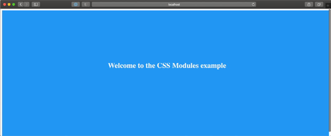
Figure 6.1 – Home page styled with CSS modules
As mentioned before, those classes are component-scoped. If you inspect the generated HTML page, your landing page will contain a div with a class that looks like this:
<div class="Home_homepage__14e3j">
<h1 class="Home_title__3DjR7">
Welcome to the CSS Modules example
</h1>
</div>
As you can see, CSS modules generated unique class names for our rules. Even if we now create new classes using the same generic title and homepage names in other CSS files, there won't be any naming collision thanks to that strategy.
But there might be cases where we want our rules to be global. For instance, if we try to render the home page we just created, we will notice that the font family is still the default one. There's also the default body margin, and we might want to override those default settings. We can quickly solve that problem by creating a new styles/globals.css file with the following content:
html,
body {
padding: 0;
margin: 0;
font-family: sans-serif;
}
We can then import it into our pages/_app.js file:
import '../styles/globals.css';
function MyApp({ Component, pageProps }) {
return <Component {...pageProps} />;
}
export default MyApp;
If we try to render the home page now, we will see that the default body margin has disappeared, and the font now is a sans-serif one:
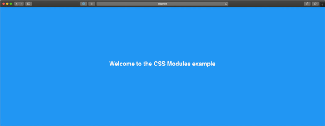
Figure 6.2 – Home page styled with global CSS module styles
We can also use the :global keyword to create globally available CSS rules, for example:
.button :global {
padding: 5px;
background-color: blue;
color: white;
border: none;
border-radius: 5px;
}
There's also another excellent CSS module feature that I'd like you to consider when testing out that styling method: selector composition.
In fact, you can create a very generic rule and then override some of its properties by using the composes property:
.button-default {
padding: 5px;
border: none;
border-radius: 5px;
background-color: grey;
color: black;
}
.button-success {
composes: button-default;
background-color: green;
color: white;
}
.button-danger {
composes: button-default;
background-color: red;
color: white;
}
The main idea of CSS modules is to provide a straightforward way to write modular CSS classes with zero runtime costs in every language. Thanks to PostCSS modules (https://github.com/madyankin/postcss-modules), you can use CSS modules in basically every language (PHP, Ruby, Java, and so on) and templating engine (Pug, Mustache, EJS, and so on).
We've only scratched the surface of CSS modules and why they are an excellent solution for writing modular, lightweight, classes with zero runtime cost. If you want to learn more about CSS module specifications, you can look at the official repository: https://github.com/css-modules/css-modules.
Just like Styled JSX, CSS modules are available out of the box in every Next.js installation, so once you bootstrap your project, you can get started using them immediately. Still, you might need to tweak the default configuration to add, remove, or edit some features, and Next.js makes this step easy too.
In fact, Next.js compiles CSS modules using PostCSS, a popular tool for compiling CSS at build time.
By default, it is configured by Next.js to include the following features:
- Autoprefixer: It adds vendor prefixes to your CSS rules using values from Can I Use (https://caniuse.com). For instance, if you're writing a rule for the ::placeholder selector, it will compile it to make it compatible with all the browsers where the selector is slightly different, such as :-ms-input-placeholder, ::-moz-placeholder, and so on. You can learn more about that feature at https://github.com/postcss/autoprefixer.
- Cross-browser flexbox bug fixes: PostCSS follows a community-curated list of flexbox issues (which can be found at https://github.com/philipwalton/flexbugs) and adds some workarounds for making it work correctly on every browser.
- IE11 compatibility: PostCSS compiles new CSS features, making them available on older browsers such as IE11. Still, there's an exception: CSS variables are not compiled, as it is not safe to do so. If you really need to support older browsers and still want to use them, you can jump to the next section (Integrating SASS with Next.js) and use SASS/SCSS variables.
We can edit the PostCSS default configuration by creating a postcss.config.json file inside of our project root, then adding the default Next.js configuration:
{
"plugins": [
"postcss-flexbugs-fixes",
[
"postcss-preset-env",
{
"autoprefixer": {
"flexbox": "no-2009"
},
"stage": 3,
"features": {
"custom-properties": false
}
}
]
]
}
From this point, we can edit the configuration as we prefer, adding, removing, or changing any property.
In the next section, we will see how to integrate another popular CSS preprocessor: Sass.
Integrating SASS with Next.js
SASS is probably one of the most loved and used CSS preprocessors out there, and Next.js did an excellent job making it possible to integrate it with ease. In fact, just like CSS modules and Styled JSX, SASS is supported out of the box; we just need to install the sass npm package inside of our Next.js project, and we're ready to go:
yarn add sass
At this point, you can start using CSS modules with SASS and SCSS syntax, just like we did in the previous section.
Let's look at a simple example. If we open the pages/index.js file from the previous section, we can just change the CSS import to look as follows:
import styles from '../styles/Home.module.scss';
export default function Home() {
return (
<div className={styles.homepage}>
<h1> Welcome to the CSS Modules example </h1>
</div>
);
}
Now we need to rename our styles/Home.module.css file to styles/Home.module.scss and we're ready to edit that file using the Sass (or SCSS) specific syntax.
Thanks to SASS and SCSS syntax, we can take advantage of a large set of features that makes our code even more modular and easy to maintain.
Pay Attention to the Names!
SASS and SCSS are two different syntaxes for the same CSS preprocessor. However, they both provide enhanced ways for writing CSS styles such as for variables, loops, mixins, and many other features.
While the names may look similar, and the final purpose remains the same, the main difference is that SCSS (Sassy CSS) extends the CSS syntax by adding those features available in every .scss file. Any standard .css file can be renamed as .scss without any problem, as the CSS syntax is valid in .scss files.
SASS is an older syntax that is not compatible with standard CSS. It doesn't use curly brackets or semicolons; it just uses indentation and new lines to separate properties and nested selectors.
Both of those syntaxes need to be transpiled into vanilla CSS in order to be used on regular web browsers.
Let's take the CSS module compose property as an example. We've previously seen how to create new CSS classes extending an existing one:
.button-default {
padding: 5px;
border: none;
border-radius: 5px;
background-color: grey;
color: black;
}
.button-success {
composes: button-default;
background-color: green;
color: white;
}
.button-danger {
composes: button-default;
background-color: red;
color: white;
}
With SCSS, we can choose between many different approaches, such as using the @extend keyword (which works just like the compose keyword from CSS modules):
.button-default {
padding: 5px;
border: none;
border-radius: 5px;
background-color: grey;
color: black;
}
.button-success {
@extend .button-default;
background-color: green;
color: white;
}
.button-danger {
@extend .button-default;
background-color: red;
color: white;
}
Alternatively, we can change our class names a bit and take advantage of the selector nesting feature:
.button {
padding: 5px;
border: none;
border-radius: 5px;
background-color: grey;
color: black;
&.success {
background-color: green;
color: white;
}
&.danger {
background-color: red;
color: white;
}
}
SCSS ships with a large set of features, such as loops, mixins, functions, and more, allowing any developer to write complex UIs with ease.
Even though Next.js integrates it natively, you may still need to enable or disable some specific feature or edit the default SASS configuration.
You can easily do that by editing the next.config.js configuration file:
module.exports = {
sassOptions: {
outputStyle: 'compressed'
// ...add any SASS configuration here
},
}
If you're interested in learning more about SASS and SCSS, I'd highly recommend looking at the official documentation at https://sass-lang.com.
Summary
The CSS ecosystem has evolved a lot in recent years, and the Next.js team keeps the framework up to date with the most modern, performant, and modular solutions for writing CSS styles.
In this chapter, we've looked at three different built-in solutions, and of course, any one of them has some trade-offs compared with the others.
Styled JSX, for instance, is definitely one of the easiest ways of writing CSS rules. You can interoperate with JavaScript, dynamically change some CSS rules and properties depending on the user actions, and so on, but it also has some significant drawbacks. Like most CSS-in-JS libraries, Styled JSX first renders on the server side but re-renders the whole generated CSS on the client right after React hydration occurs. That adds some runtime cost to your application, making your application less performant and more challenging to scale. Also, it makes it impossible for the browser to cache your CSS rules, as they get regenerated on every request for server-side and client-side rendered pages.
SASS and SCSS syntaxes are well integrated into Next.js, and they give you tons of great features for writing complex UIs with zero runtime cost. In fact, Next.js will compile all the .scss and .sass files to plain CSS at build time, making it possible for the browser to cache all your styling rules. However, we should consider that we can't see the production-optimized plain CSS output until the final build phase. Unlike CSS modules, where what we write is really close to what we get in the final production bundle, the vast set of features provided by SASS could potentially produce a huge final CSS file, and it's not always easy to predict the compiler output while writing deeply nested rules, loops, and so on.
Ultimately, CSS modules and PostCSS seems to be an excellent option for writing modern CSS styles. The produced output is more easily predictable, and PostCSS automatically polyfills modern CSS features for older browsers (down to IE11).
In the next chapter, will see how to integrate external UI libraries, making it even easier to write style and feature-rich components and UIs.