
Chapter 9: Report and Dashboard Design
In the previous chapter, we looked at how to load data into Power BI efficiently to reduce system resource use and reduce the amount of time taken to load data. Slow data refreshes generally do not impact a user's report performance experience directly because they usually occur in the background and are scheduled at off-peak times.
Now, we will shift our focus to the visual layer of Power BI. Here, inappropriate choices can directly affect the end user experience, from both a performance and usability perspective. While we will continue to focus on design patterns that improve performance, we will point out when performance guidance can also improve usability.
In this chapter, we will learn how the Power BI visual framework works within reports and how these relate to queries and engine load. This will give us fundamental knowledge on report behavior, which will help identify what to optimize. We will then go through a range of common design pitfalls and will recommend alternative solutions that can provide better performance, covering the three options for creating visual content in Power BI.
This chapter consists of the following sections:
- Optimizing interactive reports
- Optimizing dashboards
- Optimizing paginated reports
Technical requirements
There are samples available for some parts of this chapter. We will call out which files to refer to. Please check out the Chapter09 folder on GitHub to get these assets: https://github.com/PacktPublishing/Microsoft-Power-BI-Performance-Best-Practices.
Optimizing interactive reports
When we use the term interactive report, we refer to the primary report implementation experience available in Power BI where authoring is performed in Power BI Desktop. These reports have dynamic visuals designed primarily for viewing on screens. The report elements can resize and react to screen dimension and resolution changes, and the authoring experience is What You See is What You Get (WYSIWYG).
The term interactive report is unofficial and used in this book for convenience and clarity. Microsoft specifically differentiates interactive reports from paginated reports by name – only the latter is a documented term. Paginated reports are based on SQL Server Reporting Services (SSRS) and use a different paradigm, which we will describe further in the final section of the chapter.
Note
From here on, we will only specifically call out paginated reports. If this distinction is not made, please assume we are referring to interactive reports.
Interactive reports are built by placing individual visuals on one or more predetermined report pages. Most visuals are data-driven, which means they need to be supplied with data to render meaningful content. The Power BI visual frontend is a modern JavaScript application that executes in the client browser. Therefore, in general, a faster client device will execute the JavaScript code faster and result in a better-performing report. Do bear this in mind when considering reporting performance issues on much older hardware. However, be aware that a faster computer will usually give you less of a performance boost than spending time properly optimizing the report and its underlying dataset.
Next, we will explore the relationship between visuals and queries to learn how this affects performance.
Controlling the visuals and associated queries
An important point to note is that visuals in Power BI are designed to execute in parallel. This has interesting implications for performance. When you open an interactive Power BI report, all visuals execute at once. Data-driven visuals will each issue at least one query to the underlying dataset, and these queries are sent in batches to be executed in parallel where possible. Even visuals that do not issue queries (such as a textbox) need some CPU time. An unfortunate side-effect of Power BI being a JavaScript application is caused by how browsers execute JavaScript code. Even though visuals execute in parallel, they are executed on a single CPU thread, which means time is divided up between the visuals. Therefore, technically, only one visual is doing work on the CPU at any instant. This limitation applies to any JavaScript application. For Power BI, it means that the more visuals you have on a page, the more time they can spend waiting for the CPU, due to contention with all the other visuals.
Note
There is a direct relationship between the number of visuals and the load generated by a report. Higher load often results in poorer performance. This load will be spread over two areas – both the client device executing visuals and the dataset that is responding to queries. This includes queries sent to external data sources in DirectQuery mode. Therefore, you should strive to reduce the total number of visuals on a page wherever possible, especially knowing that the more you have, the more work you are asking of a single CPU thread. You should also configure visuals in a way that avoids complex queries and try to return the least amount of data – only what is needed for the scenario.
There is no specific number of visuals beyond which a Power BI report will slow down. Some guidance online suggests around 20 visuals being a concern, but we do not wish to go down this path. The reason for this is that the visual type, configuration, and underlying dataset and DAX designs will have the largest effect on performance, and two reports with the same number of visuals may have vastly different performance characteristics. Instead, we recommend driving report and dataset optimization based on pre-established targets and thresholds that take user requirements and report complexity into account. This guidance was covered in Chapter 7, Governing with a Performance Framework, in the first, Performance governance framework section, where we talked about establishing baselines and targets.
Let's now cover in detail the recommended visual-related design patterns to improve report performance:
- Have default slicer/filter selections for the initial landing experience – If you have a very large dataset, it can take a while to return results even after optimization. By default, Power BI will not select any values for filters and slicers. To make the initial experience faster, you can consider preselecting values for slicers or filters to limit the query space and reduce the amount of data scanned. Preselect the most frequently used set of attributes to cater for the broadest set of users. Even if some users need to change the slicer selections to get the desired context, this can save them a lot of time because they can avoid waiting for a very slow initial report load. To set default filter and slicer selections, simply save the report with the filters already applied.
- Avoid detailed tables with many columns in the initial experience – Users often need to see detailed source data. However, this isn't usually the starting point of data analysis. It's better to summarize important information and allow drilling to details within a narrow specific context. This concept is sometimes referred to as master-detail report design. You can build a dedicated drill target page that forces context and avoids issuing queries that return many rows of data. Let's look at a practical example. Suppose you wanted to build a report to investigate user behavior from an event log. Instead of building a single report page with a table showing the event level detail, a master-detail design is likely to work better here, both for performance and usability. An alternate design is to split this report into a master summary page that focuses on a smaller number of interesting users and a detail page at the event level that is designed to look at one user only. The following figure demonstrates a summary page that aggregates data by users in two different visuals:
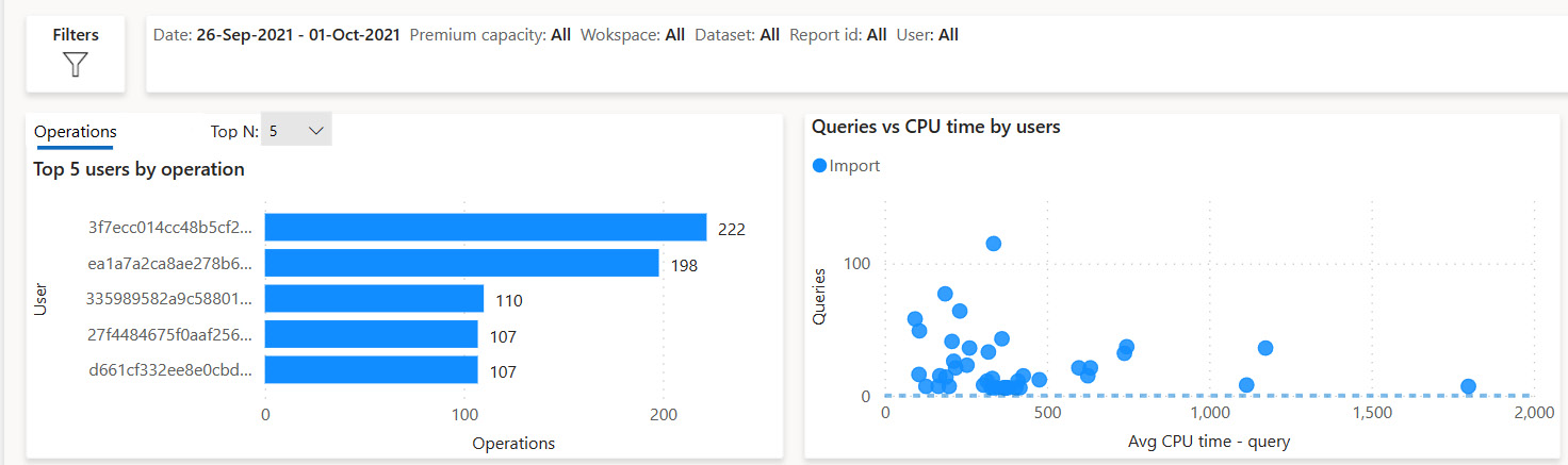
Figure 9.1 – Summary visuals showing the aggregates and the top five users
The next figure shows a detailed drill-through page that can be the target of either summary visual in the previous Figure 9.1:
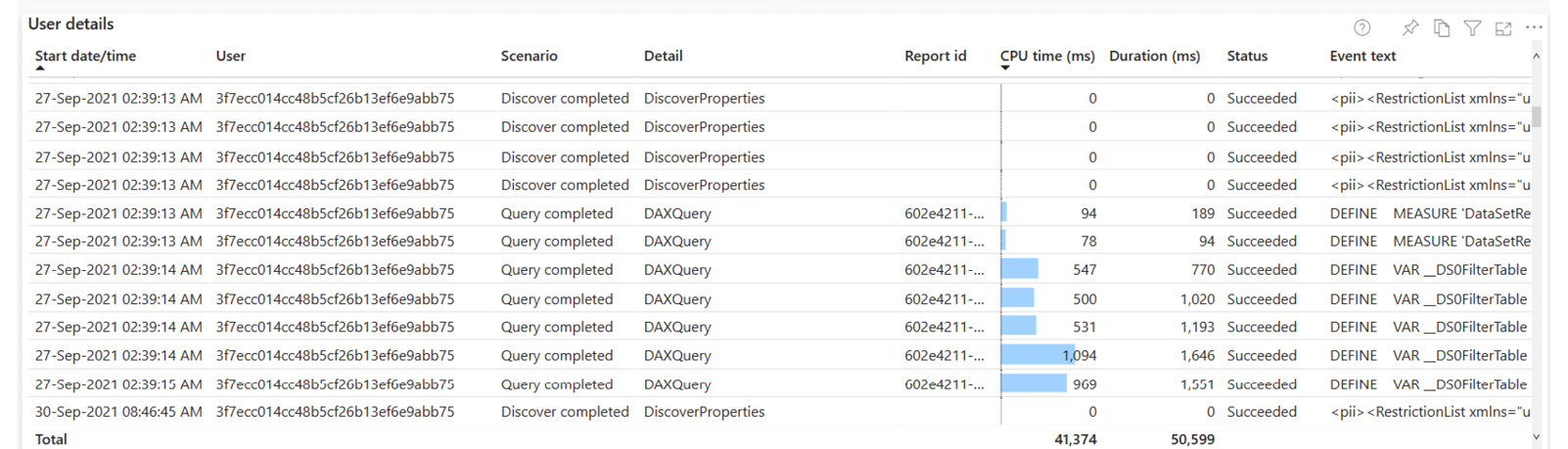
Figure 9.2 – A detailed drill-through visual, showing an event detail for only one user
- Combine individual cards into multi-row cards or tables – A common report practice is to use many individual card visuals to display some summary metrics in a row. We now know that each of these visuals will issue a query. When measures are at the same scope, data storage engines (including Power BI's Analysis Services) can often retrieve data and calculate multiple measures in a single batch. However, when issued by separate visuals, these measures are requested in separate independent queries and may not benefit from optimizations at the data source. To avoid this problem, you can use a single multi-row card or table visual to group all the measures. This means you will only need to initialize one visual and issue one query.
You can see how one visual only needs one query using Power BI Desktop's Performance Analyzer in the following figures, taken from the Many cards.pbix sample file. Figure 9.3 that follows shows how each of the five card visuals issues a DAX query, and each takes approximately 2 seconds to execute:
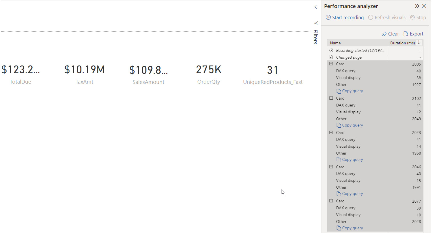
Figure 9.3 – Five separate card visuals issuing five independent queries
Figure 9.4 shows how the same measures can be placed in a multi-row card to issue only one query:
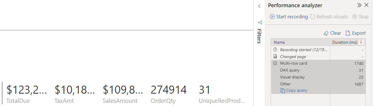
Figure 9.4 – Measures combined into a multi-row card only issue one query
Figure 9.5 shows how the same measures can be placed in a table visual, again issuing only one query:
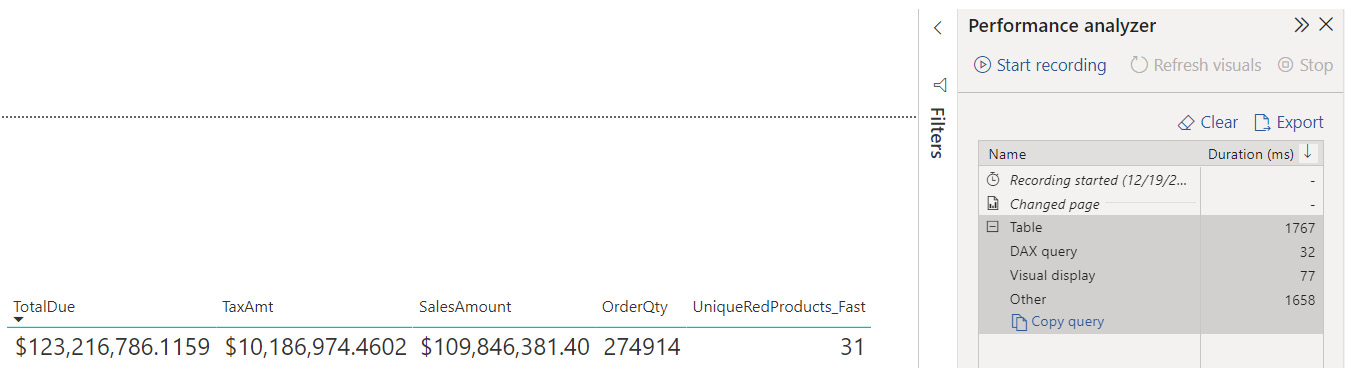
Figure 9.5 – Measures combined into a table only issue one query
The example dataset used in the previous three figures is small, so the difference to an end user is negligible. However, with larger datasets and measures of higher complexity, significant performance gains can be realized with this technique.
- Use Top N filters to limit data in the report – When looking at summary information, it is a good practice to highlight items with the highest or lowest values instead of listing every single one. For example, a customer satisfaction-related visual can be limited to just the 10 customers who had the lowest satisfaction score. This reduces the amount of data returned and can speed up the report. There are two ways you can implement Top N filtering. The simplest method is to use the out-of-the-box Top N filtering available for Power BI visuals in the Filters pane. This can be seen in the following Figure 9.6 where the left-side visual is in the default state, whereas the right-side visual has been configured to show the top five Manufacturer names ranked by SalesAmount:
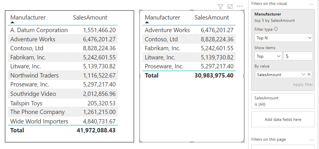
Figure 9.6 – The left visual in the default state and the right visual configured to show the top five items
Another way to implement top N is to write measures that explicitly use ranking functions. While this approach requires more effort, it allows you to perform dynamic ranking through slicer or filter values. This allows a user to choose from a list of pre-determined group sizes such as 5, 10, and 20. Whichever approach you use, we still recommend testing with and without top N enabled. There can be cases where the ranking calculation itself is expensive, and this can cause the visual to be slower when limited by top N.
- Move infrequently used slicers to the filter pane – It is tempting to include many different slicers on a report to provide a user with a range of options to set their context when analyzing data. A slicer is a regular Power BI visual that needs to query a dataset to populate its values. When a slicer selection is made, the default behavior in Power BI is to update all other slicers to reflect the selection made to give you a better idea of how data is distributed. The other slicers execute queries to make this update. While this functionality is useful, it can slow down reports if you have a lot of slicers with large datasets. In such cases, consider moving the least frequently used slicers to the Filters pane. This reduces the number of queries executed during report interaction because a filter only queries the data source to fetch values after user interaction and is not affected by slicer selections.
- Remove unnecessary visual interactions – When you select a data point on a Power BI visual, the default behavior is to cross-filter all other visuals. Sometimes, this might not add any value to the analysis. Therefore, we recommend reviewing report interactions for every visual and removing those that are unnecessary. This will reduce the number of queries issued because a selection in one visual no longer affects every other one. This technique also applies to slicers interacting with each other. The following figure shows how this can be configured by selecting a visual and then using the Edit interactions option in the Format menu. The slicer is selected and has its interactions edited so that it no longer affects the right-hand side visual. When editing interactions, visuals indicate their behavior with small icons at the top right, as highlighted:
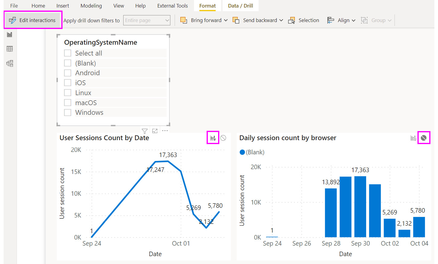
Figure 9.7 – A slicer will only affect the right-side visual, as shown by the icons
- Use tooltips to reduce query result volume and query complexity – Some analyses might need many different measures. In such cases, report developers tend to use tables or matrices with all the measures displayed. If measures are complex and data volumes are large, this can make the query quite slow. A good workaround is to only display the critical measures and move the rest to Tooltips. Most Power BI visuals support tooltips, which are a popup overlay shown when a user hovers over a data point and will only load data on demand. Tooltips are set via the properties of a visual and can be either a list of attributes or a report page. We recommend making users aware of the tooltip functionality as part of their onboarding and report familiarization training.
The following Figure 9.8 shows a visual where a report page Tooltips type has been displayed when hovering over the second row in the table. It also shows the tooltip configuration properties, indicating that the report page called TT-Visual count is used as the tooltip:
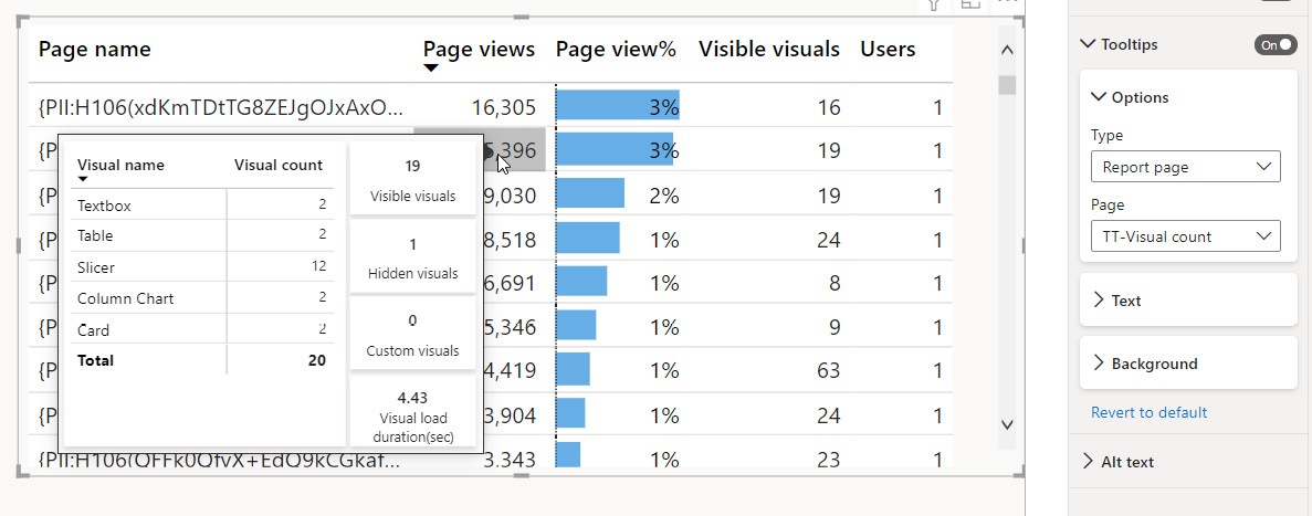
Figure 9.8 – Tooltips used to provide information that is not needed immediately
- Performance-test custom visuals and prioritize certified custom visuals – One of Power BI's strengths is the wide range of custom visuals available to extend your analytical capability. Some are not well-optimized or may not be updated to take advantage of improvements in the visual framework. Such visuals can perform slowly even if you have a fast dataset. We recommend testing custom visuals in isolation with the Power BI Desktop Performance Analyzer to determine their performance characteristics. Use realistic data volumes when testing and compare them with out-of-the-box visuals for typical report interactions, such as cross-highlighting and filtering. We also recommend using Power BI certified visuals, which are reviewed and validated by Microsoft. If a custom visual is too slow, we recommend exploring other ways of presenting the same information, possibly using multiple interacting visuals to be analyzed together. However, we acknowledge that some custom visuals are unique and cannot be easily replaced.
- Leverage query reduction for complex reports – Another way to reduce the number of queries and improve report performance is to change the default behavior of interactions, slicers, and filters. You can set configure query reduction in Power BI Desktop from the options screen. This will allow you to disable visual interactions by default and lets you add an Apply button to slicers and filters. This will let users change many slicers and filters without issuing new queries for each change. Only one final set of queries will be sent when the Apply button is used. The options are shown in Figure 9.9 that follows:
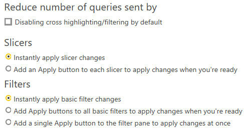
Figure 9.9 – The query reduction options in Power BI Desktop
Report visuals can be pinned to create Power BI dashboards, so next, we will look at how we can optimize dashboards.
Optimizing dashboards
A Power BI dashboard lets users curate a collection of reports and visuals to show on a single page through an action called pinning. It is an easy way to create a customized view of the most important elements from different and potentially unrelated reports into a single dashboard. Dashboards in Power BI were designed to be fast and behave differently to reports because, where possible, they cache the query result and visual beforehand. This greatly reduces dashboard load time because it avoids most on-demand processing. Power BI does this by executing queries and preparing dashboard tiles when the underlying data has been updated.
Note
Visuals are cached when pinned to a dashboard, but reports (called live report tiles) are not. Therefore, we recommend only pinning individual visuals to dashboards instead of report pages to take advantage of caching.
There is also the potential to add significant background load on a system when using dashboards. This is because dashboard tiles must respect security context. If you are using row-level security, there will be different roles/contexts, so Power BI will need to generate a unique tile cache for each security context. This happens automatically after a dataset refresh for Import mode. For DirectQuery datasets, tiles are refreshed hourly.
With large datasets and many contexts, there is the potential to generate hundreds or thousands of background queries in a short time span. If you are not using Premium capacities, the most likely effect is increased data refresh duration because the tile refresh is performed at the end. However, if you are using Premium capacity, you have a fixed set of resources, and these background operations have a higher likelihood of impacting interactive users.
Since tile refresh is automatic and there are no settings available to configure it, we recommend testing without row-level security to determine whether tile refresh is the cause of a suspected performance issue.
In the final section, we will cover paginated reports.
Optimizing paginated reports
Paginated reports in Power BI use the mature SSRS technology. A paginated report implements the XML-based Report Definition Language (RDL) to define reports. They are known as pixel-perfect, referring to the fact that they are designed with printing in mind. They are designed with a pre-determined page size (often a standard letter or A4), and the designer will lay out elements exactly where they need to appear on a page by specifying element sizes. They are very good at handling operational-style reports with many rows and pages, such as a group of sales invoices, by providing features such as page headers, footers, and margins. The designer often does not know how many pages the report will generate, as more content simply overflows to a new page. Paginated reports have a dedicated authoring tool called Power BI Report Builder.
Paginated reports can use relational or analytical data sources, which can be hosted in the cloud or on-premises. The latter refers to multidimensional sources such as Power BI datasets, and we will explore their optimization in detail in the next chapter. For the remainder of this chapter, we will focus on relational sources – typically, transactional database systems such as SQL Server and Oracle Database.
The following points provide guidance on optimizing paginated reports:
- Use cloud data sources – On-premises sources are likely to be geographically distant and need to be accessed through a gateway. This can be much slower than a cloud source, especially if it is in the same region as Power BI.
- Use the DAX query designer for analytical sources – Power BI Report Builder offers an Analysis Services DAX query designer and an Analysis Services MDX query designer. Data Analysis Expressions (DAX) and Multi-dimensional Expressions (MDX) are different query languages supported by Analysis Services. These designers can be used for Power BI dataset data sources or any Analysis Services model. We recommend using the DAX designer for better performance, especially over tabular models.
- Leverage stored procedures in the relational source – Stored procedures are encapsulated pieces of business logic. They can be reused across multiple reports and parameterized to deal with various input. They can contain complex logic, such as loops and temporary tables. They generally perform well due to optimizations applied at the data source, such as cached execution plans.
- Only retrieve required data – A paginated report allows you to aggregate and filter data within a visual report control, such as a table or chart. However, this can result in slower queries and higher data volumes loaded into the report. It can also require more report processing overhead to render the results. Therefore, we recommend performing aggregation and filtering at the source in the stored procedure or by customizing the relational query. These are likely to perform better than relying on the paginated report engine.
- Dataset filtering versus parameterization – Paginated reports can apply filters over already retrieved data (filtering) or pass a filter directly to the data source (parameterization). Let's illustrate via an example. Suppose we have a sales report that can be filtered to different countries. With dataset filtering, the report will retrieve all country data upfront. When a user selects a specific country, it will perform the filtering without needing to issue new queries to the data source. With dataset parameterization, changing the country will issue a new query and retrieve only the results for the selected country.
We recommend dataset filtering when you expect a different subset of the dataset rows will be reused many times – in our example, the user may switch between countries often. Here, you recognize that the cost of retrieving a larger dataset can be traded off against the number of times it will be reused. However, caching large datasets on a per-user basis may negatively impact performance and capacity throughput.
- Avoid calculated fields – A paginated report allows you to define your own custom fields within a query result. For example, you might concatenate values or perform some arithmetic. We recommend doing this at the data source instead so that the calculation will be done beforehand and be readily available for the report. This can have a significant impact if the query returns many rows.
- Optimize images – Keep image file sizes as small as possible by using the lowest resolution that still gives you good quality. Compressed formats such as JPG will help reduce size, and some graphics programs will let you adjust compression settings to balance size with quality.
Try to avoid embedded images, as they can bloat the report size and slow down rendering. A better alternative is to use images stored on web servers or a database, which improves maintainability through central storage. However, be aware that when using web servers, the images may load slowly if they are from an external network.
Let's now summarize what we have learned from this chapter.
Summary
In this chapter, we looked focused on the visual layer of Power BI where we design the report content. We learned that there are two types of reports in Power BI. Interactive reports consist of a collection of visuals such as charts and slicers and are more commonly used. Paginated reports are based on mature SSRS technology and provide pixel-perfect reports designed for print media.
Interactive reports are comprised of visuals that execute queries to fetch data to render. Power BI is a modern JavaScript application where each visual can be thought of as a code block that executes in parallel. This means that the more visuals you have on a page, the more work the data source needs to do. Browsers do not actually execute JavaScript in parallel, since the work is all assigned to a single CPU thread. This means that the more visuals a report has, the more each visual needs to wait to get a slice of the CPU. Hence, we described how visual reduction is a good design goal because it reduces CPU contention.
We also learned that user actions in interactive reports often result in multiple queries being executed. This can provide a bad experience with large datasets, many visuals, and complex measures because every click results in multiple complex queries that overwhelm the source. To combat this, we learned about different ways to design the report to reduce visual and query counts, using principles such as master-detail and query reduction features in the product.
We then learned how Power BI dashboards provide a way to aggregate content from different reports and how they use caches for visuals but not live report tiles. Here, we learned that tile refresh after scheduled refresh can impact the overall refresh times or the user report interaction experience, more so on Premium capacities.
We completed the chapter by exploring paginated reports and learned how to take advantage of the relational data source.
In the next chapter, we will get into data modeling, which is one of the most important sections of the book. A poorly performing data model can affect the reporting layer significantly and negate the guidance we covered in this chapter.