11
Engaging Business Users with Business Applications
Business users are key participants in most successful automation solutions. You might think that, by automating a business process, your business users no longer play a pivotal role in your business processes, but that’s rarely the case. For example, your customer service representative might need to kick off your automation when they interact with a client. Or a subject matter expert may have to step in to manually handle an error situation that isn’t yet automated or can’t be automated.
In addition, it’s often wise to build your automated solution iteratively. You’d do this by starting with a solution where there is heavy human involvement and only a little automation. You’d then incrementally inject more and more automation over time while gradually reducing involvement from your human workforce. Doing this incrementally reduces risk and gives you time to learn and refine. But it requires an agile solution – one that allows you to easily leverage your business users without a lot of upfront investment in terms of time and effort.
IBM Cloud Pak for Business Automation provides business applications that are designed to do exactly this. These business applications provide user interfaces that your business users make use of to trigger automation or to participate within a larger automation flow. They’re built using a low-code WYSIWYG user interface designer, allowing you to compose user interfaces quickly and easily via simple drag-and-drop gestures. It enables an accelerated time-to-value, which allows you to quickly adapt and pivot as your automation solution grows and matures, or as the needs of the business change.
In this chapter, we’ll demonstrate how to build a business application for client onboarding. This application provides a form that captures information about the client and demonstrates how to call a backend service that persists the information when the form is submitted.
Therefore, in this chapter, we will cover the following topics:
- Creating a business application
- Building the user interface
- Leveraging Automation Services
- Reusable user interface widgets and templates
- Content Services
- Packaging and deployment
Technical requirements
You can sign up for free trial access to a guided tour of IBM Cloud Pak for Business Automation. This trial includes access to the Business Application authoring experience described in this chapter. While this isn’t required to understand the concepts and techniques described, it’s highly recommended.
To sign up, follow the instructions in this IBM Automation Community blog: https://community.ibm.com/community/user/automation/blogs/bill-lawton1/2021/09/20/new-ibm-cloud-pak-for-business-automation-trial-is.
Creating a business application
In IBM Cloud Pak for Business Automation, you can build business applications by going to Business Automation Studio:
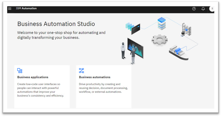
Figure 11.1 – Business Automation Studio
Follow these steps to create a business application:
- Click on the Business applications tile to go to a view where you can work with your library of business applications, explore provided templates and samples, or create new business applications.
- To create a new business application, simply click Create and select Application. Then, fill out the fields in the dialog that appears. As shown in the following figure, here, we are creating an application named Client Onboarding. It does not use a base application template. We’ll discuss application templates in the Leveraging Automation Services section:
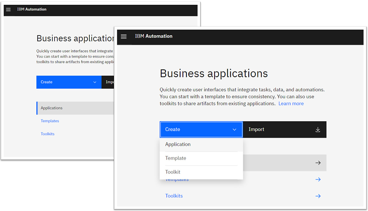
Figure 11.2 – The Business applications view
- After that, click Create:
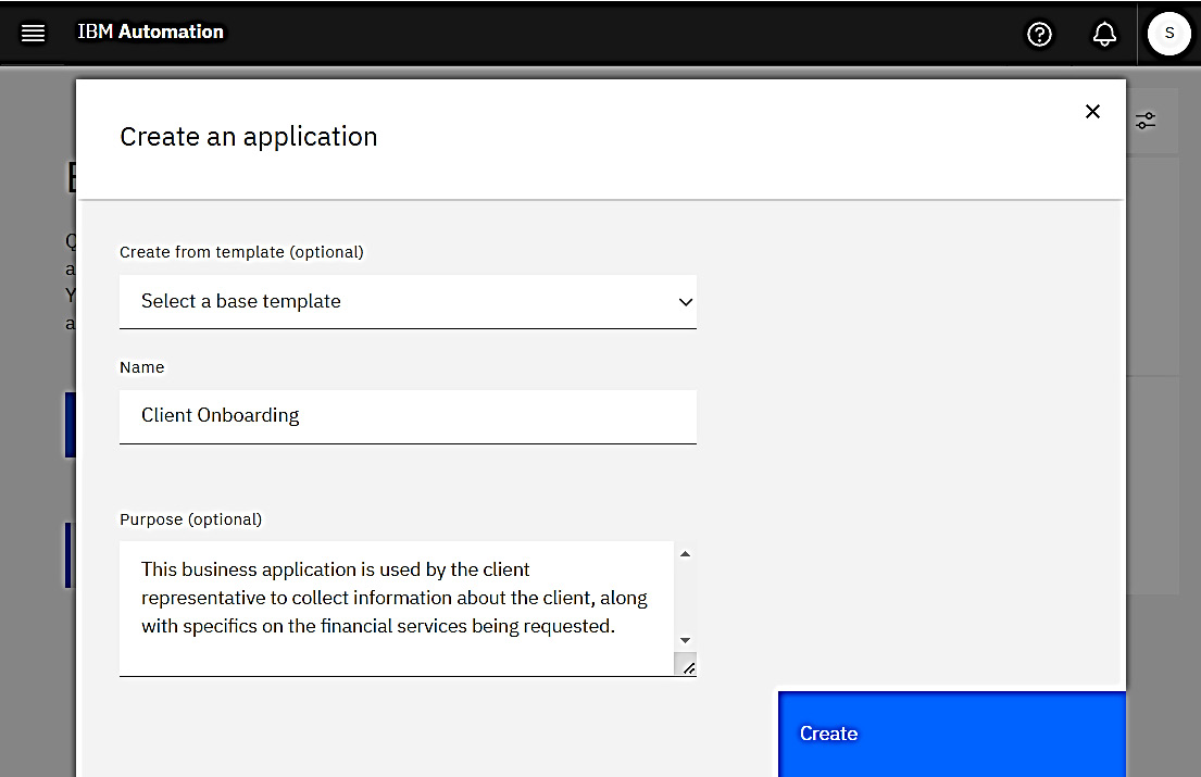
Figure 11.3 – The Create an application dialog
Now, you will find yourself in the Business applications editor. Here, you can design the user interfaces that make up your application:
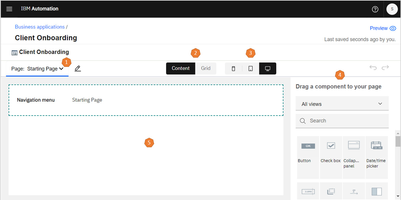
Figure 11.4 – Business applications editor
Now, let’s understand the key elements within the editor, as numbered in the preceding screenshot:
- Page menus and controls: This menu can be used to create, edit, or manage the pages that make up your application.
- Content/Grid toggle: We will be demonstrating the use of this feature throughout this chapter.
- Responsive form factors: Again, this feature will be demonstrated as we progress through this chapter.
- Component palette: A pre-built set of UI components that you can use to build out your application.
- Canvas: Your primary work area. This feature will help you lay out the UI elements that make up the user interface for your application.
You are now ready to start building your user interface.
Building the user interface
With the business application editor open, you can start building the user interface for your Client Onboarding application. Specifically, you will create a user interface that collects contact information.
Setting up the pages
The application contains an initial starting page, as shown in Figure 11.4. Let’s give it a more meaningful name:
- Click the edit icon next to Page to bring up the Edit pages dialog and change Page name to Contact Information:
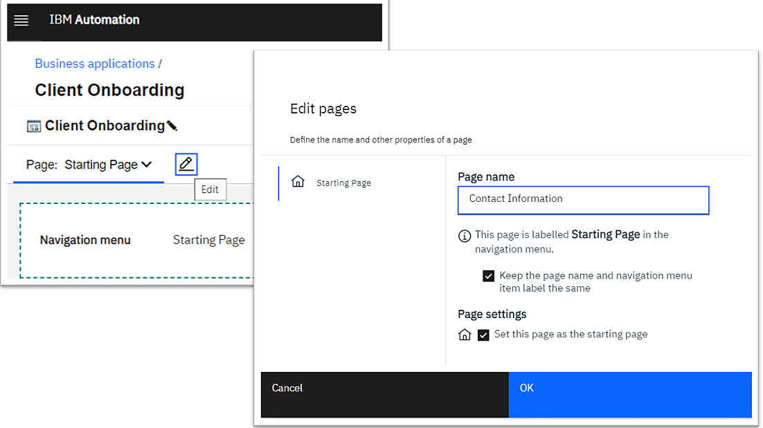
Figure 11.5 – The Edit pages dialog
- Back in the editor, as shown in Figure 11.4, you’ll notice a Navigation menu component on the canvas. Let’s delete it.
It’s useful when you have a large or complex application that contains several pages, but this application will be relatively simple, with no need for a user to navigate between pages. You can delete it by simply clicking on it and hitting the Delete key. Alternatively, you can right-click on it and click Delete in the context menu.
- Finally, create a second page called Submit Confirmation. This simply provides feedback to your user:
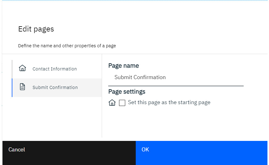
Figure 11.6 – Submit Confirmation
At this point, you now have two pages:
- Contact Information
- Submit Confirmation
Let’s proceed and add some UI elements to the Contact Information page using simple drag-and-drop mechanisms.
Laying out the Contact Information page
Your Contact Information page is a blank canvas at this point. You’ll start by adding a panel to it. Panels are useful for grouping widgets and for ensuring they have a consistent style. Follow these steps:
- Locate the Panel component in the palette on the right and drag it onto your canvas.
Tip
IBM Cloud Pak for Business Automation provides an extensive library of pre-built components in the widget palette. Use the dropdown to filter the palette based on categories of components. The Panel component can be found in the Layout category. Alternatively, if you know the name of the component, you can simply use the Search field to find it.
- Once the panel is on your canvas, click on it to bring up the toolbar, and then click the Change label tool to rename the panel Contact Information:
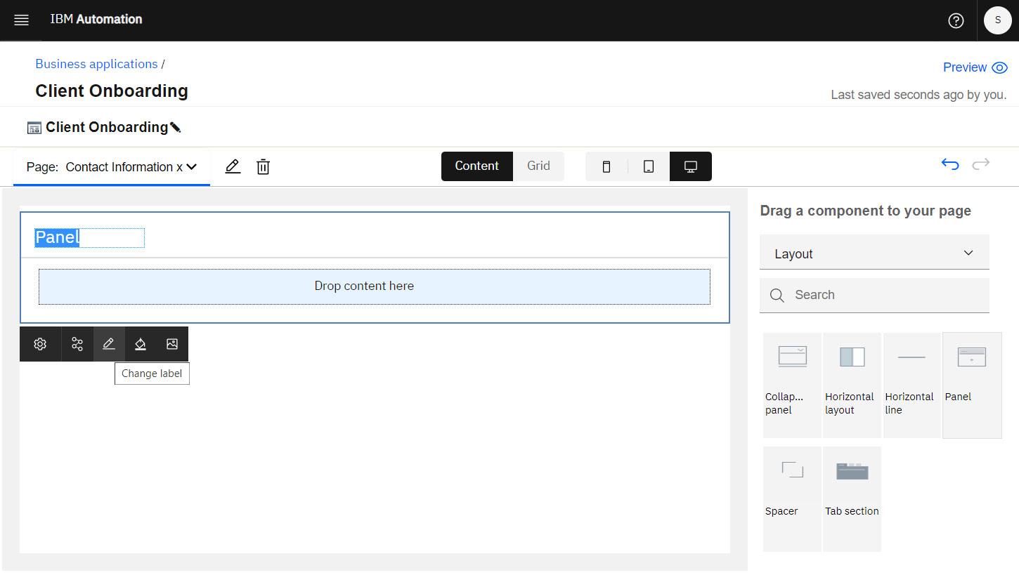
Figure 11.7 – Panel added to the Contact Information page
We want these laid out side by side. So, let’s inject some layout instructions within the panel so that we can control the placement of those fields.
- At the top of the editor, click Grid to toggle to the grid view. You’ll notice that the palette on the right now shows different options. If the palette is blank, you likely have some search text entered, so simply clear that out.
- We have two fields that we wish to lay out side by side. The Two columns component in the palette provides that layout out of the box. Drag that component and drop it onto the canvas, inside the panel:
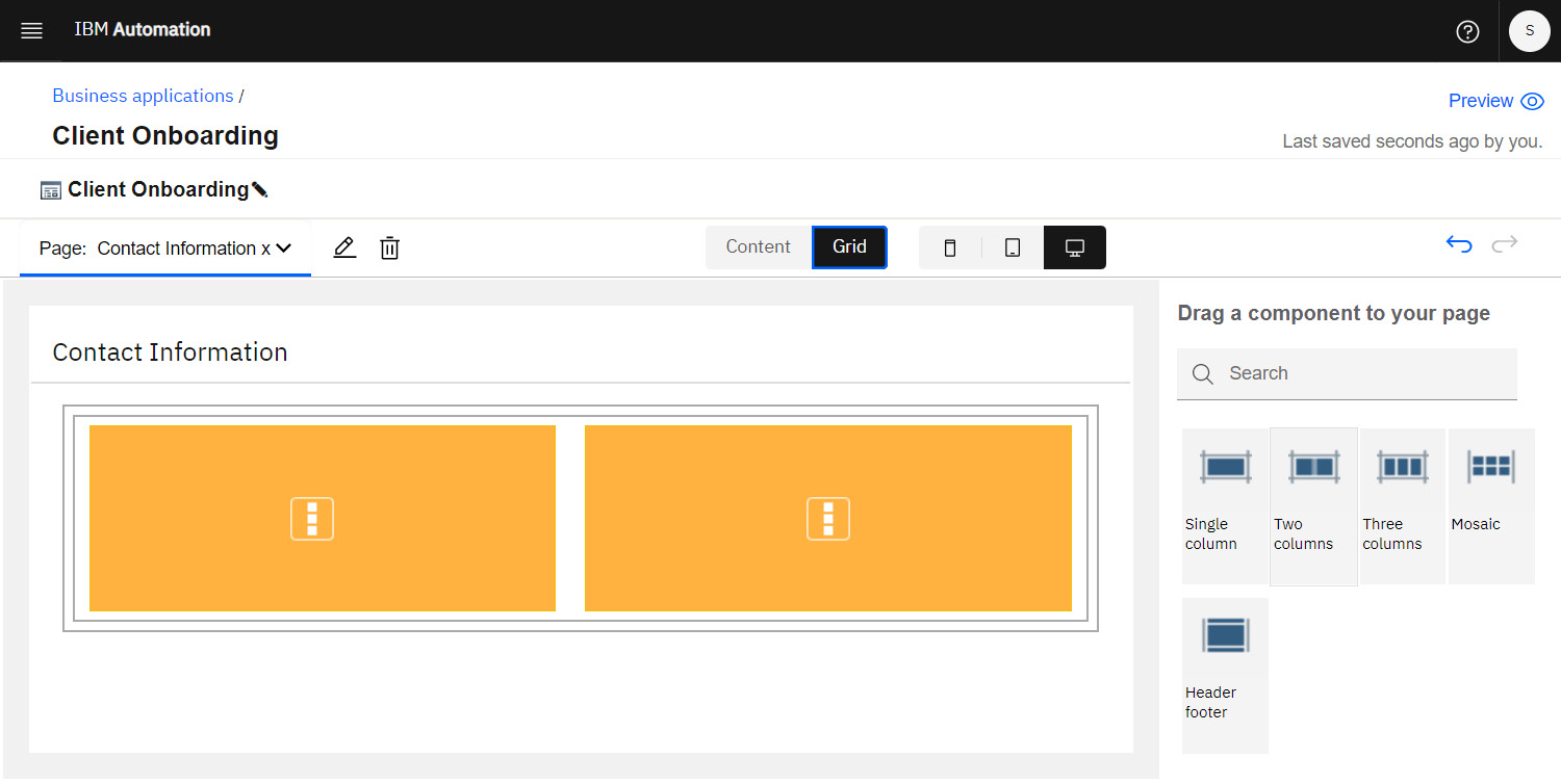
Figure 11.8 – Panel with two columns
- If you accidentally dropped the Two columns widget outside of the panel, simply select it in the canvas, drag it over the panel, and drop it.
- Now, let’s add a Single column component at the bottom that fills the width of the panel. You can do this by dragging from the palette, as you did previously.
- But let’s try a different gesture this time. Hover your mouse over the bottom of the Two columns component on the canvas. You’ll see a + symbol appear, along with an orange horizontal bar that extends under both columns. Click on the symbol when it appears to add a Single column component to your panel:
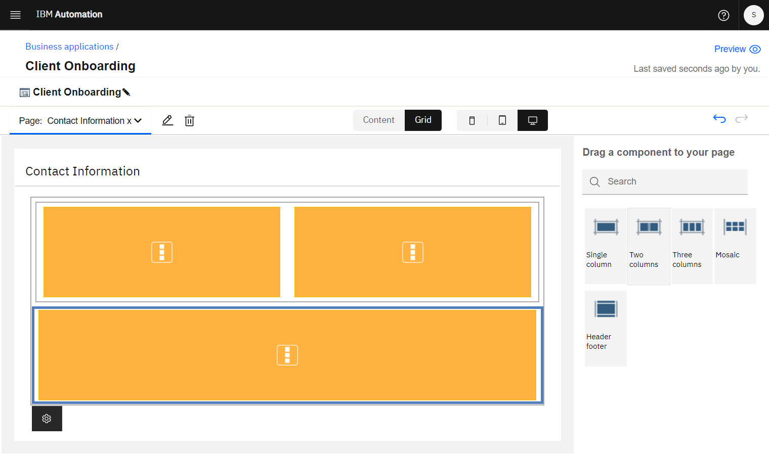
Figure 11.9 – Panel with an additional single column
You’re now ready to start adding fields to your panel.
Adding input fields to the Contact Information page
You have enough layout elements for now. So, it’s time to start adding content:
- In the application editor, click the Content toggle button:
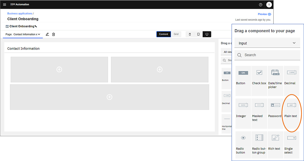
Figure 11.10 – Panel in Content mode
Notice how the canvas’s appearance has changed. The gray boxes correspond with the layout elements you added while in grid mode.
- Let’s add an input field to capture the first name. In the palette, locate the Plain text component, then drag and drop it to the top left of the canvas:
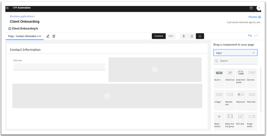
Figure 11.11 – Panel with its first Plain text component
- Now, let’s configure it.
- Click on it in the canvas and select the Properties tool in the toolbar to bring up the Properties dialog:
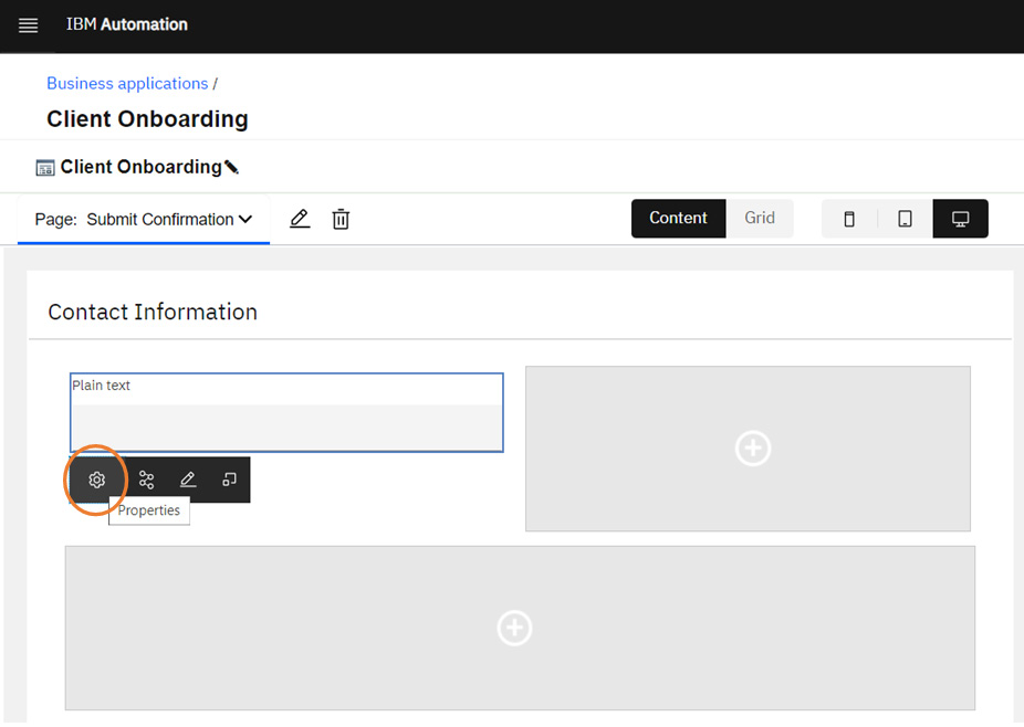
Figure 11.12 – The Properties tool
Here is the Properties dialog:
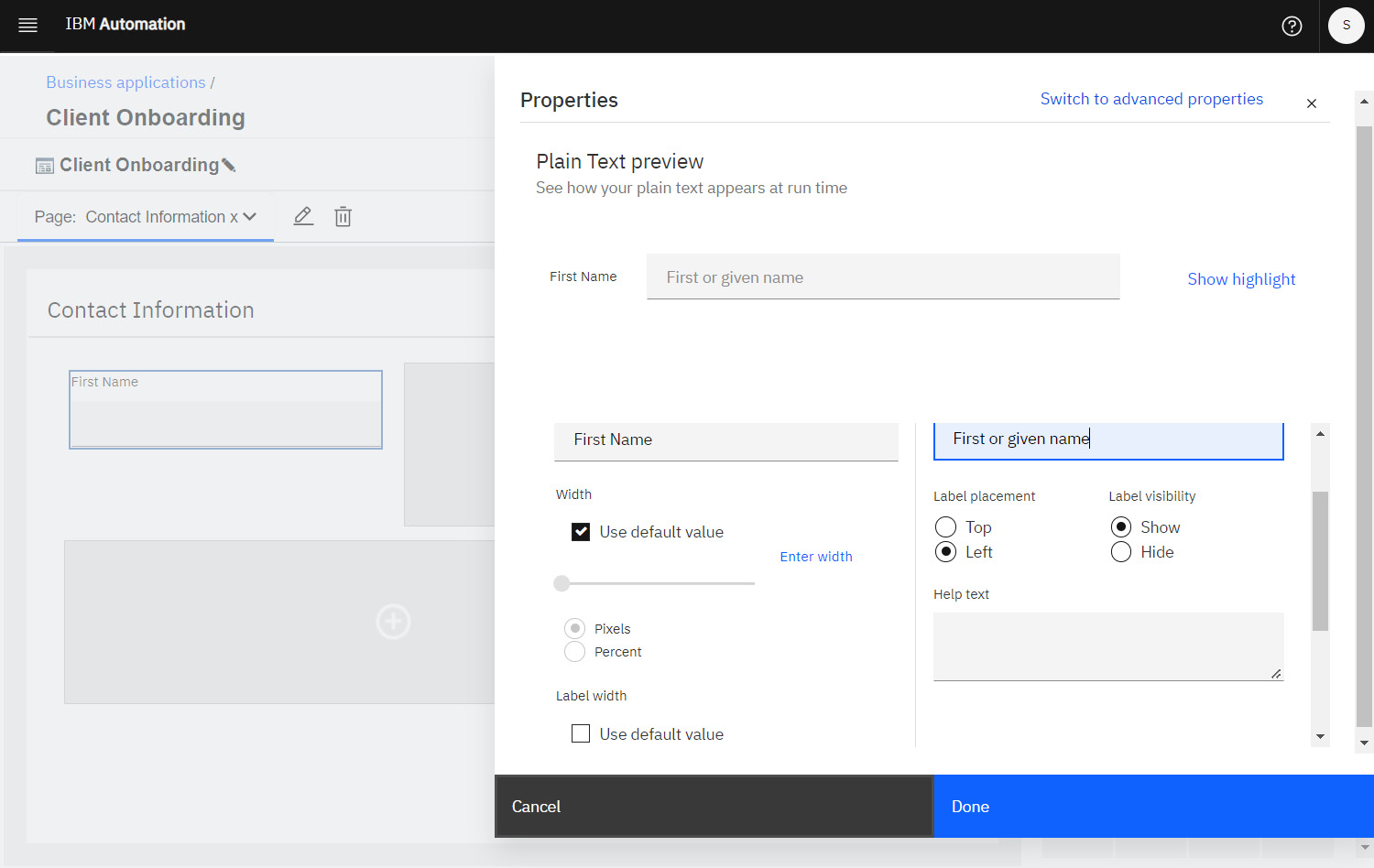
Figure 11.13 – The Properties dialog for the First Name input field
- In this dialog, do the following:
- Change the field label to First Name.
- Assign placeholder text of First or given name.
- Use the Label placement radio buttons to place the label to the left of the input field.
- Set a custom width for the label. First, you must deselect the Use default value checkbox. Ensure you’re setting the width of the label and not the width of the input field. 85 px is a good width, but you can play around with others.
- A preview of what the field looks like will appear at the top of the dialog. When you’re satisfied, click Done to close the dialog.
- Now, add another field for Last Name to the right of the First Name field and customize it similarly.
- Finally, as you did in Step 2 for the Plain text component, locate the Horizontal line component from the palette, and then drag and drop it below the two input fields:
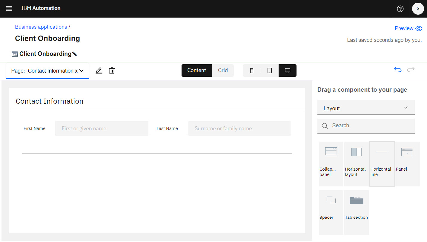
Figure 11.14 – Panel with the First Name and Last Name fields added
At this point, you now have a page that’s nicely laid out, with fields that prompt for first and last names.
Setting data associations
When a user enters values into the First Name or Last Name input fields, those values must be captured somewhere. Cloud Pak for Business Automation captures these values in variables. But first, you must choose which variables should be used for which fields. That’s where data associations come in:
- Once again, click on the First Name component on your canvas to make the toolbar appear. But this time, select the Data association tool:
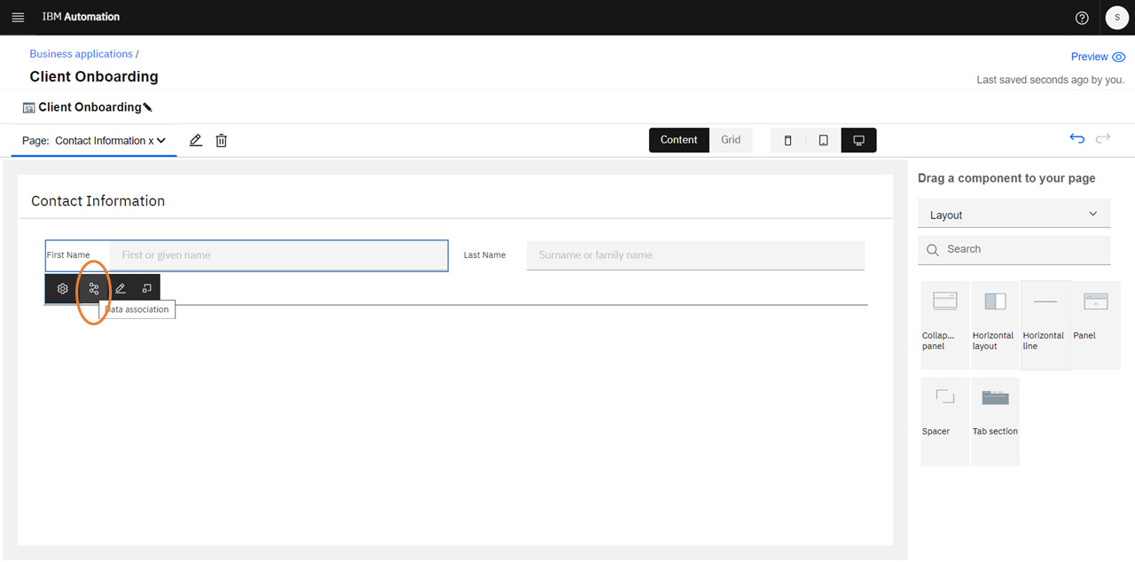
Figure 11.15 – Toolbar showing the Data association tool
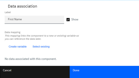
Figure 11.16 – The Data association dialog
- You can use an existing variable or create a new one. Given you have no variables created yet, select Create variable and enter a meaningful variable name, such as firstName.
- Click Done. Now, your First Name input field is associated with the firstName variable, and the value that’s entered in that field will be stored in that variable.
- Repeat these steps to create a new lastName variable and associate it with your Last Name input field. We’ll use these variables later when we cover Automation Services.
Continue building out your Contact Information page, using the techniques you’ve learned so far. You can add input fields for an email address, telephone number, and other typical kinds of information you’d use for contact purposes. Explore the component palette and try different layouts using grid mode. Don’t forget to associate each of your input fields with a variable so that the input values are captured:
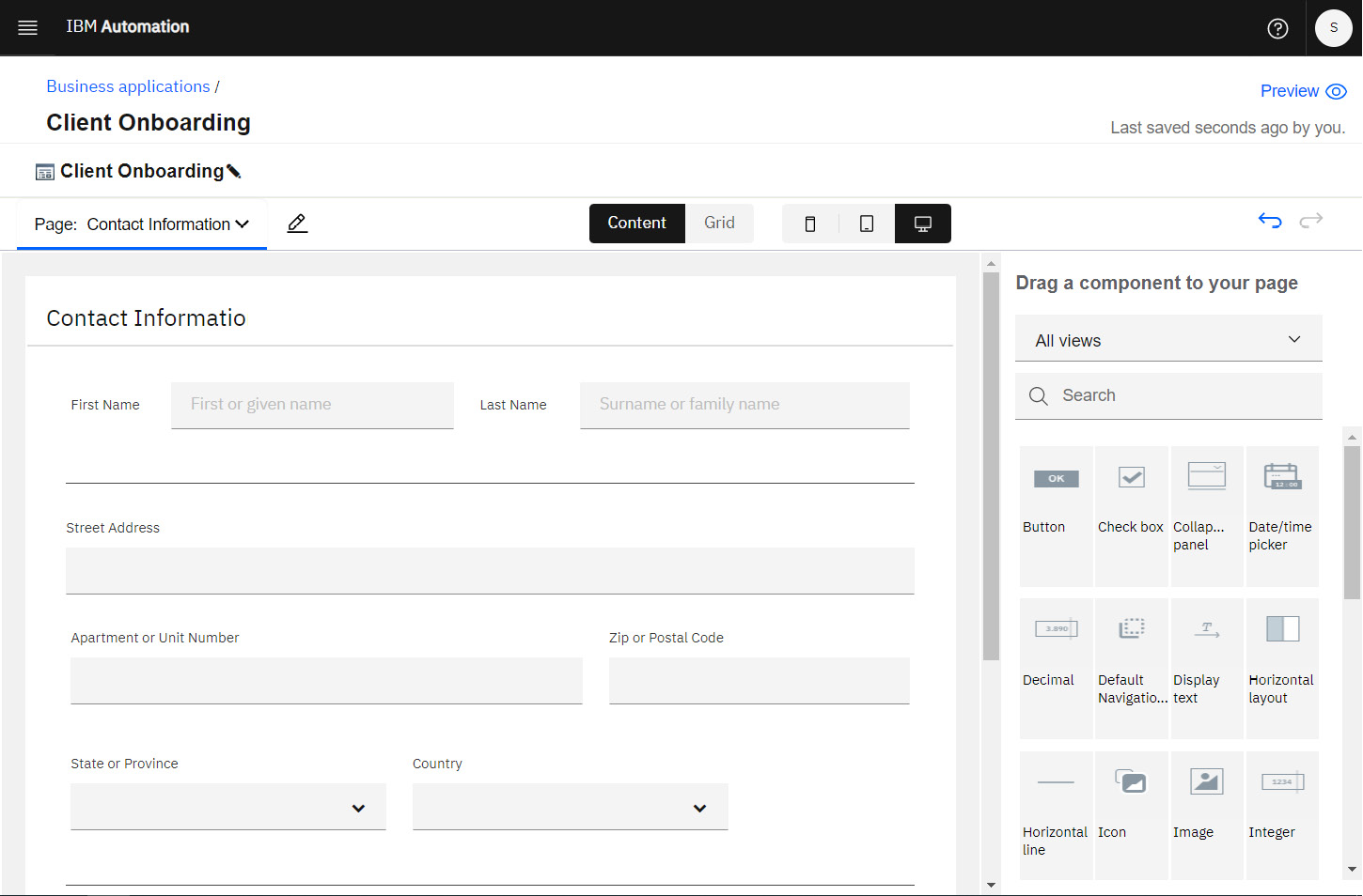
Figure 11.17 – The Contact Information page with all fields
Once you have all the required fields to capture input, you need the means to send the values somewhere.
Adding a Submit button
In this section, you’ll provide a button that a user can click when they’re ready to submit their details.
In the editor, toggle to Grid mode and add a Single column component at the bottom of the panel. This will hold the button, but we want the button placed over on the right:
- Click within the new component you just added to toggle its layout from vertical, which is the default, to horizontal. You’ll see an additional toggle show up inside the component. This controls the layout justification.
- Click it until it shows the right justification:
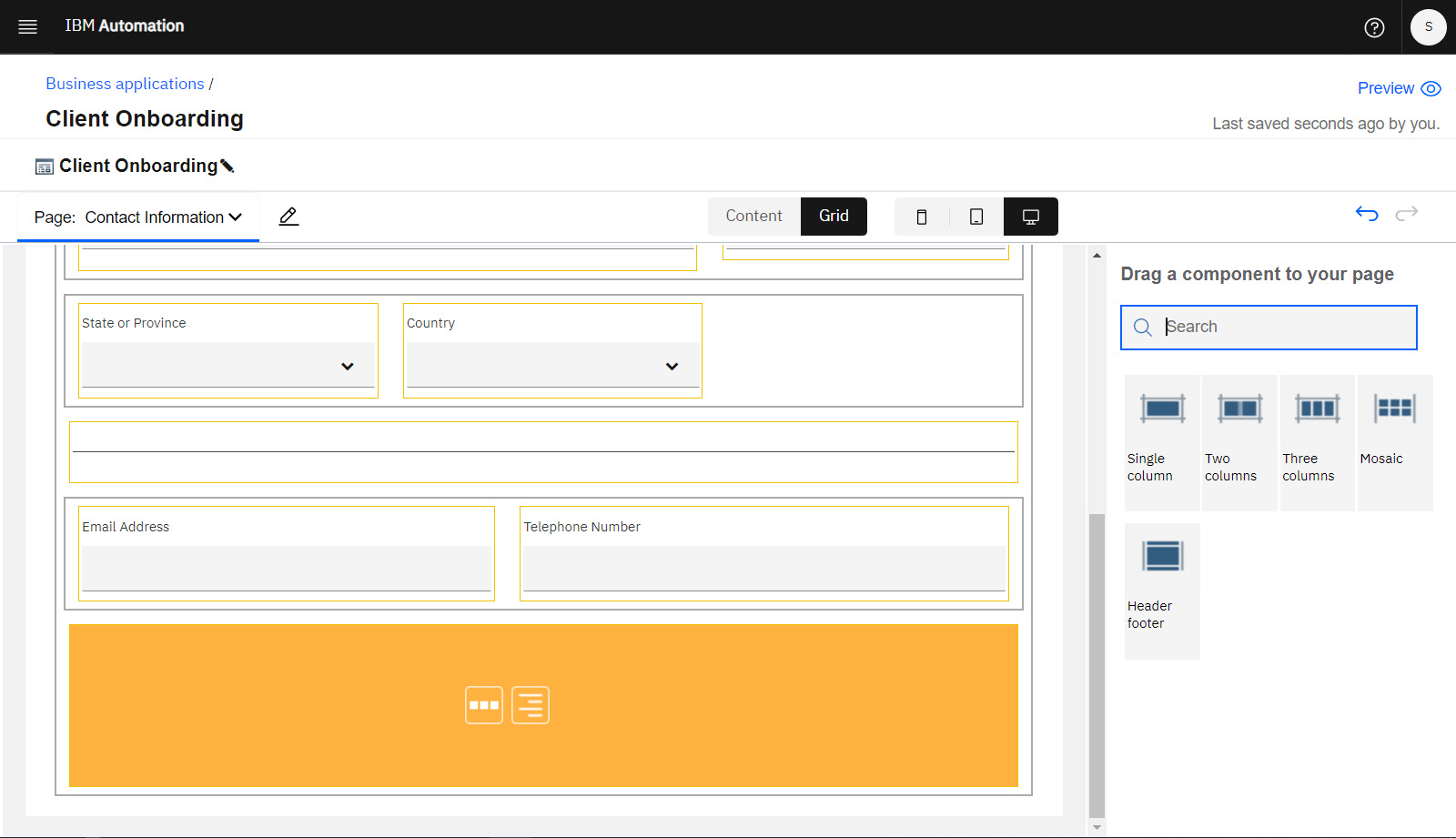
Figure 11.18 – Grid configured for a right-justified button
- Toggle the editor back to Content mode and add a Button component. This button should automatically position itself on the right of the panel.
- Rename it Submit and adjust the text size and color as you wish:
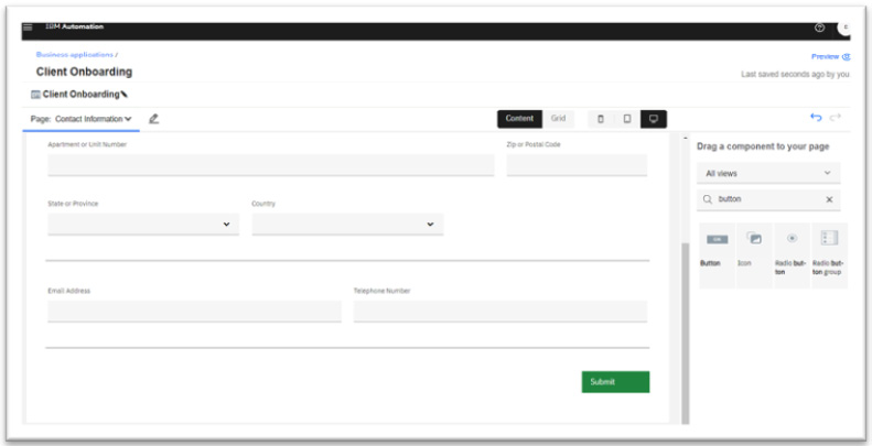
Figure 11.19 – Panel with the Submit button
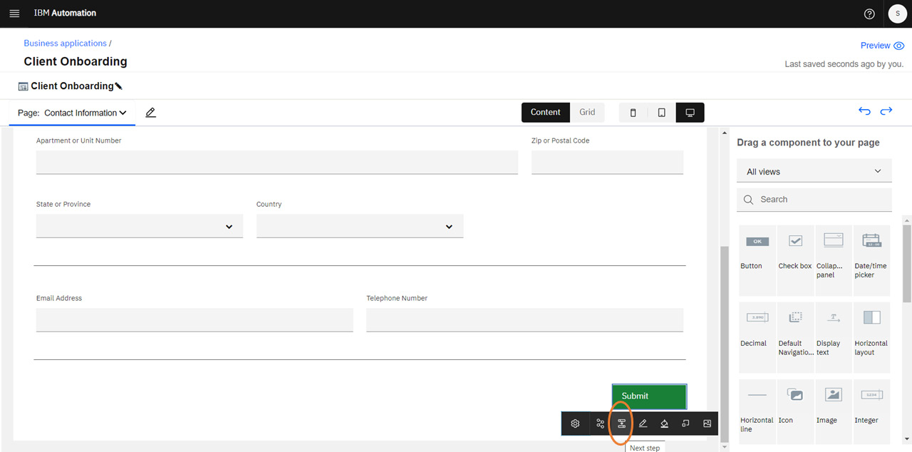
Figure 1120 – The Next step tool on the Submit button toolbar
Then, select the Next step tool in the toolbar:
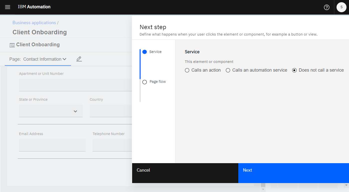
Figure 11.21 – The Next step dialog
- A dialog will appear that allows you to control what happens when the button is clicked. We’ll skip the first setting for now. Ultimately, we want this button to call a service, but we don’t have one we can use just yet. Click Next to skip to the next setting.
- On the Page flow page of the dialog, you can choose what the user sees after clicking the Submit button. Remember the Submit Confirmation page you created earlier?
- Select Go to Submit Confirmation now:
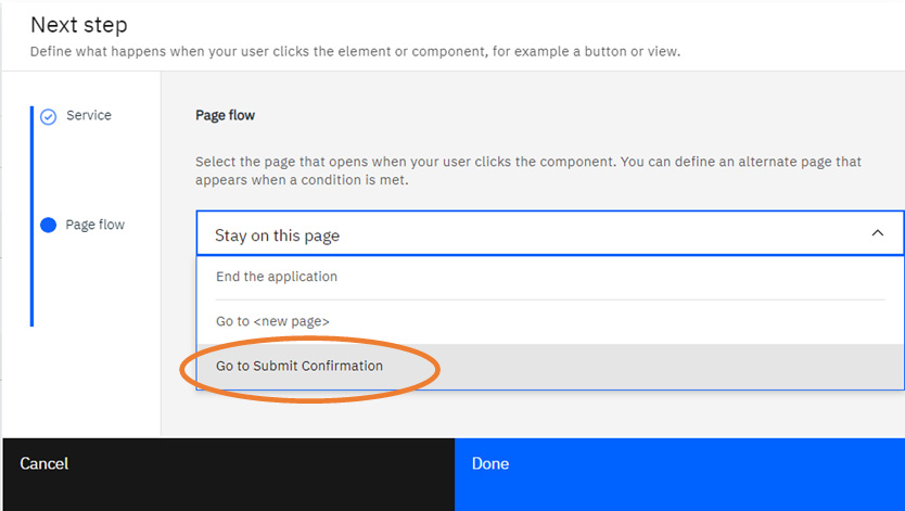
Figure 11.22 – Page flow setting
You’ll also want to switch to the Submit Confirmation page and add some content to it. A simple Success! message would suffice. You can also add images or instructions if required.
Testing and ensuring responsiveness
If your user interfaces must be available on mobile devices, whether on a phone or tablet, then you will want to ensure your experience responds to different screen sizes and the components are laid out appropriately.
Business applications built using IBM Cloud Pak for Business Automation are inherently responsive in this fashion, with no additional work needed on your part.
You can easily view how your experience responds using the screen size toggles at the top of the editor:
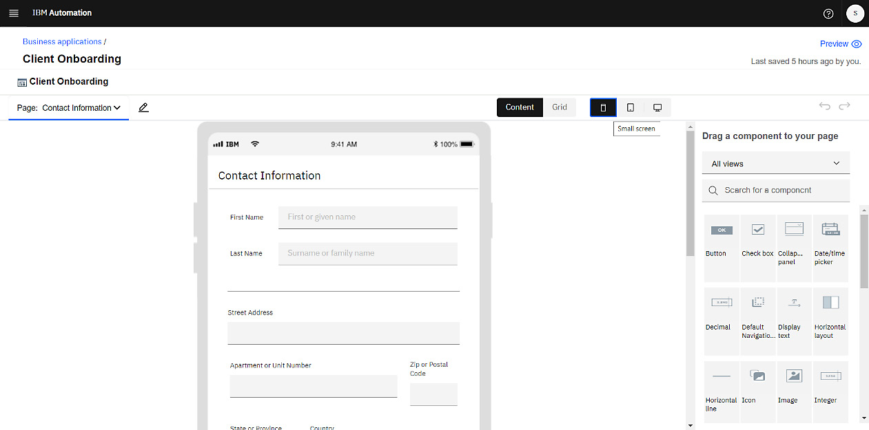
Figure 11.23 – The Contact Information page’s layout on a small-sized (mobile) screen
Follow these steps:
- Switch between the different screen sizes to see how they appear.
- In addition, you can use the Preview button at the top right of the editor to see how the application will appear to your users. You should do this periodically as you incrementally build out your experience so that you can adjust as you go.
At this point, your user interface is all set. All that’s left is to ensure that the data your users input goes to the appropriate backend systems. For that, we need Automation Services.
Leveraging Automation Services
Automation Services are reusable business automations that have been published to IBM Automation Studio for use within your business applications or automation workflows.
As a best practice, your automation services should be designed to satisfy a business need, with inputs and outputs that are easily understood. This allows them to be easily consumed within your low-code business applications.
Creating an Automation Service
Automation Services are created and managed within the Business Automations view. Follow these steps to create an Automation Service:
- You can get to this view either by returning to the Automation Studio home page and clicking the Business automations tile or by selecting Business automations in the IBM Automation menu in the top-left corner:
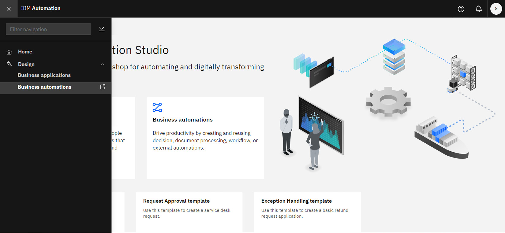
Figure 11.24 – Navigating to the Business automations view
- Once within the Business automations view, click Create to create a new automation service:
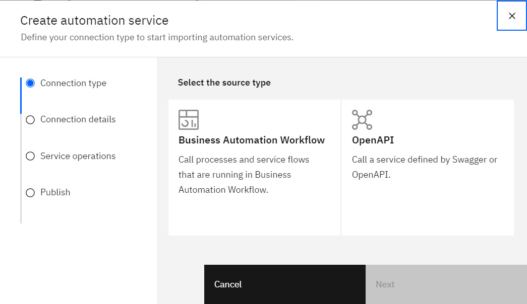
Figure 11.25 – Source type options for automation services
Now, you must identify the type of service you wish to call. You have two source types to choose from:
- Business Automation Workflow
- OpenAPI
Both will be discussed in the next two sections.
Automation services that call a Business Automation Workflow
If you have a Business Automation Workflow that you wish to use, you can expose it as an Automation Service, and then call it from within your automation application.
The process app that contains the workflow must be published and deployed to a server that can be reached by you. You will need the URL for that server, as well as credentials for connecting to it, as shown here:
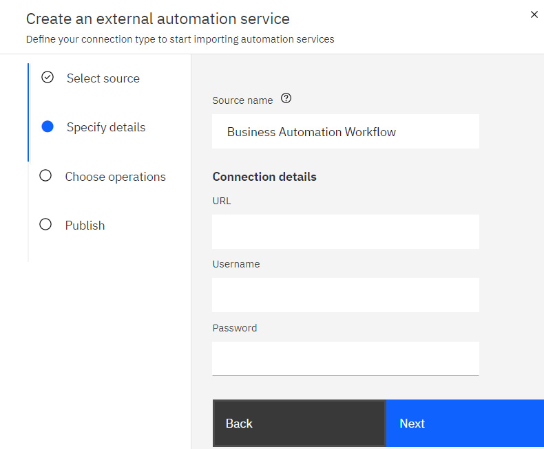
Figure 11.26 – Automation service configuration for workflow applications
Provide the required connection details, then select the operation that represents the workflow you wish to expose. On the final Publish page, you can configure who has access to this automation service.
Automation services that call an external API or bot
Alternatively, you can create an automation service that invokes an external API, for example, a RESTful API, or one that triggers a bot that has been exposed via an API. Follow these steps:
- You will require a Swagger file that describes the API. Swagger files describe RESTful APIs using a standardized format. This Swagger file must conform with the OpenAPI specification. If you’re unfamiliar with OpenAPI or with Swagger files, more information can be found here: https://swagger.io/specification/.
- If you don’t have a Swagger file that describes your service, reach out to the owner of the service to request one. A sample Swagger file is available here: https://github.com/icp4a/ibm-app-designer-samples/blob/master/contributionForProcessingSwaggerFiles/PetStore.json.
- When creating the automation service, select the OpenAPI source type in the dialog, and then upload the Swagger file:
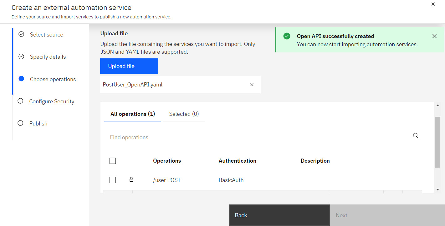
Figure 11.27 – Uploading an OpenAPI Swagger file
- Your Swagger file will be read; the operations declared within it will be listed in the dialog. The preceding screenshot shows the results of importing a Swagger file with a POST operation that requires BasicAuth authentication.
- Choose the operation that you wish to expose and provide the security configuration and credentials as required by your API.
As with the workflow option, you must configure who has access.
Restricting access
On the final page of the Create automation service dialog, you will be able to specify who has access to the service:
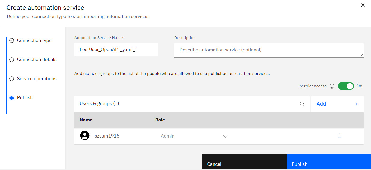
Figure 11.28 – Configuring automation service access
As a best practice, you will want to restrict access to the minimum set of people who might need it. If you’re unsure, start with a more restrictive setting. For example, limit access to admins only or even to yourself only. Then, gradually and selectively increase who has access.
Lastly, click Publish. You now have an exposed automation service that you can use.
Making the automation service available to your application
Now that you have an automation service, let’s return to your automation application:
- Open your Client Onboarding application.
- In the component palette, select Automation service:
Figure 11.29 – Application editor showing palette filter
Here, you will see automation services that are available to this application. Because this is the first time you’re doing so, the palette will initially be empty.
- Click the Add button and select the automation service:
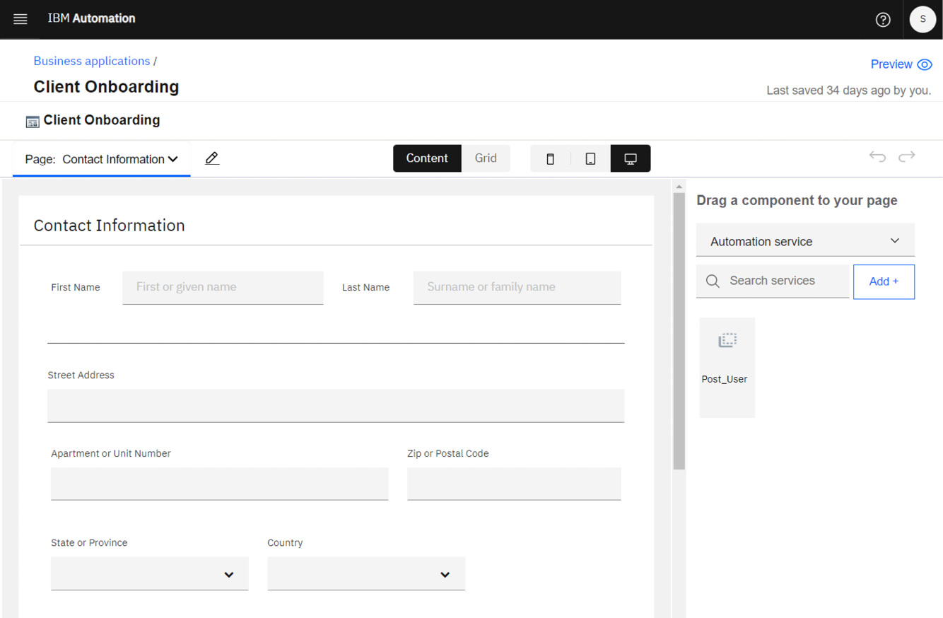
Figure 11.30 – Automation service in the palette
The automation service will show up in your palette, which means it is now ready for you to use.
Configuring the Submit button
Now, let’s connect the Submit button to the automation service:
- Select the Submit button and click the Next step tool:
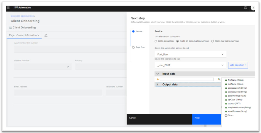
Figure 11.31 – Next step configuration to invoke an automation service
- In the dialog, select Calls an automation service, then select the automation service and operation to call.
Recall that you created variables for each input field in your Contact Information panel. In this same dialog, you will need to map each variable to the input fields of your automation service. This ensures the values are sent to your backend systems.
If your automation service produces output, you can map that output to variables that display within your application. For example, if it produced a reference number, you could display that on your confirmation page.
You now have a fully configured automation that presents an elegant and responsive user interface to your users, without you needing to write a single line of code. It collects contact information and passes that information to a backend service for processing and storage.
Reusable user interface widgets and templates
In the previous section, you learned how to create and configure a new business application. And that works well when you’re just getting started or only have a few user interfaces. But as you scale out, you’ll likely notice repeated patterns or come across experiences that are just variations of each other. This is when reuse becomes important; otherwise, you risk effort duplication. For example, in this chapter, you built a form that captures names and addresses, which are fairly common pieces of data, likely required in multiple forms. This would be a good candidate for reuse.
IBM Cloud Pak for Business Automation provides two mechanisms that will help you reduce effort duplication. You can see these in the Business applications view.
Application templates
If you have user interfaces that are essentially just variations on each other, consider creating application templates:
- In the Business applications view, click Create. But instead of selecting Application, select Template instead:
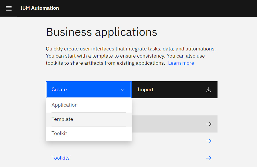
Figure 11.32 – Create | Template
- Provide a Name and Description. You’ll then be presented with an automation application editor where you can build out your user experience, as you did previously.
When it’s time to create your application, select your template in the Create Application dialog.
By doing this, you will start with an application that already contains everything that was in your template. Then, you simply need to tweak or adjust it with what’s unique to this application.
Toolkits
Toolkits allow you to contribute new components to your component palette. These could be simple custom widgets, or they could be composite panels containing other widgets. Follow these steps:
- To create a toolkit, click Create in the Business applications view, and select Toolkit.
- Within the designer, click the Add button next to User interface in the tree on the left, and select the View component:
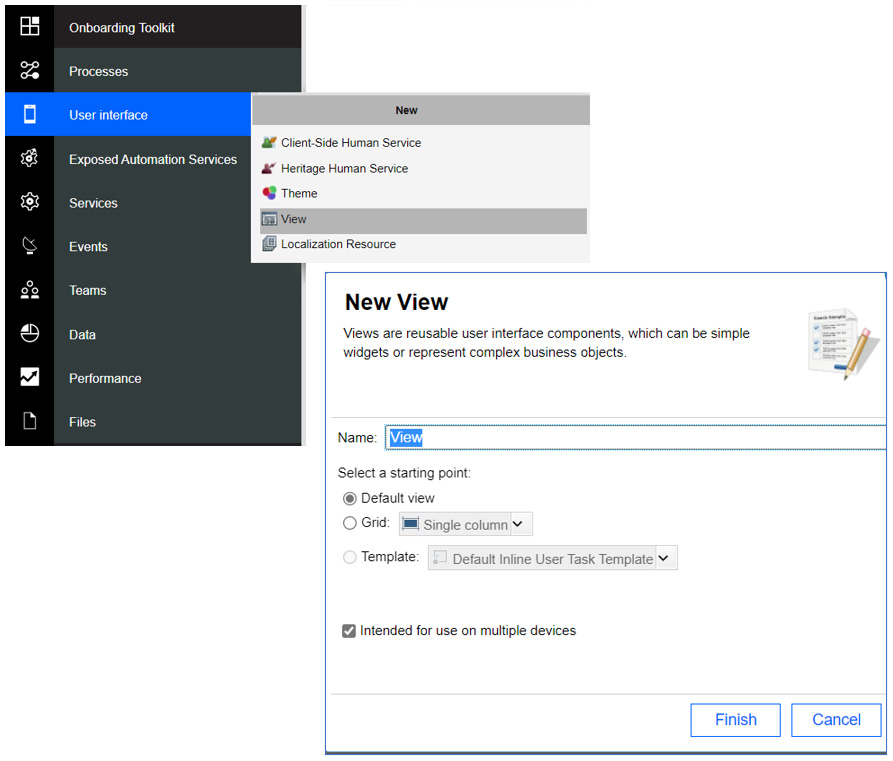
Figure 11.33 – Creating a View component
IBM Cloud Pak for Business Automation includes several toolkits, including UI Toolkit, which provides the primitive components that you’ve used throughout this chapter:
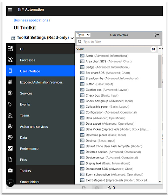
Figure 11.34 – View components within UI Toolkit
UI Toolkit is a good reference if you wish to create your toolkit or your widgets.
Content Services
If you have a content management system and you wish to build applications that integrate with it, IBM Cloud Pak for Business Automation includes a Content Services toolkit that provides common widgets and services:
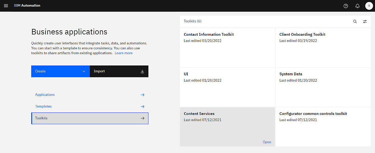
Figure 11.35 – Available toolkits
In addition, it provides a Content Services Sample Template application that you can use as a starting point for your custom applications.
More information can be found in the GitHub repository at https://github.com/icp4a/content-toolkit, including a copy of the template that you can import into your environment, and detailed instructions on how to use it.
Packaging and deployment
Once you’re satisfied with your business application, you’ll want to designate a version to deploy:
- If you haven’t created a version, do so now by going to the Business applications page and clicking the tile that represents your application:
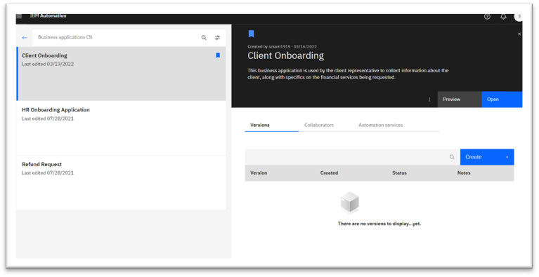
Figure 11.36 – Client Onboarding versions
- Click the Create button on the Versions tab to create a new version. It’s a good practice to provide some details of what went into that version.
- Next, click the three-dot icon (next to the Preview button) and select Request publish. The admins for your instance will then review and deploy your application to the IBM Automation Navigator.
You now have a running business application that contains a responsive user interface that your end users can launch and use to collect contact information.
Summary
In this chapter, we explored the various capabilities within IBM Cloud Pak for Business Automation that allow you to build user interfaces that call workflows or backend services via exposed automation services.
We built a responsive multi-page business application that provides a user interface for collecting contact information. We looked at the layout and configuration of view components, associated input fields with variables that held the input values, and examined how to connect the application to automation services, including how to map data from variables to service inputs.
After that, we examined templates and toolkits as mechanisms for reuse, to reduce duplication and effort. We also discussed some of the toolkits and templates provided out of the box, including UI Toolkit and Content Services.
Finally, we described the steps to version and publish the application so that it can be deployed to IBM Automation Navigator. From there, end users can launch the application.
In the next chapter, you’ll learn how to use IBM Cloud Pak for Business Automation to observe and gain insight into your running automation.
Further reading
- https://www.ibm.com/docs/en/cloud-paks/cp-biz-automation/22.0.1?topic=building-business-applications – Online documentation
- https://github.com/icp4a/ibm-app-designer-samples - Business Application samples