
3
Probability and Data Generation Processes
The field of probability calculation was born in the context of gambling. It was then developed further, assuming a relevant role in the analysis of collective phenomena and becoming an essential feature of statistics and statistical decision theory. Probability calculation is an abstract and highly formalized mathematical discipline while maintaining relevance to its original and pertinent empirical context. The concept of probability is strongly linked to that of uncertainty. The probability of an event can, in fact, be defined as the quantification of the level of randomness of that event. What is not known or cannot be predicted with an absolute level of certainty is known as being random. In this chapter, we will learn how to distinguish between the different definitions of probabilities and how these can be integrated to obtain useful information in the simulation of real phenomena.
In this chapter, we’re going to cover the following main topics:
- Explaining probability concepts
- Understanding Bayes’ theorem
- Probability distributions
- Generating synthetic data
- Data generation with Keras
- Simulation of power analysis
Technical requirements
This chapter will discuss an introduction to the theory of probability. To deal with these topics, it is necessary that you have a basic knowledge of algebra and mathematical modeling.
To install a library not contained in your Python environment, use the pip install command. To work with the Python code in this chapter, you need the following files (available on GitHub at the following URL: https://github.com/PacktPublishing/Hands-On-Simulation-Modeling-with-Python-Second-Edition):
- Uniform_distribution.py
- Binomial_distribution.py
- Normal_distribution.py
- image_augmentation.py
- power_analysis.py
Explaining probability concepts
If we take a moment to reflect, we’ll notice that our everyday lives are full of probabilistic considerations, although not necessarily formalized as such. Examples of probabilistic assessments include choosing to participate in a competition given the limited chance of winning, the team’s predictions of winning the championship, and statistics that inform us about the probability of death from smoking or failure to use seat belts in the event of a road accident, and the chances of winning in games and lotteries.
In all situations of uncertainty, there is basically a tendency to give a measure of uncertainty that, although indicated in various terms, expresses the intuitive meaning of probability. The fact that probability has an intuitive meaning also means that establishing its rules can, within certain limits, be guided by intuition. However, relying completely on intuition can lead to incorrect conclusions. To avoid reaching incorrect conclusions, it is necessary to formalize the calculation of probabilities by establishing their rules and concepts logically and rigorously.
Types of events
We define an event as any result to which, following an experiment or an observation, a well-defined degree of truth can be uniquely assigned. In everyday life, some events happen with certainty, while others never happen. For example, if a box contains only yellow marbles, by extracting one at random, we are sure that it will be yellow, while it is impossible to extract a red ball. We call the events of the first type – that is, extracting a yellow marble – certain events, while we call those of the second type – that is, extracting a red marble – impossible events.
These two types of events – certain and impossible – are events that can happen, but without certainty. If the box contains both yellow and red balls, then extracting a yellow ball is a possible but not certain event, as is extracting a red ball. In other words, we cannot predict the color of the extracted ball because the extraction is random.
Something that may or may not happen at random is called a random event. In Chapter 2, Understanding Randomness and Random Numbers, we introduced random events. An example of such a random event is being selected in chemistry to check homework over a week’s worth of lessons.
The same event can be certain, random, or impossible, depending on the context in which it is considered. Let’s analyze an example: winning the Mega Millions jackpot game. This event can be considered certain if we buy all the tickets for the game; it is impossible if we do not buy even one, and it is random if we buy one or more than one, but not all.
Calculating probability
The succession of random events has led people to formulate bets on their occurrence. The concept of probability was born precisely because of gambling. Over 3,000 years ago, the Egyptians played an ancestor of the dice game. The game of dice was widespread in ancient Rome too, so much so that some studies have found that this game dates back to the age of Cicero. But the birth of the systematic study of the calculation of probabilities dates back to 1654, by the mathematician and philosopher Blaise Pascal.
Probability definition with an example
Before we analyze some simple examples of calculating the probability of the occurrence of an event, it is good to define the concept of probability. To start, we must distinguish between a classical approach to the definition of probability and the frequentist point of view.
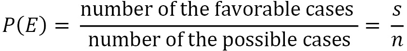
A priori probability
The a priori probability p(E) of a random event E is defined as the ratio between the number s of the favorable cases and the number n of the possible cases, which are all considered equally probable:
In a box, there are 14 yellow marbles and 6 red marbles. The marbles are similar in every way except for their color; they’re made of the same material, are the same size, are perfectly spherical, and so on. We’ll put a hand into the box without looking inside, pulling out a random marble. What is the probability that the pulled-out marble is red?
In total, there are 14 + 6 = 20 marbles. By pulling out a marble, we have 20 possible cases. We have no reason to think that some marbles are more privileged than others; that is, they are more likely to be pulled out. Therefore, the 20 possible cases are equally probable.
Of these 20 possible cases, there are only 6 cases in which the marble being pulled out is red. These are the cases that are favorable to the expected event.
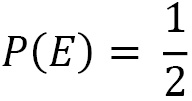
Therefore, the red marble being pulled out has 6 out of 20 possible occurrences. Defining its probability as the ratio between the favorable and possible cases, we will get the following:

Based on the definition of probability, we can say the following:
- The probability of an impossible event is 0
- The probability of a certain event is 1
- The probability of a random event is between 0 and 1
Previously, we introduced the concept of equally probable events. Given a group of events, if there is no reason to think that some event occurs more frequently than others, then all group events should be considered equally likely.
Complementary events
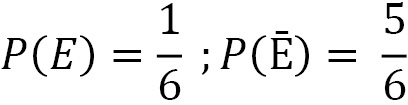
Complementary events are two events – usually referred to as E and Ē – that are mutually exclusive.
For example, when rolling some dice, we consider the event as E = number 5 comes out.
The complementary event will be Ē = number 5 does not come out.
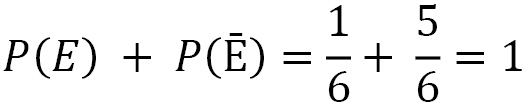
E and Ē are mutually exclusive because the two events cannot happen simultaneously; they are exhaustive because the sum of their probabilities is 1.
For event E, there are 1 (5) favorable cases, while for event Ē, there are 5 favorable cases, that is, all the remaining cases (1, 2, 3, 4, 6). So, the a priori probability is as follows:
Due to this, we can observe the following:
Relative frequency and probability
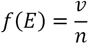
However, the classical definition of probability is not applicable to all situations. To affirm that all cases are equally probable is to make an a priori assumption about their probability of occurring, thus using the same concept in the definition that you want to define.
The relative frequency f(E) of an event subjected to n experiments, all carried out under the same conditions, is the ratio between the number v of the times the event occurred, and the number n of tests carried out:
If we consider the toss of a coin and the event E = heads up, classical probability gives us the following value:
If we perform many throws, we will see that the number of times the coin landed heads up is almost equal to the number of times a cross occurs. That is, the relative frequency of the event E approaches the theoretical value:
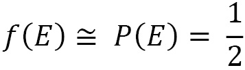
Given a random event E, subjected to n tests performed all under the same conditions, the value of the relative frequency tends to the value of the probability as the number of tests carried out increases.
Important note
The probability of a repeatable event coincides with the relative frequency of its occurrence when the number of tests being carried out is sufficiently high.
Note that in the classical definition, the probability is evaluated a priori, while the frequency is a value that’s evaluated posteriori.
The frequency-based approach is applied, for example, in the field of insurance, to assess the average life span of an individual, the probability of theft, and the probability of accidents. It can also be applied in the field of medicine in order to evaluate the probability of contracting a certain disease or the probability that a drug is effective. In all these events, the calculation is based on what has happened in the past, that is, by evaluating the probability by calculating the relative frequencies.
Let’s now look at another approach we can use to calculate probabilities that estimate the levels of confidence in the occurrence of a given event.
Understanding Bayes’ theorem
From the Bayesian point of view, probability measures the degree of likelihood that an event will occur. It is an inverse probability in the sense that from the observed frequencies, we obtain the probability.
Bayesian statistics foresee the calculation of the probability of a certain event before carrying out the experiment; this calculation is made based on previous considerations. Using Bayes’ theorem, by using the observed frequencies, we can calculate the a priori probability, and from this, we can determine the posterior probability. By adopting this method, the prediction of the degree of credibility of a given hypothesis is used before observing the data, which is then used to calculate the probability after observing the data.
Important note
In the frequentist approach, we determine how often the observation falls within a certain interval, while in the Bayesian approach, the probability of truth is directly attributable to the interval.
In cases where a frequentist result exists within the limit of a very large sample, the Bayesian and frequentist results coincide. There are also cases where the frequentist approach is not applicable.
Compound probability
Now, consider two events, E1 and E2, where we want to calculate the probability P(E1∩E2) that both occur. Two cases can occur:
- E1 and E2 are stochastically independent
- E1 and E2 are stochastically dependent
The two events, E1 and E2, are stochastically independent if they do not influence each other, that is, if the occurrence of one of the two does not change the probability of the second occurring. Conversely, the two events, E1 and E2, are stochastically dependent if the occurrence of one of the two changes the probability of the second occurring.
Let’s look at an example: you draw a card from a deck of 40 that contains the numbers 1 to 7, plus the 3 face cards for each suit. What is the probability that it is a face card and from the hearts suit?
To start, we must ask ourselves whether the two events are dependent or independent.
There are 12 faces, 3 for each symbol, so the probability of the first event is equal to 12/40, that is, 3/10. The probability that the card is from the hearts suit is not influenced by the occurrence of the event that the card is a face card; therefore, it is worth 10/40, that is, 1/4. Therefore, the compound probability will be 3/40.
Therefore, this is a case of independent events. The compound probability is given by the product of the probabilities of the individual events, as follows:

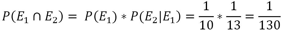
Let’s look at a second example: we draw a card from a deck of 40 and, without putting it back in the deck, we draw a second one. What is the probability that they are two queens?
The probability of the first event is 4/40, that is, 1/10. But when drawing the second card, there are only 39 remaining, and there are only 3 queens. So, the probability that the second card is still a queen will have become 3/39, that is, 1/13. Therefore, the compound probability will be given by the product of the probability that the first card is a queen for the probability that the second is still a queen, that is, 1/130.
Thus, this is a case of dependent events; that is, the probability of the second event is conditioned by the occurrence of the first event. Similarly, the two events are considered dependent if the two cards are drawn simultaneously when there is no reintegration.
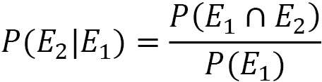
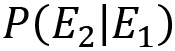
When the probability of an E2 event depends on the occurrence of the E1 event, we speak of the conditional probability, which is denoted by P(E2|E1), and we see that the probability of E2 is conditional on E1.
When the two events are stochastically dependent, the compound probability is given by the following equation:
From the previous equation, we can derive the equation that gives us the conditional probability:
After defining the concept of conditional probability, we can move on and analyze the heart of Bayesian statistics.
Bayes’ theorem
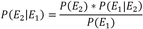
Let’s say that E1 and E2 are two dependent events. In the Compound probability section, we learned that the compound probability of the two events is calculated using the following equation:

By exchanging the order of succession of the two events, we can write the following equation:

The left-hand part of the two previous equations contains the same quantity, which must also be true for the right-hand part. Based on this consideration, we can write the following equation:
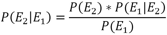
The same is true by exchanging the order of events:
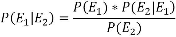
The preceding equations represent the mathematical formulation of Bayes’ theorem. The use of one or the other depends on the purpose of our work. Bayes’ theorem is derived from two fundamental probability theorems: the compound probability theorem and the total probability theorem. It is used to calculate the probability of a cause that triggered the verified event.
In Bayes’ theorem, we know the result of the experiment, and we want to calculate the probability that it is due to a certain cause. Let’s analyze the elements that appear in the equation that formalizes Bayes’ theorem in detail:
Here, we have the following:
 is called posterior probability (what we want to calculate)
 is called prior probability
 is called likelihood (represents the probability of observing the E1 event when the correct hypothesis is E2)
 is called marginal likelihood
Bayes’ theorem applies to many real-life situations, such as in the medical field for finding false positives in one analysis or verifying the effectiveness of a drug.
Now, let’s learn how to represent the probabilities of possible results in an experiment.
Exploring probability distributions
A probability distribution is a mathematical model that links the values of a variable to the probabilities that these values can be observed. Probability distributions are used to model the behavior of a phenomenon of interest in relation to the reference population, or to all the cases in which the researcher observes a given sample.
Based on the measurement scale of the variable of interest X, we can distinguish two types of probability distributions:
- Continuous distributions: The variable is expressed on a continuous scale
- Discrete distributions: The variable is measured with integer numerical values
In this context, the variable of interest is seen as a random variable whose probability law expresses the degree of uncertainty with which its values can be observed. Probability distributions are expressed by a mathematical law called the probability density function (f(x)) or probability function (p(x)) for continuous or discrete distributions, respectively. The following diagram shows a continuous distribution (to the left) and a discrete distribution (to the right):
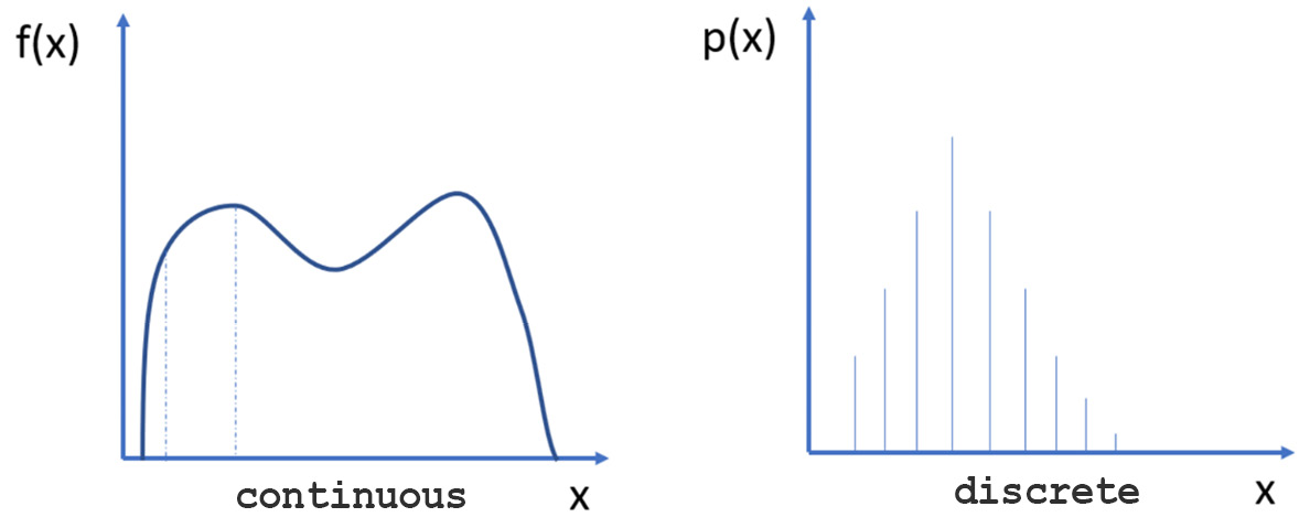
Figure 3.1 – A continuous distribution and a discrete distribution
To analyze how a series of data is distributed, which we assume can take any real value, it is necessary to start with the definition of the probability density function. Let’s see how that works.
The probability density function
The probability density function (PDF) P(x) represents the probability p(x) that a given x value of the continuous variable is contained in the interval (x, x + Δx), divided by the width of the interval Δx when this tends to be zero:
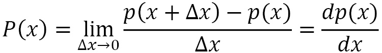
The probability of finding a given x value in the interval [a, b] is given by the following equation:
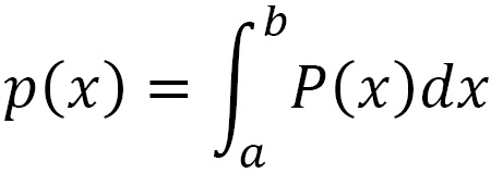
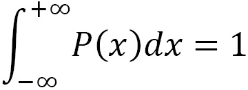
Since x takes a real value, the following property holds:
In practice, we do not have an infinite set of real values but rather a discrete set N of real numbers xi. Then, we proceed by dividing the interval [xmin, xmax] into a certain number Nc of subintervals (bins) of amplitude Δx, considering the definition of probability as the ratio between the number of favorable cases and the number of possible cases.
The calculation for the PDF refers to dividing the interval [xmin, xmax] into Nc subintervals and counting how many xi values fall into each of these subintervals before dividing each value by Δx*N, as shown in the following equation:
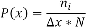
Here, we can see the following:
- P(x) is the PDF
- ni is the number of x values that fall into the i-th sub-interval
 is the amplitude of each sub-interval
 is the number of observations x
Now, let’s learn how to determine the probability distribution of a variable in the Python environment.
Mean and variance
The expected value, which is also called the average of the distribution of a random variable, is a position index. The expected value of a random variable represents the expected value that can be obtained with a sufficiently large number of tests so that it is possible to predict, by probability, the relative frequencies of various events.
The expected value of a discrete random variable, if the distribution is finite, is a real number given by the sum of the products of each value of the random variable for the respective probability:
The expected value is, therefore, a weighted sum of the values that the random variable assumes when weighted with the associated probabilities. Due to this, it can be either negative or positive.
After the expected value, the most used parameter to characterize the probability distributions of the random variables is the variance, which indicates how scattered the values of the random variable are relative to its average value.
Given a random variable X, whatever E(X) is is its expected value. Consider the random variable X– E (X), whose values are the distances between the values of X and the expected value E(X). Substituting a variable X for the variable X-E (X) is equivalent to translating the reference system that brings the expected value to the origin of the axes.
The variance of a discrete random variable X, if the distribution is finite, is calculated with the following equation:
The variance is equal to zero when all the values of the variable are equal, and therefore, there is no variability in the distribution; in any case, it is positive and measures the degree of variability of a distribution. The greater the variance, the more scattered the values are. The smaller the variance, the more the values of X are concentrated around the average value.
Uniform distribution
The simplest of the continuous variable probability distribution functions is the one in which the same degree of confidence is assigned to all the possible values of a variable defined in a certain range. Since the probability density function is constant, the distribution function is linear. The uniform distribution is used to treat measurement errors whenever they occur with the certainty that a certain variable is contained in a certain range, but there is no reason to believe some values are more plausible than others. Using suitable techniques, starting from a uniformly distributed variable, it is possible to build other variables that have been distributed at will.
Now, let’s start practicing using it. We will start by generating a uniform distribution of random numbers contained within a specific range. To do this, we will use the numpy random.uniform() function. This function generates random values uniformly distributed over the half-open interval [a, b); that is, it includes the first but excludes the second. Any value within the given interval is equally likely to be drawn by uniform distribution:
- To start, we import the necessary libraries:
import numpy as np
import matplotlib.pyplot as plt
The numpy library is a Python library that contains numerous functions that help us manage multidimensional matrices. Furthermore, it contains a large collection of high-level mathematical functions that we can perform on these matrices.
The matplotlib library is a Python library for printing high-quality graphics. With matplotlib, it is possible to generate graphs, histograms, bar graphs, power spectra, error graphs, scatter graphs, and so on with a few commands. This is a collection of command-line functions like those provided by the MATLAB software.
- After this, we define the extremes of the range and the number of values we want to generate:
a=1
b=100
N=100
Now, we can generate the uniform distribution using the random.uniform() function, as follows:
X1=np.random.uniform(a,b,N)
With that, we can view the numbers that we generated. To begin, draw a diagram in which we report the values of the 100 random numbers that we have generated:
plt.plot(X1)
plt.show()
The following graph will be output:
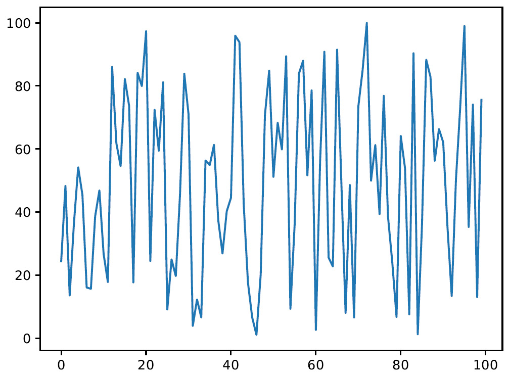
Figure 3.2 – Diagram plotting the 100 numbers
- At this point, to analyze how the generated values are distributed within the interval considered, we draw a graph of the probability density function:
plt.figure()
plt.hist(X1, density=True, histtype='stepfilled', alpha=0.2)
plt.show()
The matplotlib.hist() function draws a histogram, that is, a diagram of a continuous character shown in classes. It is used in many contexts, usually to show statistical data, when there is an interval of the definition of the independent variable divided into subintervals. These subintervals can be intrinsic or artificial, can be of equal or unequal amplitude, and are or can be considered constant. Each of these can either be an independent or dependent variable. Each rectangle has a non-random length equal to the width of the class it represents. The height of each rectangle is equal to the ratio between the absolute frequency associated with the class and the amplitude of the class, and it can be defined as frequency density. The following four parameters are passed:
- X1: Input values.
- density=True: This is a bool where, if True, the function returns the counts normalized to form a probability density.
- histtype='stepfilled': This parameter defines the type of histogram to draw. The stepfilled value generates a line plot that is filled by default.
- alpha=0.2: This is a float value that defines the characteristics of the content (0.0 transparent through 1.0 opaque).
The following graph will be output:
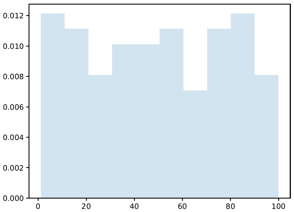
Figure 3.3 – Graph plotting the generated values
Here, we can see that the generated values are distributed almost evenly throughout the range. What happens if we increase the number of generated values?
- Then, we repeat the commands we just analyzed to modify only the number of samples to be managed. We change this from 100 to 10000:
a=1
b=100
N=10000
X2=np.random.uniform(a,b,N)
plt.figure()
plt.plot(X2)
plt.show()
plt.figure()
plt.hist(X2, density=True, histtype='stepfilled', alpha=0.2)
plt.show()
It is not necessary to reanalyze the piece of code line by line since we are using the same commands. Let’s see the results, starting from the generated values:
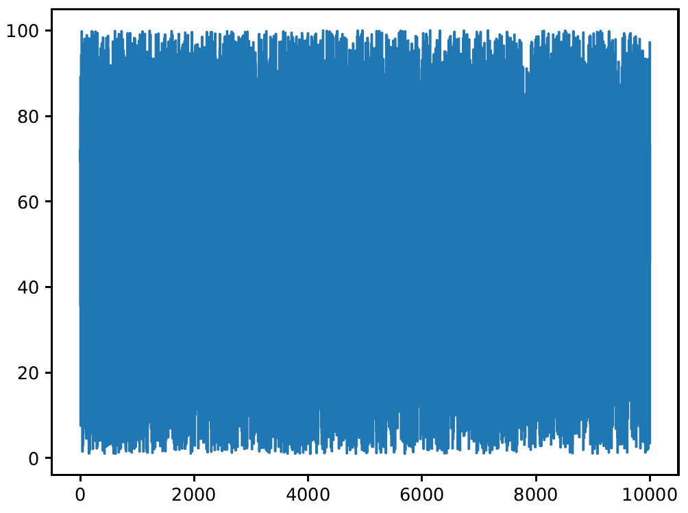
Figure 3.4 – Graph plotting the number of samples
Now, the number of samples that have been generated has increased significantly. Let’s see how they are distributed within the range considered:
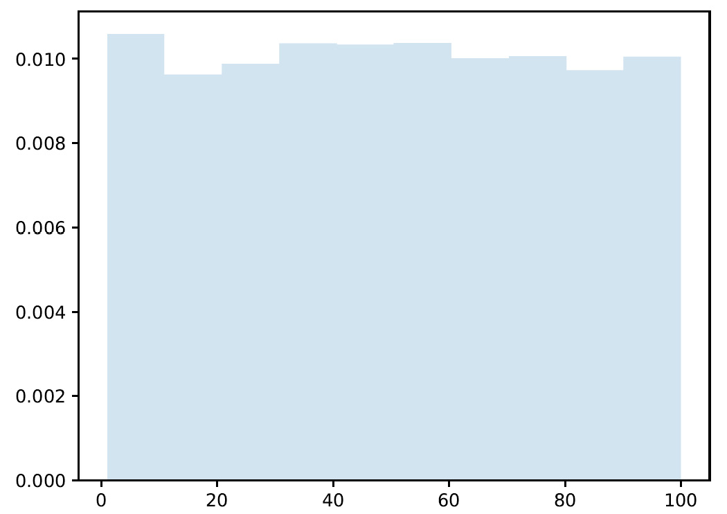
Figure 3.5 – Graph showing the sample distribution
Analyzing the previous histogram and comparing it with what we obtained in the case of N=100, we can see that this time, the distribution appears to be flatter. The distribution becomes flatter as N increases, increasing the statistics in each individual bin.
Binomial distribution
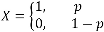
In many situations, we are interested in checking whether a certain characteristic occurs or not. This corresponds to an experiment with only two possible outcomes – also called dichotomous – that can be modeled with a random variable X that assumes value 1 (success) with probability p and value 0 (failure) with probability 1-p, with 0 < p < 1, as follows:
The expected value and variance of X are calculated as follows:


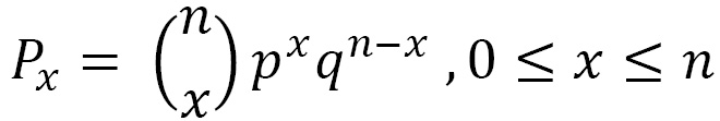
The binomial distribution is the probability of obtaining x successes in n independent trials. The probability density for the binomial distribution is obtained using the following equation:
Here, we have the following:
- Px is the probability density
- n is the number of independent experiments
- x is the number of successes
- p is the probability of success
- q is the probability of fail
Now, let’s look at a practical example. We throw a dice n = 10 times. In this case, we want to study the binomial variable x = number of times a number <= 3 came out. We define the parameters of the problem as follows:
We then evaluate the probability density function with Python code as follows:
- Let’s start as always by importing the necessary libraries:
import numpy as np
import matplotlib.pyplot as plt
Now, we set the parameters of the problem:
N = 1000
n = 10
p = 0.5
Here, N is the number of trials, n is the number of independent experiments in each trial, and p is the probability of success for each experiment.
The numpy random.binomial() function generates values from a binomial distribution. These values are extracted from a binomial distribution with the specified parameters. The result is a parameterized binomial distribution, in which each value is equal to the number of successes obtained in the n independent experiments. Let’s take a look at the return values:
plt.plot(P1)
plt.show()
The following graph is output:
Figure 3.6 – A graph plotting the return values for the binomial distribution
Let’s see how these samples are distributed within the range considered:
plt.figure()
plt.hist(P1, density=True, alpha=0.8, histtype='bar', color = 'green', ec='black')
plt.show()
This time, we used a higher alpha value to make the colors brighter, we used the traditional bar-type histogram, and we set the color of the bars.
- Finally, we used the ec parameter to set the edge color of each bar. The following results are obtained:
Figure 3.7 – Histogram plotting the return values
All the areas of the binomial distributions, that is, the sum of the rectangles, being the sum of probability, are worth 1.
Normal distribution
As the number of independent experiments that are carried out increases, the binomial distributions approach a curve called the bell curve or Gauss curve. The normal distribution, also called the Gaussian distribution, is the most used continuous distribution in statistics. Normal distribution is important in statistics for the following fundamental reasons:
- Several continuous phenomena seem to follow, at least approximately, a normal distribution
- The normal distribution can be used to approximate numerous discrete probability distributions
- The normal distribution is the basis of classical statistical inference by virtue of the central limit theorem (the mean of a large number of independent random variables with the same distribution is approximately normal, regardless of the underlying distribution)
Normal distribution has some important characteristics:
- The normal distribution is symmetrical and bell-shaped
- Its central position measures – the expected value and the median – coincide
- Its interquartile range is 1.33 times the mean square deviation
- The random variable in the normal distribution takes values between -∞ and + ∞
In the case of a normal distribution, the normal probability density function is given by the following equation:
Here, we have the following:
 is the expected value
 is the standard deviation
Note that, since e and π are mathematical constants, the probabilities of a normal distribution depend only on the values assumed by the parameters µ and σ.
Now, let’s learn how to generate a normal distribution in Python. Let’s start as always by importing the necessary libraries:
import numpy as np
import matplotlib.pyplot as plt
import seaborn as sns
Here, we have imported a new seaborn library. It is a Python library that enhances the data visualization tools of the matplotlib module. In the seaborn module, there are several features we can use to graphically represent our data. There are methods that facilitate the construction of statistical graphs with matplotlib.
Now, we set the parameters of the problem. As we’ve already mentioned, only two parameters are needed to generate a normal distribution: the expected value and the standard deviation. The μ value is also indicated as the center of the distribution and characterizes the position of the curve with respect to the ordinate axis. The σ parameter characterizes the shape of the curve since it represents the dispersion of the values around the maximum of the curve.
To appreciate the functionality of these two parameters, we will generate a normal distribution by changing the values of these parameters, as follows:
mu = 10
sigma =2
P1 = np.random.normal(mu, sigma, 1000)
mu = 5
sigma =2
P2 = np.random.normal(mu, sigma, 1000)
mu = 15
sigma =2
P3 = np.random.normal(mu, sigma, 1000)
mu = 10
sigma =2
P4 = np.random.normal(mu, sigma, 1000)
mu = 10
sigma =1
P5 = np.random.normal(mu, sigma, 1000)
mu = 10
sigma =0.5
P6 = np.random.normal(mu, sigma, 1000)
For each distribution, we have set the two parameters (µ and σ) and then used the numpy random.normal() function to generate a normal distribution. Three parameters are passed: µ, σ, and the number of samples to generate. At this point, it is necessary to view the generated distributions. To do this, we will use the histplot() function of the seaborn library, as follows:
Plot1 = sns.histplot(P1,stat="density", kde=True, color="g")
Plot2 = sns.histplot(P2,stat="density", kde=True, color="b")
Plot3 = sns.histplot(P3,stat="density", kde=True, color="y")
plt.figure()
Plot4 = sns.histplot(P4,stat="density", kde=True, color="g")
Plot5 = sns.histplot(P5,stat="density", kde=True, color="b")
Plot6 = sns.histplot(P6,stat="density", kde=True, color="y")
plt.show()
The histplot() function allows us to flexibly plot a univariate or bivariate distribution of observations. Let’s first analyze the results that were obtained in the first graph:
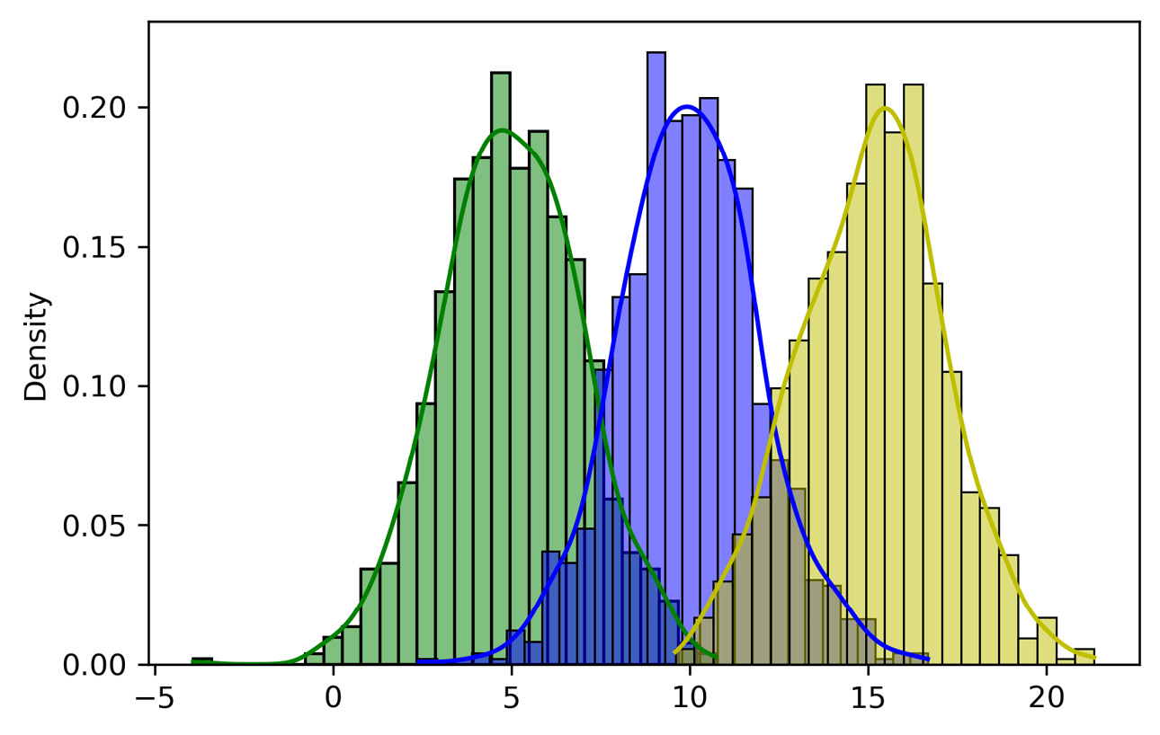
Figure 3.8 – Seaborn plot of the samples
Three curves have been generated that represent the three distributions we have named: P1, P2, and P3. The only difference that we can notice lies in the value of μ, which assumes the values 5, 10, and 15. Due to the variation of μ, the curve moves along the x-axis, but its shape remains unchanged. Let’s now see the graph that represents the remaining distributions:
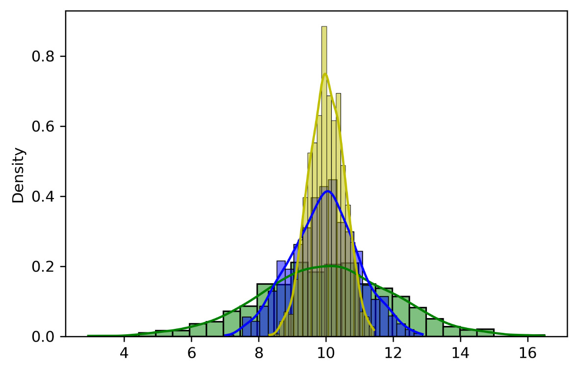
Figure 3.9 – Merged plots
In this case, by keeping the value of µ constant, we have varied the value of σ, which assumes the following values: 2, 1, and 0.5. As σ increases, the curve flattens and widens, while as σ decreases, the curve narrows and rises.
A specific normal distribution is one that’s obtained with µ = 0 and σ = 1. This distribution is called the standardized normal distribution.
Now that we’ve seen all the relevant kinds of probability distribution, let’s learn how to generate data artificially.
Generating synthetic data
Machine learning-based systems have shown great progress and great results in real-world applications, but they have major limitations due to the quality of the data processed. In fact, the results and performances that these models return are strongly dependent on the data, on their quantity, and above all, on their quality. However, it is evident that the manual process of annotating and labeling data requires a very high level of work, which obviously increases with the amount of data generated.
Real data versus artificial data
The use of simulation systems as a method of data collection, then, becomes an effective solution that allows you to produce a large amount of data of better quality and with much less human effort. It is, in fact, possible to programmatically annotate the data that is produced and do so at a speed far superior to the real case. The precision of associating the correct annotation with data can make the difference in having an algorithm capable of interacting effectively with the surrounding environment. Usually, this is done by human annotators, resulting in an additional cost to be taken into consideration, in addition to the poor accuracy of the annotations. Further problems arise from the restrictions in terms of privacy that may occur if there is a need to have categories of sensitive data available. Generating annotations that are as accurate as possible when dealing with a massive amount of data is a challenge for the developer community. Although for some functions, more than satisfactory datasets are already available, in other contexts, you may have to deal with data that errs in the absence of precise annotations.
The availability of low-cost sensors and the ability to connect them together to create data collection networks is not always an advantage. Researchers find limitations when testing their methods because they need labeled data for the validation of their experiments. And even if information from sensors or sensor networks is available, it may not be accessible for legal reasons. Furthermore, obtaining data from a sensor network is associated with a double cost because the realization of a sensor network can be expensive in economic terms and in terms of time since the sensors must perform a sampling, which in some cases involves lengthening the time taken by weeks or even months, to have the data available and carry out the experimentation.
As a solution to such problems, there are various data repositories, both public and private. However, they are not always adapted to the needs of the problem they intend to deal with. The solution to all these limitations is the generation of synthetic data that emulates the behavior of the reality of the problem to be faced. This data is artificially created from detailed information on the process it is intended to represent. In this way, the synthetic data captures the structural and statistical characteristics of the original data without associating the personal information contained in the original dataset. By generating data on the basis of the statistical distributions derived from the original data, it is possible to obtain data that has similar behavior to the data returned by various sensors. The generation of pseudo-realistic character data cannot consist of obtaining random samples with a uniform probability distribution since the result would be a sequence of values devoid of any coherence. For this reason, several mechanisms are required to modify the original data. The generated data can be stored in the most popular database formats used for experimentation.
The use of synthetic data yields multiple advantages. For example, we obtain robustness since the sensors can return incorrect data in certain cases. Data obtained from a synthetic data generator lacks this problem. Another noteworthy feature is security, as synthetic data can be generated with a level of detail and realism that means you don’t have to take any kind of risk.
Feature selection methodologies can be used to extract the characteristic properties of the original database. Feature selection is the process of identifying a set of data attributes that constitute the essential features of a dataset. Feature selection is commonly used in machine learning to limit the dimensionality of the input, remove irrelevant or redundant attributes, and filter out noisy data, with the aim of improving generalization, learning speed, or reducing the complexity of the template. The reduction of dimensionality through the selection of features has become even more important in recent times with the advent of big data.
Feature selection algorithms are commonly evaluated based on their stability or the mean probability of models trained on selected subsets of characteristics of the input data agreeing with their predictions. Feature selection can be associated with feature extraction, which creates new features as features of other features, where features found through selection directly map existing attributes. Feature extraction is most employed in data that has relatively few samples relative to the number of attributes.
In the context of synthetic data, feature selection techniques are used to identify attribute dependencies that should be modeled and reproduced in the output dataset. Additionally, high dimensionality in real-world data can be computationally challenging for generating synthetic data. Limiting the selection of modeled attributes to those that are important to the synthetic data use case can greatly improve performance and quality.
Features extracted into the real dataset can introduce other challenges to quality data generation if the features they derive from are reproduced as well, as this introduces additional feature relationships that should be maintained in the output.
Synthetic data generation methods
Synthetic data generation can be divided into two stages: kernel extraction and synthesis. In general, kernel extraction consists of analyzing real data and simulation requirements to identify the algorithms and parameters to be used. Synthesis is the invocation of the kernel algorithms to produce an output based on the derived parameters. So, let’s see some of the methodologies used for the generation of synthetic data.
Structured data
Structured data is where its characteristics are easily understood and can be summarized by tables that allow them to be easily read and compared with other data. Thanks to this feature, it is much easier to analyze than unstructured data and typically takes the form of written text. It constitutes highly organized information.
The generation of structured synthetic data is not critical and can be generalized. There are several approaches to identifying and modeling value distributions and feature interdependencies. The most popular methods involve the adoption of independent statistical distributions of type t for each characteristic and the subsequent generation of data by imputation. For noise reduction, multiple imputations or aggregations of multiple synthetic datasets generated by the same kernel can be adopted.
The relationships between features can be reconstructed in several ways: For example, we can adopt synthetic reconstruction and combinatorial optimization, which apply conditional probability to impute different distributions based on feature relationships. The increase in computing power has led to the feasibility of more sophisticated machine learning techniques for maintaining feature relationships, such as the use of support vector machines and random forests.
Other forms of structured data include images and time series measurements, in which the relationships between features can be described spatially within a record. Technically, any image transformation method can be classified as generating new synthetic image data, but a particularly useful application of image synthesis is augmenting training images in a deep learning pipeline.
Semi-structured data
Unstructured or non-relational data is essentially the opposite of structured data. It has a structure within it, but it is difficult to summarize with schemes or models. Therefore, there is no schema, as in the case of multimedia objects or narrative text-only files. Semi-structured data is data with partial structure. It has characteristics of both structured and unstructured data. The email is a typical example of information containing structured and unstructured data; in fact, there are both personal data connotations and textual or multimedia content.
The main format for representing semi-structured data is XML. It can be used both to represent structured data, for example, for the purpose of exchanging it between different applications, and to represent semi-structured data, taking advantage of its flexibility and the possibility of indicating both the data and the schema. Synthesis of semi-structured documents such as XML can be challenging, particularly when the documents have complex nested structures that depend on values within the document. One approach is to treat document structures as templates and generate documents based on the frequency of template examples.
Rule-based procedural generation is another possibility, especially for recreating complex and plausible data structures. The extracted kernel could be condensed into a set of schema segments with rules for rebuilding, along with value distributions.
Having introduced the concepts behind the generation of synthetic data, let’s now see some practical examples with the use of the Python Keras library.
Data generation with Keras
Keras is an open source library written in Python that contains algorithms based on machine learning and for training neural networks. The purpose of this library is to allow the configuration of neural networks. Keras does not act as a framework but as a simple interface (API) for accessing and programming various machine learning frameworks. Among these frameworks, Keras supports the TensorFlow, Microsoft Cognitive Toolkit, and Theano libraries. This library provides fundamental components on which complex machine learning models can be developed. Keras allows you to define even complex algorithms in a few lines of code, allowing you to define training and evaluation in a single line of code.
In the Generating synthetic data section, we saw that the generation of synthetic data represents a powerful tool to overcome the criticalities related to data scarcity or restrictions due to privacy that some types of data present.
Data augmentation
The lack of data represents a real problem in many applications. A widespread way to increase the number of available samples lies in the methodology called data augmentation. Data augmentation is a set of techniques that expands the dataset without adding new elements but applying random changes to the data that already exists. In applications that make use of machine learning, this is a widely used methodology because it reduces convergence times, increases the generalization capacity, prevents overfitting, and regularizes the model. This technique allows the enrichment of data through transformation procedures in the data and/or features.
In the case of an image dataset, there are several techniques that allow for the extraction of variations through artificial transformations of the images. The visual characteristics of an object in an image are different: brightness, focus, rotation, distance from the point of view, background, shape, and color. Let’s see some of them in detail:
- Flipping: Both horizontal and vertical – the choice of one or both depends on the characteristics of the object. Car recognition does not benefit much from a vertical flip, as the overturned car will not be recognized by the algorithm. While for an object positioned on a horizontal plane, both flips can be considered useful. Similarly, the choice to rotate an object or not in the data augmentation phase is dictated by how it is supposed to be arranged in testing.
- Cropping: Random cropping into smaller pieces starting from an image allows the network to adapt to the case where the classification of an object of which only a part has been acquired is required. For example, for the recognition of animals, random crops allow a network to recognize them even if only the face is available. A typical way to proceed is to acquire images at a resolution higher than that required and take clippings with a resolution equal to that of the network input.
- Rotation: These are rotations made with respect to an axis of the image. The safety of the operation lies in the angular range of rotation performed.
- Translation: This represents a rigid translation of the image in one of the four main directions and is a very effective technique as it avoids positional bias in the data. For example, if all images in the dataset are centered, this means that the classifier should only be tested on perfectly centered images. To preserve the original spatial dimensions, the remaining space after the translation is filled either with a constant value (such as 0 or 255) or with Gaussian or random noise.
Color must be added to the spatial transformations. Color images are encoded as three stacked matrices, each height x width in size. These matrices represent the pixel values for each RGB channel. Brightness-related biases are among the most common challenges in recognition problems. Therefore, the meaning of the transformations in this context is understandable. A quick way to change the brightness is to add or subtract a constant value from the individual pixels or isolate the three channels. Another option is to manipulate the color histogram to apply filters that modify the characteristics of the color space. The disadvantages related to these techniques concern the required memory increase, transformation costs, and training time. They can also lead to the loss of information about the colors themselves and therefore represent an unsafe transformation. So, let’s see some transformations in the color space:
- Brightness and contrast: The lighting conditions can significantly affect the recognition of an object. Therefore, in addition to acquiring images in the field with different light conditions, it is possible to act by randomly changing the brightness and contrast of the image.
- Distortion: This property is interesting to consider for objects subjected to various types of distortion (stretching) or for objects acquired from slightly different perspectives.
The choice of ideal transformations to consider is given by the characteristics of the dataset. The general rule to consider is to maximize the variation of the transformations of the objects within each class and minimize the variation between different classes. The use of data augmentation causes a slower model training convergence, a factor that is irrelevant in the face of greater accuracy in the testing phase.
The Python Keras library allows you to perform data augmentation. The ImageDataGenerator class has methods for generating images starting from a source and applying spatial and color space transformations. To understand how this class is used, we will analyze an example in detail. Here is the Python code (image_augmentation.py):
from keras.preprocessing.image import load_img
from keras.preprocessing.image import img_to_array
from keras.preprocessing.image import ImageDataGenerator
image_generation = ImageDataGenerator(
        rotation_range=10,
        width_shift_range=0.1,
        height_shift_range=0.1,
        shear_range=0.1,
        zoom_range=0.1,
        horizontal_flip=True,
        fill_mode='nearest')
source_img = load_img('colosseum.jpg')
x = img_to_array(source_img)
x = x.reshape((1,) + x.shape)
i = 0
for batch in image_generation.flow(x, batch_size=1,
            save_to_dir='AugImage', save_prefix='new_image',
            save_format='jpeg'):
    i += 1
    if i > 50:
        break
Now let’s analyze the code just proposed line by line to understand all the commands. Let’s start with the import of the libraries:
from keras.preprocessing.image import load_img
from keras.preprocessing.image import img_to_array
from keras.preprocessing.image import ImageDataGenerator
Three libraries were imported to process the data. All libraries belong to the Keras preprocessing module. This module contains utilities for data preprocessing and augmentation and provides utilities for working with image, text, and sequence data. To get started we imported the load_img () function, which allows you to load an image from a file as a PIL image object. PIL stands for Python Imaging Library, and it provides the Python interpreter with image editing capabilities. The second function we imported is img_to_array(), which converts a PIL image into a NumPy array. Finally, we have imprinted the ImageDataGenerator() function, which will allow us to generate new images from that source.
Let’s start by defining the generator object by setting a series of parameters:
image_generation = ImageDataGenerator(
        rotation_range=10,
        width_shift_range=0.1,
        height_shift_range=0.1,
        shear_range=0.1,
        zoom_range=0.1,
        horizontal_flip=True,
        fill_mode='nearest')
In defining the object, we set the following parameters:
- rotation_range: An integer value to define the range of degrees in random rotations
- width_shift_range: Shifts the image left or right (horizontal shifts)
- height_shift_range: Shifts the image up or down (vertical shifts)
- shear_range: Sets a value for the random application of shear transformations
- zoom_range: Sets a value to randomly enlarge images
- horizontal_flip: Sets a value to randomly flip half of the image horizontally
- fill_mode: Defines the strategy used to fill the newly created pixels, which can appear after a rotation or a shift in width/height
At this point we can load the source image:
source_img = load_img('colosseum.jpg')It is an image of the famous Flavian Amphitheater, known by the name the Colosseum, located in Rome (Italy), and famous because it represents the largest Roman amphitheater in the world. To load the image, we used the load_img() function, which loads an image from a file as a PIL image object. Let’s now turn this image by doing the following:
x = img_to_array(source_img)
x = x.reshape((1,) + x.shape)
First, we transformed a GDP image (783.1156) into a NumPy matrix (783.1156.3). Next, we added an extra dimension to the NumPy array to make it compatible with the ImageDataGenerator() function.
Now, we can finally proceed with the creation of the images:
i = 0
for batch in image_generation.flow(x, batch_size=1,
            save_to_dir='AugImage', save_prefix='new_image',
            save_format='jpeg'):
    i += 1
    if i > 50:
        break
To do this we used a for loop that exploits the potential of the flow () method. This method takes advantage of data and labels, and generates batches of augmented data. We passed the following topics:
- Input data (x): A Numpy array of rank 4 or a tuple.
- batch_size: An integer value.
- save_to_dir: Optionally, specify a directory in which to save the generated augmented images. In our case, we have defined the 'AugImage' folder, which must be previously created and added to the path.
- save_prefix: A prefix to be used for the filenames of saved images.
- save_format: The format of the generated image file. Available formats are PNG, JPEG, BMP, PDF, PPM, GIF, TIF, and JPG.
Finally, we set a break to end the for loop, which otherwise would have continued indefinitely.
If all goes well, we will find 50 new images generated by our script in the AugImage folder. In the following screenshot, a summary of augmented images is shown:

Figure 3.10 – Augmented images examples
After seeing how to practically generate data distributions, let’s turn our attention to test statistics.
Simulation of power analysis
In the Testing uniform distribution section of Chapter 2, Understanding Randomness and Random Numbers, we introduced the concept of statistical testing. A statistical test is a procedure that allows us to verify with a high degree of confidence our initial hypothesis, which is also called a working hypothesis or null hypothesis. This is a calculation procedure based on the analysis of the numerical data we have available, data that is interpreted as observed values of a certain random variable.
The power of a statistical test
The power of a statistical test provides us with important information on the probability that the hypotheses formulated are confirmed by the data. In this way, we will be able to evaluate the reliability of the results of a study and, more importantly, to evaluate the sample size necessary to obtain statistically significant results.
Hypothesis tests allow us to verify whether, and to what extent, a given hypothesis is supported by experimental results. The goal is to decide whether a certain hypothesis formulated on a specific population is true or false. The phenomenon studied must be representable by means of a distribution. A hypothesis test begins with defining the problem in terms of a hypothesis about the parameter under study. In a hypothesis test, two types of errors can be made:
- Type I error: Reject a hypothesis when it is true. It occurs when the hypothesis testing procedure tells us which data supports the research hypothesis. However, this research hypothesis is false.
- Type II error: Accept a hypothesis when it is false. It occurs when the hypothesis testing procedure tells us that the results are inconclusive. However, the research hypothesis is true.
The probability of a type I error is called the level of significance and is denoted by the Greek letter α: it is like the degree of confidence.
We can conclude that a statistical test leads to an exact conclusion in two cases:
- If it does not reject the null hypothesis when it is true
- If it rejects the null hypothesis when it is false
There is a sort of competition between errors of the first type and errors of the second type. If the level of significance is lowered, that is, the probability of committing type I errors, the level of type II error increases and vice versa. It is a question of seeing which of the two is more harmful in the choice that must be made. The only way to reduce both is to increase the amount of data. However, it is not always possible to expand the size of the sample, either because it has already been collected or because the costs and time required become excessive due to the availability of the researcher.
The power of a test measures the probability that a statistical test has of falsifying the null hypothesis when the null hypothesis is actually false. In other words, the power of a test is its ability to detect differences when those differences exist. The statistical test is constructed in such a way as to keep the level of significance constant, regardless of the sample size. But this result is achieved at the expense of the power of the test, which increases as the sample size increases.
There are six factors that affect the power of a test:
- Level of significance: A test is significant only when the probability estimated by the test is lower than the pre-established conventional critical value, usually chosen in the range of 0.05 to 0.001.
The size of the difference between the observed value and the expected value in the null hypothesis is the second factor affecting the power of a test. Frequently, tests are about the difference between means. The power of a statistical test is an increasing function of the difference, taken as an absolute value.
- Variability of the data: The power of a test is a decreasing function of the variance.
- Direction of the hypothesis: The alternative hypothesis H1, to be verified with a test, can be bilateral or unilateral.
- Sample size: This is the parameter that has the most important effect on the power of a test in the planning phase of the experiment and evaluation of the results, as it is closely linked to the behavior of the researcher.
- Characteristics of the test: Starting from the same data, not all tests have the same ability to reject the null hypothesis when it is false. It is therefore very important to choose the most suitable test.
Results obtained with insufficient potency will lead to incorrect conclusions. That is why only results with an acceptable power level should be taken into account. It is quite common to design experiments with an 80% power level, which results in a 20% chance of making a type II error. The main way to achieve adequate power is to plan an adequate sample size in the study protocol.
Power analysis
Power analysis is used at the beginning of a research project to determine the correct sample size. In fact, every time you start researching, you need to make several decisions: one of these is precisely the size of the sample.
Power analysis is generally used for two purposes:
- A posteriori to determine the power of a test: Since the search is carried out on a certain sample (of amplitude N) and using a certain level, and from the results obtained we can calculate the size, we can estimate the power of a test after the fact, such as the probability of having made the right choice.
- A priori to determine the size of the sample: If we want to do research that has a certain power, once a certain level of significance has been established, and a certain sample size assumed, what should the size of the sample be?
Power analysis is based on the following metrics:
- Effect size
- Power
- Significance level
- Sample size
These quantities are related to each other: A decrease in significance level can lead to a decrease in power, while a larger sample may make the effect easier to detect. We can then evaluate any of these values once the other three are known. In designing an experiment, by setting the level of significance, power, and size of the desired effect, we can estimate the size of the sample that we must collect in order for the experiment to return valid results. Or, in the validation procedure of an experiment, having set the sample size, the effect size, and the significance level, we can calculate the power, which is the probability of making a type II error.
Furthermore, we can carry out a sensitivity analysis by performing the power analysis several times and showing the results on a graph. In this way, we can see how the required sample size changes with an increase or decrease in the level of significance.
To see how to perform a power analysis in a Python environment, we can use the statsmodels.stats.power package. This package contains various statistical tests and tools. Some can be used independently of any model while others are intended as an extension of the models and model results. As always, to understand how it works, we will analyze in detail a practical example. Here is the Python code (power_analysis.py):
import numpy as np
import matplotlib.pyplot as plt
import statsmodels.stats.power as ssp
stat_power = ssp.TTestPower()
sample_size = stat_power.solve_power(effect_size=0.5,
              nobs = None, alpha=0.05, power=0.8)
print('Sample Size = {:.2f}'.format(sample_size))
power = stat_power.solve_power(effect_size = 0.5,nobs=33,
                           alpha = 0.05, power = None)
print('Power = {:.2f}'.format(power))
effect_sizes = np.array([0.2, 0.5, 0.8,1])
sample_sizes = np.array(range(5, 500))
stat_power.plot_power(dep_var='nobs', nobs=sample_sizes,
               effect_size=effect_sizes)
plt.xlabel('Sample Size')
plt.ylabel('Power')
plt.show()
As always, we analyze the code line by line. Let’s start by importing the libraries:
To start, we imported the numpy library: numpy is a library of additional scientific functions of the Python language designed to perform operations on vectors and dimensional matrices. numpy allows you to work with vectors and matrices more efficiently and faster than you can do with lists and lists of lists (matrices). In addition, it contains an extensive library of high-level mathematical functions that can operate on these arrays. We then imported the matplotlib.pyplot library: the matplotlib library is a Python library for printing high-quality graphics. Finally, we imported statsmodels.stats.power.
As a first step, we carry out the power analysis:
stat_power = ssp.TTestPower()
sample_size = stat_power.solve_power(effect_size=0.5,
              nobs = None, alpha=0.05, power=0.8)
print('Sample Size = {:.2f}'.format(ss))
The first command creates an instance for the calculation of the power of a t-test for two independent samples using the aggregate variance. The second command uses the solve_power() function, which solves any parameter of the power of a sample t-test. As previously stated, four parameters are available: effect_size, nobs, alpha, and power. One of these parameters must be set as None; all the others need numerical values. In our case, nobs = None has been set, which represents the sample size. In this way, the calculation will give us the number of samples necessary to obtain a power equal to 0.8, with effect_size equal to 0.5 and a significance level equal to 0.05. Finally, we printed the result on the screen:
Sample Size = 33.37
We then calculated the minimum number of samples to be used to obtain the required power (80%). Now let’s see how to get the power available when we form the number of samples as input:
power = stat_power.solve_power(effect_size = 0.5,nobs=33,
                           alpha = 0.05, power = None)
print('Power = {:.2f}'.format(power))
Once again we used the solve_power() function, but this time we set the power as None. We have printed the following result on the screen:
Power = 0.80
As a third operation, we will draw a diagram to see how the power varies as the number of samples varies:
effect_sizes = np.array([0.2, 0.5, 0.8, 1])
sample_sizes = np.array(range(5, 500))
stat_power.plot_power(dep_var='nobs', nobs=sample_sizes,
               effect_size=effect_sizes)
plt.xlabel('Sample Size')
plt.ylabel('Power')
plt.show()
To start, we have set up two vectors; the first is to set effect_sizes. According to Cohen, 0.2 corresponds to a small effect size, 0.5 to medium, and 0.8 to large. Jacob Cohen introduced a measure of the distance between two proportions to quantify the difference between them. Therefore, Cohen believes that differences between means of less than 20% of the standard deviation should be considered irrelevant, even if potentially significant. The second vector will contain the variation in the number of samples that we will analyze.
Subsequently, we used the plot_power() function to plot a graph of the power trend as the number of samples changes. Four parameters were passed:
- dep_var: Specifies which variable is used for the horizontal axis
- nobs: Specifies the values of the number of observations in the chart
- effect_size: Specifies the effect size values in the graph
The following chart is returned:
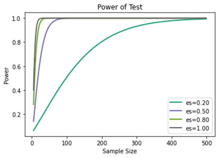
Figure 3.11 – Power of test
From the analysis of Figure 3.11, we can see that as the effect size decreases, the number of samples required to reach a power of at least 80% increases significantly.
Summary
Knowing the basics of probability theory in depth helps us to understand how random phenomena work. We discovered the differences between a priori, compound, and conditioned probabilities. We also saw how Bayes’ theorem allows us to calculate the conditional probability of a cause of an event, starting from the knowledge of the a priori probabilities and the conditional probability. Next, we analyzed some probability distributions and how such distributions can be generated in Python.
In the final part of the chapter, we introduced the basics of synthetic data generation by analyzing a practical case of data augmentation with the Keras library. Finally, we explored power analysis for statistical tests.
In the next chapter, we will learn about the basic concepts of Monte Carlo simulation and explore some of its applications. Then, we will discover how to generate a sequence of numbers that have been randomly distributed according to Gaussian. Finally, we will take a look at the practical application of the Monte Carlo method in order to calculate a definite integral.