
Chapter 9: Fullscreen Effects with postprocessing
So far, we have created different objects to alter the visuals of our scene, such as meshes, particles, and lights. We can tweak the settings of those objects here and there to improve our scene quality, but you will always feel that something is missing when comparing it with modern game scenes, and that is fullscreen or postprocessing effects. In this chapter, you will learn how to apply effects to the final rendered frame, which will alter the look of the overall scene.
- In this chapter, we will examine the following image effect concepts:
- Using postprocessing
- Using advanced effects
Using postprocessing
postprocessing is a Unity feature that allows us to apply several effects (a stack of effects) one on top of the other, which will alter the final look of an image. Each one will affect the finished frame, changing the colors in it based on different criteria. In the following screenshots, you can see a scene before and after applying image effects. You will notice a dramatic difference, but that scene doesn't have any change in its objects, including lights, particles, or meshes. The effects applied are based on pixel analysis. Have a look at both scenes here:
.jpg)
Figure 9.1 – A scene without image effects (left) and the same scene with effects (right)
Something to take into account is that the previous postprocessing solution, postprocessing Stack version 2 (PPv2) won't work on the Universal Render Pipeline (URP); it has its own postprocessing implementation, so we will see that one in this chapter. Anyway, they are very similar, so even if you are using PPv2, you can still get something from this chapter.
In this section, we will discuss the following URP postprocessing concepts:
- Setting up a profile
- Using basic effects
Let's start preparing our scene to apply effects.
Setting up a profile
To start applying effects, we need to create a Profile, it being an Asset containing all the effects and settings we want to apply. This is a separated asset for the same reason the Material also is, because we can share the same post-processing profile across different scenes and parts of scenes. When we refer to parts of the scenes, we are referring to volumes or areas of the game that have certain effects applied. We can define a global area that applies effects regardless of the position of the player, or we can apply different effects—for example, when we are outdoors or indoors.
In this case, we will use a global volume, one that we will use to apply a profile with our first effect, by doing the following:
- Create a new empty Game Object (GameObject | Create Empty).
- Name it as PP Volume (meaning postprocessing Volume).
- Add the Volume component to it.
- Make sure the Mode is set to Global.
- Click on the New button at the right of the Profile setting, which will generate a new Profile Asset named like our object (PPVolume Profile). You can later move that to its own folder, which is recommended for Asset organization purposes. The process is illustrated in the following screenshot:
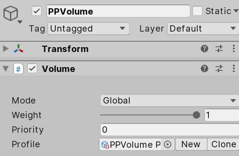
Figure 9.2 – Volume component
- To test if the volume is working, let's add an effect. Click the Add Override button, and select the postprocessing | Chromatic Aberration option.
- Check the Intensity checkbox in the Chromatic Aberration effect and set the intensity to 0.5, as illustrated in the following screenshot:
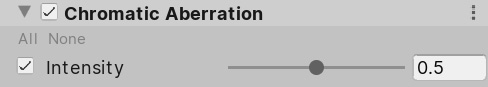
Figure 9.3 – C Chromatic aberration effect
- Now, you will see an aberration effect being applied in the corners of the image. Remember to look at this in the Scene Panel; we will apply the effect to the Game View in the next step. This is illustrated in the following screenshot:
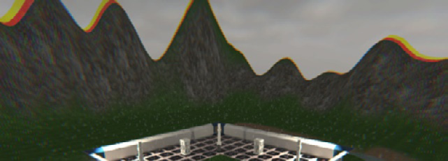
Figure 9.4 – Chromatic aberration applied to the scene
- Now, if you hit Play and see the game from the view of the Main Camera, you will see that the effect is not being applied, and that's because we need to check the postprocessing checkbox in the Rendering section of our Main Camera, as illustrated in the following screenshot:
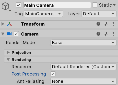
Figure 9.5 – Enabling post-processing
So, we have created a global volume, which will apply the effects specified as overrides to the entire scene regardless of the player position.
Now that we have prepared our scene to use postprocessing, we can start experimenting with different effects. Let's start with the simplest ones in the next section.
Using basic effects
Now that we have postprocessing in our scene, the only thing needed is to start adding effects and set them up until we have the desired look and feel. In order to do that, let's explore several simple effects included in the system.
Let's start with Chromatic Aberration, the one we just used, which, as with most image effects, tries to replicate a particular real-life effect. All game-engine rendering systems use a simple mathematical approximation of how eye vision really works, and because of that, we don't have some effects that occur in the human eyes or camera lenses. A real camera lens works by bending light rays to point them toward the camera sensors, but that bending is not perfect in some lenses (sometimes intentionally), and, hence, you can see a distortion, as shown in the following screenshot:
.jpg)
Figure 9.6 – I1mage without chromatic aberration (left) and the same image with chromatic aberration (right)
This effect will be one of several that we will add to generate a cinematic feeling in our game, simulating the usage of real-life cameras. Of course, this effect won't look nice in every kind of game; maybe a simplistic cartoonish style won't benefit from this one, but you never know: art is subjective, so it's a matter of trial and error.
Also, we have exaggerated the intensity a little bit in the previous example to make the effect more noticeable, but I would recommend using an intensity of 0.25 in this scenario. It is usually recommended to be gentle with the intensity of the effects; it's tempting to have intense effects, but as you will be adding lots of them, after a while the image will be bloated, with too many distortions. So, try to add several subtle effects instead of a few intense ones. But, again, this depends on the target style you are looking for; there are no absolute truths here (but common sense still applies).
Finally, before moving on to discuss other effects, if you are used to using other kinds of postprocessing effects frameworks, you will notice that this version of chromatic aberration has fewer settings, and that's because the URP version seeks performance, so it will be as simple as possible.
The next effect we are going to discuss is Vignette. This is another camera-lens imperfection where the image intensity is lost at the edges of the lens. This can be applied not only to simulate older cameras but also to draw the attention of the user toward the center of the camera—for example, during cinematics. Also, if you are developing virtual reality (VR) applications, this can be used to reduce motion sickness by reducing the peripheral vision of the player. In the following screenshot, you can see an example of vignetting on an old camera:
Figure 9.7 – Photo taken with an old camera, with vignetting over the edges
Just to try it, let's apply some vignetting to our scene by doing the following:
- Select the PP Volume GameObject.
- Add the postprocessing | Vignette effect by clicking on the Add Override button.
- Check the Intensity checkbox and set it to 0.3, increasing the effect.
- Check the Smoothness checkbox and set it to 0.5; this will increase the spread of the effect. You can see the result in the following screenshot:
Figure 9.8 – Vignette effect
If you want, you can change the color by checking the Color checkbox and setting it to another value; in our case, black is okay to reinforce the rainy-day environment. Here, I invite you to check how other properties, such as Center and Rounded, work as Particles. You can create nice effects just playing with the values.
Another effect we are going to review in this basics section is Motion Blur, and again, it simulates the way the cameras work. A camera has an exposure time, the time it needs to capture photons to get each frame. When an object moves fast enough, the same object is placed in different positions during that brief exposure time, so it will appear blurred. In the following screenshot, you can see the effect applied to our scene. In the case of this image, we are rotating the camera up and down fast, with the following result:
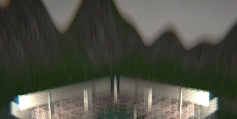
Figure 9.9 Motion Blur being applied to our scene
One thing to consider is that this blur will only be applied to the camera movement and not the movement of the objects (still camera, moving objects), due to the fact that this URP doesn't support motion vectors yet.
In order to use this effect, follow these next steps:
- Add the Post-processing | Motion Blur override with the Add override button.
- Check the Intensity checkbox and set it to 0.5.
- Rotate the camera while seeing the Game View (not the Scene View). You can click and drag the X property of the Transform of the camera (not the value—the X label), as illustrated in the following screenshot:
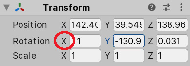
Figure 9.10 – Changing rotation
As you can see, this effect cannot be seen in the Scene View, as well as other effects, so take that into account before concluding the effect is not working. Unity does this because it would be very annoying to have that effect while working in the scene.
Finally, we are going to briefly discuss two final simple effects, Film Grain and White Balance. The first is pretty simple: add it, set the intensity to 1, and you will get the famous grain effect from the old movies. You can set the Type with different sizes to make it more subtle or obvious. White Balance allows you to change the color temperature, making colors warmer or cooler depending on how you configure it. In our case, we are working in a cold dark scene, so you can add it and set the temperature to -20 to adjust the appearance just slightly, and improve the look and feel in this kind of scene.
Now that we have seen a few of the simple effects, let's check out a few of the remaining ones, which are affected by some advanced rendering features.
Using advanced effects
The effects we are going to see in this section don't differ a lot from the previous ones; they are just a little bit trickier and need some background to properly use them. So, let's dive into them!
In this section, we are going to see the advanced effect concepts of
High Dynamic Range (HDR) and Depth Maps.
Advanced effects
Let's start by discussing some requirements for some of these effects to work properly.
HDR and Depth Map
Some effects not only work with the rendered image but also need additional data. We can first discuss the Depth Map, a concept we already discussed in the previous chapter. To do a recap, a Depth Map is an image rendered from the point of view of the camera, but instead of generating a final image of the scene, it renders the scene objects' depth, rendering the objects in shades of gray. The darker the color, the further from the camera the pixel is, and vice versa. In the following screenshot, you can see an example of a depth map:
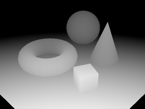
Figure 9.11 – Depth map of a few primitive shapes
We will see some effects such as Depth of Field, which will blur some parts of the image based on the distance of the camera, but it can be used for several purposes on custom effects (not in the base URP package).
Another concept to discuss here that will alter how colors are treated and, hence, how some effects work is HDR. In older hardware, color channels (red, green, and blue) were encoded in a 0 to 1 range, 0 being no intensity and 1 being full intensity (per channel), so all lighting and color calculations were done in that range. That seems okay but doesn't reflect how light actually works. You can see full white (all channels set to 1) in a piece of paper being lit by sunlight, and you can see full white when you look directly at a light bulb, but even if both light and paper are of the same color, the latter will, first, irritate the eye after a while, and secondly, will have some overglow due to an excess of light. The problem here is that the maximum value (1) is not enough to represent the most intense color, so if you have a high-intensity light and another with even more intensity, both will generate the same color (1 in each channel) because calculations cannot go further than 1. So, that's why HDR Rendering was created.
HDR is a way for colors to exceed the 0.1 range, so lighting and effects that work based on color intensity have better accuracy in this mode. It is the same idea of the new TV feature with the same name, although in this case, Unity will do the calculations in HDR, but the final image will still work using the previous color space (0 to 1, or Low Dynamic Range (LDR), so don't confuse Unity's HDR Rendering with the Display's HDR. To convert the HDR calculations back to LDR, Unity (and also TVs) uses a concept called tonemapping. You can see an example of an LDR-rendered scene and tonemapping being used in an HDR scene in the following screenshots:
.jpg)
Figure 9.12 – An LDR-rendered scene (left) and an HDR scene with corrected overbrights using tonemapping (right)
Tonemapping is a way to bring colors outside the 0.1 range back to it. It basically uses some formulas and curves to determine how each color channel should be mapped back. You can clearly see this in the typical darker-to-lighter scene transition, such as when you exit a building without windows to go out into a bright day. For a time, you will see everything lighter until everything goes back to normal. The idea here is that calculations are not different when you are inside or outside the building; a white wall inside the building will have a color near the 1 intensity, while the same white wall outside will have a higher value (due to sunlight). The difference is that tonemapping will take the higher-than-1 color back to 1 when you are outside the building, and maybe it will increase the lighting of the wall inside if all the scene is darker, depending on how you set it.
Even if HDR is enabled by default, let's just see how we can check that, by doing the following:
- Go to Edit | Project Settings.
- Click on the Graphics Settings section in the left panel.
- Click the asset referenced under the Scriptable Render Pipeline Settings property.
- Click on the highlighted asset in the Project Panel. Ensure that this panel is visible before clicking the property in the Graphics settings.
- Under the Quality section, ensure that HDR is checked, as illustrated in the following screenshot:
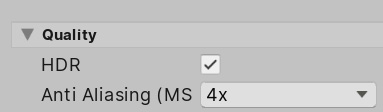
Figure 9.13 – Enabling HDR
Of course, the fact that HDR is togglable means that there are scenarios where you don't want to use it. As you can guess, not all hardware supports HDR, and using it incurs a performance overhead, so take that into account. Luckily, most effects work with both HDR and LDR color ranges, so if you have HDR enabled but the user device doesn't support it, you won't get any errors, just different results.
Now that we are sure we have HDR enabled, let's explore some advanced effects that use this and Depth Mapping.
Let's see certain effects that use the previously described techniques, starting with the commonly used Bloom. This effect, as usual, emulates the overglow that happens around a heavily lit object on a camera lens or even the human eye. In the following screenshots, you can see the difference between the default version of our scene and an exaggerated Bloom version. You can observe how the effect is only applied to the brightest areas of our scene. Have a look at both effects here:
.jpg)
Figure 9.14 – The default scene (left) and the same scene with a high-intensity Bloom (right)
This effect is actually very common and simple, but I considered it advanced because the results are drastically affected by HDR. This effect relies on calculating the intensity of each pixel's color to detect areas where it can be applied. In LDR, we can have a white object that isn't actually overbright, but due to the limitations in this color range, Bloom may cause an overglow over it. In HDR, due to its increased color range, we can detect if an object is white or if the object is maybe light blue but just overbright, generating the illusion that it is white (such as objects near a high-intensity lamp). In the following screenshot, you can see the difference between our scene with HDR and without it. You will notice that the LDR version will have overglow in areas that are not necessarily overlit. The difference may be very subtle, but pay attention to the little details to note the difference. And remember, I exaggerated the effect here. Have a look at both scenes here:
.jpg)
Figure 9.15 – Bloom in an LDR scene (left) and Bloom in an HDR scene (right). Notice that the Bloom settings were changed to try to approximate them as much as possible
For now, let's stick with the HDR version of the scene. In order to enable Bloom, do the following:
- Add the Bloom override to the profile, as usual.
- Enable the Intensity checkbox by checking it, and set the value to 1.5. This controls how much overglow will be applied.
- Enable Threshold and set it to 0.7. This value indicates the minimum intensity a color needs to have to be considered for overglow. In our case, our scene is somewhat dark, so we need to reduce this value in the Bloom effect settings to have more pixels included. As usual, those values need to be adjusted to your specific scenario.
- You will notice that the difference is very subtle, but again, remember that you will have several effects, so all those little differences will sum up. You can see both effects in the following screenshots:
.jpg)
Figure 9.16 – Bloom effect
As usual, it is recommended for you to fiddle with the other values. Some interesting settings I recommend you to test are the Dirt Texture and Dirt Intensity values.
Now, let's move to another common effect, Depth of Field. This one relies on the depth map we discussed earlier. It is not that obvious to the naked eye, but when you focus on an object within your sight, the surrounding objects became blurred because they are out of focus. We can use this to focus the attention of the player in key moments of the gameplay. This effect will sample the Depth Map to see if the object is within the focus range; if it is, no blur will be applied, and vice versa. In order to use it, do the following:
- This effect depends on the camera positioning of your game. To test it, in this case, we will put the camera near a column to try to focus on that specific object, as illustrated in the following screenshot:
Figure 9.17 – Camera positioning
- Add the Depth of Field override.
- Enable and set the Mode setting to Gaussian: the simplest one to use.
- In my case, I have set Start to 10 and End to 20, which will make the effect start at a distance behind the target object. The End setting will control how the blur´s intensity will increase, reaching its maximum at a distance of 20 meters. Remember to tweak these values to your case.
- If you want to exaggerate the effect a little bit, set Max Radius to 1.5. The result is shown in the following screenshot:
Figure 9.18 – Exaggerated effect
Something to consider here is that our particular game will have a top-down perspective, and unlike the first-person camera, where you can see distant objects, here we will have objects near enough to not notice the effect, so we can limit the use of this effect just for cutscenes in our scenario.
Now, most of the remaining effects are different ways to alter the actual colors of the scene. The idea is that the real color sometimes doesn't give you the exact look and feel you are seeking. Maybe you need the dark zones to be darker to reinforce the sensation of a horror ambience, or maybe you want to do the opposite: increase the lightness of dark areas to represent an open scene. Maybe you want to tint the highlights a little bit to get a neon effect if you are creating a futuristic game, or perhaps you want a sepia effect temporarily, to do a flashback. We have a myriad ways to do this, and in this case, I will use a simple but powerful effect called Shadow, Midtones, Highlights.
This effect will apply different color corrections to—well —Shadows, Midtones, and Highlights, meaning that we can modify darker, lighter, and medium areas separately. Let's try it by doing the following:
- Add the Shadow, Midtones, Highlights override.
- Let's start doing some testing. Check the three Shadows, Midtones, and Highlights checkboxes.
- Move the Shadow and Midtones sliders all the way to the left and the one for Highlights to the right. This will reduce the intensity of Shadows and Midtones and increase the intensity of Highlights. We did this so that you can see the areas that Highlights will alter, based on their intensity (this can also be an interesting effect in a horror game). You can do the same with the rest of the sliders to check the other two areas. You can see the result in the following screenshot:
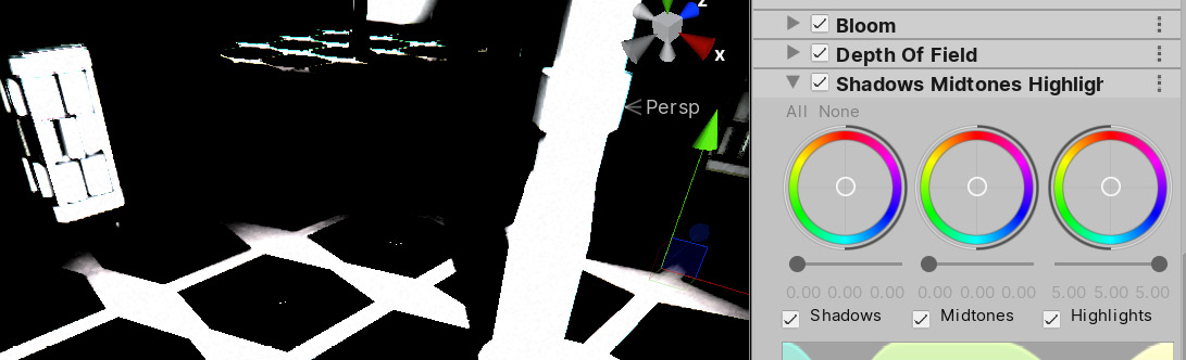
Figure 9.19 – Isolating highlights
- Also, you can test moving the white circle at the center of the colored circle to apply a little bit of tinting to those areas. Reduce the intensity of the highlights by moving the slider a little bit to the left to make the tinting more noticeable. You can see the result in the following screenshot:
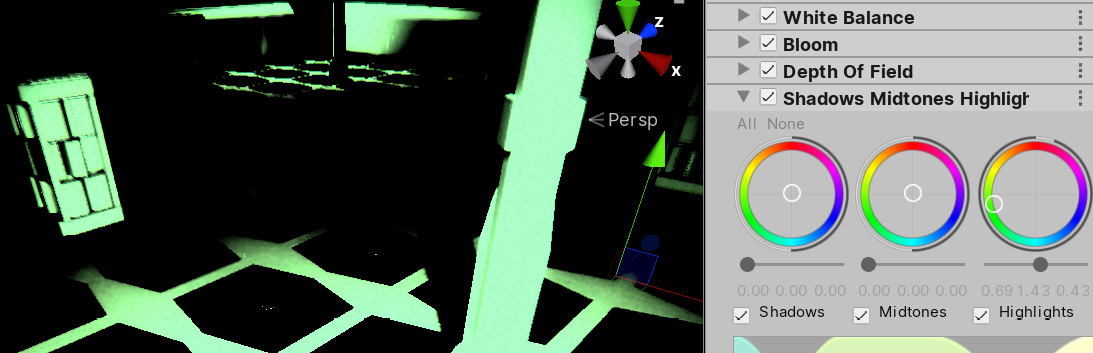
Figure 9.20 – Tinting highlights
- By doing this, you can explore how those controls work, but of course, those extreme values are useful for some edge cases. In our scene, the settings you can see in the following screenshot worked best for me. As always, it is better to use subtler values to not distort too much the original result, as illustrated here:
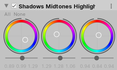
Figure 9.21 – Subtle changes
- You can see the before-and-after effects in the following screenshots:
.jpg)
Figure 9.22 – Before-and-after effects
You have other simpler options such as Split Toning, which does something similar but just with Shadows and Highlights, or Color Curves, which give you advanced control of how each color channel of the scene will be mapped, but the idea is the same—that is, to alter the actual color of the resulting scene to apply a specific color ambience to your scene. If you remember the movie series The Matrix, when the characters were in the Matrix, everything had subtle green tinting and, while outside it, the tinting was blue.
Remember that the results of using HDR and not using it regarding these effects is important, so it is better to decide sooner rather than later whether to use HDR, excluding certain target platforms (which may not be important to your target audience), or not to use it (using LDR) and have less control over your scene lighting levels.
Also, take into account that maybe you will need to tweak some object's settings, such as light intensities and material properties, because sometimes we use postprocessing to fix graphics errors that may be caused by wrongly set objects, and that's not okay. For example, increasing the Ambient Lighting in our scene will drastically change the output of the effects, and we can use that to increase the overall brightness instead of using an effect if we find the scene too dark.
This has covered the main image effects to use. Remember that the idea is not to use every single one but to use the ones that you feel are contributing to your scene; they are not free in terms of performance (although not that resource-intensive), so use them wisely. Also, you can check for the already created profiles to apply them to your game and see how little changes can make a huge difference.
Summary
In this chapter, we discussed basic and advanced fullscreen effects to apply in our scene, making it look more realistic in terms of camera-lens effects and more stylish in terms of color distortions. We also discussed the internals of HDR and Depth Maps and how they are important when using those effects, which can immediately increase your game's graphic quality with minimal effort.
Now that we have covered most of the common graphics found in Unity systems, let's start looking at how to increase the immersion of our scene, using sounds.