Introduction to Control Charts
Uncontrolled variation is the enemy of quality.
—W. Edwards Deming
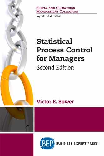
A control chart is defined as a “chart with upper (UCL) and lower (LCL) control limits on which values of some statistical measure for a series of samples or subgroups are plotted. The chart frequently shows a central line (CL) to help detect a trend of plotted values toward either control limit.”1 Note the absence of any mention of specification limits in this definition. Specifications represent the organization “talking” to the process—that is, telling the process what the organizations desires. A control chart represents “the process talking to the organization”—telling the organization what the process can do. Specifications should generally not be included on a control chart. The general form of a control chart is shown in Figure 3.1.
The CL represents the mean of the distribution for the statistical measure being plotted on the control chart. The distance between the UCL and LCL represents the natural variation in the process subgroups. The UCL is generally set at 3 standard deviations (a measure of the variation in the process output statistic plotted on the control chart—see Appendix A) above the CL and the LCL is generally set at 3 standard deviations2 below the CL. The parameters upon which the control limits are based are estimated from an in-control reference sample of at least 25 data points.
In Chapters 4, 5, and 6 we will discuss specific types of control charts, how to select the appropriate control chart for the job, and how to use statistical process control (SPC) software such as Minitab® 18 and Northwest Analytical Quality Analyst 6.3 to construct and use the charts. In this chapter, we will discuss the general idea—that is the theory—of control charts. To illustrate this discussion, we will use the control chart for individual variable measurements, which is based on the normal (bell-shaped) distribution, but the general theory we discuss in this chapter applies to all types of control charts discussed in the subsequent chapters. We will also discuss appropriate ways to go about implementing SPC.
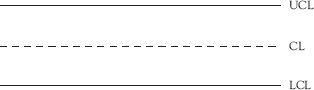
Figure 3.1 General form of the control chart
Before beginning the next section of the chapter, readers with no previous training in statistics should read Appendix A, Bare Bones Introduction to Basic Statistical Concepts. Appendix A is short and to the point. Reading it first will provide the necessary background to understand the terminology and concepts discussed in the next section of this chapter and in the succeeding chapters.
General Theory of the Control Chart
“A control chart is used to make decisions about a process.”3 Specifically, a control chart is designed to determine what kind of variation exists in the statistical measure being plotted. If that measure is a key process characteristic, we can then say that a process is either in control or out of control relative to that characteristic. The term “in control” means there is only common cause variation present. Out of control means that there is assignable cause variation present in addition to the common cause variation. A process that is in control is predictable; a process that is out of control is not predictable.
When we collect data from a process in order to create a control chart, we will find that some variation exists. This variation can be shown graphically in the form of a distribution. Perhaps our data can be described by the distribution shown in Figure 3.2.
This distribution is symmetrical, with half of the area on either side of the highest point of the curve. The highest point of the curve is located at the mean or arithmetic average of all of the individual values in the distribution. Most of the values are clustered near the mean with increasingly fewer values as we approach the tails of the distribution. We can mark the lines that represent 3 standard deviations above and below the mean on the distribution.4 The majority of the values in the population represented by this distribution can be expected to fall between the 3 standard deviation lines and generally be distributed equally on either side of the mean. We will use the Greek letter sigma (σ) to represent the standard deviation.
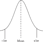
Figure 3.2 Normal distribution
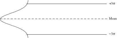
Figure 3.3 Normal distribution tipped on its side
In Figure 3.3 we tip the distribution on its side and extend the lines marking the mean and 3 standard deviations above and below the mean.
Finally we remove the normal distribution, relabel the mean line as the center line (CL), the +3 standard deviation line as the upper control limit (UCL), the –3 standard deviation line as the lower control limit (LCL) and we are left with a control chart as shown in Figure 3.4 (compare Figure 3.4 with Figure 3.1). We refer to this control chart as a control chart for individuals meaning that the chart is suitable for use with individual values that are approximately normally distributed.

Figure 3.4 Control chart for individuals
Setting 3σ UCL and LCL is a standard practice when using control charts. However, it is possible to create control charts with UCL and LCL set at 2σ, 4σ, or any other value the user determines to be best. When setting control limits below 3σ, a greater number of false signals will be obtained. However, when the cost of investigating a false signal is far less than the cost of a missed signal, 2σ control limits might be warranted. When the cost of investigating a false signal greatly exceeds the cost of missing a signal, then 4σ control limits might be best. Changing control limits to some value other than 3σ should be the result of a clear rationale and a careful analysis of the trade-offs involved.
Now, what should we plot on our chart? The first step in the process of creating a control chart is to identify the statistical measure or measures that best represent the process. These are sometimes called key quality characteristics (KQC) or key performance indicators (KPI). There are many characteristics in a process that can be monitored. The trick is to identify the really significant ones that are good measures of the process and are meaningful for our purposes.
Then we collect data from the process and examine the data to determine the appropriate control chart to use and to check to be sure whether the assumptions for that control chart are satisfied. At least 25 observations from the process should be used in this step although a larger number of observations will result in a better estimate of the process parameters.5
The next step is creating the control chart. Remember, for the purpose of this discussion we will be using the control chart for individuals. Subsequent chapters will discuss other types of control charts. Then we construct the chart and plot the data on the chart. For our purposes, we will use statistical analysis software to do this. There are several advantages to using software rather than constructing and maintaining control charts by hand. So long as the data are entered correctly, the software will not make calculation errors and all points will be accurately plotted on the chart. Additional benefits include getting a professional looking chart and the ability to do additional analysis of the data easily. The major drawback to using software to construct control charts is that the software will create charts and analyze data according to your instructions. If you lack the knowledge to tell the software the right things to do, you will obtain wrong and misleading results.
Example 3.1
The Tiny Mountain Coal Mine
Suppose you manage a small mining process that produces coal. The only real characteristic of interest to you is how many tons of coal are produced per week, so this is the statistical measure to be plotted. You have been dismayed with what you consider to be the excessive variation in the amount of coal produced per week. You would like to decrease the variation and increase the total output per week. You have determined that SPC is an appropriate tool to incorporate into your improvement process. You have collected output data for 45 consecutive weeks in Table 3.1 arranged chronologically.
Perhaps the only sense we can make of the data in this form is that production seems to range from 6 to 14 or so. We now enter these data into Minitab® 18, a statistical analysis software package, in order to learn more about what the data are telling us.
We believe that a control chart for individuals6 would be the right chart to use but we understand that this chart is sensitive to data that are not distributed normally.7 So we use Minitab® 18 to examine the distribution of the data, which is also shown in Figure 3.5. The histogram shows that data appear to be approximately normally distributed, so we will proceed with the construction of the control chart for individuals shown in Figure 3.6. We can see from the chart CL that the mean number of tons of coal produced during this 45-day period is 10.23. Most SPC software sets the UCL and LCL at 3 standard deviations from the CL unless instructed otherwise, so the chart shows the UCL is 17.40 and the LCL is 3.06. The next question is “What else does the chart tell us about the process?”
Table 3.1 Tons of coal produced per week arranged in time series
Day |
Tons of coal |
Day |
Tons of coal |
Day |
Tons of coal |
1 |
7.2 |
16 |
12.0 |
31 |
9.6 |
2 |
8.5 |
17 |
11.6 |
32 |
10.5 |
3 |
12.1 |
18 |
9.9 |
33 |
13.8 |
4 |
10.0 |
19 |
11.1 |
34 |
10.4 |
5 |
14.3 |
20 |
6.4 |
35 |
8.9 |
6 |
11.6 |
21 |
10.4 |
36 |
7.2 |
7 |
9.1 |
22 |
8.8 |
37 |
10.0 |
8 |
9.7 |
23 |
12.6 |
38 |
12.1 |
9 |
7.5 |
24 |
9.9 |
39 |
9.5 |
10 |
11.6 |
25 |
4.5 |
40 |
11.3 |
11 |
8.8 |
26 |
10.4 |
41 |
6.7 |
12 |
13.5 |
27 |
9.4 |
42 |
10.5 |
13 |
10.2 |
28 |
11.4 |
43 |
8.4 |
14 |
11.7 |
29 |
10.4 |
44 |
9.7 |
15 |
10.5 |
30 |
15.5 |
45 |
11.5 |
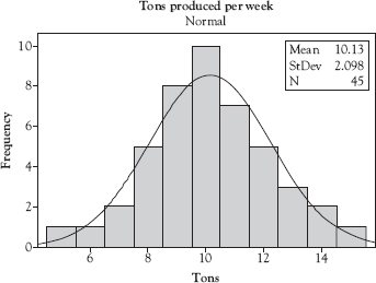
Figure 3.5 Data entry and histogram using Minitab 18
Source: Created using Minitab 18.
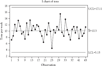
Figure 3.6 Control chart for individuals for tons of coal per week
Source: Created Using Minitab 18.
Control Chart Signals
Control charts represent the process talking to you—telling you how it is behaving. The value of a control chart depends upon our ability to read and understand what the process is saying. The chart in Figure 3.6, for example, is telling us that this process is in control—only common cause variation is present. We know this because there are no signs or signals that appear to be nonrandom. Because the control chart shows that the process is in control, we are comfortable using these control limits to monitor and control the process ongoing.
Are we 100 percent certain that this is a true message—that the process is actually in control? The answer is no. There is the possibility that nonrandom variation is also present and that we are missing it. However, that risk is small, so, as Example 3.2 illustrates, we behave as if we know with certainty that the process is in control. We should be aware of this risk, but trust the chart.
There are a number of sets of rules defining patterns on a control chart for determining that a process is out of control. Most software products used for SPC allow the user to specify which rules to use as shown in Figure 3.7. In this section, we will discuss the more commonly used rules for judging whether a process is out of control. Using a combination of the one-point rule and the pattern rules will minimize the probability of reacting to a false signal or failing to react to a real signal.
Often in our daily lives we behave as if we know something with certainty when actually there is a measureable risk that what we think we know is false. The smaller the risk, the more appropriate is this behavior. After all, there are few certainties in life. Among them, according to some sources, are death and taxes. In everything else, there is uncertainty (risk) at some level.

Assume you are playing a game with a friend. He flips a coin, and for every head you owe your friend a dollar. For every tail he owes you a dollar. You know that the odds of a tail (you win) for a fair coin are 50/50 (probability = 0.50) for each flip. The first flip lands heads, so you pay your friend a dollar. So does the second, and the third. After how many successive flips resulting in heads will you decide that the coin is not a fair coin? If you stop playing the game after 5 heads in a row (and a payment of $5 to your friend), you have behaved as if you know this to be certain even though there is 1 chance in 32 that you are wrong. This probability is so low that you behave as if you know with certainty that the coin is not fair. You are unwilling to risk another dollar by continuing to play the game in the face of the results you have observed.
The same logic applies to reacting to out-of-control signals on a control chart. There is a probability that the signal is false, but because the probability is low, we react as if we know with certainty that the process is out of control.
The Single Point Rule
The basic out-of-control signal on a control chart is one point that is above the UCL or below the LCL. Figure 3.8 shows a control chart used by a recreational runner to monitor his time over the same two-mile route. The 12th reading on the chart is above the UCL indicating the process is out of control. The software has flagged this point by showing it as a red square rather than a black dot. The runner has investigated the reason for the out of control signal, a sprained ankle, and entered it as a comment on the chart.
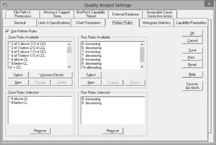
Figure 3.7 Screen for selecting pattern rules in NWA Quality Analyst 6.3
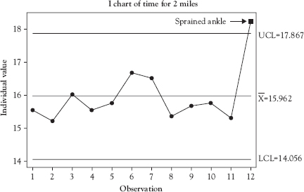
Figure 3.8 Process out of control—one point beyond UCL
Source: Created using Minitab 18.
The types of problems triggering this signal tend to be those that develop or manifest suddenly such as changing to a defective lot of materials, an inexperienced operator replacing a well trained one, catastrophic failure of a machine part, change in a machine setting, or rapid change in an environmental condition.
One point outside the control limits when the control limits are set at 3σ above and below the mean will yield very few false signals. However, it sometimes will fail to provide a signal when a significant change has occurred in the process. For this reason, we supplement this rule with additional rules referred to as run rules. Run rules are designed to detect assignable cause variation even when there is not a single point outside the control limits of the chart.
Run Rules
We will use two run rules. The first of these is a run of eight points on a rising or falling trend. This rule can create an out-of-control signal even if there are no points outside the UCL or LCL. Figure 3.9 illustrates this rule for a falling trend in the part weight of an item produced by a molding process. Points 10 through 17 show a falling trend in the part weight, indicating the process is out of control. The operator has investigated the reason for the out of control signal, a chiller failure, and entered it as a comment on the chart. This signal should initiate action to repair the chiller and return the process to an in-control condition. The rule works in exactly the same way for a rising trend.
The types of problems triggering this signal tend to be those that develop and worsen over a period of time such as a heater failing resulting in a gradual drop in process temperature, a loose limit switch that changes position slightly with each repetition, gradual operator fatigue, or gradual buildup of waste material affecting the seating of parts in a fixture.
The second run rule we will use is a run of eight points above or below the CL. This rule, sometimes referred to as a pattern rule, also can create an out-of-control signal even if there are no points outside the UCL or LCL. Figure 3.10 illustrates this rule for eight points falling above the CL in a chart plotting the monthly total output of silver from a refinery. Points 10 through 17 all fall above the CL of the control chart, indicating the process is out of control. The operator has investigated the reason for the out-of-control signal, implementation of a continuous quality improvement program, and entered it as a comment on the chart. In this case, since the signal represents a desired and planned improvement to the process, the control limits should be recalculated using the data beginning at point 10. The rule works in exactly the same way for eight points falling below the CL.
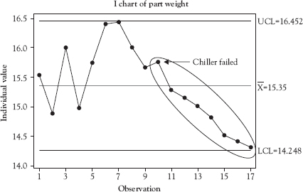
Figure 3.9 Process out of control—eight points on falling trend
Source: Created using Minitab 18.
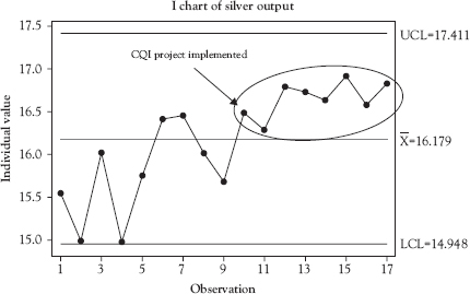
Figure 3.10 Process out of control—eight points above CL
Source: Created using Minitab 18.
The types of problems triggering this signal tend to be associated with significant shifts in some part of the process such as switching suppliers for a key raw material, making a known change to the process, changes of operator or shift, or failure of a machine part.
Zone Rules
The combination of using control limits set at 3σ, and using the single point rule with the run rules discussed above usually is sufficient to simultaneously minimize the probability of observing a false signal and the probability of missing a true signal. There are additional rules referred to as zone rules that are sometimes used to decrease the probability of missing a true signal. Caution must be taken not to impose such a large number of rules that interpretation of the control charts in real time by operators becomes overly complex.
To use the zone rules, the control chart area between the UCL and LCL is divided into sections corresponding to 1σ and 2σ above and below the CL. The 1σ lines are the upper and lower inner limits (uil/lil). The 2σ lines are the upper and lower warning limits (uwl/lwl). One zone rule signal is when two of three consecutive points fall within the 2σ (uwl/lwl) and 3σ (ucl/lcl) zone on either side of the CL. Figure 3.11 shows this signal at point 6 (marked (a) on the chart). Another zone signal is where four of five consecutive points fall within the 1σ (uil/lil) and 2σ (uwl/lwl) zone on either side of the CL. Figure 3.11 shows this signal at point 34 (marked (b) on the chart).
Other Nonrandom Patterns
The previous sections of this chapter discussed well-defined rules for determining that a process is most likely out of control. However, any nonrandom pattern can also provide a valid out-of-control signal. Sometimes, these nonrandom patterns may exist without any of the formal rules being violated. Sometimes, a formal rule is violated but the nonrandom pattern provides extra insight into possible causes of the out-of-control condition. Example 3.3 provides an example of how a problem was identified by recognition of a nonrandom pattern coupled with six single point out-of-control signals.
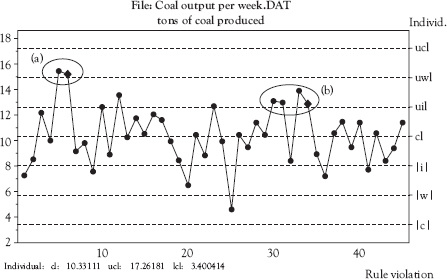
Figure 3.11 Process out of control—zone rules
Source: Created using NWA Quality Analyst 6.3.
Example 3.3
Shift-to-Shift Variation Pattern
An injection molding company had just started implementing SPC in their processes, which ran 24 hours a day on three shifts. Typically, they collected data to use to construct the initial control chart limits on first shift since that was most convenient for the quality engineers. Before collecting the data, a cross-functional team comprised of quality engineers, process engineers, maintenance technicians, and operators inspected the process to be sure that the equipment was in good working order, raw materials were within specifications, and operators were trained.
The engineers were pleased that the process was in control when they analyzed the first 25 data points. They used these data to construct a control chart for the process. They provided operators training in sampling, testing, recording the data on the control charts, and detecting out-of-control signals. They then started a pilot implementation of SPC for this process.
After a few days, it was clear from the chart in Figure 3.12 that something was wrong. Instead of the nice, in-control chart they observed initially, there were points beyond the control limits and a disturbing cyclical pattern that was clearly nonrandom. The cycles correlated with changing shifts. It appeared that second shift produced systematically higher part weights and third shift produced systematically lower part weights when compared with first shift.
The company employed a setup technician on each shift who was responsible for setting up the molding machines and troubleshooting problems that might arise. All three setup technicians were very knowledgeable, were known to be diligent workers, and had fairly long tenures in the organization.
The first step the quality engineer took to get at the root cause of the problem was to visit each shift and talk with the setup technicians. Each setup technician related the same story when asked what the biggest problem they faced in doing their jobs. Each said that their biggest problem was setting the machines properly at the start of each shift. The previous shift always ran the machines incorrectly.
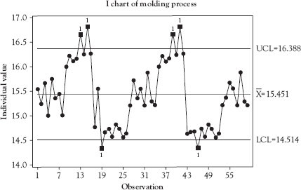
Figure 3.12 Pilot implementation control chart
Source: Created using Minitab 18.
The cause of the problem was now clear. All three setup technicians had their own ideas about how the machines should be run. Each was very diligent about adjusting the machine settings until the process was running optimally according to their idea about what optimal meant. This was not a case of incompetency or lack of diligence. All three setup technicians were experienced and worked diligently to do their best for the organization. Deming often said that doing your best is not good enough. You must know what to do and all three setup technicians thought they knew what to do. The problem was a lack of coordination, which is a management issue and not an operator or setup technician issue.
The next step was to get all three setup technicians together on one shift. The quality engineer coordinated experiments designed to arrive at the true optimal setup conditions for the process. Once these were determined and agreed to, they were written up and signed by each setup technician. These documents became the standard operating procedures (SOP) for setting up this process.
The end result? The process was found to be in control. The problem with this process was solved and the quality engineer learned a lesson that she now applied when implementing SPC on other processes.
Action to be Taken Upon Seeing an Out-of-Control Signal
Whoever is responsible for taking samples, making the measurements, collecting the data, and entering that data on control charts must be taught not only how to read the charts but what to do when they observe an out of control signal. There is no standard SOP for this. Appropriate actions vary depending upon organizational decisions and factors. Among these are:
• Who collects the data and plots it on the control charts—that is, who controls the charts? Operators? Inspectors? Quality technicians?
• What authority has management provided to the person controlling the chart?
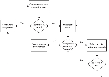
Figure 3.13 Action plan for responding to an out-of-control signal
• What resources does the person controlling the chart have available?
• How does the person controlling the chart communicate with others who need to know and who are available to assist in troubleshooting problems?
Figure 3.13 illustrates an example of a simple decision diagram to guide an operator tasked with maintaining the control chart for a process.
Implementing SPC
Implementing SPC involves much more than just creating control charts. When not properly implemented, results will be disappointing. Proper implementation is a key to the success of SPC. The basic steps involved in implementing SPC are:
• Answer the questions: Why am I interested in implementing SPC? What is the purpose of the implementation? What do I expect the results to be?
• How will we run the SPC program? Will it be a quality department effort where quality technicians periodically sample the process or will the process operators collect the data and plot it on the control charts?
• Select and train the implementation team. The level of training will vary from basic SPC skills to advanced proficiency in SPC. There should be at least one or more highly trained SPC expert in the organization to support the initiative.
• Many organizations find that providing hands-on experience is a vital component of training. This can be done by conducting a pilot SPC implementation on a selected process as part of the training.
• Select the process and identify the KQC(s) that is the best measure of process performance.
• Insure that the measurement system to be used is accurate and reliable.
• Determine the sampling frequency, sample size, and rational subgroup.
![]() Sampling frequency is often a balance between efficiency and effectiveness. Too frequent sampling can be expensive and a wasteful use of resources. Samples taken at large intervals can allow an out of control condition to persist too long.
Sampling frequency is often a balance between efficiency and effectiveness. Too frequent sampling can be expensive and a wasteful use of resources. Samples taken at large intervals can allow an out of control condition to persist too long.
![]() Sample size also involves a balance between resources and effectiveness. Larger samples provide better information, but this must be balanced against the cost of sampling and testing.
Sample size also involves a balance between resources and effectiveness. Larger samples provide better information, but this must be balanced against the cost of sampling and testing.
![]() Shewhart’s rational subgroup concept is usually satisfied by taking consecutively produced samples for testing. Alternatively, random samples may be taken from all of the output of the process since the last sample was taken.
Shewhart’s rational subgroup concept is usually satisfied by taking consecutively produced samples for testing. Alternatively, random samples may be taken from all of the output of the process since the last sample was taken.
• A cross-functional team should examine the process to determine that it is operating as designed. The team should ensure that the equipment is in good repair, adjusted properly, and set up to design specifications, raw materials meet specifications, and that the operators are properly trained. Then collect real-time data from the process to construct the initial control chart. At least 25 samples should be used.
• Examine the initial control chart for out-of-control signals. If none are present, this chart represents the current state of the process when operating in control. If signals are present, each should be investigated, the assignable cause addressed, and a new chart should be constructed using additional data.
• Establish the resulting chart as the “standard” chart for the process and establish a set of rules for reacting to out-of-control conditions.
• Follow-up to insure that the SPC process is being maintained properly and appropriate action is taken when an out of control signal is detected.
• Assess the improvements gained from implementing SPC. How do the improvements compare to the original expectations?
• Incorporate what you have learned into plans for continuous improvement of the process and plans for the expansion of the use of SPC.
It is better to start implementing SPC on a single process rather than trying to do so for all processes simultaneously. This provides the implementation team the opportunity to gain experience and confidence on a small scale before tackling the entire operation. As the number of people with SPC implementation knowledge and experience grows, it is much easier to implement SPC on multiple processes simultaneously.
Chapter Take-Aways
• A control chart contains upper (UCL) and lower (LCL) control limits and a central line (CL). Values of some key statistical measure for a series of samples or subgroups are plotted on the chart.
• A control chart represents the process talking to the organization—telling the organization what the process can do.
• Specifications represent the organization talking to the process—telling the process what the organizations desires. Specifications should generally not be included on a control chart.
• Control charts are based on some probability distribution.
• When assignable cause variation is present in a process, signals will be observed on the control chart that indicate the process is out of control. Appropriate action should be taken immediately to identify the root cause of the signal and eliminate it from the process.
Questions You Should be Asking About Your Work Environment
• Are your processes talking to you? Is their message one of control or chaos? If the latter, what would be the value of reducing the chaos and replacing it with control?
• Implementing SPC is not easy. The implementation process requires resources and expertise. What would an investment in SPC be expected to return in order to be considered a profitable investment?