
Tron had it right. Data is a vast, towering world to be explored. End of Line.
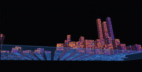
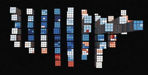
“Underlying Data” is exploration from my Datascrapers series

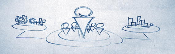
Overlaying the data constructs onto the NYC skyline aligned my approach
The more I looked at the data from different camera angles and with various color palettes applied, the social implications of the data’s foundation began to seep through. I was seeing thematic statements of inequity and struggle within the thousands of data points. Socially tinged messages bled from the artwork (at least to me). There was a story of struggle that needed to be told through data in the form of artwork, at least to me. It was very moving at the time I was working on it, and remains one of my favorite envisioning pieces.
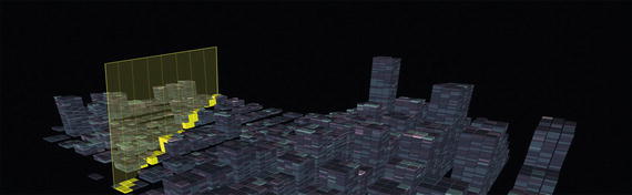
But, it wasn’t until after I had completed the series that I realized the better way to get the social themes within Datascrapers across to people – they needed to be experienced firsthand. These data forms should exist as giant, looming holograms that you could walk through to see and feel the impact of the thousands of individual stories represented by those census datapoints.
Data wants to be free they say. I think it also wants to reflect its own magnitude.
Data-Inspired Holograms
Reflecting on Datascrapers recently, it became clear that I was overlooking some other key design insights from that series in my current work of creating holographic experiences.
Datascrapers evolved from data being cast in a new light, onto a giant canvas. The scale of the data became the design center, which drove the magnitude of the pieces. And the familiarity of the shapes (skyscrapers) made a connection with people when first viewing the pieces.
That last point, familiarity, really stuck with me. In our rush to leap forward, we often create things that are foreign looking, sometimes confusing our audience at first.
Familiarity is not the enemy of innovation.
So, rather than spending all my time trying to imagine completely new constructs to bring to life as holograms, why wasn’t I starting with the familiar?
Good question. The answer of course is that familiarity is somewhat counter to breakthrough thinking, which encourages us to leap forward, shattering the envelope. Focusing on today’s familiar things seems counter to innovation. Yet, we already have so many ways to create and consume today, why not leverage them?
Applying that thinking to the subject of data, we could spend from now until forever converting that common language of business (data) into incredible holograms. Maybe looking at the familiar representations of data more openly, we can unlock countless new possibilities.
By using productivity tools like Microsoft Office, or more sophisticated business intelligence services like Power BI and Tableau, we can leverage our data as inspiration for holograms. This isn’t new-to-world or unexpected. People have been (poorly) imagining 3D versions of our business data for decades. The difference is that now we have the mixed reality medium to better support this type of exploration with data.
Everyday Data
Data-inspired holograms (perhaps “datagrams”) have been right in front of us all along. Hidden in plain sight. Waiting for someone to free them from their incredibly ordinary containers. It just didn’t occur to me how easy it was to achieve. By taking a new approach, we could be the masters of our own holographic destiny, not merely spectators beholden to mysterious wizards of code and cinematic special effects.

Data insights are not always revealed through conventional visualization
To be clear, I consider “data” anything from a single bit of information, to a collection colors in a striking image, or even the sound of notes in a majestic symphony. Data certainly is not just exabytes of numbers. It’s whatever we consider the output of creation and existence. We are awash in data, yet we only tend to see it in traditional ways.
What if that didn’t have to be?
For example, think about how you regularly generate and analyze your business reports in Excel today to convey key information. There are insights to be found just by looking through the data in the spreadsheets or by going over the charts you generate. By carefully looking for things that pop out as trends, we increase our understanding. Pretty standard today. Now, think about a very real future where artificial intelligence works in the background to help surface insights for us and renders those in holographic form for us to explore. It’s already happening. Just not with holograms.
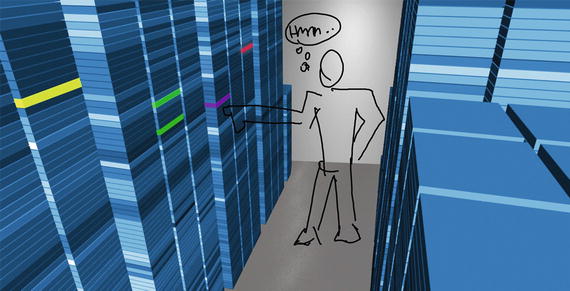
Storage capacity data taking the form of server racks in a virtual datacenter
Finding the places where we have lots of data or even just a few datapoints that are critically important metrics can be springboards for ideas about making the familiar extraordinary.
The Technique
The future of holographic experiences has everything to do with channeling the output of today’s productivity tools into AI-powered, interactive holograms.
Use any productivity or data tool available to you as an idea generator for holograms. If you make a 3D chart and think it’s a hologram, please stop. That’s not it. Re-read this book from Chapter 1 then try again. The form holograms take doesn’t need to be recognizable as characters or creatures, but they should represent familiar concepts from your data that has come to life digitally.
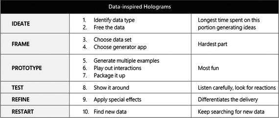
Table 15-1. A technique for creating data-inspired holograms.
The following sections show this process step-by-step. Let’s work through creating data-inspired holograms using the Datascrapers technique.
Step 1. IDEATE
Start by choosing a subject you know well to ideate over for a limited amount of time. Don’t spend more than ten minutes thinking about it. That should be enough time to get your best ideas out into the open. For example, there must be a few important aspects of your business or career that rely on data to measure or report progress. You probably deal with them in email, spreadsheets, meeting presentations, mobile dashboards, or raw numbers. Regardless, consider the impact and importance of that data on your thinking and actions. We’re looking for a place to leap ahead in our use of this, creating a breakthrough data experience.
Identify data type
Let’s start by choosing an activity or point in time where you collect data for some purpose, or rely on data to guide decisions or communicate key metrics. That situation requires the use of a particular type of data – numeric, textual, graphic, and so on.
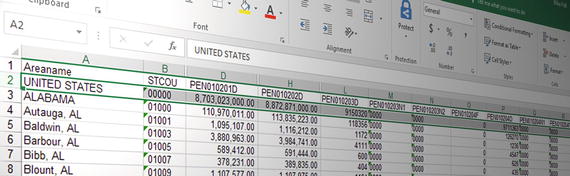
For example, you may need to analyze census data to figure out how to distribute funds to communities for better social programs. That data is typically in a spreadsheet with many columns of text and numbers that represent individuals who live in specific areas, who reported different levels of education and income.
That data’s form is columnar text and numbers. Pretty straightforward. Once you have isolated the form of the data you’re most interested in, it’s time to unleash it as a hologram.
Tip
Don’t overthink this step. We’re just trying to be clear on the starting form of the data so we can compare it to the holographic form.
Free the data
Now comes the interesting part (and the most difficult it turns out). We’re going to convert the existing data from its current form into a new holographic container that provides something you don’t get currently. The hope is that transformation reveals a leap forward in the ability to understand or work with the data. But, to do that, we have to free the data from its current form and container.
What’s the most logical conversion from current form to a 3D shape? Why?
Would the new form convey the important aspects more clearly?
Would it be quicker to understand?
What new kinds of actions could you take?
I’m not saying these answers will come easy, or that converting a traditional media form to a three-dimensional holographic representation is a straightforward thing to do. In fact, if we’re being completely honest here, it’s actually quite advanced on the design thinking and conceptualization scale. But, I know you’re up to it.
Try sketching out a few quick transitions from current form to released
In my example, I took census data in columnar format and converted it into a map of the region that the data represented. Then I looked at what additional value we could add now that we’re working in multiple dimensions. That turned out to be using the z-axis or height of data points applied to the flat map. The new form of the information is not just a table of text and numbers in columns, but an easy to recognize map of the region with data points rising above the map plane representing income from the census data. Using more dimensions to overlay information is a prime method for realizing better recognition and understanding.
It would make sense to view US Census data in a map-like shape
You’ll find that often in holographic design it pays off to make the experience revolve around a room-scale set of holograms, using life-sized characters and accurate dimensions of objects. That’s not to say every experience has to be a 1:1 real-world match, but you’ll be surprised how the recognition and comfort with your experience goes up with things appear in their natural sizes. Wait, you say. Data has no real-world size – it’s just a bunch of numbers, right? No, actually those numbers represent things in the real world, or theoretical world, or alternate universe. No matter. Things have size. Think about using it to your advantage.
Match shape to its creator - Now that we have a rough idea of the shape of the new holographic container for our data, what type of tool creates that basic shape? Exactly. Nothing. No really, that’s not quite true. There’s probably something that can create the dimensional shape you are looking at in your sketch. Pretty certain that tool won’t export the shape directly as a hologram (few do), but you can probably figure out what type of app or tool can create that shape with particular parameters (size, shape, color, orientation, etc.). For example, I could use any search engine’s map tool to create a flat map of the areas my census data covers.
Identifying this data shape creation tool now will save us a ton of time later.
Avoid doing this - Now that you have the gist of how that works, let’s talk through a few things that might trip you up along the way to finding a new representation for your original form.
Don’t try to keep too closely to the original form of the data. The key to unlocking the value has to do with finding the most logical physical world representation of things that are often shown as lists of numbers.
Resist the temptation to fit your data onto a tabletop or in a small area that resembles how you consume it on glass today. That’s wrongheaded more often than not. Go big or go home.
Don’t reuse existing 3D charting and visualization forms for holographic data. Walking around 3D pie charts doesn’t make them any more understandable or accurate.
Now that we have a few different sketches of holographic forms that our data could be released into, it’s time to imagine how we might interact with them if they were right in front of us.
Tip
The biggest advantage of using mixed reality for representing data is to make it as large as is called for. Go room-scale first.
Step 2. FRAME
Some of the decisions we need to make up front lock us into a particular direction. Don’t think of that as a bad thing though. It’s going to speed up the overall workflow and get us to a testable state quicker.
Choose data set
For each new experiment with a data-inspired hologram, we need to pick a specific data set to work with so our interactions are grounded and focused in something we can test and measure. If we were to use made up data, it would be hard to know if what we’re doing is any better or worse than expected.
Having some degree of familiarity with the data set we pick ensures we will realize when it becomes unrecognizable or distorted. By using a data set that matches the original data type from the ideation phase, we’ve aligned the container and its contents.
For example, I picked a spreadsheet containing the U.S. census data for a particular year (2012) covering the continental United States.
You aren’t limited to choosing a big data set or a data feed from service. Use your own sales data charts. Get a report of your credit card spending in spreadsheet form. Download the number of steps you’ve taken this month from your fitness app. Whatever works for you. Again, the key is being familiar with the data.
Tip
Don’t try to use a gigantic data set to prototype with, unless it has been cleaned and you can visualize it quickly. We need to go fast.
Choose a generator app
To create all of the variations of the new holographic data form, we need an app that generate the shape or something close to it without too much trouble.
The best kinds of apps to choose when doing this type of envisioning are those that allow fluid exploration and rapid creation of content. In our case, being able to generate the form that we think unlocks the insights or important aspects of the data.
Programs that let you do 3D modeling and animation are great for this task if you know how to use them efficiently. We need throughput, so don’t discount more consumer-grade software. Programs like Paint 3D, SketchUp, Blocks are all good choices. For the more advanced forms you want to bring to life try out things like Maya for complex combinations or Tilt Brush for the freedom of creating flowing shapes.
Since my example deals with census data and the regions it applies to, I choose an app that can do more than generate shapes. This kind of app specializes in dealing with data sets. SandDance, a Microsoft Garage project, is a world-class data exploration web service that allows you to load just about any data set and visualize it in many different ways. It also happens to be built into Microsoft’s flagship data product Power BI.

SandDance, a Microsoft Garage project, proved to be a great form generation app
You don’t have to use anything like SandDance for your data form generator. For example, if the shape you were thinking about using is more like a person or character, use a 3D modeler that can pose figures in any position you need. Or conversely, if your form resembles architectural spaces or furniture, use something like SketchUp to quickly generate those forms.
Tip
The app you choose to generate the new data shape doesn’t have to output a 3D shape to be useful.
Step 3. PROTOTYPE
Our task in this portion is getting the output of the generation app into something that lets us not only show the new form, but tell the story behind it. In a perfect world, that would be done through a working prototype. Short of that, we can take some shortcuts to achieve the same end – a compelling showcase for the insights you’ve unlocked in various tangible forms.
Generate multiple examples
Now that we have a generator app picked out and are fairly comfortable flying it, time to start cranking out lots of experimental forms.
Generate at least one good example of what you’re trying to depict first. Examine it a bit critically to see if it embodies the key aspects we look for – clarity, impact, depth, ability to generate questions, and a newness that wasn’t there before.

Building on the basic form, generate several very different approaches
Elements to experiment with are the form’s shape, size, orientation, color, camera angle, lighting, overlays, or different data to fill it out. We’re looking for those moments where you know something has either locked in or gone too far in the wrong direction. Both help dial in the appearance and presentation we’re looking for.
This part of the process can be a time sink because of all this tinkering, so watch how much you invest. Speed is our friend, always.
Tip
Push hard to not fall into the trap of making slight alterations on the same basic idea. Not enough payoff for that kind of prototyping.
Play out interactions
One of the best things about envisioning is the ability to figure out how things will behave without writing a single line of code. We can simply use our imaginations, or better yet, our teammates and coworkers, to help act out how these data-inspired holograms respond to our inquiries, actions, or even inaction.
Having just generated a bunch of different variations of our new data form, it’s time to see if this works for people. That requires figuring out the interaction basics and then engaging with people to try out our assumptions.

It doesn’t take much convincing to get people acting as holograms
Basic capabilities – what can the datagram do (described simply)?
Common scenarios – what do people expect this data object to do for them?
Pleasant surprises – are there unexpected moments that unfold to thrill people?
Magical moments – did you unlock a new insight that was non-obvious before?
Of all the things we get to do during envisioning, this step is the most fun. You always learn a great deal from being inside the interactions with real people, no question. Yet, the lasting impression from the phase is the laughter that inevitably comes with running this type of design. Give it a try. I guarantee it’ll become a standard part of your envisioning, no matter what the subject happens to be.
Tip
Make videos of the interactions between real people and the newly envisioned data shapes. You’ll learn something or at least have a good laugh.
Package it up
Now that we have basic data form figured out and know roughly how it behaves, time to put it into a vehicle that can deliver the intended impact to our audience. The whole point of this is to get in in front of people that will (hopefully) see the value in using our new representation. We’ll have to think about the best to reach them in the natural flow of their work.
Consider the intent of this envisioning exercise when you choose the packaging. Think back on why we started doing this experiment in the first place. Was it to quickly convey a concept? Impress upon someone the need to unlock the data in this way? Show a technical proof it could be done in this way?
Quickest – Use the HoloScenes technique of combining the holographic form of the data with a photo of a physical space, like someone’s office or home. This is an easy way to depict exactly how you’d like to see this play out. You control the setup, camera angle, overlays on the data, and position of people in the scene for maximum impact. Downside is not being able to show the interactions in motion. They are implied, but left to interpretation.
Effective – Wireframing the scene and animating the key interactions can easily be done using PowerPoint or other presentation software. They have all the capabilities you need to drop in photos, drawing, models, and add your own markup over the top. By creating a clickable model that responds to someone’s touching things or issuing voice commands, you can simulate pretty well what you are going for. The downside is this technique is clearly more lofi than you’d optimally want for high impact. It will be seen for what it is – a quick and dirty interactive sketch.
Highest Impact – A slightly polished video production of the scene playing out with the interactions you figured out through acting is going to win people over. They may know right away you used slick video compositing to drop the holograms into the scene, but being able to show the richness of the presentation and interaction aspects provide a value that’s hard to get in other forms of envisioning. The downside is you need at least some rudimentary video editing and compositing skills on the team.
Most Impressive – Working prototypes using real data sets are without question going to make the biggest impression on people entirely because they are real. The old saying “Code wins” is apt here. Being able to demonstrate the concept with working models, data, and code will excite people’s imaginations and have them telling you exactly what needs to be better. Mission accomplished. Downside is this is expensive time-wise and requires resources to get working.
Tip
The way you first show these ideas to people will impact their perceived viability and value. Pick well by understanding your audience.
Step 4. TEST
As with other envisioning techniques, trying it out on someone will surprise you in some way. It always does. The things we see clearly as the envisioners of these new forms are not always as clear to other people right away. Doesn’t mean it isn’t good or valuable. Does mean we need to listen carefully to why.
Show it around
This is where your narrative and storytelling skills come in. You could construct a good test for the data form where you do a before and after type of comparison.
Start with telling the story to someone about how you normally work with the type of data you choose originally. Show them how you’d normally consume or work with it. Quickly run through the difficulties. Conjecture about the opportunities to improve it. Then reveal the new data form. Stop talking.
What people should immediately jump to is how it can be improved or how it’s more clear, understandable, or actionable. What you hope to not hear is silence, denoting you missed the mark. Of course, hearing this doesn’t make sense is a good indicator you may want to try another one of your explorations out on them. Either way, the idea is moving forward.
Tip
It’s normal for people to reject a new form of something they are used to. Don’t let that dissuade you from exploring its value.
Step 5. REFINE
Based on the feedback from your tests, there are probably some areas that need attention. Being more clear about what the data is, how the form represents it, and what actions are possible most commonly get refined during this phase. This is also a great time to add in your secret weapons to assist with persuasion.
Apply special effects


Affordances – There are typically widgets that we use to manipulate digital objects that sometimes are left as part of the surrounding chrome or interface of the programs we use. There are times when we can embed those within our holograms to assist with actions. The key is inserting them in natural and straightforward ways so they don’t district from the data and insights themselves. An example of that is a “datablade” that cuts through the data set to focus on one particular slice.
Tip
Don’t underestimate the importance of using sound to make your holographic data come to life. It’s almost always overlooked in normal data.
Step 6. RESTART
It’s logical to just continue testing the refined ideas out on people once you’ve gotten them to a point where it’s a plausible evolution of the current data form (which is no small feat in itself). I’d suggest that when you reach that point of being comfortable with the exploration, it’s a clear indicator that you’ve done enough on that tack. Good time to take stock of what you learned and accomplished, because it’s time to move on.
Find new data
The best way to prove whether you really hit on something valuable or even a breakthrough experience is to “reload” your new hologram with new data. Maybe it’s from a different year or completely different region. Perhaps you try to fit a whole new type of data into your container to see if it still holds up. Whatever you decide to try will help you learn more about the original idea you had for this particular form.
A great way to tell if you should dig deeper with this prototype is getting a new data set to almost work. That last bit that didn’t is your new area of exploration. Why was that? The form or data set? What if there was a ton of data that needed to be visualized and worked with in this way – would it work?
We can’t possibly anticipate all the different kinds of actual data people will want to use your holographic container for, so pushing ourselves to try data that’s non-obvious is always an eye-opening experience.
Summary
Using holographic containers to free data from its current confines is an extremely promising area of exploration. We need your thinking here to unlock the potential.