Chapter 5. Layout Tools
FileMaker Pro developers spend much of their time in Layout mode, crafting user interfaces and reports with the help of dozens of tools for creating, styling, and arranging objects. The better you know these tools of the trade, the better your databases will be. Of course, creativity and an eye for effective interfaces help too, but they are well beyond the scope of what can be taught here.
Unless otherwise noted, assume that you need to be in Layout mode to access all tools and menus referenced in this chapter. You can access Layout using the File, Layout Mode menu item.
About Layouts
Layout is the FileMaker term for a screen or interface that a user interacts with, whether it is a data entry screen, formatted report, or simple table view. A database may have only a single layout, or it could contain hundreds; there is no limit to the number of layouts you can have within a database solution. Generally, a developer creates and maintains layouts, but anyone with sufficient access privileges can create and modify layouts, even while other users continue to use the system.
A layout is composed of objects. Many different types of objects are available to you—fields, lines, buttons, portals, web viewers, charts, to name a few—and all have properties and attributes that you can configure. There is no practical limit to the number of objects that you can place on a layout.
Layouts in FileMaker Pro 12 have a maximum size of 32,000 points (width and height), which is approximately 444 inches. That’s significantly larger than previous versions, which had a maximum width and height of approximately 121 inches.
The Layout Setup Dialog
Within Layout mode, you create new layouts using the Layout, New Layout/Report menu item. Selecting this item takes you through a multiscreen wizard that enables you to begin to set up and customize the layout. Even after you have created a layout, though, you can still modify all its properties. The main tool to do this is the Layout Setup dialog (Layouts, Layout Setup), which is shown in Figure 5.1.

Figure 5.1. Using the Layout Setup dialog, you can alter many of the core attributes of a layout, including its name and the table occurrence with which it is associated.
The layout properties specified by the Layout Setup dialog include the following:
• Layout Name—The layout name cannot exceed 100 characters. Layouts do not need to be uniquely named, although it is a good practice to do so.
• Include in Layout Menus—This setting determines whether users can see and select the layout from the list of layouts presented in the formatting bar. You might, for instance, have developer layouts that you want to hide from users.
• Show Records From—Every layout must be associated with one, and only one, table occurrence from the Relationships Graph. Because a table occurrence is associated with a source table, this setting determines what type of data is shown on the layout (that is, invoice records, student records, and so on), as well as what related data can be shown via relationships. Generally, you should not change this setting after the layout has been created.
• Save Record Changes Automatically—When this option is checked, data changes are automatically committed when a user clicks out of a field or navigates to another record or layout. Uncheck this option if you would like users to be presented with a dialog that explicitly asks them whether they would like to save their changes.
• Show Field Frames When Record Is Active—When this option is enabled, fields are framed with a dotted line to make them easier to see. Generally, adding frames is not necessary because you can set borders or fill colors to achieve this effect.
• Delineate Fields on Current Record Only—This setting is pertinent only to list views. If it is enabled, style attributes (such as border and fill color, for all object states) show for only the current record.
• Menu Set—By default, a layout uses the file’s default menu set. However, you can override the default by specifying a custom menu set that is installed anytime a user navigates to this layout. Creating custom menu sets requires FileMaker Pro Advanced.
• Enable Quick Find—This option enables or disables Quick Find when the current layout is active. You might disable it, for instance, on layouts that contain a lot of summary fields or related fields to avoid performance issues. Individual fields can be enabled or disabled for Quick Find as well, using the Data tab of the Inspector.
• Views—A user can normally control whether a layout is set to View as Form, View as List, or View as Table. Using the Views tab, however, you can prevent a user from switching to certain modes. At least one mode must be available. Table view has many properties that you can customize, including the presence of a header and/or footer, and the capabilities to resize and/or reorder columns.
• Printing—On the Printing tab, you can specify fixed page margins for a layout, although generally this is neither necessary nor advised. You can also set up a layout to print in multiple columns. Be aware that you see data in multiple columns only in Preview mode.
• Script Triggers—A layout can be configured with up to nine script triggers. For instance, you can configure the layout so that a particular script is activated anytime a user navigates to the layout.
→ To learn more about script triggers, see Chapter 13, “Script Triggers.”
Layout Themes
A theme is a collection of coordinated styles that determine the appearance of new objects placed on a layout. Background color, text attributes, and borders are examples of attributes controlled by the layout’s theme. Every layout must be based on a particular theme, which you originally choose in the New Layout/Report assistant. You can change the layout’s theme at any point, though, using the Layouts, Change Theme menu item.
You should, of course, choose a theme that best suits the purpose of your layout. Generally, you should use the same theme for all or most of the layouts in a given database to provide a consistent look and feel for users. If your layout will be used on an iOS device, consider using one of the themes developed specifically for this purpose.
You can specify custom appearance attributes for any object, overriding those provided by the theme. If you subsequently change the layout’s theme, all objects are given the new theme’s appearance settings. However, if you undo the change, custom styles reappear. If you undo a second time, the theme change itself is reverted. This is important to remember so that you can retain custom settings as you change themes.
Using FileMaker Pro 12, you cannot create new themes or edit the default properties of existing themes.
Organizing Layouts
You can keep your layouts organized using the Manage Layouts dialog (File, Manage, Layouts). Here, you can reorder layouts simply by clicking and dragging them to a new location. You can also create folders and place layouts within them. This capability is particularly useful when a solution contains dozens or hundreds of layouts.
Another helpful feature of the Manage Layouts dialog is the ability to pull up the Layout Setup dialog for any layout without navigating to the layout itself by using the Edit button at the bottom of the dialog.
Several other tools, notably screen stencils and guides, are helpful in keeping your layouts well organized.
Screen stencils, new in FileMaker Pro 12, help you design layouts for a particular size screen resolution. This feature is particularly useful when you are designing for FileMaker Go. As you can see in Figure 5.2, you can turn stencils on or off using a tool in the layout bar. If desired, you can have multiple stencils visible at the same time.
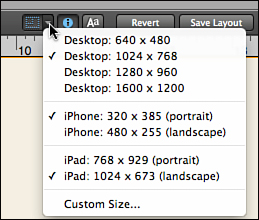
Figure 5.2. Screen stencils help you design layouts for a particular screen resolution.
Two types of guides can help you position layout objects precisely:
• Manual guides—You can set up any number of vertical or horizontal guides on a layout by clicking on either the horizontal or vertical ruler (rulers must be active for you to be able to create guides) and dragging the guide on to the layout. Once there, you can right-click the guide to lock it or to share it across all layouts. You can show or hide guides using the View, Guides, Show Guides menu item.
• Dynamic guides—When dynamic guides have been enabled (View, Dynamic Guides), as you move or resize an object, you see small blue guides appear when an object becomes aligned with other layout objects. Dynamic guides also appear when the new width or height of an object matches the size of another object on the layout.
With dynamic guides enabled, objects automatically snap as they approach alignment with another object. You can enable similar behavior for manual guides by enabling the View, Guides, Snap to Guides option.
The Inspector
The Inspector is a floating palette available in Layout mode that contains most of the tools available for configuring layout objects. You can activate it (in Layout mode) using the View, Inspector menu item. You can also toggle it on and off using the Ctrl-I (Windows)/Cmd-I (Mac OS) keyboard shortcut.
The tools of the Inspector are organized into three tabs: Position, Appearance, and Data. Each tab is organized into a handful of sections, which are illustrated and described in detail next.
Position Tab
The Position tab of the Inspector not only contains controls for specifying the position of objects, but also for determining how an object’s position is affected by things like resizing the window and empty space above it.
Position
You can use the Position section of the Inspector (see Figure 5.3) to see and/or set an object’s position, as well as to name an object and set a tooltip.
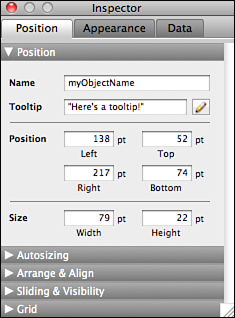
Figure 5.3. The Position section of the Inspector.
• Name—You can assign a name to any object on a layout using the Inspector. Object names must be unique to the layout. Generally, you give an object a name only if you need to be able to reference it using a script step such as Go To Object or Set Web Viewer, or to be able to investigate it using the GetLayoutObjectAttribute function, all of which require an object name as a parameter.
• Tooltip—Any object on a layout can be configured with a ToolTip that is displayed when a user mouses over the object in Browse or Find mode. ToolTips are often used to provide information or instructions to the user, but you can also configure them to display the result of a calculation formula. The calculation formula is evaluated when the ToolTip is activated, not when the layout is first loaded.
• Position—The Position fields display the location of the left, top, right, and bottom edges of the object. The location is relative to the inside top-left corner of the current layout. You can toggle the unit of measure between points, inches, and centimeters by clicking on any of the unit labels in the Inspector. (It is generally easiest to work in points.) In addition to displaying the position of an object, you can use this section of the Inspector to set the position of an object, which makes it quick and easy to precisely align objects even across layouts.
• Size—The Size fields display the width and height of the selected object. As with the Position fields, you can resize an object by manually entering a number into either field.
Autosizing
An object’s autosizing settings (see Figure 5.4) determine how the object behaves if a user expands the window. By default, every object is anchored to the top and left edges of the layout, which means that its position is fixed relative to the top left of the layout; it does not move or resize as the window is enlarged.

Figure 5.4. The Autosizing section of the Inspector.
Other possible behaviors are as follows:
• When you set a right anchor and no left anchor, the object’s position remains fixed relative to the right side of the window. It appears to move right as the window is expanded horizontally.
• When you set a bottom anchor and no top anchor, the object’s position remains fixed relative to the bottom of the window. It appears to move down as the window is expanded vertically.
• When you set both a right and left anchor, the object stretches horizontally as the window is expanded so that both its right and left edges remain a fixed distance from the edges of the window.
• When you set both a top and bottom anchor, the object stretches vertically as the window is expanded so that both its top and bottom edges remain a fixed distance from the edges of the window.
• If neither a left nor right anchor is set, the object remains a constant distance from the center of the layout as it is expanded horizontally. Similarly, if neither a top nor bottom anchor is set, it remains a constant distance from the center of the layout as it expanded vertically.
→ Some further anchoring behaviors that are specific to tab control and portal objects are discussed in Chapter 7, “Other Layout Objects.”
Arrange & Align
The Arrange & Align section (see Figure 5.5) of the Inspector contains tools for grouping and aligning objects, for example. Menu commands are available for all these operations, and many also have keyboard shortcuts.

Figure 5.5. The Arrange & Align section of the Inspector.
→ For a comprehensive list of keyboard shortcuts, see Chapter 23, “FileMaker Keyboard Shortcuts.”
• Align—When multiple objects are selected, you can align them left, center, right, top, middle, or bottom. For example, when you select multiple objects and align left, they are all repositioned to align to the left edge of the leftmost object you have selected. When you align center, the centers of the objects are aligned to the midpoint between the left edge of the leftmost object and the right edge of the rightmost object.
• Space—You can select multiple objects and then choose to distribute them horizontally or vertically. Objects are repositioned so that the space separating the two objects furthest apart is evenly divided among all the selected objects.
• Resize—When multiple objects are selected, you can use these tools to resize them to a uniform height and/or width. From left to right, the buttons resize the objects to the smallest width, the largest width, the smallest height, the largest height, the smallest height and width, and the largest height and width.
• Group/Ungroup—You can group multiple objects together so that they appear and act like a single object. This capability can be helpful to ensure that a set of objects is all positioned consistently even if they are moved. Be aware that when you apply attributes such as script triggers, conditional formatting, or ToolTips to a grouped object, if you ever ungroup the object, each of the objects of the group retains all the group’s attributes.
• Arrange—Even though a layout displays in two dimensions and can be thought of as an x,y grid, there is an implied third dimension, which is often referred to as the z-axis or the stacking order. The stacking order determines which object appears on top when two objects overlap; it can be changed using the four Arrange buttons. An object can be moved forward (toward the top) or backward (toward the bottom) in the stacking order, or it can be moved to the front or back. When FileMaker displays a layout, it renders objects from back to front.
• Lock/Unlock—When you lock an object, its handles display as an X instead of an open square. A locked object cannot be moved, resized, deleted, or otherwise altered in any way. This capability can very useful when you have layered objects (such as a colored rectangle behind a set of fields) so that you don’t inadvertently move or select the background object when working with foreground objects.
Sliding & Visibility
The behaviors controlled by the Sliding & Visibility options (see Figure 5.6) are evident only in Preview mode or when printing.
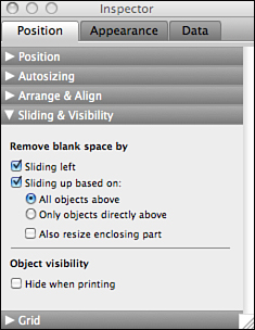
Figure 5.6. The Sliding & Visibility section of the Inspector.
• Remove Blank Space By—In Browse mode, if a field is not large enough to display all the text that has been entered into it, the user can simply scroll to see the rest of the text. You cannot do that, however, with a printed report; the text is simply clipped. As a result, on a layout that will be printed, you often must size fields much larger than you would for screen display; typically, you would size it to comfortably fit the longest field entry, which means that many records will have extra blank space in fields. By using the Remove blank space settings, you can have FileMaker close up the blank space in Preview mode and when printing; these settings have no effect in Browse or Find mode.
• Sliding Left—If two fields are placed side by side and you want the field on the right to slide left to close the gap between the fields, place this option on both fields. The distance between the fields does not actually change; if you specify a 5-point gap between the fields in Layout mode, that 5-point gap is always respected. However, the right edge of the first field is adjusted based on the length of the field entry. As an example, if you have First Name and Last Name fields next to each other on a layout, you would likely set the First Name to slide left so that there is not a large gap between the fields for people with short first names.
• Sliding Up Based On—A common use for this setting is to eliminate blank space at the bottom of a comment or note field. You place this option both on the comment field as well as on all objects below it that should move upward to fill the vacated space. As a further option, you can choose whether an object slides up based on all objects above it or only those directly above it. Generally, the latter is necessary only when you have a printout with multiple columns that need to slide independently of each other.
• Also Resize Enclosing Part—This option enables you to have a list view in which the height of the body part (and/or subsummary parts) varies depending on the amount of data in a field. For example, imagine you have a status report that needs to include a comments field that might or might not have multiple lines of text. You would begin by setting up the layout so that the body part and the comments field were both long enough to display the longest record. Then you would turn on sliding for the comments field and also resize the enclosing part (the body part) so that each row on a printout is just as long as it needs to be to display the comment.
• Object Visibility—When you set the Hide When Printing option for an object, that object becomes invisible in Preview mode and when the layout is printed. Choosing this setting enables you to place buttons and instructions on a layout but have them disappear when printing.
Grid
Unlike the other settings of the Inspector, the Grid settings (see Figure 5.7) are not applied to an individual object. Rather, they govern some basic properties of Layout mode itself.

Figure 5.7. The Grid section of the Inspector.
• Show Grid—When you turn on this option, both major and minor gridlines display on your layout. This feature can be helpful for aligning objects and creating forms that need precise measurements.
• Snap to Grid—Regardless of whether or not the grid is visible, when the Snap to Grid option is enabled, objects snap to the nearest minor gridline when they are moved or resized. Depending on the grid spacing specified, this likely results in chunky movement; objects move and resize from gridline to gridline rather than in 1-point increments. You can temporarily override this option by holding the Alt key (Windows) or Command key (Mac OS) as you move or resize an object.
• Major Grid Spacing—The default major grid spacing is 72 points (1 inch). You can toggle the unit of measure between points, inches, and centimeters by clicking on the unit label.
• Minor Grid Steps—This setting controls the number of subdivisions within the major grid spacing. For instance, if the major grid spacing is set to 100 points and you specify 20 for the minor grid steps, the minor grid spacing is 5 points.
If you have multiple snapping effects enabled, grid snapping takes precedence, followed by dynamic guides, and then guides.
Appearance
The Appearance tab of the Inspector governs most physical aspects of an object’s appearance, including its color, text formatting, line spacing, and indents. The layout’s theme determines an object’s initial appearance, so any changes you make result in a custom style. As a result, you see either Theme Default or Custom as the Style at the top of the Appearance tab (shown in Figure 5.8).

Figure 5.8. The Appearance tab of the Inspector.
The four buttons to the right perform the following actions:
• Copy Object Style
• Paste Object Style
• Apply Theme Style
• Remove Styles
You also can access these actions using the Edit menu. Copying and pasting an object’s style does the exact same thing as using the Format Painter tool from the Status Toolbar; the only difference between them is that you cannot use the Format Painter to copy and paste styles to a layout part, whereas you can use the buttons on the Appearance tab to do so.
Applying the theme’s style reverts the object to the theme defaults. Removing styles clears all styles—custom and theme defaults—from the object.
Be aware that all four of these actions affect the appearance of all the object’s states.
Object States
In FileMaker Pro 12, you can configure objects to have a different physical appearance in different “states.” Doing so can add a high level of visual polish to a database. The following four states can be configured:
• Normal—This is the state of an object when it is not in focus, pressed, or being hovered over.
• In Focus—An object is in focus when a user tabs or clicks into it. In other words, it is in focus when it is the active object.
• Hover—The hover state controls the appearance of an object when a user mouses over it.
• Pressed—This state controls how an object appears while a user is clicking on it. The pressed state appears only when a mouse button is actually being held down.
You can see and set the attributes for each state by selecting it from the drop-down menu at the top of the Appearance tab. All the attributes in the Graphic, Text, Paragraph, and Tabs sections can be configured for each state, although for some types of objects, not all object states are pertinent. For instance, a text object displays only the Normal state; it cannot be made active or pressed. If you ever need an object such as this to display other states, you can do so by setting it up as a button that performs an innocuous script step such as Set Variable.
The Text, Paragraph, and Tabs sections of the Appearance tab are intuitive and do not require detailed explanation. The Graphic section, however, has some interesting options for specifying background fill and line properties.
Fill
Four options are available for the background fill of an object or part. Keep in mind that each state can use a different fill, if you so desire.
• None—If no background fill is specified, the object is transparent.
• Solid Color—You can set a solid color as the background fill for an object. Click the color swatch to bring up a color picker and select a color.
• Gradient—When you specify gradient as the background fill, you see a colored bar with two color stops below it. The space between the two color stops is filled with a smooth transition from one color to the other. You can click a tab to specify a gradient color, and you can slide it to change the amount of transition space between the colors. By clicking the bar itself, you can add up to five additional color stops. Slide a color stop off the end of the bar to remove it.
In addition to setting the colors that will be blended, you can use the controls beneath the color bar to switch between a linear and circular gradient, reverse the order of the color stops, and change the angle at which the gradient will appear on the object.
• Image—The final background fill option is to use an image; supported formats include .png, .bmp, .tif, .gif, or .jpg. After choosing an image to use, you can specify whether the image should display at its original size or whether it should scale to fill or fit. You can also tile the image, which means it displays in a repeated pattern to fill the space.
The final option, shown in Figure 5.9, is to slice the image. With this option, you can slide two horizontal and two vertical lines on the image to specify where it should be sliced. The four corners that result are displayed as the corners for the background fill; the space between the lines are repeated to fill the space. Effectively, this allows the image to be stretched without losing any resolution.
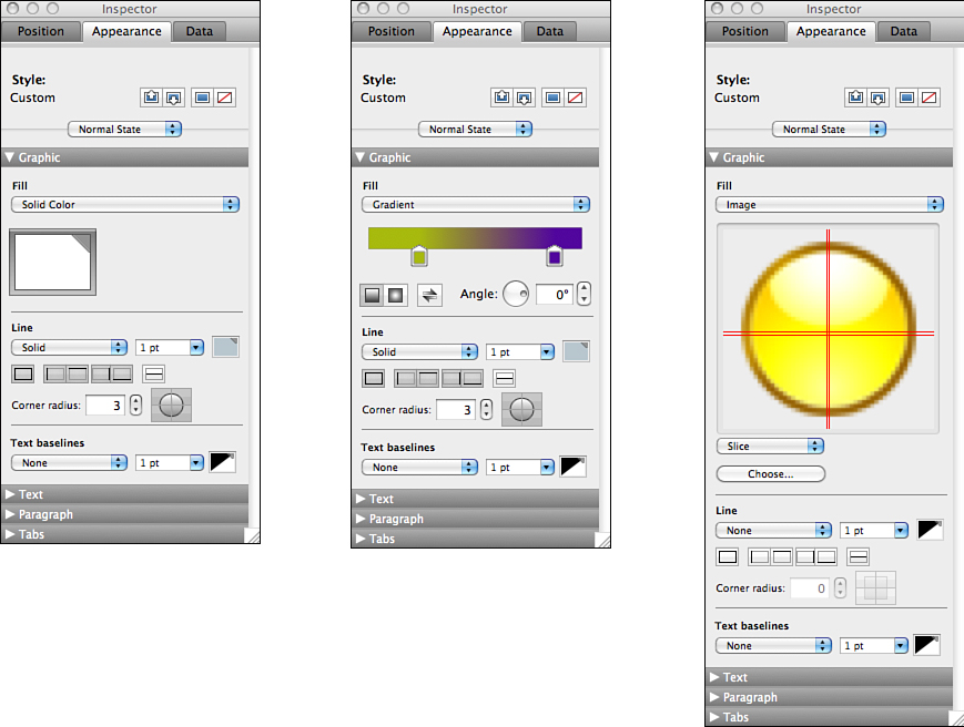
Figure 5.9. The background fill can be set to display a solid color, a gradient, or an image.
If you use the same image to fill multiple objects, FileMaker stores only one copy of the image. Additionally, FileMaker reduces any image that is larger than 20MB down to 20MB.
Line
In addition to the background fill, several options are available for customizing an object’s border. You can specify the style of the border (None, Solid, Dashed, Dotted), its thickness, and its color. You can also specify on which edges of the object the border should appear.
Finally, you can customize the corner radius by specifying a number from 0 to 100, which represents the distance (in points) from each corner that the curve will begin. You can also specify which of the four corners of the object should have a radius by clicking on the pieces of the circle to the right of the radius setting.
Data
The Data tab of the Inspector contains useful tools for formatting field objects and controlling various aspects of their behavior.
Field
The Field section of the Data tab (see Figure 5.10) enables you to format a field as a drop-down menu, for example, or auto-complete as you type. These tools can be applied only to field objects; they are grayed out for other types of objects.
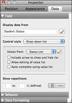
Figure 5.10. The Field section of the Data tab.
• Display Data From—This setting displays the fully qualified name of the field attached to the layout object. You can select a different field by double-clicking on the field itself or by clicking on the pencil icon next to the field name in the Inspector.
• Control Style—The control styles available are Edit Box, Drop-Down List, Pop-Up Menu, Checkbox Set, Radio Button Set, and Drop-Down Calendar. Depending on your selection, further options are available for configuring. For instance, with an Edit box, if the field is an indexed text field, you also can specify an option to auto-complete using existing values. With a calendar, you can choose to have the field display an icon to show and hide the calendar.
With all the other four control styles, you need to specify a value list to use. You can access the Manage Value List dialog directly from the Inspector by clicking the pencil icon next to the value list drop-down list.
• Show Repetitions—If the selected field object has been defined to use repetitions, you can specify which repetitions to display as well as their orientation (vertical or horizontal).
Behavior
You can configure several behavior settings for fields (see Figure 5.11). Keep in mind that these settings need to be applied to fields on a layout-by-layout basis; they cannot be specified as part of the field definition.
• Field Entry, Browse Mode—If users should be able to see fields but not click into them, you can disable field entry for Browse mode. Typically, you might do this for a primary key field so that users do not inadvertently change its value. If users cannot enter the field, they are not able to scroll or see data that goes beyond the field’s boundaries.
• Field Entry, Find Mode—Similar to the Browse mode option, you can allow or prevent users from entering a field in Find mode using this tool. You might use it, for instance, to prevent users from searching on unindexed fields.
• Select Entire Contents on Entry—When this option is enabled, the entire contents of a field are selected when users tab to or click into a field. This capability is useful if users generally replace the entire contents of the field (as opposed to appending additional data).
• Go to Next Object Using—By default, the Tab key is configured for moving from object to object in the tab order. However, sometimes you might want the Return/Enter key to perform this way as well. For instance, to prevent users from entering stray return characters at the end of a FirstName field, you could configure the field so that the Return key moves the users to the next object. If you disable the Tab key from moving to the next object, you can then use the Tab key to place a tab within a field. (You must use Option+Tab [Mac OS] or Control+Tab [Windows] to insert a tab into a field if the Tab key is configured to move to the next object.)
• Include Field for Quick Find—If you want fields on a layout omitted from a Quick Find, you can uncheck this option for those field objects. Typically, to avoid performance issues, you should disable Quick Find for related fields and unstored calculation fields. You can disable Quick Find for the entire layout in the Layout Setup dialog.
• Do Not Apply Visual Spell-checking—A setting on the Spelling tab of the File Options dialog, when enabled, causes words with questionable spelling to be indicated with a red underline. However, there might be specific fields, such as names or email addresses, for which you want to suppress this behavior. You can do so by checking the option not to apply visual spell-checking.
• Set Input Method—This option is pertinent only for entering Japanese text into a FileMaker field. Input methods are utilities that convert keystrokes into another language.
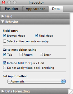
Figure 5.11. The Behavior section of the Data tab.
Data Formatting
Number, date, time, timestamp, and container fields can have various data formatting settings applied to them. The formatting is not stored with the record data; it is defined as an attribute of a particular layout object. For instance, Figure 5.12 shows how you would typically set up a field to display currency.
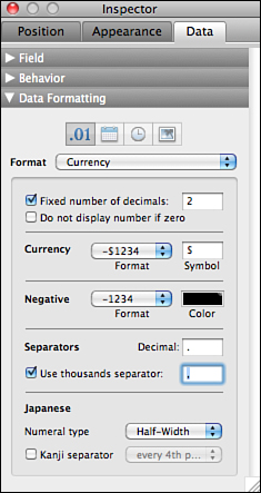
Figure 5.12. Using the Data Formatting section of the Inspector, you can configure a number field to display as currency.
There are similar options for configuring numbers as percents, decimals, and Boolean values.
For date and time fields, you can choose among various predefined formatting options (for example, 5/21/2012 could be displayed as “May 21, 2012”, “5/21/12,” or even as “Wed, May 21, 2012”). You can also specify a custom format, which can be useful if you want to display only a portion of the date, such as “May, 2012” or “05/21.”
With container fields, the data formatting options include resizing to fit and alignment within the container. You can also choose to optimize a container field either for images (for example, .jpg or .bmp) or for interactive content (such as PDF or QuickTime). By optimizing for interactive content, you can work directly with certain types of files. For example, you are able to scroll through the pages of a PDF and to play audio or movies. Note that a container field in a portal cannot be optimized for interactive content.
Additional Object Formatting
Although you can use the Inspector to configure most object properties, three important properties are controlled by other means: button setup, conditional formatting, and script triggers. You access all three using either the Format menu or the contextual menu that appears when you right-click (Windows) or Control-click (Mac OS) an object in Layout mode.
Button Setup
You can create buttons using the Button tool from the Status Toolbar, but in fact, you can turn any object on a layout into a button simply by selecting it and then accessing the Button Setup menu. Generally, buttons should be configured to perform a script rather than execute single script steps. This centralizes all script logic in one place, and it gives you more flexibility should you ever need to alter or expand the button’s capability down the road.
→ For more information on setting up buttons, see Chapter 12, “Script Primer.”
Conditional Formatting
You can use conditional formatting to alter an object’s appearance under specified conditions. For instance, you might want a due date field to appear with a red background color when it is empty or a customer’s name to appear in italic when she has past due invoices. Using the Conditional Formatting dialog, shown in Figure 5.13, you can specify whatever conditions you want, along with formatting to apply when that condition is true.

Figure 5.13. You can use the Conditional Formatting dialog to specify object formatting that is applied only under certain circumstances you define.
If you specify multiple conditions, the formatting for all true conditions is applied cumulatively. In the event of a conflict, the formatting of the last true condition is used. You can drag the conditions to reorder them to ensure proper evaluation order.
You can specify a conditional test in two ways. The first is to use the Value Is option and choose from one of the predefined conditions (such as empty, greater than, or equal to). The other is to specify Formula Is and supply an equation that returns True or False (1 or 0).
Script Triggers
Most types of objects can be configured to activate script triggers. Simply select the object and then choose Script Triggers from the object’s contextual menu. Examples of actions that you can configure to trigger an object-level script trigger are OnObjectEnter, OnObjectKeystroke, and OnTabSwitch.
→ For more details about script triggers, see Chapter 13, “Script Triggers.”
Accessibility Inspector
A new feature in FileMaker Pro 12 is the ability to make layout objects accessible to screen readers, such as JAWS for Windows and VoiceOver for Mac OS X. To add accessibility labels to a layout object, choose View, Accessibility Inspector. The Accessibility Inspector, shown in Figure 5.14, enables you to specify three accessibility attributes for an object.

Figure 5.14. The Accessibility Inspector enables you to specify a label and help information that can be read via a screen reader.
• Label—You can specify a text object on the layout as the field’s accessibility label. The text of the label object is spoken when the field becomes active.
• Title—Alternatively, you can specify a custom text string as the accessibility label by typing it into the space provided or by setting up a calculation that returns a text string. Generally, you specify either a text object or a custom text string as the label. If you specify both, the screen reader first speaks the text of the label field and then the custom text string.
• Help—When a user first clicks into a field, the contents of the field are read, along with the label and/or title. If the user takes no other action for several seconds, the screen reader speaks the text from the Help section of the Accessibility Inspector.