Chapter 7. Other Layout Objects
Chapter 5, “Layout Tools,” discussed layout objects in general, and Chapter 6, “Charting,” discussed one particular object, the chart object, in detail. This chapter focuses on three additional layout objects—namely portals, tab controls, and Web Viewers—each of which has specialized uses and attributes. These tools are among the most useful in a FileMaker developer’s toolbox.
As you can see in Figure 7.1, you can find all three tools in the Status Toolbar (in Layout mode, of course). You also have access to them via the Insert menu, but you should avoid accessing them this way because you cannot control their location or size.
Figure 7.1. The three tools discussed in this chapter—the tab control, portal, and Web Viewer—are all accessed via the Status Toolbar.
Tab Controls
A tab control is useful for organizing information on a layout. Users immediately grasp the tab metaphor; by clicking a tab, you activate a tab panel that contains a particular set of content. It creates the illusion of a third dimension and enables you to use screen real estate very effectively. As an example, Figure 7.2 shows two versions of the same layout. In the first, Contact Info is the active tab panel, and in the second, Notes is active.

Figure 7.2. A tab control is composed of any number of tab panels, each of which can contain unique content.
To add a tab control object to a layout, click on the tool in the Status Toolbar, and then click and drag to form the object. The Tab Control Setup dialog is displayed (see Figure 7.3), and you can specify the number and names of the tab panels, as well as several appearance options. You can access this dialog anytime by double-clicking on the object.

Figure 7.3. Use the Tab Control Setup dialog to create, delete, and rename tab panels, as well as to specify several appearance options.
The appearance options controlled by the Tab Control Setup dialog are the following:
• Default Front Tab—This option controls which tab is active when a user first navigates to the layout. If a user activates a different tab and then switches layouts, when he returns to the layout, the default front tab is active again; FileMaker does not remember the active tab.
• Tab Justification—This control specifies the position of the tabs relative to the top edge of the tab panel: Left, Center, Right, or Full.
• Tab Width—By default, tabs have a variable size based on their label width, but you can also give them some extra padding by choosing Label Width + Margin Of. Other options include sizing all tabs to the width of the widest label, setting a fixed width for all tabs, and setting a minimum tab width. If you a set a fixed width of zero, the tab names effectively disappear; you can use your own buttons and scripts to control tab navigation.
Here are a few points to keep in mind when you are specifying names for tabs in the Tab Control Setup dialog:
• You can reorder tab panels by clicking the tab name and dragging it to a different position.
• If you delete a tab, all objects that were on that panel are also removed.
• Tab names do not need to be unique.
• You can create tab panels without entering a tab name.
• Although there is no practical limit to the number of tabs you can have, the tabs are truncated at the point they exceed the width of the tab control itself.
• A tab name can be up to 255 characters long.
Formatting a Tab Control
The layout’s theme controls the default appearance of the tab control, but you can customize many attributes. Text formatting attributes of the tab labels are set for the entire object; you cannot specify a different text size, font, or color for an individual tab label.
Even though the tab control as a whole is considered a single object, you can configure many things for individual tab panels. To do so, select the tab panel by clicking on it twice (not double-clicking). (You can tell that it’s selected if the name of the tab has a black border.)
At the tab panel level, you can set attributes such as the background fill, border, and corner radius. You can set these attributes for three states: Normal, Hover, and In Focus. A tab control does not display a pressed state. The Hover and In Focus states appear only when a tab is inactive and the user mouses over it (Hover) or activates it via the tab order (In Focus).
Using the Inspector, you can also specify an object name for an individual tab panel, which allows for scripted navigation to a particular panel.
Individual tab panels can also have conditional formatting configured for them. Conditional formatting affects the display of the tab label.
Finally, several script triggers can be set for tab controls. OnObjectEnter and OnObjectExit activate when you tab to and from a tab control. OnTabSwitch and OnObjectModify activate when you switch from one tab to another.
Autosizing of Tab Controls
There are a few special behaviors to be aware of when configuring autosizing settings for the objects contained on a tab control. The tab control object itself can move or stretch just like any other object. However, objects contained on a tab control are limited by the tab control’s settings. This is necessary so that the objects do not exceed the boundaries of the tab control.
The rule to keep in mind is that objects on a tab control can only resize in the same way as the tab control itself. If the tab control has only left and top anchors set (no moving or stretching), regardless of how you anchor objects contained on it, those objects do not move or stretch. If the control has both left and right anchors (horizontal stretch), objects within it can have left, right, or left/right anchors set. Another way to think about this is to imagine that you anchor objects on a tab control to the edges of the tab control rather than the edges of the layout.
Other Tab Control Notes
Here are few other issues to keep in mind when working with tab control objects:
• You can include a tab control object in the tab order. After tabbing to a tab control, you can use the arrow keys to navigate to other tabs, and use the spacebar or Return key to switch to the tab.
• Objects on inactive tabs are omitted from the tab order.
• You can nest tab controls within each other.
• When you move a tab control, all objects it contains move with it.
• The blank space to the left or right of the tab labels is considered part of the current tab panel. This means that you can place objects such as buttons outside the apparent boundary of the panel, yet have them be visible only when that given panel is active.
• You cannot place a tab control within a portal.
• If you print a layout that contains a tab control, only the active tab panel is printed.
• If you spellcheck a record, only the active tab is checked.
• If you choose Save Records As Excel, only the fields on the active tab are included in the export.
• If you change the view to View As Table, all fields on any tab panel are displayed.
Portals
Portals are among the most powerful and useful tools available to a FileMaker developer. A portal enables you to view a set of related records; each row in a portal represents a record from a related table. For instance, Figure 7.4 shows a layout that presents data about a customer, and the portal displays three related order records.

Figure 7.4. A portal is used to display a set of related records. Here, the layout is based on a Customer table occurrence, and the portal shows Orders related to the current customer.
Portal Setup
To add a portal to a layout, click the Portal tool in the Status Toolbar; then click and drag a rectangle on the layout where you want the portal to appear. You are then taken to the Portal Setup dialog, which is shown in Figure 7.5.
The most important setting in the Portal Setup dialog is the choice of where to show related records from. Layouts are linked to table occurrences; this situates them on a particular node in the Relationships Graph. A portal placed on a layout must show records from a table occurrence that is related (however distantly) to the table occurrence of the layout. From the current record, if you were to traverse the relationship path that linked these two table occurrences, the resulting set of records is what appears in the portal. In a sense, then, a portal shows the results of performing a relational query.
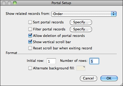
Figure 7.5. The Portal Setup dialog enables you to configure functional and aesthetic properties of a portal.
Several other configuration options are available in the Portal Setup dialog. You can specify them during the initial portal setup, or you can double-click an existing portal at any time to access the Portal Setup dialog.
• Sort Portal Records—By default, related records are sorted according to the relationship’s settings; if no sort has been set at the relationship level, they are displayed in creation order. You can override this setting, if desired, in the Portal Setup dialog. Keep in mind that if a portal displays hundreds or thousands of records, there might be some performance penalty to sort the related set. Operations such as Go to Related Records and the GetNthRecord function return results based on the relationship’s sort order; they are not affected by the portal’s sort order.
• Filter Portal Records—In some situations you might not want to see all the related records in a portal. Rather than altering the relationship, you can filter the results by specifying a condition by which records should be displayed. For instance, imagine you have a Project database that includes a portal into a related Task table. If you want the portal to display only records with a status of In Progress, you simply base the portal on a relationship from Project to Task, but you can specify a filter such as Status = In Progress to filter out completed or canceled tasks.
Unlike previous versions, in FileMaker Pro 12 portal filters are evaluated on the server (rather than the client), which means that performance for a filtered portal should be similar to what you would experience with a filtered relationship.
• Allow Deletion of Portal Records—This setting controls whether a user can delete related records via the portal. Assuming it is allowed, there are a few ways the user could initiate the deletion of a related record. If a user clicks into a field in the portal and she selects Records, Delete Records, she sees a dialog asking whether she wants to delete the entire master record or just the one related record. If the user activates a portal row without clicking into any field in the portal (that is, if she clicks on a portal row but clicks outside an enterable field), she can initiate deletion either by pressing the Delete or Backspace key or by selecting Records, Delete Records. The dialog in this case, however, simply confirms whether the user wants to delete the related record; she does not have the option to delete the master record.
• Show Vertical Scroll Bar—This setting governs whether the portal has a vertical scrollbar. Generally, it is a good idea to select this option. Without it, there is no way to see more related records than could be displayed in the allotted rows. The exception is a situation in which you know there will never be more than a certain number of related records.
• Reset Scroll Bar When Exiting Record—If a user scrolls down within a portal and then exits the record (typically by clicking somewhere on the layout background), should the portal jump back up to display the top rows, or should it stay scrolled? You can control that behavior with this setting. When it is selected, the portal pops back to the top when the user exits the record.
• Initial Row and Number of Rows—The number of rows setting determines how many rows are displayed in the portal. Resizing the portal object itself determines only the size of the top row of the portal, not the number of rows. That must be set in the Portal Setup dialog. Generally, you leave the initial row setting as 1, indicating that the portal should begin with the first related record. The setting is useful, however, if you ever need to put multiple portals next to each other. For instance, you might display the first four related records in one portal (Initial row: 1, Number of rows: 4, no scrollbar) and then place the identical portal next to it to display the remaining rows (Initial row: 5, Number of rows: 4, show scrollbar).
• Alternate Background Fill—The color you specify is used for every other portal row. An alternating background fill can make a large portal easier to read.
Working with Records in a Portal
It is important to remember that each portal row is actually a record in a related table. As such, you can use portals to create, edit, and delete related records.
You can use a portal to create related records if the relationship it is based on is the Allow Creation of Records in This Table via This Relationship option. When it is, the portal displays a blank row beneath any existing related records. By entering data into the blank row, the user initiates creation of a new record in the related table. The foreign key of the related record is set automatically. This means that the match field in the relationship (in the target table) cannot be a calculation field and that the relationship has to be based on an equality operator.
Deletion of related records can be controlled via script (the Delete Portal Row script step) or by the setting in the Portal Setup dialog to allow deletion of portal records.
A user can edit records in a portal as he would any other record data, but there is a crucial distinction when it comes to committing records. If the user edits data in one portal row and then clicks into another portal row, the prior data is not committed. Similarly, if data is edited in a portal and then the user clicks into a field in the master record, the portal row data is not committed. When a user finally exits the record (by clicking outside any field, by navigating to another record, or by pressing the Enter key), the master record and all related records are committed at once as a single transaction. This has a few practical implications. The first is that a given user might have locks on many records simultaneously. The second is that all data changes made within a portal—including record creation and deletion!—can be reverted using the Records, Revert Record menu item. As a developer, you can use this feature to your advantage to ensure that multiple records that make up a single “transaction” are fully committed together or reverted together.
→ This transactional approach is particularly useful for databases that will be accessed via FileMaker Go. For more details on this topic, see Chapter 16, “Designing for FileMaker Go.”
Autosizing of Portals
Portals, like tab controls, are designed to contain other objects, and, as such, they have special behaviors when it comes to autosizing. Similarly to a tab control, the objects in a portal are constrained by the settings of the portal itself. That is, autosizing settings on objects in a portal are irrelevant if the portal itself does not resize. Just imagine that the objects within a portal are anchored to the edges of the portal row, rather than to the edges of the window.
If a portal object has both a top and bottom anchor set, the portal stretches as the window is enlarged vertically, just as it would for any object with opposing top and bottom anchors. But how that stretch affects the individual portal rows themselves is another matter. There are two options, which are controlled by the anchoring settings of the objects within the portal:
• If none of the objects in the portal have a bottom anchor set, as the portal stretches vertically, additional rows appear.
• If any object contained in the portal has a bottom anchor set, and regardless of any other anchoring, each portal row expands proportionally—like an accordion—as the window is enlarged.
Other Notes About Portals
Here are a few miscellaneous details about portals that you should know:
• Objects placed in a portal row don’t display unless there is a related record present.
• When you move a portal, all objects contained within the portal move with it (this was not the case in previous versions of FileMaker Pro). Similarly, if you delete a portal object, all objects it contains are also deleted.
• You cannot place a tab control, chart, or Web Viewer in a portal.
• You cannot nest portals within each other.
• You can place the Record Number Symbol ( {{RecordNumber}} ) in a portal to display the portal row number.
• You cannot work interractively with container fields that are in portals.
• The OnObjectEnter and OnObjectExit script triggers can be applied to a portal object. They activate anytime a different row in the portal is entered or exited.
• You can apply the OnObjectKeystroke script trigger to a portal object. It activates if a portal row is active and the user is not clicked into a field within the portal row. So, for instance, if you have a portal in which the fields are set not to allow entry in Browse mode, you can configure a keystroke trigger so that the up- and down-arrow keys navigate up and down the portal, perhaps triggering the display of additional detail about the portal row somewhere else on the layout.
• You can specify different fill and line settings for a portal for its Normal, Hover, and In Focus states. The state settings are applied to the entire portal, not just a single portal row. The Hover state does not appear when the user mouses over a field in the portal that can be entered in Browse mode. Similarly, the In Focus state appears only when the user activates a portal row, but not when he clicks into a field within the portal. In other words, the state settings of objects within the portal have priority over the state settings of the portal itself.
• When displayed using FileMaker Go, the scrollbar on a portal is a little small and can be difficult to use. Rendering a portal that contains many records can be quite slow when it is accessed over the WAN, particularly over 3G. You might consider creating a fixed row portal that relies on relationship filtering and then provide Next and Previous buttons to control the subset of records displayed.
Web Viewer
A Web Viewer, essentially, is a web browser that you can embed into a FileMaker Pro layout. Web Viewers use the operating system’s web browser technology—Safari on Mac, Internet Explorer on Windows—and render most content just as a browser would. Their real power, though, derives from your ability to control the Web Viewer’s URL via calculation or script.
There is a plethora of practical uses for Web Viewers. For instance, if you have a customer’s website URL stored in a field, you can display it in a Web Viewer. You might have another that uses data stored in address fields to show a map of the customer’s location or perhaps directions from your office. JavaScript widgets also make great Web Viewer content and can provide user interface devices not possible through FileMaker alone. Imagine, for instance, placing a news crawl or a clock at the top of a layout. Using something known as a data URL, you can even use Web Viewers to produce highly stylized and dynamic reports.
To create a Web Viewer, select the Web Viewer tool from the Status Toolbar and then click and drag a rectangle on the layout where you want it to appear. The Web Viewer Setup dialog is displayed as shown in Figure 7.6.

Figure 7.6. A Web Viewer can display web pages or other web-based content directly in a FileMaker Pro layout.
The Web Address field in the middle of the dialog contains a calculation expression that determines the URL that is initially displayed in the Web Viewer. You can specify this calculation yourself—perhaps something as simple as "http://" & Customer::URL—or you can use one of the templates provided in the top half of the dialog. For instance, you can see in Figure 7.6 that the Google Web Search (US) template is selected, and this requires one Query value, which has been populated with the name of a field. The calculation shown in the Web Address field is automatically built based on the template and the query values specified.
When entering your own formula for a web address, be sure that it begins with the correct schema, such as http://, https://, ftp://, or file://. If you omit the schema, the Web Viewer might not display properly.
Several check boxes are available at the bottom of the Web Viewer Setup dialog:
• Allow Interaction with Web Viewer Content—If this option is unchecked, the Web Viewer becomes a read-only object. The user cannot click on hyperlinks or enter values into forms. Typically, you leave this option checked.
• Display Content in Find Mode—If the URL for a Web Viewer is based on dynamic content, it might not function properly in Find mode. Check or uncheck this option depending on whether it makes sense for the Web Viewer to render content in Find mode. If this option is unchecked, the Web Viewer is simply blank in Find mode.
• Display Progress Bar—When this option is selected, the bottom of the Web Viewer displays a progress bar as the page loads.
• Display Status Messages—Enable this option if you want status messages to display at the bottom of the Web Viewer. They include, for example, loading messages, error messages, and security status (including a lock icon when secure web pages are loaded).
• Automatically Encode URL—If this option is selected, FileMaker applies URL encoding rules as necessary. For instance, if a field used to construct a URL contains characters such as spaces, ampersands, percents, and backslashes, these generally need to be encoded for the URL to function properly. You can prevent automatic encoding by deselecting this option; deselecting might be appropriate if you have query parameters in a field and need special characters to remain as entered.
Setting a Web Viewer via Script
You can specify the initial URL for a Web Viewer object in the Web Viewer Setup dialog. Subsequently, you can control it using the Set Web Viewer script step. This script step requires two parameters. The first is the object name of the Web Viewer to set. This is required because a layout could conceivably contain multiple Web Viewers and the script step needs a way to distinguish which one to act upon. You can use the Position tab of the Inspector to set an object name for a Web Viewer, just as you would any other layout object.
For the second parameter, you select from the following possible actions:
• Reset—Resets the Web Viewer to the web address specified in the Web Viewer Setup dialog. This also clears the object’s Back and Forward history.
• Reload—Reloads whatever page the Web Viewer is currently displaying.
• Go Forward—Goes forward one page in the Web Viewer’s history.
• Go Back—Goes back one page in the Web Viewer’s history.
• Go to URL—Allows you to specify an entirely new URL for the Web Viewer. The interface for specifying the URL is similar to the Web Viewer Setup dialog.
Other Web Viewer Notes
Just as with portals and tab controls, there are many other interesting and useful details to learn about Web Viewers:
• You cannot place a Web Viewer in a portal.
• A Web Viewer works with a layout set to View as Form or View as Table. If the layout is set to View as Table, the Web Viewer needs to be in the header or footer part to be displayed.
• You cannot rotate a Web Viewer object.
• You can configure a Web Viewer’s fill and line attributes for all states (Normal, Hover, In Focus, and Pressed). However, if the Web Viewer does not allow a user to interact with it, the Hover and In Focus states are not available.
• You can render a string of HTML content directly in a Web Viewer using a data URL. For instance, if you specify the string "data:text/html,<html><body>Testing 123</body></html>" as the web address for a Web Viewer, you set the words Testing 123 in the Web Viewer. This is very powerful in that it enables you to build and display entire web pages dynamically. Images that are BASE64 encoded can also be displayed using data URLs.
• Although there is no hard limit as to the number of Web Viewer objects you may display on a layout, having multiple Web Viewers on a layout might affect performance, especially when viewed on an iOS device.