
Chapter 7
Transitions & Titles

Introduction
This chapter moves out of storytelling into story “enhancement.” We enter the world of transitions, titles, and, ultimately, effects. We also shift from the purely technical (“push this button to make that happen”) into creative squishiness (“what’s the ‘right’ length for a dissolve?”), where the answers depend upon your point of view.
We also enter into the world of editing “style.” Transitions, fonts, animation—all change over time. As one editor told me, “The young audience today wants fast cuts. Plenty of jump cuts. Keep everything short and moving. Short, jerky, jarring. Short attention spans demand editors eliminate the pauses. Cram more content in. That’s today’s world.”
For myself, I prefer slower cutting so I can actually see what’s on the screen. To me, fast cutting implies you are trying to hide what’s on the screen, not enhance it.
Definitions for This Chapter
Transition. A switch from one clip to the next. There are three types of transitions: cuts, dissolves, and wipes.
Dissolve. A visual transition where one clip slowly blends, or mixes, with another.
Wipe. A visual transition where one image object moves off-screen while one or more image objects move onscreen at the same time.
Fade. A visual transition where one clip dissolves to or from black or, in some instances, white.
Handles. Extra audio and/or video before the In and/or after the Out of a clip. This is used for trimming and transitions.
Generator. Video that is wholly created by the computer. These are used for animated backgrounds, inserting into text and other effects. They conform to any frame size, frame rate, or duration.
Tweak. To adjust, generally in small amounts.
The camera represents the point of view (the “eye”) of the audience.
Transitions
The default transition in Final Cut Pro is the cut—an instantaneous switch from one shot to another. However, many other transition options are available. These range from reasonably normal to way, way over the top.
354 The Three Types of Visual Transitions
Each creates an emotional response in the viewer.
Visual transitions come in three broad categories, regardless of which NLE you use: cuts, dissolves, and wipes. The default transition in Final Cut is a cut. All others are added after the edit is made. Transitions are always added at an edit point.
There are three categories of visual transitions: cuts, dissolves, and wipes. Use wipes sparingly.
All transitions convey an emotional value, so pick the one that represents the emotion you want to convey to the audience. Transitions are easy to abuse. We’ve all seen videos where the editor acts like they never met a wipe they didn’t like. Those programs induce visual whiplash.
Remember that the camera represents the eye of the audience; every time you change a shot, you move the audience to a new position. Try to move your audience gently. Here are some suggestions for using transitions wisely:
Cut. A change in perspective; 90% of your transitions should be cuts.
Dissolve. A change in time or place; 90% of your remaining transitions should be dissolves.
Wipe. This breaks the flow of the story to take the audience somewhere completely different. Be very cautious with these. Use a wipe only when you want a complete disconnect between what went before and what comes after.
The problem with wipes is that they call attention to themselves. They are intentionally distracting. Adding too many wipes to a video means the audience starts paying more attention to the wipes and less to the content. Then again, if you have a weak story or weak talent, adding lots of wipes distracts from the fact you’ve got nothing to work with.
355 Add a Dissolve
A dissolve means a change in time or place.
The easiest transition to add is a dissolve, with a variety of ways to select where to apply it:
Put the playhead on an edit point.
Or—select an edit point.
Or—select a clip.
Or—select a group of clips.
Press Cmd+T.
The default transition, a dissolve, is applied to the selected edit point(s). The default transition duration is set in Preferences > Editing. (See Tip 70, Optimize Editing Preferences.) By selecting a group of clips, you can apply the same transition to all selected edit points at once. If you select one or more clips, the transition is applied to both ends.
Cmd+T applies the default transition to all selected edit points or clips.
356 Handles Are Essential for Transitions
If handles don’t exist, Final Cut will “invent” them.
Handles, extra media at the ends of a clip, are essential for transitions; see Tip 224, Handles Are Essential for Trimming. Why? Because during a transition, portions of both clips are onscreen at the same time. That means they both need media during the transition.
At a minimum, the handles must be the same duration as the transition itself. (Longer is better.) If the handles exist, great. Everything works as expected.
But if there isn’t enough media, Final Cut pops up a warning; see FIGURE 7.1. If you click Create Transition, Final Cut will shorten whichever edit point lacks sufficient handles, by moving the In or the Out the duration of the transition. This essentially performs a ripple trim to the edit point.
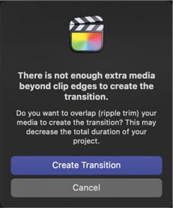
FIGURE 7.1 This warning means FCP will shorten the edges of any clip at the edit point without sufficient handles to match the transition duration.
This may be good or bad, depending upon the contents of the clip and the transition you are applying.
357 The Transitions Browser
Final Cut provides hundreds of transitions to choose from.
Although cuts are the most popular transition, followed by dissolves, Final Cut does not stop there. The Transitions browser (see FIGURE 7.2) contains more than 150 transitions in a mind-bending variety of styles. Because transitions are easy to create using Motion and other software tools, third-party developers delight in creating more. Hundreds of transitions are available from a wide variety of websites.
To open the Transitions browser, click the bowtie icon (top-right arrow in Figure 7.2) in the top-right corner of the timeline (shortcut: Control+Cmd+5).
To resize the Browser, drag the left edge.
To hide the sidebar, click the icon in the lower left (lower-left arrow).
To see all transitions, click All in the top left of the Browser (top-left arrow).
To see all transitions in a single category, click the category name in the sidebar on the left (for example, Dissolves).

FIGURE 7.2 The Transitions browser. To see all available transitions, click the word “All.” To hide the sidebar, click the lower-left icon (lower red arrow).
358 Use Search to Find a Specific Transition
You can use partial words in a search.
To search for a specific transition, enter the text to search for in the search box at the bottom; see FIGURE 7.3. You don’t need to enter a complete word.

FIGURE 7.3 Use the search box to look for all transitions with “pan” in their name. There are 16 transitions meeting this condition.
To cancel the search, click the “x” in a circle on the right side.
359 Apply a Transition from the Transitions Browser
Apply transitions to an edit point, clip, or group of clips.
Transitions are applied from the Transitions browser in a variety of ways:
Drag it from the Transitions browser and drop it on an edit point. The edit point does not need to be selected.
Or—select an edit point, a clip, or a group of clips and double-click the transition icon.
To replace a transition, drag the new transition from the Transitions browser and drop it on top of the existing transition in the timeline. The new transition inherits the duration of the old one.
To remove a transition applied to a clip, select it in the timeline and press Delete.
Note
Click the center of a transition to select it.
360 Preview Transitions
Preview transitions in real time.
Final Cut makes it easy to preview a transition. Simply hover your mouse over the transition you are curious about. Wait a second or two for Final Cut to load the transition into RAM, then drag the mouse—without clicking—across the transition.
Hover, then drag your mouse over any transition to preview it.
You will see the effect full screen in the Viewer.
361 Change the Transition Duration
Two ways to modify any transition duration.
To change the duration of a transition, do one of the following:
Grab an of the transition edge and drag it; see FIGURE 7.4.

FIGURE 7.4 Drag the edge of a transition to change its duration.
Select the transition, press Control+D, enter the duration you want, and press Return.
Note
Click the center of a transition to select it.
362 Trim a Clip Under a Transition
You don’t need to remove a transition to trim the clips under it.
Zoom in to the timeline until you see the three icons at the top of a transition shown in FIGURE 7.5. (Cmd+[plus] is one way to zoom in.)
To ripple trim the In of the incoming clip, drag the double bars on the left.
To ripple trim the Out of the outgoing clip, drag the double bars on the right.
To roll trim both the In and the Out, drag the bow-tie in the middle.

FIGURE 7.5 The three trimming controls displayed at the top of every transition allow trimming under the transition.
Trimming clips without removing the transition saves time, provided you see these trim icons. If you don’t, zoom in closer to the timeline.
Note
Even though you are clicking icons in the transition, you are actually trimming the clip under it.
363 Modify Transitions
Transitions can be modified in more ways than just duration.
Although all transitions can be modified, some are more flexible than others; see FIGURE 7.6. Select the transition in the timeline, then go to the Transition Inspector (note the blue hourglass icon in this screen shot) and tweak it.

FIGURE 7.6 Almost all transitions can be modified in some way. Here are two different examples. Select the transition, then open the Transition Inspector (shortcut: Cmd+4) to see the options.
Almost all transitions can be modified in the Transition Inspector.
364 Hidden Dissolve Options
Unique ways to modify dissolves.
A dissolve is not just a dissolve—not when Final Cut gives you hidden options. The Dissolve category in the Transitions browser has four additional dissolves to experiment with.
Even the default cross-dissolve (Cmd+T) holds secrets. Apply the transition to a clip, select it, then look in the Transition Inspector. The default look is Video, but as FIGURE 7.7 shows, there are a dozen variations to choose from.
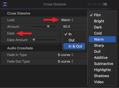
FIGURE 7.7 A composite image of options available for a cross-dissolve transition.
As well, when you add, say, Warm, you can adjust the Amount to set how “warm” it will be.
You can also adjust acceleration “ease” during the transition. This won’t make a difference in dissolves less than two seconds, but for longer ones, you can control how it starts (Ease Out) and how it ends (Ease In). This is subtle, but it’s easier to see during playback than write about.
365 Create a New Default Transition
Cmd+T is the shortcut; choosing the transition is up to you.
The default transition is a cross-dissolve (shortcut: Cmd+T). However, you can change the default to a different transition; see FIGURE 7.8.
Right-click the transition you want to make the new default in the Transitions browser.
Choose Make Default.
The next time you press Cmd+T, this will be the transition that is applied.
To reset the default, choose Dissolves and right-click Cross-Dissolve.

FIGURE 7.8 Right-click any transition in the Transitions browser to set it to the default.
366 Flow Minimizes Jump Cuts
Flow blends video to make jump cuts disappear.
A jump cut is an unjustified “jump” in video caused by editing two similar clips together. In the past, jump cuts were anathema. But now, they’re all over YouTube, which I guess says something right there.
To me, a jump cut says “Really bad editing done here!” They are lazy edits (and, perhaps, lazy production). Instead of finding a way to cover the edit point with B-roll, or a different shot, the editor simply slices a clip and lets the jumps fall where they may. (Then again, maybe I’m just old-fashioned.)
Flow blends edges at the edit point to minimize jump cuts.
Flow is a transition in Final Cut that seeks to minimize the visual stutter of a jump cut. It uses optical flow technology to seamlessly blend two clips so a jump cut disappears. If you haven’t changed the Transition duration in Preferences > Editing, the Flow duration is four frames. If you have, it will be either the duration you specify or 15 frames, whichever is less. With this transition, shorter is better. I recommend four to six frames.
To apply it, drag Flow from the Dissolves category to the edit point.
Note
Flow does not work with generators or dissimilar still images.
367 Here’s What Those Yellow Dots Mean
These transitions combine multiple images into one movement.
There are a few transitions, Pan Far Right and Pan Down being two, that, when you edit them into the timeline, display yellow dots; see FIGURE 7.9. What are these things?

FIGURE 7.9 The yellow dots determine which frames appear in a multi-image transition like Pan Far Right.
I call these yellow dots “placeholder drop zones.”
In the case of Pan Far Right, as you move through the transition, in addition to the two clips for the up-front dissolve, there are six other images that appear in the background. The images in those clips are still frames based on where the yellow dots are located.
Drag a dot horizontally to reposition it, though you can’t move a dot to a clip on a different layer. You can, however, move a dot to the other side of the transition. You can also put two or more dots in the same clip.
368 Modify Transitions Using Motion
All effects in Final Cut Pro are created using either Motion or FXPlug, a software development kit that specializes in creating plug-ins for Final Cut. Because of this, you can customize almost all existing transitions in Motion to meet specific needs.
Open any transition into Motion for modification.
Note
Apple Motion is purchased separately and available in the Mac App Store.
To move a transition from FCP to Motion, right-click the transition in the Transitions browser and select Open a Copy in Motion; see FIGURE 7.10. (Apple requires modifying copies to prevent damage to the original transition.)

FIGURE 7.10 Modify almost every FCP transition in Motion by right-clicking it in the Transitions browser.
Save the modified copy in Motion to automatically bring the customized effect back to Final Cut in the same category as the original.
369 Create or Delete Custom Transitions
The process is the same as creating custom titles.
You can create custom transitions using Apple Motion.
To create a custom transition:
In the Motion Project browser, select Final Cut Transition.
Define the project specs in the top-right corner.
The Motion project that opens will be preset for a cross-dissolve.
To delete a custom transition, whether created or modified:
Right-click it and select Reveal in Finder.
Read Tip 392, Remove a Custom Title (or Transition), for the next steps.
Titles & Text
Unlike captions that can be turned on or off, titles and other text are permanently “burned” into the image. However, the good news is that there is a vast array of ways to customize how these titles look, as well as animations you can apply.
370 Larry’s “10 Rules for Titles”
Video is a low-resolution image. Adjust your text accordingly.
Before we tackle how to create text, let’s take a minute to think about using text. Video, even 4K, is low-resolution compared to print. Even more challenging, many viewers are distracted and not paying full attention to the video. So when adding text to video, you need to give the audience time to read what you put on the screen.
Readability is everything. If the audience can’t read the text, you’ve wasted the message.
Always add a drop shadow to text you want the audience to read, except if it is over black.
When creating text you want the audience to read, be sure the text contrasts in shape, texture, color, and grayscale from the background. Some in your audience may be color-blind.
Hold text onscreen long enough for you to read it aloud twice. (If you are using really fanciful or script fonts, hold it onscreen even longer.)
Given the same amount of screen time, horizontal text is more readable than text at an angle or vertical.
Don’t make your text too small. In general, for HD video, avoid point sizes smaller than 22 points. For SD video, avoid point sizes smaller than 26 points. Slightly larger is better.
Avoid fonts with very thin bars or serifs, unless they are scaled large.
Avoid highly “designed” or fanciful fonts, unless they are scaled large.
When creating projects for broadcast, cable, streaming media, or digital cinema, use the video scopes to verify that font colors are not excessively saturated and that white levels do not exceed 100%.
When creating projects for broadcast, cable, streaming media, or digital cinema, keep all text inside the Title Safe zone (the inner rectangle). When creating projects for the web, keep text inside the Action Safe zone (the outer rectangle). Even today, not all displays show the entire image. (See Tip 103, Display Action Safe and Title Safe Zones.)
Text readability is everything.
371 Fonts Wrap Text with Emotion
Fonts convey a lot by how they look, as well as what they say.
Books are written about typefaces. Let me provide some tips to help you use fonts better. Like all things fashionable, fonts fall into and out of favor (witness Comic Sans).
Every typeface is carefully designed to evoke a specific style or feeling. These looks convey emotion just as much as, or more than, the message written with the text. Be sure that the emotional message matches the emotion of your project; see FIGURE 7.11.
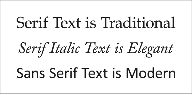
FIGURE 7.11 Examples of different font styles: Palatino Roman (top), Adobe Caslon Pro Italic (middle), and Calibri Regular (bottom). Sans serif fonts are easier to read onscreen.
The two most important font categories are serif and sans serif. Serif fonts have little “feet” at the bottom of the letters. It is a traditional font, designed to make reading books easier. The italic weight of serif fonts is elegant and graceful. Sans serif fonts don’t have the feet. They are also much more readable onscreen. For most of your projects, consider using sans serif fonts. There are hundreds to choose from.
372 Preview a Title
Preview a title before you use it.
To preview a title in the Titles browser, hover your mouse over the Title icon, then wait a couple of seconds for Final Cut to load it. As you drag your mouse across the title, it will preview, including any animation, in the Viewer.
373 Add a Title to the Timeline
With dozens to choose from, adding a title is easy. Picking is hard.
Final Cut includes dozens of titles, most of which are animated, for use in your projects. Be careful with animation; don’t let your story get overwhelmed by text that’s too busy.
To add a title to the timeline, double-click its icon in the Titles browser.
To add a title to the timeline, open the Titles browser by clicking its icon; see FIGURE 7.12 (shortcut: Option+Cmd+1). Titles are always added at the position of the playhead (skimmer) in the lowest available layer:
Drag the title icon into the timeline.
Or—select its icon and press Q.
Or—double-click its icon.
To search for a title, enter some or all of its name in the search box of the Titles browser.
To remove a title from the timeline, select it and press Delete.

FIGURE 7.12 The Titles browser.
374 Modify a Title
There are four principal ways to modify a title.
A title clip behaves just like any other clip in the timeline. You can adjust its position, change its duration, and add transitions just like any other clip. When it comes to the text itself, there are four ways to modify a title: Position, Content, Format, and Animation.
Position. Change the position of the clip by selecting the clip in the timeline; then drag either the white circle or the white box that appears in the Viewer to a new location; see FIGURE 7.13.

FIGURE 7.13 Drag the white circle (or, sometimes, a white box) in the Viewer to reposition text onscreen.
Content. To change the content of a clip, select the clip in the timeline; then double-click the text that appears in the Viewer.
Format. To change the format of the text, select the clip in the timeline; then open one of two Inspectors that control text (see FIGURE 7.14): Text Formatting (top-left arrow) and Text Animation (the Inspector to its left).

FIGURE 7.14 This is the top half of the Text Inspector (blue icon). Change the onscreen text using the Text field (bottom red arrow) or format the text using these Basic settings.
Formatting text is similar to other applications with two hidden tricks:
When you reach the limit of a slider (±100 points in the case of Line Spacing), extend the setting by entering a number in the size field (–130 in the screen shot).
Press the Option key and click in the slider track to move it in one-unit increments. This provides precise control over changes.
Animation. Animation options are controlled by the Text Animation inspector, the icon to the left of the Text Formatting inspector (top-left red arrow).
Note
You can also change the value of a numeric field by placing the cursor in the numeric field and dragging up or down.
375 Modify Text Position More Precisely
Dragging is easy, but the Inspector provides more precise options.
The really fun options for text are lower in the Text Inspector; see FIGURE 7.15. Click and drag any number to change it.
Position. This provides numerical precision over placement of the selected text onscreen. All text lives in 3D space, even though Final Cut does not yet take full advantage of it. (“Z” refers to moving the text to or from your eye, as represented by the surface of your monitor.)
Rotation. Rotating text on the y-axis is one of my favorite ways to add depth to text.
Scale. Stretch the text along the x- or y-axis. (The z-axis makes no visible change.)

FIGURE 7.15 The text position and formatting controls in the Text Inspector provide much greater flexibility and control than dragging the text onscreen.
The lower five options are discussed in Tip 378, Format How Titles Look.
376 A Simple Way to Add Depth to Text
Rotate text on the y-axis to add the illusion of depth.
Although Final Cut does not support 3D rotation of objects, it does support 3D rotation of text. This provides an easy way to create the illusion of depth—rotate the text on either the x- or y-axis.
Add depth by rotating text on the y-axis.
In FIGURE 7.16, the text was rotated 55° on the y-axis, while both its vertical and horizontal positions were adjusted using the Text Position settings. However, text rotation in Final Cut can’t be keyframed, meaning the rotation can’t be animated.

FIGURE 7.16 Rotating text on the y-axis is a good way to simulate depth.
Note
Text can be fully rotated and animated in Apple Motion, then saved as a custom text template for Final Cut Pro.
377 Add Cast Shadows to Text
Just change one setting.
Cast shadows, like those created in bright sunlight, can be added to any clip. However, they work best for text; see FIGURE 7.17.
Select the text clip.
Choose Effects browser > Stylize > Drop Shadow. (Effects are illustrated in Chapter 8.)
In the Video Inspector, change the drop shadow setting from Classic Drop Shadow to Perspective Back.
Use the onscreen controls to adjust the shadow position and settings.

FIGURE 7.17 Add cast shadows to text, then adjust the position and angle onscreen.
378 Format How Titles Look
These four formatting groups change the color and look of text.
As shown in Figure 7.15, four groups of settings control the color of the text in a title: Face, Outline, Glow, and Drop Shadow. (I’ll talk about 3D separately.) I’m a big fan of drop shadows. Although there’s a trend today that says drop shadows are passé, personally I think they significantly improve text readability.
Face. This determines the color of the main portion of text. Click the color chip (see Tip 380, Pick Your Color Picker) to open the Mac color picker. A useful trick is to click the eyedropper, then click a color in the image to apply that color to your text; see FIGURE 7.18.
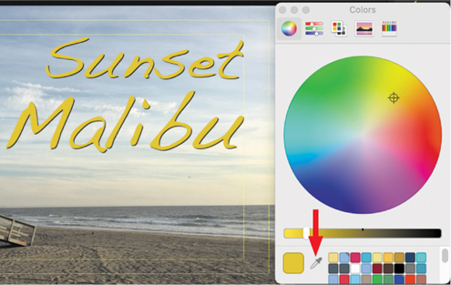
FIGURE 7.18 Use the eyedropper tool to select an onscreen color to apply to the selected text.
Outline and Glow. I’m not a big fan of outlines or glows. But they are available should you wish.
Drop shadow. Drop shadows add critical readability to all video text. Why? FIGURE 7.19 illustrates how adding a drop shadow makes even hard-to-read text stand out onscreen. The color of the text matched the background; it was not changed between the two images. My custom drop shadow settings are illustrated at the bottom. (You don’t need to use drop shadows when text is placed over a black background.)
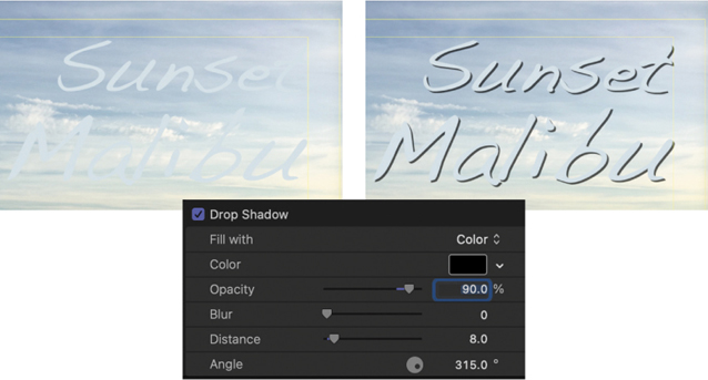
FIGURE 7.19 Even though the text color matches the background in both examples, adding a drop shadow vastly improves readability. The bottom image shows the settings applied to the text. (I will also frequently add 4–10 points of Blur.)
Always add drop shadows to all onscreen text that isn’t black.
379 Fonts Don’t Need to Be White
All fonts are a solid color—white. Change it by adding a gradient.
By default, all text in Final Cut is solid and white. Boring. Instead, replace that solid color with a gradient, then change the colors of the gradient; see FIGURE 7.20.
Select the text you want to modify in either the Inspector or the Viewer.
In the Text Inspector, scroll down and show Face.
Change Fill with to Gradient.
Twirl the arrow next to Gradient (upper red arrow) to reveal the gradient color picker.
The top white bar represents opacity over time. Generally, leave that alone.
Click one of the color squares below it to select it (lower red arrow).
Click either the color chip or the arrow next to the color chip to display a color picker.
To add another color to the gradient, click once in the thin horizontal color bar.
Drag a color square left or right to change where the colors transition.
FIGURE 7.20 Text with a gradient applied. Settings used are shown below the image.
Note
Replicate a color square in the color picker by Option-dragging it. Delete a color square by dragging it off the bar.
380 Pick Your Color Picker
Final Cut offers two different color pickers.
Whenever you see a color picker in Final Cut, there are two options to choose from, depending upon where you click; see FIGURE 7.21. They both do the same thing—just in different ways. I like the Mac color picker because it can save colors using the chips at the bottom, and it looks like the Vectorscope.
If you click the color chip itself, the traditional Mac color picker appears.
If you click the small chevron to the right, the Motion color picker appears.

FIGURE 7.21 Click the color chip (left arrow) and the Mac color picker appears (left). Click the chevron and the Motion color picker appears.
381 Kerning Improves Large Text Titles
Kerning adjusts the space between two selected letters.
Most of the time, the spacing between letters in a text clip is fine. However, when you create a large title, especially with a serif font, letter spacing can often use some help.
Kerning to the rescue. Kerning adjusts the space between a pair of letters. The top image in FIGURE 7.22 shows text with a wider apparent space between the A and w than between the other letters. This is caused by how letter spacing is calculated on computers.

FIGURE 7.22 Kerning adjusts the space between a pair of letters.
To adjust this spacing:
Select the title clip in the timeline.
In the Viewer, click between the pair of letters you want to adjust so that a white bar appears between them.
Press Option+Cmd+[ to tighten spacing.
Press Option+Cmd+] to loosen spacing.
Adjust until the spacing “looks right.”
Final Cut has two default titles. Change them to something more useful.
382 Change the Default Titles
Final Cut has two default titles. Change them.
Final Cut has two default titles: Basic Title and Basic Lower Third. Neither has any animation, and both are boring. The only advantage to using these is that they are applied with a keyboard shortcut. Titles added using a keyboard shortcut always appear in the timeline on the highest layer at the position of the playhead (skimmer).
However, see FIGURE 7.23, you can change these defaults.
Right-click the icon of the title you want to make a default.
Choose whether to make it a default title or lower third.
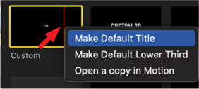
FIGURE 7.23 Assign the two titles you use the most to one of these two defaults. Select from any title, including custom titles.
Here’s the secret. This choice doesn’t matter! All you are doing is assigning a keyboard shortcut to a specific title. I assigned both these shortcuts to two different lower-third titles that I use constantly when editing my webinars.
383 Review Timeline Titles Quickly
The Timeline Index is a great help in reviewing titles quickly.
You’re ready to export the final project, just as soon as you review your titles one last time. You know, just to make sure there are no typos. Except, given the size of your project, how can you be sure you found them all? The Timeline Index to the rescue!
Open the Timeline Index (shortcut: Shift+Cmd+2); see FIGURE 7.24.
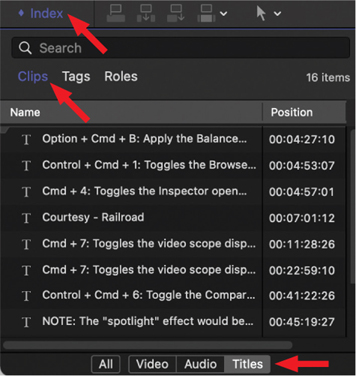
FIGURE 7.24 Choose Timeline Index > Clips > Titles to quickly review all titles in a project.
Click the Clips text button at the top.
Click the Titles button at the bottom.
Starting at the top of the list, either click each title or use the Up/Down arrow keys to move through the list.
When a title is selected in the Index, FCP jumps the playhead to the start of the title in the timeline and displays it in the Viewer.
If you need to make text changes, select the title in the Viewer and change what needs changing.
The fastest way to review titles is to use the Up/Down arrows in the Timeline Index.
384 There’s a Hidden Shortcut for Titles
This shortcut helps find and replace text.
Final Cut has a shortcut to find and replace title text. Except it isn’t assigned to any key. To create your own shortcut:
Choose Final Cut Pro > Commands > Customize.
Search for “title text.”
“Find and Replace Title Text” appears in the Command panel.
Assign a keyboard shortcut (I used Control+F) and click Save.
After creating this shortcut (in my example, Control+F), press it, and the Find and Replace Text window appears; see FIGURE 7.25.

FIGURE 7.25 The Find and Replace Title Text window.
Select settings that determine how to replace text: in all titles in the project or just in the selected title. Other options are similar to using a word processor.
385 Add Emojis to Titles
I’m probably opening Pandora’s box here, but emojis can be titles.
All emojis are simply text wearing costumes. Adding emojis to a title is easy:
Place your cursor in a text clip where you want to add an emoji.
Press Control+Cmd+spacebar to display the Character Viewer, which contains emojis and lots of other interesting characters.
Double-click any emoji icon to add it to the title.
But why stop there? Resize them.
Just as with text, select an emoji and then adjust its size in the Text Inspector by choosing Font Size.
Just what I was looking for…a 500-point drunken sun! (See FIGURE 7.26.)
Select any emoji in the Character Viewer to see variations of it in the Font Variation panel on the right side.

FIGURE 7.26 Yes, even you can add a drunken sun to your next project.
All emojis are simply text wearing costumes.
386 Many Titles Include Animation
Turn animation on or off with a single switch.
Many titles, especially lower-thirds, include animation to bring them on or off the screen. Even easier, there are no settings to adjust. The animation is on by default, but you can change that.
Add a title to the timeline, then select it.
Go to the Text Animation Inspector (top red arrow). See FIGURE 7.27.
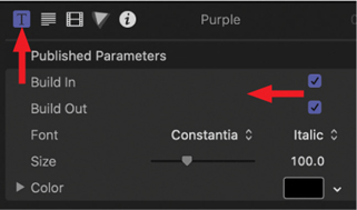
FIGURE 7.27 Title animation is controlled from the Text Animation Inspector (top-left arrow). Build In enables opening animation. Build Out enables closing animation.
By default, animation is on.
Deselect Build In to disable the animation at the start of a clip.
Deselect Build Out to disable the animation at the end of a clip.
Change these settings at any time.
387 Access More Complex Animation
Several titles also include very complex animation.
Animation gets very old very fast, unless it is really well done. When you use animation, use it sparingly. At the beginning of this section, I recommended you use one of the Custom titles; see FIGURE 7.28. Here’s why.
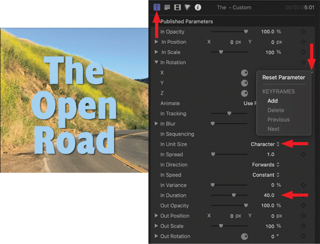
FIGURE 7.28 The Custom title includes extensive animation options, adjusted using the Title Animation Inspector.
Search for and edit the Custom title into the timeline, then select it. Open the Title Inspector (top-left arrow). Yup, that’s a lot of animation controls! Explaining all these settings would take pages. Here are the highlights:
Parameters starting with “In” affect opening animation.
Parameters starting with “Out” affect closing animation.
All parameter settings determine the amount of change. For example, when In Opacity is set to any value other than 100%, the text will fade in starting with that percentage. Try 0% and watch what happens.
In Duration determines, in frames, how long the opening animation will take (bottom red arrow).
In Unit size determines whether animation is by letter, word, or the entire block of text.
To reset a parameter, click the small down-pointing chevron and choose Reset Parameter.
Play with this to see what it can do. Feel free to change multiple settings. This is a very flexible and fun title.
388 3D Text Is Just Like 2D—Almost
Except, ah, it has depth! And textures. And lighting.
One of the exciting text features in Final Cut is 3D text. In truth, 3D text is just like 2D except for three areas: depth, textures, and lighting. From a text selection, formatting, and editing point of view, 3D is the same as 2D. This makes working with it easy.
A variety of 3D text templates are in the Titles browser. For the same reasons I recommend using Custom for 2D text, I recommend Custom 3D now. Apply the title the same way as 2D: double-click the text icon to edit it into the timeline at the position of the playhead (skimmer).
Final Cut Pro offers three unique settings for 3D text: Depth, Textures, and Lighting.
When you first look at this 3D title, it isn’t that impressive. The font is thin, the depth is more like a drop shadow, and the overall impression is disappointing. Not to worry, there is a lot to work with here.
Select the clip in the timeline.
Change the font to Impact, 225 points.
Rotate the image 45° or so on the y-axis so the edges and sides are more visible.
Notice that the lighting changes as you rotate the text.
In the 3D Text category further down the Inspector, increase Depth to 60; see FIGURE 7.29.
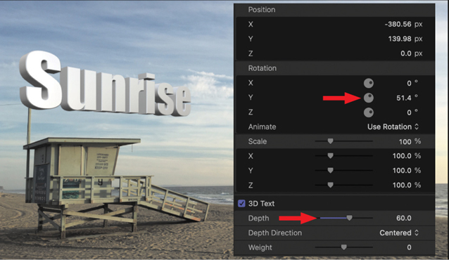
FIGURE 7.29 3D text has depth. In fact, the text can rotate to reveal different textures for the side and back, which you can’t do with 2D text.
389 3D Textures Provide Stunning Versatility
Apply different textures to the front, side, back, and all edges.
With 2D text, you can apply one color or a gradient. With 3D text, you can get all dressed up and ready for a night out. Unlike 2D text, which has only one side (front), 3D text has three sides and two edges: front, front edge, side, back, and back edge. As an example, scroll down the Text Inspector to the Material section; see FIGURE 7.30.
Single. Whatever texture you pick is applied to all five surfaces.
Multiple. This menu provides separate texture options for each surface. Personally, I like something shiny for edges because it adds sparkle. I selected the front texture to pick up the sand color from the beach. The side texture was chosen because its color complemented the brown sand.

FIGURE 7.30 Textures applied to 3D text. Notice how the textures reinforce the lighting and overall tone of the image. The front corner edge is shiny to emphasize the depth of the letters.
There are 11 texture categories to choose from, containing almost 100 different textures. This provides a great range of options to play with. There are no “right” answers, only those that look good with your project.
390 Lighting 3D Text
Lots of options with eye-popping results.
3D text is exciting because of its depth and the variety of textures available for each surface. But the real excitement comes when you start to play with lighting. Although Motion contains far more lighting and lighting animation options than Final Cut, there are still several adjustments you can make.
Just above Materials is Lighting; see FIGURE 7.31.
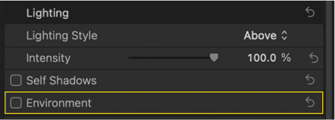
FIGURE 7.31 Lighting is controlled in this section. Click the Lighting Style menu to reveal presets. Deselect Environment to add more drama to your light (above).
Click Show to see the contents.
Click the Lighting Style menu (“Standard”) to reveal 11 lighting presets. (See FIGURE 7.32.)

FIGURE 7.32 These eleven presets change lighting position and emphasis. While they can’t be animated in FCP, they can in Motion (left).
As an example, FIGURE 7.33 shows the text lit using the Above setting.

FIGURE 7.33 “Above” is applied as a lighting effect to the text. I changed the side material to Thick Plaster to show more texture with this angle of light (above).
Check Self-Shadows for each letter to cast shadows on the text next to it. I generally decrease Opacity and increase Softness.
Deselect Environment to turn off the general-purpose lighting that all 3D text is lit with.
Select Environment and change Type to Colorful. I like the party atmosphere of this lighting effect.
Choose Adjust Environment > Rotation to change the colors.
Continue playing until it’s time for dinner.
391 Modify Any Title in Motion
Modify an existing title to create your own custom version.
As with transitions, Motion can modify any title. Right-click any title icon to open a copy in Motion. (As with transitions, you modify only copies—you can’t change the original.)
When you are done modifying, save it in Motion, and it will appear in the Titles browser next to the original, as illustrated in FIGURE 7.34. This is exactly what I did to create the large “Custom Title” shown in Figure 7.34.
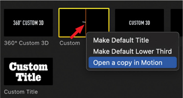
FIGURE 7.34 Right-click a title icon to open a copy in Motion for customizing.
392 Remove a Custom Title (or Transition)
Removing a custom title is easy but takes a few steps.
To remove a custom title or transition, right-click it in the Titles (or Transitions) browser (see FIGURE 7.35), then choose Reveal in Finder.

FIGURE 7.35 Right-click a custom title and choose Reveal in Finder.
Note
Once you locate an effect in the Finder, you may get more reliable results if you quit Final Cut before deleting the folder containing the effect.
Here’s the tricky step. You can’t just remove the elements of the title; you need to remove the folder that contains them.
Right-click the name of the effect in the top left of the Finder window (red arrow); see FIGURE 7.36.

FIGURE 7.36 Right-click the name at the top of the Finder window and select the next level down. (Your path list will look different from mine.)
Choose the next level down in the list.
In the folder that opens, delete the folder that’s named after your custom effect.
In my case, I’m deleting the Custom Copy folder; see FIGURE 7.37. Most of the time, this effect will disappear in Final Cut. If it doesn’t, quit and relaunch Final Cut.
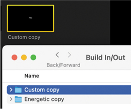
FIGURE 7.37 Delete the folder with the name of the custom title you want to delete.
Generators
Generators are computer-generated media. They range from full-screen animated backgrounds to very specific effects. They are unique to Final Cut and can provide interesting looks to many different projects.
393 What’s a Generator?
Generators are adjustable computer-generated media.
Generators were originally created in Motion, then migrated to Final Cut. Each of these is computer-generated and can assume any frame size, frame rate, or duration. Use them whenever you need an animated background. Some are pretty tacky, but others are very useful.
Generators are adjustable computer-generated media that are compatible with any project.
Generators share the same browser with titles (shortcut: Option+Cmd+1). There are five default categories: 360°, Backgrounds, Elements, Solids, and Textures; see FIGURE 7.38.

FIGURE 7.38 The Generators browser.
As you might expect, hundreds of third-party generators are available. As you might not expect, you can also create your own generators in Motion. I use generators whenever I need to create a background for an infographic.
394 Generator Backgrounds
Backgrounds are full screen, animated, and flexible.
Backgrounds (see FIGURE 7.39) are full-screen, generated media. What that means is that they will fit any frame size, any frame rate, or any duration you need.
Some, like Organic, have no formatting options at all.
Others, like Collage, allow you to disable the animation.
Others, like Drifting, Clouds, and Underwater, have a wide variety of formatting options.
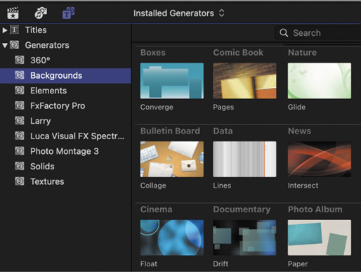
FIGURE 7.39 This composite image illustrates the variety of generator backgrounds available in Final Cut Pro, most of which are animated.
Edit a generator to the timeline like any other Browser clip. Select it in the timeline, then look in the Generator Inspector for animation and format options.
Although I wish that Apple provided more darker backgrounds to make text easier to read, I use Generators—or modifications of them—in many projects as animated backgrounds for infographics. As well, because generators are so easy to create, you’ll find hundreds of additional options available from third-party developers.
395 Generator Elements
Specific video for specific needs.
Four generators are in the Element category; see FIGURE 7.40. After editing an element to the timeline, select it, and then look at the options in the Generator inspector.
Counting. This creates a countdown or count-up. If the Start number is smaller than the End, the video counts up. If the End is smaller, it counts down. Format controls include font, size, color, and numeric format. Number formats include numbers, currency, percentages, and spelled-out words.
Placeholder. This creates “storyboard-like” still images where you can specify framing, number of people in the shot, and their gender, background, and sky. The placeholder can switch between interior and exterior.
Shapes. This generates 12 shapes: circle, rectangle, star, arrow, and so on. You can change the size, color, border, and drop shadow.
Timecode. This, to me, is the most useful. Use this generator to burn labels and timecode into clips or projects. (See Tip 396, How to Burn Timecode into a Project.)
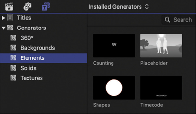
FIGURE 7.40 Generator elements create video for specific needs.
396 How to Burn Timecode into a Project
“Burning” timecode records the project timecode into video.
Although online project review is growing in popularity, there’s often a need to send a client a video and ask for comments. For them to provide comments that make sense, you also need to also supply a time reference with the video. The easiest and best way to do this is to add, or “burn,” timecode into the video; see FIGURE 7.41.
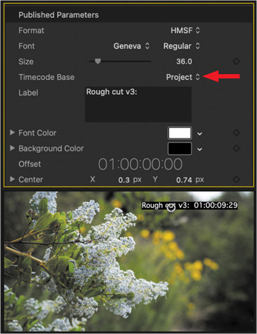
FIGURE 7.41 The settings (top) that created the “burned-in” timecode effect (bottom).
Creating this effect is easy:
Drag the Timecode generator onto a layer above all timeline clips.
Stretch its duration so it spans the full length of your project.
Select the Timecode clip.
Drag the white circle in the Viewer and move the timecode display to a corner (I prefer the upper right) or a lower edge. Keep it inside Action Safe.
Go to the Generator Inspector and modify the settings as you see fit.
I generally set the font size to 36 point, as 48 feels too big. Be sure Timecode Base is set to Project. Change the label as you see fit.
When you export the project, the timecode will be permanently burned into the video.
To remove this effect, just delete the timecode clip from the timeline. You can also press V to make it temporarily invisible.
397 Generator Solids
Solids are adjustable, solid, unanimated colors.
Generator solids, see FIGURE 7.42, are exactly that: a solid color. They are not animated, but the colors can be modified. Each comes with a menu of color selections.

FIGURE 7.42 The Custom solid is the most flexible, but all Solids provide useful color options in the Generator Inspector.
The most flexible is Custom, because you can select any color you want, but two others I find useful are Whites and Grey Scale.
398 Generator Textures
Textures are the most fun of all the generators.
I really like textures! So much computer-generated video is smooth, “plastic,” and artificial, because it’s so perfect. Textures totally mess with that, especially when you start playing with blend modes, which I’ll do in the next two tips.
Each texture (see FIGURE 7.43) has about a dozen image options in the Generator Inspector, so there’s plenty of variety to choose from. Clearly, one use is for backgrounds for infographics. However, like solids, textures are not animated. Backgrounds would be a better choice simply because they contain animation.

FIGURE 7.43 Each texture includes multiple image options, which are selected in the Generator Inspector.
399 Modify the Default Generator
Just as with transitions, you can set a default generator.
Titles, transitions, and generators all support setting a default. To do this for generators, right-click a specific generator (see FIGURE 7.44) and select Make Default Generator.
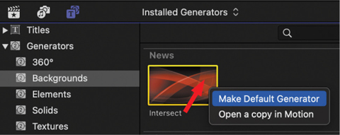
FIGURE 7.44 Right-click a generator icon to change it to the default generator.
The keyboard shortcut to add the default generator at the position of the timeline playhead (skimmer) is Option+Cmd+W.
400 Add Texture to Text
Use blend modes and generators to add texture to text.
Normally, text has a flat surface. But as you can see in FIGURE 7.45, you can easily add texture using a generator and blend mode. Here’s how:
Edit the Stone texture into the timeline (lower-left image) and select the clip.
In the Generator Inspector, change the Stone Type to Slate.
Edit a text clip above the texture. (I used Custom.)
Change the font and point size as needed. (I used Bradley Hand at 450 point, rotated 20°.)
Change the color to anything except white. (I used black.)
In the Video Inspector (lower-right image), change the blend mode to Overlay.

FIGURE 7.45 Generator textures combined with blend modes can add texture to text. Use this effect with any two clips, though it works really well with text.
Ta-dah! It looks like the text was sprayed on the stone. There are infinite variations on this.
401 Put Video Inside Text
This is another example of the power of blend modes.
Here, you’ll put a texture (or video) inside text; see FIGURE 7.46:
Edit a texture into the timeline. (I used Metal.)
Change the Metal Type to Frosted Chevrons, or whatever you want.
Edit a text clip above the texture; see the lower image.
Change the text format as you see fit. I used Giza and 400 points.
Select the text clip.
In the Video Inspector, change Blend Mode to Stencil Alpha.
Ta-dah, um, again! This effect, too, is used endlessly these days.
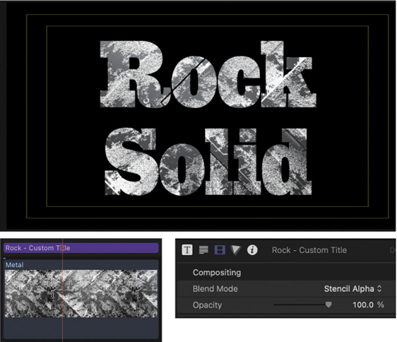
FIGURE 7.46 Use Blend Mode: Stencil Alpha to put the lower clip into the upper clip. This works best with text or any item with an alpha channel.
402 Put Video Inside Text Over Video
This combines several tips to create an interesting effect.
This should probably go in Chapter 8, “Visual Effects,” but since we are discussing textures, text, and blend modes, here’s one more. This puts video inside a text clip, then puts that effect over a background video.
This is a three-layer effect using blend modes and a compound clip; see FIGURE 7.47:
Put the background video in the Primary Storyline.
Above that, put the video you want to put inside the text.
Above that, put the text, formatted as you want.
I’m using Cracked at 500 points.
Select the text clip and change the blend mode to Stencil Alpha.
Select both the middle video and the text clip and convert them to a compound clip (shortcut: Option+G).
The video now appears inside the text, on top of the background video.

FIGURE 7.47 Video inside text over video. This uses the Intersect generator and a Stencil Alpha blend mode applied to the text; then combined into a compound clip to add it to the background.
Chapter 7—Transitions & Titles Shortcuts
CATEGORY | SHORTCUT | WHAT IT DOES |
|---|---|---|
Transitions | Control+Cmd+5 Cmd+T Control+D | Open the Transitions browser Apply the default transition to edit point Change duration for selected transition(s), titles, generators, and clips |
Titles | Option+Cmd+1 Control+T Shift+Control+T Option+Cmd+[ Option+Cmd+] Shift+Cmd+2 | Open the Titles browser Add default title at playhead Add default lower-third title at playhead Kern the spacing tighter between two letters Kern the spacing looser between two letters Toggle the Timeline Index open or closed |
Generators | Option+Cmd+1 Option+Cmd+W V Option-click | Open the Generators browser Add default generator at playhead (skimmer) Toggle visibility for selected clip(s) on or off Constrain a slider to move in 1-unit increments (applies to most effects) |
Chapter Wrap
Like all effects, the operative phrase is “Less is more.” The fewer transitions and generators in your video, the more powerful each use of them becomes. Don’t let the effects get in the way of telling your story. All too often, they do.
The rule is different for text. So many videos today are viewed without listening to the audio that text must get your message across even when the audio is turned off. This also means to hold titles onscreen long enough for most viewers to read them. Remember, they only get to see your program once.