Chapter 5
Working with Type in Edge Animate
“Letterforms that honor and elucidate what humans see and say deserve to be honored in their turn. Well-chosen words deserve well-chosen letters; these in their turn deserve to be set with affection, intelligence, knowledge and skill. Typography is a link, and it ought, as a matter of honor, courtesy and pure delight, to be as strong as the others in the chain.” Robert Bringhurst
This quote from Bringhurst’s masterwork, The Elements of Typographic Style (second edition, Hartley and Marks, 2002), sums up the essence of type use in Adobe Edge Animate. The words we put on the Stage and subsequently put into motion are usually well chosen. They have to be, because they are the communication messengers, providing the user with access to understand the message you are trying to communicate. This chapter will focus on using type to do just that. The problem with type on the Web is that typography wasn’t in the equation. Still, when it comes to using type on the Web, things are changing for the better.
Here is what we will cover in this chapter:
- A brief typography primer
- Adding text in Adobe Edge Animate
- Formatting text
- Adding and using drop shadows
- Clipping text
- Using web fonts in Adobe Edge Animate
If you haven’t already downloaded the chapter files, they can be found at http://www.apress.com/9781430243502. In this chapter, we will be using these files:
![]()
Autumn.an
![]()
Quote.rtf
![]()
Shadow.an
![]()
Clipping.an
![]()
TypeKit.an
![]()
GoogleFont.an
![]()
AdobeWebFont.an
Fonts and Typefaces
Before we explain the difference between a font and a typeface, let’s get really clear on one point: type is not that gray stuff that fits around your “whizzy” Adobe Edge Animate animations. It is your primary communications tool.
Reading is hard-wired into us. If it were not, you wouldn’t be looking at this sentence and assimilating it in your brain. You have a need for information, and words are how you get it. The thing is, the choice of font and how you present the text not only affect the message, but they also affect the information presented. You can see this in Figure 5-1. The phrase “Edge is cool” takes on a different meaning in each instance of the phrase. Using the same Times New Roman typeface, but with the bold and italic variants, the message “changes,” depending on the style applied.
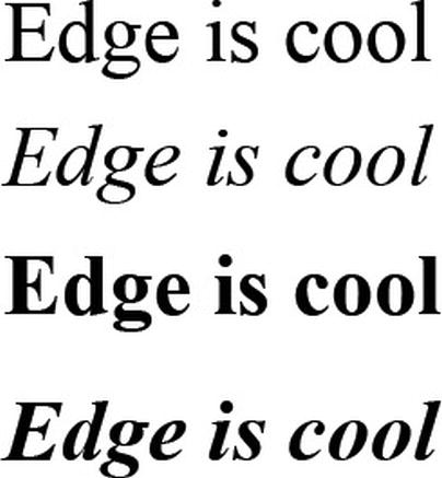
Figure 5-1. It is all about the message.
You can take this to the next level and see that not only variants but also the typeface itself have an effect on the message. Figure 5-2 shows five examples of the same information presented using different typefaces. You can see how the message changes even more dramatically.
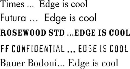
Figure 5-2. It is all about the message and the typeface chosen.
When choosing your fonts, you also have to be aware of their impact on readability and legibility. Both are achieved by an acute awareness of the qualities and attributes that make type readable. These attributes would include the typeface, the size, the color, and so on.
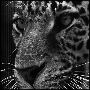
To illustrate this point, take a look at a small exercise one of the authors uses in his classes. What word is shown in Figure 5-3? Don’t be too hasty to say “legibility.” What are the sixth, seventh, eighth, and ninth characters? What letters are the first and second letters? Suddenly things become a bit disorienting.
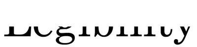
Figure 5-3. What word is this?
This disorientation is important for you to understand. Our visual clue to legibility and readability, as shown in Figure 5-4, is the flow along the tops of the letters. This is why text that consists of all capital letters is usually so hard to read.
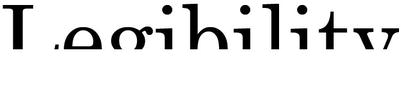
Figure 5-4. We get our clues to letterforms from the tops of the letters.
We include this exercise because there is a huge temptation on the part of people new to Adobe Edge Animate to prove they’re one of the “cool kids” and use font and color combinations that make otherwise legible text impossible to read. A good example of this is Figure 5-5. The word is set in a medium gray color on a dark gray background, and the size of the text is 10 pixels. The text is very difficult to read, and yet somehow the “cool kids” think this is some sweet action. Wrong! They just killed all access to the information contained in the text.
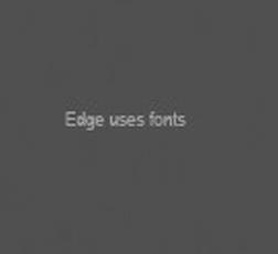
Figure 5-5. It is all about the message and the font chosen.
Figure 5-6 goes in the opposite direction. Type, even in signage, is used as a clear communication vehicle for the message.
Although paying attention to design is critical, from a type perspective, font-rendering technology in Edge Animate makes the use of a wide variety of fonts in your Animate projects a definite reality. In many respects, the ability to import fonts into Edge Animate gives you the opportunity to give those “well-chosen words” those “well-chosen letters” using the characters from a world of font choices rather than relying on the usual list of web-safe fonts. The ability to animate those well-chosen letters also gives you the ability to draw the viewer’s attention to the message.
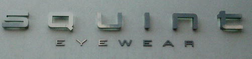
Figure 5-6. The message comes through loud and clear.
Adding Text
In 2003, the noted Japanese designer Kenya Hara produced a series of stunning ads for his company, Muji. These ads contained nothing more than a photo of a horizon and the company name. In his 2007 book, Designing Design (Lars Muller Publishers), Kenya explains the concept: “The 2003 campaign uses photographs of the horizon as an empty vessel of epic proportions.” Although we can’t hope to even come close to Kenya’s accomplishment, the following exercise uses his concept of “emptiness” and a single word to convey the message. Let’s get started:
- Open the
Autumn.anfile located in yourExercisefolder. What you are looking at, as shown in Figure 5-7, is an autumn scene of the Niagara escarpment in southern Ontario.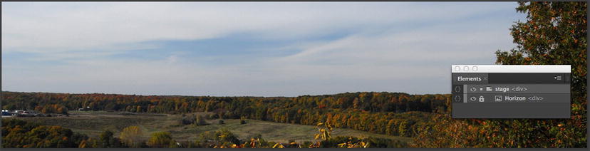
Figure 5-7. We start with a simple horizon element.
- Select the
Texttool and click once on the Stage. Enter the wordAutumn. You will notice that the text entry in Adobe Edge Animate is quite different from what you may be used to. The word, as shown in Figure 5-8, appears in a box and also on the Stage.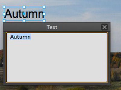
Figure 5-8. Adding text to an Edge Animate document
One aspect of text you need to be aware of is how it is edited. If you need to fix a typo, add some text, or change a word, double-click the text to open the Text Input box.
- Having entered the text, the next step is to format it in the
Propertiespanel shown in Figure 5-9. Click the double arrows at the bottom of theTextproperties to reveal all of the choices available to you. Let’s take a moment and review the various bits and pieces of this panel.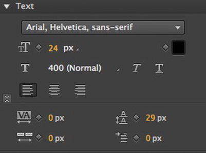
Figure 5-9. Your formatting options are found in the Properties panel.
• Font: This pop-down list lets you choose to apply the standard set of web fonts and their substitutes. These substitutes are referred to as the fallbacks. For example, If Arial is not installed on the viewer’s device or computer, the browser will use Helvetica.
• Size: Scrub this value to increase or decrease the size of the text.
• Color picker: Click this to apply color to text.
• Font weight: You have to admit the font Times Roman Bold Oblique sounds rather neat. The problem is that CSS3 doesn’t have a clue what the term Bold means. In Edge Animate, which uses CSS3, the weight of the fonts is expressed on a numerical basis. If you click the 400 (Normal) weight in the Properties panel, the pop-down shown in Figure 5-10 appears. The values 100 to 900 specify font weights where each number represents a weight darker than its predecessor. In all cases, 400 is generally considered the “normal” or Roman weight, and 700 is bold.
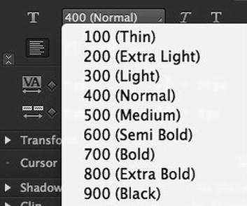
Figure 5-10. Font weights are expressed numerically.
Be careful with the font weights. When you add a font to an Edge Animate composition, it may or may not include all of the weights. The unavailable weights will not be grayed out in this menu. Choose a weight that is not available, Geneva 500 for example, and the weight will default to Geneva 700.
• Alignment: The choices are flush left, centered, or flush right.
• Letter spacing: Don’t confuse this with kerning. Scrub this value and you increase the space between letters in the text block, not letter pairs. Negative values aren’t allowed.
• Line height: Just like its “leading” counterpart, this choice adds space between lines of text.
• Word spacing: Increases the space between the words in the text block. Negative values aren’t allowed.
• Indent: Scrub this value to indent a text block, not the first line. Negative values can’t be applied.
There is one other aspect of using fonts in Edge Animate: contextual selectors. At the top of the Properties panel is the pop-down list, as shown in Figure 5-11. The list contains a number of element/tag selectors commonly used in CSS. This is deliberate. Remember, Adobe Edge Animate uses CSS to create motion, and the formatting you choose will be applied to the element/tag selectors in the CSS created by Adobe Edge Animate.
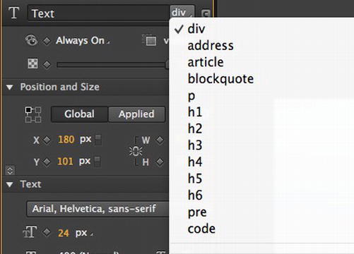
Figure 5-11. You can apply CSS formatting to your text in Adobe Edge Animate.
- With the text selected, use these values in the Properties panel:
- Deselect the text and, as shown in Figure 5-12, you get a real sense of how well-chosen words benefit from well-formatted letters. To understand how font choice affects the message, change the font to one of the others in the font pop-down.
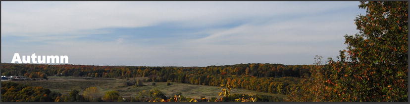
Figure 5-12. A single word, if properly formatted, can speak volumes.
Working with Text Blocks in Edge Animate
Edge Animate can also work with blocks of text, but there are a few things you need to be aware of. Let’s find out:
- Delete the text on the Stage.
- Open
Quote.rtfin a word processor and copy the paragraph—it is the quote that leads off this chapter—to the clipboard. - Quit the word processor and return to Edge Animate.
- Select the Text tool, click once on the Stage, and paste the text on the clipboard into the text entry box. The text, as shown in Figure 5-13, is placed using the last style chosen in the Font menu.
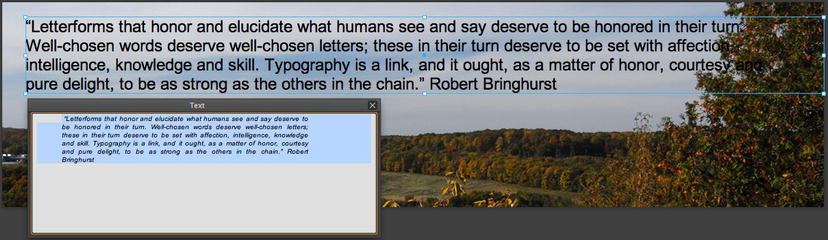
Figure 5-13. Blocks of text can be pasted into Animate or directly entered into the Text entry box.
- With the text box selected on the Stage, use these format settings:
- Font: Tahoma, Geneva, sans-serif
- Size: 18 pixels
- Weight: 500 Medium
- Line height: 28 pixels
- Obviously the line length for the text is not correct. Drag the right edge of the text box inward to between the words “say” and “deserve” in the first line of the text.
- You will notice the height of the text box doesn’t change, although the text is all there. Pull the bottom of the box to the bottom of the text block. This behavior may be new to many of you used to text blocks that cut off the overflow text. In Edge Animate, the text is in an element and, in the case of text, the Overflow property is not set to Hidden.
- The next thing to do is to format the author’s name to be under the quote. Double-click the text to open the Text dialog box, click once in front of the author’s name and press the Return key. As shown in Figure 5-14, there is a lot of space added in the dialog box, but the name just shifts down a line in the text on the Stage. Just add another space to move the name down one more line.
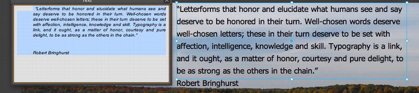
Figure 5-14. There is a difference between what you see in the text box and what you see on the Stage.
What you can gather from this is that all of the text in a text box is treated as a single entity. If you try, for example, to change the quote’s color from black to white, this change will apply to all of the text in the text element on the Stage. When working with long blocks of text, this is something to keep in mind.
Text Shadows
In Chapter 3 we showed you how shadows can be added to objects. The same techniques can be applied to text as well. When applying a drop shadow to objects and text, one aspect of a shadow—the light source—tends to get overlooked.
When objects are in motion and cast a shadow, the assumption is the light source is fixed into one position. This is not necessarily the case. Shadows can indicate depth—the farther away a shadow is from the object the fainter it becomes—and shadows can actually indicate a light source in motion. Let’s explore these two concepts:
- Open the
Shadow.anfile in yourExercisefolder. When it opens, you will see a rusted steel door with the word Rust on the Stage. - Select the text and apply the following shadow settings:
- Color: Black
- Horizontal: 13 pixels
- Vertical: 16 pixels
- Blur radius: 13 pixels
As shown in Figure 5-15, a standard shadow appears under the text.
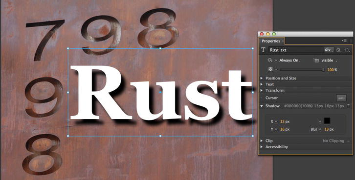
Figure 5-15. We start with a standard drop shadow.
- Click once on the
Pin and move the playhead to the 2-second mark of the timeline. - Change the
Blurradius value to 30 and scrub the timeline. The shadow gets fainter, which indicates the text, as shown in Figure 5-16, has moved closer to the light source. What you can gather from this simple example is that shadow properties can be animated.
Figure 5-16. The Shadow Blur Radius can be tweened.
Knowing
the Text Blur Radiuscan be tweened, it is logical to assume the Vertical and Horizontal Offset properties can also be tweened. Here’s how: - Move the playhead—not the Pin—to the 0 point on the timeline and move the text to the upper left corner of the image. Change the Y value to –20 and the X value to –33. The shadow is above and to the left of the text.
- Move the playhead to the 2-second mark and move the text block to the bottom right of the image. Change the Y value to 32 and the X
valueto 34. - Rewind the movie and press the spacebar to play the movie. The text position, the shadow blur, and the offset values (Figure 5-17) all change as the text moves down the Stage.
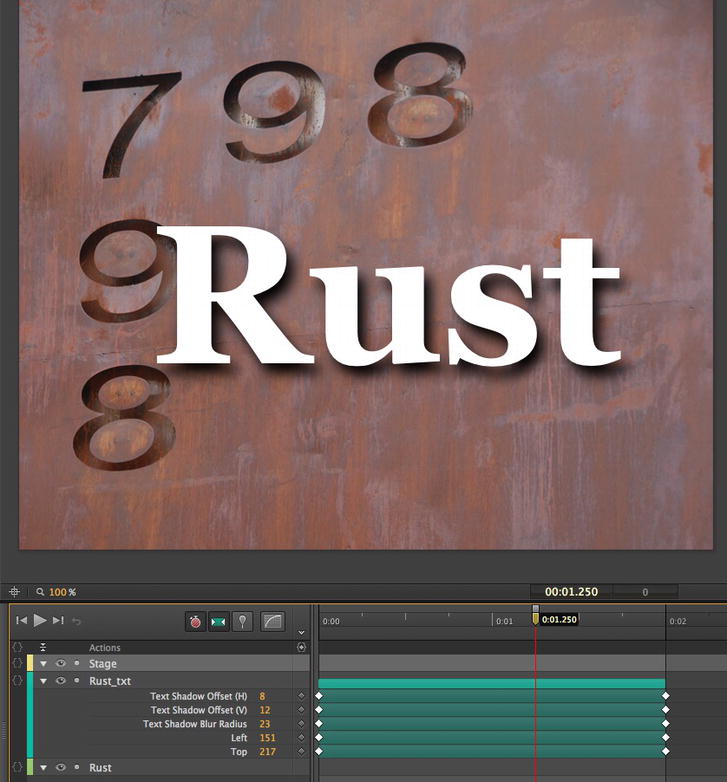
Figure 5-17. Shadows can be put in motion.
Clipping Text
We have all seen those banner ads where a car or some other object zips across the ad and the text appears, letter by letter, as the object moves across the text block. This is not accomplished using fancy masking techniques or the use of a solid shape that is carefully scaled on the horizontal axis to reveal the text. It is done using the clip:rect =() property of the CSS specification.
The key to understanding how clipping works is the rect segment of the property. Remember, text sits in an element on the Edge Animate Stage, and each element is really nothing more than a box/rect with some content in it. The clipping property in Edge Animate allows you to animate the four sides of that box to create some rather interesting effects. In this example, we are going to “pull some words out of a hat” using the clipping property. Let’s get started:
- Open the
Clipping.anfile located in yourExercisefolder. When it opens, as shown in Figure 5-18, you will see an extremely long arm has been animated to move over 2 seconds. The plan is to have the text under the arm appear as the arm move off the Stage.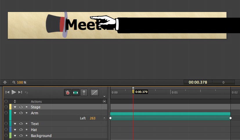
Figure 5-18. For our next magic trick, we will pull some text out of a hat.
- Move the playhead to the 0 point of the timeline and select the
Textelement. - With the text selected, click the Clipping switch in the Properties panel to turn on clipping.
- Change the
Rightvalue, as shown in Figure 5-19, to 0 and add aClipkeyframe The text box shrinks and the text disappears. The text really didn’t disappear. The right edge of the element “clipped” off the contents.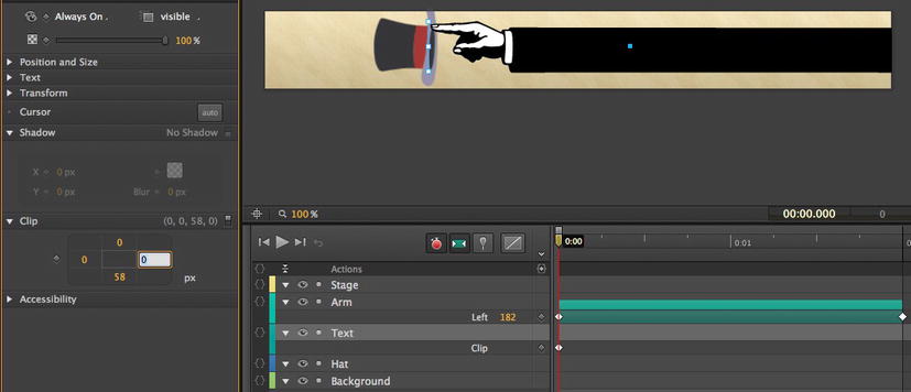
Figure 5-19. Clipping text.
- Move the playhead to the 2-second mark of the timeline and scrub the right edge value in the Properties panel to reveal the text.
- Test the movie in a browser (Figure 5-20). It’s not magic—it’s clipping.
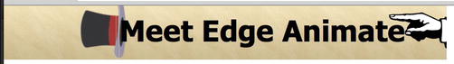
Figure 5-20. Clipping text is an effective technique to know.
Meet Your New Best Friend: Web Fonts
It is important that we start this section by stating the obvious: Web typography, deservedly, has a really bad reputation.
In 1995, when Netscape added the <font> tag to HTML, it only took a short time for designers to realize just how limiting this tag was when it came to typography. This was especially true when they realized this lowly tag was controlling not only the content but also the style. One year later, the first CSS specification, separating presentation from structure, was published, and the standards movement really took hold shortly thereafter. Even then there was a serious issue, designers couldn’t use fonts that were not installed on the user’s computer.
Although a number of solutions—sIFR (Scalable Inman Flash Replacement) was one—appeared, they just didn’t solve the font issue because they presented their own set of problems, ranging from a reliance on third-party software and text that couldn’t be selected to increased load times. The crazy thing was the solution to the issues was actually contained in the CSS2 specification released in 1998. The solution? @font-face. Why did it take so long for this rule to find its way to Adobe Edge Animate? A number of things derailed this rule, and it is a familiar tale.
First, the major browser manufacturers, Microsoft and Netscape, picked different methods of supporting web fonts in their browsers. Both ignored the most widely used font technology in the business: TrueType. Instead, Netscape went one way and supported TrueDoc, while Microsoft went in the opposite direction and developed its own format: Embedded Open Type (EOT) format. Although the two major type foundries at the time—Adobe and Monotype—supported the EOT format, market resistance to anything Microsoft hobbled EOT.
It took 10 years for this impasse to be resolved and, in 2007, Microsoft released the EOT specification and sent it to the W3C for approval. Naturally, this solution hit a roadblock. The other browser vendors refused to support it because of serious Digital Rights Management (DRM) concerns regarding legal liabilities. The design industry didn’t exactly embrace it either. Microsoft’s method of converting TTF (TrueType) fonts to EOT was seen as being confusing and difficult to use. What was needed was a solution that used OpenType, had no licensing issues, and was relatively code free.
That solution, which has finally received broad acceptance from all concerned, is the Web Open Font Format (WOFF). WOFF is essentially a compressed version of the file format used by the PostScript, TrueType, and OpenType fonts on your computer. What broke the logjam was WOFF’s ability to include metadata allowing font vendors to “tag” their fonts along with private-use data, which is the reason WOFF has been embraced by the major foundries and the @font-face rule from the CSS2 specification is broadly used.
The upshot of all of this is web designers have a world of typography options available to them because fonts can now be “rented” by web sites by licensing a particular font to a URL or, if they are open source or royalty free, can be used in any web page. Not only that, but the text is fully searchable and, as time goes on, fonts used in other languages can be used on web sites. This also explains, to a great extent, why Adobe, in 2011, purchased Typekit, one of the first web font delivery and hosting services and, one year later, add the Webfonts app to the Edge Tools and Services, which offers a collection of Webkit, Google web fonts, and open source fonts that can be freely used in your Animate compositions. Naturally, this technology has been built into Edge Animate.
Before we start, it is important you understand that we will start by using a font from Typekit. If you don’t have a Typekit account, you aren’t out of the game. There are a number of other font delivery services out there—http://webfonts.fonts.com/en-US—that will supply you with a similar embed code to those used in this example. We also explain how to use the free Google fonts after this example. This is also one of the few exercises in this book where, for obvious copyright reasons, we won’t be supplying a completed exercise file.
Adding Typekit Web Fonts to an Edge Animate Project
We still aren’t happy using Arial Black in the Autumn project. It is a bit too heavy and the decision is to use a condensed font for the word. After hitting the typebooks, the team settles on Franklin Gothic Condensed from Typekit. Here’s how to pick and add a Typekit web font to an Edge Animate composition:
Most vendors will allow you to try out their service on a limited basis, and one of the most important questions during the sign up process will be the URL of the site to which you are licensing the font. To see the fonts you will choose in your Edge Animate project, enter the following local IP address—127.0.0.1—when asked by a vendor. Remember, Edge Animate uses a Webkit browser to display stage content. This is the IP address used by the Edge Animate Stage.
- Log in to your Typekit account and you will see the
Browse Fontspage shown in Figure 5-21.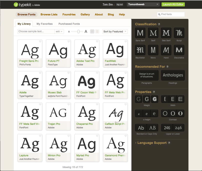
Figure 5-21. There are quite a number of fonts to choose from.
- On the left side of the page are the fonts available. The right side lets you narrow the selection. We want to use a Franklin Gothic Condensed font. We can use the filters on the right side to narrow the selection:
- Classification: Sans Serif
- Properties: Roman
- Width: Narrow
Notice, too, the
Language Supportlist. By choosing a language, the glyphs and characters unique to that language will also be added to your font choices. - Locate the font named Franklin Gothic URW Condensed and click the
+Add to Kitbutton. This adds the selected font to your lineup and takes you to thetypekitEditor, shown in Figure 5-22.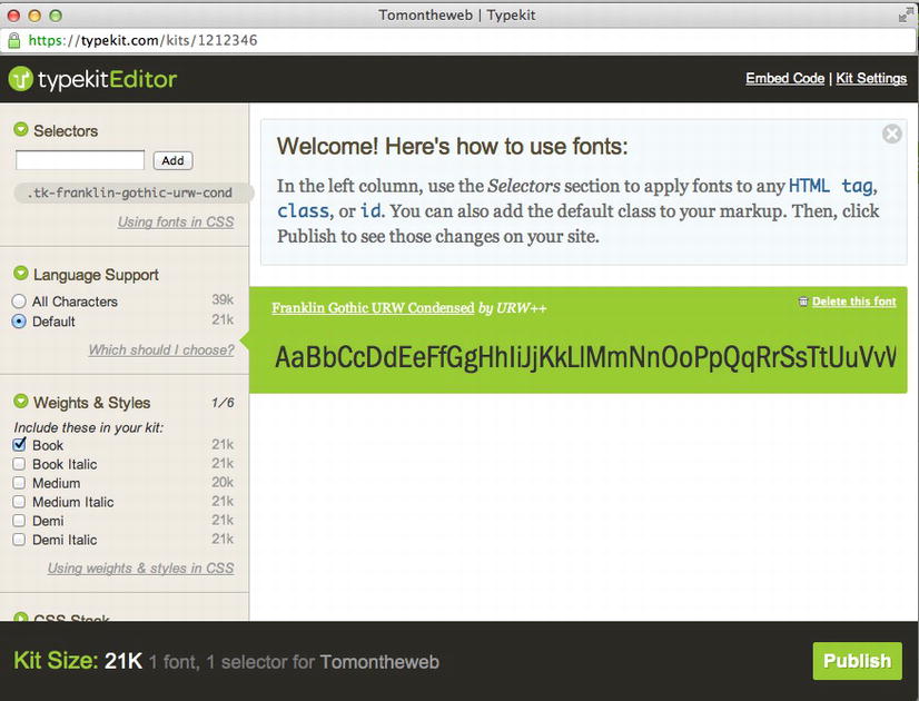
Figure 5-22. The typekitEditor is how the fonts are added to a project.
- In the left column, select
Bookin theWeights&Stylessection. This restricts the font to only that weight and keeps the file size to a manageable 21k. - Edge Animate needs to know what name to use for the font’s selector and fallback font. Click the
Using font family names in your CSSlink to open the dialog box shown in Figure 5-23. Pull out a pen and write down, exactly including the quotation marks, the text selected in the top area of the dialog box.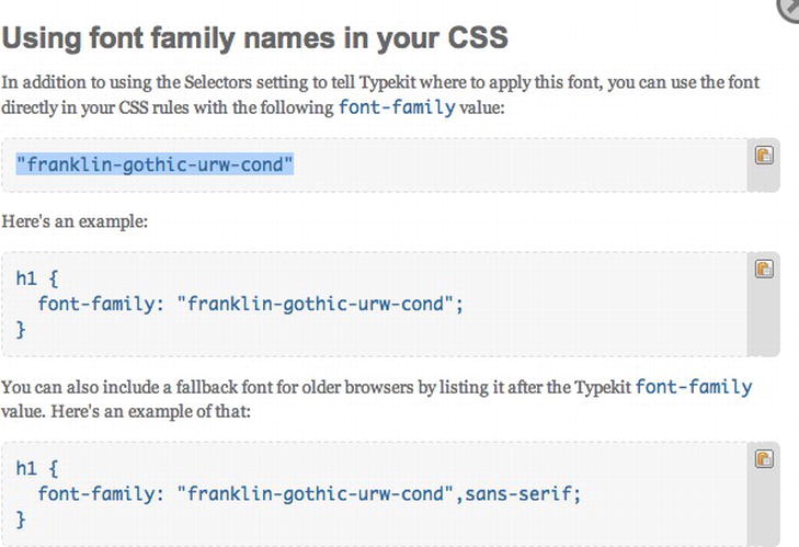
Figure 5-23. Edge Animate needs to know what font family value to use when accessing the web font.
- Click the
Embed Codelink. The dialog box shown in Figure 5-24 opens. Copy the code to the clipboard. You will need it in Edge Animate.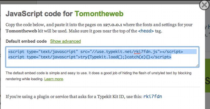
Figure 5-24. Copy the JavaScript embed code to the clipboard.
- Close the Embed code and click the Publish button. When the Updating Alert disappears, quit the browser.
Adding a Web Font to Adobe Edge Animate
Having copied and pasted the JavaScript code to the clipboard, you will be using it in Adobe Edge Animate. Follow these steps:
- Open the
TypeKit.anfile found in yourExercisefolder. - If it isn’t open, open the
Libraryand click the+sign in theFontssection to open theEdit Web Fontdialog box shown in Figure 5-25. - Paste the JavaScript on your clipboard into the
Embed Codearea. - In the
Font Fallback Listarea, enter the name of the font you earlier noted: “franklin-gothic-urw-cond”, Arial, sans-serif.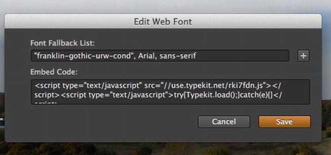
Figure 5-25. The web font and the fallback fonts are added to the Adobe Edge Animate project.
- Click the
Savebutton. The dialog box will close and you will see the font appear in the Library. - Select the text and, in the
Propertiespanel, select your new font in theFontpop-down. When you release the mouse, the text, as show in Figure 5-26, is formatted usingFranklin Gothic Condensed.
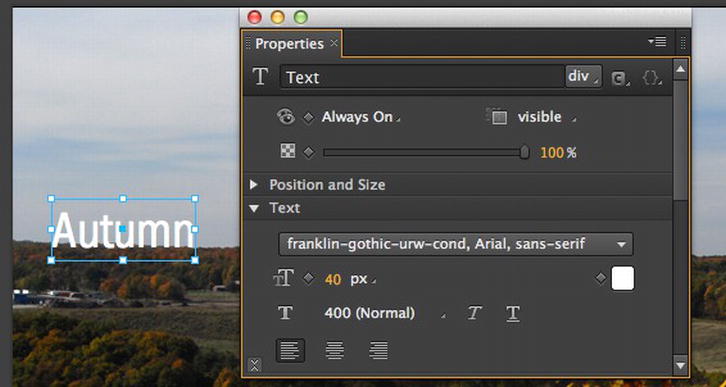
Figure 5-26. Web fonts can rapidly become your new best friend.
The key to this exercise is not the Typekit font. It is the JavaScript code that you need and the web font vendors will supply the code. The only difference between this example and the other vendors is the route to the JavaScript. The other key point to keep in mind is the fallback font. You need it because there are still browsers out there that do not support the @fontface tag.
Adding a Free Google Web Font to an Adobe Edge Animate Project
It comes as no surprise that Google is in the web fonts game. If you point your browser to http://www.google.com/webfonts, you have access to a rather extensive collection of fonts that can be used in your projects. In this exercise we are going to choose and use a free Google web font in an Adobe Edge Animate project. You will discover the process to be remarkable similar to using one from a commercial service such as Typekit. Let’s get started:
- Open the web page at
http://www.google.com/webfontsas shown in Figure 5-27.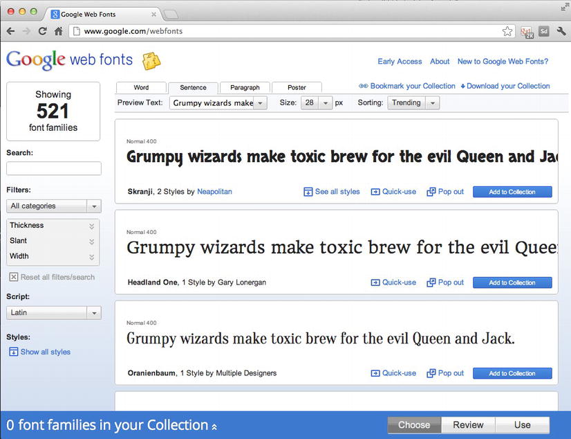
Figure 5-27. You start at Google’s web fonts home page.
The plan is to use a relatively thin sans-serif as we did in the previous exercise.
- Select
Sans Serifin theFilterspop-down. A list of suggestions, as shown in Figure 5-28, will appear to the right. At the top of this we chose36 pxas our starting point because we wanted to see a sample that was close to the 40 pixel size used in Adobe Edge Animate.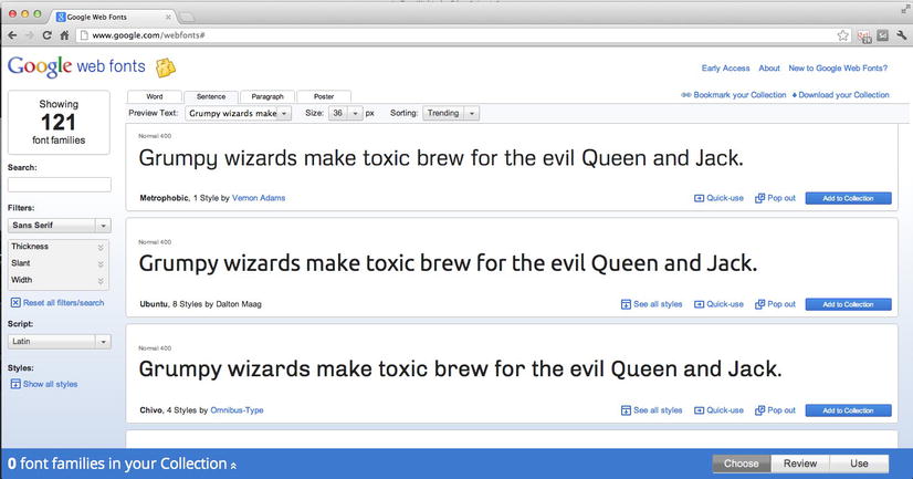
Figure 5-28. Picking a Google web font.
Unlike Typekit, you don’t have access to the font weight variations used in Typekit. Google uses a slider-based approach for thickness, slant, and width to filter a font selection, which makes choosing an Ultra Bold Italic variation of the selected font extremely difficult.
- Locate
Ubuntuand click theAdd to Collectionbutton. - Click the
Quick-usebutton at the bottom of the interface to open the font page shown in Figure 5-29. At the top of the page are the various styles. We selected theNormal 400variation. That little stopwatch on the right acts as a speedometer showing you what happens to page load speed as you add or subtract variations of the Ubuntu font.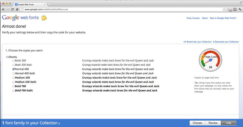
Figure 5-29. We settle on the Normal 400 variation of the Ubuntu font.
- Scroll down the page. The next three areas, shown in Figure 5-30, allow you to choose the character sets and present you with the embed code and fallback fonts to use in Adobe Edge Animate.
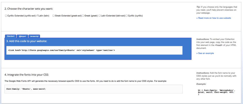
Figure 5-30. The embed code and fallback path.
- Copy the embed code to your clipboard and open the
GoogleFont.anproject in yourExercisefolder. - When Adobe Edge Animate opens, click the
+sign in theFontspanel to open theEdit Web Fontdialog box, shown in Figure 5-31. Enter aFont Fallback Listand paste theEmbed Code. The font will be added to the fonts panel.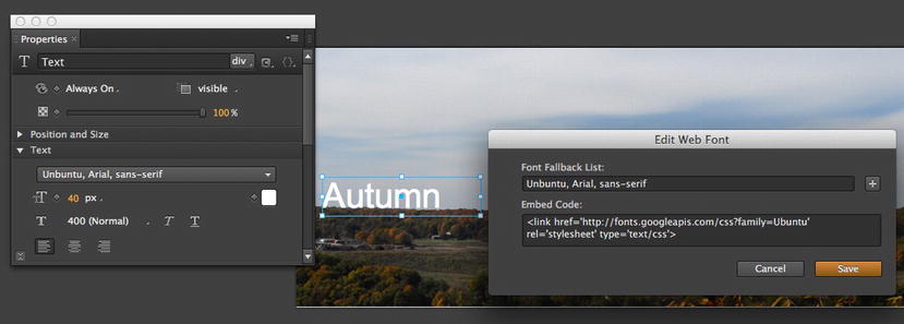
Figure 5-31. A Google web font is added for use in Adobe Edge Animate.
- In the
Propertiespanel, open the font pop-down and, as shown in Figure 5-32, your new font is in the list. Select the font and set the text to a size of 40 pixels and the color to white.
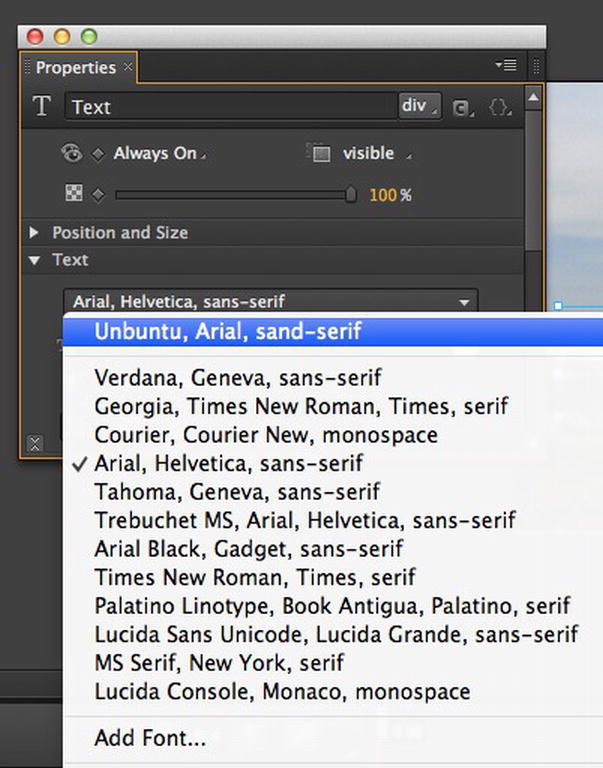
Figure 5-32. The Google web font has been added to the font list.
What if you change your mind and want to remove a font from the list? Simply click once on it in the Fonts area of the Library and press the Delete key.
Using Adobe Edge Web Fonts in Animate
In late September 2012, Adobe introduced a full range of HTML 5 tools and services under the Edge brand. Included in this offering was a font service called Web Fonts. This service, still in its infancy, is planned to become a rather extensive offering of free web fonts from a variety of vendors ranging from Typekit to Google web fonts and a number of open source font collections.
An obvious question is: “Can I use the Web Fonts in my Animate compositions?” The answer is yes but the workflow is a bit different from that used to add a web font to a composition. The reason is, Web Fonts was still in development when Animate was completed and, unlike Typekit and Google web fonts, there are no direct “hooks,” like those from Google and Typekit, into Animate at the time of this writing. Even so, the workflow is not complicated. If you can copy and paste, you can use web fonts. Here’s how:
- Open your browser and point it to
http://html.adobe.com/edge/webfonts/. This will open theAdobe Web Fontsservice page. - Scroll down to the
Preview Edge Web Fontsarea, shown in Figure 5-33.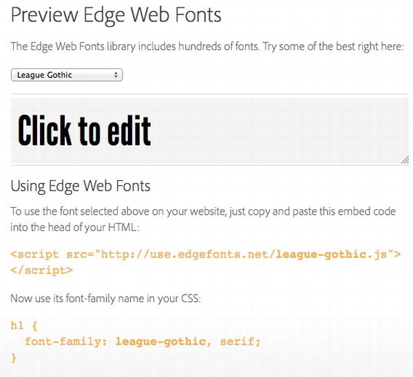
Figure 5-33. Fonts are chosen from the Preview Edge Web Fonts area of the page.
- Click the pop-down list to reveal the available fonts. Select
League Gothic. A preview of the font will appear. - Select the Embed code and copy it to your clipboard. Don’t close the browser.
This is where the new workflow comes into play. You can’t paste the Embed code on the clipboard into the Edge Animate Add Web Font dialog box. It needs to be added the to
<Head>of the HTML document containing the Animate composition. In this case we will be using the HTML created by Animate. Here’s how: - Open an HTML editor, we are using Dreamweaver CS6, and open the
AdobeWebFont.htmlpage. Switch to Code view. - Click once in
line 7of the code and paste the Embed code on the clipboard into the code between the<head></head>tags. (Figure 5-34). Save the file and quit your editor.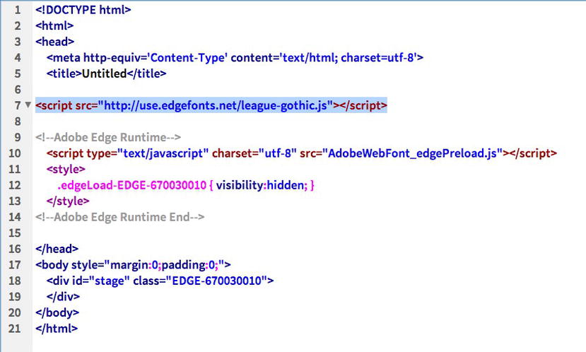
Figure 5-34. The Web font embed code is pasted into the <head> of the HTML document.
- Return to the web browser and, in the font family area, select just the words
league-gothic,serifand copy it to the clipboard. Close the browser. - Open the
AdobeWebFonts.anfile located in yourExercisefolder. When it opens, you will be informed that, as shown in Figure 5-35, the file has changed. This is to be expected because you added the embed code to the document’s<header>.ClickYes.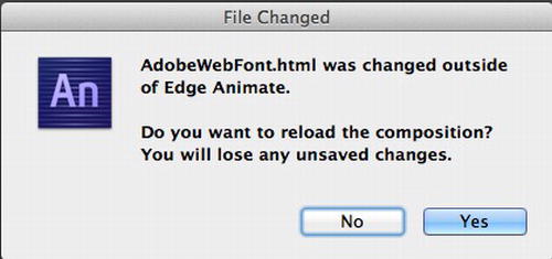
Figure 5-35. Notification that the file has been changed.
- Click the
Add Fonticon and when theAdd Fontdialog box opens, paste the contents of the clipboard into theFont Fallback Listarea. Click the Add Font button to accept the change. - Select the text on the Stage and, in the
Textarea of the Properties panel, selectleague-gothic, serif. The text font changes to League-Gothic, serif (Figure 5-36).
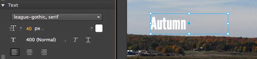
Figure 5-36. The Adobe web font is added to Edge Animate.
You Have Learned
In this chapter, we have covered the absolute basics of using type in an Adobe Edge Animate project. We covered:
- Typography fundamentals.
- Formatting text on the Adobe Edge Animate Stage
- The features of the text area in the Properties panel
- Adding shadows to text and putting them in motion
- Clipping text
- Adding a Typekit font to the Font panel
- Adding a Google web font to the Font panel
- Adding an Adobe Web Font to an Edge Animate composition
This also marks the midpoint of the book. So far we have covered the basics of using Adobe Edge Animate. From this point on, we will start looking at the really neat stuff you can do with the application, and it starts with interactivity. Turn the page and start learning how the code features of Adobe Edge Animate open an entire universe of possibility to your projects.