Chapter 3: Building Your First Graph
3.2 Starting with a Basic Histogram
3.3 Adding Normal and Kernel Density Curves
3.6 Adding the Title and Footnote
3.7 Adding a Separate Horizontal Box Plot
3.9 Using Common External X-Axis
You miss 100 percent of the shots you never take. - Wayne Gretzky
Let us now dive directly into building your first graph. We will build a graph to visualize the distribution of vehicle mileage as shown in Section 3.1. To build this graph, we will use many key features of GTL. By the end of this exercise, you will have a good grasp of the process of building graphs using GTL.
In the example below, we will just go ahead and use the syntax needed to create the graph. Don’t worry about the details at this time. You will learn the details in later chapters.
3.1 Overview
We will take a step-by-step approach to building this graph to illustrate the building-block process used to create all GTL graphs. Let us first examine the features of this graph.
This graph has the following features:
• A title and a footnote.
• Two cells of unequal heights for the display of the data.
• The upper cell has the following:
º A histogram.
º A normal density curve.
º A kernel density curve.
º A legend.
• The lower cell has a box plot.
• The two cells have a common external x-axis.
Before we get started, let us review the terminology that we will use for the different parts of the graph shown in the figure above. You will see these terms used frequently throughout the book, and understanding the terms will make it easier to discuss the features.
3.1.1 Terminology
• The resulting visual in the output file is called a GRAPH.
• A graph can have one or more CELLS. The graph in Section 3.1 has two cells.
• The cells contain the visual representation of the data, and generally contain:
º Up to two sets of X and Y axes.
º One or more plots that are overlaid in a common data space.
º Other insets like legends, statistics tables, or text entries.
º All plots, charts, and other visual representation of data are called PLOT.
• Zero or more TITLEs that are all displayed at the top of the graph.
• Zero or more FOOTNOTEs that are all displayed at the bottom of the graph.
Creating a graph with GTL is a two-step process as shown above.
• Step 1: Define a STATGRAPH template with a name by using the TEMPLATE procedure. The structure and features of the graph are defined using GTL. In this step, the template is compiled and saved. No graph is created.
• Step 2: Create the graph by using the SGRENDER procedure. This step associates the data with the template to produce the graph.
3.2 Starting with a Basic Histogram
Though the graph in section 3.1 has two cells, we will start by building the basic histogram first. We will add the second cell with the box plot later. To create the basic histogram, we will use a histogram statement in a layout overlay.
|
proc template; define statgraph gtl.dist1; begingraph; layout overlay; histogram mpg_city; endlayout; endgraph; end; run; proc sgrender data=sashelp.cars template=gtl.dist1; where type ne 'Hybrid'; run; |
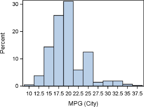 |
In the program shown above, we have used a LAYOUT OVERLAY block to define this graph as highlighted above. The program produces the graph shown above on the right. Note that the default axis type for a histogram is BIN, where each bin is labeled (if possible). The default scale for the Y axis is percent.
The LAYOUT OVERLAY statement defines a single cell container within which we can put multiple plot statements. In this case, we have only one plot statement – the histogram. But we will add more plots soon. The histogram statement needs a numeric column as a required parameter. Here we have used a specific column name mpg_city. In order for this graph to be successfully created, a numeric column with this name must exist in the data set.
In the PROC SGRENDER step, we have specified the data set and the template names that are used together to create this graph. The variable mpg_city is expected in the data set.
Let us examine the syntax in the PROC TEMPLATE step program shown above. The part of the syntax that is not highlighted is essentially boilerplate. Every template must have this code, so you can just cut and paste that part. The only thing unique in that part of the code is the name of the template. Of course, there are some statement options that we will examine later.
We only need three lines of unique code to define the template for this graph. The SGRENDER step uses the template and a subset of the data to render the graph shown on the right.
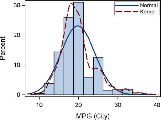
3.3 Adding Normal and Kernel Density Curves
Often, the addition of normal and kernel density curves on a histogram helps in a better understanding of the distribution of the data. In GTL, these are not built in as options on the histogram statement, but are independent plot statements that can be used in combination with the histogram.
To add the normal density curve to the graph, we add a DENSITYPLOT statement to the graph specification in the PROC TEMPLATE step within the LAYOUT OVERLAY block. The new statement is highlighted in the program shown below. Density plots come in two flavors: normal and kernel. The default is normal, so no additional options need to be specified.
|
proc template; define statgraph gtl.dist2; begingraph; layout overlay; histogram mpg_city / binaxis=false; densityplot mpg_city; endlayout; endgraph; end; run; proc sgrender data=sashelp.cars template=gtl.dist2; where type ne 'Hybrid'; run; |
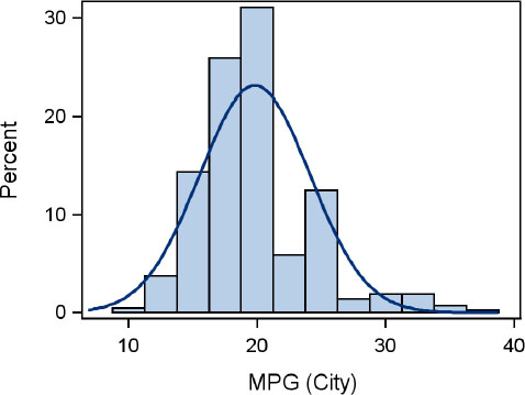 |
The graph created by the program is shown above on the right. The template now includes a DENSITYPLOT statement with the same analysis variable mpg_city. We have set BINAXIS=false for the histogram to get a linear x-axis and changed the template name.
This step highlights an important feature of GTL layouts. The LAYOUT OVERLAY statement defines a CELL; all plot statements placed in it are drawn in the same common area of the cell. All plots in a cell share a common set of axes. The extents of the axes are a union of the data contributed by each plot. Then, all the plots are drawn with the correct scaling.
The plots are drawn in the order in which they are specified, with the last plot drawn on top. In the graph shown above, the density curve is drawn on top of the histogram. If the order of the statements is reversed, the histogram will be drawn last, and might obscure parts of the density plot.
The axis derives many of its attributes from the primary plot. In this case, the histogram is primary because it is the first plot in the container. Previously we had a “bin” axis. Now, since the histogram has a linear axis, the x-axis is changed to linear.
Now let us add the kernel density estimate curve to the graph. As you guessed, all you need to do is add another density plot statement with the appropriate options. The new template is shown below on the left, with the addition of the second density plot with the KERNEL() option. The resulting graph is shown below on the right. Additional options for kernel density estimates can be provided within the parentheses. In this case, we are using only the default settings.
|
proc template; define statgraph gtl.dist3; begingraph; layout overlay; histogram mpg_city / binaxis=false; densityplot mpg_city; densityplot mpg_city / kernel(); endlayout; endgraph; end; run; proc sgrender data=sashelp.cars template=gtl.dist3; where type ne 'Hybrid'; run; |
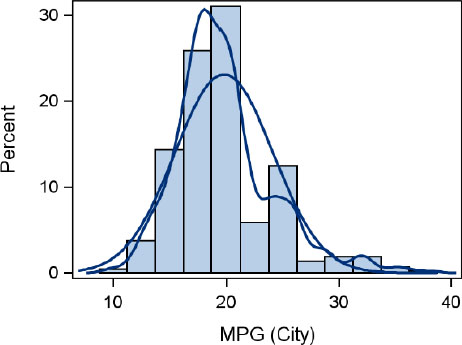 |
3.4 Setting Plot Properties
When plots are drawn in a graph, the visual attributes of the plot are derived from the appropriate style element of the active style for each open destination. A sample mapping from graphical element to style element is provided in Chapter 8. For now, it is sufficient to know the following mappings:
The histogram fill color is derived from the GRAPHDATADEFAULT style element.
The density plot line color and pattern are derived from GRAPHFIT style element.
Since we have drawn two density plots, both plots are drawn using the GRAPHFIT style element. So it is hard to distinguish between the two density curves at this point. To effectively convey the right information, we need to change the visual properties of one of the density curves. To do that, we use the appropriate attribute options for the plot statement.
The density plot statement has an option called LINEATTRS with the following specification:
LINEATTRS=<style-element> (COLOR=value PATTERN=value)
We can use this option to set the color and pattern of the line. If we use the settings shown below, this plot will be drawn using a red dashed line.
LINEATTRS=(COLOR=red PATTERN=dash)
|
proc template; define statgraph gtl.dist4; begingraph; layout overlay; histogram mpg_city / binaxis=false; densityplot mpg_city; densityplot mpg_city / kernel() lineattrs=graphfit2; endlayout; endgraph; end; run; proc sgrender data=sashelp.cars template=gtl.dist4; where type ne 'Hybrid'; run; |
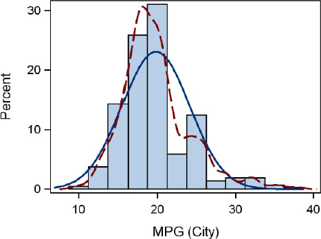 |
However, specifying a hard-coded color is not the recommended practice for GTL programming. A template graph can be rendered to multiple ODS destinations at the same time, each destination having its own default active style. A hard-coded color can conflict with other colors of the style, resulting in a poor quality graph.
For this reason, it is recommended that you use style references to assign visual attributes to any plot. Since all style elements and attributes are carefully designed to play well with each other, the visual integrity of the graph is retained. For special cases, a hard-coded color is just fine.
Keeping this in mind, let us now assign a different set of visual attributes to the kernel density plot. All styles that are supplied by SAS include a large set of style elements, each used by some graph element by default. However, a few additional elements are also included. One such element is GRAPHFIT2. This element is not automatically used with any plot, and is designed to be used in such cases. In the program above, we have set LINEATTRS=GRAPHFIT2 for the kernel density curve. The resulting graph is shown above on the right.
3.5 Adding a Legend
Now it is easier to distinguish between the two density curves, but it is still not clear which curve is which. To help decode this information, we need to provide a legend as follows:
• Name each plot that needs to be included in the legend.
• Use the DISCRETELEGEND statement with the names of the plots to be included.
|
proc template; define statgraph gtl.dist5; begingraph; layout overlay; histogram mpg_city / binaxis=false; densityplot mpg_city / name='Normal'; densityplot mpg_city / name='Kernel' kernel() lineattrs=graphfit2; discretelegend 'Normal' 'Kernel' / across=1 location=inside halign=right valign=top; endlayout; endgraph; end; run; |
 |
Note: In the program code shown above on the left, we have no longer shown the PROC SGRENDER step. To conserve space, we do not show the render step of the program unless necessary. There is no change to this step, except a change in the name of the template, and this step is required to create the graph. In this set of examples, most of the coding change is in the template code.
The code required to add a discrete legend to the graph is highlighted in the program above. First, we provide names to the statements that we wish to include in the legend. Since we only want to include the two density plots, we provide names only for the two density plot statements.
Now we add the DISCRETELEGEND statement, and provide the list of plot names that are to be included in the legend. In this case, we have provided the names “Normal” and “Kernel”. If we don’t provide the options after the “/”, this legend will be drawn in its default location below the x-axis. Since some white space is available inside the cell, we can put the legend in the top right corner by specifying LOCATION=inside and providing the appropriate VALIGN and HALIGN options. ACROSS=1 places all of the legend entries in one column.
The definition of the upper cell of the graph in Section 3.1 is now complete. The code block from the LAYOUT OVERLAY to ENDLAYOUT in the above program that is enclosed in the brace defines the upper cell. As we go ahead with building this graph, we will refer to this block of code as the “upper cell,” and we will not display its contents to save space.
3.6 Adding the Title and Footnote
In the program shown below, <Upper cell plot statements> represents the statements needed to create the histogram. We need the space to show the statements that we use to enhance the graph.
|
proc template; define statgraph gtl.dist6; begingraph; entrytitle 'Distribution of Mileage'; entryfootnote halign=left 'Excluding Hybrids'; layout overlay /xaxisopts= (display=(ticks tickvalues)); < upper cell plot statements > endlayout; endgraph; end; run; |
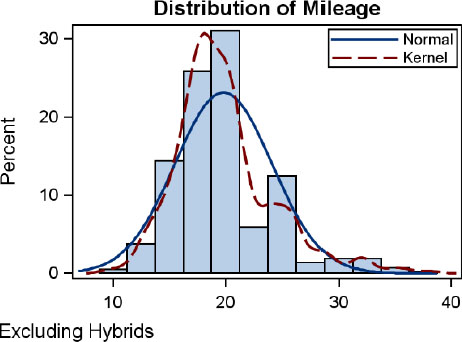 |
Here we have added a title and a footnote. These statements must be placed within the context of the outermost BEGINGRAPH block. The TITLE and FOOTNOTE statements can be placed anywhere in the outer block. The title is always drawn at the top of the graph, and the footnote is always drawn at the bottom. Multiple title and footnote statements can be provided, and they are drawn in the order in which they are specified. For the footnote, we have specified HALIGN=left.
Since the title already contains the reference to the analysis variable, it is not necessary to include the x-axis label, which displays the same information. So, to reduce unnecessary ink in the graph, we have suppressed the display of the x-axis label by setting the DISPLAY suboptions in the XAXISOPTS option. Here we have excluded LABEL from the list of suboptions.
This is the preferred way to remove an axis label and recover the space normally reserved for it. We could provide a blank label by setting LABEL=” ” for the x-axis. In this case, a blank label would be drawn, and the space for the label would still be reserved.
This axis setting illustrates an important aspect of the GTL graph structure. As mentioned earlier, multiple plots statements can be included inside a LAYOUT OVERLAY. These plots are overlaid, and the axis data range is the union of the data ranges from all the plots in the overlay container.
One implication of this is that the axis does not belong to any one plot, but to the overlay container (another term for a layout).
So, the options to customize any of the axes are on the LAYOUT OVERLAY statement, and not on one of the plot statements. None of the plot statements have any axis options. In this case, we want to suppress the axis label for the x-axis. To do this, we use the XAXISOPTS option on the LAYOUT OVERLAY statement and set the appropriate suboption. We will examine the various options available for the axes in subsequent chapters.
3.7 Adding a Separate Horizontal Box Plot
The graph that we have built so far is a typical single-cell graph. The graph in Section 3.6 has one data area that contains the combination of three plots and a legend. The graph has a title and a footnote.
Now we want to take a step beyond the simple one-cell graph. GTL supports nesting of layout statements, but there can be only one root layout for the entire tree of layouts. There can be multiple title and footnote statements inside the BEGINGRAPH block. But there can be only one nested block of layout statements.
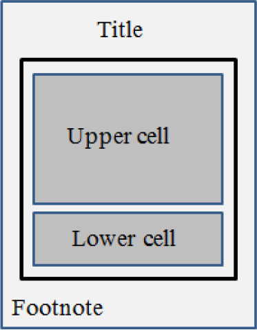
So, we will nest the “upper-cell” and a new “lower-cell” in another outer level layout as shown in bold outline in the figure on the right.
The graph in the upper cell is defined by the entire Layout Overlay – End layout block along with all the statements contained in between as shown below.
|
<Upper-cell> = |
layout overlay / <options>; histogram var / <options>; densityplot var / <options>; densityplot var / <options>; discretelegend <name> / <options>; endlayout; |
To create an outer container, we will use the LAYOUT LATTICE statement. This layout is very versatile, and will be described in full in subsequent chapters. At this point, it will suffice to say that, unlike the LAYOUT OVERLAY, a LAYOUT LATTICE subdivides the available graph space into a regular grid of rows and columns as specified by the ROWS and COLUMNS options on the statement.
The layout can have a grid of N rows and M columns. For our purposes, we need a grid of two rows and one column. We use the LAYOUT LATTICE statement as shown in the program below. Here we have set COLUMNS=1 outside the upper-cell block. Inside the layout Lattice, we have placed the upper-cell along with a new lower-cell block.
The program shown below on the left creates a graph with two cells of equal height. The graph is shown below on the right. The outer layout lattice itself is not visible, but you could turn on the borders to see each cell outlined. The upper cell contains the layout overlay contents from Section 3.6. In the lower cell, we have added a horizontal box plot, with the analysis variable mpg_city.
Each cell has its own set of independent X and Y axes (if appropriate). Since the horizontal box plot has no X role (mapped to the Y axis), there is no Y axis for the lower cell.
|
proc template; define statgraph gtl.dist7; begingraph; entrytitle <options>; entryfootnote <options>; layout lattice/columns=1; <upper-cell> layout overlay; boxplot y=mpg_city / orient=horizontal; endlayout; endlayout; endgraph; end; run; |
 |
There are a couple of problems with this version of the graph:
1. The two x-axes do not have the same data range and are not aligned. They are not uniform.
2. We really do not need to use all the extra space to show both axes. We need one common external x-axis for both the cells. The data within each cell should be correctly aligned to this common external x-axis.
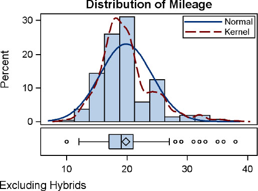
3.8 Using Uniform X-Axes
To ensure the data integrity of the graph, we need to make sure that the x-axis for both the cells are uniform as shown in the graph below on the right.
|
proc template; define statgraph gtl.dist8; begingraph; entrytitle <options>; entryfootnote <options>; layout lattice / columns=1 columndatarange=union; <upper-cell> <lower-cell> endlayout; endgraph; end; run; |
 |
This is done simply by setting COLUMNDATARANGE=union on the layout lattice statement, as shown in the program and the graph below.
In the graph above, the x-axes for both the upper and lower cells have the same data range and the same axis tick values that are aligned with each other. This is essential to avoid misinterpretation of the graph, but the multiple x-axes still take up too much space.. So, let us fix that to provide more space for the plots.
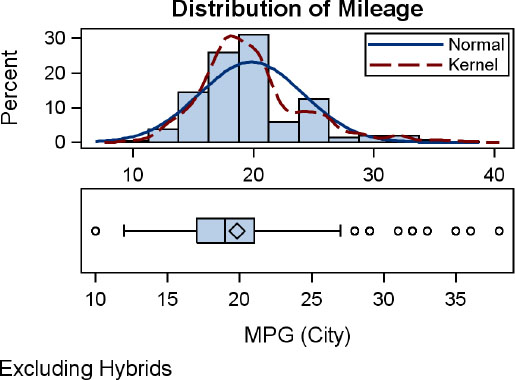
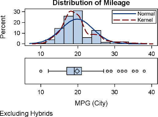
3.9 Using Common External X-Axis
To create one common external axis for both cells, we have to provide a COLUMNAXES block inside the layout lattice as shown below. Since we have only one column, we need only one COLUMNAXIS statement. Also, we have specified ROWWEIGHTS of 0.8 and 0.2 to make the upper cell taller than the lower.
|
proc template; define statgraph gtl.dist9; begingraph; entrytitle <options>; entryfootnote <options>; layout lattice / columns=1 rowweights=(0.8 0.2) columndatarange=union; columnaxes; columnaxis / display= (ticks tickvalues); endcolumnaxes; <upper-cell> <lower-cell> endlayout; endgraph; end; run; |
 |
The resulting graph is shown above on the right. The upper cell now has more space, and the graph has a common external X-axis. All the plots in the two cells are scaled correctly to the common X-axis.
3.10 Setting Output Options
By default, the size of the graph is 640 x 480 pixels. For the LISTING and HTML destinations, the default output resolution is 96 dpi. These default settings work well for most cases. However, often we want to create graphs that will fit in a smaller space as in this case. To do that, we can use options on the ODS destination or the ODS Graphics statements.
Since the SGRENDER procedure’s sole purpose is to render graphs using the ODS Graphics system, the ODS GRAPHICS=ON option is not explicitly required. However, if you want to change some of the default options, you have to use this statement. For all the graphs shown in this chapter, the following settings were used with the SGRENDER procedure:
ods listing image_dpi=300;
ods graphics / reset noborder width=3in height=2.25in;
These settings produce a graph that is 3 inches wide and 2.25 inches tall at 300 dpi, which is suitable for inclusions in the 3-inch wide space here. If we had inserted graphs rendered at the default size and resolution, the details within the graph would have shrunk a lot and become unreadable. More details on this topic are covered later in this book.
3.11 Full Code for the Graph
The full code for the graph in Section 3.1 is shown below.
• The BEGINGRAPH block and the LAYOUT LATTICE blocks are shown with braces.
• The COLUMNAXES block and the two LAYOUT OVERLAY blocks are highlighted.
proc template;
define statgraph gtl.dist;
begingraph;
entrytitle 'Distribution of Mileage';
entryfootnote halign=left 'Excluding Hybrids';
layout lattice / rowweights=(0.8 0.2) columns=1
columndatarange=union;
columnaxes;
columnaxis / display=(ticks tickvalues);
endcolumnaxes;
layout overlay;
histogram mpg_city / binaxis=false;
densityplot mpg_city / name='n' legendlabel='Normal';
densityplot mpg_city / kernel() lineattrs=graphfit2
name='k' legendlabel='Kernel';
discretelegend 'n' 'k' / location=inside halign=right
valign=top across=1;
endlayout;
layout overlay;
boxplot y=mpg_city / orient=horizontal boxwidth=0.8;
endlayout;
endlayout;
endgraph;
end;
run;
ods graphics / reset imagename='Distribution';
proc sgrender data=sashelp.cars template=gtl.dist;
where type ne 'Hybrid';
run;
3.12 Review
As promised, we used many fundamental features of the GTL while creating the above graph. Let us review the features that we used in this chapter.
• GTL graphs consist of one or more cells that display the data along with titles, footnotes, and legends. Graphs are built using a building-block approach.
• The entire graph definition is in the BEGINGRAPH – ENDGRAPH block.
• Graphs are created using plots, layouts, and other statements.
• GTL supports many different plot types, each of which has a set of required parameters and options.
• Plots determine how the data is displayed while layouts determine where the data is displayed. Layouts are also commonly referred to as “containers.”
• Multiple (compatible) plots can be placed in a LAYOUT OVERLAY container. All these plots are drawn in a common region using common axes in the sequence in which they are placed, with the last one drawn on top.
• A LAYOUT OVERLAY container, along with the plots inside it, creates one cell.
• is the axes are shared by all the plots in the layout overlay. The axis data range is a union of all the data ranges that are associated with the axis.
• The axis belongs to the layout container, and not to any individual plot.
• A LAYOUT LATTICE subdivides the available graph area into a regular grid of cells.
• Each LAYOUT OVERLAY block placed inside the LAYOUT LATTICE defines one cell.
• A plot can be placed by itself inside the LAYOUT LATTICE, and in this case, it will occupy one cell by itself. .Layouts can be nested, within layouts.
• All title and footnote statements must be specified in the context of the BEGINGRAPH statement, outside the layout containers. This is checked during the template compilation step.
• There can be only one nested layout block. All other layout statements must be inside the outermost layout statement.
3.13 Summary
In this chapter, we have created a multi-cell graph from start to finish. As you have seen, we have used a building block approach, and created the graph step-by-step.
First we created a single-cell graph using a LAYOUT OVERLAY, a HISTOGRAM, and two DENSITY statements. We added a legend.
We then created a second single-cell graph to display the BOXPLOT. To place these two single-cell graphs together in one graph, we have to use a parent container that can include these two single-cell graphs as its children. We used a LAYOUT LATTICE to do that. Then, we made the X-Axes for both the cells uniform, and finally, replaced the two separate X-Axes with one common external X-Axis.
Titles and footnotes are added to finish off the full graph. The graph is then rendered to a customized size using the ODS GRAPHICS statement. A dpi of 300 is used, as specified in the ODS destination statement.
By this time, you should have a good feel for the way that we use GTL to create graphs. In the next chapter, we will look at some of the plot statements that are commonly used to create single-cell graphs. We will also see how you can combine these statements together to create sophisticated graphs.