Chapter 7: Attribute Maps, Draw, and Annotate
Never ascribe to malice that which can be explained by incompetence. -Napoleon
Using bar charts or series plots by the appropriate class variable, you create a graph of response by visit and drug or revenues by product and year. But, when you run the program with a different data set, the colors for the groups shift. What to do?
Or, you want to add a feature to the graph, but there is no plot statement that will let you do it. How do you proceed?
In this chapter, we will cover the tools GTL provides to address these issues.
7.1 Overview
After you have created your graph, you can further refine it to gracefully handle changing data. Or, you can add some customizations to your graph.
Discrete Attributes Map
Normally, group colors are assigned from the GRAPHDATA1 – GRAPHDATA12 style elements in the order of their occurrence. So, the attributes depend on the position of the data, not its value.
You can use the discrete attributes to assign the visual attributes based on group value, independent of its position. With a discrete attributes map you can be sure of the color and other attributes used for each group value.
Range Attributes Map
Similar to the group colors, when using a color response role, the model colors are mapped to the extreme values of the variable in the data. So, a particular shade of blue or red does not correspond to a specific data value.
You can use the range attributes map to define the range of data and the specific colors for each range. With a range attributes map you can associate specific shades of color to specific data values so that you can have consistent color representation across different graphs.
Inline Draw Statements
Often, you need to have some specific annotations inside your graph that are not possible to create using the plot statements. Maybe you need a special symbol at a certain location in the graph. You can create such annotations inside the GTL using the inline draw statements.
Data Set Based Annotation
Often, in the graph, you need to draw some text or other graphical features that are derived from data such as at-risk values at each visit on the x axis in a survival plot. Or, you want to add multiple columns of statistics for each category at the right side of a bar chart or dot plot. These can be easily done using the data set based annotations.
7.2 Discrete Attribute Maps
Normally, when using a plot statement with a group role, each distinct group value is rendered using one of the GRAPHDATA1 to GRAPHDATA12 elements from the active style. The order of usage is the same as the order in which the unique group values are encountered in the data.
You can use a discrete attributes map to define an association between discrete data values and the visual attributes that are used to display the associated graphical element. This ensures that the group values are always rendered using the specified visual attributes regardless of their order in the data.
The general process is as follows:
1. Use the DISCRETEATTRMAP statement block to define a named attribute map.
2. Use one or more VALUE statements to define visual attributes for each data value.
3. Define a new attribute map variable by associating a data variable with the attribute map.
4. Use the attribute map variable with the group or color group role in the plot statement.
Here is a sample code fragment:
begingraph;
discreteattrmap name='AttrMap';
value 'A' / fillattrs=(color=lilac);
value 'B' / fillattrs=(color=powderblue);
value 'C' / fillattrs=(color=gold);
enddiscreteattrmap;
discreteattrvar attrvar=AttrVar var=var attrmap='AttrMap';
layout overlay;
scatterplot x=var y=var / group=AttrVar;
endlayout;
endgraph;
DiscreteAttrMap statement options: IGNORECASE, TRIMLEADING.
Value statement options: FILLATTRS, LINEATTRS, MARKERATTRS, TEXTATTRS.
DiscreteAttrVar does not have any options.
The FILLATTRS, LINEATTRS, MARKERATTRS, and the TEXTATTRS are specified in exactly the same way as they are in the plot statements as shown in many examples in the previous sections. See the product documentation for details.
7.2.1 Discrete Attributes Map – Line Attributes
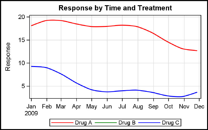
This is a graph of response over time and treatment. You always want Drug A to be red and Drug C to be Blue. You can achieve that by defining a discrete attributes map called “drug” with the value statements to define the line attributes for the three drugs. We have also defined a discrete attribute variable called “drugname” that associates the variable “drug” with the discrete attributes map name “drug.” This new attribute variable is used for the GROUP role. Now, the line attributes defined in the discrete attributes map are used when the corresponding group values are encountered in the data. Note: The discrete legend has a reference to the attribute map and gets all the defined values.
proc template; /*--SAS 9.4--*/
define statgraph Fig_7_2_1;
dynamic _title;
begingraph / subpixel=on;
discreteattrmap name='drug';
value 'Drug A' / lineattrs=(color=red pattern=solid);
value 'Drug B' / lineattrs=(color=green pattern=solid);
value 'Drug C' / lineattrs=(color=blue pattern=solid);
enddiscreteattrmap;
discreteattrvar attrvar=drugname var=drug attrmap='drug';
entrytitle 'Response by Time and Treatment';
layout overlay / yaxisopts=(griddisplay=on label='Response')
xaxisopts=(griddisplay=on display=(ticks
tickvalues));
seriesplot x=date y=val / group=drugname curvelabel=drug name='a'
smoothconnect=true lineattrs=(thickness=2);
discretelegend 'drug' / type=line
endlayout;
endgraph;
end;
run;
proc sgrender data=GTL_GS_Series_Dis_Attr_Map template=Fig_7_2_1; run;
7.2.2 Discrete Attributes Map – Fill Attributes
This is a graph of response over time and treatment. Here you always want Drugs A, B, and C to have specific colors. You can achieve that result by defining a discrete attributes map called “drug” with the value statements to define the fill attributes for the three drugs. We have also defined a discrete attribute variable called “drugname” that associates the column variable “drug” with the discrete attributes map name “drug.” This new attribute variable is used for the GROUP role. Now, the fill attributes that are defined in the discrete attributes map are used when the corresponding group values are encountered in the data.
proc template;
define statgraph Fig_7_2_2;
dynamic _title;
begingraph;
discreteattrmap name='drug';
value 'A' / fillattrs=(color=lilac);
value 'B' / fillattrs=(color=powderblue);
value 'C' / fillattrs=(color=gold);
enddiscreteattrmap;
discreteattrvar attrvar=drugname var=drug attrmap='drug';
entrytitle 'Response by Time and Treatment';
layout overlay / yaxisopts=(griddisplay=on label='Response')
xaxisopts=(griddisplay=on display=(ticks
tickvalues));
highlowplot y=drug high=high low=low / type=bar highcap=cap
group=drugname outlineattrs=(color=black) name='a';
discretelegend 'a';
endlayout;
endgraph;
end;
run;
proc sgrender data=GTL_GS_highlow_Dis_Attr_Map template=Fig_7_2_2;
run;
7.3 Range Attribute Maps
Normally, when you are using a plot statement with a color response role for a heat map or a marker color gradient for a scatter plot, the default three-color model from the active style is used to map the colors. The range used for mapping is the actual data range from the data set variable.
When you want specific value ranges in the data to be represented by specific color ranges, you can use a range attributes map to achieve this behavior. A range attributes map defines an association between data value ranges and colors that are used to display the associated graphical element. The colors used can be a single discrete color, or a color range.
The general process is as follows:
1. Use the RANGEATTRMAP statement block to define a named attribute map.
2. Use one or more RANGE statements to define visual attributes for data value ranges.
3. Define a new attribute map variable by associating a data variable with the attribute map.
4. Use the attribute map variable with the color response role in the plot statement.
Here is a sample code fragment:
begingraph;
rangeattrmap name='AttrMap';
range 1 - 2 / rangecolor=red;
range 2 - 3 / rangecolor=white;
range 4 - 5 / rangecolormodel=(white blue);
endrangeattrmap;
rangeeattrvar attrvar=AttrVar var=var attrmap='AttrMap';
layout overlay;
heatmap x=var y=var colorresponse=AttrVar;
endlayout;
endgraph;
The range color model can be a list of one or more colors.
7.3.1 Range Attributes Map – Discrete Colors
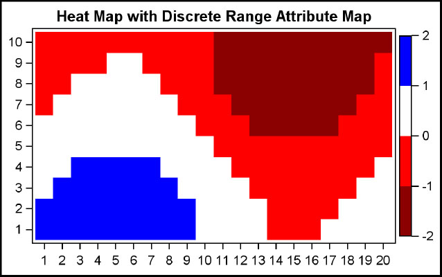
This is a heat map of response by X and Y. You can define a range attributes map called “Resp” with range statements to define the fill attributes for the response value ranges. You can define a range attribute variable called “AttrValue” that associates the column variable “value” with the range attributes map name “Resp.”
This new attribute variable is used for the color response role. Now, the colors for each cell of the heat map are derived from the range colors that are defined in the range attributes map. Note that in this case, the color for the range is a constant color value.
proc template;
define statgraph Fig_7_3_1;
begingraph;
rangeattrmap name='Resp';
range -2 - -1 / rangecolor=darkred;
range -1 - 0 / rangecolor=red;
range 0 - 1 / rangecolor=white;
range 1 - 2 / rangecolor=blue;
endrangeattrmap;
rangeattrvar attrvar=AttrValue var=value attrmap='Resp';
entrytitle "Heat Map with Discrete Range Attribute Map";
layout overlay / xaxisopts=(display=(ticks tickvalues))
yaxisopts=(display=(ticks tickvalues));
heatmapparm x=x y=y colorresponse=AttrValue / name='a';
continuouslegend 'a';
endlayout;
endgraph;
end;
run;
proc sgrender data=GTL_GS_HeatmapParm template=Fig_7_3_1;
run;
7.3.2 Range Attributes Map – Gradient Colors
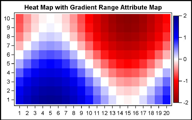
This is a heat map of response by X and Y. You can define a range attributes map called “Resp” with range statements to define the fill attributes for the response value ranges. You also need to define a range attribute variable called “AttrValue” that associates the column variable “value” with the range attributes map name “Resp.”
This new attribute variable is used for the color response role. Now, the colors for each cell of the heat map are derived from the range colors that are defined in the range attributes map. Note that in this case, the color for the range is a gradient of two colors.
proc template;
define statgraph Fig_7_3_2;
begingraph;
rangeattrmap name='Resp';
range -2 - -1 / rangecolormodel=(darkred red);
range -1 - 0 / rangecolormodel=(red white);
range 0 - 1 / rangecolormodel=(white blue);
range 1 - 2 / rangecolormodel=(blue darkblue);
endrangeattrmap;
rangeattrvar attrvar=AttrValue var=value attrmap='Resp';
entrytitle "Basic Heat Map";
layout overlay / xaxisopts=(display=(ticks tickvalues))
yaxisopts=(display=(ticks tickvalues));
heatmapparm x=x y=y colorresponse=AttrValue / name='a';
continuouslegend 'a';
endlayout;
endgraph;
end;
run;
proc sgrender data=GTL_GS_HeatmapParm template=Fig_7_3_2;
run;
7.4 Inline Draw Statements
Often, there is a need to add some annotation to the graph that cannot be added by using one of the plot statements. In such a case, you can use the inline DRAW statements that are supported by GTL. These statements provide great flexibility to draw any text or graphical shape in the graph.
The drawing can be done in one of four contexts using one of the units shown below:
• Draw space: Graph, Layout, Wall, and Data.
• Units: Pixel, Percent, and Value. Value can be used only with the Data draw space.
The supported draw statements are:
• DRAWARROW
• DRAWIMAGE
• DRAWLINE
• DRAWOVAL
• DRAWRECTANGLE
• DRAWTEXT
• BEGINPOLYGON – ENDPOLYGON block with DRAW statements inside
• BEGINPOLYLINE – ENDPOLYLINE block with DRAW statements inside
The statement options for DRAWTEXT statement are shown below as a typical example. See the product documentations for all the details.
Draw Text statement options: Anchor, Border, BorderAttrs, DiscreteOffset, DrawSpace, Justify, Layer, Name, Pad, Rotate, Transparency, Width, WidthUnit, X, XAxis, XSpace, Y, YAxis, YSpace.
7.4.1 Draw Text
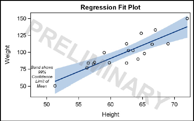
In this graph of weight by height, we want to add some textual annotations to indicate what the band is showing. Also, we want this graph to have a “Preliminary” watermark to indicate the status of the project; if the graph is distributed, the status will stay with the graph. To display these text strings, we have used the DRAWTEXT statements, providing the text string to be displayed, along with the other parameters that are needed to achieve the results. The statement provides for a WIDTH option, which wraps the string within the width provided.
proc template;
define statgraph Fig_7_4_1;
begingraph;
entrytitle "Regression Fit Plot";
layout overlay / xaxisopts=( offsetmin=.1);
drawtext textattrs=(style=italic size=7pt)
"Band shows 99% Confidence Limit of Mean" /
anchor=bottomleft width=15 widthunit=percent
xspace=wallpercent yspace=wallpercent
x=0 y=10 justify=center ;
modelband "myclm";
scatterplot x=height y=weight / primary=true;
regressionplot x=height y=weight / alpha=.01 clm="myclm" ;
drawtext textattrs=(color=gray size=40pt weight=bold)
"PRELIMINARY"/ transparency=.75 rotate=-30 width=200
widthunit=percent justify=center;
endlayout;
endgraph;
end;
run;
proc sgrender data=sashelp.class template=Fig_7_4_1;
run;
7.5 Data Set Based Annotation
Sometimes, you need to add some annotation to the graph that cannot be added by using one of the plot statements. One way to do this was described in Section 7.4. Another way to do this is by using data set annotation.
In this process, you will need to create a data set that contains special reserved column names to define the annotation to be added to the graph. Each observation represents one annotation object. This annotation data set is then provided to the SGRENDER procedure using the SGANNO option.
This method of adding annotations is particularly useful when adding statistics tables that are aligned with other elements in a graph, like mean and median values for each bar in a bar chart. The FUNCTION column in the data set specifies the type of annotation, and additional columns are required based on the function to be performed.
The functions supported are as follows. See the product documentation for details.
• Text
• Textcont – to continue text to create rich text
• Image
• Line
• Arrow
• Rectangle
• Oval
• Polygon
• Polyline
• Polycont – to continue a polygon or polyline
Based on the function to be performed, additional data may be needed as follows:
Id, Anchor, Label, Border, DiscreteOffset, Justify, Layer, Rotate, CornerRadius, Transparency, FillTransparency, Image, ImageScale, Scale, Shape, Direction, Display, XAxis, YAxis, Width, WidthUnit, Height, HeightUnit, X1, Y1, X2, Y2, XC1, YC1, XC2, YC2, X1Space, Y1Space, X2Space, Y2Space, DeawSpace, FillColor, LineColor, LinePattern, LineThickness, TextColor, TextFont, TextSize, TextWeight, TextStyle
7.5.1 Data Set Based Annotation
In this example, we have created a special SGAnnotate data set with the necessary column names to provide all the information needed to draw the text string. Then, the annotation data set “anno” is provided to the SGRENDER procedure using the SGANNO procedure option.
proc template; /*--SAS 9.4--*/
define statgraph Fig_7_5_1;
begingraph;
entrytitle 'Vehicle Statistics';
layout lattice / columns=2;
layout overlay;
barchart x=origin y=mpg_city / stat=mean group=type
groupdisplay=cluster dataskin=gloss;
endlayout;
layout overlay;
histogram mpg_city;
densityplot mpg_city;
endlayout;
annotate;
endlayout;
endgraph;
end;
run;
data anno;
retain function 'text' x1space 'graphpercent'
y1space 'graphpercent';
retain textsize 40 textcolor 'black' textweight 'bold';
width=1000; anchor='center'; x1=50; y1=50; rotate=30;
transparency=0.5; label="Confidential"; output;
run;
proc sgrender template=Fig_7_5_1 sganno=anno
data=sashelp.cars(where=(type in ('Sedan' 'Sports' 'SUV')));
run;
7.6 Summary
In this chapter, you have seen how you can enhance the graphs that you create by using some special features. These features can help you make your graphs robust.
You can use the Discrete Attributes Map and the Range Attributes Map to define specific attributes for group values and response values. This ensures that your graph always represents the data correctly, regardless of the range of the data, or the presence or absence of certain classifications.
You can also enhance the presentation of your graphs by adding specific annotations, either graphical or textual. You can use the in-line draw statements for cases where the embellishments are small in number and of a constant nature. If the annotations are based on data, and larger in number, you can use the data set based annotation features.
In the next chapter, you will learn about some advanced features of the GTL syntax that will help you make your graphs more flexible and extensible.