
Clarify the Data
When displaying data in a presentation, pursue clarity above all else. The people in your audience can’t spend extra time with your projected charts or pull them closer to examine them, as they do with charts in print. They have to get meaning from your numbers at a distance, before you click away.
People will interpret your data slides first by reading the titles, then by looking at the shapes the data make, and then by reading the axes. It’s a multistep process, complex to begin with. So if the information you’re displaying is visually complex, the audience won’t have time to comprehend it.
These rules of thumb will help you clarify—and simplify—your data.
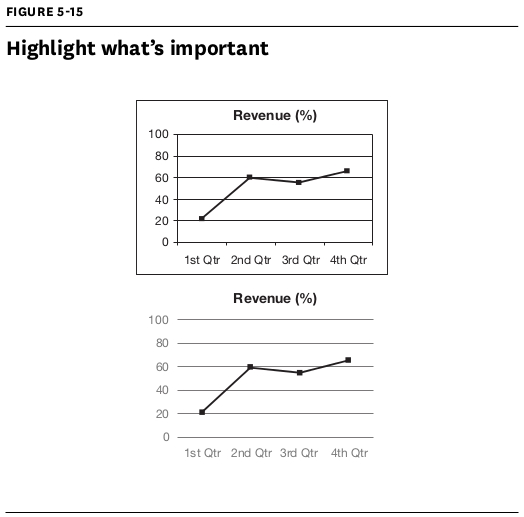
Highlight what’s important
Start by asking, “What would I like people to remember about the data?”—and give that point visual emphasis. If you’re projecting a chart about sales trends over five years but talking specifically about how sales are consistently low in the first quarter, show the first-quarter bar of each year in a rich color and other bars in a neutral color, like gray. Deemphasize grid lines, borders, axes, and labels—you’ll provide that kind of context when you speak, so your visuals don’t have to—and use contrast (color, size, or position) to draw the viewer’s eye to where the meaning is.
Notice in figure 5-15 (top) how the grid lines and borders all have the same weight as the data, so the eye doesn’t know where to go first. But the bottom image—borderless, with muted axes and gridlines—takes viewers right to the point: They see immediately that revenue leveled off after a spike early in the year.
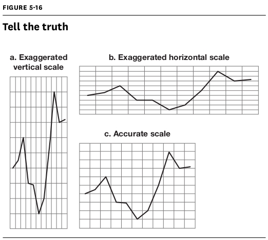
Tell the truth
This may seem obvious, but many presenters play fast and loose with their charts. If you don’t have a z-axis in your data, omit 3-D effects—the depth can make your numbers look larger than they are. In a 3-D pie chart, for example, the pie piece in the foreground appears deceptively larger than the rest. Also, don’t alter the proportions of your axes. Doing so can make a change in the numbers look more significant (figure 5-16a) or less so (figure 5-16b). Square grid lines (figure 5-16c) will keep your data true.
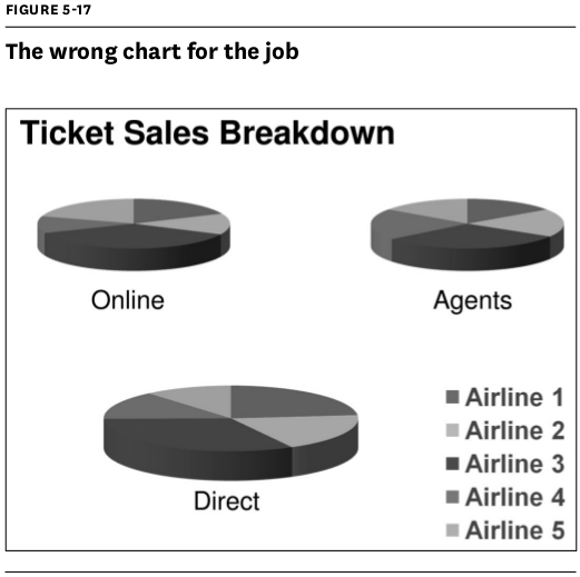
Pick the right chart for the job
The most common charts in business are pies, bars, matrixes, and line graphs. They serve different purposes, though. Use a line graph instead of a bar chart if the shape of the line will draw attention to your most important point. Use a matrix instead of multiple pie charts if you want to show relationships between the data points.
For example, the slide in figure 5-17 uses pie charts to show how airline ticket sales break down between three different sales channels: online, agents, and direct sales. But there’s not much you can deduce from these charts, because they’re visually similar.
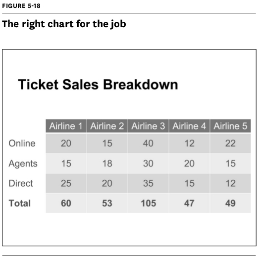
Lay out the data in a matrix, however, and suddenly it’s clear that total sales for Airline 3 are almost double the others (figure 5-18).
Sometimes the best chart is no chart at all. If a number conveys your key message most clearly on its own, show just that number—huge—on the slide.
Find the narrative in the data
Explain not just the “what,” but the “why” and the “how” of your data. Maybe the numbers went up, but what made them go up? What impact did people have on them? How will people be affected by them?
Use concrete comparisons to express magnitude
The bigger a number is, the tougher it is to grasp. Millions, billions, and trillions sound a lot alike, but they’re nowhere near each other in magnitude. Help your audience understand scale by communicating large numbers in concrete terms. For example, if you’re trying to get an audience to visualize a billion square feet, hold up a carpet square that’s 12″ × 12″ and tell them it would take a billion of those squares to cover Manhattan.