Create Slides People Can “Get” in Three Seconds
Audiences can process only one stream of information at a time. They’ll either listen to you speak or read your slides—they won’t do both simultaneously (not without missing key parts of your message, anyway). So make sure they can quickly comprehend your visuals and then turn their attention back to what you’re saying.
Let’s say you’re using the default template in PowerPoint, and you completely fill in the field that says “Click to Add Text” each time you create a slide. That field holds about 80 words, and the average reading speed is 250 words per minute. So, if you develop 40 text-heavy slides for a 40-minute presentation, people will miss about 13 minutes (one-third!) of your talk just because they’re too busy reading your slides to listen.
Another important reason to keep your slides simple: Research shows that people learn more effectively from multimedia messages when they’re stripped of extraneous words, graphics, animation, and sounds. The extras actually take away meaning because they become a distraction. They overtax the audience’s cognitive resources.
Each slide should pass what I call the glance test: People should be able to comprehend it in three seconds. Think of your slides as billboards. When people drive, they only briefly take their eyes off their main focus—the road—to process billboard information. Similarly, your audience should focus intently on what you’re saying, looking only briefly at your slides when you display them.
To create slides that pass the glance test:
- Start with a clean surface: Instead of using the default “Click to Add Title” and “Click to Add Text” slide master, turn off all the master prompts and start with a blank slide. And when you add elements, make sure you have a good reason. Does the audience need to see your logo on each slide to remember who you work for? Does that blue swoosh add meaning? If not, leave it off.
- Limit your text: Keep the text short and easy to skim. Scale the type as large as possible so the people in the back of the room can see it.
- Coordinate visual elements: Select one typeface—two at most—for the entire slide deck. Use a consistent color palette throughout (limit yourself to three complementary colors, plus a couple of neutral shades, like gray or pale blue). Photos should be taken by the same photographer or look as if they are. Illustrations should be done in the same style.
- Arrange elements with care: When you project your slides, they’ll be many times larger than they are on your laptop screen—so they need to be tidy. (Blown up, unkempt slides look downright chaotic.) Align your graphics and text blocks. Size objects appropriately. If one element is larger than another, the audience will interpret that to mean the larger object is more important.
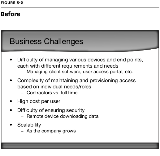
Take a look at the “before” slide (figure 5-2). It fails the glance test because it’s packed with text.
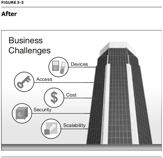
But when you streamline the text and incorporate simple visual elements—as in figure 5-3—you help the audience process the information much more quickly.
Presentation software gives us many shiny, seductive elements to work with. But there’s beauty and clarity in restraint. Though you can develop your visual sensibility by studying well-designed publications, you may also want to ask a professional designer to customize a template for you so you’ll have a solid foundation to build from.