
Arrange Slide Elements with Care
By carefully arranging your slide elements, you can help your audience process the information more easily—and that, as we’ve discussed, frees up people to hear what you’re saying.
Follow these five design principles when arranging elements to simplify your slides.
Flow
Placement governs flow—that is, how the eye travels across a space. You can direct people’s eyes to certain areas of a slide and help your audience get to the important points quickly. People should be able to move their eyes across your slide in one back-and-forth motion and be done processing the information.
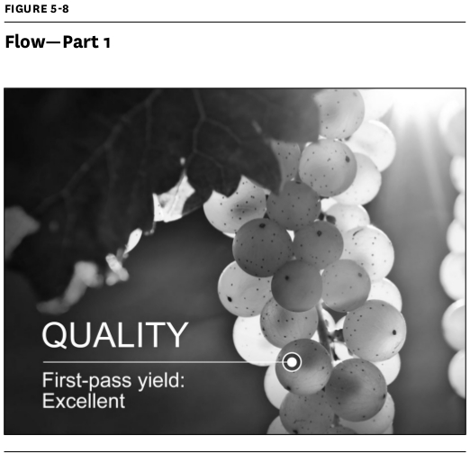
In figure 5-8, your eye takes in the cluster of grapes, then moves to the text, then focuses on one individual grape.
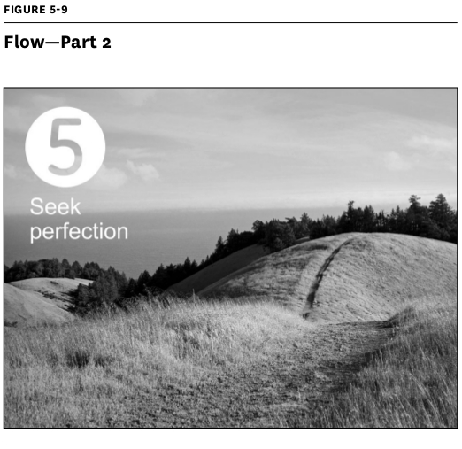
The next example (figure 5-9) shows one of a series of five points made. Your eye moves from left to right: You see the number 5 and the title, then your eye follows the path to the ridgeline.
Contrast
Our eyes are drawn to things that stand out, so designers use contrast to focus attention. Create contrast through your elements’ size, shape, color, and proximity.
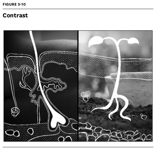
Look at figure 5-10, where the presenter compared cross-sections of skin and soil to show that tending to both requires an understanding of the microbiological activity beneath the surface. Notice how the blurred background images set off the stark white illustrations in high relief so they can be processed quickly.
White space
White space is the open space surrounding items of interest. Presenters are often tempted to fill it up with additional content that competes for attention. But including a healthy amount of white space imparts a feeling of luxury (advertisers have discovered that it creates higher perceived value) and sharpens viewers’ focus by isolating elements.
That doesn’t necessarily mean that everything is literally “white”—just that the design feels spacious. See the example in figure 5-11:
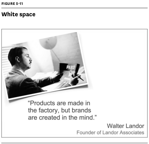
If we’d paired the quote with a larger or more detailed image, your eye wouldn’t know where to begin. Buried, the quote’s message would have lost its power.
Hierarchy
A clear visual hierarchy allows viewers to quickly ascertain a slide’s most important elements.
The sample slide in figure 5-12, citing a statistic from a recent McKinsey study, has a top-down hierarchy: You process the picture, and then the large percentage, and then the supporting copy.
Unity
Slides with visual unity look as though the same person created them and make your message feel cohesive. You can achieve this through consistent type styles, color, image treatment, and element placement throughout the slide deck.

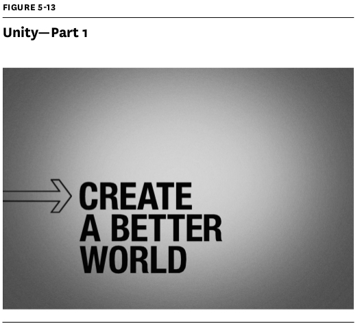
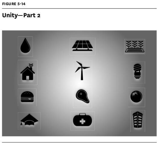
The slides in figures 5-13 and 5-14 feel united for a couple of reasons: Both of their backgrounds are dark around the edges and lighter in the middle. Also, all the type and the images are black.