10
Advanced and Experimental Features
HTML is constantly changing and evolving to meet the needs of modern web developers, users, and devices. A perfect example of this is the srcset attribute, which allows the use of multiple images with the <img> and <source> elements.
This wasn’t part of the original HTML5 spec, but it was added because enough people requested and voted on the proposal. In this chapter, you’ll learn about some of the cool advanced features built into HTML5, what’s coming down the pike, and how to start using those experimental features today.
It’s All About Browser Support
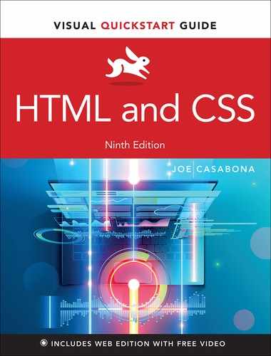
Hopefully it’s clear by now that how webpages render and work is highly dependent on the browser on which your end user views them. A page with one set of markup will render differently in two different browsers (FIGURE 10.1).
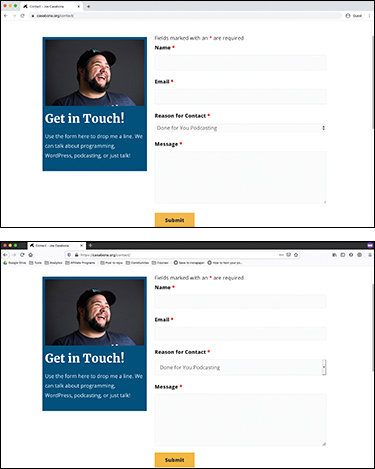
Figure 10.1 A website rendered in Chrome compared to its rendering in Firefox
That’s a result of the fact that some browsers support new features before others, and the way a new feature is implemented in one browser might be totally different from its implementation in another.
The HTML specification (or spec) is the document that describes new features in HTML and how they should work. Then it’s up to browsers to implement that spec. Things have gotten a lot better in recent years, with browser developers working together to make sure there’s not a lot of disparity between them.
But you should still be mindful that some browsers might support new features sooner than others, and until a feature is marked as an official part of the HTML spec, its functionality could change from browser to browser.
Checking browser support with “Can I Use …”
The best place to check browser support is the website caniuse.com (FIGURE 10.2).

Figure 10.2 Caniuse.com
Caniuse.com allows you to look up an HTML or CSS tag or attribute, and it gives you a full report on how it’s used and what browsers support it. It will also give you helpful information like global usage statistics, whether some browsers provide partial support, and known issues.
Checking this site is a good idea if you want to implement something (especially for new and experimental features) and you’re not sure how widely supported it is.
Fallbacks and polyfills
In the event that you want to use a feature of HTML that might not be supported by all browsers, as a contingency plan you can implement fallbacks or polyfills.
A fallback is code or content used in the event that the original code or content isn’t supported by the current browser. It’s a way of saying to the browser, “If you don’t understand the main code, use this other code instead.”
HTML is very forgiving, so unsupported markup is just ignored. This is great for you as a web designer, because it means that if you want to use something like srcset, you can. Just make sure to include a standard src attribute as a fallback for browsers that don’t yet support srcset.
The same goes for most elements. Either there’s a default fallback (like unsupported form elements defaulting to the text input type) or you can define your own fallback (as in the srcset/src example). In features you’ll see later in the book, you can even define an error message that users will see if their browser doesn’t support the feature. Each of these prevent your website from completely breaking in older browsers.
You can also add a polyfill. Mozilla (the creators of the Firefox browser) defines it like this: A polyfill is a piece of code (usually JavaScript on the Web) used to provide modern functionality on older browsers that do not natively support it.
Basically, you add code that you can download to older browsers to support newer elements. While writing JavaScript is outside the scope of this book, one example is using a polyfill to add srcset support to old browsers. You can download the polyfill, called Picturefill.js, from scottjehl.github.io/picturefill/. Include a reference to the code in the head of your HTML document by using the <script> element, which allows you to pull in code that is not HTML or CSS. It’s most commonly used for JavaScript, and it works very similarly to the <style> element, which you’ll learn about when you get to the CSS section of the book. For the examples in this chapter, the script element is being used to pull in an external JavaScript file.
Assuming the file picturefill.js is in the root directory, add the highlighted code to the <head> element:
<head>
    <script src="picturefill.js">
    →</script>
</head>
This script will do the heavy lifting of checking the browser to see if srcset is supported and, if it’s not, creating the attribute for you to use.
Advanced Elements
So what exactly qualifies as an advanced HTML element? For me, it’s any element that is supported by HTML5 but requires something extra (usually JavaScript) to work. Everything you should know about JavaScript would certainly fill more than one book, so there won’t be much JavaScript here.
The <canvas> element
The <canvas> element allows you to create drawings by writing JavaScript (FIGURE 10.3). In more advanced examples, you can even allow website visitors to use their mouse cursor to draw in real time.
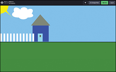
Figure 10.3 A house drawn with the <canvas> element
This is an example of an element that requires heavy JavaScript to use. HTML5 basically gives you a way to execute JavaScript in real time to draw things, and then a set of functions to help you draw. This demonstrates how powerful HTML and the browser have become.
Adding support for offline storage
One great feature of HTML5 that has evolved as a result of its use on mobile devices is support for offline storage. This allows you to tap into the browser’s local storage and keep content there in case the user’s device goes offline (FIGURE 10.4).

Figure 10.4 When viewed with a broken internet connection, the Twitter mobile site uses offline storage to show most of the page.
Designing your website to allow offline storage also lets you store assets on the user’s device and helps the site to load faster.
While offline storage does use some JavaScript to store and retrieve data, the code is very readable. This task demonstrates the basic idea. It builds on the example you saw in the Chapter 9 section “Input fields” which gave you the code for building a search box.
To store data offline:
In between the opening and closing
<head>tags, type<script>.This tag tells the browser that the following markup is JavaScript and should be processed as such.
Type
localStorage.setItem ("lastSearch", "Atlantis");.In Chapter 9, you created a search box and entered the term “Atlantis.” You’re building on that same code example here.
localStorage.setItemcreates a key name-value pair. You’ll learn more about variables in a later chapter, but for the purposes of this task, know that we are storing something named “lastSearch” and it has a value of “Atlantis.”Type
</script>.
This produces no visible change on the webpage, but it tells the browser, “Store this, just in case you go offline.”
Retrieving information is just as straightforward.
To retrieve offline storage data:
After the opening
<body>tag, type<div id="last-search">.You’re using the general-purpose
divhere because it’s not a specific section of the website. Theidattribute provides context for what information it contains.Type
<script>.Type
document.write( localStorage. getItem("lastSearch") );.document.writetells JavaScript to display text in the browser for the user to see. Unlike with HTML, which will display anything that isn’t a tag, you need to explicitly tell JavaScript when something should be displayed.localStorage.getItemtells JavaScript to retrieve the item you stored in the last task.</script>.</div>.Open your HTML file in the browser to view the results (FIGURE 10.5).

Figure 10.5 The data retrieved from offline storage
Experimental Features
The HTML5 spec is a living document that is constantly changing and being updated based on proposals from developers, companies, and individuals like you.
It’s often hard to nail down what new features are being worked on, what’s been accepted, and what’s going to become official.
Caniuse.com can be a good resource for this, especially the news page: caniuse.com/#info_news.
Many advanced features being developed for HTML today are application programming interfaces (APIs). These APIs, like Canvas and Local Storage, are aided by JavaScript. But there’s one fantastic feature that is as easy to implement as an attribute is.
Lazy loading
Lazy loading is a technique used to download and display only the parts of your webpage that a user sees in the browser window. This allows the browser to download only what it needs, making webpages load faster.
Traditionally this has been done with JavaScript or another scripting language. However, native support for the feature is now being added to browsers (FIGURE 10.6).
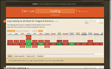
Figure 10.6 The caniuse.com page for native lazy loading
To add lazy loading to images:
Type
<img src="space.jpg".Type
loading="lazy".This attribute is where the magic happens! You’re telling the browser that this image should be lazy-loaded. Since the browser has this information, it checks to see whether the image is showing in the user’s viewport (the browser window), and if it is, the image will be loaded.
Type
alt="This is outer space."/>.
That’s it! Now the browser will download and display this image only if the user has scrolled to its vicinity.
Wrapping Up
With that look at some of the more advanced features of HTML, you’ve come to the end of the HTML section of this book. You can now mark up a page, display text and media, and build forms!
But that’s only half the battle. Now that you have the “function” aspect of a website down, it’s time to look at the “form” aspect: making websites look good with CSS.