
Chapter 14
Enhancing HTML5 Forms with JavaScript
In This Chapter
 Reviewing special HTML5 form features
Interacting with form elements
Performing validation checks on forms
So far the book has discussed forms in general. The form examples rely on the modern features that JavaScript supports, but they could have been any form from any of the newer versions of HTML. This chapter is different. Instead of looking at forms in general, you encounter forms specifically designed for use in an HTML5 environment.
 Many people think newer is better. However, that isn’t always the case. This chapter presents a tradeoff. Yes, you get to use the new features that HTML5 provides to create robust applications that require less coding on your part. The new features that HTML5 supports make it easier to create applications that work consistently across platforms and browsers. The tradeoff is that these applications won’t run on older browsers that don’t support HTML5 (many of these older browsers don’t even support the version of HTML in existence at the time they were created). The applications may look like they’ll work for a while, but eventually they’ll fail. When you have a lot of users that rely on older browsers and are unlikely to upgrade, you risk alienating them in order to take advantage of new technology. It’s also important to note that HTML5 is still in the process of becoming a standard, so you may still see changes in how it works.
The first section of this chapter is a must read because it helps you understand the new features that HTML5 brings for forms. Previous chapters help you understand forms as they exist for the majority of browsers today. These new features are specific to HTML5, and you can use them only with HTML5 applications. To use the new features, you must know that they exist and understand why they’re so important.
The rest of the chapter provides specific examples of how HTML5 can make your development experience much better and improve the user’s experience as well. You discover how HTML5 provides greater flexibility, enhances security, creates a reliable environment, and defines better consistency. All these elements are essential given the heavy reliance on browser-based applications today.
Revisiting the HTML5 Form Features
Before you can begin using the new form features of HTML5, you need to know what they are. HTML5 strives to make the user experience better by creating a more flexible environment. The addition of controls that make input requirements more specific reduce user frustration with inputting incorrect data. In addition, these changes make the environment more secure by making it harder to input unexpected data, and they make the environment more consistent because the controls help developers create robust applications without resorting to odd coding techniques. The following sections provide you with an overview of the various HTML5 changes.
Working with the new elements
HTML5 provides a number of new elements that make it easier to write applications. The following list provides an overview of these elements:
<article>: Defines standalone text that makes sense on its own. Even though the text appears as part of a larger page, you could move the text somewhere else and still find it readable. Potential sources of articles include:
• How-to post
• Forum post
• Blog post
• Commentary or opinion piece
• News story
• Comment
<aside>: Provides material that's related to the rest of the material on a page, but is in addition to it and not actually part of that material. Many people refer to such material as a sidebar. The main content of the page should read well without the aside in place.
<audio>: Specifies the source and playing conditions for audio presented on a page.
<bdi>: Provides the means of placing text that may be formatted in an alternative direction in isolation from the text surrounding it. For example, if you wanted to place a Chinese quote on an English language page, you could use the Bi-Directional Isolation (BDI), <bdi>, tag to do it.
<canvas>: Allows dynamic drawing of graphics on the page using a language such as JavaScript. The canvas acts as a container for the drawing — the developer must still provide code to perform the actual drawing.
<embed>: Allows inclusion of an external application or interactive content (such as a plug-in).
<figcaption>: Defines a caption for a figure that's placed within a <figure> tag.
<figure>: Creates a container for holding self-contained material such as images, diagrams, and code listings.
<footer>: Contains information about the container element in which it appears. This tag is normally used to provide descriptive information about the container's content.
<header>: Provides a heading or navigational aids for the container in which it appears.
<hgroup>: Defines a group of headings used together to create content. For example, you could use this feature to create an outline on pages with complex content.
<mark>: Specifies that the affected content is highlighted in some way.
<nav>: Creates a blog of navigational links. This tag is used for major link blocks rather than individual links that appear in other areas of a document.
<rp>: Specifies how a browser should react if it doesn't support ruby annotations. This tag is used with the <rt> and <ruby> tags to provide a complete solution for ruby annotations.
 A ruby annotation is a short run of text that appears alongside the baseline text that's used to show pronunciation or to provide a short annotation. This feature is normally used with East Asian languages. You can read more about ruby annotations at
 http://www.w3.org/TR/ruby. The demonstration at http://www.alanflavell.org.uk/www/umusalu.html shows ruby annotations in use.
<rt>: Provides an explanation or annotation of pronunciation of text. This tag is used with the <rp> and <ruby> tags to provide a complete solution for ruby annotations.
<ruby>: Defines a ruby annotation. This tag is used with the <rp> and <rt> tags to provide a complete solution for ruby annotations.
<section>: Creates a document section. A document section can include chapters, headings, footers, or other sectional content.
<source>: Links the document to external multimedia resources such as audio or video files.
<video>: Specifies the source and playing conditions for video presented on a page.
 This list is incomplete for a good reason (you can find a complete list at
 http://www.w3schools.com/tags/default.asp). Some of the tags are poor choices for creating applications, so the book doesn't discuss them. You may be tempted to use tags that aren't supported well by other browsers, but you must consider the ramifications of doing so. For example, the <command> tag doesn't appear in this list because it's poorly supported by browsers. Only Internet Explorer version 9 and above support the tag, so you'd need to be sure that application users have this browser installed. Likewise, Internet Explorer doesn't support the <datalist> or <keygen> tags (although a majority of other browsers do support them). When you build an application for use in an organization with specific criteria, tags such as <details> could prove useful; but again, the <details> tag works on the Mac only, and the user must use either the Chrome or Safari browsers. At least one tag, <time>, is also read by all browsers, but they don't render it in any way, making the tag pretty much useless.
Working with the new controls
Forms are hard to put together at times. Part of the problem is that the real world has more data types than HTML was originally designed to accommodate. It's no wonder, then, that each new version of HTML has included a few new <input> tags to make form creation simpler. Table 14-1 describes the <input> tag additions for HTML5.
Table 14-1 New Controls Available with HTML5
|
Control |
Supported Browsers |
Description |
|
|
Chrome and Opera |
Displays as a color picker dialog box on browsers that support it. Browsers that don’t support this control often display it as a text box where the user can enter a color name or other valid color input. |
|
|
Chrome, Safari, and Opera |
Displays a date picker dialog box on browsers that support it. Browsers that don’t support this control often display it as a text box where the user can enter a valid date. |
|
|
Safari and Opera |
Displays a date and time picker dialog box on browsers that support it. Input includes a time zone. Browsers that don’t support this control often display it as a text box where the user can enter a valid date. |
|
|
Safari and Opera |
Displays a date and time picker dialog box on browsers that support it. Input relies on the local time zone. Browsers that don’t support this control often display it as a text box where the user can enter a valid date. |
|
|
Firefox, Chrome, and Opera |
Renders as a standard text box for inputting an e-mail address. However, using a specific control helps the user understand the kind of content you want. In addition, mobile devices often provide a context-specific keyboard for inputting the information. |
|
|
Chrome, Safari, and Opera |
Renders as a standard text box for inputting the month and year. However, using a specific control helps the user understand the kind of content you want. In addition, mobile devices often provide a context-specific keyboard for inputting the information. |
|
|
Chrome, Safari, and Opera |
Creates a text box and spinner combination for inputting a number on browsers that support it. Browsers that don’t support this control often display it as a text box where the user can enter a valid number. |
|
|
Chrome, Safari, and Opera |
Displays a slider where a user can choose from a range of input values on browsers that support this control. Browsers that don’t support this control often display it as a text box where the user can enter a valid value (usually numeric). |
|
|
Chrome and Safari |
Renders as a standard text box for inputting a search term. The text box does include a clear button on browsers that support it. Using a specific control helps the user understand the kind of content you want. |
|
|
N/A |
No browsers currently support this control. However, when support becomes available, the control renders as a standard text box for inputting a telephone number. Using a specific control helps the user understand the kind of content you want. In addition, mobile devices often provide a context-specific keyboard for inputting the information. |
|
|
Chrome, Safari, and Opera |
Creates a specialized segmented text box and spinner combination for inputting the time on browsers that support it. The hours, minutes, seconds, and milliseconds each have a separate entry area in the text box. Browsers that don’t support this control often display it as a text box where the user can enter a valid time. |
|
|
Firefox, Chrome, and Opera |
Renders as a standard text box for inputting a URL. However, using a specific control helps the user understand the kind of content you want. In addition, mobile devices often provide a context-specific keyboard for inputting the information. |
|
|
Chrome, Safari, and Opera |
Renders as a standard text box for inputting the week (as a numeric value) and year. However, using a specific control helps the user understand the kind of content you want. In addition, mobile devices often provide a context-specific keyboard for inputting the information. |
It's important to note that none of the tags in Table 14-1 enjoys support from all the browsers and platforms on the market today; you need to choose these additional tags carefully. You can find demonstrations of most of these controls at http://dev.opera.com/articles/view/new-form-features-in-html5. Because these tags are so useful, expect to see better support for them in future versions of most browsers.
Understanding the new attributes
HTML5 provides access to a number of useful new attributes. There are only two new form-specific attributes: autocomplete and novalidate. The autocomplete attribute determines whether the browser turns autocomplete on or off for a form as a whole. Every browser on the market supports the autocomplete attribute. The novalidate attribute is true when the browser should avoid validating form input. Only Firefox, Chrome, and Opera support the novalidate attribute, which means you must use it with care.
The <input> tag also has a number of new attributes associated with it. Of the new attributes, Internet Explorer supports only the height and width attributes. Table 14-2 provides an overview of the attributes and tells you which browsers support them. In most cases, most browsers, with the exception of Internet Explorer, support the new attributes.
Table 14-2 <input> Tag Attribute Additions in HTML5
|
Attribute |
Supported Browsers |
Description |
|
|
Firefox, Chrome, Safari, and Opera |
Determines whether the browser turns autocomplete on or off for a specific control. It’s possible to change the form-level setting independently from the control-level setting. The control-level setting always takes precedence. |
|
|
Firefox, Chrome, Safari, and Opera |
Determines that the element should automatically receive the focus when the page loads when set to true. |
|
|
Firefox, Chrome, Safari, and Opera |
Specifies that an element belongs to one or more forms. You can create a single element to appear on multiple forms by providing a comma-separated list of forms. |
|
|
Firefox, Chrome, Safari, and Opera |
Defines the name of an application file that will process the input when the form is submitted to the server. |
|
|
Firefox, Chrome, Safari, and Opera |
Specifies the kind of encoding that the browser should use when submitting the input to the server. |
|
|
Firefox, Chrome, Safari, and Opera |
Controls the method that the browser will use for submitting the input to the server. For example, you can choose to submit the data by using the post method. |
|
|
Firefox, Chrome, and Opera |
Specifies that the affected input isn't validated prior to submitting it to the server when set to |
|
|
Firefox, Chrome, Safari, and Opera |
Defines a target that should receive output (the result) from the server after submitting the form. Each input can have a different target for multiple outputs. |
|
|
Internet Explorer, Firefox, Chrome, Safari, and Opera |
Control the height and width of any element. It’s essential to set both height and width when loading graphics to ensure consistent and error-free browser operation. |
|
|
Firefox, Chrome, and Opera |
Specifies which |
|
|
Chrome and Opera |
Determine the minimum and maximum values that an input element can accept. |
|
|
Firefox, Chrome, Safari, and Opera |
Allows the user to enter more than one value in an input element when set to true. |
|
|
Firefox, Chrome, and Opera |
Provides a regular expression that's used to validate the input element's data when the user submits it. Even if your JavaScript editor lets you use this attribute with all (or most) input controls, browsers only check it with the |
|
|
Firefox, Chrome, Safari, and Opera |
Allows the developer to provide a hint or short piece of text to describe the expected input value for an input element. The text appears grayed out and disappears when the user starts inputting data. |
|
|
Firefox, Chrome, and Opera |
Ensures that the user provides a value for the input element, but doesn't ensure that the input is correct (or even feasible) when set to |
|
|
Firefox, Chrome, and Opera |
Define an input interval for the |
Accessing Form Elements
As with any other HTML elements, you can interact directly with HTML5 elements. The trick is to ensure that the elements you choose will work with the browsers and platforms you need to support. In this example, you see how to use the <figure> and <figcaption> tags as part of a solution that loads an image from disk and stores it in an <img> tag. The following code shows the HTML you use to perform the task. (You can find complete code for this example in the Chapter 14 folder of the downloadable code as ImageLoad.HTML.)
<figure onclick="Clicked()">
<img id="Image"
src=""
alt=""
height="200px"
width="200px">
<figcaption id="Caption" />
</figure>
The <figure> tag acts as a container that holds the tags <img> and <figcaption> . The use of a container like this means that you can perform tasks such as formatting both image and caption at the same time. Events are also handled jointly. In this case, it doesn't matter whether the user clicks the image or the caption, the application calls Clicked(). In this case, all that Clicked() does is display a message to the user as shown here:
function Clicked()
{
// Display a message.
alert("You clicked the image.");
}
JavaScript is fully capable of accessing these elements. In this case, the <img> tag is empty when the form loads. Clicking a button displays the image onscreen by changing the <img> tag content. Here's the code needed to load the image:
function LoadImage()
{
// Specify the image.
var Image = document.getElementById("Image");
Image.alt = "This is a test image.";
Image.src = "TestImage.png";
// Set the caption.
var Caption = document.getElementById("Caption");
Caption.innerHTML = "A Test Image";
}
When working with the <img> tag, you access the src (image source) and alt (image alternative text description) attributes directly. Set the <figcaption> content using the innerHTML property. Figure 14-1 shows typical output from this example.
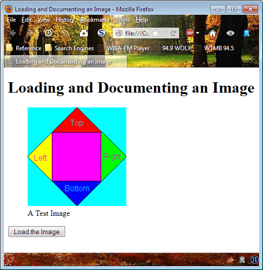
Figure 14-1: Use the <figure> tag to make it easier to work with media.
Validating Forms
Validation is an important part of working with forms. Unfortunately, not every browser provides support for the validation features of HTML5. The example in this section won’t work with Internet Explorer because Internet Explorer fails to support any of the HTML5 validation features. In order to validate input for Internet Explorer, you need to use the techniques described in previous chapters. For example, Chapter 9 shows techniques for validating optional arguments that you could also use to validate form data.
A large part of validating data in HTML5 is creating the right type of form. The following code shows a simple form with a name, telephone number, and two password fields (an original and a confirmation). (You can find complete code for this example in the Chapter 14 folder of the downloadable code as ValidateData.HTML.)
<form action="#" method="post"
enctype="multipart/form-data">
<fieldset>
<div>
<label>Name:</label>
<input id="Name"
type="text"
placeholder="Type Your Name"
maxlength="100"
nbps;
required
x-moz-errormessage="Type Your Name"/>
</div>
<div>
<label>Telephone:</label>
<input id="Telephone"
type="tel"
placeholder="Type Your Number"
pattern="ddd ddd dddd"
required
x-moz-errormessage=
"Type Your Number as XXX XXX XXXX"/>
</div>
<div>
<label>Password:</label>
<input id="P1"
type="password"
placeholder="Password" />
</div>
<div>
<label>Confirm Password:</label>
<input id="P2"
type="password"
placeholder="Password"
onfocus="ValidatePassword(
document.getElementById('P1'), this);"
oninput="ValidatePassword(
document.getElementById('P1'), this);"/>
</div>
</fieldset>
<fieldset>
<div>
<input id="Submit"
type="submit"
value="Submit Data" />
</div>
</fieldset>
</form>
The first two fields use automatic validation as supplied by HTML5. Notice the use of the required attribute in both cases, which means the user must type a value (not necessarily a correct value). In addition, the placeholder attribute provides a clue as to what the user needs to type, which is always a good first step in obtaining information. The maxlength attribute prevents users from trying to type too much or someone inputting a script instead of content. Likewise, the pattern attribute looks for specific information from the user.
 The generic error messages that HMTL5 provides are acceptable, but hardly enlightening. This example shows how to use the
 x-moz-errormessage attribute in order to create a custom error message. Many browsers don't support this attribute, so users may still see the generic error message, but there's at least a chance that users will see something that's a little more targeted toward providing helpful information.
The two password fields can't rely on standard HTML5 validation. In this case, you must use JavaScript to confirm that the user has entered the same password in both fields and that the fields do, in fact, contain a password. Here's the ValidatePassword() function used to perform the validation:
function ValidatePassword(P1, P2)
{
if (P1.value != P2.value ||
P1.value == "" ||
P2.value == "")
{
P2.setCustomValidity(
"The Password Is Incorrect");
}
else
{
P2.setCustomValidity("");
}
}
The example verifies that both password fields contain an entry and that the entry is the same in both fields. Of course, your password check could do more. Figure 14-2 shows a typical validation error message for this example. The error message appears as a pop-up. Notice how each field contains a helpful hint on what to type.
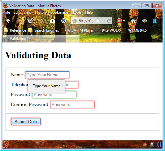
Figure 14-2: Validation is an important part of any application.