
Chapter 6. Building user-friendly forms using Flex formatters and validators
In this chapter, you’ll learn how to use the formatters and validators that make building data entry forms in Flex such a pleasure—well, at least compared to everywhere else. Flex formatters are used primarily to format data that’s being displayed to the user in controls like the DataGrid you saw in chapter 5. Flex formatters can also be used to take user input and turn it into correctly formatted input. Flex validators are used to validate user input and display validation messages when the user input isn’t correct.
The API documentation for formatters and validators is excellent in many regards; however, one area it has always been lousy at is showing how to use formatters and validators together on the same input controls that the user is using. There’s a good reason for this: it’s a bit tricky to do well! However, if you care about making your forms as usable as possible, this is the road you’ll inevitably end up going down. So, if you do, the time this chapter could save you should alone be worth the book price.
Ever since Flex 1.0, the support for formatting has been good, and the support for validation has been better. The biggest improvement since the early days of Flex is that validator classes can now have id properties and that you can bind to their properties. So, building apps that integrate formatting and validation on the same components is easier now than it once was.

We’ll start by building a small toy example that uses the built-in Flex formatters and validators in a straightforward way. Our goal is to see how formatters and validators work without extra work on our part. Then, we’ll dive in and build a full-fledged AddressForm that will show how formatters and validators can be used together in real-world situations. This task will require some effort on our part: the AddressForm is about 180 lines of code, so it’s a bit more complex than the examples we’ve seen so far. This is fine, however: as we’re concluding the stand-alone workshop sessions in this chapter, it’s good to end with a bang, not a whimper. Furthermore, form code may seem boring, but it’s a meal ticket for many Flex programmers. Also, there are lots of ways to shoot yourself in the foot with data binding when integrating formatting and validation, so this is a very relevant chapter.
Besides, in the next chapter we take the sustained example approach even further, spending some 40 pages building a Twitter + Yahoo! Maps mashup. So, wading through a few pages of form code will serve as an appetizer for the code feast ahead, if you wish. Finally, we’ll be using the Form and FormItem Halo layout components in the AddressForm. So, we haven’t seen the last of Halo.

First, however, let’s build the small toy example that uses the built-in Flex formatters and validators that I promised.
Session 25. Formatters and validators

In this workshop session, we’ll start by seeing what the built-in formatters and validators in Flex can do. At this point I could launch into a huge example featuring all the standard Flex formatters and validators at once, but they essentially all function the same way (except for CreditCardValidator; see the API documentation for details).
All formatters are subclasses of mx.formatters.Formatter. The subclasses of Formatter that come with Flex 4 are CurrencyFormatter, DateFormatter, NumberFormatter, PhoneFormatter, and ZipCodeFormatter. The Formatter class defines a format() method, which must be overridden by its subclasses.
Similarly, all validators are subclasses of mx.validators.Validator, which implements the ability to make required the field it’s validating by setting the required property of the Validator to true. The following are the different Validator subclasses included in Flex 4: CreditCardValidator, CurrencyValidator, DateValidator, EmailValidator, NumberValidator, PhoneNumberValidator, RegExpValidator, SocialSecurityValidator, StringValidator, StyleValidator, and ZipCodeValidator.
So, since they’re essentially all the same, in this workshop session we’ll pick one formatter and one validator to look at: CurrencyFormatter and CurrrencyValidator. I selected these since showing how they interact is straightforward, and since formatting money is something you may very well want to do. We’ll build a small app that uses both on the same Spark TextInput class. We’ll see many more formatters and validators in the next session when we build an address form.
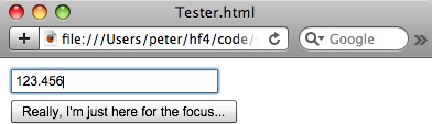
The app we’re going to build in this session looks like this when we’re typing text into the TextInput:
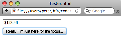
Once we focus out (by pressing the Tab key), the CurrencyFormatter formats the text, resulting in the following screen:
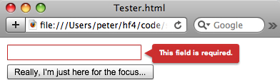
If we type garbage into the field and focus out, we preserve the garbage in question so that our validator shows the correct message:

This is a lot of functionality, and it would take a lot of code to accomplish this in some frameworks. Let’s see the Flex code for this.
session25/src/Tester.mxml

|
This function formats the text on focusOut. |
|
|
|
We only assign the text to the moneyTI.text if formatting succeeded. |
|
|
The CurrencyFormatter is set to round to the nearest penny. |
|
|
The CurrencyValidator is set to validate the text property of the moneyTI. |
|
|
Here we handle the focusOut Event of the moneyTI TextInput. |
Note that if we didn’t use the guard statement  inside the moneyTIFocusOutHandler
  , the currencyFormatter
  would assign the text of the moneyTI
  in all cases. This result would be less than satisfactory, since even though the CurrencyValidator
  would show an error message, it would be the error for having typed nothing (because the CurrencyFormatter would be triggered before the CurrencyValidator). The following screenshot shows this:
That’s it! We’ve seen how to use formatters and validators together, and you now know that with a bit of care in checking the formatter output you can produce a very usable UI.
Key points
- Formatters are used to format text nicely.
- Validators are used to validate whether a value matches the criteria defined by the validator. Typically, they’re used with TextInputs, but (as we’ll see in the next session) they can also be used with things like DropDownLists.
- Formatters return the empty string when they fail, so be sure to check for that before using their value somewhere. Otherwise, you’ll be validating the wrong thing.
- You can write your own custom formatters and validators, as we’ll see in the next section.

Session 26. Real-world forms, formatters, and validators
In this workshop session, we’ll dive deeper into formatters and validators, building an AddressForm that’s as close to production code as you’ll get in a book. Of course, in the real world things aren’t as easy as in toy examples, so this workshop session won’t be a toy either. We’ll use a number of validators in this example, specifically a NumberValidator, RegExpValidator, StringValidator, and ZipCodeValidator. We’ll also use the ZipCodeFormatter class. This table shows how we’ll use these classes in this session:
|
Class |
Purpose in this session |
|---|---|
|
NumberValidator |
Validating that DropDownLists have selected values |
|
RegExpValidator |
Performing customized validation of Canadian postal codes |
|
StringValidator |
Validating that the Street Address and City fields have the minimum amount of text in them |
|
ZipCodeValidator |
Validating US zip codes |
|
ZipCodeFormatter |
Formatting US zip codes and Canadian postal codes |
Here’s the app we’re building in this workshop session:
We’re building a reusable AddressForm component, an Address to use in it, and a Tester app to demonstrate switching between Addresses and show how the AddressForm correctly responds. (Like all the code in this book, the AddressForm is MIT-licensed, so you can use it in your own commercial apps.)
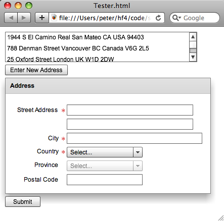
As shown in the following screen, when you click an Address in the top List, you populate the AddressForm with the Address you selected.

I’ll show screenshots of how this app behaves as we go into code; for now, let’s start by looking at the Tester app.
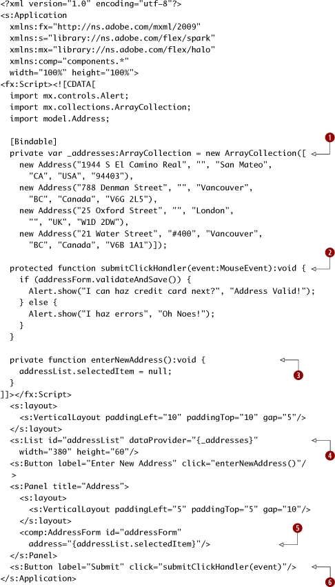
session26/src/Tester.mxml
|
The _addresses ArrayCollection of test Addresses holds the addresses we’ll use. (The first two are of Santa Ramen and Kintaro Ramen, both of which I love.) |
|
|
|
The submitClickHandler function validates and saves the Address and shows an alert based on the result. |
|
|
The enterNewAddress function simply sets the selectedItem to null, which also triggers the binding to the address property. |
|
|
The addressList has a dataProvider of _addresses. |
|
|
The AddressForm has its address property bound to the selectedItem of the addressList. |
|
|
The Submit button click event triggers the submitClickHandler. |
We start by creating an ArrayCollection of _addresses, which is used as the dataProvider of the addressList . The selectedItem of this List is passed into the AddressForm that we’re building. We have a Submit button  whose click event is handled by a function that calls the validateAndSave method of the AddressForm and shows one of two Alert messages based on the outcome. We can also click an Enter New Address button that calls the enterNewAddress() function to null out the existing address.
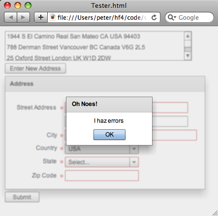
The following figure shows an Alert that happens on a validation error.
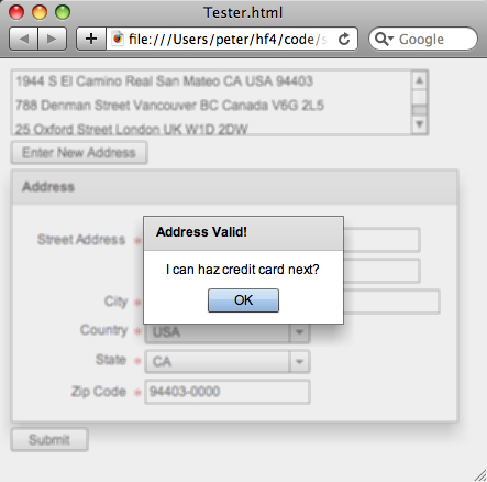
Similarly, here’s what happens when all the validations succeed:
Next, we create the Address model class.
session26/src/model/Address.as
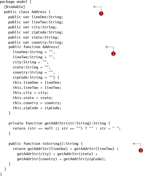
The Address model is pretty straightforward: we want every variable to be bindable, so we stick a [Bindable] annotation on the class. (Making things bindable results in more code being generated, so don’t abuse this notation.) Second, we create
a constructor that has default values (the empty string) for all its parameters. This lets us just specify some (or none) of the parameters
when creating a new Address. Finally, we create a toString function which uses a getAddrStr utility method to ensure that Addresses with only some fields specified don’t have a bunch of extra spaces. (Yes, it will have one extra space at the end; fixing
this is an exercise for the reader.)
Just as in Java, the toString method is called whenever an object needs to be presented as a String form, and it’s often overridden to present the information in a more usable manner. Note that what I’m doing here is OK in the toString method, but in general the model code should not define view level information.
Before we create the AddressForm, I’m going to show a number of screenshots that demonstrate the various features of the AddressForm, and that show how it performs with validation errors.
First, the following screenshot shows that when a US zip code is entered for a Canadian postal code, a proper validation message is displayed. (This is something that currently doesn’t happen out of the box with the ZipCodeValidator, and it’s one of the things we’re fixing in this example.)
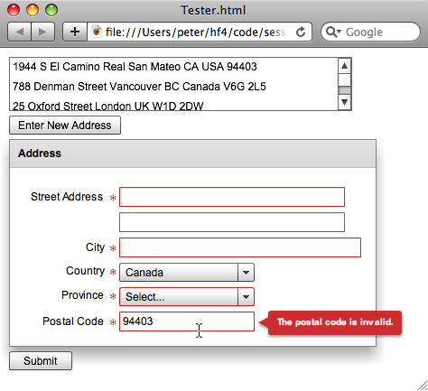
Also note that the form labels say “Province” and “Postal Code,” not “State” and “Zip Code,” when the country is Canada.
Next, note that when a Canadian postal code is entered for a US zip code, the validation error is displayed and the erroneous text isn’t cleared out by the formatter.
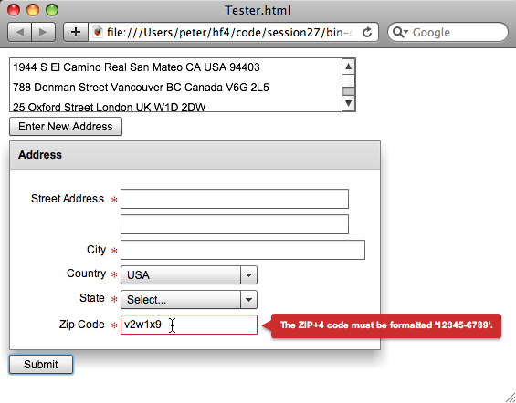
Once you’re done coding this example, you’ll be able to see the formatters in action, updating the zip codes to the 5+4 modern US style, and uppercasing Canadian postal codes and adding a space in them.
Yes, it’s as thrilling as it sounds.
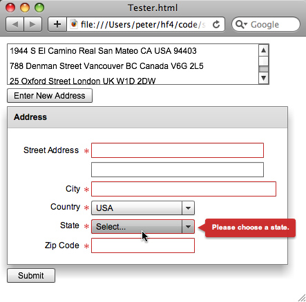
Finally, the following screenshot shows that we’re also using a validator to require that a state be chosen for the USA (or a province for Canada), and also requiring a zip code/postal code for the USA or Canada.
For countries that aren’t the USA or Canada, we don’t require a province or postal code, as this screenshot shows:

Not only are there no validation errors, but there are no red asterisks on the form indicating that the province or postal code is required.
Without further ado, let’s create the AddressForm. (Finally!) This is a lot of code, so we’ll take a few breaks along the way and explain what we’re doing.
session26/src/components/AddressForm.mxml

|
The _address holds the Address this AddressForm is editing. |
|
|
|
The validateAndSave method is called by the Tester app. It calls isFormValid to check whether the form components are all valid, and if so, it updates the address with the state of the form components. This approach is used to ensure that we don’t corrupt the Address with invalid or only partially valid data. |
|
|
We assign “” for the state when the selectedItem is null (for when there is no selected item), such as when the states/provinces list is empty for a given country. |
|
|
The isFormValid method runs the validators by constructing an array of them and calling Validator.validateAll with this Array. It also runs the zip code validator separately by calling a function called validateAndFormatZipCode, which we’ll see later. If there are any validation errors in the Validator.validateAll call, the results.length will be nonzero. Note that we use a temporary variable for zipCodeValid since we don’t want the validation to short-circuit and not call the validateAndFormatZipCode method. (Our intention is to call all the validators to show all the validation errors at once.) |
|
|
The setFormFromAddress method updates the state of the form from the state of the address. Because this is all done inside one method, we can be sure that we have set the country correctly before updating the states. When you see the following form code, the importance of this will become clearer. |
session26/src/components/AddressForm.mxml (continued)
|
|
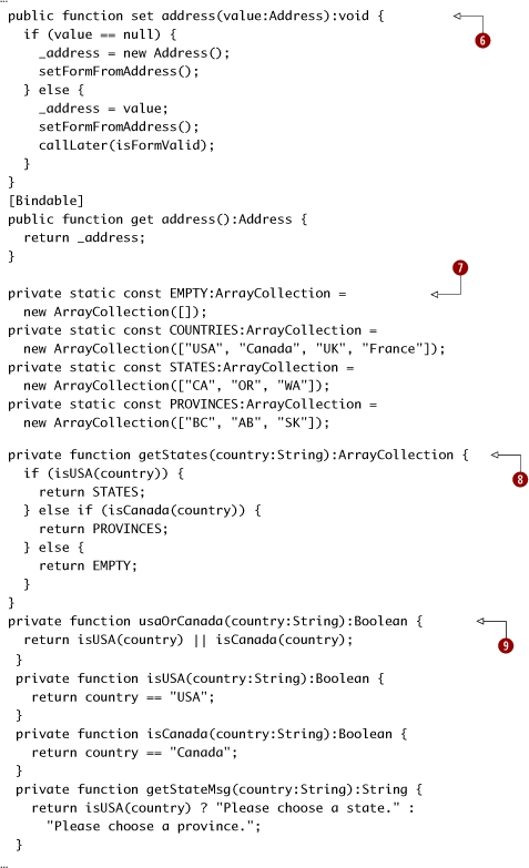
The address setter creates a new Address if the passed-in value is null. In both cases, the setFormFromAddress function is called after this address is set. However, when there is a non-null value passed in, we also invoke the isFormValid method (shown earlier) by using the callLater method. By using callLater, we ensure that the form controls have had time to reflect the new values that they have been set to. (I haven’t talked about callLater in this book since it’s an advanced technique. Basically, it runs a function later—that is, in the next screen refresh—so that values have had the chance to get set.) The reason that we only run the validation when setting a non-null Address is that we don’t want an empty form to show a bunch of validation errors—that would look ugly. (Also, since the user hasn’t made any mistakes—yet—on an empty form, it would be misleading!) Below this method, we also create an address getter which is much simpler. |
|
|
These constants are obviously “book code.” Yes, there are more countries in the world, and more states and provinces than I’ve shown. I just saved a tree. |
|
|
The getStates function returns STATES for the USA, PROVINCES for Canada, and EMPTY for the rest of the world. This is the North America–centric behavior we want; “international” readers can feel free to modify this code as necessary! |
|
|
These four convenience functions are used in the form to show/hide required asterisks beside the children of the FormItems. I created them since I use them in bindings, and they read nicely. |
session26/src/components/AddressForm.mxml (continued)
|
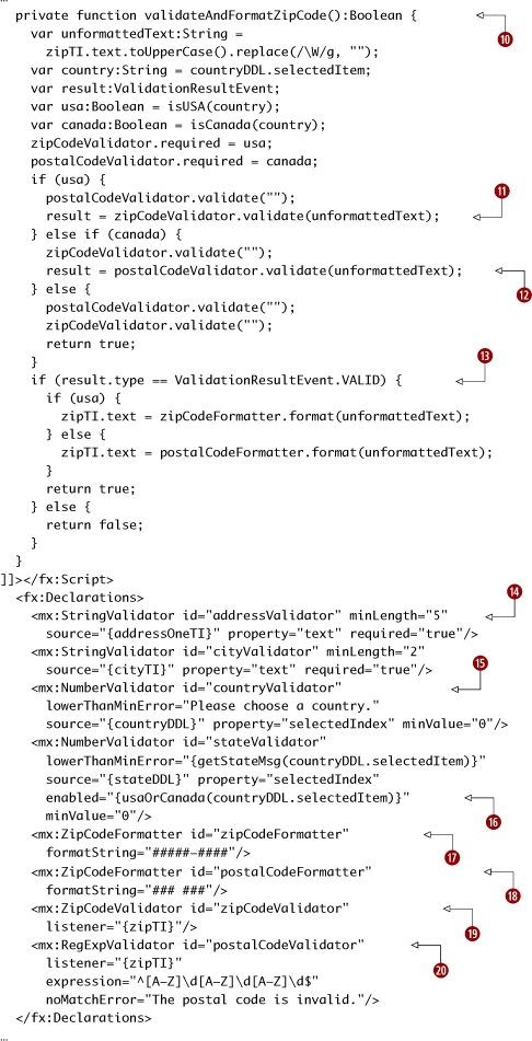
The validateAndFormatZipCode function returns whether the zip or postal code was valid and successfully formatted. |
|
|
|
For the USA, the zipCodeValidator is run. |
|
|
For Canada, the postalCodeValidator is run. |
|
|
If the result is VALID, the formatters are run. The zipCodeFormatter is run for the USA; the postalCodeFormatter is run for Canada. (Since only the USA and Canada get their zip/postal codes validated, the else case is legitimate.) |
|
|
We create StringValidator instances that ensure that the input meets a certain minimum length. The source object is the component that contains the property that is being validated. |
|
|
The countryValidator and stateValidator are NumberValidator instances, which are run on the selectedIndex properties of the DropDownLists for the country and state. Yes, this is considered the best practice. |
|
|
The stateValidator is only enabled for the USA or Canada. |
|
|
The zipCodeFormatter uses US zip code 5+4 format. |
|
|
The postalCodeFormatter is, confusingly enough, a ZipCodeFormatter. |
|
|
The zipCodeValidator uses the built-in ZipCodeValidator. |
|
|
The postalCodeValidator uses the built-in RegExpValidator to validate Canadian postal codes using regular expressions. |
session26/src/components/AddressForm.mxml (continued)
|
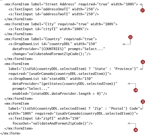
The FormItem components are just layout tools, much like the Form itself is. There is no special functionality in the Form container: unlike HTML Forms, a Flex Halo Form is just a layout tool. |
|
|
|
The countries are in a countryDDL DropDownList. When the country changes, we call validateAndFormatZipCode() to ensure the zip/postal code validation is current. |
|
|
The selectedItem of the countryDDL is used to determine whether the FormItems are required. All that this property on the FormItem means is that a little red asterisk is displayed. It has no effect on the controls inside the FormItem unless those controls also use it. |
|
The dataProvider of the stateDDL is determined by the selectedItem of the countryDDL. |
|
|
|
The selectedItem of the countryDDL is used to determine the label of the FormItem for zip/postal code and state/province. |
|
|
The zipTI focusOut event triggers the validateAndFormatZipCode function, to ensure that errors in zip and postal codes are caught right away. |
Phew!
That was a very long example, and it even involved a bit of regular expressions. Sorry about that—if I’d told you up front that was what you were in for, you may have skipped it! Thankfully, Flex has a RegExpValidator that lets us construct a regular expression-using validator very easily.

Who knew zip codes and postal codes could be so complicated? (Furthermore, we’ve totally ignored the rest of the world—so doing this properly would be much worse!)
Key points
- Flex comes with a number of useful formatters and validators.

- Flex makes it (relatively) easy to build custom components that use both formatters and validators to be as user-friendly as possible.
- Be careful of using data binding in form components that are interdependent, such as country and state DropDownList components. You could create a form that works well when modifying a new model object, but that doesn’t handle the model object being set from the outside world properly.
- In some situations, callLater can be used to work around tricky UI timing issues. However, it’s something that should be used carefully, as it’s prone to being abused and not solving the underlying problems.
- Form and FormItem are just layout tools. There’s no need to use them to submit forms, unlike what you do in HTML. Think of them as a VGroup customized to display forms nicely.
What’s next?
As we have seen throughout the book, Flex makes it easy to create custom components. In this session we’ve gone deep into formatters and validators, creating a custom validator and a complex custom form component.

I don’t know about you, but—despite their usefulness—I’m getting sick of forms. In the next chapter we’ll do something completely different and have some fun, as we finally build our Twitter + Yahoo! Maps mashup. This will demonstrate how real-world Flex applications are built, how to architect larger Flex applications using Cairngorm, and how to talk to servers using HTTPService.