One of the best things in life is the ability to never stop learning.
Learning more and more about accessibility has brought about the knowledge that if something is annoying, it’s probably not accessible. An annoyance is something that causes some irritation in some sort of way. Picture this scenario.
Imagine being at a conference and sitting in a room that housed 1100 chairs (Figure 3-1 shows the back of the conference room). You are a little late to the start of the presentation and you decide to sit in the very back of the room.

Conference room at HOW Design Live 2018
This is an example of an annoying experience from an audience perspective. It is the responsibility of the conference and the presenter to ensure that the information on the screen is as clear for the person in the front of the room as it is for the person in the back of the room.
Unfortunately, this happened to me when I did a presentation at HOW Design Live in 2018 speaking about accessibility. It is what prompted me to write this chapter. Although I read everything that was on the slides during my presentation, and the conference provided sign language interpreters, the typeface on my slides were too small, and in the end, my accessibility talk was not accessible to many people who were sitting further than five rows back.
In this chapter, we will cover annoying things in relation to digital products and how often things that are annoying are probably not accessible. It’s important to note that often things that are annoying are inaccessible and therefore exclude people with disabilities.
The Annoyances and Solutions
Pages take too long to load
Poor functionality of desktop site
App leads to web site
Links going to different places/dead links
Poor content layout
Pop-ups
Icons not clear
FONTS ALL CAPS
Too much text
Text spans the full width
Misplaced button boxes
AutoPlay
This list came from asking many of my past students, family members, and anyone I had the chance to ask, “What do you find annoying about web site/apps/digital products?” As we walk through these annoyances, we will note possible solution and the Web Content Accessibility Guidelines (WCAG) that would make it not so annoying and accessible. It’s good to remember that user experience starts at the moment the project begins. Using W5H (who, what, where, when, why, and how) as creators, we can think about what we are building in relation to our users.
A Page Taking Too Long to Load
When you go on a site and you are waiting to see the page and nothing happens. As you sit there and wait for it to appear, you might see some sort of indicator that the page is loading. When someone is using assistive technologies, they are waiting without seeing the wait indicator. We are in the 21st century and there is an expectation that when we visit a page, we will be able to view it right away. There are several reasons for pages taking a long time to load due to image size or errors.
There is an option in HTML to alert screen reader users the way that sighted users are notified with an indicator.
The moment the element finishes loading, the screen reader should be alerted. If the element was already in the original source code when the page loaded, the screen reader will announce the error immediately after announcing the page title. You always want to orient the user as to where they are and what they are doing. Any alert or indicator is good for them to experience.
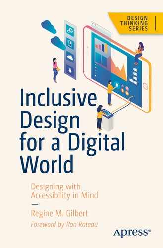
Poor Content Layout
Example of large text imagery
Success Criterion 1.3.1 Info and Relationships (Level A): Information, structure, and relationships conveyed through presentation can be programmatically determined or are available in text.
Success Criterion 1.3.2 Meaningful Sequence (Level A): When the sequence in which content is presented affects its meaning, a correct reading sequence can be programmatically determined.
Success Criterion 1.3.3 Sensory Characteristics (Level A): Instructions provided for understanding and operating content do not rely solely on sensory characteristics of components such as shape, color, size, visual location, orientation, or sound.
We want to provide users with an opportunity to explore our content but in the way in which is guided by the design. Set up what is next for users in a way that aligns with their expectations.
Pop-ups
Beloved pop-ups! I have designed many pop-up (otherwise known as modals) during my time as a designer. A lot of businesses feel they are good for the collection of emails and the numbers don’t lie! People engage with them. Out of everyone I asked, no one likes pop-ups and yet we still use them.
The annoyance with pop-ups is that they interrupt whatever we were about to do. When asked about the biggest pain point people experience, “not being able to close the pop-up” was a high on their list.
There are options to improve this experience overall. One way is to ensure that you are providing the right affordances to allow the user to close the pop-up once it appears. Another way is to use proper color contrast so users can distinguish between the background and the foreground.
When it comes to code, there are several options as well. One of them is to manage focus for the user. To restrict focus to just the modal dialog, you will need to use JavaScript to put focus on the dialog container (i.e., the <article> element) and then force focus back onto the dialog if the focus leaves.
Modal Dialog Markup Example
Too Much Text
Too much text can be annoying because you may feel overwhelmed. For instance, when people with dyslexia2 view too much text, they may not be able to distinguish between the letters. One way to alleviate too much text is referring back to hierarchy and page layout.
Ensuring that you use a proper layout that is understandable can help people move through the content. Breaking the content into different pages and not putting everything on one page is another solution.
Use readable fonts for the web (i.e., sans-serif fonts).
Build readable layouts.
Use complete sentences.
Use proper contrast between foreground and background.
In the end, you want the individuals using your product to complete their goals so that you, as a business, can continue to grow.
Uncertainty Related to Buttons and Links

(Source: Web Axe www.webaxe.org/proper-use-buttons-links/)
SC 1.3.5 Identify Input Purpose (AA): For content created with markup languages, the purpose of specific input fields indicated in WCAG 2.1 needs to be communicated programmatically such as via the autocomplete attribute in HTML. The purpose can then be transformed by personalization tools to communicate this in different ways such as via icons or symbols to assist users with cognitive and learning disabilities.
SC 1.3.6 Identify Purpose (AAA): This builds on SC 1.3.5 and includes communicating purpose for icons, regions, links, buttons, and other user interface elements, to support personalization for people with cognitive and learning disabilities.
SC 2.2.6 Timeouts (AAA): When a timeout is used, advise users of the duration of inactivity that will cause the timeout and result in loss of data. Users with cognitive disabilities or other focus/memory-related disabilities may require more time to read content or to complete interactions, such as completing an order form. The use of timed events can present barriers for people who need to take breaks. Providing the duration of inactivity before a timeout occurs will help users plan for breaks.
When there is a call to action and the individual needs to make a choice, you want to make that as clear as possible for them.
Autoplay
Autoplay can also be called making things impossible.

Tweets about Netflix autoplay functionality
Not only is autoplay an issue when it comes to videos, it also happens with music. This is an issue for so many reasons including the fact that videos and flashes can trigger seizures in individuals as well as cause panic and anxiety when sound is suddenly blared loudly. Not only is autoplay annoying, it can be dangerous.
Add a play/stop button to allow the user to have control
If you must have autoplay, have the video only play once
Refrain from using audio and opt to have captions with transcripts available
In the world of balancing business needs and user goals, it is important to remember that happy individuals will engage more with your businesses, and when they are not happy they will let you know it. As creators, we have a responsibility to the business and the individual. When we make things less annoying, we actually make them more accessible and ultimately we want individuals to have delightful experiences.
WCAG 2.1 criteria 1.4.2 Audio Control4 states: “Success Criterion 1.4.2 Audio Control (Level A): If any audio on a Web page plays automatically for more than 3 seconds, either a mechanism is available to pause or stop the audio, or a mechanism is available to control audio volume independently from the overall system volume level.”
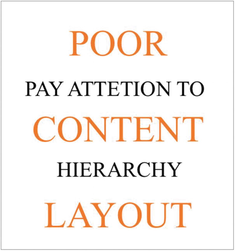
Case Study: Manipulative (Dark) Patterns
Three checkbox options —“Unsubscribe to the newsletter,” “unsubscribe to emails,” “receive emails weekly,” and an option to select “unsubscribe to all”
WTF—what is the focus? We don’t really know what we should choose. This example is meant to deceive the user and keep them subscribed to email and newsletters.
Case Study: From ABC Science
There is nothing better than a first-person account of a scenario. This case study from ABC science tells Dr. Scott Hollier’s experience with manipulative (dark) patterns. Dr. Hollier is legally blind. The case study expresses the importance of how designs can be made for ease of use or can cause friction.
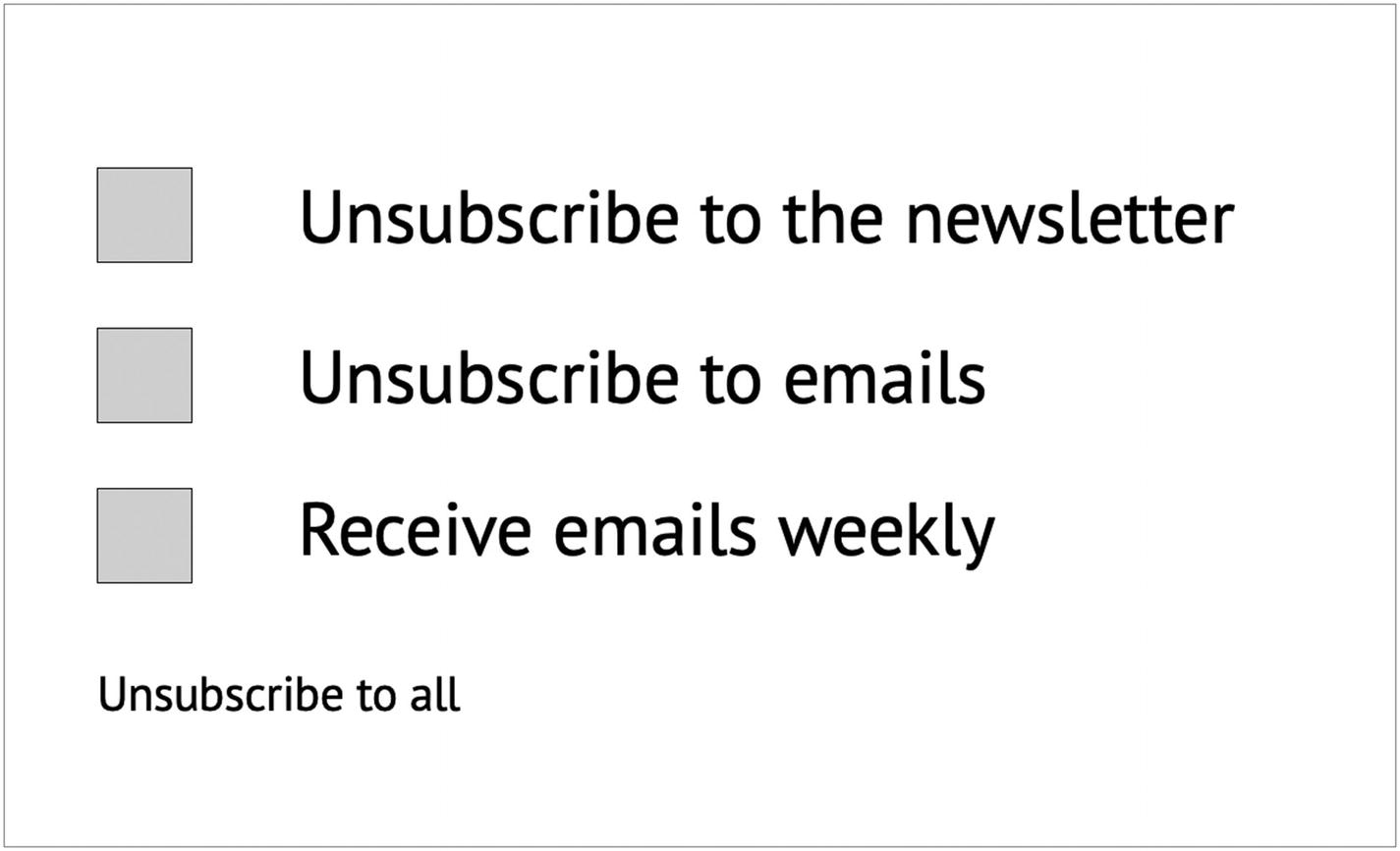
Scott Hollier logged into an online portal recently and was immediately faced with a familiar yet irritating Internet question: “How many of these pictures include buses?”
IMAGE CAPTCHA messages, which asked Internet users to pass visual tests, can be a problem for people with a vision impairment. (Pixabay: Stevepb)
“I had two choices,” said Dr. Hollier, a digital access specialist who is legally blind.
“I could either not do what I needed to do for my work or I could ask my 11-year-old son to come figure it out for me.”
These moments of friction or “encoded inhospitality,” as accessibility advocate Chancey Fleet has put it, block nonvisual access to everyday digital interactions.
She also calls them “dark patterns”—a term popularized by British user-experience consultant Harry Brignull, which describes online techniques that manipulate users. A completely fake online countdown, for example.
Ms. Fleet said that while most conversations about dark patterns focus on design choices that nudge, deceive, and distract, the concept should extend to “inhospitable design features arising from inattention, neglect, and false assumptions about the capabilities and desires of disabled people.”
For people who are blind or vision impaired, such roadblocks can “come and go without documentation, explanation or apology,” she wrote in an email.
“Dark Patterns” Everywhere
Like asking your son to help you get past CAPTCHA, the onus is often on people who have a disability to use workarounds when they encounter “dark patterns” online.
If not, accounts are not set up, purchases are not made and full participation in the online economy and conversation is elided.
Think of navigating a football ticket purchase with a screen reader that converts text to audio or braille only to have the web page time out because you took longer than the allotted 8 minutes.
Dr. Hollier has taken on CAPTCHA in particular, writing advice for the World Wide Web Consortium that offers alternative methods for web site designers that are less exclusionary.
“The oldest CAPTCHA is the one with the squiggly letters, which are almost impossible to read under the best of circumstances,” Dr. Hollier said.
“And understandably, people who are blind can’t do those ones either. And the audio CAPTCHAs are terrible as well.”
Web accessibility consultant Mark Muscat said webform instructions can also be problematic—interactive calendars can be needlessly difficult to navigate, for example, when picking a date for a flight or a move.
It’s also just bad for business. “If people can’t use a website within...30 seconds, they’re going to go look somewhere else,” he said.
While many online services have accessibility features, they’re not always implemented by default—another dark pattern, in Ms. Fleet’s view.

INFOGRAPHIC on Twitter, the ability to add image descriptions are not on by default. (ABC News: Twitter screenshot)
Take Twitter, which offers the ability to add image descriptions so that they will be included by screen readers. But the option is buried in its settings and not turned on by default.
“This dark pattern profoundly limits the ability of blind people to perceive and engage with memes, infographics, and photos that express identity, affect, and aesthetic experience,” Ms. Fleet said.
Slowly, solutions do emerge. Google, for example, has introduced ReCAPTCHA, which attempts to determine human vs. bot based on the user’s recent online interactions rather than making them click on pictures.
Who Makes the Rules?
Dr. Hollier looks at accessibility from two perspectives: Can people with disabilities access assistive technologies such as screen readers on the devices of their choice, and is online content accessible?
“What’s been exciting in recent years is that whether we’re talking Windows or iPhone, iPad or Android, or a Mac, accessibility features are largely built in,” he said.
Ensuring content is accessible across desktops, laptops, tablets, and mobile devices, however, remains a challenge.
The Web Content Accessibility Guidelines 2.1 (WCAG 2.1) is an international standard, with recommendations that Dr Hollier said would address many of the digital “dark patterns.”
He suggested moving Australian web sites and apps to WCAG 2.1 should be a priority.
Another challenge raised by Dr. Hollier is that Australia’s Disability Discrimination Act, which was first passed in 1992, is not explicit enough about technological accessibility.
Issues of equal access to online information and services were raised in a landmark case brought by Bruce Maguire against the Sydney Organising Committee for the Olympic Games in 2000.
The committee was found to have unlawfully discriminated against Mr. Maguire, who is blind, for failing to provide a web site which was accessible, among other issues.
Dr. Ben Gauntlett, Australia’s Disability Discrimination Commissioner, acknowledged the law was drafted at a time when most computer technologies were not prevalent.
“There is a critical need for us to assess whether the Disability Discrimination Act is fit for purpose in relation to new technology,” he said.
“All service providers in Australia need to realize that there are a lot of people from a diverse range of backgrounds who use their services.”
What to Do Next
To fight against “dark patterns” that stymy people with disabilities, advocates see a few ways forward.
Ms. Fleet suggested that accessibility errors could be displayed to users and developers just like spelling and grammar mistakes.
“Let’s assume that users would rather know they’re creating a problem, rather than ‘save’ them a moment on the assumption that no one will need their work to be accessible,” she said.
“Treat accessibility errors like fire code violations: correct them every time so that the things we collectively build are safe for everyone.”
Mr. Muscat said web accessibility should be a part of any project from the ground up.
“You can run all these tools and have these web accessibility inspectors...but the reality is, nothing beats the actual true user,” he said.
Dr. Hollier also wants more people with disabilities involved in user experience testing, and Ms. Fleet suggested dark patterns arise because people who use accessibility tools are not on development teams or hired to test technology and new software before it goes live.
She believes that employing people with the lived experience of a disability can help but also advocates “fierce and sustained allyship to hold companies accountable to bake accessibility into ALL products.”
“Tech culture—from platforms to procurement to education—must shift away from focusing on accessibility when a person with a disability presents a need, and shift toward treating accessibility as a consistently required part of every product,” she said.5
By having some insight into frustrations of our users, we can always do better and improve on things. A large part of many creators’ job is to balance business needs and user goals. When we can reduce friction and eliminate manipulative patterns, we are better able to serve our users.
Closing Thoughts
Do the best you can until you know better. Then when you know better, do better.
—Maya Angelou
There are some things here that Web Content Accessibility Guidelines does not cover; however, these best practices can be applied to keep all users engaged and avoid excluding individuals from using your products.
Clear calls to action: Clearly differentiate between buttons and links.
Clear layout: Create the most logical layout for the individual users of the site.
Typography: Use typography that is readable.
Ability to apply filters: Allow individuals to control filters on the site.
Clear navigation: Provide clear navigation so the individual knows where to go next.
Appropriate related content: Ensure content is connected through the layout.
Skip to content: Allow users to “skip to content” (this is especially helpful for screen readers).
Correct contrast: Use color contrast checker to validate colors are within the guidelines.