We may not always think this way but user experience starts the moment a project begins. We start asking questions and researching W5H (who, what, where, when, why, and how). Design is a way of thinking, and as such, we must approach our project with an open mind.
The beauty of user experience is that it is platform agnostic, meaning you can approach any digital or physical product and use similar strategies.
As creators, we help our users focus on their core tasks for our products, such as: What features do they need to accomplish their goals? What are the goals of the business? How do we align business needs and user goals?
In this chapter, we will discuss design frameworks, principles for accessibility, and creating accessible content that can assist in making more inclusive experiences for individuals using your digital products.
User Experience Starts the Moment a Project Begins
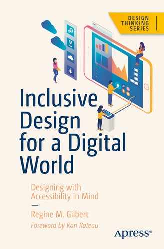
EVVCC Framework by James Vanié and Regine Gilbert1
A house without a frame cannot stand on its own. One way of looking at a framework is to see it as the supportive approach to designing products. Frameworks can provide structure around how you might approach certain problems. In the EVVCC framework, the approach is to look at projects with an informed lens. The EVVCC stands for empathy, values, vision, context, and communication.
Empathy: The ability to understand and respond to our co-workers and customer needs
Values: The core shared beliefs which inform organizational norms
Vision: Shared alignment in organizational values, goals, and accountability to co-workers and customers
Context: The challenge in relation to the project, person, urgency, risk, benefit, and a range of situational factors
Communication: Articulating needs, goals, intentions, and feedback in conversations and products
Exclusion is not a PR-friendly word, but it is a universal human experience. We all know how it feels when we’re left out.
— Kat Holmes, Mismatch Design
People say that they can’t think of all the disabilities out there and they cannot address all of their users. This is often times true; there is no way to address all the needs of the people using your products. If you can’t consider all disabilities, consider blindness. About 80% of accessibility issues are related to blindness.2
With that said, by thinking about accessibility from the start, you are already ahead by incorporating thought about all possible users of your products.
In the EVVCC framework, you start with empathy and the vision and values of your organization. Another piece of the framework is communication and context. There is no one-size-fits-all solution, and the context of the situation may vary depending on the needs of the business as well as your users. What is the overall goal for the product and are you addressing your users’ needs in correlation to that?
Design strategy is pivotal when producing and developing a product. It’s not something that everyone may have at the start of a project. However, it can serve the project well when it is done well.
Once a way of working has been established, it may be good for some teams or individuals to think about the principles for accessibility.
AirBnb and News Deeply Case Study
There are many types of frameworks to consider: Airbnb uses Another Lens frameworks for creations—a research tool for conscious creatives.
How can you design for everyone without understanding the full picture?
To help examine how bias influences our worldview, Airbnb Design partnered with News Deeply, a journalism startup dedicated to providing in-depth coverage of the world’s most critical challenges. The end result was the Shadow to Light installation, an experience that pressed us to recognize our biases and grapple with our limitations.
We believe that both designers and journalists have the responsibility to shine a light on their bias by asking the right questions, seeking conflicting viewpoints, and expanding their lens to build inclusive, global solutions.
Three Guiding Principles
Together with News Deeply, our design research team put together a set of guiding principles and exercises: balancing your bias, considering the opposite, and embracing a growth mindset. These help designers address skewed perspectives in order to create thoughtful, inclusive work.

Balance your bias

Consider the opposite

Embrace a growth mindset
Here are some of the questions, two from each area—balance your bias, consider the opposite, and embrace a growth mindset.
Balance Your Bias
Question: What are my lenses?
Background
Your lenses are always there, and they influence how you see the world. These could be inherited (e.g., race, gender, nationality), developed (political views or religious perspectives), or behavioral (How do you approach problems? Whom do you get advice from? Where do you find news?). Everyone has lenses, but not everyone is aware that they do or even what they are. Be explicit about the lenses you apply to any given decision or project. As you work to identify your own lenses, also think through the lenses you might be missing.
Question: Am I just confirming my assumptions, or am I challenging them?
Background
Confirmation bias is the tendency to search for, interpret, favor, and remember information in a way that confirms one’s existing beliefs. It’s very much a human tendency and is particularly strong around issues that are emotionally charged. It’s also one of the biggest threats to equitable design and fair reporting. If we seek to confirm or validate an idea, we will certainly be able to do so. As designers, we must constantly examine our own biases and be honest with ourselves about how our own lenses could bring imbalance to the projects we pursue, the sources we talk to, and the language we use. Write down three things about your background that might be informing your work, and for each thing, write down a corresponding assumption that might lead to bias.3
Consider the Opposite
Question: What would the world look like if my assumptions were wrong?
Background
Back in the 1980s, psychologist Charles Lord ran an experiment to try and help people overcome confirmation bias—the trick our minds play on us that causes us to highlight information that already confirms what we believe and ignore information that disproves it. He and his colleagues were able to show that asking people explicitly to “consider the opposite” had a direct impact on overcoming confirmation bias. Never ask questions to validate—work to disprove your assumptions instead. The next time you design a solution, first write down your assumptions and your hypotheses; then write down what you’d see in the world if your assumptions were wrong. Any research you do to inform your work should be focused on helping to find evidence of those things.
Question: Who might disagree with what I’m designing?
Background
We tend to surround ourselves with people who are similar to us—this is called homophily. It’s simply part of human nature; hundreds of studies have been conducted that illustrate how similarity fosters connection. When designing, make sure that you gather input on your solutions not only from people who are similar to you (i.e., your friends and family) but also from those with a wildly different point of view.
Embrace a Growth Mindset
Question: Is my audience open to change?
Background
In a “fixed mindset,” people believe that they have a set of fixed, immovable traits and their experiences reinforce these traits. In a “growth mindset,” people believe that their traits and abilities can be developed and improved upon, and their experiences are opportunities to learn and become more resilient. How people react to change—whether they’re open to it or resist it—is very much dependent on which mindset they subscribe to. Ensure your design works both for people with a fixed mindset and people with a growth mindset by working to understand where people are and then meeting them there.
Question: If I could learn one thing to help me on this project, what would that one thing be?
Background
By focusing time on learning, we also end up creating space to shake bias out of our thinking. Research shows that when people are distracted or overwhelmed, they tend to rely on biases even more. Make sure you’ve carved out time for learning, not just doing, on this project.
It can help to go beyond looking into your industry to find answers for approaching problems as Airbnb did in this case study by reaching out to the journalism community for answers to questions of bias. More questions can be found on the website https://airbnb.design/anotherlens/#answer15.
Principles for Inclusivity
Design may start with a brand-new product or iterating on an old one. Wherever you are in the process, it may be good to look at what could be done to keep the people you are creating the product at the forefront of your team’s minds.
Provide a comparable experience.
Consider situation.
Be consistent.
Give control.
Offer choice.
Prioritize content.
Add value.
When incorporating accessibility into your product, you want them to have a comparable experience to those who may be using assistive technologies.
At the end of the day, we want to make sure users of all abilities are able to complete their goals with our products. Asking the question “What value are we providing?” to both the business and the user with whatever we are building can lead to larger adoption of the use of the product. That is when we are actually providing value to both the business and the user.
Design Tips for More Inclusive Designs
Do’s and Don’ts of Inclusive Design
Designing for users | Do | Don’t |
|---|---|---|
on the autistic spectrum | use simple colors write in plain English use simple sentences and bullets make buttons descriptive—for example, Attach files build simple and consistent layouts | use bright contrasting colors use figures of speech and idioms create a wall of text make buttons vague and unpredictable—for example, Click here build complex and cluttered layouts |
of screen readers | describe images and provide transcripts for video follow a linear, logical layout structure content using HTML5 build for keyboard use only write descriptive links and heading—for example, Contact us | only show information in an image or video spread content all over a page rely on text size and placement for structure force mouse or screen use write uninformative links and heading—for example, Click here |
with low vision | use good contrasts and a readable font size publish all information on web pages (HTML) use a combination of color, shapes, and text follow a linear, logical layout and ensure text flows and is visible when text is magnified to 200% put buttons and notifications in context | use low color contrasts and small font size bury information in downloads only use color to convey meaning spread content all over a page and force user to scroll horizontally when text is magnified to 200% separate actions from their context |
with physical or motor disabilities | make large clickable actions give form fields space design for keyboard or speech-only use design with mobile and touch screen in mind provide shortcuts | demand precision bunch interactions together make dynamic content that requires a lot of mouse movement have short time-out windows tire users with lots of typing and scrolling |
who are D/deaf or hard of hearing | write in plain English use subtitles or provide transcripts for video use a linear, logical layout break up content with subheadings, images, and videos let users ask for their preferred communication support when booking appointments | use complicated words or figures of speech put content in audio or video only make complex layouts and menus make users read long blocks of content don’t make telephone the only means of contact for users |
with dyslexia | use images and diagrams to support text align text to the left and keep a consistent layout consider producing materials in other formats (e.g., audio and video) keep content short, clear, and simple let users change the contrast between background and text | use large blocks of heavy text underline words, use italics, or write capitals force users to remember things from previous pages–give reminders and prompts rely on accurate spelling—use autocorrect or provide suggestions put too much information in one place |
This is a great list from the UK.Gov on some do’s and don’ts. This list is not meant to be strict guidelines but a roadmap for what to look out for when creating digital products. Besides trying out some of the design principles, you will want to test them out before any release. In Chapter 9, we will discuss more in relation to usability testing products with people with disabilities.
At the heart of any digital product is what it can offer to the users. When it comes to what we crave, the most is enjoyable content. Designing accessible content is part of what can make for a more inclusive experience when done right.
Designing Accessible Content
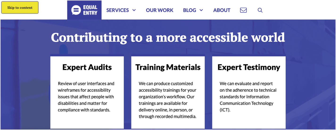
Equal Entry web site yellow “Skip to Content” button at top of page https://equalentry.com/
Accessible Writing
Use simple words.
Be concise with calls to action.
Keep sentences short (think about Tweets-short and full of information).
Do not use style of font as the only indicator.
Strikethroughs
Bold
Color
Bold
Italics
Underline
Use other types of indicators to signify importance.
Provide guidance to your users so that they can move throughout your site and on to the next thing in order to accomplish their goal. And you want to do that in the simplest way possible.

HTML image tag
Provide Enough Time to Use and Read Content
The designer should assume that people will be interrupted during their activities.
— The Design of Everyday Things6
Providing users with enough time to use and read content will give them time to complete their task; it may also add anxiety to users who may not be able to complete things in a timely manner. Be sure to provide more time to complete tasks. Figure 5-7 shows a timer in the right-hand corner with the amount of time left to purchase a concert ticket.
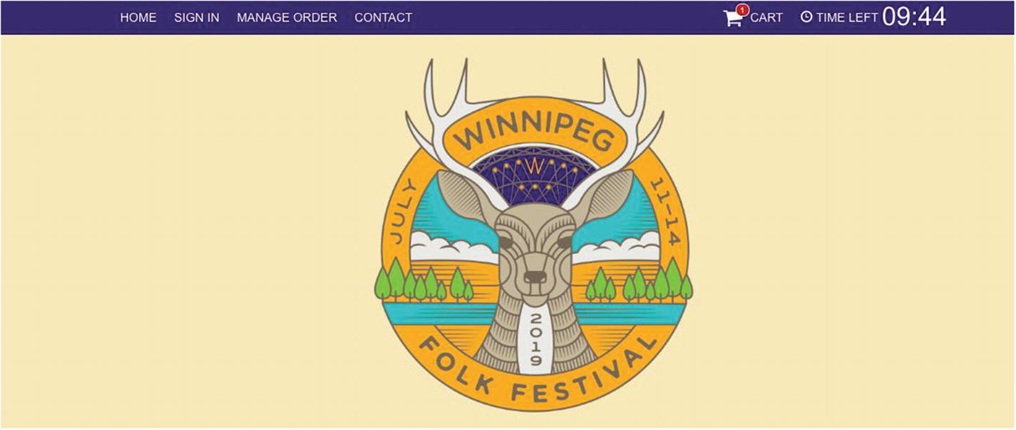
Ticket purchase timer https://winnipegfolkfestival.frontgatetickets.com/event/aq0zldopnq22q0br
Conclusion
We live in a world where all of us are temporarily able bodied, and it pays to make more inclusive products, not only for others but also for ourselves.
Design principles and frameworks are just a start and can lead to you and your team finding an impactful way to create more inclusive and accessible experiences. Asking questions of yourself and your team can help you get to asking the right questions for building your products and making your products more inclusive.
There is no one-size-fits-all scenario, so it is recommended that you customize these guides based on your current working situation. In the end, we want to add value to the use of our products by having the widest audience possible. On our internal teams, we have a chance to create spaces for allowing more people to use our products when we incorporate accessibility early on.
We are on our way to building a vision for the future, not just our future users but our future selves.