Appendix A. Case Studies
You made it to the end of the book! If you find yourself needing inspiration at any point along your D3 path, I hope you’ll explore this collection of interviews with well-established practitioners. Each one focused on a single project, presented here because it illustrates some novel or compelling use of D3. Taken together, these projects demonstrate a wide range of possibilities. The people behind them are brilliant, kind, curious, and fascinating.
“Close Votes”
- September 2012
- http://tulpinteractive.com/close-votes/
- Jan Willem Tulp
- tulpinteractive.com
- @JanWillemTulp
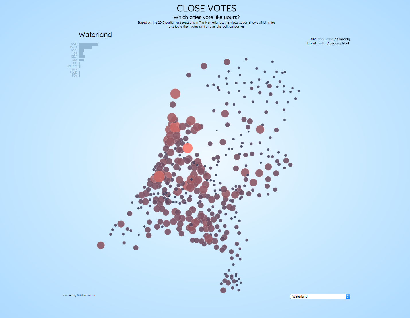
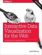
Figure A-1. The initial view of “Close Votes”
Scott: I love this project, both conceptually and aesthetically. The headline question leads viewers to explore the content through a personalized lens. You could have said “2012 Elections Results,” but instead you ask “Which cities vote like yours?” What triggered this personal project?
Jan Willem: I had the idea for this project when I was at a conference in Switzerland. Something the speaker mentioned gave me a primarily visual idea of showing election results. I don’t remember what the speaker was actually talking about, but at least it gave me an idea which I wrote down immediately, as a sketch.
But besides an idea for a visual representation, it was also just my personal interest to answer the question: “Which city votes like my city?” You may have some ideas, but maybe you can find out more if you have the data, see some unexpected patterns, or patterns that confirm your assumptions.
And what was the response to this project?
The response was quite huge. I don’t have exact numbers, but I have received quite a bit of feedback from people, people who played with it for half an hour during work, and so on. I’ve heard that teachers use it as an example in GIS education to show that a geographical map is not always the best solution. And even last week it was mentioned during a meeting I was in. So, overall I think it has had a relatively large impact, if people are still talking about it.

Figure A-2. Similarity of Urk’s voting as compared to all other cities
What I love most about this is how I, as someone ignorant of Dutch politics, can identify similarities and dissimilarities. It is fun to explore, even without any real understanding of the meaning behind the data, such as what each political party stands for. For example, Urk! I’ve never been to Urk, but, wow, it is clear that it really votes its own way!
Yes, that is also something I think is a very strong aspect of this project. There is a lot to explore: you can click on every single city in the Netherlands to see what the pattern is (and both radially and geographically), and at the same time, in many cases you do see patterns, but in some you don’t see patterns. So, my belief is that this is something that invites users to explore and to play with it. It’s easy to interact with, just clicking, and at the same time you can do your own discovery and find some very strong patterns.
And if you do know something about Dutch politics, or some other aspects of the Netherlands, you do recognize those, too. For instance, you can clearly recognize the Bible belt, which apparently votes in a similar way. And also cities known as “rich cities” in the Netherlands clearly have a distinctive voting pattern.
D3 had not been around long in 2012, but you were already working with it. I think you even wrote the very first tutorial I ever saw about D3. So why did you choose D3 for this project?
I think it’s part of my personality to be interested in some of the latest technological developments in general. So, I like to keep up, and try new things. At the same time, D3 was not really an unexpected choice for me. I had been working with Protovis before D3, which is more or less the predecessor of D3. And at that time I was also in contact with Mike Bostock, the creator of D3, as I was using it even before it was officially released. I guess I was a kind of test case for him, and some of the examples you can still see on the D3 website were actually answers to questions I had which he often answered with an example. And a final reason is that a library such as D3, which uses SVG, is very suitable for a project like this.
The aesthetics of this piece are spot-on. There are no browser defaults; it doesn’t feel like it was made with D3 or any specific tool. How are your visual design and coding processes integrated? Or are they one and the same?
For me, during the process it’s more or less the same thing. I am constantly switching between code and design (and data, too). And it’s a kind of strange and indirect way of designing, because you’re not drawing directly on paper or something—you’re looking at your design, and then going back to a text editor to change some functions or numbers. But in a sense, it’s constantly tweaking the design. Therefore it’s usually quite hard for me to tell clients what I’ll be creating at the beginning of the project; because of all the tweaks and changes, I may end up somewhere completely different. This is sometimes hard for clients, because if you pay for something, you also would like to know what you get for it. But this freedom to play around and to tweak is something I always need, as it will guarantee the best results. So my design and coding are very much integrated. I’m constantly looking for things that may be improved, that don’t work well and should be changed, and that need to have subtle adjustments.
Subtle interactions help reinforce the concept throughout, such as the thin black bars indicating an area’s party results that appear when you mouse over a circle. How do you decide what elements to include, and what not to?
When there are some requirements up front, you have some guidance on what to include and what not to include. In this case, it’s a personal project where only I decide what to include and what not to. I did keep in the back of my mind that this was something for a general audience that may visit the visualization quickly and then move on. So, in general, it should not be too complex to understand or interact with. At the same time, you also try to engage people so that they do stick around. Therefore, it’s really a matter of finding a balance. And one thing I always remember is a quote from Martin Wattenberg: if you are playing with your visualization more than you are writing code, then you know you’re on the right track. [See “A Conversation with Jeff Heer, Martin Wattenberg, and Fernanda Viégas,” ACM Queue, Volume 8, Issue 3, March 23, 2010.] Another hint that you may be on the right track is if you begin to see patterns. And I guess for the engaging part, I think that if you find some kind of balance between having to do a little work to find something, but the reward is good (such as discovering an interesting pattern), then people may stick around.

Figure A-3. Circles sized by population, organized radially by similarity
Was there anything you wanted to include in this project, but didn’t?
I did include cities’ populations, which was a different dataset that I merged with the election result data. My initial thought was that there could be some kind of correlation between population size and how people vote. But I didn’t know that until I actually made the visualization. So, that was a good thing to include.
Of course, we could extend the data to address other dimensions as well. I mentioned the “rich cities” in the Netherlands—you could imagine merging in an income dataset to see if there are relationships there, or a religion dataset, or whatever else. You see patterns based on voting results, and naturally you try to explain this. And for many cases this could be done by including more datasets so that you can compare it with actual data. But adding more data and more interaction makes everything more complex, too, and takes more time to implement and design. So, I decided to keep it simple and include only one additional dataset (populations).
The transitions in “Close Votes” feel smooth and deliberate. How do you use transitions (in this project or otherwise) to help facilitate data exploration?
I think that transitions can help you understand that you are looking at the same data, but in a different configuration or layout, because you see the same data points moving from one position to another. The transition moves too fast to follow individual dots, but just seeing that there is a transition in the first place gives you this understanding. The alternative—not showing a transition—would result in two different views that are not connected to each other (with a transition). So a natural question you will then have is: am I looking at the same data, or is this something else? A transition avoids this question altogether.
Revisiting this project in 2017, does anything about it embarrass you or make you uncomfortable?
No, not embarrassed or uncomfortable. Today I do see some small things I probably would improve a little bit, but in general I am still very happy with this project. The most important thing I would improve I think is having a bit more (visual) guidance on finding a specific city in the radial layout.
What else do you wish I had asked you about this project?
Something about data collection perhaps. What I think is fun is that the moment I wanted to create this visualization, the data was not available yet. There is an official government website that publishes all the (historical) election results, but apparently it takes them some time to publish the most recent results. I knew that there were some news websites publishing the results, but it took me some creativity to obtain the election result data before it was published on the original channels.
Could you expand on what you mean by “some creativity”?
The creativity required was that the data was not readily available, so when I noticed that some news organizations were publishing the results at the detail level I was looking for, I had to look at the source code of these websites, figure out how they accessed the data, and then write a few scripts that extracted the data from these sources and then merged them into one large dataset.
What other data vis projects, D3-based or otherwise, have inspired you, before or since this project?
There are many projects that have inspired me and still inspire me today. My two longtime heroes are Moritz Stefaner and Jer Thorp. They’re some of the first to be doing these kinds of projects and always remain very creative in their approaches and designs. But also other projects, like The Cosmic Web by Kim Albrecht is something I really like, or a project like Visualizing MBTA as a way to integrate many interactive graphics with a longer story is very good. There are too many examples that inspire me, to be honest.
How has working with D3 influenced your career? Has it taken you in any unexpected directions? What are you doing now, thanks to D3?
I think the majority of the projects that I do are done with D3. So, in that sense, D3 is a big part of my career now, and even though you may be able to achieve similar results in some cases, I think D3 is a very well-designed library that allows me to have the freedom I want when playing around with data visually. It has helped me do a lot of projects for great clients that would otherwise have taken me more effort. So I am very grateful for the fact that there is a D3!
“What Size Am I?”
- January 2012
- http://sizes.darkgreener.com
- Anna Powell-Smith
- anna.ps
- @darkgreener

Figure A-4. The initial view of “What Size Am I?”
Scott: This is one of those rare data visualization projects that is so brilliant because it goes beyond merely informing and solves an actual problem for real people. You articulated the initial problem on your blog:
For many women, there are few things more frustrating than trying on clothes. To put it in terms that my (mostly male) coder friends will understand: debugging CSS doesn’t come close to the blood-boiling irritation of trying to work out whether you are a size 8, a size 10, or both. Because, yes, you can be one size for tops and another for skirts, all in the same shop.
How does “What Size Am I?” address that problem?
Anna: It lets you enter your personal measurements—bust, waist, and hips—and see which dress sizes are likely to fit you in various US and UK stores. The calculations are based on each store’s online size chart. Most stores have these size charts, but they tend to be hidden away and static, and obviously only on one site at a time! So my tool is designed to make choosing the right size a bit easier.
It also lets you visualize how the shapes differ across stores—some brands tend to be curvier in shape. That’s useful to know—especially for online shopping where you can’t try clothes on.
What were you surprised to discover while creating this project?
-
Exactly how much variation there is between store sizing—it’s huge.
-
Just how many women are frustrated by dress sizes! I had no idea the project would get the attention it did.
Figure A-5. Showing bust, waist, and hip measurements for the wide range of sizes at ASOS
You received a lot of media coverage for this project, which is unusual for any work of data visualization. Do you feel it was represented fairly, and that your intent was conveyed accurately?
Overall, yes, I think it was represented fairly. The only thing that made me a bit uncomfortable was journalists overhyping it as “solving the dress size problem”—it definitely doesn’t do that!
All the media coverage led to a lot of commercial work, which was great.
Outside of media coverage, what sorts of responses or reactions have you seen from individuals? (Have you received any fan mail?)
Yes, I got lots of fan mail, even now, five years later! Mostly it’s people saying “thanks,” and sharing their frustration about dress sizing. Sometimes people ask me to add a new store. Occasionally people complain that the site tells them they are one size but actually they’re another—that’s understandable because fitting a dress has lots of variables, like fabric type, garment cut, manufacturing tolerance, body type, personal preference, so it’s in no way a perfect predictor.
I’ve had quite a few emails asking for a male version too…
D3 was still quite new in 2012. How and why did you choose D3 for this project?
I’d seen the D3 Showreel by Mike Bostock, and I’d seen the first visualizations starting to appear. Really the whole project was an excuse to learn D3.
I believe this was your first project with D3. What was the process of learning how to use D3?
I think I found an existing line chart, copied and pasted it, and then very slowly broke it, fixed it, broke it, and fixed it again, looking at the documentation, until it did roughly what I wanted! That’s how everyone learns to use a new library, right? I do remember discovering your tutorials at some point, which were incredibly helpful.
Was there anything you wanted to include in this project, but didn’t?
I would have liked to make the curves more realistic—D3 is obviously flexible enough to create a human-shaped curve, which would be a bit friendlier than a line chart. But at some point you just have to stop and hit the big “publish” button.
Revisiting this project in 2017, does anything about it embarrass you or make you uncomfortable?
Ha—yes, almost everything! I wish the graph was rotated through 90 degrees, so it looked more like a person, and I wish I had the time to make it better on mobile.

Figure A-6. Showing a comparatively narrow range of bust, waist, and hip measurements for sizes at Gap
What else do you wish I had asked you about this project?
Where the idea came from! The answer is that it was based on an infographic in the New York Times (see the related article, “One Size Fits Nobody: Seeking a Steady 4 or a 10”, by Stephanie Clifford, April 24, 2011) about dress sizes, which was very similar but static. I just thought, “Oh, I could do an interactive version of that.”
What other data vis projects, D3-based or otherwise, have inspired you, before or since this project?
As a child in the early 1990s I read the State of the World Atlas, which was a book of radical cartography. It had choropleths and cartograms—mind-blowing at the time—showing things like the number of nuclear warheads per country. I think that atlas taught me that data and maps could convey things about the world that words couldn’t.
When I was just starting my career, in about 2004, I remember seeing a double-page spread in the print edition of the Guardian. It was a map of London based on census data that showed the different nationalities of inhabitants in each area, down to street level, in incredible detail. It was very beautiful, and it was an example of data visualization being used to extend a journalistic story in a deep and meaningful way. (I think that map was print-only, but a modern equivalent would be Oliver O’Brien’s DataShine maps of the UK census.)
Jason Davies’s maps work in D3 is genius, and so is basically everything by Amanda Cox at the New York Times. There’s so much great work out there!
How has working with D3 influenced your career? Has it taken you in any unexpected directions? What are you doing now, thanks to D3?
I was a freelancer before I started working with D3, but from about 2012 onward for a few years I did an absolute ton of freelance D3 and data visualization work. D3 was like getting a new superpower!
I then began to focus on data vis and data analysis more generally. I spent most of 2015 and 2016 cofounding the Evidence-Based Medicine Data Lab at Oxford University, which we set up to help clinicians work with data.
I’m now taking a break to think about what to do next. My academic background is in natural language processing, so I’m catching up with the latest developments in that field, and of course thinking about how visualization can help.
Oh, and through D3 I found the data visualization community, which is lovely and super welcoming!
“Explained Visually” Series
- 2014–2015
- http://setosa.io/ev/
- Lewis Lehe
- lewislehe.com
- @lewislehe

Figure A-7. The “Explained Visually” series home
Scott: You’ve collaborated on a number of projects under the “Setosa” banner. How did the “Explained Visually” series get started?
Victor: It has its roots in a few early experiments. The first was probably a post on the central limit theorem. It did so well, in terms of page-views, we figured we might be onto something interesting.
Lewis: The first visualization we did together I think was Simpson’s paradox, and that became very popular. So we knew there was a big demand for math explanations with text and interaction.
I love the clarity of these explanations. It seems that designing an effective visual representation to illustrate each abstract concept is just half of the challenge—you also need clear supporting text, examples, and means of interacting with the examples for readers to learn effectively. What’s your process like for producing one of these explanations?
Victor: First, we start with a concept we think will lend itself to a visual, interactive explanation and that others haven’t tried to tackle in depth. Then we try to sketch out on paper what will be the key connection or concept we’d like the user to get. After that, we start to flesh out the concept in code. The explanation will evolve a lot in code so it’s important to keep things flexible, knowing a lot will get thrown out or rewritten. Lastly, we add the text.
Lewis: Like Victor said, we usually start out with one or two of the visualizations in mind and draw it as a picture. Some of the ideas for our visualizations were based on existing, static learning materials that we knew would work well interactive. For example, the Principal Component Analysis vis used an example on food consumption in the UK that we found from a professor’s course notes. Another way to think of a good visualization is to take things literally. For example, in the regression explanation, we show that you’re minimizing the sum of squares by drawing literal squares. I should also note that Victor and I have been living together for a long time, so we’re able to collaborate almost entirely by insulting each other.

Figure A-8. One view of the interactive explanation on “Exponentiation”
Do each of you have a personal favorite explanation in the series?
Victor: For me, it’s Markov Chains because so many people see it and say, “I finally get this.” It does a great job of using movement to bring what is often presented as a very abstract idea and makes it real. Something you can touch and feel.
Lewis: Eigenvectors and Eigenvalues. That one doesn’t just show what eigenvectors/values are; it is sort of an introduction to what matrix multiplication really does. Also, eigenvectors/values are something lots of people are introduced to but don’t really “get” in any intuitive way. Finally, we used a lot of techniques, such as the migration plot that plays like a movie when you hover over it, and the cool SVG effects on the Fibonacci demonstration.
What has the response been to this series?
Victor: Positive. We don’t get any hate mail.
Lewis: Nearly all the feedback has been positive. I like hearing comments like, “Now I finally understand this.”
D3 is really intended for data binding and visualization, but I would call what you’ve done here modeling visualization. Really, you are visualizing abstract concepts or processes, not data, as we traditionally understand it. Given that, why have you chosen to use D3 for this series?
Victor: I like to think we are visualizing data. The data just happens to be from the output of simulations with the goal of helping people to understand the underlying process instead of the data. Still, D3 is a great toolkit for general web development. You don’t have to just be creating visualizations.
Lewis: I agree it’s not really data visualization. We are visualizing relationships and processes. I like “visual explanation” as a description. We chose D3 because it’s a convenient way to manipulate the DOM, especially when you’re working with axes, scales, and animations. I use React all the time today, but D3 is better for controlling transitions and such.
Have you encountered any technical limitations that prevented you from doing something you wanted to?
Victor: There were a few times we used fewer example data points for performance reasons, but that’s about it. Most folks don’t realize how performant modern browsers are these days. We’ve also been fortunate in that we don’t have to support older browsers.
What additional explanations would you like to create?
Victor: Convolutional Neural Networks.
Lewis: Partial differential equations. Also, several ideas from transportation engineering.
Revisiting this series today, and knowing what you know now, does anything about it embarrass you or make you uncomfortable?
Victor: In the exponentiation explanation, I claimed the spread of a virus is exponentiation growth, but it’s really polynomial.
What else do you wish I had asked you about these projects?
Victor: How long they took. These visualizations typically took weeks or months, even though they’re only a single page.
Lewis: How did you divide responsibilities? Victor wrote nearly all the code for “Explained Visually.” I came up with ideas, sketched designs, and wrote the text. Generally, most of the Setosa visualizations (of which EV is a part) were coded entirely by one or the other of us, even if both of us worked on the ideas.

Figure A-9. One of several interactive graphics in “Eigenvectors and Eigenvalues”
What other data vis projects, D3-based or otherwise, have inspired you, before or since this project?
Victor: Explorable Explanations and Up and Down the Ladder of Abstraction by Bret Victor and Mike Bostock’s bl.ocks.org examples.
Lewis: MIT has a page with a bunch of “Mathlets” to teach math. Also, everything that Nicky Case makes.
How has working with D3 influenced each of your careers? Has it taken you in any unexpected directions? What are you doing now, thanks to D3?
Victor: Although I don’t use D3 much in my work now, I can say confidently it has had a large influence on my career path. It’s what inspired me to think of the web as a first-class medium for visualization and graphics. I now work at Uber on the maps team.
Lewis: I learned JavaScript just to learn D3 during the first year of my PhD in civil engineering at UC Berkeley. Victor and I had just moved to Berkeley, and once Victor showed me the library I got the idea I could make traffic simulations if I could code in D3. Once my visualizations started to get out, I got a lot of offers to do freelance work, so I was able to make some extra money and work on lots of interesting projects while I was in school.
More fundamentally, D3 is what got me interested in coding in the first place. From there I learned Julia and Python to do research. I got my PhD last month, so as of now I sort of have two jobs: I’m a lecturer in transportation engineering at UC Berkeley and I’m a freelance developer. This summer I’ll be applying to professor jobs, and I hope all my visualizations will help to set me apart.
“Workers’ Comp Benefits: How Much Is a Limb Worth?”
- March 5, 2015
- http://bit.ly/2v27udh
- Also with Michael Grabell, ProPublica, and Cynthia Cotts, for ProPublica
- Lena Groeger
- lenagroeger.com
- @lenagroeger

Figure A-10. The initial view of “Workers’ Comp Benefits: How Much Is a Limb Worth?”
Scott: I find this project distressing, yet compelling. Do you get that a lot?
Lena: Yes, definitely. I think using human body parts to encode data is not something that can or should be taken lightly. We thought very hard about visualizing this data, which was essentially a list of body parts and dollar amounts (based on how much workers’ compensation you’d get for the loss of each). Ultimately we decided that the “distressing” aspect was worth it. In fact, it helped underscore the seriousness and discomfort of the subject. Losing a limb in an accident is absolutely devastating to people in the real world, and if our graphic makes people slightly uncomfortable, well, that seemed fitting. I certainly don’t think it would always be the best or most appropriate solution. But visualizing limbs is certainly unusual, so people took notice.
Let’s get the obvious question out of the way first. I heard you speak about this project at the Information+ Conference in 2016. Your talk was titled “Meat Charts”. How and why (why?!) did you decide to represent this data pictorially?
I think the most exciting part of data visualization is the challenge of capturing something unique about the data. Trying to do something that can only be done with this particular dataset. Sure, bar charts and line charts are fine, and sometimes they are perfect for a project. But they accept any kind of data; there is nothing about a bar chart that reflects the peculiarities of the data it is displaying. The most striking visualizations I’ve ever seen manage to capture that specific thing about a dataset.
In this case, we had a dataset about body parts. A list of dollar amounts for eyes, ears, legs, toes, etc. That was our specific thing—that’s what we had to take advantage of. So we did.
“Meat Charts” was a nickname we gave the project almost from the beginning. During reporting for the project, someone had mentioned that the lists of body parts reminded them of the famous Angus Beef Chart. From that moment on, all we could think about was how we could use this data to make a human version of that chart.
I will also add that the main point of this chart was to emphasize just how different limbs are worth depending on where you live. The fact that your arm could be worth 17 times as much in one state versus another—that’s what we wanted to convey. For us, it was less important that someone look at the chart and glean that the maximum compensation for an arm in Nevada is $859,634—in that case, a bar chart would indeed have been the better option. But for our purposes, we wanted to convey a sense of scale (wow, that arm is huge compared to that other one), and precision was less important. And so we traded precision for a chance to do something unique and surprising.
What were you surprised to discover while creating this project?
Well, first of all, I was truly shocked to learn that if you are injured on the job, your arm or leg or pinky finger is worth dramatically different amounts depending on where you live. This fact, as well as the overall slow dismantling of workers’ compensation in the United States, was the crux of the story, and the one that my colleague Michael Grabell at ProPublica and Howard Berkes at NPR spent months reporting and writing about.
On a more technical level, I was surprised at how hard it was to design a human figure that was not too creepily realistic, not too ridiculously cartoonish, and not obviously gendered male or female. I spent weeks creating that figure, and am still not 100% happy with it. But, let’s be serious, after seven hours tweaking the shape of individual fingers on a hand, you gotta move on.

Figure A-11. Oregon values pinky fingers more highly than any other state—almost double the next-highest state of Montana. In fact, Oregon is first-ranked for all digits except thumbs, which are compensated more highly in Kentucky, Nevada, and Tennessee.
Tell us about the data challenges you faced. It’s clear that a lot of research and reporting had to happen before you could even start thinking about visuals and interaction.
Yes, the data collection process was an immense task. Each state has a different set of laws surrounding their workers’ comp system, and each has a different “schedule of benefits” which lists the reimbursement rates for different body parts. Almost all states have the standard body parts like arms and legs, but some also include specific provisions for whether or not you’ve injured your dominant hand, or include specific body parts (such as testicles, believe it or not). My colleague Michael and researcher Cynthia Cotts spent weeks sifting through these convoluted rules and compiling a single dataset of 13 body parts for each of the 50 states. They handled almost all of the heavy data lifting (I can’t take any credit for that!), and we continued to make slight tweaks as I began building the interactive.
Did you make any discoveries only after creating the visualization? (That is, what wasn’t apparent in the raw data?)
To me, the main discovery was realizing just how huge the difference is between different states’ compensation rates. Of course, you can tell looking at the numbers that $82,000 for a ring finger in Oregon is different from the $3,000 you’d get if you lived in Colorado. But actually seeing it visualized is so much more impactful.
Also, I realized very quickly that visualizing eyes in a non–horror-film way is exceedingly difficult. I would not try it at home (or alone).
Questions of taste aside, I see that all of the limbs are rendered as SVG paths. How was working with D3 to create these data-driven bodies?
I drew the “average” human figure in Adobe Illustrator, and then exported it as an SVG. That served as the base figure for all 50 states. Then, using D3, I looped through the data and resized each body part to the correct proportion. I actually used the math behind this noncontiguous cartogram example to do the resizing. That’s one of the great things about the D3 community and culture of sharing: you never know what little snippet of code will be useful to other people for totally different types of projects!
I then also built a little tool in D3 that let me tweak the precise positions of each body part by hand (for example, moving a finger 2 pixels to the left and 5 pixels up), and then saved all those tweaks as transforms I could apply to the final image.
What has the reaction to this piece been, both from inside the data vis community as well as the larger world?
The general reaction has been very positive, from both the data vis community and broader world. It’s not every day you see a visualization of human limbs, and I think the novelty factor was certainly helpful in bringing people into the piece who would have otherwise ignored it. I mean, it’s a story about insurance, of all things! But once you frame an obscure risk (who really thinks about the state laws protecting them if they get injured at work?) as a tangible and visceral story, it sticks. It was one of our most popular pieces at ProPublica.
This was a collaboration with your colleagues at ProPublica. What was your role, and how did you divide up the work?
My role on this project was mostly designer and developer—taking the raw data and imagining a way to visualize it, designing the human figure and the bits and pieces of the display and user interaction, and building the graphic from start to finish. As I mentioned before, my colleague Michael Grabell and Howard Berkes at NPR were the main reporters behind this project, and had been working on it for months before I got involved. The “Insult to Injury” project launched with two main stories, one focusing on the demolition of workers’ compensation benefits across the country, and another focusing on the state-by-state discrepancy in benefits. The interactive graphic that I worked on, which we eventually called “Workers’ Comp Benefits: How Much Is a Limb Worth?”, was just one portion of a much bigger, multifaceted series.
Was there anything you wanted to include in this project, but didn’t?
More of the opposite. We were very close to not including testicles, because I couldn’t figure out for the life of me how I was going to visualize them without being too absurd or too realistic. I can’t remember who suggested that we use a male symbol instead, but this worked out perfectly. It meant that we could also include the eyes and ears as symbols, and avoid putting the eyes on the face (which, as I mentioned earlier, is extremely macabre).
In the end, this was an important part to include, because it led to a number of quite catchy headlines like this one from Gawker.

Figure A-12. Alabama compensates workers less for lost legs than any other state
What else do you wish I had asked you about this project?
I think you’ve asked the main questions, but if you are somehow interested in even more details, I wrote a piece about the making of this graphic.
What other data vis projects, D3-based or otherwise, have inspired you, before or since this project?
“The Parable of the Polygons”, by Vi Hart and Nicky Case, continues to be one of my favorite data visualizations of all time. It’s an interactive game, really: you move around triangles and squares based on their slight preferences to be with shapes like themselves. Eventually, you see how even shapes that are only a slight bit “shapist” can dramatically alter their environments and lead to widespread segregation (which is only overcome with an active preference for diversity). I love this project because it’s a news game that attempts to explain a hugely complex social phenomenon. I wish we had more people doing creative and important work like this.
How has working with D3 influenced your career? Has it taken you in any unexpected directions? What are you doing now, thanks to D3?
One of the great things about working with D3 is that there are so many well-documented examples out there of different visualization forms, techniques, and solutions. It’s much easier to create a zoomable treemap or county choropleth, for example, if you can see how someone else has done it. D3’s blocks make sharing solutions so much easier, and provide a lot of inspiration when you’re contemplating how to best visualize a dataset. It’s also just so flexible, so you can go wild with ways to display data (as we did with the workers’ comp piece). D3 doesn’t give you a bunch of out-of-the-box chart forms to fit your data into, so the limit on what you can visualize is not the tool; it’s really just your imagination.
“Farmers’ Markets” Series
- September 2016
- http://susielu.com/data-viz/farmers-markets
- Susie Lu
- susielu.com
- @DataToViz

Figure A-13. Small multiples map illustrating availability of goods at farmers’ markets
Scott: I love the aesthetics and content of each of these. What triggered this personal project?
Susie: I wanted to work on a series of studies that explored one dataset from multiple perspectives.
This series of related visualizations includes some static graphics (such as the small multiples in Figure A-13) and some interactive pieces. The interactive ones were made with D3, but what about all the others?
The static one was made in canvas because I was learning p5 at the time and wanted to expand my familiarity with the API. I was learning p5 more generally to broaden my toolset for making graphics with code.
Why use D3 for these?
I’m much more familiar with D3 for making interactive data visualizations. I also like the challenge of making a well-designed piece within the constraints of a bl.ock. It keeps you focused on one story.
One of the interactive pieces is an overlapping bump chart, which lets you map one or two types of products at a time. The map highlights farmers’ markets where each product is sold, and—interestingly—the area plots below and to the right of the map display the aggregate values for each product by latitude and longitude. I’d never seen a display like this, and I find it interesting to compare regional differences—noting, for example, that maple products are primarily sold in the Northeast (as one would expect). What were you hoping to discover with this visual perspective, and what did you find?
You hit on the main relationship I wanted to explore, goods between North/South and East/West compared to an overall map view. With the map you can see more specific regions where goods are more popular, but it’s hard to aggregate visually into a percentage—at most you can really say is “more” or “less.” The aggregate along lat/lon would afford summarized statements about the comparisons. I had been using bump charts at work, but all of them had more than two categories. The idea of limiting the chart to only two categories so you could create an overlapping bump (or Venn bump) was the new concept I wanted to examine here. The overlapping also allows you to compare the markets with those goods to the total number of farmers’ markets since adding them doesn’t double-count. I was hoping to find some regional differences in market goods and I found the most striking comparison to be maple with seafood.

Figure A-14. Goods availability map with area plots representing totals by latitude and longitude
The second interactive piece is super beautiful but less self-explanatory. Can you explain k-means clustering to us? Once we understand the concept, what can we discover here?
K-means is an algorithm for taking a set of data and, based on the values for shared attributes, putting them into similar clusters. You give the algorithm the number of clusters you want, and the list of attributes to use to search for similarities and differences. In this example all of the types of goods (along the x-axis) were passed to the algorithm.
There’s a recluster button because k-means can produce different results each time it is run.
I went for an unorthodox visualization to emphasize the attributes where the clusters were most different from one another. The larger the area, the more of an outlier that cluster is on that attribute. That way it calls your attention to its most definable parts.

Figure A-15. K-means clustering for farmers’ market goods
What sort of responses have people had to this project?
One of my friends said that the chart looked drunk. I would say these types of responses come with the territory when you want to push the bounds of data visualization, especially when using graphical elements to represent relationships instead of pure numerical precision. It was mentioned in the Data Science Weekly newsletter, so it must not have been too offensive to the data science community.
Your attention to typography and color is fantastic. The type is clear and legible, and the colors are all fantastically bright and spot on. What is your approach to these important visual elements?
A lot of trial and error. I am a strong believer that data visualization is a subset of design. In the last couple of years I’ve read many books on both typography and color, but nothing is as worthwhile as trying as many combinations as you can and homing in on your own aesthetic. There is a lot of squinting involved to make sure the key points from both typographical and graphical weight, style, and size are emphasized.
Was there anything you wanted to include in this project, but didn’t?
I think there are a few more iterations I could squeeze out of this dataset. I’ve also thought about making a mashup with it.
You’ve also made a ridiculously useful module that makes it easy to generate legends, D3 SVG Legend. How annoyed do you have to get before writing your own D3 module?
It depends on how general or specific the problem seems to be. I enjoy tackling the problem of solving more general problems with modules, but the work needs to match the amount of impact I think it could have with the community. D3 SVG Legend has become the most popular module outside of core D3, and so all the time I’ve spent adding features and fixing bugs has definitely felt worthwhile.
What other data vis projects, D3-based or otherwise, have inspired you, before or since this project?
It’s taken me about two years since the legend project, but I’m now actively working on a new module that is tackling the problem of making annotations using D3, d3-annotation. [Also see Susie’s introduction to the new module.] I’ve seen small one-off tools for making annotations, and I’ve seen some lovely examples of annotations used effectively. But, similarly to legends, I believe annotations would (and should) be used so much more widely if it were easier to make them.
How has working with D3 influenced your career? Has it taken you in any unexpected directions? What are you doing now, thanks to D3?
It’s had a huge influence on my career. I started moving toward data visualization right when D3 was becoming popular. Without it I would have had a much harder time creating custom visualizations. Not only the D3 library itself, but the wealth of examples and the community together helped me become a full-time data visualization designer and developer.
“Weather Circles”
- March 31, 2015
- http://weather.zanarmstrong.com
- Zan Armstrong
- zanarmstrong.com
- @zanstrong

Figure A-16. The default view of “Weather Circles”
Scott: You write on your site that you initiated this personal project in response to a lost bet. Tell us the story!
Zan: I had bet that San Francisco was warmer in January than June. A quick check on Weather Spark showed that this wasn’t true. But I wondered if perhaps hourly temperatures might reveal a different story. Perhaps at noon it was true (and I would have won the bet)? Or at 5:00 pm? So, as anyone might do, I found the hourly data on NOAA and downloaded it. Along with temperature, I discovered that they also had data on cloudiness, wind speed, and other metrics.
Once I got into it, what I began to see in the data became much more interesting than the original bet.
The weather “circles” were actually the third visual form that I tried. A disappointing heatmap was my first attempt, followed by the more successful weather lines.
The final weather circles came out of my desire to see the change within each day more clearly, and to compare that to other days. Unlike heatmaps, the weather circles looked more beautiful and interesting than I’d expected. Cloud cover was even more interesting than temperature; the shapes drew me in, and I wanted to understand more.
I actually like both the weather lines and weather circles. It’s fun, the same exact data feels so different across the two forms.
Why did you use D3 for this project?
I love D3 for the ability to draw with data. It’s the perfect choice for this project, because it’s so flexible.
In this weather chart, I created 365 polygons with 24 points, one for each hour of the day. It might have been hard (or impossible) to wrestle a more typical charting library to create this form, because it’s nonstandard. But with D3, I could just define the points for the path myself using D3 and a little trigonometry. I like that I have so much direct control over how the data gets transformed into visual attributes.
Also, if you know any high schoolers taking trigonometry and bemoaning “When am I ever going to use this?” you now have a great answer.
On the other hand, D3 can be challenging when you just want a simple bar chart or line chart because it doesn’t have concepts of these basic chart types built in. Fortunately, that’s why a number of charting libraries have been built on top of D3.
For me, however, it’s exciting to build something a little unusual (like 365 polygons with 24 points) using the same fundamental structure as something more common like a bar chart.
What were you surprised to discover while creating this project?
I was surprised to see how different it felt to experience the same data in the lines vs. circles view.
In addition, I had no idea that San Diego was so cloudy on summer mornings. Evidently, those in Southern California are familiar with the “June Gloom”.
I am a sucker for circles, and I find the aesthetic of these “weather circles” captivating. How did you get D3 to render these data points as SVG paths?
I used the time of day to determine the angle from the center, taking the sine and cosine to transform it into x- and y-positions, multiplied by the distance from the center as determined by a scale applied to the value (temperature or cloudiness) of the point. (See my code.)
Then I used the function for the x and y points, based on angle and distance, along with D3’s d3.svg.line (see code) to define the path string. [In D3 version 4.x, d3.svg.line is now called, simply, d3.line. —SM]
These colors are gorgeous. How did you choose the colors for the months?
I honestly don’t quite remember. I know that I wanted each season to have a color that fit the season: blues for winter, sunny yellows for spring, hotter pinks and reds for summer, and cooler greens for late fall. I started from there, and chose colors that seemed to fit and looked good.
What is the intent of the “white lines” option, which doesn’t distinguish between months of the year?
While I enjoyed the colors, there was something I found very starkly beautiful about just the white lines. The varying densities can feel either very delicate or quite heavy and strong, based on the data. So, I wanted to keep a way to get back to that aesthetic even after I introduced the colors.
I’ve also thought it would be fun to use these as an etching, perhaps on a pint glass with the min point instead being a circle part of the way up the glass and the max a circle closer to the rim.

Figure A-17. Mousing over reveals a scale guide
The scale and units of each plot weren’t clear to me until I hovered over the circles, and a scale guide was revealed. This is an elegant solution to displaying a persistently visible, labeled axis, but why did you choose to do it this way?
For being able to immediately interpret the viz cognitively, the alternate weather lines form seemed to work better. For the “circles,” I liked that the first impression was simply this very delicate but also robust shape. I wanted the intuitive impression to come first, followed by a conscious interpretation, taking into account the scale and units. It was all about giving priority to a way of seeing the weather data, before interpreting it.
I like how you can click to toggle specific months on and off, such as to highlight San Francisco’s foggiest summer months (see Figure A-18). Did this functionality help you win the bet, or at least figure out why you lost?
Nope—still lost the bet!
My guess is that my incorrect assumptions came either from abnormal weather patterns during the drought years that I lived in San Francisco or (more likely) from the differences in weather between San Francisco and the rest of the US. I’ve thought about doing visualizations to further explore these two hypotheses, but haven’t followed up yet. So much more to explore!
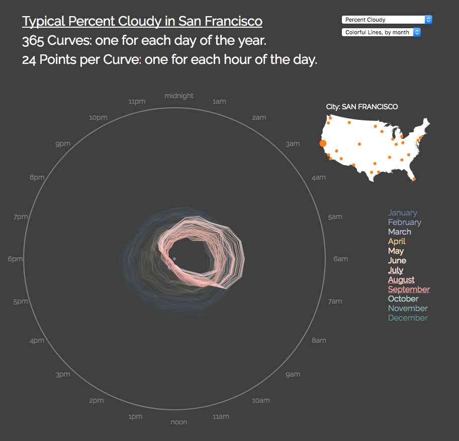
Figure A-18. Months of peak fog in San Francisco—note how it’s “cloudiest” in early morning, but then the fog burns off by mid-morning
You cite NOAA as your data source. What sort of data cleanup was needed to get values into a D3-friendly format?
NOAA was a fairly friendly data source. I swapped out the airport names for city names and simplified the date/times.
The bigger challenge was that I originally tried to read in a single file for all the cities at once, but it was much too large and made it really slow to load at first. So, I switched to having separate files for each city and only read them in when needed.
I thought about improving the load time further by making the files even more concise, but with this number of cities it was working well enough for now.
What has the reaction to this piece been?
I think people have enjoyed it! It’s always a fun surprise when somebody mentions having seen it. It seems people enjoy seeing something as familiar as weather in a different view, which gives a different way of noticing the patterns we experience (like the windiness in San Francisco in the late summer afternoons). And, because it’s something we all experience, everybody can connect with it in some way. My favorite is showing it to friends who don’t normally work in data vis, as it’s fun to see them connect with it and be curious.
Initially I didn’t have the lines animate as they appear. But, when I met Eric Socolofsky, we talked about the project, and he suggested the animation. I loved the idea, and added it that night. I enjoy just clicking on different cities and see the paths fill in. It brings an added dimension to see the seasons fill in through the animation, and notice things I wouldn’t see just in the flat image. It especially makes the temperature metric more interesting, as cities like New York get this big expansion and contraction going into and out of the summer heat.
What other data vis projects, D3-based or otherwise, have inspired you, before or since this project?
Oh! So many!
My first taste of data vis was taking one of Cole Nussbaumer Knaflic’s Storytelling with Data workshops, from which I learned that one should always use color intentionally.
Your workshop at Eyeo in 2015 was my first time using D3!
I love Eric Fischer’s “Locals and Tourists” visualizations and Dustin Cable’s “The Racial Dot Map,” especially when teaching data vis to students. I’ve taught fifth-grade students data vis using “The Racial Dot Map.” They love to find where they live, and start asking data-driven questions about their neighborhoods. It also epitomizes that more data, shown well, is often more intuitive than “simpler,” aggregated data. The fabulous “Wind Map” by Fernanda Viégas and Martin Wattenberg is another great example of showing a lot of data in a way that is immediately interpretable.
Of course, the fact that Mike Bostock illustrates the code of D3 with beautiful example bl.ocks is always inspiring.
I frequently use Ian Johnson’s Bl.ock Builder Search to find examples of how specific D3 APIs are used.
Jim Vallandingham’s “Visualizing the Racial Divide” uses force layouts in a really powerful way to create a sense of fracturing the city based on its racial divides. I like how the “fracture” makes you really feel the data in a way that people don’t usually feel with maps of demographic data.
Bloomberg’s “What’s Really Warming the World” by Eric Roston and Blacki Migliozzi is inspiring, as I love that it shows the value of showing the data that isn’t the cause. It would have been all too easy to just show the greenhouse gases and temperature. But, by instead showing all these possible causes which don’t correlate, it makes the correlation that much more compelling. Sometimes showing what is not happening is valuable.
But I think my favorite data viz of all time is the “Price-Chart of Upland Cotton for 56 Years,” as depicted in an 1883 publication from the US Census. A classic problem is how to show a graph in which two very different scales are meaningful—in this case, both the smaller fluctuations in the early 1800s as well as the spike during the Civil War. I love that they solve this by creating a reasonable frame for the graph for the smaller changes, and then blasting the spike through the top of the chart, through the whitespace, and into another chart. This graph inspired part of a chart that I recently collaborated on with Nadieh Bremer for Scientific American, in which we have a large spike in the data that also breaks through the frame to emphasize that it’s unusually large.
How has working with D3 influenced your career? Has it taken you in any unexpected directions? What are you doing now, thanks to D3?
Working with D3 has very much pivoted my career. I was previously a data analyst. I started to think more intentionally about how I used visualization after I took Cole’s Storytelling with Data workshop. The first really impactful data visualization I made used small multiples, and was made in Excel. Not long after, I also fell in love with the power of faceting in ggplot2: instant small multiples!
When I started working with D3, the best part was discovering that I could truly draw with data. At the heart of D3 is mapping numeric data to visual attributes (position, size, color, distance). This opens up so much flexibility to create whatever form best fits the data.
Now I am a freelance data visualization engineer. My projects have included exploratory tools for metagenomic scientists (with Stamen, including Kai Chang) and for neuro-genetic scientists, new chart types for analysts visualizing “mix effects” and Simpson’s paradox, illustrating when babies are born (with Nadieh Bremer), and creating visualizations that give a sense of disgust or calm (also with the Stamen team). I also enjoy talking about seasonality in data.
“Data Sketches” Series
- 2016–2017
- http://datasketch.es
- Nadieh Bremer
- VisualCinnamon.com
- @NadiehBremer

Figure A-19. Just three months’ worth of projects from the “Data Sketches” project page, featuring Nadieh’s work in the left column and Shirley’s on the right
Scott: So…how did you you two meet?
Shirley: There’s a data vis Slack channel that a handful of us are in, and it’s mostly people that we’ve met through conferences or that we hang out with in the Bay Area. But a few of us really liked Nadieh’s work and went out on a limb to invite her to the Slack—this was probably fall of 2015. It’s kind of hard being in a Slack where you know no one, not to mention intimidating, but Nadieh jumped right into the discussions. That’s how we met, virtually. We then found out that we were speaking at OpenVis 2016 together, met each other in person, and (I think) really hit it off.
Nadieh: Yes, you can definitely remove the “I think” from that.
You’re now most of the way through the “Data Sketches” collaboration, in which you each produce a new visualization exploring some topic every month. You started working on this in June 2016, and—as of this writing—“Data Sketches” encompasses 18 projects in all: one from each of you for each month (with one exception), from July 2016 through March 2017, plus a guest post. How did the idea for this year-long series of personal projects come about?
Shirley: Last June, I was going through Nadieh’s SVG tutorials from OpenVis Conf, and we struck up a conversation because of that. Somewhere in there, Nadieh mentioned that nominations for Kantar’s Information Is Beautiful Awards were open again, and lamented that she had only one completed project in the past year. That felt like as good of an opener as any, so I plucked up my courage and asked her if she wanted to collaborate on something.
Nadieh: I would’ve never had to courage to ask that, so I’m so glad that Shirley did! And it was an immediate yes from my side. After that we brainstormed about the set-up, but I think it only took a few days to get most fundamental things figured out, although neither of us can remember how we came up with also doing a write-up besides the visuals (although we’re very happy we did).
How do you choose the topic for each month?
Nadieh: At the start, we brainstormed to try and choose topics for every month before we even got started, but we have found ourselves deviating from our plan more and more as we go. Now, we might come up with a new idea randomly and if the other likes it, we schedule it for the next available month.
Shirley: The first time we “pivoted” on an idea was October, which was supposed to be “Elections”…until I realized that I wanted nothing to do with what was going on. Nadieh was super understanding, and within one conversation we arrived at the new topic, “Presidents & Royals”. I think that’s one of our best months, because we both loved our angle. Can you imagine if we had begrudgingly visualized something about the elections instead? I think I would have been miserable. We’ve been super flexible since.
The most important thing, we’ve come to realize, is that we choose topics that both of us are excited and curious about. And now that we’ve added a guest to the mix every month, we make sure the topics are meaningful to them too.

Figure A-20. An excerpt of process notes from October 2016, “Presidents & Royals”
Do each of you have a personal favorite process post in the series?
Shirley: Oh, wow, that’s a tough one. I always love reading Nadieh’s data section, because she does things with R packages that I would never think of trying, and I also love when she makes custom SVG paths. The one that I love most is her October Royal Constellations, when she guesstimated the birth years of people connected to royalty that she just didn’t have birth years for; I was just blown away by the creativity of her approach. I don’t think I have a specific favorite from my write-ups (except maybe my October data gathering), but I do get a kick from all the bugs I make—especially the canvas bugs for my November Hamilton viz.
Nadieh: Strangely, I can say the same thing about Shirley, but in reverse. I still remember reading her October President’s emoji write-up, and my jaw just kept falling lower and lower in awe of the steps she took to get those emoji on the president’s face. So many tiny Node packages and other resources that, combined, could create that cool result. I have no experience with Node or much experience with APIs in general, so I didn’t even imagine you were able to do things like the facial recognition through Google, for example.
What has the response been to this series?
Shirley: Incredible and humbling. When we first started, the write-ups were just an afterthought, as in, “Hey, wouldn’t it be cool if we documented our process?” But it’s turned out to be the part we get the most feedback on, about how valuable it is—especially as an educational tool—to see the thought process from beginning to end. It’s also given me the conversation starter to talk to many people and hear their philosophies and perspectives, including thought leaders in the industry. I would have never had the opportunity without “Data Sketches,” and I’m beyond grateful for that.
Nadieh: Indeed, and it has opened some doors for us on a personal level as well: clients that want similar things, or having a topic to speak about at conferences, such as OpenVis.
Have you used D3 for all of the final web pieces so far?
Nadieh: Practically all, yes, although for my December visual, I’ve taken the beeswarm that I made into Illustrator and combined that with charts made in R to create a static poster. Also, February will use HTML5 canvas.
Shirley: Yup, every single one.

Figure A-21. Still image from Nadieh’s February “Nature” sketch
Have you encountered any technical limitations that prevented you from doing something you wanted to?
Nadieh: Although I am getting better at creating custom SVG paths, I do sometimes have a different shape in my head than what I can get out of the path, programmatically speaking. For the Dragon Ball Z fights, I originally wanted to make the “swoosh” of the main character be spiky, which is a reference to the series, but adding in the spikes was a step too far, sadly. Also, I often run up against the performance of browsers to do animations on many elements at once, making the whole appear jittery, which is quite frustrating.
Shirley: Plenty, right from my very first piece. For July, I had wanted to visualize fireworks going off in the night sky, but settled on flowers instead, because I had no idea how to simulate the path of fireworks. It’s similar to what Nadieh said, that we have an idea in our heads, but it doesn’t come out the way we imagine. For me, it’s often when I dream up visuals that are too math- or physics-heavy to implement, and I don’t have enough time in a month to wrap my head around it. For my August, I was visualizing Olympic diving scores, and wanted an effect like ink bleeding through water. For December, I wanted an effect similar to teamLab’s Crystal Universe. On the other hand, I’m proud of the technical challenges I’ve forced myself to overcome, because I learn a bit more every time.
Can you share with us any topics you’d like to explore in the remaining months?
Nadieh: The topic of “fun” is on the agenda.
Shirley: I actually haven’t pitched this to Nadieh yet, but there’s this tea shop I love and frequent, and they have a whole empty wall. I’ve always wanted to make art for those walls with their shop data.
You’ve called “Data Sketches” a collaboration, but attribution is split right down the middle—the site features Nadieh’s projects and Shirley’s projects, side by side. How much collaborating is involved, and what form does it take?
Nadieh: Our collaboration comes in the form of feedback and support. True, we don’t work together on the same project, but that gives us the freedom to experiment with whatever we have in mind. Nonetheless, any project improves when you can get feedback, so we often show each other work in progress and then give each other pointers. And we also help each other along when the other is busy or needs a pick-me-up.
Shirley: Plus, we’re nine hours apart by time zone working on this in our free time for fun. That makes working in the same codebase a potential logistical nightmare, and I would hate it if I were blocking Nadieh on her work. On top of feedback and emotional support, we do collaborate with each other on things like our upcoming talks about “Data Sketches” and this interview.

Figure A-22. Excerpt from Shirley’s August “Olympics” sketch
What similarities in your individual working processes have you observed? What aspects do you handle in the same way, and what do you do differently?
Shirley: I think we’re definitely similar in that we’ll always come up with the idea first, and then go out looking for the pieces we need. This is true for our data gathering, where we figure out our angle for the topic, and then see what data is out there. Sometimes we’ll also manually create our data, if we don’t find what we’re looking for. It’s the same thing for the visuals.
Nadieh: In an abstract sense, I feel we approach it similarly, like Shirley says, but in execution we differ. I, for example, always for my data prep in R, whereas Shirley does a lot with JavaScript and Node. Shirley uses React to structure her visuals, where I always try to keep it rather vanilla JavaScript plus D3 (because I’m not that versed in all of the frameworks).
What other data vis projects, D3-based or otherwise, have inspired you, before or since this project?
Nadieh: I’ve always been very inspired by the works of Jan Willem Tulp. He does a lot with D3, and especially when I was just starting with D3, his works were an inspiration to me—to see the possibilities once you are creatively and technically adept with the tool. Lately, I’m also into the works of Valentina D’Efilippo (such as the Poppy Field or her latest, Oddity Viz of David Bowie’s “Space Oddity”) and Nicholas Rougeux (our January guest) is always putting out amazing work.
How has working with D3 influenced each of your careers? Has it taken you in any unexpected directions? What are you doing now, thanks to D3?
Nadieh: It has been the gateway into something I didn’t know I loved doing! I was working as a data scientist, but after about three or four years I knew that, though I liked analyzing data, I didn’t love it. That completely changed once I was introduced to D3 and started using it to visualize results of the analyses that I was doing. I decided to focus completely on data visualization about two years ago, I was hired as a full-time data visualization designer a year ago, and then I began freelancing in January 2017.
Now I’m working on things that I love, which all started at an Introduction to D3 presentation, given by Scott Murray and Jerome Cukier, that I attended at the Strata Conference in February of 2013.