Chapter 16. Project Walk-Through
You’re nearly a D3 pro! You have already worked your way through a full 118 code examples, each one illustrating a specific concept or technique. I thought we’d wrap up our time together with a walk-through of a single, complete D3 project from start to finish, integrating many of the technical concepts covered earlier, and sharing a few new tips along the way.
Our subject will be electric cars because, let’s be honest: I kind of want one. (Maybe with a built-in D3 dashboard?)
The sequence we’ll follow to achieve this is as follows:
-
Prepare the data
-
Load and parse the data
-
Render the initial view
-
Add interactivity
-
Refine styling
-
Provide context
For each of these, I’ll highlight the most important steps.
Prepare the Data
Remember Figure 16-1, the stacked area chart from Chapter 13?

Figure 16-1. Stacked area chart
Well, I found this data really compelling, but it wasn’t exactly current, ending at June 2013. It’s 2017, people! Just in the past few months, we’ve seen many new electric models, including the Model X from Tesla, the Chevrolet Bolt (the first “affordable” electric car with a range of over 200 miles—i.e., not a Tesla), and the first-ever plug-in hybrid minivan (the Chrysler Pacifica). With the growing array of electric, plug-in hybrid, and other alternative-fuel vehicles, I wanted to see how many more options we have now, compared to just a few years ago.
I contacted Yan (Joann) Zhou at Argonne National Laboratory, US Department of Energy, who graciously provided me with an updated version of that dataset, including figures through February 2017.
See Figure 16-2 for a preview of a tiny portion of the full dataset in vehicle_sales_data.csv.
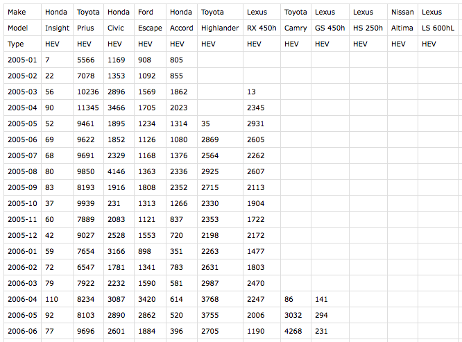
Figure 16-2. Our new dataset
I’ve restructured this significantly from the original to best fit my use case with D3. Things to note: the first two rows identify the make and model of each vehicle, while the third is one of four type values:
-
HEV (hybrid electric vehicles—primarily gas-powered, but with batteries and electric motors, too)
-
PHEV (plug-in hybrid electric vehicles—can be fueled with both electricity and gas)
-
BEV (battery electric vehicles—what we think of as “pure” electric cars)
-
FCEV (fuel-cell electric vehicles—typically hydrogen-powered)
Each subsequent row captures the number of individual vehicles sold in the US in a given month. Note that I’ve formatted month values as YYYY-MM, and empty cells represent zero values (e.g., because the vehicle had not yet been introduced, or had been discontinued).
Load and Parse the Data
The structure of this new dataset differs significantly from the simpler one we used in Chapter 13, ev_sales_data.csv. You’ll remember that dataset included a single header row, and all other rows contained the sales values. Note the excerpt in Figure 16-3.

Figure 16-3. Our earlier, e-vehicle dataset
Unfortunately for us, the d3.csv() method assumes a single header row with column names. Since our new dataset (see Figure 16-2) uses a slightly different structure, we’ll have to do a bit more manual work to load the data in properly. Follow along with these changes in 01_initial_chart.html.
First, I’m using d3.request() to load in the CSV instead of d3.csv(). d3.csv() is basically just a preconfigured version of d3.request(), which is a more generic method of loading in any external file from a URL. With d3.request(), we can specify that we’ll be loading in a CSV file, but it won’t automatically try to parse anything for us; we’ll just end up with a big, long string.
//Load in datad3.request("vehicle_sales_data.csv").mimeType("text/csv").get(function(response){//Do something with the 'response',//i.e., the raw CSV file contents.});
Within get(), I’ll use d3.csvParseRows() to split the big, long string into an array of strings, with one value per row. (Try uncommenting the console.log() statement to see what this looks like.) Everything after that is just vanilla JavaScript to extract the values and put them in the structure I want.
//// DATA PARSING////Parse each row of the CSV into an array of string valuesvarrows=d3.csvParseRows(response.responseText);// console.log(rows);//Make dataset an empty array, so we can start adding valuesdataset=[];//Loop once for each row of the CSV, starting at row 3,//since rows 0-2 contain only vehicle info, not sales values.for(vari=3;i<rows.length;i++){//Create a new objectdataset[i-3]={date:parseTime(rows[i][0])//Make a new Date object for each year + month};//Loop once for each vehicle in this row (i.e., for this date)for(varj=1;j<rows[i].length;j++){varmake=rows[0][j];//'Make' from 1st row in CSVvarmodel=rows[1][j];//'Model' from 2nd row in CSVvarmakeModel=rows[0][j]+" "+rows[1][j];//'Make' + 'Model' will// serve as our keyvartype=rows[2][j];//'Type' from 3rd row in CSVvarsales=rows[i][j];//Sales value for this vehicle and month//If sales value exists…if(sales){sales=parseInt(sales);//Convert from string to int}else{//Otherwise…sales=0;//Set to zero}//Append a new object with data for this vehicle and monthdataset[i-3][makeModel]={"make":make,"model":model,"type":type,"sales":sales};}}//Log out the final state of dataset// console.log(dataset);
Uncomment that final line to see the dataset we just created. Here’s a snippet of the start of that JSON:
[{"date":"2005-01-01T08:00:00.000Z","Honda Insight":{"make":"Honda","model":"Insight","type":"HEV","sales":7},"Toyota Prius":{"make":"Toyota","model":"Prius","type":"HEV","sales":5566},"Honda Civic":{"make":"Honda","model":"Civic","type":"HEV","sales":1169},…
As with the electric vehicle example in Chapter 13, we now have an array of objects, where each object contains a date value, as well as sales values for each vehicle for that month. The different here is that we’ve grouped together all the vehicle-related information (make, model, type, sales) into their own subobjects. Note that I’m using make + model as the key for each object. We’ll need those keys in order to correctly configure the stacking function.
//// STACKING////Now that we know the column names in the data,//get all the keys (make + model), but toss out 'date'varkeys=Object.keys(dataset[0]).slice(1);// console.log(keys);//Tell stack function where to find the keysstack.keys(keys).value(functionvalue(d,key){returnd[key].sales;});//Stack the data and log it outvarseries=stack(dataset);// console.log(series);
This gets the list of keys and hands them off to stack(). Now that the sales values are nested inside subobjects, we also have to specify a value() accessor, telling stack() that, when it’s time to stack, it should look inside each subobject for a value called sales.
Finally, we call stack(dataset) to stack the values, which are returned into series. I encourage you to uncomment the console.log() statements and explore the output.
Render the Initial View
Most of the actual chart-making code after that point is unchanged, with one exception: we have to update the accessor function used within yScale(), so the domain’s max value can be calculated:
yScale=d3.scaleLinear().domain([0,d3.max(dataset,function(d){varsum=0;//Loops once for each row, to calculate//the total (sum) of sales of all vehiclesfor(vari=0;i<keys.length;i++){sum+=d[keys[i]].sales;// <-- Added .sales!};returnsum;})]).range([h-padding,padding/2]).nice();
What do you know? It works! Run 01_initial_chart.html and see Figure 16-4 here:

Figure 16-4. The initial chart
Twelve years of electric-drive vehicle sales in the US—cool! Only it’s a bit of a mess, visually. What can we learn from this chart? First and foremost, the Toyota Prius is by far the biggest seller over time. (Note that it’s at the bottom of the stack because of the sort order we specified.) Second, 20 colors simply aren’t enough for 92 different vehicles! Remember, we were pulling colors from d3.schemeCategory20, so after the 20th vehicle, we ran out of colors, and the newly added areas (at top right) have a default fill of black.
Finally, this chart’s legibility might benefit from a wider aspect ratio, due to the many layers and sharp peaks and troughs. In Figure 16-5, I’ve set w to 1,400 pixels.

Figure 16-5. The initial chart, widened to 1,400 pixels
As an experiment, let’s reduce the number of total colors by coloring each vehicle’s area by type: HEV, PHEV, BEV, or FCEV. I updated how the area fills are set in 02_color_by_type.html:
….attr("fill",function(d){//Which vehicle is this?varthisKey=d.key;//What 'type' is this vehicle?varthisType=d[0].data[thisKey].type;// console.log(thisType);//New color varvarcolor;switch(thisType){case"HEV":color=d3.schemeCategory20[0];break;case"PHEV":color=d3.schemeCategory20[1];break;case"BEV":color=d3.schemeCategory20[2];break;case"FCEV":color=d3.schemeCategory20[3];break;}returncolor;})…
The weirdest part here is the bit of traversing through the stacked data series needed to grab thisType: peek into the first value of d, then into the data object, then look at the values for this vehicle (e.g., "Toyota Prius") and get its type. The switch statement just assigns one of four colors, depending on the value of thisType. (You could also use an ordinal scale for this part.)
I also made the chart a bit shorter, for less-steep peaks and troughs. See what that looks like in Figure 16-6.
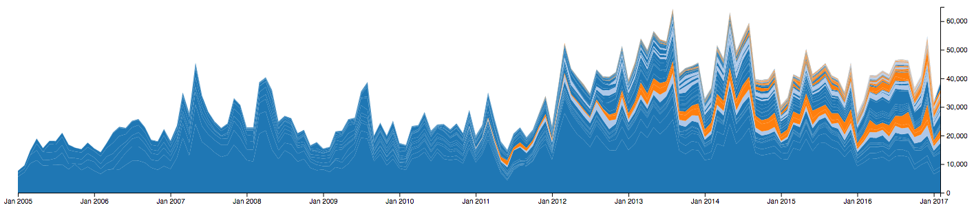
Figure 16-6. Vehicles, colored by type
This is better! There is still a lot going on, but we can make out some trends: there is a lot more dark blue than light blue, and an increasing amount of orange, starting in early 2011.
By mousing over the various colors, you’ll note that dark blue represents HEVs, light blue are PHEVs, and orange are BEVs. There are so few FCEVs that you’ll have to zoom waaaaaaay in to see them.
It would be nicer, though, to group all vehicles of each type together. Luckily for me, the sort I used in the initial dataset was first by type, then by date of first sales. So, by simply commenting out the order() method, I’ll get the default sorting, which is to say no sorting at all, on D3’s part. Values will appear in the order of appearance in the raw CSV. (If you wanted a custom sort, you could either re-sort your initial, or re-sort values once they’ve been parsed and stored in dataset, or specify a custom stacking order.)
//Set up stack methodvarstack=d3.stack();//.order(d3.stackOrderDescending);
See the result in 03_sorted_by_type.html and Figure 16-7.

Figure 16-7. Vehicles, sorted by type
Better! I can see at a glance the overall increase in electric-drive vehicles over the last 12 years, as well as the gradually increasing share taken by PHEVs and BEVs.
Add Interactivity
There’s a sort of hierarchy of meaning here: four categories of types of vehicles first, followed by the individual vehicles (makes + models) themselves. Let’s clean up the visuals to reflect that, and introduce some interactivity to enable users to drill down, moving from a broad, initial view to a very specific detailed view.
In 04_types_only.html, I’ve duplicated, then modified, some of the data parsing code to create a secondary, derived typeDataset. Instead of including sales figures for each individual vehicle, this rolls up sums of each type per monthly period, and then generates four areas, one for each type. This requires configuring a second stacking function, and of course generating a second set of paths using the selectAll/data/enter/append pattern. See the result in Figure 16-8.

Figure 16-8. Four areas, one for each of the four types
For sanity, I’ve grouped these new areas in a group with the ID of types, and moved the individual vehicle areas into a group with the ID of vehicles. I also gave the new areas vividly different colors, and attached behavior, so if you click anywhere on #types, those areas will fade away to reveal the #vehicles beneath—so it looks exactly like Figure 16-7.
What I’d really like is the ability to click any type, have the other types fade away, transition the selected type to a zero baseline, and then reveal all the individual vehicles within that type—sort of like “zooming in” to a category to reveal more detail. Let’s take that a step at a time.
In 05_click_transition.html, I’ve modified the click functionality so clicking any path within the #types group:
-
Identifies which
typewas clicked. -
Generates a new dataset with all-zero values, except for the clicked type. (For example, clicking the BEV area will generate zero values for HEV, PHEV, and FCEV, but will carry over the original BEV values.)
-
Stacks the newly generated dataset (even though there’s now effectively just a single “layer”).
-
Binds the new stacked dataset to the existing paths, overwriting any old bound data.
-
Transitions the paths into their new positions (effectively flattening all but one of them).
-
Updates
yScaleto reflect a new max domain value. -
Transitions the paths (yes, again!) into their new positions, reflecting
yScale’s new domain.
Try 05_click_transition.html out for yourself, and you’ll see why I wanted two separate transitions. The first simply collapses the areas along the baseline, as you can see in Figure 16-9.

Figure 16-9. After the first transition, the BEV area is visible, while the others have flattened out
The second transition expands the clicked area vertically, to reveal its details more clearly, as in Figure 16-10.

Figure 16-10. After the second transition, the BEV area has grown to fit the new yScale
Yes, the individual vehicle areas are still visible in the background; that’s an issue, and we’ll address it shortly.
But first I want to point out that we did something new here: we staged transitions, running one after another. We discussed one way to do this in Chapter 9, but this example introduces named transitions:
//Store this transition in a new variable for later reference.varareaTransitions=paths.transition().duration(1000).attr("d",area);//…update yScale…//Append this transition to the one already in progress.areaTransitions.transition().delay(200).duration(1000).attr("d",area);
When we initiate the first transition, we store a reference to it in areaTransitions. This gets the paths moving down, toward the baseline. Then we update the yScale. Following that, we tack a second transition on to areaTransitions. This schedules the second transition to run as soon as the first one is completed. By the time the second transition runs, the yScale domain will have been updated—the result being that the target height for the clicked area is now taller: it expands to fill the space. Hooray!
Better make sure the y-axis is updated, too, to reflect the new y scale! In 06_update_axis.html, I added some more transition code, using on() to specify that the axis transition should execute at the same time as the clicked area is expanding.
areaTransitions.transition().delay(200).on("start",function(){//Transition axis to new scale concurrentlyd3.select("g.axis.y").transition().duration(1000).call(yAxis);}).duration(1000).attr("d",area);
It’s easier to see this in action by running 06_update_axis.html, but note the final result—with a y-axis that tops out around 13,000—in Figure 16-11.

Figure 16-11. Y-axis, transitioned
Try clicking any of the other categories (HEV, PHEV, or even the very tiny FCEV) and note that the y-axis scales accordingly.
Note
Exercise: In addition to updating the y-scale, also update the x-scale’s domain to fit the extent of the selected type, then transition all paths to fit the new scale.
So far, the vehicles’ areas are still just sitting still, making a mess of the chart background. It’s time to address this by incorporating them into our silky smooth sequence of transitions. I’ll start by applying .attr("opacity", 0) to the vehicle areas, and .attr("opacity", 1) to the type ones, for consistency. Then we’ll be able to dial opacity values up and down to reveal and hide areas as needed. I’ve done that in Figure 16-12—the vehicles are still there; you just can’t see them.

Next, I want the BEV area to fade out, revealing individual BEV vehicles beneath. To do that, I first need to get the BEV vehicles into position, while hiding all the other vehicles. Now, I could fudge the dataset a bit, as I did with the type categories, copying the original dataset and dropping in zero values for everything I want to hide. I took that hacky approach earlier because, well, I didn’t want to have to complicate matter by updating the stacking function configuration. Unfortunately, it is time to complicate matters.
See 07_hide_reveal_vehicles.html, which appears as shown in Figure 16-13 after we click the BEV category.

Figure 16-13. A proper sequence of transitions, in which vehicle areas are visible at the end
This includes the following changes:
-
Moved data stacking and creation of vehicle areas, so it no longer happens immediately on page load, but only later, after a type category is clicked.
-
Modified the stacking function so it only stacks data for vehicles of the selected type. This is a more proper solution than zeroing out values for unwanted areas; with this approach, only the data we want is bound using the selectAll/data/enter/append pattern, so there are no “hidden” vehicle areas.
-
Added to the transition sequence, so the newly created vehicle areas are made fully opaque (visible) immediately before the obscuring type area is faded out.
-
Applied a new CSS rule of
cursor: pointeron all areas. This has the effect of changing the mouse to a finger-pointing hand icon on hover—a nice visual indicator that something is clickable. -
Applied a new class of
unclickablewhen any type category is clicked. In the CSS,.unclickableitems are set topointer-events: none, which lets any such events (like clicking or hovering) pass right through them. For us, this is an easy way to prevent multiple clicks from interrupting our silky-smooth transition process. So if you click the BEV area, clicking it again (or quickly clicking any of the other areas, before they collapse) won’t trigger repeat click events, which could confuse matters. -
Added a little magic leveraging
d3.interpolateCool()to choose similarly pretty colors for the newly created vehicle areas.
Mousing over individual vehicles reveals some interesting detail, as in Figure 16-14, where you can see sales of the Prius plug-in hybrid fluctuate, then taper off to nearly zero in late 2015, resuming again a year later.

Figure 16-14. The magical Prius plug-in sales disappearing act
I’d like to be able to “zoom in” on an individual vehicle, removing the context of other vehicles of the same type, and setting this vehicle area’s baseline values to zero. This would give us a more “honest” view of a single vehicle, without the wiggly perceptual challenges of the stack.
I’ve implemented that in 08_zoom_to_vehicle.html. Try clicking an area first, then an individual vehicle. Here’s what happens next:
-
All other vehicle areas fade out. (They actually remain in place, though are invisible; I’ll want to restore them later.)
-
The clicked area is transitioned downward, to have a flat (zero) baseline.
-
A new y-scale domain, based on the sales for this vehicle only, is calculated and set.
-
The clicked area and y-axis are transitioned into place, to fit the new domain.
See what that looks like after clicking the Prius plug-in hybrid, in Figure 16-15.

Figure 16-15. The magical Prius plug-in sales disappearing act, standing alone on a zero baseline
Nice! This is certainly a clearer view of this individual series of values. Of course, I can’t explain why this vehicle seems to vanish from the market for about a year: that would require reporting, research, and industry knowledge. But our visualization has led me to this one question, at least, and more exploring should trigger even more questions.
All the new code in 08_zoom_to_vehicle.html is tucked into a click behavior bound to each vehicle area:
//Which vehicle was clicked?varthisType=d.key;//Fade out all other vehicle areasd3.selectAll("g#vehicles path").classed("unclickable","true")//Prevent future clicks.filter(function(d){//Filter out 'this' oneif(d.key!==thisType){returntrue;}}).transition().duration(1000).attr("opacity",0);//Define area generator that will be used just this one timevarsingleVehicleArea=d3.area().x(function(d){returnxScale(d.data.date);}).y0(function(d){returnyScale(0);})//Note zero baseline.y1(function(d){returnyScale(d.data[thisType].sales);});//Note y1 uses the raw 'sales' value for 'this' vehicle,//not the stacked data values (e.g., d[0] or d[1]).//Use this new area generator to transition the area downward,//to have a flat (zero) baseline.varthisAreaTransition=d3.select(this).transition().delay(1000).duration(1000).attr("d",singleVehicleArea);//Update y-scale domain, based on the sales for this vehicle onlyyScale.domain([0,d3.max(dataset,function(d){returnd[thisType].sales;})]);//Transitions the clicked area and y-axis into place, to fit the new domainthisAreaTransition.transition().duration(1000).attr("d",singleVehicleArea).on("start",function(){//Transition axis to new scale concurrentlyd3.select("g.axis.y").transition().duration(1000).call(yAxis);}).on("end",function(){//Restore clickability (is that a word?)d3.select(this).classed("unclickable","false");});
I’ll draw your attention to the singleVehicleArea area generator, which I’ve employed here as yet another possible solution to the problem of how to transition from displaying several stacked areas to showing only a single area. You’ll remember that for the type areas, my hacky solution was to overwrite the data bound to unwanted areas with zeros, so some areas were present, if hidden from view. Later, when generating the vehicle areas, I generated a subset of the data (vehicles for only one type), then stacked and bound that data. So there were no “hidden” vehicles, until I faded some of them out on click.
Here, I’ve avoided both fudging a dataset (with zeros) and also generating and re-binding a subset of the original dataset. Instead, I made a new area generator, singleVehicleArea, whose value accessors are defined such that the baseline y0 is always zero (with no changes to the bound dataset) and the topline y1 simply references the original data values (already bound to each area) instead of the stacked values. Instead of messing with the data, I messed with the function that defines how the area is calculated and displayed.
I’m belaboring this point to illustrate that there are always lots of possible solutions to achieving the same results. Purists may feel that you should avoid fudging or re-binding datasets—and maybe they’re right. But I think you should choose whatever solutions make the most sense to you, given your familiarity with D3, your conceptualization of the project and its internal logic, and the challenge at hand.
Everyone feel better? Okay, I’m ready to move beyond this Prius plug-in and look at something else.
But—uh oh, we’re trapped: there’s no user path back to the prior view, or the one before that, other than reloading the page.
It might be time to start tracking state; otherwise, things could get really messy, really fast. Okay, fine: messier. This charts has essentially three main views, which I’ll store in a new, global variable:
//Tracks view state. Possible values:// 0 = default (vehicle types)// 1 = vehicles (of one type)// 2 = vehicle (singular)varviewState=0;
These state values don’t account for the in-between states during transitions, but that’s okay for our purposes. Let’s start viewState at zero. Then, when a type area is clicked, we set viewState to one and transition to that view. When an individual vehicle is clicked, we set viewState to two and transition to that view.
Let’s also create a new “back button” element in the SVG. It’s hidden initially, but once we enter view states 1 or 2, we make the back button visible and clickable. Clicking the back button will decrement viewState and trigger transitions to move “back” to the preceding views.
At a high level, the back button logic will look like this:
//Define click behaviorbackButton.on("click",function(){if(viewState==1){//Go back to default view}elseif(viewState==2){//Go back to vehicles view}});
Try running 09_back_button.html and note the new back button, as shown in Figure 16-16.

Figure 16-16. Looking at the traditional, HEV Prius—with back button!
Explore the backButton click event code in 09_back_button.html, and you’ll note that it essentially does the same steps we did earlier, but in reverse. I sped things up a bit and combined some transitions, so clicking back wouldn’t feel quite so tedious.
One addition, however, is a new global variable for tracking which type is being viewed:
//Tracks most recently viewed/clicked 'type'. Possible values://"HEV", "PHEV", "BEV", "FCEV", or undefinedvarviewType;
This simplified the logic for moving from viewState 2 back to 1.
Also note that in this example I included a new function, toggleBackButton:
vartoggleBackButton=function(){//Select the buttonvarbackButton=d3.select("#backButton");//Is the button hidden right now?varhidden=backButton.classed("unclickable");//Decide whether to reveal or hide itif(hidden){//Reveal itbackButton.classed("unclickable",false).transition().duration(500).attr("opacity",1);}else{//Hide itbackButton.classed("unclickable",true).transition().duration(200).attr("opacity",0);}};
Since the new back button does a lot of fading in and out, it made sense to centralize the code for handling this in a single place. Then I can call toggleBackButton() as needed, at other points in the code. And because toggleBackButton keeps track of the button’s state itself (visible or not), there’s no need for awareness of that state whenever the function is called.
You already know that redundancy in code is not optimal, so to speak. And you’ve noticed by now that the code for this example is quite messy, with many layers deep into click functions, transitions, and otherwise. Yet this book is here to help you learn D3, not code optimization, so, yes, that gets me off the hook. Besides, my perspective is you should always write what makes sense to you first, then worry about the computer later.
Note
Exercise: Clean up my code! There’s lots of stuff in each of the many click and callback functions. Where is there redundancy, or at least some overlap? What could be extracted into its own function? Use toggleBackButton as a model for how functionality can live separately from the place where it’s called. Could the entire project be rewritten with concise and meaningful function names?
loadTheData();parseTheData();generateInitialChart();defineInteractiveBehaviors();
Find a balance of abstraction and legibility that works for you. More abstraction is not always better, or worth your while! But the right amount can keep your code comprehensible and your mind calm.
Refine Styling
10_refine_styling.html is functionally the same, but with some visual refinements to hover states and the back button. Note that the text of the back button now changes dynamically, depending on the viewState and viewType, as you can see in Figure 16-17.

Figure 16-17. Dynamic text used for back button
“Back to all x vehicles” provides more navigational direction than just “Back.” To accommodate the changing text, I also update the width of the back button’s background rectangle.
//Resize button depending on text widthvarrectWidth=Math.round(backButton.select("text").node().getBBox().width+16);backButton.select("rect").attr("width",rectWidth);
To set rectWidth, we get the width value from the bounding box dimensions of the SVG text node. We add 16 to that (an arbitrary value, for some horizontal visual padding) and then round the result (for a nice, clean edge on the rect).
Note
Exercise: For more navigational guidance, try creating a new text box that describes the user’s current view. For example, it could read “Chevrolet Volt (PHEV)” or “Mercedes B-Class (PHEV).” This would reduce the current dependence on hover tooltips, which don’t work on mobile, and which are deactivated when pointer-events: none is applied.
The text box could be either an SVG text element, or a div or p that lives outside of the SVG. Consider assigning it a unique ID, then updating its contents as the view changes, using something like d3.select("#myTextBox").text(…).
Provide Context
You may develop your D3 projects as standalone charts—sitting alone, on an otherwise empty page—as I have done throughout this book. But before publishing your masterful work to the world, you’ll likely need to integrate it alongside other content on the page. At a minimum, you’ll need to visually frame the chart, adding a headline and some explanatory text.
The HTML body, then, will need more structure. You could start with something like this:
<divid="container"><h1>Headline…</h1><p>Explanatory text…</p><divid="chartContainer">…</div><divid="footer">…</div></div>
Pasting my <script> code into the bottom of such a page results in Figure 16-18.

Figure 16-18. Oops, I dropped the chart
Until now, we’ve created our initial SVG element using something like d3.select("body").append("svg")…. Now that there’s other stuff in the body, we better update that selection, so the SVG (our chart) is appended in the right place! Here, I’ll use d3.select("#chartContainer")… (see Figure 16-19).

Figure 16-19. SVG appended to #chartContainer, as intended
Better! The first step to integrating your chart onto a larger page is updating any select() statements to target more specific page elements (that is, not just body). It’s convenient if the HTML structure includes a div or similar with a unique id to latch on to.
Multiple Charts on a Page
It’s easy to have multiple charts on the same page! Just use your select() statements wisely, to target the right places.
For example, say you have two charts, a bar chart and a line chart. The HTML structure could include two divs, one with the ID of barChart and one with lineChart. Use select() to target the appropriate div when creating each separate SVG.
You’ll have to be careful with subsequent selection statements, too. For example, if both of your charts have axes, something like d3.select(".axis") may select an axis, but which one? (Answer: The first element on the page with a class of axis.)
You could use more verbose selection statements, such as d3.select("#lineChart .axis"), or it may be more convenient to store a more memorable reference to each chart. Throughout this book, I’ve used a variable named svg for this purpose:
varsvg=d3.select("#chartContainer").append("svg")…
But with two or more charts on the page, you could use more meaningful names, like:
varbarChart=d3.select("#barChart").append("svg")…varlineChart=d3.select("#lineChart").append("svg")…
Then prefix subsequent selections with whichever chart you’re trying to address, as in: lineChart.select(".axis")…
Similarly, you’ll have to make sure that any global variables don’t conflict, as you can’t have two datasets, two xScales, and so on. See “Global namespace” in Chapter 3 for more.
After a few dimensions adjustments, we see the final chart in Figure 16-20. Explore the code in 11_context.html.

Figure 16-20. Our final electric-drive vehicle chart (and page!)
Note
Exercise: If you’re interested in alternative-fuel vehicles, you’re probably also interested in fuel economy. Try downloading fuel economy data from the US Environmental Protection Agency. How could the data be incorporated into this chart in a meaningful way? Could you use it to illustrate the fuel economy of individal vehicles, of each fuel type category, or of electric-drive vehicles overall? Are they getting more efficient over time, as the technologies improve?
Dancing Versus Gardening
I’ve often felt like coding was a bit like dancing: first, you flail over here, then you flail over there. Nothing makes sense at first, but eventually you find your rhythm and the moves that work for you. One moment you’re in the center of the dance floor, the next you’re wiggling around the edges.
I’m not a great dancer, by the way.
Maybe coding is more like gardening. You start with a seed of an idea, and plant it somewhere. You water it, give it sunlight and care. Gradually the seed grows, and starts pushing out against the world around it, so you have to adapt other elements in the garden to accommodate. Eventually, after lots of attention and care, you end up with a full-grown plant that, er, communicates your data in an honest and effective manner.
My point is that there’s no straightforward path for any project. You’ll never start with perfect data, plan a perfect design, and then implement it perfectly. An integrated process of design and development is always highly iterative, with lots of tiny refinements and scooching around the edges. You may not be a dancer or a gardener (I’m clearly neither), but I hope you can learn to get comfortable acting like one, sitting there at your computer, flailing at the keyboard, typing chains of D3 methods while wearing your finest gardening gloves. Get comfortable with the discomfort, the indirectness of it all, and take one step at a time. Good luck.