WHAT YOU WILL LEARN IN THIS CHAPTER
How to create dialog resources
How to add controls to a dialog
The basic varieties of controls available
How to create a dialog class to manage a dialog
How to program the creation of a dialog box, and how to get information back from the controls in it
Modal and modeless dialogs
How to implement and use direct data exchange and validation with controls
How to implement view scaling
How to add a status bar to an application
Dialogs and controls are basic tools for user communication in the Windows environment. In this chapter you'll learn how to implement dialogs and controls by applying them to extend the Sketcher program.
Of course, dialog boxes are not new to you. Most Windows programs of consequence use dialogs to manage some of their data input. You click a menu item and up pops a dialog box with various controls that you use for entering information. Just about everything that appears in a dialog box is a control. A dialog box is actually a window and, in fact, each of the controls in a dialog is also a specialized window. Come to think of it, most things you see on the screen under Windows are windows.
There are two things needed to create and display a dialog box in an MFC program: the physical appearance of the dialog box, which is defined in a resource file, and a dialog class object, used to manage the operation of the dialog and its controls. MFC provides a class called CDialog for you to use after you have defined your dialog resource.
Many different controls are available to you in Windows, and in most cases there's flexibility to how they look and operate. Most of them fall into one of the six categories shown in the following table.
CONTROL TYPE | WHAT THEY DO |
|---|---|
These are used to provide titles or descriptive information. | |
Buttons provide a single-click input mechanism. There are basically three flavors of button controls: simple push buttons, radio buttons (of which only one may be in a selected state at any one time), and checkboxes (of which several may be in a selected state at one time). | |
Scrollbars are typically used to scroll text or images, either horizontally or vertically, within another control. | |
These present a list of choices of which one or more selections can be in effect at one time. | |
Edit controls allow text input or editing of text that is displayed. | |
Combo boxes present a list of choices from which you can select, combined with the option of entering text yourself. |
A control may or may not be associated with a class object. Static controls don't do anything directly, so an associated class object may seem superfluous; however, there's an MFC class, CStatic, that provides functions to enable you to alter the appearance of static controls. Button controls can also be handled by the dialog object in many cases, but again, MFC does provide the CButton class for use in situations where you need a class object to manage a control. MFC also provides a full complement of classes to support the other controls. Because controls are windows, they are all derived from CWnd.
Here's a concrete example. You could add a dialog to Sketcher to provide a choice of pen widths for drawing elements. This ultimately involves modifying the current pen width in the document, as well as in the CElement class, and adding or modifying functions to manage pen widths. You'll deal with all that, though, after you've gotten the dialog together.
Display the Resource View, expand the resource tree for Sketcher by clicking ⊳ twice, and right-click the Dialog folder in the tree; then click Insert Dialog from the pop-up to add a new dialog resource to Sketcher. This results in the Dialog Resource editor swinging into action and displaying the dialog in the Editor pane, and the Toolbox showing a list of controls that you can add; if the Toolbox is not displayed, click Toolbox in the right-hand sidebar or press Ctrl+Alt+X.
The dialog has OK and Cancel button controls already in place. Adding more controls to the dialog is simplicity itself: you can just drag the control from the list in the Toolbox window to the position at which you want to place it in the dialog. Alternatively, you can click a control from the list to select it, and then click in the dialog where you want the control to be positioned. When it appears you'll still be able to move it around to set its exact position, and you'll also be able to resize it by dragging handles on the boundaries.
The dialog has a default ID assigned, IDD_DIALOG1, but it would be better to have an ID that's a bit more meaningful. You can edit the ID by right-clicking the dialog name in the Resource View pane and selecting Properties from the pop-up; this displays the properties for the dialog node. Change the ID to something that relates to the purpose of the dialog, such as IDD_PENWIDTH_DLG. You can also display the properties for the dialog itself by right-clicking in the Dialog Editor pane and selecting from the pop-up. Here you can change the Caption property value that appears in the title bar of the dialog window to Set Pen Width.
To provide a mechanism for entering a pen width, you can add controls to the basic dialog that is displayed initially until it looks like the one shown in Figure 18-1. The figure shows the grid that you can use to position controls. If the grid is not displayed, you can select the appropriate toolbar button to display it; the toolbar button toggles the grid on and off.
Alternatively, you can display rules along the side and top of the dialog, which you can use to create guide lines, by clicking the Toggle Guides button. You create a horizontal guide by clicking in the appropriate rule where you want the guide to appear. Controls placed in contact with a guide will be attached to it and move with the guide. You can reposition a guide line by dragging the arrow for it along the rule. You can use one or more guides when positioning a control. You can toggle guides on and off by clicking the Toggle Guides toolbar button.
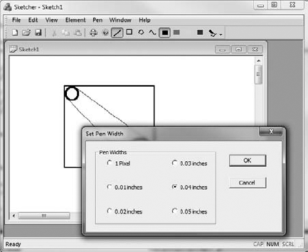
The dialog shown has six radio buttons that provide the pen width options. These are enclosed within a group box with the caption Pen Widths. The group box serves to enclose the radio buttons and make them operate as a group, for which only one member of the group can be checked at any given time. Each radio button has an appropriate label to identify the pen width that is set when it is selected. There are also the default OK and Cancel buttons that close the dialog. Each of the controls in the dialog has its own set of properties that you can access and modify, just as for the dialog box itself. Let's press on with putting the dialog together.
The next step in the creation of the dialog shown in Figure 18-1 is to add the group box. As I said, the group box serves to associate the radio buttons in a group from an operational standpoint, and to provide a caption and a boundary for the group of buttons. Where you need more than one set of radio buttons, a means of grouping them is essential if they are to work properly. You can select the button corresponding to the group box from the common controls palette by clicking it; then click the approximate position in the dialog box where you want to place the center of the group box. This places a group box of default size onto the dialog. You can then drag the borders of the group box to enlarge it to accommodate the six radio buttons that you add. To set the caption for the group box, type the caption you want while the group box is selected (in this case, type Pen Widths).
The last step is to add the radio buttons. Select the radio button control by clicking it, and then clicking the position in the dialog where you want to place a radio button within the group box. Do the same for all six radio buttons. You can select each button by clicking it; then type in the caption to change it. You can also drag the border of the button to set its size, if necessary. To display the Properties window for a control, select it by right-clicking it; then select Properties from the pop-up. You can change the ID for each radio button in the Properties window for the control, in order to make the ID correspond better to its purpose: IDC_PENWIDTH0 for the one-pixel-width pen, IDC_PENWIDTH1 for the 0.01-inch-width pen, IDC_PENWIDTH2 for the 0.02-inch-pen, and so on.
You can position individual controls by dragging them around with the mouse. You can also select a group of controls by selecting successive controls with the Shift key pressed, or by dragging the cursor with the left button pressed to create an enclosing rectangle. To align a group of controls, or to space them evenly horizontally or vertically, select the appropriate button from the Dialog Editor toolbar. If the Dialog Editor toolbar is not visible, you can show it by right-clicking in the toolbar area and selecting it from the list of toolbars that is displayed. You can also align controls in the dialog by selecting from the Format menu.
The dialog resource is now complete. You can test it by selecting the toolbar button that appears at the left end of the toolbar or by pressing Ctrl+T. This displays the dialog window with the basic operations of the controls available, so you can try clicking on the radio buttons. When you have a group of radio buttons, only one can be selected at a time. As you select one, any other that was previously selected is reset. Click either the OK or Cancel button, or even the close icon in the title bar of the dialog, to end the test. After you have saved the dialog resource, you're ready to add some code to support it.
There are two aspects to programming for a dialog: getting it displayed, and handling the effects of its controls. Before you can display the dialog corresponding to the resource you've just created, you must first define a dialog class for it. The Class Wizard helps with this.
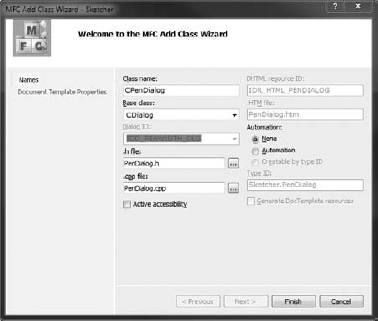
Right-click in the Resource Editor pane for the dialog and then select Add Class from the pop-up to display the Class Wizard dialog. You'll define a new dialog class derived from the MFC class CDialog, so select that class name from the "Base class" drop-down list box, if it's not already selected. You can enter the class name as CPenDialog in the Class name edit box. The Class Wizard dialog should look as shown in Figure 18-2. Click the Finish button to create the new class.
The CDialog class is a window class (derived from the MFC class CWnd) that's specifically for displaying and managing dialogs. The dialog resource that you have created automatically associates with an object of type CPenDialog because the IDD class member is initialized with the ID of the dialog resource:
class CPenDialog : public CDialog
{
  DECLARE_DYNAMIC(CPenDialog)

public:
  CPenDialog(CWnd* pParent = NULL);   // standard constructor
  virtual ~CPenDialog();

// Dialog Data
  enum { IDD = IDD_PENWIDTH_DLG };

protected:
  virtual void DoDataExchange(CDataExchange* pDX);    // DDX/DDV support

  DECLARE_MESSAGE_MAP()
};
The boldfaced statement defines IDD as a symbolic name for the dialog ID in the enumeration. Incidentally, using an enumeration is one of two ways to get an initialized data member into a native C++ class definition. The other way is to define a static const integral member of the class, so the Class Wizard could have used the following in the class definition:
static const int IDD = IDD_PENWIDTH_DLG;
If you try putting an initial value for any regular non-static data member declaration in a class, it won't compile.
Having your own dialog class derived from CDialog means that you get all the functionality that that class provides. You can also customize the dialog class by adding data members and functions to suit your particular needs. You'll often want to handle messages from controls within the dialog class, although you can also choose to handle them in a view or a document class if this is more convenient.
There are two different types of dialogs, modal and modeless, and they work in completely different ways. While a modal dialog is displayed, all operations in the other windows in the application are suspended until the dialog box is closed, usually by the user clicking an OK or Cancel button. With a modeless dialog you can move the focus back and forth between the dialog window and other windows in your application just by clicking them, and you can continue to use the dialog at any time until you close it. The Class Wizard is an example of a modal dialog; the Properties window is modeless.
You can create a modeless dialog box by calling the Create() member of the CDialog class in your dialog class constructor. You create a modal dialog box by creating an object on the stack from your dialog class and calling its DoModal() function.
Where you put the code to display a dialog in your program depends on the application. In the Sketcher program, it will be convenient to add a menu item that, when selected, results in the pen width dialog's being displayed. You can put this item in the IDR_SketcherTYPE menu bar. As both the pen width and the drawing color are associated with a pen, you can rename the Color menu as Pen. You do this just by double-clicking the Color menu item in the Resource Editor pane to open its Properties window and changing the value of the Caption property to &Pen.
When you add the Width menu item to the Pen menu, it would be a good idea to separate it from the colors in the menu. You can add a separator after the last color menu item by right-clicking the empty menu item and selecting the Insert Separator menu item from the pop-up. You can then enter the new Width item as the next menu item after the separator. The Width menu item ends with an ellipsis (three periods) to indicate that it displays a dialog; this is a standard Windows convention. Double-click the menu to display the menu properties for modification, as shown in Figure 18-3.
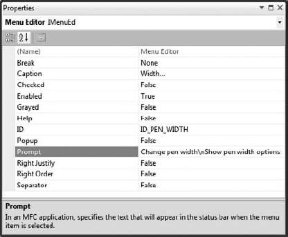
The default ID, ID_PEN_WIDTH, is fine, so you don't need to change that. You can add a status bar prompt for the menu item, and because you'll also add a toolbar button, you can include text for the tooltip as well. Remember, you just put the tooltip text after the status bar prompt text, separated from it by
. Here, the value for the Prompt property is "Change pen width
Show pen width options."
You need to add toolbar buttons to both toolbars corresponding to the Width menu item. To add the toolbar button to the toolbar that is displayed when you check "Large icons" in the Customize dialog for the application toolbar, open the toolbar resource by extending the Toolbar folder in the Resource View and double-clicking IDR_MAINFRAME_256. You can add a toolbar button to represent a pen width. The one shown in Figure 18-4 tries to represent a pen drawing a line.
To associate the new button with the menu item that you just added, open the Properties box for the button and specify its ID as ID_PEN_WIDTH, the same as that for the menu item. You then need to repeat the process for the IDR_MAINFRAME toolbar.
The code to display the dialog goes in the handler for the Pen
Right-click the Width menu item in the Resource View pane for the IDR_SketcherTYPE menu and select Add Event Handler from the pop-up. You can then create a function for the COMMAND message handler corresponding to ID_PEN_WIDTH in the CSketcherDoc class. Now edit this handler and enter the following code:
// Handler for the pen width menu itemvoid CSketcherDoc::OnPenWidth() {CPenDialog aDlg; // Create a local dialog object// Display the dialog as modalaDlg.DoModal();}
There are just two statements in the handler at the moment. The first creates a dialog object that is automatically associated with your dialog resource. You then display the dialog by calling the DoModal() function for the aDlg object.
Because the handler creates a CPenDialog object, you must add a #include directive for PenDialog.h to the beginning of SketcherDoc.cpp (after the #include directives for stdafx.h and Sketcher.h); otherwise, you'll get compilation errors when you build the program. After you've done that, you can build Sketcher and try out the dialog. It should appear when you click the pen-width toolbar button. Of course, if the dialog is to do anything, you still have to add the code to support the operation of the controls; to close the dialog, you can use either of the buttons or the close icon in the title bar.
The OK and Cancel buttons (and the close icon on the title bar) already close the dialog. The handlers to deal with the BN_CLICKED event handlers for the OK and Cancel button controls have been implemented for you. However, it's useful to know how the action of closing the dialog is implemented, in case you want to do more before the dialog is finally closed, or if you are working with a modeless dialog.
The CDialog class defines the OnOK() method that is called when you click the default OK button, which has IDOK as its ID. This function closes the dialog and causes the DoModal() method to return the ID of the default OK button, IDOK. The OnCancel() function is called when you click the default Cancel button in the dialog; this closes the dialog, and DoModal() returns the button ID, which is IDCANCEL. You can override either or both of these functions in your dialog class to do what you want. You just need to make sure you call the corresponding base class function at the end of your function implementation. You'll probably remember by now that you can add an override class by clicking the override button in the Properties window for the class.
For example, you could implement an override for the OnOK() function as follows:
void CPenDialog::OnOK()
{
  // Your code for data validation or other actions...

  CDialog::OnOK();                     // Close the dialog
}
In a complicated dialog, you might want to verify that the options selected, or the data that has been entered, is valid. You could put code here to check the state of the dialog and fix up the data, or even to leave the dialog open if there are problems.
Calling the OnOK()function defined in the base class closes the dialog and causes the DoModal() function to return IDOK. Thus, you can use the value returned from DoModal() to detect when the dialog was closed via the OK button.
As I said, you can also override the OnCancel() function in a similar way if you need to do extra cleanup operations before the dialog closes. Be sure to call the base class method at the end of your function implementation.
When you are using a modeless dialog you must implement the OnOK() and OnCancel() function overrides so that they call the inherited DestroyWindow() to terminate the dialog. In this case, you must not call the base class OnOK() or OnCancel() functions, because they do not destroy the dialog window, but merely render it invisible.
For the pen dialog you'll store the selected pen width in a data member, m_PenWidth, of the CPenDialog class. You can either add the data member by right-clicking the CPenDialog class name and selecting from the context menu, or you can add it directly to the class definition as follows:
class CPenDialog : public CDialog
{
// Construction
public:
   CPenDialog(CWnd* pParent = NULL);   // standard constructor

// Dialog Data
   enum { IDD = IDD_PENWIDTH_DLG };

   int m_PenWidth;                     // Record the current pen width

// Plus the rest of the class definition....

};
Note
If you do use the context menu for the class to add m_PenWidth, be sure to add a comment to the member variable definition. This is a good habit to get into, even when the member name looks self-explanatory.
You'll use the m_PenWidth data member to set as checked the radio button corresponding to the current pen width in the document. You'll also arrange for the pen width selected in the dialog to be stored in this member, so that you can retrieve it when the dialog closes. At this point you could arrange to initialize m_PenWidth to 0 in the CPenDialog class constructor.
You can initialize the radio buttons by overriding the OnInitDialog() function defined in the base class, CDialog. This function is called in response to a WM_INITDIALOG message, which is sent during the execution of DoModal() just before the dialog box is displayed. You can add the function to the CPenDialog class by selecting OnInitDialog in the list of overrides in the Properties window for the CPenDialog class. The implementation for the new version of OnInitDialog() is:
BOOL CPenDialog::OnInitDialog()
{
   CDialog::OnInitDialog();
   // Check the radio button corresponding to the pen width
   switch(m_PenWidth)
   {
      case 1:
         CheckDlgButton(IDC_PENWIDTH1,1);
         break;
      case 2:
         CheckDlgButton(IDC_PENWIDTH2,1);
         break;
      case 3:
         CheckDlgButton(IDC_PENWIDTH3,1);
         break;
      case 4:
         CheckDlgButton(IDC_PENWIDTH4,1);
         break;
      case 5:
         CheckDlgButton(IDC_PENWIDTH5,1);
         break;
      default:
         CheckDlgButton(IDC_PENWIDTH0,1);
   }
   return TRUE;  // return TRUE unless you set the focus to a control
                 // EXCEPTION: OCX Property Pages should return FALSE
}
You should leave the call to the base class function there because it does some essential setup for the dialog. The switch statement checks one of the radio buttons, depending on the value set in the m_PenWidth data member. This implies that you must arrange to set m_PenWidth to a suitable value before you execute DoModal() because the DoModal() function causes the WM_INITDIALOG message to be sent, resulting in your version of OnInitDialog() being called.
The CheckDlgButton() function is inherited indirectly from CWnd through CDialog. The first argument identifies the button, and the second argument, of type UINT, sets its check status. If the second argument is 1, it checks the button corresponding to the ID you specify in the first argument. If the second argument is 0, the button is unchecked. This function works with both checkboxes and radio buttons.
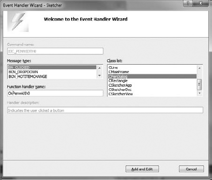
After the dialog box is displayed, every time you click one of the radio buttons a message is generated and sent to the application. To deal with these messages, you can add handlers to the CPenDialog class. Return to the dialog resource that you created, right-click each of the radio buttons in turn, and select Add Event Handler from the pop-up to create a handler for the BN_CLICKED message. Figure 18-5 shows the event handler dialog window for the button that has IDC_PENWIDTH0 as its ID. Note that I have edited the name of the handler, as the default name was a little cumbersome.
The implementations of the BN_CLICKED event handlers for all of these radio buttons are similar because each just sets the pen width in the dialog object. As an example, the handler for IDC_PENWIDTH0 is as follows:
void CPenDialog::OnPenwidth0()
{
   m_PenWidth = 0;
}
You need to add the code for all six handlers to the CPenDialog class implementation, setting m_PenWidth to 1 in OnPenwidth1(), to 2 in OnPenwidth2(), and so on.
You must now modify the OnPenWidth() handler in CSketcherDoc to make the dialog effective. Add the following code to the function:
// Handler for the pen width menu item
void CSketcherDoc::OnPenWidth()
{
   CPenDialog aDlg;     // Create a local dialog object
   // Set the pen width in the dialog to that stored in the document
   aDlg.m_PenWidth = m_PenWidth;
   // Display the dialog as modal
   // When closed with OK, get the pen width
   if(aDlg.DoModal() == IDOK)
   {
      m_PenWidth = aDlg.m_PenWidth;
   }
}
The m_PenWidth member of the aDlg object is passed a pen width stored in the m_PenWidth member of the document; you still have to add this member to CSketcherDoc. The call of the DoModal() function now occurs in the condition of the if statement, which is true if the DoModal() function returns IDOK. In this case you retrieve the pen width stored in the aDlg object and store it in the m_PenWidth member of the document. If the dialog box is closed by means of the Cancel button, the escape key on the keyboard, or the close icon, IDOK won't be returned by DoModal(), and the value of m_PenWidth in the document will not be changed.
Note that even though the dialog box is closed when DoModal() returns a value, the aDlg object still exists, so you can call its member functions without any problem. The aDlg object is destroyed automatically, on return from OnPenWidth().
All that remains to do to support variable pen widths in your application is to update the affected classes: CSketcherDoc, CElement, and the four shape classes derived from CElement.
You need to add the m_PenWidth member to the document class, and the GetPenWidth() function to allow external access to the value stored. You should add the following bolded statements to the CSketcherDoc class definition:
class CSketcherDoc : public CDocument
{
// the rest as before...

protected:
// the rest as before...
   int m_PenWidth;                     // Current pen width

// Operations
public:
// the rest as before...
   int GetPenWidth() const             // Get the current pen width
      { return m_PenWidth; }

// the rest as before...
};
Because it's trivial, you can define the GetPenWidth() function in the definition of the class and gain the benefit of its being implicitly inline. You still need to add initialization for m_PenWidth to the constructor for CSketcherDoc, so modify the constructor in SketcherDoc.cpp to initialize m_PenWidth to 0.
You have a little more to do to the CElement class and the shape classes that are derived from it. You already have a member m_PenWidth in CElement to store the width to be used when you are drawing an element, and you must extend each of the constructors for elements to accept a pen width as an argument, and set the member in the class accordingly. The GetBoundRect() function in CElement must be altered to deal with a pen width of 0. You can modify the CElement class first. The new version of the GetBoundRect() function in the CElement class is as follows:
// Get the bounding rectangle for an element
CRect CElement::GetBoundRect() const
{
   CRect boundingRect(m_EnclosingRect);      // Object to store bounding rectangle
   //Increase the bounding rectangle by the pen width
   int Offset = m_PenWidth == 0 ? 1 : m_PenWidth; // Width must be at least 1
   boundingRect.InflateRect(Offset, Offset);
   return BoundingRect;
}
You use the local variable Offset to ensure that you pass the InflateRect() function a value of 1 if the pen width is 0 (a pen width of 0 always draws a line one pixel wide), and that you pass the actual pen width in all other cases.
Each of the constructors for CLine, CRectangle, CCircle, and CCurve must be modified to accept a pen width as an argument, and to store it in the inherited m_PenWidth member of the class. The declaration for the constructor in each class definition needs to be modified to add the extra parameter. For example, in the CLine class, the constructor declaration becomes:
CLine(const CPoint& start, const CPoint& end, COLORREF aColor, int penWidth);
And the constructor implementation should be modified to this:
CLine::CLine(const CPoint& start, const CPoint& end, COLORREF aColor, int penWidth):m_StartPoint(start), m_EndPoint(end) {m_PenWidth = penWidth; // Set pen widthm_Color = aColor; // Set line color // Define the enclosing rectangle m_EnclosingRect = CRect(Start, End); m_EnclosingRect.NormalizeRect(); }
You should modify each of the class definitions and constructors for the shapes in the same way, so that each initializes m_PenWidth with the value passed as the last argument.
The last change you need to make is to the CreateElement() member of CSketcherView. Because you have added the pen width as an argument to the constructors for each of the shapes, you must update the calls to the constructors to reflect this. Change the definition of CSketcherView::CreateElement() to the following:
CElement* CSketcherView::CreateElement()
{
   // Get a pointer to the document for this view
CSketcherDoc* pDoc = GetDocument();
ASSERT_VALID(pDoc); // Verify the pointer is good
// Now select the element using the type stored in the document
switch(pDoc->GetElementType())
{
case RECTANGLE:
return new CRectangle(m_FirstPoint, m_SecondPoint,
pDoc->GetElementColor(), pDoc->GetPenWidth());
case CIRCLE:
return new CCircle(m_FirstPoint, m_SecondPoint,
pDoc->GetElementColor(), pDoc->GetPenWidth());
case CURVE:
return new CCurve(m_FirstPoint, m_SecondPoint,
pDoc->GetElementColor(), pDoc->GetPenWidth());
case LINE:
return new CLine(m_FirstPoint, m_SecondPoint,
pDoc->GetElementColor(), pDoc->GetPenWidth());
default: // Something's gone wrong
AfxMessageBox(_T("Bad Element code"), MB_OK);
AfxAbort();
return nullptr;
}
}Each constructor call now passes the pen width as an argument. This is retrieved from the document with the GetPenWidth() function that you added to the document class.
You can now build and run the latest version of Sketcher to see how the pen dialog works out. Selecting the Pen
Note that the dialog box is a completely separate window. You can drag it around to position it where you want. You can even drag it outside the Sketcher application window.
Now you can move on to looking at how the spin button can help in the Sketcher application. The spin button is particularly useful when you want to constrain an input within a given integer range. It's normally used in association with another control, called a buddy control, that displays the value that the spin button modifies. The associated control is usually an edit control, but it doesn't have to be.
It would be nice to be able to draw at different viewing scales in Sketcher. If you had a way to change the scale, you could scale up whenever you wanted to fill in the fine detail in your masterpiece, and scale down again when working across the whole vista. You could apply the spin control to managing scaling in a document view. A drawing scale would be a view-specific property, and you would want the element drawing functions to take the current scale of a view into account. Altering the existing code to deal with view scaling requires rather more work than setting up the control, so first look at how you create a spin button and make it work.
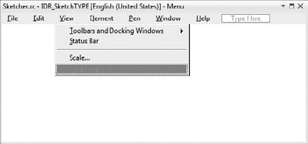
The first step is to provide a means of displaying the scale dialog. Go to Resource View and open the IDR_SketcherTYPE menu. You are going to add a Scale menu item to the end of the View menu. Enter the caption for the unused menu item as Scale. . . . This item will bring up the scale dialog, so you end the caption with an ellipsis (three periods) to indicate that it displays a dialog. Next you can add a separator before the new menu item by right-clicking it and selecting Insert Separator from the pop-up. The menu should now look as shown in Figure 18-7.
You can also add toolbar buttons to both toolbars for this menu item. All you need to do is make sure that the ID for each new button is also set to ID_VIEW_SCALE.
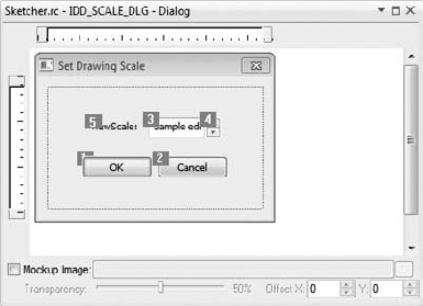
You've got the menu item; you better have a dialog to go with it. In Resource View, add a new dialog by right-clicking the Dialog folder on the tree and selecting Insert Dialog from the pop-up. Change the ID to IDD_SCALE_DLG and the Caption property to Set Drawing Scale.
Click the spin control in the palette, and then click on the position in the dialog where you want it to be placed. Next, right-click the spin control to display its properties. Change its ID to something more meaningful than the default, such as IDC_SPIN_SCALE. Now take at look at the properties for the spin button. They are shown in Figure 18-8.
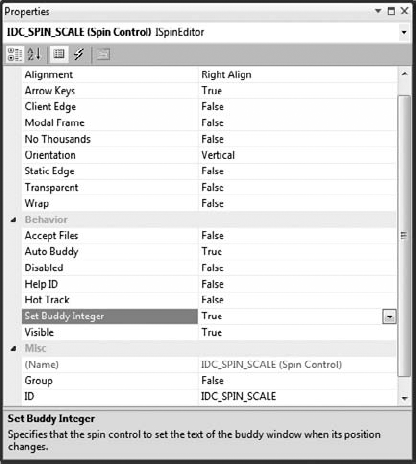
The Arrow Keys property is already set to True, enabling you to operate the spin button by using arrow keys on the keyboard. You should also set to true the value for both the Set Buddy Integer property, which specifies the buddy control value as an integer, and Auto Buddy, which provides for automatic selection of the buddy control. The effect of the latter is that the control selected as the buddy is automatically the previous control defined in the dialog. At the moment this is the Cancel button, which is not exactly ideal, but you'll see how to change this in a moment. The Alignment property determines how the spin button is displayed in relation to its buddy. You should set this to Right Align so that the spin button is attached to the right edge of its buddy control.
Next, add an edit control at the left side of the spin button by selecting the edit control from the list in the toolbox pane and clicking in the dialog where you want it positioned. Change the ID for the edit control to IDC_SCALE.
To make the contents of the edit control quite clear, you could add a static control just to the left of the edit control in the dialog and enter View Scale: as the caption. You can select all three controls by clicking them while holding down the Shift key. Pressing the F9 function key aligns the controls tidily, or you can use the Format menu.
Controls in a dialog have what is called a tab sequence. This is the sequence in which the focus shifts from one control to the next when you press the tab key, determined initially by the sequence in which controls are added to the dialog. You can see the tab sequence for the current dialog box by selecting Format
If the tab order you see is different, you have to change it. You really want the edit control to precede the spin button in the tab sequence, so you need to select the controls by clicking them in the order in which you want them to be numbered: OK button; Cancel button; edit control; spin button; and finally the static control. So, the tab order will be as shown in Figure 18-9. Now the edit control is selected as the buddy to the spin button.
After saving the resource file, you can right-click the dialog and select Add Class from the pop-up at the cursor. You'll then be able to define the new class associated with the dialog resource that you have created. You should name the class CScaleDialog and select the base class as CDialog. Clicking the Finish button adds the class to the Sketcher project.
You need to add a variable to the dialog class that stores the value returned from the edit control, so right-click the CScaleDialog class name in the Class View and select Add
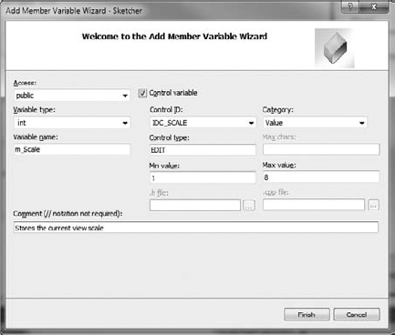
Figure 18-10 shows how the window for the Add Member Variable Wizard should look when you are done.
When you click the Finish button, the wizard takes care of entering the code necessary to support your new control variable.
You will also need to access the spin control in the dialog, and you can use the Add Member Variable Wizard to create that, too. Right-click CScaleDialog in Class View once again and click the "Control variable" checkbox. Leave the Category selection as Control and select IDC_SPIN_SCALE as the control ID: this corresponds to the spin control. You can now enter the variable name as m_Spin and add a suitable comment. When you click the Finish button, the new variable will be added to the CScaleDialog class.
The class definition you'll end up with after the wizard has added the new members is as follows:
class CScaleDialog : public CDialog
{
  DECLARE_DYNAMIC(CScaleDialog)

public:
  CScaleDialog(CWnd* pParent = NULL);   // standard constructor
  virtual ~CScaleDialog();

// Dialog Data
  enum { IDD = IDD_SCALE_DLG };

protected:
  virtual void DoDataExchange(CDataExchange* pDX);    // DDX/DDV support

  DECLARE_MESSAGE_MAP()
public:
  // Stores the current drawing scale
  int m_Scale;
  // Spin control for view scale
  CSpinButtonCtrl m_Spin;

};
The interesting bits of the class definition are bolded. The class is associated with the dialog resource through the enum statement, initializing IDD with the ID of the resource. It contains the variable m_Scale, which is specified as a public member of the class, so you can set and retrieve its value in a CScaleDialog object directly. There's also some special code in the implementation of the class to deal with the new m_Scale member. The m_Spin variable references the CSpinButtonCtrl object so you can call functions for the spin control.
A virtual function called DoDataExchange() has been included in the class by the Class Wizard. If you look in the ScaleDialog.cpp file, you'll find that the implementation looks like this:
void CScaleDialog::DoDataExchange(CDataExchange* pDX)
{
   CDialog::DoDataExchange(pDX);
   DDX_Text(pDX, IDC_SCALE, m_Scale);
   DDV_MinMaxInt(pDX, m_Scale, 1, 8);
   DDX_Control(pDX, IDC_SPIN_SCALE, m_Spin);
}
This function is called by the framework to carry out the exchange of data between variables in a dialog and the dialog's controls. This mechanism is called dialog data exchange, usually abbreviated to DDX. This is a powerful mechanism that can provide automatic transfer of information between a dialog and its controls in most circumstances, thus saving you the effort of programming to get the data yourself, as you did with the radio buttons in the pen width dialog.
In the scale dialog, DDX handles data transfers between the edit control and the variable m_Scale in the CScaleDialog class. The variable pDX, passed to the DoDataExchange() function, controls the direction in which data is transferred. After the base class DoDataExchange() function is called, the DDX_Text() function is called. The latter actually moves data between the variable m_Scale and the edit control.
The call to the DDV_MinMaxInt() function verifies that the value transferred is within the limits specified. This mechanism is called dialog data validation, or DDV. The DoDataExchange() function is called automatically before the dialog is displayed to pass the value stored in m_Scale to the edit control. When the dialog is closed with the OK button, it is automatically called again to pass the value in the control back to the variable m_Scale in the dialog object. All this is taken care of for you. You need only to ensure that the right value is stored in m_Scale before the dialog box is displayed, and arrange to collect the result when the dialog box closes.
You'll use the OnInitDialog() function to initialize the dialog, just as you did for the pen width dialog. This time you'll use it to set up the spin control. You'll initialize the m_Scale member a little later when you create the dialog in the handler for a Scale menu item, because it should be set to the value of the scale stored in the view. For now, add an override for the OnInitDialog() function to the CScaleDialog class, using the same mechanism you used for the previous dialog, and add code to initialize the spin control as follows:
BOOL CScaleDialog::OnInitDialog()
{
   CDialog::OnInitDialog();

   // If you have not checked the auto buddy option in
   // the spin control's properties, you can set the buddy control here

   // Set the spin control range
   m_Spin.SetRange(1, 8);

   return TRUE;  // return TRUE unless you set the focus to a control
                 // EXCEPTION: OCX Property Pages should return FALSE
}
There is only one line of code to add. This sets the upper and lower limits for the spin button by calling the SetRange() member of the spin control object. Although you have set the range limits for the edit control, this doesn't affect the spin control directly. If you don't limit the values in the spin control here, you allow the spin control to insert values outside the limits in the edit control, and there will be an error message from the edit control. You can demonstrate this by commenting out the statement that calls SetRange() here and trying out Sketcher without it.
If you want to set the buddy control using code, rather than by setting the value of Auto buddy in the spin button's properties to True, the CSpinButtonCtrl class has a function member to do this. You need to add the statement
mSpin.SetBuddy(GetDlgItem(IDC_SCALE));
at the point indicated by the comments.
Note
You can also access controls in a dialog programmatically. The function GetDlgItem() is inherited from CWnd via CDialog, and you can use it to retrieve the address of any control from the ID you pass as the argument. Thus, calling GetDlgItem() with IDC_SPIN_SCALE as the argument would return the address of the spin control. As you saw earlier, a control is just a specialized window, so the pointer returned is of type CWnd*; you therefore have to cast it to the type appropriate to the particular control, which would be CSpinButtonCtrl* in this case.
The dialog is to be displayed when the Scale menu option (or its associated toolbar button) is selected, so you need to add a COMMAND event handler to the CSketcherView class corresponding to the ID_VIEW_SCALE message through the Properties window for the class. You can then add code as follows:
void CSketcherView::OnViewScale()
{
  CScaleDialog aDlg;                   // Create a dialog object
  aDlg.m_Scale = m_Scale;              // Pass the view scale to the dialog
if(aDlg.DoModal() == IDOK){m_Scale = aDlg.m_Scale; // Get the new scaleInvalidateRect(0); // Invalidate the whole window}}
You create the dialog as a modal dialog, just as you did the pen width dialog. Before the dialog box is displayed by the DoModal() function call, you store the scale value provided by the m_Scale member of CSketcherView in the dialog member with the same name; this ensures that the control displays the current scale value when the dialog is displayed. If the dialog is closed with the OK button, you store the new scale from the m_Scale member of the dialog object in the view member with the same name. Because you have changed the view scale, you need to get the view redrawn with the new scale value applied. The call to InvalidateRect() does this. Don't forget to add an #include directive for ScaleDialog.h to SketcherView.cpp.
Of course, you must not forget to add the m_Scale data member to the definition of CSketcherView, so add the following line at the end of the other data members in the class definition:
int m_Scale; // Current view scale
You should also modify the CSketcherView constructor to initialize m_Scale to 1. This results in a view always starting out with a scale of one to one.
That's all you need to get the scale dialog and its spin control operational. You can build and run Sketcher to give it a trial spin before you add the code to use a view scale factor in the drawing process.
Scaling with Windows usually involves using one of the scalable mapping modes, MM_ISOTROPIC or MM_ANISOTROPIC. By using one of these mapping modes you can get Windows to do most of the work. Unfortunately, it's not as simple as just changing the mapping mode, because neither is supported by CScrollView. If you can get around that, however, you're home and dry. You'll use MM_ANISOTROPIC for reasons that you'll see in a moment, so let's first understand what's involved in using this mapping mode.
As I've said, there are two mapping modes that allow the mapping between logical coordinates and device coordinates to be altered, and these are the MM_ISOTROPIC and MM_ANISOTROPIC modes. The MM_ISOTROPIC mode has a property that forces the scaling factor for both the x- and y-axes to be the same, which has the advantage that your circles will always be circles. The disadvantage is that you can't map a document to fit into a rectangle of a different aspect ratio. The MM_ANISOTROPIC mode, on the other hand, permits scaling of each axis independently. Because it's the more flexible mode of the two, you'll use MM_ANISOTROPIC for scaling operations in Sketcher.
The way in which logical coordinates are transformed to device coordinates is dependent on the following parameters, which you can set:
PARAMETER | DESCRIPTION |
|---|---|
| The logical coordinates of the upper left corner of the window. You set this by calling the function |
| The size of the window specified in logical coordinates. You set this by calling the function |
| The coordinates of the upper left corner of the window in device coordinates (pixels). You set this by calling the function |
| The size of the window in device coordinates (pixels). You set this by calling the function |
The viewport referred to here has no physical significance by itself; it serves only as a parameter for defining how coordinates are transformed from logical coordinates to device coordinates.
Remember the following:
Logical coordinates (also referred to as page coordinates) are determined by the mapping mode. For example, the
MM_LOENGLISHmapping mode has logical coordinates in units of 0.01 inches, with the origin in the upper left corner of the client area, and the positive y-axis direction running from bottom to top. These are used by the device context drawing functions.Device coordinates (also referred to as client coordinates in a window) are measured in pixels in the case of a window, with the origin at the upper left corner of the client area, and with the positive y-axis direction from top to bottom. These are used outside a device context — for example, for defining the position of the cursor in mouse message handlers.
Screen coordinates are measured in pixels and have the origin at the upper left corner of the screen, with the positive y-axis direction from top to bottom. These are used for getting or setting the cursor position.
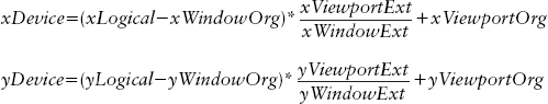
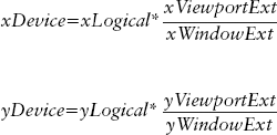
The formulae used by Windows to convert from logical coordinates to device coordinates are:
With coordinate systems other than those provided by the MM_ISOTROPIC and MM_ANISOTROPIC mapping modes, the window extent and the viewport extent are fixed by the mapping mode and can't be changed. Calling the functions SetWindowExt() or SetViewportExt() in the CDC object to change them has no effect, although you can still move the position of (0,0) in your logical reference frame by calling SetWindowOrg() or SetViewportOrg(). However, for a given document size that is expressed by the window extent in logical coordinate units, you can adjust the scale at which elements are displayed by setting the viewport extent appropriately. By using and setting the window and viewport extents, you can get the scaling done automatically.
You need to maintain the size of the document in logical units in the document object. You can add a protected data member, m_DocSize, to the CSketcherDoc class definition to store the size of the document:
CSize m_DocSize; // Document size
You will also want to access this data member from the view class, so add a public function to the CSketcherDoc class definition as follows:
CSize GetDocSize() const            // Retrieve the document size
    { return m_DocSize; }
You must initialize the m_DocSize member in the constructor for the document; modify the implementation of CSketcherDoc() as follows:
CSketcherDoc::CSketcherDoc()
: m_Element(LINE)
, m_Color(BLACK)
, m_PenWidth(0)
, m_DocSize(CSize(3000,3000))
{
  // TODO: add one-time construction code here
}
You'll be using notional MM_LOENGLISH coordinates, so you can treat the logical units as increments of 0.01 inches, and the value set gives you an area of 30 square inches to draw on.
You can set the mapping mode to MM_ANISOTROPIC in an override for the inherited OnPrepareDC() function in the CSketcherView class. This function is always called for any WM_PAINT message, and you have arranged to call it when you draw temporary objects in the mouse message handlers; however, you have to do a little more than just set the mapping mode.
You'll need to create the function override in CSketcherView before you can add the code. Just open the Properties window for the CSketcherView class and click the Overrides toolbar button. You can then add the override by selecting OnPrepareDC from the list and clicking on <Add> OnPrepareDC in the adjacent column. You are now able to type the code directly into the Editor pane. The implementation of OnPrepareDC() is as follows:
void CSketcherView::OnPrepareDC(CDC* pDC, CPrintInfo* pInfo)
{
  CScrollView::OnPrepareDC(pDC, pInfo);
  CSketcherDoc* pDoc = GetDocument();
  pDC->SetMapMode(MM_ANISOTROPIC);     // Set the map mode
  CSize DocSize = pDoc->GetDocSize();  // Get the document size
  pDC->SetWindowExt(DocSize);          // Now set the window extent
  // Get the number of pixels per inch in x and y
  int xLogPixels = pDC->GetDeviceCaps(LOGPIXELSX);
  int yLogPixels = pDC->GetDeviceCaps(LOGPIXELSY);
  // Calculate the viewport extent in x and y
  int xExtent = (DocSize.cx*m_Scale*xLogPixels)/100;
  int yExtent = (DocSize.cy*m_Scale*yLogPixels)/100;
  pDC->SetViewportExt(xExtent,yExtent); // Set viewport extent
}
The override of the base class function is unusual here in that you have left in the call to CScrollView::OnPrepareDC() and added the modifications after it, rather than where the comment in the default code suggests. If the class was derived from CView, you would replace the call to the base class version because it does nothing, but in the case of CScrollView, this isn't the case. You need the base class function to set some attributes before you set the mapping mode. Don't make the mistake of calling the base class function at the end of the override version, though — if you do, scaling won't work.
The CDC member function GetDeviceCaps() supplies information about the device with which the device context is associated. You can get various kinds of information about the device, depending on the argument you pass to the function. In this case the arguments LOGPIXELSX and LOGPIXELSY return the number of pixels per logical inch in the x and y directions, respectively. These values are equivalent to 100 units in your logical coordinates.
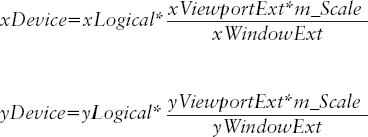
You use these values to calculate the x and y values for the viewport extent, which you store in the local variables xExtent and yExtent, respectively. The document extent along an axis in logical units, divided by 100, gives the document extent in inches. If this is multiplied by the number of logical pixels per inch for the device, you get the equivalent number of pixels for the extent. If you then use this value as the viewport extent, you get the elements displayed at a scale of one to one. If you simplify the equations for converting between device and logical coordinates by assuming that the window origin and the viewport origin are both (0,0), they become the following:
If you multiply the viewport extent values by the scale (stored in m_Scale), the elements are drawn according to the value of m_Scale. This logic is exactly represented by the expressions for the x and y viewport extents in your code. The simplified equations, with the scale included, are as follows:
You should be able to see from this that a given pair of device coordinates varies in proportion to the scale value. The coordinates at a scale of three are three times the coordinates at a scale of one. Of course, as well as making elements larger, increasing the scale also moves them away from the origin.
That's all you need in order to scale the view. Unfortunately, at the moment scrolling won't work with scaling, so you need to see what you can do about that.
CScrollView just won't work with the MM_ANISOTROPIC mapping mode, so clearly you must use another mapping mode to set up the scrollbars. The easiest way to do this is to use MM_TEXT, because in this case the units of logical coordinates are the same as the client coordinates — pixels, in other words. All you need to do, then, is figure out how many pixels are equivalent to the logical document extent for the scale at which you are drawing, which is easier than you might think. You can add a function to CSketcherView to take care of the scrollbars and implement it to work out the number of pixels corresponding to the logical document extent. Right-click the CSketcherView class name in Class View and add a public function, ResetScrollSizes(), with a void return type and no parameters. Add the code to the implementation, as follows:
void CSketcherView::ResetScrollSizes(void)
{
  CClientDC aDC(this);
  OnPrepareDC(&aDC);                             // Set up the device context
  CSize DocSize = GetDocument()->GetDocSize();   // Get the document size
  aDC.LPtoDP(&DocSize);                          // Get the size in pixels
  SetScrollSizes(MM_TEXT, DocSize);              // Set up the scrollbars
}
After creating a local CClientDC object for the view, you call OnPrepareDC() to set up the MM_ANISOTROPIC mapping mode. Because this takes scaling into account, the LPtoDP() member of the aDC object converts the document size stored in the local variable DocSize to the correct number of pixels for the current logical document size and scale. The total document size in pixels defines how large the scrollbars must be in MM_TEXT mode — remember, MM_TEXT logical coordinates are in pixels. You can then get the SetScrollSizes() member of CScrollView to set up the scrollbars based on this by specifying MM_TEXT as the mapping mode.
It may seem strange that you can change the mapping mode in this way, but it's important to keep in mind that the mapping mode is nothing more than a definition of how logical coordinates are to be converted to device coordinates. Whatever mode (and therefore coordinate conversion algorithm) you've set up applies to all subsequent device context functions until you change it, and you can change it whenever you want. When you set a new mode, subsequent device context function calls just use the conversion algorithm defined by the new mode. You figure out how big the document is in pixels with MM_ANISOTROPIC because this is the only way you can get the scaling into the process; you then switch to MM_TEXT to set up the scrollbars because you need units for this in pixels for it to work properly. Simple really, when you know how.
You must set up the scrollbars initially for the view in the OnInitialUpdate() member of CSketcherView. Change the previous implementation of the function to the following:
void CSketcherView::OnInitialUpdate()
{
  ResetScrollSizes();                  // Set up the scrollbars
  CScrollView::OnInitialUpdate();
}
All you do is call the ResetScrollSizes() function that you just added to the view. This takes care of everything — well, almost. The CScrollView object needs an initial extent to be set in order for OnPrepareDC() to work properly, so you need to add one statement to the CSketcherView constructor:
CSketcherView::CSketcherView()
: m_FirstPoint(CPoint(0,0))           // Set 1st recorded point to 0,0
, m_SecondPoint(CPoint(0,0))          // Set 2nd recorded point to 0,0
, m_pTempElement(NULL)                // Set temporary element pointer to 0
, m_pSelected(NULL)                   // No element selected initially
, m_MoveMode(FALSE)                   // Set move mode off
, m_CursorPos(CPoint(0,0))            // Initialize as zero
, m_FirstPos(CPoint(0,0))             // Initialize as zero
, m_Scale(1)                          // Set scale to 1:1
{
   SetScrollSizes(MM_TEXT, CSize(0,0));     // Set arbitrary scrollers
}
The additional statement just calls SetScrollSizes() with an arbitrary extent to get the scrollbars initialized before the view is drawn. When the view is drawn for the first time, the ResetScrollSizes() function call in OnInitialUpdate() sets up the scrollbars properly.
Of course, each time the view scale changes, you need to update the scrollbars before the view is redrawn. You can take care of this in the OnViewScale() handler in the CSketcherView class:
void CSketcherView::OnViewScale()
{
  CScaleDialog aDlg;                   // Create a dialog object
  aDlg.m_Scale = m_Scale;              // Pass the view scale to the dialog
  if(aDlg.DoModal() == IDOK)
{
m_Scale = aDlg.m_Scale; // Get the new scale
ResetScrollSizes(); // Adjust scrolling to the new scale
InvalidateRect(0); // Invalidate the whole window
}
}With the ResetScrollSizes() function, taking care of the scrollbars isn't complicated. Everything is covered by the one additional line of code.
Now you can build the project and run the application. You'll see that the scrollbars work just as they should. Note that each view maintains its own scale factor, independently of the other views.
The CTaskDialog class is a new feature of Visual C++ 2010 that enables you to create and display a wide range of message boxes and input dialogs programmatically. Although CTaskDialog is easy to use, it has a couple of limitations. First, it works only if your application is running under Windows Vista or later. If you want to use it, and also support earlier versions of Windows, you have to program the old-fashioned way as an alternative, so it doesn't save you any effort. Second, you have much more flexibility in how your input dialogs look and work if you create dialog resources for them in the way you have seen. Because of these limitations, I'll only discuss the class briefly, and we won't be integrating it into Sketcher.
To use the CTaskDialog class in a source file, you need an #include directive for afxTaskDialog.h. You can program to use this class, but only when it is supported, like this:
if(CTaskDialog::IsSupported)
{
  // Use CTaskDialog
}
else
{
  // Use a dialog derived from CDialog or use AfxMessageBox()
}
The static IsSupported() function in CTaskDialog returns TRUE if the operating system environment on which the application is running supports it.
The simplest way to create a CTaskDialog dialog and display it is to call the static ShowDialog() member of the class. Because you have no explicit CTaskDialog object, you can't do anything beyond the basic options offered by the ShowDialog() function, so this is primarily a more sophisticated alternative to calling AfxMessageBox(). The prototype of the ShowDialog() function is as follows:
static INT_PTR ShowDialog(
const CString& content,                          // Content of the dialog
const CString& mainInstr,                        // Main instruction in the dialog
const CString& title,                            // Title bar text
int nIDCommandFirst,                             // String ID of the first command
int nIDCommandLast,                              // String ID of the last command
int buttons = TDCBF_YES_BUTTON|TDCBF_NO_BUTTON,  // Buttons in the dialog
int nOptions = TDF_ENABLE_HYPERLINKS|TDF_USE_COMMAND_LINKS,  // Dialog options
const CString& footer=_T(""));                   // Footer string in the dialog
The nIDCommandFirst and nIDCommandLast parameters specify a range of IDs that should identify entries in the string table resource in your application. For each valid ID, a command button will be created, and the string from the table will appear as the caption for the command button. You need to make sure that the value for the nIDCommandFirst parameter is greater than the IDs for any other buttons you may be using, such as IDOK and IDCANCEL. If you create the IDs through the resource editor for the string table, this should not be a problem.
The buttons parameter specifies the common buttons that the user can click to close the dialog. In addition to the defaults, you can also use TDCBF_OK_BUTTON, TDCBF_CANCEL_BUTTON, TDCBF_RETRY_BUTTON, and TDCBF_CLOSE_BUTTON. These are single-bit masks that identify the buttons. When you want to have two or more buttons displayed in the dialog, you OR them together.
There are many standard options you can specify via the nOptions parameter, in addition to the default values shown. You can find these in the documentation for the SetOptions() function in the dialog class.
The integer value that is returned reflects the selection made by the user to close the dialog. This will be the ID for the control that was clicked to close the dialog. In the case of a command button being clicked, the ID will be the ID that identifies the entry in the string table. If a common button is clicked to close the dialog, the value returned will be one of IDYES, IDNO, IDOK, IDCANCEL, IDRETRY, or IDCLOSE.
Here's a code fragment showing how you might use the ShowDialog() function:
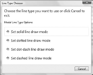
CString content(_T("Modal Line Type Options"));
    CString mainInst(
              _T("Choose the line type you want to use or click Cancel to exit:"));
    CString title(_T("Line Type Chooser"));
    int result = CTaskDialog::ShowDialog(
      content,
      mainInst,
      title,
      IDS_SOLID_LINE,
      IDS_DASHED_LINE,
      TDCBF_CANCEL_BUTTON
      );
For this fragment to compile and execute successfully, you would need to have defined the symbols IDS_SOLID_LINE, IDS_DOTTED_LINE, IDS_DOTDASH_LINE, and IDS_DASHED_LINE with consecutive values. You can create new symbols by clicking on the string table resource on the Resources pane and pressing the insert key to add a new string. You will then be able to edit the Caption, ID, and Value properties for the new entry.
The dialog that is displayed is shown in Figure 18-11.
To get the data from this dialog when it closes, you could use the following code:
switch(result)
    {
      case IDS_SOLID_LINE:
       m_LineType = SOLID;
       break;
      case IDS_DOTTED_LINE:
       m_LineType = DOTTED;
       break;
      case IDS_DOTDASH_LINE:
       m_LineType = DOTDASH;
       break;
      case IDS_DASHED_LINE:
       m_LineType = DASHED;
       break;
      case IDCANCEL:
       break;
      default:
        CTaskDialog::ShowDialog(
         _T("Error Choosing Line Type"),
         _T("Invalid return from dialog!"),
         _T("Error"),
         0,
         0,
         TDCBF_OK_BUTTON
         );
        break;
    }
This fragment sets the value of a member variable, m_LineType, depending on the value returned from the ShowDialog() function. The function returns the symbol value corresponding to the command or common button that was clicked to terminate the dialog. There's a provision in the default case for displaying an error dialog using the ShowDialog() function. This supplies string arguments as literals rather than creating CString objects.
When you create a CTaskDialog object using the class constructor, you have increased flexibility in what you can do with the dialog because you have functions available that enable you to customize the dialog object. There are two constructors that have parameters similar to those of the ShowDialog() function. One has parameters for specifying a range of IDs for command controls, and the other doesn't. The prototype for the constructor without command control parameters is as follows:
CTaskDialog(
const CString& content,                          // Content of the dialog
const CString& mainInstr,                        // Main instruction in the dialog
const CString& title,                            // Title bar text
int buttons = TDCBF_OK_BUTTON|TDCBF_CANCEL_BUTTON,   // Buttons in the dialog
int nOptions = TDF_ENABLE_HYPERLINKS|TDF_USE_COMMAND_LINKS,  // Dialog options
const CString& footer=_T("")                     // Footer string in the dialog
};
Note that the default button values are different from those of the ShowDialog() function. Here the defaults are for OK and Cancel buttons rather than Yes and No buttons. Here's how you could use this constructor:
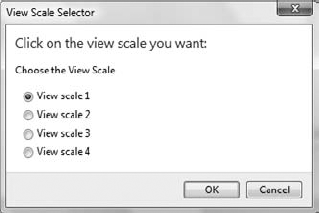
CTaskDialog scaleDlg(
_T("Choose the View Scale"),
_T("Click on the view scale you want:"),
_T("View Scale Selector") );
When you use this constructor, you typically customize the object by calling member functions before displaying the dialog.
The more comprehensive constructor adds two parameters that specify the IDs for a range of command controls:
CTaskDialog(
const CString& content,                          // Content of the dialog
const CString& mainInstr,                        // Main instruction in the dialog
const CString& title,                            // Title bar text
int nIDCommandFirst,                             // String ID of the first command
int nIDCommandLast,                              // String ID of the last command
int buttons,                                     // Buttons in the dialog
int nOptions = TDF_ENABLE_HYPERLINKS|TDF_USE_COMMAND_LINKS,  // Dialog options
const CString& footer=_T("")                     // Footer string in the dialog
};
As you see, there are no default button values in this case. This constructor produces an object that encapsulates a dialog that is similar to the one produced by the ShowDialog() function.
You can add radio buttons to a CTaskDialog object using the AddRadioButton() function. Here's how you could add radio buttons to the scaleDlg object that was created in the previous section:
const int SCALE_1(1001), SCALE_2(1002), SCALE_3(1003), SCALE_4(1004);
scaleDlg.AddRadioButton(SCALE_1, _T("View scale 1"));
scaleDlg.AddRadioButton(SCALE_2, _T("View scale 2"));
scaleDlg.AddRadioButton(SCALE_3, _T("View scale 3"));
scaleDlg.AddRadioButton(SCALE_4, _T("View scale 4"));
int result = scaleDlg.DoModal();
The first statement defines four integer constants that you use to identify the radio buttons. The AddRadioButton() function calls add four radio buttons, each identified by the first argument, with the annotation for each radio button specified by the second argument. Executing this fragment, following the statement in the previous section that creates scaleDlg, will display the dialog shown in Figure 18-12.
The first radio button is selected by default. If you wanted to have a different radio button selected by default, you could call the SetDefaultRadioButton() function for the dialog before you display it. For example:
scaleDlg.SetDefaultRadioButton(SCALE_3);
The argument to the function is the ID of the button you want to set as the default selection.
You can remove all the radio buttons from a CTaskDialog object by calling its RemoveAllRadioButtons() function. You would do this if you wanted to add a different set of radio buttons before you re-display the dialog.
You can obtain the ID of the radio button that is selected when the dialog closes by calling the GetSelectedRadioButtonID() function for the dialog object. Here's how you can get output from scaleDlg:
if(scaleDlg.DoModal() == IDOK)
  {
    switch(scaleDlg.GetSelectedRadioButtonID())
    {
    case SCALE_1:
      m_Scale = 1;
      break;
    case SCALE_2:
      m_Scale = 2;
      break;
    case SCALE_3:
      m_Scale = 3;
      break;
    case SCALE_4:
      m_Scale = 4;
      break;
    }
  }
You display the dialog by calling DoModal() for scaleDlg. You want to check the state of the radio buttons in the dialog only when the OK button is used to close the dialog, and the if statement verifies that the return from DoModal() corresponds to the OK button. The GetSelectedRadioButtonID() function returns the ID of the radio button that is selected, so the switch statement sets the value of the m_Scale member, depending on the ID that is returned.
The CTaskDialog class is a convenient and more flexible alternative to the AfxMessageBox() function, especially when you want to get user input in addition to communicating a message. There are also many more functions that the CTaskDialog class defines for manipulating and updating the dialog that I have described here. However, creating a dialog resource using the toolbox provides you with a much wider range of controls that you can use and gives you complete flexibility in how the dialog is laid out. Furthermore, when you do use the CTaskDialog class in an application that you want to run with Windows XP or earlier operating systems, you must call the IsSupported() function to verify that the class is supported before you attempt to use it, and you will need to program for an alternative dialog creation process when it isn't. For these reasons, you will find that most dialogs are best created as a dialog resource or through AfxMessageBox().
With each view now being scaled independently, there's a real need to have some indication of what the current scale in a view is. A convenient way to do this would be to display the scale in the status bar for each view window. A status bar was created by default in the Sketcher main application window. Usually, the status bar appears at the bottom of an application window, below the horizontal scrollbar, although you can arrange for it to be at the top of the client area. The status bar is divided into segments called panes; the status bar in the main application window in Sketcher has four panes. The one on the left contains the text "Ready," and the other three are the recessed areas on the right that are used as indicators to record when Caps Lock, Num Lock, and Scroll Lock are in effect.
It's possible for you to write to the status bar that the Application Wizard supplied by default, but you need access to the m_wndStatusBar member of the CMainFrame object for the application, as this represents it. As it's a protected member of the class, you must either add a public member function to modify the status bar from outside the class, or add a member to return a reference to m_wndStatusBar.
You may well have several views of the same sketch, each with its own view scale, so you really want to associate displaying the scale with each view. Our approach will be to give each child window its own status bar. The m_wndStatusBar object in CMainFrame is an instance of the CMFCStatusBar class. You can use the same class to implement your own status bars in the view windows.
The CMFCStatusBar class defines a control bar with multiple panes in which you can display information. We will be using this in a very simple way, but the CMFCStatusBar class provides a great deal of advanced capability, including the ability to display icons in status bar panes. Consult the Visual C++ 2010 documentation for the CMFCStatusBar class for more information on this.
The first step to using CMFCStatusBar is to add a data member for the status bar to the definition of CChildFrame, which is the frame window for a view. Add the following declaration to the public section of the class:
CMFCStatusBar m_StatusBar; // Status bar object
Note
Status bars should be part of the frame, not part of the view. You don't want to be able to scroll the status bars or draw over them. They should just remain anchored to the bottom of the window. If you added a status bar to the view, it would appear inside the scrollbars and would be scrolled whenever you scrolled the view. Drawing over the part of the view containing the status bar would cause the bar to be redrawn, leading to an annoying flicker. Having the status bar as part of the frame avoids these problems.
To create the panes in the status bar, you call the SetIndicators() function for the status bar object. This function requires two arguments, a const array of indicators of type UINT and the number of elements in the array. Each element in the array is a resource symbol that will be associated with a pane in the status bar, and each resource symbol must have an entry in the resource string table that will be the default text in the pane. There are standard resource symbols, such as ID_INDICATOR_CAPS and ID_INDICATOR_NUM, which are used to identify indicators for the Caps Lock and Num Lock keys respectively, and you can see these in use if you look at the implementation of the OnCreate() function in the CMainFrame class. They also appear in the string table resource.
You can create your own indicator resource symbol by extending the String Table resource in Resource View: click the ⊳ symbol, double-click the String Table entry to display the table, and then press the insert key. If you right-click the new entry in the table and select Properties from the menu, you will be able to change the ID to ID_INDICATOR_SCALE and the caption to View Scale: 1.
You should initialize the m_StatusBar data member just before the visible view window is displayed. So, using the Properties window for the CChildFrame class, you can add a function to the class that will be called in response to the WM_CREATE message that is sent to the application when the window is to be created. Add the following code to the OnCreate() handler:
int CChildFrame::OnCreate(LPCREATESTRUCT lpCreateStruct)
{
  if(CMDIChildWndEx::OnCreate(lpCreateStruct) == -1)
    return −1;

  // Create the status bar
  m_StatusBar.Create(this);
  static UINT indicators[] = {ID_INDICATOR_SCALE};
  m_StatusBar.SetIndicators(indicators, sizeof(indicators)/sizeof(UINT));
  m_StatusBar.SetPaneStyle(0, SBPS_STRETCH);     // Stretch the first pane
  return 0;
}
The generated code isn't bolded. There's a call to the base class version of the OnCreate() function, which takes care of creating the definition of the view window. It's important not to delete this function call; otherwise, the window is not created.
Calling the Create() function for the CMFCStatusBar object creates the status bar. You pass the this pointer for the current CChildFrame object to the Create() function, setting up a connection between the status bar and the window that owns it. The indicators that define the panes in the status bar are typically defined as an array of UINT elements. Here you are interested only in setting up a single pane, so you define indicators as an array that is initialized just with the symbol for your status pane. When you want to add multiple panes to a status bar, you can separate them by including ID_SEPARATOR symbols between your symbols in the indicators array. You call the SetIndicators() function for the status bar object with the address of indicators as the first argument and a count of the number of elements in the array as the second argument. This will create a single pane to the left in the status bar. The call to SetPaneStyle() for the first pane causes this pane to be stretched as necessary, the first argument being the pane index and the second a UINT value specifying the style or styles to be set. Without this, the sizing grip would not remain in the correct position when you resized the window. Only one pane can have the SBPS_STRETCH style. Other styles you can set for a pane are as follows:
| No stretch, borders, or pop-out styles set. |
| Border reversed, so text pops out. |
| No 3D borders. |
| No text drawn in the pane. |
You just OR the styles together when you want to set more than one style for a pane.
If you build and run the code now, the status bars appear, but they show only a scale factor of one, grayed out, no matter what scale factor is actually being used — not very useful. This is because there is no mechanism in place for updating the status bar. What you need to do is add code somewhere that changes the text in the status bar pane each time a different scale is chosen. The obvious place to do this is in the CSketcherView class because that's where the current view scale is recorded.
You can update a pane in the status bar by adding an UPDATE_COMMAND_UI handler that is associated with the indicator symbol for the pane. Right-click CSketcherView in Class View, and select Class Wizard from the pop-up. This will display the MFC Class Wizard dialog. As you can see, this enables you to create and edit a whole range of functions in a class and provides an alternative way to access any class member.
If it is not already visible, select the Commands tab in the dialog: this enables you to add command handlers to the class. Select ID_INDICATOR_SCALE in the Object IDs pane; this ID identifies the status bar pane you want to update. Then, select UPDATE_COMMAND_UI in the Messages pane. The dialog should look like Figure 18-13.
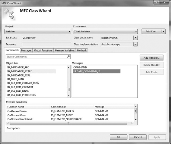
Click the Add Handler button to add the command handler to the class. Another dialog will be displayed that gives you the opportunity to change the handler function name to OnUpdateScale, which is a little more concise than the default. You can then click OK to close the dialog, and OK again to close the MFC Class Wizard dialog.
All you need is to complete the definition for the handler that was added, so add the following code to the function in SketcherView.cpp:
void CSketcherView::OnUpdateScale(CCmdUI *pCmdUI)
{
    pCmdUI->Enable();
    CString scaleStr;
    scaleStr.Format(_T(" View Scale : %d"), m_Scale);
    pCmdUI->SetText(scaleStr);
}
The parameter is a pointer to a CCmdUI object that encapsulates the status bar pane as a command target. You create a CString object and call its Format() function to generate the text string to be displayed in the pane. The first argument to Format() is a format control string in which you can embed conversion specifiers for subsequent arguments. The format string with the embedded specifiers is the same as for the C function, printf(). Each of the subsequent arguments is converted according to the corresponding format specifier in the first argument, so there must be one format specifier in the format string for each argument after the first. Here the %d specifier converts the value of m_Scale to a decimal string, and this is incorporated into the format string. Other common specifiers you can use are %f for floating point values and %s for string values. Calling SetText() for the CCmdUI object sets the string you supply as the argument in the status bar pane. Calling Enable() for the CCmdUI object causes the pane text to be displayed normally because the BOOL parameter has a default value of TRUE. An explicit argument of FALSE would make the pane text grayed out.
That's all you need for the status bar. If you build Sketcher again, you should have multiple, scrolled windows, each at different scales, with the scale displayed in the status bar in each view.
Of course, you don't have to use a spin button to set the scale. You could also use a list box control, for example. The logic for handling a scale factor would be exactly the same, and only the dialog box and the code to extract the value for the scale factor from it would change. If you want to try this out without messing up the development of the Sketcher program, you can copy the complete Sketcher project to another folder and make the modifications to the copy. Deleting part of a Class Wizard–managed program can be a bit messy, so it's a useful experience to have before you really need to do it.
You first need to delete the definition and implementation of CScaleDialog from the copy of the Sketcher project, as well as the resource for the scale dialog. To do this, go to the Solution Explorer pane, select ScaleDialog.cpp, and press the delete key. Click the Delete button in the dialog that is displayed, unless you want to keep the file; then select ScaleDialog.h and remove it from the project in the same way. Go to Resource View, expand the Dialog folder, click IDD_SCALE_DLG, and press the delete key to remove the dialog resource. Delete the #include directive for ScaleDialog.h from SketcherView.cpp.
At this stage, all references to the original dialog class have been removed from the project. Are you all done yet? Almost. The IDs for the resources should have been deleted for you. To verify this, right-click Sketcher.rc in Resource View and select the Resource Symbols menu item from the pop-up; you can check that IDC_SCALE and IDC_SPIN_SCALE are no longer in the list. Of course, the OnViewScale() handler in the CSketcherView class still refers to CScaleDialog, so the Sketcher project won't compile yet. You'll fix that when you have added the list box control.
Select the Build
Right-click the Dialog folder in Resource View, and add a new dialog with a suitable ID and caption. You could use the same ID as before, IDD_SCALE_DLG.
Select the list box button in the list of controls, and click where you want the list box to be positioned in the dialog box. You can enlarge the list box and adjust its position in the dialog by dragging it appropriately. Right-click the list box and select Properties from the pop-up. You can set the ID to something suitable, such as IDC_SCALE_LIST, as shown in Figure 18-14.
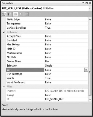
The Sort property will be True by default, so make sure you set it to False. This means that strings that you add to the list box are not automatically sorted. Instead, they're appended to the end of the list in the box, and are displayed in the sequence in which you enter them. Because you will be using the position of the selected item in the list to indicate the scale, it's important not to have the sequence changed. The list box has a vertical scrollbar for the list entries by default, and you can accept the defaults for the other properties. If you want to look into the effects of the other properties, you can click each of them in turn to display text at the bottom of the Properties window explaining what the property does.
Now that the dialog is complete, you can save it, and you're ready to create the class for the dialog.
Right-click the dialog and select Add Class from the pop-up. Again, you'll be taken to the dialog to create a new class. Give the class an appropriate name, such as the one you used before, CScaleDialog, and select CDialog as the base class. If, when you click Finish, you get a message box saying that ScaleDialog.cpp already exists, you forgot to explicitly delete the .h and .cpp files. Go back and do that now, or rename the files if you want to keep them. Everything should then work as it's supposed to. After you've completed that, all you need to do is add a public control variable called m_Scale to the class, corresponding to the list box ID, IDC_SCALE_LIST. The type should be int and the limits should be 0 and 7. Don't forget to set the Category as Value; otherwise, you won't be able to enter the limits. Because you have created it as a control variable, DDX is implemented for the m_Scale data member, and you will use the variable to store a zero-based index to one of the eight entries in the list box.
You need to initialize the list box in the OnInitDialog() override in the CScaleDialog class, so add an override for this function using the Properties window for the class. Add code to the function as follows:
BOOL CScaleDialog::OnInitDialog()
{
  CDialog::OnInitDialog();

  CListBox* pListBox = static_cast<CListBox*>(GetDlgItem(IDC_SCALE_LIST));
  CString scaleStr;
  for(int i = 1 ; i <= 8 ; ++i)
  {
    scaleStr.Format(_T("Scale %d"), i);
    pListBox->AddString(scaleStr);
  }
  pListBox->SetCurSel(m_Scale);        // Set current scale

  return TRUE;  // return TRUE unless you set the focus to a control
                // EXCEPTION: OCX Property Pages should return FALSE
}
The first line that you have added obtains a pointer to the list box control by calling the GetDlgItem() member of the dialog class. This is inherited from the MFC class, CWnd. It returns a pointer of type CWnd*, so you cast this to type CListBox*, which is a pointer to the MFC class defining a list box.
Using the pointer to the dialog's CListBox object, you then use the AddString() member repeatedly in the for loop to add the lines defining the list of scale factors. Each entry in the list box is formed by a call to the Format() member of the scaleStr object. The statement following the for loop sets the currently selected entry in the list box to correspond to the value of m_Scale. These entries appear in the list box in the order in which you enter them, so that the dialog is displayed as shown in Figure 18-15.
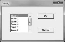
Each entry in the list is associated with a zero-based index value that is automatically stored in the m_Scale member of CScaleDialog through the DDX mechanism. Thus, if you select the third entry in the list, m_Scale is set to 2.
The dialog is displayed by the OnViewScale() handler that you added to CSketcherView in the previous version of Sketcher. You need only to amend this function to deal with the new dialog, using a list box, the code for it is as follows:
void CSketcherView::OnViewScale()
{
  CScaleDialog aDlg;                   // Create a dialog object
  aDlg.m_Scale = m_Scale - 1;          // Pass the view scale to the dialog
  if(aDlg.DoModal() == IDOK)
  {
    m_Scale = 1 + aDlg.m_Scale;        // Get the new scale

    ResetScrollSizes();                // Adjust scrolling to the new scale
    InvalidateRect(0);                 // Invalidate the whole window
  }
}
Because the index value for the entry selected from the list is zero-based, you must decrement the current scale value by one when setting the value in the CScaleDialog object. You also need to add one to the value obtained from the dialog to get the actual scale value to be stored in the view. The code to display this value in the view's status bar is exactly as before. The rest of the code to handle scale factors is already complete and requires no changes. After you've added back the #include directive for ScaleDialog.h, you can build and execute this version of Sketcher to see the list box in action.
You could use an edit box control to add annotations to a sketch in Sketcher. You'll need a new element type, CText, that corresponds to a text string, and an extra menu item to set a TEXT mode for creating elements. Because a text element needs only one reference point, you can create it in the OnLButtonDown() handler in the view class. You'll also need a new item in the Element menu to set TEXT mode. You'll add this text capability to Sketcher in the following sequence:
Create a dialog resource and its associated class with an edit box control for input.
Add the new menu item.
Add the code to open the dialog for creating an element.
Add the support for a
CTextclass.
Create a new dialog resource in Resource View by right-clicking the Dialog folder and selecting Insert Dialog from the pop-up. Change the ID for the new dialog to IDD_TEXT_DLG, and the caption text to Enter Text.
To add an edit box, select the edit control icon from the list of controls and then click the position in the dialog where you want to place it. You can adjust the size of the edit control by dragging its borders, and you can alter its position in the dialog by dragging the whole thing around. You can display the properties for the edit box by right-clicking it and selecting Properties from the pop-up. You could first change its ID to IDC_EDIT_TEXT, as shown in Figure 18-16.

Some of the properties for this control are of interest at this point. First, select the Multiline property. Setting the value for this as True creates a multiline edit box in which the text you enter can span more than one line. This enables you to enter a long line of text that will still remain visible in its entirety in the edit box. The Align text property determines how the text is to be positioned in the multiline edit box. The value Left is fine here, but you also have the options for Center and Right.
If you were to change the value for the Want return property to True, pressing Enter on the keyboard while entering the text in the control would insert a return character into the text string. This enables you to analyze the string if you want to break it into multiple lines for display. You don't want this effect, so leave the property value as False. In this state, pressing enter has the effect of selecting the default control (which is the OK button), so pressing enter closes the dialog.
If you set the value of the Auto HScroll property to False, there is an automatic spill to the next line in the edit box when you reach the edge of the control while entering text. However, this is just for visibility in the edit box — it has no effect on the contents of the string. You could also change the value of the Auto VScroll property to True to allow text to continue beyond the number of lines that are visible in the control. If you set the Vertical Scroll property to True, the edit control will be supplied with a scrollbar that will allow you to scroll the text.
When you've finished setting the properties for the edit box, close its Properties window. Make sure that the edit box is first in the tab order by selecting the Format
You can even enter text into the dialog in test mode to see how it works. Clicking the OK or Cancel button closes the dialog.
After saving the dialog resource, you can create a suitable dialog class corresponding to the resource, which you could call CTextDialog. To do this, right-click the dialog in Resource View and select Add Class from the pop-up. The base class should be CDialog. Next you can add a control variable to the CTextDialog class by right-clicking the class name in Class View and selecting Add
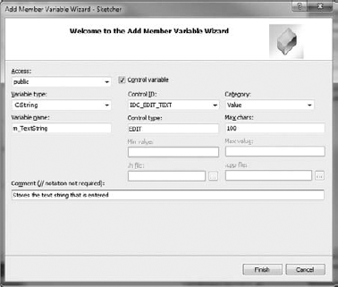
A length of 100 is more than adequate for your needs. The variable that you have added here is automatically updated from the data entered into the control by the DDX mechanism. You can click Finish to create the variable in the CTextDialog class, and close the Add Member Variable wizard.
You have already used CString objects a couple of times in Sketcher, but there's more to it than you have seen so far. The CString class provides a very convenient and easy-to-use mechanism for handling strings that you can use just about anywhere a string is required. To be more precise, you can use a CString object in place of strings of type const char*, which is the usual type for a character string in native C++, or of type LPCTSTR, which is a type that comes up frequently in Windows API functions.
The CString class provides several overloaded operators, as shown in the following table, that make it easy to process strings.
OPERATOR | USAGE |
|---|---|
| Copies one string to another, as in: str1 = str2;
str1 = _T("A normal string");
|
| Concatenates two or more strings, as in:
|
| Appends a string to an existing
|
| Compares two strings for equality, as in:
|
| Tests if one string is less than another. |
| Tests if one string is less than or equal to another. |
| Tests if one string is greater than another. |
| Tests if one string is greater than or equal to another. |
The variables str1 and str2 in the preceding table are CString objects.
CString objects automatically grow as necessary, such as when you add an additional string to the end of an existing object. For example:
CString str = _T("A fool and your money ");
str += _T("are soon partners.");
The first statement declares and initializes the object str. The second statement appends an additional string to str, so the length of str automatically increases.
Adding a new menu item should be easy by now. You just need to open the menu resource with the ID IDR_SketcherTYPE in Resource View by double-clicking it, and add a new menu item, Text, to the Element menu. The default ID, ID_ELEMENT_TEXT, that appears in the Properties window for the item is fine, so you can leave that as it is. You can add a prompt to be displayed on the status bar corresponding to the menu item, and because you'll also want to add an additional toolbar button corresponding to this menu item, you can add a tooltip to the end of the prompt line, using
to separate the prompt and the tooltip.
Don't forget the context menu. You can copy the menu item from IDR_SketcherTYPE. Right-click the Text menu item and select Copy from the pop-up. Open the menu IDR_NOELEMENT_MENU, right-click the empty item at the bottom, and select Paste. All you need to do then, is drag the item to the appropriate position — above the separator — and save the resource file.
Add the toolbar button to the IDR_MAINFRAME_256 toolbar and set its ID to the same as that for the menu item, ID_ELEMENT_TEXT. You can drag the new button so that it's positioned at the end of the block defining the other types of elements. Do the same for the IDR_MAINFRAME toolbar that is used for small toolbar icons. When you've saved the resources, you can add an event handler for the new menu item.
In the Class View pane, right-click CSketcherDoc and display its Properties window. Add a COMMAND handler for the ID_ELEMENT_TEXT ID and add code to it as follows:
void CSketcherDoc::OnElementText()
{
  m_Element = TEXT;
}
Only one line of code is necessary to set the element type in the document to TEXT.
You also need to add a function to check the menu item if it is the current mode, so add an UPDATE_COMMAND_UI handler corresponding to the ID_ELEMENT_TEXT ID, and implement the code for it as follows:
void CSketcherDoc::OnUpdateElementText(CCmdUI* pCmdUI)
{
  // Set checked if the current element is text
  pCmdUI->SetCheck(m_Element == TEXT);
}
This operates in the same way as the other Element pop-up menu items. Of course, you could also have added both of these handlers through the Class Wizard dialog that you display by selecting Class Wizard from the context menu in Class View.
You must also add an additional entry to the ElementType enum in the SketcherConstants.h header file:
enum ElementType{LINE, RECTANGLE, CIRCLE, CURVE, TEXT};The next step is to define the CText class for an element of type TEXT.
You can derive the class CText from the CElement class as follows:
// Class defining a text object
class CText: public CElement
{
  public:
    // Function to display a text element
    virtual void Draw(CDC* pDC, CElement* pElement=0);

    // Constructor for a text element
    CText(const CString& aString, const CRect& rect, COLORREF aColor);
    virtual void Move(const CSize& size);  // Move a text element

  protected:
    CString m_String;                      // Text to be displayed
    CText(){}                              // Default constructor
};
I added this manually, but I'll leave it to you to decide how you want to do it. This definition should go at the end of the Elements.h file, following the other element types. This class definition declares the virtual Draw() and Move() functions, as the other element classes do. The data member m_String of type CString stores the text to be displayed.
The CText constructor declaration defines three parameters: the string to be displayed, the rectangle in which the string is to be displayed, and the color. The pen width doesn't apply to an item of text, because the appearance is determined by the font. Although you do not need to pass a pen width as an argument to the constructor, the constructor needs to initialize the m_PenWidth member inherited from the base class because it is used in the computation of the bounding rectangle for the text.
You have three functions to implement for the CText class:
The constructor for a
CTextobjectThe virtual
Draw()function to display itThe
Move()function to support moving a text object by dragging it with the mouse
I added these directly to the Elements.cpp file.
The constructor for a CText object needs to initialize the class and base class data members:
// CText constructor
CText::CText(const CString& aString, const CRect& rect, COLORREF aColor)
{
  m_PenWidth = 1;                      // Set the pen width
m_Color = aColor; // Set the color for the text m_String = aString; // Make a copy of the string m_EnclosingRect = rect; m_EnclosingRect.NormalizeRect(); }
You set the pen width to 1, and store the color and the text string to be displayed. The second parameter is the rectangle in which the text is to be displayed, so this is stored as the enclosing rectangle.
After the element type has been set to TEXT, a text object should be created at the cursor position whenever you click the left mouse button and enter the text you want to display. You therefore need to display the dialog that permits text to be entered in the OnLButtonDown() handler, but only when the element type is TEXT. Add the following code to this handler in the CSketcherView class:
void CSketcherView::OnLButtonDown(UINT nFlags, CPoint point)
{
  CClientDC aDC(this);           // Create a device context
  OnPrepareDC(&aDC);             // Get origin adjusted
  aDC.DPtoLP(&point);            // convert point to Logical
  // In moving mode, so drop the element
  if(m_MoveMode)
  {
    m_MoveMode = false;                      // Kill move mode
    m_pSelected = nullptr;                   // De-select element
    GetDocument()->UpdateAllViews(nullptr);  // Redraw all the views
    return;
  }
  CSketcherDoc* pDoc = GetDocument();// Get a document pointer
  if(pDoc->GetElementType() == TEXT)
  {
    CTextDialog aDlg;
    if(aDlg.DoModal() == IDOK)
    {
      // Exit OK so create a text element
      CSize textExtent = aDC.GetTextExtent(aDlg.m_TextString);
      CRect rect(point, textExtent);      //Create enclosing rectangle
      CText* pTextElement = new CText(
                              aDlg.m_TextString, rect, pDoc->GetElementColor());
      // Add the element to the document
      pDoc->AddElement(pTextElement);
      // Get all views updated
      pDoc->UpdateAllViews(nullptr, 0, pTextElement);
    }
    return;
  }
   m_FirstPoint = point;             // Record the cursor position
   SetCapture();                     // Capture subsequent mouse messages
}
The code to be added is bolded. It creates a CTextDialog object and then opens the dialog using the DoModal() function call. The m_TextString member of aDlg is automatically set to the string entered in the edit box, so you can use this data member to pass the string entered back to the CText constructor if the OK button is used to close the dialog. The color is obtained from the document using the GetElementColor()member that you have used previously.
You also need to determine the rectangle that bounds the text. Because the size of the rectangle for the block of text depends on the font used in a device context, you use the GetTextExtent() function in the CClientDC object, aDC, to initialize the CSize object, textExtent, with the width and height of the text string in logical coordinates. You then use a CRect constructor that creates a rectangle from a point that is the top right corner of the rectangle, and a CSize object that specifies the width and height of the rectangle.
The CText object is created on the heap because the list in the document maintains only pointers to the elements. You add the new element to the document by calling the AddElement() member of CSketcherDoc, with the pointer to the new text element as an argument. Finally, UpdateAllViews() is called with the first argument 0, which specifies that all views are to be updated.
Drawing text in a device context is different from drawing a geometric figure. The implementation of the Draw() function for a CText object is as follows:
void CText::Draw(CDC* pDC, CElement* pElement)
{
  COLORREF Color(m_Color);             // Initialize with element color

  if(this==pElement)
    Color = SELECT_COLOR;              // Set selected color

  // Set the text color and output the text
  pDC->SetTextColor(Color);
  pDC->DrawText(m_String, m_EnclosingRect, DT_CENTER|DT_VCENTER|

DT_SINGLELINE|DT_NOCLIP);
}
You don't need a pen to display text. You just need to specify the text color using the SetTextColor() function member of the CDC object, and then use the DrawText() member to output the text string. This displays the string, specified by the first argument, in the rectangle specified by the second argument, using the default font. The third argument specifies how the text is to be formatted. You specify the third argument as one or more standard formatting constants of type UINT combined together with logical ORs.
Many of these constants correspond to the ones defined for use with the Windows API DrawText() function. The following table lists some of the more common constants:
MEANING | |
|---|---|
| Text is aligned with the left of the rectangle. |
| Text is centered horizontally in the rectangle. |
| Text is aligned with the right of the rectangle. |
| Text is aligned with the top of the rectangle. |
| Text is centered vertically in the rectangle. This is used only with |
| Text is aligned with the bottom of the rectangle. This is used only with |
| Text is displayed on a single line. |
| Inhibits clipping of the text, and drawing is faster. |
| The string will be broken between words if it would otherwise extend beyond the sides of the rectangle. |
Because the TextOut() function doesn't use a pen, it isn't affected by setting the drawing mode of the device context. This means that the raster operations (ROP) method that you use to move the elements leaves temporary trails behind when applied to text. Remember that you used the SetROP2() function to specify the way in which the pen would logically combine with the background. By choosing R2_NOTXORPEN as the drawing mode, you could cause a previously drawn element to disappear by redrawing it — it would then revert to the background color and thus become invisible. Fonts aren't drawn with a pen, so it won't work properly with the text elements. You'll see how to fix this problem a little later in this chapter.
The Move() function for a CText object is simple:
void CText::Move(const CSize& size)
{
  m_EnclosingRect += size;            // Move the rectangle
}
All you need to do is alter the enclosing rectangle by the distance specified in the size parameter.
To fix the trails problem when moving a text element, you have to treat it as a special case in the MoveElement() function in the CSketcherView class. Providing an alternative move mechanism for text elements requires that you can discover when the m_pSelected pointer contains the address of a CText object. The typeid operator in native C++ that you met back in Chapter 2 can help with this.
By comparing the expression typeid(*m_pSelected) with typeid(CText), you can determine whether or not m_pSelected is pointing to a CText object. To be able to use the typeid operator in your code, you must change the Enable Run-Time Type Information property value for the project to Yes(/GR). You can open the project's Properties dialog by pressing Alt+F7; you will find the property to change by selecting Configuration Properties
Here's how you can update the MoveElement() function to eliminate the trails when moving text:
void CSketcherView::MoveElement(CClientDC& aDC, CPoint& point)
{
  CSize distance = point - m_CursorPos;   // Get move distance
  m_CursorPos = point;          // Set current point as 1st for next time

  // If there is an element, selected, move it
  if(m_pSelected)
  {
    // If the element is text use this method...
    if (typeid(*m_pSelected) == typeid(CText))
    {
      CRect oldRect=m_pSelected->GetBoundRect(); // Get old bound rect
      aDC.LPtoDP(oldRect);                          // Convert to client coords
      m_pSelected->Move(distance);               // Move the element
      InvalidateRect(&oldRect);                 // Invalidate combined area
      UpdateWindow();                               // Redraw immediately
      m_pSelected->Draw(&aDC,m_pSelected);   // Draw highlighted
      return;
    }
    // ...otherwise, use this method
    aDC.SetROP2(R2_NOTXORPEN);
    m_pSelected->Draw(&aDC,m_pSelected);    // Draw the element to erase it
    m_pSelected->Move(distance);            // Now move the element
    m_pSelected->Draw(&aDC,m_pSelected);    // Draw the moved element
  }
}
When m_pSelected points to a text element, you obtain the bounding rectangle for the old element before moving the element to its new position, and convert the rectangle to client coordinates, because that's what InvalidateRect() expects. After the move, you call InvalidateRect() to redraw the rectangle where the element used to be.
You can see that the code for invalidating the rectangles that you must use for moving the text is a little less elegant than the ROP code that you use for all the other elements. It works, though, as you'll see for yourself if you make this modification, and then build and run the application. Because you use the typeid operator for testing the type, you must add an #include directive for the typeinfo header to SketcherView.cpp. This header provides the definition for the type_info class, and you need this because the typeid operator returns a reference to a const type_info object.
For the program to compile successfully, you need to add a #include directive for TextDialog.h to the SketcherView.cpp file. You should now be able to produce annotated sketches using multiple scaled and scrolled views, such as the ones shown in Figure 18-19.
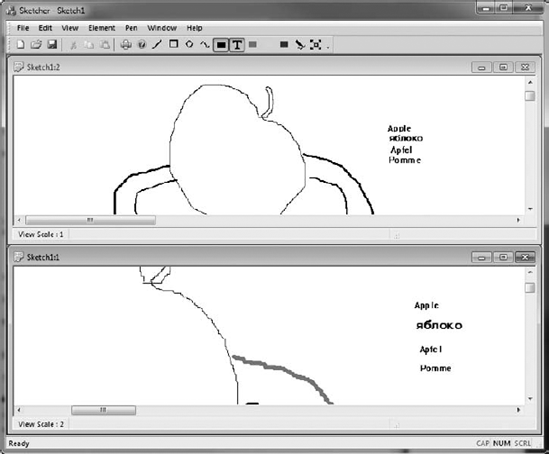
You can see that the text does not scale along with the shapes. You could scale the text by adjusting the font size in the device context based on the scale. Of course, you would have to adjust the rectangle enclosing the text when you draw it, too.
There is a full range of dialogs and controls available for use in a CLR program, but the procedure for adding them to an application is often different from what you have seen in the MFC version of Sketcher. Extending CLR Sketcher will allow you to try out some of the ways in which you can use dialogs and controls in a Windows Forms application. You will not necessarily end up with the GUI for CLR Sketcher that you would want in practice because you will inevitably duplicate some functions in a way that is not needed in the application.
It would be useful to add a dialog that you can use to enter pen widths, to allow elements to be drawn with lines of different thicknesses. Your first thought as to how to do this is likely to involve the Design window for the form — and indeed, for some predefined dialogs this is the place to start. However, when you want to create your own dialog from the ground up, the starting point is Solution Explorer.
To add a dialog, you actually add a form to the project that you then modify to make it a dialog window. In Solution Explorer, right-click your project, click the Add menu item, then click New Item. In the dialog that displays, select the UI group in the left pane; then select Windows Form in the right pane. Enter the name as PenDialog.cs and click the OK button. The .cs extension identifies that the dialog is for a C++/CLI program. A new Design window will display showing the dialog. In the Properties window for the dialog, change the FormBorderStyle property in the Appearance group to FixedDialog and set the ControlBox, MinimizeBox, and MaximizeBox properties in the Window Style group to false. Change the value of the Text property to Set Pen Width. You now have a modal dialog for setting the pen width, so next you can add the controls you need to the dialog.
You'll use radio buttons to allow a pen width to be chosen, and place them within a group box that serves to keep them in a group in which only one radio button can be checked at one time. Drag a GroupBox control from the Containers group in the Toolbox window onto the dialog you have created. Change the value of the Text property for the group box to Select Pen Width and change the value of the (name) property to penWidthGroupBox. Adjust the size of the group box by dragging its border so that it fits nicely within the dialog frame. Drag six RadioButton controls from the Toolbox window to the group box and arrange them in a rectangular configuration as you did in the MFC Sketcher program. You'll notice that alignment guides to help you position the controls display automatically for each RadioButton control after the first. Change the text properties for the radio button controls to Pen Width 1 through Pen Width 6, and the corresponding (name) property values to penWidthButton1 through penWidthButton6. Change the value of the Checked property for penWidthButton1 to true.
Next you can add two buttons to the dialog and change their Text properties to OK and Cancel, and the (name) properties to penWidthOK and penWidthCancel. Return to the dialog's Properties window and set the AcceptButton and CancelButton property values to penWidthOK and penWidthCancel by selecting from the list in the values column. Verify that the DialogResult property values for the buttons are OK and Cancel; this will cause the appropriate DialogResult value to be returned when the dialog is closed by the user clicking one button or the other. You should now have a dialog in the Design window that looks similar to Figure 18-20.
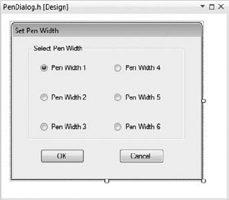
The code for the dialog class is part of the project and is defined in the PenDialog.h header file. However, there are no instances of the PenDialog class anywhere at the moment, so to use the dialog you must create one. You will create a PenDialog object in the Form1 class; add an #include directive for PenDialog.h to Form1.h. Add a new private variable of type PenDialog^ to the Form1 class with the name penDialog and initialize it in the Form1 constructor to gcnew PenDialog().
You need a way to get information about which radio button is checked from the PenDialog object. One way to do this is to add a public property to the class to make the information available. It can be a read-only property, so you need only to implement get() for the property. The code that the Windows Form Designer generates is delimited by a #pragma region and a #pragma endregion directive, and you should not modify this manually or add in your own code. Add the following code to the PenDialog class definition immediately after the #pragma endregion directive:
public: property float PenWidth
{
  float get()
  {
    if(penWidthButton1->Checked)
      return 1.0f;
    if(penWidthButton2->Checked)
      return 2.0f;
    if(penWidthButton3->Checked)
      return 3.0f;
    if(penWidthButton4->Checked)
      return 4.0f;
    if(penWidthButton5->Checked)
      return 5.0f;
    return 6.0f;
  }
}
The System::Drawing::Pen class defines a pen where the pen width is a floating-point value; hence, the PenWidth property is floating-point.
Now that the dialog is complete, and you have a Form1 member that references a dialog object, you need a mechanism to open the dialog. Another toolbar button on the Form1 window is a good choice.
You need a bitmap to display on the new toolbar button. Switch to the Resource View, right-click the Bitmap folder, and click Insert Bitmap. Set the Height and Width property values for the bitmap to 16, the Filename property value to penwidth.bmp, and the ID to IDB_PENWIDTH. You can now create a bitmap of your choosing to represent a line width; I'll use a symbol that looks like a pen drawing a line, as in MFC Sketcher.
In the Design window for Form1.h, add a separator to the toolbar, followed by a new toolbar button. Change the (name) property value to penWidthButton and the ToolTipText property value to Change pen width. Set the image for the new button to penwidth.bmp, and then create a Click event handler for the toolbar button by double-clicking the Click event in its Properties window. You can add the following code to the new event handler to display the pen dialog:
private: System::Void penWidthButton _Click(
                                    System::Object^  sender, System::EventArgs^  e)
{
  if(penDialog->ShowDialog() == System::Windows::Forms::DialogResult::OK)
  {
    // Get the pen width ...
  }
}
Calling ShowDialog() for the PenDialog object displays the dialog. Because it is a modal dialog, it remains visible until a button is clicked to close it. The ShowDialog() function returns a value that is an enumerator from the System::Windows::Forms::DialogResult enumeration. This enumeration defines the following enumerator values:
None, OK, Cancel, Abort, Retry, Ignore, Yes, No
These provide for a variety of buttons being identified to close a dialog, and you can set any of these values from the drop-down list of values for the DialogResult property of a button. You must fully qualify the DialogResult type name here because the Form1 class has an inherited member with the name DialogResult.
You need somewhere to record the current pen width in the Form1 class, so add a private penWidth variable of type float to the class and initialize it to 1.0f in the constructor. You can now replace the comment in the preceding Click event handler with the following:
penWidth = penDialog->PenWidth;
This will set the current pen width to the value returned by the PenWidth property for the dialog.
All that remains to do is to implement creating and drawing elements with a given pen width.
This will involve modifying the constructor in each of the derived element classes. The modifications are essentially the same in each class, so I'll just show how the Line class constructor changes, and you can do the rest.
The changes to the Line class constructor to allow for different pen widths are as follows:
Line(Color color, Point start, Point end, float penWidth)
      {
        pen = gcnew Pen(color, penWidth);
      this->color = color;
      position = start;
      this->end = end - Size(start);
      boundRect = System::Drawing::Rectangle(Math::Min(position.X, end.X),
                                             Math::Min(position.Y, end.Y),
                    Math::Abs(position.X - end.X), Math::Abs(position.Y - end.Y));
boundRect.Inflate(safe_cast<int>(penWidth), safe_cast<int>(penWidth));
}The only changes are to add an extra parameter to the Line constructor, to use the Pen constructor that accepts a second argument of type float that specifies the pen width, and to increase the size of the bounding rectangle by the penWidth argument value. Make the same change to the constructors for the other element classes.
Because you have changed the parameter list for the element class constructors, you must change the MouseMove event handler that creates elements:
private: System::Void Form1_MouseMove(System::Object^  sender,
System::Windows::Forms::MouseEventArgs^  e) {
   if(drawing)
  {
    if(tempElement)
      Invalidate(tempElement->Bound);  // The old element region
    switch(elementType)
    {
      case ElementType::LINE:
        tempElement = gcnew Line(color, firstPoint, e->Location, penWidth);
        break;
      case ElementType::RECTANGLE:
        tempElement = gcnew Rectangle(color, firstPoint, e->Location, penWidth);
        break;
      case ElementType::CIRCLE:
        tempElement = gcnew Circle(color, firstPoint, e->Location, penWidth);
        break;
      case ElementType::CURVE:
        if(tempElement)
          safe_cast<Curve^>(tempElement)->Add(e->Location);
        else
          tempElement = gcnew Curve(color, firstPoint, e->Location, penWidth);
        break;
    }
    // Rest of the code as before...
 }
You should now have CLR Sketcher with pen widths fully working, as Figure 18-21 illustrates.
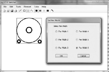
You can add a combo box to the toolbar in the Form1 Design window to provide a way to enter a line style. ComboBox is an option in the list that displays when you click the down arrow for the toolbar item that adds new entries in the Design window. You can customize this option to do what you want.
Set the DropDownStyle property to DropDownList; the effect of this is to only allow values to be selected from the list. A value of DropDown allows any value to be typed in the combo box. Change (name) to something more relevant, such as lineStyleComboBox. You want to add a specific set of items to be displayed in the combo box, and the Items property holds these. Select the Items property, click (Collection) in the value column, and select the ellipsis at the right to open the String Collection Editor dialog. You can then enter strings, as shown in Figure 18-22.
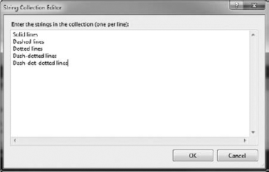
These are the entries that will be displayed in the drop-down for the combo box; they are indexed from 0 to 4.
Because the default size for the combo box is not as wide as you need for the longest string, change the value of the Size property to 150,25. You can also change the FlatStyle property to Standard, so that the combo box will be more visible on the toolbar. You can set the ToolTipText property to Choose line style.
At present the combo box will not show anything when it is first displayed, but you can fix that in the Form1 constructor. Add the following line of code to the constructor after the // TODO comment:
lineStyleComboBox->SelectedIndex = 0;
The SelectedIndex property determines which of the entries in the Items collection is displayed in the combo box, and because the entries in the combo box Items property collection are indexed from 0, this causes the first entry to be displayed initially. That will continue to be the entry displayed until you select a new entry from the combo box, so the combo box will always show the currently selected line width.
You need somewhere to store the current line style, so add a private member, lineStyle, to the Form1 class of type System::Drawing::Drawing2D::DashStyle. This is an enum type used by the Pen class to specify a style for drawing lines. If you add a using directive for the System::Drawing::Drawing2D namespace, you can specify the type for lineStyle as just DashStyle.
The DashStyle enum defines the members Solid, Dash, Dot, DashDot, DashDotDot, and Custom. The meaning for the first five are obvious. The Custom style gives you complete flexibility in specifying a line style as virtually any sequence of line segments and spaces of differing lengths that you want. You specify how the line style is to appear by setting the DashPattern property for the Pen object. You specify the pattern with an array of float values that specify the lengths of the line segments and intervening spaces. Here's an example:
array<float>^ pattern = {5.0f, 3.0f};
pen->DashPattern = pattern;
This specifies a dashed line for the Pen object pen, consisting of segments of length 5.0f separated by spaces of length 3.0f. The pattern you specify is repeated as often as necessary to draw a given line. Obviously, by specifying more elements in the array, you can define patterns as complicated as you like.
You need to know when an entry from the combo box is selected so that you can update the lineStyle member of the Form1 class. An easy way to arrange this is to add a handler for the SelectedIndexChanged event for the ComboBox object; add this handler through the Properties window and implement it like this:
private: System::Void lineStyleComboBox_SelectedIndexChanged(
                            System::Object^  sender, System::EventArgs^ e)
{
  switch(lineStyleComboBox->SelectedIndex)
  {
    case 1:
     lineStyle = DashStyle::Dash;
     break;
    case 2:
     lineStyle = DashStyle::Dot;
     break;
    case 3:
     lineStyle = DashStyle::DashDot;
     break;
    case 4:
     lineStyle = DashStyle::DashDotDot;
     break;
    default:
     lineStyle = DashStyle::Solid;
     break;
  }
}
This just sets the value of lineStyle to one of the DashStyle enum values based on the value of the SelectedIndex property for the combo box object.
To draw elements with different line styles you must add another parameter of type DashStyle to each of the element constructors. First, add the following using directive to Elements.h:
using namespace System::Drawing::Drawing2D;
Here's how you update the Line class constructor to support drawing lines in different styles:
Line(Color color, Point start, Point end, float penWidth, DashStyle style){ pen = gcnew Pen(color, penWidth);pen->DashStyle = style;// Rest of the code for the function as before... }
There's just one new line of code, which sets the DashStyle property for the pen to the property passed as the last argument to the constructor. Change the other element class constructors in the same way.
The last thing you must do is update the constructor calls in the mouse move event handler in the Form1 class:
private: System::Void Form1_MouseMove(System::Object^  sender,
System::Windows::Forms::MouseEventArgs^  e)
{
  if(drawing)
  {
    if(tempElement)
      Invalidate(tempElement->bound);               // Invalidate old element area
    switch(elementType)
    {
      case ElementType::LINE:
        tempElement = gcnew Line(color, firstPoint, e->Location, penWidth,
                                                                        lineStyle);
        break;
      case ElementType::RECTANGLE:
        tempElement = gcnew Rectangle(color, firstPoint, e->Location, penWidth,
                                                                        lineStyle);
        break;
      case ElementType::CIRCLE:
        tempElement = gcnew Circle(color, firstPoint, e->Location, penWidth,
                                                                        lineStyle);
        break;
      case ElementType::CURVE:
        if(tempElement)
          safe_cast<Curve^>(tempElement)->Add(e->Location);
        else
          tempElement = gcnew Curve(color, firstPoint, e->Location, penWidth,
                                                                        lineStyle);
        break;
    }

   // Rest of the code for the function as before...
}
If you recompile CLR Sketcher and run it again, the combo box will enable you to select a new line style for drawing elements. The line styles don't really work for curves because of the way they are drawn — as a series of very short line segments. With the other elements, the line styles look better if you draw with a pen width greater than the default.
Drawing text in CLR Sketcher will be similar to drawing text in MFC Sketcher. Selecting a Text menu item or clicking a text toolbar button will set Text as the element drawing mode, and in this mode clicking anywhere on the form will display a modal dialog that allows some text to be entered; closing the dialog with the OK button will display the text at the cursor position. There are many ramifications to drawing text, but in the interest of keeping the book to a modest weight, I'll limit this discussion to the basics.
Add a TEXT enumerator to the ElementType enum class, then add a Text menu item to the Elements menu, and a corresponding toolbar button in the Form1 Design window; you will need to create a bitmap resource for the button. Change the value of the (name) property for the menu item to textToolStripMenuItem if necessary, and create a Click event handler for it. You can also add a value for the ToolTipText property for the menu item and the toolbar button. You can create a bitmap for the toolbar button to indicate text mode, and select the Click event handler for the toolbar button to be the Click event handler for the menu item. You can implement the Click event handler like this:
private: System::Void textToolStripMenuItem_Click(
                                    System::Object^  sender, System::EventArgs^  e)
{
   elementType = ElementType::TEXT;
   SetElementTypeButtonState();
}
The function just sets elementType to the ElementType enumerator that represents text drawing mode.
Update the SetElementTypeButtonsState() function to check the text button. You will need to update the DropDownOpening event handler for the tool strip to ensure that the new text menu item gets checked. Don't forget to add a Text menu item to the context menu, too. This will involve amending the handler for the Opening event for the context menu to add the Text menu item, and set it as checked when appropriate.
You need to look into several things before you can make CLR Sketcher create and draw text. Let's start with how you draw text. The Graphics class defines a DrawString() function for drawing text. There are several overloaded versions of this function, as described in the following table.
Clearly, you need to understand a bit about fonts and brushes in order to use the DrawString() function, so I'll briefly introduce those before returning to how you can create and display Text elements.
You specify the font to be used when you draw a string by a System::Drawing::Font object that defines the typeface, style, and size of the drawn characters. An object of type System::Drawing::FontFamily defines a group of fonts with a given typeface, such as "Arial" or "Times New Roman". The System::Drawing::FontStyle enumeration defines possible font styles, which can be any of the following: Regular, Bold, Italic, Underline, and Strikeout.
You can create a Font object like this:
FontFamily^ family = gcnew FontFamily(L"Arial");
System::Drawing::Font^ font = gcnew System::Drawing::Font(family, 10,
                                            FontStyle::Bold,  GraphicsUnit::Point);
You create the FontFamily object by passing the name of the font to the constructor. The arguments to the Font constructor are the font family, the size of the font, the font style, and an enumerator from the GraphicUnit enumeration that defines the units for the font size.
The possible enumerator values are as follows:
| The world coordinate system is the unit of measure. |
| The unit of measure is that of the display device: pixels for monitors, and 1/100 inch for printers. |
| A device pixel is the unit of measure. |
| The unit of measure is a point (1/72 inch). |
| The unit of measure is the inch. |
| The unit of measure is the document unit, which is 1/300 inch. |
| The millimeter is the unit of measure. |
Thus, the previous code fragment defines a 10-point bold Arial font. Note that the Font type name is fully qualified in the fragment because a form object in a Windows Forms application inherits a property with the name Font from the Form base class that identifies the default font for the form. Windows Forms applications support TrueType fonts primarily, so it is best not to choose Open Type fonts. If you attempt to use a font that is not supported, or the font is not installed on your computer, the Microsoft Sans Serif font will be used.
A System::Drawing::Brush object determines the color used to draw a string with a given font; it is also used to specify the color and texture used to fill a shape. You can't create a Brush object directly because Brush is an abstract class. You create brushes using the SolidBrush, the TextureBrush, and the LinearGradientBrush class types derived from Brush. A SolidBrush object is a brush of a single color, a TextureBrush object is a brush that uses an image to fill the interior of a shape, and a LinearGradientBrush is a brush defining a color gradient blend, usually between two colors, but also possibly among several colors. You will use a SolidBrush object to draw text, which you create like this:
SolidBrush^ brush = gcnew SolidBrush(Color::Red);
This creates a solid brush that will draw text in red.
You can store a reference to the current Font object, to be used when CLR Sketcher is creating Text elements, by adding a private variable of type System::Drawing::Font^, and with the name textFont, to the Form1 class. You must use the fully qualified type name to avoid confusion with the inherited property with the name Font. Initialize textFont in the Form1 constructor to Font, which is a form property specifying the default font for the form. Be sure to do this in the body of the constructor following the // TODO: comment; if you attempt to initialize it in the initialization list, the program will fail because Font is not defined at this point.
You can add a toolbar button to allow the user to select a font for entering text, perhaps a button with a bitmap representation of F for font. Give the button a suitable value for the (name) property, such as toolStripFontButton, and add a Click event handler for it.
The Toolbox window has a standard dialog for choosing a font that will display all the fonts available on your system and allow selection of the font style and size. Select the Design window for Form1.h and drag a FontDialog control from the Toolbox window to the form. The Click event handler for the toolStripFontButton can display the font dialog:
private: System::Void toolStripFontButton_Click(
                                   System::Object^  sender, System::EventArgs^  e)
{
  if(fontDialog1->ShowDialog() == System::Windows::Forms::DialogResult::OK)
  {
    textFont = fontDialog1->Font;
  }
}
You display the dialog by calling its ShowDialog() function, as you did for the pen dialog. If the function returns DialogResult::OK, you know the dialog was closed with the OK button. In this case, you retrieve the chosen font from the Font property for the dialog object, and store it in the textFont variable in the Form1 class object. You can try this out if you want. The Font dialog will look like Figure 18-23.
You need a class to represent a Text element, so let's define that next.
The TextElement element type will have Element as a base class like the other element types, so you can call the Draw() function polymorphically. Basic information about the location and color of the text element will be recorded in the members inherited from the base class, but you need to add extra members to store the text and information relating to the font. Here's the initial definition of the class:
public ref class TextElement : Element
  {
    protected:
      String^ text;
      SolidBrush^ brush;
      Font^ font;
public:
TextElement(Color color, Point p, String^ text, Font^ font)
{
this->color = color;
brush = gcnew SolidBrush(color);
position = p;
this->text = text;
this->font = font;
int height = font->Height; // Height of text string
int width = static_cast<int>(font->Size*text->Length); // Width of string
boundRect = System::Drawing::Rectangle(position, Size(width, height));
boundRect.Inflate(2,2); // Allow for descenders
}
virtual void Draw(Graphics^ g) override
{
brush->Color = highlighted ? highlightColor : color;
g->TranslateTransform(safe_cast<float>(position.X),
safe_cast<float>(position.Y));
g->DrawString(text, font, brush, Point(0,0));
g->ResetTransform();
}
};I chose the TextElement type name, rather than just Text, to avoid confusion with a member of the Form class with the name Text. A TextElement object has members to store the text string, the font, and the brush to be used to draw the text.
Determining the bounding rectangle for a text element introduces a slight complication in that it depends on the point size of the font, and you have to figure out the width and height from the font size. The height is easy because the font object has a Height property that makes the font's line spacing available, which is a good estimate for the height of the text string. The Size property returns the em size of the font (which is the width of the letter M), so you can get a generous estimate of the width of the rectangle the string will occupy by multiplying the em size by the number of characters in the string. I have inflated the rectangle by two because the line spacing doesn't always result in a bounding rectangle that takes account of descenders such as in lowercase ps and qs.
You'll want to enter text from the keyboard when you create a TextElement element, so you need a dialog to manage this. Go to the Solution Explorer window, and add a new form to CLR Sketcher by right-clicking the project name and clicking Add
The next step is to add buttons to close the dialog. Add an OK button and a Cancel button to the text dialog with the DialogResult property values set appropriately. Change the (name) property values to textOKButton and textCancelButton respectively. Set the AcceptButton property value for TextDialog to textOKButton and the CancelButton property value to textCancelButton.
A TextBox control allows a single line or multiple lines of text to be entered, so it certainly covers what you want to do here. Add a TextBox to the text dialog by dragging it from the Toolbox window to the dialog in the Design window. By default, a TextBox allows a single line of text to be entered, and you can stick with that here. When you want to allow multiple lines of input, you click the arrow to the right on the TextBox in the Design window, and click the checkbox to enable Multiline. The Text property for the TextBox provides access to the input and makes it available as a String object.
Ideally, you want the text dialog to open with the focus on the box for entering text. Then you can enter the text immediately after the dialog opens, and press enter to close it as if you had selected the OK button. The control that has the focus initially is determined by the tab order of the controls on the dialog, which depends on the value of the TabIndex property for the controls. If you set the TabIndex property for the text box to 0 and the OK and Cancel buttons to 1 and 2 respectively, this will result in the text box having the focus when the dialog initially displays. The tab order also defines the sequence in which the focus changes when you press the tab key. You can display the tab order for the controls in the Design window for the dialog by selecting View
The textBox1 control will store the string you enter, but because this is a private member of the dialog object, it is not accessible directly. You must add a mechanism to retrieve the string from the dialog object. Another problem is that the textBox1 control will retain the text you enter and display it the next time the dialog is opened. You probably don't want this to occur, so you need a way to reset the Text property of textBox1. You can add a public property to the TextDialog class that will deal with both difficulties. Add the following code to the TextDialog class definition, following the #pragma endregion directive:
// Property to access the text in the edit box
    public: property String^ TextString
    {
      String^ get() {return textBox1->Text; }
      void set(String^ text) { textBox1->Text = text; }
    }
The get() function for the TextString property makes the string you enter available, and the set() function enables you to reset it.
It would be nice if the text appeared in the edit box in the current font so that the user could tell whether it's what he or she wants. This will provide an opportunity to cancel the text entry and change to another font. Add the following property to the TextDialog class, following the preceding one:
// Set the edit box font
public: property System::Drawing::Font^ TextFont
{
  void set(System::Drawing::Font^ font) { textBox1->Font = font; }
}
This is a set-only property that you can use to set the font for the edit box object textBox1.
You need an extra data member in the Form1 class to help you create text elements. Add an #include directive for TextDialog.h to Form1.h, then add a textDialog member of type TextDialog^. You can initialize it to gcnew TextDialog() in the initialization list for the Form1 class constructor.
The process for creating an element that is text is different from the process for geometric elements, so to understand the sequence of events in the code, let's describe the interactive process. Text element mode is in effect when you select the Text menu item or toolbar button. To create an element, you click at the position on the form where you want the top left corner of the text string to be. This will display the text dialog; you type the text you want in the text box, and press Enter to close the dialog. The MouseMove handler is not involved in the process at all. Clicking the mouse to define the position of the element embodies the whole process. This implies that you must display the dialog and create the text element in the MouseDown event handler. Here's the code to do that:
private: System::Void Form1_MouseDown(System::Object^  sender,
System::Windows::Forms::MouseEventArgs^  e) {
  if(e->Button == System::Windows::Forms::MouseButtons::Left)
  {
    firstPoint = e->Location;
    if(mode == Mode::Normal)
    {
      if(elementType == ElementType::TEXT)
      {
        textDialog->TextString = L"";        // Reset the text box string
        textDialog->TextFont = textFont;     // Set the font for the edit box
        if(textDialog->ShowDialog() == System::Windows::Forms::DialogResult::OK)
        {
          tempElement = gcnew TextElement(color, firstPoint,
                                                 textDialog->TextString, textFont);
          sketch += tempElement;
          Invalidate(tempElement->bound);    // The text element region
          tempElement = nullptr;
          Update();
        }
        drawing = false;
      }
      else
      {
        drawing = true;
      }
    }
  }
}
You create text elements only when the elementType member of the form has the value ElementType::TEXT and the mode is Mode::Normal; the second condition is essential to avoid displaying the dialog when you are in move mode. When a text element is being created, the first action is to reset the Text property for the textBox1 control to an empty string by setting it as the value for the TextString property for the dialog. You also set the font for the edit box to the value stored in the textFont member of the form.
You display the dialog by calling ShowDialog() in the if condition expression. If the ShowDialog() function returns DialogResult::OK, you retrieve the string from the dialog, use it to create the TextElement object, and add the object to the sketch. You then invalidate the region occupied by the new element and call Update() to display it. You also reset tempElement to nullptr when you are done with it. Finally, you set drawing to false to prevent the MouseMove handler from attempting to create an element.
If you recompile Sketcher, you should be able to create text elements using a font of your choice. Not only that, but you can move and delete them too. Figure 18-24 shows Sketcher displaying text elements.
In this chapter you've seen several different dialogs using a variety of controls. Although you haven't created dialogs involving several different controls at once, the mechanism for handling them is the same as what you have seen, because each control can operate independently of the others. Dialogs are a fundamental tool for managing user input in an application. They provide a way for you to manage the input of multiple related items of data. You can easily ensure that an application only receives valid data. Judicious choice of the controls in a dialog can force the user to choose from a specific set of options. You can also check the data after it has been entered in a dialog and prompt the user when it is not valid.
WHAT YOU LEARNED IN THIS CHAPTER
TOPIC | CONCEPT |
|---|---|
Dialogs | A dialog involves two components: a resource defining the dialog box and its controls, and a class that is used to display and manage the dialog. |
Extracting data from a dialog | Information can be extracted from controls in a dialog by means of the DDX mechanism. The data can be validated with the DDV mechanism. To use DDX/DDV you need only use the Add Control Variable option for the Add Member Variable wizard to define variables in the dialog class associated with the controls. |
Modal dialogs | A modal dialog retains the focus in the application until the dialog box is closed. As long as a modal dialog is displayed, all other windows in an application are inactive. |
Modeless dialogs | A modeless dialog allows the focus to switch from the dialog box to other windows in the application and back again. A modeless dialog can remain displayed as long as the application is executing, if required. |
Common controls | Common Controls are a set of standard Windows controls supported by MFC and the resource editing capabilities of Developer Studio. |
Adding controls | Although controls are usually associated with a dialog, you can add controls to any window. |
Adding a new form in a Windows Forms application | You add a form to a Windows Forms application using the Solutions Explorer pane; you right-click the project name and select Add |
Converting a form into a modal dialog | You convert a form into a modal dialog window by changing the value of the |
Adding controls to a dialog | You populate a dialog with controls by dragging them from the Toolbox window onto the dialog in the Design pane. |
Displaying a dialog | You display a dialog by calling its |
The | The value that you set for the |
Using standard dialogs | The toolbox has several complete standard dialogs available, including a dialog for choosing a font. |
Drawing test on a form | You can draw a string on a form by calling the |