Example of a Parallel Plot
This example uses the Dogs.jmp sample data table, which contains histamine level measurements for 16 dogs that were given two different drugs. The histamine levels were taken at zero, one, three, and five minutes. Examine the variation in the histamine levels for each drug.
1. Select Help > Sample Data Library and open Dogs.jmp.
To see the differences by drug, color the parallel plot lines by drug:
2. Select Rows > Color or Mark by Column.
3. Select drug and click OK.
Morphine appears red and trimeth appears blue.
Create the parallel plot:
4. Select Graph > Parallel Plot.
5. Select hist0, hist1, hist3, and hist5 and click Y, Response.
6. Click OK.
The report window appears.
Figure 8.2 Parallel Plot of Histamine Variables
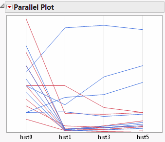
Each connected line segment represents a single observation. Click on a line segment to see which observation (or row) it corresponds to in the data table.
For further exploration, isolate the trimeth values:
7. Select Rows > Data Filter.
8. Select drug and click Add.
9. Select trimeth.
Only the trimeth values are highlighted in the parallel plot.
Figure 8.3 Trimeth Values Highlighted
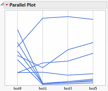
From Figure 8.3, you observe the following about the histamine levels for dogs given trimeth:
• For most of the dogs, the histamine levels had a sharp drop at one minute.
• For four of the dogs, the histamine levels remained high, or rose higher. You might investigate this finding further, to determine why the histamine levels were different for these dogs.
Launch the Parallel Plot Platform
Launch the Parallel Plot platform by selecting Graph > Parallel Plot.
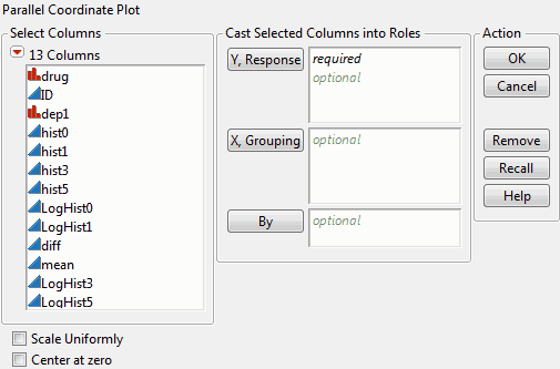
Figure 8.4 The Parallel Plot Launch Window
|
Y, Response
|
Variables appear on the horizontal axis of the parallel plot. These values are plotted and connected in the parallel plot.
|
|
X, Grouping
|
Produces a separate parallel plot for each level of the variable.
|
|
By
|
Identifies a column that creates a report consisting of separate analyses for each level of the specified variable.
|
|
Scale Uniformly
|
Represents all variables on the same scale, adding a y-axis to the plot. Without this option, each variable is on a different scale.
To allow for proper comparisons, select this option if your variables are measured on the same scale.
|
|
Center at zero
|
Centers the parallel plot (not the variables) at zero.
|
For more information about the launch window, see Using JMP.
After you click OK, the Parallel plot appears. See “The Parallel Plot”.
The Parallel Plot
To produce the plot shown in Figure 8.5, follow the instructions in “Example of a Parallel Plot”.
Figure 8.5 The Parallel Plot Report
A parallel plot is one of the few types of coordinate plots that show any number of variables in one plot. However, the relationships between variables might be evident only in the following circumstances:
• when the variables are side by side
• if you assign a color to a level of a variable to track groups
• if you select lines to track groups
Note: If the columns in a parallel plot use the Spec Limits column property, the specification limits appear as red lines.
Interpreting Parallel Plots
To help you interpret parallel plots, compare the parallel plot with a scatterplot. In each of the following figures, the parallel plot appears on the left, and the scatterplot appears on the right.
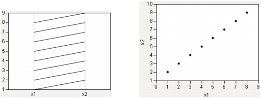
Strong Positive Correlation
The following relationship shows a strong positive correlation. Notice the coherence of the lines in the parallel plot.
Figure 8.6 Strong Positive Correlation
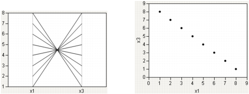
Strong Negative Correlation
A strong negative correlation, by contrast, shows a narrow neck in the parallel plot.
Figure 8.7 Strong Negative Correlation
 [
[Collinear Groups
Now, consider a case that encompasses both situations: two groups, both strongly collinear. One has a positive slope, the other has a negative slope. In Figure 8.8, the positively sloped group is highlighted.
Figure 8.8 Collinear Groups: Parallel Plot and Scatterplot

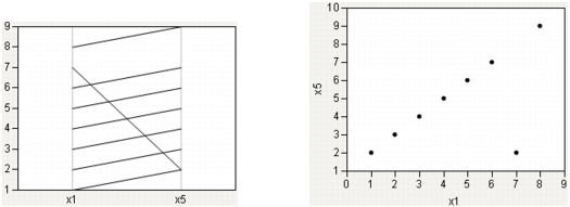
Single Outlier
Finally, consider the case of a single outlier. The parallel plot shows a general coherence among the lines, with a noticeable exception.
Figure 8.9 Single Outlier: Parallel Plot and Scatterplot
Parallel Plot Platform Options
The following table describes the options within the red triangle menu for Parallel Plot.
|
Show Reversing Checkboxes
|
Reverses the scale for one or more variables.
|
|
Script
|
This menu contains options that are available to all platforms. They enable you to redo the analysis or save the JSL commands for the analysis to a window or a file. For more information, see Using JMP.
|
For details about the context menu options that appear when you right-click on a parallel plot, see Using JMP.
Additional Examples of the Parallel Plot Platform
The following examples further illustrate using the Parallel Plots platform.
Examine Iris Measurements
The following example uses the Fisher’s Iris data set (Mardia, Kent, and Bibby 1979). The Iris.jmp sample data table contains measurements of the sepal length and width and petal length and width in centimeters for three species of Iris flowers: setosa, versicolor, and virginica. To find characteristics that differentiate the three species, examine these measurements.
Examine Three Species in One Parallel Plot
1. Select Help > Sample Data Library and open Iris.jmp.
2. Select Graph > Parallel Plot.
3. Select Sepal length, Sepal width, Petal length, and Petal width and click Y, Response.
4. Select the Scale Uniformly check box.
5. Click OK.
The report window appears.
Figure 8.10 Three Species in One Parallel Plot
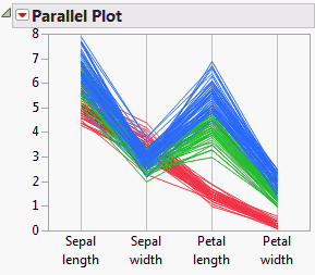
In this parallel plot, the three species are all represented in the same plot. The colors correspond to the three species, as follows:
• Blue corresponds to virginica.
• Green corresponds to versicolor.
• Red corresponds to setosa.
From Figure 8.10, you observe the following:
• For sepal width, the setosa values appear to be higher than the virginica and versicolor values.
• For petal width, the setosa values appear to be lower than the virginica and versicolor values.
Examine Three Species in Different Parallel Plots
1. From the Iris.jmp sample data table, select Graph > Parallel Plot.
2. Select Sepal length, Sepal width, Petal length, and Petal width and click Y, Response.
3. Select Species and click X, Grouping.
4. Click OK.
The report window appears.
Figure 8.11 Three Species in Different Parallel Plots

Each species is represented in a separate parallel plot.
Examine Student Measurements
The following example uses the Big Class.jmp sample data table, which contains data on age, sex, height, and weight for 40 students. Examine the relationships between different variables.
1. Select Help > Sample Data Library and open Big Class.jmp.
2. Select Graph > Parallel Plot.
3. Select height and weight and click Y, Response.
4. Select age and click X, Grouping.
5. Select sex and click By.
6. Select the Scale Uniformly check box.
7. Click OK.
Figure 8.12 Height and Weight by Sex, Grouped by Age
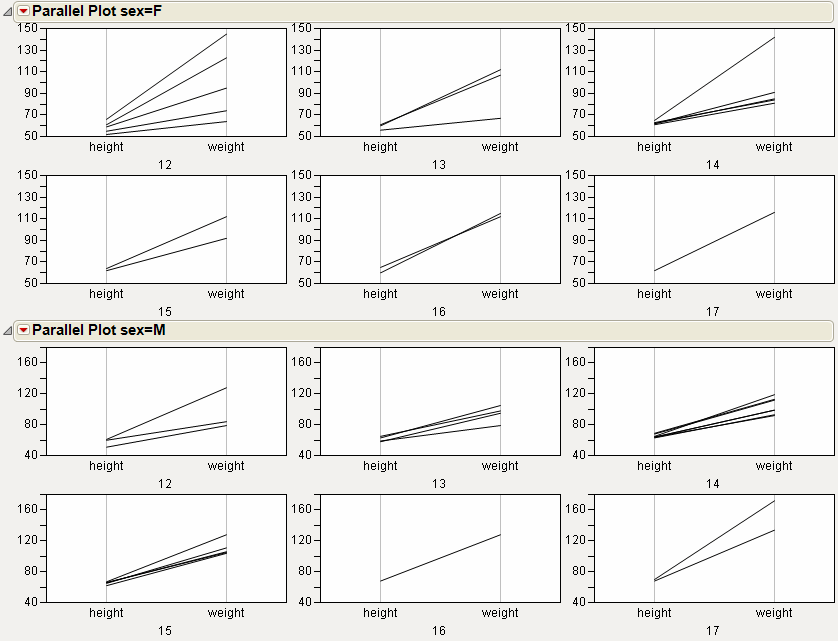
From Figure 8.12, you observe the following:
• Among the 13-year-old females, one female’s weight is lower than the other females in her age group. If you click on the line representing the lower weight, the respective individual (Susan) is highlighted in the data table.
• Among the 14-year-old females, one female’s weight is higher than the other females in her age group. If you click on the line representing the higher weight, the respective individual (Leslie) is highlighted in the data table.
..................Content has been hidden....................
You can't read the all page of ebook, please click here login for view all page.