
Example of Treemaps
Treemaps can be useful in cases where histograms or bar charts are ineffective. This example uses the Cities.jmp sample data table, which contains meteorological and demographic statistics for 52 cities. Compare the bar chart to the treemap.
Create a bar chart representing ozone levels in each of the 52 cities:
1. Select Help > Sample Data Library and open Cities.jmp.
2. Select Graph > Chart.
The launch window appears.
3. Select OZONE and click Statistics.
4. Select Mean.
5. Select city and click Categories, X, Levels.
6. Click OK.
The report window appears.
Figure 10.2 Ozone Levels in a Bar Chart
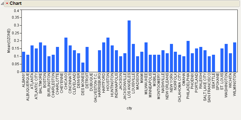
Although it is easy to see that there is a single large measurement, each bar looks similar. Subtle distinctions are difficult to see.
Create a treemap representing ozone levels in each of the 52 cities:
1. Return to the Cities.jmp sample data table.
2. Select Graph > Treemap.
The launch window appears.
3. Select POP (population) and click Sizes.
4. Select city and click Categories.
5. Select OZONE and click Coloring.
6. Click OK.
The report window appears.
Figure 10.3 Ozone Levels in a Treemap

Compare the bar chart to the treemap. Because the treemap folds the data over two dimensions (size and color), each city’s data looks more distinctive than it did in the bar chart.
Note the following about this treemap:
• The magnitude of the ozone level for each city is represented by color.
• Each rectangle is colored based on a continuous color spectrum, with bright blue on the lowest end and bright red on the highest end. In this treemap, Des Moines has the lowest ozone levels, and Los Angeles has the highest ozone levels.
• Ozone levels somewhere in the middle decrease the intensity of the color, so pale blue, and pink indicate levels that are closer to the mean ozone level.
• Cities colored black have missing ozone values.
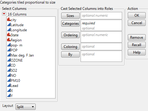
Launch the Treemap Platform
Launch the Treemap platform by selecting Graph > Treemap.
Figure 10.4 The Treemap Launch Window
|
Sizes
|
Determines the size of the rectangles based on the values of the specified variable. See “Sizes”.
|
|
Categories
|
(Required) Specifies the category that comprises the treemap. See “Categories”.
|
|
Ordering
|
Changes the ordering from alphabetical (where values progress from the top left to the lower right) to order by the specified variable. You can specify more than one ordering variable. See “Ordering”.
|
|
Coloring
|
Colors the rectangles corresponding to the levels of the specified variable.
• If the variable is continuous, the colors are based on a continuous color spectrum.
• If the variable is categorical, the default colors are selected in order from JMPs color theme.
See “Coloring”.
|
|
By
|
Identifies a column that creates a report consisting of separate treemaps for each level of the variable.
|
|
Layout
|
Determines the layout of the rectangles. See “Layout”.
|
For more information about the launch window, see Using JMP.
After you click OK, the Treemap window appears. See “The Treemap Window”.
Sizes
If you want the size of the rectangles to correspond to the levels of a variable, specify a Sizes variable. The rectangle size is proportional to the sum of the Sizes variable across all of the rows corresponding to a category. If you do not specify a Sizes variable, the rectangle size is proportional to the number of rows for each category.
Categories
The only required variable role for the Treemap platform is Categories. If you specify only a Categories variable and no other variables, the rectangles in the treemap have these attributes:
• They are colored from a rotating color theme.
• They are arranged alphabetically.
• They are sized by the number of occurrences in each group.
If you specify two Categories variables, the treemap is grouped by the first variable, and sorts within groups by the second variable. For example, using the Cities.jmp sample data table, specify Region and city (in that order) as the Categories variables.
Ordering
By default, the rectangles in a treemap appear in alphabetical order. Values progress from the top left to the lower right. To change this ordering, specify an Ordering variable. When an Ordering variable is specified, the rectangles appear with the values progressing from the bottom left to the upper right.
If you specify a single Ordering variable, the rectangles are clustered, with the high levels or large values together, and the low levels or small values together.
If you specify two Ordering variables, the treemap arranges the rectangles horizontally by the first ordering variable, and vertically by the second ordering variable. This approach can be useful for geographic data.
Coloring
If you specify a Coloring variable, the colors of the rectangles correspond to the levels of the variable.
• If the variable is continuous, the colors are based on a continuous color theme setting. The default color theme is Blue to Gray to Red. The color of each value is based on the average value of all of the rows. Blue represents the lowest values, and red represents the highest values. The color is most intense at the extremes of the variable, and paler colors correspond to levels that are close to the mean. For example, see “The Treemap Window”.
• If the variable is categorical, the colors are based on a categorical color theme. The default color theme is JMP Default. For an example, see “Example of a Categorical Coloring Variable”.
Note: If you have used the Value Colors column property to color a column, that property determines the colors of the categories.
• If you do not specify a Coloring variable, colors are chosen from a rotating color palette.
The Treemap Window
To produce the plot shown in Figure 10.5, follow the instructions in “Example of Treemaps”.
Figure 10.5 The Treemap Window
Tip: To zoom in on the treemap, use the Magnifier tool or press the Z key.
Treemap rectangles can have the following attributes:
• Categories add labels to the rectangles. You can specify one or two categories. You can show or hide labels using the Show Labels option. See “Context Menu”.
• Rectangle size is determined by one of the following:
‒ The Sizes variable, if you specify one.
‒ If you do not specify a Sizes variable, size is determined by the frequency of the category.
• Rectangle color is determined by one of the following:
‒ If the variable is continuous, the colors are based on a continuous color theme setting. The default color theme is Blue to Gray to Red. The color of each value is based on the average value of all of the rows. Blue represents the lowest values, and red represents the highest values. The color is most intense at the extremes of the variable, and paler colors correspond to levels that are close to the mean. For example, see “Example of a Continuous Coloring Variable”.
‒ If the variable is categorical, the colors are based on a categorical color theme. The default color theme is JMP Default. For example, see “Example of a Categorical Coloring Variable”.
‒ If you do not specify a Coloring variable, colors are chosen from a rotating color theme.
‒ If you have used the Value Colors column property to color a column, that property determines the colors of the categories.
• The order of the rectangles is determined by one of the following:
‒ The Ordering variable, if you specify one.
‒ If you do not specify an Ordering variable, the order is alphabetical by default. Values progress from the top left to the lower right.
Treemap Platform Options
The following table describes the options within the red triangle menu next to Treemap.
|
Change Color Column
|
Change the column that is currently used to color the rectangles.
|
|
Color Theme
|
Change the colors representing the high, middle, and low values of the color column. This option is available only if you have specified a Coloring variable.
|
|
Color Range
|
Specify the range that you want applied to the color gradient. The default low value is the column minimum, and the default high value is the column maximum. This option is available only if you have specified a continuous column as the Coloring variable.
|
|
Legend
|
Shows or hides a legend that defines the coloring used on the treemap. This option is available only if you have specified a Coloring variable.
|
|
Layout
|
Arranges rectangles by order of the variable or by size of the rectangle.
• Split preserves the order of the data. Split is the default setting.
• Squarify sorts the data first. The largest value is in the top left corner. The rectangle sizes decrease diagonally to the lower right corner. The order of the variables is not preserved, but visually comparing variables is easier.
• Mixed preserves the order of the data for the main category and then sorts within the subcategory. Applies only when you select a category and subcategory.
|
|
Script
|
This menu contains options that are available to all platforms. They enable you to redo the analysis or save the JSL commands for the analysis to a window or a file. For more information, see Using JMP.
|
Context Menu
The following table describes the options available by right-clicking on the treemap.
|
Suppress Box Frames
|
Suppresses the black lines outlining each box.
|
|
Ignore Group Hierarchy
|
Flattens the hierarchy and sorts by the Ordering columns without using grouping, except to define cells.
|
|
Show Labels
|
Shows or hides the Categories labels. If you have specified two Categories, the secondary labels are hidden or shown. If you hide the Categories labels, place your mouse pointer over a rectangle to show the primary or secondary category label.
|
|
Show Group Labels
|
Shows or hides the group labels. This option is available only if more than one variable is assigned to the Categories role.
|
|
Group Label Background
|
Adjust the transparency of the group label. This option is available only if more than one variable is assigned to the Categories role.
|
Additional Examples of the Treemap Platform
The following examples further illustrate using the Treemap platform.
Example Using a Sizes Variable
Using the Cities.jmp sample data table, specify a Sizes variable to see a treemap of city sizes based on population.
1. Select Help > Sample Data Library and open Cities.jmp.
2. Select Graph > Treemap.
3. Select POP (population) and click Sizes.
4. Select city and click Categories.
5. Click OK.
The report window appears.
Figure 10.6 POP as Sizes Variable
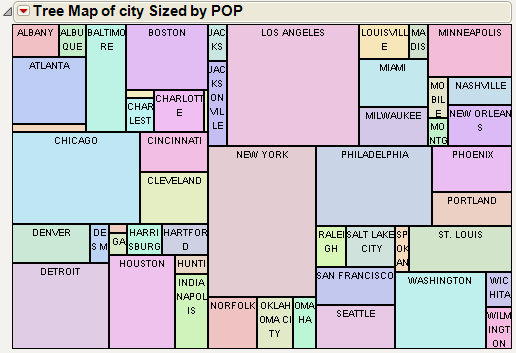
• Cities with large populations are represented by large rectangles, such as New York and Los Angeles.
• Cities with smaller populations are represented by smaller rectangles, such as Cheyenne and Dubuque.
Some rectangles are too small to show their labels (for example, Cheyenne and Dubuque). Click on a small rectangle to select the corresponding row in the data table, where you can see the label.
Example Using an Ordering Variable
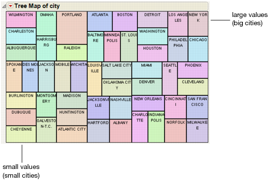
For example, using the Cities.jmp sample data table, specify an Ordering variable as follows:
1. Select Help > Sample Data Library and open Cities.jmp.
2. Select Graph > Treemap.
3. Select city and click Categories.
4. Select POP (population) and click Ordering.
5. Click OK.
The report window appears. Since you specified an Ordering variable, the cities in the treemap are ordered from bottom left (small cities) to upper right (big cities).
Figure 10.7 POP as Ordering Variable
Example Using Two Ordering Variables
For example, in the Cities.jmp sample data table, the X and Y columns correspond to the geographic location of the cities. Specify the X and Y columns as Ordering variables:
1. Select Help > Sample Data Library and open Cities.jmp.
2. Select Graph > Treemap.
3. Select city and click Categories.
4. Select X and click Ordering.
The X variable corresponds to the western and eastern US states.
5. Select Y and click Ordering.
The Y variable corresponds to the northern and southern US states.
6. Click OK.
The report window appears.
Figure 10.8 Treemap with Two Ordering Variables
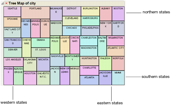
The western and eastern US states are arranged horizontally, and the northern and southern US states are arranged vertically.
Example of a Continuous Coloring Variable
For example, using the Cities.jmp sample data table, specify a continuous Coloring variable as follows:
1. Select Help > Sample Data Library and open Cities.jmp.
2. Select Graph > Treemap.
3. Select city and click Categories.
4. Select OZONE and click Coloring.
5. Click OK.
The report window appears.
Figure 10.9 City Colored by OZONE
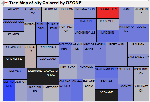
Note that the size of the rectangles is still based on the number of occurrences of the Categories variable, but the colors are mapped to ozone values. The high ozone value for Los Angeles clearly stands out. Missing values appear as black rectangles.
Example of a Categorical Coloring Variable
For example, using the Cities.jmp sample data table, specify a categorical Coloring variable as follows:
1. Select Help > Sample Data Library and open Cities.jmp.
2. Select Graph > Treemap.
3. Select city and click Categories.
4. Select Region and click Coloring.
5. Click OK.
The report window appears.
Figure 10.10 City Colored by Region
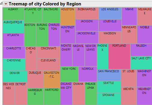
All of the cities belonging to the same region are colored the same color. The colors are chosen from JMP’s color theme.
6. From the red triangle menu, select Layout > Squarify.
Figure 10.11 Squarify Treemap
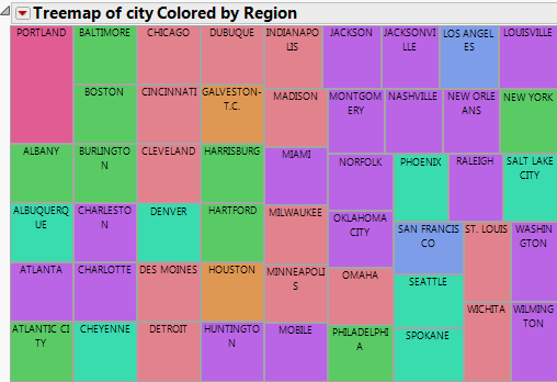
The squares are now ordered according to size from the top left corner to the smallest rectangle in the lower right corner. This makes the data easier to analyze.
To order the squares using a combination of Split and Squarify, select the Mixed layout option.
Examine Pollution Levels
Using the Cities.jmp sample data table, examine the distribution of different pollution measurements (ozone and lead) across selected cities in the United States.
First, examine ozone levels in the selected cities.
1. Select Help > Sample Data Library and open Cities.jmp.
2. Select Graph > Treemap.
3. Select POP (population) and click Sizes.
4. Select city and click Categories.
5. Select X and Y and click Ordering.
6. Select OZONE and click Coloring.
7. Click OK.
The report window appears.
Figure 10.12 OZONE Levels for Selected Cities
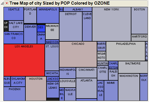
From Figure 10.12, you observe the following:
• Los Angeles has a high level of ozone. It is also a western state, and that is reflected by its positioning in the treemap.
• Chicago and Houston have slightly elevated ozone levels.
• New York and Washington have slightly lower-than-average ozone levels.
Next, examine lead levels in the selected cities. Perform the same steps as before, but substitute Lead with OZONE for the Coloring variable.
Figure 10.13 Lead Levels for Selected Cities
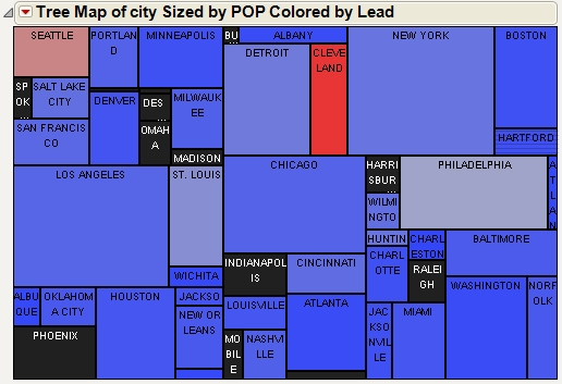
From Figure 10.13, you observe the following:
• Cleveland and Seattle have high levels of lead. Cleveland is near the middle of the country, and Seattle is in the northwest. These locations are reflected by their positioning in the treemap.
• Interestingly, most other cities have rather low lead levels.
• Raleigh and Phoenix have missing values for lead measurements.
Examine Causes of Failure
This example uses the Failure3.jmp sample data table, which contains the common causes of failure during the fabrication of integrated circuits. Examine the causes of failure and when it occurs.
1. Select Help > Sample Data Library and open Quality Control/Failure3.jmp.
2. Select Graph > Treemap.
3. Select N and click Sizes.
4. Select failure and clean and click Categories.
5. Select clean and click Coloring.
6. Click OK.
The report window appears.
Figure 10.14 Failure Modes

From Figure 10.14, you observe the following:
• Contamination is the biggest cause of failure.
• Contamination occurs more often before the circuits were cleaned, rather than after they were cleaned.
Examine Patterns in Car Safety
This example uses the Cars.jmp sample data table, which contains impact measurements of crash-test dummies in automobile safety tests. Compare these measurements for different automobile makes and models during the years 1990 and 1991.
1. Select Help > Sample Data Library and open Cars.jmp.
Filter the data to show only the years 1990 and 1991 and create a subset of the Cars.jmp data table.
2. Select Rows > Data Filter.
3. Select Year.
4. Click Add.
5. Select 90 and 91.
The rows corresponding to 1990 and 1991 are highlighted in the data table.
6. Select Tables > Subset.
7. Ensure that Selected Rows is selected and click OK.
A new data table (Subset of Cars) appears that contains only the data corresponding to the years 1990 and 1991.
Now, using the Subset of Cars data table, create the treemap.
1. Select Graph > Treemap.
2. Select Wt (weight) and click Sizes.
3. Select Make and Model and click Categories.
4. Select L Leg and click Coloring.
L Leg represents a measurement of injuries resulting from the deceleration speed of the left leg, where more deceleration causes more injury.
5. Click OK.
The report window appears.
Figure 10.15 Left Leg Deceleration Injuries
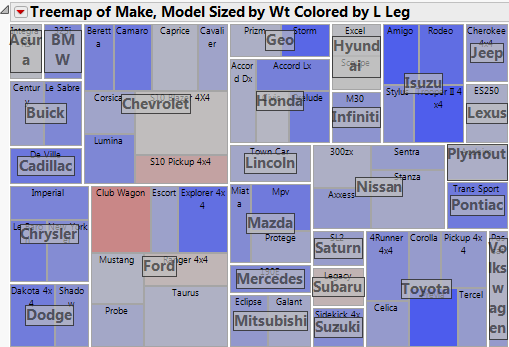
From Figure 10.15, you can see that the Club Wagon and S10 Pickup 4x4 have the largest number of left leg deceleration injuries.
You can examine other safety measurements without re-launching the Treemap platform, as follows:
1. From the red triangle menu, select Change Color Column.
2. Select Head IC.
3. Click OK.
The treemap updates to reflect head injuries instead of left leg injuries.
Figure 10.16 Head Injuries
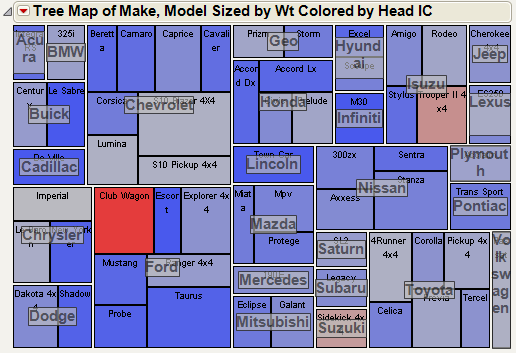
From Figure 10.16, you notice the following:
• Although the S10 Pickup 4x4 had a high number of left leg deceleration injuries, it has a lower number of head injuries.
• The Club Wagon still has a high number of head injuries, in addition to the high number of left leg deceleration injuries.
• The Trooper II 4x4 had a low number of left leg deceleration injuries, but it has a high number of head injuries.
..................Content has been hidden....................
You can't read the all page of ebook, please click here login for view all page.