
17 Exploratory Modeling
Overview
Exploratory modeling (sometimes known as data mining) is the process of exploring large amounts of data, usually using an automated method, to find patterns and make discoveries. JMP has two platforms especially designed for exploratory modeling: the Partition platform and the Neural platform.
The Partition platform recursively partitions data, automatically splitting the data at optimum points. The result is a decision tree that classifies each observation into a group. The classic example is turning a table of symptoms and diagnoses of a certain illness into a hierarchy of assessments to be evaluated on new patients.
The Neural platform implements neural networks. Neural networks are used to predict one or more response variables from a flexible network of functions of input variables. They can be very good predictors, and are useful when the underlying functional form of the response surface is not important.
Chapter Contents
Recursive Partitioning (Decision Trees)
Exploratory Modeling with Partition
Recursive Partitioning (Decision Trees)
The Partition platform is used to form decision tree models. The platform recursively partitions a data set in ways similar to CART, CHAID, and C4.5. Recursively partitioning data is often taught as a data mining technique, for these reasons:
● It is good for exploring relationships without having a good prior model.
● It handles large problems easily.
● It works well with nominal variable and messy or unruly data.
● The results are very interpretable.
The factor columns (Xs) can be either continuous or categorical. If an X is continuous, then the splits (partitions) are created by a cutting value. The sample is divided into values below and above this cutting value. If the X is categorical, then the sample is divided into two groups of levels.
The response column (Y) can also be either continuous or categorical. If Y is continuous, then a regression tree is fit. The platform creates splits that most significantly separate the means by examining the sums of squares due to the differences in the means. If Y is categorical, then a classification tree is fit. The response rates (the estimated probability for each response level) become the fitted value. The most significant split is determined by the largest likelihood-ratio chi-square statistic (G2). In either case, the split is chosen to maximize the difference in the responses between the two branches of the split.
The Partition platform displays slightly different outputs, depending on whether the Y-variable is categorical or continuous.
Figure 17.1 shows the partition plot and tree after one split for a categorical response. Points have been colored according to their response category. Each point in the partition plot represents the response category and the partition that it falls in. The x- and y-positions for each point are random within their corresponding partition. The partition width is proportional to the number of observations in the category, and the partition height is the estimated probability for that group.
Figure 17.2 shows the case for a continuous response. The points are positioned at the response value, above or below the mean of the partition that they are in.
Figure 17.1 Output with Categorical Response (Titanic Passengers.jmp)

Figure 17.2 Output for Continuous Responses (Lipid Data.jmp)
Growing Trees
As an example of a typical analysis for a continuous response, select Help > Sample Data Library and open Lipid Data.jmp. These data contain results from blood tests, physical measurements, and medical history for 95 subjects. For examples using a categorical response, see the exercises at the end.
Cholesterol tests are invasive (requiring the extraction of blood) and require laboratory procedures to obtain results. Suppose these researchers are interested in using non-invasive, external measurements and also information from questionnaires to determine which patients are likely to have high cholesterol levels. Specifically, they want to predict the values stored in the Cholesterol column with information found in the Gender, Age, Height, Weight, Skinfold, Systolic BP, and Diastolic BP columns.
To begin the analysis:
![]() Select Analyze > Predictive Modeling > Partition.
Select Analyze > Predictive Modeling > Partition.
![]() Assign Cholesterol to Y, Response, and the X, Factor variables as shown in Figure 17.3.
Assign Cholesterol to Y, Response, and the X, Factor variables as shown in Figure 17.3.
Note: The default partitioning method is called the Decision Tree method. If you are using JMP Pro, a Methods menu appears at the lower left of the launch window, which offers four additional methods: Bootstrap Forest, Boosted Tree, K Nearest Neighbors, and Naive Bayes. JMP Pro also provides additional validation features.
![]() Click OK to see the results in Figure 17.4.
Click OK to see the results in Figure 17.4.
Figure 17.3 Partition Launch Window

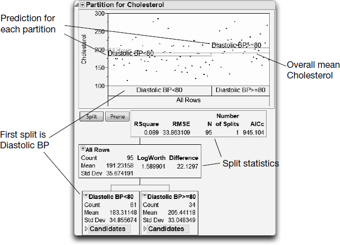
Figure 17.4 shows the initial Partition report that appears. By default, the Candidates node of the report is closed, but is open here for illustration. Note that no partitioning has happened yet—all of the data are placed in a single group whose estimate is the mean cholesterol value (191.23).
Figure 17.4 Initial Lipid Partition Report

The Partition platform looks at values of each X variable to find the optimum split. The variable that results in the highest reduction in total sum of squares is the optimum split, and is used to create a new branch of the tree.
As shown in Figure 17.4, the Candidate SS column for Diastolic BP results in a reduction of 10691.44094 in the total SS, so it is used as the splitting variable.
Note: The split chosen is based on the LogWorth statistic, which is the -log10(p-value). The LogWorth is based on an adjusted p-value, which takes into account the number of different ways splits can occur. The highest LogWorth statistic determines where the split actually occurs.
To begin the partitioning process, you interactively request splits.
![]() Click the Split button to split the data into two subsets.
Click the Split button to split the data into two subsets.
As expected, the data are split on the Diastolic BP variable.
The complete report is shown in Figure 17.5. People with a diastolic blood pressure less than 80 tend to have lower cholesterol (a mean of 183.3) than those with blood pressure of 80 or more (with a mean of 205.4).
Figure 17.5 First Split of Lipid Data

![]() To examine the candidates report, open the Candidates outline node in each of the Diastolic BP leaves.
To examine the candidates report, open the Candidates outline node in each of the Diastolic BP leaves.
An examination of the candidates in Figure 17.6 shows the possibilities for the second split. Under the Diastolic BP<80 leaf, a split using the Weight variable has a LogWorth of 1.76. The highest LogWorth under the Diastolic BP >=80 leaf is 1.21 for the Age variable. Therefore, you expect that pressing the Split button again will give two new weight leaves under the Diastolic<80 leaf, since Weight has the highest overall LogWorth.
Figure 17.6 Candidates for Second Split

![]() Click the Split button to conduct the second split.
Click the Split button to conduct the second split.
The resulting report is shown in Figure 17.7. Its corresponding tree is shown in Figure 17.8.
Figure 17.7 Plot after Second Split

Figure 17.8 Tree after Second Split

This second split shows that of the people with diastolic blood pressure less than 80, weight is the best predictor of cholesterol. For this group, the model predicts that those who weigh 185 pounds or more have an average cholesterol of 149. For those that weigh less than 185 pounds, the predicted average cholesterol is 188.5.
You can continue to split until you are satisfied with the predictive power of the model. As opposed to software that continues splitting until a criterion is met, JMP enables you to be the judge of the effectiveness of the model.
![]() Click the Split button two more times, to produce a total of four splits.
Click the Split button two more times, to produce a total of four splits.
Viewing Large Trees
With several levels of partitioning, tree reports can become quite large. JMP has several ways to ease the viewing of these large trees.
● Use the Display Options from the red triangle menu next to Partition to turn off parts of the report that are not needed. For example, Figure 17.9 shows the current lipid results after four splits, with Display Options > Show Split Stats and Display Options > Show Split Candidates turned off.
Figure 17.9 Lipid Data after Four Splits

You can also request a more compact version of the partition tree.
![]() Select Small Tree View from the red triangle menu next to Partition.
Select Small Tree View from the red triangle menu next to Partition.
This option produces a compact view of the tree, appended to the right of the main partition graph. Figure 17.10 shows the Small Tree View corresponding to Figure 17.9.
Figure 17.10 Small Tree View

Additional options for exploring the tree, such as the Leaf Report, are available from the red triangle menu next to Partition.
Viewing Column Contributions
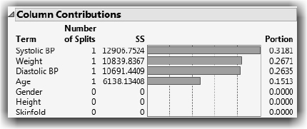
You might want to see a summary of how many times a variable was split, along with the sums of squares attributed to that variable. This is particularly useful when building large trees involving many variables. The Column Contribution report provides this information. To see the report in Figure 17.11 select Column Contributions from the red triangle menu next to Partition.
Figure 17.11 Column Contributions after Four Splits
Exploratory Modeling with Partition
You might wonder if there is an optimum number of splits to do for a given set of data. One way to explore recursive splitting is to use K Fold Crossvalidation. Lets do that now.
![]() Close the current partitioning of the Lipid Data to start over.
Close the current partitioning of the Lipid Data to start over.
![]() Again select Analyze > Predictive Modeling > Partition. Click Recall to populate the window. If you haven’t run the previous model, then assign variable roles as shown previously in Figure 17.3, and then click OK.
Again select Analyze > Predictive Modeling > Partition. Click Recall to populate the window. If you haven’t run the previous model, then assign variable roles as shown previously in Figure 17.3, and then click OK.
![]() When the Partition report appears, select the follow options from the red triangle menu next to Partition:
When the Partition report appears, select the follow options from the red triangle menu next to Partition:
● Select Split History.
● Deselect Display Options > Show Tree.
● Deselect Display Options > Show Graph.
● Select K Fold Crossvalidation. When the cross validation window shows, use the default of 5 subgroups and click OK.
You have now customized the Partition platform to let you interactively split or prune the model step by step and observe the results. Furthermore, you are using a K Fold validation that randomly divides the original data into K subsets. Each of the K subsets is used to validate the model fit on the rest of the data, fitting a total of K models. The model giving the best validation R2 statistic is considered the best model. The beginning partition platform should look like Figure 17.12.
Figure 17.12 Initial Partition Platform with Cross Validation and History Plot

Click Split, and watch changes in the split statistics.
![]() Click Split eight times. Watch the change in the statistics at each split.
Click Split eight times. Watch the change in the statistics at each split.
Figure 17.13 shows the Split History after eight splits for this example. Your validation results might not be exactly the same as those shown because the validation subsets are randomly chosen.
If you continue to split until the data is completely partitioned, the model continues to improve fitting the data. However, this usually results in overfitting, which means the model predicts the fitted data well, but predicts future observations poorly, as seen by less desirable validation statistics.
We can see this in our example (Figure 17.13). After eight splits, the Overall R2 is 0.4552, but the K Fold R2 is 0.2977. From split seven to split eight the Overall R2 increased, but the validation R2 decreased. This could be an example of overfitting.
Figure 17.13 Partition Platform with K-Fold Validation after Eight Splits

Saving Columns and Formulas
Once you have partitioned the data to your satisfaction, you can save the partition model information.
The Save Columns submenu provides options for saving results to the data table. For example, we return to the regression tree with four splits for Lipid Data.jmp.
![]() Select Save Columns > Save Prediction Formula from the red triangle menu next to Partition.
Select Save Columns > Save Prediction Formula from the red triangle menu next to Partition.
This adds a column to the report named Cholesterol Predictor that contains a formula using the estimates from the partitions of the tree.
To see the formula, return to the Lipid Data table and do the following:
![]() Right-click in the Cholesterol Predictor column header and select Formula from the menu that appears (Figure 17.14).
Right-click in the Cholesterol Predictor column header and select Formula from the menu that appears (Figure 17.14).
Figure 17.14 Formula for Partition Model Example after Four Splits

You can see that the formula is a collection of nested If functions that use the partitioning results. You can copy and paste the formula to test its validity on other similar data.
Note: The Partition launch window in Figure 17.13 includes the Informative Missing option, which is selected by default. This option tells JMP how to handle missing values. In Figure 17.14, we see that JMP includes missing values in the prediction formula. For more information, select Help > JMP Help and see the Partition chapter in the Predictive and Specialized Modeling book.
Neural Nets
The Neural platform implements a connected network with one layer (or two layers in JMP Pro). Neural networks can predict one or more response variables using flexible functions of the input variables. This type of model can be a very useful when it is not necessary to do the following:
● describe the functional form of the response surface,
● to describe the relationship between the input variables and the response, or
● narrow down the list of important variables.
A neural network can be thought of as a function of a set of derived inputs called hidden nodes. Hidden nodes are nonlinear functions (called activation functions) of the original inputs. You can specify as many nodes as you want.

At each node, the activation function transforms a linear combination of all the input variables using the S- shaped hyperbolic tangent function (TanH). The function then applied to the response is a linear combination of the nodes for continuous responses or a logistic transformation for categorical responses.
Note: Additional activation functions and other features are available in JMP Pro. This section continues with a simple example showing the abilities of the Neural platform in JMP. For more advanced examples that use JMP Pro features, and for technical details of the functions used in the neural network implementation, select Help > JMP Help and see the Predictive and Specialized Modeling book.
A Simple Example
This section uses the sample data table Peanuts.jmp, from an experiment that tests a device for shelling peanuts. A reciprocating grid automatically shells the peanuts. The length and frequency of the reciprocating stroke, as well as the spacing of the peanuts, are factors in the experiment. Kernel damage, shelling time, and the number of unshelled peanuts need to be predicted. This example illustrates the procedure using only the number of unshelled peanuts as the response. A more involved neural modeling situation could have several factors, multiple responses, or both.
![]() Select Help > Sample Data Library and open Peanuts.jmp.
Select Help > Sample Data Library and open Peanuts.jmp.
![]() Select Analyze > Predictive Modeling > Neural.
Select Analyze > Predictive Modeling > Neural.
![]() Assign Unshelled to Y, Response and Length, Freq, and Space to X, Factor.
Assign Unshelled to Y, Response and Length, Freq, and Space to X, Factor.
![]() Click OK to see the Neural control panel on the left in Figure 17.15.
Click OK to see the Neural control panel on the left in Figure 17.15.
Note: If you are using JMP Pro, or earlier versions of the Neural platform, your initial Control Panel has different options.
When the Control Panel appears, you have the option of selecting the validation method most suitable for your data.
Important: Neural networks require some form of validation. Three validation methods are built into the Neural platform (additional validation options are available in JMP Pro). Validation designates that the original data be randomly divided into training and validation sets. The predictive ability of the response function derived on the training set is tested on the validation set. Validation statistics tell you how well the model fits data that were not used to fit the model.
The options on the Validation Method menu (middle of Figure 17.15) determine how the Neural fitting machinery subsets your data to test and decide on a final model:
● Excluded Rows Holdback uses row states to subset the data. Unexcluded rows are used as the training set, and excluded rows are used as the validation set.
● Holdback, the default, randomly divides the original data into the training and validation sets. You can specify the proportion of the original data to use as the validation set (holdback). The holdback proportion 0.333 is the default.
● KFold divides the original data into K subsets. Each of the K sets is used to validate the model fit on the rest of the data, fitting a total of K models. The model giving the best validation statistic is chosen as the final model.
Holdback, the default option, is the best used for larger samples (hundreds or thousands of observations). The KFold option is better used for smaller samples such as the peanuts data.
Figure 17.15 Model Launch Control Panel

![]() For this example, select KFold from the Validation Method menu, and click Go to see Neural results similar to those shown in Figure 17.16.
For this example, select KFold from the Validation Method menu, and click Go to see Neural results similar to those shown in Figure 17.16.
Note: Your results are different because the Neural fitting process begins with a random seed. The random seed determines the starting point for the search algorithm. To produce the results shown in Figure 17.16, enter 1234 in the Random Seed field of the Model Launch control panel.
Figure 17.16 Example Results from Neural Platform

The reports in Figure 17.16 give straightforward information for both the training and validation samples. You can see that the KFold number is reflected by 16 subjects in the training group and four in the validation group. The RSquare for the training group of 0.724 is very good, and the high RSquare for the validation group of 0.900 gives confidence that the model fits well. A Validation RSquare that is substantially lower than the Training RSquare indicates that the model is fitting noise rather than structure.
Neural networks are very flexible functions that have a tendency to overfit the data. When that happens, the model predicts the fitted data well, but predicts future observations poorly. However, the penalty system included in the Neural platform helps prevent the consequences of overfitting. If you are running JMP Pro, there is an option to select a specific penalty function.
You can use Model Launch, shown open in Figure 17.16, and click Go to run the neural net fitting as many times as you want, or to run models with different numbers of nodes.
You can also request a diagram of the example showing how the factor columns are transformed through three hidden nodes, whose outputs are then combined to form the predicted values.
![]() Select Diagram from the red triangle menu next to Model NTanH(3).
Select Diagram from the red triangle menu next to Model NTanH(3).
You should see the diagram shown in Figure 17.17.
Figure 17.17 Neural Net Diagram

Modeling with Neural Networks
In the Neural Net diagram it’s easy to see the inputs and the output, but the circle (hidden) nodes might seem more like black boxes. However, red triangle menu options for the Model let you see what is in the nodes and how they are used to produce the predicted output.
Saving Columns
Like most analysis platforms, results from the Neural analyses can be saved to columns in the data table. The following save options are available.
Save Formulas creates new columns in the data table that contain formulas for the predicted response and for the hidden layer nodes. This option is useful if rows are added to the data table, because predicted values are automatically calculated.
Save Profile Formulas creates new columns in the data table that contain formulas for the predicted response. Formulas for the hidden nodes are embedded in this formula. This option produces formulas that can be used by the Flash version of the Profiler.
Save Fast Formulas creates new columns in the data table for the response variable, with embedded formulas for the hidden nodes. This formula evaluates faster that the Save Profile Formula results but cannot be used in the Flash version of the Profiler.
![]() Select Save Profile Formulas from the red triangle menu next to Model NTanH(3) to create a new column in the Peanuts.jmp sample data table.
Select Save Profile Formulas from the red triangle menu next to Model NTanH(3) to create a new column in the Peanuts.jmp sample data table.
For this example, the new column, called Predicted Unshelled, contains the formula shown in Figure 17.18. You can see three TanH formulas for the three hidden nodes embedded in this prediction formula.
Figure 17.18 Saved Profile Formula

![]() Next, return to the Neural analysis and select Plot Actual by Predicted and Plot Residual by Predicted from the red triangle menu next to Model NTanH(3) to see the plots in Figure 17.19.
Next, return to the Neural analysis and select Plot Actual by Predicted and Plot Residual by Predicted from the red triangle menu next to Model NTanH(3) to see the plots in Figure 17.19.
The Actual by Predicted and the Residual by Predicted plots are similar to their counterparts in linear regression. Use them to help judge the predictive ability of the model. In this example, the model fits fairly well, and there are no glaring problems in the residual plots.
Figure 17.19 Neural Net Plots

Profiles in Neural
The slices through the response surface can be interesting and informative.
![]() Select Profiler from the red triangle menu next to Model NTanH(3).
Select Profiler from the red triangle menu next to Model NTanH(3).
The Prediction Profiler (Figure 17.20) clearly shows the nonlinear nature of the model. Running the model with more hidden nodes increases the flexibility of these curves; running with fewer stiffens them.
The Profiler has all of the features used in analyzing linear models and response surfaces (discussed in “Analyze the Model” on page 433 and in the Profilers book). Select Help > JMP Help and refer to the Profilers book.
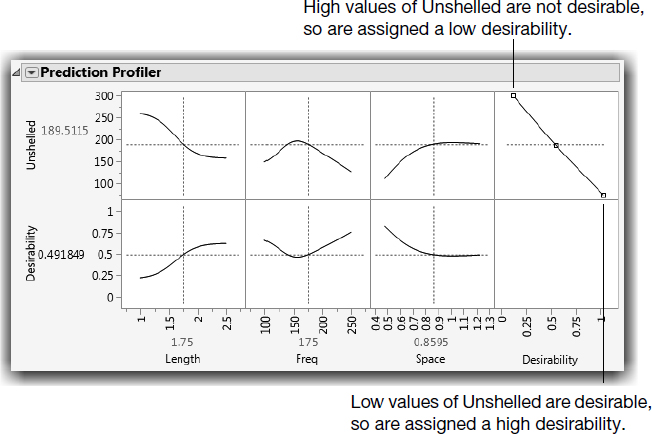
Since we are interested in minimizing the number of unshelled peanuts, we use the Profiler’s Desirability Functions, which are automatically shown (Figure 17.20).
Figure 17.20 Prediction Profiler with Initial Settings
To have JMP automatically compute the optimum factor settings:
![]() Select Optimization and Desirability > Maximize Desirability from the red triangle menu next to Prediction Profiler.
Select Optimization and Desirability > Maximize Desirability from the red triangle menu next to Prediction Profiler.
![]() If needed, double-click the y-axis next to Unshelled in the Prediction Profiler and change the Minimum axis value to 0.
If needed, double-click the y-axis next to Unshelled in the Prediction Profiler and change the Minimum axis value to 0.
JMP computes the maximum desirability, which in this example is a low value of Unshelled. Results are shown in Figure 17.21.
Figure 17.21 Prediction Profiler with Maximized Desirability Settings

Optimal settings for the factors show in red below the plots. In this case, optimal Unshelled values came from setting Length = 2.5, Freq = 137.1, and Space = 0.48. The predicted value of the response, Unshelled, dropped from 189.51 to 30.58.
Note: Recall that your results are different from the example shown here if you did not set the random seed 1234. A random seed is used to determine the starting point for the Neural fitting process.
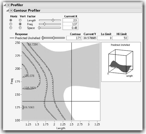
In addition to seeing two-dimensional slices through the response surface, the Contour Profiler can be used to visualize contours (sometimes called level curves) and mesh plots of the response surface. The Surface Profilers also provide an interesting view of the response surface.
There are options on the red triangle menu next to Model in the Neural report for both of these plots. However, if you saved the prediction formula for the Neural model fit, you can replicate all the model plots at any time using commands in the Graph menu. Earlier, we showed how to save the profile formula in a single column (see Figure 17.18). You should have a column in the Peanuts table called Predicted Unshelled. Lets use Graph commands to see more views of the results.
![]() Select Graph > Contour Profiler.
Select Graph > Contour Profiler.
![]() Select Predicted Unshelled and assign it to Y, Prediction Formula.
Select Predicted Unshelled and assign it to Y, Prediction Formula.
![]() Click OK to see the initial contours and mesh plot for this example.
Click OK to see the initial contours and mesh plot for this example.
![]() Select Contour Grid from the red triangle menu next to Contour Profiler and click OK to display more contours and contour values.
Select Contour Grid from the red triangle menu next to Contour Profiler and click OK to display more contours and contour values.
![]() Next, enter the optimal factor settings given by the Prediction Profiler in Figure 17.21 (enter your settings).
Next, enter the optimal factor settings given by the Prediction Profiler in Figure 17.21 (enter your settings).
![]() Finally, enter Lo Limit and Hi Limit values. Let’s say we can tolerate up to 50 unshelled peanuts. The Lo Limit is 0 and the Hi Limit is 50, as shown.
Finally, enter Lo Limit and Hi Limit values. Let’s say we can tolerate up to 50 unshelled peanuts. The Lo Limit is 0 and the Hi Limit is 50, as shown.
![]() Adjust the x-axis and y-axis scaling if necessary.
Adjust the x-axis and y-axis scaling if necessary.
In Figure 17.21, you can see that for these low and high limits and factor settings, the number of unshelled peanuts falls in an acceptable (unshaded) region. Click on the cross-hairs and drag to explore this region for the two variables selected. Note that, for this example, there is more than one acceptable region.
Figure 17.22 Contour Profiler with Optimal Values
You can also see a response surface view of the number of unshelled peanuts as a function of two of the three factors, using a surface profiler (or surface plot, which has more features). The Surface Profiler is available in the Neural platform, or from any of the profilers available from the Graph menu. The Surface Plot command on the Graph menu can be used if you saved the prediction equation, as in this example.
![]() Select Graph > Surface Plot.
Select Graph > Surface Plot.
![]() On the launch window, assign Predicted Unshelled to Columns to assign it as the response.
On the launch window, assign Predicted Unshelled to Columns to assign it as the response.
The surface plot in Figure 17.23 shows the surface when the optimal settings for the factors and the predicted value of unshelled peanuts are entered into the platform, as shown.
This plot shows just how nonlinear, or bendy, our fitted Neural model is.
Figure 17.23 Surface Plot of Unshelled Peanuts

Exercises
1. As shown in this chapter, the sample data table Lipid Data.jmp contains blood measure- ments, physical measurements, and questionnaire data from subjects in a California hospital. Repeat the Partition analysis of this chapter to explore models for these vari- ables:
(a) HDL (good cholesterol - higher than 60 is considered protection against heart disease)
(b) LDL (bad cholesterol - less than 120 is optimal)
(c) Triglyceride levels (less than 150 is normal) Statistics provided by the American Heart Association (http://www.heart.org).
2. Use the sample data table Peanuts.jmp and the Neural platform to complete this exer- cise. The factors of Freq, Space, and Length are described earlier in this chapter. Use these factors for the following:
(a) Create a model for Time, the time to complete the shelling process. Use the Profiler and Desirability Functions to find the optimum settings for the factors that minimize the time of shelling.
(b) Create a model for Damaged, the number of damaged peanuts after shelling is complete. Find values of the factors that minimize the number of damaged peanuts.
(c) Compare the values found in the text of the chapter (Figure 17.21) and the values that you found in parts (a) and (b) of this question. What settings would you recommend to the manufacturer?
3. The sample data table Mushroom.jmp contains 22 characteristics of 8,124 edible and poi- sonous mushroom. To see probabilities, select Display Options > Show Split Prob from the top red triangle menu.
(a) Use the Partition platform to build a seven split model to predict whether a mushroom is edible based on the 22 characteristics.
(b) Which characteristics are most important? Note: Use Column Contributions.
(c) What are the characteristics of edible mushrooms? Note: Use the Small Tree View and Leaf Report.
(d) Prune back to two splits. What is the predicted probability that a mushroom with no odor and a white spore print color is edible?
(e) Return to the Partition launch window, enter the value 0.3 in the Validation Portion field, and then rerun the model. We use a holdout validation set to determine the best number of splits. Do the validation statistics improve much after three splits? After four splits?
Exploratory Modeling: A Case Study
The following exercise is a case study that examines characteristics of passengers on the Titanic. The response is whether an individual passenger survived or was lost. The case study uses many of the platforms introduced so far in this book.
1. Select Help > Sample Data Library and open Titanic Passengers.jmp, which describes the survival status of individual passengers on the Titanic. The response variable is Sur- vived (“Yes” or “No”), and the variables of interest (factors or x-variables) are Passen- ger Class, Sex, Age, Siblings and Spouses, and Parents and Children.
(a) Use the Distribution platform and dynamic linking to explore the Survived variable and the variables listed above. Click on the bars for “Yes” and “No” in the Survived plot. Does Survived seem to be related to any of the other variables?
(b) Use the Fit Y by X and Graph Builder platforms to further explore the relationship between Survived and the other variables.
● Did passengers who survived tend to fall in a particular Passenger Class?
● Did they tend to be males or females?
● Is Survived related to the other variables?
● Do there appear to be any interactions? For example, does the relationship between Passenger Class and Survived depend on the Sex?
(c) Use Fit Model to fit a logistic model for the response Survived and the five factors. Include the following interaction terms: Passenger Class*Sex, Passenger Class*Age, Sex*Age.
● Are any of the interactions significant?
● Which main effects are significant?
● Use the profiler (under the top red triangle menu) to explore the model. Drag the vertical red lines for each factor to see changes in the predicted survival rate. Since interactions were included, you also see changes in the profile traces for other factors.
● For which group was the predicted survival rate the highest?
● For which group was it the lowest? (Keep this window open).
(d) Use the Partition platform to build a classification tree for Survived, using the same five factors.
● Select Display Options > Show Split Prob from the red triangle menu next to Partition, and then split the model several times.
● What are the most important split variables?
● Do you see evidence of important interactions? For example, were the second and third splits on the same variable, or did it choose different split variables?
● Compare these results to those found earlier using logistic regression. Do you come to similar conclusion, or are the conclusions very different? (Keep this window open as well).
(e) Use the Neural platform to build a Neural Net for Survived, using the same factors. Click Go on the Neural control panel to accept the default model settings.
● Select the Profiler from the red triangle menu next to Model. Drag the vertical red lines for each factor to explore changes in the predicted survival rate.
● How does this profiler compare to the one for the Logistic model found previously?
(f) Using the three final models (logistic, partition, and neural), to determine the predicted survival rate for (1) a first-class female and (2) a 20-year-old man. Are the results comparable? Hint: Save the formulas for these models, and select Profiler from the Graph menu to compare the results.
(g) Summarize your exploration of the Titanic data and conclusions in a form suitable for presentation. Note: Results can be saved in a variety of formats including PowerPoint and interactive HTML. Most JMP output can also be saved as an interactive Web report by selecting View > Create Web Report.