In this chapter, you will learn just enough about styles and style sheets (otherwise known as CSS) to be able to deploy them on a daily basis. There is enough information to achieve something concrete, but not so much as to cloud what should be a simple issue—you want the content to reflect the design, but be able to change it on a whim without recoding everything from the ground up.
Not everything in the CSS standard is covered, because that would not be helpful; naturally you will learn more about CSS and its application as you use it in real projects. The W3C maintains an excellent repository of detailed and interlinked information that can be referred to if esoteric code is encountered: for the most part, everything you need is here.
Style sheets solve a very specific problem—how to attach specific information pertaining to the rendering of HTML while remaining within XML and HTML guidelines. Moreover, you might want to define that information separately from the actual content, to facilitate maintenance or just a change to the look and feel.
This is part of the principle of separating content from layout, something you’ll meet again in Chapter 8, when you look at Content Management Systems (CMS). If you want to build a CMS that is as future-proof as possible, you need to be able to separate the style (colors), the flow (layout), and the content as far as possible.
Styles solve this very easily—they provide an addition to the Web programmer’s toolbox that’s XML compliant (styles can be used with both HTML and XML/ XHTML) and provides an interface to set any of a number of properties, as well as a way to create named variations (classes) of specific tags.
So, if you want a purple heading, you can create a named derivation of the <h1> tag and adjust the text color in the style. Then, whenever you use the new class (<h1 class="PurpleText">), the browser knows what to do with it. This makes styles very easy to apply and keeps them separate from the HTML.
Styles are created using the "text/css" language (remember that you learned in the last chapter that HTML is specified as "text/html"). Style sheets are an external implementation of styles. You can introduce styles in three places:
Inline (at the same time as the tag, such as
<h1 style="color: purple;">...)Internally, as part of the
<head>of the documentExternally, in style sheets
External style sheets are a good idea if you need to be able to swap between styles (think of the different Blogger.com layouts, for example) without changing the actual XHTML that defines the content. If the content is generated, you can benefit from an external style sheet because you simply need to give the browser the reference to a different sheet, and the style change is reflected through the content.
There are actually two flavors of style sheet languages—CSS and XSL—which exist to perform slightly different functions. Generally, you will use CSS throughout this book, but in future projects, you may find that XSL becomes necessary.
The difference between CSS and XSL is that where CSS just adds style to existing content, XSL actually provides the possibility to transform the content into something different—be it CSS and HMTML, XHTML, or XML. Therefore, XSL is a transformation language, defined in XML (so as to be self-validating and self-referential).
CSS does not transform the content, allowing the browser only to display the existing content in a specific way having interpreted the style information. If you need to take one data format (say XML) and transform it into something else, like HTML, XSL provides a way to do that.
You’ll look at XSL briefly when you read about Web 2.0 and XML processing, as it is just one way in which you can deploy XSL in a Web 2.0 environment. However, many things can be achieved with client side processing of incoming XML data (the main reason for using XSL is to transform it into HTML), which you look at in Chapter 5.
Remember that CSS (styles) just manipulate the properties of existing items in the page, it does not change the content. This means that the rendering of any object can be updated by the browser, either statically or dynamically, with client side scripting and without changing the content itself.
It also means that the presentation of generated content can be changed without updating the content itself. As mentioned, an example of this is in a CMS, where the content is stored in a database. At the storage point, the content is just text, which is then rendered (converted from database entries into an HTML page) by a server side script.
That style information is used to tell the browser how to display the content. If the style information is stored outside the script generating the page, as a style sheet, the generated content need only refer to it. The server side code can then remain the same, even if it is necessary to change the style used to render the content.
So, to change the look and feel, you need only to update one small item in the database; this means that users can change between predefined styles as well.
To do this, you need to manipulate the Document Model that you last saw in Chapter 3, attaching style information to the elements rendered by the Web browser.
Caution
Note that because styles are designed to be used with XML as well as HTML, I have presented all the code in XML standard: with the tags in lowercase, rather than uppercase. If you want your style information and HTML to be XHTML compliant (as noted in Chapter 3), it must be in lowercase no matter how hard that makes the resulting document source to read!
In the previous chapter, I talked about the Document Model. All that it is, is a way to describe a document that contains more than just text. A plain text file has no real Document Model, as it is just flat text with no real style information. A Word document has style information for bold headings, plain text, and so forth, called “Styles.”
Each one of these Word Styles can be adjusted to taste, and is reflected through the Word document. So it is also for HTML—each object (element) in the page has properties, and you refer to each one through the Document Model. The Document Model can be seen as a tree, where the document is at the bottom, and each block element (<div>, <p>, heading, table, list, and so on) can be a branch, or leaf, on that tree.
Each element has properties, but in HMTL most of these are hidden because they have default behavior that is well understood. For example, the <b> tag makes whatever text is enclosed in it bold. The <font> tag has no default behavior, and so you can attach properties to it:
<font face="Arial">This is Arial Text</Font>
Styles give access to all properties, so that they can be changed, but to prevent collisions with existing definitions, you can give any derived styles new names, much as you can in Word.
Each tag in an HTML document can be altered with the application of a style, and that style will override any default behavior (or augment it) that the tag might have had. The W3C actually defines a style sheet for XHTML 1.0, which gives the default style information for the tags that are defined in that standard.
Using styles means, for example, that you can change the meaning of the bold tag to use a different color or some other text decoration. The published W3C default style sheet for HTML 4 (http://www.w3.org/TR/CSS21/sample.html), for example, describes the styles for each of the defined tags.
The trouble with overriding those tags so that they reflect the kind of styles that you want to display is that doing this makes the changes document wide. If you define the bold tag as being green and bold, that will be applied each time you use the <b> tag. This might not be convenient.
For example, if there is some black text on a green background, having a single color (green) defined for bold text is clearly not going to work. Now, you could use HTML tags such as the font tag to change that color, but this means inserting specific style related information directly in the HTML, which is exactly what you are trying to avoid.
The CSS way to achieve this is to separate your tags into classes. Each class becomes a specialization of a tag, with a user-defined name, thus keeping its definition apart from other tags with similar meanings. These objects are derived from the basic HTML elements.
So, to create a specialization of the h1 class, you would write:
h1.my_heading { color: "blue"; }This would turn all the text in h1 tags, which were indicated as belonging to the my_heading class, blue. To access this, you would then write:
<h1 class="my_heading">H1 In Blue</h1>
This might need some more explanation, so let’s look at how to use derived objects in detail.
Deriving objects means that you can create special versions of tags and assign them a class name. You can use any of the HTML tags for this purpose and attach style information to them. The default properties defined for the derived tag will not change unless negated by a specific piece of user-defined style information.
So, you typically override those bits that you want to be rendered differently, and leave the rest alone. There are exceptions to this, which you’ll see soon. It is also not possible, except under special circumstances, to alter the behavior associated with a tag—a <ul> for example, will always be a list, and a <table> will always be a table.
You can change the flow, layout, position, and size, and even adjust the parameters so that the resulting rendering might not look much like a list or table, but the behavior will remain the same: the content in the <ul> must be contained within <li> tags, for example, and each row of the table (<tr>) must still contain cells (<td>).
To derive your own version of a tag, you simply name the class in the tag:
<h1 class="my_heading_1">Heading 1</h1>
Then, you create a style for my_heading_1 that reflects the way that you want the browser to render it. So, as before, you create a statement such as:
h1.my_heading_1 { color: "blue"; }Exactly where this is done is the subject of the next section of this chapter entitled “Setting Up Style Sheets.” Before you look at that, let’s review two common, powerful, and easy-to-use tags: <div> and <span>. These are commonly derived to provide some great visual effects, using exactly the same syntax as in the simple heading example.
The <div> is a block level element. In other words, in a Document Model tree it can be either a branch (containing sub-blocks) or a leaf (containing only text to be rendered). It is almost a document within the document.
A block defined with the <div> tag can have specific borders, background, margins, text styles, and so on. The default text formatting for content inside is inherited from the <div> tag, so a list, for example, will have the same font as the other content.
The <span> is an inline element. Therefore, it cannot have all the properties of a block level element like <div>, but can have specific a background, font, and text decoration. It also does not separate itself from other blocks, like <div>, which adds space between itself and the next block level element, much like the <p> tag does. <span>, on the other hand, does not interrupt the flow of text.
The <div> and <span> tags can both be used to make classes. The mechanism is much the same as for the <h1> tag that you saw previously:
<div class="sidebar_menu">
  <span class="sidebar_menu_item">Item One</span><br/>
</div>
From this snippet, you will note that I have started to lay out the code in a more readable way. This is purely so that you can see where the tags are and how they are defined—there is no relation between how you write the code and how the content is rendered in regard to whitespace. A carriage return does not start a new line without the <br/> tag.
A final note about the <div> and <span> tags is that they have very few default properties set. So, they are blank canvases for you to apply style information to. To do that, you need to know how to set up style sheets.
A style consists of three parts:
The selector—. The object, or part of the HTML document
The property—. The attribute (property) of the object
The value—. A valid value for that property
The style mechanism works in the following way. When you create a selector, you do so using a dotted notation to select a tag and name a new class (if you are deriving your own class). Then, in curly brackets ({ and }) that I shall call braces from here on in, you specify each property and value, separated by a colon and terminated by a semicolon.
The layout of the notation can be quite varied, there being no set standard, but the book uses one of two possible variants:
tag.class { multiple properties; }or
tag.class {
   property: value;
   property: value;
           }
Programmers will note that the closing brace does not have a semicolon. The class may not be required, which results in notation such as
tag { multiple properties; }or
tag {
   property: value;
   property: value;
     }
In all cases, tag (or tag.class) is the selector and the property: value combination or combinations that set the actual style data are always contained within braces. This only changes when you use inline styles, something that I cover later on, but which I do not recommend, for a number of reasons.
Where a single line is used, the multiple properties must be supplied with semicolons splitting them, just like with the multi-line variant. It actually makes no difference to the Web browser, unless either the colons, semicolons, or braces are missing, because it will remove any whitespace from the code layout, as it does when parsing HTML.
So, the layout mentioned here is purely for human convenience.
Setting multiple properties at once also has a shorthand where single properties can be combined. In other words, there are certain properties that can be grouped into a single statement, thus negating the need to be long-winded when defining a object that has multiple possible properties that can be set, or multiple components.
For example, a border has four sides, and there are often four variants of the border property, for example:
border-top border-left border-bottom border-right
To set the style (say dotted or solid), you can specify each property independently:
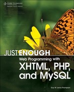
div.odd_borders { border-top-style: solid; border-bottom-style: dotted; }These can also be combined in a specific order (top, right, bottom, and left) into a single property setting:
div.odd_borders { border-style: solid solid dotted solid; }This is rendered in Figure 4.1.
As mentioned, these styles can be set in different places in an HTML document, and the notation changes slightly accordingly. There are:
Inline styles—. As a tag property
Internal styles—. Defined along with the
headof the documentExternal style sheets—. As separate documents
Like so many of the aspects of HTML and CSS, these are purely human conveniences. The rendering will be no different if you use an external style sheet or an inline style, but there are big implications for maintainability and updatability of the style information.
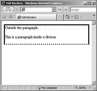
Inline styles are defined where the HTML is actually introduced, as if they are properties of the tag that they are creating a specialization of. For example, you can set a new kind of heading style with the following:
<html>
<head>Example Inline Styles</head>
<body>
<h1 style="text-decoration: underline overline; font-weight: bolder;">
Heading 1
</h1>
</body>
</html>
This code is rendered as in Figure 4.2.
The convenience of this is that specific style information can be attached to each element separately. It cannot, however, be easily changed in multiple places. If you want each heading to be defined as in the previous example, you would need to attach the appropriate style to each one, as evidenced in Figure 4.2.
This is the inconvenience of inline styles. A side effect is that you would need to recode all of the HTML pages to change the style, say to change the text color or remove the overline. This might be massively time-consuming.
Part of this can be mitigated if a server side script is being used to generate the HTML and inline styles. However, if the style data is to be generated by a server side script, it will still be a lot of work to change both the content generation and the style generation because it is intertwined in the code. You’ll look at this in more detail in Chapter 6.
A better approach, if you want to use styles that are local to a specific document, is to put the style data in a single place in the file, using an internal style sheet.
Internal style sheets are defined in the <head> section of the document, along with elements like the <title> and <meta> tags. Scripts also go in here, as you’ll see in Chapter 5, so it is a good place to embed some specific style information.
The style sheets are embedded inside a special style tag that is part of the <head> section, and has a property that defines the type of style sheet that is being used. For example:
<head>
  <title>Example Style Placement</title>

  <style type="text/css">
    <!—style statements here—>
  </style>
</head>
<body>
  <!—page content here—>
</body>
The disadvantage with this approach is that if the page is to be generated by a server, you again need to provide code to write the style information as well. At least, using this approach, you only need to change the code that generates the <head> section and the style with it. All the style information is in one place and applied to the document in question.
This might not be convenient, though, especially if you have multiple pages with similar style information (you need to generate the style for each one, wasting bandwidth), or if you want to be able to use the same specialized classes, but with different styles, depending on the circumstances.
To do this, you need to use external style sheets.
External style sheets are defined in a file that is external to the HTML page itself, but that is referenced from the HTML document via a special kind of tag in the <head> called <link>.
<link href="mystyle.css" rel="stylesheet" type="text/css" />
Without going into too much detail, the href simply gives the URI for the style sheet—a location—just like you do with images, other Web pages, and so on in regular HTML objects. The URI contains the location of the style sheet, expressed here as being in the same location as the Web page.
However, as you’ll see in the CMS chapter (Chapter 8), many systems group style information in specific places. So, you might equally well end up with URIs such as:
href="http://myserver.com/cms/styles/default/blue.css"
The rel gives the relationship between the page and the resource, in this case a style to be applied to the HTML document that contains the link. The type, as before, tells the browser that the file contains text of the CSS language.
The external style sheet file itself (with the .css extension), with no preamble, can go straight into the style data. It is just a plain text file that begins with the first style and ends with the last one. It can contain comments, too, just like in HTML.
Firstly, a quick reminder about how properties are set in styles. They can be done explicitly, property by property, for example:
tag.class { property: value } i.e. h1.inverted { color: white; }They can also be set in a shorthand, by compiling a list of multiple property settings, attached to a single named property. There are two types of this kind of named property.
The first is for setting multiple properties for a tag or class, the second is for setting properties across common components, like the sides of a box that has a border. So, you can set all the borders to be dotted, red, of width 10 pixels in a single statement:
div.dotted_borders { border: 10px dotted red; }This example groups style statements and applies them to multiple elements. The properties need to be given in the correct order, although if you miss one, the browser will figure it out and render the result appropriately. Of course, if an invalid value is used, and the browser cannot decide what it represents, and the results will vary.
It is also possible to group style information and apply it so a single element that makes up a collection. So, you can apply the shorthand style to a single border, with the following:
div.dotted_sidebar { border-left: 10px dotted red; }This is shorthand for:
div.dotted_sidebar {
  border-left-width: 10px;
  border-left-style: dotted;
  border-left-color: red;
   }
With this in mind, let’s now look at some different kinds of properties.
Most of the following needs to be understood with respect to the viewport—the bit of the document currently visible—and how it relates to the document. In essence, the viewport is like a window on the document: different browsers display different parts of the document in the viewport.
This is because different users have different screen resolutions, or different browser window sizes. Toolbars, for example, encroach on the available screen real estate for the document to be displayed in. So, the bottom of a document that coincides with the bottom of the viewport on one platform might not share that relationship with other users’ platforms.
In order to help get around these differences, different kinds of positioning modes are permitted.
First, there is absolute positioning, which allows an element to be placed on the document surface (canvas) at a precise location. This location is an offset from the elements containing block. So, if the containing block has a left edge that is 50 pixels from the left side of the screen, and you define a new block with a left edge of 50 pixels, it will end up 100 pixels from the left side.
A containing block is just a block level container, such as a <div>, which can be positioned. Spanning tags such as <span> cannot be accurately positioned in this way as they are not block level.
The following properties are allowed:
|
|
|
|
These can be specified as either percentages or pixel values, depending on the way that the content author chooses to lay out the document. If a percentage is used, it is with reference to the containing block.
Within the category of absolute positioning, fixed positioning does not allow the item to move when the page is scrolled; it becomes fixed at the absolute point that it has been set with reference to the viewport. Anything that is behind the fixed items can be scrolled as normal using the scroll bar, but the fixed items will remain fixed in their places.
Caution
Internet Explorer 7 handles absolute and fixed positioning in the same way, and does not fix them to the viewport as defined by the CSS2 standard. Firefox, however, interprets fixed as being fixed to the viewport, and absolute as being absolute with reference to the document itself.
In both cases, content that extends beyond the specific height of the box will cause it to extend itself, unless fixed is specified. Naturally, this only works for Firefox, as IE seems to ignore the fixed value.
To be cross-browser compatible, it is wise only to use absolute positioning, based on the flow of the document. To define fixed items, you can use client side scripting instead.
To specify an absolute position for a box, for example, you might find a style:
div.inside_box {
    position: absolute;
    border-top: 1px dotted black;
    text-align: center;
    width: 100px;
    height: 100px;
    top:100px;
    right: 0;
    bottom: 0;
    left: 25px;
    background-color: white;
     }
The result of this is Figure 4.3.
The alternative is relative positioning, which is the default. Position information supplied is considered to be an offset from the containing block, so if a value of 10px is supplied for the left property of a contained paragraph, the paragraph will be offset by 10 pixels from the left side of the containing block.
When positioning is used, quite often you will find that the text “underneath” does not quite flow around the objects that you position. This can be changed using floating positioning, which useful because it specifies a box (image, division, and so on) that is shifted to the left or right of the current line and allows text to flow around it using the float property.
For example, suppose that two styles are defined:
div.outer_div {
  width:200px;
  background-color:gray;

  color:white;
  }
p.floating_para {
  float:right;
  width:50px;
  border:2 dotted white;
  text-align:right;
  background-color:silver;
}
In the floating_para, the float: property has been set to right. This style information was used to create the layout shown in Figure 4.4.
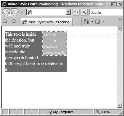
In Figure 4.4, no matter the size of the viewport, the text will always be made to flow around the paragraph. This is useful for resource boxes, or sidebars containing additional, separate, but related information. They can be further separated from the flow of text using margins, padding, and borders.
All block level elements have a margin, which gives the offset of the content of the containing block from the outside edge of the inner block. This applies equally to divisions, paragraphs, table cells, and so on, which all contain content inside a formatting box.
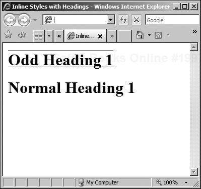
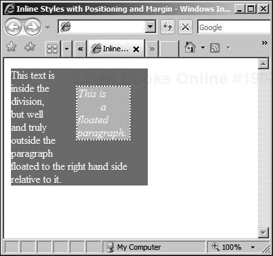
Another way to look at it is that a margin is outside of the block to which it applies. For example, if you redefine the floating paragraph from the previous example as:
p.floating_para {
    float:right;
    width:50px;
    border:2 dotted white;
    text-align:right;
    background-color:silver;
    margin: 25px;
  }
This yields the result in Figure 4.5 that you can compare with Figure 4.4; the top-rightmost edge of the floating paragraph is offset by 25 pixels from the outer edge of the containing division.
Margins can be set explicitly—margin-left/right/top/bottom—but also as a group margin, as in the previous example. If you wanted to get rid of the outer margin, leaving only a gap between the left and bottom edges, you would use:
margin-left: 25px;
 margin-bottom: 25px;
To create a gap around the inside of the paragraph, you need to use padding.
Padding is applied inside the block, in the same way that a margin is applied around the outside. Again, this effect applies equally well to all kinds of block level elements, this time creating a gap around the inside of the bounding box. For example, you could add padding to any of the previous examples:
div.outer_div {
    width:200px;
    background-color:gray;
    color:white;
    padding: 5px;
    }
  p.floating_para {
    float:right;
    width:50px;
    border:2 dotted white;
    text-align:right;
    background-color:silver;

    margin: 5px;
    padding: 5px;
 }
The two padding properties keep the text away from the edge, but do not create gaps between the content and any inner floating blocks of content. Hence, to retain the gap around the floating paragraph, you need to retain the margin. The result is as shown in Figure 4.6.

Like margins, padding can be set explicitly—padding-left/right/top/bottom—or as a group, as in the code that produced Figure 4.6. Note that I have added padding to both the division (outer_div) as well as to the floating paragraph.
One feature of the floating paragraph is the border, something not yet covered.
The preceding examples have used a border to show you the effect of the formatting. For example, there is a dotted border around the floating paragraph in Figures 4.4 to 4.6, to separate it from the content inside the outer division block. The border is, by default, positioned between the margin and the padding (if there is any of either specified).
As with other box-based parameters, borders can be set explicitly or as a group, as you have seen on previous occasions. There are three basic parameters that each border can be set with:
Width—. The width, in pixels, percentage, or relative measurement
Style—. For example, solid, dotted, and so on
Color—. The color
You’ll look at the actual values later, in the short reference, because there are many settings that can be applied. There are three ways that the parameters can be specified. You can group a border by edge, for example:
border-top: width style color;
The parameters can be grouped for all edges, by property, for example:
border-width: width;
border-style: solid;
border-color: red;
Finally, they can be set explicitly for a specific edge-property combination, for example:
border-top-width: 5px;
border-bottom-style: dotted;
border-right-color: blue;
border-left: 10px solid red;
Adding this to the floating paragraph in place of the existing border code yields the output shown in Figure 4.7.
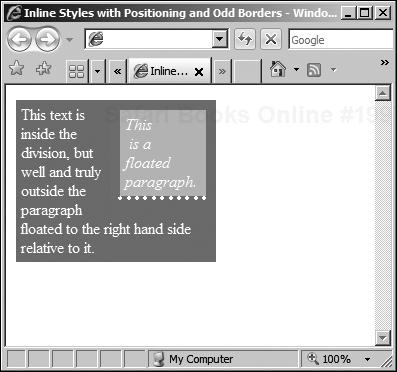
You will note that (although you cannot see the colors) the style information for the top and right borders has not been applied. This is because there is style information missing. This is a good lesson to learn—it is better to over-specify the styles so that all possible parameters are covered and not rely on any automatic handling on the part of the browser.
So far, all of the examples have concentrated on elements that have a specific place in the document model (tree). Style information is then attached to them on the basis of their named occurrence or the default class attached to them.
However, there are some elements that do not fall into this framework, or do not have specific default classes attached to them. For example, actions such as hovering over or clicking on a link can be applied to multiple elements, and their style information is contained within pseudo-classes.
CSS allows you to create pseudo-classes of properties, and pseudo-elements to give you objects to refer to, for those things that are not included within the basic document model or are not explicit properties or elements under the HTML element definition.
This is quite advanced use of CSS, but can be very powerful, and is mentioned here because that power can be useful. It is better to know about and have to refer back to it rather than try to remember all of the techniques. There are some pseudo-classes that you will use quite often and others that you will never see again.
These pseudo-classes are attached to any anchor (that is, an href) that refers to a resource that can be clicked to from the document. A URL that points to another HTML page, for example, has some properties that are part of the link pseudo-class.
Typically, these are underlined and colored in blue or purple, depending on whether the link has been visited. The colors that are applied are potentially browser-dependent, but the standard appears to be blue, underlined, and purple, also underlined.
The browser will reset the color after a period of time, as the link moves from being recently visited to just another link. Now, the color and decoration is applied as a style that can be manipulated using style information.
To change the link and visited link, for colors and decoration that are different from the default, style information such as the following could be used:
a:link { color: green; }
a:visited { text-decoration:overline; }
This changes the color to green and adjusts the decoration, but all other text-formatting properties (see the section entitled “CSS Objects and Properties Short Reference” that follows) can also be used. Also, certain box formatting such as borders and backgrounds can also be applied.
However, these are more commonly used with the dynamic pseudo-classes that are activated as a result of interacting with the mouse. Dynamic pseudo-classes work in much the same way as the link pseudo-class.
When the mouse pointer moves into range of a clickable element (link, button, and so on), it generates a dynamic event that can be trapped. There are three such events, each of which is mapped to a dynamic pseudo-class. The three events are:
Hover: When the mouse is over an item
Active: When the user clicks the button, but before it is released
Focus: When the element can accept keyboard input
So, to change the background color, when a user hovers over a link, for example, code such as the following could be used:
a:hover { background: gray; }When the user clicks the item, it is activated, and the resulting style can be changed with code such as the following:
a:active { color: white; }Finally, for those elements that accept input from the keyboard, such as tabbed over links and form controls, their style can be changed with code such as:
a:focus { border: 1 dotted red; }The properties that can be changed will differ from one element to another. Form elements such as buttons, for example, may have different formatting possibilities that lead to different style options.
Finally, there are elements that have no corresponding tag in HTML. In other words, they might be contained within a tag or just be outside the document model. They are, however, quite browser-dependent, and so I will cover only two of them here.
The two pseudo-elements that I do cover, as they are interpreted in the same way under Internet Explorer and Firefox, are:
The first line of a block (
div,p, and so on)The first letter of an inline or block element (
span,block,p, and so on)
Note that the first line might not be as long or short as you think, depending on the way that the users have positioned and sized their browsers. It is possible to make sure (using specific font sizes in points and bounding boxes in pixels) that the text takes the same space on every platform, but often this is not desirable.
In such cases, the browser will break the line according to the space available and the formatting options (margins, padding, and so on) that are applied at the time that the line is rendered. Without using precise measurements in the styles, the only way to guarantee that the line meets your needs is to include a <br /> tag.
(This might have other undesirable effects, such as a too-short first line, so it is better to leave the line break decision to the browser.)
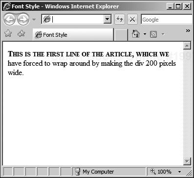
Bearing these caveats in mind, the first-line and first-letter pseudo-elements can be used to set formatting styles and are quite useful. If the first letter of each work of the first line of a block should be in uppercase (for example), you can use:
div.article:first-line { text-transform: capitalize; }If you assume that the very first letter should be given extra importance, you can add the following:
div.article:first-letter { font-size: 14pt; }Sometimes, you will need to add other properties to make the text flow better, which is where having better (more precise) control over the box formatting comes into play. For example, you can use the following:
div { width: 150px; margin:10px;}
div:first-line { text-transform: uppercase; }
div:first-letter { font-size: 200%; float:left; }
This gives the result in Figure 4.8.
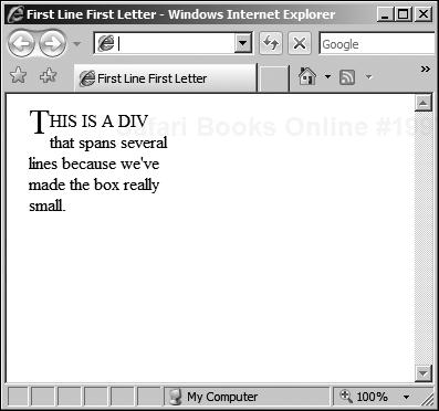
Without the float specified in the division, the effect is not quite the same, and you might like to experiment with different floats for the first letter to see how the text flows around it with different settings of float.
This section contains a rundown of the most useful combinations of objects and properties that can be defined in HTML with CSS. Not every possible combination of tag and style is covered, because this would be inappropriate for those trying to obtain a working knowledge of the topic.
It is therefore not designed to replace the W3C official appendix to HTML CSS (Appendix F: http://www.w3.org/TR/1998/REC-CSS2-19980512/propidx.html) but it is a useful application of some of the objects and properties.
In essence, this chapter provides an overview of the most common uses for HTML and CSS, and those sticking rigidly to “Just Enough” principles will find that it suites their needs perfectly. There is no extraneous detail, just the most commonly used objects and styles.
Background properties can be used with practically any element, from divisions and table cells to the document body itself. It is most useful with the body itself, as well as tables and divisions, to set the background color or possibly to add an image.
The background color can be set with styles such as:
background-color : red;
background-color : #f00;
background-color : #ff0000;
So, to set the background for a division, code such as the following can be used:
div.warning_text {
  background-color: red;
   }
It is also possible to specify a background image, using an URI to point to the image on the server, with code such as:
background-image: url("http://www.server.com/myimage.jpg")The image will scroll with the rest of the content, but it can be fixed to the viewport by specifying fixed as a value for the background-attachment property. For example:
body {
  background-image: url("http://www.server.com/myimage.jpg");
  background-attachment : fixed;
}
If the image is smaller than the allotted space (canvas), it is also possible to make it repeat to cover the available space. This is known as tiling, and is typically performed by the browser by starting in the center of the horizontal or vertical axis and repeating the image from the center out towards the edges.
The background-repeat property is used to set this behavior. There are four possible settings, from which one may be chosen:
background-repeat : repeat repeat-x repeat-y no-repeat
If repeat is specified, the image is tiled throughout the background, starting from the center of the background. If repeat-x or repeat-y is specified, the image is repeated in either the horizontal or vertical axis, working from the inside out.
Box formatting styles generally contain properties for individual borders and styles as well as supporting grouping of properties and styles. For example, you can set the border color (or width, style, and so on) for the box using the appropriate selector with a named parameter:
div.warning_text {
   border-color: black;
   border-width: 2px;
   border-style: solid;
    }
On the other hand, you can also set specific border colors using one of two methods—first by using the specific edge-color property:
border-top-color: black;
The second method for setting a single color (or width, style, and so on) is through grouping values, such as:
border-color: black red blue white;
Remember that the order is important—top, right, bottom, left—so the previous example will assign black to the top border, red to the right border, blue to the bottom, and white to the left side. The last kind of property grouping can be used to set all the borders to specific width, color, and style using code such as:
border: 2px black dashed;
Like background settings, borders can be applied to many kinds of elements, including block and inline elements. They can be combined with the dynamic pseudo-classes, too, to provide additional visual clues and interactivity.
They are best used with the div tag to provide areas of the screen that are naturally separated into areas, as a way to highlight the different uses of each area. When used with absolute positioning, borders can make a page that has specific areas like navigation and advertising that are in appropriate places.
The width can be set as a number or as a relative size. The relative sizes include a predefined value (thin, medium, or thick) or a percentage. The relative sizes can be unreliable, so leave the choice of width to the user agent—be it a Web browser or something else.
However, for a Web browser, you should generally use pixel measurements for the best effect (they offer the most control), resorting to percentages when you are unsure as to the actual screen resolution of the user’s browser platform. The obvious advantage of using percentages is, of course, that they minimize the chance that a navigation or advertising pane will be in an area of the screen that must be scrolled to in order to make it visible.
So the border width can be set as a number:
| For a relative percentage |
| For a pixel value |
Or, it can be set as a predefined relative thickness:
border-width: thin;
The border color can be set using standard HTML named colors, or #RRGGBB values. These are identical to the colors and hexadecimal values discussed in Chapter 3 and follow the same rules.
There is also an additional possibility, the #RGB setting, which allows the designer to use single digit 0-F values which are then multiplied to fill the #RRGGBB hexadecimal values traditionally used. So, #FAB becomes #FFAABB, meaning that #FFF is white and #000 is black.
Therefore, the following are all equivalent:
border-color: blue;
border-color: #00f;
border-color: #0000ff;
The case of the color specifier does not matter. However, XHTML convention, based on XML, would suggest that lowercase is possibly the default choice for those working with XHTML, and that uppercase is normally used by those who have a background in HTML.
In addition to the width and color of the border, there are many styles that can be set. These are set with code such as:
<div style="border-style:groove; text-align: center;">
<p><b>Groove Border</b></p>
 </div>
This is a snippet from a longer piece that produced the image in Figure 4.9, showing the currently supported options (dotted, dashed, solid, double, groove, and ridge).
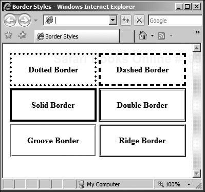
The borders in Figure 4.9 were set as inline styles as div element properties inside a borderless table (covered in Chapter 3). They could equally well have been set as table borders, with the additional caveat that this would have merged them, as all the cells share the same walls in a table.
So, the different types of borders can be set with statements such as:
<div style="border-style:dotted; text-align: center;">
The available styles—dotted, dashed, solid, double, groove, and ridge—can all be set per side or for the element as a whole (as in the example). As noted, they can be combined with the other elements and specified per side:
border-top: 2px double red;
And, each of the properties can be set individually, again either per side or for the whole element border at once. This gives very precise control over the styles, while also offering the possibility to create short forms of the style to set the properties quickly and easily.
Finally, blocks can have margins and padding, which can also be set side by side or applied to the whole block. Examples of this have been introduced already, but to recap, the margin is the distance from the outside formatting box to the border, and the padding is the distance from the border to the content inside the block.
Experimentation will often be your best guide to get the right look, especially because the margin and padding values add to the width of the element. The best way to think of this is to imagine that the width value specified is the width of the content and that the margins and padding then add to that measurement.
So, to specify a ten-pixel margin all around, you would use the following:
margin: 10px;
To specify only the top and bottom margins, you would use a style such as:
margin-top: 5px;
margin-bottom: 5px;
Padding might be inside the border, but otherwise works in the same way as margins, so you can specify the padding for the whole block level element as:
padding: 10px;
You can also set the individual padding side by side:
padding-top: 5px;
padding-bottom: 5px;
Typically, you use margins and padding with the body, div, and table elements as a way to lay out the page in conjunction with borders and shading.
Any text block or span can have its text and font properties set; this includes the div, p, table, and span elements. The font, color, spacing, decoration (underlining, for example), line height, weight (bold, for example), and alignment (center, right, and so on) can all be specified using styles.
In addition, href elements (like the <a href. . . tag) as well as others can also have their text style settings specified. This allows for specific colorization or customization of the font properties for different kinds of links (inline, menu, image, and so on) within a document, above and beyond those associated with the dynamic pseudo-classes mentioned in the “Pseudo-Classes” section.
The most basic setting is the only one that doesn’t have a text- or font- prefix, and is used to set the text color:
color: <name> or value
As before, and as with all color settings, you can use #RRGGBB, #RGB, or the accepted XHTML names. So, for example, the following are identical:
p.red_text { color: red; }
p.red_text { color: #F00; }
p.red_text { color: #ff0000; }
To change more than the color, you can assign values to properties in the same way as for other elements using style statements. The first of these is the font-style property, which allows you to select among the following:
font-style: normal, italic, or oblique
In most browsers, italic and oblique are rendered in the same way, as are the different weights that can be set with font-weight. This is clearly shown in Figure 4.10, which gives various styles and weights alongside normal text for comparison.
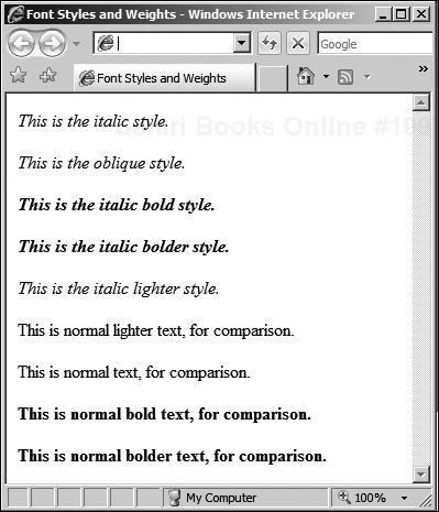
The weight is set with the following style statement:
font-weight: normal, bold, bolder, lighter
However, as Figure 4.10 shows, the only font style and weights that are rendered any differently tend to be italic, normal, and bold. This gives bold, italic, and bold italic text as the three principal variations to remember. In effect, these are equal to using the <b>, <i>, and <b><i> tag combinations.
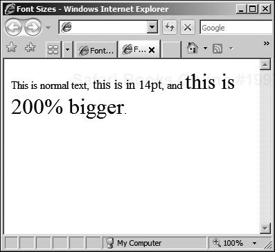
In addition, you can set the text (font) size, as a relative or actual value, using:
font-size: pt size or percentage
So, you could have style statements containing either of the following (which are not equivalent):
font-size: 14pt;
font-size: 200%:
The effect of these is shown in Figure 4.11.
In Figure 4.11, it would have been helpful also to set the line-height, which is generally used to ensure that in a mixed font block, the lines are the correct distance apart. For example, if a paragraph consists of text in several sizes, a line containing a smaller size only will be spaced with reference to that text size.
To make sure that all the lines are spaced with reference to the largest font used in the entire paragraph, and not space each line according to the size of the text contained within, you must set the line-height property:
line-height: pt size, multiplier or percentage
The pt size is the size in points. The multiplier is a simple number, and, like the percentage, is calculated with reference to the font size of the element to which the style property is being set. The following are equivalent:
<div style="line-height: 1.2; font-size: 12pt;">
<div style="line-height: 120%; font-size: 12pt;">
<div style="line-height: 14pt; font-size: 12pt;">
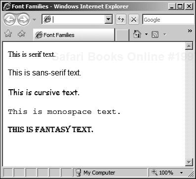
The next style property you’ll read about is the font-family, and is possibly the most complex to remember and apply. The basic generic form is quite simple:
font-family: name
or
generic name
Using this form, you can identify an exact font, with a generic alternative:
font-family: Times New Roman, serif;
This first example would choose an appropriate serif styled font, if Times New Roman were not available on the system in question. This is important, because not all platforms will have all font styles available, and to avoid viewers having to download custom fonts, it is better to stick with well-known font families, backed up with “best guess” generic system fonts.
The generic families are:
Serif—. Times New Roman, Garamond, and so on
Sans-serif—. Arial, Verdana, and so on
Cursive—. Script, Corsiva, and so on
Fantasy—. Anything goes. . .
Monospace—. Courier New and so on
These are all shown in Figure 4.12.
Note that you should always try to provide explicit guidance with the real name and the generic family as a fallback to help the system choose the right font. It is inadvisable to specify only the specific font name unless you are certain that all systems support the font in question. If the exact family is not important, stick to the generic families.
The font property can also be specified as a compound property statement:
font: style + variant + weight + size + line-height + family
So, you could set a font as:
div.article:first-line {
   font: normal small-caps bold 12pt
   14pt Times New Roman, serif;
    }
The result of this code is shown in Figure 4.13.
I have not really discussed the variant setting in any great detail, because there are only two settings—normal and small-caps. The small-caps setting is as in the first line of Figure 4.13 (which is also in bold).
There are also possibilities to exclude certain items, but it is better to set them explicitly rather than try to create a minimum compound property setting. One property that cannot be combined is the decoration property, which allows you to add additional formatting:
text-decoration: underline, overline, line-through, none
These can be combined with any of the other formatting properties, of course, so you can, for example, indicate changed text by striking it through and making it blue (for example) with:
div.changed_text {
   text-decoration: line-through;
   color: blue;
    }
Any block level element can also have its text alignment set with:
text-align: left, right, center, justify
Single line elements like h1 can also be set with the text-align property, but for some inline elements it makes no sense. Because the rest of the rendered block will not be affected, browsers may not implement this uniformly. The values for text-align work as you expect, save that the justify value does not always create a justified text block. It is platform-dependent and best avoided.
In addition, the indent can be set using a number (in pixels) or a percentage with:
text-indent: number
or
percentage
Finally, you can apply transformations to blocks or inline elements:
text-transform: uppercase, capitalize, lowercase
The uppercase option sets every letter to uppercase, whereas capitalize just sets the first letter of each word to uppercase. The lowercase option forces lowercase.
Lists are quite specific, because they have many options that can be set, including all the various text and font settings. For example, they can have various bullet types, borders, backgrounds, and layouts, as well as many variations of counted lists, including special character sets and numbering schemes.
If block level formatting is used, care has to be taken, as the first property you see shows. The list-style-position indicates where the bullets (or numbers, letters, and so on) should be placed in relation to the list item text and formatting box. It is specified as follows:
list-style-position: inside, outside
If inside is set, the list bullets are contained inside the formatting rectangle; if outside is set, the formatting affects only the text and not the bullets themselves. This is best illustrated with an example, as in Figure 4.14.
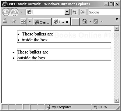
The code for the Figure 4.14 is as follows:
<ul style="list-style-position: inside;border: 1px solid black;">
  <li>These bullets are</li>
  <li>inside the box</li>
</ul>
<ul style="list-style-position: outside;border: 1px solid black;">
  <li>These bullets are</li>
  <li>outside the box</li>
</ul>
You will note from Figure 4.14 that the border in the outside list runs between the text content of the items and the bullets. The style of the bullets can be set with the list-style-type property, which has different variations depending on whether you are using an ordered or unordered list (<ul> or <ol>).
For unordered lists, there are three main variations:
list-style-type: disc, circle, square
These are little discs, circles, or squares, and are rendered according to the whim of the browser creator. For ordered lists, there is a choice between several possible styles:
list-style-type: decimal, alpha, roman
These are shown in Figure 4.15.
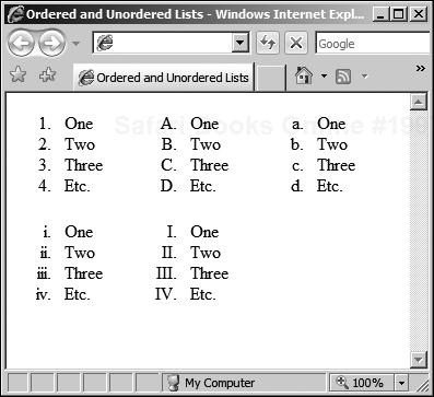
The decimal style can be seen in the top-left and is just a numerical scheme. The alpha style must be used in conjunction with the word lower- or upper-, indicating the case of the alphabetical scheme used. These can be seen in Figure 4.15.
Similarly, the roman variant must be used in conjunction with an upper- or lower- prefix, and examples of these can be seen in the second row of lists in Figure 4.15. There may be other fonts and systems supported, but because they are not guaranteed between platforms, it is wise to stick with the more common variations.
It is also possible to specify an image using the following statement:
list-style-image: url(http://mydomain.com/image_file.png)
This is useful if you need control over the images used for the bullets, and the browser will lay out the list with respect to the image size. Finally, you can group these into a single compound statement:
list-style: type + position + image
This code might be useful when the image may not be available, as it allows you to specify the type as well as the image. That way, if the image cannot be found, the browser can substitute a suitable bullet type. For example:
<ul style="list-style: disc inside url (http://domain.com/image/image_file.jpg;">
Of course, ordered lists are not particularly useful when you specify the image variation, because the numbers will be overwritten.
The HTML defines where the content should be in the layout, as well as the actual content itself. It gives the general look and feel of the document without being specific about the details. A browser can render the page in absence of any style information, because the actual page is defined using standard HTML tags that are well understood.
So, styles do not generally add new tags to the HTML set, they just give you a way to customize the default behavior of the browser in rendering them, as well as giving you precise control over the positioning of individual elements. These styles can be placed inside the page or as separate documents.
It is a good idea to abstract the styles into named extensions (classes) of existing tags so as not to include the style information inline. This has many advantages, such as being able to update the styles in all pages that link to the style sheet rather than having to edit each one individually.
The visual formatting model is based on discrete pixel measurements, or percentages of available space. This is known as the box formatting model and allows block level elements (and some inline elements) to have borders, backgrounds, padding, and margins.
The flow of the content around the page is then defined by the measurements given by the designer in either absolute or relative terms. Absolute positioning allows the designer to give the precise location for elements, whereas relative positioning uses a parent-child relationship to determine the layout of elements that are contained inside other (block-level) elements.