
HTML is the language of the World Wide Web. It is the basis for all the content that you see, hear, and interact with on Web pages. The language itself gives the producer the ability to define the look and feel of the content (layout and presentation) as well as the actual content—text and multimedia—itself.
Without HTML, all you would be able to exchange on the Internet would be the individual content pieces themselves. This is quite adequate if all you need to do is read plain text, look at a picture, or watch a video in isolation, but not sufficient if you want to be able to navigate, search, and interact with the Web pages.
HTML is based on a standard called XML, which allows you to define your own content delivery specifications. In short, HTML is an application of XML, but formally, the new standard of the Web is XHTML. XHTML is a formal redefinition of HTML under XML.
This makes the HTML code easier to validate, as it adheres more closely to the XML standard for data exchange. You will learn, in due course, how to form an HTML document correctly so that it adheres to the XML standard (XHTML) to make your Web applications as future proof as possible.
You will learn about the Document Model, how the parts relate to each other, and what each section is nominally for. HTML breaks each page down into a set of parts, each with their own function, and it is vital to know what goes where.
You will also learn about the relevant HTML tags that you will use most frequently for formatting content. It is important to understand them before you learn about styles, because the attributes that the tags have can all be changed using style information. If you do not know what attributes can be used with each tag, and what effect they have, it is difficult to apply styles.
HTML can be used without styles, especially if it is generated, but the addition of style sheets in Chapter 4 makes the dynamic presentation of content easier. This chapter will also be useful as a reference in its own right once you start building pages of your own.
Although it was designed to be easy to deploy, the HTML tag collection is large, and it is unlikely that you will be able to remember all the tags at a single sitting. Over time, of course, you will gain experience that will allow you to both hand-create HTML documents as well as techniques to enable you to build HTML documents using scripts.
When people want to refer to the collection of elements that make up a Web page, they refer to them in terms of the Document Model. Of course, this term means much more than just a Web page—it is the core technology behind sharing information using standards such as XML and computer programs.
As far as this chapter is concerned, the HTML Document Model consists of layered containers:
The physical HTML document (or file)
The document information (title, keywords, and so on)
The layout information (formatting and presentation)
The content items (text, hyperlinks, videos, pictures, add-ins, and so on)
The physical file contains the plain text that makes up the HTML logical document. Inside that, there is document information that tells the browser more about the actual HTML (including the version and character set), as well as the title of the document, usually displayed in the title bar of the browser.
Also inside the logical HTML file there is the layout information and content, collectively also known as the body of the document. The content can be contained inside tags (formatting or layout), and tags can contain tags (nesting).
Before you look at a document, you need to know how to construct the basic unit of definition used in XML and HTML—the tag. The basic usage, all you need right now, is as follows:
<tag_name>Content inside tag</tag_name>
You almost always need a start and end tag (the end tag being the one that has the tag name preceded by a forward slash, /), and whatever is in between is considered to be the target to be modified by the tag. Tags are always (in HTML, XML, and XHTML) contained within chevrons (< and >).
Bearing this in mind, let’s look at how an HTML document is constructed.
An HTML document consists of three parts:
Definition section
The
HEADThe
BODY
In the Definition section, which you’ll read about in a moment, you put information that has nothing to do with the content to be passed to the browser, but defines that content. It is outside of the HTML section, which contains the HEAD and BODY.
In the HEAD section you put all the content that is information to the browser (W3C calls this the user agent), but which is not intended to be displayed to the end user. In the BODY section, you place all the content that is designed to be rendered.
Outside of the HEAD, and something that many Web creators leave out, is the aforementioned Definition section. In this, you tell the browser what version of HTML you’re using:
<!DOCTYPE HTML PUBLIC "-//W3C//DTD HTML 4.01 Transitional//EN"
   "http://www.w3.org/TR/html4/loose.dtd">
The DOCTYPE in this case is HTML 4.01 Transitional. This is allowable under W3C guidelines, but includes some features that have been replaced by style sheets. In essence, if you are creating a document that doesn’t use style sheets, Transitional offers some features for controlling attributes that the strict version of HTML 4.01 doesn’t.
(Each document that the server serves that follows the standard ought to have a DOCTYPE—named types exist for all flavors of HTML and XML, for example. If a proprietary standard were to be used to transmit information, the DOCTYPE could be used to tell the user agent what kind of information to expect.)
Although with experience you will work out which to use between the two, the examples for now stick with Transitional, because it gives you better control over the tags that you want to deploy. As long as you include the DOCTYPE information, along with the reference to the Document Type Definition (DTD) file, the browser knows where to find the exact definition of the version you are using.
The Strict DOCTYPE statement looks like this:
<!DOCTYPE HTML PUBLIC "-//W3C//DTD HTML 4.01//EN"
   "http://www.w3.org/TR/html4/strict.dtd">
The changes have been placed in bold text to set them apart. It might look complex, but all you really need to do is copy the text for the Transitional DOCTYPE into a text file and copy and paste it into future HTML projects.
The remainder of the document framework then looks like this:
<HTML>

  <HEAD>
  </HEAD>

  <BODY>
  </BODY>

</HTML>
Again, you might find this a bit alien at first, but all you really have here is a container HTML with a HEAD and BODY container inside it. Again, copy it to the text file, which is going to be your HTML skeleton file, underneath the DOCTYPE, and keep it handy.
These stay more or less static for every page. The first section that you’ll learn to customize with each different Web page is the HEAD.
The TITLE tag contains the title of the page, which is usually displayed in the title bar of the browser. Figure 3.1 shows the W3C HTML 4.01 page.

The title appears, in this case, next to the Internet Explorer icon in the title bar and is followed by the application name (Windows Internet Explorer). The HTML source for this would be:
<TITLE>HTML 4.01 Specification</TITLE>
This is another tag that you can store in the skeleton file that you are building, and should be inserted in the HEAD section. You will need to change the actual content, of course, to match your own page content.
Another set of tags that can be present in the HEAD section are known as meta tags. These tags contain information that might not be relevant to a browser, but that could be relevant to another user agent application. The most common example, and the one that I’ll use to illustrate the use of meta tags, is in SEO (Search Engine Optimization).
You read in the previous chapter that search engines power the Web. Without them, your page will never be found. But, you can tell a search engine to index a page and give it some help in categorizing the information you’re providing.
Meta tags provide one way to do this and are often used by search engines and other information broker applications to construct an entry in their database that can be displayed to the users. For search engines, you want to include a meta tag with keywords, for indexing purposes, and a meta tag with a description of the page, to display to the end users.
The SEO (search engine optimization) meta tags for a page about this book might look like this:
<META NAME="keywords" CONTENT="HTML, book, tutorial" >
<META NAME="description" CONTENT="Just Enough Web Programming, a book about. . .">
You will note that the META tag, unlike the other tags you have met so far, does not have an end tag. This is because all the information that you need is contained within the tag, in something called attributes. The NAME is one attribute and CONTENT is another. You will look at these in more detail when you come to the short reference section.
Of course, here again, you will need to copy these tags to your skeleton text file, for later use. Feel free to split the tag definition across multiple lines—the browser will not mind, or indeed notice any whitespace, which is part of the XML flexibility.
Tip
If you want to test out your file, copy it to a new name and add the extension .html. So, if your skeleton file was called html-skel.txt now, it should be called new-html-skel.html, thereby preserving the original. You can now open the .html file in your browser.
The final item that you might put in the HEAD of the document is a section containing any client side scripts that are needed for the page. Now, these can also be put in the BODY of the document, but Web programmers tend to collect any common functionality in the HEAD section for clarity.
You will see this in action in Chapter 5, when you look at client side programming. For now, let’s look at the BODY of the HTML document in more detail.
The BODY is where you place the actual content that you want the browser to render, along with the mark-up that determines what it will look like. The content might be rendered as it is read, or the browser might read the whole page in and then render it.
This makes a difference, because if the browser does not intend to wait before rendering the page, it has no way of knowing what the final layout will look like. This means that, from the point of view of the content producer, you need to make sure that you give the browser enough information.
For example, browsers typically render images last, because they need to be downloaded separately. So, if you do not tell the browser what dimensions the images are, it cannot arrange the content appropriately. The more information about content you can give the browser up front, within the confines of HTML, the better.
Part of this information includes the logical layout, of which the default unit is the paragraph. Each block of text should be contained between paragraph tags that delimit the block. Within each paragraph, you can introduce tags that modify the style of the text. So, you contain the text between <P> and </P> tags, denoting the start and end of a paragraph.
This is achieved with specific tags (such as <B> for bold) or by using the SPAN tag, which allows you to name an inline block of text and apply discrete style attributes to the text. The SPAN tag may not cross paragraphs, nor contain them.
If you want to do that, paragraphs can be entirely contained (one or more of them, in fact) within a DIV (or division). Similar to the SPAN tag, the DIV tag lets you apply both a name and a collection of attributes to format the text (and paragraphs) more precisely than with individual style tags.
The next section looks at these style elements in more detail.
There are many style elements in HTML. You have come across two in the preceding section—SPAN and DIV—that offer a way to change both the flow and the appearance of the content that they contain.
HTML also offers nested headings to give titles varying levels of importance. These headings can be specified in a hierarchy from one to seven, with one being the most important. The HTML designer should not try to circumvent the strict hierarchy; if text is to be given a specific visual aspect to set it apart, but is not a heading, a heading tag should not be used.
Instead, you must find a way to set the text apart using other visual style formatting. Similarly, headings must not be skipped; otherwise, future browsers or other user agents may have problems parsing the HTML code and rendering the page.
If you need to create collections of items, line by line, HTML offers two kinds of lists. A numbered list, for example, allows you to list items with a number in front of them. The numbering is automatic, so there is no need to worry if you want to add items at a later date. The accompanying list, without numbers, is an unnumbered list.
HTML also provides ways in which tables can be constructed, complete with headings in a separate style, and the possibility to add borders. Besides using tables to arrange collections of data, you can also use them to lay out the page.
A common use for tables is to set all the content in a single table, with a left column for the menu, and a right column for related content, advertising, or product sales. The middle column contains the content proper.
The remaining style elements fall into the text-formatting category. These range from simple bold and italic text to decorations such as underlining. They do not generally allow you to change the behavior through the use of attributes, so they are designed to be used for very discrete textual effects.
If you need more flexibility, HTML allows the possibility to manipulate fonts—changing the style (face), as well as the size and color. With the advent of style sheets, the specific font handling tags have become deprecated, but you still have the possibility to use them, and they can be easier in many cases to deploy than style sheets.
The power of the Web, of course, is in being able to link content together. Whether it is a page, an image, a video, a sound, or a zip file containing a software release, hyperlinking is a vital part of the HTML standard.
Besides links to resources (covered next), you will encounter two kinds of reference within an HTML page. These are called anchors:
Internal anchors
External anchors
An internal anchor is a reference within the current document—you can, for example, specify a table of contents at the top of a page, and allow the users to click each one and be directed to a different part of the page. If you want this reference point to be accessible from another document, you need to refer to it using an external anchor.
Calling these requires that you construct something called a URL.
A URL (Uniform Resource Location or, sometimes, Uniform Resource Locator, depending on who you talk to) consists of:
<protocol>://<location>[/path_to/resource.type]
So, for example, you could create an URL that points to a simple Website:
http://www.w3c.org
However, you could create one that points to a specific page:
http://www.w3c.org/TR/html401/index.html
HTML gives you a variety of ways to introduce these into your pages, all of which are covered in the HTML Short Reference section. You need to remember, however, that the http:// protocol is only one of a collection. You could equally have:
| FTP file download (usually done in the browser) |
| Shorthand for “please open my mail application and start an email” |
| Command-line remote Internet services |
No doubt in the future there will be more protocols to contend with, but for now these are the four (along with http://) principal ones.
(Systems programmers will also be aware that you can define your own protocols and register them in the operating system or Web server configuration, but most readers will never have cause to do this!)
The principal way in which a page offers interactivity to the end user is through clickable images (maps) or forms. The HTML Short Reference contains the actual HTML tags and appropriate codes.
A clickable image simply allows the users to click on a part of it and be directed to a new resource. It can also trigger a script, which should be reasonably transparent to the end users. The image can be part of a form.
The form offers, as you have seen, text entry areas, buttons, and other user interface elements. It is usually posted to the server, as discussed in the preceding chapter, but it can also be processed locally if the data is not designed to be relayed to the server, and the result displayed in the browser using client side scripting.
HTML 4.01 is the current standard for Web documents. It is not the most recent incarnation of HTML; the W3C actually suggests that you adopt the XHTML standard as soon as possible. However, well formed HTML 4.01 is compatible with the XHTML standard, and is well understood by content producers and Web application developers alike.
It is also likely to remain usable by browsers for the foreseeable future, largely due to its stability and wide acceptance. It is also very helpful, even if you are going to develop content in XHTML, to understand the way HTML is constructed, as most of the principles carry through.
Before looking at the actual tags that will enable you to create marked-up content, you need a grounding in the basics, as well as some of the rules for using the tags in practice.
You should be aware that some of the usage that is referred to here is what the W3C calls deprecated. Deprecated usage includes things that remain in the standard, but which have been superseded by other, more recent, innovations.
Using deprecated HTML carries a very minimal risk that the content will not be correctly rendered in the years to come. However, following the principle that the content is designed to be around for a given period of time, and also taking into account the fact that browsers will try to remain as backward compatible as possible, for commercial reasons, I am quite content to include deprecated usage where such is useful.
Deprecated usage is pointed out as it is encountered, and the advised replacement, as offered by the W3C, is given. Often, items become deprecated with the addition of style information, which is covered in Chapter 4. This is, despite the stance of the W3C, often taken as a separate topic, and I have also adopted that approach.
So, the following gives perfectly valid HTML 4.01; however, if you are building more than a couple of static pages, it is advised to take this as introductory matter, and use inline styles and style sheets instead of some of the deprecated usage mentioned here.
The syntax of HTML is very easy; each element consists of a tag, possibly some attributes, bracketing the content that the tag is designed to alter. Anything in the document that is between chevrons (< and >) is considered to be an HTML tag, and will be evaluated as such.
It need not even be correct; the robust parsing of most browsers will just ignore tags that are invalid or improperly formed. This is a double-edged sword, of course, as it can mask poorly formed HTML as well as providing for unofficial extensions.
One set of tags that needs special mention is for inserting comments into the HTML. Comments are things that are intended for the human reader, and not the browser. It’s a good habit to get into: making sure that the comments that you write into the HTML give a clear indication of the intent of the code.
For example, you might implement a page as a table with three columns. At the start of each column, you might want to place a piece of text that indicates what the column is for: Menu, Content, Averts, and so on.
So, the HTML comment for a menu might look like this:
<!--This is the Menu Bar-->
The starting tag <!-- indicates to the browser that the following text is a comment and can be ignored. The closing tag --> marks the end of the comment. This technique is equally useful for footers, copyright notices, and the like. It has the advantage that you can then search for the text when you open the source and jump straight to it.
Information designed to be treated as mark-up for the content is expressed in terms of a tag and some attributes. The generic form for a tag is:
<tag attribute="value">content</tag>
The tag tells the browser what kind of mark-up is being introduced, and the attributes can be used to change the exact rendering of the mark-up. Depending on the tag, the attributes might be optional.
The content to be marked up is contained between the start and end tags. The start tag switches the formatting “on” and the end tag “off.” The tags and attributes can have any names you like, but only a certain collection is recognized as valid HTML.
A minimized tag is one where there is no start and end tag, just a single instance of the tag. Line break tags, for example, need no end tag. The HTML specification allows for them to be written as follows:
<tag>
or:
<tag/>
Note that the second variation is the one preferred by the XHTML standard and is also implemented for HTML 4.01 browsers. Unless backward compatibility with other standards is a concern, it is the preferred form.
There are two other small usage matters to clear up—nesting and overlapping—that must abide by fairly strict rules to be correctly interpreted and rendered by the browser. Nesting means including tags inside other tags, and overlapping means extending the inner tag past the outer tag.
Many tags can be nested, provided that the sense of the document is retained. In other words, you can specify italic text inside bold text in order to have bold, italic text. You can also nest containers such as tables inside other containers (inside cells of tables, in the case of tables). On the other hand, although nesting a <B> tag inside another <B> tag might not be rejected by the browser, it makes no sense as it will not create a doubly bold result.
In other words, you can put one set of tags inside another to add to the mark-up being applied to the content. This is called nesting, and should be complete.
<tag_one>Content <tag_two>Other Content</tag_two> More Content</tag_one>
In the previous example, Content has the tag_one applied to it as does More Content. Because tag_two is nested inside tag_one, Other Content has both tag_one and tag_two applied to it.
The nested tags should be completely contained within the outer tags, which means that the inner set of tags should be within the start and end tags of the outer set. In fact, there are some sets of tags that can be overlapped, which means that there is an area that is common to both tags, as well as two areas outside:
<tag_one>Content <tag_two>Other Content</tag_one> More Content</tag_two>
In the previous example, if you assume that tag_one turns on bold text, and tag_two italics, you would expect Content to be in bold, Other Content to be in bold italics, but More Content to be in italics only. This not only looks confusing, but is arguably incorrect.
<B>Bold <I>Bold + Italics</B> Italics only?</I>
The result of this example can be seen in Figure 3.2.
Here, in Firefox, you can see that the result is exactly as expected. However, this might not always be the case, because some user agents might have trouble rendering the overlap. In a trivial example such as this one, that might not matter, but the more complex the Web document becomes, the more the end results begin to matter.
My own advice is to avoid nesting wherever possible, and never use overlapped tags. It is too easy to lose track of exactly what the original intent was, even if there are some tags that will allow overlapping within the HTML standard.
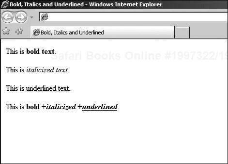
The first three tags you will learn are the easiest. They typically have no attributes, and are used on their own, or nested, in order to render specific effects—bold text, italicized text, and underlined text. The bold text tag is <B>:
This will be <B>in bold</B>.
If you want italics, use the <I> tag, as follows:
This will be <I>in italics</I>.
Finally, for underlined text, the appropriate tag is <U>, which follows the same pattern:
This will be <U>underlined</U>.
You can nest these tags, giving the following HTML fragment:
<HTML>
<HEAD>
  <TITLE>Bold, Italics and Underlined</TITLE>
</HEAD>
<BODY>
This is <B>bold text</B>.<BR /><BR />
This is <I>italicized text</I>.<BR /><BR />
This is <U>underlined text</U>.<BR /><BR />
This is <B>bold +<I>italicized +<U>underlined</U></I></B>.
</BODY>
</HTML>
The nested code example will be rendered as shown in Figure 3.3.
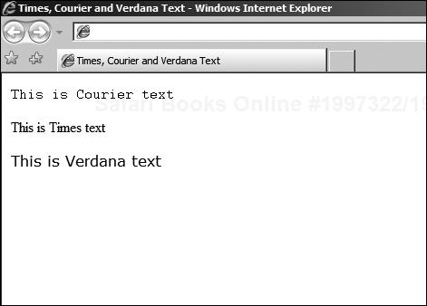
You can add a little more finesse to text by using the FONT tag. Although this has been deprecated by the addition of style sheets, it remains a popular way to manipulate textual content without all the additional complexity that style sheets entail.
By itself, the font tag doesn’t actually do anything, it only provides a vehicle for the attributes that allow you to specify the font, color, and size of the text that you want to be displayed. Let’s take these attributes one at a time.
The FACE attribute allows you to select a font by name. Of course, you need to be sure that the font that you choose has a good chance of being available on the target system. Not all systems have all fonts, but luckily most platforms are capable of selecting replacements (substitutions) in case the ones you choose are not present.
However, you can also specify a list of font names (faces) to choose from. So, if you do know what platforms support what fonts, you can at least give the browser a list of suitable names. Some of the common ones are Times, Courier, and Verdana.
To apply an attribute, you simply add it as part of the starting tag. For example, the following HTML fragment selects first Courier, and then Times, and finally Verdana faces:
<HTML>
<HEAD>
  <TITLE>Times, Courier and Verdana Text</TITLE>
</HEAD>
<BODY>
<FONT FACE="Courier">This is Courier text</FONT><BR /><BR />
<FONT FACE="Times">This is Times text</FONT><BR /><BR />
<FONT FACE="Verdana">This is Verdana text</FONT><BR /><BR />
</BODY>
</HTML>
Now the system will try to render the fonts that are specified, but if they are not available, the browser will try to substitute a font that ought to work. This means that different results might be obtained on different systems. The result of this on my system, for example, can be seen in Figure 3.4.
In addition to specifying the font face with the FACE attribute, you can also specify the size using the SIZE attribute. This is not a discrete font size, as it would be if you were specifying it in a word processor in points. Rather, it is a proportional measure—2 is bigger than 1, 3 is bigger than 2, but there are no guarantees as to the actual size in points.
The following HTML fragment illustrates all seven possible values for the SIZE attribute:
<HTML>
<HEAD>
  <TITLE>Font Sizes</TITLE>
</HEAD>
<BODY>
<FONT SIZE="1">This is Size 1</FONT><BR /><BR />
<FONT SIZE="2">This is Size 2</FONT><BR /><BR />
<FONT SIZE="3">This is Size 3</FONT><BR /><BR />

<FONT SIZE="4">This is Size 4</FONT><BR /><BR />
<FONT SIZE="5">This is Size 5</FONT><BR /><BR />
<FONT SIZE="6">This is Size 6</FONT><BR /><BR />
<FONT SIZE="7">This is Size 7</FONT><BR /><BR />
</BODY>
</HTML>
To have an idea as to the actual result that this brings, Figure 3.5 shows the previous HTML code loaded into a browser.

The last FONT attribute that you’ll look at here is the COLOR. Color values in HTML are a little odd at first glance. For a start, there is actually a list of named colors in the HTML standard, and these have been designed to fit into most display palettes.
Black | Silver | Gray | White |
Maroon | Purple | Fuchsia | Red |
Yellow | Olive | Green | Lime |
Navy | Teal | Blue | Aqua |
These are used in the same way as the previous FONT attributes:
<FONT COLOR="Red">This is Red Text</FONT><BR /><BR />
However, there is another way to specify the color, by using a series of hexadecimal numbers. If you’re not familiar with this color coding scheme, rest assured it is not terribly complex. Let’s start at the beginning.
The numerical value that can be specified instead of the standard color name is split into three parts—red, green, and blue. These colors are therefore called RGB colors. Each component is specified as a number between 0 and 255 representing the relative intensity of the color.
So, 0 is black (zero intensity) and 255 is maximum intensity. The following table shows some basic colors:
Red | Green | Blue | Result |
|---|---|---|---|
0 | 0 | 0 | Black |
255 | 0 | 0 | Red |
0 | 255 | 0 | Green |
0 | 0 | 255 | Blue |
128 | 128 | 128 | Gray |
255 | 255 | 255 | White |
You can also combine the red, green, and blue components to give any shade in the spectrum between black and white, by varying the independent components. If this was all there was to it, it would be easy enough. However, you will remember that the color components are in hexadecimal, and not decimal as in the table.
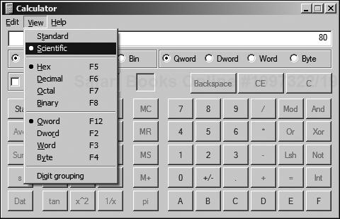
Hexadecimal is a counting system where numbers are represented by values between 00 (decimal 0) and FF (decimal 128). Without going into too much detail, all that you have to really remember is that you probably have a tool to calculate hexadecimal values—the calculator supplied with your operating system.
Figure 3.6 shows the Windows Calculator application, with the Hex button circled. If the user then selects Dec, the value changes back to decimal. In order to access this mode, it may be necessary to select the Scientific mode. This is shown in Figure 3.7.

Having calculated, for example, that the color gray is made by mixing 80 red, 80 green, and 80 blue (having converted from 128, 128, 128), you can then introduce this into the color attribute as follows:
<FONT COLOR="#808080">Gray Text</FONT>
Now, all this is looking to be quite abstract, so it would be nice to have something to play around with. Luckily, there is an excellent resource called the Color Schemer, available at http://www.colorschemer.com/online.html.
The Color Schemer comes in two versions—online and downloadable—and helps you to select colors based on an intuitive interface. It is designed such that the resulting colors work well together, and should be the first place you go when designing a color scheme. It is also handy for converting RGB decimal to hexadecimal values, as well as picking colors from a selected set of HTML safe possibilities.
Rather than using the FONT tag, there are some standard HTML tags that allow you to structure blocks of text according to some predefined layouts. Although different browsers will likely interpret these in different ways, the advantage is that you can later change the layout to something more specific using styles.
This might not be immediately apparent, but in Chapter 4 you will see how using styles with HTML text formatting tags (or elements) can help reduce your workload when creating and changing HTML pages. For now, you need to know that these elements exist and how they make your life easier.
For example, the <PRE> tag allows you to pre-format a section of text:
<PRE>
  This text
    is preformatted.
</PRE>
The browser should render this <PRE> tag exactly as it is typed. However, the HTML standard does not prescribe any formal rules as to how it should look. Guidelines exist, though, and usually a browser will create a text block where the layout is unchanged, and in a fixed font (such as Courier).
Although many people use the <B> tag (bold) and <I> (italics) to identify text that should be emphasized, HTML actually provides <EM> and <STRONG> for this very purpose. They are used in the same way as <B> and <I>, that is:
This text is <EM>emphasized</EM>.
This text is <STRONG>strongly emphasized</STRONG>.
Browsers are free to render these as they wish; however, you can be certain that they will both be emphasized over the appearance of normal text within the same block, regardless of the underlying style chosen for that text.
There is also a collection of tags aimed at programmers:
CODE—. Computer code excerptsSAMP—. Sample output from programsKBD—. Text to be entered by users
This last would be equally useful for an online user manual. Each one must have a start and end tag and can be adjusted with style information. Other useful text rendering tags include handling abbreviations and acronyms:
ABBR—. For an abbreviation, such as Mr.ACRONYM—. For an acronym, such as WWW
These also require a start and end tag to enclose the abbreviated text or acronym. Citations are handled through the <CITE> and </CITE> tags, whereas quotations are inserted as a block with <BLOCKQUOTE> and </BLOCKQUOTE> or inline with the <Q> and </Q> tags.
For all of these additional text rendering tags, there may be some variation on how browsers handle the exact layout and fonts chosen. They are incredibly useful for organizing the text, however, and the general flow of the page will be respected. Tighter control through styles is possible, of course.
The last two HTML tags that you need for text formatting are:
SPANDIV
The purpose of these tags is very similar—to provide bulk formatting for a section of text, which can be adjusted using nested tags such as <B>, <I>, and so on, to enhance the base formatting specified in the <SPAN> or <DIV> tag. You’ll revisit these tags when you look at styles in the next chapter.
The <SPAN> tag is used in conjunction with inline content. In other words, it cannot break across paragraphs (see the following section called “Flow Formatting”) or divisions (defined with the <DIV> tag).
The <DIV> (division) tag defines block content—one that can contain any other tag, including paragraphs and <SPAN> content. Divisions can also be nested, but I would advise against it, based on experience with the way that some browsers render the content.
You’ll see how these tags can be used for formatting the flow of the content in the next section.
Anything that changes the flow of the content around the page, as well as (optionally) specific color and style information, I have chosen to place in this section. These tags are usable on their own, but can also be combined, as you shall see in the next chapter, with specific style information to enhance them.
The first of these tags is the heading tag. HTML supports up to six levels of headings, with heading 1 as the most important, and 6 as the least. Browsers are expected to use appropriate fonts, sizes, and decoration to put across this hierarchy. However, in some cases, the lower level headings may not be all that different from normal text.
For example, consider the following HTML fragment:
<H1>Heading 1</H1>
<H2>Heading 2</H2>
<H3>Heading 3</H3>
<H4>Heading 4</H4>
<H5>Heading 5</H5>
<H6>Heading 6</H6>
This is normal text.
You might expect that all the headings would be rendered in a suitable fashion such that they would all be more visually important than the normal text. This is not the case in all browsers. For example, in Internet Explorer, headings after <H3> are rendered in a way that makes them smaller in size than the normal text.
This can be seen in Figure 3.8.

It is advisable to avoid skipping levels, as there may be some browsers that add a number to the start of the heading, and this would cause them to skip numbers. In addition, you should not nest headings, as this is both illogical and might not be rendered consistently.
As you can see from Figure 3.8, extra line breaks are also added to make sure that the heading stands apart from the rest of the content. The heading tag accepts a number of attributes, some style related (discussed in the next chapter) and others not. Of the non-style related attributes, the only one of particular use is the ALIGN attribute.
For example:
<H1 ALIGN="RIGHT">Right Aligned Heading</H1>
This HTML code would place the heading text at the right side of the current content block. Other possible values for the ALIGN attribute are "CENTER" and "LEFT", producing centered and left aligned headings, respectively.
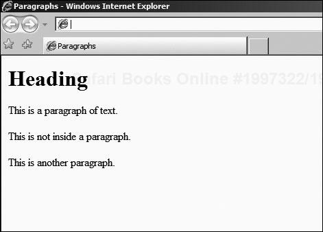
The next flow formatting tag is the paragraph tag. This is used to separate a block of text into a nominal paragraph of content. This implies inserting line breaks appropriately and choosing a default font.
The basic use of the <P> tag is as follows:
<P>This is a
paragraph of text.</P>
<P>This is another paragraph.</P>
You can combine this with the heading tags, and the browser will usually keep the flow, even when there are fragments outside the paragraph tags, and when there are paragraphs directly following heading tags. For example:
<BODY>
<H1 ALIGN="LEFT">Heading</H1>
<P>This is a
paragraph of text.</P>
This is not inside a paragraph.
<P>This is another paragraph.</P>
</BODY>
This is rendered by Internet Explorer as shown in Figure 3.9. You might expect that the text outside the paragraph would not be correctly spaced, or that the act of placing a paragraph following a heading might be over-spaced, but this is generally speaking not the case. Browsers usually manage to maintain the flow.
You can also use the ALIGN attribute with the paragraph tag. This is deprecated, having been superseded to a certain extent with style information. The following is perfectly valid HTML:
<P ALIGN="CENTER">
Centered paragraph text.
</P>
This ALIGN attribute will cause the whole paragraph to be centered. Although its use is deprecated, the use of the ALIGN attribute with the DIV tag is not, and so you could group a collection of paragraphs within a division:
<DIV ALIGN="CENTER">
<P>This is centered.</P>
</DIV>
<P>This is not.</P>
The alternative is to use a style (see Chapter 4) that centers the text, or to use three very useful flow control tags:
<CENTER><RIGHT><LEFT>
As you would expect, these will center-, right-, and left-align text in the vast majority of browsers. However, only the CENTER tag is supported in the HTML standard and is part of the Transitional definition. In other words, under strict HTML 4.01, it should not be used.
The paragraph tag makes a paragraph by inserting line breaks at appropriate places. If you want to force a line break, either within a paragraph or because you’re just not using paragraphs, you can use the <BR> tag.
Prior to XHTML, it was accepted just to use the short form:
Line break<BR>
new line.
Since the introduction of XHTML, it is generally regarded as bad practice to ever use a minimized tag in this fashion; instead, you should get into the habit of using the proper XML minimized tag form:
Line break<BR />
new line.
A double line break will insert a blank line. Often, this will be rendered by the browser as if it were the close of a paragraph. It is not, however, a good idea to rely on this, and you should use proper paragraphs rather than line breaks.
If you need to have lists of items, there are three kinds of lists provided by HTML:
An ordered list has numbered items (nominally 1, 2, 3, and so on, but this can be changed), where an unordered list just has bullets. A definition list is slightly special in that each item is rendered in two parts: the item title and the actual definition. These will usually be rendered in different styles in order to make the meaning plain.
The various lists can be seen in Figure 3.10.

You construct the ordered list by enclosing it in <OL> and </OL> tags. Each item must begin with an <LI> tag; however, a closing tag is not required. Many Web programmers choose to include it, if only to disambiguate the usage for those browsers that might not correctly display list items that do not have both a start and end tag.
Because it does no harm to the correctness, you may prefer to leave the closing tags in place as a matter of course, but I do need to mention that the HTML standard leaves them out. The closing </OL> tag is, of course, required.
Another deprecated feature of the <OL> is the TYPE attribute. This has been superseded by the use of styles (see Chapter 4); however, it is still part of the HTML 4.01 Transitional standard and in widespread use.
The TYPE attribute can be used to change the numbering scheme used. So, specifying "i" will cause the list to be rendered using successive roman numerals (i, ii, iii, iv, and so on), and specifying "a" will cause the list to be rendered using lowercase letters (a, b, c, d, and so on).
This can be useful in nested lists, as in:
<OL TYPE="1">
<LI>This is the first item
  <OL TYPE="a">
    <LI>This is sub-item one
    <LI>This is sub-item two
    <LI>etc.
  </OL>
</OL>
This example should be rendered as in Figure 3.11, but you should remember that other browsers may do so differently. You will also notice that I have left off the closing LI tags by way of illustration.

The counterpart to the ordered list is the unordered list. Here, there is simply a bullet or other illustrative element in front of the item rather than a number (letter, numeral, and so on). Otherwise, the unordered list works in the same way as an ordered list, except that you use the tags <UL> and </UL> rather than <OL></OL> as before.
Nested lists are also possible:
<UL>
<LI>This is the first item
  <UL>
    <LI>This is sub-item one
    <LI>This is sub-item two
    <LI>etc.
  </UL>
</UL>
Note in these two HTML fragments I have indented the list items so that it is clear what the structure of the list is. HTML indenting keeps the code neat and readable and is a must for easy maintenance. There’s nothing worse than picking up an HTML page and not remembering how the flow translates into the rendered page, and being unable to determine that from the HTML itself.
The graphical element used to indicate the list bullet can be changed through the TYPE attribute in much the same way as the TYPE attribute is used to change the ordering style for the ordered list. There are three allowable values:
DISCSQUARECIRCLE
Although these are accepted under HTML, and defined as part of the standard, some people consider their use to be deprecated by the introduction of styles (see Chapter 4). However, they remain very much in the fore, and while you will learn in due course how to change the bullet using styles, the TYPE attribute remains very popular.
You can use bullet types to separate sub-lists:
<UL TYPE="DISC">
<LI>This is the first item
  <UL TYPE="SQUARE">
    <LI>This is sub-item one

    <LI>This is sub-item two
    <LI TYPE="CIRCLE">This is a different sub-item bullet!
  </UL>
</UL>
However, you cannot always rely on different browsers treating this fragment equally. As an example of how rendering can change between platforms, Figure 3.12 shows the HTML fragment as rendered by Mozilla Firefox.

By contrast, Figure 3.13 shows the same fragment rendered by Microsoft Internet Explorer.
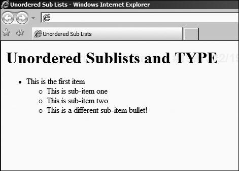
Neither is incorrect; it is part of the flexibility of HTML, and the accepted norm that different browser application developers will make different rendering decisions. Until you use styles to dictate exactly what kind of rendering you want, the browser is free to decide for itself what makes a logical graphical representation.
This interpretation philosophy is equally applicable in rendering the final kind of list—the definition list. A definition list is just a structured list that contains items and their definitions. The definition block is usually slightly indented from the item to which it refers, and when the line wraps, the indent is kept.
You can see an example of a definition list in Figure 3.10. It is rendered more or less the same way in any browser, but you cannot change the aspect of it using the TYPE attribute. Instead, styles must be used to change the rendering.
The following HTML fragment is the one that produced the example in Figure 3.10:
<DL>
 <DT>First item</DT>
  <DD>First definition</DD>
 <DT>Second item</DT>
  <DD>Second definition, first part</DD>
  <DD>Second definition, second part</DD>
</DL>
You will also note that you can have multiple definition lines in each item; if the line wraps around due to the width of the available area, this will cause the new definition line to be rendered with a carriage return, much as you would expect.
Other ways to organize content include tables. Like lists, tables are examples of HTML elements I call structured flow control containers. These are elements that are built up from a structure where nesting is an integral part of the HTML code. Care has to be taken so that someone reading the HTML is aware of where the various parts of the container start and end.
A table consists of a start tag <TABLE> and end tag </TABLE>. Between these, it is build up from a series of rows, which have a start tag <TR> and an end tag </TR>. Inside those, there are a number of columns, or cells, each with a start tag <TD> and end tag </TD>. The browser will not render the table until it has entirely loaded.
The basic structure of a table might look like the following HTML fragment:
<TABLE BORDER="1">
 <TR>
  <TD>Row 1, Cell 1</TD>
  <TD>Row 1, Cell 2</TD>
 </TR>
 <TR>
  <TD>Row 2, Cell 1</TD>
  <TD>Row 2, Cell 2</TD>
 </TR>
</TABLE>
An example of how it might be rendered is shown in Figure 3.14.

You will have noticed that I have introduced the BORDER attribute to be sure that the border is shown ("0" can be used to force the border to be invisible). Otherwise, you would not have been able to see the separation between cells. In addition, the browser has rendered the table such that it is exactly the right size to contain the content.
This might not be the effect that you want, so you can control the width that the table is supposed to take up by using the WIDTH attribute. The value for the WIDTH attribute can be presented as a percentage of the available block or as a discrete value, in pixels.
So, to create a table that has three columns, two of 25% and one of 50%, you would use HTML such as:
<TABLE WIDTH="100%">
 <TR>
  <TD WIDTH="25%">
  </TD>
 </TR>
<TR>
  <TD WIDTH="50%">
  </TD>
 </TR>
<TR>
  <TD WIDTH="25%">
  </TD>
 </TR>
</TABLE>
Note that this example has specified that the entire table will take up 100% of the available width, and that each column width is specified in terms of the total width, and not the table width. I do not advise mixing pixel and percentage widths, because experience has shown that browsers do not always render tables in the same way. For example:
<TABLE WIDTH="640">
 <TR>
  <TD WIDTH="25%">
  </TD>
 </TR>
<TR>
  <TD WIDTH="50%">
  </TD>
 </TR>
<TR>
  <TD WIDTH="25%">
  </TD>
 </TR>
</TABLE>
In this example, you might assume that the browser is clever enough to spot that you want the first column to measure 25% of the available 640 pixels that you have specified as the total width of the table. However, browsers might not always render this in the same way, and instead choose to use a value that is equal to 25% of the total document width rather than the 640 pixels that is use for the width of the table.
Naturally, if you want to center the table, you can enclose it in <CENTER> and </CENTER> tags. This is a common approach for a newsletter style Web page, where you would like the content to appear in the center, in columns divided (like a blog) between the navigation, advertising content, and main article text.
There are also a few tricks that you can use to add, for example, a row that spans the whole table width, regardless of the number of columns. This is very useful for creating headers (banners or navigation strips) or footers. For example, assume you want to create a page layout such as that in Figure 3.15.

Now for the longest HTML fragment that you have yet seen, and which generated the page rendered in Figure 3.15.
<TABLE WIDTH="600">
<TR>
<TD COLSPAN="3" VALIGN="BOTTOM">
<CENTER>
<H1>Banner Would Go Here</H1>
[ Home | Latest Blog | About Us... ]
</CENTER>
</TD>
</TR>
<TR>
<TD WIDTH="150" VALIGN="TOP">
Menu<BR/>
Sub-menu<BR/>
</TD>
<TD WIDTH="300">
<!- - An empty paragraph to space it out,
with a double line break - ->
<BR /><BR />
<P>This is where all the glorious content
would go, if we actually had any.</P>
<P>Instead, we've put in this wonderful placeholder
that is more original than the fake Latin that most
people use instead of real text.</P>
<!- - An empty paragraph to space it out,
with a double line break - ->
<BR /><BR />
</TD>
<TD WIDTH="150">
<CENTER>
Sample<BR/>Advertising<BR/>Here<BR/>
</CENTER>
</TD>
</TR>
<TR>
<TD COLSPAN="3" VALIGN="BOTTOM">
<CENTER>
<I>Copyright Statement, privacy statement,
perhaps an additional menu here. . .</I>
</CENTER>
</TD>
</TR>
</TABLE>I have introduced a number of interesting attributes in this HTML fragment, all of which are vital in laying out the page properly. Firstly, the COLSPAN attribute allows you to create cells that span several columns. This is used in the header (banner and menu strip) as well as the footer (copyright statement).
You can only span as many columns as are available in the table. If a larger number is used, the results are probably going to vary wildly between browsers. Next, I have used the VALIGN attribute to make sure that the vertical alignment is correct for the various cells that contain less content than the calculated cell height.
The browser decides the cell height, and sometimes (as in the advertising pane) the content will not be as large (in height) as the entire column. The default behavior of browsers seems to be to center the content. So, to prevent this happening for content that you want to be aligned otherwise, you can specify a VALIGN value of:
TOPCENTERBOTTOM
As you are probably starting to appreciate, leaving the default behavior (or assuming any default behavior at all) for layout is inadvisable, so you should get into the habit of always specifying the layout (alignment in this case) for HTML where it is of importance.
Cells can also be aligned horizontally, using the ALIGN attribute, although it is deprecated. Instead, I have chosen to use the <CENTER> tag to center the content where appropriate.
There are three other attributes that I might have made use of to further break up the visual appearance of the table.
The BGCOLOR attribute is used to set the background of the table or a particular cell inside the table. Now, it has been deprecated, and you are encouraged to use styles instead; however, often it is simply more convenient just to insert a BGCOLOR attribute when only a single instance is required.
Although this is quite acceptable by most people for the time being, if you want to try to make sure that your content is XHTML compliant (see the next section) or want to prepare for full XHTML rendering, you should get into the habit of using styles for setting the background color.
The CELLSPACING and CELLPADDING attributes are used in the <TABLE> tag to set the space between cells (spacing) and the inside margins (padding). You could have used this to introduce whitespace in the previous fragment if, for example, the left menu items began to creep towards the main content.
The CELLPADDING attribute, in particular, has to be used with a degree of caution, as it can cause unintended line breaks to appear as the table will not be extended with reference to the border or padding that is used. In other words, you get less space for your content, and subsequently if the content extends beyond the new edge of the cell, it will be wrapped automatically.
Of course, tables can also be used to display data sets. Arguably, this is what they were designed for, and with this in mind, the last tag that I present here is the <TH> tag. This allows you to specify that a cell contains heading information, and the browser will usually render it in a way that is more visually important than the regular table data.
The following HTML fragment employs this tag:
<TABLE>
 <TR>
  <TH>Col 1</TH>
  <TH>Col 2</TH>
  <TH>Col 3</TH>
 </TR>
 <TR>
  <TD>Cell 1</TD>
  <TD>Cell 2</TD>
  <TD>Cell 3</TD>
 </TR>
</TABLE>
Like all tags, the collection of table elements can all be manipulated through the use of inline styles or style sheets (see Chapter 4). This includes the headings as well as the cells themselves.
A vital part of the multimedia communication possibilities offered by HTML is the ability to include images inline with the other content. This includes non-interactive pictures as well as images that can be given a clickable user interface—anything from a map to a navigation bar can be created using a simple image and some tags.
Firstly, you need to know how to insert an image into a Web page. This is broken down into two stages—first you need to tell the browser that you want to insert an image, and then you need to tell it where to find the image itself.
Assuming that the image is in the same place as the Web page, the generic form for an image element is as follows:
<IMG SRC="image_name" WIDTH="width" HEIGHT="height" ALT="Image Text">
Note that there is no end tag—it is not allowed under the HTML standard. You have several attributes, with the first being the location of the image—its URL (see Introduction and Chapter 2).
The next two are the width and height of the image. If you don’t know the width and height, load the image into an image editor (such as Microsoft Paint, Ifran-View, or Adobe Photoshop) and use the Image Information option to find out.
It is a good idea to tell the browser what the width and height of the image are so that it can render the page correctly before loading the image and determining the dimensions for itself. As an aside, you can also force the image to be resized in the browser, with varying degrees of quality, by specifying a size that is bigger or smaller than the original.
The ALT attribute allows you to supply a textual description in case the browser is unable to display the image or is not a visual user agent. For example, if the interface is vocal, the image’s alternate text will be read out, because the image itself cannot be displayed. The best practice, in order to be compliant with standards on accessibility, is always to provide an ALT attribute. Plus, it makes for better SEO—a search engine cannot index an image if it doesn’t know what it displays.
Finally, there is an optional BORDER attribute that can be used to specify a border around the image, or "0" for no border. Using "0" also means that if you turn the image into a hyperlink (see the “Document Linking” section), there will be no blue border around it.
To turn the image into a client side imagemap, you need to specify the USEMAP attribute and insert a reference to the <MAP> element that contains the specific information relating to the areas of the image that can be clicked. You will find a concrete example at the end of this section.
However, before you can go on, you need to know a little bit more about how the imagemap works. The HTML code is designed to divide the image up into areas that can refer to other documents. In the “Document Linking” section, you will read how this works in more detail; for now, you just need to be aware that the mechanism exists.
The areas of the map can be rectangular, circular, or irregularly shaped. In order to be able to tell the browser what the shape is, you need to know the coordinates. To get these, you need to load the image into an image editor and use it to determine exactly where each corner (or the center of a circle) is located.
Figure 3.16 contains a sample imagemap that has a rectangle, circle, and polygon.

Next, you need to load your image into, for example, MS Paint. I’ve used that for illustrative purposes because it is part of nearly every Windows system and suits the needs here perfectly. Figure 3.17 shows where the coordinates can be found.

In Figure 3.17, you will note that the image is zoomed in to help with accuracy. The next step is to locate each corner of each shape and write them down. So, for the image that I have used as an example, the coordinates would be:
Rectangle | 13,16 | 83,90 | (Top-Left and Bottom-Right) |
Circle | 58,147 | 32 | (Center and Radius) |
Polygon | 108,31 158,51 181,155 139,147 103,65 |
For the polygon, you have to note each point on the perimeter, because it is irregularly shaped. All that is left now is to encode the image and its map into HTML. This is fairly repetitive, but straightforward:
<IMG SRC="imagemap.jpg" WIDTH="200" HEIGHT="200" USEMAP="#image_map">
<MAP NAME="image_map">
 <AREA HREF="index.html" SHAPE="RECT" COORDS="13,16,83,90">
 <AREA HREF="page2.html" SHAPE="CIRCLE" COORDS="58,147,32">
 <AREA HREF="page3.html" SHAPE="POLY"
    COORDS="108,31,158,51,181,155,139,147,103,65,108,31">
</MAP>
This HTML fragment has introduced a lot of new information, some of which is unfamiliar. Firstly, you will note that I refer to the image_map by putting a # in front of it in the IMG tag’s USEMAP attribute. This is an example of an internal reference to an element, which is covered in the “Document Linking” section that follows.
Next, you will note that the NAME attribute of the MAP tag, which is used to contain the map element itself, does not contain the # reference. There is then a new tag <AREA> with no end tag, which allows you to specify a clickable region.
The HREF attribute is an example of a reference to a document, its URL. It tells the browser where to find the resource once the user has clicked inside the area to which it refers. The SHAPE attribute tells the browser what kind of COORDS it can expect: the shape of the area.
The three values that SHAPE can take are:
RECT: RectangleCIRCLE: CirclePOLY: Polygon
The final note is that the COORDS just contain the list of corner locations that you worked out using the MS Paint (or similar) application previously. The polygon contains identical coordinates in the first and last slots so as to close the shape to provide a filled area that can be clicked.
Because this is an example of document (or resource) linking, now is a good time to look at this topic in more detail.
As you saw in Chapter 2, the World Wide Web is an interlinked collection of documents and other resources. In order to navigate between them, HTML defines elements called anchors. These anchors point to other resources, and when the user clicks them, they open that resource in the browser.
There are two kinds of links:
Link with an external target (external link)
Link with an internal target (internal link)
Assume that you have a collection of pages where the first one is an index into the others. Each of the other pages in the collection is a single subject, broken down into sections. Using external and internal links, you want to build up navigation between the topics covered in the collection of pages.
The generic form for an external link (which will be in the index page, linking to other pages) is as follows:
<A HREF="target_page.html">Link Text</A>
This is known as the anchor tag. The HREF attribute, like in an imagemap <AREA> tag, refers to the location of the page. In the previous example, I have assumed that it is in the same location as the source page. This is known as a relative URL.
You can also specify a link to a page that is in a different folder, relative to the one that the source page is in:
<A HREF="target_folder/target_page.html">Link Text</A>
If the target page is on a different server altogether, the final possibility is:
<A HREF="http://www.mycom.com/target_folder/target_page.html">Link Text</A>
In this last example, the target folder might not be required, depending on the URL to the page being linked to. In each example, the browser will render the link text (between the <A> and </A> tags) in a specific way that indicates to the users that the text can be clicked. This can be changed through the use of styles (see Chapter 4).
The next kind of link that you need in order to be able to use a small table of contents at the start of each page is an internal link. These consist of a named anchor within the page that provides a location that can be linked to. The general form for this is as follows:
<A NAME="internal_ref_name">Anchor Text</A>
This snippet creates the named area that an internal link will point to, but it does get rendered as a link by the browser. It is just a reference point. This kind of anchor can be referred to from inside or outside the document. To refer to it from inside the document, the following form can be used:
<A HREF="#internal_ref_name>Link Text</A>
Note that the # symbol is used, as it was in the client side imagemap, to create the proper reference to the anchor. If you need to link directly to this point in the page from outside the page, the external reference form can also be used:
<A HREF="http://www.mycom.com/target_folder/target_page.html #internal_
                ref_name"> Link Text</A>
This anchor will be underlined and highlighted in the same way as any other anchor, and when clicked, it will jump to the appropriate place in the target document.
This is all that there is to creating hyperlinks, for the time being. I will expand upon the basic form through the book as I discuss different aspects of site and content management systems. For now, you need to look at another kind of interactivity—the form.
This section is only designed to give you the basics about forms. You will look at how a form is constructed and what the basic parts are, but not what to do once the data has been submitted. The two different methods (Get and Post) were discussed in Chapter 2, and you will look at how to process form data in Chapters 5 and 6.
A form is created by using the <FORM> and </FORM> tags to contain the form elements. Each element is designed to offer some form of data capture to the user, which can be relayed to the server (or pressed by the client, using client side scripting).
Typically, a form has two attributes filled out—the ACTION and the METHOD. The action is the location of the script that will process the form contents, and the method indicates the method that will be used in sever side processing (GET or POST).
In order to specify the elements that are to be used to allow the users to enter data, the <INPUT> tag is used. This needs to be accompanied by the NAME and TYPE attributes. The NAME gives the name of the field that will be used by the script on the server (or client) to retrieve the data associated with the field.
The TYPE attribute can be one of a variety of different data entry types, of which the most common are likely to be:
TEXTRADIOCHECKBOXSUBMIT
The TEXT type is a single line text entry field. The RADIO type is usually a group of items, of which only one can be selected. Thus, each item has the same NAME attribute, but with different VALUE attributes so that the server can be told which one has been chosen by the user. Only one of the group can be selected at a time.
The HTML for a set of RADIO input types might look like:
<INPUT TYPE="RADIO" NAME="SET_1" VALUE="OPTION_1">Option 1<BR/>
<INPUT TYPE="RADIO" NAME="SET_1" VALUE="OPTION_1">Option 2<BR/>
<INPUT TYPE="RADIO" NAME="SET_1" VALUE="OPTION_1">Option 3<BR/>
The CHECKBOX type provides a simple checkbox that can be selected. The SUBMIT type provides a button that is used to submit the form data to the server. Putting some of these together, you might construct an address entry form as follows:
<FORM ACTION="http://mysite.com/scripts/addaddress" METHOD="POST">
Name: <INPUT TYPE="TEXT" NAME="NAME"><BR />
Address:<BR />
<TEXTAREA NAME="ADDRESS" ROWS="5" COLS="25"></TEXTAREA><BR />
<INPUT TYPE="SUBMIT" VALUE="Add Address">
</FORM>
This HTML fragment might be rendered as in Figure 3.18.
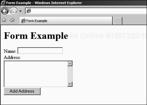
Notice the new tag here—<TEXTAREA> and </TEXTAREA>—it allows the users to enter freeform text in a multi-line control. The ROWS attribute specifies the number of lines, and the COLS attribute specifies the number of characters across each row. You will also note that it requires an end tag, unlike other form elements.
Finally, the HIDDEN type is special. It allows you to enter data into the form that the user cannot see without looking at the source of the page. Even then, it is usually designed for innocuous data (that is, data which has no value, such as step information in a wizard) or is heavily encrypted or safeguarded to render it useless to anyone else but the site owner.
In addition to specifying the TYPE attribute (containing "HIDDEN"), you should also specify the NAME and VALUE attributes. The VALUE attribute, in this case, contains the vale that you want to be returned to the server.
As you will now be aware, there are certain characters that have special meaning in HTML: the two chevrons, for example < and >, as well as quotation marks. Luckily, the HTML standard offers a good solution, by combining the & symbol and a short code that is replaced, by the user agent, by the character that it represents.
The generic format for these short codes, which the W3C calls Character Entity References, is:
&code;
The full list is available from the W3C, but here are the some of the most common:
Code | Symbol | Code | Symbol |
|---|---|---|---|
< | < | > | > |
" | " | © | © |
® | ® |
There is one other code of particular importance and function, the non-breaking space. The code for this is:
The purpose of the non-breaking space is to insert a space character. You will recall that HTML is parsed as a stream of tokens, separated by whitespace. This whitespace is then discarded, as it is essentially meaningless. Of course, single spaces are retained because they are part of the content.
However, if you actually want two spaces, you need to use the code to insert a space that cannot be discarded. Why would this be useful? There are many reasons, but one of the most common is to indent child items in hierarchical menus.
The following is an example, with the layout on the left, and the HTML on the right:
Home |
|
Services |
|
| |
Website |
|
In order to indent the Email and Website items, I have inserted two non-breaking spaces in front of each item. If I had simply used a double space, the items would be lined up along the left side, one above the other.
The entire list of character entity references can be found on the W3C Website at http://www.w3.org/TR/html401/sgml/entities.html.
It is also part of a specific set of ISO standards, ISO 8879, which are available from your local ISO office at a price. For the technically minded, you can actually use a direct reference to the Latin-1 character set (also known as ISO 8859-1) by inserting the appropriate character code.
This is done in a similar manner as the character entity name:
&#number;
If, for example, you want to insert the character code for a non-breaking space, it would be:
 
Note the use of the # in this case to signify a decimal number. The last time you saw it was in the definition of color codes, where the numbers were hexadecimal. From this you can deduce that # just denotes data of some kind. Anchors also used it to reference a named section inside a document.
To look up other character codes, you can use your system character map application. Under the Windows operating system, it is located in:
Start→Programs→Accessories→System Tools→Character Map
Usage is simple—just pick an appropriate Latin-1 encoded font (Courier New, for example), and select the character that you want to use in your HTML. In Figure 3.19, I have selected the copyright symbol.

In Figure 3.19, you will see that the bottom right corner has been circled in red—this is the code that you need to insert in the HTML, using the &# notation. In this case, it is keystroke Alt+0169, which is how you would access it if you were typing a document. Because you’re creating an HTML code, you only need to retain the number:
©
This character reference system can be used with any of the characters in the Latin-1 character set, and is more fully discussed in the aforementioned W3C reference. It is helpful when writing HTML for content publishing frameworks that filter out the character entity names.
Now that you know all about HTML, it is time to discuss the newer standard, XHTML. You will find that some of the statements are a little general, but all will become clear as soon as you start deploying HTML in the field.
An HTML document can be seen as a specialization of an XML document. In fact, HTML is based on the SGML standard, and for more detailed information on this, you should consult the W3C Website.
In essence, XML gives you the framework and standards by which you can create documents that contain marked-up content: tags, attributes, and content. It is a standard for data exchange, as discussed in Chapter 2.
It tells you that you need tags, that there must be start and end tags, and that tags can nest but not overlap, along with specific rules for how you inform people what the standards are. One particular rule that you’ve already seen is in processing end tags.
In HTML, the document definition itself is responsible for telling the user agent whether a tag is allowed to have an end tag. It is assumed that if no end tag is specified, it is forbidden.
However, XML takes a different view. It says that only minimized tags are allowed in cases where no end tag is necessary. Thus, you will see that, when you use the line break tag, in HTML, <BR> was allowed. In XHTML (based on XML), the correct form, and the one you will see here, is <BR />. This is just one example.
XML also allows for attributes (in an extensible way, to refine elements) and standardizes the way that you can present data. In other words, the document can be parsed by knowing how XML works, without needing to know what the document represents. This makes it easy to validate for correctness, but gives no information about rendering.
HTML tells you what kind of tags and attributes you can have by name and usage, whereas XML documents are self-defining. XHTML constructs HTML documents, based on XML principles.
The W3C currently offers XHTML 1.0 as a replacement for pure HTML for those who wish to adopt it. Because these standards are all open, there is no compunction to migrate towards XHTML, especially since HTML 4.01 plus styles and style sheets is more or less stable and well recognized.
There are good reasons for using XHTML, however, and these are explained on the W3C Website. Without going into too much detail, XHTML provides a much more easily adapted and flexible approach to document exchange and allows for better interoperability between agents accessing the content.
This means that, by definition, XHTML documents must be well formed. In other words, the reasonably lax approach to validation used by modern browsers is supposed to be replaced with more strict adherence to XML principles.
In addition, element and attribute names (tags and attributes) must be in lowercase. I have generally used uppercase for HTML 4, as it is more readable and easier to identify the tags from the content.
You have already seen how empty tags are treated, for example, using <br /> and not <br> by itself. Furthermore, elements that are designed to be empty but which may have content should not be used in their minimized form. In other words, you must write <p></p> and not <p/>.
Even if not using XHTML, Web programmers must get into the habit of producing correct documents, and this starts with respecting these differences. In addition, you should consult the XHTML specification provided by the W3C if you want to write XHTML; because if you say that it is XHTML, it will likely be validated as such in the future.
Part of this, as you have seen, is providing a valid DOCTYPE. This is the bare minimum, and should be used to identify the fact that you are providing content that is HTML or XHTML in nature.
Many current sites (Google, Yahoo, and so on) do not actually follow the standards at all, at the time of writing. If you want to check, you can use the W3C validator service at http://validator.w3.org/ which can tell you of probable standard violations in your HTML.
Browsers obviously want to be as open as possible to all implementations; to do anything different would make them incompatible with a lot of existing content. So, they don’t usually adhere 100% to the standards proposed by the W3C, and can sometimes even provide unauthorized extensions.
On top of which, the open nature of XML allows you to extend the mark-up and still remain correct with respect to the XML principle. This means that specific application vendors and providers can process information provided in documents in a special way.
These extensions are another reason why XHTML is a step up from HTML; it allows for you to have these extensions in a more graceful manner. If the user agent does not support a given feature, they can still validate the document, display those elements that are relevant, and leave out those that are not.
XHTML, then is a more correct implementation of HTML (which is an SGML) using the XML standard. Very few new functionalities are in fact added at all, and the work of the W3C is more in line with bringing the existing standard into the XML world.
This is essentially a reference chapter, in that you have looked at a collection of the most useful HTML tags, seen how you can correctly form your HTML so that it is acceptable in an XHTML world, and learned the key concepts of Web programming.
These are the basic fundamentals upon which you need to build your knowledge to turn the reasonably plain looking HTML documents that the basic tags can produce into something more visually pleasing, using styles. But, before you read the next chapter, please be sure that you have experimented a bit with the examples, and perhaps even created some local Web pages, to test your newfound knowledge.