9 Films – types and technical data
Today digital photography is by large predominant, but film photography has its own followers and deserves its space in this book. A great allure in film photography is that light ‘writes’ directly on the photosensitive medium. A permanent record of the ‘writing of light’ (a phrase which translates to the Greek phrase ‘photo-graphy’) is created after development and fixing. If you are interested in film photography it is a good idea to work with a limited range of well-chosen films as you get to know their performance intimately, their response to different subject situations and, when necessary, just how far you can abuse a film before results become unacceptable. However, you must still pick your materials in the first place. It would also be a pity not to explore some of the lesser-known films worth experimenting with for their special qualities and effects.
This chapter discusses the practical points you should consider when choosing film. A section on reading manufacturers’ data explains how products are described and compared by the graphs and tables that appear in technical information sheets. Finally, there is a review of some special-purpose films, selected for their unusual results or usefulness for solving special tasks.
Film design
Early photographers were more chemists than artists. In the 1850s they had to take darkroom tents everywhere, primitively coating sheet glass with light-sensitive silver compounds just before exposure and development. However, these ‘wet plates’ were followed by gelatin silver halide emulsions that could be prepared in advance, and so opened up photographic material manufacturing from about 1876. One by one, other barriers were overcome through emulsion research by chemists and manufacturers – glass was replaced by roll-up film, speed was increased over a thousand-fold, response to only the short wavelengths of light (corresponding to blue hues) was extended to the full visible spectrum. The latter opened the way to practical films for colour photography (slides in 1935 and negative/positive around 1942).
Throughout this evolution there were always essential skills in emulsion making, passed down from one generation to the next. In more recent times the very large investment in research and development applied to light-sensitive systems plus advances in technology generally brought much greater mastery of production. A kind of creative chemistry was evolved, typifed by Dr Edwin Land’s introduction of instant-picture colour materials in 1963. Emulsion chemists became able to ‘fine-tune’ film performance, due to a better fundamental understanding of how an emulsion behaves when an image is focused on it in the camera. Manufacturers gained unprecedented control over crystal structuring and complex multilayer coating of film.
Although in the new millennium digital image recording seems to be prevailing over chemical photography, film is still used by some consumers, professionals and artists. Several requirements are necessary in high-quality films, such as light sensitivity, sharpness, colour reproduction, convenience and stability. Some of these are conficting. For example, it is difficult to increase International Organization for Standardization (ISO) speed without, at the same time, reducing ability to resolve detail and record subtleties of tone and colour. Sheer film speed has always been an attraction, and gives defnitive figures that everyone understands. However, the larger grains and thicker emulsion coating, traditionally needed for extra light sensitivity, deprive you of fine detail (Figure 9.1).
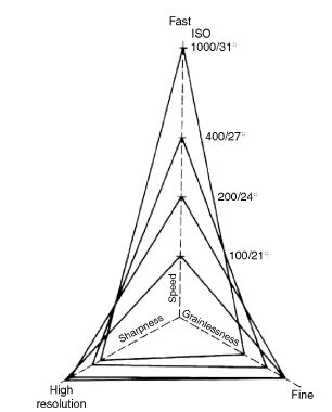
Figure 9.1 Requirements for film to offer good image resolution, light sensitivity and freedom from grain all pull in different directions. Triangles here represent four films of differing speeds. Gains in one direction inevitably result in losses in another.
In recent decades manufacturers gave importance to improving image quality within their existing speed range of films. One way to do this is by advanced engineering. For example, by preventing silver halide crystals from growing into their normal smooth symmetrical shapes and instead forming flat ‘tabular’ crystals with a ruffed surface texture greatly increases the total surface area exposed to light (ruffing alone more than doubles the area of a smooth crystal). Since these crystal shapes lie flatter in the coated film, emulsions can be thinner, giving less image diffusion, improving sharpness and using less silver without loss of film speed. In other words, emulsion effciency is improved all round (Figure 9.2).

Figure 9.2 Thin, tabular-shaped film emulsion silver halide grains, magnified by about ×10000. Unlike traditional flat-sided crystals these are thinner and have ruffed surfaces to increase area. The result is a better trade-off between speed and resolution. Courtesy of Kodak Ltd.
Colour films nowadays have better colour rendering and visual sharpness, and less grainy images are achieved by incorporating chemical ‘inhibitors’ that are released during colour development and increase the contrast and the saturation of dominant colours without making neutral grey tones unacceptably harsh. The result is rich colour but without the sacrifice of shadow and/or highlight details you would expect if just contrast was boosted.
Choosing films
There is still competition between the main film manufacturers. When you are choosing films, bear in mind each of the following aspects: image quality, speed, exposure and colour latitude, suitability for slides and transparencies or prints, image dye stability, and grain and resolution.
Image quality
Slides (for projection) and transparencies (larger-format reversal film) on slow material remain unbeatable for resolution of detail, colour density and saturation. A projected slide in a properly blacked-out room (with no extraneous light to grey-up shadow detail) can give highlights 400 times brighter than shadows. This is about four times the range of a print, which is severely limited by some reflectance of its paper base and maximum absorption of light by its darkest dyes. The result is that often colour prints from colour negatives tend to lack the sparkle of a colour slide. For example, specular highlights merge with diffused ones – a water droplet on a white fower petal becomes more difficult to pick out.
In slide or transparency films the image has only been through a lens once and therefore image sharpness is greater. However, you must also be much more accurate with lighting, composition and exposure at the camera stage when you use them. On the other hand, black and white negatives give you plenty of scope for control through cropping, choice of paper grades, shading and printing-in.
No modern colour film can really be said to be of better quality than another. The different dyes used are patented by manufacturers and used in slightly varied mixtures to reproduce image colours according to the colour response of each emulsion layer. Beyond a certain point, image quality is subjective. Some Asian manufacturers and users put a premium on brilliance of greens, while in North America consumers accept a ‘cooler’ bias, with greater richness of blues preferred. Knowing the reproduction characteristics of several films will help you choose a film that may render your subject in a favourable way (Figure 9.3). These differences between films are not easy to see in isolation, but show up clearly if you are unwise enough to shoot an assignment using a mixture of film brands. In order to avoid professional photographers opting for a rival brand just to obtain subtle colour variations, some manufacturers offer two different versions of a film, such as the Kodak Elite Chrome and Elite Chrome Extra Colour. They both match in speed but one gives slightly warmer, more flattering skin tones, the other more colourful hues well suited to flashion garments, outdoor scenes and so on.
Speed
In general, grain pattern and loss of colour saturation are increased with increase in ISO speed. The deterioration shows up more in fast colour slide materials than when colour negatives

Figure 9.3 Left: the sandstone tower in the entrance of the Park Avenue valley has been shot with an extra rich in colour film (Kodak Elite Chrome Extra Colour) and a polarizing filter to bring out the beautiful colours of the landscape and provide impressive contrast with the sky. Right: the richness of the greens in this shot of pine and fr trunks covered with lichen was achieved by shooting with an Asian film (Fuji Velvia), which favours brilliant green colours. Photos by Mark Chappell.
on film of an equivalent speed are printed. Overexposure of negatives and push-processing of films both tend to increase granularity. (Note that this is not the case with chromogenic negative materials – both black and white and colour – where increased exposure improves both granularity and sharpness.) However, fast slide and fast black and white negative films can be push-processed most successfully for extra speed because they have lower inherent contrast. Slower films tend to produce high-contrast images, and (with certain exceptions) colour negative films should not be pushed at all. Remember that manufacturers’ speed figures are not absolute. Use them as recommendations – they assume average subjects and lighting, standard processing and results that show maximum accuracy of tone and colour. Your own conditions and needs will sometimes be different. You must then decide from your own experience whether particular materials will perform better for you up- or down-rated.
Exposure latitude and colour temperature tolerance
Exposure latitude depends greatly on subject brightness range, being less with high-contrast scenes and greatest with soft, flat lighting. Having said this, slides and transparencies are least tolerant of wrong exposure, and black and white negatives offer greatest exposure latitude. Reversal colour films for slides and transparencies tolerate up to about half a stop overexposure or one stop underexposure. Colour negative films expand this latitude to one stop underexposure and two stops overexposure. However, most experienced photographers often
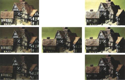
Figure 9.4 The more contrast in your subject, the less your exposure latitude. Of the three softly lit pictures (left column), the top one was overexposed two stops and the bottom one underexposed two stops. When harshly lit (right column), just one stop overexposure (top) and one stop underexposure (bottom) starts to lose highlight and shadow detail respectively. Centre picture has normal contrast lighting, correct exposure.
deliberately overexpose colour negatives by half or one stop, maintaining that they get optimum results. Latitude is considered two stops in each direction (Figure 9.4).
Colour negatives are also much more tolerant of wrong or mixed colour temperature subject lighting than reversal materials, but do not overdo it – underexposure or overexposure of one colour recording layer inevitably narrows the subject brightness range that your film can accurately reproduce (Figure 9.5). Nevertheless, colour negative films are a better choice if you are shooting under varying or mixed lighting, and they give you an extra safety margin taking available-light pictures in situations where the illumination is unknown.
With black and white material one and a half stops underexposure and two stops overexposure are about the outside limits for fast and medium-speed film. Exposure latitude is slightly less with slow films because they are higher contrast media. Even this amount of overexposure is undesirable with 35 mm or smaller images because you start losing resolution through light spread, and ‘solid’ highlight detail in the negative demands high-contrast printing paper, which exaggerates grain.
Films for slides and display transparencies
When final results have to be slides for projection the obvious choice is 35 mm reversal film – if possible running off additional original exposures if more than one copy is needed. For extra copies later you can print off an original slide on to 35 mm low-contrast duplicating slide film (page 265). As an alternative you could shoot on colour negative stock and print on to print film. Both routes allow some adjustments of colour filtration and lightening of density through exposure, either overall or locally by shading. Best-quality monochrome slides result from
Figure 9.5 Characteristic curves for an ISO 100/21° colour negative film exposed to a scene under correct colour temperature lighting (left), and exposed in lighting defcient in red (right). Only the parts between the broken lines are usable if you want to avoid colour-distorted shadows. So, for the same subject brightness range (SBR), wrong colour temperature means less exposure latitude. Latitude shrinks even further with high-contrast subjects.
or black and white reversal film (see page 266). Alternatively, slow general-purpose black and white negative such as Kodak T-Max can be used and given reversal processing (see Langford’s Basic Photography). You can also print on lith film developed in dilute D-76 to get medium-contrast results (page 266). Large display colour transparencies for rear-illuminated advertisements, etc. are most often enlarged on special print film from colour negatives, using the same processing chemistry as for negative/positive colour paper.
Films for prints
Prints have obvious advantages for jobs where the photograph itself is the finished product (for example, sales albums, framed display prints, etc.). Prints also accept retouching and artwork far more easily than images on film. The most obvious route to a colour print is to shoot on colour negative and then use negative/positive paper by the same maker. The best monochrome print quality undoubtedly comes from good monochrome negatives. Bromide prints from colour negatives (preferably on panchromatic paper) give a handy method of proofng results for facial expression, etc. but do not make finished enlargements this way, because they will lack the subtle tonal values possible from black and white film. Otherwise, black and white chromogenic film, which is designed for C-41 processing and printing on colour negative paper, has the advantage of rapid production in any lab that processes colour negative film.
Image dye stability
All colour images change in the course of time. Dye stability varies with particular hue and from one brand to another. Materials that contain ready-formed rather than chemically generated dyes, such as dye-bleach paper, give inherently long-lasting images. However, a given dye can have good stability in dark storage but fades fairly rapidly when displayed in the light, and vice versa. Trials show, for example, that the magenta dye in most regular chromogenic colour films and papers has good dark but poorer light stability (Figures 13.15 and 13.16). Cyan dyes often have the opposite characteristics. So when pictures are hidden away image colours gradually become warmer, but framed on the wall (or projected) they shift towards cold hues. A colour slide left showing continuously in a typical projector starts to bleach noticeably and colour changes after about 5 min. In general, slides shot on fast film stock deteriorate more rapidly than slow films and black and white silver images. Much depends on how you store your final images, of course. Always file colour photographs in cool and dry conditions (below 70°F (21°C) and less than 50% humidity) and avoid exposure to volatile chemicals. This includes contamination from unsuitable paper or plastic sleeves and envelopes. With properly processed and stored film you can anticipate a life of at least 20 years without perceptible colour change. Refer to Chapter 13, ‘Permanence, storage and archiving’ section, for more information on photographic image stability.
Understanding technical descriptions
The technical information departments of film manufacturers, and most technical photographic magazines, publish comparative data on products in the form of graphs, tables, etc. (Figure 9.6). Some parts of this material are more useful than others, but provided you can read and understand it there is more information to be found here about practical film performance than in purely advertising literature. Topics covered include granularity, edge sharpness, modulation transfer function (MTF) performance, characteristic curves, spectral sensitivity, reciprocity failure and DX coding.
Grain
The grain pattern seen in a processed photographic film is like ‘noise’ in an audio or electronic signal (think of analogue TV switched on but not tuned to a channel) – an overlaid mealy pattern breaking up image tones and fine detail. You are always most conscious of grain in midtone parts of the image, especially flat, even areas such as the sky or a plain grey studio background.
Grain is coarser in fast films than in slow materials, partly because larger silver crystals are more sensitive to light and partly because fast films tend to have thicker emulsion layers. Thinner coatings of tabular-shaped silver halide crystals (page 248) help to minimize this relationship, but it is still inherent. In most colour films each colour-developed silver halide crystal produces a larger, roughly spherical patch of dye. Only these dye clouds remain after all silver is removed towards the end of processing, so although the dye coupling has effectively enlarged original grain size its character is softer, more globular and diffused.
The grain qualities of a film are sometimes expressed by the terms ‘granularity’ and sometimes ‘graininess’. They are not quite the same thing. Granularity is an objective figure. It is measured under laboratory conditions using a microdensitometer, which tracks across the processed image of an even mid-grey tone. The instrument’s readout (Figure 9.7) can be converted into a number based on the average fuctuations of density above and below the mean density level. Manufacturers therefore publish figures called ‘diffuse RMS granularity × 1000’ for their regular film range, usually measured from an area with a density of 1.0. (RMS means ‘root mean square’ – an average you get by adding up the squares of the variations from mean density and taking the square root of this total.) Commonly, a 48 µm aperture is used for granularity measurements (the magnitude of the density fuctuations will vary with aperture area and therefore RMS granularity figures are comparable only if measurements are taken with similar area apertures).

Figure 9.6 Part of manufacturer s data sheets for two black and white films, quantifying practical performance. Reprinted with permission from Eastman Kodak Company.
A very-fine-grained, ISO 25/15° monochrome emulsion might rate 4 or 5 on this scale, whereas a black and white film of ISO 400/27° typically has a granularity figure of about 12. When you look at granularity figures for increasing densities, black and white film continues to rise but colour tends to decrease slightly (Figure 9.8). One reason for this is that dye clouds visually tend to merge together more readily than silver grains. You should over- rather than underexpose colour negative film. Granularity figures are useful in comparing one film stock against another (they help to explain differences in film MTF graphs – for example, page 257). In practice, many other factors influence the way grain looks in your final image.
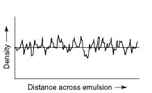
Figure 9.7 Granularity measurement. A micro-densitometer tracking 0.1 mm across an apparently ‘uniform’ density patch gives this kind of analogue record traces, indicating the density fuctuations around a mean density.
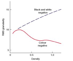
Figure 9.8 A major difference between colour negatives and black and white negatives is that as density increases image granularity pattern becomes less (colour) and greater (black and white). On this basis, colour negative film survives overexposure better than black and white film (but not chromogenic monochrome films).
Unlike granularity, graininess is a subjective measure, taking into account the overall visual impression of the enlarged result under practical viewing conditions. It has to be based on ‘average’ observers reporting on just acceptable levels of grain pattern. The main factors influencing graininess are:
1. The granularity of the film you use.
2. Image content, i.e. whether your subject has a lot of fine detail that ‘hides’ the grain structure or uniform areas, proportion of midtones and the optical sharpness of its image. A soft-focus or movement-blurred camera image is more likely to display its grainy structure, as this emulsion pattern may be the only sharp detail you can see. However, a sharp negative printed through a diffused or unfocused enlarging lens will lose its grain pattern along with image detail (Figure 9.9).

Figure 9.9 Left: normal photography on grainy reversal colour film. Centre: shot with a diffuser over the camera lens. Grain is still apparent. Right: reversal print from the left-hand transparency, with the enlarger lens diffused. Grain is blurred and thus visually lost, along with image detail.
3. Exposure and contrast. A black and white negative wholly under- or overexposed shows lower contrast and needs higher contrast printing, which emphasizes its grain pattern. Overexposure additionally scatters light, further reducing contrast so the prints made on high-contrast paper end up with more graininess. Low-contrast subject and lighting conditions result in flat images, which again need high-contrast paper, emphasizing graininess.
4. Degree of development - normal, held back or pushed. Also, with monochrome silver emulsions, the choice of developer type is a factor. Overdevelopment and the use of speed-enhancing developers both increase graininess.
5. Chemical after-treatment of the film image. Most solutions which reduce or intensify image density also increase graininess.
6. Enlarging. Obviously, degree of enlargement is important, but so is type of enlarger (diffuser or condenser light source). Printing paper contrast and surface texture - glossy or textured - is a major factor, but not the paper emulsion structure because this is very slow and fine grained and not itself enlarged.
7. The viewing distance and the brightness of lighting on the final result. Also the conditions of viewing - a transparency surrounded by strong light on a viewing box shows less graininess than when masked off with dark surround.
Graininess is not always a thing to avoid. As long as it can be controlled you can use it creatively. Grain simplifes images by destroying unimportant small detail, evokes atmosphere, and breaks up large monotonous areas of tone and colour (Figure 9.10). To maximize grain, shoot with a small-format camera and high-resolution lens on fast film. Keep the image small (for extra enlargement later) and use flat subject lighting so that you can step up development to increase graininess without creating excessive image contrast. For black and white work, push-process fast film in a speed-enhancing developer, or use E-6 first developer giving about 5 min at 25°C. Silver image negatives can be slightly overexposed, then overdeveloped and reduced in Farmer’s Reducer R-4a (page 437). You next enlarge with a condenser-type enlarger, preferably a point source, on to high-contrast glossy paper. As a less subtle but easier-to-handle alternative, print through a grained screen sandwiched with your film in the enlarger. Screens can be bought or made by yourself, by underexposing coarse-grained film to an image of an evenly lit plain surface.

Figure 9.10 Graininess can visually contribute positively to the atmosphere of a picture. In this purposefully unsharp shot, it provides a painting-like effect and breaks up the large areas of continuous tone. © Sophie Triantaphillidou.
Edge sharpness
Boundaries between areas of the image – light and dark – tend to be exaggerated when silver halides are developed. Figure 9.11 shows how the higher density of a boundary becomes greater and the lower one less along the edge of light and dark. This so-called adjacency or ‘edge effect’ is due to chemical changes during development. Active developer diffuses from the low-density area where it is underused, boosting development along the adjacent high-density one. Meanwhile, the oxidation by-products – bromide and iodide – released in largest quantities from the high-density side slow development on the low-density edge of the boundary. All this is of practical importance, since exaggerated edges give a stronger impression of image sharpness. This principle is being used in digital sharpening filters available in all image manipulation applications. High-acutance black and white developers are formulated to exaggerate edge effects. They may, however, increase graininess by sharpening up edge contrast (Figure 9.12).
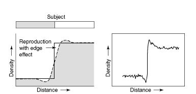
Figure 9.11 Adjacency effect. When a subject boundary between dark and light (left) is imaged on to film, the density change in the processed negative does not show the expected profile (solid line). Instead, chemical changes across the boundary give an exaggerated edge effect. This improves visual sharpness. Right: the effect as recorded by a microdensitometer showing a trace across an actual film image.
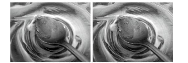
Figure 9.12 Left: unprocessed image. Right: image sharpness is increased digitally. The edge contrast is boosted but the result looks grainier too. © Sophie Triantaphillidou.
Film MTF
In Chapter 3, we saw how the quality of lens performance can be shown by a graph which plots the lens’s contrast response (modulation) with respect to coarse and to fine detail (low-to-high spatial frequency, measured in cycles/mm or lp/mm). Modulation transfer function (MTF) is also published for films (see Figure 9.13). Notice how the graph shows 100% modulation (or more, depending on the film and manufacturer) with coarse to medium detail, because edge effects have greatest influence here and boost contrast. At the finest detail, shown at highest frequencies at the end of the scale, grain size and light scatter within the emulsion take their toll,
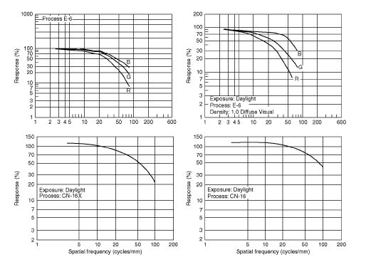
Figure 9.13 Top: MTF curves of Kodak Elite Chrome 100 (left) and 400 (right) colour slide films. The MTF curves published by Kodak are for the three different colour records. In this case, the green MTF is the most important because the eye is more sensitive to the yellow-green part of the spectrum. Bottom: MTF curves for Fujicolor 100 (left) and 1600 (right) colour negative films. The slower ISO 100 film shows better response in middle and high frequencies and a higher cut-off than the very fast ISO 1600 film. Top: reprinted with permission from Eastman Kodak Company. Bottom: reprinted with permission from Fujifilm UK Ltd.
so that response dips. The point on the frequency axis where the graph line drops to 10% response is sometimes quoted as the maximum resolving power of the film. Typical limits are about 200 cycles/mm for very fine grain, slow black and white film, 120 cycles/mm for a medium-speed colour negative film and 80 cycles/ mm for a medium-speed colour slide material.
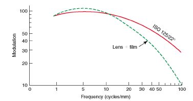
Figure 9.14 MTF curve of film and combined MTF of the camera and film system.
Most manufacturers’ technical data sheets on films include an MTF graph for comparative purposes. These prove that a fine-grained thinly coated, slow film generally has a higher curve than a fast one. You can also take into account the MTF curve for the lens you are using, ‘cascading’ the two together by multiplying their fractional values (i.e. modulation values from 0 to 1) at each spatial frequency. The result shows the combined performance of your lens + film, as shown in Figure 9.14. Clearly, a low-resolution film can demolish the effective practical performance of an expensive lens, just as a poor lens nullifes a high-resolution film. MTF can be taken even further by considering the performance of enlarging lens and printing paper. As discussed in Chapter 3, you can also apply a cut-off frequency beyond which performance is unimportant (say 40 cylces/mm). The exact figure will depend on camera format, degree of enlargement and the distance expected for viewing final pictures (Figure 9.15).

Figure 9.15 Typical contrast sensitivity function of the human visual system (considered as the MTF of the eye), for a typical reading distance. Multiply figures on the frequency scale by seven to relate them to a 35 mm film frame which will be enlarged to an 8 × 10 in. print.
Characteristic curves
Curves like Figure 9.16 are the oldest type of performance graphs for light-sensitive emulsions, pioneered by scientists Hurter and

Figure 9.16 Characteristic curves of an ISO 100/21° black and white film (a), an ISO 400/27° black and white film (b), an ISO 400/27° colour negative film (c) and an ISO 400/27° colour slide film (d).Diagrams (a) and (b) reprinted with permission from Ilford Photo/Harman Technology Limited. Diagrams (c) and (d) reprinted with permission from Eastman Kodak Company.
Driffield working in Britain in 1890. Traditionally known as ‘characteristic curves’, they are also called H & D curves, density curves or Dlog H curves. The curve plots the resulting image densities, measured after processing and plotted on the upright y-axis against a wide range of light exposures given to the film (log relative exposure), scaled on the x-axis of the graph. Both density and log exposure are logarithmic quantities (density is the log of the film opacity).
As shown in Langford’s Basic Photography, a quick comparison of characteristic curves for different films shows you many of their vital differences. Relative contrast can be seen from the general slope of the curve; speeds can be compared broadly from how far to the left the curve rises from horizontal. Exposure latitude can also be gauged. This is done by seeing how far the range of exposure units representing your subject from the shadows to highlights (1:100 brightness range = 2.0log E) can be moved in either direction along the log E axis before they fall on the unacceptably tone-flattening toe or shoulder of the curve. Characteristic curves published in sets like Figure 9.17 also show the effect of different degrees of development on density and contrast.
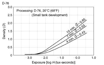
Figure 9.17 Characteristic curves showing the effect of development time on the response of a black and white negative. The film is developed for 4, 7 and 10 min. Longer times result in higher densities and increased contrast (g is the average gradient). Reprinted with permission from Fujifilm UK Ltd.
Reversal materials have characteristic curves which slope downwards as light exposure increases (see Figure 9.16(d)). After reversal processing, parts of the image that contained most light reproduce as having least density – a directly positive result. The slide or transparency must have higher contrast to be viewed projected in total darkness as your final picture, unlike a negative, which is an intermediate and contrast can be boosted in the print. It also needs good clear highlights. These features are shown by a steeply angled curve and low density at the bottom of the curve, 0.2 (it is mainly the density of the gelatin film base itself) (Figure 9.18).
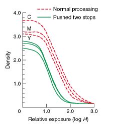
Figure 9.18 Characteristic curves for 800/1600 colour transparency film, given normal and (two stops) pushed processing. Unlike negatives, extra development lessens the final density of shadows.
Characteristic curves of colour film images are most often prepared by exposing the material to a transparent scale of grey tones, the light, of course, matching the colour temperature for which the film is balanced. The great majority of colour materials recreate all the colours of the picture through superimposed images in yellow, magenta and cyan dyes. So after film processing every tone on the greyscale image is checked out three times with a densitometer, reading through a blue filter to measure yellow dye density, then a green filter for magenta and a red one for the cyan layer density. All three plots must coincide in shape along most of their length, as in the graphs in Figure 9.16(c) and (d).
It is vital that the same filters and densitometer colour response be adopted worldwide when making comparative measurements of this kind. Certifed conditions known as Status A are used for positive colour film images. Three slightly different filter values are needed for evaluating colour negatives because the dye images here are geared to best suit the colour sensitivity of colour printing paper, not your eyes. Conditions are then called Status M.
Looking at Figure 9.16(c), you can see that characteristic curves for a typical colour negative film, read through correct blue, green and red filters, are similar in contrast to regular monochrome negatives. They are also offset vertically. This displacement is due to masking built into the dye layers, designed to compensate deficiencies in negative and print dyes. Provided there is no displacement horizontally, and all curves match in shape, colour printing will cancel out this apparent discrepancy. Programs for quality control of colour processing make similar readings of test strips which are put through the system at regular intervals to check any variations in solution chemical content, temperature, etc. (see page 287).
Spectral sensitivity
Afilm’s response to different colours of the spectrum is shown by a graph in which sensitivity (usually ‘log relative sensitivity’, being the log sensitometric speed of the photographic material determined at appropriate wavelengths) is shown against wavelength. The main points to look for in spectral sensitivity curves for black and white films are:
1. The highest wavelength cut-off point (Figure 9.19), showing whether a film is panchromatic, orthochromatic or only blue sensitive. Ortho films finally reproduce red lips, red lettering, etc. as black or very dark, but films can be handled under deep-red safe lighting. Blue-sensitive materials extend dark reproduction to greens but they are safe under bright amber bromide paper lights.
2. The uniformity of response of panchromatic film. Most films are panchromatic, but some fast materials have extended red light response, which helps to boost speed and records more detail in deep-red subjects but also

Figure 9.19 Spectral sensitivity curves for four types of black and white material. Extending panchromatic sensitivity to 720 nm boosts speed, especially in tungsten lighting. But for general work the final, positive, reproduction of red from negative material of this kind may be too bleached to be acceptable.
tends to bleach lips and other pale reds. Colour film sensitivity curves are in sets of three for the blue-, green-and red-sensitive layers. Each curve should just overlap so that every colour in the spectrum is recorded by some response in one or more layers.
Colour balance
Colour films balanced for tungsten-lit subjects have blue-sensitive layers slightly faster in speed than red ones (Figure 9.20). This compensates for the fact that tungsten-lamp illumination is defcient in blue wavelengths relative to daylight. It has a lower ‘colour temperature’ (page 6). Therefore, by adjusting emulsion sensitivities the manufacturers can make different films balanced for practically any light source that gives out a continuous spectrum, i.e. contains a mixture of all visible wavelengths. In practice, only a few colour balances are on offer because, apart from daylight type, the market is quite small.
You may often have to pick the nearest film type and then make good any mismatch with a suitable colour-correction filter over the lens (see Appendix F). Even with colour negative film it is still best to match up lighting and colour balance as closely as possible at the camera stage rather than rely too much on filtering back during colour printing (Figure 9.21). Using a film balanced for a different colour temperature than the colour temperature of the light source, lighting your subject can be used creatively. For example, a tungsten balanced film used

Figure 9.20 Colour sensitivity curves for daylight balanced (left) and tungsten light balanced (right) slide film. Only response above the broken line is significant. Notice the extra blue sensitivity of tungsten light film. If exposed in daylight it needs an orange filter to avoid excessive blue.

Figure 9.21 The three main colour film types and their (unfiltered) compatibility with various white light sources.
outdoors on bright sunny days will produce pictures with moody, cold colours, full of blues and dark greys and deprived of vivid reds and yellows (Figure 9.22).

Figure 9.22 The ‘cold mood’ in this photograph is due to shooting outdoors during a bright sunny day with a tungsten balanced film, which is much more sensitive to blue than to yellow, orange and red hues. © Sophie Triantaphillidou.
Reciprocity failure
The reduction in film speed which occurs when you give a very long exposure to a very dim image is usually presented as some form of table (Figure 9.23). Short-duration reciprocity failure is less important. Modern films are designed to respond normally for very brief (1/10 000 second) bright images because this is needed for some forms of flash. However, long-duration reciprocity failure means that you may have to extend exposures of 1 second or beyond. Remember this when using an AE camera in aperture-preferred mode, which rarely takes reciprocity failure into account. Make corrections with the camera’s exposure compensation dial.
With colour materials some form of pale correction filter may also be specified. Filter colour varies with different brands and types of film. Reciprocity correction is most critical on professional colour films, where sometimes separate types are made for different exposure times (see Figure 9.24). Try to work strictly to manufacturers’ recommendations
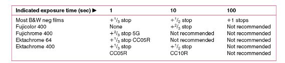
Figure 9.23 Reciprocity failure varies with brand and film type. Filtration maybe needed for colour compensation.

Figure 9.24 Type L professional colour films are formulated to be exposed at 1/30 second or longer. Use Type S films for exposures of 1/15 second or shorter. Type L films are also balanced for tungsten light 3200 K colour temperature, and Type S for daylight.
for critical record work, studio portraits, etc. Fortunately, in a great deal of existing light photography – taken at dusk or night, for example – slight colour variations are accepted as natural. Provided that you remember to bracket your exposures towards longer times, complicated filtration and multiplication calculations (leading to still more reciprocity failure) can usually be avoided.
Product coding
Manufacturers mark up their products in various ways to identify type and batch. Most sheet films have coded notches (Figure 9.25) to show type, and may have a batch number impressed into the rebate of each sheet as well as printed on the outside of the box. Notches have the advantage that in the dark you can ‘feel’ the type of film you are loading. Rollfilm-type information appears on the start and end of the backing paper and is printed by light along the film rebate for you to read after processing. Most 35 mm cassette-loaded film is DX coded to program the camera automatically for the film’s characteristics.
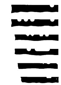
Figure 9.25 Some notch codings from top right corner of sheet films.
DX information is communicated through a panel of 12 squares on the outside of the cassette, making up a chequerboard mixture of bright metal and insulated (painted) patches. As shown in Figure 9.26, shiny patches 1 and 7 are always unpainted electrical contacts. Probes in the camera film chamber use this common area as an earth. Battery power applied through probes in other positions ‘read’ information according to whether they touch bare metal and complete the circuit or are insulated by paint. Five patches communicate the film’s ISO speed. Three more tell the camera film length – to program its liquid crystal display (LCD) ‘frames left’ counter and film rewind, for example. A further two patches encode whether the film has narrow exposure latitude (colour slide material) or
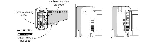
Figure 9.26 DX coding. The cassette’s chequerboard pattern (numbered here) completes circuits through probes in the camera’s film compartment. Centre: basic cameras use only three or four contacts. Right: advanced types have six more contacts, four covering squares 7-10 (film length, latitude, etc.).
wider latitude (colour negative), information used to modify camera auto-exposure programs. These data are also useful if the camera’s light-reading system works by comparing several highlight and shadow ‘spot’ measurements (see page 124).
Modern 35 mm cameras have 10 probes in two rows to fully utilize all the DX-coded information. Cameras with less than six probes default ISO 3200 film to 1600, while the simplest two-probe models default all films ISO 800 and faster to ISO 400. What happens when you load the camera with an uncoded cassette depends upon the camera design. Most cameras set ISO 100/21° in default; some memorize and reset for the last film you loaded, then flash a warning in the viewfinder and top display panel. Take care if you refill old cassettes from bulk film of a different kind. Self-adhesive printed foil ‘recoder’ labels are available for specific ISO ratings.
Thirty-five millimetre cassettes also carry an external bar code, which equipment at the processing laboratory reads immediately on arrival to sort films into batches for different processes. Finally, a code pattern, light-printed along the entire film rebate, can be read after processing by an automatic printing machine, which then adjusts its filtration and exposure to suit the parameters of the particular type of film. The machine’s database will already be programmed to recall the colour balance and typical image density range of the film (along with the characteristics of dozens of other film types). Lab recognition was taken further with Advanced Photographic System (APS) 24 mm wide film in cartridges, designed for the amateur market (see Langford’s Basic Photography).
Special materials
Instant pictures
The first instant-picture – black and white, Polaroid film – was introduced in the late 1940s; with the introduction of the colour Polaroid in the 1960s, instant photography became very popular. Today, there are only a few instant-picture materials still available. They are loaded in instant cameras and many professional cameras, provided the necessary accessories are in hand. Some 4 × 5 in. sheets come in packs as well as in individual envelopes. Peel-apart 8 × 10 in. colour material, in special envelopes, fits large-format view cameras. This material is ‘processed’ by feeding through a separate pod-crushing unit with 8-inch-wide motorized rollers.
It is difficult to run off duplicates from peel-apart instant pictures, or make enlargements without loss of quality. The complex chemistry in instant pictures is also temperature sensitive. It is difficult to get results at all when photographing outdoors in near-fireezing conditions unless you can warm the material while it processes. Instant pictures are more expensive than regular films, even including savings on processing costs. The colour materials are balanced for daylight and flash illumination. You can ft camera lens correction filters for other light sources, but these filters may differ slightly in density and hue from types needed for conventional colour films (Figure 9.27).
Colour duplicating film
There are a few kinds of duplicating colour film made in bulk 35 mm and sheet film sizes. They are mostly colour reversal types, although some colour negatives that are designed for normal photography can also be potentially used as duplicating material. All of them are slightly

Figure 9.27 Using 8 × 10 in. peel-apart instant-picture material. (1) A special holder hinges open to receive one sheet of material in a flat envelope. You reclose it, then remove envelope alone through bottom of holder. (2) Film holder is used as normal for camera exposure. (3) Holder, plus receiving paper and chemical pod, is faced up to processor unit. (4) Motor draws exposed material out of holder and passes it with the paper through pod-breaking rollers. Later you pull the two sheets apart.
low-contrast and have characteristic curves (Figure 9.28), which are predominantly long and straight with very little ‘toe’. The reason for this is that when you are copying a colour photograph, duplicating a slide or turning either into a colour negative for subsequent colour printing, you have to avoid two hazards. One is building up excessive contrast. The other is having correct midtone values but compressed tone and colour values in shadows or highlights, so that your result looks like a copy from its degraded darker tones or veiled highlights. You will meet both problems if you try duplicating on regular camera films. Colour materials designed specifically for duplicating purposes are normally balanced for tungsten light.
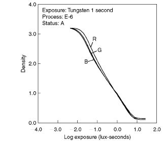
Figure 9.28 Characteristic curves of the Kodak EDUPE colour duplicating slide film. Reprinted with permission from Eastman Kodak Company.
Black and white slide film
Beautiful artistic pictures with superb tones and image quality can be created using black and white slide film (true slide, in comparison to a negative processed to give a positive image). The Agfa Scala 200 35 mm slide film is no longer made by Agfa, but there are still batches available by independent photographic labs. A replacement, the Fomapan R100, is provided by the Czech manufacturer Foma Bohemia Ltd and requires special processing using a reversal kit specifically designed by Foma for this film. The film can be processed at variable speeds.
Lith/orthochromatic film
Lith film gets its name from lithographic photomechanical reproduction and it is used for line drawings, some graphic arts applications and in the printing industry for line originals, lettering, etc. It is used much less nowadays, as it has largely been replaced by digital processes. When processed as recommended it gives extreme contrast and very high maximum density. Lith film is very slow and most types have orthochromatic sensitivity (they are not sensitive to the red part of the spectrum), so you can handle and process them under deep-red safe lighting. It is designed to be developed in lith developer, which allows development to start slowly and accelerate as the image forms. This so-called ‘infectious’ development gives lith film its extremely rich blacks, combined with clear whites and no midtones. It also produces edge effects (see page 256).
Accurate exposure and processing times are very critical. The high contrast also exaggerates any uneven lighting. As with most materials of this kind processed to extreme contrast, you get some clear ‘pinholes’ in the image. Lith film is good for any subjects consisting of pure black and white. You can make monochrome slides by exposing lith film to regular continuous-tone negatives, under the enlarger or through a copy camera set-up. Three kinds of results are then possible: by processing in D-76 type developer the film gives normal-contrast, continuous-tone monochrome slides. If you overexpose and then process by inspection in lith developer diluted to about one-quarter of the strength, results are normal in contrast but the tones are extremely warm. Alternatively, by careful exposure and standard lith development, you can turn your continuous-tone images into stark black and white.
Black and white and colour infrared films
Black and white infrared films, available in 35 and 120 mm rolls, have especially extended sensitivity to near-infrared wavelengths (Figure 9.29). This means that they react to infrared radiation, which is invisible to humans. The effective speed will change according to the filter you use to block the visible (Figure 9.30). You can process black and white infrared films in most regular type film developers such as D-76 and print the results on regular black and white paper. Infrared properties and photographic techniques are discussed extensively in Chapter 11 (Figures 11.1–11.3).

Figure 9.29 Spectral sensitivity curve for a black and white infrared film. Although sensitivity extends well beyond the (700 nm) limits of visible light, the film is also sensitive to red, blue and ultraviolet. This can be controlled by using a deep-red or IR-only passing filter (see Chapter 11).
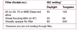
Figure 9.30 The effective speed setting for Kodak infrared black and white film varies according to the filter you use. Visually opaque filters are not very practical, and may result in excessively slow film speed.
A ‘false colour’ infrared reversal 35 mm colour film is produced by Kodak (Ektachrome Professional Infrared EIR). It differs in many ways from black and white infrared material, as it has three emulsion layers, but instead of these being sensitive to blue, green and red they respond mostly to green, red and near infrared (Figure 9.31). The film is normally exposed through a deep-yellow filter to reduce the sensitivities of all emulsions to blue light. With the yellow filter

Figure 9.31 Colour sensitivity curves for emulsion layers in infrared Ektachrome film. Response is mostly to green (yellow dye forming), red (magenta forming) and infrared 700-900 nm (cyan forming). The sensitivity of the emulsion layers to blue light is subdued by exposing pictures through a yellow filter–often a Wratten 12.
in place, the layers act as though they are sensitive only to green, red, and infrared, since all blue radiation is absorbed by the filter.The three layers form yellow, magenta and cyan dyes respectively. The practical effect of all this is that green foliage refecting infrared (see Chapter 11) records in the green and infrared layers and so produces red or magenta depending on the health of foliage – since healthy foliage refects more infrared relative to green (Figure 9.32). Red paint, fowers and lips appear yellow, but blue sky becomes dark blue or turns cyan. The exact colour rendition is dependent upon exposure, processes (E-6 or AR-5, push-processing of E-6) and the amount of infrared reflectance present. The results obtained using the E-6 process are generally higher in contrast, while colours are more saturated.
Infrared colour film was designed for aerial photography, detecting camoufage from its living foliage surroundings and healthy forestry from diseased species. It is used also for
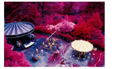
Figure 9.32 Andy Finney’s Fairground has been shot on Ektachrome Professional Infrared EIR film through an orange filter and processed with E-6. The foliage refecting green and infrared is recorded in the green- and infrared-sensitive layers, which activate the blue and red dyes in the film respectively. Red light activates the green layer in the film and blue must be filtered out. The rendition of foliage with this colour infrared film changes from red to magenta as it becomes less healthy. The hues of inanimate objects in a scene can have seemingly arbitrary colour changes depending on their original colour and the amount of infrared they refect. © Andy Finney.
medical applications. In general, editorial and flashion illustration, this bizarre film is best used like a fisheye lens – with great restraint. You will produce most striking results by shooting landscapes in direct sunlight during spring (firesh growth contains most abundant chlorophyll, which refects infrared). For different false colour effects try changing the deep-yellow filter for other strong filters (see Figure 9.33). Focus the camera lens normally, because despite its infrared response the film still uses predominantly visible wavelengths. Infrared Ektachrome is processed in standard E-6 chemicals.
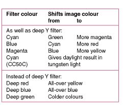
Figure 9.33 The effect of strong colour filters on infrared Ektachrome (deep yellow is normal). Read exposure through whatever filters are fitted, rating the film ISO at 200/24°.
SUMMARY
- Early silver halide emulsions were blue-sensitive only, and crudely hand-coated on to glass. Today the industry has unprecedented control over crystal formation, thin multilayer coatings and the use of additives. The result is new standards of light sensitivity, colour fdelity, sharpness and freedom from graininess – but with growing competition from electronic methods of still-image recording.
- For resolution, tone range and richness of colour, slides and transparencies are hard to beat. They are still preferred for printed reproduction. However, colour bias differs between brands.
- Speed ratings are relative in many ways. With most materials much depends on the degree of processing you choose to give (least fexibility with colour negatives). Processing, in turn, depends on subject and lighting contrast.
- Slides and transparencies are least tolerant of errors in exposure and lighting colour. When shooting under the most difficult conditions try to shoot colour (or black and white) negatives – then you can make improvements at the printing stage.
- Other things being equal, the most direct route from camera to final result is usually best. Repeat exposures of the subject when runs of slides are required (colour or black and white); shoot colour negatives for colour prints and monochrome negatives for monochrome prints.
- All dyes change with time. ‘Dark’ and ‘light’ storage stability varies with different dye types and colours. Avoid humidity, heat, fumes and prolonged bright light (including slide projection).
- Grain (‘noise’) linked to fast, thick emulsions shows most in image midtones and can be measured objectively in terms of granularity. Subjective graininess combines visual effects of grain size, image detail and contrast, exposure and processing, after-treatment, enlarging and final display conditions.
- Chemical effects at tone boundaries improve the visual appearance of sharpness. The edge effect is encouraged in emulsions and developers formulated to give such effects.
- MTF graphs plot an emulsion’s modulation against cycles per millimetre spatial frequency. Film MTF curves can be combined with the MTF of the camera lens to estimate the system MTF.
- Characteristic curves plot image densities against log exposure to light. They help you to compare contrast, speed, palest and deepest tones, and the effect of processing. Densities of colour film materials are measured through appropriate A or M ‘status’ tricolour filters.
- Spectral sensitivity curves plot emulsion response (log sensitivity) against wavelength. The relative spectral response of the three primary emulsion layers in colour film is designed to be balanced to record subject colours accurately under lighting of a particular colour temperature.
- Reciprocity-failure loss of film speed differs in severity according to film type and brand. Published data show how to correct it through additional exposure, preferably by widening the aperture. Black and white materials can be given altered development to compensate for reciprocity-failure changes to contrast. Colour films may need a correction filter. Type S and L professional colour films are designed for shutter speeds and lighting colour balance appropriate to short or long exposure times respectively.
- Codings on packaging and on the film itself (notches, numbers and code light-printed on rebate) give identifying information. Thirty-five millimetre DX cassette code communicates film speed, length and exposure latitude to the camera, given sufficient sensing probes in the film compartment. Lack of DX information may set ISO 100/21° automatically.
- Instant-picture materials come as peel-apart types (ft backs for regular cameras) and integral types for cameras having a mirror in the optical path.
- Lith film gives extreme black and white density and contrast in lith developer (infectious development). Exposure is critical, pinholes common; remember to maintain developer temperature. Uses include line subjects, highlight masking, etc. Processed in low-activity developer, lith film will give continuous-tone projection positives from normal-contrast negatives.
- Black and white reversal 35 mm film is the most direct, high-quality route to monochrome slides.
- Infrared monochrome films have sensitivity extended up to about 900 nm. Used with a deep-red or infrared-only passing filter, it records infrared reflectance that is invisible to the human eye.
- Infrared colour reversal film (yellow filter) gives a mixture of false colours. Infrared-refecting vegetation records as magenta, lips and red paint yellow, giving bizarre results. The material is important too for aerial surveys of vegetation and some medical applications.
- Colour reversal duplicating films offer low-contrast and long straight-line characteristic curves needed for duplicating slides.
PROJECTS
1 Set up a display of coloured objects, such as fruits, coloured pencils, colour garments etc. Using standard lighting and your 35 mm camera, try to shoot approximately the same frames on colour negative and on colour slide films. Print out the negatives on 127 × 178 mm quality glossy colour paper (see Chapter 10) or use a professional lab for the purpose. Have a good look at them under bright lighting conditions. Project the colour slides in a blacked-out room. Take a note on the vividness (saturation) of your colour objects and the overall image sharpness reproduced by the different media.
2 Visit the website of various film manufacturers. Download the technical specifications of one film of the same film format, speed and type (slide or negative) from each manufacturer. Compare granularity figures, characteristic curves, spectral sensitivities and MTF curves. Later, use these films in various photographic projects. Once you have collected a number of images and some knowledge on the behaviour of each film, try to associate the objective information provided on the manufacturers’ data sheets with the subjective impression you get by looking at the images (e.g. MTF curves with image sharpness, granularity with graininess, characteristic curve properties with film contrast, spectral sensitivities with film colours).
3 Choose two of your pictures captured on black and white negative film. One image should contain a plenty of fine detail and the other a lot of uniform areas. Print the two images on multigrade paper:
(a) using different filtration for print contrast;
(b) two three different sizes (contact prints, 127 × 178 mm and 203 × 254 mm).
Observe graininess and with respect to image detail, image contrast and image size.