
This chapter describes the properties of light with regard to colour. It presents the principles that have been applied to colour photography, both analogue and digital. In the beginning of the chapter you will see how colour is produced from visible light and how we can get information about the colour of a light source. Colour originates from different types of sources and you will see how it is affected by their properties. One of the major issues in colour photography is the difference in colour between different types of light sources. This is important when you want to achieve colour-balanced scenes in your photographs. This chapter presents ways of measuring the colour of the light sources and controlling colour.
Colour exists because of the way our visual system interprets the sensation of light. An introduction to the human visual system is therefore included in this chapter, and is focused on our colour vision. This includes the Young–Helmholtz trichromatic theory where colour photography and imaging is based.
Working with colour has made the development of colour classification systems essential. With these systems any colour can be described by a unique set of numbers. Several systems have been devised and three of them are presented in this chapter. Colour, however, is a perceptual phenomenon. The characteristics of human vision have therefore been taken into account in the design of some colour classification systems.
Finally, the chapter discusses the effect of subjective judgement when looking at colour photographs. You will see how colour adaptation of the human visual system affects the colours you see. The effect of eye fatigue and psychological influences on the perception of colour are also presented and discussed.
Light and colour
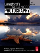
Colour is produced by light rays reflected or transmitted from an object. A light ray can be considered as an electromagnetic wave, part of the wider series of electromagnetic waves that travel in space, and is described by its wavelength and frequency. The wavelength is the distance between two adjacent corresponding points on the wave train, as shown in Figure 4.1, while the frequency refers to the number of waves passing from a given point over 1 sec. The product of wavelength and frequency gives the speed of the wave.
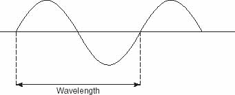
Figure 4.1 Wavelength is the distance between two adjacent corresponding points on the wave train.
The electromagnetic spectrum extends from wavelengths of 0.0000001 nm to 1000 km. What we call light is the visible part of the spectrum, from approximately 400 nm to approximately 700 nm. If you take into account that 1 nm is equal to 1/1 000 000 000 m, you see that the visible spectrum is a very small part of the electromagnetic spectrum.
The ultraviolet (UV) band of radiation lies below 390 nm and the infrared (IR) band above 760 nm. The UV and IR rays are, therefore, not visible. Photographic film however, is sensitive to a wavelength range between 350 nm and 700 nm and so it is sensitive to UV rays. For this reason, a UV filter is placed in front of the lens, to stop UV rays reaching the film. In digital cameras, charge-coupled device (CCD) and complementary metal-oxide semiconductor (CMOS) electronic sensors are sensitive to IR rays. To eliminate the effect of the IR rays, a special filter is placed in front of the imaging sensor. In some digital cameras this filter can be removed and you can record in the IR region. With film cameras you can record the IR light with the use of an IR film. See Chapter 13 for UV and IR photography.
X-rays and gamma rays have wavelengths below the UV rays. Although they do not form part of the visible spectrum there are imaging applications, such as in medical imaging, where these rays are recorded. Rays above IR include radar and radio waves.
White light is a mixture of colour rays. In the late 1600s, Sir Isaac Newton showed that when white light falls on a clear glass prism, it is not only deviated but also refracted to many colour rays, as shown in Figure 4.2, in the following order: red, orange, yellow, green, blue, indigo and violet. The magnitude of refraction depends on the wavelength of the ray so the white light was shown to consist of rays with different wavelengths. These correspond to the colours we see in the spectrum.

Figure 4.2 White light refracted to colours of the visible spectrum.
The human visual system
Colour exists due to our visual perception and specifically our colour visual system, which interprets the different wavelengths of light as colour (Figure 4.3).
Many ingenious inventions are based on ‘observations of nature’. The way colour films and imaging sensors work owes much to scientists’ basic study of just what colour is, and how human eyes and brains respond to coloured surroundings. In 1802 Thomas Young suggested that the retina of the human eye does not contain receptors for each discernible hue. Instead it has a mixture of three different kinds of receptor – sensitive to red, green and blue. Young called these colours the primary colours of light (not the same as pigment primary colours, familiar to the artist as blue, yellow and red). This ‘three-colour vision’ gives your brain the sensation of colour which it derives from the combination of signals it receives. The theory was quantified by Helmholtz in 1866 and is known as the Young–Helmholtz theory of colour vision.

Figure 4.3 Colour is perceived when wavelengths from a light source are reflected by the surface of an object. The human visual system interprets the wavelengths as the colour of the object.
James Clerk Maxwell proved this in the 1850s by demonstrating with light from blue-, green- and red-filtered lanterns overlapped on one screen. Dimming or brightening individual lanterns re-created all the colours of the spectrum, while an equal mixture of the three primary colours formed a patch of white. Combination of two primary colours results in a secondary colour. This is shown in Figure 4.4(a). This type of colour mixing is called additive. Note that during the 1870s and 1880s the technique of pointillism was used by French Impressionist painters such as Monet, Pissaro and Seurat. Pointillism is the technique of juxtapositioning tiny brush strokes in paints of strong luminous colours and subtle tones. It is a significant fact that the very first colour photography materials to go on sale were manufactured in France (Lumière’s ‘Autochrome’, 1907) and worked on what is known as the additive principle. With the additive method, you can create any colour by mixing red, green and blue points in an image. When viewing an image from a distance, the eye sees a uniform colour and not individual colour points. One of the applications of this method is in the design of television and computer displays (see page 217). The colours are formed by very small red, green and blue dots, which you can discriminate only with very close inspection of the screen. The additive method is also used for instant picture materials and in most cases for the design of digital imaging sensors.

Figure 4.4 Additive (a) and subtractive (b) methods to create colour. In the additive method, mixing of two primary colours, red, green or blue, creates a complementary colour, cyan, magenta or yellow. Mixing of all three colours results in white. In the subtractive method, two complementary colours create a primary colour.
Another method, the subtractive method, has its origins in work by the French scientist Luis Ducos du Hauron in the late 1800s. He published a book Les Couleurs en Photographie, in 1868, forecasting several of the colour reproduction systems we now use. However, it was not until the 1880s that Dr Hermann Vogel’s research in Germany into sensitizing additives made possible orthochromatic and panchromatic emulsions to add to the blue-sensitive materials used exclusively up until this time. Panchromatic response to all colours, and ability to control colour sensitivity unlocked the door to practical colour photography.
The subtractive method is based on light absorption using the complementary colours cyan, magenta and yellow. We can take, as an example, a set of cyan, magenta and yellow filters. The cyan filter will subtract red, the magenta will subtract green and the yellow will subtract blue. If the cyan and magenta filters overlap, they will transmit blue. This is because they will have both subtracted red and green. The same applies with the other two combinations, cyan with yellow which transmit green, and magenta with yellow which transmit red. When the cyan, magenta and yellow are combined, red, green and blue are subtracted, and the result is black. This is illustrated in Figure 4.4(b). The subtractive method is used for photographic films, colour printing and other applications which use dyes.
In colour reversal films the top layer of the emulsion is blue-only sensitive. Below it there is a green-sensitive layer and then a red-sensitive layer. Some sensitivity to blue by the red- and green-sensitive emulsion layers is nullified by a yellow filter located directly below the blue-sensitive emulsion. This filter lets green and red pass freely. The filter becomes colourless later during processing. With the exception of a few materials (one such being Kodachrome), all reversal films use silver halide emulsions with ‘colour couplers’ included – in the blue-sensitive emulsion these chemicals will later form yellow dye when triggered during processing. Similarly, there are other couplers to form magenta dye in the green-sensitive layers and cyan-forming couplers in the red-sensitive ones. Colour negative films use the same principle of having red-, green- and blue-sensitive layers with cyan-, magenta- and yellow-forming couplers, respectively. See Chapter 12 for a description of film processing methods.
Today it is well established that our retinas contain many millions of rod- and cone-shaped cells. The rods are more sensitive to light but have no colour discrimination. They are distributed in the peripheral area of the retina, where the image is formed. There are about 75 000 000– 150 000 000 rods in that area. The less-sensitive cones react to colour with their three types of reception determined by chemical content. They are concentrated in the centre of the retina and they are fewer in number than the rods, about 6 000 000–7 000 000.
Some aspects of colour vision are not fully explained by the trichromatic theory, but the discoveries of these nineteenth-century scientists remain highly relevant for understanding colour photography. At the same time, remember that your eyes are virtually an extension of your brain, connected to it by over 750 000 fibres in each optic nerve. In dealing with colour vision the brain’s ability to interpret is as relevant as the actual stimuli received from eye response.
Light sources and their characteristics
The amount of light that is emitted by a light source at each wavelength is called relative power. If we plot the relative power against the wavelength we have a graph that gives the spectral power distribution curve of the source. If energy is used instead of power (energy power × time), we have the spectral energy distribution of a light source. Information and graphs on the spectral power distribution are often given as technical data for light sources.
From the spectral distribution graphs you can determine what is the colour of a light source. You are also given information on whether the specific light source has a continuous spectrum and emits light at all wavelengths or if it has a discontinuous spectrum and emits only at specific wavelengths. Light sources with continuous spectra include all incandescent sources (materials that glow with heat after a certain temperature) and the sun. Light sources such as sodiumvapour and mercury-vapour lamps have discontinuous spectrum. There is also a third type of light source that emits broad bands of continuous spectrum with magnitudes that vary. An example of this light source is the discharge tube.
Colour temperature
As described previously, incandescent light sources have a continuous spectrum. The relative proportion of short and long wavelengths produced by these sources varies widely. This variation depends on the temperature of the source. As an example we can take two 100 W household lamps, one run at correct voltage and the other underrun at a fraction of correct voltage. The underrun lamp is not only less bright but gives more orangey illumination. Similarly, if you compare correctly run 500 W and 100 W lamps, the weaker source gives out a higher proportion of red wavelengths and a lower proportion of blue ones. It looks more orangey-red.
The spectral power distribution curve gives information on the colour of the source, as we saw earlier. In photography, however, the colour of a light source is also expressed by a unit of measurement, the colour temperature. This is based on the fact that continuous spectra, emitted by incandescent light sources of equal colour temperature, are the same, so they give the same results on film. Colour temperature is defined based on the black body radiator or Planckian radiator, as follows: The colour temperature of a white light source is the temperature in Kelvins(K) of a perfectly radiating black body when emitting light matching the source under test.
The black body radiator is a solid metal dark body that does not reflect incident light. When heated it becomes incandescent and radiates continuously and evenly throughout the spectrum. It first transmits red colour and as the temperature increases, its colour changes towards blue or ‘white hot’. Colour temperature is measured using the Absolute scale in Kelvins (0°C 273 K), named after the scientist Lord Kelvin. Figure 4.5 illustrates the spectral power distribution curves of some white sources and their corresponding colour temperature in Kelvins.

Figure 4.5 Spectral power distribution curves for some white light sources. Each contains a ‘cocktail’ of all the visible wavelengths – some rich in blue and depleted in red, others the reverse. They can also be described by their colour temperatures in Kelvins.

Figure 4.6 Natural daylight is by no means consistent in colour temperature, as these figures show.
When the colour temperature is low, the light source emits more red and yellow wavelengths and less blue. An example is a typical candle flame, which has a colour temperature of 1900 K. The filament of a 500 W tungsten photographic lamp produces more blue and less red wavelengths and has higher colour temperature, about 3200 K. Daylight varies considerably in colour temperature, according to time of day and atmospheric conditions as shown in Figure 4.6.The ‘direct noon sunlight’ colour temperature (an average, measured at ground level throughout the year in Washington, DC, USA) is 5400 K. In the shade with light only from blue sky the colour temperature is 12 000 K while at sunset it is 1900 K.
An example of spectral power distribution curves and the corresponding colour temperatures of two daylight illuminants is illustrated in Figure 4.7. Note that it is important to avoid any confusion with the terms ‘warm’ or ‘cold’ colours (often used when referring to image composition), and colour temperature. With colour temperature the opposite applies: Low-colour temperature results in red colours and high-colour temperature results in blue colours.
There are also non-incandescent light sources that emit light without generating heat. These include fluorescent tubes, sodium lamps and electronic flash. They have a discontinuous spectrum and the energy is given out in lines or bands with large gaps in the spectrum where no wavelengths are produced at all, as shown in Figure 4.8.

Figure 4.7 Spectral power distribution curves of light sources with colour temperatures of 5000 K and 6500 K.

Figure 4.8 Spectral power distribution graph of a mercury-vapour lamp. Only bands of wavelengths are produced. This lamp gives out no red wavelengths at all.
Accurate reproduction of colour in photography can be achieved if the light source emits light with all wavelengths of the spectrum and the film is balanced for that light source. Fortunately, most fluorescent tubes now used in retail shops, light boxes, etc. have both continuous and discontinuous spectrum. The tube gives a continuous spectrum overlaid with a fluorescent band spectrum from the tube coating. This is shown in Figure 4.9. The suitability of a fluorescent tube for photography depends on the proportion of continuous spectrum in the total light emitted. The larger the proportion of continuous spectrum, the more suitable the light source is for photography. Photographic flash tubes have line spectra due to their gas filling. But because of pressure and the high-density electrical discharge, the lines broaden into bands which overlap to become continuous.
The concept of colour temperature is based on the colour of a material heated to incandescence. Non-incandescent sources, such as fluorescent tubes, which create light by other means, cannot strictly be given a colourtemperature figure. For this case the term correlated colour temperature is used. Correlated colour temperature is the temperature of the black body when it has the same or nearly the same colour as the non-incandescent light source. Typical and correlated colour temperatures are shown in Figure 4.10.

Figure 4.9 A daylight ‘white’ fluorescent tube produces a mixture of band and continuous spectra. This is suitable for colour photography, but will probably need a magenta filter to reduce green.
Figure 4.10 Colour temperatures for some typical light sources. CRI stands for Colour Rendering Index, quoted by fluorescent tube manufacturers. HMI lamps use a metal halide arc and provide flicker-free illumination.
Standard illuminants
The Commission Internationale de l’Eclairage (CIE) has defined the spectral power distributions of light sources known as illuminants. Illuminant A represents incandescent light with equivalent colour temperature of 2856 K. The D50 and the D65 illuminants have been defined for daylight. For the D50 illuminant the correlated colour temperature is 5000 K and for D65 it is 6500 K. Their spectral power distribution is shown in Figure 4.7.
Most photographic films have been designed for lighting conditions with colour temperature of 5500 K. When using light sources with colour temperature of 3200 K (Tungsten) you can use Tungsten or type B film balanced (such as the Kodak Ektachrome 160T or Fujichrome T64) for that colour temperature, or daylight film with the suitable filter in front of the lens (see Figure 4.13). Digital cameras provide settings for colour temperature where colour correction is applied on the image. You can read more on digital cameras and colour temperature in Chapters 2 and 7.
Measuring colour temperature
There are cases however where although you have set the correct white balance (colour temperature) on your digital camera or you have used the correct type of film for the light source, the image colour is not right. This may happen due to one or more of the following reasons:
1. A lamp is used at a voltage lower or higher than the correct rating (see Figure 4.11). (This does not apply in the same way with flash tubes, which are fed from storage capacitors. So variations in the supply alter the time these capacitors take to recharge.)
2. The light is bounced off a reflector or passed through a diffuser (or lamp optics) which is not quite colourless. Similarly, nearby coloured surroundings just outside the picture area tint the subject.
3. Atmospheric conditions filter sunlight. Colour temperature also changes during the day or time of year.
4. Other types of powerful light source with different colour temperatures are present.

Figure 4.11 The effects of decreasing or increasing the voltage applied to a tungsten lamp. Reducing the supply extends life but reduces colour temperature. Also fewer lumens of light are produced per watt consumed, and illumination dims.

Figure 4.12 Colourtemperature meters measure light using the diffusing disk near the top. The meter is programmed for the type of film (daylight or tungsten for example) and reads out reference for the colour compensation filter needed over camera lens or light source. Image courtesy of Gossen Foto-und Lichtmesstechnik GmbH.
In cases where the lighting is uncertain it is very helpful to measure the colour temperature using a colour-temperature meter (see Figure 4.12). Colour-temperature meters have three silicon photocells filtered to detect red, green and blue under an integrating diffuser. The meter circuits obtain a profile of the spectral content of your lighting by comparing the relative responses of the three colours to obtain a profile of the spectral content of your lighting. For example, the red cell has stronger response than the blue one when measuring tungsten lamps, whereas daylight produces an opposite effect. The range of light sources that can be measured varies between models and some include measurement of brief light sources such as the electronic flash.
Colour-temperature meters give a direct reading in Kelvins. There are models that take as an input the colour balance of the film and give as output the colour temperature of the light source in Kelvins together with the value of any colour-correction filter needed. The information on the correction filter is given in light balancing (LB) filter values and colour compensating (CC) filter values. The LB value refers to the red or blue LB filter and is the difference between the selected film’s colour temperature and that of the measured light source. The values for these filters are given in mireds (MIcro REciprocal Degrees). The CC value is the nominal value of the required colour-compensating filter, usually green or magenta. Another point is that within the meter’s operating limits, the intensity of your lighting is not important. The instrument’s cells can still make their comparisons whether the illumination is a 60 W lamp or brilliant sunlight.
Using a colour-temperature meter with a good range of filters provides you with good control of lighting colour when working on location. You can also check your studio lighting for any faults or changes. See page 139 on how to use filters in practice.
How to measure colour temperature
When measuring the colour of a light source with a colour-temperature meter, you position it at your subject, with the white light diffuser pointing to the light source. Colour-temperature meters take incident light readings so if they are pointed directly at the subject they will measure the subject’s colour instead of the colour of light reaching it. For measuring the colour temperature of a flash, point the meter with its diffuser facing towards the camera, preferably from the subject position or at least where it receives the same lighting.
Mireds
As mentioned previously, colour-temperature meters may give the correction LB filter you need in terms of mireds or, more accurately, in mired shift value instead of a manufacturer’s reference number. In fact, all filters for colour-temperature correction work, whatever the brand, tend to have a mired rating as well as a number (see Figure 4.13). The reason that the mired instead of the Kelvin scale is used is based on the fact that the actual colour content of light sources does not change pro rata with colour temperature. This happens because the colour-temperature scale is based on physical temperature rather than proportional colour content. So a filter which raises colour temperature by 100 K at 2800 K has a 130 K effect at 3200 K and a 300 K effect at 5000 K, as shown in Figure 4.14. To solve the filter calibration problem you convert Kelvins into mireds by dividing 1 000 000 by the Kelvin value of the source.

Figure 4.13 The mired shift values of some Kodak filters.
Mired value 1 000 000 divided by colour temperature in K.
Equal changes in the mired scale correspond to approximately equal visible variations in colour.
Notice that the higher the mired value, the lower the colour temperature and vice versa. So ‘warm-up’ yellowish orange filters have positive mired values and ‘cool-down’ bluish filters have negative ones. For example, the mired value of 2800 K household lamps is 357 M, whereas type B colour film is designed for 3200 K (312 M). A filter to balance the film to the lamp needs a mired shift value of 45, or as near this as possible. Used with photo-lamp lighting of 3400 K (294 M) the same filter would change the colour content to 249 M, which is 4000 K. Notice how the same filter resulted in a change of 400 K in the first case while it resulted a change of 600 K in the second case, in terms of the colour-temperature scale. A filter can therefore be given a mired shift value ( or –), which holds well, irrespective of the colour temperature of the light source. Sometimes filters and colour-temperature meters quote ‘decamireds’ instead of mireds. One decamired equals 10 mireds so a filter of 100 mireds would be 10 decamireds.

Figure 4.14 Why mireds are used. Left: the relative blue content of an (incandescent) light source does not increase proportionally with colour temperature. Therefore a bluish filter, which has a fixed upward influence on blue content, causes more change of Kelvins when illumination is 5000 K than when 2800 K. It cannot be given a ‘Kelvin shift value’. Right: by converting Kelvins into mireds you have a regular scale directly relating to blue content. A filter has the same ‘mired shift value’ at high and low positions on the scale.
Filters can be added together and this may prove useful when you do not have the filter with the exact mired value for correcting the colour temperature. If your colour-temperature meter, or simple calculation, shows that a 127 M filter is needed to colour balance the light source to your film you can either use a Kodak 85B ( 127 M) or combine an 85 ( 112) with an 81A ( 18). If mireds are not already shown on your filter containers, calculate and mark them up. If you have a colour-temperature meter you can finally check any proposed filter by holding it over the sensing head and remeasuring your light source. The meter should show correct colour. A Kelvin/mired conversion table is given in Figure 4.15.

Figure 4.15 Kelvin/mired conversion table.
Classification of colour
In everyday life we describe colours as green, reddish, pink, light blue, etc. These names refer to attributes of colours which have been defined as hue, saturation and lightness. The term ‘hue’ is related to the dominant wavelength expressed as a colour title such as green, yellow, etc. and is close to the general term ‘colour’. Saturation means the purity of a colour, how vivid or dull it is. Pastel colours have low saturation and strong vivid colours are highly saturated. Lightness refers to how bright or dark is a colour and it is not related to saturation. A dark colour, for example, may appear saturated.
There are different systems, which can pinpoint a colour and label it with a numerical code. The Munsell Book of Colour was devised by the American artist A. M.Munsell. This system is three-dimensional and classifies colours through a collection of over 40 charts of patches with three coordinates: Value, which describes lightness, hue and chroma which describes saturation (see Figure 4.16).
The Munsell system gives every colour a reference number, which identifies its chart (hue), and then its vertical (value) and horizontal (chroma) location, like a street atlas. The vertical axis runs from white at the top to black at the bottom and chroma increases from zero at the central axis. Munsell numbers are used as matching standards for artists’ paints, printing inks and any pigmented colour products. It is limited by the actual pigments available for printing the charts and for this reason the three-dimensional representation of the ‘Munsell Book of Colour’ has a lopsided shape rather than spherical.
Two chromaticity diagrams, the CIE xy and the CIE u’v’ have been introduced by the CIE in 1931 and 1976, respectively. The chromaticity diagrams identify all the colours of the visible spectrum by matching them to mixed quantities of blue, green and red light. Each colour is described by xy or u’v’ coordinates in the diagram which maps the relative strengths of the three sources in the spectral locus (see Figures 4.17 and 4.18). All colours whether in the form of pigment or light have a matching position somewhere within the CIE diagram, so you can describe any one by quoting graph coordinates.

Figure 4.16 Munsell system of colour classification. The Munsell ‘solid’ represents the three dimensions of the system. The central axis (neutral) runs from white at the top to black at the bottom. Saturation increases away from this central axis. In practice this sphere takes the form of dozens of charts, hinged along the vertical axis and each one dealing with a different hue. (The lopsided shape here is because printing inks have to be used rather than theoretical colours. Inks still have severe colour limitations.) Shown below are just two strips out of one chart for a blue hue, saturation increasing to the right and lightness increasing vertically. Any colour patch can be referenced by quoting hue, value and chroma coordinates. The table gives four examples.
The CIE has also introduced three-dimensional systems known as colour spaces, where each colour is described by three coordinates. The CIELAB colour space was introduced in 1976 and has been used widely in photography. You may have encountered this colour space in software packages such as Adobe Photoshop, where it is one of the image modes. It is also one of the available colour space options when you use the colour picker, as shown in Figure 4.19.

Figure 4.17 (a) The CIE xy and (b) the CIE u’v’ chromaticity diagrams, introduced by the CIE in 1931 and 1976, respectively. Reprinted with permission from The Colour Group (Great Britain).

Figure 4.18 CIE colour classification. In basic terms imagine this as a white screen with lights – red, green and blue – shining inwards from three positions (see broken lettering). The middle of the triangle formed by the lights is neutral white. Light from any one corner is at zero at any point along the opposite side. Spectrum colours from blue through to red are located along the dome-shaped locus (bold line). Quoting x and y coordinates pinpoints any colour for matching purposes. The table gives examples for some subjects shown on the chart.
The features of this colour space are illustrated in Figure 4.20. The vertical axis, L* represents lightness, as the Munsell diagram. There are also two axes that describe the colour. The a*-axis represents the red/green value and the b* represents the yellow/blue value. This three-dimensional system is based on visual perception and is perceptually approximately uniform. Equal distances between two colours in the CIELAB colour space represent visually equal differences between these colours. You can read more on colour spaces in Chapter 11, page 257.

Figure 4.19 The Color Picker tool in Adobe Photoshop includes the CIELAB coordinates of a colour.
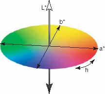
Figure 4.20 Graphical illustration of the three-dimensional CIELAB colour space. The L* axis represents lightness. The a* axis represents the red/green value and the b* axis represents the yellow/blue value. h represents hue.
Colours, of course, originate from all kinds of sources. This is what makes them difficult to reproduce exactly with any dyes or pigments, let alone mixtures of the three dyes in colour film, or three phosphors within a computer or video CRT screen. Any or all the following forms of colour may be in front of your camera:
(a) Pigments and dyes which selectively reflect, transmit or absorb incident light. Colours here are greatly influenced by the colour of the light and the subject surface. (At certain angles a smooth surface will reflect a high proportion of incident light unchanged off its top surface, mixing with and desaturating the colour selectively reflected from underneath.)
(b) Colours derived from white light by diffusion and scatter. For example, the blueness of clear sky caused by scatter of the shorter wavelengths in sunlight by water and dust molecules in the atmosphere.
(c) Colours formed by interference – as seen on soap bubbles or reflected from oil on a wet road. These changing hues are caused by two reflections from inner and outer surfaces of a thin transparent film. Displacement by half a wavelength interferes and cancels out this wavelength colour, forming other colours from remaining white light.
(d) Colours produced by diffraction – for example, reflected from a compact disc or the sheen of a rayon-type fabric. Such effects are caused by the change in direction of some wavelengths in white light when reflected from a surface covered in a fine pattern of lines.
(e) Fluorescent colours. Special inks or coatings, as on ‘dayglow’ poster papers, etc. which generate visible coloured light under sunlight or any other source containing ultra-violet radiation.
(f) Phosphorescent colours. The ‘glow’ from substances are able to store energy from light and release it in a coloured form later (for example, the luminous coating on the hands of a clock).
How we see colour
Normal human eyesight is quite good at comparing two coloured objects and judging if they match, provided they are seen together under identical illumination. However, colour seen in isolation is another matter. Judgement here varies from person to person and from one set of circumstances to another. Colours become personalized and you cannot even trust your own eyes. Look at the way people adjust the television to get ‘realistic’ colour – some have it bright and garish, others muted and restrained.
There are all kinds of eyesight inconsistencies and differences that exist between individuals.
Adaptation
Our visual system adapts itself to changes in the intensity of light (light adaptation) and the spectral quality of the light (chromatic adaptation). The dimmer the light, the wider the iris of your eye becomes (its range is about five stops). After this the retina itself slowly adapts to increase sensitivity, relying less on the cones and more on highly responsive but colour-insensitive rods. Eye peak sensitivity shifts (the Purkinje shift) further towards the blue–green, then even this colour response fades to zero. After about 20 min adaptation in extremely dim light you may just make out things in monochrome, with very poor resolution and a degree of visual ‘noise’ which destroys almost all detail. In a garden in dim moonlight you can only see the dark-grey shapes of flowers – but flash a lamp and their sudden colour brilliance emphasizes what our eyes have lost. To a lesser extent, the same thing occurs in a scene with contrasty lighting – your eyes see fewer colours in shaded areas than in midtones and highlights. (A point to remember in colour printing – colour inaccuracies are least noticeable if restricted to dark areas of the print.)
One aspect of adaptation is when the perceived colour of the objects remains constant even when the colour of the light changes. This is known as colour constancy. Walk from one area lit by daylight-type fluorescent tubes into another lit with incandescent tungsten lamps and you are at first conscious of the ‘yellowness’ of the lighting, but within a minute or so you accept this as neutral white. When you return to the tube-lit area it first strikes you as ‘blue’. An example is when we look at a white piece of paper in these conditions. It will appear as ‘white’ in both rooms despite the change in the colour of the lighting.
Eye adaptation is continuous and is not noticed in everyday life. It is useful because it serves several purposes. There is less processing of information when the steady conditions are excluded so the response to changes is faster. It also ensures that there is colour stability for all the objects around us despite the time of the day or the artificial lighting conditions.
Adaptation may cause, however, problems in colour photography. Colour films cannot respond in the same way. Long exposure in dim light (despite reciprocity effects) will record a range of subject colours which just could not be seen by eye. Film is also balanced for specific colour temperature, for example films for daylight or tungsten illumination. Under lighting of a different colour temperature, which your eyes soon ignore, film will not reproduce colours or neutral tones accurately. You may have observed this when you take photographs indoors, in a room lit with incandescent tungsten lamps, using a daylight balanced film. Although the scene appeared as lit with neutral white light after a few minutes of adaptation, the images have a strong yellow cast. It is essential, therefore, to use a film that is balanced for the ambient lighting conditions of the scene. If this is not possible you will have to use correction filters. With digital cameras you can change the ‘white balance’ setting to match the colour temperature of the lighting source. You can correct further colour deviations digitally using an imaging software package or by using filters.
Colour fatigue
Your eyes’ assessment of a coloured object is greatly influenced by the colour surrounding it as well as what you looked at previously. Figure 4.21 is a simple test that you can use to see the effect of colour fatigue. If this works for you it will be because blue receptors in your retina become ‘fatigued’. But green and red receptors in the same area remain unchanged and so temporarily respond more actively and produce the yellow afterimage.
Similarly, a pastel colour seems to change hue when taken away from one brightly coloured backdrop and set in front of another totally different in colour. Changes in eye sensitivity also sometimes make it difficult to judge colour prints – the longer you compare any two test prints with different colour casts, the more you think correct colour is midway in between. This also applies when judging colour correction on photographic prints using red, green, blue, cyan, magenta and yellow filters. If we look at the test print for several seconds through the filter, the effect of the filter on the colour of the print is less noticeable.

Figure 4.21 Place a white piece of paper to the right of the coloured shape to cover the text. Stare steadily at this coloured shape from a close reading distance for about 15 sec. Then switch your gaze directly to the adjacent blank white space. Briefly the shape is re-seen on the sheet in pale yellow.
Metamerism
In some cases two objects that have different spectral power distributions appear to have the same colour. These objects are said to be metameric. Metamerism depends not only on the spectral power distribution of the light source (illuminant metamerism), but also on the object and the observer. You may have observed the effect of illuminant metamerism when, for example, two garments appear to have the same colour when viewed indoors under incandescent lighting but they mismatch when viewed in daylight.
Individual colour vision
Everyone differs slightly in their response to colour. Can you be sure you see what someone else sees? Around 10% of the male population and 0.5% of women have some form of defective colour vision. Their trichromate response may simply be uneven or, more severely, they cannot distinguish between red and green. In some cases, which are more rare, there is defective colour vision for yellow and blue hues. Add to this the fact that the optics of your eyes grow yellower with age and it seems that we must all see colour differently. In jobs involving critical assessments – such as colour printing – good colour vision is essential. You can test yourself using charts in S. Ishihara’s book, ‘Tests for Colour Blindness’ (H. K. Lewis, London).
Psychological influences
We are also all influenced in our judgement of ‘correct’ colours by experience and memory. I may not see quite the same green as you but to me the grass in that photograph is the same colour it appeared on the lawn. Studies have shown that we remember colours more saturated than the colours in the original scene. We also remember light colours as lighter, and dark colours as darker. Similarly, you know that certain favourite flowers are yellow, city buses are another familiar colour and so on. Familiarity can even make you accept and overlook a colour which is somewhat distorted – you unconsciously ‘read into’ it what the colour should be. On the other hand, certain subject colours such as flesh tones and common foods are read quite critically. Your eyes tend to detect small deviations. All the above mentioned parameters have an effect in colour printing, when you decide on exposure and colour adjustments based on how you remember the colours in the original scene or on how you expect the colour of familiar objects to be. Colour photographs of totally unfamiliar things are almost impossible to judge unless some reference (such as a grey scale) has been included alongside.
It is an interesting point that colour can really only be remembered by comparison. Can you imagine a colour you have never actually seen? Colours have broad emotional connotations too, also based on experience. Red suggests warmth; blue cold. These are old clichés but they are still used effectively in advertising. Therefore you have an orange bias in a sales picture of hot soup and an emphasis on green–blue for ‘tingling fresh’ toothpaste.
As you will soon see in more detail, manufacturers have to work within the limitations of having only three dyes present in colour films. From different mixtures of these dyes all image colours from all kinds of subjects have to be reformed. Some, such as fluorescent and phosphorescent colours, are therefore impossible to reproduce accurately. Even subjects with regular colours will only reproduce acceptably if illuminated by light for which the tri-coloursensitive halide emulsions have been balanced. ‘Adaptation’ by using filters is only possible to a limited extent. In choosing their three image-forming dyes film manufacturers have to compromise between high accuracy in only a few colours and the acceptable reproduction of many. Different brands solve the problem in different ways, so final colour images vary slightly in appearance according to the film you choose, even though each film was used correctly.
Similar problems exist in digital photography, where the image displayed on your computer screen, formed by R, G and B phosphors if it is a CRT display or colour filters if it is an LCD, has to reproduce all subject colours. Even if you get this to look acceptable it differs again from what is later output onto paper in C, M, Y, K inks.
With all these variables and provisos it is incredible that colour photography is so realistic. ‘Correct’ rendering of colours seems so unlikely it is barely worth striving for. On the contrary, you must tightly control all the technical aspects of colour reproduction so that results are consistent and reliable, leaving human vision as the only variable. Fortunately you rarely examine final results right alongside the original subject – so here, at least, the way that your brain interprets what your eyes see is a plus factor.
SUMMARY
![]() Colour exists due to our colour visual system, which interprets the different wavelengths of light as colour. A spectral power distribution graph enables you to determine the colour of a light source and whether the specific light source has a continuous or discontinuous spectrum.
Colour exists due to our colour visual system, which interprets the different wavelengths of light as colour. A spectral power distribution graph enables you to determine the colour of a light source and whether the specific light source has a continuous or discontinuous spectrum.
![]() Colours can be identified in terms of their hue, saturation and lightness. Hue is the basic colour title; saturation (or chroma) its purity; and luminance (value) describes its lightness. The Munsell system uses numbered patches on charts against which you can match pigments. The CIE xy system uses primary coloured lights and quotes any colour of pigment or light through coordinates plotted on a chromaticity diagram. The CIELAB colour space describes the colour in three dimensions and it is perceptually approximately uniform.
Colours can be identified in terms of their hue, saturation and lightness. Hue is the basic colour title; saturation (or chroma) its purity; and luminance (value) describes its lightness. The Munsell system uses numbered patches on charts against which you can match pigments. The CIE xy system uses primary coloured lights and quotes any colour of pigment or light through coordinates plotted on a chromaticity diagram. The CIELAB colour space describes the colour in three dimensions and it is perceptually approximately uniform.
![]() Subject colours are the result of selective reflection or transmission by pigments, dyes, etc.; also scatter, interference, diffraction, even fluorescence or phosphorescence.
Subject colours are the result of selective reflection or transmission by pigments, dyes, etc.; also scatter, interference, diffraction, even fluorescence or phosphorescence.
![]() The higher the colour temperature (degrees Absolute, in Kelvins), the greater the blue wavelengths, the less red wavelengths. However, non-incandescent sources may not give out a continuous spectrum and, at best, have only a colour temperature equivalent. Films are mostly balanced for 3200 K or 5500 K. Digital sensor systems can have colour sensitivity adjusted via a ‘white balance’ setting. Lighting
colour changes occur with wrong lamp supply voltage; non-neutral reflectors/diffusers, or coloured surroundings; atmospheric conditions/time of day; and when different colour temperature sources are mixed.
The higher the colour temperature (degrees Absolute, in Kelvins), the greater the blue wavelengths, the less red wavelengths. However, non-incandescent sources may not give out a continuous spectrum and, at best, have only a colour temperature equivalent. Films are mostly balanced for 3200 K or 5500 K. Digital sensor systems can have colour sensitivity adjusted via a ‘white balance’ setting. Lighting
colour changes occur with wrong lamp supply voltage; non-neutral reflectors/diffusers, or coloured surroundings; atmospheric conditions/time of day; and when different colour temperature sources are mixed.
![]() A colour-temperature meter measures your light source for the proportions of red, green or blue wavelengths present, reads out in Kelvins or mireds (micro reciprocal degrees). M 1 million divided by K. Filter mired shift values ( or –) remain constant whatever colour temperature source they are used with. The effect of combining filters is shown by adding their mired values.
A colour-temperature meter measures your light source for the proportions of red, green or blue wavelengths present, reads out in Kelvins or mireds (micro reciprocal degrees). M 1 million divided by K. Filter mired shift values ( or –) remain constant whatever colour temperature source they are used with. The effect of combining filters is shown by adding their mired values.
![]() Have conversion filters and colour-correction filters, and preferably a colour-temperature meter. When slide results show a cast, reshoot using a filter half the strength needed to correct slide midtones visually. Errors of 10 mireds can give noticeable casts.
Have conversion filters and colour-correction filters, and preferably a colour-temperature meter. When slide results show a cast, reshoot using a filter half the strength needed to correct slide midtones visually. Errors of 10 mireds can give noticeable casts.
![]() Aim to match lighting to film colour balance, even with neg/pos colour. If mixed lighting cannot be avoided filter one source to match the other, or split your exposure and use a lens filter for one part as necessary. Have neutral surroundings and matched light sources in the studio; on location, white reflectors help to ‘clean up’ coloured environments, but do not be obsessive and destroy atmosphere.
Aim to match lighting to film colour balance, even with neg/pos colour. If mixed lighting cannot be avoided filter one source to match the other, or split your exposure and use a lens filter for one part as necessary. Have neutral surroundings and matched light sources in the studio; on location, white reflectors help to ‘clean up’ coloured environments, but do not be obsessive and destroy atmosphere.
![]() Perception of colour is affected by your eyes’ ‘adaptation’ to the intensity and colour of the viewing illumination. Other parameters include colour fatigue (previous and adjacent colours), metamerism, eyesight colour defects, and judgement influenced by memory and association. Colour film, however, has a fixed, specified response to subject colours and illumination. Its final image colours are mixtures of just three dyes.
Perception of colour is affected by your eyes’ ‘adaptation’ to the intensity and colour of the viewing illumination. Other parameters include colour fatigue (previous and adjacent colours), metamerism, eyesight colour defects, and judgement influenced by memory and association. Colour film, however, has a fixed, specified response to subject colours and illumination. Its final image colours are mixtures of just three dyes.
PROJECTS
1 Use a digital camera to test the colour correction it applies when you set it at different colour temperatures. Select an outdoors scene under bright daylight and set your camera’s colour temperature (usually described as ‘white balance’) to ‘daylight’ (the settings depend on the specific camera model). Take a picture with this setting and then make some more exposures with other settings available, for example tungsten, fluorescent, etc. See the changes your images’ colour balance for each of these settings.
2 When there is mixed lighting in the scene, you may correct the colour temperature for one lighting source but change the colour of another. You can do several tests using your digital camera’s colour temperature settings (‘white balance’) or your film camera, using daylight film and filters. An example is the following:
Choose an indoors scene with incandescent ambient lighting, which includes a window. The outdoors lighting is daylight. Shoot your first picture with your digital camera’s colour temperature setting to ‘daylight’ (or using a daylight film with a film camera). Shoot again with the white balance set to ‘tungsten’ (or using a suitable filter in front of the lens). Observe the colour differences between the two images.
3 Test the effect of viewing conditions on the perceived colour and contrast of your images:
(a) Select a medium contrast black and white digital photograph and display it on your screen with white background. Change the background to black and notice how the contrast of the image appears different. Try the same but with a colour digital photograph and backgrounds with different colours.
(b) Display a medium contrast black and white image on your computer monitor and view it under bright ambient lighting. Check the contrast of your image. View the image again with the room lights turned off and see how the contrast of the image changes.