Chapter 8
Reporting With Agile Charts And Boards
Agile uses a number of different methods to keep track of the work being done and the work that needs to be done. These charts and boards are an easy way to quickly determine how well the work is progressing.
Keeping Agile Transparent
As a project manager, I would sometimes manage successful projects that ran slightly over budget. Sometimes, it was because the team was completing work too quickly. Other times, it was because one of the developers put in much more time at the beginning.
I would also sometimes run projects that were in danger of not delivering. The budget would look fine because developers weren't putting in the hours.
Often, there are many different types of reports. These reports can say the same thing in different ways. Some of them will be out of date. Some of them will have incomplete information. The closer you look, the more confused you get about the overall health of the project.

Free Analogy
When I was younger I used to hate going to art museums. I was always hungry or tired. I could only digest the artwork in batches. It was like trying to read billboards while driving on the expressway. I could never stop too long in any one place. If I spent too much time looking at the mummy's tomb, then I would miss whole periods of artwork.
I remember I liked one art form in particular. It was a painting style called pointillism. It was a form of Impressionism that used small colored dots to create a larger work. It was an early form of dot-matrix printing. If you stood a few inches away from the painting, then it would just seem like scattered dots of color. If you took a few steps back, you would see a wonderful image.
What I liked about these paintings is that they were tricky. If you came too close they would hide. They would only reveal themselves when you stood farther away.
Agile takes a different approach to reporting. Instead of numbers and variances, agile communicates larger truths with simple images. The team should have these reports prominently displayed in their shared workspace.
These images should be clear and simple to read. It will show the team's momentum. Are they going fast or slow? Will they meet the deadline? How much work is left until the end of sprint?
These are simple questions. Agile reports try to give a simple answer.
This is commonly called the team's transparency. The truth might be good or bad but it should be available to everyone. The team will have the project's status displayed and easy to understand. Anyone with some knowledge of agile should be able to walk into the shared workspace and see how the team is performing.
Transparency is easy to talk about but much harder to actually do. Teams usually want to celebrate their successes. They'll post completed milestones and other accomplishments. It's much more difficult to be transparent when the team's behind schedule.
It's also common for teams to be optimistic. They think they might be behind schedule today, but next week they'll be able to catch up. The charts help people outside the team figure out if they're being too optimistic. The product owner can step in and change the priority or eliminate some work.
The reports and transparency are the foundation of trust between the team and the product owner.
All the reports in agile should share two common traits. They should be simple and highly visible. That way the project is open to many more participants. The team's work is transparent and open to feedback.
One of the most common charts is the team's burndown chart. This is a simple line graph that shows how much of the team's work is complete. The team can have a burndown chart for each sprint or for the entire release.
The burndown charts are usually displayed in the shared workspace. These charts are typically called communication radiators. Instead of giving off heat, they give off information. They should be ever-present artifacts radiating information about the team.
Another report that you commonly see is the team's task board. The task board is another simple information radiator. It will have the user stories and tasks on 3 × 5 cards and sticky notes. Even someone who doesn't know about agile should be able to see how the work is moving across the board. That way when the manager peeks in on the shared workspace they can see the team's progress. Too many sticky notes stuck in the to do column might be a red flag. This is especially true on the last days of the sprint.
One of the most important reports in agile is the product backlog. The product backlog is a simple list of user stories ranked by value. The top of the list has the highest-value stories. The product owner should be able to use the product backlog in most of their meetings. Not everyone will know about agile. But they should know what the product owner sees as the highest priority. It will be a simple display from top to bottom.
Communicating Progress
Traditional projects are like a submarine. Most of the work happens below the waterline. Then every so often, the project will surface and send a signal to waiting stakeholders. These signals usually come in the form of executive summaries and high-level status reports.
The signals take a lot of time to create. They are also not needed by the rest of the team. The team is hard at work within the submarine. They don't need to be updated on their own progress.

Alternate Universe
When I worked as a traditional project manager, I used to create two sets of reports. One I would create for myself. The other I would create for executives and managers. The status reports were a high-level view of milestones and accomplishments. Sometimes they were simple reports that looked like traffic lights. Green was clear and red signaled unresolved issues.
These status reports were the trade-off for traditional project management. The project would have a lot of up-front planning. After it began, the stakeholders would quickly lose sight of the project's inner workings. The status report was a mechanism to keep the stakeholders connected to the project.
I would work on each set independently. I updated the internal reports daily. Then I would translate that same information into an executive overview. Executive reports almost always coincide with an upcoming status meeting. I would create the report and then explain the information in that meeting.
I was spending a good deal of my day communicating the team's progress in both directions. I would ask questions of the team. Then I would report the answer up to executives and managers.
In agile, the team focuses on working software. There is much less of an emphasis on creating documentation. The time the team spends on reports is time they're not spending developing software. But that doesn't mean reporting isn't important. What it does mean is that an agile team should be more disciplined in how they spend time with their reports.
An agile team uses three techniques to try and make reports more efficient. The team should avoid duplication. One set of reports should work for both the team and the stakeholders.
There's a lot of potential for miscommunication on a project. One way to keep that from happening is to make sure that everybody's looking at the same information. There should be one chart that everyone can stand over. The same report should be circulated between the team and the executives.
Most product owners see documentation as a low-value item. Product owners usually drive the team to produce working software. Remember that all of the team's work is timeboxed. There is no free work. That means that when the team is working on documentation, they are not working on creating functioning software.

Pro Tip
The product owner is often one of the team's strongest allies in the struggle against too much documentation. If there is a strong drive to produce a duplicate set of documentation, then the ScrumMaster might want to enlist the help of the product owner to highlight the team's lost productivity as a result of having to create these duplicate reports.
The team should also use reports designed for improvement. Stoplight reports are not useful in helping the team improve. They're designed to communicate when things have gone wrong. An agile team should use the reports as a way to continuously improve.
In lean software development, this is often called “kaizen.” It is a reasoned and attainable path aimed at helping the team improve. A report should be a steep hill instead of a red flag. When the team looks at the report, they should think to themselves, “If we fix this, we can still reach our goal.”
An agile report is not just about showing progress. It's a way to show trends and areas to optimize or improve. A burndown chart shows long-term work patterns. The task board helps the team create a sustainable pace. If the only goal for a task board was to show progress, then there would be just two columns: one for “to do” and one for “done.”
Finally all reports should communicate movement. This should be the case whether it's up and down or left to right. The development team should always communicate forward progress. If the boards are not changing, then it means that the team is probably blocked.
It's also very motivating to have the board showing movement. The team is always pushing to burn down, or move toward completing the work. They also get a degree of satisfaction from moving tasks from left to right. They're doing work and that work is reflected in the reports.
Traditional project milestones are often spaced months apart. It's almost as if the team is walking up the side of the mountain. Each day, there is a little bit less up top and a little bit more below.
An agile report gives that satisfaction every day. You don't have to guess how much further there is to go. Each day, you can visualize the team's progress. For example, picture having to drive to the airport. You know you have three bags of luggage that you need to put into the trunk. Each trip downstairs, you put another bag in the trunk of your car. You might start with three, then two, and then one. You're not walking up the side of a mountain. Instead, you're moving things a little bit at a time from one place to another.
Pro Tip
All of your agile reports will reflect this type of movement. They'll burn down one sprint at a time. Each story will move from left to right and into the done column. Even the product backlog moves from top to bottom. As each story completes another one springs up to take its place. This movement is a big part of communicating progress.
Creating A Task Board
The task board is one of the most recognizable agile artifacts. It's a visible agile signpost. It's like a billboard that reads, “Quiet please. Agile team working.” Often managers will use the task board as a signal of progress. They'll gesture toward it and say, “This is our agile team.”
Something about the board attracts oohs and aahs from people who enter the shared workspace. It shows that the team is doing something different. It takes your team from theoretical to practical.
There are many different ways to create a task board. It's usually displayed on a large whiteboard with marker columns. The columns are labeled something along the lines of stories, to do, doing, and done. Sometimes it will be created with simple blue tape on a white wall.
Pro Tip
If a team is short on space they might use markers to scribble their board on a glass window. The boards can range in size. Some large teams will have a board that takes up the entire wall. Other teams fit it on something as small as a corkboard.
The task board is a simple swim lane diagram. Swim lane diagrams were commonly used in software development projects starting in the early 1990s. They got their name because they look like the swim lanes that divide Olympic swimming pools. They have long vertical columns with starting blocks on the top of each lane.
The column names are on the swim lane's starting blocks. The first lane will have the user stories. The other lanes will have the other column names. Each of the tasks is placed in the swim lanes starting from top to bottom. The tasks will lane hop from left to right and move across the board. When the developer starts working on a story, it is moved from the to do swim lane into the doing lane.
The task board should show a flurry of activity. Each day the board should be different. There'll be a rhythm of tasks moving from left to right. The highest placed tasks should go from to do, to doing, and then to done.
The stories should also finish from top to bottom. The top story should finish first. The second story should finish second and so on until the end of the sprint. There is some room for flexibility, but this should be the general pattern of work on the board.
Most teams place their task board prominently behind their desks. Other teams will just place it where they have their daily standup. The board needs to be where everyone can quickly step up and see the work. Anyone from the team should be able to walk up to the board and see all the work in the sprint.
You can tell a lot about the team by looking at how they organize the board. Some boards are simple. They communicate the bare minimum amount of information. Other boards look like engineering projects in themselves. Each story and task is connected with arrows and notes. The board itself looks like it might need a smaller board to explain how it's read.
Pro Tip
You can sometimes predict the team's blind spots by how they've decided to create their board. A board without much detail would suggest that the team might miss some crucial bits of information. A board that is immersed in detail might suggest the team will over-engineer parts of the project.
If you're the ScrumMaster for the team, you may want to keep an eye on the board for signs of future obstacles. If the board is too broad of a picture, then you might want to encourage the team to add greater details. If the board is too complicated, you may want to remind the team that the board is designed to be lightweight and easily read.

Field Notes
You should also be ready for how a task board can spur interest from the rest of the organization. I once worked for a team that spent months planning their agile initiative. The rest of the organization was heavily invested in traditional project management. All the meetings were quiet and passive. The project managers watched the agile slide presentations with a casual collective yawn.
No one said anything when the agile team moved into a shared workspace. It was also quiet when everyone went through the agile training. All the agile checklist items were finished and ready to go.
Then the team created their first task board. The new board set off a flurry of activity. Suddenly, they were doing something real. It went from an idea to actual change. The project managers wanted to know why the board wasn't using milestones. The team had to push back their start date so that everyone could get reoriented.
If your organization is just starting with agile, then you should immediately put up the task board. You should create the columns and swim lanes weeks before the team starts working. It will send out the message that something new is happening. If the organization is uncomfortable with change, the task board is a great way to show you're serious about going agile. The board is like a flag firmly planted in the ground. It says, “There will be agile here.”
That's also why it's usually best to start out with an actual physical board. There are many task-board software applications available which will allow you to update a virtual board from your smartphone or computer. These are especially useful if part of your team is remote. But it's not always a good idea to start with software. The board provides a tangible symbol that the team is starting their work. With the software, the whole team could start using it and no one would notice. When the board is up, everyone sees it. It advertises that work has begun.
Reading The Task Board
A task board radiates information about the team. Even if you don't know much about the project's inner workings, you can still get a sense of the big picture. The team needs to make sure that the board is complete enough to be useful, but it also needs to be simple enough that anyone outside of the team can understand the value of the work.
The board is the team's most widely used information radiator. It radiates information without anyone having to look too closely. A simple glance should be enough to take in all the information you need.
It doesn't just radiate the team's work, it also radiates the team's passion and commitment. When you walk into a shared workspace and the task board is proudly displayed, then you know that the team is excited about their work.
Just looking at the task board will provide you with a lot of information. Is the board up to date and filled with tasks? Then you probably have a motivated team with a good deal of agile experience.
Pro Tip
Sometimes, you'll see a board filled with stories but only a few tasks. They're all gathered in the doing column. That probably means that the team is not working on the project. They may be blocked or not dedicated full time. It also might mean that the teams are not reporting to one another. They may not be working together to deliver the project.
If you're the ScrumMaster, make sure you make frequent visits to the task board. If the board's neglected, it can be an obstacle for the team. Be sure to ask a few questions when evaluating the board. Is the board placed prominently? Are there a lot of tasks stuck in the to do column? Are there any tasks in the doing or done column? Is the board well kept or have the yellow sticky notes fallen and gathered underneath like little autumn leaves?
Pro Tip
The team is responsible for maintaining the task board. They should feel a sense of ownership. A board that looks abandoned or neglected usually means that they're not sharing responsibility for the work. They might come from a traditional project management background, so they might expect project managers to report their status to everyone else on the team.
In agile, that's not the project manager's role. Team members are responsible for reporting the status of their own work. No one manages the developers. The team should understand that. The board is usually a pretty good indicator of whether that idea has taken hold.
The team should update the board every day. It should be the most active of all the reports. It's a vital part of the rhythm of the project. It's almost like a large flight monitor. It shows where the team is going and how far they've got until they get there.
After the task board is up, the ScrumMaster should be very clear about why the team uses the board. Some teams have trouble accepting that it is by-the-team and for-the-team. They'll mistakenly see it as a status report designed to give managers insight into the project.
When the team doesn't see the value in the task board, then it isn't useful to anyone. The ScrumMaster should make sure that everyone recognizes why the board is valuable.
The board is designed to show everyone on the team what everyone else is doing. In software development, the team will often have to closely coordinate their work. That's why the team usually sits in a shared workspace. The board will give each of the developers a daily report of how their work impacts the rest of the project.
Let's say one person on the team is working on updating a database and other team members need to know when the database will be updated so that they can start on the next task. With the board, they can easily see who is working on this task and when it will be completed. This kind of real-time, whole-team communication is essential for self-organization.
The board is also a good way for the ScrumMaster to see if there are any unreported obstacles. As a ScrumMaster, you'll need to recognize when the team is having trouble moving tasks across the board. You'll be able to tell there's a problem when there are 20 tasks left on the board and there are only two days left in the sprint. It could be one big obstacle, or it could be several smaller obstacles. The board will alert you to the need to start determining whatever it is that's stopping the team from finishing the work.
If you're the product owner for the team, you might also want to make sure the team is working on the highest-priority work. Remember that, in general, the team should be working on the user stories from the top down. The highest-value stories will be on the top of the far left column.
If the team is working on all the stories at once, you'll see tasks spread out all over the board. When this happens, there is some danger that the team is not focusing their efforts.
This is sometimes called plateauing. It's when the team works on all of the stories simultaneously and delivers everything all at once at the end of the sprint. It's called plateauing because the number of done stories is zero until the end of the sprint. Then the done column fills up with all the completed stories.
As a product owner, you need to make sure that the team is working on the highest-value items. The team should try to finish the highest-value story before moving on to the other work. When you see the tasks evenly spread out, you should bring this up as an obstacle for the ScrumMaster.
Sizing The Task Board
The task board shows all the work that is delivered in the sprint, and every two weeks, the team will clear the board and start over. They'll add another two weeks of stories during their sprint-planning activity.
The board acts as a constraint on the team. The team should never be working on stories outside of the sprint. The board represents what the team can deliver in two weeks. So if something is added to the board, something will have to fall off. That's why the task board is fixed after each sprint-planning activity. It would be near impossible to prioritize the work if new items were coming in and out of the sprint.
In many ways, this is the same problem as multitasking. Remember that multitasking usually creates more problems than it solves. Each person is constrained by the number of hours they can work in a day. When you add too many tasks, the person becomes overwhelmed with inefficient bottlenecks. In general, people get a lot more accomplished when they can finish one thing at a time.
The same can be said of teams. The team is constrained by the number of hours they can work each day. They're also constrained by the number of people on the team. There are a certain number of people that will be able to produce work for a certain number of hours. If you overload the team, it will also create bottlenecks. The bottleneck may slow or even stop all the team's work. They're much better off setting a pace and staying within their constraints.
Free Analogy
You've probably seen the same thing when you're driving in heavy traffic. If everyone tries to cram into the same lane, it slows traffic to a stop. If everyone slows down, they can create a more consistent pace. The cars create a rhythm. First you go, then I go, then the next person goes, and so on. The drivers stay within their constraints of only one car at a time. When one or two cars try to break the pace, they create bottlenecks and the whole system slows down.
The task board is a key tool to helping the team stay in rhythm and within their constraints. Each of the agile frameworks deals with this in a different way. The Scrum framework uses sprints. Extreme programming uses equivalent sizes for features. Kanban uses work in progress. That means that the task board can be used in different ways and have different names based on the agile framework you use.
If your team is starting out with agile, then Kanban is a terrific way to get the team thinking about lightweight delivery. In Kanban, the board is the only thing the team needs to start working. There are no roles, activities, or other reports. That means there's no ScrumMaster, product owner, daily standups, demos, or retrospectives. Just put up your Kanban board, and you're ready to go.
Kanban comes from the Japanese word for “billboard.” A Kanban board is almost identical to a task board and some teams will use the term interchangeably. For example, Scrum teams will sometimes refer to their task board as a Kanban board.
The key difference between a Kanban board and a typical task board is how the team uses the doing column. In Kanban, this column will often have a number. The number will represent the maximum number of tasks that the team can be doing at any one time. In Kanban, there are no two-week sprints or velocity. Instead the work is always ongoing. The key constraint is the maximum number that you put in the doing column.
The key difference between a task board and a Kanban board is how you think of constraint. In Scrum, you constrain the work with two-week sprints. In Kanban, you regulate the flow with the work in progress.
Even though the boards are used differently, they are still agile. They're all lightweight and incremental with a focus on delivering value early and often.

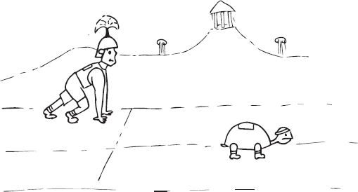
Bonus Fact
When I was in college I took a few courses in philosophy. During one of the lectures, the professor told the story of Zeno's paradox. The story was about a race between the famous Greek warrior Achilles and a tortoise. The tortoise told Achilles that it could beat him in a foot race. The great warrior laughed and said it was impossible. The tortoise said it was certainly possible as long as he got a small 10-meter head start.
The tortoise asked Achilles how long it would take him to run the 10 meters. The warrior responded it would take him no time at all.
The tortoise then asked how far Achilles thought the tortoise would have travelled when Achilles reached 10 meters. Achilles said maybe a meter at the most.
The tortoise then asked how far he would have travelled before Achilles covered that meter. The great warrior thought about it and stated the tortoise would have covered a few centimeters.
The tortoise responded that every time Achilles caught up with him, the tortoise would have run a little bit further. Achilles could never truly catch him, so the tortoise would always win the race. With that, the mighty Achilles conceded the race.
Burndown Charts
An agile project needs a way to ensure that things are on track and that the team is following the agile method. Burndown charts are an easy and important way to do this.
Free Analogy
When I was younger, I would go away for the summer to camp. After several days of camping, we all had to face the dreaded prospect of showering. At camp, the showers were lined up against the wall of a large room with four showerheads on each side. Each shower had its own tiny electric water tank. After you turned on the water, you had about two minutes of warm showering. After that, your experience changed dramatically as the warm water would stop and your shower water turned frigid.
One year, on the opposite side of the wall, the camp installed high-efficiency showerheads. These new showers constrained the amount of warm water that could come out, causing the warm water to come out in a slow and steady trickle.
So each day, we all had a choice. We could have a five-minute warm shower with a slow and steady trickle of water, or we could have a two-minute shower with a short burst of warm water that would end abruptly.
This resembles the two ways you can use your board with agile. If you use Scrum, then the constraint will be the days in the sprint. Every two weeks, you fill the board with a number of tasks the team will deliver. The work will end abruptly at the end of the sprint. With Kanban, you can fit as many tasks as you want on the board, but the workload will be slow and steady. It'll be limited by whatever constraint you put in the doing column. You'll be regulating the flow of work that comes through the team.
The paradox is that every time you travel halfway to your destination, you're still a distance away from finishing the race. One day you'll be half the distance, the next day you'll be one-quarter the distance, the next day you'll be one-eighth the distance and so on. But you'll always be one step short of completion.
As a project manager, I was always running into this paradox. We may not have called it an endless race, but it certainly felt like it. I would ask the developers how close they were to finishing the next milestone and they would invariably say they were about 80% complete. The next time I asked, they would say 87% complete. The next time, they said maybe 87% complete. Things never seemed to end.
This is the problem when you use a measurement that can always expand. The team will always split the difference and have trouble completing the work. If this happens with too many tasks, then you might have an unpleasant surprise when you reach the completion date. You could have a lot of tasks that are only 80% complete.
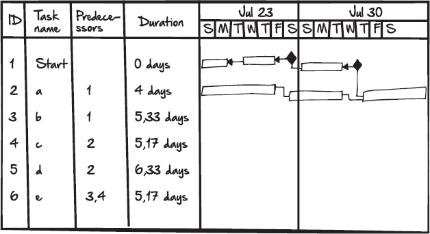
In traditional project management, you'll typically use Gantt charts or timelines. These are horizontal bars that stretch out over time. The bars end when there is a release date. There are also diamonds that represent milestones. The bars will travel the horizon of the project. They'll reach across time chasing those distant milestones.
With these charts it is very easy to add a little bit more over time. You just expand the bar a little bit further. Sometimes people don't even notice. Without knowing it, your project will run like the mighty Achilles—closing in on the milestone but not quite completing the distance.
Agile tries to combat this tendency by breaking everything down into discrete chunks of work. Each of these chunks has to be delivered within a timebox.
The challenge is to show this workflow in an easy-to-read chart. The project stakeholders need to be able to see that these chunks are finishing at a predictable rate.
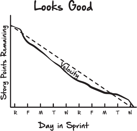
The most widely used of these high-level charts are agile burndowns. These charts are easy-to-read graphic representations of how much work the team has completed. It also shows how much work the team is expected to complete. The chart follows a predictable linear pattern.
The purpose of these charts is to show how much work the team has completed over time. On the far right of the chart, there's the finish date. The team should complete the work and zero in on the final date. The chart should burn down to the due date.
Free Analogy
The lines on the burndown look a little like a subway map. If you ride the subway, you might see the dark line representing the current train. Sometimes there's a dashed line to show future train lines. You can see all the stops in a linear pattern. Where the train line ends, the future dashed line continues in the same direction. Then there's a label that says future stop with the completion date. You can see the linear expansion of the subway. One day, the line will go one stop further.
The burndown chart works the same way. The work burns down in a predictable direction. The line goes all the way to the current day. The future work is a dashed line that shows how much of the work is left to complete.
Burndown charts are very popular for a few reasons. The main reason is that everything in agile is timeboxed. That means that the team will always be working in predictable chunks of time. There's also a strong motivational factor in using the chart. There's something very satisfying about the team zeroing in on the due date. It's much more emotionally satisfying to move toward completing the work. Each day or each sprint, your team is a little closer to the fixed goal.
One of the most powerful aspects of the burndown chart is that it cannot expand beyond the due date. The cost and time are fixed. The chart is designed to burn down to zero. The team will not be able to split the difference. There's no danger that the chart will increase incrementally over time. It can't, like Achilles, be inching forward but never closing the distance.
The only way the chart makes sense is to eliminate work. You can only add or remove scope. You can't break the timebox, but you could remove user stories.
There are two common types of burndown charts. There's the sprint burn down and the release burn down. Each of these charts follows the same pattern. On the bottom of the chart, along the x-axis, there is a fixed measurement of time. Up the y-axis, there is a fixed amount of work to be done.
Pro Tip
When you create these charts, make sure that you label them appropriately. You won't want to put your sprint and your release burndown charts next to each other. This might cause some confusion. It's usually best to put your sprint burndown chart next to your task board.
The Sprint Burndown Chart
With the sprint burndown chart, the x-axis will cover the days that make up the sprint (two weeks) and the y-axis will cover the number of story points for that sprint.
There is also one vertical dashed line that represents the team's projected productivity. It's like the dashed line on the subway map. It's showing where the team should be going. This is the team's velocity and is based on their historical productivity. If the team has a velocity of 50, then the dashed line will start at 50 on the y-axis and work its way down to zero at the end of the sprint. This is the amount they're expected to deliver during the sprint based on past performance. The actual team performance is plotted on the chart and compared to the estimated performance.
The lines on the sprint burndown chart help you to visually extrapolate the team's progress. Even for someone who doesn't know very much about the project, they can tell the trajectory of two lines. Both lines, the team's velocity and actual work, should be close together. When these two lines are not closely weaved together, then you probably have an obstacle.
The Release Burndown Chart
The second burndown chart the team will work with is the release burndown, which is very similar to the sprint burndown. This chart is usually more for the benefit of the stakeholders. It gives a much broader view of the team's progress. This chart should be less of a surprise for the team, but it could be useful for managers who are focused on the big picture.
The release burndown chart will have the familiar story points along the y-axis and the time along the x-axis. The main difference is the duration and the number of story points. In a release burndown, the velocity is estimated across several sprints. If the team's velocity is 50 then the release burndown will use 50 multiplied by the number of sprints in the release to chart the work. For example, if there are 10 sprints then the number at the top of the y-axis will be 500.
This chart will also have the dashed vertical line starting from the top of the y-axis and making its way to the end of the x-axis. This line still represents the estimated amount of work to be done but it will cover the whole 10 sprints instead of just one sprint.
Pro Tip
You can put the release burndown chart in a less prominent position in the shared workspace. You don't necessarily want to take up valuable wall space with your release burndown chart. Since this chart represents the big picture of the entire project, the team won't need to use it every day. Your best wall space should go to reports that are more frequently updated. These will usually be the team's task board, the backlogs, and the sprint burndown.
Updating The Burndown
It's inevitable that at some point a stakeholder is going to ask, “How's it going with your project?” When that happens, you won't want to give them a rundown of the team's velocity or estimates. Instead, they'll want something like “we're on track,” or “things are looking good.” Then you can point to a high-level report. For most agile teams, this high-level report is a burndown chart.
Like all reports, the burndown chart is only as good as the information that goes into it. To get the most from your burndown, you'll want to make sure that the team updates the chart in a regular pattern. Typically, in an agile team, the ScrumMaster is the person responsible for keeping the charts up to date.
Also note that the burndown chart will always be a few steps behind the team's velocity.30 That's okay. Each of these charts is time lagged to make sure they're accurate. The sprint burndown is yesterday's progress. The release burndown is accurate to the last sprint.
The two different types of burndown charts are updated at different times.
Updating The Sprint Burndown Chart
Typically, the ScrumMaster will update the sprint burndown chart before the daily standup. The sprint burndown will reflect yesterday's work. The ScrumMaster looks at the done column on the task board. When all the tasks for the story are complete, they add that user story's points to the burndown chart.
Let's say a team has a velocity of 50. That means that the team is expected to complete 50 points worth of user stories within the sprint. Each day before the standup, the ScrumMaster will create a point on the burndown. That point will be the number of story points that the team has burned down from the velocity.
If the team has completed one user story worth five points, then the point on the burndown will decrease by five. If they did that on the first day, the ScrumMaster would create a point on the chart near the number 45 on the y-axis. This point will line up with the day of the sprint on the x-axis. In this case, they'd do this on the first day of the sprint.
Each day the team should burn down a certain number of user stories. If the two lines are not closely matched, the ScrumMaster might ask about any unreported obstacles. Sometimes, this means that the team is having trouble finishing the work.
Updating The Release Burndown Chart
The ScrumMaster should update the release backlog just before the product demonstration. Remember that these activities are at the very end of your sprint. They will happen just before you demonstrate that sprint's deliverable to the project stakeholders.
Typically, the ScrumMaster will take a final tally of the story points completed. Any stories that were not completed will be moved back to the product backlog. Sometimes, you'll have stories that are partially completed. For those, it's best to take the task's yellow sticky notes and stick them onto the back of the story card. Then put the stories and tasks back into the backlog.
The ScrumMaster will then take this final tally and put a point on the burndown chart to represent the number of stories completed. This can then be compared to the estimated work.
Seeing Trouble
The burndown charts can be a powerful information radiator. Senior managers, ScrumMasters, and product owners will have a keen interest in these reports.
They just need to be updated regularly and filled out correctly. If you're the ScrumMaster for the team, try to make sure that you stay on top of these reports. They'll help you keep track of obstacles and recognize problems that are being reported by the team.31
Although each chart is different, there are a few common problems that you can identify by looking at the burndown charts. These trouble spots will mostly be visible in the sprint burndown chart. The release burndown is usually too high-level to isolate problems for the team.
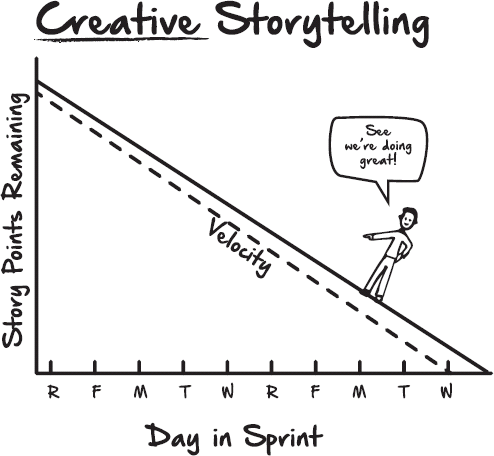
An easy way to remember these problems is to think of the acronym PEACH, which stands for pessimistic, epics, adding, creative storytelling, and hang gliding. These are the five most common challenges identified by the burndown charts.
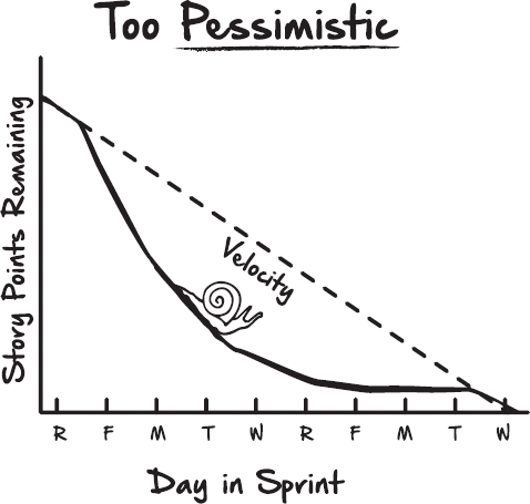
Pessimistic: Trouble can arise when the team is too pessimistic about what it can accomplish in the sprint. Often the teams will just not add enough work. This is very common when the team is just starting out with agile. What this will usually look like on the sprint burndown is a steep and steady decline with a long horizontal line at the end.
Sometimes what happens is that the team will realize that they didn't add enough work and then they'll slow their pace to fill the sprint. This will give the chart its steep and steady decline that leads to a long tailing off at the end. If you're the product owner for the team, you want to bring this up during sprint planning. It usually means the team is not pushing itself hard enough to deliver with an aggressive but predictable pace.
If you're the ScrumMaster for the team, you probably see this in organizations that are heavily invested in the waterfall approach. Often in these organizations, the developers are used to padding their estimates. They see them more as commitments. They under-commit to the sprint as a way to protect themselves from unknown risks. You'll want to bring this up at the standup. Use the burndown chart as a way to start the conversation.
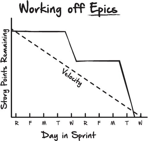
Epics: Sometimes the team won't break their epics down into the stories they need to deliver the sprint. Instead of a smooth predictable delivery, the burndown chart will look like a stepped plateau. There'll be a big delivery and a long wait.
This could mean that the team is having a couple of problems. The first is that the product owner might have trouble breaking the epics into user stories. The product owner just might need more experience with creating good stories. The second is that the development team might not recognize that these are bad user stories. Estimating the epics at 21 points or higher means that they might only have one or two user stories for each sprint.
When this happens, the ScrumMaster might want to coach the team on how to effectively write and estimate user stories.
Adding: Another problem is adding too much work. When this happens, the burndown chart will have a slow decline. It will be clearly visible after the first few days that the work line has a trajectory well beyond the end date.
Remember that the y-axis is the team's velocity. Velocity is the historical average of how much the team can accomplish in a sprint. How can the team be wrong about their own estimate on what they can accomplish? The answer is they usually aren't.
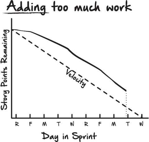
This is almost always due to an outside influence on the team. Typically what will happen is a senior manager will encourage the team to “increase their velocity.” Then the team will add a bunch of user stories to the board. This can also happen when the product owner is overloading the team.
The ScrumMaster should try to protect the team from being overloaded. The ScrumMaster usually creates the board, so it should be very apparent that the team is burdened with too much work.
The team might want to invite the product owner to the sprint retrospective and then have a frank discussion on how to avoid this from happening in the future. The team needs to produce at a predictable pace.
Creative Storytelling: Sometimes the team won't see very much value in the sprint burndown chart. Maybe they'll see it as too much documentation. Or they'll think it's just a different way of looking at the task board, so they'll create a fiction to appease any managers who might look in on the team.
A fictitious burndown chart is one of the easiest problems to spot—it will be too perfect. There'll be the dashed vertical line to show the team's velocity. The solid line will be right on top of it. It will be perfectly aligned. This could mean that the team is not reporting their progress, or it could mean that the ScrumMaster is not recording their progress. Either way, it's a sign that the team thinks that lightweight documentation means no documentation.
Hang Gliding: This is when the burndown has a long, smooth work line up until the last few days of the sprint. Then just before the sprint ends, the work takes a deep vertical dive on the day before delivery. On the task chart, the tasks will all be stuck in doing. Then on the last day, everyone will move their tasks to done.
This usually means that the development team is not working on the highest-value stories. Instead, they're working on all the stories at once, then finishing them on the last few days of the sprint.
If you're the product owner, you are going to want to push the team toward value-driven delivery. If you see hang gliding on the sprint burndown, you want to talk to the team. Work with the ScrumMaster to ensure that the team understands that they should deliver the stories from top to bottom, ideally finishing the top stories before moving on to the next ones.
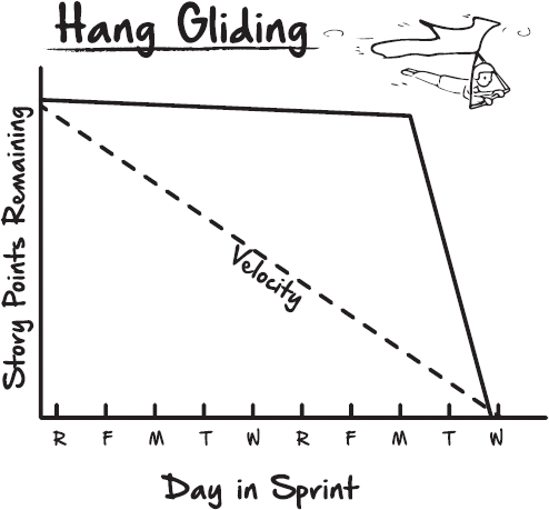
Much like its real-life counterpart, hang gliding can be a dangerous business for the team. If they don't finish the highest-value stories first, then they're in danger of not delivering at all. Remember that only the finished work is delivered in the sprint demo.
Dealing With Challenges
There are a number of challenges you will have to deal with in your quest to turn your company into an agile company. Even though there are a number of challenges, you can alleviate their impact.
How To Avoid Expanding The Burndown
In many ways, the burndown charts are bookended. The charts depend on the idea that you can't increase capacity or add time. So each side of the chart will have a start and a finish. For the y-axis, the team will have a finite amount of work they can deliver. For the x-axis, they will have a finite amount of time. Both points are fixed on the burndown from beginning to end.
This is not usually much of a problem with the sprint burndown. The sprints are also locked from start to finish. There isn't much of a need to add work to the sprint. Even if the team is pessimistic, they usually ride out the rest of the sprint and just add more stories the next time around.
It's far more common to try and add more stories to a release. Sometimes, the development team can work with the product owner to swap out equally sized stories, but other times, it's just not going to happen. The product owner wants more than the team can provide.
The trick is to allow for this, but at the same time, record the new stories in the burndown chart. In a sense, you're going through a controlled destruction of your burn down.
With traditional project management, this wasn't much of a problem. In a Gantt chart, all you have to do is extend the lines a little bit further in time. Your sponsor wanted a little bit more scope, so you added a little bit to the bar and pushed out your milestones.
Pro Tip
With burndown charts, you have finite time. In order for this chart to work, you need a non-expanding unit of time. There is no easy way to edit the chart for a later deadline. The whole project burns down to zero. In a regular burndown, there is no way to express negative time.
So you have a problem. On the one hand, the chart is designed to enforce restrictions on time and story points. On the other hand, you have a product owner who's excited about the project and is adding work for the team. Sometimes, it just isn't realistic to deny additional work. Typically, there are two ways you can deal with this problem. The first way is to scrap the idea of the burndown chart. Your team can use much more sophisticated charts. These charts are usually a sequence of stacked bar charts that show the added work.
The stacked bar charts work a bit differently from a standard burndown. These charts use a bar instead of a point that intersects the x- and y-axis. That means that each sprint will have its own progress bar. The bars will line up along the baseline of the x-axis.
The key difference is that this chart allows negative progression along the y-axis. Remember that your y-axis is the number of story points. This gives your product owner the freedom to commit more work to the development team.
The second way to deal with this problem is to create a wormhole burndown chart. Much like its science fiction counterpart, this chart will wormhole forward through time. It will burrow past the original finish date.
Both of these solutions are ugly in their own way. The bar charts give up a lot of the simplicity and readability that you get from a regular burndown. Instead of a simple information radiator, you get a much more sophisticated report.
The wormhole burndown is a bit ridiculous. Why create a burndown chart if the product owner wants to go on forever? It's inherently un-agile. You're breaking timeboxes and adding complexity.
Nevertheless, these alternatives might be necessary. The thing to keep in mind is that with both these scenarios, you're upending the intended purpose of the burndown. You want to communicate to your stakeholders and your team that time is limited.
In many ways, this is the same challenge you have with breaking a timebox. Remember, the timebox is the amount of time that is set aside for most agile activities. When you break the box, it adds uncertainty to the project. The team has to figure out a way to make up for lost time. That may mean the need to scale back on their commitments.
You run into the same problem when you continue burning down past the release in the release burndown chart. It adds uncertainty. It makes it seem like the project could go on forever. This will make it more difficult for the team to stand by their commitments. They'll be less sure of how much time they have to deliver on their promises.
Retrofitting
I once worked for an organization that was heavily invested in traditional project management. They maintained a shared document library with templates for almost every report imaginable. It represented decades of work. It was a treasure trove of effort from previous project managers. The project charter template was so old that it included a brief explanation of email. I remember it saying, “This charter can be redistributed using an electronic messaging format.”
It was a great resource for the organization. If you were a new project manager you could easily plug the templates into any new project. Everybody knew what to use and everybody knew what to expect.
But this resource for traditional project managers ended up being a serious obstacle for the agile project. After years of standardizing, the organization relied on these reports. The executive assistants had created macros to copy and paste fields from the spreadsheets. Everyone in the project management office (PMO) knew exactly what to look for in each of the documents.
The agile project didn't fit into this established library. The new agile team was even having trouble establishing itself as a project. The PMO would only create a new project if there was a project schedule with a list of milestones.
This was a bit of a challenge for the team. No one wanted to reinvent decades of work. This was especially true because the agile project was just starting. At the same time, the team didn't want to submit documentation to the organization that was a complete fiction.
There were several templates for Gantt chart and milestones. The team could create them, but they would be updated as soon as they came off the printer. The product owner would likely change them after a few sprints.
It also seemed that if the team created these documents, they would be working against their own long-term interests. Everyone had been through training. Many of the stakeholders understood that this was something new and different.
The team was worried that the project would no longer be seen as new and interesting. Instead, it would look like a mismanaged and poorly documented traditional waterfall project. Each week, the executive sponsors would get a report with a red traffic light next to the project saying it wasn't on schedule or milestones were missed.
Before we started the project, the team decided to meet and discuss whether to retrofit the organization's documentation to fit agile. We had to decide whether we wanted to try and change the organization, or did we want to create reports that didn't really reflect our actual work. If it helped us to get started, then in the future, we could go back and work more closely with the PMO.
The team had executive-level sponsorship. They could've attempted to persuade the PMO to let the team run outside their normal process. The project could be a rowboat, trailing alongside the larger and more established PMO. The team wouldn't benefit from the PMO's resources, but it wouldn't have to play by their rules.
The team decided that this made the project more vulnerable. It was independent, but it wasn't setting the stage for any organizational change.
In the end, they decided to retrofit only three templates out of the library. The team worked with the project manager to create an agile counterpart to the project charter, the project management plan, and the schedule.
The project charter was a relatively easy transformation. Instead of milestones, the charter established a half-dozen high-level epics that the product owner committed to delivering. It was likewise fairly simple to convert the vision, mission, and success criteria of an agile project charter.
The project management plan was a bit more challenging. In traditional project management, the project manager manages the plan. In agile, the team was self-organized. There's no one person who knows everything you need to know about the project.
The team decided that they would invite a project manager to the sprint planning. The project manager could update the project plan with new deliverables. The project manager warned the PMO that this plan would be designed to be flexible and would frequently change. It couldn't go through a traditional project's change-management process.
The project schedule was the most difficult to retrofit. An agile project, by design, does not have a lot of planning up front. It gives the product owner the flexibility to prioritize the project. The schedule is a byproduct of the thoroughly planned project. The team didn't want to feel like they were taking something away from the product owner.
Nevertheless, the team found that by working with the project manager, the product owner could create some high-level milestones. When the project manager attended the sprint-planning activity, they would backfill the milestones with project deliverables.
The team found that when they were retrofitting the reports, the most important relationship was between the product owner and the project manager. They could work together closely without taking up too much of the developers’ time working on low-value documentation. The ScrumMaster worked to make sure that the team wasn't spending too much time in sprint planning producing traditional documentation.
The triangle of responsibility worked well. The project manager was able to create some useful retrofitted reports. The product owner lost some flexibility, but was able to work more smoothly in the organization. The ScrumMaster guarded the framework and made sure that the team wasn't traveling too far down the path to waterfall.
Working In A Distributed Workspace
There are a lot of challenges with distributed agile teams. One challenge is how the team coordinates the reports. In agile, there's a lot of emphasis on working in a shared space. The team should be working together closely to deliver high-value user stories.
The team will be layered. They'll need to blend their expertise to produce a complete deliverable. There's no way to add vertical slices to the team's layers without a disconnect occurring.
That being said, it's often unrealistic to have everybody in the same room. Many large organizations outsource parts of development to large shops that specialize in a niche technology. Often the teams are more local but some members have the opportunity to work from home.
Pro Tip
The agile team depends on their information radiators. The task board, product backlog, and burndown charts are all reports that need constant feedback from the team. These reports are only as good as the effort that goes into making and maintaining them. The reports are much more challenging to maintain when part of the development team is at home or in a different country.
Some agile teams strongly feel that the developers are the ones who should maintain these reports. That might work well if the team is small and consistently in their shared workspace, but when you're working with distributed teams, it's usually much easier to make the ScrumMaster responsible for keeping reports up to date.
The ScrumMaster can act like a switchboard operator by coordinating with individual members and being their remote hands to update the board.
There are also several software packages available that allow the team to update their work remotely. These software packages have virtual task boards that will create automated burndown charts based on the stories’ swim lane column.
Both of these solutions have their downsides. When the ScrumMaster updates the reports, it might be okay for the local team, but it doesn't do much for the person who's working remotely. It also makes the ScrumMaster an impediment to self-organization.
It will start to feel like a ScrumMaster is working like a traditional project manager. It's hard to distinguish between someone asking for an update for the project versus someone asking for an update for a report.
The software also has its own downside. Developers are all too happy to rely completely on software. Most of the time that's what they're producing. It makes sense that they would see it as a great tool. But that's not always the best thing for an agile team.
Many agile reports force the team to interact. If the task board is a real board, the team has to sit together when they plan their sprints. When the task board is software, then the team can be at home, on another floor, or in another country. The benefit of the software can also be the flipside of the problem. This freedom allows developers to work on their own. They have greater flexibility to isolate themselves from the rest the team. This could be a slippery slope to less interaction and more miscommunication.
Field Notes
I once worked for an organization that went through a serious reorganization in the middle of an agile project. Many of the team members were pulled into different groups. Some of these different groups were in different buildings. Everyone agreed that this change should not impact the project's deliverable, but it made it much more difficult for the team to be in the shared workspace. Everyone was always being called over to different buildings for different meetings.
The team decided to supplement the shared workspace with a very popular software package. The software allowed for a shared task board and automatically created the burndown charts.
Before the reorganization, everyone would come together for the morning standup. After the software was installed, only about a third of the team attended the morning standup. The other two-thirds of the team listened in on a conference line. The team projected the virtual task board on the wall and virtually moved their stories across the board. What started out as a very nice morning ritual quickly turned into a tedious exercise in a dimly lit room.
The software gave everybody the freedom to stay in their building, but this came at a cost. It limited the spontaneous conversations that the team had after the standup. It also made the team feel less cohesive. There was always part of the team that was no more than a distant voice on a conference line.
It's important to remember that agile reports are an artifact created by the team, but they're also a vehicle for bringing the team together. The ScrumMaster and the software can be stopgaps to help create the reports, but this convenience can come with a cost. If you're the ScrumMaster for the team, you should work to keep the team in the shared workspace.
If it's not possible to keep the team together, then try one of these two alternatives. Just keep in mind that the team should make an extra effort to make sure they spend the maximum time collaborating.
Sometimes it's better to have smaller teams that are working together. If the team is depending too much on the ScrumMaster to run the software, then it may be worth a discussion with the product owner to break the team into smaller groups.
30 The Agile Manifesto Principle 7: “Working software is the primary measure of progress.”
31 “If you can't measure it, you can't manage it.” – Peter Drucker