
7
Making Visualizations that Look Great and Work Well
Tableau applies many good visual practices by default, and, for quick analysis, you likely won’t worry too much about changing many of these defaults. However, as you consider how to best communicate the data story you’ve uncovered, you’ll want to consider how to leverage everything, from fonts and text to colors and design, so that you can communicate well with your audience.
Tableau’s formatting options give you quite a bit of flexibility. Fonts, titles, captions, colors, row and column banding, labels, shading, annotations, and much more can all be customized to make your visualizations tell an impressive story.
This chapter will cover the following topics:
- Visualization considerations
- Leveraging formatting in Tableau
- Adding value to visualizations
As you think about why you should adjust a given visualization, there are several things to consider. We’ll start with those considerations.
Visualization considerations
Tableau employs good practices for formatting and visualization from the time you start dropping fields on shelves. You’ll find that the discrete palettes use colors that are easy to distinguish, the fonts are pleasant, the grid lines are faint where appropriate, and numbers and dates follow the default format settings defined in the metadata.
The default formatting is more than adequate for discovery and analysis. If your focus is analysis, you may not want to spend too much time fine-tuning the formatting until you are getting ready to share results. However, when you contemplate how you will communicate the data to others, you might consider how adjustments to the formatting can make a major difference to how well the data story is told.
Sometimes, you will have certain formatting preferences in mind or a set of corporate guidelines that dictate font and color selections. In these cases, you might set formatting options in a blank workbook and save it as a template. This workbook file could be copied in the filesystem any time you wish to begin a new set of views and dashboards.
Here are some of the things you should consider:
- Audience: Who is the audience and what are the needs of the audience?
- Goal: Is the goal to evoke an emotional response or to lay out the facts for an impassioned decision? Are you highlighting an action that needs to be taken, or simply trying to generate interest in a topic?
- Setting: This is the environment in which the data story is communicated. Is it a formal business meeting where the format should reflect a high level of professionalism? Is it going to be shared on a blog informally?
- Mode: How will the visualizations be presented? You’ll want to make sure rows, columns, fonts, and marks are large enough for a projector or compact enough for an iPad. If you are publishing to Tableau Server, Tableau Online, or Tableau Public, then did you select fonts that are safe for the web? Will you need to use the device designer to create different versions of a dashboard?
- Mood: Certain colors, fonts, and layouts can be used to set a mood. Does the data tell a story that should invoke a certain response from your audience? Is the data story somber or playful? The color red, for example, may connote danger, negative results, or indicate that an action is required. However, you’ll need to be sensitive to your audience and the specific context. Colors have different meanings in different cultures and in different contexts. In some cultures, red might indicate joy or happiness. Also, red might not be a good choice to communicate negativity if it is the color of the corporate logo.
- Consistency: Generally, use the same fonts, colors, shapes, line thickness, and row-banding throughout all visualizations. This is especially true when they will be seen together on a dashboard or even used in the same workbook. You may also consider how to remain consistent throughout the organization without being too rigid.
These considerations will inform your design and formatting decisions. As with everything else you do with Tableau, think of design as an iterative process. Seek feedback from your intended audience often and adjust your practices as necessary to make sure your communication is as clear and effective as possible. The entire goal of formatting is to more effectively communicate the data.
Leveraging formatting in Tableau
We will focus on worksheet-level formatting in this chapter, as we’ve already covered metadata (data source-level formatting) in Chapter 2, Connecting to Data in Tableau, and we will cover dashboards and stories in Chapter 8, Telling a Data Story with Dashboards. However, it is beneficial to see the big picture of formatting in Tableau.
Tableau employs default formatting that includes default fonts, colors, shading, and alignment. Additionally, there are several levels of formatting you can customize, as shown in the following table:
|
Format Level |
Description |
Example |
|
Locale |
Based on the locale of the system (or a manually adjusted locale) and sets the default format used for currency and dates. |
Setting the locale to English (United Kingdom) causes December 21 to render as 21/12/2021 while English (United States) will render the date as 12/21/2021. |
|
Data Source |
The default formatting for a field including number and date formats, colors, and shapes. |
Setting the default number format of the Sales field to Currency (Custom). |
|
Workbook |
The default format applied at a workbook level. This includes the default font for worksheets, tooltips, and titles. It also allows you to specify default formats for lines. |
Making the default format of trend lines a light-gray dotted line. |
|
Story |
Formatting applied to a story such as the story shading, title, navigator, and text objects. |
Making the default shading for the navigator a light blue. |
|
Dashboard |
Formatting applied to a dashboard such as the overall shading, dashboard title, worksheet titles, and text objects. |
Setting the default font of worksheet titles to Tableau bold, italic, and dark green. |
|
Worksheet |
All the various formatting options for a visualization including fonts, alignment, shading, lines, banding, and field formatting. |
Setting the alignment for a field to be right-aligned in the pane. |
Here is some additional detail:
- Locale level: You can set the locale for a workbook from the menu. Select File | Workbook Locale.
- Data source level: We’ve already seen how you can set default formats for numeric and date fields. Other defaults, such as colors and shapes, can also be set using the Default Properties menu on the drop-down menu in the data pane.
- Workbook level: Various global formatting options may be set. From the menu, select Format | Workbook.
- Story level: Navigate to a story tab and select Format | Story (or Story | Format) to edit formatting for story-specific elements. These include options for customizing the shading, title, navigator, and description.
- Dashboard level: Dashboard-specific elements can be formatted. When viewing a dashboard, select Format | Dashboard (or Dashboard | Format) to specify the formatting for dashboard titles, subtitles, shading, and text objects.
- Worksheet level: We’ll consider the various options. The following types of formatting are available for a worksheet:
- Sheet formatting: This formatting includes font, alignment, shading, borders, and lines. You may override the formatting of the entire sheet for row and column-specific formatting.
- Field-level formatting: This formatting includes fonts, alignment, shading, and number and date formats. This formatting is specific to how a field is displayed in the current view. The options you set at the field level override defaults set at a worksheet level. Number and date formats will also override the default field formatting.
- Additional formatting: Additional formatting can be applied to titles, captions, tooltips, labels, annotations, reference lines, field labels, and more.
- Rich-text formatting: Titles, captions, annotations, labels, and tooltips all contain text that can be formatted with varying fonts, colors, and alignment. This formatting is specific to the individual text element.
Let’s start by examining workbook-level formatting.
Workbook-level formatting
Tableau allows you to set certain formatting defaults at a workbook level. To view the options and make changes to the defaults, click Format | Workbook.... The left pane will now show formatting options for the workbook:

Figure 7.1: Workbook formatting options
The options include the ability to change default Fonts, which apply to various parts of a view or dashboard, and default Lines, which apply to the various types of lines used in visualizations. Notice also the Reset to Defaults button, should you wish to revert to the default formatting. Any changes here will impact the whole workbook.
At times, you’ll want to apply formatting specific to a given sheet, and we’ll consider that next.
Worksheet-level formatting
You’ve already seen how to edit metadata in previous chapters, and we’ll cover dashboards and stories in detail in future chapters. So, we’ll shift our attention to worksheet-level formatting.
Before we look at specifically how to adjust formatting, consider the following parts of a view related to formatting:

Figure 7.2: Parts of a view that can be formatted using worksheet-level formatting
This view consists of the following parts, which can be formatted:
- Field labels for rows: Field labels can be formatted from the menu (Format | Field Labels...) or by right-clicking them in the view and selecting Format.... Additionally, you can hide field labels from the menu (Analysis | Table Layout and then uncheck the option for showing field labels) or by right-clicking them in the view and selecting the option to hide. You can use the Analysis | Table Layout option on the top menu to show them again, if needed.
- Field labels for columns: These have the same options as labels for rows, but they may be formatted or shown/hidden independently from the row-field labels.
- Row headers: These will follow the formatting of headers in general unless you specify different formatting for headers for rows only. Notice that subtotals and grand totals have headers. The subtotal and grand total headers are marked a and b respectively.
- Column headers: These will follow the formatting of headers in general unless you specify different formatting for headers for the columns only. Notice that subtotals and grand totals have headers. The grand total header marked in the preceding screenshot is a column header.
- Pane: Many formatting options include the ability to format the pane differently than the headers.
- Grand totals (column) pane: This is the pane for grand totals that can be formatted at a sheet or column level.
- Grand totals (row) pane: This is the pane for grand totals that can be formatted at a sheet or row level.
Worksheet-level formatting is accomplished using the format window, which will appear on the left side, in place of the data pane.
To view the format window, select Format from the menu and then Font…, Alignment…, Shading…, Borders…, or Lines…:

Figure 7.3: Formatting options for a worksheet
You can also right-click nearly any element in the view and select Format. This will open the format window specific to the context of the element you selected. Just be sure to verify that the title of the format window matches what you expect. When you make a change, you should see the view update immediately to reflect your formatting. If you don’t, you are likely working in the wrong tab of the formatting window, or you may have formatted something at a lower level (for example, Rows) that overrides changes made at a higher level (for example, Sheet).
You should now see the format window on the left, in this case, Format Font. It will look like this:
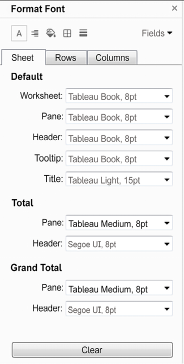
Figure 7.4: The Format Font pane
Notice these key aspects of the formatting window:
- The title of the window will give you the context for your formatting selections.
- The icons at the top match the selection options of the Format menu. This allows you to easily navigate through those options without returning to the menu each time.
- The three tabs, Sheet, Rows, and Columns, allow you to specify options at a sheet level and then override those options and defaults at a row and column level. For example, you could make the Row grand totals have different pane and header fonts from the Column grand totals (although this specific choice would likely be jarring and is not recommended!).
- The Fields dropdown in the upper-right corner allows you to fine-tune formatting at the field level.
- Any changes that you make will be previewed and result in a bold label to indicate that the formatting option has been changed from the default (notice how the font for Header under Total has been customized, resulting in the label text of Header being shown in bold).
The three options for clearing the format are as follows:
- Clear Single Option: In the format window, right-click the label or control of any single option you have changed and select Clear from the pop-up menu.
- Clear All Current Options: At the bottom of the format window, click the Clear button to clear all visible changes. This applies only to what you are currently seeing in the format window. For example, if you are viewing Shading on the Rows tab and click Clear, only the shading options on the Rows tab will be cleared.
- Clear Sheet: From the menu, select Worksheet | Clear | Formatting. You can also use the dropdown from the Clear item on the toolbar. This clears all custom formatting on the current worksheet.
The other format options (such as alignment and shading) all work very similarly to the font option. There are only a few subtleties to mention:
- Alignment includes options for horizontal and vertical alignment, text direction, and text wrapping.
- Shading includes an option for row and column banding. The banding allows alternating patterns of shading that help to differentiate or group rows and columns. Light row banding is enabled by default for text tables, but it can be useful in other visualization types, such as horizontal bar charts as well. Row banding can be set to different levels that correspond to the number of discrete (blue) fields present on the Rows or Columns shelves.
- Borders refers to the borders drawn around cells, panes, and headers. It includes an option for row and column dividers. You can see in the view the dividers between the departments. By default, the level of the borders is set based on the next-to-last field in the rows or columns.
- Lines refers to lines that are drawn on visualizations using an axis. This includes grid lines, reference lines, zero lines, and axis rulers. You can access a more complete set of options for reference lines and drop lines from the Format option of the menu.
We have considered how to adjust formatting at the entire workbook level as well as for a given sheet. Let’s turn our attention to formatting at the field level.
Field-level formatting
In the upper-right corner of the format window is a little drop-down menu labeled Fields. Selecting this drop-down menu gives you a list of fields in the current view, and selecting a field updates the format window with options appropriate for the field. Here, for example, is the window as it appears for the SUM(Sales) field:
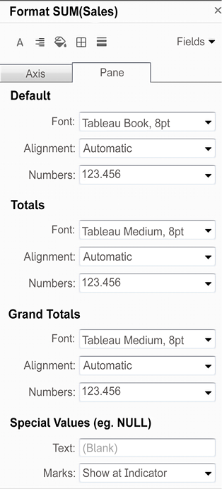
Figure 7.5: The Format pane for field-level formatting
The title of the format window will alert you to the field you are formatting. Selecting an icon for Font, Alignment, and so on from the top-left corner of the window will switch back to sheet-level formatting. However, you can switch between the tabs of Axis and Pane. These two tabs allow you to have different formatting for a field when it is used in the header or as an axis label versus how it is formatted in the pane of the view. The options for fields include Font, Alignment, Shading, and Number and Date formats. The last two options will override any default metadata formats.
You’ll notice special options for formatting certain types of fields. Numbers allow a wide range of formatting options and even include the ability to provide custom formatting, which we’ll consider next.
Custom number formatting
When you alter the format of a number, you can select from several standard formats, as well as a custom format. The custom format allows you to enter a format string that Tableau will use to format the number. Your format string may use combinations of the number sign (#), commas, negative signs, and parentheses, along with a literal string enclosed in quotation marks to indicate how the number should display.
The format string allows up to three entries, separated by semicolons to represent positive, negative, and zero formats.
Here are some examples, assuming the positive number is 34,331.336 and the negative number is -8,156.7777:

Figure 7.6: Examples of format strings and resulting values
You can replicate these examples and experiment with other format strings using the Custom Number Formatting view in the Starter or Complete workbooks:

Figure 7.7: Experiment with format strings using the Custom Number Formatting view in the Chapter 7 workbook
Notice how Tableau rounds the display of the number based on the format string. Always be aware that numbers you see as text, labels, or headers may have been rounded due to the format. For example, if you specify the format #,###, then a value such as 1500.03 would be shown rounded as 1,500, but if you used the format string #,###.##, then you would see the precise value, 1,500.03.
Also observe how you can mix format characters such as the number sign, commas, and decimal points with strings. The fourth example shown would provide a label where a value of zero would normally be displayed.
Finally, notice that the last example uses Unicode characters, which gives a wide range of possibilities, such as displaying degrees or other units of measure. Unicode characters may be used throughout Tableau in textboxes, titles, field names and labels, aliases, and more!
Selecting a predefined format that is close to what you want, and then switching to custom, will allow you to start with a custom format string that is close to your desired format.
Custom date formatting
In a similar way, you can define custom date formatting using a custom string. The following table illustrates some possible formatting of the date value of 11/08/2018, 1:30 PM based on various format strings:
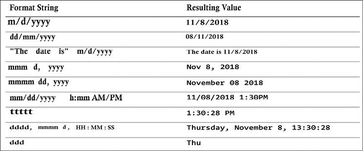
Figure 7.8: Some possible date formatting examples
These are merely examples, and you may include as many literal strings as you’d like.
For a complete list of custom date format string options, check out https://onlinehelp.tableau.com/current/pro/desktop/en-us/dates_custom_date_formats.htm.
Notice how applying some custom date formatting improves the readability of the axis for a small timeline in this example:

Figure 7.9: The custom format string used here is mmmmm, which results in a single letter for the month
Custom number and date formats are fine when you have values that need to be formatted. But what if there is no value? That is, how can we format NULL values? Let’s consider that next.
Null formatting
An additional aspect of formatting a field is specially formatting Null values. When formatting a field, select the Pane tab and locate the Special Values section, as shown in the following screenshot:

Figure 7.10: The Special Values options appear on the Format pane
Enter any text you would like to display in the pane (in the Text field) when the value of the field is null. You can also choose where marks should be displayed. The Marks drop-down menu gives multiple options that define where and how the marks for null values should be drawn when an axis is being used. You have the following options:
- Show at Indicator results in a small indicator with the number of null values in the lower right of the view. You can click the indicator for options to filter the null values or show them at the default value. You can right-click the indicator to hide it.
- Show at Default Value displays a mark at the default location (usually 0).
- Hide (Connect Lines) does not place a mark for null values but does connect lines between all non-null values.
- Hide (Break Lines) causes the line to break where there are gaps created by not showing the null values.
You can see these options in the following screenshots, with the location of two null values indicated by a gray band.
Show at Indicator reveals no marks in the gray band with the number of null values indicated in the lower-right corner:
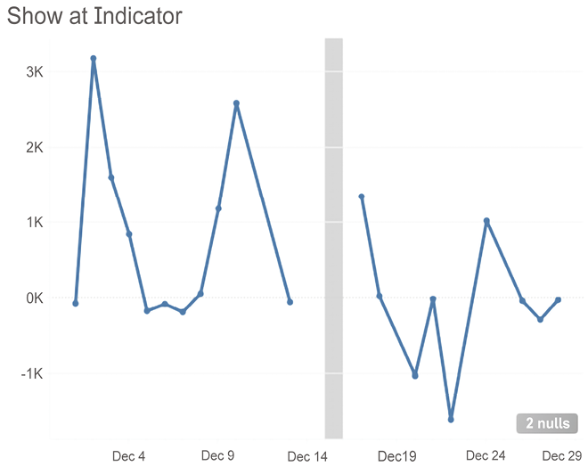
Figure 7.11: Show at Indicator
Show at Default Value places marks at 0 and connects the lines:

Figure 7.12: Show at Default Value
Hide (Connect Lines) removes marks for the missing values, but does connect the existing marks:
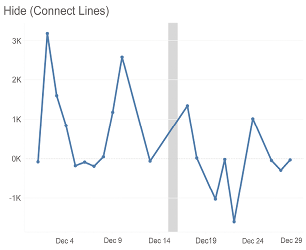
Figure 7.13: Hide (Connect Lines)
Hide (Break Lines) removes the marks for the missing values and does not connect the existing marks:

Figure 7.14: Hide (Break Lines)
Any of these options might have a good use but consider how each communicates the information. Connecting the lines might help communicate a movement over time but may also minimize the existence of missing data. Breaking the lines might help highlight missing values but might take away from the overall message. You’ll need to decide which option best meets your goals based on the considerations mentioned at the beginning of this chapter.
You’ll notice that the preceding line charts have little circle markers at the location of each mark drawn in the view. When the mark type is a line, clicking on the color shelf opens a menu that gives options for the markers. All mark types have standard options, such as color and transparency.
Some mark types support additional options such as border and/or halo, as shown here:

Figure 7.15: Adding Markers to lines
Knowing these options will help you as you think about how to communicate missing data, but always consider that another visualization type such as a bar chart might be even more effective in communicating missing values:

Figure 7.16: Bar charts are sometimes better than line charts for showing missing values
Knowing how to format null values gives you some options as you consider how to communicate the data. Let’s take a look at a few additional options.
Additional formatting options
Additional formatting options can also be accessed from the formatting window. These options include the following:
- A myriad of options for Reference Lines
- Line and text options for Drop Lines
- Shading and border options for Titles and Captions
- Text, box, and line options for Annotations
- Font, shading, alignment, and separator options for Field labels
- Title and body options for Legends, Quick Filters, and Parameters
- Cell size and Workbook theme options
You’ll find most of these relatively straightforward. A few options might not be as obvious:
- Drop Lines, which appear as lines drawn from the mark to the axis, can be enabled by right-clicking any blank area in the pane of the view with an axis and selecting Drop Lines | Show Drop Lines. Additional options can be accessed by using the same right-click menu and selecting Edit Drop Lines. Drop lines are only displayed in Tableau Desktop and Reader but are not currently available when a view is published to Tableau Server, Online, or Public.
- Titles and Captions can be shown or hidden for any view by selecting Worksheet from the menu and then selecting the desired options. In addition to standard formatting, which can be applied to titles and captions, the text of a title or caption can be edited and specifically formatted by double-clicking the title or caption, right-clicking the title or caption and selecting Edit, or by using the drop-down menu of the title or caption (or the drop-down menu of the view on a dashboard). The text of titles and captions can dynamically include the values of parameters, the values of any field in the view, and certain other data and worksheet-specific values.
- Annotations can be created by right-clicking a mark or space in the view, selecting Annotate, and then selecting one of the following three types of annotations:
- Mark annotations are associated with a specific mark in the view. If that mark does not show (due to a filter or axis range), then neither will the annotation. Mark annotations can include a display of the values of any fields that define the mark or its location.
- Point annotations are anchored to a specific point in the view. If the point is ever not visible in the view, the annotation will disappear. Point annotations can include a display of any field values that define the location of the point (for example, the coordinates of the axis).
- Area annotations are contained within a rectangular area. The text of all annotations can dynamically include the values of parameters, and certain other data- and worksheet-specific values.
You can copy formatting from one worksheet to another (within the same workbook or across workbooks) by selecting Copy Formatting from the Format menu while viewing the source worksheet (or selecting the Copy Formatting option from the right-click menu on the source worksheet tab). Then, select Paste Formatting on the Format menu while viewing the target worksheet (or select the option from the right-click menu on the Target worksheet tab).
This option will apply any custom formatting present on the source sheet to the target. However, specific formatting applied during the editing of the text of titles, captions, labels, and tooltips is not copied to the target sheet.
We’ve now considered a lot of options for formatting the workbook, individual sheets, fields, numbers, dates, and null values. Now, let’s consider how we can leverage some of these techniques to truly bring a better understanding of the data.
Adding value to visualizations
Now that we’ve considered how formatting works in Tableau, let’s look at some ways in which formatting can add value to a visualization.
When you apply custom formatting, always ask yourself what the formatting adds to the understanding of the data. Is it making the visualization clearer and easier to understand? Or is it just adding clutter and noise?
In general, try a minimalistic approach. Remove everything from the visualization that isn’t necessary. Emphasize important values, text, and marks, while de-emphasizing those that are only providing support or context.
Consider the following visualization, all using default formatting:

Figure 7.17: The default formatting is often great for data discovery and quick analysis but may be more cluttered than desired for clearly communicating and emphasizing the data story to others
The default format works fairly well, but compare that to this visualization:

Figure 7.18: Formatting can make a visualization less cluttered and communicate data more effectively
Both of the preceding diagrams show sales by the quarter, filtered to the Office Supplies department. The first view uses the default formatting. The second view has some formatting adjustments, including the following:
- Title has been adjusted to include the department name.
- Sales has been formatted to be shown using a custom currency with two decimal places and units of millions. This is true for the axis and the annotations. Often, a high level of precision can clutter a visualization. The initial view of the data gives us the trend and enough detail to understand the order of magnitude. Tooltips or additional views can be used to reveal detail and increase precision.
- The axis labels have been removed by right-clicking the axis, selecting Edit Axis, and then clearing the text. The title of the view clearly indicates that you are looking at
Sales. The values alone reveal the second axis to be by the quarter. If there are multiple dates in the data, you might need to specify which one is in use. Depending on your goals, you might consider hiding the axes completely. - The gridlines on Rows have been removed. Gridlines can add value to a view, especially in views where being able to determine values is of high importance. However, they can also clutter and distract. You’ll need to decide, based on the view itself and the story you are trying to tell, whether gridlines are helpful.
- The trend line has been formatted to match the color of the line, though it is lighter and thinner, to de-emphasize it. Additionally, the confidence bands have been removed. You’ll have to decide whether they add context or clutter based on your needs and the audience.
- The lines, shading, and boxes have been removed from the annotations to reduce clutter.
- The size and color of the annotations have been altered to make them stand out. If the goal had been to simply highlight the minimum and maximum values on the line, labels might have been a better choice, as they can be set to display at only Min/Max. In this case, however, the lower number is actually the second-lowest point in the view.
- Axis rulers and ticks have been emphasized and colored to match the marks and reference line (axis rulers are available under the Lines option on the Format window).
Formatting can also be used to dramatically alter the appearance of a visualization. Consider the following chart:

Figure 7.19: A dark background can be set by formatting the shading of a view
This visualization is nearly identical to the previous view. However, shading has been applied to the worksheet and the title. Additionally, fonts were lightened or darkened as needed to show up well on a dark background. Some find this format more pleasing, especially on mobile devices. If the view is to be embedded into a website with a dark theme, this formatting may be very desirable. However, you may find some text more difficult to read on a dark background.
You’ll want to consider your audience, the setting, and the mode of delivery as you consider whether such a format is the best for your situation.
Sequential color palettes (a single color gradient based on a continuous field) should be reversed when using a dark background. This is because the default of lighter (lower) to darker (higher) works well on a white background, where darker colors stand out and lighter colors fade into white. On a black background, lighter colors stand out more and darker colors fade into black. You’ll find the reverse option when you edit a color palette using the drop-down menu upon double-clicking the legend, or right-clicking the legend, selecting Edit Colors..., and checking Reversed.
Tooltips
As they are not always visible, tooltips are an easily overlooked aspect of visualizations. However, they add subtle professionalism. Consider the following default tooltip that displays when the end user hovers over one of the marks shown in the preceding screenshot:

Figure 7.20: Default tooltip
Compare it to this tooltip:
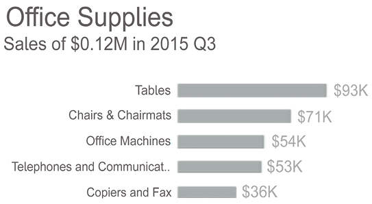
Figure 7.21: Customized tooltip
The tooltip was edited by clicking Tooltip on the Marks card, which brought up an editor allowing the rich editing of text in the tooltip:

Figure 7.22: Tooltip editor
This editor is similar to those used for editing the text of labels, titles, captions, and annotations. You can input text and format it as desired. Additionally, the Edit Tooltip dialog has some additional functionality:
- The Insert drop-down menu in the upper-right corner allows you to insert sheets, fields, parameters, and other dynamic values. These special or dynamic text objects are enclosed as a tag in the text editor (for example,
<SUM(Sales)>). We’ll consider the special case of sheets in a moment. - A checkbox option to Show tooltips and a drop-down menu to indicate the style of the tooltip (Responsive - show tooltips instantly or On Hover).
- A checkbox option to Include command buttons. This is the default, and you can observe the command buttons in the first, unedited tooltip in this section. The command buttons include options such as Include, Exclude, Create Sets, and so on. Many of these options are still available to the end user via a right-click, so removing them from the tooltip does not prevent the user from accessing them completely.
- A checkbox option to Allow selection by category. When enabled, this feature allows users to click the values of dimensions shown in the tooltip and thus select all marks associated with that value in the view.
Consider unchecking Show tooltips for any view where they do not significantly and intentionally add value to the user experience.
Viz in Tooltip
Tableau allows you to embed visualizations in tooltips that are dynamically filtered as you hover over different marks. Often referred to as Viz in Tooltip, this greatly extends the interactivity available to end users, the ability to drill down to the details, and the ability to quickly see data in different ways.
In the preceding screenshot, the following tag was added to the tooltip by selecting Insert | Sheets | Categories:
<Sheet name="Categories" maxwidth="300" maxheight="300" filter="<All Fields>">
This tag, which you may edit by directly editing the text, tells Tableau to show the visualization in the Categories sheet as part of the tooltip. The maximum width and height are set to 300 pixels by default. The filter indicates which field(s) act as a filter from the sheet to the Viz in Tooltip. By default, <All Fields> means that all dimensions in the view will act as filters. However, you may specify a list of fields to specifically filter by one or more dimensions that are present in the view (for example, <Department>, <Category>).
Notice the final view with the tooltip:

Figure 7.23: Viz in Tooltip
There are many possibilities with Viz in Tooltip. First, you can leverage the capability to drill down into details without using extra space on a dashboard and without navigating to a separate view. Second, you can show different aspects of the data (for example, geographic location as a tooltip for a time series). Finally, you might consider how to use Viz in Tooltip to allow the end user to see parts of the whole within a broader context.
There are a great many more valuable applications of this feature, but here are a few tips to wrap up our examination of Viz in Tooltip:
- You may have more than one Viz in a single tooltip.
- Setting the Fit option to Entire View for the sheet being used in a tooltip fits it to the maximum width and height.
- You may hide sheets used in tooltips by right-clicking the tab of the sheet and selecting Hide. To restore them, right-click the tab of the sheet being used in the tooltip and select Unhide Sheets.
Summary
The goal of formatting is to increase effective communication of the data at hand. Always consider the audience, setting, mode, mood, and consistency as you work through the iterative process of formatting. Look for formatting that adds value to your visualization and avoid useless clutter.
We covered quite a few options for formatting—from fonts, colors, lines, and more at the workbook level to formatting individual sheets and fields. We discussed how to customize formatting for numbers, dates, and null values and how to use these techniques to bring value to your visualizations.
With an understanding of how formatting works in Tableau, you’ll have the ability to refine the visualizations that you created in discovery and analysis into incredibly effective communication of your data story.
In the next chapter, we’ll look at how this all comes together on dashboards.
Join our community on Discord
Join our community’s Discord space for discussions with the author and other readers: https://packt.link/ips2H
