System Dynamics

Creating a kit of parts
Identity design must be fluid. When the logo is complete, many more elements need to be created to make the logo truly usable in a variety of applications. An identity system needs to be designed that will be dynamic enough to allow for the ever-changing needs of the client. Therefore it is essential that designers create logos with flexibility in mind.
CONSISTENCY OF CONCEPT
It is important that the identity system functions as a cohesive group of visual and verbal elements that serve to continually identify the client to its target audience(s). Consistency is central to effective branding. This does not preclude creativity. An identity system will fail if it is predictable and lifeless. Power, clarity, and freshness must accompany consistency.
CLARITY OF MESSAGE
The role of the identity system is to provide a visible and obvious shorthand that supports the intended image of the client. To achieve this, every graphic element within the identity system must clearly support the logo.
ACCOMMODATING TO THE CLIENT
When the system is developed, the designer must understand who will use it and how they will use it. With this information, the designer will be able to create a system that is graphically appropriate, and capable of both accommodating the requirements and reflecting the personality of the client. The designer must create a system that can be customized within the constraints of the client’s needs.
FLEXIBILITY FOR USERS
The identity system must allow for an individual user’s own modifications. As much as the original designer may not wish it, other creatives will use the identity system. Plan for enough variables in the system to keep the identity fresh.
What is a kit of parts?
Quite simply, it is all the core aspects of a complete identity design program. All these elements must be thought through and carefully determined:
Logo & Variations
• What is the main mark or signature? (e.g., icon only, icon + type)
• Are there variations? (e.g., horizontal, vertical)
• What changes get made to vary size? (e.g., redrawn for large scale use)
• What happens to the logo in various media? (e.g., thicker line weights for TV use)
• How are brand extensions handled? (e.g., a product logo)
• How does the logo work with other related logos? (e.g., trademark icon)
Color Palettes
• What is the primary color or color combination for the logo?
• Are there acceptable alternative colors?
• What about black and white usage?
• Can the logo be reversed? Reversed out of a containing shape only?
• What are the exact Pantone Matching System (PMS) numbers and CMYK, RGB values?
Containing Shapes
Is the logo designed to be contained within a particular shape? Always? Or only in specific circumstances?
• If so, what shape?
• Does the shape ever change?
• Does the shape contain anything other than the logo?
Typography Selection
• What is the primary typeface?
• Are there secondary fonts?
• Does the client need a range of weights? Italics too?
• What changes need to be made to the type selections in order to accommodate different media? (e.g., is the primary typeface a default font for web use or does an alternative need to be specified?)
Taglines and Modifying Copy
• What is the primary tagline?
• Is there a secondary or alternative tagline?
• What typeface are these set in?
• What is the size ratio of logo to tagline?
• Are there any other modifying copy or symbols required? (e.g., copyright symbol)
• Are there any legal lines or other mandatory copy which must be incorporated?
Imagery Specifications
If images, photographs, and/or illustrations are considered to be part of the identity system concept:
• How are they used?
• When are they used?
• In what size ratio and proximity to the logo?
• Is there an image library? Where does it exist? How is it accessed?
• What if additional images are required in the future?
Sound Signature
If the identity will be used in broadcast or web environments there will most likely be a sound component to develop:
• Is there a musical or tonal signature or sting? (e.g., Intel’s chimes)
• When and how will sound elements be used?
• Will there be music? If so, what kind?
Animation
Again, if the identity will appear in other media besides print, especially broadcast or web environments, it may need to be animated:
• How will the logo behave when it is in motion? How does it move?
• How does it react with other visual and audio elements?
• When and how will the animated version of the logo be used?

93
The identity system developed by Liska + Associates emphasizes Hotel 71’s unrepeatable experience and dynamic atmosphere. It specifies a set of changing colors and typefaces, allowing the hotel some flexibility in terms of the image it chooses to present. The identity also projects the idea that the hotel is welcoming rather than exclusive.
Liska + Associates
Hotel 71
Liska + Associates created an identity system for Hotel 71 that is fresh, fun, savvy, and inviting. Hotel 71 is a 450-room boutique hotel in Chicago. The designers were charged with reinventing the way travelers perceive the hotel experience. At the heart of the assignment was the creation of a brand image that would appeal to people looking for more than a bland, predicable lodging experience. The logo needed to be anything but predictable as well. In addition, the identity needed to work when applied to everything from the hotel’s website to guest room incentive items to marketing materials to staff uniforms.
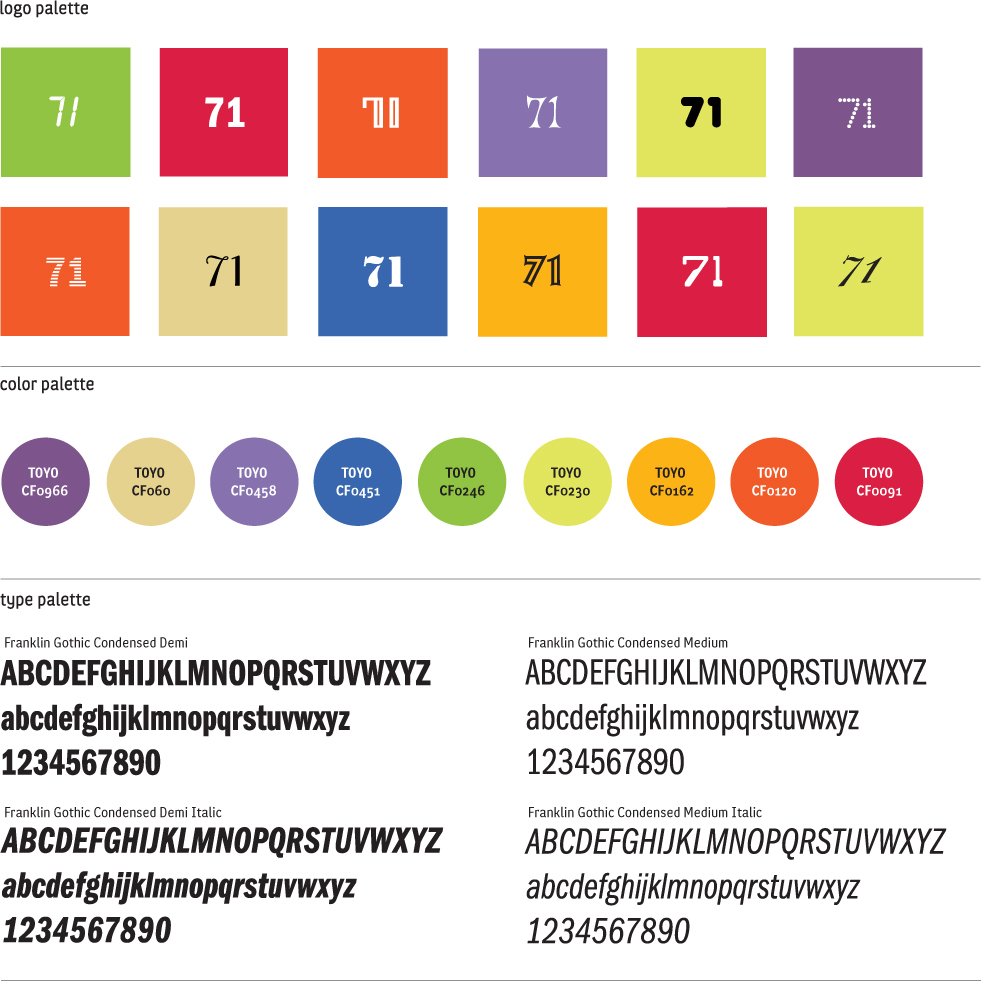
The Hotel 71 logo consists of a solid square of color, in one of twelve approved colors, with the numeral “71,” in one of the twelve approved typefaces, reversed out of it. The various combinations of typography and block colors can convey a wide range of tones and messages—some serious, some more playful. This variety of choices allows any creative user working with the Hotel 71 system the ability to implement their own individual expression, as well as to maintain consistent branding.

94
A series of direct mail postcards were created to provide Hotel 71 with a way to communicate information to existing and potential travel guests. The postcard set here includes four different postcards, which the hotel’s sales department can use for printing information about its latest offers.
Liska + Associates

Segura, Inc.
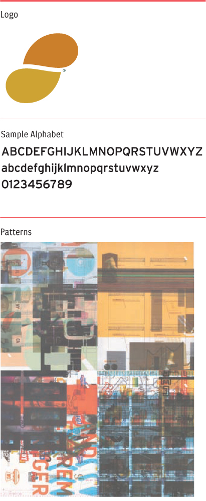
Segura, Inc. is an innovative design and advertising firm located in the United States whose principal, Carlos Segura, also heads T-26 Digital Type Foundry and 5-Inch CDs. Segura, Inc. needed to convey their own unique brand of creativity. The designers created a lush identity system, which has a heavy emphasis on photographic-based image patterns. These patterns appear on the backs of all corporate business materials required by the firm, while the logo itself is treated as a small, subtle visual element.
The Segura, Inc. identity system has an unusual, eclectic feeling that captures the brand image the firm wishes to convey. There is a visual reference to printers’ “make-ready” test sheets that offset lithographers run through their press to set the machine and prepare for a print job. Being your own client is a huge challenge for many designers, but Segura, Inc. was clearly able to successfully rise to the occasion.

95
The Segura, Inc. identity system’s kit of parts includes logo, typography, and visual patterns.
Segura, Inc.
Photos, type, illustration, and color all combine to create an elegant and eclectic series of patterns in the identity system. The logo itself plays a more secondary role as can be seen in the Segura, Inc. business papers shown opposite. Segura, Inc.

96
Sagmeister’s goal of surprising people into consciousness is achieved with an interactive card that slides to reveal a comparison chart of government spending. The card illustrates such things as how many schools can be bought for the price of one jet.
Sagmeister Inc.

97
The Move Our Money identity system pictured here contains a serious message within its fun, colorful graphics. This contemporary example of powerful graphic design conveys the client’s opinion that the U.S government is spending too much money on its military, and that those funds should, instead, be diverted to health and education programs. The T-shirt graphics show various versions of the information graphics.
Sagmeister Inc.
Move Our Money
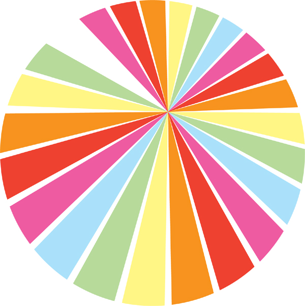
Ben Cohen, of Ben & Jerry’s Ice Cream, heads a political action group called Business Leaders for Sensible Priorities. The group launched “Move Our Money” as a nonprofit organization created to raise the consciousness of ordinary American citizens about the way their government allots huge amounts of its discretionary budget on military spending. Designer Stefan Sagmeister, who met and bonded with Cohen at a conference, volunteered to develop an identity system that clearly illustrated the facts, and disclosed how the money was being spent. Sagmeister created a pie chart logo as well as a series of simple charts and graphs, all designed to allow the viewer to grasp the message instantly.
Sagmeister used the system to design unique and accessible communication vehicles for communicating Move Our Money’s various messages to its target audience. Nontraditional, simple, and playful media was used to impart serious messages: lenticular printing, a pen that pulled apart to reveal the American flag, huge inflatable plastic graphs, a traveling bus, and a mini-lapel. Sagmeister’s goal was to try several different tones to convey the same message, which resulted in a deliberately kinetic identity system. Move Our Money has since taken on broader international issues and has morphed into a group called True Majority.


98-99
A ballpoint pen and large inflatables are clever ways, developed by Sagmeister Inc., of getting the Move Our Money message across to American citizens.
Sagmeister Inc.
OK
Mr. Keedy, a type designer and CalArts graphic design faculty member, developed this dynamic identity system for OK. Located in Los Angeles, OK is a retail shop specializing in modern furnishings. The store is known for offering well-designed, and in some cases, rare, objects for home and personal use. It’s a resource for good design, and Mr. Keedy was challenged to be just as unique and resourceful with his design.
The identity system is a collection of logos and text that are designed to work together as interchangeable elements rather than as fixed graphic images. This collection of idiosyncratic choices allows a variety of interpretations of the OK brand, which results in a fluid identity. The letterforms are innovative, with a wide variety of ideas—crazy and abstract, blocky and bold, clean and modern. Bursts and bars also work with the letterforms to create unique and interesting patterns.
OK is a variable identity system with a large range of approved logo and typographic elements. Each one of these elements is designed in, and is native to, Fontographer. Using a typography design software program such as Fontographer allows the logo to be a typeface rather than a traditional digital file (eps or tiff file). With a locked font, the designer eliminated the need for the client to own high-end graphics software to work with the identity. Mr. Keedy also circumvented the Macintosh/PC platform problems since the logo is a font that works in any program. All the identity elements are contained within the “font.” This allows the client to easily use the logo, applying it to a variety of disparate applications.


100-102
All of the OK identity system is dynamic. Created in Fontographer, the system offers nearly infinite possibilities for combination. At right are various OK symbols, and opposite, are OK’s address graphics. All these various elements are designed to fit together no matter what combination is selected (just like the letters in the typeface fit together.) Basically, Mr. Keedy delivered a graphic language, not a traditional logo that the client uses and evolves. It is a simple example of what Mr. Keedy thinks may be the future of branding.
Mr. Keedy

