Implementing Logos
Rollout: process and best practices
Now that the logo is created, an identity system is designed, and everything is approved by the client, the next step is rollout. Rollout means actually putting the logo to use in real-world scenarios. In order to prepare for these various applications of the logo, designers create identity standards manuals. This allows the original designer to visualize all the information needed to implement the logo successfully. It requires thinking through every possible use of the logo, and providing specific guidelines for those uses.
A comprehensive yet concise list of directions will save time, forestall bad design, and result in an effective message, even when designers new to the business are added. To paraphrase Milton Glaser, design which has been given minimal thought will have little value in the long run. Since the word design means to formulate a plan, creating a road map in the form of a standards manual is a key step in the process of designing a logo.
Standards manuals or guidelines allow identity systems to be managed properly—because they serve as the ultimate resource for consistent application of the logo throughout all communication and visual materials required by the client. Manuals function to ensure that the standards and ideas developed by the original designers are systematically and consistently reproduced in the same manner every time. It is vital that the logo be used properly over its lifetime, not only for the first six months of rollout when the original designer creates the first round of materials. Designers who take these extra steps are invaluable to their clients. This is one of the primary reasons that major corporate clients work repeatedly with design consultants who understand implementation and the role of identity guidelines. Informed clients, for example, understand the confusion and disorganization their brand image will suffer when something as simple as inconsistent color is used in the printing of their business cards.

103-104
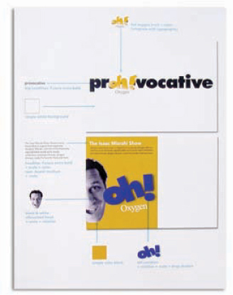
The Oxygen Television Network’s Oh! logo manual was designed in the form of two slim volumes—one covering print communications and the other providing guidelines for broadcast on-air usage—thereby allowing two completely different in-house creative departments to use the manual.
AdamsMorioka, Inc.
Manuals must be created to be useful to the widest possible group of logo users. Often, in larger companies, there is an identity or branding coordinator who assures continuity and accurate use of the identity by following the graphic standards manual. In-house design departments are often the primary users of a graphic standards manual, but not all clients are large enough organizations to have such groups. All outsourced designers will use the manual. Other in-house departments and related consultants that need the manual include: advertising, public relations, marketing, investor relations, merchandising, licensing, printers, package manufacturers, signage fabricators, vehicle and uniform supply companies, and all purchasing departments responsible for any of the above.
Getting all creatives and related consultants to use the standards manual will be of primary importance. A CEO that supports the new identity system is critical. Many manuals begin with a CEO letter. This letter states the support of the CEO, briefly explains the need for the identity, and directs the employees to support and correctly use the identity. This, in effect, makes brand stewards of the employees. If a designer has been able to lay the groundwork for acceptance, success is attainable.
Anatomy of a Standards Manual
Graphic standards manuals can be slim and concise or multipaged behemoths, depending on the personality and needs of the client. Whether they are printed and bound pieces or whether they exist only on the client’s intranet, identity guidelines are the key to consistent use of a logo.


As a point of reference, we suggest you include any/all of these things in a graphic standards manual:

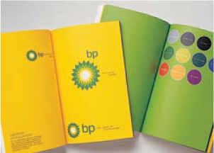
Standards manual pages from (105) Pow Wow designed by Wolff Olins, London; (106) BP designed by Landor Associates, San Fransisco; and (107) XYIO designed by Girvin, Seattle, are pictured at left.

108-109
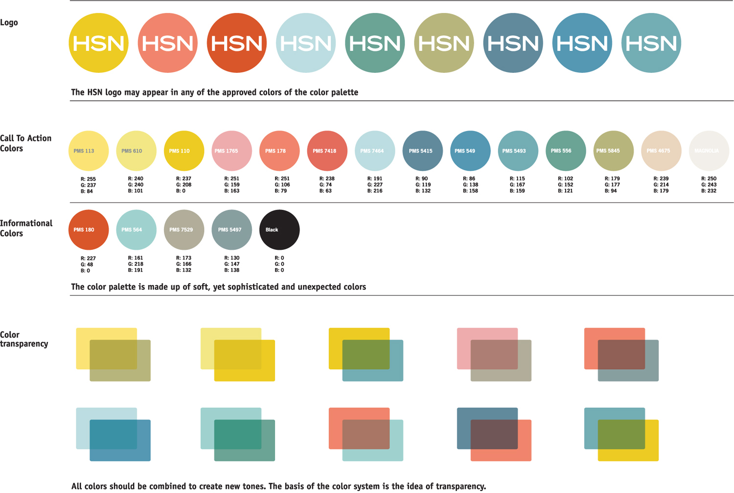
The identity system standards for the Home Shopping Network is depicted in a single sheet format.
AdamsMorioka, Inc.
A manual can be as small as a one-page pdf file showing the logo, type, and color palette, or as large as a 300-page printed and bound book with a companion CD full of the same information in digital form. It can be printed with limited edition laser printouts or four-color process offset. The idea is to design a set of guidelines that serves the needs of both the identity system and the client. After the logo designing process, a designer will understand the work process and personality of thier client. This information will help decide which format will be most successful.
Having a printed manual, or printing one on demand, allows the client to have a physical object which makes the guidelines seem more real to most users. Additionally, putting the entire manual, or appropriate segments, on the client’s intranet or extranet is a smart idea for large, multiuser enterprises. Consider that the implementation of the logo will grow and possibly change, so creating a three-ring binder style manual that allows for additional pages to be added in the future is also a good idea. The exact length of the manual will be determined by the specific needs of the client, but should contain representative pieces illustrating how the logo has been applied. The size and scope of a graphics standards manuals is also heavily impacted by budget considerations. Designers need to understand what these parameters are, and develop a manual that works within these limits. The goal here is to be thorough yet flexible.


110-111 Metropolitan Market is a chain of high-end, urban boutique grocery stores whose identity reflects a name change and a new business model for the client. SamataMason
SamataMason, a corporate identity and communications design consultancy based in Chicago, created the identity for Metropolitan Market, Food Markets Northwest, Inc.’s new retail store venture. Metropolitan Market is a collection of neighborhood grocery stores originally known as Thriftway. When the business model changed from a discount provider to a gourmet destination, SamataMason was asked to capture and project the organization’s growing and unique character. The client needed an identity that was a quick read with fresh graphic appeal, a visual language that would speak to the active, urban, and upscale customer in a distinctive contemporary fashion. It was important that the branded personality said to its young, adventure-shopper customer base, “this is your place.”

112-113
SamataMason understood the importance of buy-in for the new identity program. They helped to ensure company-wide acceptance and appropriate usage of the identity by developing a graphic standards manual that contains both a letter from the CEO endorsing the program and a statement explaining the importance of consistent standards.
SamataMason
114
Metropolitan Market’s founder, CEO, and president Terry Halverson’s unique vision and creativity moved SamataMason to its fresh, focused, and personality-rich brand solution. Theirs was an open and collaborative identity development process.
SamataMason

115
The Metropolitan Market visual brand strategy is presented in the form of a 102-page book that is laser printed and spiral bound. The graphic standards are also available in pdf form for review on screen or for laser printing. To maintain viewer interest, the manual is interspersed with photographic duotone image pages displaying a variety of fruits and vegetables. It is divided into eleven sections: Introduction, Brand Elements, Business Papers, Typing Templates, Exterior Signage, Interior Signage, Labels (because this is an extensive program within itself, this manual refers users to a separate labels-only manual), Customer Promotions, Advertising, and Uniforms.
SamataMason
116
The graphic standards manual works to provide direction, guidance, and rules that best project and maintain the identification platform in a clear and friendly manner. It is obvious from the professionalism displayed in the document that a strict branding program exists and that specific guidelines must be upheld for the identity program to succeed.
SamataMason

117
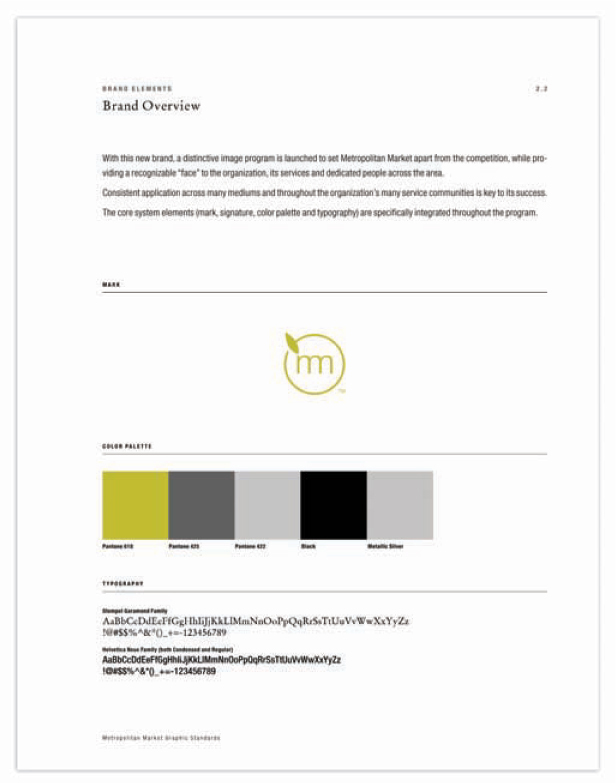
SamataMason requests that creative users of the new Metropolitan Market System carefully study and adhere to the guidelines they have established for the brand. Through use of this document they have been able to effectively communicate the essence of their identity while conveying the personality of the client, consequently building brand champions out of the staff users. A “Brand Overview” page provides an at-a-glance view of all core identity elements. The entire manual is written in simple language that even nondesigners can easily comprehend.
SamataMason


118-122
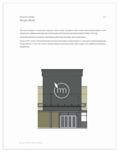
The Metropolitan Market in-store visual experience is colorful and active, providing almost too much visual stimulation. To counteract the busy atmosphere, SamataMason chose a muted olive color with an accompanying neutral palette, and designed clean, modern, fashion-driven graphic elements that would appeal to the younger high-end urban customers.
The new Metropolitan Market logo (or “circle m”) represents a sense of organized artisanship that is meaningful and rich in texture. The strict mathematical relationship of the “circle m” logo elements may not be altered or modified—it is a precise and unchanging ratio. A page such as “Brand Mark and Signature Display” helps users understand the relationship between the identity elements, and illustrates preferred and secondary usage options.
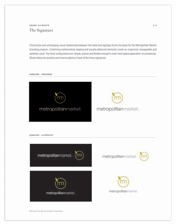
“The Signature” manual page explains the rationale behind the staging and visual balance of the identity elements. It shows three configurations, all of which are simple, precise, and flexible enough to meet most spatial applications. Offering options to users is a key strategy in designing a logo that works in the real world of communication.
The Metropolitan Market graphic standards includes a “Brand Mark Color Usage” page, which provides a quick reference to the approved colors, not only by listing the Pantone numbers, but by showing an example of what the logo looks like in each color version. The entire “Brand Elements” section of this manual contains very detailed information on: Staging Requirements, Sizing, Acceptable and Unacceptable Usage Variations, Positioning Methodology, Color Systems, Signature Applications, Typography, Design Motifs, Photographic Themes, and Grid Systems—all in an easy to use layout. This thorough yet accessible approach virtually eliminates confusion on how to use the Metropolitan Market identity system.
123-124
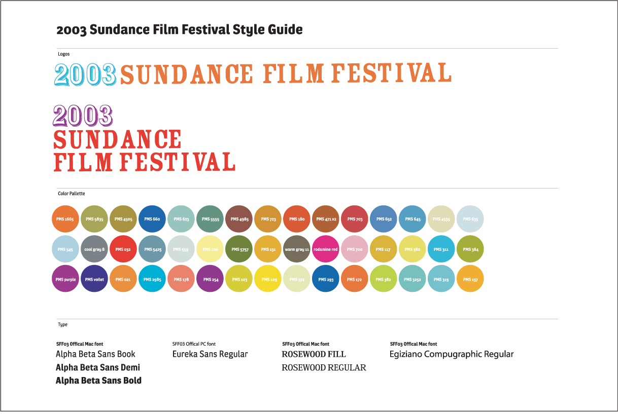
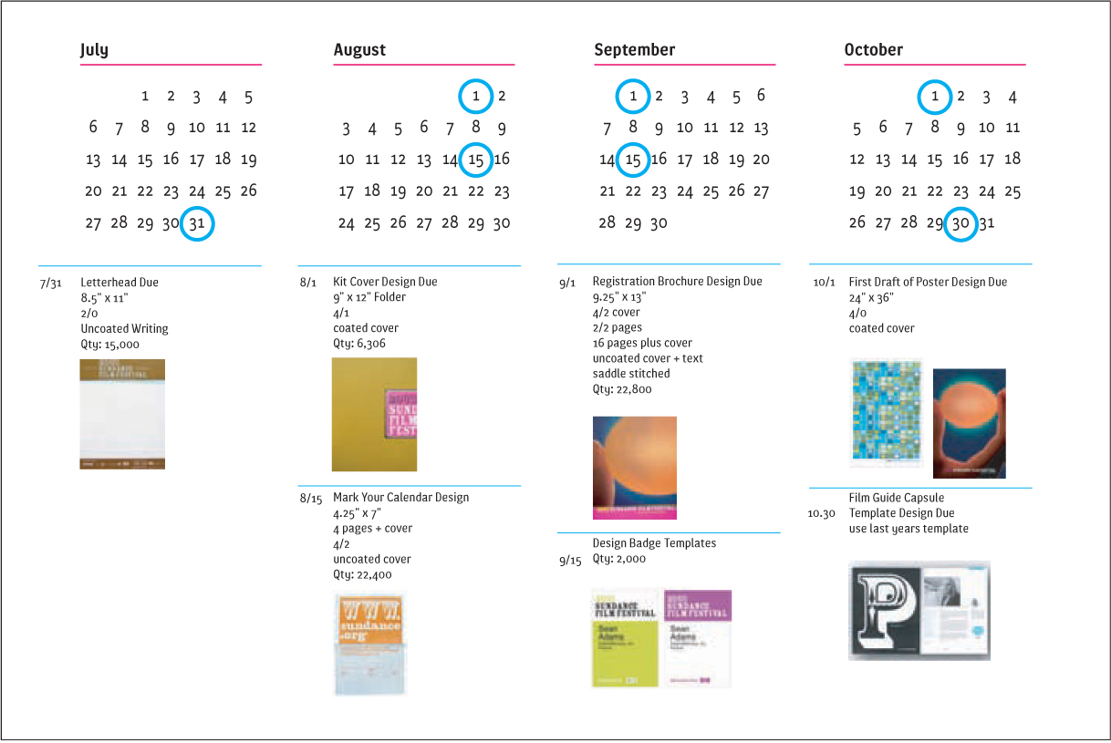
The Sundance Film Festival requires a range of materials to be developed in a relatively short period of time. AdamsMorioka simplified the identity standards to create two posters. This maintained a common understanding of the rollout of the Sundance Film Festival identity.
AdamsMorioka, Inc.

125-126
The identity by the design team of Linda van Deursen and Armand Mevis for the multicultural City of Rotterdam was designed to connect and promote arts and cultural institutes to residents and visitors. Mevis & van Deursen
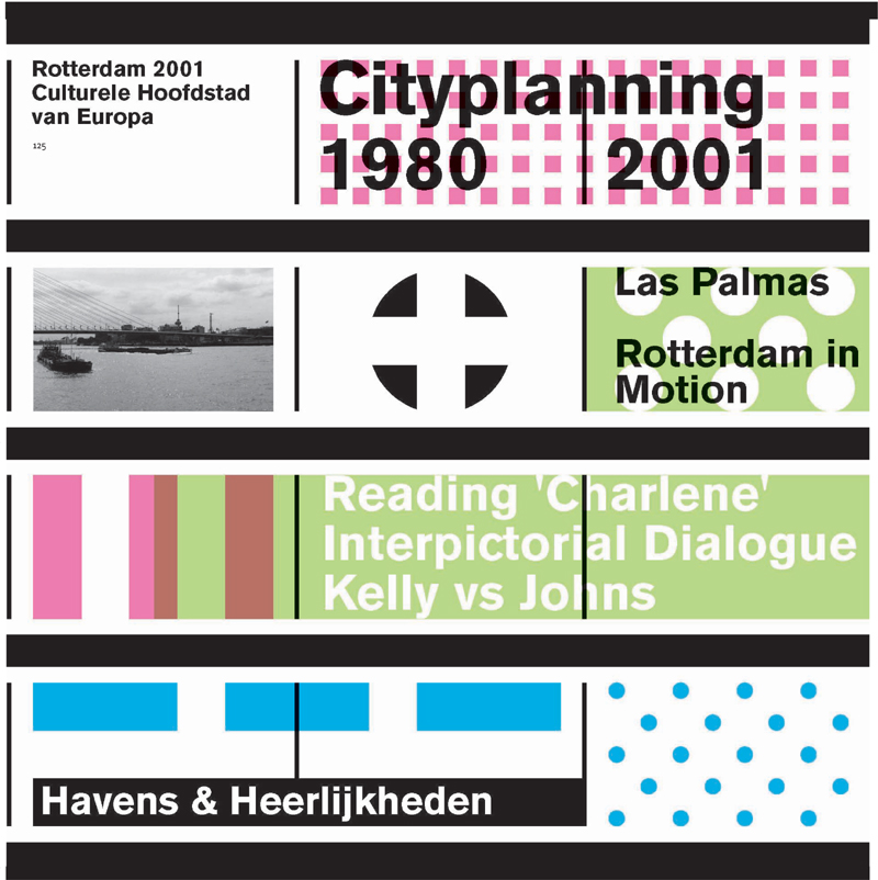
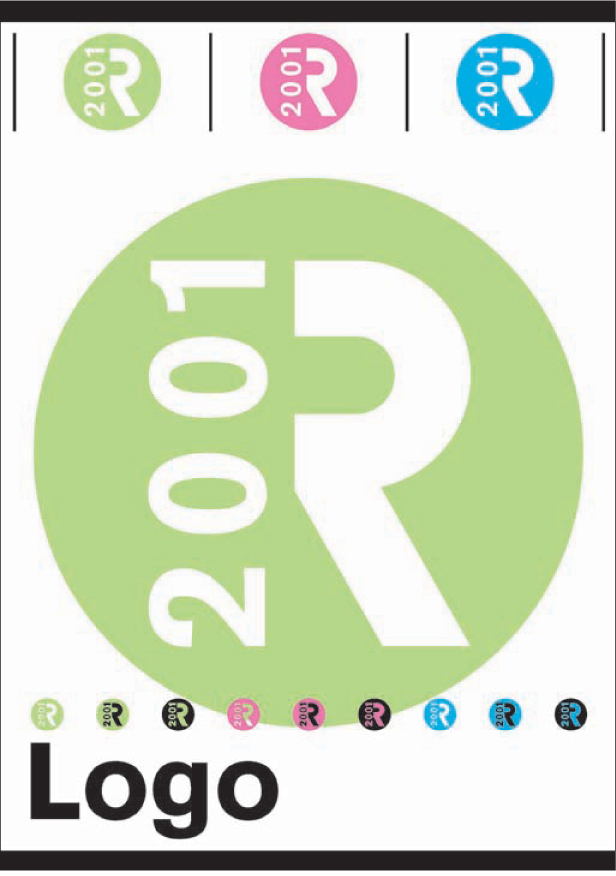
A variety of graphic elements are presented in a page from the City of Rotterdam standards manual. Mevis & van Deursen
City of Rotterdam
Mevis & van Deursen, in collaboration with the cultural department of the City of Rotterdam, accepted the challenge of branding an entire city. The goal was to promote the cultural aspects of the city and enhance the perception of the city’s attractiveness, both to citizens and visitors. Rotterdam is considered to be one of the cultural capitals of Europe, and the city’s mayor sought to utilize this association.
At the heart of the design problem was the need to develop an identity that would connect all the various cultural activities in Rotterdam. The identity had to function as a logo system, and it needed to be flexible enough to allow other designers to use it. Users needed to receive clear guidelines in order to be able to “play” with the system.
Mevis & van Deursen designed the logo system knowing that it would be handed off to many other designers, so a graphic standards manual was created. Mevis & van Deursen worked with the logo system through the implementation of the stationery and the first series of posters. Subsequently, numerous other designers became involved with the project. Mevis & van Deursen were aware that this dissemination would occur, and created a user friendly, “damage proof” system. A large range of successful pieces were created, but certain items were designed in a manner Mevis & van Deursen disliked. At a certain point though the original designer must give up control of the creation. Although it may be difficult, it is inevitable. All of which reinforces the need for good a graphics standards manual.
127
The City of Rotterdam identity system is targeted at a vast audience, made up of a diverse population living in a large, multicultural city. Despite this, Mevis & van Deursen chose to use the visual language that is traditionally directed to a culturally aware audience.
Although Mevis & van Deursen had relevant experience with culturally themed assignments (they had done work for theater, art, design, and architecture organizations), they did not have much experience with complex identities until the City of Rotterdam project. The designers exceeded expectations and developed an innovative, fresh, kinetic identity system and a template for a comprehensive print program. For the design of the city’s website they collaborated with Mauritz de Bruijn.

128
Conceptually, the designers combined multiple ideas in creating the identity system. Formal needs, such as schedules and logistics, drove the visual form of a white information banner that appears on all print materials. The banner can be interpreted as a river of information, an idea referential to the river Maas in Rotterdam.
129
In creating an identity system for the city, Rotterdam’s cultural director, Bert van Meggelen, chose to integrate the idea that Rotterdam is actually composed of many cities; a theory based on Italo Calvino’s book,Invisible Cities. Following this idea, the designers used either dots or squares to represent these “cities” on a map. A collection of repeating dots and squares was subsequently developed, which could be recombined to form abstract logos symbolizing multiple cities.

130
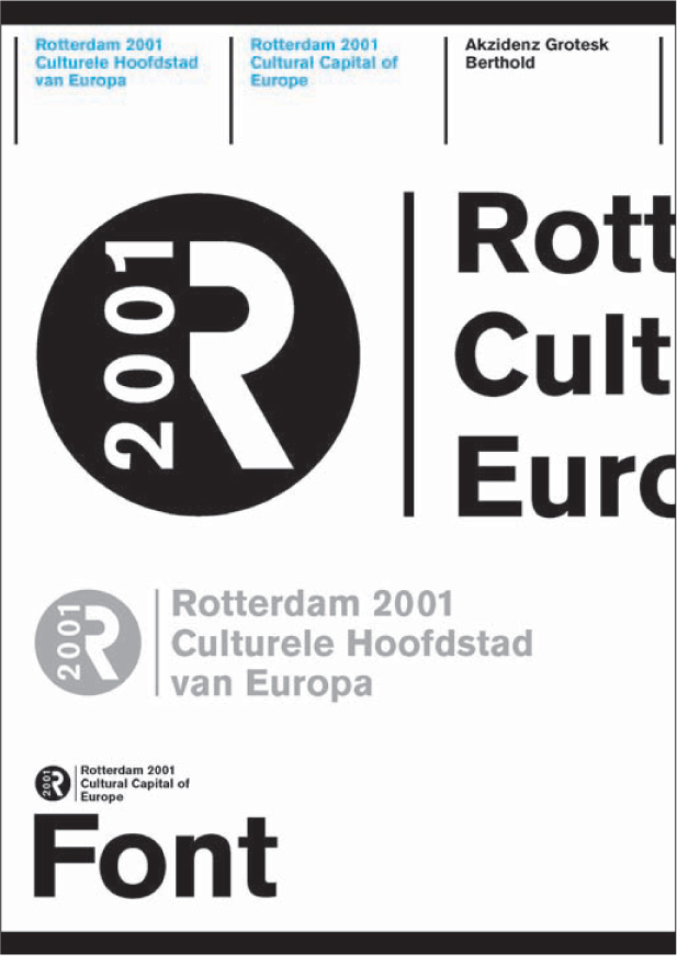
According to Mevis & van Deursen the colors used in the City of Rotterdam identity system were not specific to conceptual ideas. Rather, practical considerations dictated the color palette. Because most of the logo applications would be printed in four-color process CMYK, the designers chose magenta and cyan as the main colors. In Mevis & van Deursen’s opinion, green can be problematic in a four-color process; accordingly they tried to avoid using it in the system. Two key components in the logo system were grids and the typography selection, Berthold Akzidenz Grotesk, chosen for its clarity and versatility. The identity system designed by Mevis & van Deursen works to represent the actual, as well as the aspirational, image of the City of Rotterdam.
131
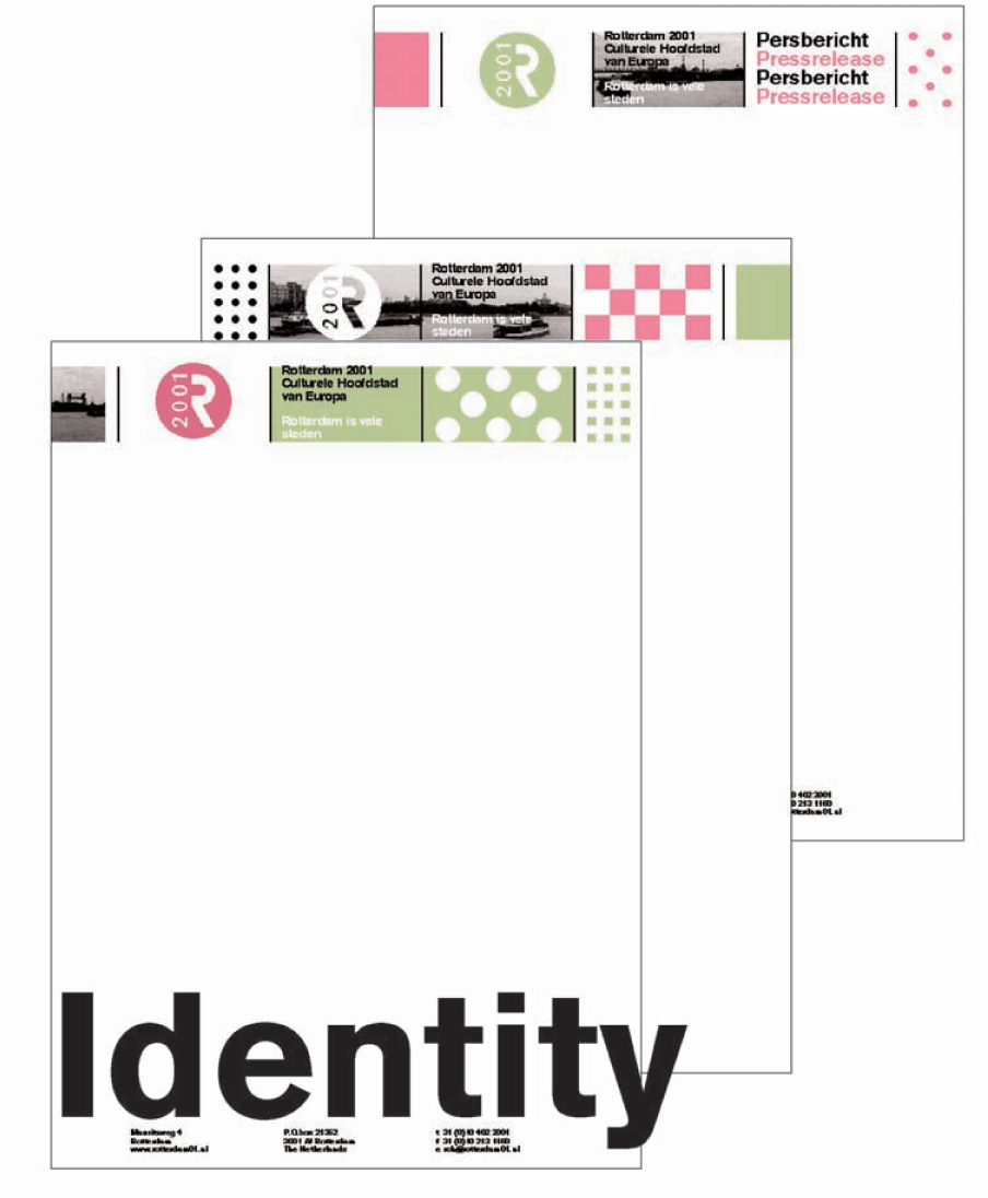
When all the graphic elements are combined, as seen in the samples of the stationery and business cards, the City of Rotterdam logo system comes together as a lively and contemporary visual solution, rich with layers of meaning. The city’s identity system is a tool box. The graphic tools provided were fairly fixed, but the creative users of the system could manipulate them to create a variety of forms. With this flexibility, the designers created a nontraditional manual that clearly conveyed the visual concepts of the identity system, and provided a wealth of typical application samples.
It is important to remember that even if a designer has created a great logo, designed a complete, yet flexible, identity system, put it all in a well-conceived, well-presented graphics standards manual, the client (and/or other creative users) can still develop items that would never be approved by the original designers. Make the work as “foolproof” as possible, but understand that creative people may feel compelled to subvert the system in order to assert their creativity. Remember the advice of designer Tibor Kalman: “Rules are good. Break them.” Allow for change. Expect it.
Staying Involved: Auditing Systems
Once the development and rollout phases are complete, the designer should stay involved with the client to monitor the identity programs they have created. Some designers continue working with the client, designing everything required, which ensures brand continuity. If that is not an option, try to secure a consulting arrangement with the client. Typically, a designer will provide intensive, on-site art direction in the first few months following the launch of a new logo. They may then taper off to monthly, quarterly, and perhaps, annual reviews.
At these periodic implementation reviews:
• Specifically review any benchmarks that were set up.
• Do a visual audit of the client’s communication materials and other applications of the identity.
• Review consistency of usage in design and messaging.
• Determine if the identity assets are being managed well. Is the system available to all users?
• Interview users. Hear what their issues and concerns are, or simply collect platitudes on how well the identity system works.
• Problem-solve solutions for cases in which the new identity system is not working.
• Review the quality of the printing, fabrication, and manufacturing of items using the new identity system to ensure that suppliers are adhering to guidelines. See how well the identity is holding up technically. Note quality-control issues.
• Check that the identity system is evolving to meet the client’s expanding needs.
• Alert the client to any changes in the competitive landscape that might impact the identity system.
• Evaluate how well the client is doing with the new identity. Note what is exceptional (both good and bad).
• Put your findings into a written report and/or follow up with an analysis presentation meeting.
• Validate great creative thinking. Identify successful applications and the people involved.
• Empower those in charge of the identity system to help ensure accountability. Make sure that they have implemented a method that works to maintain the system.
• Express your commitment to ongoing excellence, and stress your availability for consultation.
• Determine additional opportunities for working with the client.
• Request an invitation to provide a bid/proposal for new projects. Use this as a sales opportunity.
Nickelodeon
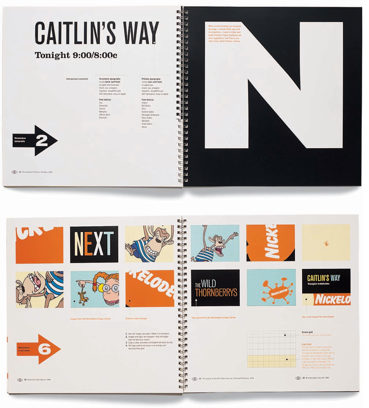
Nickelodeon, a children’s entertainment company owned by Viacom, had been growing organically over fifteen years to become a multifaceted global brand. In the process, however, it had become disjointed and was losing some of its cohesion. The original logo, designed by Tom Corey, needed an update and expansion. AdamsMorioka was brought in as identity consultants with a goal of bringing together Nickelodeon’s brand extensions, as well as unifying the company’s messages and visual vocabulary across all media. Overall, the brand needed to be more accessible and less oblique to Nickelodeon’s external, as well as internal, audience.
AdamsMorioka designed a simple identity toolkit based on the original logo. The identity system was intended to refocus Nick’s internal creative departments on the core promises and messages of the brand, and encourage creative thinking and execution.

AdamsMorioka designed the Nickelodeon Visual System Basics as an explanation of the new visual system. The thirty-eight page book is a 10" x 10" (25 cm x 25 cm) spiral bound booklet with several short sheets and a gatefold. It contains a CD with digital files for the system. The manual reflects the identity and message, is lively and nontraditional, and focuses on positive inspiration. A list of the creative sources that may inform some of the system’s ideas is provided in the manual. This encourages the Nickelodeon creative services department to look at new sources, from Paul Rand and Alvin Lustig to Andy Warhol and Alexander Calder. Rather than using these sources as forms to slavishly copy, they provide insight into basic ideas of modernism. The manual is bright, fun, concise, and easy to follow.

