10 rules
1 Answer who, what, why?
2 Identify, don’t explain
3 Understand limitations
4 Be seductive
5 Make mnemonic value
6 Pose a question
7 Design for longevity
8 Make the logo the foundation of a system
9 Design for a variety of media
10 Be strong
1 Answer who, what, why?
Before anything begins, the most basic questions that must be asked and answered are “Who is the client?” “Who is the audience?” “What is needed?” A logo should grow organically from the answers to these questions. Rather than imposing an idea onto the problem, the problem should dictate the solution. This is a statement repeated by every design teacher. Unfortunately, it is often ignored or misunderstood. It does not mean that the whims of the client should be obediently followed. It does not mean that the designer’s vision should be sublimated. It does mean that as much information as possible should be gathered, criteria developed, and creative work created, through the filter of the designer.
Who is the client? In the simplest terms, this addresses the company’s values, attitudes, and goals. Who is the audience? This may be answered demographically—women eighteen through thirty-four, or psychographically—athletic men who love adventure. And, more specifically, who makes the final decision on this logo? Is it the marketing manager who hired the designer, or the CEO, whom the designer never met? Finally, what is needed? Is a logo the answer? Or is the problem larger—a bad product, staff, or message? Will a good logo be lost in a quagmire of a creative department that is understaffed or poorly managed?
Answering these questions may solve the current problems. The wrench in this plan, however, is that a client’s current business may be radically different from his long-term goals. What does the client want to be in the next year, five years, and ten years? Every company will evolve and change. The size of the company, product, and needs are in constant flux. While the client may currently have a small, regional company with one product, the goal might be to eventually expand and produce a greater diversity of goods. It is human nature to focus on our current needs; it is the designer’s job to presuppose future needs.
Goals and promises
It is important to look at the client’s business and communication goals. Identifying the promises the client makes to its audiences synthesizes what the client stands for because it states what their audience is assured that they can expect.
Briefing questions
1. Positioning
Compared with other companies, what is the client’s current positioning?
2. Purpose
What is the client’s business? What is the client’s purpose?
3. Mission
Beyond the economics, why is it worth doing? What is the client’s mission?
4. Composition
What is the client’s current internal structure?
5. Culture
What are the client’s distinctive shared behaviors that best support the purpose and mission?
6. Personality
What is the client’s chosen style and manner?
7. Client goals
What are five key goals over the next year/five years?
8. Growth
What are the greatest opportunities for the growth of the client and its image?
9. Promises
What promises does the client make?
10. Current audience
Who is the client’s current audience? Who, where, when, why?
11. Audience goal
Does the client want another type of audience? What is the desired demographic?
12. Perception
How does the client’s target audience currently view the brand?
13. Desired perception
How does the client want the audience to view the brand?
14. Competition
How is the client different from its competition?
15. Response
What response does the client want the target audience to take away with them?
16. Objective
What is the marketing objective?
11
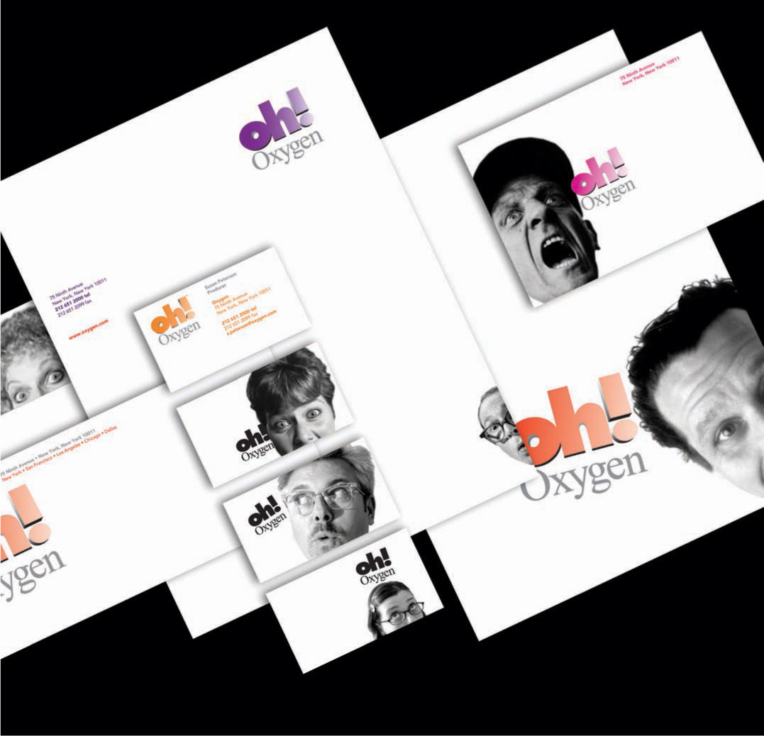
The Oxygen Channel’s logo does not describe every aspect of the company or specify television as its primary product. Rather than illustrating the physical element of “oxygen,” or explaining the network’s demographic, it uses the reaction “oh!” to communicate the attitude and surprise of the product.
AdamsMorioka, Inc.
2 Identify, don’t explain
12
The logo for Artists Management Group is a tumbling cube made up of the companies’ initials—AMG—that expresses the ever-changing nature of the entertainment industry they serve.
AdamsMorioka, Inc.

13
The current Dole logo positions Dole with the ability to expand into other businesses.
Landor and Associates

14
The logo for the graphic design company Pato Macedo does not illustrate the tools of the graphic design industry. It identifies the company as fresh, clear, and credible with its elegant, no-nonsense approach.
Pato Macedo
15
Stealing Time is a full service video editing company serving the advertising and broadcast industries. The “running man” logo represents a clever visual pun of the company name.
Concrete Communications
We are identified, in good company, with names like John, Maria, or Frank. We prefer to not to be called “the guy who lives on Maple Street and works at the pharmacy” or “the woman who has a beehive hairstyle and runs a trucking company.” This is long-winded, confusing, and forgettable. In the same way, a logo should not literally describe the client’s business; a logo is an identifier. Many clients would like their logo to describe every aspect of their company. This is natural, they’re proud of their achievement. It is problematic, however, and may lead to a restraining identity. The logo is a signpost that identifies the company and reflects its attitudes and values.
There are many companies who use illustrations, but have been convinced by well-meaning, but underequipped designers that these are logos. A logo is a shortcut, a visual language that is quickly recognizable and memorable. An illustration is a drawing or photograph that helps to explain text. Speaking with the most straightforward and clear voice is always more successful than the convoluted or overwrought.
16
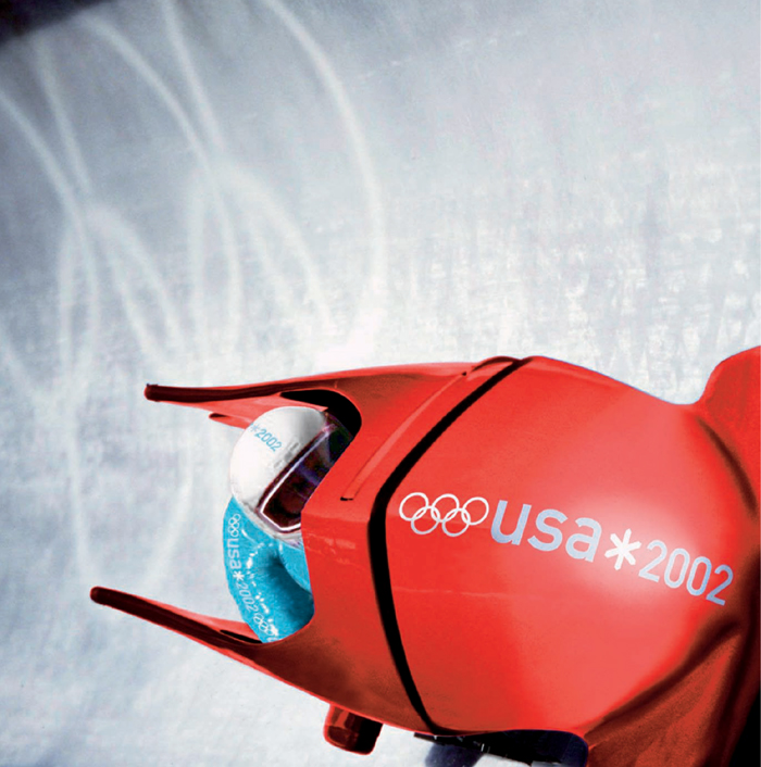
The story of the 2002 Salt Lake City Winter Games emblem represents the four components of the theme: (1) the graphic elements feature the contrast of the mountain snow and the desert sun of Utah’s landscape; (2) the symbol is suggestive of the unique culture of ancient marks that are woven into our heritage, thus emphasizing the history of the Olympic games; (3) the emblem is also a snowflake, symbolic of the winter games; and (4) the bold, bright, vivid colors further suggest the true essence of the games—a celebration of Olympic ideals and the courage present in the spirit of the athlete.
Landor Associates
3 Understand limitations
Here is the bad news: A logo is not a magic lantern. It can’t make a bad product successful or save a poorly managed corporation. This is the good news: A well-designed logo will always help a good product realize its full potential. Smart design, along with the power of repetition, can make an enormous impact. The logo gives direction and attitude, while the product informs the meaning.

17
Until the Nazis co-opted the symbol, the swastika was used by many cultures throughout the past 3,000 years to represent life, sun, power, strength, and good luck. In 1920, Adolf Hitler adopted the swastika for the Nazi insignia and flag. The swastika, a primitive and simple geometric form, became a symbol of hate, anti-Semitism, violence, death, and murder.

18
Various peoples from Asia, Egypt, the Americas, and Africa have used multiple forms of the cross in early history. The cross typically signified the contrast of heaven and earth or space and time. When Christianity adopted the symbol in the fourth century, the mark came to represent man’s redemption. Inherently this symbol has no meaning, but when combined with the ideas it represents it becomes an extremely powerful message.

19
As America’s largest gay and lesbian organization, the Human Rights Campaign provides a national voice on gay and lesbian issues. It increases public understanding through innovative education and communication strategies, with a focus on equality. The logo, an equal sign, has taken on the attributes of HRC through widespread dissemination.
Stone Yamashita Partners
4 Be seductive
“Make more from less.” – Ed Fella
There is an enormous amount of dialog in design education and design-oriented critical thinking about the irrelevance of pleasurable aesthetics. Over the past fifty years, the idea of logos as visually satisfying forms has been minimized. While this may play into fashionable cynicism, most people would prefer to be seduced by a mark than repulsed by one. The message must be the most important part of the identity’s design, but the form must draw the viewer into it. Making visuals aesthetically seductive is another book, but logos are most successful when they are simple and dynamic.
Unfortunately, there has never been a client who considered their company simple. Products, services, and companies are inherently complex. Multiple personalities interact, natural evolution changes the internal culture, and society at large is constantly shifting. The logo, however, must remain a clear expression of the client. Because the logo will be seen only for a moment the use of forms that are easily recognizable is important. The logo will also be subjected to abuse, either by production processes or designer creativity. A simple form will survive these violations, while a more complex form may not. Being direct is powerful. Many logos fail from their own cleverness or overproduction. Let something be what it is.

20-21
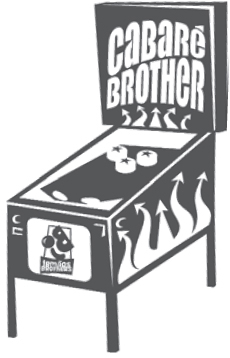
“Cabaré Brother” is a modern variety show that presents a different selection of clown acts, musical guests, poets, magicians, and a sensual stripper. Two different logos were developed for collateral material (T-shirts, banners, tickets, newspaper ads) that did not feature the poster’s four-color illustration.
Porto+Martinez designStudio
22
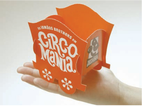
Circomania is a children’s theater production presented by the Irmãos Brothers, a clown group. Due to its low production budget, Circomania called for a logo that could entice its audience with thematic applications. A pop-out, build-it-yourself invitation, ticket, and poster set was created that when assembled, and displayed side by side, would form a long line of circus wagons.
Porto+Martinez designStudio
23
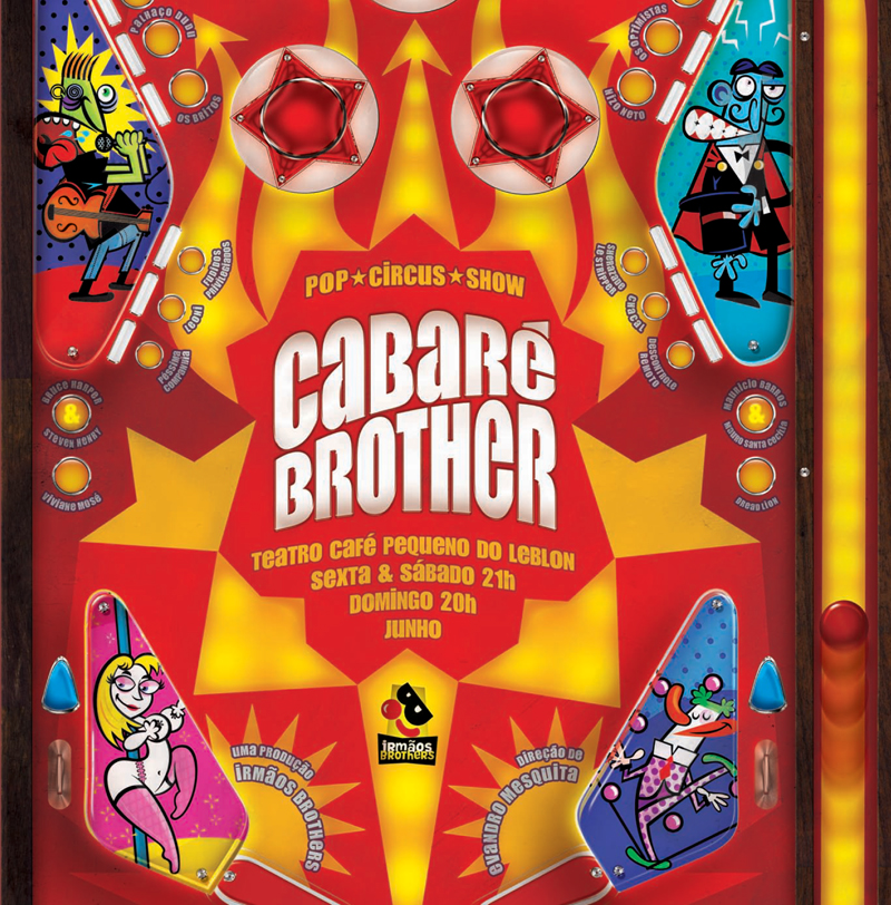
The poster for “Cabaré Brother” presents the logo as the centerpoint of a noisy vernacular pinball machine. The irreverent and exuberant attitude of the mark is exaggerated by the illustration and vibrant color palette.
Porto+Martinez designStudio
5 Make mnemonic value
When we deconstruct how memory is made, we find there are four critical attributes of the process: (1) We see shape and color. All our visual recognitions are based on this. Is something square and red, or round and yellow? From the way we read letterforms, to the way we identify faces, shape and color form the basis of this skill. Once the shape and color of a form have been determined, we (2) position it within our understanding of historical continuity. We ask ourselves, “Does this look contemporary, Victorian, or Medieval?” “Does this have relevance to me at this time?”
(3) We then use the information we have from learned responses to form meaning. We are taught very specific ideas: blue is masculine and pink is feminine, a red light means “stop,” a green light means “go.” (4) Mnemonic value is linked seamlessly with emotional association. This is the “wild card.” It is personal and difficult to predetermine. If a green car hit you when you were a child, you may have an aversion to green. If your mother wears Chanel No. 5, you may feel warm (or other more complicated emotions) when seeing the Chanel logo. Being aware of and utilizing these four attributes provides the tools to produce mnemonic value.
24
Shape
The muzak logo uses circular shapes referencing record albums and CDs. Even the negative shapes inside the counter of the letterforms are circular, echoing the containing form. Consistency of shape contributes to the power of this logo.
Pentagram SF

25
Color
Tiffany blue is unique and is used consistently on advertising, packaging, and bags. While this shade of blue is not copyright protected, the association with the logo and brand is critical.
26
Historical Continuity
The logo for Encounter Restaurant at the Los Angeles International Airport alludes to 1960s jet-set culture. The interior of the restaurant (designed by Walt Disney Imagineering) and the graphics were derived from forms in Tomorrowland (1967). These signifiers give us insight into the attitude of the restaurant experience.
AdamsMorioka, Inc.

27
Emotional Resonance
The set of logos designed for Much Better relies on the positive associations we have with games like Twister and the Milton Bradley Toy Company.
Carlos Segura
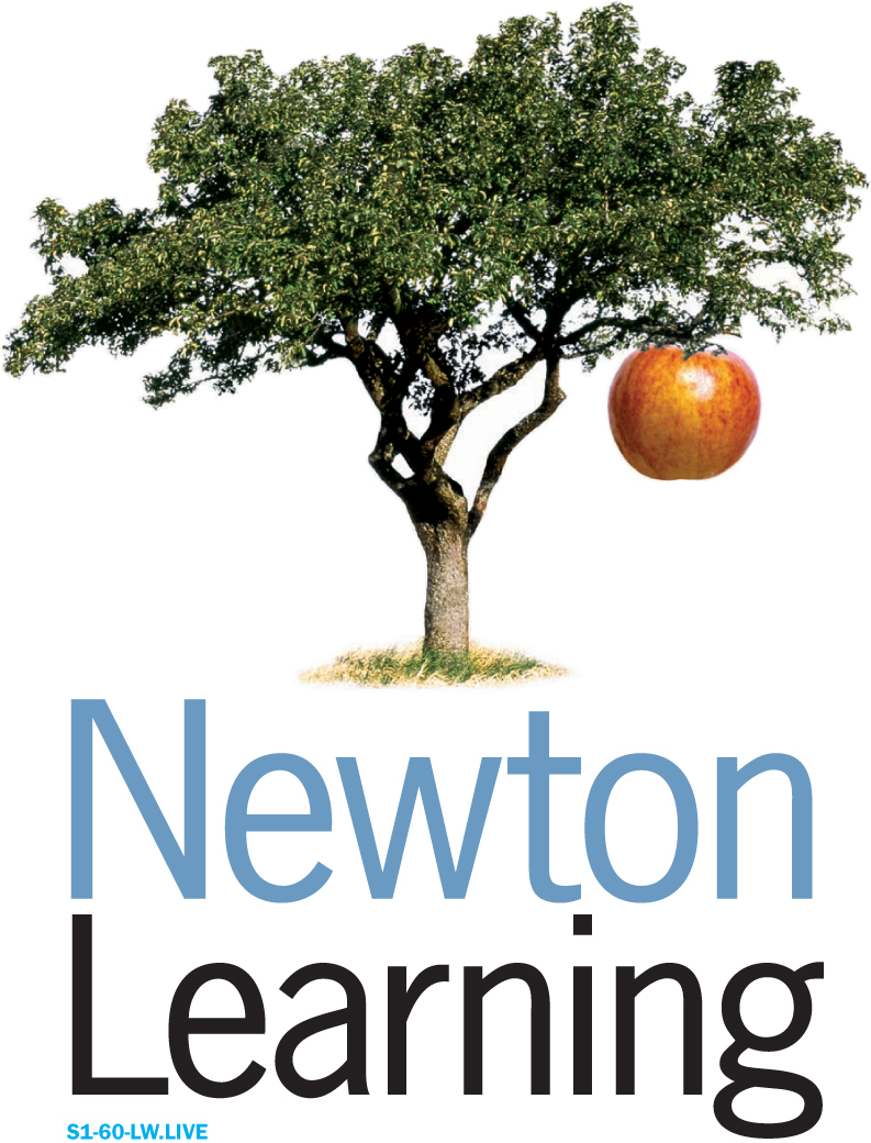
28
Learned Response
The logo for Newton Learning uses our knowledge of the story about Isaac Newton’s discovery of gravity when the apple fell on his head.
Doyle Partners

29
Curious Pictures is a production company for television programs and commercials. The use of wit and humor in the unexpected letterform usage seduces the viewer into the logo.
Pentagram NY
6 Pose a question
“If you can’t explain the idea in one sentence over the telephone, it won’t work.” – Lou Danziger

30
Moto is a consulting firm specializing in technology design strategy. The company delivers high-tech solutions to complex problems in a smart, energetic manner, which the logo reflects.
Tenazas Design

31-32
The Republic of Tea logo utilizes a teapot icon because it is an easily recognizable symbol, which also alludes to the mystical power of the company’s various brews. The icon, used with and without a steam graphic, is based on a traditional Japanese teapot recalling a certain set of ceremonial and cultural associations. The Zen-like “magic teapot” can take a person to places real or imaginary.
Clement Mok
When we receive input from our senses, there is a question, “What is this taste?” and a response, “This is chocolate.” We also do this when we watch television, listen to music, or read a book. This is part of our thinking process. The books and television programs we find the most unsatisfying are often the most predictable. If the viewer is given all the facts there is little reason for him to process the information. Alternatively, if the question is presented, and the viewer must provide an answer in his head, he will be forced to spend more time with the message and therefore become more intimate with it. There is a fine line, however, between posing a question that invites a response and asking an unsolvable one. A visual solution that takes hours to interpret, or needs accompanying text will not succeed, and will soon be resigned from usage.
7 Design for longevity

33
The Jolly Roger or Joulie Rouge, the fierce flag of pirate ships first seen in the mid-1600s, was a symbol of death. It continues to symbolize pirates, and their exploits, 400 years later.

34
The R+H logo is made with extreme simplicity. The weights of the letterforms and cross are refined. The relationship of the outer ring to the negative space is considered. The minimal forms and skilled craft provide the tools to give this logo a long life.
Ph.D
35
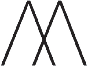
Pentagram took the “M” for Marcus and created a simple but stylish branding device, inspired by the hallmarks used to identify and authenticate precious metals.
Pentagram UK
Every hour we are barraged with an endless array of images and ideas. Our visual landscape is composed of billboards and signs, television commercials, magazine advertisements, messages on packaging, and other forms of visual communication. Almost every one of these messages is combined with a logo, but many of these have little impact and are quickly forgotten. The ideas that connect are the ideas that resonate with us emotionally. Style and trends may be enticing, but they rarely have lasting emotional resonance. Marks that date quickly result from a concentration on “formal,” rather than “conceptual” ideas. The logo must be able to convey its message over a long period of time and it must be able to adapt to cultural changes. It might be exciting to design a logo that is influenced by the typeface du jour, but it will quickly become embarrassing and will need to be redesigned in later years. Marks designed with a focus on current style and trends are often outdated in a short amount of time and soon become “quaint.” There are very few clients who would like to be perceived as either outdated or quaint.

36
The ABC logo, developed by Paul Rand, has been in continual use since 1962 and has never been modified. Rand said that he designed it for durability, function, usefulness, rightness, and beauty.
Paul Rand

37
The color palette complemented, but did not replicate, the mark. The typeface, Info Display, designed by MetaDesign, was chosen as a counterpoint to the Nick Jr. letterforms. A freeform shape library was created for use as enclosing or background shapes with typography or television characters. These were deliberately different from the “caregiver” mark. A palette of gradations was created as backgrounds for the logo, allowing the environment to change without overpowering the Nick Jr. logo. The Nick Jr. mark dictates the elements of the visual system. Maintaining the original criteria and message is the foremost goal, and understanding who will design with the visual system is paramount to achieving that goal.
AdamsMorioka, Inc.
8 Make the logo the foundation of a system

38
The Nick Jr. logo’s relationship to the visual system is critical. The logo is a changeable set of icons. The letterforms and colors are always consistent. The “caregiver” shape changes on each application. The attitude of play and levity is built into the logo, and the visual system reinforces these ideas.
AdamsMorioka, Inc.
Like the foundation of a building, the logo is the base for all other messages. When the designer is in the process of designing a logo, it will be the only item on his computer screen. Often, when presented to a client, it will be the only item on the page. This is a mistake. The audience will never see the logo in a void. It will always be in context, accompanied by other visuals and ideas. It may be seen on business cards, on vans, and on top of buildings. If the logo is the foundation, the visual system is, to keep the construction metaphor alive, the framing of the structure. A visual system is derived from the logo. It does not copy the mark’s form, but complements it. The visual system will include guidelines for usage of color, typography, imagery, copy style, and product usage. Without these guidelines, very bad things can happen to the logo. Party hats could be put on it for Christmas cards, its color could be changed to something inappropriate, or it might be used as signage on the lobby floor, stepped on daily. The guidelines protect the mark and clarify the environment it occupies. This, consequently, protects the integrity of its message and the company it represents.
9 Design for a variety of media

39
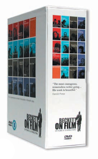
The logo developed for the Beckett on Film Festival concentrates on the artistry, genius, and introspection of Samuel Beckett, the man. This open-ended approach is not only personal and resonant, but also allows the logo to be incorporated successfully on a variety of applications, each with different needs.
Dynamo


40-42
The communications program for the Beckett on Film Festival has a distinctly Irish image, making it worthy of global publicity and marketing to international visitors. The logo is utilized on applications as varied as DVD packaging, promotional box sets, the website, tickets, and posters. The logo succeeds in maintaining a clear vision across platforms while allowing each item to communicate a specific message. This cohesive quality across the programs is possible because of the consistent use of the logo.
Dynamo
Until the 1950s most logos needed to work technically in only one medium, print. The expansion of digital, broadcast, and interactive media over the last fifty years has changed this. The logo should now be legible and clear on a one-color newspaper ad, a website, three-dimensional signage, and on television. Most clients will have a predisposed idea of the logo’s usage. At the time of its inception they may only intend to use the mark in print. Given the constant evolution of media and information delivery systems, it would be very unique for the mark to exist only in one medium over its lifespan. Once again, it is the designer’s responsibility to plan for the unplanned.
43
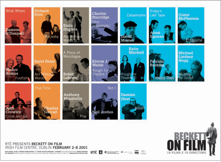
Nineteen different film directors with varying viewpoints are represented on the poster. The connection of portraits of these film directors to the image-based logo maintains a clear and direct spirit.
Dynamo
10 Be strong
“Design depends largely on constraints.”
–Charles Eames
“The businessman will never respect the professional who does not believe in what he does.”
–Paul Rand
“God helps them that help themselves.”
–Benjamin Franklin
There is an often-told story about a well-known designer throwing a leather office chair across the room when a client rejected his design. Being strong is not about throwing chairs. That’s a temper tantrum. Being strong is understanding your role, the client’s role, and maintaining a clear vision.
There is a fine line between intransigence and confidence, or between uncertainty and collaboration. The design process is often subjective, with logos and identity at the core of a sense of self. A client’s love of red, for example, may be irrelevant to the strategy, but rejection of that idea may become a deeply personal issue. On the other hand, the designer may fall in love with the style of a logo that is not conceptually relevant. In order to reach a solution that solves the problems with sustainability, the final logo must address the client’s goals and messages. Sidestepping the emotional landmines and personal politics is one of the most challenging aspects of the design process. While every situation is different, the best solution is to maintain a clear vision and connection to the primary goal. The designer, as an outside consultant, will be able to see the larger picture without being distracted by day-to-day operations. Frequently reminding the client of the desired outcome and central message is critical.
As the design of a logo is burdened with emotional and political issues, the designer may find himself in the role of “the bad guy” to others in the company not involved in the design process. This is not a negative. No one likes change and the designer is the catalyst for change. Achieving “buy-in” from these other voices is important and can be done with updated information and patient listening to internal issues. Making people feel good, however, is not the designer’s job; producing a viable and effective logo is.
“Good designers make trouble.”
—Tibor Kalman
