
Data visualizationis the process of creating and studying the visual representation of data to bring some meaningful insights. Michael Friendly’s 2009 paper titled “Milestones in the history of thematic cartography, statistical graphics, and data visualization,” provides the following overarching definition of information visualization:
Information visualization is the broadest term that could be taken to subsume all the developments described here. At this level, almost anything, if sufficiently organized, is information of a sort. Tables, graphs, maps, and even text, whether static or dynamic, provide some means to see what lies within, determine the answer to a question, find relations, and perhaps apprehend things which could not be seen so readily in other forms.
This comprehensive definition should make you aware what a large scope visualization covers. The broader fields of Information visualization is also called infographics , where information might be stored in other formats than data. Our focus in this chapter is only one specific type of visualization, which is commonly called data visualization. Data visualization specifically deals with visualizing the information in a given data. This can include multiple types of charts, graphs, colors, line plots, etc. Data visualization is an effective way to present data because it shifts the balance between perception and cognition to take fuller advantage of the brain's abilities. The ways we encode the information is very important to make direct pathways into the brain cognition. The core tools used to encode information in a visualization are color, size, shape, numbers, and other properties.
Data visualization has brought about a lot of benefits for industry and academia. Data visualization led the wave of the analytics world for quite some years and is expected to lead the curve for the next decade. This phenomenal growth has been possible because visualization is very useful for understanding massive data that we are gathering in our industry and academic research. The first step for data science is to understand the data, only then do start thinking about model and algorithm use. There are many benefits to embrace data visualization as an integral part of data science process. Some of the direct benefits of the data visualization are:
Identifying red spots in data, starting diagnostics
Tracking and identifying relations among different attributes
Seeing the trend and fallouts to understand the reasons
Summarizing complicated long spreadsheets and databases into visual art
Easy to use and very impactful way to store and present information and others
The market has many paid visualization software suites and on-demand cloud applications that can create meaningful visuals by the click of a button. However, we will explore the power of open source packages and tools for creating visualization in R.
Any kind of data visualization fundamentally depends on four key elements of data presentation , namely Comparison, Relationship, Distribution, and Composition. Comparison is used to see the differences between multiple items at given point in time or to see the relative change in a variable over a time period. A relationship element helps in finding correlation between two or more variables with an increase or decrease in values. Scatter and bubble chart are some examples in this category. Distribution charts like column and line histograms show the spread of data. For instance, data with skewness toward left or right could be easily spotted. Composition refers to a stacked chart with multiple components like a pie chart or stacked column/area chart. In our PEBE ML process flow, visualization plays a key role in the exploration phase.
Visualization serves as an aid in story telling by harnessing the power of data. There are plenty of examples to show patterns emerging from some simple plots, which otherwise is difficult to find even after using sophisticated statistics. Throughout this chapter, we will explore the four elements of data presentation with suitable examples and highlight how important role does visualization plays in better understanding the data to its finest of detail. Although we put this dedicated chapter for data visualization, the adaption of the approaches taught here is stretching across every other chapter of this book.
4.1 Introduction to the ggplot2 Package
R developers have created a good collection of visualization tool library. Being open source, these packages get updated very rapidly with new features. Another remarkable development in R tools for visualization is that the developers have been able to create functions that can replicate some of the high computational 3D plots and model outputs. The most important of all packages available in R for visualizations is ggplot2().
ggplot2is a data visualization package created by Hadley Wickham in 2005. It’s an implementation of Leland Wilkinson's Grammar of Graphics—a general scheme for data visualization that breaks up graphs into semantic components such as scales and layers. It is also important to state here that the other powerful plotting function that we have used multiple time is plot(). Plot() and ggplot2() are extensively used in the book. Before we go deeper into this chapter, this section includes a quick guide with some basic understanding of ggplot and its various layers, which you will see being used throughout this chapter (for a detailed study of ggplot, we recommend “ggplot2: Elegant Graphics for Data Analysis,” by Hadley Wickham [1]). The following descriptions are taken from the R documentation :
ggplot(): Initializes a ggplot object. It can be used to declare the input data frame for a graphic and to specify the set of plot aesthetics intended to be common throughout all subsequent layers unless specifically overridden.
aes(): Generates aesthetic mappings that describe how variables in the data are mapped to visual properties (aesthetics) of geoms. This function also standardizes aesthetic names by performing partial name matching, converting color to color, and old style R names to ggplot names (for example, pch to shape, cex to size).
geom_point(): The point geom is used to create scatterplots.
geom_line: Connects the observation in order of the variable on the x-axis.
scale_x_log10(): Transformation functions that prove very useful while setting the scale of the plots and charts .
scale_size_continuous(): Scales the area. The size aesthetic is most commonly used for points and text, and humans perceive the area of points, so this provides for optimal perception.
facet_wrap(): Most displays are roughly rectangular, so if you have a categorical variable with many levels, it doesn't make sense to try to display them all in one row (or one column). To solve this dilemma, facet_wrap wraps a 1D sequence of panels into 2D, making best use of screen real estate.
scale_fill_manual(): Create your own discrete scale, which includes, color, size, shape, etc.
xlab(): Changes x-axis labels.
ylab(): Changes y-axis labels.
ggtitle(): Changes the plot and legend title.
theme(): Use this function to modify theme settings. This function comes with a very rich set of parameters that provides for creating elegant looking graphics. Detailed ggplot2() documentation can be accessed from at https://cran.r-project.org/web/packages/ggplot2/ggplot2.pdf .
There are some other packages that we use in this chapter and would like readers to explore more of them. Some of them are googleVis(), ggmap(), ggrepel(), waterfall(), and rCharts(). These are all highly recommended .
4.2 World Development Indicators
A good data visualization tells a story with numbers. Economics is one of the fields that has integrated well into the visualization world. The visualization in economics has been very old. Playfair’s 1801 pie-circle-line chart, comparing population and taxes in several nations, is a proof of how old the relationship between economics and visualization is. Michael Friendly provided a comprehensive history and early examples of data visualization in his paper, also mentioned in previous section.
In this chapter we will be discussing chart types with some examples. Half of the chapter discusses economic indicators to build visualizations. The specific plots and graphs will be discussed with specific examples. The World Bank collects data to monitor economic indicators across the world. For details of the data and economic principles, visit http://www.worldbank.org/ .
The following section is a quick introduction of core indicators. A suitable visualization used for understanding its meaning and impact will be presented in following sections. There has been lot of good research using many of the World Bank’s data by social scientists in various sectors. We have cherry picked a few really impactful parts of that research and brought the real essence of the data into view. As we move from one example to the other, there will be emphasis given to the right type of visualization and extracting meaning out of the data without looking at the hundreds of rows and columns of a CSV or Excel file. Many of these visualizations are also provided on the World Bank web site; however, here in this book, you will learn how to use the ggplot package available in R to produce different graphs, charts, and plots. Instead of following a traditional approach of learning the grammar of graphics and then discussing a lot of theory on visualization, in this book, we have chosen a theme (World Bank’s development indicators) and will take you through a journey by means of storytelling. On the way, various types of visualization will be introduced.
4.3 Line Chart
A line chartis a basic visualization chart type in which information is displayed in a series of data points called markers connected by line segments. Line charts are used for showing trends in multiple categories of a variable. For instance, Figure 4-1 shows the growth of the Gross Domestic Product (GDP) over the years for the top 10 countries based on their most recent reported GDP figures. It helps in visualizing the trend in GDP growth for all these countries in a single plot.

Figure 4-1. A line chart showing the top 10 countries based on their GDP
library(reshape)library(ggplot2)GDP <-read.csv("Dataset/Total GDP 2015 Top 10.csv")names(GDP) <-c("Country", "2010","2011","2012","2013","2014","2015")
The following code uses a very important function that will be repeated in later sections as well, called melt().
The melt function takes data in wide formats and stacks a set of columns into a single column of data. You can think of it as melting the current dimensions and getting simpler dimensions. Melt() is available in the reshape2() package. In the following code, you will, after reshaping the dataset, reduce it to three columns. The columns are stacked versions of the same information along multiple columns. The melt() function can only melt the categorical attributes; the numeric ones are aggregated .
GDP_Long_Format <-melt(GDP, id="Country")names(GDP_Long_Format) <-c("Country", "Year","GDP_USD_Trillion")
This function is very important to understand in terms of how it is creating the plot using ggplot. Let’s break down this once, the same concept follows for these plots:
Aes(): The aesthetics of the plot, it tells the ggplot() object the input data, the x and y values, and other options.
Geom_line: This adds a layer to the plot with a line type as defined in aes().
Geom_point: This adds points to another layer of plot, the features of the type of points and their properties is provided in aes(), for instance, in the following code, we want points on each line with the color of the points being the same for each country and the size of point to be 5.
Theme: This command has options to design the theme of the plot canvas.
Xlab: Labeling the x-axis.
Ylab: Labeling the y-axis.
Ggtittle: Title of the plot.
In this this book, you might find new ways, so always make sure to visit the ggplot2() manual for any specific need. The chances are good that you will be able to have the kind of visualization you want .
ggplot(GDP_Long_Format, aes(x=Year, y=GDP_USD_Trillion, group=Country)) +geom_line(aes(colour=Country)) +geom_point(aes(colour=Country),size =5) +theme(legend.title=element_text(family="Times",size=20),legend.text=element_text(family="Times",face ="italic",size=15),plot.title=element_text(family="Times", face="bold", size=20),axis.title.x=element_text(family="Times", face="bold", size=12),axis.title.y=element_text(family="Times", face="bold", size=12)) +xlab("Year") +ylab("GDP (in trillion USD)") +ggtitle("Gross Domestic Product - Top 10 Countries")
Clearly, among the top 10, the United States is leading the race, followed by China and Japan. So, without looking at the data, we are seeing rich information being shown in this visualization. Now, the obvious next question that comes to your mind is, what really makes any country's GDP go up or down? Let’s try to understand for these countries, how much percentage of their GDP is contributed by agriculture, the service sector, and industry.
# AgricultureAgri_GDP <-read.csv("Dataset/Agriculture - Top 10 Country.csv")
Again, we melt the data into smaller numbers of columns to allow plotting .
Agri_GDP_Long_Format <-melt(Agri_GDP, id ="Country")names(Agri_GDP_Long_Format) <-c("Country", "Year", "Agri_Perc")Agri_GDP_Long_Format$Year <-substr(Agri_GDP_Long_Format$Year, 2,length(Agri_GDP_Long_Format$Year))
Apply the ggplot2() options to create plots as follows:
ggplot(Agri_GDP_Long_Format, aes(x=Year, y=Agri_Perc, group=Country)) +geom_line(aes(colour=Country)) +geom_point(aes(colour=Country),size =5) +theme(legend.title=element_text(family="Times",size=20),legend.text=element_text(family="Times",face ="italic",size=15),plot.title=element_text(family="Times", face="bold", size=20),axis.title.x=element_text(family="Times", face="bold", size=12),axis.title.y=element_text(family="Times", face="bold", size=12)) +xlab("Year") +ylab("Agriculture % Contribution to GDP") +ggtitle("Agriculture % Contribution to GDP - Top 10 Countries")

Figure 4-2. A line chart showing the top 10 countries based on percent contribution to GDP from agriculture
While countries like India and Brazil, which didn't get the top three spots when we looked at the GDP, top the charts in agriculture (along with China, which comes in top three here as well). This shows the importance these countries give to agriculture .
# ServiceService_GDP <-read.csv("Services - Top 10 Country.csv")Service_GDP_Long_Format <-melt(Service_GDP, id ="Country")names(Service_GDP_Long_Format) <-c("Country", "Year", "Service_Perc")Service_GDP_Long_Format$Year <-substr(Service_GDP_Long_Format$Year, 2,length(Service_GDP_Long_Format$Year))ggplot(Service_GDP_Long_Format, aes(x=Year, y=Service_Perc, group=Country)) +geom_line(aes(colour=Country)) +geom_point(aes(colour=Country),size =5) +theme(legend.title=element_text(family="Times",size=20),legend.text=element_text(family="Times",face ="italic",size=15),plot.title=element_text(family="Times", face="bold", size=20),axis.title.x=element_text(family="Times", face="bold", size=12),axis.title.y=element_text(family="Times", face="bold", size=12)) +xlab("Year") +ylab("Service sector % Contribution to GDP") +ggtitle("Service sector % Contribution to GDP - Top 10 Countries")

Figure 4-3. A line chart showing the top 10 countries based on percent contribution to GDP from the service sector
Now, contrary to agriculture, looking at the service sector , you will understand the reason behind the large GDP of the United States, China, and the United Kingdom. These countries have typically built their strong economies with service sectors. So, when you hear about Silicon Valley in the United States and London being the world's largest financial center, it’s actually their economies’ biggest growth drivers.
# IndustryIndustry_GDP <-read.csv("Industry - Top 10 Country.csv")Industry_GDP_Long_Format <-melt(Industry_GDP, id ="Country")names(Industry_GDP_Long_Format) <-c("Country", "Year", "Industry_Perc")Industry_GDP_Long_Format$Year <-substr(Industry_GDP_Long_Format$Year, 2,length(Industry_GDP_Long_Format$Year))ggplot(Industry_GDP_Long_Format, aes(x=Year, y=Industry_Perc, group=Country)) +geom_line(aes(colour=Country)) +geom_point(aes(colour=Country),size =5) +theme(legend.title=element_text(family="Times",size=20),legend.text=element_text(family="Times",face ="italic",size=15),plot.title=element_text(family="Times", face="bold", size=20),axis.title.x=element_text(family="Times", face="bold", size=12),axis.title.y=element_text(family="Times", face="bold", size=12)) +xlab("Year") +ylab("Industry % Contribution to GDP") +ggtitle("Industry % Contribution to GDP - Top 10 Countries")

Figure 4-4. A line chart showing the top 10 countries based on percent contribution to GDP from industry
After looking at agriculture and service sector, industry is the third biggest component in the GDP pie. And this particular component is by far led by China and their manufacturing industry. This is why you see many big brands like Apple embedding a label in their products that says, "Designed by Apple in California. Assembled in China". It’s not just mobile phones or companies like Apple, China is a manufacturing hub for many product segments like apparel and accessories, automobile parts, motorcycle parts, furniture, and the list goes on.
So, the overall trend shows while the industry and the service sector keep increasing in their contributions to GDP, agriculture has seen a steady decrease. Is this a signal of growth or a compromise of our food sources in the name of more lucrative sectors? Perhaps we will leave that question for the economic experts to answer. However, we definitely see how this visualization can show us insights that would have been difficult otherwise to interpret from the raw data.
In concluding remarks, among these big economies, many countries are witnessing a drastic drop in their industry output, like China, France, Australia, and Japan. India is the only country among these 10, where there has been a steady increase of industrial output over the years, which is a sign of development. Having said that, it still remains to see how agriculture and the service sector are balanced for the unprecedented growth in Industry. Even in this situation of unbalanced economies of developed and developing countries, what really helps to keep the balance is that the world is lot more free when it comes to trade. If you have strong agricultural output, you are free to export your production to other countries where it’s deficient and the same goes with the other sectors as well.
Before we embark on another story through visualization, the following section shows a stacked column chart showing percentage contributions from each of the sectors to the world’s total GDP .
4.4 Stacked Column Charts
Stacked column chartsare an elegant way of showing the composition of various categories that make up a particular variable. Here in the example in Figure 4-5, it’s easy to see how much percentage contribution each of these sectors has in the world's total GDP.

Figure 4-5. A stacked column chart showing the contribution of various sectors to the world’s GDP
library(plyr)World_Comp_GDP <-read.csv("World GDP and Sector.csv")World_Comp_GDP_Long_Format <-melt(World_Comp_GDP, id ="Sector")names(World_Comp_GDP_Long_Format) <-c("Sector", "Year", "USD")World_Comp_GDP_Long_Format$Year <-substr(World_Comp_GDP_Long_Format$Year, 2,length(World_Comp_GDP_Long_Format$Year))# calculate midpoints of barsWorld_Comp_GDP_Long_Format_Label <-ddply(World_Comp_GDP_Long_Format, .(Year),transform, pos =cumsum(USD) -(0.5 *USD))ggplot(World_Comp_GDP_Long_Format_Label, aes(x = Year, y = USD, fill = Sector)) +geom_bar(stat ="identity") +geom_text(aes(label = USD, y = pos), size =3) +theme(legend.title=element_text(family="Times",size=20),legend.text=element_text(family="Times",face ="italic",size=15),plot.title=element_text(family="Times", face="bold", size=20),axis.title.x=element_text(family="Times", face="bold", size=12),axis.title.y=element_text(family="Times", face="bold", size=12)) +xlab("Year") +ylab("% of GDP") +ggtitle("Contribution of various sector in the World GDP")
It’s clear from the stacked column chart in Figure 4-5 that the service sector has a major contribution all the years, followed by industry, and then agriculture. As the size of each block does not change meaning, the GDP has grown with similar ratios among these sectors.
The age dependency ratio is a good measure to show how this line plots and the stacked column chart can help investigate the measure. As defined by the World Bank, the age dependency ratio is the ratio of dependents—people younger than 15 or older than 64—to the working-age population—those aged between 15-64.
If the age dependency ratio is very high for a country, the government’s expenditure goes up on health, social security, and education, which are mostly spent on people younger than 14 or older than 64 (the numerator) because the number of people supporting these expenditures (people aged between 15-64) is less (the denominator). This also means individuals in the workforce have to take more of the burden to support their dependents than what is recommended. And at times, this leads to social issues like child labor (people aged less than 14 years ending up in the adult workforce). So, many developing economies where age dependency is high have to deal with these issues. The stacked line chart in Figure 4-6 shows how the working age ratio has been decreasing over the years for the top 10 countries .

Figure 4-6. A stacked line chart showing the top 10 countries based on their working age ratio
library(reshape2)library(ggplot2)Population_Working_Age <-read.csv("Age dependency ratio - Top 10 Country.csv")Population_Working_Age_Long_Format <-melt(Population_Working_Age, id ="Country")names(Population_Working_Age_Long_Format) <-c("Country", "Year", "Wrk_Age_Ratio")Population_Working_Age_Long_Format$Year <-substr(Population_Working_Age_Long_Format$Year, 2,length(Population_Working_Age_Long_Format$Year))ggplot(Population_Working_Age_Long_Format, aes(x=Year, y=Wrk_Age_Ratio, group=Country)) +geom_line(aes(colour=Country)) +geom_point(aes(colour=Country),size =5) +theme(legend.title=element_text(family="Times",size=20),legend.text=element_text(family="Times",face ="italic",size=15),plot.title=element_text(family="Times", face="bold", size=20),axis.title.x=element_text(family="Times", face="bold", size=12),axis.title.y=element_text(family="Times", face="bold", size=12)) +xlab("Year") +ylab("Working age Ratio") +ggtitle("Working age Ratio - Top 10 Countries")
If you look at the line charts in Figures 4-6 and 4-7, you will notice, in recent years, countries like Japan and France have the largest ageing population, hence a higher age dependency ratio, whereas, countries like India and China have a strong and large population of young people and thus show a steady decrease in this ratio over the years. For instance, in the year 2015, India and China reported 65.6% and 73.22% of their population aged between 15 and 64, respectively (34.41% and 26.78% with people aged below 14 and above 65, respectively). The same percentage for Japan and France is 60.8 and 62.4, respectively (33.19% and 37.57%, with people aged below 14 and above 65, respectively).

Figure 4-7. A stacked bar chart showing the constituents of different age groups as a percentage of the total population
library(reshape2)library(ggplot2)library(plyr)Population_Age <-read.csv("Population Ages - All Age - Top 10 Country.csv")Population_Age_Long_Format <-melt(Population_Age, id ="Country")names(Population_Age_Long_Format) <-c("Country", "Age_Group", "Age_Perc")Population_Age_Long_Format$Age_Group <-substr(Population_Age_Long_Format$Age_Group, 2,length(Population_Age_Long_Format$Age_Group))# calculate midpoints of barsPopulation_Age_Long_Format_Label <-ddply(Population_Age_Long_Format, .(Country),transform, pos =cumsum(Age_Perc) -(0.5 *Age_Perc))ggplot(Population_Age_Long_Format_Label, aes(x = Country, y = Age_Perc, fill = Age_Group)) +geom_bar(stat ="identity") +geom_text(aes(label = Age_Perc, y = pos), size =3) +theme(legend.title=element_text(family="Times",size=20),legend.text=element_text(family="Times",face ="italic",size=15),plot.title=element_text(family="Times", face="bold", size=20),axis.title.x=element_text(family="Times", face="bold", size=12),axis.title.y=element_text(family="Times", face="bold", size=12)) +xlab("Country") +ylab("% of Total Population") +ggtitle("Age Group - % of Total Population - Top 10 Country")
In a way, if you look at it, many economic factors—like income parity, inflation, imports and exports, GDP, and many more—have a direct or indirect effect on population growth and ageing. With population growth slowing down, as shown in Figure 4-8, for most of countries, there is a need for good public polices and awareness campaigns from the government in order to balance the ageing and younger population over the coming years.

Figure 4-8. A line chart showing the top 10 countries and their annual percentage of population growth
library(reshape2)library(ggplot2)Population_Growth <-read.csv("Population growth (annual %) - Top 10 Country.csv")Population_Growth_Long_Format <-melt(Population_Growth, id ="Country")names(Population_Growth_Long_Format) <-c("Country", "Year", "Annual_Pop_Growth")Population_Growth_Long_Format$Year <-substr(Population_Growth_Long_Format$Year, 2,length(Population_Growth_Long_Format$Year))ggplot(Population_Growth_Long_Format, aes(x=Year, y=Annual_Pop_Growth, group=Country)) +geom_line(aes(colour=Country)) +geom_point(aes(colour=Country),size =5) +theme(legend.title=element_text(family="Times",size=20),legend.text=element_text(family="Times",face ="italic",size=15),plot.title=element_text(family="Times", face="bold", size=20),axis.title.x=element_text(family="Times", face="bold", size=12),axis.title.y=element_text(family="Times", face="bold", size=12)) +xlab("Year") +ylab("Annual % Population Growth") +ggtitle("Annual % Population Growth - Top 10 Countries")
These plot are very interesting to peruse. The population growth for a few countries is very erratic while for others, it’s stable and decreasing. For instance, see the population growth of India, which has been steadily decreasing, while for the United States it stabilized and then increased .
4.5 Scatterplots
A scatterplotis a graph that helps identify if there is a relationship between two variables. Scatterplots use Cartesian coordinates to show two variables on an x- and y-axis. Higher dimensional scatterplots are also possible but they are difficult to visualize, hence two-dimensional scattercharts are very popular. If we add dimensions of color or shape or size, so we can present more than two variables on a two-dimensional scatterplot as well. In this case, we will look at a population growth indicator from the World Bank’s development indicators.
Any economy's strength is its people, and it is most important to measure if the citizens are doing well in terms of their financials, health, education, and all the basic necessities. A robust and strong economy is only built if it’s designed and planned to keep the citizens at the center of everything. So, while GDP as an indicator signifies the growth of the country, there are many indicators that measure how well people are growing with the GDP. So, before we look at such indicators, let’s try to explore the basic characteristics of the data using some of the widely used visualization tools, like scatterplots, boxplots, and histograms. Let’s see if there are some patterns emerging from the population growth data and the GDP of the top 10 countries.
library(reshape2)library(ggplot2)GDP_Pop <-read.csv("GDP and Population 2015.csv")ggplot(GDP_Pop, aes(x=Population_Billion, y=GDP_Trilion_USD))+geom_point(aes(color=Country),size =5) +theme(legend.title=element_text(family="Times",size=20),legend.text=element_text(family="Times",face ="italic",size=15),plot.title=element_text(family="Times", face="bold", size=20),axis.title.x=element_text(family="Times", face="bold", size=12),axis.title.y=element_text(family="Times", face="bold", size=12)) +xlab("Population ( in Billion)") +ylab("GDP (in Trillion US $)") +ggtitle("Population Vs GDP - Top 10 Countries")
The scatterplot in Figure 4-9 shows that for countries like United States (US) since 2009, the population has been relatively low compared to other countries in the top 10; however, the United States, being the worlds’ largest economy, has a very large GDP, taking the point high in the y-axis of the scatterplot. Similarly, if you look at China, with the worlds’ largest population of 1.37 billion and 10.8 trillion of US dollars of GDP, it’s represented by a point on the extreme right of the x-axis.

Figure 4-9. A scatterplot showing the relationship between population and GDP for the top 10 countries
4.6 Boxplots
Boxplots are a compact way of representing the five-number summary described in Chapter 1, namely median, first and third quartiles (25th and 75th percentile) and min and max. The upper side of the vertical rectangular box represents the third quartile and the lower, the first quartile. The difference between the two points is known as the interquartile range, which consist of 50% of the data. A line dividing the rectangle represents the median. It also contains a line extending on both sides (known as whiskers) of the rectangle, which indicate the variability outside the first and third quartile. And finally the points plotted, which are shown as extensions of the lines, are called outliers. Numerically, these points have a value more than twice the standard deviation of the variable.
# GDPGDP_all <-read.csv("Dataset/WDi/GDP All Year.csv")GDP_all_Long_Format <-melt(GDP_all, id ="Country")names(GDP_all_Long_Format) <-c("Country", "Year", "GDP_USD_Trillion")GDP_all_Long_Format$Year <-substr(GDP_all_Long_Format$Year, 2,length(GDP_all_Long_Format$Year))ggplot(GDP_all_Long_Format, aes(factor(Country), GDP_USD_Trillion)) +geom_boxplot(aes(fill =factor(Country)))+theme(legend.title=element_text(family="Times",size=20),legend.text=element_text(family="Times",face ="italic",size=15),plot.title=element_text(family="Times", face="bold", size=20),axis.title.x=element_text(family="Times", face="bold", size=12),axis.title.y=element_text(family="Times", face="bold", size=12)) +xlab("Country") +ylab("GDP (in Trillion US $)") +ggtitle("GDP (in Trillion US $): Boxplot - Top 10 Countries")
A boxplot is a wonderful representation of the degree of dispersion (spread), skewness, and outliers in a single plot. Using ggplot, it’s possible to stack the different categories of the variables together side-by-side to see a comparison. For instance, looking at Figure 4-10, you see a boxplot of GDP by country. This contains the GDP data from 1962 to 2015. You see that the United States has shown the highest level of growth (degree of dispersion) with no outliers, indicating a sustained growth with no extreme highs or lows, whereas in China shows a high number of outliers, which roughly indicates the country has seen many unpredicted growths between 1962 and 2015. This interpretation is prone to error as we haven't looked at the reasons for these outliers in the data. An economist might intuitively generate some insights by just glancing at this plot; however, a naive analyst might end up producing some erroneous conclusions if they didn’t give attention to the details. So, always hold onto the excitement of seeing a beautiful visualization and carefully analyze the other statistical properties of the data before making conclusions.

Figure 4-10. A boxplot showing the GDP (in trillion US$) for the top 10 countries
# PopulationPopulation_all <-read.csv("Population All Year.csv")Population_all_Long_Format <-melt(Population_all, id ="Country")names(Population_all_Long_Format) <-c("Country", "Year", "Pop_Billion")Population_all_Long_Format$Year <-substr(Population_all_Long_Format$Year, 2,length(Population_all_Long_Format$Year))ggplot(Population_all_Long_Format, aes(factor(Country), Pop_Billion)) +geom_boxplot(aes(fill =factor(Country))) +theme(legend.title=element_text(family="Times",size=20),legend.text=element_text(family="Times",face ="italic",size=15),plot.title=element_text(family="Times", face="bold", size=20),axis.title.x=element_text(family="Times", face="bold", size=12),axis.title.y=element_text(family="Times", face="bold", size=12)) +xlab("Country") +ylab("Population (in Billion)") +ggtitle("Population (in Billion): Boxplot - Top 10 Countries")
The boxplot for population of these 10 countries (in Figure 4-11) shows a similar trend but with no outliers. India and China are clearly emerging as the largest countries in terms of population.

Figure 4-11. A boxplot showing the population (in billions) for the top 10 countries
4.7 Histograms and Density Plots
A histogramis one of the most basic and easy to understand graphical representations of numerical data. It consists of rectangular boxes. The width of each rectangle has a certain range and the height signifies the number of data points within that range. Constructing a histogram begins with dividing the entire range of values into non-overlapping and equal sized smaller bins (the rectangles). Histograms show an estimate of the probability distribution of a continuous variable .
Now imagine if you increase the number of bins to a large number in the histogram. What happens as a result is that you get a smooth surface and the rectangles appear to diminish into an area with some density. Alternatively, you could also use a density plot. Here we will show a histogram and then a density plot separately.
# PopulationPopulation_all <-read.csv("Population All Year.csv")Population_all_Long_Format <-melt(Population_all, id ="Country")names(Population_all_Long_Format) <-c("Country", "Year", "Pop_Billion")Population_all_Long_Format$Year <-substr(Population_all_Long_Format$Year , 2,length(Population_all_Long_Format$Year))#Developed CountryPopulation_Developed <-Population_all_Long_Format[!(Population_all_Long_Format$Country %in%c('India','China','Australia','Brazil','Canada','France','United States')),]ggplot(Population_Developed, aes(Pop_Billion, fill = Country)) +geom_histogram(alpha =0.5, aes(y = ..density..),col="black") +theme(legend.title=element_text(family="Times",size=20),legend.text=element_text(family="Times",face ="italic",size=15),plot.title=element_text(family="Times", face="bold", size=20),axis.title.x=element_text(family="Times", face="bold", size=12),axis.title.y=element_text(family="Times", face="bold", size=12)) +xlab("Population (in Billion)") +ylab("Frequency") +ggtitle("Population (in Billion): Histogram")
Figures 4-12 shows the distribution of population for three countries—Germany, Japan, and the United Kingdom.

Figure 4-12. A histogram showing GDP and population for three developed countries
This distribution can be shown in density scales as well; here is the plot showing density scales.
ggplot(Population_Developed, aes(Pop_Billion, fill = Country)) +geom_density(alpha =0.2, col="black") +theme(legend.title=element_text(family="Times",size=20),legend.text=element_text(family="Times",face ="italic",size=15),plot.title=element_text(family="Times", face="bold", size=20),axis.title.x=element_text(family="Times", face="bold", size=12),axis.title.y=element_text(family="Times", face="bold", size=12)) +xlab("Population (in Billion)") +ylab("Frequency") +ggtitle("Population (in Billion): Density")

Figure 4-13. A density plot showing GDP and population for three developed countries
#Developing CountryPopulation_Developing <-Population_all_Long_Format[Population_all_Long_Format$Country %in%c('India','China'),]#Histogramggplot(Population_Developing, aes(Pop_Billion, fill = Country)) +geom_histogram(alpha =0.5, aes(y = ..density..),col="black") +theme(legend.title=element_text(family="Times",size=20),legend.text=element_text(family="Times",face ="italic",size=15),plot.title=element_text(family="Times", face="bold", size=20),axis.title.x=element_text(family="Times", face="bold", size=12),axis.title.y=element_text(family="Times", face="bold", size=12)) +xlab("Population (in Billion)") +ylab("Frequency") +ggtitle("Population (in Billion): Histogram")

Figure 4-14. A histogram showing GDP and population for two developing countries
#Densityggplot(Population_Developing, aes(Pop_Billion, fill = Country)) +geom_density(alpha =0.2, col="black") +theme(legend.title=element_text(family="Times",size=20),legend.text=element_text(family="Times",face ="italic",size=15),plot.title=element_text(family="Times", face="bold", size=20),axis.title.x=element_text(family="Times", face="bold", size=12),axis.title.y=element_text(family="Times", face="bold", size=12)) +xlab("Population (in Billion)") +ylab("Frequency") +ggtitle("Population (in Billion): Density Plot")

Figure 4-15. A density plot showing GDP and population for two developing countries
Looking at these histograms and density plots, you can see over the years, how the population data for these developed and developing nations is distributed. Now, since we have explored the data in detail, let’s get a little more specific about the indicators based on population but split by different cohorts, like country and age .
4.8 Pie Charts
In India, the lowest consumption group spends almost close to 53% of their money on food and beverages as compared to the higher consumption group with by far the lowest among other groups at 12%. On the other hand, their spending on housing stands at 39%. This has one clear indication—the lowest consumption group with less disposable income spends a lot on basic survival needs like food, whereas the higher income group is looking for nice places to buy homes. The middle income group has something very similar to the higher group, but they have a larger pie allocated for food as well, which stands at 21%.
So, in India, businesses around real estates and food industry have flourished to an all time high in recent years. With a 1.31 billion population base, and a majority of them in the lowest, low, or middle income group, India has become a land of opportunity for the food industry .
Another interesting sector is transport, which finds its highest share of contribution from the higher income group, which often is making travel plans throughout the year. The transport here includes the usual mode of commuting to home and the office as well as holiday travels. With the presence of global businesses like Uber, which has solved the world’s commuting problems, and with technology being present in more than 28 cities of India, this tells us the potential of this sector.
# Indialibrary(reshape2)library(ggplot2)GCD_India <-read.csv("India - USD - Percentage.csv")GCD_India_Long_Format <-melt(GCD_India, id ="Sector")names(GCD_India_Long_Format) <-c("Sector", "Income_Group","Perc_Cont")ggplot(data=GCD_India_Long_Format, aes(x=factor(1), fill =factor(Sector))) +geom_bar(aes(weight = Perc_Cont), width=1) +coord_polar(theta="y", start =0) +facet_grid(facets=. ∼Income_Group) +scale_fill_brewer(palette="Set3") +xlab('') +ylab('') +labs(fill='Sector') +ggtitle("India - Percentage share of each sector by Consumption Segment")

Figure 4-16. A pie chart showing the percentage share of each sector by consumption segment in India
In contrast to India, if you look at China, the need for food and housing is more evenly distributed among different income groups, whereas what emerges very distinctively in China is the spending on information and communication technologies (ICT) by the higher income group, which stands at 14% of the total spend. This puts China more into the league of developed nations, where such high adaptability and spend on ICT could be seen.
# Chinalibrary(reshape2)library(ggplot2)GCD_China <-read.csv("China - USD - Percentage.csv")GCD_China_Long_Format <-melt(GCD_China, id ="Sector")names(GCD_China_Long_Format) <-c("Sector", "Income_Group","Perc_Cont")ggplot(data=GCD_China_Long_Format, aes(x=factor(1), fill =factor(Sector))) +geom_bar(aes(weight = Perc_Cont), width=1) +coord_polar(theta="y", start =0) +facet_grid(facets=. ∼Income_Group) +scale_fill_brewer(palette="Set3") +xlab('') +ylab('') +labs(fill='Sector') +ggtitle("China - Percentage share of each sector by Consumption Segment")
The pie chart in Figure 4-17 is very intuitive. Look at the lowest segment, the pie chart on extreme left. Almost half of the consumption is for food and beverages, as for the poor, the first priority is food. As you move to the higher segment, the priories shift and things like education and ICT (computing devices) go up substantially.

Figure 4-17. A pie chart showing the percentage share of each sector by consumption segment in China
4.9 Correlation Plots
The best way to show how much one indicator relates to another is by computing the correlation. Though we won't go into the details of the mathematics behind correlation, those of you who thought that correlations are only seen through a nxn matrix are in for a surprise. Here comes the visual representation of it using the corrplot library in R.Correlational as a statistical measure is discussed in Chapter 6.
Corrplot()is a R package that can be used for graphical display of a correlation matrix, confidence interval. It also contains some algorithms to do matrix reordering. In addition, corrplot is good at details, including choosing color, text labels, color labels, layout, etc.
In this last section of the chapter, we want to tie few development indicators discussed in previous sections like GDP and population with some indicators that contribute to its growth. The World Bank data used from 1961 to 2014 at an overall world level. For instance, fertility rate (births per women) highly correlates to population growth rate .
library(corrplot)library(reshape2)library(ggplot2)correlation_world <-read.csv("Correlation Data.csv")corrplot(cor(correlation_world[,2:6],method ="pearson"),diag =FALSE,title ="Correlation Plot", method ="ellipse",tl.cex =0.7, tl.col ="black", cl.ratio =0.2)
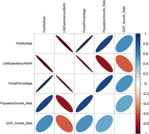
Figure 4-18. A plot showing correlation between various world development indicators
There are many methods with the corrplot function (the method used in the cor function defines which correlation measure to use; here we use a Pearson correlation) with which you can experiment to see different shapes in this plot. We prefer the “ellipse,” for two reasons. The ellipse can give us size and directional elements to capture more information. The combination of color, size, and position encapsulates a numeric value into a visual representation. For example, a correlation between fertility rate and population growth has a value greater than 0 (reflected in the shades of blue), and the direction of the ellipse represents a positive or negative correlation . The size represents the value; a thin ellipse would mean either a low or negative correlation and vice versa .
This way of leveraging the color, shape, and position gives us more dimensions to present a visualization in 2D, which otherwise would have been difficult to visualize. Some of the insights we get from this plot without even looking at the correlation matrix are as follows:
As the fertility rates go down, we can see an increased life expectancy.
With increase in the life expectancy, people start to live longer and there is greater burden on the economy to meet their healthcare needs. As a result, we see its negative correlation with GDP growth rate. Although it would be a gross mistake to say it’s only the increase in life expectancy causing the GDP growth rate to go down, it is fair to point out the negative correlation that exists between the two variables.
An increase in females also shows a positive (although not too high) correlation with GDP growth rate. This might mean that female contribution in household income growth and hence the spending increase has some effect on the countries GDP .
4.10 HeatMaps
Carrying on with the indicators and their correlations in the last section, Heatmaps are visualization of data where values are represented as different shades of colors, darker the shade, higher is the value. For example, it would help us visualize how different regions of the world are responding to the development indicators.
The heatmap in Figure 4-19 shows six development indicators and how its scaled values (between 0 to 1) compare for different regions. Some insights we could derive from this heatmap are:

Figure 4-19. A heatmap between regions and their various world development indicators
The East Asia and Pacific region has the world’s highest population (mostly contributed by China), followed by South Asia (contribution from India).
North America, with its very low population, has the highest GDP per capita value (GDP/Population). It also has the lowest fertility rate and highest life expectancy, which comes from the fact that both of these indicators are highly correlated. Sub-Saharan Africa has the lowest GDP and GDP per capita.
Interestingly, life expectancy throughout the world is now looks healthy in terms of its scaled value. This perhaps is because of the improved healthcare services and reduced fertility rates. So, it seems most of the countries in the world are able to use contraceptives and enjoy the economic benefits of a smaller family .
library(corrplot)library(reshape2)library(ggplot2)library("scales")#Heat Mapsbc <-read.csv("Region Wise Data.csv")bc_long_form <-melt(bc, id =c("Region","Indicator"))names(bc_long_form) <-c("Region","Indicator","Year", "Inc_Value")bc_long_form$Year <-substr(bc_long_form$Year, 2,length(bc_long_form$Year))bc_long_form_rs <-ddply(bc_long_form, .(Indicator), transform ,rescale =rescale(Inc_Value))ggplot(bc_long_form_rs, aes(Indicator, Region)) +geom_tile(aes(fill = rescale),colour ="white") +scale_fill_gradient(low ="white",high ="steelblue") +theme_grey(base_size =11) +scale_x_discrete(expand =c(0, 0)) +scale_y_discrete(expand =c(0, 0)) +theme(axis.text.x =element_text(size =15 *0.8, angle =330, hjust =0, colour ="black",face="bold"),axis.text.y =element_text(size =15 *0.8, colour ="black",face="bold"))+ggtitle("Heatmap - Region Vs World Development Indicators") +theme(text=element_text(size=12),title=element_text(size=14,face="bold"))
4.11 Bubble Charts
In order to appreciate bubble charts , you need to first watch the TED talk by Hans Rosling, called “The best stats you've ever seen”. He is a Swedish medical doctor, academic, statistician, and public speaker. Hans co-founded Gapminder Foundations, a non-profit organization promoting the use of data to explore development issues. They came out with software named Trendalyzer, which was later acquired by Google and rebranded as googleViz or otherwise known as Google Motion Charts. Google didn't commercialize this product, but rather made it available free publicly.
In this section, we use a dataset made available by Gapminder, which has the data around continent, country, life expectancy, and GDP per capita from 1995 to 2007. Though it looks good in 2D and in static charts, it’s a visual delight to see these bubbles move in a motion chart.
library(corrplot)library(reshape2)library(ggplot2)library("scales")#Bubble chartbc <-read.delim("BubbleChart_GapMInderData.txt")bc_clean <-droplevels(subset(bc, continent != "Oceania"))str(bc_clean)'data.frame': 1680 obs. of 6 variables:$ country : Factor w/ 140 levels "Afghanistan",..: 1 1 1 1 1 1 1 1 1 1 ...$ year : int 1952 1957 1962 1967 1972 1977 1982 1987 1992 1997 ...$ pop : num 8425333 9240934 10267083 11537966 13079460 ...$ continent: Factor w/ 4 levels "Africa","Americas",..: 3 3 3 3 3 3 3 3 3 3 ...$ lifeExp : num 28.8 30.3 32 34 36.1 ...$ gdpPercap: num 779 821 853 836 740 ...bc_clean_subset <-subset(bc_clean, year ==2007)bc_clean_subset$year =as.factor(bc_clean_subset$year)ggplot(bc_clean_subset, aes(x = gdpPercap, y = lifeExp)) +scale_x_log10() +geom_point(aes(size =sqrt(pop/pi)), pch =21, show.legend =FALSE) +scale_size_continuous(range=c(1,40)) +facet_wrap(∼continent) +aes(fill = continent) +scale_fill_manual(values =c("#FAB25B", "#276419", "#529624", "#C6E79C")) +xlab("GDP Per Capita(in US $)")+ylab("Life Expectancy(in years)")+ggtitle("Bubble Chart - GDP Per Capita Vs Life Expectancy") +theme(text=element_text(size=12),title=element_text(size=14,face="bold"))
The book, Lattice: Multivariate Data Visualization with R available via SpringerLink, by Deepayan Sarkar, Springer (2008) has a comprehensive analysis on bubble charts. Readers who want a deeper understanding of this visualization may refer to this book.
The bubble chart in Figure 4-20 shows the plot between life expectancy and GDP per capita for the year 2007. The size of the bubble indicates the population of countries in that continent. The bigger the bubble size, the larger the population. You can see that Asia contains multiple large bubbles because of the India and China presence, whereas Europe consists of mostly less populated countries and a high GDP per capita and life expectancy. America has some densely populated areas at the same time as a high value for both the indicators .

Figure 4-20. A bubble chart showing GDP per capita vs life expectancy
library(corrplot)library(reshape2)library(ggplot2)library("scales")bc <-read.csv("Bubble Chart.csv")ggplot(bc, aes(x = GDPPerCapita, y = LifeExpectancy)) +scale_x_log10() +geom_point(aes(size =sqrt(Population/pi)), pch =21, show.legend =FALSE) +scale_size_continuous(range=c(1,40)) +facet_wrap(∼Country) +aes(fill = Country) +xlab("GDP Per Capita(in US $)")+ylab("Life Expectancy(in years)")+ggtitle("Bubble Chart - GDP Per Capita Vs Life Expectancy - Four Countries") +theme(text=element_text(size=12),title=element_text(size=14,face="bold"))
The bubble chart in Figure 4-21 is for the two most developed and two fastest developing countries. Note that the developing nations, China and India, are quickly catching up in GDP and life expectancy to the developed nations over the years, despite their large population .

Figure 4-21. A bubble chart showing GDP per capita vs life expectancy for four countries
library(corrplot)library(reshape2)library(ggplot2)library("scales")bc <-read.csv("Bubble Chart.csv")ggplot(bc, aes(y = FertilityRate, x = LifeExpectancy)) +scale_x_log10() +geom_point(aes(size =sqrt(Population/pi)), pch =21, show.legend =FALSE) +scale_size_continuous(range=c(1,40)) +facet_wrap(∼Country) +aes(fill = Country) +ylab("Fertility rate, total (births per woman)")+xlab("Life Expectancy(in years)")+ggtitle("Bubble Chart - Fertility rate Vs Life Expectancy") +theme(text=element_text(size=12),title=element_text(size=14,face="bold"))
It’s evident from the chart in Figure 4-22 that, with decreasing fertility rates, the life expectancy is getting longer for all these four nations. India steadily reduced the gap between itself and China in terms of life expectancy. There were 14 years between them to begin with and it fell to 6 or 7 years .

Figure 4-22. A bubble chart showing fertility rate vs life expectancy
4.12 Waterfall Charts
A waterfall charthelps visualize the cumulative effect of sequential changes (addition and deletion) in the values. Just like waterflow, it shows the flow of values in and out of the main values. Waterfall charts are also known as flying bricks charts or Mario charts due to the apparent suspension of columns (bricks) in midair. They are very popular in accounting and stock management visualizations, as the quantities keep on changing in a sequential manner. We will be using the package waterfall to create an example on hypothetical data of border control.
Waterfall() is an R package that provides support for creating waterfall charts in R using both traditional base and lattice graphics. The package details can be found at https://cran.r-project.org/web/packages/waterfall/waterfall.pdf .
The data we have is of border control, where each month the footfall of people is counted. More people going out than coming in means the net migration is negative, and when more people come in than out, the migration is positive. If we record this exchange over the border for 12 months, we can see the net migration. The waterfall chart will show us how it changed over these months .
#Read the Footfall Datafootfall <-read.csv("Dataset/Waterfall Shop Footfall Data.csv",header = T)#Display the data for easy readfootfall#Convert the Months into factors to retain the order in chartfootfall$Month <-factor(footfall$Month)footfall$Time_Period <-factor(footfall$Time_Period)#Load waterfall librarylibrary(waterfall)library(lattice)#Plot using waterfallwaterfallplot(footfall$Net,names.arg=footfall$Month, xlab ="Time Period(Month)",ylab="Footfall",col = footfall$Type,main="Footfall by Month")

Figure 4-23. Waterfall plot of footfall at the border
The green blocks are starting or ending blocks, corresponding to January and December, respectively. The red blocks are people coming in while black blocks are people going out. When you follow this over a year, you can see that positive migration happened most of the year, except in three months where more people went out (the black blocks) .
The following plot is alternative view of the same waterfall charts (see Figure 4-24) .

Figure 4-24. Waterfall chart with net effect
waterfallchart(Net∼Time_Period, data=footfall,col = footfall$Type,xlab ="Time Period(Month)",ylab="Footfall",main="Footfall by Month")The plot in Figure 4-24 is similar to the previous one, with the only difference of the total column at the end. The total column presents the final net value in our counter of footfall after the year ended .
The same plot can be created to show the percentage of footfall contribution by month. This will show how the ending footfall count each month is proportional to the total end footfall. The sum of such percentage should be 100 and is divided into 12 months.
waterfallchart(Month∼Footfall_End_Percent, data=footfall)Note that the end count fluctuated during the month of April, followed by March and November. The interpretation will vary based on what you are more interested in from the plots in Figures 4-24 and 4-25.

Figure 4-25. Footfall end count as percentage of total end count
4.13 Dendogram
Dendograms are visual representations specifically useful in clustering analysis. They are tree diagrams frequently used to illustrate the formation of clusters as is done in hierarchical clusters. Chapter 6 explains how hierarchical clustering works. Dendograms are popular in computational biology where similarities among species can be presented using histograms to classify them.
Dendograms are native to the basic plot() command. There are some other packages as well for more detailed dendograms like ggdendro() and dendextend().
The y-axis in dendograms measures the closeness (or similarity) of an individual data point of clusters.
The x-axis lists the elements in the dataset (and hence they look messy on the leaf nodes).
The dendogram helps in choosing the right numbers of clusters by showing how the tree grows with distance matrix (or height) on the y-axis. Cut the tree where you feel substantially separated clusters can be seen on dendogram . A cut means a like y=c, where c is 1, 2, or 3..n and c is the number of clusters.
Here, we create a example with iris data, and in the end show how good the clusters fit to the actual data.
library(ggplot2)data(iris)# prepare hierarchical cluster on iris datahc <-hclust(dist(iris[,1:2]))# using dendogram objectshcd <-as.dendrogram(hc)#Zoom Into it at level 1plot(cut(hcd, h =1)$upper, main ="Upper tree of cut at h=1")
Looking at the dendogram in Figure 4-26, the best cut seems like it will be somewhere between 2 and 3, as the clusters have to be complete. We will go ahead with three clusters and see how they fit into our prior knowledge of clusters.

Figure 4-26. Dendogram with distance/height up to h=1
#lets show how cluster looks looks like if we have cut the tree at y=3clusterCut <-cutree(hc, 3)iris$clusterCut <-as.factor(clusterCut)ggplot(iris, aes(Petal.Length, Petal.Width, color = iris$Species)) +geom_point(alpha =0.4, size =3.5) +geom_point(col = clusterCut) +scale_color_manual(values =c('black', 'red', 'green'))
We can see in the plots in Figure 4-27 that most of the clusters we predicted and the already existing classification of species match. This also means the variables we use for clustering petal width and petal length are important features for the type of species they belong to .

Figure 4-27. Clusters by actual classification of species in iris data
4.14 Wordclouds
Wordclouds are word plots with frequency weighted to the size of the words. The more frequently a word appears, the bigger the word. You can look at text data and quickly identify the most prominent themes discussed. The earliest example of weighted lists of English keywords were the "subconscious files" in Douglas Coupland's Microserfs (1995). After that, this has become a prominent way of quickly perceiving the most frequent terms and for locating a word alphabetically to determine its relative importance.
In R, we have package wordcloud(), which is used in this section to create a wordcloud. The details of this package are available at https://cran.r-project.org/web/packages/wordcloud/wordcloud.pdf .
In this section, we show a good example of how wordclouds can be useful. We have just copied multiple job descriptions from the Internet for a data science position. Now the wordcloud on this document will tell us which words occur most frequency in the job descriptions and hence give us an idea about what the hot skills in market are and the demand of other qualities .
#Load the text filejob_desc <-readLines("Dataset/wordcloud.txt")library(tm)library(SnowballC)library(wordcloud)Loading required package: RColorBrewerjeopCorpus <-Corpus(VectorSource(job_desc))jeopCorpus <-tm_map(jeopCorpus, PlainTextDocument)#jeopCorpus <- tm_map(jeopCorpus, content_transformer(tolower))#Remove punctuation marksjeopCorpus <-tm_map(jeopCorpus, removePunctuation)#remove English stopwords and some more custom wordsjeopCorpus <-tm_map(jeopCorpus, removeWords,(c("Data","data","Experi","work","develop","use","will","can","you","busi", stopwords('english'))))#Create the document matrixjeopCorpus <-tm_map(jeopCorpus, stemDocument)#Creating the color pellet for the word imagespal <-brewer.pal(9,"YlGnBu")pal <-pal[-(1:4)]set.seed(146)#creating the wordcloudwordcloud(words = jeopCorpus, scale=c(3,0.5), max.words=100, random.order=FALSE,rot.per=0.10, use.r.layout=FALSE, colors=pal)

Figure 4-28. Wordcloud of job descriptions
The wordcloud shows that the key trends in data science positions are experienced people, analyst positions, Hadoop, statistics, Python, and others. This way, without even going through all the data, we have been able to extract the prominent requirements for a data science position .
4.15 Sankey Plots
Sankey plotsare also called river plots . They are used to show how the different elements of data are connected, with the density of connecting lines presenting the strength of connection. They help show the flow of connected items from one factor to another.
It is highly recommended that users explore a powerful visualization package for making lot of beautiful charts in R: Rcharts(). The source of this package, with lots of examples, can be found at https://github.com/ramnathv/rCharts .
In the following example, we will use another powerful visualization tool, googleVis(). GoogleVis is an R interface to the Google Charts API, allowing users to create interactive charts based on data frames. Charts are displayed locally via the R HTTP help server. A modern browser with an Internet connection is required and for some charts a Flash player. The data remains local and is not uploaded to Google. (Source: https://cran.r-project.org/web/packages/googleVis/googleVis.pdf )
In our example, we will show how the HousePrice flows among different attributes; we have chosen three layers of plot with Type of House, Estate type, and Type of Sale .
#Load the data from sankey.csvsankey_data <-read.csv("Dataset/sankey2.csv",header=T)library(googleVis)plot(gvisSankey(sankey_data, from="Start",to="End", weight="Weight",options=list(height=250,sankey="{link:{color:{fill:'lightblue'}}}")))
Note
The visualization is loaded on a web browser, so you don’t need a working Internet connection to load this example.
starting httpd help server ...done

Figure 4-29. The Sankey chart for house sale data
The Sankey chart provides us with some important information, like the most popular house type is the individual house. They then are available in all the type of states. Further the societies only have individual house and they have gone through new house sale, second resale, and third resale only. You can use these plots to explain a lot of other insights as well .
4.16 Time Series Graphs
We have already shown time series plots in earlier sections in this chapter. Essentially, when the data is time indexed, like GDP data, we take time on the x-axis and plot the data to see how it has been changing over time. We can use time series plots to evaluate patterns and behavior in data over time.
R has powerful libraries to plot multiple types of time series plots. A good read for you can be found at https://cran.r-project.org/web/packages/timeSeries/vignettes/timeSeriesPlot.pdf .
For our example, we will try to show two time plots to understand some stark behavior:
GDP of eight countries overlayed on a single plot to show how the GDP growth varied for these countries over the last 25 years.
Tracing the GDP growth of three countries during the recession of 2008.
The first example plots GDP growth over 25 years for eight countries /areas (the Arab world, UAE, Australia, Bangladesh, Spain, United Kingdom, India, and the United States).
library(reshape2)library(ggplot2)library(ggrepel)time_series <-read.csv("Dataset/timeseries.csv",header=TRUE);mdf <-melt(time_series,id.vars="Year");mdf$Date <-as.Date(mdf$Year,format="%d/%m/%Y");names(mdf)=c("Year","Country","GDP_Growth","Date");ggplot(data=mdf,aes(x=Date,y=GDP_Growth)) +geom_line(aes(color=Country),size=1.5)
The plot in Figure 4-30 shows that the most volatile economy among the eight countries is UAE. They showed phenomenal growth after the 1990s. You can also see during 2007-2009 that all the economies showed lower GDP growth, due to a worldwide recession .

Figure 4-30. GDP growth for eight countries
In the following plots, we will see how the recessions impacted three major economies and to what extent (United States, the UK, and India).
#Now lets just see the growth rates for India, US and UK during recession years (2006,2007,2008,2009,2010)mdf_2 <-mdf[mdf$Country %in%c("India","United.States","United.Kingdom") &(mdf$Date >as.Date("2005-01-01") &mdf$Date <as.Date("2011-01-01")),]mdf_2$GDP_Growth <-round(mdf_2$GDP_Growth,2)tp <-ggplot(data=mdf_2,aes(x=Date,y=GDP_Growth)) +geom_line(aes(color=Country),size=1.5)tp +geom_text_repel(aes(label=GDP_Growth))

Figure 4-31. GDP growth during recession
You can see in 2008, that the United States and the UK showed negative growth, while India’s growth slowed but was not negative. The United States and the UK were in a deep recession in 2009 as well, while India started picking up. After 2009, all the economies were on the recovery path.
4.17 Cohort Diagrams
Cohort diagramsare two-dimensional diagrams used to present events that occur to a set of observations (individuals) belonging to different cohorts. They are very popular in credit analysis, marketing analysis, and other demographic studies. Cohort diagrams are also sometimes called Lexis diagrams.
A cohort is a group of people that form a group that’s assumed to behave differently than others based on demographics. In our credit example , we assume the cohorts as the year in which credit was issued. This means each year applicants will be treated as a cohort and then we track how many of them still remain unpaid in the following years. In cohort plots time is usually represented on the horizontal axis, while the value of interest is represented on the vertical axis.
Let’s create the cohort diagram for our credit example.
library(ggplot2)require(plyr)cohort <-read.csv("Dataset/cohort.csv",header=TRUE)#we need to melt datacohort.chart <-melt(cohort, id.vars ="Credit_Issued")colnames(cohort.chart) <-c('Credit_Issued', 'Year_Active', 'Active_Num')cohort.chart$Credit_Issued <-factor(cohort.chart$Credit_Issued)#define paletteblues <-colorRampPalette(c('lightblue', 'darkblue'))#plot datap <-ggplot(cohort.chart, aes(x=Year_Active, y=Active_Num, group=Credit_Issued))p +geom_area(aes(fill = Credit_Issued)) +scale_fill_manual(values =blues(nrow(cohort))) +ggtitle('Active Credit Cards Volume')
The plot in Figure 4-32 shows how each cohort volume changes with the number of active years. You can see how the active number of cards decreases over the years. The decline rate can be estimated by the slope of each cohort and can be tested against others to see if some particular cohort behaved differently.
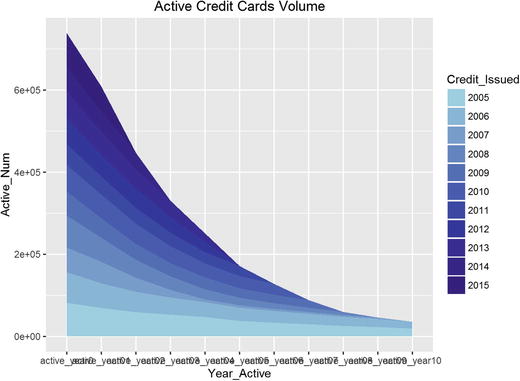
Figure 4-32. The cohort plot for credit card active by year of issue
4.18 Spatial Maps
Spatial mapshave become very popular in recent days. They are powerful presentations of data that’s tagged with locations on a map. If the information is geotagged, we can create powerful visual presentations of the data. You can see lots of applications of them—weather reporting, demographics, crime monitoring, trails monitoring, and some very interesting crowd behavior tracking using Twitter data, Flikr data, and other geotagged personal data.
We recommend a good read, available at https://journal.r-project.org/archive/2013-1/kahle-wickham.pdf .
To show an example, we have selected the crime records data from the National Crime Records Bureau, India. We show how the robbery cases across the states can be shown on an Indian map. This will help us compare data relatively without getting into the data itself.
Data source: https://data.gov.in/catalog/cases-reported-and-value-property-stolen-place-occurrence
The Ggmap() package is used for spatial visualization along with ggplot2. It is a collection of functions to visualize spatial data and models on top of static maps from various online sources (e.g., Google Maps and Stamen Maps). It includes tools common to those tasks, including functions for geolocation and routing. (Source: https://cran.r-project.org/web/packages/ggmap/ggmap.pdf )
Let’s walk through each step in detail:
Load the crime data into crime_data:
crime_data <-read.csv("Dataset/Case_reported_and_value_of_property_taken_away.csv",header=T)#install.packages("ggmap")library(ggmap)Pull an example map to check if the ggplot() function is working or not:
#Example map to test if ggmap is able to pull graphs or notqmap(location ="New Delhi, India")Map from URL : http://maps.googleapis.com/maps/api/staticmap?center=New+Delhi,+India&zoom=10&size=640x640&scale=2&maptype=terrain&language=en-EN&sensor=falseInformation from URL : http://maps.googleapis.com/maps/api/geocode/json?address=New%20Delhi,%20India&sensor=falseThe plot in Figure 4-33 confirms that the ggmap()can pull the maps by passing the location into the function .

Figure 4-33. An example map pulled using ggplot()—New Delhi India
Get the geolocation of all the states of India present in the crime data:
crime_data$geo_location <-as.character(crime_data$geo_location)crime_data$robbery =as.numeric(crime_data$robbery)#lets just see the stats fpr 2010mydata <-crime_data[crime_data$year == '2010',]#Summarise the data by statelibrary(dplyr)mydata <-summarise(group_by(mydata, geo_location),robbery_count=sum(robbery))#get Geop code for all the citiesfor (i in 1:nrow(mydata)) {latlon =geocode(mydata$geo_location[i])mydata$lon[i] =as.numeric(latlon[1])mydata$lat[i] =as.numeric(latlon[2])}Information from URL : http://maps.googleapis.com/maps/api/geocode/json?address=A&N%20Islands,%20India&sensor=false.....Information from URL : http://maps.googleapis.com/maps/api/geocode/json?address=West%20Bengal,%20India&sensor=falseHere you can see that each state has been geotagged with the central coordinates in longitude and latitude duplets .
head(mydata)# A tibble: 6 × 4geo_location robbery_count lon lat<chr><dbl><dbl><dbl>1 A&N Islands, India 14 10.89779 48.370542 Andhra Pradesh, India 1120 79.73999 15.912903 Arunachal Pradesh, India 138 94.72775 28.218004 Assam, India 1330 92.93757 26.200605 Bihar, India 3106 85.31312 25.096076 Chandigarh, India 134 76.77942 30.73331#write the data with geocode for future referencemydata <-mydata[-8,]row.names(mydata) <-NULLwrite.csv(mydata,"Dataset/Crime Data for 2010 from NCRB with geocodes.csv",row.names =FALSE)Creating a data frame , with an aggregated number of robberies in the state, its longitude, and its latitude.
Robbery_By_State =data.frame(mydata$robbery_count, mydata$lon, mydata$lat)colnames(Robbery_By_State) <-c('robbery','lon','lat')Find the center of India on the map and then pull the map of India to store in IndiaMap.
india_center =as.numeric(geocode("India"))Information from URL : http://maps.googleapis.com/maps/api/geocode/json?address=India&sensor=falseIndiaMap <-ggmap(get_googlemap(center=india_center, scale=2, zoom=5,maptype ='terrain'));Map from URL : http://maps.googleapis.com/maps/api/staticmap?center=20.593684,78.96288&zoom=5&size=640x640&scale=2&maptype=terrain&sensor=falsePlot the India map overlayed by orange circles showing the robbery count for each state. The bigger the circle, the higher the robbery rate :
circle_scale_amt <-0.005IndiaMap +geom_point(data=Robbery_By_State,aes(x=lon,y=lat), col="orange", alpha=0.4, size=Robbery_By_State$robbery*circle_scale_amt) +scale_size_continuous(range=range(mv_num_collisions$robbery))
Looking at the spatial visualizations , it’s easy to see the distribution of robbery cases in India. We can quickly do the comparative analysis also by state. In the plots in Figure 4-34, Maharashtra, then UP, and then Bihar top the list of robberies registered in 2010.

Figure 4-34. India map with robbery counts in 2010
4.19 Summary
Data visualization is an art and science at the same time. What information to show comes from scientific reasoning while how to show it comes from the cognitive capabilities of brain. It is proved that the brain processes images faster than numbers, so it becomes very important for a professional to compress the information in meaningful visuals rather than long data feeds.
In this chapter, we discussed many types of visualization plots and charts that can be used to build a story around what the data is telling us. We started with World Bank data and showed how to track the changes in key indicators using line charts and columns charts. We also saw how histograms and density plots save us from generalization our inferences by looking at overall levels, as histograms show the distribution within. Pie charts are a good way to show the contribution of individual components. Boxplots were used to show the extreme values in our dataset. Overall, the correlation plot, heatmaps, and finally bubble charts have many commonalities in terms of the rich information they show in a relatively small real estate of a chart. While similarities exist, you need to carefully choose the right graphs and plots to represent your data.
Waterfall charts were used to show how a sequential flow of information can be captured in more intuitive ways. Similar to waterfall charts are the Sankey plots, drawn for different purposes. Sankey plots show properties of connection among different components in a flow visualization. Dendograms have specific uses in clustering and analysis of similarities among subjects. Time series plots are very important for time-indexed data; using time series plots enables you to see how in recession years the GDP growth went negative among three countries.
Another popular chart is the cohort chart. These charts are very popular in analyzing groups of people over time for some key characteristic changes. We used a credit card example where different cohorts were shown on different time periods from issuance of credit. The last and one of most powerful charts are spatial maps. They are presentations of information on maps. Any data that’s geotagged can be presented using spatial maps. Overall, R has scalable libraries to create powerful visualizations.
It’s of foremost importance that you understand the audience of your presentation before choosing an appropriate visualization technique. As stated, data visualization has a vast scope and we will continuously use many such plots, charts, and graphs throughout the book.
In the next chapter, we will explore another aspect of data exploration, which is feature engineering. If we have hundreds and thousands of variables or features, how do we decide which particular feature is useful in building a ML model? Such questions will be answered to set the stage to start building our ML model in Chapter 6.
4.20 References
“ggplot2: Elegant Graphics for Data Analysis,” by Hadley Wickham
http://www.math.yorku.ca/SCS/Gallery/milestone/milestone.pdf
https://cran.r-project.org/web/packages/waterfall/waterfall.pdf
https://cran.r-project.org/web/packages/wordcloud/wordcloud.pdf
https://cran.r-project.org/web/packages/googleVis/googleVis.pdf
https://cran.r-project.org/web/packages/timeSeries/vignettes/timeSeriesPlot.pdf
https://journal.r-project.org/archive/2013-1/kahle-wickham.pdf
https://data.gov.in/catalog/cases-reported-and-value-property-stolen-place-occurrence