
Power BI is a self-service business intelligence (BI) software. This tool can be used for data visualization, data cleaning, modeling, analysis, and collaboration at enterprise scale. Many books and blogs have been published about how to use Power BI. In this chapter, I am going to show how we can leverage R to create better visualizations and get additional value from Power BI. In this chapter, I will explain how to set up R within Power BI, how to draw charts in Power BI using R scripts, how to set up the Power BI report environment, how to set up Power BI to write R code, and how to draw R charts in Power BI.
Power BI
- 1.
Data comparison
- 2.
Data relationship
- 3.
Data composition
- 4.
Data distribution
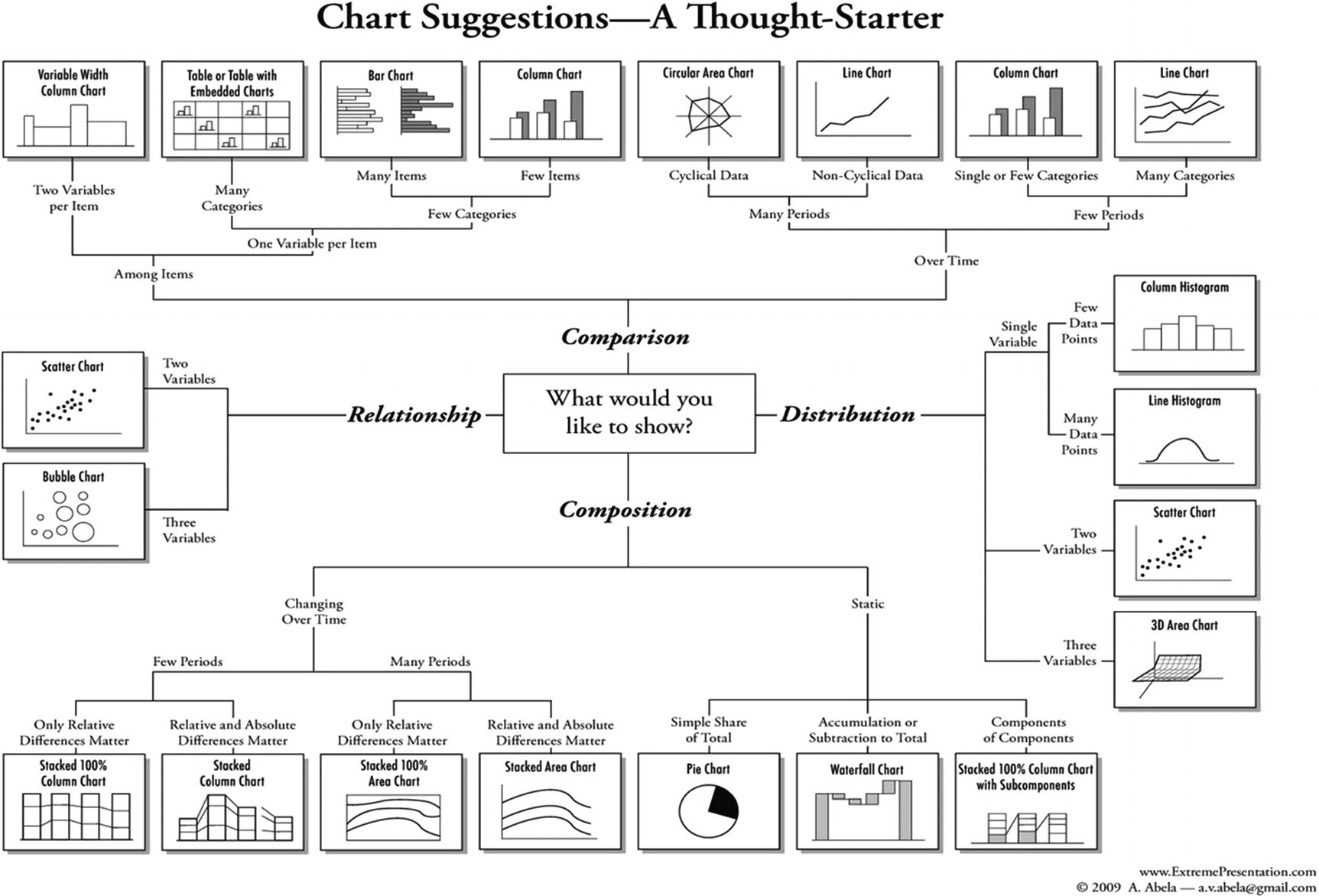
Data visualization diagram [1]
Power BI Desktop is a free application that you can download from https://powerbi.microsoft.com/en-us/desktop/ . The Power BI Visualizations panel supports most of the charts suggested in Figure 4-1. It is possible to extend the visualization capabilities, by importing custom visuals from the marketplace or other sources.

Power BI Visualizations environment
Setting Up R in Power BI
Setting up the R environment in Power BI

Specifying an R version and environment in Power BI
Writing R Code in Power BI
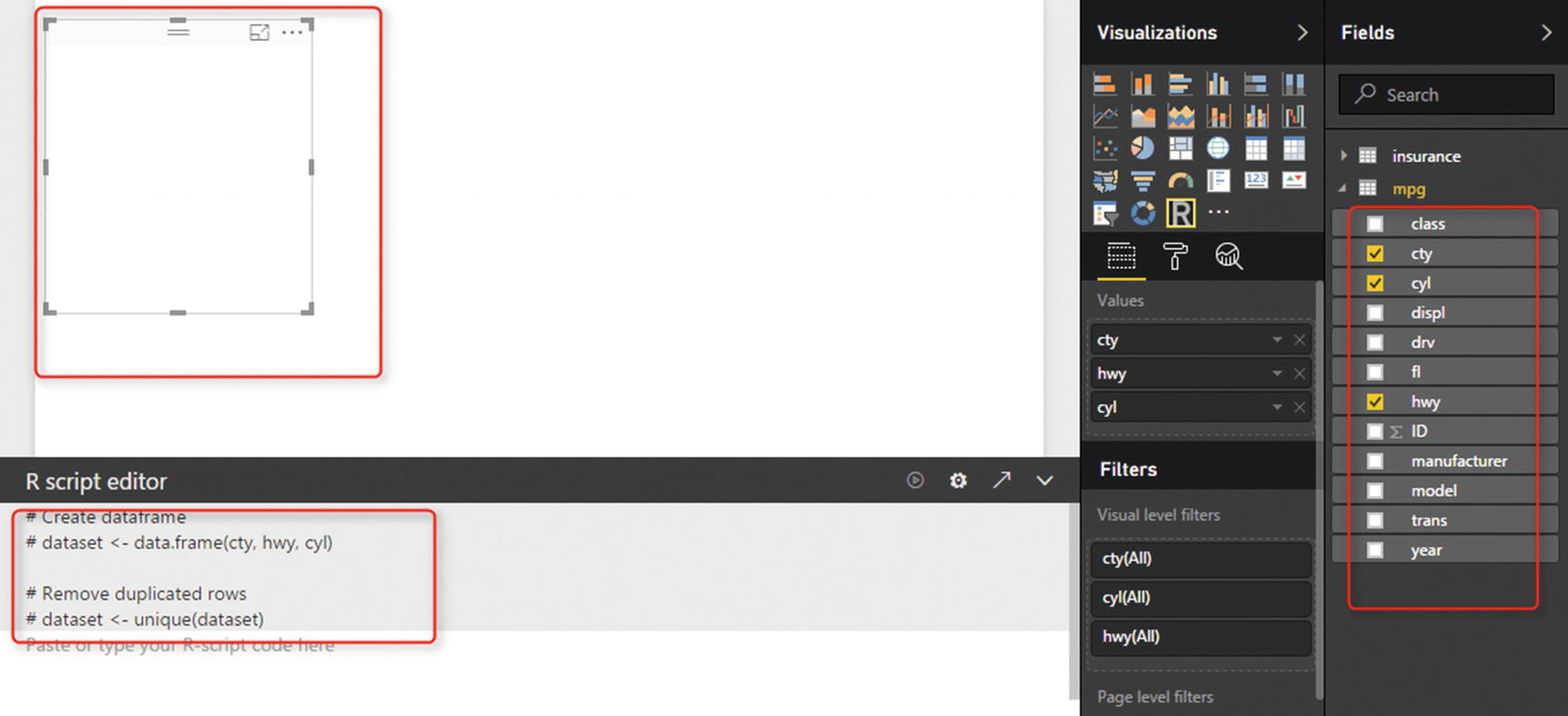
It is possible to write R code in Power BI’s report area. To do that, we must import data into Power BI report.

Importing a CSV file into Power BI Desktop

Putting R into a whitespace area

Selecting related data from the mpg file
Active Python environment in Visual Studio 2017
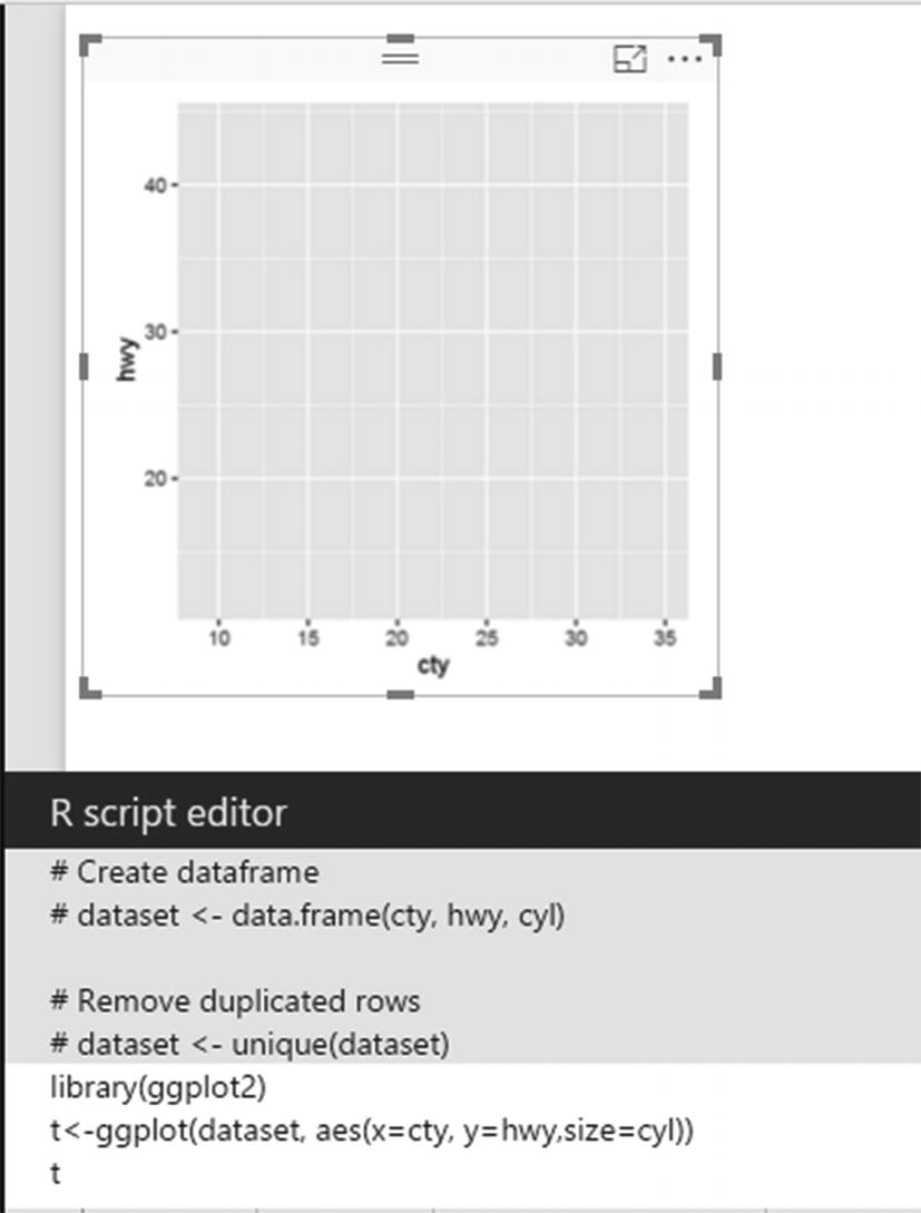
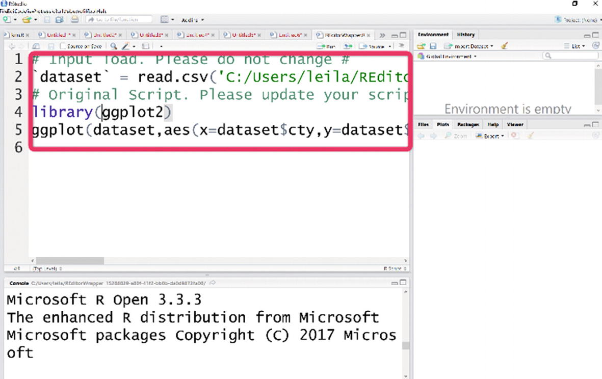
Next, we are going to put R codes for drawing a two-dimensional graph in Power BI. In Power BI, to use any R scripts, install the package in R, using the install.package() function. In our case, we must install ggplot2. We use the function library(ggplot2) to refer to this package. The first line of code in the R editor is library(ggplot2). This package contains some important functions for drawing charts.
R script editor

How to run the R code
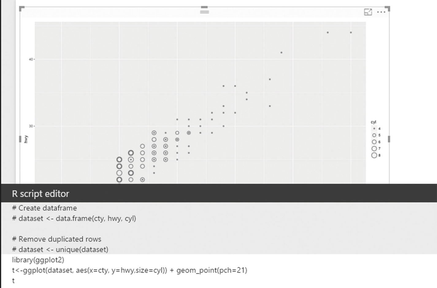
Drawing a chart using the ggplot function
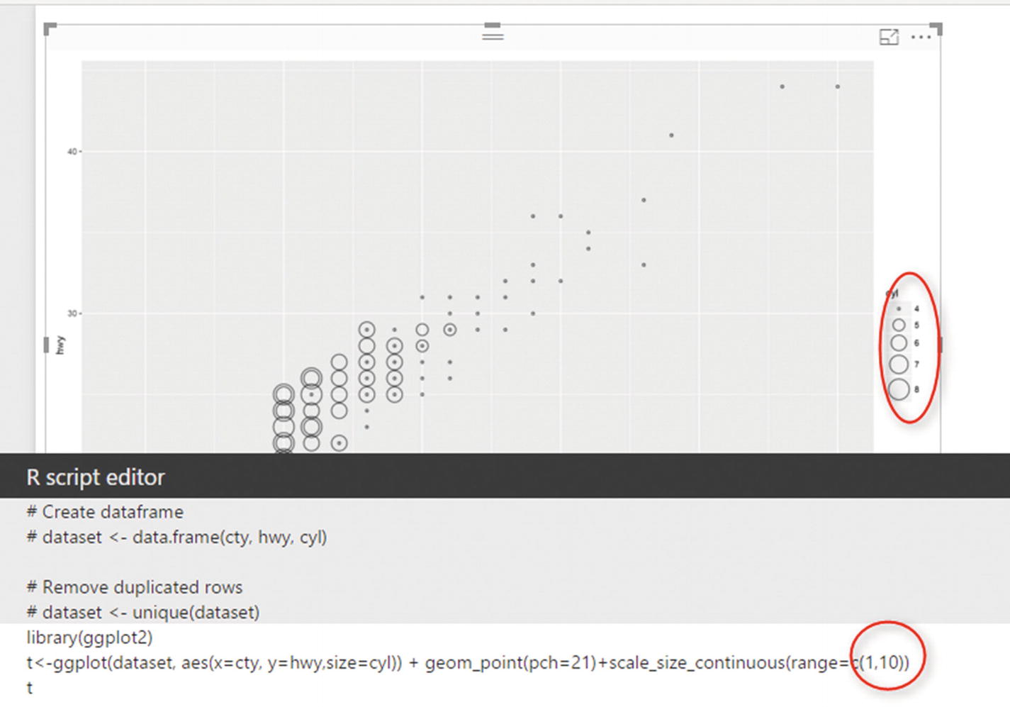
Scatter chart showing speed in the city and on the highway, plus the number of cylinders

The final chart
By changing the aes function argument, we have replaced size argument with color. This indicates that I want to differentiate a car’s cylinder values not just by cycle size, but that I am going to show them by allocating different colors to them. Hence, I change the aes function as in the preceding code snippet.
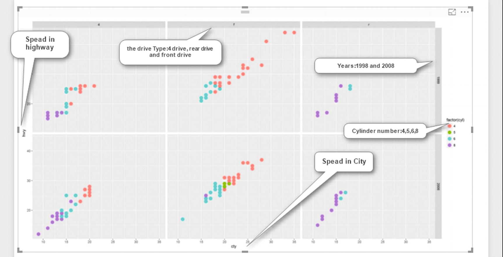
Drawing a table chart showing five variables in the same chart
R Features in Power BI
R script editor has some features that help us to better use Power BI Desktop, such as slice and dice and edit R code.
Slice and Dice
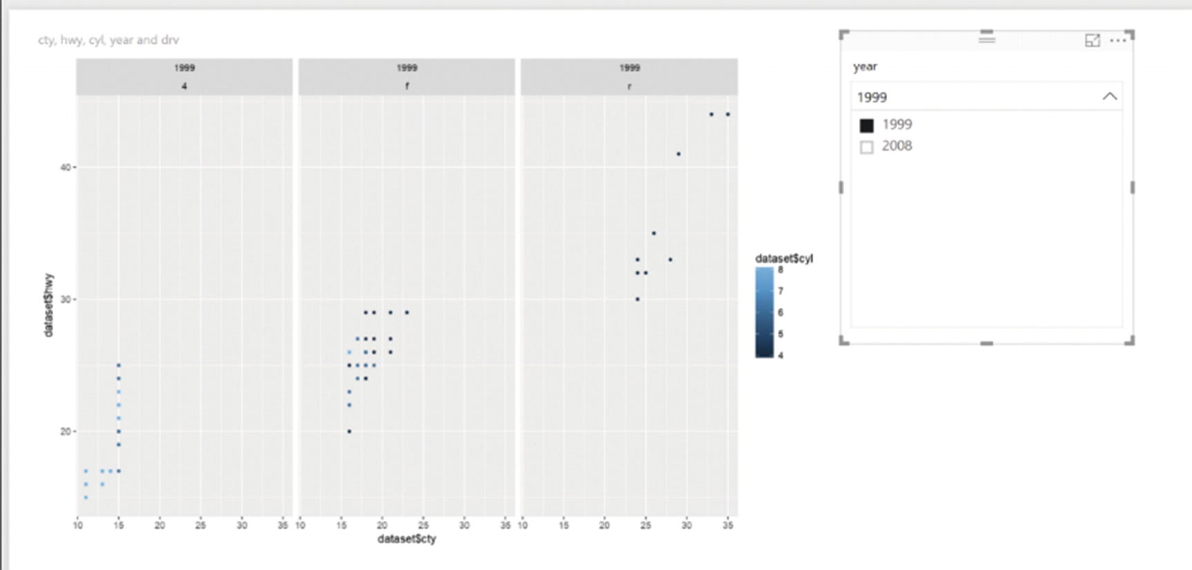
Slicing and dicing the R visual
Edit R Code in RStudio

Running the R code
Opening R code in RStudio
Custom Visuals
- 1.
Use existing custom visuals available from the Office store
- 2.
Create custom visuals
Custom Visuals in the Power BI Office Store

Signing in to a Power BI account

Importing visuals from the Power BI store

Power BI Custom Visuals pane
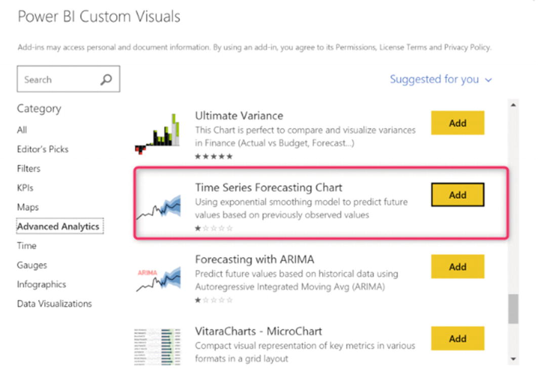
As mentioned, Power BI Custom Visuals includes an Advanced Analytics category. By clicking it, you will see such advanced analytics as time series, associative rules, clustering, and more. I am going to use one of these custom visuals to forecast milk production.
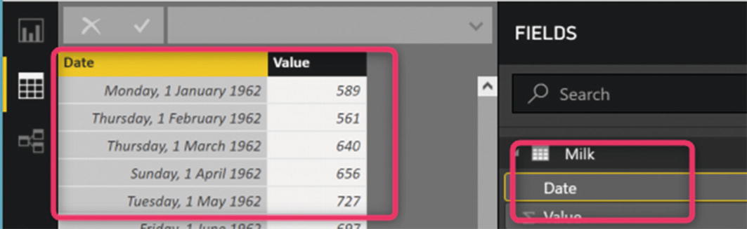
Milk production data
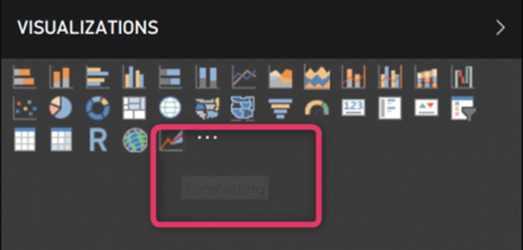
Advanced Analytics time series custom visual
Forecasting a custom visual
Having imported the forecasting custom visual, we must now choose the date and value for the data field.

Forecasting milk production
The forecasting chart shows in yellow the actual data related to the production of milk in the previous months, and the forecasting for the later ten months is in red.

Forecast milk production for the next ten months
Custom visuals in Power BI extend the possibility of having different charts. However, the number of custom visuals created by the Microsoft team is limited. To extend visualization capabilities, there is a way to create custom visuals by using R scripts. In the next section, I will explain the process of creating custom visuals.
Creating Custom Visuals
Some of the main Power BI standard visuals in Power BI Desktop are widely used. However, as mentioned in the previous section, it is possible to extend these with custom visuals. To access the custom visuals, you must click Market Place in Power BI Desktop. There are two ways to create custom visuals using Java scripts or R codes.
- 1.
The first step is to install NodeJS from https://nodejs.org/ .
- 2.
Next, install Power BI visuals tools using the command prompt (Figure 4-26):
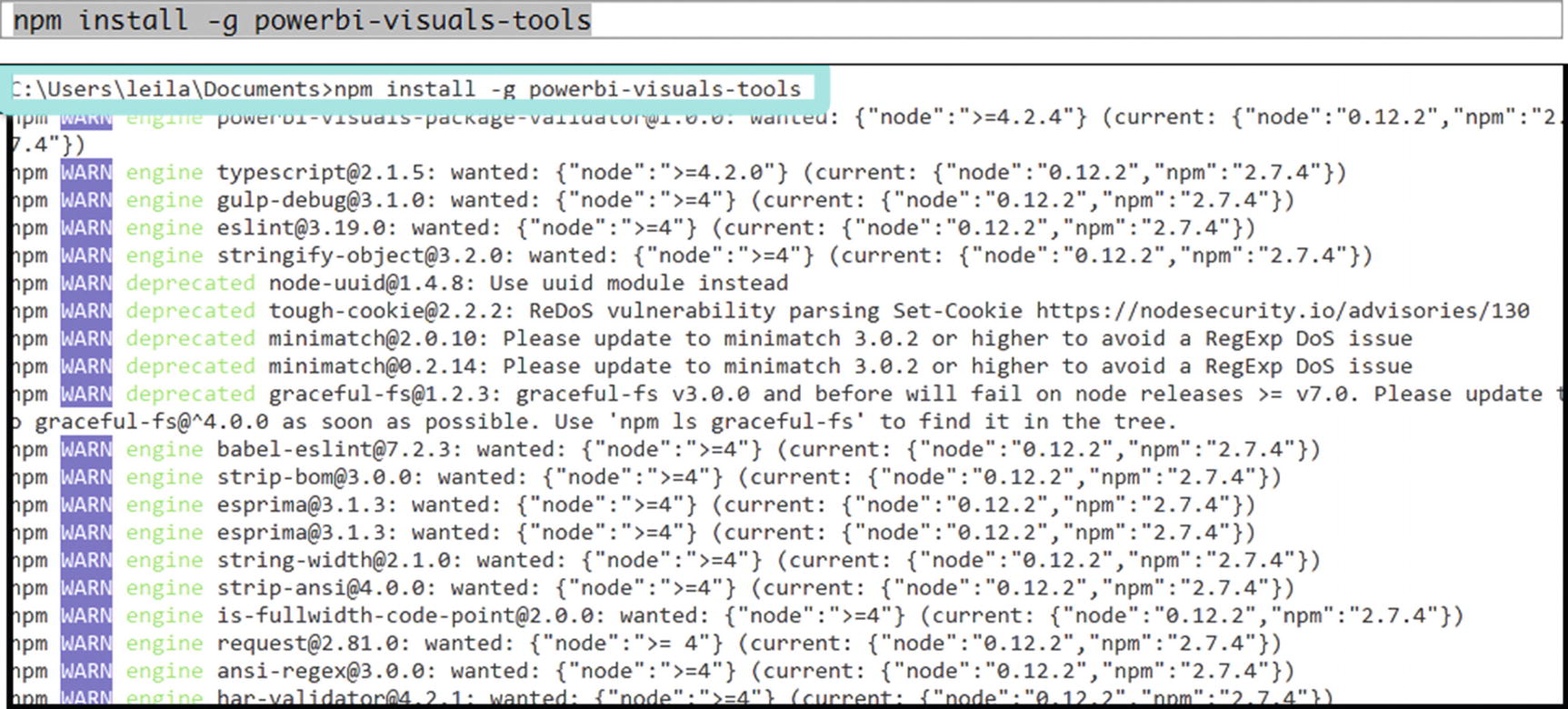
Installing Power BI custom visuals via the command prompt
- 3.After installing the Power BI custom visuals, to ensure that they are properly installed, we must run the pbiviz command. After running this command, the information about Power BI Custom Visual Tool will be shown in the command prompt console (Figure 4-27).
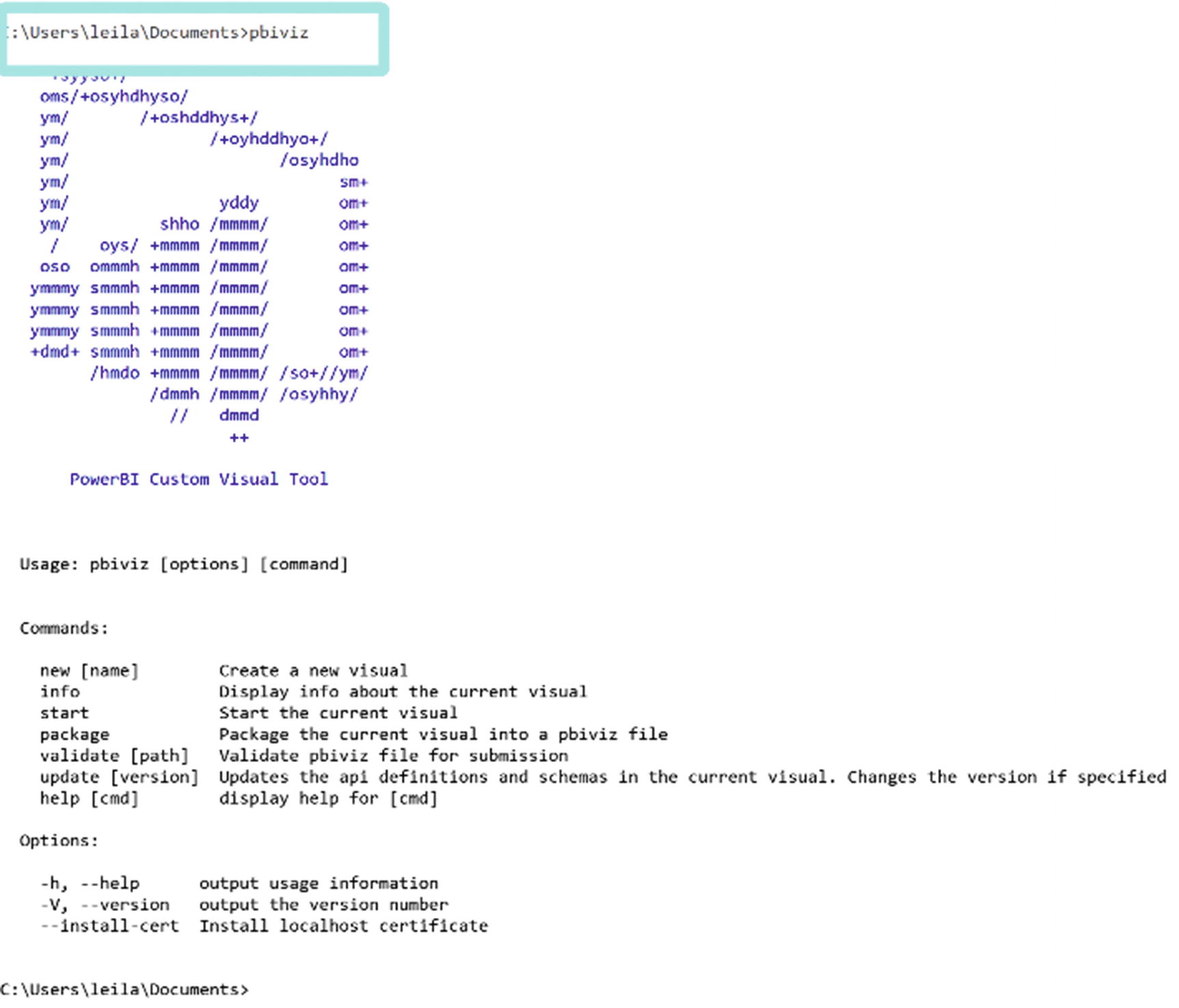 Figure 4-27
Confirming Power BI custom visuals
- 4.
Next, we must create an rhtml template. To create a template folder, we first must create an empty folder in the C drive. After creating a new folder with the name CustomVisual in the C folder, then, using the command prompt, we must change the directory to C: CustomVisual. From the command prompt, we run the following code:

A sample folder for custom visuals
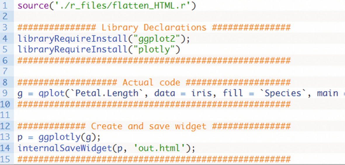
R codes inside the script file
Now, as you can see in the code in Figure 4-29, we require two libraries, Plotly and ggplot2, to draw a simple ggplot2 chart with Plotly.
Here, the data set has been hard-coded for iris, which is an open source data set in R. The plot gets the data from the iris data set and shows the petal and the length and species of the flower. Then we use the ggplotly function to show the data.
Creating a custom visual in the command prompt
- 5.Open the custom visual in the Power BI file. To do this, we must select the Import from file option in the Visualizations standard panel (Figure 4-31).
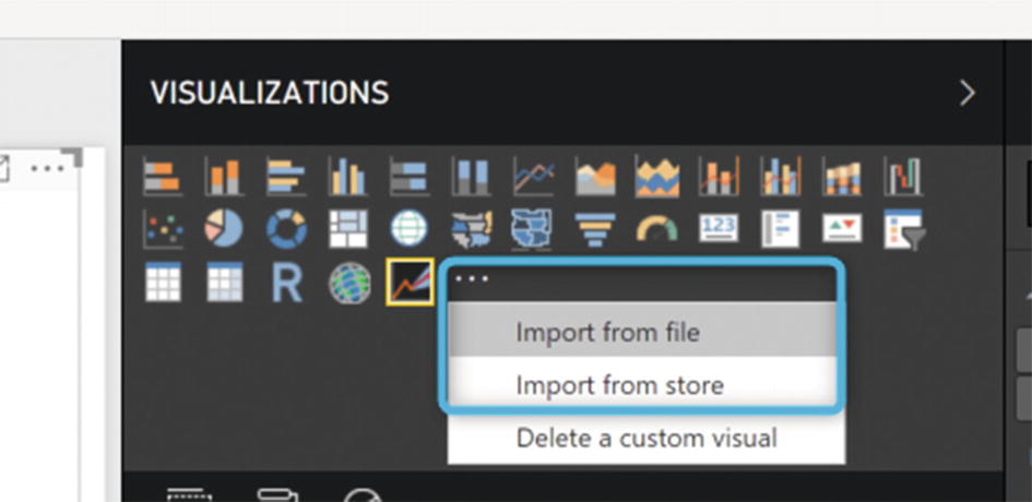 Figure 4-31
Importing a custom visual into Power BI
- 6.After choosing the Import from file option, we must browse the sampleRHTMLVisual folder and look for the dist folder. In this folder, there is a pbiviz file with the folder name. We must import this file into the Power BI Visualizations panel (Figure 4-32).
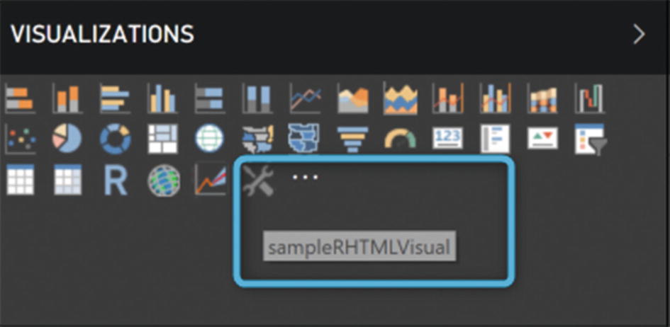 Figure 4-32
Imported custom visual
- 7.The last step is to drag and drop the custom visual into the Power BI report area (Figure 4-33). The visual is not related to the specific data.
 Figure 4-33
Custom visual with R code
We can change the R code and create a custom visual with a different name and icon. In another example, I am going to create a table chart. (I already explained the R codes for this earlier in the chapter.)
- 1.
Change the name of the custom visual to “TableChart.”
- 2.
Create an icon for a custom visual with the dimension 20×20 and put it into the assets folder.
- 3.Change the address of the icon in the JSON file (Figure 4-34).
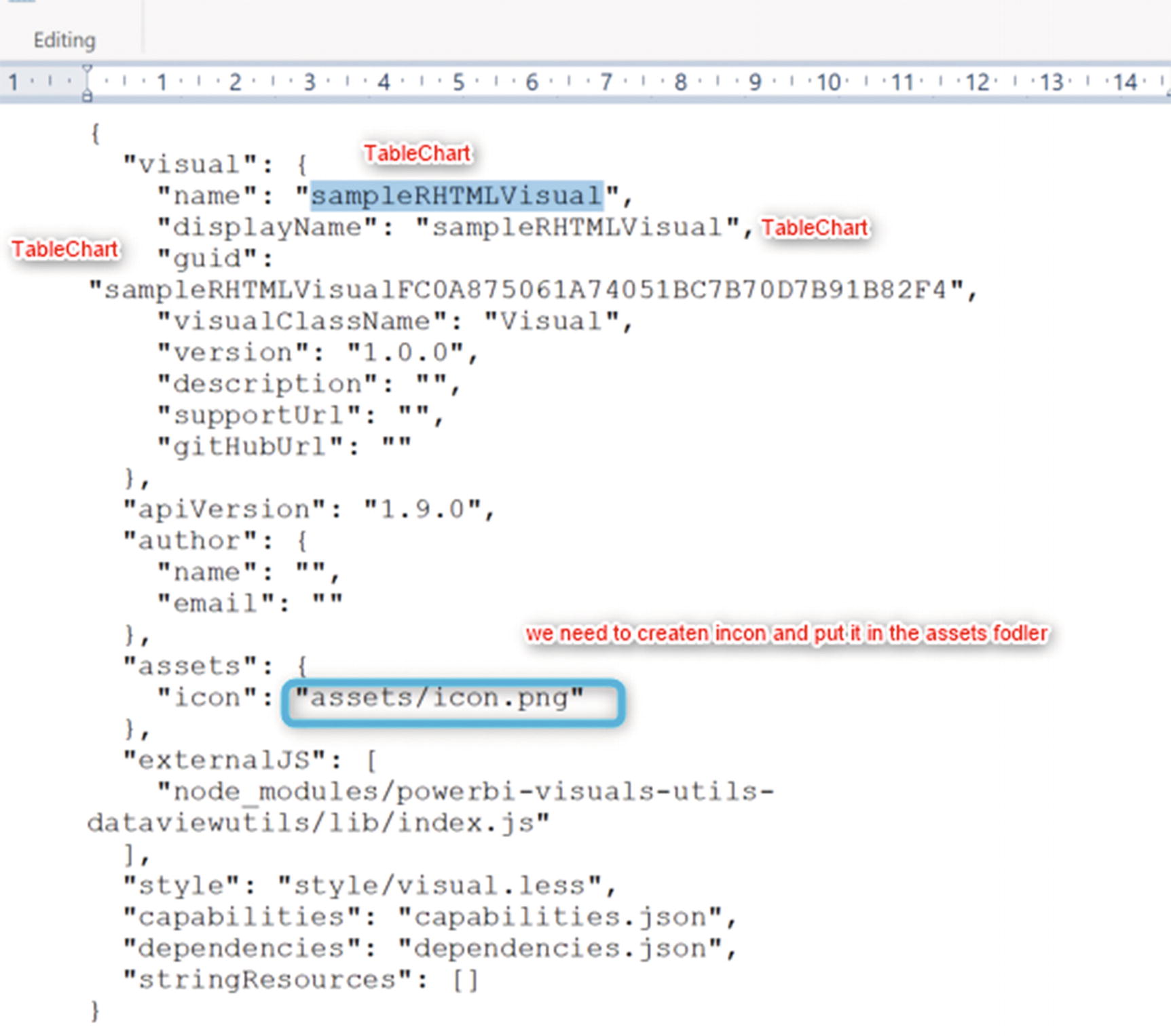 Figure 4-34
JSON file name must be changed
- 4.
After changing the name and creating a new icon for the custom visual, we must save the JSON file and put the created icon in the assets folder.
- 5.Next, we must change the R scripts in the scripts. R file. In the actual code, section, replace the existing code with the following one.if(ncol(Values)==5){names(Values)[1]<-paste("X")names(Values)[2]<-paste("Y")names(Values)[3]<-paste("Z")names(Values)[4]<-paste("W")names(Values)[5]<-paste("M")g=ggplot(Values,aes(x=X,y=Y,color=Z))+geom_jitter()+facet_grid( M ~ W,scales = "free")}
- 6.
Save the file.
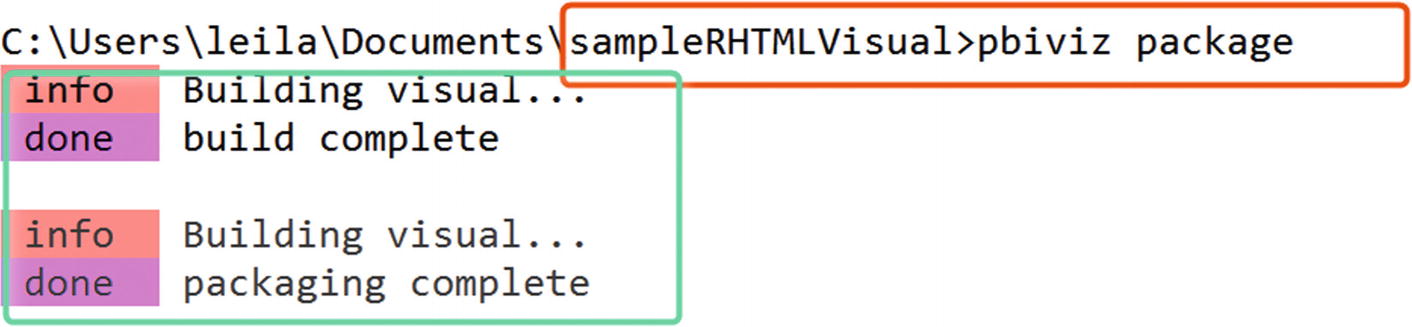
- 7.We must now return to the command prompt environment and change the directory to the sampleRHTMLVisual folder, by typing pbiviz package (Figure 4-35).
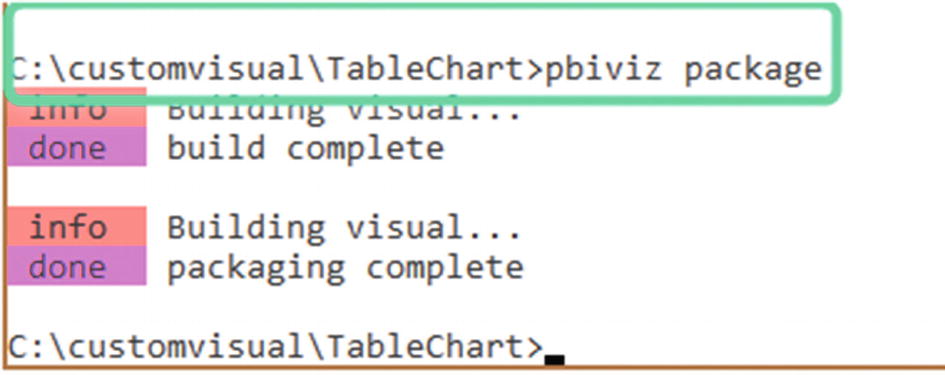 Figure 4-35
pbiviz command in the command prompt
- 8.After running the code, we should be able to see a new pbiviz file with name TableChart in the dist folder (Figure 4-36).
 Figure 4-36
Custom visual for a table chart
- 9.
Finally, we must import the created custom visual into Power BI Desktop and pass the data fields to the visual.
The main data set is Values. The first item in the Values data set relates to the x axis, the second to the y axis, and so forth.
So, in Power BI Desktop, be careful about the axis you specify in the R code.

Custom visual with a specific R code, name, and icon
It is possible to change the Value fields to have separate x, y, legend, row, and column data fields. This can be done from capabilities.JSON. Additional information on how to change the data fields and how to add more settings is accessible via other Microsoft sources and the RADACAD web site .
Summary
This chapter explained how to set up Power BI Desktop to write R code. It also described how to draw a simple chart using R packages, such as ggplot2 and Plotly, inside Power BI. A very brief explanation of the available custom visuals for advanced analytics in Power BI was provided. Finally, the process of how we can create R custom visuals by writing R and JSON scripts was addressed briefly. In the next chapter, the main concepts for businesses to understand before initiating machine learning will be explained.
Reference
- [1]
Dr. Abela, The Extreme Presentation ™ Method: Extremely effective communication of complex information, “Choosing a Good Chart,” http://extremepresentation.typepad.com/blog/2006/09/choosing_a_good.html , September 6, 2006.