
Chapter 11: Classification Analysis
When we speak about the field of machine learning and specifically the types of machine learning algorithms, we tend to invoke a taxonomy of three different classes of algorithms: supervised learning, unsupervised learning, and reinforcement learning. The third one falls outside of the scope of both this book and the current features available in the Elastic Stack, while the second one has been our topic of investigation throughout the chapters on anomaly detection, as well as the previous chapter on outlier detection. In this chapter, we will finally start dipping our toes into the world of supervised learning. The Elastic Stack provides two flavors of supervised learning: classification and regression. This chapter will be dedicated to understanding the former, while the subsequent chapter will tackle the latter.
The goal of supervised learning is to take a labeled dataset and extract the patterns from it, encode the knowledge obtained from the dataset within a structure we call a model, and then use this trained model to make predictions on previously unseen examples of data. This is common for both classification and regression. The former is used to predict discrete labels or classes while the former for continuous values.
Classification problems are all around us. A histopathologist looking at patient samples is tasked with classifying each as either malignant or benign, an assembly line worker looking at machine parts is tasked with classifying each as faulty or functional, a business analyst looking at customer churn data is trying to predict whether a customer will renew or cancel a subscription for a service and so forth.
The process of learning about classification and how it works in the Elastic Stack will also bring us into close contact with a number of other topics, the understanding of which is relevant to any practitioner who wishes to make full use of classification to solve problems. These topics include feature engineering, the division of a dataset into a training and a test set, understanding how to measure the performance of a classifier and why the same performance metric applied to the training set measures a different thing than when it is applied to the testing set, how to use feature importance to understand how each feature contributed to the class label the model assigned to a data point, as well as many others whose discussion will make the bulk of this chapter.
In this chapter, we will cover the following topics:
- Classification: from data to a trained model
- Taking your first steps with classification
- Classification under the hood: gradient boosted decision trees
- Hyperparameters
- Interpreting results
Technical requirements
The material in this chapter requires Elasticsearch 7.9+. The examples have been tested using Elasticsearch version 7.10.1, but should work on any version of Elasticsearch later than 7.9. Please note that running the examples in this chapter requires a Platinum license. In case a particular example or section requires a later version of Elasticsearch, this will be mentioned in the text.
Classification: from data to a trained model
The process of training a classification model from a source dataset is a multi-step affair that involves many steps. In this section, we will take a bird's eye view (depicted in Figure 11.1) of this whole process, which begins with a labeled training dataset (Figure 11.1 part A.).
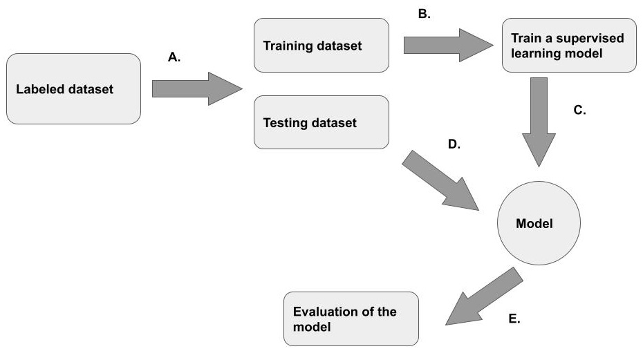
Figure 11.1 – An overview of the supervised learning process that takes a labeled dataset and outputs a trained model
This training dataset is usually split into a training part, which will be fed into the training algorithm (Figure 11.1 part B.). The output of the training algorithm is a trained model (Figure 11.1 part C.). The trained model is then used to classify the testing dataset (Figure 11.1, part D.), originally set aside from the whole dataset. The performance of the model on the testing dataset is captured in a set of evaluation metrics that can be used to determine whether a model generalizes well enough to previously unseen examples.
Each of these steps will be further clarified in practical walk-throughs presented in this chapter. To relate the practical examples to the more theoretical aspects of machine learning, we will also present a conceptual understanding of what supervised learning is. This will lead us into a discussion about feature engineering – what are features and how do they impact the performance of a classifier? Finally, we will look at how to evaluate the performance of a classifier and how splitting the data into a training and a testing set helps us measure two different kinds of performance.
lassification models learn from data
A common maxim in the machine learning community is that a machine learning classifier is a software artifact that learns from data. What exactly does it mean for a software artifact to learn from data? One way to think about this is that learning happens when the model becomes better and better at making classifications (in the case of classification models) as it sees or experiences more and more data. But a machine learning model, after all, is not a living being, so what exactly do we mean when we say that a model learns from data?
The answer to this question will lead us to the important concept of decision boundaries. Let's examine this concept through a fictional two-dimensional dataset that records the weights and circumferences of pumpkins. Suppose that our dataset contains measurements from different variants of pumpkins and our goal is to teach our classification model to classify pumpkins into variants based on their weight and circumference.
If we plot our pumpkin dataset in two dimensions, it might look something like Figure 11.2.

Figure 11.2 – A fictional two-dimensional dataset depicting circumference and weight measurements from two different types of pumpkins represented by the circles and squares
The weight is on the horizontal axis and the circumference on the vertical. If a data point is represented by a circle, it represents a pumpkin of the first variant. If by a square, it represents a pumpkin of another variant. Take a moment to look at the distribution of squares and circles in Figure 11.2 and imagine you had to create a simple rule to distinguish the square variant pumpkins from the circle variant pumpkins and record it in such a way so that when another person looks at your drawing at a later time, they can use it to determine which of the two variants a new pumpkin they have just measured belongs to.
A very simple way you might go about this task is to examine the two-dimensional representation in front of you and draw with a pen, a line that approximately separates the square variant from the circle variant, for example, as in Figure 11.3.
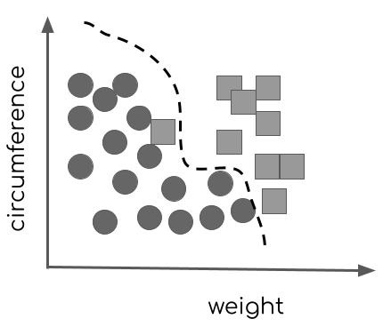
Figure 11.3 – A decision boundary separates two classes of pumpkins – represented as data points in a two-dimensional space – from each other.
A few data points will end up on the wrong sides of the line, but this is just the inevitable nature of designing classifiers – very few classifications end up being perfect! What you have just recorded is a decision boundary – a line or a hyperdimensional plane (if we are operating on a dataset with multiple variables) that separates the members of one class from another. Now, anyone who wants to classify newly measured pumpkins can pick up your diagram and plot the measurements of their own pumpkin on the diagram to see which side of the decision boundary their data point falls on, as shown in Figure 11.4.

Figure 11.4 – The new data point represented by the triangle falls on the right side of the decision boundary and is thus likely a part of the square variant
This is a conceptual approximation of the process that classification algorithms take. They take a set of training data (our original pumpkin measurements and the variants to which each measured pumpkin belongs) and then apply various tests and transformations to learn a decision boundary. This process of learning from the training data is called training and it applies not only to classification algorithms but to regression ones as well. This boundary becomes encoded in a trained model and can then be used to make predictions on future, previously unseen data points.
One thing to note from the above fictional example is that we got fairly lucky. The two-dimensional plot of our data of pumpkin weight versus pumpkin circumferences yielded a picture where we could easily draw a decision boundary that, while imperfect, nevertheless gives good results for the majority of data points. However, in the real world, very few datasets will lend themselves this neatly to machine learning analysis, and as we will learn, the attributes that we choose to represent our data points can have a big impact on how separable a dataset is and thus how well a classification model will perform on it.
Suppose that instead of using the features weight and circumference for our pumpkins, we had chosen the percentage of chemical compound X that was discovered in the pumpkin and the amount of water that was used to water it during growth. In this case, the two-dimensional plot of the data points (shown in Figure 11.5) using these features does not make it easy to draw any kind of decision boundary at all!

Figure 11.5 – These features do not provide a meaningful separation of the two classes
As we will see in the next section, feature engineering is a large topic on its own and a major pre-processing step and warrants consideration when embarking on any machine learning project, whether in the Elastic Stack or outside of it.
Feature engineering
In the previous section, we illustrated the concept of decision boundaries that are the product of the classifier learning from data using a fictional pumpkin dataset. Let's examine the next topic, the process of selecting and manipulating features in such a way that they are suitable for classification, with the help of a more realistic example: that of malware classification. With millions of new malware variants being released into the wild almost every day, it is difficult for traditional rule-based approaches to classify benign binaries from malicious ones and stay effective. Because we are dealing with a large volume of data and varied inputs impossible to capture with inflexible rules, machine learning provides a perfect solution for this. How exactly do we need to preprocess the training data – the malicious and benign binaries in this case – in order for the machine learning algorithm to be able to understand them. This question and the answer to it brings us to a whole subfield of study in machine learning known as feature engineering.
The process of feature engineering involves taking the knowledge that domain experts have about the problem and applying it to the training data. For example, a malware analyst might be able to tell us that the strings in normal binaries are often longer than the strings in malicious binaries and this can be a helpful feature in distinguishing the two. As part of the feature engineering process, we would then develop a way to calculate the average string length in each of the binaries in our training data and use that as a feature.
It is good to set aside some time to understand what knowledge domain experts have of the problem and what features have been used to achieve state-of-the-art results. This is important, because, as we saw in our fictional pumpkin example above, the selection of features determines whether or not our model will be able to learn the distinguishing characteristics of the two classes. For example, suppose that we trained our malware classification model to use the size of the binary in bytes and the presence of the letter a in the name of the binary as features. If it turned out that both malicious and benign binaries exhibit similar sizes in bytes and both contain the letter a in their names, our resulting classifier would be useless because it would look at features that make no difference when it comes to distinguishing malicious binaries from benign.
Feature engineering often involves iteration. One should start with a guess of what features might produce good results, train a model, and evaluate it on the test set and then iterate gradually adding, reducing, or manipulating features until a desired quality of results is reached. Later on in the chapter, we will take a look at exactly how to measure the performance of the model and how you can achieve this using machine learning in the Elastic Stack.
Evaluating the model
The final topic that we will cover in this introductory section on classification is that of evaluation. How do we know how well our model performed? There are various ways to quantify model performance and we will take a look at these techniques and what they mean in a later section of this chapter in detail. An important concept related to measuring the performance of the model is what data the performance is measured on.
In order to measure how well a model does, we need to use the model to make predictions on a labeled dataset so that we can compare the class labels that the model has predicted with the ground truth labels and calculate how many mistakes the model made. One of these datasets is the training data, but if we were to use this data to estimate the performance of the model, we would be essentially showing the model the same data as we used to train it. While doing this would give us a good estimate of the training error, it would not tell us anything about how well the model will generalize to make predictions on previously unseen examples.
In order to estimate the performance of the model on data the model has not previously seen, we have to set aside a portion of the training data. This portion, also often known as the testing dataset, will not be used for training the model. Instead, after the training process has been completed, we will use the model to make predictions on the testing dataset and see how many data points in the testing dataset are misclassified. This measure will give us an idea of how well the model will generalize to make predictions on previously unseen data points. The number of mistakes the model makes when making predictions on this dataset is known as the generalization error.
Several metrics such as accuracy, precision, and recall (some of which we saw in Chapter 10, Outlier Detection), will be used to measure these errors. Refer back to the section Evaluating outlier detection with the Evaluate API in Chapter 10 for a quick reminder of the basic concepts.
We will discuss each of the ideas explored above in more detail in later chapters, but for now, let's turn to see how these concepts play out in practice. We will use the Wisconsin Breast Cancer public dataset to create a sample classification data frame analytics job.
Taking your first steps with classification
In this section, we will be creating a sample classification job using the public Wisconsin Breast Cancer dataset. The original dataset is available here: (https://archive.ics.uci.edu/ml/datasets/breast+cancer+wisconsin+(original)). For this exercise, we will be using a slightly sanitized version of the dataset, which will remove the necessity for data cleaning (an important step in the lifecycle of a machine learning project, but not one we have space to discuss in this book) and allow us to focus on the basics of creating a classification job:
- Download the sanitized dataset file breast-cancer-wisconsin-outlier.csv from the Chapter 11 - Classification Analysis folder in the book's GitHub repository (https://github.com/PacktPublishing/Machine-Learning-with-Elastic-Stack-Second-Edition/tree/main/Chapter%2011%20-%20Classification%20Analysis) and store it locally on your machine. In your Kibana instance, navigate to the Machine Learning app from the left-hand side menu and click on the Data Visualizer tab. This will take you to the File Uploader. Click on Upload file and select the CSV you downloaded.
Once the upload is successful (check your index pattern under Discover and briefly browse a few documents to make sure everything is alright with the dataset), navigate back to the Machine Learning app and instead of selecting the Data Visualizer tab, select Data Frame Analytics. This should bring up a view like the one displayed in Figure 11.6.

Figure 11.6 – This data frame analytics jobs overview is currently empty
- Click on the blue Create job button. This will take you to the Data frame analytics wizard, which is a bit like the Transforms wizard we introduced in Chapter 9, Introducting Data Frame Analytics, and allows you to easily create a classification, regression, or outlier detection job. In this case, we will be selecting classification in the dropdown in Figure 11.7.
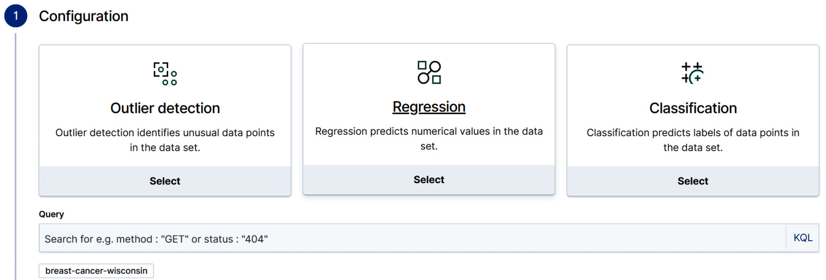
Figure 11.7 – The Data frame analytics wizard assists with creating three different types of jobs. For our current case, select Classification
- Next, we will move on to selecting the dependent variable. If you recall from our discussion earlier, the goal of classification is to learn to predict which class a given, previously unseen data point belongs to. The variable that denotes this class is called the dependent variable – its value depends on the generalizations our classifier will make from the other data points. In order to do this, the classifier must first learn from the training data and thus we must tell the wizard which variable contains the class label. In this dataset, the class label is stored in the Class variable and hence we select that from the dropdown.
Once we make the selection, the wizard will display a list of included and excluded fields. Pay attention here. If there is an existing field in your dataset that can act as a proxy of the dependent variable, then you are likely to get a classifier that simply defaults to checking the value of the proxy field instead of actually learning from the dataset.
Let's see what this would mean concretely. Suppose that in our case, all of the cancer samples were organized in such a way that the malignant samples come first and the benign after. This would mean that the sample number would effectively be a proxy for the Class. If the sample number is less than say 30, then predict malignant. If not, predict benign. Therefore, it is good to be prudent, examine one's data in advance, and then delete all of the variables that are not expected to carry meaningful information that would help predict the dependent variable.
Even if the variable that denotes the sample number does not carry such proxying artifacts, we still do not expect it to convey much meaningful information that would help in deducing the dependent variable and as such, it would just bloat our job's memory and it is better to exclude it right from the start.
As you can see in Figure 11.8, we have excluded the variable Sample_code_number from the job by unticking the box.
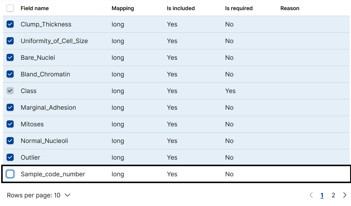
Figure 11.8 – Exclude Sample_code_number from the classification job to avoid introducing proxying effects
- After this, we are ready to move on to the next part of the configuration, which involves selecting the training percentage. Recall that at the beginning of this section, we discussed how the performance of the classifier can be evaluated on two distinct datasets derived from the parent dataset: the training and the testing dataset. Making this split manually within Elasticsearch can be tedious, in particular, if one is dealing with a large dataset. To make this easier, the Data Frame Analytics job wizard includes a configuration option that allows us to set how much of the dataset we want to set aside for training the model and how much of the dataset we want to set aside for testing the model. This quantity is set in the wizard by using the slider displayed in Figure 11.9.

Figure 11.9 – The training percent slider
How should one determine the training percent? As in many phases of building a machine learning program, the answer to this will largely depend on the size of your dataset and whether you care more about getting an accurate estimate for the performance on the training dataset or on the testing dataset. We will discuss the difference between these two performance measures in more detail later, but for now, suffice it to say that the performance of the model on the testing dataset gives you an estimate of how well the model will perform once you start applying it to previously unseen examples, so in most cases, it definitely pays to dedicate a portion of the data to get an estimate of how well your model will perform once you deploy it into production.
The other aspect is the size of the dataset. As a rule of thumb, if your dataset contains more than 100,000 documents, start with a smaller training percentage – around 10% or 15% and then iterate depending on the quality of the results.
Since in this case, the whole dataset contains just under 700 documents, we will set the training percent as 60%.
- After selecting the training percent, the wizard guides us to move onto Additional options as shown in Figure 11.10. We will leave these settings as defaults for now but will return to discuss them in later, more advanced examples.
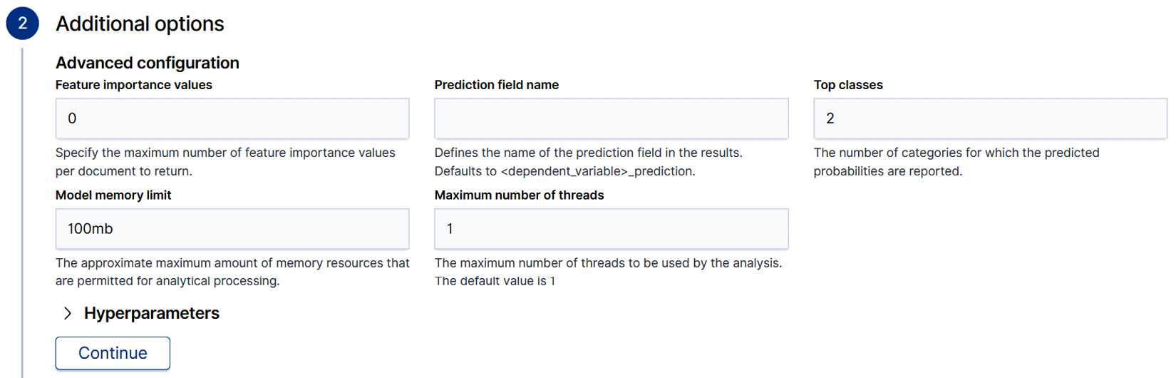
Figure 11.10 – Additional options for classification Data Frame Analytics jobs
- Finally, after clicking Continue, we will set the job ID and leave everything else as the default. Tick the Start immediately tickbox and finally create and start the job by clicking the Create button.
Return back to the Data frame analytics main page. You should see the job you just created in the job management panel as displayed in Figure 11.11.

Figure 11.11 – The Data frame analytics job overview panel shows a summary of the current Data frame analytics jobs
Once the job status is displayed as stopped and the Progress bar display indicates that all phases of the job have been completed, use the Actions menu to navigate to the results. This is achieved by clicking on View in the menu.
- The results page displays a host of information that is vital to understanding how the classifier we trained on our dataset performed. A sample results page is shown in Figure 11.12.
As you look at this figure, make a note of the Testing and Training buttons in the top-right corner. These toggles control which portions of the dataset the remaining metrics, visualizations, and tables on the page are calculated against. When the results view is first loaded, these metrics are calculated against the whole dataset, which includes both the training and the testing dataset.
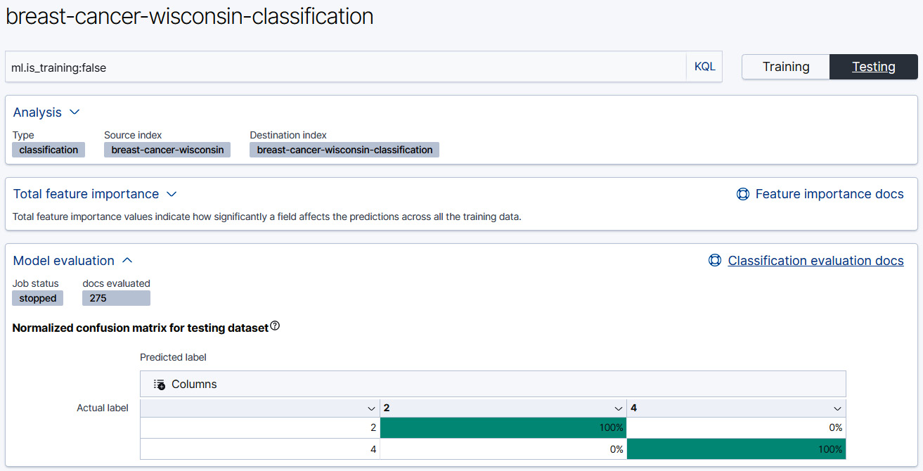
Figure 11.12 – The results page for a Classification job displays the confusion matrix
Toggle the display to show the results from the Testing data and look at the confusion matrix. Remember the goal of this exercise was to learn to predict whether a given tissue sample is malignant or benign. These are denoted with a class label 4 for malignant, 2 for benign. Since this is a dataset that contains ground truth labels for each sample, each of the samples in the resulting index will have two class labels: the actual class label and the predicted class label.
The confusion matrix summarizes the number of instances where the actual class label (displayed on the left-hand side of the confusion matrix depicted in Figure 11.12) matches the predicted class label (displayed horizontally across the matrix above) and the number of instances where a mismatch has occurred. If you recall back in Chapter 10, Outlier Detection, we examined the confusion matrix in detail and derived a vocabulary to represent the quantities in the matrix. The instances where the actual class label matches the predicted one are called true positives and true negatives and instances where there is a mismatch are false positives and false negatives.
If you look at the confusion matrix in Figure 11.12, you see something strange going on. There are no false positives and no false negatives. Instead, it seems that our classifiers have performed perfectly on the testing dataset!
At this point, you should hold off on congratulating yourself and instead approach this result with skepticism. Some results are too good to be true and as we will discover in just a moment, this is certainly the case here.
In cases where we achieve perfect results on the testing set (remember, these are data points that the classification model has not seen during training and thus it would not have been possible for it to learn to classify these perfectly in advance), the culprit is usually a feature in the dataset that acts as a proxy for the dependent variable and thus the classifier can become lazy and simply default to checking the value of the proxy in deciding which class to assign.
In this case, let's take a look at the job details to see what values were included if that might give us a clue as to what is going on. Navigate back to the Data Frame Analytics job management page and click on the downward arrow near the job name on the left. In the panel that appears, navigate to the JSON tab. It will look a bit like Figure 11.13.

Figure 11.13 – The JSON configuration of the classification job.
If you look closely at the analyzed_fields stanza, you will see that there is a field called Outlier. This was a duplicate field that we created from the Class field in Chapter 10, Outlier Detection. This means that it was also the proxy field that was making our results look better than they really are.
- Let's re-create a duplicate job but exclude both the field Outlier and the field Sample_code_number. After this job has finished, the new results on the testing dataset look like Figure 11.14.
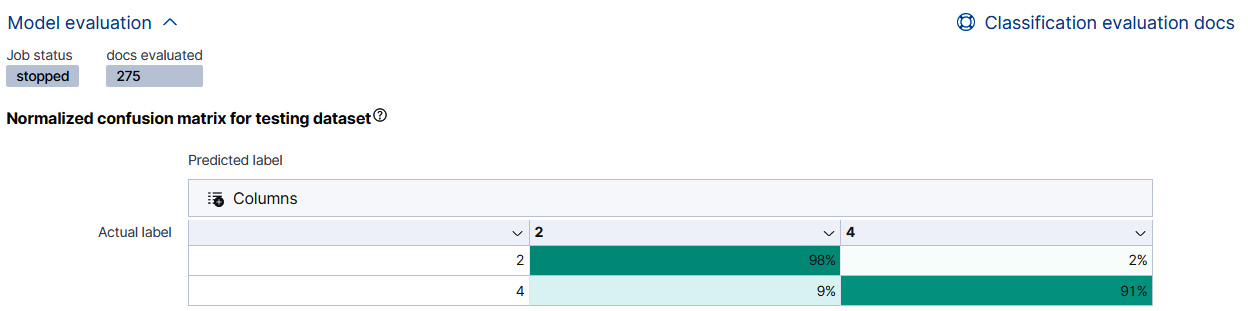
Figure 11.14 – The confusion matrix displays the results from the classification job after excluding the Outlier variable
As we can see from the results in Figure 11.14, excluding the Outlier variable along with the Sample_code_number variable has resulted in a true positive rate of 98% as well as some false positives and false negatives, which is a more realistic result than the perfect classification score we had before.
Before we go any further into classification problems, it will be good to understand exactly what goes under the hood in the Elastic Machine Learning Stack when we train our classification model. That is what the next section will be dedicated to: understanding how decision trees work under the hood.
Classification under the hood: gradient boosted decision trees
The ultimate goal for a classification task is to solve a problem that requires us to take previously unseen data points and try to infer which of the several possible classes they belong to. We achieve this by taking a labeled training dataset that contains a representative number of data points, extracting relevant features that allow us to learn a decision boundary, and then encode the knowledge about this decision boundary into a classification model. This model then makes decisions about which class a given data point belongs to. How does the model learn to do this? This is the question that we will try to answer in this section.
In accordance with our habits throughout the book, let's start by exploring conceptually what tools humans use to navigate a set of complicated decisions. A familiar tool that many of us have used before to help make decisions when several, possibly complex factors are involved, is a flowchart. Figure 11.15 displays a sample flowchart that one might construct to be able to decide, given the weather conditions of the day, what type of jacket to wear.
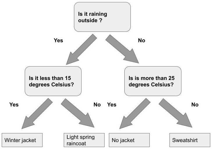
Figure 11.15 – A basic flowchart
At each stage, a flowchart asks a question (such as how warm or cold it is or whether or not it is raining outside) and based on our answer, redirects us to another part of the flowchart and a new set of questions. Ultimately, by answering questions in the flowchart and following the flow, we come to a decision or a class label.
The model that is produced as part of the training process in the Elastic Stack, conceptually, does something very similar. In the machine learning field, the algorithm is known as a decision tree. Although the version used in the Elastic ML stack is much more complicated than what is described here, the basic concepts apply.
Let's take a closer look at decision trees.
Introduction to decision trees
How is our decision tree constructed? We begin by splitting the dataset into two groups using the value of a certain feature and a certain threshold. The way we determine this feature and this threshold is by looking through all of the available features (or fields if we want to use the Elasticsearch terminology) and then find the one feature threshold pair that produces the purest split. What do we mean by the purest split? In order to understand the concept of node purity and how it affects the construction of the decision tree and the subsequent usage of the decision tree to classify a new previously unseen datapoint, we have to take a step back and examine the overall picture.
As you may recall, our goal is to essentially design a decision flowchart that we can traverse when we need to classify a new, unknown data point. The way we determine a classification in a flowchart is by looking at the final node to which our traversal leads. In decision trees, this final node is called the leaf node and it consists of all of the data points in our training data that have ended up there as a result of successive splits performed using a certain feature and a certain threshold. Since the classification procedure is usually imperfect, it is inevitable that terminal leaves will not contain data points belonging to one class only, but instead will be mixed. The amount of this mixing can be quantified by various measures and is known as the purity of the node or leaf. A leaf or node that contains only data points of one class is the purest one.
Having pure nodes in a decision tree is great because it means that once we have reached the terminal node in our "flowchart" we can be fairly confident that the datapoint we are currently trying to classify belongs to the same class as the data points already in the terminal node. In practice, optimizing for pure nodes may lead to too much splitting in the decision tree (after all, we could gauge this metric by simply creating as many leaf nodes as there are data points – in this way, each leaf would contain exactly one data point of exactly one class and thus have perfect purity), so the leaf nodes will always be mixed.
Computing the proportion of data points in the leaf node that belongs to a given class gives us an estimate of the probability that the datapoint we are trying to classify belongs to that class. For example, suppose we have a decision tree to classify data points into class A and class B. One of the terminal nodes has 80 examples from class A and 20 examples from class B. During classification, if our new data point ends up in this node, the probability of it being class A is then 0.8.
This is of course a simplified representation of what actually happens under the hood, but should hopefully give you a conceptual understanding of how decision trees work.
Gradient boosted decision trees
Often a single decision tree on its own will not produce a strong classifier. That is why, over the years, data scientists and machine learning practitioners have discovered that tree-based classifiers can be powerful if combined with special training schemes that iteratively improve them. One such scheme is known as boosting.
Without going into too much technical detail, the process of boosting trains a succession of decision trees, and each decision tree improves upon the previous one. The boosting procedure does this by taking the data points that were misclassified by the previous iteration of the decision tree and re-training a new decision tree to improve classification on these previously misclassified points.
Hyperparameters
In the previous section, we took a conceptual overview of how decision trees are constructed. In particular, we established that one of the criteria for determining where a decision tree should be split (in other words, when a new path should be added to our conceptual flowchart) is by looking at the purity of the resulting nodes. We also noted that allowing the algorithm to exclusively focus on the purity of the nodes as a criterion for constructing the decision tree would quickly lead to trees that overfit the training data. These decision trees are so tuned to the training data that they are not only capturing the most salient features for classifying a given data point but are even modeling the noise in the data as though it is a real signal. Therefore, while this kind of a decision tree that is allowed to optimize for specific metrics without restrictions will perform really well on the training data, it will neither perform well on the testing dataset nor generalize well to classifying previously unseen data points, which is the ultimate goal in training the model.
To mitigate against these pitfalls, the training procedure for generating a decision tree from a training dataset has several hyperparameters. A hyperparameter is a kind of knob or advanced configuration setting that one can twist and adjust until one finds the optimal settings for training one's model. These knobs control things such as the number of trees that are trained in our boosting sequence, how deep each tree grows, how many features are used to train the tree, and so forth.
The hyperparameters that are exposed by the Data Frame Analytics API for classification are the following: eta, feature_bag_fraction, gamma, lambda, and max_trees. We will take a look at each of these in turn, but before we dive into examining what they mean and how they affect the resulting decision trees that are trained from our dataset, let's take a moment to discuss hyperparameter optimization.
If you are an advanced user and have trained gradient boosted trees with other frameworks, you probably have an idea what is the optimal value for each of these for your particular training dataset and problem. However, how do you approach setting these values if you are starting from scratch. A systematic process for finding the best values for hyperparameters is called hyperparameter optimization. In this process, the training dataset is split into groups or cross-validation folds. To make sure that each cross-validation fold is representative of the whole training dataset, the sampling procedure that generates these folds makes sure that the proportion of members from each class is approximately the same in each cross-validation fold as it is in the whole dataset.
Once the dataset has been stratified into these folds, we can proceed to the next part of hyperparameter optimization. We have five hyperparameters that can each take a large range of values. How do we devise a systematic method for finding the best combination of hyperparameters? One option is to create a multidimensional grid where each point on the grid corresponds to a particular combination of hyperparameter values. For example, we could have eta 0.5, feature_bag_fraction at 0.8, gamma at 0.7, lambda at 0.6, and max_trees at 50. Once we have selected these parameters, we take our K cross-validation folds and train a model on K-1 of the folds while leaving the Kth fold set aside for testing. We then perform this procedure K times for the same set of parameters so that each time we leave out a different Kth fold for testing.
We then repeat this procedure for the next set of possible hyperparameter values until we find a combination of values that performs the best on the held-out testing set. As you can probably imagine, repeating this procedure even for a handful of hyperparameter combinations can be quite expensive in terms of time and compute. Thus, in practice, we use various optimization techniques to arrive at a good-enough set of hyperparameters while keeping in mind the potential cost of computation.
If you are curious which hyperparameters are selected for your model using hyperparameter optimization, you can navigate to the Data Frame Analytics page in Kibana and click on Manage Jobs. This will take you to the Data Frame Analytics job management page. Find the ID of the classification job that you wish to examine and click on the downward arrow on the left-hand side beside the job ID. This will display a dropdown with the details about the job. Click on the Job stats panel as shown in Figure 11.17. This will display information about the job along with analysis statistics.
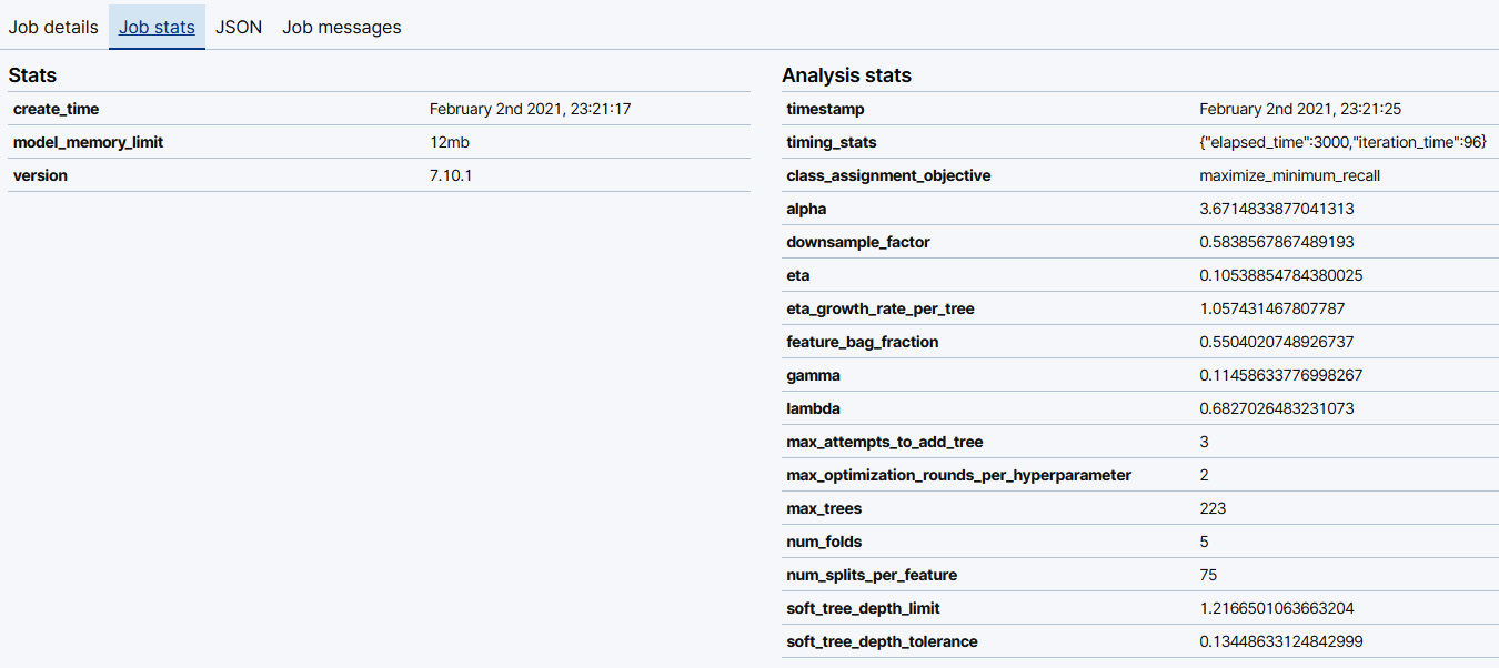
Figure 11.16 – The Job stats panel displays basic information about the classification job as well as information about the hyperparameters determined by hyperparameter optimization
Finally, before we close off this section of the chapter, let's take a brief tour of the five aforementioned hyperparameters: eta, feature_bag_fraction, gamma, lambda, and max_trees to get a feel for what they mean and what aspect of the decision tree training process they control. Before we dive into the process of figuring out what each of these means, let's take a brief look at how gradient boosted decision trees are constructed. This will help set the definitions of these hyperparameters in context and make it clearer how each of these affects the final form of the sequence of decision trees that are produced as a result of gradient boosting.
As you might recall from previous sections, the basic building block of gradient boosted decision trees is a simple decision tree. The decision tree is constructed by recursively dividing the dataset into smaller and smaller sections based on thresholds from certain features. For example, if we were classifying data points representing various measurements from iris flowers, we might decide to split the dataset on petal length. All data points with petal lengths of less than 2 cm are split into the left node, the rest into the right. The way we pick this feature – petal length in this case – is by going through all of the possible features in the dataset and examining the purity of the nodes that result in making a split using that feature. As you might imagine, in multidimensional datasets, it might take a very long time computationally to go through each of the features and test to see how pure the nodes that result from splitting on that feature are. In order to reduce the computation time required, we can choose to only test a fraction of the features and this fraction is what is controlled by the feature_bag_fraction parameter.
After we have trained our first decision tree based on the training dataset, the process of boosting demands that we take the data points that were misclassified by the first decision tree and construct a subsequent iteration that aims to improve upon the first decision tree. Thus by the end of this procedure, we will have a sequence of decision trees, which in some literature is also called a forest. The rate at which this forest grows, in other words, how long the final sequence of decision trees will be, is controlled by the parameter eta. The smaller the value of eta, the larger the forest will be, and also the better this forest will generalize to previously unseen data points.
In our section introducing decision trees, we discussed how, when left to simply optimize to fit the training dataset, the tree can grow until it fits the training data perfectly. Although this might sound desirable, in reality allowing a tree to overfit the training dataset will result in a final model that generalizes poorly. Thus to control the growth of an individual decision tree, we have two hyperparameters, gamma and lambda. The higher the value of gamma, the more the training process will prefer smaller trees, which will help mitigate overfitting. Similarly to gamma, the higher the value of lambda, the smaller the decision trees will be.
Although in practice you can always rely on the hyperparameter optimization process to pick good values for each of these parameters, it is good to be aware at least on a conceptual level what each of these means and how they affect the final trained model.
Interpreting results
In the last section, we took a look at the theoretical underpinnings of decision trees and took a conceptual tour of how they are constructed. In this section, we will return to the classification example we examined earlier in the chapter and take a closer look at the format of the results as well as how to interpret them.
Earlier in the chapter, we created a trained model to predict whether a given breast tissue sample was malicious or benign (as a reminder, in this dataset malignant is denoted by class 2 and benign by class 4). A snippet of the classification results for this model is shown in Figure 11.18.
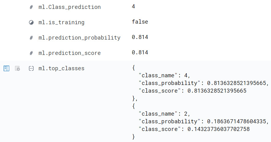
Figure 11.17 – Classification results for a sample data point in the Wisconsin breast cancer dataset
With this trained model, we can take previously unseen data points and make predictions. What form do these predictions take? In the simplest form, a data point is assigned a class label (the field ml.Class_prediction in Figure 11.18 shows an example of this). In our example case, this label can take one of two values: 2 (malignant) and 4 (benign).
However, this way of classifying data points masks a certain issue in the process of prediction: that of how confident we are in our predictions. You can see the importance of quantifying the uncertainty associated with our predictions if you think about something as quotidian as daily weather forecasts. One can predict that it will rain on Wednesday with an 80% probability and on Thursday with a 16% probability. Both days have been assigned the label "rainy," but you would be less likely to forget your umbrella on Wednesday than on Thursday. This all goes to say that when evaluating our machine learning classifiers, we not only care about the label that has been assigned to a given data point but also how confident the model is about that label. In the Elastic Stack, there are two metrics that measure how confident our classification model is about the assigned class labels: class probability and class score. We will discuss both of these in greater detail below.
In addition to knowing how confident a model is about a given prediction, it can often be very useful to know which features of the data point were important in nudging the classification of the point towards one class over another. The contribution of a datapoint's feature to its predicted label is summarized by its feature importance value.
Class probability
As mentioned above, it is usually not enough to just examine the label that a machine learning classifier has assigned to a data point. We also need to know what the probability of the assignment was. In Figure 11.18, the probabilities for both class 2 and class 4 are shown in the nested structure under the field ml.top_classes. As we can see from Figure 11.18, the class label assigned to the data point is 4 and the probability of the data point belonging to this class is 0.814 (rounded). The model is confident that this data point indeed belongs to class 4.
Class score
While for many cases, assigning the class label based on the class that receives the higher probability is a good enough rule, it is not a good choice for all datasets. For example, for datasets where classes are highly imbalanced, a better option might be to use the class score. This value is recorded as ml.prediction_score in Figure 11.18 and as a more precise ml.top_classes.class_score in the nested breakdown of class labels and class probabilities.
The class score is computed from the class probability, but in such a way that takes into whether one wants to maximize the accuracy or the minimum recall. In other words, how tolerant one is to misclassifications in classes that are less represented in the training dataset.
Tip
For a detailed explanation of how class scores are computed, please see the Elastic documentation here: https://www.elastic.co/guide/en/machine-learning/current/dfa-classification.html#dfa-classification-class-score and for a more detailed walk-through, the Jupyter notebook here: https://github.com/elastic/examples/blob/master/Machine%20Learning/Class%20Assigment%20Objectives/classification-class-assignment-objective.ipynb.
Feature importance
When examining the predictions of a machine learning model, not only do we care about the predicted class label, the probability of that class label, and also, potentially, the class score, we usually also want to know what were the features that contributed to the model making a certain decision. This is captured with feature importance. Each field used in the training process (the fields that were selected as Included during the configuration of the Classification job in the section Taking your first steps with classification) can be assigned a potential feature importance value, but usually, we only want to know about the most important features, that is, the fields that had the highest feature importance values.
Thus, to avoid cluttering the Elasticsearch results index that is written to our cluster with the results of each machine learning job, the Classification job configuration allows us to select the number of top feature importance values that will be written for each classified datapoint. This configuration is set to 4 in the example shown in Figure 11.19.

Figure 11.18 – This configuration will write out 4 feature importance values for each document
Once the classification job has finished, each document in the results index will have, in addition to the predicted class, the class probability breakdown and the class score, and entries for each of the top four feature importance values for a given data point. An abridged snippet of the feature importance values for a sample data point is shown in Figure 11.20.
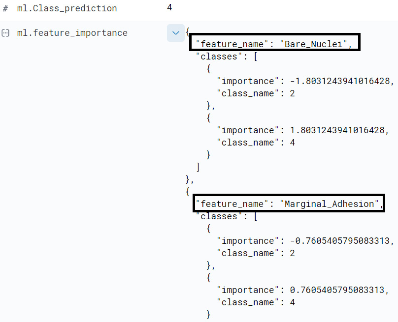
Figure 11.19 – Two feature importance values for a sample datapoint
This datapoint is assigned class label 4. Among the features that contributed to this predicted label were the value that this data point had for the field Bare_Nuclei and the value that it had for Marginal_Adhesion.
In addition to examining the feature importance values for each individual data point, we can also examine which features are significant for classifications in the dataset as a whole. This chart is displayed in Figure 11.21 and is available in the Data Frame Analytics results view (you can access this view by going to the Data Frame Analytics jobs management page, selecting the job for which you have configured how many feature importance values should be written out, and then clicking on View).
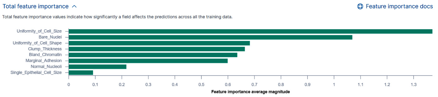
Figure 11.20 – The total feature importance values for the whole dataset
Summary
In this chapter, we have taken a deep dive into supervised learning. We have examined what supervised learning means, what role is played by training data in constructing the model, what it means to train a supervised learning model, what features are and how they should be engineered to obtain optimal performance, as well as how a model is evaluated and what various model performance measures mean.
After learning about the basics of supervised learning in general, we took a closer look at classification and examined how one can create and run classification jobs in the Elastic Stack as well as how one can evaluate the trained models that are produced by these jobs. In addition to looking at basic concepts such as confusion matrices, we also examined situations where it is good to be skeptical about results that seem to be too good to be true and the potential underlying reasons why classification results can sometimes appear perfect and why this does not necessarily mean that the underlying trained model is any good.
Moreover, we took a deeper look at the engine that drives the classification functionality in the Elastic Stack: gradient boosted decision trees. To learn more about how decision trees work under the hood, we took a conceptual look at how an individual decision tree is constructed, what we mean by purity in the context of decision trees, as well as how unconstrained decision trees can lead to trained models that overfit on the training dataset and generalize poorly. In order to tune the process of growing a decision tree from a dataset, the training procedure exposes several advanced configuration parameters or hyperparameters. By default, these are set by a procedure known as hyperparameter optimization, but advanced users may also choose to tune these manually.
In the final section of this chapter, we returned to our original breast cancer classification dataset to further examine the results format and the meaning of class probability, class score, and how feature importance can be used to determine which features contribute to a data point being assigned one class over another.
In the next chapter, we will build upon the foundation laid in this chapter to learn how decision trees can be used to solve problems where the dependent variable we want to predict is not a discrete value as in the case of classification but a continuous value.
Further reading
For more information about how the class score is calculated, please take a look at the text and code examples in this Jupyter notebook: https://github.com/elastic/examples/blob/master/Machine%20Learning/Class%20Assigment%20Objectives/classification-class-assignment-objective.ipynb.