To support, develop and advance a process of continuous improvement it is necessary for an organization to use a selection of tools and techniques. Some of these tools and techniques are simple, while others are more complex. There are a considerable number of tools and techniques; the following are perhaps the most popular and best known:
Checklists
Flowcharts
The seven quality control tools (QC7: cause-and-effect diagram, check sheet, control chart, graphs, histogram, Pareto diagram and scatter diagram)
Quality costing
Statistical process control
Failure mode and effects analysis
Fault tree analysis
Design of experiments
Quality function deployment
The seven management tools (M7: affinity diagrams, relations diagrams, systematic diagrams, matrix diagrams, matrix data analysis, process decision programme chart, and arrow diagrams)
Departmental purpose analysis
Mistake-proofing
Benchmarking
Total productive maintenance
Housekeeping and 5s
Tools and techniques have different roles to play in continuous improvement and if applied correctly give repeatable and reliable results (Bamford and Greatbanks 2005). Their roles include:
Summarizing data and organizing its presentation
Data-collection and structuring ideas
Identifying relationships
Discovering and understanding a problem
Implementing actions
Finding and removing the causes of the problem
Selecting problems for improvement and assisting with the setting of priorities
Monitoring and maintaining control
Planning
Performance measurement and capability assessment
A number of the tools and techniques in the above list will be detailed in the following chapters.
This chapter provides an overview of the tools, which are likely to be used in an organization's improvement process. The focus is on describing the tools and their uses and avoids detail on construction. A deliberate attempt has been made to choose examples from a variety of situations to give the reader a flavour of their applicability in a wide number of situations.
Selecting Tools and Techniques
The potential user must always be aware of the main uses of the particular tool or technique they are considering applying. There is often a danger of using a tool or technique in a blinkered manner, almost expecting it to solve the problem automatically.
When selecting tools and techniques there are two factors, which organizations should keep in mind:
The application of any tool or technique in isolation without a strategy and plan will only provide short-term benefits. If tools and techniques are to be effective over the longer term, appropriate employee behaviour and attitudes are needed to make effective improvements.
No one tool or technique is more important than another – they all have a role to play at some point in the improvement process. It is a mistake to single out one tool or technique for special attention and to become over-reliant on it. The Japanese make the point that a warrior should never have a favourite weapon. A common saying used to emphasize this is ‘If you only have a hammer, it is surprising how many problems look like nails.’
A number of companies use tools and techniques without thinking through the implications for TQM or how the concept will be developed and advanced within the organization. This can give rise to misconceptions and misunderstandings, which eventually become barriers to progress. Many companies who use tools and techniques as the springboard to launch an improvement process usually single out a specific tool or technique, sometimes at random, and apply it with undue haste without giving sufficient thought to the following issues:
What is the fundamental purpose of the technique?
What will it achieve?
Will it produce benefits if applied on its own?
Is the technique right for the company's product, processes, people and culture?
How will the technique facilitate improvement?
How will it fit in with, complement or support other techniques, methods and quality management systems already in place, and any that might be introduced in the future?
What organizational changes, if any, are necessary to make the most effective use of the technique?
What is the best method of introducing and then using the technique?
What are the resources, skills, information training, etc. required to introduce the technique successfully?
Has the company the management skills and resources and the commitment to make the technique work successfully?
What are the potential difficulties in using the technique?
What are the limitations, if any, of the technique?
It is important for managers to address these questions when considering the introduction of any tool or technique. Unfortunately, some managers are always looking for tools and techniques as a quick-fix solution to the problems facing their organization at a particular point in time. In general, management teams that are ‘technique reactive’ tend to be unclear on the concept of TQM and strategic process improvement. They often confuse the implementation of a particular technique with TQM and tend to use the technique as an end in itself rather than as a means to an end.
If the management team is preoccupied with specific techniques and lacks an adequate understanding of TQM and the improvement process, the risk is that tools and techniques are picked up and discarded as fashion changes (see Figure 9.1). When this happens and a tool or technique fails to meet expectations, disillusionment sets in and the company experiences considerable difficulty convincing its employees that it is serious about improvement. This, of course, has an adverse effect on the use of techniques in the organization in the future.
Figure 9.1 The use of quality management tools and techniques
One of the main reasons that companies fall into this trap is that they have unduly high expectations of the benefits arising from the use of a single tool or technique which stem from the lack of clarity and in-depth understanding of it. Much of this is a result of the publicity and selling which often accompany a specific tool or technique. In general, on its own a single tool or technique may simply indicate or signify the presence of a problem which must be identified and resolved to produce only a small incremental improvement. It is only as a result of the cumulative effect of a series of tools and techniques within a TQM approach that the organization starts to see long-term benefits from its improvement endeavours (see Figure 9.2). Therefore, organizations should resist the temptation to isolate the benefits arising from any one tool or technique.
Figure 9.2 Incremental improvement through the use of quality management tools and techniques
Motivation for the use of any particular tool or technique is a key factor in the success of its implementation (Bamford and Greatbanks 2005). They could be those specified as a contractual requirement by a major customer, they may be what management believe the marketplace will be expecting in the future, or the view may be taken that their use will give the organization an edge over its competitors.
Dale and Shaw (1990) found that when a major customer insists on the use of a specific technique as a contractual requirement of its suppliers, two phases can be identified in its use.
The technique is applied by the supplier simply to satisfy the demands of the customer in order to maintain the business. To emphasize this they point out a case in which Statistical Process Control (SPC) has been used on a process for a particular customer's product, though when other customers' products were made with the same process SPC was not used. During this phase the supplier often resorts to a number of camouflage measures, fakes and ruses to convince the customer that the technique is being applied effectively and beneficially. The emphasis in this phase is on satisfying the customer's paperwork requirements. This phase is wasteful of time and resources, but suggests that suppliers appear to need this phase to develop their own awareness and understanding of the technique which is being applied.
The second phase begins when the supplier's management team starts to question how they might best use the technique to enhance the company's competitive position. This is when real improvements begin to occur. They also point out that motor industry suppliers appear to have reached this phase in a shorter period of time with failure mode and effects analysis (FMEA) than they did with SPC, and suggest that this is due to the learning experience and also the depth of intellectual demands of each technique. Those organizations using techniques such as SPC for the sole reason of satisfying the quality system audits of major customers are missing the direct benefits of the correct use of the technique and also the opportunity that it affords to launch a process of quality improvement. The danger in adopting this approach is that the improvement process goes only as far as the customer requires.
Because of the variety of starting points and motivations for improvement it is not possible to identify a universal implementation plan detailing the order in which specific techniques should be used by an organization. However, one piece of advice is that organizations should start with the simpler techniques, such as checklists, flowcharts and the seven original quality control tools. Simple tools and techniques can be just as effective as the more complex ones. In the West there is a tendency to ignore the simple tools and to use tools and techniques in isolation, whereas the Japanese companies tend to use the seven original quality control tools together and give high visibility to the results. In this way they are not only listening to the process through control charts, but also taking action to improve it. This combined use of the seven tools facilitates problem resolution and improvement action.
Difficulties and Issues Relating to the Use of Tools and Techniques
Research carried out by Dale et al. (1998) into the difficulties relating to the use of tools and techniques discovered that the critical success factors relating to the successful use and application of tools and techniques could be grouped into four main categories:
Data collection
Use and application
Role in improvement
Organization and infrastructure
Dale et al. (1998) identified a number of issues which relate to the difficulties experienced with all tools and techniques, including management support, user understanding, integral approach, discipline and application. A number of issues which relate to specific tools and techniques were also highlighted, including level of complexity, visual display, initial investment and overall status of TQM.
Building on this initial work, Dale and McQuater (1998) have identified five main influences on each of the four success factors (see Figure 9.3). The influences are experience, management, resources, education, and training. Based on these influences an assessment methodology has been developed for identifying potential difficulties that impinge on the effective use of tools and techniques in an organization and for providing a diagnostic analysis. The methodology, described by Dale and McQuater (1998), consists mainly of an assessment grid, questionnaire and semi-structured interviews. These approaches can be used separately as well as in combinations, depending on the organization's objectives for carrying out the assessment. The assessment grid, which can be used on its own to undertake a ‘health check’ of potential areas for concern, is reproduced in Table 9.1.
Figure 9.3 The effects of influences on continuous improvement
Table 9.1An assessment grid for a health check: (a) recognition and use grid; (b) application grid
Please indicate on the grid ONLY the techniques and tools you recognize. For those that you have recognized, if you use them for any purpose, not only for quality-related matters, please tick the box marked use.
Example
Recognize
Use
QC7
Cause and effect
✓
Check sheets
Control charts
Graphs/charts
✓
✓
Histograms
✓
✓
Pareto analysis
✓
✓
Scatter diagrams
✓
Recognize
Use
QC7
Cause and effect
Check sheets
Control charts
Graphs/charts
Histograms
Pareto analysis
Scatter diagrams
M7
Affinity diagrams
Arrow diagrams/critical path analysis
Matrix data analysis methods
Matrix diagrams
Process decision programme chart
Relation diagrams
Systematic diagrams/tree diagrams
Techniques
Benchmarking
Brainstorming/brainwriting
Departmental purpose analysis
Design of experiments (Taguchi)
Failure mode and effects analysis
Flow charts
Force field analysis
Problem solving methodology
Quality costs
Quality function deployment
Questionnaire
Sampling
Statistical process control
*
*
*
*
*
*Add any company-specific techniques and tools not indicated on the list
Please complete the grid ONLY for the techniques or tools you indicated on the recognition and use grid. Do not attempt to fill it in its entirety. There may be occasions when some of the categories cannot be allocated a score; in that case insert 9 (not applicable)
Score out of 5 in each of the categories where:
1 = No value
2 = Low value (e.g. little used, not understood, little or poor training, etc.)
3 = Some value (e.g. basic understanding, small benefits, basic training, etc.)
4 = High value (e.g. good understanding, some benefits, reasonable training, etc.)
5 = Very high value (e.g. complete understanding, excellent benefits, effective training, etc.)
9 = Not applicable or no training
Importance
Relevance
Use
Understand
Application
Resources
Management
Training
Benefit
For example:Pareto analysis
5
4
2
3
3
2
1
1
4
Importance
Relevance
Use
Understand
Application
Resources
Management
Training
Benefit
QC7
Cause and effect
Check sheets
Control charts
Graphs/charts
Histograms
Pareto analysis
Scatter diagrams
QC7
Affinity diagrams
Arrow diagrams/critical path analysis
Matrix data analysis methods
Matrix diagrams
Process decision programme chart
Relation diagrams
Systematic diagrams/tree diagrams
Techniques
Benchmarking
Brainstorming/brainwriting
Departmental purpose analysis
Design of experiments (Taguchi)
Failure mode and effects analysis
Flow charts
Force field analysis
Problem solving methodology
Quality costs
Quality function deployment
Questionnaire
Sampling
Statistical process control
Other techniques, tools, systems
For example:
ISO9000 series
Quality operating system QS9000
Other awards (e.g. EQA)
Problem-Solving Methodology
The use of tools and techniques should be employed within a problem-solving approach for maximum effectiveness and efficiency. Probably the best-known problem-solving cycle is PDCA (‘plan, do, check, act’).
The plan aspect of the cycle is usually considered in four stages:
Define the problem or improvement opportunity and specify objectives.
Identify the likely causes of the problem.
Pinpoint the root causes of the problem.
Prepare solutions and develop and agree an action plan.
The do is concerned with implementing the action plan; check monitors the effectiveness of the actions which have been implemented and act relates to standardization of the results and transferring the practices to other processes.
At each stage of the cycle a range of tools and techniques is employed. The Ford Motor Company has been at the forefront in developing a step-by-step process of ensuring that any improvement action is permanent. This is known as the TOPS (team-orientated problem-solving) 8D (eight-discipline) approach. The following is a summary of the eight disciplines.
D1 Use a team approach
D2 Describe the problem:
Review and analyse existing data
Establish problem definition and statement
Develop the problem profile
Confirm problem with the customer
D3 Implement and verify interim containment actions (ICA):
Choose best ICA
Test for feasibility
Develop action plan and implement ICA to isolate the problem from the customer until permanent corrective action is available
Monitor and report effectiveness of ICA
D4 Define and verify root cause(s):
Review, improve and update problem definition and description
Identify possible causes by comparison to the problem description
Select likely causes
Verify root causes
Report
D5 Choose and verify permanent corrective actions (PCA):
Choose best PCA
Re-evaluate ICA
Verify PCA
Make choice
Report
D6 Implement permanent corrective action:
Develop implementation plan
Remove ICA
Implement PCA
Monitor process and assess the effectiveness of problem elimination
Formalize changes, and update documents and system
Notify affected personnel
Report
D7 Prevent recurrence:
Review current process
Identify critical areas or supporting PCA
Make recommendations for improvement current processes
Report
D8 Congratulate the team
Checklists
Checklists (sometimes called inspection or validation checklists) are used as prompts and aids to personnel. They highlight the key features of a process, equipment, system and/or product/service to which attention needs to be given, and ensure that the procedures for an operation, housekeeping, inspection, and maintenance have been followed. Checklists are also used in audits of both product and systems. They are an invaluable aid for quality assurance.
The basic steps in constructing a checklist are:
Study the activity for which the checklist is to be drawn up.
Drawing on observations of the process, discussions with operatives, and appropriate working instructions and procedures, construct the checklist.
Walk the checklist through the process by following what happens at each stage.
Ask the person who is carrying out the process to check its accuracy.
Display it next to the process.
Assess its use in practice.
Flowcharts
Process mapping (sometimes called ‘blueprinting’ or process modelling) in either a structured or unstructured format, is a prerequisite to obtaining an in-depth understanding of a process, before the application of quality management tools and techniques such as FMEA, SPC and quality costing. A flowchart is employed to provide a diagrammatic picture, often by means of a set of established symbols, showing all the steps or stages in a process, project or sequence of events and is of considerable assistance in documenting and describing a process as an aid to understanding examination and improvement.
A chart, when used in a manufacturing context, may show the complete process from goods receipt through storage, manufacture, and assembly to dispatch of final product, or simply some part of this process in detail. What is important is that each ‘activity’ is included, to focus attention on aspects of the process or subset of the process where problems have occurred or may occur, to enable some corrective action to be taken or counter-measure put into place.
Traditionally charts (called process charts) have employed conventional symbols to define activities such as operation, inspection, delay or temporary storage, permanent storage and transportation, and are much used by operations and methods and industrial engineering personnel. In more recent times they have witnessed considerable use in business process re-engineering.
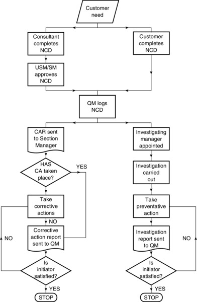
There are a number of variants of the classical process flowchart, including those tailored to an individual company's use, with different symbols being used to reflect the situation under study. What is important is not the format of the chart and/or flow diagram, but that the process has been mapped out with key inputs, value-adding steps and outputs defined, and that it is understood by those directly involved and responsible for initiating improvements. Analysing the data collected on a flowchart can help to uncover irregularities and potential problem points. Also in some organizations people are only aware of their own particular aspect of a process and process mapping helps to facilitate a greater understanding of the whole process: it is essential to the development of the internal customer–supplier relationship. Figure 9.4 is an example of flowcharting for the process of non-conformance identification and preventative action.
Figure 9.4 Flowchart: non-conformance identification and preventative action process
For an example of a specific process mapping see Crossfield and Dale (1990) who developed a methodology at Allied Signal Garrett Automotive plant in Skelmersdale. The following are the main steps in constructing a flowchart:
Define the process and its boundaries, including start- and end-points.
Decide the type and method of charting and the symbols to be used, and do not deviate from the convention chosen.
Decide the detail with which the process is to be mapped.
Describe the stages, in sequence, in the process using the agreed methodology.
Assess if these stages are in the correct sequence.
Ask people involved with the process to check its veracity.
Checksheets
These are a sheet or form used to record data. The checksheet is a simple and convenient recording method for collecting and determining the occurrence of events. The events relate to non-conformities, including the position in which they appear.
Checksheets are helpful in following the maxim of ‘no checking or measurement without recording the data’, and are effective in making the first attack on a problem.
They are prepared, in advance of the recording of data, by the operatives and staff being affected by a problem. Checksheets, in table, process, diagram or picture format, are extremely useful as a data-collection device and a record to supplement quality control charts. The data from a checksheet provide the factual basis for subsequent analysis and corrective action. There are many different kinds of checksheets: Figure 9.3 is one example.
The following are the main steps in constructing a checksheet:
Decide the type of data to be illustrated. The data can relate to: number of defectives, percentage of total defectives, cost of defectives, type of defective, process, equipment, shift, business unit, operator, etc.
Decide which features/characteristics and items are to be checked.
Determine the type of checksheet to use (i.e. tabular form or defect position chart).
Design the sheet; ideally it should be flexible enough to allow the data to be arranged in a variety of ways. Data should always be arranged in the most meaningful way to make best use of them.
Specify the format, instructions and sampling method for recording the data, including the use of appropriate symbols.
Decide the time period over which data are to be collected.
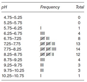
Tally Charts and Histograms
Tally charts are a descriptive presentation of data and help to identify patterns in the data. They may be used as checksheets with attribute data (pass/fail, present/absent) but are more commonly used with measured or variable data (e.g. temperature, weight, length) to establish the pattern of variation displayed, prior to the assessment of capability and computation of process capability indices (see the SPC section of Chapter 10 for details). Tally charts are regarded as simple or crude frequency distribution curves and provide a quick way of recording and displaying data.
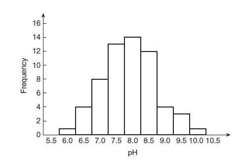
Statisticians would tend to construct histograms rather than tally charts, but for general analysis purposes they are more or less the same. A histogram is a graphical representation of individual measured values in a data set according to the frequency or relative frequency of occurrence. It takes measured data from the tally sheet and displays its distribution using the class intervals or value as a base – it resembles a bar chart with the bars representing the frequency of data over a range of values. The histogram helps to visualize the distribution of data and in this way reveals the amount of variation within a process, and/or other factors such as edited data and poor sampling techniques. It can be used to assess performance to a given standard, specification or tolerance. There are several forms which should be recognized – normal, skewed, bimodal, isolated island, etc. There are a number of theoretical models which provide patterns and working tools for various shapes of distribution. The shape of distribution most often encountered is called Normal or Gaussian.
Figure 9.6 shows a tally chart; Figure 9.7 is a histogram which has been constructed from the data collected on the tally chart.
There are several ways of constructing histograms depending upon whether the data are discrete or continuous, whether they are single or grouped values, and whether there is a vast amount of data or not. The following guidelines are given for the treatment of continuous data of sufficient quantity that grouping is required.
Subtract the smallest individual value from the largest.
Divide this range by 8 or 9 to give that many classes or groups.
The resultant value indicates the width or interval of the group. This should be rounded for convenience, e.g. 4.3 could be regarded as either 4 or 5 depending upon the data collected.
These minor calculations are undertaken to give approximately eight or nine group class intervals of a rational width.
Each individual measurement now goes into its respective group or class.
Construct the histogram with measurements on the horizontal scale and frequency (or number of measurements) on the vertical scale.
The ‘blocks’ of the histogram should adjoin each other, i.e. there should be no gaps unless there is a recorded zero frequency.
Clearly label the histogram and state the source of the data.
Graphs
Graphs, be they presentational (i.e. to convey data in a pictorial way), or mathematical (i.e. into which data may be interpolated or from which they may be extrapolated), are used to facilitate understanding and analysis of the collected data, investigate relationships between factors, attract attention, indicate trends and make the data memorable (a picture is worth a thousand words).
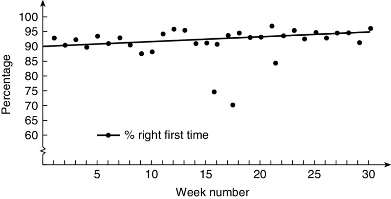
There is a wide choice of graphical methods available (line graphs, bar charts, pie charts, Gantt charts, radar charts, band charts) for different types of application. Figure 9.8 is a line graph which illustrates right-first-time production; Figure 9.9 is a bar chart showing right-first-time production.
Figure 9.8 Line graph: right-first-time production
The following are the types of issues which need to be considered in the construction of graphs:
Use clear titles and indicate when and how the data were collected (i.e. the theme of the graphs and the source of data).
Ensure that the scales are clear, understandable and represent the data accurately.
When possible, use symbols for extra data to provide clarity of explanation.
Always keep in mind the reason why a graph is being used (i.e. to highlight some information or data in a striking and unambiguous way); anything which facilitates this objective is desirable.
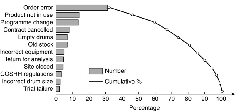
Pareto Analysis
This is a technique employed for prioritizing problems of any type; for example, quality, production, complaints, stock control, sickness, absenteeism, accident occurrences and resource allocation. The analysis highlights the fact that most problems come from a few causes, and it indicates what problems to solve and in what order (e.g. Juran's (1988) ‘vital few and trivial many’). In this way improvement efforts and resources are directed where they will have the greatest impact. Pareto analysis is an extremely useful tool: it can be used to compare before and after situations and data over different time periods. It can provide insights or problem-solving and process improvement. A Pareto diagram can be considered as a special form of bar chart, comprising a simple bar chart with a cumulative percentage curve overlaid on it.
The diagram is named after a nineteenth-century Italian economist, Wilfredo Pareto, who observed that a large proportion of a country's wealth is held by a small proportion of the population (hence the expression ‘the 80/20 rule’). In the 1950s Juran, using a similar analogy, observed that a large proportion of quality problems were attributable to a small number of causes (i.e. 80 per cent of rejections are caused by 20 per cent of defect types).
The technique involves ranking the collected data, usually via a checksheet, with the most commonly occurring problem at the top and the least common at the bottom. The contribution of each problem to the grand total is expressed as a percentage, and cumulative percentages are used in compounding the effect of these problems. The ranking of the problems is usually in terms of occurrence and/or cost – just because one defect type happens more frequently than another it does not necessarily mean that it is the costliest or the one that should be tackled first. The results are often presented in two ways: (1) ranked data as a bar chart and (2) cumulative percentages as a graph. Figure 9.10 is an analysis of the reasons for returned goods.
Figure 9.10 Pareto analysis: reasons for returned goods
Pareto analysis, while simple in terms of its construction, is extremely powerful in presenting data by focusing attention on the major contributor(s) to a quality problem in order to generate attention, efforts, ideas and suggestions to hopefully gain a significant overall reduction in these problems.
The following are the basic steps in constructing a Pareto diagram:
Agree the problem that is to be analysed.
Decide the time period over which data are to be collected.
Identify the main causes or categories of the problem.
Decide how the data will be measured.
Collect the data using, for example, a checksheet.
Tabulate the frequency of each category and list in descending order of frequency (if there are too many categories it is permissible to group some into a miscellaneous category, for the purpose of analysis and presentation).
Arrange the data as a bar chart.
Construct the Pareto diagram with the columns arranged in order of descending frequency.
Determine cumulative totals and percentages and construct the cumulative percentage curve, superimposing it on the bar chart.
Interpret the data portrayed on the diagram.
Cause-and-Effect Diagrams
This type of diagram was developed by Ishikawa (1976) to determine and break down the main causes of a given problem. Cause-and-effect diagrams are often called Ishikawa diagrams, and sometimes ‘fishbone’ diagrams, because of their skeletal appearance. They are usually employed where there is only one problem and the possible causes are hierarchical in nature.
The effect (a specific problem or a quality characteristic/condition) is considered to be the head, and potential causes and sub-causes of the problem or quality characteristic/condition to be the bone structure of the fish. The diagrams illustrate in a clear manner the possible relationships between some identified effect and the causes influencing it. They also assist in helping to uncover the root causes of a problem and in generating improvement ideas.
They are typically used by a quality control circle, quality improvement team, kaizen team, and problem-solving team, as part of a brainstorming exercise to solicit ideas and opinions as to the possible major cause(s) of a problem, and subsequently to offer recommendations to resolve or counteract it.
It is important to define the problem or abnormality clearly, giving as much detail as possible to enable the identification of potential causes. This can be quite a difficult task, and the team leader must assume responsibility for defining a manageable problem (if it is too large it may need subdividing into a number of sub-problems) to ensure that the team's efforts and contributions are maximized in a constructive manner.
5M cause-and-effect diagram. The main ‘bone’ structure or branches typically comprise machinery, manpower, method, material and maintenance. Occasionally teams omit maintenance, and hence use a 4M diagram, while others may add a sixth M (Mother Nature) and so use a 6M diagram. The 4M, 5M, or 6M diagram is useful for those with little experience of constructing cause-and-effect diagrams and is a good starting point in the event of any uncertainty. In non-manufacturing areas the four Ps (policies, procedures, people and plant) are sometimes found to be more appropriate. As with any type of cause-and-effect diagram, the exact format is not so important as the process of bringing about appropriate counter-measures for the identified and agreed major cause(s) of the problem.
Figure 9.11 shows an example of a cause-and-effect diagram for a non-value-added work analysis carried out by a purchasing department.
Figure 9.11 Cause-and-effect analysis: purchasing department non-value-added work analysis
Cause-and-effect diagrams are usually produced via a team approach and involve the following basic steps:
Define with clarity and write in a box to the right the key symptom or effect of the problem and draw a horizontal line from the left of the box.
Ensure that every team member understands the problem and develop a clear problem statement.
Decide the major groupings or categories for the causes of the effect; these form the main branches of the diagram.
In a brainstorming session, the group members speculate on causes of the effect and these are added to the branches or sub-branches of the diagram.
In a following session the causes are discussed and analysed to determine those which are most likely to have caused the effect.
The most likely, or major causes of the problems are ranked, by the group, in order of importance. This can be done by Pareto voting: 80 per cent of the votes should be cast for 20 per cent of the causes. (If, for example, there are 35 causes, using the figure of 20 per cent gives each member seven votes to allocate to what they believe are the causes of the effect.)
Additional data are sometimes gathered to confirm the key causes.
Improvement plans, actions, tests and experiments are decided upon to both verify and address the key causes.
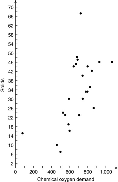
Scatter Diagrams and Regression Analysis
Scatter diagrams or scatter plots are used when examining the possible relationship or association between two variables, characteristics or factors; they indicate the relationship as a pattern – cause and effect. For example, one variable may be a process parameter (e.g. temperature, pressure, screw speed), and the other may be some measurable characteristic or feature of the product (e.g. length, weight, thickness). As the process parameter is changed (independent variable) it is noted, together with any measured change in the product variable (dependent variable), and this is repeated until sufficient data have been collected. The results, when plotted on a graph, will give what is called a scatter graph, scatter plot or scatter diagram. In very simple terms, variables that are associated may show a linear pattern and those that are unrelated may portray an obvious or non-linear random pattern. An example of a linear scatter plot of an effluent analysis for solids/chemical oxygen demand is given in Figure 9.12.
Analysis should concern itself with the dispersion of the plots, and if some linear, or known non-linear, relationship exists between the two variables. In this way the scatter diagram is a valuable tool for diagnosis and problem-solving. Regression analysis would subsequently be used not only to establish lines of ‘best fit’, but to provide the basis for making estimates or predictions of, say, the product variable for a given value of the process parameter. In this way, it is possible to reduce the amount of data which is measured, collected, plotted and analysed.
How valid or reliable such estimates are, is largely a function of the degree of correlation which exists between the two variables (if indeed only two variables are under consideration), and whether the estimates are interpolated (i.e. from within the range of collected data) or extrapolated (i.e. outside that range).
Where there are more than two variables, multivariate regression analysis should be used, but a good background of statistical knowledge is required to undertake this analysis.
The Seven Management Tools
The so-called ‘seven new management tools’ of quality control were developed by the Japanese to collect and analyse non-qualitative and verbal data, in particular from sales and marketing and design and development activities. Most of the tools have seen previous use in other than TQM applications (for example, value engineering and value analysis, critical path analysis, programme evaluation and review technique (PERT), organizational analysis); the choice of the term ‘new’ is unfortunate. In Japanese companies these tools are typically used by quality control circles in sales and design areas, and in quality function deployment. It is usual to find some of the tools used together (e.g. a systematic diagram being produced from the data contained in an affinity diagram). A full description of these tools is outside the scope of this chapter; however, further details and examples are provided in the previous (fifth) edition of this book. Moreover, they are covered in detail by Mizuno (1988), Ozeki and Asaka (1990) and Barker (1989). The tools are listed briefly below.
Relations diagram method (relationship diagraph or linkage diagram)
This is used to identify, understand and clarify complex cause-and-effect relationships to find the causes of and solutions to a problem and to determine the key factors in the situation under study. They are also employed to identify the key issues for some desired result. Relations diagrams are used when the causes are non-hierarchical and when there are multiple interrelated problems; they tend to be used when there is a strong feeling that the problem under discussion is only a symptom. They allow the problem to be analysed from a wide perspective, as a specific framework is not employed, and allow for the use of multidirectional rather than linear thinking.
This is used to categorize verbal and language data about previously unexplored issues, problems and themes which are hazy, uncertain, large, complex and difficult to understand, thereby helping to create order out of chaos. It is used in conjunction with or as an alternative to brainstorming and is useful when new thoughts and ideas are needed. This diagram uses the natural affinity between opinions and partial data from a variety of situations to help understand and structure the problem. It tends to be a creative rather than a logical process.
Systematic diagram method (tree diagram)
This is used to examine, in a systematic manner, the most appropriate and effective means of planning to accomplish a task (‘how to’) or solve a problem; events are represented in the form of a root-and-branch relationship. It displays in increasing detail the means and paths necessary to achieve a specific goal or to clarify the component parts which lead to the root cause of a problem. They are used when the causes that influence the problem are known, but a plan and a method for resolving the problem have not been developed. They can also be useful when a task has been considered to be simple but has run into implementation difficulties. A systematic diagram is usually used to evaluate several different methods and plans for solving a problem and thereby assist with complex implementation. It is used to identify dependencies in a given situation and to search for the most suitable improvement opportunities, and also when there are major consequences for missing key tasks.
Matrix diagram method
This is used to clarify the relationship and connecting points between results and causes or between objectives and methods and, by the use of codes, to indicate their relative importance and the direction of the influence. The diagram is also useful to draw conclusions between consequences and their causes. They are used when there are two sets of factors and methods which may have no relationship with each other and when there is a need to get a cumulative numerical score to compare one item to another. The factors are arranged in rows and columns on a chart with the intersections identifying the problem and its concentration; the intersecting points are the base for future action and problem-solving.
Matrix data-analysis method
This is used to quantify and arrange the data presented in a matrix diagram in a clear manner. It is a numerical analysis method and employs techniques such as multivariate analysis.
Process decision programme chart (PDPC) method
This is used to select the best processes to obtain the desired outcome from a problem statement by evaluating all possible events, contingencies and outcomes that can occur in any implementation plan. Considering the system as a whole, it is used to anticipate unexpected events and develop plans, counter-measures and actions for such outcomes. It is used to plan each possible chain of events that might occur when the problem or goal is unfamiliar, new, or unique, particularly when the stakes of potential failure are high. In this it is similar to failure mode and effects analysis and fault tree analysis. However, it is claimed to be more dynamic than these two methods since the relationship between the initiating condition/event and terminating condition/event has been thought out and mapped. It is based on a systematic diagram and uses a questioning technique – for example, ‘What could go wrong?’, ‘What are the alternatives?’ – and lists actions or counter-measures accordingly. The PDPC has no prescribed set of rules.
Arrow diagram method
This method applies systematic thinking to the planning and execution of a complex set of tasks. It is used to establish the most suitable plan and schedule for a series of activities in a project, and to monitor its progress in an efficient manner to ensure adherence to the schedule. Arrow diagrams are necessary to describe the interrelationship and dependencies of tasks within a job or project that is complex. They are deployed at the implementation planning stage of a project. The sequence of the steps involved and their relation to each other are indicated by an arrow, and in this way a network of activities is developed. This method, its form of construction, calculations and identification of critical path are well known and used in project management in relation to critical path analysis (CPA) and programme evaluation and review technique (PERT).
Housekeeping and the 5S technique
The discipline of cleanliness and housekeeping is a prerequisite for effective quality assurance. It creates a working environment which is comfortable and in harmony with all employees. Organizations need to make sufficient effort to define and quantify their housekeeping requirements. It is also necessary to ensure that employees local to an area accept that the condition of housekeeping is their responsibility. A variety of aids can be used to promote housekeeping under what is termed the 5s; the strength of this methodology is its simplicity. The 5s are Japanese words (seiri, seiton, seiso, seiketsu and shitsuke), which translate approximately as shown below.
Seiri. Organization: separating what is required from that which is not, eliminating those which are not required and/or tidy them away.
Seiton. Neatness: arranging the required items in a tidy manner and in a clearly defined place, so that they can be accessed quickly.
Seiso. Cleaning: keeping the surrounding area and environment clean and tidy.
Seiketsu. Standardization: clean the machinery and equipment according to laid-down standards and routines in order to identify deterioration.
Shitsuke. Discipline: follow the procedures and previous four steps which have been laid down and continuously improve them.
They sometimes also translate in English as: sort, set in order, shine, standardize and sustain.
The 5s evaluation form used by NSK-RHP (Aerospace) is given in Table 9.2. Nissan Motor Manufacturing (UK) refer to this form of housekeeping as the 5 Cs:
Clean out – determine what is necessary and unnecessary and dispose of the latter.
Configure – provide a convenient, safe and orderly place for everything and keep it there.
Clean and check – monitor the condition of the area during cleaning.
Conformity – develop the habit of routinely maintaining cleanliness.
Custom and practice – train people in the disciplines of the 5 Cs.
All items not required for performing operations are removed from the work area, only tools and products are present at work stations.
2. Storage of cleaning equipment
All cleaning equipment is stored in a neat manner; handy and readily available when needed.
3. Floor cleaning
All floors are clean and free of debris, oil and dirt. Cleaning of floors is done routinely – daily at a minimum – posted schedule.
4. Bulletin boards
All bulletins are arranged in a neat and orderly manner. No outdated, torn or soiled announcements are displayed.
5. Emergency access
Fire hoses and emergency equipment are unobstructed and stored in a prominent easy-to-locate area. Stop switches and breakers are marked or colour-coded for visibility.
6. Items on floor
Work-in-process, tools and any other material are not left to sit directly on the floor. Large items such as tote boxes are positioned on the floor in clearly marked areas, identified by painted lines.
7. Aisleways – markings
Aisles and walkways are clearly marked and can be identified at a glance; lines are straight and at right angles with no chipped or worn paint.
8. Aisleways – maintenance
Aisles are always free of material and obstructions; nothing is placed on the lines, and objects are always placed at right angles to the aisles.
9. Storage and arrangement
Storage of boxes, containers and material is always neat and at right angles. When items are stacked, they are never crooked or in danger of toppling over.
10. Equipment – painting
All machines and equipment are neatly painted; there are no places in the plant less than two metres high that are unpainted.
Subtotal pg 1
Item # and description
5S Evaluation Form
Item Score (0–5)
What is the team doing to improve to next level?
11. Equipment – cleanliness
All machines and equipment are kept clean by routine daily care.
12. Equipment – maintenance
Controls of machines are properly labelled and critical points for daily maintenance checks are clearly marked. Equipment checksheets are neatly displayed and clean.
13. Equipment – storage
Nothing is placed on top of machines, cabinets and equipment; nothing leans against walls or columns. Guards and deflectors are used to keep chips and coolant from falling to the floor.
14. Documents – storage
Only documents necessary to the operation are stored at the work stations and these are stored in a neat and orderly manner.
15. Documents – control
All documents are labelled clearly as to content and responsibility for control and revision. Obsolete or unused documents are routinely removed.
16. Tools and gauges arrangement
Tools, gauges and fixtures are arranged neatly and stored, kept clean and free of any risk of damage.
17. Tools and gauges convenience
Tools, gauges and fixtures are arranged so they can be easily accessed when changeovers or setups are made.
18. Shelves and benches – arrangement
Arranged, divided and clearly labelled. It is obvious where things are stored; status and condition is recorded.
19. Workbench and desk – control
Kept free of objects including records and documents. Tools and fixtures are clean and placed in their proper location.
20. 5S control and maintenance
A disciplined system of control is maintained at the highest possible level. It is the responsibility of everyone to maintain this system and environment.
Subtotal pg 2
+
Subtotal pg 1
Total
÷ 20 = 5S Score
NSK-RHP (Blackburn) use the acronym CANDO – cleanliness, arrangement, neatness, discipline, orderliness.
Mistake-Proofing
Mistake-proofing is a technique which is used to prevent errors being converted into defects. The concept was developed by Shingo (1986). The technique is based on the assumption that, no matter how observant or skilled people are, mistakes will occur unless preventative measures are put in place. Shingo argues that using statistical methods is tantamount to accepting defects as inevitable and that instead of looking for and correcting the causes of defective work, the source of the mistake should be inspected, analysed and rectified. He places great emphasis on what he calls source inspection, which checks for factors which cause mistakes, and then on using poka-yoke or mistake-proofing devices to prevent their recurrence.
Mistake-proofing has two main steps: preventing the occurrence of a defect and detecting the defect. In short, the purpose is to stop processes from operating when conditions exist that will lead to defects. The system is applied at three points in the process:
In the event of an error, prevent the start of a process and shut it down.
Prevent a non-conforming product from leaving a process.
Prevent a non-conforming part being passed to the next process.
The mistake-proofing technique employs the ingenuity and skills not only of the engineers and/or technical specialists who may develop and fit the devices, but also of the operators who have first identified the cause of the mistake and participated in the corrective action measures. In Japanese companies, quality control circles are very active in developing and using mistake-proofing devices. The devices may be simple mechanical counters which ensure that the correct number of parts are fed into a machine, or they may be cut-off switches, limit switches or float switches which provide some regulatory control of the process or operation, thereby stopping a machine or process automatically. They may be devices which prevent a part being incorrectly fed into the machine, assembled incorrectly, fabricated incorrectly, or placed incorrectly into fixturing. In other words, the assumption is made that if the part can possibly be fed in wrongly it will be unless some preventative measure is taken. This is the essence of mistake-proofing. Patel et al. (2001) worked along four precision component manufacturing companies and found that the main types of control method used were: jigs, pegs or guide pins, beam sensors, reset and interlock devices and gauges. It is usual to supply the mistake-proofing device and signal with some audible or visual display or mimic diagrams and/or warning light to indicate that something has gone wrong, and not to plan to bring the abnormality to the attention of the operator. They are a relatively cheap and effective way of preventing defects.
Dale and Lightburn (1992), based on their research into mistake-proofing in a European motor industry supplier, offer the following guidelines to organizations approaching the development of mistake-proofing:
Mistake-proof at the earliest possible opportunity, certainly at the development stage and before any pre-production activities are undertaken.
Involve manufacturing and quality department personnel in the research and development activity and ensure that there is a forum for the discussion of manufacturing and design problems and their interfaces; cross-functional teams, and concurrent and simultaneous engineering should facilitate this.
The design and process FMEA, analysis of customer reject returns, warranty claims, field failure reports, in-house scrap and rework, and inspection data should help to pinpoint potential problems that could be resolved by mistake-proofing.
It is much easier to mistake-proof new products than develop devices for existing products.
A team approach should be taken to study potential problems and likely causes of mistakes, and the development of mistake-proofing ideas and devices. The team should be multidisciplinary and involve operators. Customers should also be involved as this helps to build up relationships and provides concrete proof that long-lasting improvement action is being taken. However, some suppliers are sensitive to their problems being exposed to customers.
There should be some basic training in the principles, techniques, applications, and use of mistake-proofing as well as other activities such as problem-solving and team-building.
To broaden the experience of mistake-proofing techniques and applications, information should be shared with other companies using the concept.
Total Productive Maintenance
The Japanese have evolved the concept of total productive maintenance (TPM), based on the planned approach to preventative maintenance (PM). Nakajima (1986) outlines how, in 1953, 20 Japanese companies formed a PM research group and, after a mission to the US in 1962 to study equipment maintenance, the Japan Institute of Plant Engineers (JIPE) was formed in 1969, which was the predecessor of the Japan Institute of Plant Maintenance (JIPM). In 1969 JIPE started working closely with the automotive component manufacturer Nippondenso on the issue of PM, and when the company decided to change the role of operators to allow them to carry out routine maintenance it was the beginning of TPM. Tajiri and Gotan (1992) point out that, while TPM was communicated throughout Japan, only a small number of factories took up the challenge. It was the severe economic situation in the early 1970s that accelerated the adaptation of TPM, propagated by the seven-step programme developed by the Tokai Rubber Industries (see Nakajima 1988).
TPM combines PM with TQM and employee involvement and is considered as a total method of management. Dale (1999), after missions to study Japanese manufacturing organizations, reports that in Japan ‘TPM is considered as an additional driver which is complementary to TQM.’ The condition of the equipment has a considerable influence on the quality of production output and is a key element in manufacturing a quality product. The machine needs the input of people to keep it lean and to improve its efficiency and operation, thereby promoting a sense of ‘plant ownership’ by the operators and a feeling of shop-floor goodwill. This is the purpose of TPM.
TPM is a scientific, company-wide approach in which every employee is concerned about the maintenance, quality and efficiency of their equipment. The objective is to reduce the whole-life cost of machinery and equipment through more efficient maintenance management, and as far as possible to integrate the maintenance and manufacturing departments. Teamwork is a key element of TPM. By analysing each piece of equipment it focuses on reducing manufacturing losses and costs (i.e. the six major losses: breakdown, set up/adjustment, speed, idling and minor stoppages, quality defects and start-up; see Nakajima 1988), and establishes a system of preventative maintenance over a machine's working life. The emphasis of TPM is to improve the skills of operators in relation to machine technology and to train and educate them to clean, maintain and make adjustments to their machine. The training and education of operators is carried out by maintenance and engineering staff. In this way machinery is kept at optimal operating efficiency. The 5s are essential activities in TPM, and they also promote visible management.
The main organizational characteristics of TPM are:
Integration of maintenance and production departments
Small teams of operators/maintainers
Training is undertaken to make operators feel like owners
Good habits are developed:
Cleaning becomes checking
Cleaning highlights abnormalities
Abnormalities are rectified
Continuous improvement of environment and equipment
The seven key steps of a TPM programme are usually considered to be:
Step 1Initial cleaning, to identify problems with equipment that are not noticed during normal operations.
Step 2Counter-measures at the source of problems, to minimize accumulation of dirt and other contaminants and put in place improvements to make it easy to access parts of the equipment which need cleaning.
Step 3Set maintenance, cleaning and lubrication standards for groups of equipment and carry out appropriate training.
Step 4General inspection procedures and schedules.
Step 5Autonomous inspection procedures and schedules.
Step 6Orderliness and tidiness.
Step 7Full autonomous maintenance.
Summary
Irrespective of the TQM or strategic improvement approach chosen and followed, an organization will need to use a selection of tools and techniques to assist with the process of continuous improvement. It is recommended that the more simple tools and techniques, such as the seven quality control tools, are used in the beginning, and that it should be ensured that the tools and techniques which are currently employed are used effectively before attempts are made to introduce other techniques. A planned approach for the application of tools and techniques is necessary.
The temptation to single out one tool or technique for special attention should be resisted, and to get maximum benefit from the use of tools and techniques they should be used in combination. It should be recognized that tools and techniques play different roles, and management and staff should be fully aware of the main purpose and use of the tools and techniques they are considering applying in the organization; if this is not the case they could well be disappointed if a tool or technique fails to live up to expectations. It is also important to understand the limitations of how and when tools and techniques can best be used. The tools and techniques should be used to facilitate improvement and be integrated into the way the business works rather than being used and viewed as ‘bolt-on’ techniques. The ways in which the tool or technique is applied and how its results are interpreted are critical to its successful use; a tool or technique is only as good as the person who is using it.
From research by Bamford and Greatbanks (2005) the following are key for the successful implementation, use and success of applying the QC and M7 tools and techniques:
In-depth knowledge of the process
Formal training in problem solving techniques
Appropriateness of tools selected for use
Application simple models at all levels in the organization to aid communication and learning.
Tools and techniques on their own are not enough; they need an environment and technology conducive to improvement and to their use. An organization's CEO and senior managers have a key role to play in the effective use of tools and techniques. They should, for example:
Develop their knowledge of the tools and, when appropriate, use them in their day-to-day activities and decision-making.
Be fully aware of the main purpose and use of the particular tools and techniques which are being applied.
Delegate responsibility for their promotion to suitable individuals.
Maintain an active interest in the use of tools and the results.
Endorse expenditure arising from the education and training required and the improvement activities resulting from the employment of tools.
Recognize and reward those employees who utilize tools and techniques in their day-to-day work activities.
References
Bamford, D and Greatbanks, R. (2005), The use of Quality Management Tools and Techniques: A Study of Application in Everyday Situations, International Journal of Quality and Reliability Management, 22(4), 376–92.
Barker, R. L. (1989), The seven new QC tools. In Proceedings of the First Conference on Tools and Techniques for TQM, 95–120. Bedford: IFS Conferences.
Crossfield, R. T. and Dale, B. G. (1990), Mapping quality assurance systems: a methodology. Quality and Reliability Engineering International, 6(3), 167–78.
Dale, B. G. (1999), Managing Quality, 3rd edn. Oxford: Blackwell.
Dale, B. G. and Lightburn, K. (1992), Continuous quality improvement: why some organisations lack commitment. International Journal of Production Economics, 27(1), 57–67.
Dale, B. G. and McQuater, R. E. (1998), Managing Business Improvement and Quality: Implementing Key Tools and Techniques. Oxford: Blackwell.
Dale, B. G. and Shaw, P. (1990), Failure mode and effects analysis in the motor industry: A state-of-the-art study. Quality and Reliability Engineering International, 6(3), 179–88.
Dale, B. G., Boaden, R. J., Wilcox, M. and McQuater, R. E. (1998), The use of quality management techniques and tools: An examination of some key issues. International Journal of Technology Management, 16(4–6), 305–25.
Ishikawa, K. (1976), Guide to Quality Control. Tokyo: Asian Productivity Organization.
Juran, J. M. (1988), Quality Control Handbook. New York: McGraw-Hill.
Mizuno, S. (1988), Management for Quality Improvement: The Seven New QC Tools. Cambridge, Mass.: Productivity Press.
Nakajima, S. (1986), A challenge to the improvement of productivity by small group activities. Maintenance Management International, 6(1), 73–83.
Nakajima, S. (1988), Introduction to Total Productive Maintenance. Cambridge, Mass.: Productivity Press.
Ozeki, K. and Asaka, T. (1990), Handbook of Quality Tools. Cambridge, Mass.: Productivity Press.
Patel, S., Dale, B. G. and Shaw, P. (2001), Set-up time reduction and mistake-proofing methods: An examination in precision component manufacturing. The TQM Magazine, 13(3), 175–9.
Shingo, S. (1986), Zero Quality Control: Source Inspection and the Poka Yoke System. Cambridge, Mass.: Productivity Press.
Tajiri, M. and Gotan, F. (1992), IPM Implementation: A Japanese Approach. New York: McGraw-Hill.