
Chapter 12: Working with MVC/Razor Pages
ABP Framework was designed to be modular, layered, and UI framework-agnostic. It is perfect for server-client architecture, and in theory, it can work with any kind of UI technology. The server-side uses the standard authentication protocols and provides standard-compliant HTTP APIs. You can use your favorite SPA framework and consume server-side APIs easily. In this way, you can utilize the entire server-side infrastructure of ABP Framework.
However, ABP Framework helps with your UI development too. It provides systems so that you can build modular user interfaces, UI themes, layouts, navigation menus, and toolbars. It makes your development process easier while working with data tables, modals, and forms or authenticating and communicating with the server.
ABP Framework is well integrated with, and provides startup solution templates for, the following UI frameworks:
- ASP.NET Core MVC/Razor Pages
- Blazor
- Angular
In the fourth section of this book, I will cover working with the MVC/Razor Pages and Blazor UI options. In this chapter, you will learn how ABP Framework's MVC/Razor Page infrastructure is designed and how it can help you with your regular UI development cycle.
I call this UI type MVC/Razor Pages as it supports both the MVC and Razor Pages approaches. You can even use both in a single application. However, since Razor Pages (introduced with ASP.NET Core 2.0) is Microsoft's recommended approach for new applications, all pre-built ABP modules, samples, and documents use the Razor Pages approach.
This chapter covers the following topics:
- Understanding the theming system
- Using bundling and minification
- Working with menus
- Working with Bootstrap tag helpers
- Creating forms and implementing validation
- Working with modals
- Using the JavaScript API
- Consuming HTTP APIs
Technical requirements
If you want to follow along with the examples in this chapter, you will need to have an IDE/editor that supports ASP.NET Core development. We will use the ABP CLI at some points, so you will need to install the ABP CLI, as explained in Chapter 2, Getting Started with ABP Framework. Finally, you will need to install Node.js v14+ to be able to install NPM packages.
You can download the example application from this book's GitHub repository: https://github.com/PacktPublishing/Mastering-ABP-Framework. It contains some of the examples provided in this chapter.
Understanding the theming system
UI styling is the most customized part of an application, and you have plenty of options. You can start with one of the UI kits such as Bootstrap, Tailwind CSS, or Bulma as the base for your application UI. You can then build a design language or buy a pre-built, cheap UI theme from a theme market. If you are building an independent application, you can make your selections and create your UI pages and components based on these selections. Your pages and styling don't have to be compatible with another application.
On the other hand, if you want to build a modular application where each module's UI is independently developed (probably by a separate team) where the modules come together at runtime as a single application, you need to determine a design standard that should be implemented by all the module developers so that you have a consistent user interface.
Since ABP Framework provides a modular infrastructure, it provides a theming system that determines a set of base libraries and standards. This helps ensure that the application and module developers can build UI pages and components without depending on a particular theme or style set. Once the module/application code is theme-independent and the theme standards are explicit, you can build different themes and easily use that theme for an application with a simple configuration.
ABP Framework provides two free pre-built UI themes:
- The Basic theme is a minimalist theme that is built on the plain Bootstrap styling. It is ideal if you want to build styling from scratch.
- The LeptonX theme is a modern and production-ready UI theme built by the ABP Framework team.
This book uses the Basic theme in all examples. The following is a screenshot of the LeptonX theme:
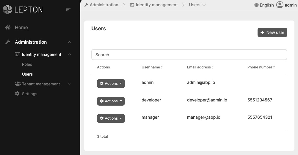
Figure 12.1 – The LeptonX theme and the application layout
Pre-built UI themes are deployed as NuGet and NPM packages, so you can easily install and switch between them.
The next two sections will introduce the fundamental base libraries and layouts that are shared by these themes.
The base libraries
To make modules/applications independent of a particular theme, ABP determines some base CSS and JavaScript libraries that our module/application can rely on.
The first and the most fundamental dependency of the ABP Framework MVC/Razor Pages UI is the Twitter Bootstrap framework. Starting with ABP Framework version 5.0, Bootstrap 5.x is used.
Besides Bootstrap, there are some other core library dependencies such as Datatables.Net, JQuery, JQuery Validation, FontAwesome, Sweetalert, Toastr, Lodash, and more. No additional setup is needed if you want to use these standard libraries in your module or application.
The next section will explain the layout system that is needed to understand how a web page is built.
The layouts
A typical web page consists of two parts – the layout and the page's content. The layout shapes the overall page and generally includes the main header, a company/product logo, the main navigation menu, a footer, and other standard components. The following screenshot shows these parts on an example layout:

Figure 12.2 – Parts of a page layout
In modern web applications, layouts are designed to be responsive, which means they change their shape and placing so that they are suitable for the device that's being used by the current user.
The layout's content almost remains the same across different pages – only the page's content changes. The page's content is generally a large part of the layout and may scroll if the content is larger than the height of the screen.
A web application may have different layout requirements in different parts/pages. In ABP Framework, a theme can define one or more layouts. Every layout has a unique string name, and ABP Framework defines four standard layout names:
- Application: Designed for back-office-style web applications with a header, menu, toolbar, footer, and so on. An example is shown in Figure 12.1.
- Account: Designed for login, register, and other account-related pages.
- Public: Designed for public-facing websites, such as a landing page for your product.
- Empty: A layout without an actual layout. The page's content covers the entire screen.
These strings are defined in the Volo.Abp.AspNetCore.Mvc.UI.Theming. StandardLayouts class. Every theme must define the Application, Account, and Empty layouts because they are common for most applications. The Public layout is optional and falls back to the Application layout if it's not implemented by the theme. A theme may define more layouts with different names.
The Application layout is the default unless you change it. You can change it per page/view or for a folder. If you change it for a folder, all the pages/views under that folder will use the selected layout.
To change it for a page/view, inject the IThemeManager service and use the CurrentTheme.GetLayout method with a layout name:
@inject IThemeManager ThemeManager
@{
Layout = ThemeManager.CurrentTheme
.GetLayout(StandardLayouts.Empty);
}
Here, you can use the StandardLayouts class to get the standard layout names. For this example, we could use GetLayout("Empty") since the value of StandardLayouts.Empty is a constant string that's Empty. In this way, you can get your theme's non-standard layouts with their string names.
If you want to change the layout for all the pages/views in a folder, you can create a _ViewStart.cshtml file in that folder and place the following code inside it:
@using Volo.Abp.AspNetCore.Mvc.UI.Theming
@inject IThemeManager ThemeManager
@{
Layout = ThemeManager.CurrentTheme
.GetLayout(StandardLayouts.Account);
}
If you place that _ViewStart.cshtml file in the Pages folder (or in Views for MVC views), all your pages will use the selected layout unless you select another layout for a subfolder or a particular page/view.
We can easily select a layout for our page to place content in. The next section will explain how to import script/style files into our pages and utilize the bundling and minification system.
Using the bundling and minification system
ABP offers an end-to-end solution for installing client-side packages, adding script/style files to the pages, and bundling and minifying these files in development and production environments.
Let's start by installing a client-side package for the application.
Installing NPM packages
NPM is the de facto package manager for JavaScript/CSS libraries. When you create a new solution with the MVC/Razor Pages UI, you will see a package.json file in the web project's root folder. The initial content of the package.json file will look something like this:
{
...
"dependencies": {
"@abp/aspnetcore.mvc.ui.theme.basic": "^5.0.0"
}
}
Initially, we have a single NPM package dependency called @abp/aspnetcore.mvc.ui.theme.basic. This package has dependencies on all the base CSS/JavaScript libraries that are necessary for the Basic theme. If we want to install another NPM package, we can use the standard npm install (or yarn add) command.
Let's assume that we want to use the Vue.js library in our application. We can run the following command in the root directory of the web project:
npm install vue
This command installs the vue NPM package in the node_modules/vue folder. However, we can't use the files under the node_modules folder. We should copy the necessary files into the wwwroot folder of the web project to import them into the pages.
You can copy the necessary files manually, but this is not the best way. ABP provides an install-libs command to automate this process using a mapping file. Open the abp.resourcemapping.js file under the web project and add the following code to the mappings dictionary:
"@node_modules/vue/dist/vue.min.js": "@libs/vue/"
The final content of the abp.resourcemapping.js file should look as follows:
module.exports = {
aliases: { },
mappings: {
"@node_modules/vue/dist/vue.min.js": "@libs/vue/"
}
};
Now, we can run the following command in a command-line terminal, in the root directory of the web project:
abp install-libs
The vue.min.js file should be copied under the wwwroot/libs/vue folder:
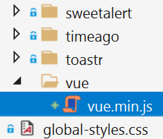
Figure 12.3 – Adding the Vue.js library to the web project
Mappings support glob/wildcard patterns. For example, you can copy all the files in the vue package with the following mapping:
"@node_modules/vue/dist/*": "@libs/vue/"
The libs folder is committed to the source control system (such as Git) by default. This means that if your teammate gets the code from your source control system, they don't need to run the npm install or abp install-libs commands. If you want, you can add the libs folder to the ignore file of your source control (such as .gitignore for Git). In this case, you need to run the npm install and abp install-libs commands before running the application.
The next section explains the standard ABP NPM packages.
Using the standard packages
Building a modular system has another challenge – all the modules should use the same (or compatible) version of the same NPM package. ABP Framework provides a set of standard NPM packages to allow the ABP ecosystem to use the same version of these NPM packages and automate the mapping to copy the resources to the libs folder.
@abp/vue is one of these standard packages that can be used to install the Vue.js library in your project. You can install this package instead of the vue package:
npm install @abp/vue
Now, you can run the abp install-libs command to copy the vue.min.js file into the wwwroot/libs/vue folder. Notice that you don't need to define the mapping in the abp.resourcemapping.js file since the @abp/vue package already includes the necessary mapping configuration.
It is suggested that you use the standard @abp/* packages when they are available. In this way, you can depend on a standard version of the related library, and you don't need to configure the abp.resourcemapping.js file manually.
However, when you install the library in your project, you will need to import it into the page to use it in your application.
Importing script and style files
Once we have installed a JavaScript or CSS library, we can include it in any page or bundle. Let's start with the most simple case – you can import vue.min.js into a Razor Page or view it using the following code:
@section scripts {
<abp-script src=»/libs/vue/vue.min.js» />
}
Here, we are importing JavaScript files into the scripts section, so the theme is placing them at the end of the HTML document, after the global scripts. abp-script is a tag helper that's defined by ABP Framework to include scripts to the page/view. It is rendered as follows:
<script src=»/libs/vue/vue.min.js?_v=637653840922970000»></script>
We could use a standard script tag, but abp-script has the following advantages:
- It automatically minifies the file in the production (or staging) environment if the given file is not already minified. If it is not minified and ABP finds the minified file near the original file, it uses the pre-minified file instead of dynamically minifying at runtime.
- It adds a query string parameter to add versioning information so that the browsers don't cache it when the file changes. This means that when you re-deploy your application, browsers don't accidentally cache the old versions of your script files.
- ABP ensures that the file is added to the page only once, even if you include it multiple times. This is a good feature if you wish to build a modular system since different module components may include the same library independent of each other, and ABP Framework eliminates this duplication.
Once we have included Vue.js in a page, we can utilize its power to create highly dynamic pages. Here is an example Razor Page, named VueDemo.cshtml:
@page
@model MvcDemo.Web.Pages.VueDemoModel
<abp-script src=»/libs/vue/vue.min.js» />
<script>
var app = new Vue({
el: '#app',
data: {
message: 'Hello Vue!'
}
})
</script>
}
<div id="app">
<h2>{{ message }}</h2>
</div>
If you run this page, a Hello Vue! message will be shown on the UI. I can recommend using Vue.js in some pages of your MVC/Razor Pages applications when you need to build complex and dynamic user interfaces.
Let's take this example one step further and move the custom JavaScript code into a separate file. Create a JavaScript file named VueDemo.cshtml.js in the same folder:

Figure 12.4 – Adding a JavaScript file
I prefer this naming convention, but you can set any name for the JavaScript file.
JavaScript/CSS Files Under the Pages Folder
In a regular ASP.NET Core application, you should place all the JavaScript/CSS files under the wwwroot folder. ABP allows you to add JavaScript/CSS files to the Pages or Views folder, near the corresponding .cshtml file. I find this approach to be pretty useful since we keep the related files together.
The content of the new JavaScript file is shown in the following code block:
var app = new Vue({
el: '#app',
data: {
message: 'Hello Vue!'
}
});
Now, we can update the VueDemo.cshtml file's content, as shown in the following code block:
@page
@model MvcDemo.Web.Pages.VueDemoModel
@section scripts {
<abp-script src=»/libs/vue/vue.min.js» />
<abp-script src=»/Pages/VueDemo.cshtml.js» />
}
<div id="app">
<h2>{{ message }}</h2>
</div>
It is good to keep JavaScript code in a separate file and include it on the page as an external file, as in the preceding example.
Working with style (CSS) files is pretty similar to working with script files. The following example uses the styles section and the abp-style tag helper to import a style file on the page:
@section styles {
<abp-style src="/Pages/VueDemo.cshtml.css" />
}
We can import multiple script or style files into a page. The next section will show you how to bundle these files as a single, minified file in production.
Creating page bundles
When we use multiple abp-script (or abp-style) tags on a page, ABP individually includes the files on the page and includes the minified versions in production. However, we generally want to create a single bundled and minified file in production. We can use the abp-script-bundle and abp-style-bundle tag helpers to create bundles for a page, as shown in the following example:
<abp-script-bundle>
<abp-script src=»/libs/vue/vue.min.js» />
<abp-script src=»/Pages/VueDemo.cshtml.js» />
</abp-script-bundle>
}
Here, we are creating a bundle that includes two files. ABP automatically minifies these files and bundles them as a single file, and then versions this single file in the production environment. ABP makes the bundling operation in the first request to the page and then caches the bundled file in memory. It uses the cached bundle file for subsequent requests.
You can use conditional logic or dynamic code inside the bundle tags, as shown in the following example:
<abp-script-bundle>
<abp-script src="/validator.js" />
@if (System.Globalization.CultureInfo
.CurrentUICulture.Name == "tr")
{
<abp-script src="/validator.tr.js" />
}
<abp-script src="/some-other.js" />
</abp-script-bundle>
This example adds a sample validation library to the bundle and conditionally adds the Turkish localization script. If the user's language is Turkish, then Turkish localization will be added to the bundle. Otherwise, it won't be added. ABP can understand the difference – it creates and caches two separate bundles, one for Turkish users and one for the rest.
With that, we've learned how to create bundles for an individual page. In the next section, we will explain how to configure global bundles.
Configuring global bundles
The bundling tag helpers are very useful for page bundles. You can also use them if you are creating custom layouts. However, when we use themes, the layouts are controlled by the theme.
Let's assume that we've decided to use the Vue.js library on all the pages and want to add it to the global bundle instead of adding it to every page individually. For this, we can configure AbpBundlingOptions in ConfigureServices of our module (in the web project), as shown in the following code block:
Configure<AbpBundlingOptions>(options =>
{
options.ScriptBundles.Configure(
StandardBundles.Scripts.Global,
bundle =>
{
bundle.AddFiles(«/libs/vue/vue.min.js»);
}
);
options.StyleBundles.Configure(
StandardBundles.Styles.Global,
bundle =>
{
bundle.AddFiles("/global-styles.css");
}
);
});
The options.ScriptBundles.Configure method is used to manipulate a bundle with the given name. The first parameter is the name of the bundle. StandardBundles.Scripts.Global is a constant string whose value is the name of the global script bundle, which is imported by all the layouts. The preceding example also adds a CSS file to the global style bundle.
The global bundles are just named bundles. We will explain these in the next section.
Creating named bundles
Page-based bundling is a simple way to create bundles for a single page. However, there are situations where you will need to define a bundle and reuse it on multiple pages. As explained in the previous section, the global style and script bundles were named bundles. We can also define custom-named bundles and import the bundle in any page or layout.
The following example defines a named bundle and adds three JavaScript files inside it:
Configure<AbpBundlingOptions>(options =>
{
options
.ScriptBundles
.Add("MyGlobalScripts", bundle => {
bundle.AddFiles(
"/libs/jquery/jquery.js",
"/libs/bootstrap/js/bootstrap.js",
"/scripts/my-global-scripts.js"
);
});
});
We can write this code in ConfigureServices of a module class (typically, the module class in the web layer). options.ScriptBundles and options.StyleBundles are two kinds of bundles. In this example, we've used the ScriptBundles property to create a bundle that includes some JavaScript files.
Once we have created a named bundle, we can use it in a page/view using the abp-script-bundle and abp-style-bundle tag helpers, as shown in the following example:
<abp-script-bundle name="MyGlobalScripts" />
When we use this code in a page or view, all the script files are individually added to the page at development time. They are automatically bundled and minified in the production environment by default. The next section explains how to change this default behavior.
Controlling the bundling and minification behavior
We can use the AbpBundlingOptions options class to change the default behavior of the bundling and minification system. See the following configuration:
Configure<AbpBundlingOptions>(options =>
{
options.Mode = BundlingMode.None;
});
This configuration code disables the bundling and minification logic. This means that even in production, all the script/style files are individually added to the page without bundling and minification. options.Mode can take one of the following values:
- Auto (default): Bundles and minifies in production and staging environments but disables bundling and minification at development time.
- Bundle: Bundles the files (creates a file per bundle) but does not minify the styles/scripts.
- BundleAndMinify: Always bundles and minifies the files, even at development time.
- None: Disables the bundling and minification process.
In this book, I've explained the basic usage of the bundling and minification system. However, it has advanced features, such as creating bundle contributor classes, inheriting a bundle from another bundle, extending and manipulating bundles, and more. These features are especially helpful when you want to create reusable UI modules. Please refer to the ABP Framework documentation for all the features: https://docs.abp.io/en/abp/latest/UI/AspNetCore/Bundling-Minification.
In the next section, you will learn how to work with navigation menus.
Working with menus
Menus are rendered by the current theme, so the final application or modules can't directly change the menu items. You can see the main menu on the left-hand side of Figure 12.1. ABP provides a menu system, so the modules and the final application can dynamically add new menu items or remove/change the items that are added by those modules.
We can use AbpNavigationOptions to add contributors to the menu system. ABP executes all the contributors to build the menu dynamically, as shown in the following example:
Configure<AbpNavigationOptions>(options =>
{
options.MenuContributors.Add(new MyMenuContributor());
});
Here, MyMenuContributor should be a class that implements the IMenuContributor interface. The ABP startup solution template already contains a menu contributor class that you can directly use. IMenuContributor defines the ConfigureMenuAsync method, which we should implement like so:
public class MvcDemoMenuContributor : IMenuContributor
{
public async Task ConfigureMenuAsync(
MenuConfigurationContext context)
{
if (context.Menu.Name == StandardMenus.Main)
{
//TODO: Configure the main menu
}
}
}
The first thing we should consider is the menu's name. Two standard menu names are defined as constants in the StandardMenus class (in the Volo.Abp.UI.Navigation namespace):
- Main: The main menu of the application. It is shown on the left-hand side of Figure 12.1.
- User: The user context menu. It is opened when you click your username on the header.
So, the preceding example checks the menu's name and only adds items to the main menu. The following example code block adds a Customer Relation Management (CRM) menu item with two sub-menu items:
var l = context.GetLocalizer<MvcDemoResource>();
context.Menu.AddItem(
new ApplicationMenuItem("MyProject.Crm", l["CRM"])
.AddItem(new ApplicationMenuItem(
name: "MyProject.Crm.Customers",
displayName: l["Customers"],
url: "/crm/customers")
).AddItem(new ApplicationMenuItem(
name: "MyProject.Crm.Orders",
displayName: l["Orders"],
url: "/crm/orders")
)
);
In this example, we are getting an IStringLocalizer instance (l) to localize the display names of the menu items. context.GetLocalizer is a shortcut to getting localizer services. You can use context.ServiceProvider to resolve any service and apply your custom logic to build the menu.
Every menu item should have a unique name (such as MyProject.Crm.Customers in this example) and a displayName. There are url, icon, order, and some other options available to control the appearance and behavior of the menu items.
The basic theme renders the example menu, as shown in the following screenshot:

Figure 12.5 – Menu items rendered by the Basic theme
It is important to understand that the ConfigureMenuAsync method is called every time we render the menu. For a typical MVC/Razor Pages application, this method is called in every page request. In this way, you can dynamically shape the menu and conditionally add or remove items. You generally need to check permissions while adding the menu items, as shown in the following code block:
if (await context.IsGrantedAsync("MyPermissionName"))
{
context.Menu.AddItem(...);
}
context.IsGrantedAsync is a shortcut for checking the permissions for the current user with a permission name. If we want to resolve and use IAuthorizationService manually, we could rewrite the same code, as shown in the following code block:
var authorizationService = context
.ServiceProvider.GetRequiredService<IAuthorizationService>();
if (await authorizationService.IsGrantedAsync(
"MyPermissionName"))
{
context.Menu.AddItem()
}
In this example, I used context.ServiceProvider to resolve IauthorizationService. Then, I used its IsGrantedAsync method, just like in the previous example. You can safely resolve services from context.ServiceProvider and let ABP Framework release these services at the end of the menu's build process.
It is also possible to find existing menu items (added by the depending modules) in the context.Menu.Items collection to modify or remove them.
In the next section, we will continue looking at Bootstrap tag helpers and learn how to render common Bootstrap components in a type-safe way.
Working with Bootstrap tag helpers
Bootstrap is one of the most popular UI (HTML/CSS/JS) libraries in the world, and it is the fundamental UI framework that's used by all the ABP themes. As a benefit of using such a library as a standard library, we can build our UI pages and components based on Bootstrap and let the theme style them. In this way, our modules and even applications can be theme-independent and work with any ABP-compatible UI theme.
Bootstrap is a well-documented and easy-to-use library. However, there are two problems while writing Bootstrap-based UI code:
- Some components require a lot of boilerplate code. Most parts of these codes are repetitive and tedious to write and maintain.
- Writing plain Bootstrap code in an MVC/Razor Pages web application is not very type-safe. We can make mistakes in class names and HTML structure that we can't catch at compile time.
ASP.NET Core MVC/Razor Pages has a tag helper system to define reusable components and use them as other HTML tags in our pages/views. ABP takes the power of tag helpers and provides a set of tag helper components for the Bootstrap library. In this way, we can build Bootstrap-based UI pages and components with less code and in a type-safe manner.
It is still possible to write native Bootstrap HTML code with ABP Framework, and ABP's Bootstrap tag helpers don't cover Bootstrap 100%. However, we suggest using the Bootstrap tag helpers wherever possible. See the following example:
<abp-button button-type="Primary" text="Click me!" />
Here, I used the abp-button tag helper to render a Bootstrap button. I used the button-type and text attributes with compile-time check support. This example code is rendered as follows at runtime:
<button class="btn btn-primary" type="button">
Click me!
</button>
There are many Bootstrap tag helpers in ABP Framework, so I won't explain all of them here. Please refer to ABP's documentation to learn how to use them: https://docs.abp.io/en/abp/latest/UI/AspNetCore/Tag-Helpers/Index.
In the next two sections, we will use some of these Bootstrap tag helpers to build form items and open modals.
Creating forms and implementing validation
ASP.NET Core provides a good infrastructure for preparing forms and submitting, validating, and processing them on the server side. However, it still requires writing some boilerplate and repeating code. ABP Framework simplifies working with forms by providing tag helpers and automating validation and localization wherever possible. Let's begin with how to render form elements using ABP's tag helpers.
Rendering form elements
The abp-input tag helper is used to render an appropriate HTML input element for a given property. It is better to show its usage in a complete example.
Let's assume that we need to build a form to create a new movie entity and have created a new Razor Page called CreateMovie.cshtml. First, let's look at the code-behind file:
public class CreateMovieModel : AbpPageModel
{
[BindProperty]
public MovieViewModel Movie { get; set; }
public void OnGet()
{
Movie = new MovieViewModel();
}
public async Task OnPostAsync()
{
// TODO: process the form (using the Movie object)
}
}
Page models are normally derived from the PageModel class. However, we are deriving from ABP's AbpPageModel base class since it provides some pre-injected services and helper methods. That's a simple page model class. Here, we are creating a new MovieViewModel instance in the OnGet method to bind it to the form elements. We also have an OnPostAsync method that we can use to process the posted form data. [BindProperty] tells ASP.NET Core to bind the post data to the Movie object.
To explore this example, let's look at the MovieViewModel class:
public class MovieViewModel
{
[Required]
[StringLength(256)]
public string Name { get; set; }
[Required]
[DataType(DataType.Date)]
public DateTime ReleaseDate { get; set; }
[Required]
[TextArea]
[StringLength(1000)]
public string Description { get; set; }
public Genre Genre { get; set; }
public float? Price { get; set; }
public bool PreOrder { get; set; }
}
This object is used to render the form elements and bind the post data when the user submits the form. Notice that some properties have data annotation validation attributes to validate the values of these properties automatically. Here, the Genre property is an enum, as shown here:
public enum Genre
{
Classic, Action, Fiction, Fantasy, Animation
}
Now, we can switch to the view part and try to render a form to get the movie information from the user.
First, I will you show how we can do this without ABP Framework to understand the benefits of using ABP Framework. First, we must open a form element, as shown in the following code block:
<form method="post">
<-- TODO: FORM ELEMENTS -->
<button class="btn btn-primary" type="submit">
Submit
</button>
</form>
In the form block, we write code for each form element, and then we add a submit button to post the form. Showing the full code of form would be too long for this book, so I will only show the code that is necessary for rendering the input element for the Movie.Name property:
<div class="form-group">
<label asp-for="Movie.Name" class="control-label">
</label>
<input asp-for="Movie.Name" class="form-control"/>
<span asp-validation-for="Movie.Name"
class="text-danger"></span>
</div>
The preceding code block should seem very familiar to you if you have ever created a form with ASP.NET Core Razor Pages/MVC and Bootstrap. It puts a label, the actual input element, and a validation message area by wrapping them with a form-group. The following screenshot shows the rendered form:

Figure 12.6 – A simple form with a single text input
The form currently contains only a single piece of text input for the Name property. You could write similar code for each property of the Movie class, which would result in large and repetitive code. Let's see how we can render the same input using ABP Framework's abp-input tag helper:
<abp-input asp-for="Movie.Name" />
That's pretty easy. Now, we can render all the form elements. The following is the finalized code:
<form method="post">
<abp-input asp-for="Movie.Name" />
<abp-select asp-for="Movie.Genre" />
<abp-input asp-for="Movie.Description" />
<abp-input asp-for="Movie.Price" />
<abp-input asp-for="Movie.ReleaseDate" />
<abp-input asp-for="Movie.PreOrder" />
<abp-button type="submit" button-type="Primary"
text="Submit"/>
</form>
The preceding code block is dramatically shorter compared to the standard Bootstrap form code. I used the abp-select tag helper for the Genre property. It understands that Genre is an enum and creates the dropdown element using the enum members. The following is the rendered form:

Figure 12.7 – Full form for creating a new movie
ABP automatically adds * near the label of required form fields. It reads the types and attributes of the class properties and determines the form fields.
If all you want to do is render the input elements in order, you can replace the last code block with the following one:
<abp-dynamic-form abp-model="Movie" submit-button="true" />
The abp-dynamic-form tag helper gets a model and creates the entire form automatically!
The abp-input, abp-select, and abp-radio tag helpers are mapped to a class property and render the corresponding UI element. You can use them if you want to control the layout of the form and place custom HTML elements between the form controls. On the other hand, abp-dynamic-form makes creating the form super simple while you have less control over the form's layout. However you create the form, ABP automates the validation and localization process for you, as I will explain in the next few sections.
Validating user inputs
If you try to submit the form without filling in the required fields, the form won't be submitted to the server, and an error message will be shown for each invalid form element. The following screenshot shows the error message when you leave the Name property empty and submit the form:
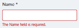
Figure 12.8 – Invalid user input
Client-side validation is automatically done based on the data annotation attributes in the MovieViewModel.Name property. So, you don't need to write any validation code for the standard checks. Users can't submit the form until all the fields are valid.
Client-side validation is just for the user experience. It would be easy to bypass the client-side validation and submit an invalid form to the server (by manipulating or disabling the JavaScript code in the browser's developer tools). So, you should always validate the user input on the server side, which should be done in the OnPostAsync method of the page model class. The following code block shows the common pattern that's used while handling a form post:
public async Task OnPostAsync()
{
if (ModelState.IsValid)
{
//TODO: Create a new movie
}
else
{
Alerts.Danger("Please correct the form fields!");
}
}
ModelState.IsValid returns false if any form field is invalid. This is a standard feature of ASP.NET Core. You should always process the input in such an if statement. Optionally, you can have logic in the else statement. In this example, I used ABP's Alerts feature to show a client-side alert message to the user. The following screenshot shows the result of submitting the invalid form:
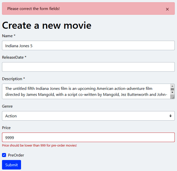
Figure 12.9 – Invalid form result from the server
If you look at the validation error message under the Price field, you will see a custom error message. I've implemented the IValidatableObject interface for the MovieViewModel class, as shown in the following code block:
public class MovieViewModel : IValidatableObject
{
// ... properties omitted
public IEnumerable<ValidationResult> Validate(
ValidationContext validationContext)
{
if (PreOrder && Price > 999)
{
yield return new ValidationResult(
"Price should be lower than 999 for
pre-order movies!",
new[] { nameof(Price) }
);
}
}
}
I'm performing complex custom validation logic in the Validate method. You can refer to the Validating user inputs section in Chapter 7, Exploring Cross-Cutting Concerns, to learn more about server-side validation. Here, we should understand that we can use custom logic on the server and show validation messages on the client side.
In the next section, we will learn how to localize validation errors, as well as form labels.
Localizing forms
ABP Framework automatically localizes the validation error messages based on the current language. Try to switch to another language and submit the form without providing a movie name. The following screenshot shows this for the Turkish language:

Figure 12.10 – Auto-localized validation error messages
The error text has changed. However, you can still see Name as the field name because that's our custom field name, and we haven't localized it yet.
ABP provides a convention-based localization system for the form fields. You just define a localization entry in your localization JSON file with the key formatted as DisplayName:<property-name>. I can add the following lines to the en.json file (in the Domain.Shared project) to localize all the fields of the movie creation form:
"DisplayName:Name": "Name",
"DisplayName:ReleaseDate": "Release date",
«DisplayName:Description»: «Description»,
«DisplayName:Genre»: «Genre»,
"DisplayName:Price": "Price",
"DisplayName:PreOrder": "Pre-order"
Then, I can localize these in the Turkish language with the following entries in the tr.json file:
"DisplayName:Name": "İsim",
"DisplayName:ReleaseDate": "Yayınlanma tarihi",
"DisplayName:Description": "Açıklama",
"DisplayName:Genre": "Tür",
"DisplayName:Price": "Ücret",
"DisplayName:PreOrder": "Ön sipariş"
Now, we have a localized label and a more localized validation error message:
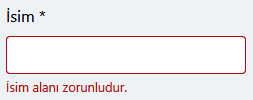
Figure 12.11 – Fully localized validation error message and the field label
Adding the DisplayName: prefix to the property name is a suggested convention for the form fields, but actually, it is not required. If ABP can't find the DisplayName:Price entry, it will search an entry with the Price key, without any prefix. If you want to specify the localization key for a property, you can add the [DisplayName] attribute on top of the property, as shown in the following example:
[DisplayName("MoviePrice")]
public float? Price { get; set; }
With this setup, ABP will try to localize the field name using the "MoviePrice" key.
The abp-select tag localizes the items in the dropdown for enum types by conventions. You can add entries to your localization file, such as <enum-type>.<enum-member>. For the Action member of the Genre enum type, we can add a localization entry with the Genre.Action key. It falls back to the Action key if the Genre.Action key is not found.
In the next section, we will discuss how to convert a standard form into a fully AJAX form.
Implementing AJAX forms
When the user submits a standard form, a full-page post is performed and the server re-renders the entire page. An alternative approach could be posting the form as an AJAX request and handling the response in JavaScript code. This approach is much faster than the regular post request since the browser doesn't need to reload the whole page and all the resources of the page. It is also a better user experience in many cases since you can show some animations on the waiting time. Also, in this way, you don't lose the page's state and can perform smart actions in your JavaScript code.
You can handle all the AJAX stuff manually, but ABP Framework provides built-in ways for such common patterns. You can add the data-ajaxForm="true" attribute to any form element (including the abp-dynamic-form element) to make it posted through an AJAX request.
The following example adds the AJAX feature to abp-dynamic-form:
<abp-dynamic-form abp-model="Movie"
submit-button="true"
data-ajaxForm="true"
id="MovieForm" />
When we convert a form into an AJAX form, the post handler on the server side should be implemented properly. The following code block shows a common pattern to implement the post handler:
public async Task<IActionResult> OnPostAsync()
{
ValidateModel();
//TODO: Create a new movie
return NoContent();
}
The first line validates the user input and throws AbpValidationException if the input model is not valid. The ValidateModel method comes from the base AbpPageModel class. If you don't want to use it, you can check if (ModelState.IsValid) and take any action you need. If the form is valid, you normally save the new movie to a database. Finally, you can return the resulting data to the client. We don't need to return a response for this example, so a NoContent result is fine.
When you convert a form into an AJAX form, you typically want to take action when the form is successfully submitted. The following example handles the abp-ajax-success event of the form:
$(function (){
$('#MovieForm').on('abp-ajax-success', function(){
$('#MovieForm').slideUp();
abp.message.success('Successfully saved, thanks
:)');
});
});
In this example, I registered a callback function for the abp-ajax-success event of the form. In this callback, you can do anything you need. For example, I used the slideUp JQuery function to hide the form, then used ABP's success UI message. We will return to the abp.message API in the Using the JavaScript API section of this chapter.
Exception handling logic is different for AJAX requests. ABP handles all exceptions, returns a proper JSON response to the client, and then automatically handles the error on the client side. For example, suppose the form has a validation error that's been determined on the server side. In this case, the server returns a validation error message, and the client shows a message box, as shown in the following screenshot:

Figure 12.12 – Server-side validation errors on the AJAX form submit
The message box is shown in any exception, including your custom exceptions and UserFriendlyException. Go to the Exception handling section of Chapter 7, Exploring Cross-Cutting Concerns, to learn more about the exception handling system.
In addition to converting the form into an AJAX form and handling exceptions, ABP also prevents double-clicking on the Submit button to prevent multiple posts. The Submit button becomes busy, and the button's text changes to Processing… until the request is completed. You can set the data-busy-text attribute on the Submit button to use another piece of text.
In the next section, we will learn how ABP Framework helps us while working with modal dialogs.
Working with modals
A modal is one of the essential components when you want to create interactive user interfaces. It provides a convenient way to get a response from the user or show some information without changing the current page layout.
Bootstrap has a modal component, but it requires some boilerplate code. ABP Framework provides the abp-modal tag helper to render a modal component, which simplifies the modal's usage in most use cases. Another problem with modals is placing the modal code inside the page that opens the modal, which makes the modal hard to reuse. ABP provides a modal API on the JavaScript side to dynamically load and control these modals. It also works well with forms inside modals. Let's begin with the simplest usage.
Understanding the basics of modals
ABP suggests defining modals as separate Razor Pages (or views if you are using the MVC pattern). So, as the first step, we should create a new Razor Page. Let's assume that we've created a new Razor Page called MySimpleModal.cshtml under the Pages folder. The code-behind file is simple:
public class MySimpleModalModel : AbpPageModel
{
public string Message { get; set; }
public void OnGet()
{
Message = "Hello modals!";
}
}
We just have a Message property being shown inside the modal dialog. Let's see the view side:
@page
@model MvcDemo.Web.Pages.MySimpleModalModel
@{
Layout = null;
}
<abp-modal>
<abp-modal-header title="My header"></abp-modal-header>
<abp-modal-body>
@Model.Message
</abp-modal-body>
<abp-modal-footer buttons="Close"></abp-modal-footer>
</abp-modal>
The Layout = null statement is critical here. Because this page is loaded with an AJAX request, the result should only contain the modal's content, not the standard layout. abp-modal is the main tag helper that renders the HTML of the modal dialog. abp-modal-header, abp-modal-body, and abp-modal-footer are the main parts of the modal and have different options. The modal body is very simple in this example; it just shows Message on the model.
We've created the modal, but we should create a way to open it. ABP provides the ModalManager API on the JavaScript side to control a modal. Here, we need to create a ModalManager object on the page where we want to open the modal:
var simpleModal = new abp.ModalManager({
viewUrl: '/MySimpleModal'
});
abp.ModalManager has a few options, but the most basic is viewUrl, which indicates the URL where the modal content will be loaded. Once we have a ModalManager instance, we can call its open method to open the modal:
$(function (){
$('#Button1').click(function (){
simpleModal.open();
});
});
This example assumes there is a button with an ID of Button1 on the page. We are opening the modal when the user clicks the button. The following screenshot shows the opened modal:
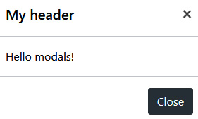
Figure 12.13 – A simple modal dialog box
Typically, we create dynamic content in a modal, so we need to pass some arguments while opening the modal dialog box. To do this, you can pass an object to the open method that contains the modal arguments, as shown in the following example:
simpleModal.open({
productId: 42
});
Here, we passed a productId argument to the modal, so it may show details of the given product. You can add the same argument to the OnGet method of the MySimpleModalModel class to obtain the value and process inside the method:
public void OnGet(int productId)
{
...
}
You can get the product information from the database and render the product details in the modal body.
In the next section, we will learn how to place a form inside a modal to get data from the user.
Working with forms inside modals
Modals are widely used to show a form to users. ABP's ModalManager API gracefully handles some common tasks for you:
- It focuses on the first input of the form.
- It triggers a validation check when you press the Enter key or click the Save button. It doesn't allow you to submit the form unless the form is fully valid.
- It submits the form via an AJAX request, disables the modal buttons, and shows a progressing icon until the save operation is complete.
- If you've entered some data and click the Cancel button or close the modal, it warns you about unsaved changes.
Let's assume that we want to show a modal dialog to create a new movie and we've created a new Razor Page called ModalWithForm.cshtml. The code-behind file is similar to what we had in the Implementing AJAX forms section:
public class ModalWithForm : AbpPageModel
{
[BindProperty]
public MovieViewModel Movie { get; set; }
public void OnGet()
{
Movie = new MovieViewModel();
}
public async Task<IActionResult> OnPostAsync()
{
ValidateModel();
//TODO: Create a new movie
return NoContent();
}
}
The OnPostAsync method validates the user input first. If the form is not valid, an exception is thrown and handled by ABP Framework on the server side and the client side. You can return a response to the client, but we are returning a NoContent response in this example.
The view side of the modal is a bit different since we mix a form with a modal:
@page
@using Volo.Abp.AspNetCore.Mvc.UI.Bootstrap.TagHelpers.Modal
@model MvcDemo.Web.Pages.ModalWithForm
@{
Layout = null;
}
<form method="post" asp-page="/ModalWithForm">
<abp-modal>
<abp-modal-header title="Create new movie">
</abp-modal-header>
<abp-modal-body>
<abp-input asp-for="Movie.Name" />
<abp-select asp-for="Movie.Genre" />
<abp-input asp-for="Movie.Description" />
<abp-input asp-for="Movie.Price" />
<abp-input asp-for="Movie.ReleaseDate" />
<abp-input asp-for="Movie.PreOrder" />
</abp-modal-body>
<abp-modal-footer buttons="@(
AbpModalButtons.Cancel|AbpModalButtons.Save)">
</abp-modal-footer>
</abp-modal>
</form>
The abp-modal tag is wrapped by a form element. We don't put the form tag inside the abp-modal-body element because the Save button (which submits the form) in the modal footer should be inside form. So, as a solution, we are placing form as the topmost element in this view. The rest of the code block should be familiar; we use ABP input tag helpers to render the form elements.
Now, we can open the modal in our JavaScript code:
var newMovieModal = new abp.ModalManager({
viewUrl: '/ModalWithForm'
});
$(function (){
$('#Button2').click(function (){
newMovieModal.open();
});
});
The opened dialog is shown in the following screenshot:

Figure 12.14 – A form inside a modal
It is also possible to use the abp-dynamic-form tag helper within a modal. We could rewrite the modal's view like so:
<abp-dynamic-form abp-model="Movie"
asp-page="ModalWithForm">
<abp-modal>
<abp-modal-header title="Create new movie!">
</abp-modal-header>
<abp-modal-body>
<abp-form-content/>
</abp-modal-body>
<abp-modal-footer buttons="@(
AbpModalButtons.Cancel|AbpModalButtons.Save)">
</abp-modal-footer>
</abp-modal>
</abp-dynamic-form>
Here, I wrapped abp-modal with an abp-dynamic-form element, just like in the previous section. The main point of this example is that I used the <abp-form-content/> tag helper in the abp-modal-body element. abp-form-content is an optional tag helper that is used to place the form inputs of the abp-dynamic-form tag helper in the desired place.
You typically want to take action once the modal form has been saved. For this, you can register a callback function to the onResult event of ModalManager, as shown in the following code block:
newMovieModal.onResult(function (e, data){
console.log(data.responseText);
});
data.responseText will be the data if the server sends any result. For example, you can return a Content response from the OnPostAsync method, as shown in the following example:
public async Task<IActionResult> OnPostAsync()
{
...
return Content("42");
}
ABP simplifies all these common tasks. Otherwise, you would write a lot of boilerplate code.
In the next section, we will learn how to add client-side logic to our modal dialogs.
Adding JavaScript for modals
If your modal needs some advanced client-side logic, you may want to write some custom JavaScript code for your modal. You can write your JavaScript code on the page where you open the modal, but that is not very modular and reusable. It is good to write your modal's JavaScript code in a separate file, ideally near the .cshtml file of the modal (remember that ABP allows you to place JavaScript files under the Pages folder).
For this, we can create a new JavaScript file and define a function in the abp.modals namespace, as shown in the following code:
abp.modals.MovieCreation = function () {
this.initModal = function(modalManager, args) {
var $modal = modalManager.getModal();
var preOrderCheckbox =
$modal.find('input[name="Movie.PreOrder"]');
preOrderCheckbox.change(function(){
if (this.checked){
alert('checked pre-order!');
}
});
console.log('initialized the modal...');
}
};
Once we have created such a JavaScript class, we can associate it with the modal while creating the ModalManager instance:
var newMovieModal = new abp.ModalManager({
viewUrl: '/ModalWithForm',
modalClass: 'MovieCreation'
});
ModalManager creates a new instance of the abp.modals.MovieCreation class for every time you open the modal and calls the initModal function if you define it. The initModal function takes two parameters. The first one is the ModalManager instance that's associated with the modal so that you can use its functions. The second parameter is the arguments that you passed to the open function while opening the modal.
The initModal function is a perfect place to prepare the modal's content and register some callbacks to the events of the modal components. In the preceding example, I got the modal instance and a JQuery object, found the Movie.PreOrder checkbox, and registered its change callback so that I'm informed when the user checks it.
This example still doesn't work yet since we haven't added the JavaScript file to the page. There are two ways to add it to the page:
- We can use the abp-script tag to include the modal's JavaScript file in the page where we open the modal.
- We can set up ModalManager so that it lazy loads the JavaScript file.
The first option is straightforward – just include the following line in the page where you want to use the modal:
<abp-script src="/Pages/ModalWithForm.cshtml.js" />
If we want to lazy load the modal's script, we can configure ModalManager like so:
var newMovieModal = new abp.ModalManager({
viewUrl: '/ModalWithForm',
scriptUrl: '/Pages/ModalWithForm.cshtml.js',
modalClass: 'MovieCreation'
});
Here, I added the scriptUrl option as the URL of the modal's JavaScript file. ModalManager lazy loads the JavaScript file the first time you open the modal. The script is not loaded again if you open the modal a second time (without refreshing the whole page).
In this section, we learned how to work with forms, validation, and modals. They are essential parts of a typical web application. In the next section, we will learn about some useful JavaScript APIs that we need in every application.
Using the JavaScript API
In this section, we will explore some useful client-side APIs of ABP Framework. Some of these APIs provide simple ways to use server-side defined features such as authentication and localization, while others provide solutions for common UI patterns, such as message boxes and notifications.
All the client-side JavaScript APIs are global objects and functions that are declared under the abp namespace. Let's begin with accessing the current user's information in your JavaScript code.
Accessing the current user
We are using the ICurrentUser service on the server side to get information about the currently logged-in user. In the JavaScript code, we can use the global abp.currentUser object, as shown here:
var userId = abp.currentUser.id;
var userName = abp.currentUser. userName;
By doing this, we can get the user's ID and username. The following JSON object is an example of the abp.currentUser object:
{
isAuthenticated: true,
id: "813108d7-7108-4ab2-b828-f3c28bbcd8e0",
tenantId: null,
userName: "john",
name: "John",
surName: "Nash",
email: "[email protected]",
emailVerified: true,
phoneNumber: "+901112223342",
phoneNumberVerified: true,
roles: ["moderator","manager"]
}
If the current user has not logged in yet, all these values will be null or false, as you would expect. The abp.currentUser object provides an easy way to get information about the current user. In the next section, we will learn how to check the permissions of the current user.
Checking user permissions
ABP's authorization and permission management system is a powerful way to define permissions and check them at runtime for the current user. Checking these permissions in your JavaScript code is effortless using the abp.auth API.
The following example checks if the current user has the DeleteProduct permission:
if (abp.auth.isGranted('DeleteProduct')) {
// TODO: Delete the product
} else {
abp.message.warn("You don't have permission to delete
products!");
}
abp.auth.isGranted returns true if the current user has given permission or a policy. If the user doesn't have permission, we show a warning message using the ABP message API, which will be explained in the Showing message boxes section later in this chapter.
While these APIs are rarely needed, you can use the abp.auth.policies object when you need to get a list of all the available permissions/policies and the abp.auth.grantedPolicies object if you need to get a list of all the granted permissions/policies for the current user.
Hiding UI Parts Based on Permissions
A typical use case for client-side permission checking is to hide some UI parts (such as action buttons) based on the user's permissions. While the abp.auth API provides a dynamic way to do that, I suggest using the standard IAuthorizationService on your Razor Pages/views to conditionally render the UI elements wherever possible.
Note that checking permissions on the client side is just for the user experience and that it doesn't guarantee security. You should always check the same permission on the server side.
In the next section, we will learn how to check the feature rights of the current tenant in a multi-tenant application.
Checking the tenant features
The feature system is used to restrict application functionalities/features based on the current tenant. We will explore ABP's multi-tenancy infrastructure in Chapter 16, Implementing Multi-Tenancy. However, we will cover checking tenant features here for the ASP.NET Core MVC/Razor Pages UI.
The abp.features API is used to check feature values for the current tenant. Let's assume that we have a feature for importing email lists from Mailchimp (a cloud email marketing platform) and that we've defined a feature named MailchimpImport. We can easily check if the current tenant has that feature enabled:
if (abp.features.isEnabled('MailchimpImport'))
{
// TODO: Import from Mailchimp
}
abp.features.isEnabled only returns true if the given feature's value is true. ABP's feature system allows you to define non-boolean features too. In this case, you can use the abp.features.get(…) function to obtain the given feature's value for the current tenant.
Checking features on the client side makes it easy to perform dynamic client-side logic, but remember to check the features on the server side as well for a secure application.
In the next section, we will continue using the localization system in your JavaScript code.
Localizing strings
One powerful part of ABP's localization system is that you can reuse the same localization strings on the client side. In this way, you don't have to deal with another kind of localization library in your JavaScript code.
The abp.localization API is available in your JavaScript code to help you utilize the localization system. Let's begin with the simplest case:
var str = abp.localization.localize('HelloWorld');
The localize function, with that usage, takes a localization key and returns the localized value based on the current language. It uses the default localization resource. If you need to, you can specify the localization resource as the second parameter:
var str = abp.localization.localize('HelloWorld', 'MyResource');
Here, we've specified MyResource as the localization resource. If you want to localize lots of strings from the same resource, there is a shorter way to do this:
var localizer = abp.localization.getResource('MyResource');
var str = localizer('HelloWorld');
Here, you can use the localizer object to get texts from the same resource.
The JavaScript localization API applies the same fallback logic to the server-side API; it returns the given key if it can't find the localized value.
If the localized string contains placeholders, you can pass the placeholder values as parameters. Let's assume that we have the following entry in the localization JSON file:
"GreetingMessage": "Hello {0}!"
We can pass a parameter to the localizer or abp.localization.localize function, as shown in the following example:
var str = abp.localization.localize('GreetingMessage', 'John');
The resulting str value will be Hello John! for this example. If you have more than one placeholder, you can pass the values to the localizer function in the same order.
Besides the localizing texts, you may need to know the current culture and language so that you can take extra actions. The abp.localization.currentCulture object contains detailed information about the current language and culture. In addition to the current language, the abp.localization.languages value is an array of all the available languages in the current application. Most of the time, you don't directly use these APIs since the theme you're using is responsible for showing a list of languages to the user and allows you to switch between them. However, it is good to know that you can access the language data when you need it.
So far, you've learned how to use some ABP server-side features on the client side. In the next section, you will learn how to show message and confirmation boxes to the user.
Showing message boxes
It is very common to show blocking message boxes to users to inform them about something important happening in the application. In this section, you will learn how to show nice message boxes and confirmation dialogs in your applications.
The abp.message API is used to show a message box to inform the user easily. There are four types of message boxes:
- abp.message.info: Displays an informative message
- abp.message.success: Displays a success message
- abp.message.warn: Displays a warning message
- abp.message.error: Displays an error message
Let's take a look at the following example:
abp.message.success('Your changes have been successfully
saved!', 'Congratulations');
In this example, I've used the success function to display a success message. The first parameter is a message text, while the optional second parameter is a message header. The result of this example is shown in the following screenshot:

Figure 12.15 – A success message box
Message boxes are blocked, which means the page is blocked (non-clickable) until the user clicks the OK button.
Another kind of message box is used for confirmation purposes. The abp.message.confirm function shows some dialog to get a response from the user:
abp.message.confirm('Are you sure to delete this product?')
.then(function(confirmed){
if(confirmed){
// TODO: Delete the product!
}
});
The confirm function returns a promise, so we could chain it with the then callback to execute some code once the user closes the dialog by accepting or canceling it. The following screenshot shows the confirmation dialog that was created for this example:
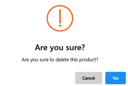
Figure 12.16 – A confirmation dialog
Message boxes are a good way to grab a user's attention. However, there is an alternative way to do this, as we'll see in the next section.
Showing notifications
Notifications are a non-blocking way to inform users of certain events. They are shown on the bottom right corner of the screen and automatically disappear after a few seconds. Just like the message boxes, there are four types of notifications:
- abp.notify.info: Displays an informative notification
- abp.notify.success: Displays a success notification
- abp.notify.warn: Displays a warning notification
- abp.notify.error: Displays an error notification
The following example shows an information notification:
abp.notify.info(
'The product has been successfully deleted.',
'Deleted the Product'
);
The second parameter is the notification title and is optional. The result of this example code is shown in the following screenshot:

Figure 12.17 – A notification message
With the notification API, we are closing the JavaScript APIs.
Here, I covered the most used APIs. However, there are more APIs you can use in your JavaScript code, all of which you can learn about by reading the ABP Framework documentation: https://docs.abp.io/en/abp/latest/UI/AspNetCore/JavaScript-API/Index. In the next section, we will learn how to consume server-side APIs from JavaScript code.
Consuming HTTP APIs
You can use any tool or technique to consume HTTP APIs from your JavaScript code. However, ABP provides the following ways as fully integrated solutions:
- You can use the abp.ajax API as an extension of the jQuery.ajax API.
- You can use dynamic JavaScript client proxies to call server-side APIs, just like you can with JavaScript functions.
- You can generate static JavaScript client proxies at development time.
Let's begin with the first one – the abp.ajax API.
Using the abp.ajax API
The abp.ajax API is a wrapper around the standard jQuery.ajax API. It automatically handles all errors and shows a localized message to the user on an error case. It also adds the anti-forgery token to the HTTP header to satisfy Cross-Site Request Forgery (CSRF) protection on the server side.
The following example uses the abp.ajax API to get a list of users from the server:
abp.ajax({
type: 'GET',
url: '/api/identity/users'
}).then(function(result){
// TODO: process the result
});
In this example, we've specified GET as the request's type. You can specify all the standard options of jQuery.ajax (or $.ajax) to override the defaults. abp.ajax returns a promise object, so we could add the then callback to handle the result that's sent by the server. We can also use the catch callback to handle errors and the always callback to perform an action at the end of the request.
The following example shows how to handle errors manually:
abp.ajax({
type: 'GET',
url: '/api/identity/users',
abpHandleError: false
}).then(function(result){
// TODO: process the result
}).catch(function(){
abp.message.error("request failed :(");
});
Here, I added a catch callback function after the then function. You can perform your error logic here. I also specified the abpHandleError: false option to disable ABP's automatic error handling logic. Otherwise, ABP will handle the error and show an error message to the user.
abp.ajax is a low-level API. You typically use dynamic or static client proxies to consume your own HTTP APIs.
Using dynamic client proxies
You should have already used the dynamic JavaScript client proxy system if you applied the example application from Chapter 3, Step-By-Step Application Development. ABP Framework generates JavaScript functions at runtime to easily consume all the HTTP APIs of your application.
The following code block shows two sample methods of IProductAppService that were defined in Chapter 3, Step-By-Step Application Development:
namespace ProductManagement.Products
{
public interface IProductAppService :
IApplicationService
{
Task CreateAsync(CreateUpdateProductDto input);
Task<ProductDto> GetAsync(Guid id);
}
}
All of these methods are available in the same namespace on the client side. For example, we can get a product by its ID, as shown in the following code block:
productManagement.products.product
.get('1b8517c8-2c08-5016-bca8-39fef5c4f817')
.then(function (result) {
console.log(result);
});
productManagement.products is the camel case equivalent of the ProductManagement.Products namespace of the C# code. product is the conventional name of IProductAppService. The I prefix and the AppService suffix have been removed, and the remaining name is converted into camel case. Then, we can use the method name that's been converted in camel case without the Async suffix. So, the GetAsync method is used as the get function in the JavaScript code. The get function takes the same parameters that the C# method takes. It returns a Deferred object so that we can chain it with the then, catch, or always callbacks, similar to what can do for the abp.ajax API. It internally uses the abp.ajax API. In this example, the result argument of the then function is the ProductDto object that's sent by the server.
Other methods are used in a similar way. For example, we can create a new product with the following code:
productManagement.products.product.create({
categoryId: '5f568193-91b2-17de-21f3-39fef5c4f808',
name: 'My product',
price: 42,
isFreeCargo: true,
releaseDate: '2023-05-24',
stockState: 'PreOrder'
});
Here, we pass the CreateUpdateProductDto object with the JSON object format.
In some cases, we may need to pass additional AJAX options for the HTTP API calls. You can pass an object as the last parameter to every proxy function:
productManagement.products.product.create({
categoryId: '5f568193-91b2-17de-21f3-39fef5c4f808',
name: 'My product',
//...other values
}, {
url: 'https://localhost:21322/api/my-custom-url'
headers: {
'MyHeader': 'MyValue'
}
});
Here, I passed an object to change the URL and add a custom header to the request. You can refer to jQuery's documentation (https://api.jquery.com/jquery.ajax/) for all the available options.
Dynamic JavaScript client proxy functions are generated at runtime by the /Abp/ServiceProxyScript endpoint of your application. This URL is added to the layout by the themes so that you can directly use any proxy function in your pages without importing any script.
In the next section, you will learn about an alternative way to consume your HTTP APIs.
Using static client proxies
Unlike dynamic client proxies, which are generated at runtime, static proxies are generated at development time. We can use the ABP CLI to generate the proxy script file.
First, we need to run the application that serves the HTTP APIs because the API endpoint data is requested from the server. Then, we can use the generate-proxy command, as shown in the following example:
abp generate-proxy -t js -u https://localhost:44349
The generate-proxy command can take the following parameters:
- -t (required): The type of the proxy. We use js for JavaScript here.
- -u (required): The root URL of the API endpoint.
- -m (optional): The module name to generate the proxy for. The default value is app and is used to generate proxies for your application. In a modular application, you can specify the module name here.
Static JavaScript proxies are generated under the wwwroot/client-proxies folder, as shown in the following screenshot:

Figure 12.18 – The static JavaScript proxy file
Then, you can import the proxy script file into any page and use the static proxy functions like you would the dynamic ones.
When you use static proxies, you don't need dynamic proxies. By default, ABP creates dynamic proxies for your application. You can configure DynamicJavaScriptProxyOptions to disable it for the application, as shown in the following example:
Configure<DynamicJavaScriptProxyOptions>(options => {
options.EnabledModules.Remove("app");
});
The EnabledModules list contains app by default. If you are building a modular application and want to enable dynamic JavaScript proxies for your module, you need to add it to the EnabledModules list explicitly.
Summary
In this chapter, we covered the fundamental design points and the essential features of the MVC/Razor Pages UI of ABP Framework.
The theming system allows you to build theme/style independent modules and applications and easily switch between UI themes. It makes this possible by defining a set of base libraries and standard layouts.
You then learned about the bundling and minification system, which covers the entire development cycle of importing and using client-side dependencies in your applications and optimizing resource usage in a production environment.
ABP makes it easy to create forms and implement validation and localization using tag helpers and predefined conventions. You also learned how to convert a standard form into an AJAX-submitted form.
We've also covered some JavaScript APIs that can utilize ABP features on the client side, such as authorization and localization, and easily show nice-looking message boxes and notifications.
Finally, you learned about alternative ways to consume HTTP APIs from your JavaScript code.
In the next chapter, you will learn about the Blazor UI for ABP Framework to build interactive web UIs using C# instead of JavaScript.