Chapter 6: Creating User Interfaces for All Devices
In this chapter, we will learn everything about graphical user interfaces (GUIs). We will learn about the different types of GUIs, what makes them different, and what they are generally used for. Besides this, we will learn how to properly build GUIs and scale them for all devices on Roblox. Then, we will learn how to use the emulator built into Roblox Studio to test the user interface (UI) of our game on different devices with different resolutions. Finally, we will also learn about the small things we need to keep in mind when creating our GUIs, such as color blindness and the navigation of our GUIs.
The following topics will be covered in this chapter:
- Creating GUIs
- Testing GUIs
- Small UI improvements
- Exercise 6.1—Creating a shop GUI
By the end of this chapter, you will know how to properly build GUIs for your game that scale on multiple devices. In addition, you will learn about all of the major GUI elements that Roblox has to offer. Besides this, you will know how to test your GUI using the emulator. Finally, you will learn tips that help you take your GUIs to the next level.
Technical requirements
To start programming with Luau, you need access to a device with internet access. This can either be a Windows or a Mac device.
You need to download the following software:
- Roblox Player
- Roblox Studio
All the code examples for this chapter can be found on GitHub at https://github.com/PacktPublishing/Mastering-Roblox-Coding.
The CiA video for this chapter can be found at https://bit.ly/3OygUlv.
Creating GUIs
In this section, we will learn all the cool things about making GUIs. In Chapter 4, Securing Your Game, we already introduced GUIs when we made the team changer. However, we did not make the GUI ourselves back then. So, in this section, we will learn how to make UIs ourselves.
UIs are something we, as players, can interact with. Because players can directly interact with GUIs, this means they are on the client. This is important to remember. Many beginner programmers try to use normal scripts to control aspects of the UI. The worst part is that they somehow manage to get it working. This is an extremely bad practice and should never be done or attempted.
There are multiple types of GUIs. In Chapter 4, Securing Your Game, we saw the usage of ScreenGuis. However, there are two more that we will cover throughout this chapter. Besides ScreenGuis, we will also learn about SurfaceGuis and BillboardGuis. In the next subsection, we will start by looking deeper into ScreenGuis.
Using ScreenGuis
Before we can look at what a ScreenGui is, we need to look at the service we use for GUIs. This service is called StarterGui. This is the service in which we will make all of our ScreenGuis. We previously learned that GUIs are on the client, so why would all the GUIs be in the same location as the StarterGui?
Well, the ScreenGuis we see as players are not the ones in the StarterGui. When we create a ScreenGui inside the StarterGui and run the game, we see that the ScreenGui is still in the StarterGui. While it is true that the ScreenGui is still in the StarterGui, it got cloned to another location. So, inside the Players service, open your Player instance and look for PlayerGui. Inside the PlayerGui, you will see the ScreenGui we just made, plus a few default ScreenGuis that Roblox inserted. The ScreenGui that was cloned to the PlayerGui is the one we see as players.
Now that we know the behavior of the StarterGui, let us look at what ScreenGuis are. Well, they are not something super complex. Remember how we stored parts from the Workspace into a Model? You could compare ScreenGuis to a Model. ScreenGuis hold different GUI elements. These GUI elements can be various instances such as buttons, text, or images. The ScreenGui itself does not show anything. It needs to get these GUI elements to start showing something.
Now that we know how the StarterGui works and what ScreenGuis are, let us look at all the different GUI elements out there. In the next section, we will look at the most basic GUI element: a Frame.
Frame GUI element
Let us insert a new Frame into our previously made ScreenGui and see what it does. If we hover over the ScreenGui, we will see a + icon appear next to it, as seen in the following screenshot. If we click on this icon, a menu opens. Look for something called Frame in this menu and click on it:

Figure 6.1 – Inserting a new Frame
Once we insert our Frame, we will see a white box with the size of 100x100 pixels appear in the top-left corner. This is our Frame. If we open the Properties window, we will see that this Frame has a lot of properties. One of the properties is BackgroundColor3. This property allows us to change the color of our Frame. The data type of this property is the Color3 data type; we have previously used this data type in Chapter 3, Event-Based Programming.
If we change the color of our Frame, we see that there is a black outline around our Frame that does not change color. This is your border pixel. You can change the color of this by changing the BorderColor3 property. Most developers do not like this border. Thankfully, we can get rid of this border by changing the BorderSizePixel value to 0. When we do this, the border’s size will be 0 pixels, making it invisible.
We now know what a Frame is and how to create one inside the ScreenGui. Besides this, we also learned how to change the color of our Frame and what the Border Pixel is. While this is cool, it is way cooler to change the Size or Position properties of our Frame. The following section will look into the UDim2 data type used to size and position frames.
UDim2 data type
If we want to change either the Position or Size values of the Frame, we need to change the designated property on the Frame for this. For instance, to change the size of the Frame, we have to change the Size property. While this makes sense, there are some odd numbers inside this property’s value. The default size of our Frame looks like this: {0, 100}, {0, 100}. But what does this even mean?
The value inside of the Size property is how a UDim2 data type is structured. The UDim2 data type is what we use when working with GUIs. If we look at the size, we see two numbers surrounded by braces. Then, we see a comma and another two numbers surrounded by braces. This is because a UDim2 data type actually consists of two UDim data types. For example, a UDim data type could look like this: {0, 100}.
Now, we know that a UDim2 data type is a combination of two UDim data types. However, we still do not know what both numbers mean. If we look at the Size or Position properties using the Properties window, we can get the answer to this question. Let us take a look at the following screenshot:
Figure 6.2 – UDim2 displayed on the Size property in the Properties frame
If we open the Size property in the Properties window, we see X and Y appear. Those are the names of both UDim data types. Once again, the Size property is a UDim2 data type, while both X and Y are UDim data types. If we open the X or Y UDim data types, we see that the first number is the Scale value, and the second number is the Offset value.
Most beginner developers do not understand the difference between Scale and Offset. This results in weird GUIs. Here is a definition and an example use case for both properties:
- Scale is deployed to use a percentage of the player’s screen. The Scale property is a value between 0 and 1. For example, when changing the Size property, the value of 0.5 would be half the screen.
- Offset is used to use a certain amount of pixels. The size or position will be the same for every player, even if their screen size is not the same. Therefore, misusing the Offset property could result in very odd GUIs.
But why do we have two Scale and Offset properties? They are both in the X and Y UDim data types. As the name gives away, the X UDim data type determines the x axis of the screen, which is horizontal. Knowing this, we can guess what the Y UDim data type means. The Y UDim data type is the y axis, which is vertical. If we were to write the full UDim2 data type in text, it would look like this: {x-axis scale, x-axis offset}, {y-axis scale, y-axis offset}.
Still, these properties might seem to be a bit confusing. Let us experiment with them a bit. Give your frame the following Size value: {0, 500},{0, 500}. This is a vast square. The size of the square is 500x500 pixels. But what if we make our screen smaller? Make sure Roblox Studio is not in fullscreen mode and try to resize the Roblox Studio window. The square stays the same size, no matter how small we make the Roblox Studio window, as seen in the following screenshot:

Figure 6.3 – Effect of Offset on a Frame
As we can see in Figure 6.3, the Frame stays the same size, no matter what. This is the effect that Offset has. Now, let us compare this to the Scale property. When we change the size of our Frame to {0.5, 0},{0.5, 0}, we will see that the Frame will always be half of the width and height of the screen. It will always stay in these proportions, no matter how small we make Roblox Studio. Let us take a look at the following screenshot:
Figure 6.4 – Effect of Scale on a Frame
In Figure 6.4, the left Frame has an AbsoluteSize value of 479x316 pixels. This is precisely half of the screen. However, if we make Roblox Studio smaller, the Frame stays half of the screen, resulting in the AbsoluteSize value of the Frame changing to 254x316 pixels.
We now know about the UDim2 and UDim data types. Besides this, we learned what the difference is between Scale and Offset. In the next section, we will learn how to position frames and how to use the AnchorPoint property.
AnchorPoint property
We want to position our Frame in the center of our screen. First, we need a Frame. We will give this frame a size of {0.25, 0},{0.25, 0}. Now, we can center the Frame. Our screen might be 1920x1080 pixels, the default for a high-definition (HD) monitor. If we want the center, we divide both numbers by two. Yes—this will get us the center pixel of our screen. Once again, not everyone has the same screen. Instead of using Offset, we have to use Scale. Scale will always put our Frame in the center, no matter what screen someone has.
If we want to use Scale, the center of the screen would be {0.5, 0},{0.5, 0}. Notice how the Frame is not centered once we put the previously given UDim2 data type as the Position type of our Frame? However, the top-left part of the Frame is exactly in the center. Rather than having the top-left part centered, we want to center the entire Frame. We can do some math for this.
We know that the position of the Frame is measured from the top-left part of the Frame. If we want to position it in the middle of our screen, we have to take the current position and subtract half of the size. This would mean that the new position of the Frame is {0.375, 0},{0.375, 0}. This is true because 0.5 – ( 0.25 / 2 ) equals 0.375. If we change the Frame’s position to this new position, we see that the Frame is now centered.
Doing this math yourself is very inefficient. If we were to change the size of our Frame, we would have to reposition it again. In Chapter 5, Optimizing Your Game, we learned about Pivots on Parts. We have something similar for GUI elements. For GUI elements, the Pivot is called the AnchorPoint. The AnchorPoint of a GUI element is in the top-left corner by default. This means that the AnchorPoint is {0, 0}. The AnchorPoint property has a Vector2 data type. A Vector2 data type has two numbers, X and Y. For AnchorPoints, both numbers need to have a value between 0 and 1. If both numbers are 0, the AnchorPoint is in the top-left corner. However, if we change both numbers to 1, the AnchorPoint is in the bottom-right corner. This means that if we set the AnchorPoint to {0.5, 0.5} we can easily position our Frame in the center. Now, we can change our position back to {0.5, 0},{0.5, 0}. We can now easily center our Frame without updating the Position value whenever we resize the Frame.
We now know how to position Frames by using AnchorPoints. We previously also learned how to size Frames using the UDim2 data type. In the next section, we will move on to the next GUI element: TextLabels.
TextLabel GUI element
As the name implies, a TextLabel allows us to display text in our game. Generally, a TextLabel is a child of a Frame. If we insert a TextLabel into our Frame and look at the Properties window, we will see that there are once again a lot of properties. We have already seen some of these properties on the Frame GUI element. However, some are unique to TextLabels. Some of these similar properties include AnchorPoint, Size, Position, BackgroundColor, and many more.
As previously mentioned, there are also new properties. Let us take a look at those. One of the new properties is called Text. As the name of this property implies, the value we give will be the text displayed on our TextLabel. There is another property called Font that allows us to change what our text looks like. It is also handy to know that we can change the size of the text by adjusting the TextSize property. Besides this, we also have a property called RichText. If we enable RichText, we can use select Hypertext Markup Language (HTML) tags in our Text property. For instance, if we want to make a particular word or phrase bold, we can change our Text property to this: This is <b>bold</b>.
There is another fascinating property called TextScaled. This property overrides the TextSize property and makes the text as big as possible. If the text does not fit inside the size of your TextLabel, the text will be automatically scaled down.
We now know what a TextLabel is. Besides this, we have learned about a few of its properties: Text, TextSize, RichText, and TextScaled. In the next section, we will learn how to gain more control over the TextScaled property.
UITextSizeConstraint
We previously learned that the TextScaled property overrides the TextSize property. Unfortunately, this means that we are no longer in control of our text’s size. After all, this is what needs to happen if we want to scale the text size automatically. Nevertheless, we might want to have some control over the text size. We can take some of this control back by adding a UITextSizeConstraint inside the TextLabel.
We see two exciting properties once we add a UITextSizeConstraint and view it with the Properties window—first, the MinTextSize property, which allows us to set a minimum size for our text. This property works even if we have the TextScaled property turned on. The other property is MaxTextSize, which does the exact opposite of the MinTextSize property: it allows us to set a maximum text size.
As mentioned, the UITextSizeConstraint works even if we use TextScaled, so inserting this constraint gives us back some control over the text size. In the next section, we will look at the next GUI element: TextBox.
TextBox GUI element
TextBox elements allow players of our game to insert text. Once they have done that, we can read what they have inserted and do something with it. We see TextBox elements everywhere. When you type a message in a chat, you use a TextBox. In Chapter 4, Securing Your Game, we saw a TextBox when we learned how to filter text. Back then, we waited for users to insert something to filter it. Let us take a look at how to read data from a TextBox, as follows:
local textBox = ...
function textboxChanged()
print(textBox.Text)
end
textBox.FocusLost:Connect(textboxChanged)
Let us take a look at the preceding code snippet. At the top of the local script, we have a variable named textBox. This variable will have a relative reference to your TextBox, depending on where you place your TextBox in your GUI. At the bottom of the script, we listen to the .FocusLost event. If someone is typing in the TextBox, there is a focus on this TextBox. However, once the player is done typing in the TextBox, they lose focus. When the player is done typing, the .FocusLost event gets fired. Once it is fired, we start the textboxChanged() function. This function simply prints the .Text property of the TextBox, and therefore, it prints what we have typed.
Besides this, there is an exciting property worth mentioning. This property is called PlaceholderText. This property allows us to display text when the Text property is empty. The power of this property is to assist players when there is no given input. For instance, if we make a custom chat GUI, we have a TextBox where players can enter their messages. We can use the PlaceholderText property and set its value to display something like this: Enter your message here.
We could use the Text property to display this message as well. However, the downside of this is that the player can simply send the message, and they would say Enter your message here, while if we used the PlaceholderText property, the Text property would be empty. When using the PlaceholderText property, we can check whether the length of the Text property is greater than zero characters to prevent players from sending a message zero characters while still showing an assisting message.
We now know how the TextBox GUI element works. We learned how to read data inserted by players into the TextBox. In addition, we have seen how the .FocusLost event works. Besides that, we also learned about the PlaceholderText property that allows us to make our GUI more navigable for our game players. In the next section, we will look at the ZIndex property on most GUI elements.
ZIndex property
If you have experimented with GUIs yourself, you might have seen the ZIndex property on a few GUI elements. Maybe you tried to change the number yourself to see what it did. Maybe it did something for you, or maybe it did not. This section will cover what this property does and when we should use it.
Previously, we saw the UDim2 data type that allowed us to change the x and y axis of our GUI elements. A GUI is two-dimensional (2D), as the screens we play on are flat. However, we do have multiple GUI elements that might overlap. The ZIndex property allows us to determine which GUI element should be displayed on top of other GUI elements. The higher the ZIndex value, the more priority a particular GUI element has.
Still, it is a bit more complex than that. For example, on ScreenGuis, there is a property called ZIndexBehavior. This property can have one of two values. To explain the difference between both options, we will use the GUI structure shown in the following screenshot:
Figure 6.5 – GUI structure
By default, the TextBox is displayed on top of the Frame. However, we can change this as well. The only requirement is that our ScreenGui has their ZIndexBehavior property set to Global. Then, we can change the ZIndex value of the Frame to 2, while keeping the ZIndex value for the TextBox at 1. This works because Global ZIndexBehavior does not care if the TextBox is a child of the Frame, whereas the other ZIndexBehavior option, Sibling, does keep this in mind. No matter what we set our Frame’s ZIndex property to, the TextBox will always be on top of the Frame when using the Sibling behavior.
If we have randomly overlapping GUI elements, we know that we need to change their ZIndex value. We learned what ZIndexes are, and we also learned there are two values for the ZIndexBehaviors property: : Global and Sibling. In the next section, we will look at the TextButton GUI element.
TextButton GUI element
Buttons are crucial. We want to register when a user wants to perform a certain action. Roblox has a GUI element called TextButton, which is basically a button and a TextLabel in one. The TextButton element has events such as .MouseButton1Down, .MouseButton1Click, .MouseButton1Up, and .MouseEnter, while also having properties that a TextLabel element has, such as Text and Font.
To play around with TextButton elements, we will create a simple Give Feedback GUI that uses buttons to change what the GUI does. Before we can do this, we will make the GUI ourselves. Follow these steps to make the GUI yourself:
- In the StarterGui, create a new ScreenGui.
- Inside the ScreenGui, create a Frame and name it GivingFeedback. Set the following properties for this Frame:
- AnchorPoint: {0.5, 0.5}
- Position: {0.5, 0},{0.5, 0}
- Size: {0.35, 50},{0.3, 25}
- BorderSizePixel: 0
- BackgroundColor3: Pick a color you like.
- Inside the GivingFeedback Frame, insert a TextLabel with the following properties:
- BorderSizePixel: 0
- Position: {0, 0},{0, 5}
- Size: {1, 0},{0.2, -5}
- Font: Choose a font you like.
- Text: Feedback
- TextScaled: True
- Besides a TextLabel, insert a TextBox into the GivingFeedback Frame with the following properties:
- AnchorPoint: {0.5, 0.5}
- BorderSizePixel: 3
- Position: {0.5, 0},{0.5, 0}
- Size: {0.8, 0},{0.4, 0}
- PlaceholderText: [ Please enter your feedback here ]
- TextTruncate: AtEnd
- TextWrapped: true
- TextYAlignment: Top
- Inside the GivingFeedback frame, insert a TextButton with the following properties:
- AnchorPoint: {0.5, 1}
- Name: SubmitFeedback
- Position: {0.5, 0},{1, -5}
- Size: {0.5, 0},{0.2, -5}
- Font: Pick a font you like.
- Text: Submit Feedback
- TextScaled: true

Figure 6.6 – An example GivingFeedback GUI
Congratulations! We have now made our first GUI Frame from scratch. An example solution is shown in Figure 6.6. However, feel free to change what your Frame looks like as you wish. However, ensure that the naming of GUI elements and the structure to which GUI elements are parented does not change.
As mentioned, we now have our feedback Frame. Well done! If users want to submit their feedback, it might be nice to see a Frame that says their feedback has been registered. Let us make this Frame as well.
First, change the Visible property on the GivingFeedback frame to false. This way, we can easily make our second Frame without having overlapping Frame. Once you have done this, follow these steps to make our second Frame:
- Inside the previously made ScreenGui, create a new Frame and name it FeedbackReceived. Set the following properties for this Frame:
- AnchorPoint: {0.5, 0.5}
- Position: {0.5, 0},{0.5, 0}
- Size: {0.2, 50},{0.2, 25}
- BackgroundColor3: Pick a color you like.
- Copy the TextLabel we made in the GivingFeedback Frame, and insert it into the FeedbackReceived Frame. You do not have to change its properties.
- Create a new TextLabel inside the FeedbackReceived Frame with the following properties:
- AnchorPoint: {0.5, 0.5}
- Position: {0.5, 0},{0.5, 0}
- Size: {0.8, 0},{0.5, 0}
- Font: Pick a font you like.
- Text: Thank you for your feedback. Your input has been recorded.
- TextScaled: true
- Finally, we will create an additional TextButton inside the FeedbackReceived Frame. We will call this button Back. Give the Back button the following properties:
- AnchorPoint: {0.5, 1}
- Position: {0.5, 0},{1, -5}
- Size: {0.5, 0},{0.2, -5}
- Font: Pick a font you like.
- Text: Back
- TextScaled: true

Figure 6.7 – FeedbackReceived GUI
Congratulations! We have now created our second Frame. An example solution is shown in Figure 6.7. Once again, feel free to change them to your liking, as long as you do not change the structure or naming. Obviously, these Frames do not do anything when we interact with them. If we want our Frames to change once feedback has been given, we will need to script this. Inside the ScreenGui, create a LocalScript. Now, let us look at the following code:
local screenGui = script.Parent
local givingFeedback = screenGui:WaitForChild("GivingFeedback")local feedbackReceived = screenGui:WaitForChild("FeedbackReceived")function setup()
givingFeedback.Visible = true
feedbackReceived.Visible = false
end
function submitFeedback()
-- Getting the user input
local textbox = givingFeedback:WaitForChild("TextBox")local input = textbox.Text
-- Checking if the user has provided feedback
if string.len(input) >= 3 then
-- Showing feedback recorded frame
givingFeedback.Visible = false
feedbackReceived.Visible = true
-- Resetting feedback textbox
textbox.Text = ""
else
warn("Cannot submit feedback less than 3 characters!")
end
end
function submitMoreFeedback()
givingFeedback.Visible = true
feedbackReceived.Visible = false
end
setup()
givingFeedback:WaitForChild("SubmitFeedback").MouseButton1Click:Connect(submitFeedback)feedbackReceived:WaitForChild("Back").MouseButton1Click:Connect(submitMoreFeedback)Let us take a look at the preceding local script. The setup() function simply changes the visibility of both Frames to ensure that only the GivingFeedback Frame is visible. Only having this Frame visible makes sense as we do not want to thank users for submitting their feedback without giving them the option to give feedback.
The submitFeedback() function gets executed once the .MouseButton1Click event fires on the SubmitFeedback button in our GivingFeedback Frame. Once the function starts, the user input is read by reading the .Text property. After that, we have an if statement that checks whether the string.len(input) function returns a value equal to or greater than 3. The string.len() function returns the number of characters in a string. Therefore, the user needs to provide feedback containing at least three characters. If the user does this, the FeedbackReceived Frame will become visible, and the text in the TextBox will be set to an empty string.
Finally, we also have the submitMoreFeedback() function. This function gets executed once we click the Back button in our FeedbackReceived Frame. Once the player presses this button, the FeedbackReceived Frame becomes invisible, and the GivingFeedback Frame becomes visible again.
Obviously, our current code does not actually record the player’s feedback. The reason for this is that it is out of our current scope. If you were to actually implement this system, you could use a Webhook or use Data Stores. In Chapter 8, Building Data Stores, we will take a look at what Datastores are and what we can do with them.
Besides this, we also use the warn() function to notify the player that their feedback needs to be at least three characters. No player will ever look in the Developer Console to see this message. It is highly recommended you make something in your GUIs that allows you to give feedback depending on the actions players of our game take. It would be a great exercise to add this yourself.
We have now seen how TextButtons elements work. Besides this, we practiced making GUIs by using: Frames, TextLabels, TextBoxes, and TextButtons elements. We have also looked at switching between two Frames by using a LocalScript. In the next section, we will look at two more GUI elements: ImageLabel and ImageButton elements.
ImageLabel and ImageButton
So far, we have looked at many text-related GUI elements, but what is better than seeing images? Most players only look at images and try to avoid as much text as possible. Because of this, it is essential to use clear images to instruct the players of your game. Doing this dramatically increases the user’s experience.
Let us start with the ImageLabel element. ImageLabel elements have a unique property called Image. In the Image property, we can insert a Roblox asset identifier (asset ID). In Chapter 5, Optimizing Your Game, we have seen these Roblox asset IDs when using animations. For images, we will use a Roblox asset ID as well. We can upload images on the following page: https://www.roblox.com/develop?View=13.
Once uploaded, we can take the ID from the Uniform Resource Locator (URL), similar to how we got the ID for animations. We can place our ID in the Image property on both an ImageLabel and an ImageButton. But what is the difference between them? We use an ImageLabels to display images to make our GUIs look better. While ImageButton elementss can do the same, the difference is that ImageButton elementss have events such as the .MouseButton1Click event, similar to TextButton elementss.
For comparison, an ImageLabel is the same as a TextLabel. Both display something, either text or an image, but players cannot interact with them. They are static. ImageButtons, on the other hand, are more like TextButtons. Both are buttons. However, an ImageButton displays an image, whereas a TextButton displays text.
Many beginner developers tend to make an empty TextButton and place a full-sized ImageLabel inside it. However, you are much better off using an ImageButton, optionally adding a TextLabel inside of it if you want to add additional text.
Tip
Try not to have text in your images. If you want to display text on top of an image, use a TextLabel or a TextButton. If you keep text in your images, scaling might get weird. Besides this, your game will be challenging to translate into other languages.
Throughout the past few sections, we learned a lot about ScreenGuis. First, we learned that ScreenGuis go inside of the StarterGui. Inside ScreenGuis, you can have various GUI elements such as a Frames, TextLabels, ImageLabels, TextButton,s, TextBoxes, and a ImageButtons. While learning about these GUI elements, we learned about their properties and unique data types. For example, the Size and Position properties use a data type called UDim2, which consists of X and Y, both with their Scale and Offset sub-properties. Because some GUI elements might overlap, there is another property called ZIndex. The ZIndex property allows you to specify the priority in which GUI elements are displayed.
As mentioned near the beginning of the chapter, there are more types of GUIs. So far, we have seen the ScreenGui. In the next section, we will take a look at SurfaceGuis. We will learn what they are and what they are used for.
Using SurfaceGuis
Sometimes, we do not want to display something by using a ScreenGui. Instead, we might want to have some text on a sign to point players in a certain direction. We could use a decal for this. Decals are similar to an ImageLabels that we use in GUIs. However, the difference is that decals are displayed on BaseParts, whereas ImageLabel elements are used in GUIs. If we were to use decals for a sign, this text will be difficult to translate. Besides this, it will be much more difficult to update the sign if we have to change what it says. In this scenario, it is not ideal to use a decal. Never use decals containing text. Having decals that contain text makes it more challenging to translate your game.
The alternative is to use a SurfaceGui. A SurfaceGui is basically a model for GUI elements similar to ScreenGuis. However, the difference is that SurfaceGuis go on BaseParts, not in the StarterGui. So, let us make a simple Part and insert a SurfaceGui into it. In the following screenshot, you can see that we have added a SurfaceGui inside of a Part. Similar to ScreenGuis, there is nothing once we add this:
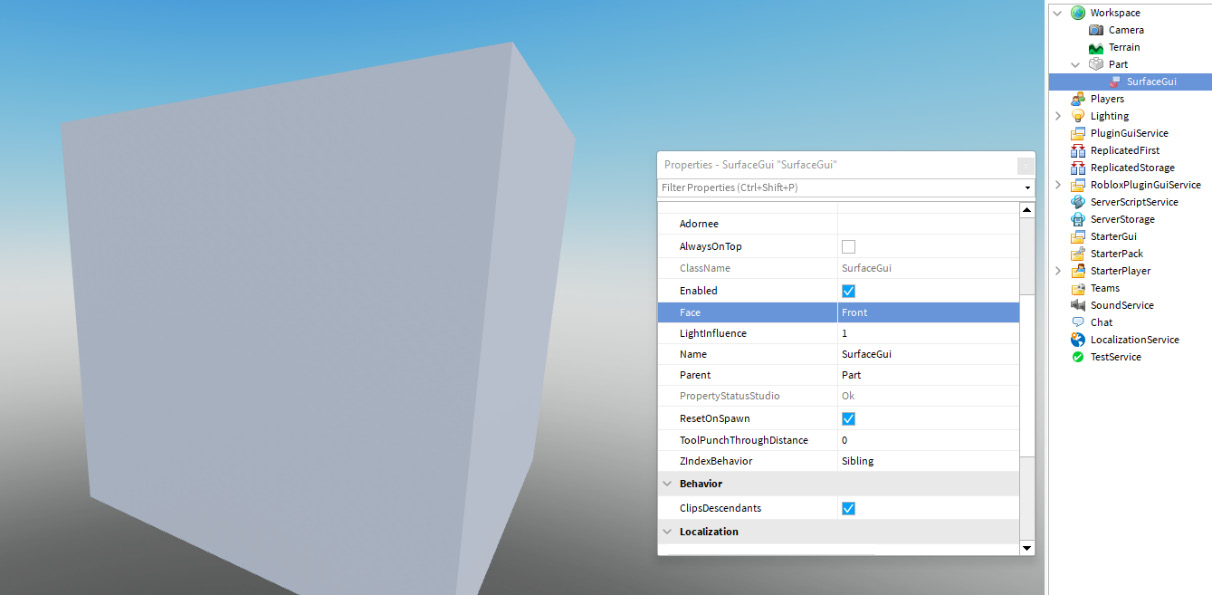
Figure 6.8 – SurfaceGui on a Part
This is because SurfaceGuis rely on GUI elements to display something; there is nothing by default.
An interesting property we can see in Figure 6.8 is the Face property. Because SurfaceGuis are displayed on BaseParts, there are multiple “faces” of these BaseParts that the SurfaceGui can be seen on. So, the Face property lets you change which of the six sides your SurfaceGui is displayed on.
As mentioned, SurfaceGuis also need GUI elements. All the previously learned GUI elements can be used on SurfaceGuis as well. One of the things many games use SurfaceGuis for is leaderboards. In the following sections, we will make our own leaderboard SurfaceGui.
Making a leaderboard SurfaceGui
In this section, we will make our own leaderboard that will display the players with the most coins in our game. If we take a look at the following screenshot, we will see what the result of this SurfaceGui could be:

Figure 6.9 – Building our own leaderboard
First, we will need a Part that serves as the board. You can change the properties on this Part however you like. Then, we will need to insert the SurfaceGui into this Part. Make sure you set the Face property of the SurfaceGui correctly.
Looking at Figure 6.9, we can identify two key sections of this SurfaceGui. The top section of the SurfaceGui displays the title of the leaderboard and the name of each column. Below this section, we list all players with their position. For both sections, we should make a Frame. Follow these instructions:
- Create a new Frame inside of the SurfaceGui with the following properties:
- Name: TopSection
- Size: {1, 0},{0.2, 0}
- Position: {0, 0},{0, 0}
- Create a second Frame inside of the SurfaceGui with the following properties:
- Name: PlayersSection
- Size: {1, 0},{0.8, 0}
- Position: {0, 0},{0.2, 0}
Once we do this, we could have something like this:
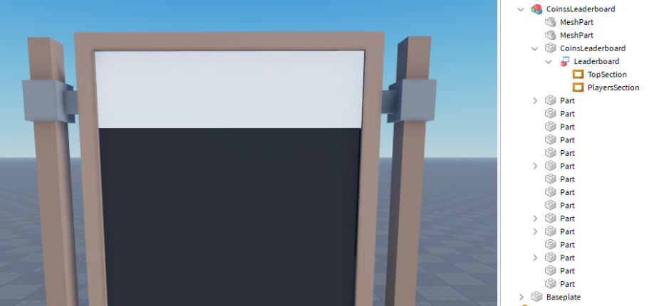
Figure 6.10 – Created Frames
Now, let us make the inside of the TopSection Frame, as follows:
- First, create a TextLabel that displays the title of the leaderboard on the top line.
- Once you have done this, create three more TextLabel elements to specify what each column means.
For the Rank and Coins columns, reserve 30% of each width. For the Name column, reserve a width of 40%. Doing this is an excellent exercise for working with GUI elements. Once done, your TopSection Frame should look something like this:
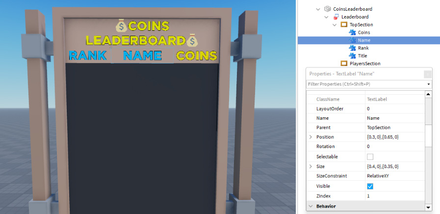
Figure 6.11 – Created TopSection Frame
Now that we have finished our TopSection Frame, we should work on the PlayersSection Frame. This Frame will contain rows with player data. Let us start by making a row for this leaderboard. Once we finish this row, we can copy it a few times. Complete these steps to create your first row:
- Create a Frame called Template with the following properties:
- Position: {0, 0},{0, 0}
- Size: {1, 0},{0, 150}
- Inside the Template Frame, create 3 TextLabel elements similar to the column names. This time, change the text to an example value instead of the column’s name. Make sure the Size value of the Frame is {1, 0},{0, 150}.
Now, we should have something like this:
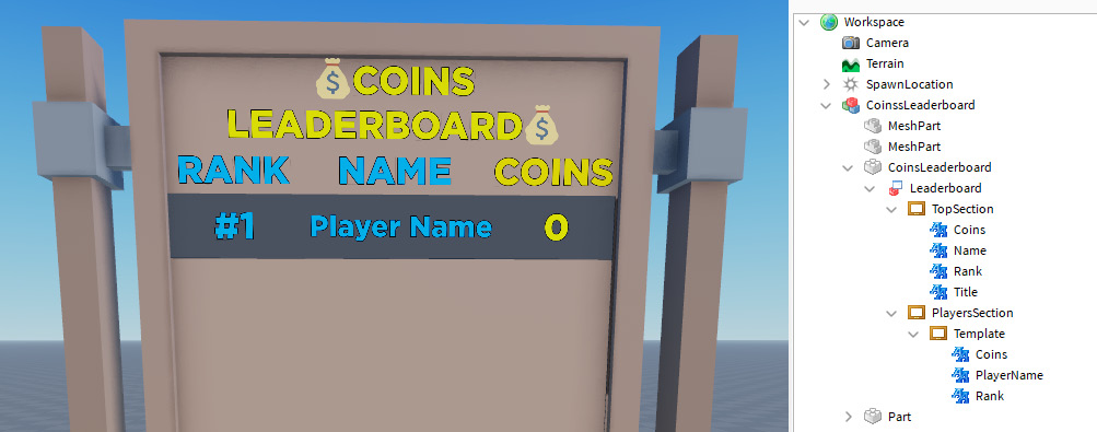
Figure 6.12 – Created leaderboard
We now have our very first SurfaceGui leaderboard. Well done! Obviously, this leaderboard does not actually show the wealthiest players in our game; for now, we are focusing on the UI aspect of the leaderboard. In Chapter 8, Building Datastores, we will look at OrderedDataStores that will allow us to make actual leaderboards.
In this section, we learned how to make our very first SurfaceGui, and we practiced making GUI elements. In the next section, we will look at something called an UIListLayout.
Using a UIListLayout
In the previous section, we started making our leaderboard. We made one Template Frame that will display player data. We do not just want to display one row with player data. We might want a top 10 or a top 20. Every time we copy our Template Frame, we have to reposition it. This is too much work. Luckily, there is a solution for this. UIListLayouts allow us to position GUI elements in a list form automatically.
If we add an UIListLayout into the PlayerSection Frame and copy the Template Frame a few times, we will see how the Template Frames get positioned automatically, as illustrated in the following screenshot. There is even an option to add spacing between Template elements. We can do this by changing the Padding property on the UIListLayout:
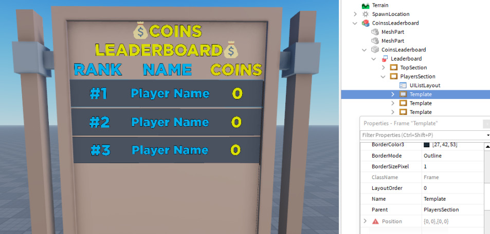
Figure 6.13 – UIListLayout automatically positions the Template Frames
In Figure 6.13, we have used padding of 10 pixels. This means there will be a 10-pixel difference between all the GUI elements in this list.
We now know how to use UIListLayouts. In the next section, we will look at the LayoutOrder and SortOrder properties.
LayoutOrder and SortOrder
We have previously seen that the UIListLayout manages to position GUI elements for us, resulting in a list. But what is this the order in which GUI elements are displayed based on? On the UIListLayout, there is a property called SortOrder option. There are two options for this property: LayoutOrder and Name. As the name implies, the Name SortOrder sorts all GUI elements based on their names. This is alphabetical sorting, meaning a GUI element that starts with the A character is displayed above a GUI element with the starting character, B.
The other SortOrder option is based on the LayoutOrder property. All GUI elements have a property called LayoutOrder. The lower the number, the higher it ends up in the list. Using this SortOrder means a GUI element with LayoutOrder 1 is displayed above a GUI element with LayoutOrder 2. As mentioned, the LayoutOrder SortOrder is the default. For our leaderboard example, it is wise to assign the same LayoutOrder as the rank. With this, we mean that the Template Frame for player #4 has a LayoutOrder of 4.
We now know how the sorting is done when using an UIListLayout. We learned there are two types of options for the SortOrders property: Name and LayoutOrder. In the next section, we will look at a new GUI element: ScrollingFrames.
ScrollingFrame GUI element
Our SurfaceGui’s size depends on how big we make our Part. We might want our game’s top 20 wealthiest players on the leaderboard. Currently, we use a Frame. Once we reach the bottom of this Frame, the size limit is reached even if we have not yet displayed 20 rows. This is an issue.
Previously, we have seen a lot of GUI elements. However, we skipped one. There are also ScrollingFrames. These are almost identical to regular Frames. The only difference is that ScrollingFrames have a scrolling bar when your data does not fit. This is the perfect solution for our previously described problem.
Note
ScrollingFrames can be used in ScreenGuis and BillboardGuis as well.
Change the Frame into a ScrollingFrame. We will keep the same properties as the Frame.
If we copy our Template Frame a few times, we will see that it still goes “hidden” as it does not fit on the Part. However, if we scroll down, we will see that those “hidden” Frames suddenly come up. This is what ScrollingFrames do. If you cannot scroll down without moving your camera in Roblox Studio, try playing the game—this will make controlling the ScrollingFrame much easier.
We now know what ScrollingFrames are and what they can be used for. In the next section, we will look at the CanvasSize property on ScrollingFrames.
CanvasSize property
In the previous section, we have seen that ScrollingFrames allow us to scroll down. At some point, you cannot scroll further down. The total size you can scroll down is based on a property called CanvasSize. The CanvasSize property has the UDim2 data type. By default, CanvasSize is set to a size of {0, 0},{2, 0}. This means that the absolute size, which includes all invisible areas of the ScrollingFrame, is twice as much as the displayed size.
Tip
This might be very difficult to understand by simply reading. It is highly recommended you play around with the CanvasSize property by changing the size and see what happens.
Previously, we have seen a solution for manually positioning all of our Template Frames. However, if we add many Template Frames inside our ScrollingFrame we still have to adjust the CanvasSize property to ensure every Frame fits on our ScrollingFrame. There is a solution for this as well. On the ScrollingFrame, there is a property called AutomaticCanvasSize. This property has three options: X, Y, and XY. These options determine in which direction the CanvasSize property is allowed to be sized automatically.
Currently, we have a list that starts at the top and goes down. Therefore, the option we should pick right now is Y. Keep in mind that your set CanvasSize property now turns into a Minimum CanvasSize property. Even though the CanvasSize property is now automatically adjusted, it never gets smaller than the size that the CanvasSize property specifies.
In this section, we learned how SurfaceGuis work and what they are used for. Besides this, we practiced making GUIs ourselves. In addition, we learned about a new GUI element called ScrollingFrames and its properties, such as CanvasSize and AutomaticCanvasSize. We also learned how to generate a list that automatically positions GUI elements for us by using a UIListLayout. In the next section, we will look at another GUI type: BillboardGuis.
Using BillboardGuis
So far, we have seen ScreenGuis that are constantly visible on your screen and SurfaceGuis that are displayed on a face of a BasePart. While both of these already cover a lot of use cases, there is another type of GUI: these are BillboardGuis. BillboardGuis go inside of BaseParts, similar to SurfaceGuis. However, instead of being displayed on a face of the BasePart, BillboardGuis behave more like ScreenGuis, while staying on the position of the BasePart.
So, what are BillboardGuis used for? Generally, BillboardGuis display controls, hints, or information about objects you see in-game. For instance, in the following screenshot, we can see a BillboardGui being used to display the price of an instrument in a shop. Please keep in mind that this screenshot contains two pictures of the same BillboardGui with two different angles to display how they work:

Figure 6.14 – BillboardGui displaying the price of an accordion
There are a few interesting properties on the BillboardGui that we should look into. One of these properties is the AlwaysOnTop property. If this property is enabled, the UI will be visible even if there is something between your camera and the BillboardGui. We can see the effect of this property in the following screenshot:
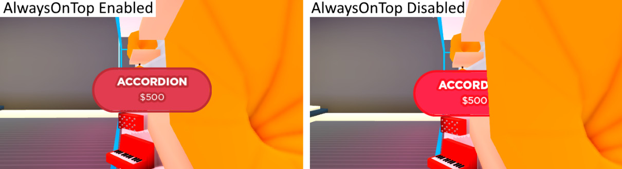
Figure 6.15 – Effects of the AlwaysOnTop property
This property is great when you are close to an object. However, if you are on the other side of the map, it might be annoying to see the price of a product. This is where the MaxDistance property comes into play. This property allows us to set a maximum distance within which the BillboardGui is visible. If a player is too far from the BillboardGui, it simply becomes invisible to them.
We now know what BillboardGuis are and what they are used for. Besides this, we learned what the AlwaysOnTop and MaxDistance properties do. We will make a BillboardGui ourselves that displays the price in the following sections.
Making a product-price BillboardGui
First, we need a Part that we can insert our BillboardGui into. Once we have done this, we can insert the BillboardGui. Once we insert our BillboardGui, we have to size it. It would be best if you used Scale for BillboardGuis. When you use Scale, the BillboardGui will keep the same aspect ratio and get smaller as you move away from it. If you were to use Offset instead, the opposite happens: the BillboardGui would keep getting bigger and bigger the further you move away from it. An example Size value for the BillboardGui could be {7, 0},{2.5, 0}.
Once we have sized it, we can insert a Frame. The size of this Frame should be {1, 0},{1, 0}. This Frame will serve as the background of our GUI. Feel free to color it however you like. Once we have done this, we can insert two TextLabels elements, one that displays the product’s name, and one that informs the player of the price. Feel free to choose any product name and price. Pick a nice Font type and TextColor property to match your GUI. Make sure the TextColor property is not close to BackgroundColor3 of the Frame, as it will be hard to read.
We practically already have the same BillboardGui as in Figure 6.14. The only difference is that the BillboardGui in Figure 6.14 is rounded and has an outline. In the following sections, we will look at UICorner and UIStroke instances.
Using a UICorner
If we add a UICorner inside a GUI element, the parent of the UICorner gets rounded. This is exactly what we did to round the Frame of our BillboardGui in Figure 6.14. The CornerRadius property allows us to change the rounding of the GUI element. Once again, a difference is made between Scale and Offset. However, it does not matter which you use here. However, try to avoid combining Scale and Offset for UICorners.
Performance
UICorners use more computer power than an image that has rounded corners by default. It is recommended not to overuse UICorners for everything. You could look at the 9-Slices editor if you are very concerned about performance. However, this will not be covered throughout the book.
We now know how to make our GUI elements look rounded by using a UICorner. Please keep in mind that UICorners work in a ScreenGui and SurfaceGui as well. In the next section, we will take a look at UIStroke.
Using a UIStroke
We can also add strokes around our GUI elements. Perhaps you are wondering why we aren’t using the BorderSizePixel property. Sometimes we can, and sometimes we cannot. For example, if we use a UICorner, we can no longer use the BorderSizePixel property. On the other hand, when we use a square Frame without the UICorner, we would be perfectly able to use the BorderSizePixel property.
But a UIStrokes can do more than just give a border around a Frame. If we create a UIStroke, we see a property called ApplyStrokeMode. The value of this property can either be Contextual or Border. This is where the real advantage of UIStrokes comes into play. We can use UIStrokes in a TextLabel, TextButton, and TextBoxe as well.
We can use UIStrokes to give an outline to text by using the Contextual ApplyStrokeMode. Please keep in mind that UIStrokes do not work with RichText at the time of writing this book. A UIStroke works on GUI elements in BillboardGuis. However, they work in a ScreenGuis and SurfaceGuis as well.
So far, we have learned a lot about GUIs already. We learned what a ScreenGui, SurfaceGui, and BillboardGui is. Besides this, we learned about many GUI eElements that we can use inside these GUIs, such as a Frame, ScrollingFrame, TextLabel, ImageLabel, TextButton, ImageButton, and TextBox.
Besides this, we learned about many properties of these GUI elements, such as Size, Position, ZIndex, LayoutOrder, CanvasSize, and many more. We also learned about useful UI constraints that allow us to give our GUI more structure or a better design. A few of these UI constraints are UITextSizeConstraint, UIListLayout, UICorner, and UIStroke. Long story short, we now know how to make proper GUIs ourselves. In the next section, we will look at a small optimization we can do in our GUIs for better performance of our game.
Optimizing UIs
There is a small optimization we can implement when making GUIs. While this optimization only increases the speed of our GUIs by a few milliseconds, it is actually important, especially for lower-end devices and mobile devices. So, how can we optimize GUIs? To answer this question, we first need to know how GUIs work.
Previously, GUIs were computed every Frame. By default, Roblox is capped to 60 frames per second (FPS). In an ideal situation, this means that GUIs were recomputed 60 times per second, even when there are no changes compared to the previous Frame. For instance, if we were to use a UICorner inside of our GUI, all the math assigned with the UICorner would be recomputed, even when there is no change. As you can see, this is not ideal and wastes a lot of computer power.
Luckily, Roblox came up with a solution. Instead of recomputing GUIs every Frame, they are now only recomputed if the GUI or something inside the GUI changes. So, for instance, if no property is changed and no new instances are inserted or removed, the GUI does not get recomputed. However, if we were to change the visibility of—for example—a Frame, the GUI would get recomputed.
This, on its own, is a major performance upgrade for everyone’s game, and the great part is that we did not have to change anything for it. So, what is the small optimization we can implement? We know that GUIs do not get recomputed unless there is a change. Well, we can use this knowledge to improve the performance of our game even more. So, how do we do this? We can simply create separate GUIs for certain Frames instead of having our entire UI inside one single ScreenGui.
For example, we may have a Frame called PurchaseCurrency that allows users to purchase our in-game currency in exchange for Robux, and another Frame called SettingsFrame that allows our users to change their in-game settings. Both Frames are completely different from each other. It is very unlikely that the PurchaseCurrency Frame updates when someone changes a setting.
Imagine if they were inside the same ScreenGui—in this scenario, the PurchaseCurrency Frame would be recomputed if we changed a setting. This is very inefficient. Instead, we should separate both Frames into different ScreenGuis. Then, the PurchaseCurrency Frame does not get recomputed when we change a setting in the SettingsFrame Frame. We should keep this small performance optimization in mind when creating a ScreenGui, SurfaceGui, or BillboardGui.
We just learned how GUIs work internally. By understanding the internal working, we figured out how to optimize our own GUIs. In the next section, we will learn how to test our own GUIs to see whether they scale correctly on different devices using the emulator.
Testing GUIs
Nothing is more annoying and unprofessional than GUIs that do not scale properly. We have already learned how to scale GUIs properly using the Scale property in the UDim2 data type throughout this chapter. Doing this already makes our GUIs scale properly across different-sized screens.
But there are many devices that you can play Roblox on. Roblox even supports consoles that might be connected to enormous TVs but also supports phones and tablets. While they keep getting bigger, there are still a lot of very small phones out there, and our job is to make our GUIs look fantastic on all of these devices.
Obviously, we cannot purchase every device to see whether our GUIs look good on them, yet we still want to see what they would look like on these devices. Luckily, there is a solution for this. Roblox Studio has a built-in emulator that allows us to pretend to be another device. This way, we can see what GUIs look like, and much more, which we will come back to in a later chapter.
In the top-right corner of the window that displays the game’s map, there is a button displaying two different devices. Clicking this allows you to change into a different device. This way, you can see what the GUIs look like as well. In addition, you can start playing the game to get a proper view of how your game would work on this device, including device-specific controls. In the following screenshot, we can see the emulator in action:
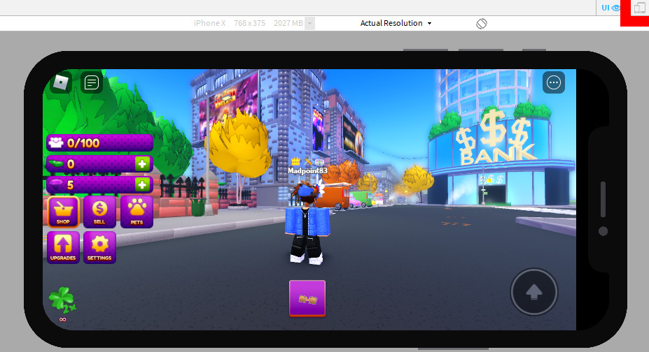
Figure 6.16 – Playing a game inside of the emulator
Tip
If you are designing a GUI for a phone, the buttons need to be big to be comfortable. Therefore, it is highly recommended you play your game on your own phone before releasing your game. Generally, if the buttons look big enough on the emulator, it is still too small. A way to automatically get your GUIs bigger on phones is to use a combination of Scale and Offset. Use Scale to properly scale your GUI while adding a bit extra using the Offset property. This will increase the size of your GUIs for smaller screens such as those on phones.
When making GUIs for your phone, a good practice is to play random games on it. Once you find a game with a comfortable layout, take a screenshot of it. Then, use an image-editing program on your PC and compare your UI to your screenshot. Take a look at sizing and position differences that you might be able to improve on.
We now know how the emulator works. This will allow us to test our GUIs better. In the next section, we will look at minor improvements to help us take our GUIs to the next level.
Small UI improvements
So far, we have learned a lot about GUIs and how to scale and test them properly. However, there are a few small things we can improve in our GUIs to increase the quality of our UI tremendously. In the following subsections, we will dive deeper into all these small improvements we can make. We will start by looking at improving our GUIs for color-blind players. After that, we will look at the controls and navigation on GUIs, and we will also talk about images. In addition, we will use Tweens on GUIs and a few other small improvements.
Working with color-blindness
When picking colors for GUIs, people tend to forget that there are color-blind people. How amazing would it be to make our UI easy to use for color-blind players? If you have some previous experience with making GUIs, you most likely used the color combination of red and green. While this is a super-basic color combination for most of us, this is a very troubling color combination for people that are color-blind. Instead of using red and green, try using red and blue or blue and yellow.
But there is more you can do to improve your GUIs. Here is a list of tips when making your GUIs:
- As previously mentioned, research your color combinations.
- Do not solely rely on colors. How many games have you played where you can pick between the red or blue team? Most likely, a lot. While this is not a troubling color combination, it would be better to have an icon inside these teams. For instance, the red team could be a pirate or robbers team. Having a simple icon that matches the theme of your game can do wonders.
- Similar to the previous one, try to add patterns or text. For example, if you have a grid of colored blocks and players have to walk to a specific color, this might be difficult. However, if random patterns were on these blocks as well, it would be much easier to differentiate. For instance, if blue has stripes, red has dots, and yellow has a cross, it is easier to see for everyone.
Keeping these tips in mind will help color-blind people enjoy your game, but the best part is that this does not only benefit those who are color-blind. These tips make our GUIs and games better for everyone. In the next section, we will learn how to make the controls displayed in our game more dynamic, depending on the device.
Displaying controls
Some GUIs display controls for certain actions that players can perform. We do not want to display controls for a device that the player is not on. As a matter of fact, we are not allowed to display incorrect controls to players that are playing on consoles. If we do this anyway, our game might get taken down. However, the problem is that there is no real way to detect which device a player is on. So, which controls do we display?
Instead of trying to display controls for the device the player is on, we should make our GUIs dynamic for any device controls. We have to make them able to change depending on what input is being used. So, how do we see this? There is a service called UserInputService that has many functions related to user input. In Chapter 7, Listening to User Input, we will learn more about this service. For now, we will use one event: .LastInputTypeChanged. This event gives us an UserInputType enum. Let us take a look at the following client-sided example code:
local UserInputService = game:GetService("UserInputService")local ui = script.Parent
local controlsText = ui:WaitForChild("ControlsText")local previousInputType = nil
function updateControls(lastInputType)
-- Checking if anything has changed
-- Small optimization in case this function gets bigger
-- overtime.
if previousInputType == lastInputType then
return
end
-- Changing controls
if lastInputType == Enum.UserInputType.Gamepad1 then
-- Player is using a gamepad.
-- Console or someone using a gamepad?
previousInputType = lastInputType
controlsText.Text = "Press [X] to confirm"
elseif lastInputType == Enum.UserInputType.Touch then
-- Player is using a touchscreen, phone/tablet?
previousInputType = lastInputType
controlsText.Text = "Click here to confirm"
elseif lastInputType == Enum.UserInputType.Keyboard
then
-- Player is using keyboard.
previousInputType = lastInputType
controlsText.Text = "Press Enter to confirm"
end
end
UserInputService.LastInputTypeChanged:Connect(updateControls)
As we can see in the preceding code snippet, we change a fictive controlsText TextButton whose text depends on the last input type. This is how we make the displayed controls as dynamic as possible. This way, even if someone is playing on their desktop with a controller connected, they switch between which controls they want to use. As a matter of fact, they could even switch while playing the game without any issues.
Making sure the controls in your game are dynamic takes your GUIs to the next level. It is highly recommended you spend some extra time perfecting your GUIs by implementing this. In the next section, we will talk about improving navigation in your GUIs.
Improving GUI navigation
This may sound really obvious, but make sure your GUIs are easy to navigate. Many developers tend to forget that new players have never used these GUIs and have no clue what each button does. Of course, the GUIs are straightforward for you, but a new person might not know what a music button does. In the following screenshot, we can see an excellent solution for this issue. When players hover over a music icon, they will instantly know what this button will do:
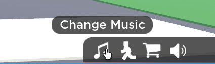
Figure 6.17 – Text displaying the purpose of a button once hovered over
This greatly improves the navigation of your GUIs. However, there is another common problem with GUIs. Generally, there are two ways to close Frames in games. You either press a button to open and close it or there is an opening button and closing button. Some games might add both for ease of use. However, you must not switch this behavior throughout your game. For instance, do not make the Change Music Frame open and close with the same button, while the Shop Frame has to be opened with button A and closed with button B.
Tip
For console users, make sure your Frames close when the Back button on the controller is pressed. This functionality is adapted in most games. It would be annoying for players if your game did not have this commonly used feature. In Chapter 7, Listening to User Input, we will learn how to do this.
We now know how to improve the navigation of our GUIs. In the next section, we will look at the use of images in GUIs.
Using images
When designing your GUIs, make sure you use enough images. Players do not want to take a look at a bunch of text explaining they need to press a particular key to open a door. Instead, it is highly recommended you show an image that shows the before-and-after scenario while displaying the controls.
Tip
Do not insert controls in images. Instead, add a TextLabel on top of the ImageLabel that displays the controls. This way, you can use the same image for multiple devices.
Besides players actually looking at images, your GUI will also look much better. You can make these images yourself or hire artists to make them for you. The second option is recommended but might not work, depending on your game’s budget.
In the next section, we will take a look at Tweens on GUIs.
Using Tweens
In Chapter 5, Optimizing Your Game, we learned about Tweens. We used these Tweens to animate a gate. In addition, we practiced making a Part fall in an exercise. But what does this have to do with GUIs? Well, we can use Tweens on GUI elements too. For example, if we want to make a certain Frame show up, we might want it to become bigger or change its position.
We can use Tweens the same way we learned in Chapter 5, Optimizing Your Game. For example, in the following client-side code snippet, we have a function that tweens the Position property of a Frame using the TweenService. Let us analyze this, as follows:
local TweenService = game:GetService("TweenService")local ui = script.Parent
local frame = ui:WaitForChild("SomeFrame")function openMenu()
-- Setting frame out of the screen
frame.Position = UDim2.new(0.5, 0, 1.5, 0)
-- Making frame visible
frame.Visible = true
-- Setting up TweenInfo
local tweenInfo = TweenInfo.new(
-- Duration of Tween
1,
-- Tween style (EasingStyle)
Enum.EasingStyle.Quad,
-- EasingStyle direction
Enum.EasingDirection.Out,
-- Amount of times the tween repeats
0,
-- Tween Reverse
false,
-- Delay before the Tween starts
0
)
local tween = TweenService:Create(frame, tweenInfo,
{Position = UDim2.new(0.5, 0, 0.5, 0)})tween:Play()
end
openMenu()
In the preceding code snippet, we use a function called openMenu(). First, we set the Position property of the Frame to UDim2 with a y-axis scale greater than 1. This means that the Frame will not be visible from this position. After that, we set the visibility of the Frame to true. This still does not show the Frame as it still has the Position property outside of our screen, but most developers set the Visible property to false if they are not in use.
After that, we create a new variable that will store TweenInfo for the tween we will make. This has many arguments. As explained in Chapter 5, Optimizing Your Game, you do not have to use all of these. The ones displayed in the preceding code snippet are the defaults. Finally, we create our Tween using the :Create() function on the TweenService. Once we have this Tween, we use the :Play() function to start the Tween.
This is how we would create a Tween on GUI elements, using what we previously learned. However, Roblox has two functions on these GUI elements called :TweenPosition() and :TweenSize() that allow us to easily tween that GUI element.
In the following code snippet, we create the exact same Tween as before. However, this time, we will use the :TweenPosition() function instead of the TweenService. Let us take a look at this here:
local ui = script.Parent
local frame = ui:WaitForChild("SomeFrame")function openMenu()
-- Setting frame out of the screen
frame.Position = UDim2.new(0.5, 0, 1.5, 0)
-- Making frame visible
frame.Visible = true
-- Moving frame into the screen
frame:TweenPosition(
-- (Required)
-- Target Position
UDim2.new(0.5, 0, 0.5, 0),
-- (Optional)
-- EasingStyle Direction
Enum.EasingDirection.Out,
-- (Optional)
-- Tween Style (EasingStyle)
Enum.EasingStyle.Quad,
-- (Optional)
-- Duration of the Tween
1,
-- (Optional)
-- Set to true if you want to
-- override a Tween that might
-- be active on the Frame right now.
false,
-- (Optional)
-- Function that gets executed
-- once the :TweenPosition finished.
function()
print("Tween has finished!")end
)
end
openMenu()
In the preceding code snippet, we use the same openMenu() function. Once again, we start by setting the Position property of the Frame to a UDim2 with a y-axis scale greater than 1. After that, we set the visibility of the Frame to true.
So far, this was the same as when using the TweenService, but here’s where the difference starts. Instead of creating TweenInfo, we use the :TweenPosition() function with quite a few arguments. Some of these arguments are similar to those from TweenInfo, but the order is mixed.
First, we specify the target position. This is basically the position that the Frame will be in once the Tween is over. This argument is required. Then, we get optional arguments; we could leave these out. Feel free to try all the differences out. The last argument is noteworthy, though. Here, we can make a function. This function gets executed once the Tween ends. Some common use cases for this function are to disable a client-side debounce, as explained in Chapter 5, Optimizing Your Game.
We have now learned how to use Tweens on GUI elements. Please keep in mind that you can use “normal” Tweens, as explained in Chapter 5, Optimizing Your Game, instead as well. In the next section, we will look at the core GUIs from Roblox.
Core GUIs
Before we can get to the improvement of this section, we first need to understand what the CoreGui service even is. Roblox has a few GUIs that are in every game by default that combined are called the core GUIs. These core GUIs include Chat, Backpack, Leaderboard, and more. Sometimes, you do not want to use these because you want to make a custom version, or maybe they overlap with your own GUIs. Generally, we try to avoid overlapping GUIs/Frames as it looks very chaotic.
Thankfully, we can disable some of the core GUIs. While there is no ScreenGui in the PlayerGui of which we can change the visibility, there is a function we can call. On the StarterGui service, there is a function called :SetCoreGuiEnabled(). In the following client-side code snippet, we will disable the Chat core GUI:
local StarterGui = game:GetService("StarterGui")StarterGui:SetCoreGuiEnabled(Enum.CoreGuiType.Chat, false)
-- Enum.CoreGuiType.Health
-- Enum.CoreGuiType.PlayerList
-- Enum.CoreGuiType.Backpack
-- Enum.CoreGuiType.EmotesMenu
-- Enum.CoreGuiType.All
In the preceding code snippet, we disable the chat using the :SetCoreGuiEnabled() function. To specify that we want to disable the Chat GUI, we use an enum. The second argument of this function is a Boolean. Currently, we provide the false Boolean. This means we want to disable the Chat GUI. If we were to reactivate the Chat GUI, we would have to put true as the second argument.
We now know what the core GUIs are. Besides this, we learned how to enable and disable them in our game. Besides the core GUIs, we also learned how to improve our GUIs for color-blind players. After that, we learned how to show the proper controls based on the player’s device. In addition, we learned how to improve the navigation of our GUIs. After that, we also learned how to play Tweens on GUI elements. In the next section, we will practice everything that we have learned throughout this chapter.
Exercise 6.1 – Creating a shop GUI
In this exercise, we will be creating a GUI that will allow users to purchase Game Passes in our game. Please remember that we will just be creating the GUI; we will not sell Game Passes. In Chapter 9, Monetizing Your Game, we will learn how to do this.
In the following screenshot, we see an example result for this exercise. Feel free to follow the steps or recreate this GUI on your own by looking at the example:
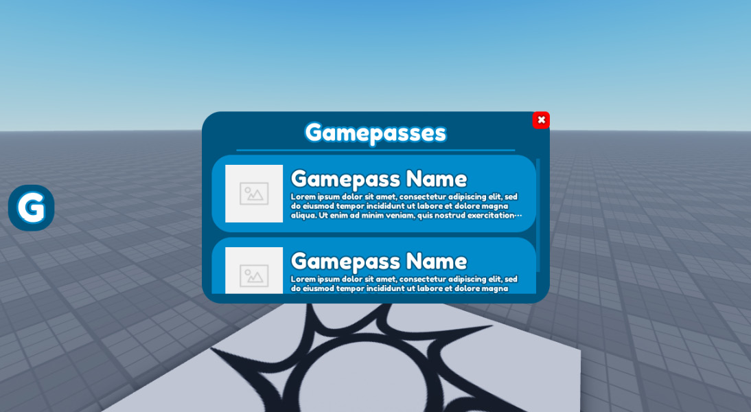
Figure 6.18 – Example result for this exercise
As mentioned, the GUI shown in Figure 6.18 is an example solution. You can mix up things if you prefer another style. Throughout the exercise, no properties will be given. You have to decide for yourself what the value of certain properties will be. Sometimes, there will be a hint toward you picking a certain property; in this case, it is recommended you do this. As for Sizes, Positions, and AnchorPoints properties, you will have to pick something that works. Use the emulator to see whether the chosen properties work for all devices. You will have to experiment with this a lot. No one picks the correct properties all the time. Take your time to perfect this.
Exercise
First, we will start by making the GUI. Proceed as follows:
- Create a ScreenGui named GamepassUI inside the StarterGui.
- Inside GamepassUI, create a Frame named MainFrame. Make sure this Frame gets a nice color, correct sizing, and rounded corners.
- Inside the MainFrame Frame, create two Frames. The first Frame should be named Header and will contain the title of this Frame. The second Frame should be a ScrollingFrame Frame named Body.
- Inside the Header frame, create a TextLabel that will display the text Gamepasses. Give this text an outline with a Thickness value of 3.
- Make sure the Body ScrollingFrame Frame automatically gets the correct CanvasSize value without you having to change the CanvasSize value manually. The minimum CanvasSize value should be {0, 0}, {0, 0}.
- Make sure the Body ScrollingFrame Frame automatically makes a list of all its child GUI elements without you having to position each GUI element manually.
- Inside the MainFrame Frame, create a TextButton named Close that displays X. The Close button must have rounded corners. Besides this, X must have an outline.
- Inside the Body ScrollingFrame frame, create a TextButton that has the same width as the Body ScrollingFrame frame, but subtract the size of the ScrollingBar. Rename this TextButton GamepassButton.
Tip for 8: ScrollingFrames have a property called ScrollBarThickness. This is the size in pixels of the ScrollingBar.
- Inside the GamePassButton, create an ImageLabel. Feel free to add an actual image. Make sure the ScaleType property is set to Fit.
- Inside the GamepassButton, create a TextLabel that displays the name of the gamepass. Choose a bold font for this. Make sure this TextLabel has an outline with a Thickness value of 2.
- Inside the GamePassButton, create another TextLabel that displays the description of the gamepass. Make sure this TextLabel has an outline with a Thickness of 2. Besides this, the text has to be set to Scaled. However, the TextSize value may never be smaller than 15 nor greater than 25. If the text does not fit, three dots have to appear at the end of the TextLabel.
Tip for 11: All the specified information can be done by inserting UI elements or changing properties. There are no scripts required for this.
We have now finished the GamePassUI ScreenGui. Next, we will create a button that will allow us to open and close the MainFrame Frame. Follow these next steps:
- Create a ScreenGui named SideButtons inside the StarterGui.
- Inside the SideButtons, create a TextButton named OpenGamepasses. The TextButton must have rounded corners.
- Make sure the OpenGamePasses TextButton displays the G character. This character should have an outline with a Thickness value of 3.
We have now finished designing our GUI. Up until this point, you did not have to use any scripts. If you did, you probably forgot about a property. We will start scripting this GUI so that the Frame becomes visible and invisible when certain actions are performed. Read the following requirements and create LocalScripts that will meet the set requirements:
- When the OpenGamePasses button inside the SideButtons ScreenGui gets pressed, the MainFrame Frame inside the GamepassUI changes visibility.
- If the MainFrame Frame is already visible when the OpenGamePasses button is pressed, then the MainFrame Frame should become invisible.
- The transition of becoming visible or invisible should be done using Tweens. The type of Tween you choose is up to you.
- When the Close button inside the MainFrame Frame is pressed, the MainFrame Frame should close. Make sure using the Close button does not bug the OpenGamePasses button.
Tip: Create a LocalScript or Module inside the GamePassUI that is responsible for opening and closing the MainFrame Frame. Then, use this Module or make BindableEvents to open and close this Frame. Here is a list of optional functions, BindableEvents, and BindableFunctions:
- For Modules: :OpenFrame(), :CloseFrame(), :IsOpen()
- For BindableEvents: OpenFrame, CloseFrame
- For BindableFunctions: IsOpen
If you forgot how Modules or BindableEvents/BindableFunctions work, go back to Chapter 3, Event-Based Programming.
Test the game to see whether it works. Do not worry if you did not manage to complete parts of this exercise. This was a very large and complicated exercise. It is highly recommended that you try to do everything in the best possible way. Once you think you are done, take a look at the default example result and try to learn from it. Preferably, try to redo this exercise after that.
Two example answers can be found on the GitHub page for this book, at https://github.com/PacktPublishing/Mastering-Roblox-Coding/tree/main/Exercises. The second example answer contains more advanced code that might be harder to understand. This example is meant for those wanting to script better GUIs.
Summary
We started this chapter by learning more about GUIs. We learned there are three types of GUIs, and these are ScreenGuis, SurfaceGuis, and BillboardGuis. Each of them has a different purpose. We learned that these GUIs do not display anything themselves—they need GUI elements for that. We learned about the: Frame, ScrollingFrame, TextLabel, ImageLabel, TextButton, ImageButton, and TextBoxe GUI elements. We have seen how each of them works.
While learning about all of these GUI elements, we have used a lot of properties as well. The two most common properties were Size and Position. We learned that both properties use a unique data type called UDim2. We have seen that a UDim2 data type is built from two UDim data types. There is one UDim data type for the x axis and one for the y axis. Besides this, we have seen how a UDim data type is built up by Scale and Offset properties. Scale allows us to keep players’ screen size, whereas Offset is measured in pixels. These pixels are the same for everyone. We have seen that GUIs could be outside of players’ screens when the developer accidentally uses Offset instead of Scale.
Besides this, we learned how to add constraints to our GUIs without any scripting. A few examples of the constraints we have seen are UITextSizeConstraint and UIListLayout. Besides those two, we have also learned about useful properties such as AutomaticCanvasSize, which automatically handles the size of the CanvasSize property without manually changing it.
Not only did we learn how to build GUIs, but we also learned how to optimize them by creating multiple ScreenGuis for frames that are not connected. In addition, we learned how to test our GUIs by using the emulator built into Roblox Studio. We have seen how the emulator allows us to pretend to be another device to see what our GUIs would look like. While doing this, we learned that we could use scale and add a bit of offset to automatically make our GUIs bigger for smaller devices such as phones. This makes it easier for players to read text and press buttons.
Finally, we also looked at a few things to keep in mind while making our GUIs. These things take little effort to implement yet have a massive impact on the quality of our GUIs. For instance, we have looked at how to design color-blind-friendly GUIs, improve navigation, and add Tweens to GUIs.
While GUIs are not very complex, they take a lot of practice. You might not be a pro in making GUIs just yet. However, the more you practice you have with it, the easier it gets, and the better your GUIs will become. In the Displaying controls section, we had a short introduction to the UserInputService service. In the next chapter, we will learn how to listen to user input using this service.