
There are a lot of things that go into delivering a great user experience in a mobile app, such as graphical design, ease of use, discoverability, accessibility, and intuitive controls, just to name a few. Graphical design is very important in a mobile app – it's largely what makes an app enjoyable to use – but just because an app is beautiful doesn't mean it's functional or easy to use. In this chapter, we are going to focus on some key concepts that will improve our app's overall user experience.
Here is a quick look at what we'll cover in this chapter:
- Leveraging platform-specific APIs to extend the default behavior of Xamarin.Forms controls with custom renderers
- Manipulating the visual appearance of bound data with value converters
- Leveraging basic accessibility APIs so that a user interface (UI) is friendly and easy to use for all audiences
We will start by creating a custom renderer for the date entry field on the New Entry page so users are presented with a native date picker instead of a standard keyboard.
Custom renderers
One of the paramount features of the Xamarin.Forms toolkit is the layer of abstraction it provides over UI implementation. With a single API, Xamarin.Forms allows you to use native UI controls and functionality.
For example, the Entry class at runtime will display a UITextField view on iOS, an EditText widget on Android, and a TextBox control on Windows. The toolkit does this using a concept called renderers. The renderers correspond with the visual elements—controls, pages, and layouts—within the API. So, for example, there is an EntryRenderer that is responsible for rendering instances of the Entry class down to the platform-specific versions of that control.
The beauty of this renderer concept is that you can subclass the various renderer classes to override how a specific element is translated at runtime. So, for example, if you want all text boxes in your app (that is, every time you display an Entry element) to be completely borderless, you could simply write a new EntryRenderer subclass for each platform that removes the border on the platform-specific element.
However, you typically won't want to completely override the default controls of the toolkit. The most common solution is to create a custom control by subclassing a Xamarin.Forms element and then writing the renderer specifically for that custom class. So, instead of removing the border from all uses of Entry, you would instead use a custom Entry class, for example, NoBorderEntry, which, when rendered, will be borderless.
The concept of custom renderers is a very powerful and handy utility when building rich apps using the Xamarin.Forms toolkit. Using the default controls and behaviors of the toolkit will certainly render a native experience, but they can limit you in more complex scenarios. Custom renderers will ensure that you can exceed these limits when needed, to deliver the exact experience you want.
Creating a TableView DatePicker
In our TripLog app, we are using a TableView with EntryCell elements to present a form so the user can add a new log entry. Currently, the date field in the form uses a regular EntryCell that presents an editable text field with the default keyboard. Obviously, this is not an ideal user experience, and is also a nightmare when it comes to data validation. Ideally, when the user taps into this date field, they should be presented with a standard, platform-specific date picker.
The Xamarin.Forms API provides the DatePicker control; however, it is based on a View, not a ViewCell. The only way to use the DatePicker control in a TableView would be to wrap it in a ViewCell, as follows:
var datePickerCell = new ViewCell
{
    View = new DatePicker()
};
Or, in XAML, as follows:
<ViewCell>
    <DatePicker />
</ViewCell>
Although this approach will work, it is somewhat limited. It is simply a control embedded in a ViewCell; it does not have the same look and feel as the rest of the cells in the TableView. In order to get a similar look and feel to the other EntryCell elements used in the TableView, you will have to add a label and also mess with the margins, spacing, and sizing to get it to look just right.
Another minor downside to this approach is that you will need to include two separate cells—one that includes DatePicker and one that includes TimePicker—in order to capture both date and time. The iOS UIDatePicker actually provides a mode that lets the user pick both the date and time in the same picker. Android does not have this same capability; however, if we're going to make a custom renderer, we can at least take advantage of the dual mode on iOS.
So, in order to overcome these limitations and deliver the best experience possible, we can create a custom renderer that extends the EntryCellRenderer to display an EntryCell that behaves like the standard DatePicker control.
Since we don't want to render all EntryCell elements in our application with the date picker functionality, the first thing that we will need to do is to create a custom EntryCell control that the custom renderer will be affiliated with. We can create this in a Controls folder within the core library of our TripLog app, as follows:
- First, create a new folder in the core project named
Controls. - Create a new class in the
Controlsfolder namedDatePickerEntryCellthat inherits fromEntryCell:public class DatePickerEntryCell : EntryCell { } - Next, add a
DateTimeBindablePropertyso that this custom control can be data bound just like any other control:public class DatePickerEntryCell : EntryCell { public static readonly BindableProperty DateProperty = BindableProperty.Create( nameof(Date), typeof(DateTime), typeof(DatePickerEntryCell), DateTime.Now, BindingMode.TwoWay); public DateTime Date { get => (DateTime)GetValue(DateProperty); set => SetValue(DateProperty, value); } }
Next, we will need to create a custom EntryCellRenderer, which will provide the platform-specific functionality for the DatePickerEntryCell, as follows:
- Create a new folder in the
TripLog.iOSproject namedRenderers. - Create a new class in the
Renderersfolder namedDatePickerEntryCellRendererthat inherits fromEntryCellRenderer, as follows:public class DatePickerEntryCellRenderer : EntryCellRenderer { } - Next, override the
EntryCellRendererGetCell()method to override the defaultEntryCellbehavior for iOS by settingInputViewof theUITextFieldto aUIDatePickerinstance:public class DatePickerEntryCellRenderer : EntryCellRenderer { public override UITableViewCell GetCell(Cell item, UITableViewCell reusableCell, UITableView tv) { var cell = base.GetCell(item, reusableCell, tv); var datepickerCell = (DatePickerEntryCell)item; UITextField textField = null; if (cell != null) { textField = (UITextField)cell.ContentView.Subviews[0]; } // Default datepicker display attributes var mode = UIDatePickerMode.Date; var displayFormat = "d"; var date = NSDate.Now; var isLocalTime = false; // Update datepicker based on Cell's properties if (datepickerCell != null) { // Kind must be Universal or Local to cast to NSDate if (datepickerCell.Date.Kind == DateTimeKind.Unspecified) { var local = new DateTime(datepickerCell.Date.Ticks, DateTimeKind.Local); date = (NSDate)local; } else { date = (NSDate)datepickerCell.Date; } isLocalTime = datepickerCell.Date.Kind == DateTimeKind.Local || datepickerCell.Date.Kind == DateTimeKind.Unspecified; } // Create iOS datepicker var datepicker = new UIDatePicker { Mode = mode, BackgroundColor = UIColor.White, Date = date, TimeZone = isLocalTime ? NSTimeZone.LocalTimeZone : new NSTimeZone("UTC") }; // Create a toolbar with a done button that will // close the datepicker and set the selected value var done = new UIBarButtonItem("Done", UIBarButtonItemStyle.Done, (s, e) => { var pickedDate = (DateTime)datepicker.Date; if (isLocalTime) { pickedDate = pickedDate.ToLocalTime(); } // Update the value of the UITextField within the Cell if (textField != null) { textField.Text = pickedDate.ToString(displayFormat); textField.ResignFirstResponder(); } // Update the Date property on the Cell if (datepickerCell != null) { datepickerCell.Date = pickedDate; datepickerCell.SendCompleted(); } }); var toolbar = new UIToolbar { BarStyle = UIBarStyle.Default, Translucent = false }; toolbar.SizeToFit(); toolbar.SetItems(new[] { done }, true); // Set the input view, toolbar and initial value for the Cell's UITextField if (textField != null) { textField.InputView = datepicker; textField.InputAccessoryView = toolbar; if (datepickerCell != null) { textField.Text = datepickerCell.Date.ToString(displayFormat); } } return cell; } } - Next, in order to register the custom renderer, simply add an
ExportRendererassembly attribute to the class above the namespace declaration. This attribute is required by Xamarin.Forms in order for the custom renderer to take action on the control at runtime:[assembly: ExportRenderer(typeof(DatePickerEntryCell), typeof(DatePickerEntryCellRenderer))] namespace TripLog.iOS.Renderers { // ... } - Finally, we will need to update the new entry XAML page to use our new custom
DatePickerEntryCell. Simply update the dateEntryCelltag to aDatePickerEntryCelltag, binding theDateproperty instead of theTextproperty. Also, ensure that you include theControlsnamespace in the rootContentPagetag, as follows:<ContentPage xmlns="http://xamarin.com/schemas/2014/forms" xmlns:x="http://schemas.microsoft.com/winfx/2009/xaml" xmlns:controls="clr-namespace:TripLog.Controls;assembly=TripLog" x:Class="TripLog.NewEntryPage" Title="New Entry"> <ContentPage.ToolbarItems> <ToolbarItem Text="Save" Command="{Binding SaveCommand}" /> </ContentPage.ToolbarItems> <ContentPage.Content> <TableView Intent="Form"> <TableView.Root> <TableSection> <EntryCell Label="Title" ... /> <EntryCell Label="Latitude" ... /> <EntryCell Label="Longitude" ... /> <controls:DatePickerEntryCell Label="Date" Date="{Binding Date, StringFormat='{0:d}'}" /> <EntryCell Label="Rating" ... /> <EntryCell Label="Notes" ... /> </TableSection> </TableView.Root> </TableView> </ContentPage.Content> </ContentPage>
Now, if we run the TripLog app, navigate to the New Entry page, and tap into the Date field, we will see a native date picker, as shown in the following screenshot.
As we pick different values in the picker, the DateProperty binding we created will automatically update the ViewModel as well:
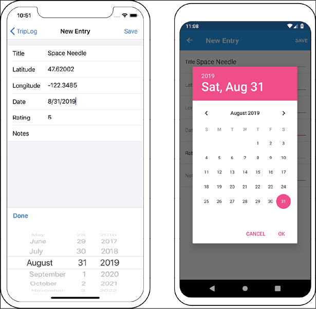
Figure 1: The TripLog new entry page with a native date picker
Value converters
Value converters form an important concept in data binding because they allow you to customize the appearance of a data property at the time of binding. If you have done any Windows Presentation Foundation (WPF) or Windows app development, you will probably be familiar with how value converters work. Xamarin.Forms provides an almost identical value converter interface as part of its API.
One of the biggest benefits of a value converter is that it prevents you from having to add a bunch of getter properties to your data model to adjust how things are displayed. For example, imagine you have a status property on your model, and you want to change the font color of the status when it is displayed based on its value. You could add a getter property to your model that returns a color based on the current value of the status property. This approach works, but it clutters the model and also potentially leaks platform-specific and UI logic into the model, which should typically remain very lean and agnostic. The more appropriate approach is to create a value converter that allows you to bind an element directly to the status property but display it differently based on the value.
Another common way that value converters are helpful in Xamarin.Forms is to toggle the visibility of elements based on a boolean property. Luckily, the Xamarin.Forms API made the VisualElement IsVisible property a boolean instead of an enumeration, so showing things based on boolean properties is fairly straightforward. However, if you want to hide something when a data bound property is true, you will need a value converter to convert the true value to a false value when it is bound to the IsVisibleProperty of an element.
In the next section, we will create a reverse visibility converter, which we will use to hide controls on the screen until the ViewModel has finished loading. We'll also create a converter that converts our integer rating property to stars, for a more appealing visual effect.
Creating a reverse visibility value converter
There are often cases where your UI must wait for data to be loaded. In the meantime, the user might see what appears to be a broken or incomplete page. In these situations, it is best to let the user know what is happening by showing some sort of progress indicator and hiding the rest of the UI, such as labels, until the data is ready.
Right now, our TripLog app uses only local data, so we do not really see any negative visual effects while the ViewModel data is loading. We will connect our app to a live API in the next chapter but, until then, we can simulate a waiting period by simply adding a 3-second delay to our NewEntryViewModel Save() method before the NavService.GoBack() method is called:
async Task Save()
{
    // ...
    // TODO: Remove this in Chapter 6
    await Task.Delay(3000);
    await NavService.GoBack();
}
Now, when we run the app and add a new trip, we will see the UI freeze up for a few seconds before navigating back to the main page. Not only is this experience unappealing, but there is also no visual indicator to explain to the user that their data is being saved.
We can improve this by displaying an ActivityIndicator control while the new trip is being saved.
In order to know whether our ViewModel is saving (or loading) data, we can create a boolean property called IsBusy, which we will set to true only while we are actually loading data or doing some sort of lengthy processing, such as saving data. Since we will need to do similar things in other ViewModels, it makes the most sense to include this boolean IsBusy property in the BaseViewModel:
- Add a public
boolproperty namedIsBusyto theBaseViewModelclass, as follows:public class BaseViewModel : INotifyPropertyChanged { // ... bool _isBusy; public bool IsBusy { get => _isBusy; set { _isBusy = value; OnPropertyChanged(); } } // ... } - Next, we will need to update the
Save()method inNewEntryViewModelto toggle theIsBusyvalue while it's saving data:async Task Save() { if (IsBusy) return; IsBusy = true; try { // ... } finally { IsBusy = false; } }
Now that our ViewModel indicates when it is busy, we will need to update the UI in NewEntryPage.xaml to hide the entry form while the trip is being saved, and show a spinner instead. We will do this by data binding the IsBusy property in two places. In order to hide the entry form TableView element when IsBusy is true, we will need to create a reverse boolean value converter:
- Create a new folder in the core project named
Converters. - Create new class file in the
Convertersfolder namedReverseBooleanConverter, that implementsXamarin.Forms.IValueConverter:public class ReverseBooleanConverter : IValueConverter { } - Next, implement the
Convert()andConvertBack()methods ofIValueConverter. The goal of this converter is to return the opposite of a given boolean value so that when something isfalse, the converter will returntrue:public class ReverseBooleanConverter : IValueConverter { public object Convert (object value, Type targetType, object parameter, CultureInfo culture) { if (!(value is Boolean)) { return value; } return !(Boolean)value; } public object ConvertBack (object value, Type targetType, object parameter, CultureInfo culture) { if (!(value is Boolean)) { return value; } return !(Boolean)value; } } - Now we can bind the
IsBusyproperty to theTableViewelement inNewEntryPage.xamlusing this converter, so it is only visible (IsVisibleistrue) whenIsBusyisfalse:<ContentPage xmlns="http://xamarin.com/schemas/2014/forms" xmlns:x="http://schemas.microsoft.com/winfx/2009/xaml" xmlns:controls="clr-namespace:TripLog.Controls;assembly=TripLog" xmlns:converters="clr-namespace:TripLog.Converters;assembly=TripLog" x:Class="TripLog.NewEntryPage" Title="New Entry"> <ContentPage.Resources> <ResourceDictionary> <converters:ReverseBooleanConverter x:Key="ReverseBooleanConverter" /> </ResourceDictionary> </ContentPage.Resources> <ContentPage.ToolbarItems> <ToolbarItem Text="Save" Command="{Binding SaveCommand}" /> </ContentPage.ToolbarItems> <ContentPage.Content> <TableView Intent="Form" IsVisible="{Binding IsBusy, Converter={StaticResource ReverseBooleanConverter}}"> <TableView.Root> <TableSection> <!-- ... --> </TableSection> </TableView.Root> </TableView> </ContentPage.Content> </ContentPage>Note that we must declare the
Convertersnamespace in the rootContentPagetag and also define a static resource key for the converter so that it can be referenced within the binding.Converters can also be defined as static resources in
App.xamlmaking them available to the entire app as opposed to being scoped to a single page. If you have a converter that is used on more than one page, it can be useful to define it at the app level so it doesn't have to be repeatedly defined on each page. - Finally, we will need to add a loading indicator to
NewEntryPage.xamland only show it whenIsBusyistrue. We'll do this by adding anActivityIndicatorcontrol and aLabelcontrol to aStackLayoutview layout and displaying it in the center of the screen. Also, because we now have two elements to show on the screen, we will need to update how we're setting theContentofContentPageusing aGrid:<ContentPage.Content> <Grid> <TableView Intent="Form" IsVisible="{Binding IsBusy, Converter={StaticResource ReverseBooleanConverter}}"> <!-- ... --> </TableView> <StackLayout Orientation="Vertical" VerticalOptions="Center" HorizontalOptions="Center" IsVisible="{Binding IsBusy}"> <ActivityIndicator IsRunning="True" /> <Label Text="Saving new entry..." /> </StackLayout> </Grid> </ContentPage.Content>
Now, when we launch the app and save a new trip, we will see a nice loading indicator while the data saves instead of a frozen UI, as shown in the following screenshot:
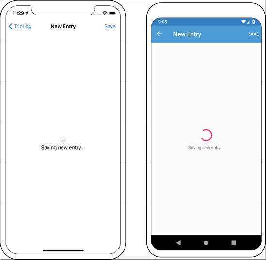
Figure 2: The TripLog new entry page with a busy indicator while saving data
Creating an integer-to-image value converter
In this section, we will continue to improve the user experience with the use of another value converter. Currently, the detail page binds to the Rating property and simply displays the integer value as a formatted string, which is a rather boring way to display data, as shown in the following screenshot:

Figure 3: The TripLog entry detail page
This rating data would look much nicer, and stand out to the user much more if it were an image of stars instead of plain text. In order to translate a number value to an image, we will need to create a new value converter, as shown in the following steps:
- Create a new class file in the core library
Convertersfolder namedRatingToStarImageNameConverterthat implementsXamarin.Forms.IValueConverter:public class RatingToStarImageNameConverter : IValueConverter { } - Next, provide implementations for the
Convert()andConvertBack()methods ofIValueConverter. In theConvert()method, we will need to check whether the value is an integer, and then, based on its value, we will need to convert it to an image filename:public class RatingToStarImageNameConverter : IValueConverter { public object Convert(object value, Type targetType, object parameter, CultureInfo culture) { if (value is int rating) { if (rating <= 1) { return "star_1"; } if (rating >= 5) { return "stars_5"; } return "stars_" + rating; } return value; } public object ConvertBack(object value, Type targetType, object parameter, CultureInfo culture) { throw new NotImplementedException(); } }Notice we are throwing a
NotImplementedExceptionin theConvertBackmethod. This converter is only used to convert the value when displaying it; the value is never changed in the UI, and therefore does not need to be converted back so the method is never called and can be left unimplemented. This is common for converters that are used with read-only or one-way data bindings. - Finally, we will need to update
DetailPage.xamlto use anImagecontrol instead of aLabelto display the rating. We will still bind theImagecontrol to the same ViewModel property; however, we will use the converter we just created to convert it to an image filename:<ContentPage xmlns="http://xamarin.com/schemas/2014/forms" xmlns:x="http://schemas.microsoft.com/winfx/2009/xaml" xmlns:maps="clr-namespace:Xamarin.Forms.Maps;assembly=Xamarin.Forms.Maps" xmlns:converters="clr-namespace:TripLog.Converters;assembly=TripLog" x:Class="TripLog.DetailPage"> <ContentPage.Resources> <ResourceDictionary> <converters:RatingToStarImageNameConverter x:Key="RatingToStartImageNameConverter" /> </ResourceDictionary> </ContentPage.Resources> <ContentPage.Content> <Grid> <!-- ... --> <StackLayout Padding="10" Grid.Row="1"> <Label HorizontalOptions="Center" Text="{Binding Entry.Title}" /> <Label HorizontalOptions="Center" Text="{Binding Entry.Date, StringFormat='{0:M}'}" /> <Image HorizontalOptions="Center" Source="{Binding Entry.Rating, Converter={StaticResource RatingToStartImageNameConverter}}" /> <Label HorizontalOptions="Center" Text="{Binding Entry.Notes}" /> </StackLayout> </Grid> </ContentPage.Content> </ContentPage>
Now, if we run the app and navigate to one of the entries, we will see a much nicer display that immediately causes the rating to stand out to the user, as shown in the following screenshot:

Figure 4: The TripLog entry detail page with an image for the entry rating
Adding pull-to-refresh
As with the new entry page, when the main page is loading our data, we should present the user with a loading indicator so that they know their list of entries is on its way. However, since the main page is using a data-bound CollectionView instead of a static TableView, we can surround the CollectionView with a RefreshView to easily add pull-to-refresh functionality.
Pull-to-refresh also has the benefit of allowing users to easily refresh the screen and load any new data that might be available. Xamarin.Forms makes adding pull-to-refresh very easy, and we will still use the IsBusy property from our BaseViewModel, just as we did on the new entry page.
The Xamarin.Forms RefreshView API requires two things: an ICommand that handles refreshing the bound source of the scrollable element it surrounds (in our case, this is a CollectionView), and a boolean field that indicates whether the RefreshView is currently refreshing or not. To add pull-to-refresh, perform the following steps:
- First, we will need to add a new refresh command to
MainViewModel. This command will simply call the existingLoadEntries()method:Command _refreshCommand; public Command RefreshCommand => _refreshCommand ?? (_refreshCommand = new Command(LoadEntries)); - Next, we will need to update the
LoadEntries()method to setIsBusywhile it's loading its data. For now, just as we did earlier in the chapter with theNewEntryViewModel, we will add a 3-second delay to simulate a waiting period (we will remove this in the next chapter when we start getting our data from a live web service):void LoadEntries() { if (IsBusy) { return; } IsBusy = true; LogEntries.Clear(); // TODO: Remove this in chapter 6 Task.Delay(3000).ContinueWith(_ => Device.BeginInvokeOnMainThread(() => { LogEntries.Add(new TripLogEntry { // ... }); LogEntries.Add(new TripLogEntry { // ... }); LogEntries.Add(new TripLogEntry { // ... }); IsBusy = false; })); } - Next, we will need to surround the
CollectionViewelement inMainPage.xamlwith aRefreshViewand bind itsCommandproperty to the newRefreshCommandcommand we just added inMainViewModel. For theIsRefreshingproperty, we can simply bind toIsBusy, as that will be set totruewhile we're loading entries and back tofalsewhen that operation is complete:<RefreshView IsRefreshing="{Binding IsBusy, Mode=OneWay}" Command="{Binding RefreshCommand}"> <CollectionView ... SelectionMode="Single" ItemsSource="{Binding LogEntries}" ... > <!-- ... --> </CollectionView> </RefreshView>
Now when we run the app, we will see the pull-to-refresh spinner while the data initially loads on the main page, as well as when the user pulls down on the list, as shown in the following screenshot:
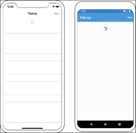
Figure 5: The TripLog main page with pull-to-refresh
Accessibility
When it comes to user interfaces, accessibility is often an afterthought or forgotten about completely. User interfaces are not just about good-looking icons, fonts, and fancy custom controls, they are also about how your users actually use the app. This means that you need to leverage the platform's accessibility APIs to ensure usability for as much of your potential audience as possible. Xamarin.Forms now provides some basic APIs for adding accessibility to your apps, so users who depend on screen readers can successfully interact with the screens of your app.
Supporting screen readers
One of the most common ways to bring accessibility to an app is to provide support for screen readers, which are used to narrate and describe elements on the screen. In this section, we will use the Xamarin.Forms AutomationProperties class to easily add screen reader support to our entry detail page:
- First, we will need to update each of the detail elements in
DetailPage.xamlto be included in the accessibility tree, making them readable by the operating systems' screen readers:<StackLayout Padding="10" Grid.Row="1"> <Label ... Text="{Binding Entry.Title}" AutomationProperties.IsInAccessibleTree="true" /> <Label ... Text="{Binding Entry.Date, StringFormat='{0:M}'}" AutomationProperties.IsInAccessibleTree="true" /> <Image ... Source="{Binding Entry.Rating, Converter={StaticResource RatingToStartImageNameConverter}}" AutomationProperties.IsInAccessibleTree="true" /> <Label ... Text="{Binding Entry.Notes}" AutomationProperties.IsInAccessibleTree="true" /> </StackLayout> - Next, we will need to update each of the detail elements in
DetailPage.xamlto describe itself. This is what the screen reader will use when narrating. There are a couple of properties that we can use for this, such asAutomationProperties.NameandAutomationProperties.HelpText. TheNameproperty is used to identify the element, while theHelpTextproperty is used to describe what the element is used for or what type of data should be provided to the element, as shown in the following code:<StackLayout Padding="10" Grid.Row="1"> <Label ... Text="{Binding Entry.Title}" AutomationProperties.IsInAccessibleTree="true" AutomationProperties.HelpText="Title of trip" /> <Label ... Text="{Binding Entry.Date, StringFormat='{0:M}'}" AutomationProperties.IsInAccessibleTree="true" AutomationProperties.HelpText="Date of trip" /> <Image ... Source="{Binding Entry.Rating, Converter={StaticResource RatingToStartImageNameConverter}}" AutomationProperties.IsInAccessibleTree="true" AutomationProperties.HelpText="{Binding Entry.Rating, StringFormat='{0} star rating'}" /> <Label ... Text="{Binding Entry.Notes}" AutomationProperties.IsInAccessibleTree="true" AutomationProperties.HelpText="Notes from trip" /> </StackLayout>
Notice how we used data binding to set the AutomationProperties.HelpText attribute for the rating Image tag.
Summary
In this chapter, we leveraged several key concepts in the Xamarin.Forms API to help improve the look, feel, and user experience of our TripLog app. With the use of a custom renderer, we are now able to tap directly into the platform-specific APIs to change the default behavior of Xamarin.Forms controls and, with the use of value converters, we are now able to alter the appearance of data when it is bound to the UI. Finally, the Xamarin.Forms accessibility APIs give us the ability to make our app more straightforward for users who rely on accessibility features to use their mobile apps.
In the next chapter, we will connect the TripLog app to an API in order to work with live data.