
In Angular Material, we have used multiple controls and elements that adapt Material Design principles and approaches. FAB is a popular component following Material Design principles. The speed dial among FAB controls is widely used in Material Design applications.
In this chapter, we will explore responsive patterns recommended by Material Design. They suggest an approach for adapting to multiple screen sizes, ranging from mobile phones to desktop computers. We use flexbox and Material Design features to achieve the same.
Reflow
This is a responsive design pattern recommended in Material Design. It allows controls and content to reflow or take up the available space on a screen.
The following example is useful on mobile devices in landscape and portrait modes. On mobile devices, a view or arrangement of controls that makes sense on a landscape mode might not always be relevant in portrait mode; the opposite is true too. There is a need to reflow the content that better fits landscape or portrait mode.
The example has two sections on the screen: one for selecting time and the other with a greeting message. The idea is to adapt to the layout change and reflow. A real-world example could be little more complex. However, the sample here is to get an idea on reflow pattern. See Figure 12-1 and Figure 12-2.

Figure 12-1. A “reflow” sample in potrait mode
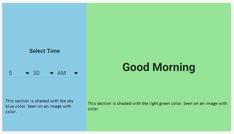
Figure 12-2. A “reflow” sample in landscape mode
We could achieve this layout by using layout attribute with a value "column". It has two child elements:
Sky blue colored time selection pane.
Light green colored greeting message pane.
Consider the following code .
<div flex layout="column" ng-controller="sampleController" ><div style="background-color:skyblue" flex="25" layout="column" layout-padding layout-align="center center"><strong>Select Time</strong><!-- A div element that constructs time selection dropdowns. Removing code for better readability. Down below, complete snippet available. --></div><!-- following div element constructs the greeting message --><div layout="column" layout-padding layout-align="center center" flex="75" style="background-color:lightgreen"><h1>{{greetingMessage}}</h1></div></div>
Notice the boldface text in the code. On the root element layout is set to be a column. There are two sections or cells in a column. The first section flexes to 25% and the second section flexes to 75%.
Now, let us make it reflow in a landscape mode. See Figure 12-2.
When in landscape mode, the screen size is greater than extra-small. Now, reflow to a row. On the root element, set layout value to be row. It overrides default layout value without a breakpoint postfix (gt-xs).
<div layout-gt-xs="row" flex layout="column" ng-controller="sampleController" >This rearranges the two sections to become cells in a row instead of a column. Here is the complete HTML template code .
<div layout-gt-xs="row" flex layout="column" ng-controller="sampleController" ><!--the rowFill CSS class forces the div to occupy full height in a row layout.ng-class uses a variable isGreaterThanXs to check the screensize and hence identify landscape mode--><div style="background-color:skyblue" ng-class="{rowFill:isGreaterThanXs}" flex="25" layout="column" layout-padding layout-align="center center"><strong>Select Time</strong><div layout="row"><md-select ng-model="selectedHour"><md-option ng-repeat="hour in hours" ">{{hour}}</md-option></md-select><md-select ng-model="selectedMinute"><md-option ng-repeat="minute in minutes">{{minute}}</md-option></md-select><md-select ng-model="selectedAMPM"><md-option ng-repeat="item in AM_PM" ">{{item}}</md-option></md-select></div></div><div layout="column" layout-padding layout-align="center center" ng-class="{rowFill:isGreaterThanXs}" flex="75" style="background-color:lightgreen"><h1>{{greeting}}</h1></div></div>
Position
The pattern is about repositioning controls and actions to fit better with the view. Consider menu as an example. On a bigger and wider screen, menu on toolbar is effective. On a smaller mobile screen, a menu is difficult to work with, especially with a large number of actions that could result in a scrollbar. Position pattern advocates making it a more accessible control for a smaller screen. Here we make it a bottom sheet on a smaller screen.
Consider Figure 12-3 and Figure 12-4. We show menu on a larger and wider screen.

Figure 12-3. Wider screen ; show actions as menu
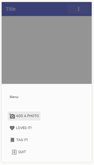
Figure 12-4. Smaller form factor resulting in bottom sheet
We show menu options on a bottom sheet on a mobile view (Figure 12-4).
Consider the following code. Notice that “menu content” is hidden by default. It is shown on a screen greater than small (gt-sm), that is, medium and above.
<md-toolbar><div class="md-toolbar-tools" layout="row"><h2>Title</h2><span flex></span><md-menu><!-- Trigger element is a md-button with an icon --><md-button ng-click="showActions($mdOpenMenu,$event); "><md-icon md-font-set="material-icons">more_vert </md-icon></md-button><!-- hide details of menu for better readability --><md-menu-content hide show-gt-sm><md-menu-item>...</md-menu-item>...</md-menu-content></md-menu></div></md-toolbar>
Notice the md-button that triggers showing the menu. On clicking, we call a function on the associated controller. The controller function has further logic for position. Consider the following controller code .
$scope.showActions = function($mdOpenMenu, event){if($mdMedia('gt-sm')){$mdOpenMenu(event);}else{$mdBottomSheet.show({templateUrl: "/bottom-sheet-template.html"});}};
Notice the statement in the preceding code. On a screen size greater than small (gt-sm), that is, medium and larger, $mdOpenMenu will run. It results in showing a menu bar. Otherwise, on a screen size that is small and extra-small, we show the bottom sheet.
Review the complete code for a holistic understanding.
Template for bottom sheet .
<script type="text/ng-template" id="/bottom-sheet-template.html"><md-bottom-sheet class="md-list"><md-subheader>Menu</md-subheader><md-list><md-list-item><md-button ng-click="null" ><md-icon md-font-set="material-icons">add_a_photo</md-icon><span>Add a photo</span></md-button></md-list-item><md-list-item><md-button ng-click="null" ><md-icon md-font-set="material-icons">favorite</md-icon><span>Loved It!</span></md-button></md-list-item><md-list-item><md-button ng-click="null" ><md-icon md-font-set="material-icons">bookmark</md-icon><span>Tag It!</span></md-button></md-list-item><md-list-item><md-button ng-click="null" ><md-icon md-font-set="material-icons">exit_to_app</md-icon><span>Quit</span></md-button></md-list-item></md-list></md-bottom-sheet></script>
Toolbar with menu included.
<md-toolbar><div class="md-toolbar-tools" layout="row"><h2>Title</h2><span flex></span><md-menu><!-- Trigger element is a md-button with an icon --><md-button ng-click="showBottomSheet($mdOpenMenu,$event); "><md-icon md-font-set="material-icons">more_vert </md-icon></md-button><md-menu-content hide show-gt-sm><md-menu-item><md-button ng-click="null" layout="row"><md-icon md-font-set="material-icons">add_a_photo</md-icon>Add a photo</md-button></md-menu-item><md-menu-item><md-button ng-click="null" layout="row"><md-icon md-font-set="material-icons">favorite</md-icon>Loved it</md-button></md-menu-item><md-menu-item><md-button ng-click="null" layout="row"><md-icon md-font-set="material-icons">bookmark</md-icon>Tag it</md-button></md-menu-item><md-menu-item><md-button ng-click="null" layout="row"><md-icon md-font-set="material-icons">exit_to_app</md-icon>Exit App</md-button></md-menu-item></md-menu-content></md-menu></div></md-toolbar>
Complete Controller ,
myModule.controller('positionSampleController', function($scope, $mdMedia, $mdBottomSheet){$scope.showBottomSheet = function($mdOpenMenu, event){if($mdMedia('gt-sm')){$mdOpenMenu(event);}else{$mdBottomSheet.show({templateUrl: "/bottom-sheet-template.html"});}};});
Transform
Transform, another responsive design pattern, recommends realigning and rearranging elements on the page for the best view on a given screen size.
Consider an example we already discussed: a responsive grid list that adapts to screen size on a mobile phone/tablet, laptop, or desktop. (Review Chapter 8, Grid List section, for reference.) Consider the following code and images that depict a transform pattern. It renders a single-column grid list by default, a two-column grid list on a small and medium-size screen, and a three-column grid list on an even bigger screen. See Figure 12-5 and Figure 12-6.

Figure 12-5. Two columns on a medium screen size

Figure 12-6. Single column and default row span for first tile on a small screen
<md-grid-list md-cols="1" md-cols-gt-xs="2" md-cols-gt-md="3" md-row-height="16:9"><md-grid-tile md-rowspan-gt-sm="{{($index===0)?2:1}}" ng-class="item.background" ng-click="null" ng-repeat="item in superheroes"><img style="max-width:100px" ng-src="{{item.imageUrl}}" /><md-grid-tile-footer layout-padding><span>{{item.category}}</span></md-grid-tile-footer><md-grid-tile-header layout-padding><h2>{{item.name}}</h2></md-grid-tile-header></md-grid-tile></md-grid-list>
Let us consider a completely new approach on top of it. Instead of a single-column grid list , we can hide the grid list on an extra-small screen and show a list view. The list view is compact and better on a smaller screen. Consider the following code. Highlighted code shows/hides the grid list. It is hidden by default. However, it will show if it is greater than an extra-small screen (i.e., small, medium, large, and extra-large).
<md-grid-list hide show-gt-xs md-cols="2" md-cols-gt-md="3" md-row-height="16:9"><md-grid-tile md-rowspan-gt-sm="{{($index===0)?2:1}}" ng-class="item.background" ng-click="null" ng-repeat="item in superheroes"><img style="max-width:100px" ng-src="{{item.imageUrl}}" /><md-grid-tile-footer layout-padding><span>{{item.category}}</span></md-grid-tile-footer><md-grid-tile-header layout-padding><h2>{{item.name}}</h2></md-grid-tile-header></md-grid-tile></md-grid-list>
On an extra-small screen, the following list view will show (see Figure 12-7). Notice that it shows the same data and in the code has the same bindings (imageUrl, name, category, etc.). Nevertheless, it is hidden on a bigger screen. It will show when grid list does not (which is on an extra-small screen).

Figure 12-7. List view on an emulated mobile phone view
<md-list hide show-xs><md-list-item class="md-2-line" ng-repeat="item in superheroes" ng-click="null"><img ng-src="{{item.imageUrl}}" class="md-avatar"><div class="md-list-item-text" layout="column"><strong>{{item.name}}</strong><div>{{item.category}}</div></div></md-list-item></md-list>
Reveal
Reveal is another responsive Material Design pattern. The UI reveals more options, content, and actions on a bigger screen. These might be hidden or collapsed on a smaller screen.
Consider the responsive approach to sidenav described in Chapter 4. On a bigger screen, sidenav could always be shown. Imagine a medium or large screen. It could be a tablet in landscape mode or a browser on desktop/laptop full screen. We have enough space to show all options. Hence, sidenav will always show. On a smaller screen, hide the sidenav to give way to workspace and the main content of the view.
Consider the following images of a browser emulated to iPad screen in portrait and landscape modes (Figure 12-8 and Figure 12-9, respectively). The former does not have enough space for sidenav, whereas the latter reveals sidenav.

Figure 12-8. Browser emulated to iPad in potrait dimentions . It does not show sidenav

Figure 12-9. Browser emulated to iPad in landscape dimentions . It has enough space for sidenav
Consider the following code to achieve the same. Notice that the code has a responsive attribute to implement the reveal pattern. The sidenav is locked open on a screen greater than small (gt-sm), which is medium and above.
<md-sidenav md-component-id='content-sidenav' md-is-locked-open="$mdMedia('gt-sm')" flex="20" class="md-sidenav-left" layout-padding><h4>side nav content</h4></md-sidenav>
Review Chapter 4 for complete code snippets on sidenav.
The sidenav, when it is hidden on a small screen, we could place a menu button on toolbar to open and use available options.
Reveal—Toolbar Actions Example
Let us explore another implementation of reveal pattern with toolbar actions. These are page-level buttons placed on the toolbar. We could use the pattern to show more options on a larger screen. On a smaller screen we could collapse to show only the most used or relevant actions.
Similar to sidenav, we may transform the remaining options into a menu. The additional options that do not fit on a smaller screen could collapse into a more options menu. This allows the screen to be clean and usable, with only a required set of actions or buttons.
Implementing a more options menu is analogous to a transform pattern, as the buttons on toolbar transform to a menu. However, adjusting available buttons on a screen is analogous to a reveal pattern.
Consider Figure 12-10. There are six toolbar actions available for a given page. As you read through the rest of the section, you will realize that these buttons gradually collapse under “more actions” buttons. A couple of them collapse initially on a small screen. More will go under the menu as the screen size reduces further. See Figure 12-10, Figure 12-11, and Figure 12-12.

Figure 12-10. Medium screen size ; all buttons shown

Figure 12-11. Toolbar with actions on extra-small screen

Figure 12-12. Hidden actions revealed by clicking more button
On a big enough screen, we could show all available buttons. On an extra-small screen, we show only two action buttons with a “more” menu. See Figure 12-11. The first two action buttons are shopping and comments (icons). Consider using the most used and relevant icons for a mobile screen. The more button acts like a menu and shows rest of the actions. See Figure 12-12.
Hide/Show Buttons on Toolbar
At first, let us look at code to hide or show buttons on the toolbar depending on the screen size. In the next section, will detail showing those on the menu.
Consider the following code. On the toolbar, shopping and comments buttons are shown irrespective of screen size. No flexbox, responsive attributes (breakpoints) for these elements.
<div class="md-toolbar-tools" layout="row"><h2>Title</h2><span flex></span><md-button ng-click="null"><md-icon md-font-set="material-icons">shopping</md-icon></md-button><md-button ng-click="null"><md-icon md-font-set="material-icons">comment</md-icon></md-button>
However, the following actions are shown on a screen greater than extra-small, that is, small and above. Review highlighted code for responsive breakpoints.
<md-button ng-click="null" hide show-gt-xs><md-icon md-font-set="material-icons">add_a_photo</md-icon></md-button><md-button ng-click="null" hide show-gt-xs><md-icon md-font-set="material-icons">favorite </md-icon></md-button>
As the screen size increases, we could show more actions. Two more toolbar buttons are shown on a medium and above screen size. On a smaller screen (small and below) they are hidden under the menu. Review boldface code for breakpoints. Also see Figure 12-13 and Figure 12-14.

Figure 12-13. On a small screen size (breakpoint sm), two action buttons are hidden under the “more action” button

Figure 12-14. Small screen size. The menu shows only the two hidden menu options
<md-button ng-click="null" hide show-gt-sm><md-icon md-font-set="material-icons">exit_to_app</md-icon></md-button><md-button ng-click="null" hide show-gt-sm><md-icon md-font-set="material-icons">bookmark</md-icon></md-button>
On the other hand, the menu for more options is shown on small and extra-small screens only. Notice that the “more actions” menu needs to have inverse breakpoints compared to other buttons on the toolbar. That is because if a button is already shown on the toolbar, it need not be shown under the “more” menu. When it is hidden because of space constraints on the toolbar, it needs to be available on the more actions menu.
Review the following code: highlighted breakpoints for the menu. It is hidden on a screen size greater than small (medium and larger). As you might have noticed in the preceding, medium and larger screen sizes have no toolbar action buttons hidden. Hence, the more button is not necessary.
<md-menu hide-gt-sm><!-- menu trigger, a button on the toolbar. --><md-button ng-click="$mdOpenMenu($event)"><md-icon md-font-set="material-icons">more_vert </md-icon></md-button>
Hide/Show Buttons on the Menu
Now that we saw code to manage buttons on the toolbar, let us look at hiding and showing the same on menu. When a button is hidden on the toolbar due to space constraints, it needs to be available under the menu.
Use Angular Material menu control to implement the “more” button. The icon button is a trigger for the menu.
Consider the following code for buttons under the menu. As learnt while discussing menu control in an earlier chapter, these buttons are coded under md-menu-content element/directive.
<md-menu-content><md-menu-item hide-gt-xs><md-button ng-click="null" layout="row"><md-icon md-font-set="material-icons">add_a_photo</md-icon>Add a photo</md-button></md-menu-item><md-menu-item hide-gt-xs><md-button ng-click="null" layout="row"><md-icon md-font-set="material-icons">favorite</md-icon>Loved it</md-button></md-menu-item>
Each menu item is wrapped in md-menu-item. Review breakpoints on the menu, which hide buttons on a screen size greater than extra-small (hide-gt-xs). This means that screen sizes of small and larger show these buttons on the toolbar. Hence, the menu does not need to have “add photo” and “favorite” (Loved it) buttons.
The following is what remains of menu content. These are hidden on a greater than small screen size (medium and above). If the menu button is shown, these buttons are also visible.
<md-menu-item hide-gt-sm><md-button ng-click="null" layout="row"><md-icon md-font-set="material-icons">bookmark</md-icon>Tag it</md-button></md-menu-item><md-menu-item hide-gt-sm><md-button ng-click="null" layout="row"><md-icon md-font-set="material-icons">exit_to_app</md-icon>Exit App</md-button></md-menu-item>
Here is the complete code.
<md-toolbar class="md-secondary"><div class="md-toolbar-tools" layout="row"><h2>Title</h2><span flex></span><md-button ng-click="null"><md-icon md-font-set="material-icons">shopping</md-icon></md-button><md-button ng-click="null"><md-icon md-font-set="material-icons">comment</md-icon></md-button><md-button ng-click="null" hide show-gt-xs><md-icon md-font-set="material-icons">add_a_photo</md-icon></md-button><md-button ng-click="null" hide show-gt-xs><md-icon md-font-set="material-icons">favorite </md-icon></md-button><md-button ng-click="null" hide show-gt-sm><md-icon md-font-set="material-icons">exit_to_app</md-icon></md-button><md-button ng-click="null" hide show-gt-sm><md-icon md-font-set="material-icons">bookmark</md-icon></md-button><md-menu hide-gt-sm><!-- Trigger element is a md-button with an icon --><md-button ng-click="$mdOpenMenu($event)"><md-icon md-font-set="material-icons">more_vert </md-icon></md-button><md-menu-content><md-menu-item hide-gt-xs><md-button ng-click="null" layout="row"><md-icon md-font-set="material-icons">add_a_photo</md-icon>Add a photo</md-button></md-menu-item><md-menu-item hide-gt-xs><md-button ng-click="null" layout="row"><md-icon md-font-set="material-icons">favorite</md-icon>Loved it</md-button></md-menu-item><md-menu-item hide-gt-sm><md-button ng-click="null" layout="row"><md-icon md-font-set="material-icons">bookmark</md-icon>Tag it</md-button></md-menu-item><md-menu-item hide-gt-sm><md-button ng-click="null" layout="row"><md-icon md-font-set="material-icons">exit_to_app</md-icon>Exit App</md-button></md-menu-item></md-menu-content></md-menu></div></md-toolbar>
Summary
Responsive design is one of the core features of Angular Material. In this chapter, we explored multiple patterns which facilitate better user experiences on all screen sizes. These patterns identify and provide solutions to commonly occurring screen layout problems.
The preceding implementations are my take on Material Design–responsive patterns. They are implemented using flexbox and Angular Material features. I acknowledge there could be multiple ways to implement the same pattern (within the Angular Material context). The preceding examples should provide some context and an initial idea.
In this chapter, we discussed the following:
Reflow: It rearranges controls and the content to fit various screen sizes. There could be variations in landscape and portrait layouts on the same device, or the app could be opened on a bigger and better screen. The reflow pattern suggests a way to rearrange content to fill available space.
Position: It suggests repositioning the control or component by screen size. A control like menu might not be suitable for a small screen. We might need a different control, of positioning at a different location on a smaller mobile screen. We may use bottom sheet instead of menu on a smaller screen and fall back to menu on a bigger screen.
Transform: It suggests approaches to rearrange and use different layouts by screen size. Transforming a grid to show different number of columns on various screen sizes is one effective approach. We could even take it to the next level and use a better and compact control like “list” on a smaller mobile screen.
Reveal: It recommends using small and important actions on smaller screens, like mobile phones. From there, reveal to show more options on a bigger screen and hence make the view or functionality more powerful on a bigger screen.
For Material Design–responsive patterns, see https://www.google.com/design/spec/layout/responsive-ui.html#responsive-ui-patterns