
Skill 37
Interpret Charts and Graphs
Graphs and charts are visual representations of numbers and their relationships to each other. You are likely to be asked to interpret one on the ASVAB test.
Circle Graph. Look at the following graph, which represents the ice cream flavor preferences reported in a poll of 165 students at a certain high school. This kind of graph is called a circle graph or pie graph (because it resembles a pie with slices). Based on the graph, which flavor was the favorite of the largest group of students who were polled?
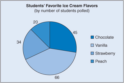
The graph makes it easy to see that the largest group, 66 students, preferred vanilla.
Sometimes the data are presented as percentages of a whole rather than actual numbers. That is why you always need to pay careful attention to the labels on graphs. The following circle graph shows the same data, but this time the number labels are percentages of the total group of 165 students, not the number of individual who preferred each ice cream flavor.

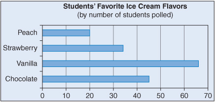
Bar Graph. Here are the same data shown on a type of graph called a bar graph:
Line Graph. A line graph is typically used to show how data change over time. For example, the following graph shows how the daily high temperature in a certain town changed from day to day during the first 2 weeks of October.

Test Yourself!
For the following five questions, base your answers on the bar graph below, which shows how students voted in a recent class election.
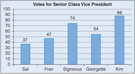
![]() How many votes were cast for Signeous?
How many votes were cast for Signeous?
![]()
![]() Who obtained the least number of votes?
Who obtained the least number of votes?
![]()
![]() How many total votes were cast?
How many total votes were cast?
![]()
![]() What percentage of votes did Kim receive?
What percentage of votes did Kim receive?
![]()
![]() How many votes did Georgette and Sal receive together?
How many votes did Georgette and Sal receive together?
![]()
Questions 6 and 7 are based on the following line graph, which shows Lethea’s scores on weekly quizzes last semester.
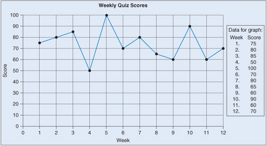
![]() In which 2 weeks did Lethea achieve her best scores?
In which 2 weeks did Lethea achieve her best scores?
![]()
![]() What was the Lethea’s lowest quiz score during the semester?
What was the Lethea’s lowest quiz score during the semester?
![]()
Question 8 is based on the following pie graph.

![]() Which four countries earned a total of 50% of the Olympic medals?
Which four countries earned a total of 50% of the Olympic medals?
![]() Canada, Germany, Norway, and Sweden
Canada, Germany, Norway, and Sweden
![]() United States, Canada, China, and Turkey
United States, Canada, China, and Turkey
![]() Germany, Norway, China, and South Korea
Germany, Norway, China, and South Korea
![]() Turkey, South Korea, Sweden, and Germany
Turkey, South Korea, Sweden, and Germany