

Work in Slide Master View
</objective> <objective>Modify Slide Layouts
</objective> <objective>Add Custom Placeholders
</objective> <objective>Create SmartArt Diagrams
</objective> <objective>Fit Text
</objective> <objective>Create and Add Tab Stops
</objective> <objective>Work with Tables
</objective> <objective>Create Charts
</objective> </feature>ON THE CD:
The sample presentation and all other files you need to work with can be found on the CD in the Makeover 02 folder.
Many presenters find it disconcerting to see their presentations completely changed—they don’t recognize them and become extremely stressed as a result. Thus, rather than completely overhauling this presentation, our goal is to create consistency throughout the slides and make them visually interesting, yet easy to read and understand quickly. Sukomu, Inc., will use this presentation for a medical speaker training meeting to teach healthcare professionals about their new drug, Chewaway.
One simple thing you can do to help a presentation look more professional and pulled together is to use placeholders to make sure that various text elements—titles, references, and so on—are positioned in the same location on all slides throughout the file. PowerPoint 2007 allows the user to do this by creating her own placeholders, so take advantage of this new feature.
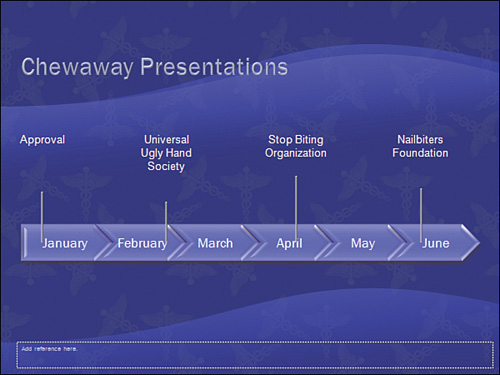
Figure 3.1 shows you two slides from the “before” presentation; these are conventional slides that look similar to the millions of slides churned out in offices every single day.

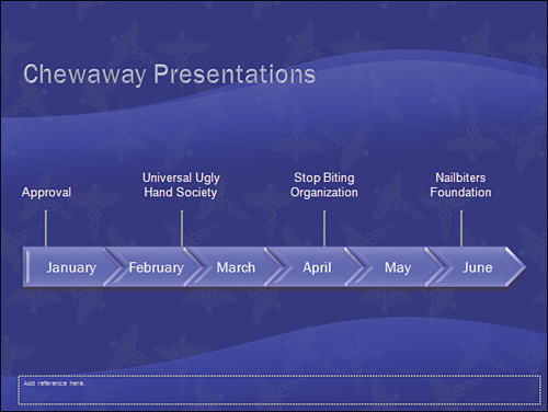
Figure 3.2 shows you the same slides, but as you can see, these have more pizzazz in them even though they really aren’t too different from the slides in Figure 3.1.

To create consistency in the slides, we will apply a theme, adjust the title placeholders, and put reference text into placeholders on some of the Slide Layouts.
A theme consists of a color scheme, a font set, effects, Slide Masters, Slide Layouts, and background styles. Applying a theme to your presentation is the best way to ensure that these elements remain consistent throughout the file.
Follow these steps to get started:
Open the original presentation,
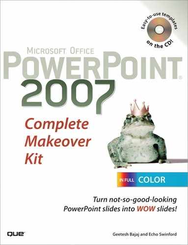
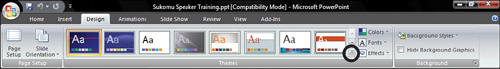
medical_00.pptx, by clicking Office Button, Open.Now you need to apply a medical theme that we included on the CD. Click the Design tab on the Ribbon. Click the More arrow to the far right of the Themes gallery (see Figure 3.3) to display all the available theme choices.
Click Browse for Themes (see Figure 3.4).
Navigate to the
medical.thmxfile in theMakeover 02Themefolder on the CD, and click Apply.
Working with Slide Masters and Layouts
If you want something to appear on every slide, you should place it on the Slide Master.
If you want something to appear on a specific type of slide, you should place it on the Slide Layout(s). For example, if you want your corporate logo to appear only on your title slides, add the logo to the Title Slide Layout, not to the Slide Master. In addition, if you want a different font face on the title slide, change that on the Title Slide Layout, not on the Slide Master.
To work with Slide Masters and Layouts, click the View tab, and click Slide Master to open Slide Master view.
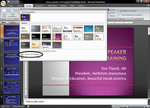
A Slide Master is the design basis for each of your individual slides. Each Slide Master also has related Slide Layouts that control how individual slides look.
The large thumbnail in the Slides pane is the Slide Master. The smaller thumbnails below the large thumbnail are Slide Layouts. The design of the Slide Layout is based on the Slide Master above it in the Slides pane (see Figure 3.5). You can have more than one Slide Master in a presentation.
Consider carefully whether to include another Slide Master with its collateral layouts or simply add a Slide Layout to an existing master (see Figure 3.6). This is not always an easy decision to make. You might need to have one master for every layout that includes a logo and a second master for every layout that is without a logo. On the other hand, you might prefer to include just a few individual layouts with a logo and a few without, all attached to the same Slide Master.

Whichever way you go, delete extra Slide Layouts you are sure you won’t need, as they do add to file size (and also make it confusing for you to choose from a crowded layout gallery).
When you are done, you can exit the Slide Master view by selecting the Slide Master tab, and then clicking the Close Master View button. Alternatively, click Normal on the View tab.
Slide titles rarely are the same length; they vary from one line of text to two lines of text and often include more lines still. When you add title text, usually the title placeholder expands on both the top and the bottom to make room for the text. This causes the baseline of the title text to jump and “descend” as you move from one slide to another during a presentation.
To avoid this type of distracting design (see slide 6 in the original presentation for an example), anchor the baseline of the text at the bottom of the placeholder.
Tip
Repeating elements, such as slide titles and references, that don’t jump around as you move from slide to slide indicate a professionally developed presentation.
If you are following the makeover step by step, continue using your saved presentation. If you just stepped in, you can use the medical_02.pptx presentation from the Makeover 02Steps folder on the CD.
To anchor the text in the title placeholder, do the following:
Click the View tab on the Ribbon, and choose Slide Master to open Slide Master view.
Select the Slide Master by clicking the larger thumbnail on the top in the Slides pane. You might have to scroll up to the top of the Slides pane if the Slide Master is not visible, and then select the title placeholder in the Slide Master.
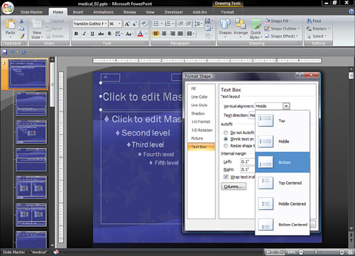
Right-click the title placeholder, and choose Format Shape to open the Format Shape dialog box (see Figure 3.7).
In the Format Shape dialog box, click Text Box on the left and choose Bottom from the Vertical Alignment drop-down list on the right (refer again to Figure 3.7).
Click Close to close the dialog box and get it out of your way.
Click the View tab on the Ribbon, and then choose Normal to return to Normal editing view. You also can click the Slide Master tab on the Ribbon and choose Close Master View.
To ensure that the theme formatting is applied, we must reset the Slide Layout for the title slide. We also need to apply the correct layout to the rest of our slides. Sometimes PowerPoint gets mixed up and applies the wrong Slide Layouts when you apply a theme. This is one of those times, but it’s easy to correct. If you don’t understand all this stuff, don’t worry; just follow this quick series of steps that will teach you exactly what you need to learn.
If you are following the makeover step by step, continue using your saved presentation. If you just stepped in, you can use the medical_03.pptx presentation from the Makeover 02Steps folder on the CD.
Follow these steps to reset the Slide Layout:
Select the Title Slide in the Slides pane.
On the Home tab on the Ribbon, choose Reset in the Slides group.
The result is nicely formatted text that is readable and visually appealing (see Figure 3.8).


We created some layouts with a reference placeholder so that our references could be in the same position from slide to slide. We need to apply these layouts to the slides.
To apply a different Slide Layout
Select slides 2, 3, 5, and 7 in the Slides pane (or in Slide Sorter view) by Ctrl+clicking on each thumbnail.
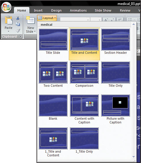
On the Home tab on the Ribbon, choose Layout, and then the Title and Content layout (see Figure 3.9).
Similarly, apply the Title Only Slide Layout to slides 4 and 6.
Finally, select slides 2 through 7 and on the Home tab of the Ribbon, choose Reset to apply the placeholder formatting to the selected slides. Now see? I told you it was easy!
The next thing you need to do with the existing medical presentation is to paste the reference text into the reference placeholders so that they’ll be properly positioned.
Select the reference text on slide 5, copy it, and paste it into the reference placeholder (where it says Add Reference Here). Then delete the old reference text box if necessary. Repeat this process for the references on slide 6, and save your file.
Sometimes you don’t need a full-fledged table, but your text could still benefit from alignment that is better than what a couple taps of the spacebar can provide. In those situations, PowerPoint’s tabs sure come in handy!
If you are following the makeover step by step, just continue using your saved presentation. If you just stepped in, you can use the medical_03.pptx presentation from the Makeover 02Steps folder on the CD.
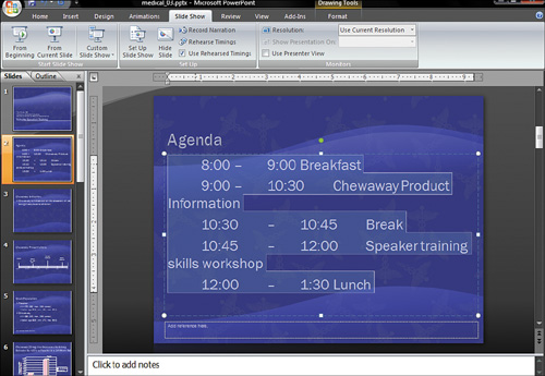
We added tabs on slide 2 to better align the times on the agenda and to make them easier to read at a glance—it’s much better than trying to eyeball it using the spacebar!
To add tabs on a slide, do the following:
Right-click the edge of the text placeholder on slide 2 so that you don’t select any individual text. On the mini toolbar that shows up, click the bullet icon to remove the bullets from the text.
Click before the first time (8:00) and press Tab.
Between 8:00 and the dash, delete the space and press Tab again.
Between the dash and 9:00, delete the space and press Tab again.
Between 9:00 and the word Breakfast, delete the space and press Tab once more. Repeat steps 2–5 for the rest of the lines. For now, don’t worry if the text spills over to the next line or if it looks as if the tab is not there (see Figure 3.10).
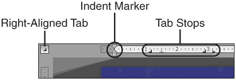
Now position the tab stops. The first is a right-aligned tab to align the right edges of the first numbers.
If the ruler isn’t visible, turn it on by clicking the View tab on the Ribbon and placing a check in the Ruler check box.
Select all the text.
Slide the bottom indent caret (refer to Figure 3.10) on the ruler all the way to the left to remove the indent from the text. Don’t panic if the text shifts to the right, because you’ll fix this in the next steps.
Note that the tab selector on the far left shows the left align tab by default. Clicking it in succession rotates between center, right, and justified align tabs. Click it twice so that the right-aligned tab is showing (see Figure 3.11).
Click the bottom edge of the ruler to add a tab. You don’t need to worry about how far along the ruler you click because you’ll reposition the tab next.
Click and drag the new tab stop marker on the ruler to a position where you want the right-most characters in the opening set of timings to anchor (use Figure 3.11 as a reference).
With all the text still selected, repeat steps 4–6 using a center tab for the dash, another right tab for the ending time, and a left-aligned tab for the session description (see Figure 3.12).
Capitalize the words Training Skills and Workshop. Alternatively, make the words Product and Information lowercased. It doesn’t really matter which you do, just be consistent.
Finally, select the Chewaway Product Information line of text, right-click it, and then select Light Yellow, Accent 3 from the Font Color drop-down list on the mini toolbar. Repeat this step for the Speaker Training Skills Workshop text. This helps the reader’s eye distinguish the topic from the others as she reads down the list. See Figure 3.12 to see how the finished slide looks.

SmartArt diagrams are a new feature in PowerPoint 2007. They make it easy for you to create organization charts, flow charts, process plans, and other types of diagrams and to apply formatting that coordinates well with your presentation. Why not save yourself some hassle and use SmartArt instead of drawing diagrams from scratch?
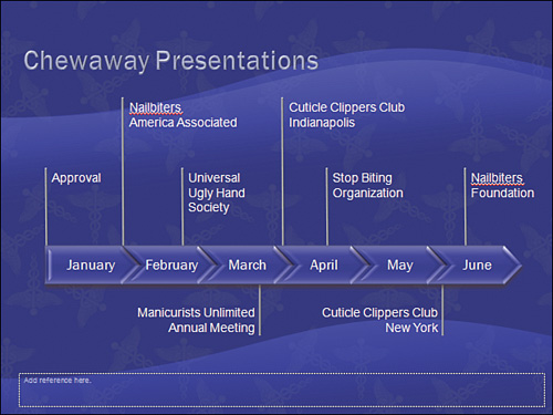
SmartArt diagrams are just what you need for the timeline graphic in this makeover. Here we inserted the Closed Chevron Process diagram and chose 3D Inset from the SmartArt Styles gallery.
If you are following the makeover step by step, continue using your saved presentation. If you just stepped in, you can use the medical_04.pptx presentation from the Makeover 02Steps folder on the CD.
Insert a SmartArt diagram following these steps:
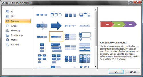
On slide 4, click the Insert tab on the Ribbon, and then click SmartArt. This brings up the Choose a SmartArt Graphic dialog box.
Choose the Process category on the left pane of the dialog box, and select Closed Chevron Process from the list in the middle of the dialog box (see Figure 3.13).
Click OK to close the dialog box and add the diagram to your slide.
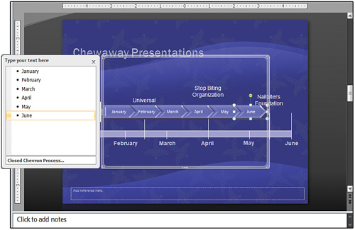
Click the double-headed arrow on the left of the SmartArt diagram to open the SmartArt Text pane (if it is not already visible). Type the months January through June in this pane (see Figure 3.14).
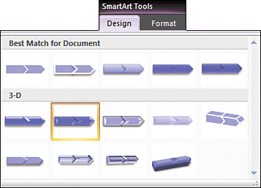
On the SmartArt Tools Design tab of the Ribbon, choose SmartArt Styles gallery. Click the More drop-down arrow to view the entire gallery. Click the 3D Inset style (see Figure 3.15) to apply it.
Drag the edges of the diagram to resize the entire diagram and place it on the middle of the slide, generally in the same position as the existing timeline. You might want to click the close button on the Text pane before you do the resizing.
With the SmartArt graphic selected, click the Home tab on the Ribbon, and then click Arrange, Send to Back.
On the slide itself, delete the January through June text boxes, the lines pointing to February, March, May, and June, and the rectangle that represents the timeline (see Figure 3.16).
Although the basis of most timelines can be added with the SmartArt tool, often you need to add other lines and shapes to complete the diagram. We’ve use PowerPoint’s shapes and lines to add labels for individual events on the timeline.
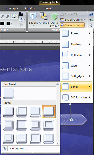
Give the lines pointing to the events a little depth so that they don’t look so flat against the 3D timeline:
Select each of the lines by Shift+clicking each line.
Click the Home tab on the Ribbon, and choose Shape Outline, Weight, 2 1/4 pt.
With the lines still selected, choose Shape Effects, Bevel, Cool Slant (see Figure 3.17).
Aligning the tops of the event label text boxes does not look good because it creates a very large gap between some of the lines and the event labels (see Figure 3.18). One workaround to that is to vary the length of the lines. Another is to align the horizontal middle of the text boxes. We chose to widen the Universal Ugly Hand Society text box so that it spans two lines instead of three. This helps make the labels more consistent, because all the other labels are one or two lines.
Shift+click to select the event text boxes.
Click the Home tab on the Ribbon, and then click Arrange, Align, Align Bottom.
Shift+click to select the event lines.
Click the Home tab on the Ribbon, and then choose Arrange, Align, Align Top.
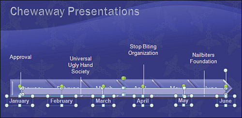
Finally, select the SmartArt diagram, click the Home tab on the Ribbon, and then choose Arrange, Bring to Front to reposition the diagram on the layer on top of the lines that point to each event. This makes the lines look as if they were extending from the timeline (see Figure 3.19).
Note
If the Bring to Front option is not available in the Arrange drop-down list, you have probably selected an object inside the SmartArt diagram instead of the diagram itself. (Sometimes it’s hard to tell!) To make the function available, click the edge of the SmartArt diagram and try again.
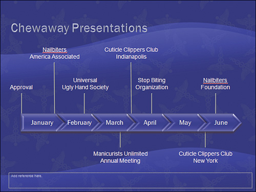
If you have more event labels than our makeover presentation has, no problem! Extend some lines and place labels below the timeline. Add more labels above the first row. Abbreviate text. Highlight the more important dates. Be creative. However, do try your best to make the timeline clean and concise and the labels and lines well-aligned. See Figures 3.20 and 3.21 for a few examples.
One way to display information and make it easier to grasp quickly is to use a table. PowerPoint 2007 tables are easy to use and format, so be sure to take advantage of this feature.
If you are following the makeover step by step, continue using your saved presentation. If you just stepped in, you can use the medical_05.pptx presentation from the Makeover 02Steps folder on the CD.
Slide 5 (see Figure 3.22) could benefit from a better display to make the data easier to read. We used a table because they make information easier to grasp (and they look so good in PowerPoint 2007!).

Here’s how to work with a table:
Click the Insert tab on the Ribbon, and then select Table. Drag to select the number of columns and rows you want. We used 3×3, as you can see in Figure 3.23
Type the content for the table (see Figure 3.24).
On the Table Tools Design tab on the Ribbon, click the More arrow at the far right of the Table Styles gallery so that you can see the various options. We used the Table quick style Medium Style 2 – Accent 1.
Click the edge of the table to select it. Click the Table Tools Layout tab on the Ribbon, and then select Alignment, Center Vertically to vertically align all text in the center of its row.
Select the cells in the Chewaway and Placebo columns by clicking and dragging your mouse in them. Click the Table Tools Layout tab of the Ribbon, and then select Alignment, Center Horizontally to center the text in the cells.
Double-click the vertical edge between the first and second column to automatically resize the first column.
Drag the bottom edge of the table to make it taller.
Press Shift+Enter in each cell to move the male/female and minimum/maximum information to the next line. Make the font size for this text smaller if you wish. This helps highlight the most important information.
Click the Home tab on the Ribbon, and then click Layout, Title Only to change the Slide Layout. Delete the text box with the original text.
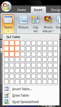

Figure 3.24 shows how the finished table looks with all the formatting changes applied.
Tip
Don’t forget to use the vertical alignment options on the Table Tools Layout tab in the Alignment group. Even just setting all cells to center vertically will make your table look more polished.
Tables are pretty easy to navigate and format. The following guidelines can be used sequentially, or you could just use the ones that are relevant for a particular table:
Click in a table cell, and drag your mouse to select text in entire columns, rows, or cells.
Use the up- and down-arrow keys to move vertically or the right- and left-arrow keys to move horizontally, or you can just click in a cell with your mouse.
Use the Tab key to move from cell to cell. Pressing the Tab key in the last cell of a table adds a new row automatically. Shift+Tab moves you backward through the cells.
Use Ctrl+Tab to add a tab stop in a cell. Adjust it by dragging the tab marker on the Ruler. (If necessary, turn on your ruler by selecting the View tab, then Ruler.)
Choose the Table Tools Layout tab, and then select Alignment, Align Top, Center Vertically, or Align Bottom to control the vertical placement of text in a cell. You also can use the left-align, center, and right-align tools to control the horizontal alignment of the text.
Format text in the table just like you would any other text, although you probably will find PowerPoint’s table layouts so nice that you won’t need to do this!
Hover your mouse cursor at the right edge of a column until it turns into a double-headed arrow. Then double-click to size the column automatically.
Adjust internal cell margins using the Table Tools Layout tab, then select Alignment, Cell Margins.
Add shading for specific rows using the check boxes in the Table Tools Design tab, Table Style Options group.
Office 2007 includes some beautiful charting options, and they’re so easy to create and modify.
If you are following the makeover step by step, continue using your saved presentation. If you just stepped in, you can use the medical_07.pptx presentation from the Makeover 02Steps folder on the CD.
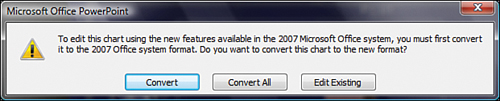
Because this presentation was originally created in PowerPoint 2003, it uses the old MSGraph style charts. Before we can use PowerPoint 2007’s formatting tools, we have to convert the old-style chart to a new one. We’ll show you how you can do that and more; just follow these steps:
Simply double-click the chart on Slide 6, and PowerPoint will prompt you to convert the chart to the 2007 format (see Figure 3.25).
Now select the chart, and the new Chart Tools tabs—Design, Layout, and Format—become available on the Ribbon.
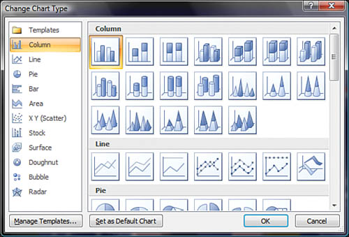
To change the chart to a 2D column, which is easier to read and displays the data more accurately than a 3D chart, click the edge of the chart to select it.
Click the Chart Tools Design tab, and then select Change Chart Type to bring up the dialog box that you can see in Figure 3.26.
Click the Clustered Column icon (the first icon in the Column category).
Click OK.
Note
You can change the chart type for just one data series. For example, you could change just one data series into a line by selecting that data series and then choosing the Chart Tools Design tab, Change Chart Type, or by right-clicking the data series and choosing Change Series Chart Type. Either of these methods opens the Change Chart Type dialog box, but applies the change only to the single data series. You can see why it’s important to select the appropriate element, the entire chart, or a specific data series before you change the chart type.
Tip
The most often used settings for chart elements are available directly from the Chart Tools Design tab. However, it can take a lot of clicks to open the Format dialog box if you need to tweak various chart elements. Luckily, this dialog box can be accessed on the right-click menu as well. For example, right-click an axis on your chart and choose Format Axis to open the Format Axis dialog box.
Format the chart using the Chart Styles quick styles gallery on the Chart Tools Design tab. These make it easy to add flair to your charts with a single click.
Select the chart.
Click the Chart Tools Design tab on the Ribbon, and then select Chart Styles, Style 26.
To further improve the look of the chart, adjust the major unit of the vertical axis so that there are not so many numbers cluttering up the slide.
Click the Chart Tools Layout tab on the Ribbon, and then select Axes, Primary Vertical Axis, More Primary Vertical Axis Options.
In the Format Axis dialog box, click the Axis Options tab. Change the Major unit to Fixed and change 5.0 to
10.0(see Figure 3.27).While you’re in the Format Axis dialog box, remove the tickmarks from the axis by selecting None in both the Major and Minor tick mark type drop-down boxes. (Many presenters will insist you keep the tickmarks. If that’s the case, then leave them in, although the chart will be much cleaner without them and they’re usually not really necessary.)
Click Close, press the Tab key, or select another option in the dialog box to apply the change.
Tip
If you prefer to have gridlines on your charts (you generally don’t need them, especially if you add data labels to your charts), you can at least format them so that they’re not so distracting. Simply right-click a gridline or an axis, choose Format Gridlines, and change the color to something more similar to the background or increase the transparency. To remove the gridlines, simply select them and press the Delete key, or right-click and choose Delete from the shortcut menu.

To complete the chart formatting, do the following:
Delete the gridlines.
Remove the tickmarks from the horizontal axis.
Right-click a column to select the data series and choose Add Data Labels. Repeat for the next column.
Right-click the data labels for the Chewaway series and choose Format Data Labels. Then click Label Options and choose Inside End to reposition the data labels. Repeat for the Placebo series data labels.
Right-click the edge of the chart to select the entire chart, and then choose 16 from the Font Size drop-down list on the mini toolbar.
Click and drag the right edge of the plot area so that the legend has room to breathe.
Click and drag to move the legend flush with the top of the chart.
Insert a less-than-or-equal-to symbol in the P-value text.
Tip
The less-than-or-equal-to symbol in the P-Value text box was created by typing the less-than character and formatting with an underline. Replace this cheesy text with a real symbol! With your cursor in a text box, choose the Insert tab on the Ribbon, and then click Symbol. Find the less-than-or-equal-to symbol, and click Insert. The same goes for the greater-than-or-equal-to symbol.
Unbold the text on the vertical axis title. Click and drag to center the axis title on the vertical axis.
Save the presentation. You can see the finished presentation in the
Makeover 02Stepsfolder on the CD (seemedical_07.pptx).
Figure 3.28 shows you the chart prior to the formatting changes. Not very appealing, is it? Figure 3.29 shows you how you can dramatically improve the look of a chart, and of the presentation overall, with just a few clicks.